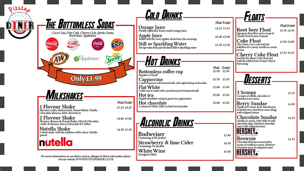
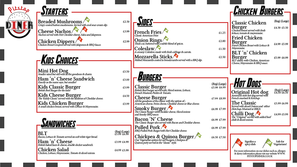
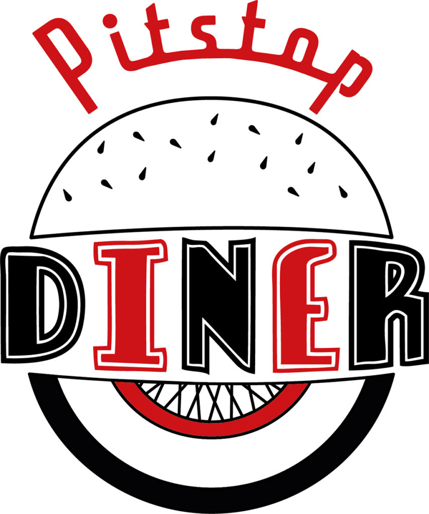
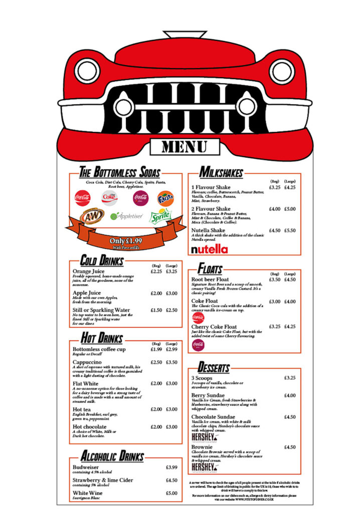
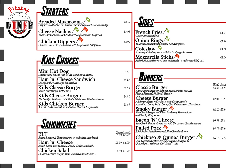
My Project was to create a corporate identity for a branch of Diner. I was inspired by modern Diner’s based on 1950’s aesthetics such as Ed’s Diner, Five guys and OK diner. To create accurate graphics for the diner in depth research into these branches and into the period of the 1950’s had to be done, this included looking into processes that were often used to create menus, logos and overhead boards. Throughout the project, I stuck as close to my intentions from the beginning as I could, creating a Logo, menu and Overhead board for a diner called “Pitstop”, a 1950’s inspired diner with a theme of racing/cars, by using a white walled wheel in the logo (a popular wheel used in the 50s) and including the front of a Cadillac in the menu. Overall, I was able to accurately create components that suit the 1950s theme and create a Diner that would be appealing to a wide variety of customers.
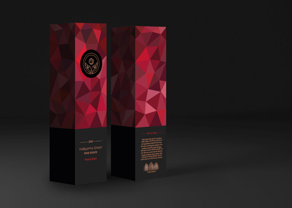
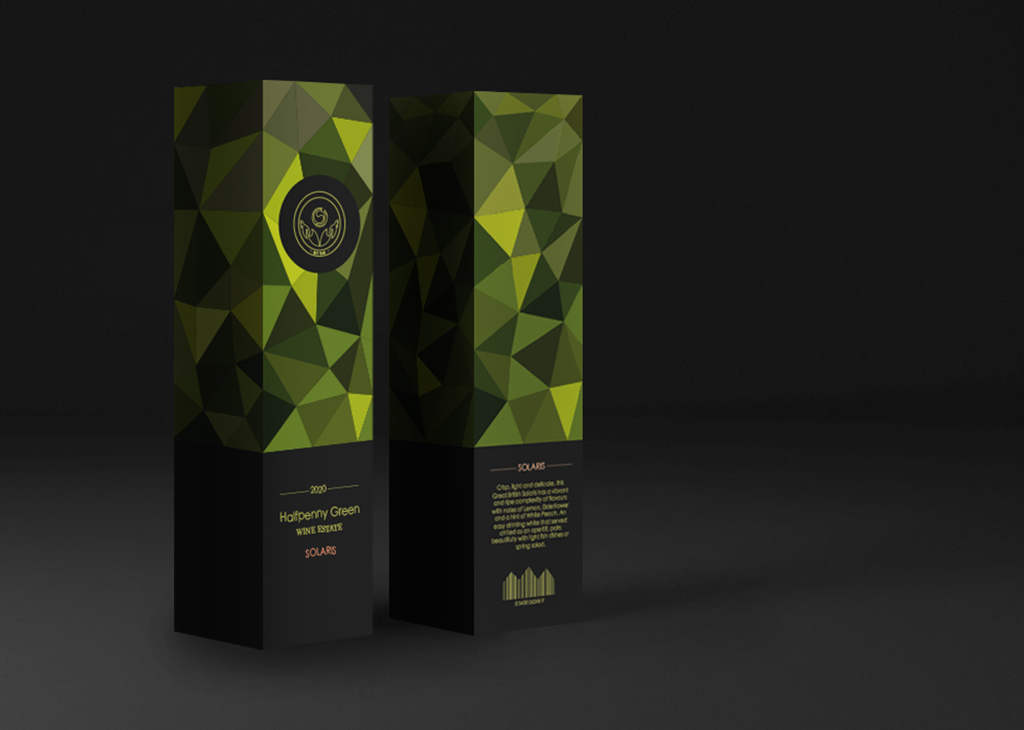
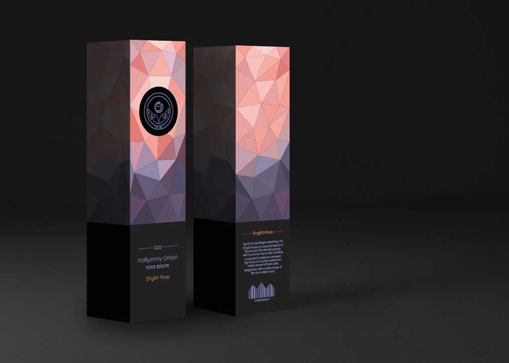
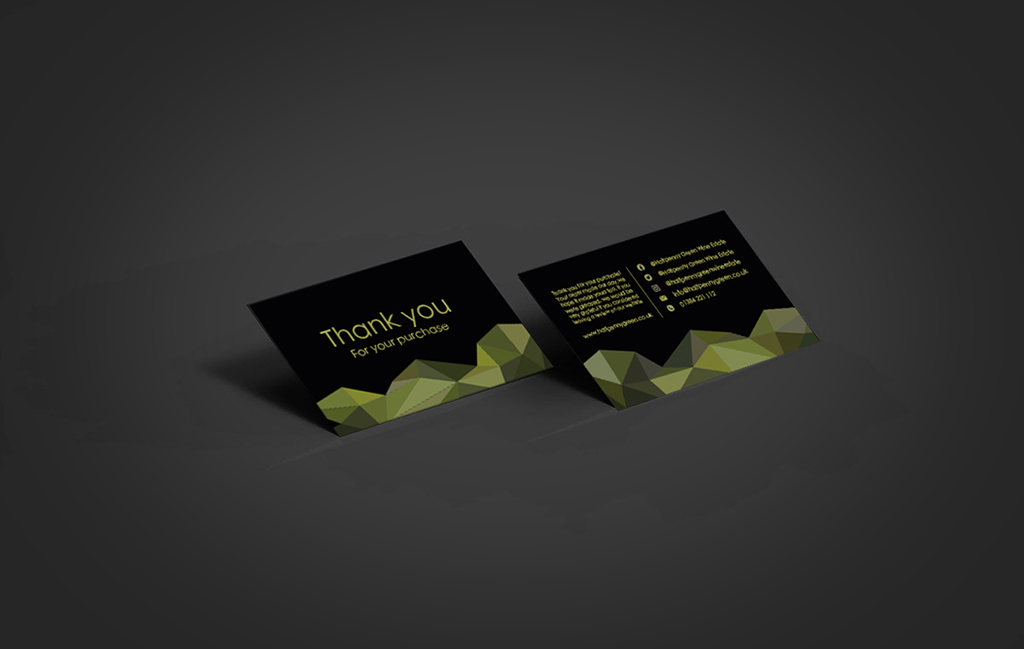
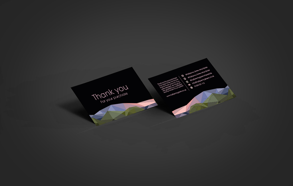
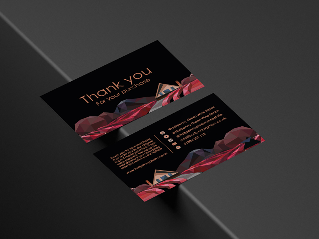
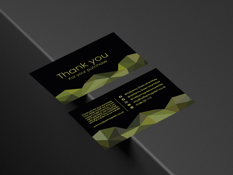
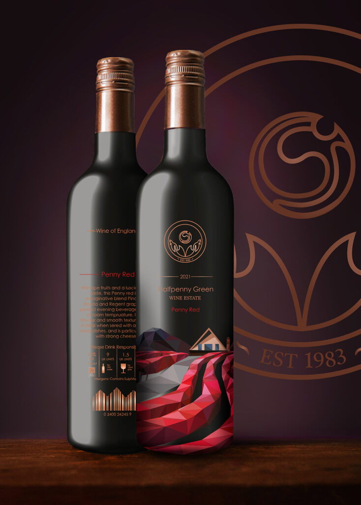
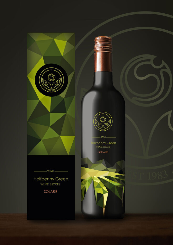
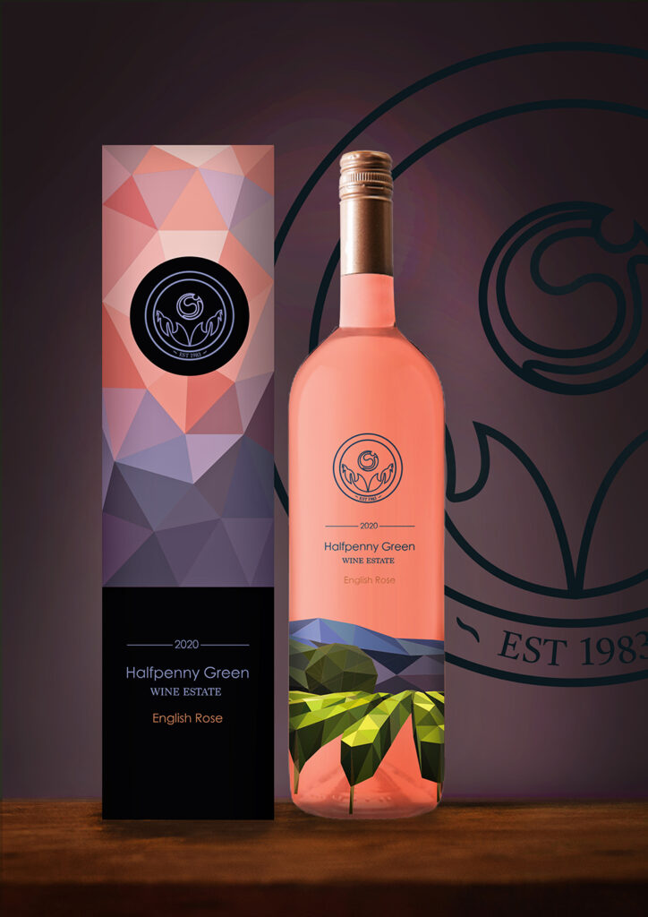
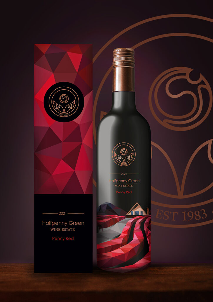
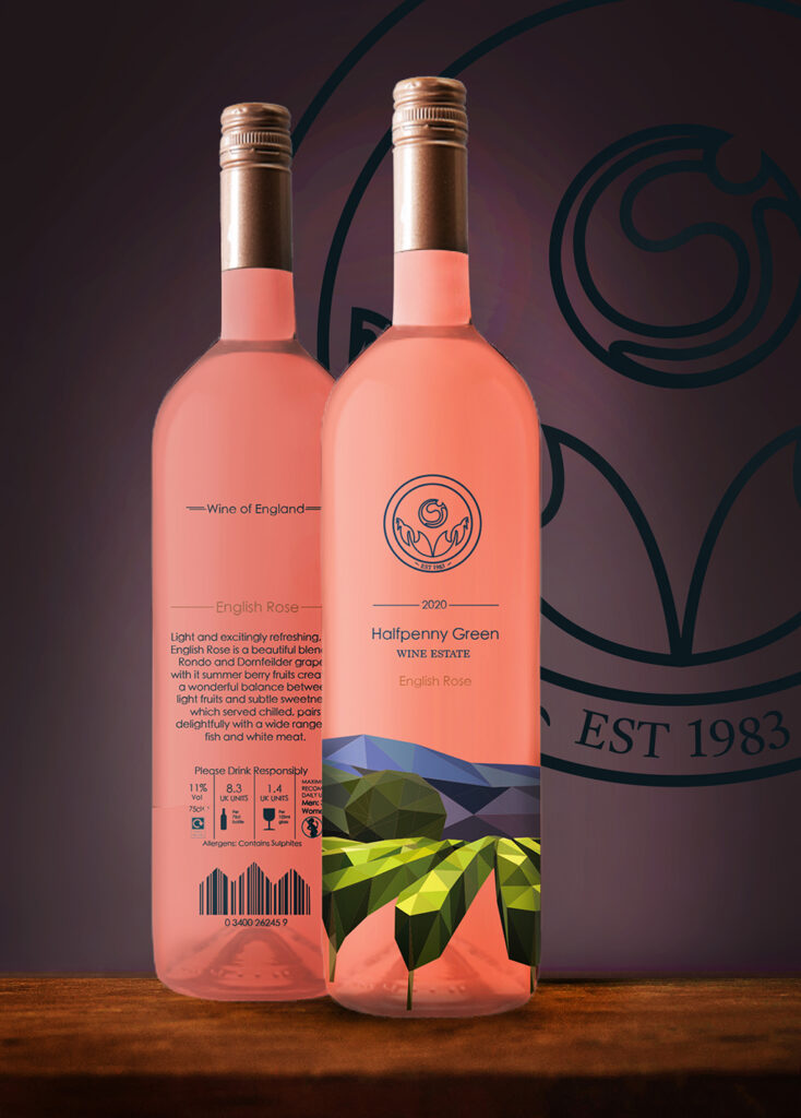
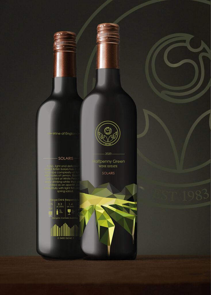
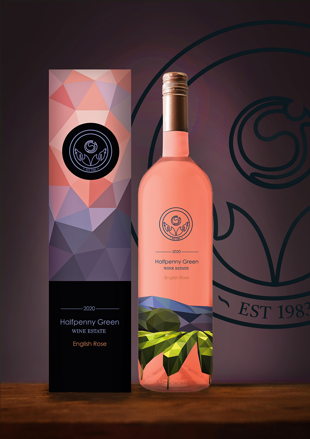
As part of my project, I created a range of graphics for a local vineyard, the Halfpenny Green Vineyard and Wine Estate. These graphics included a brand-new modern logo, a set of labels for 3 flavours of wine, Solaris, English Rose and Penny red, as well as complementary wine boxes which would keep each of the bottles safe and secure. The final pieces I designed were ‘Thank you’ Business cards, tailored for the flavour of wine purchased, following the luxurious Morales of the brand. The Vineyards landscape is a large selling point of the business, so this was an element which I chose to focus my designs around, creating a range of beautiful illustrations in the minimalistic form of art, geometric art, inspired by artist Elyse Dodge a style which would make up the identity of the brand.
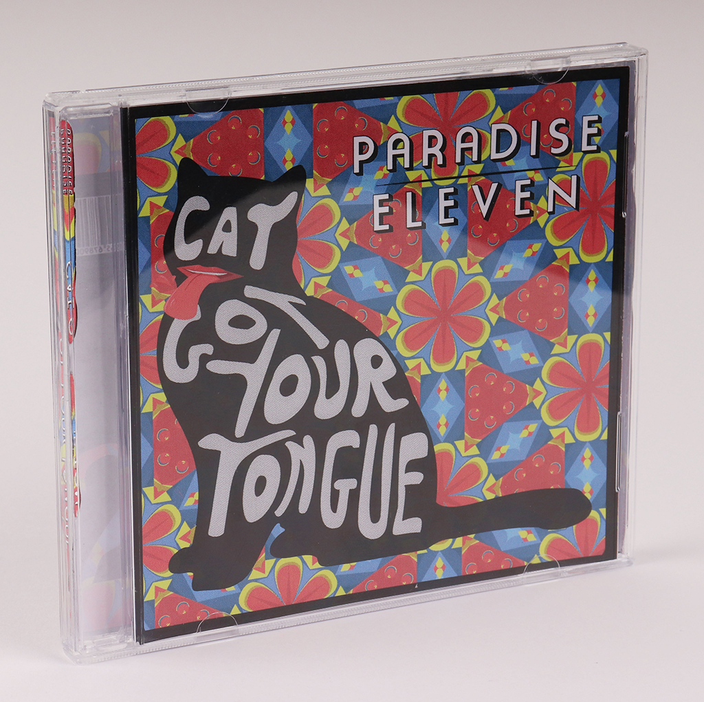
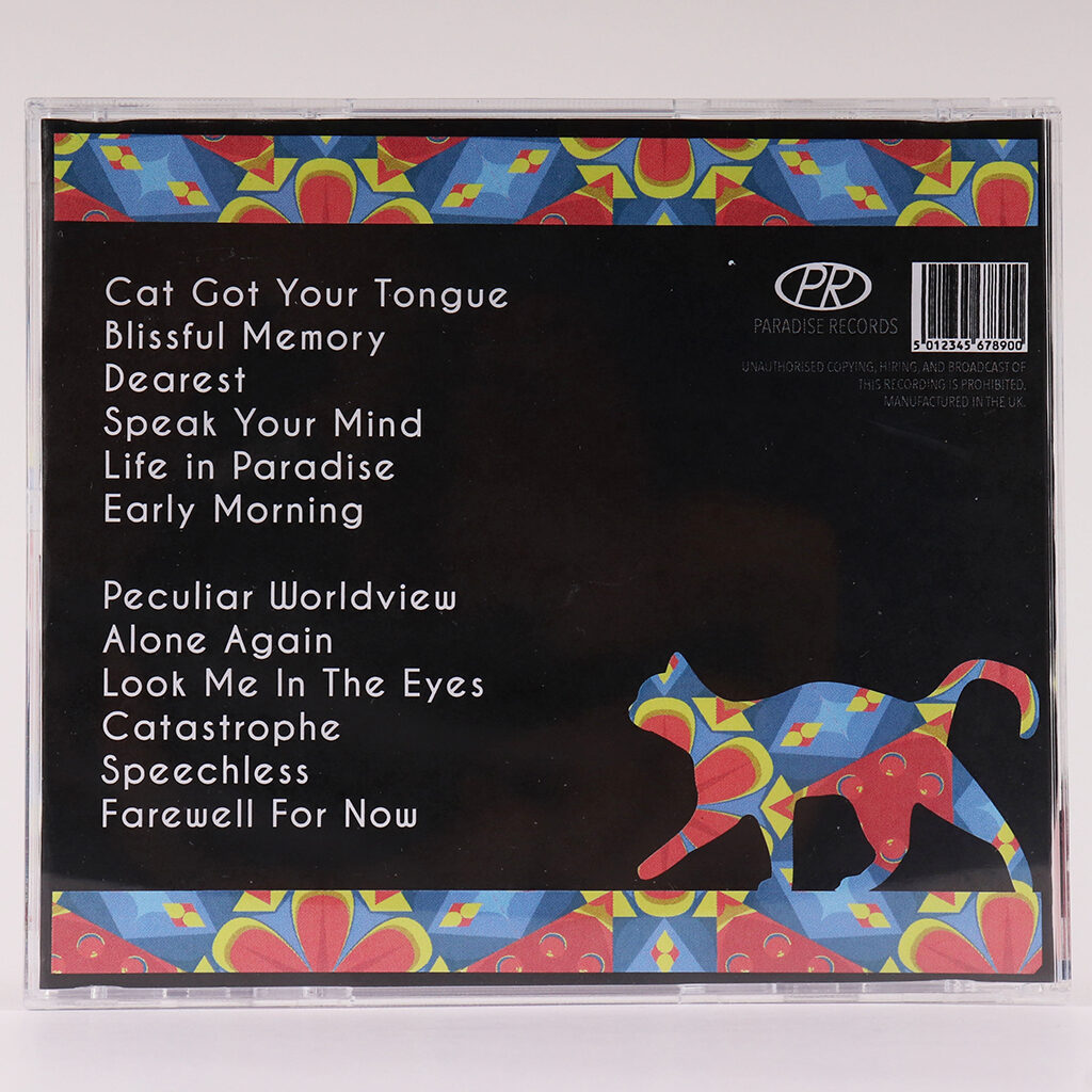
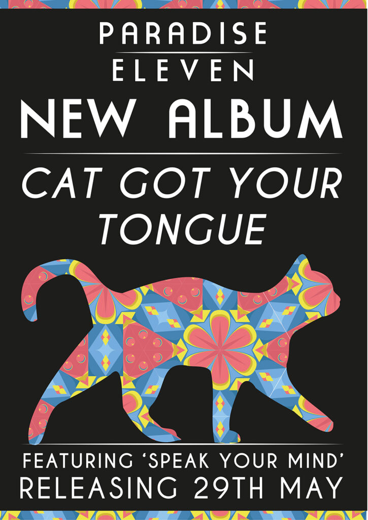
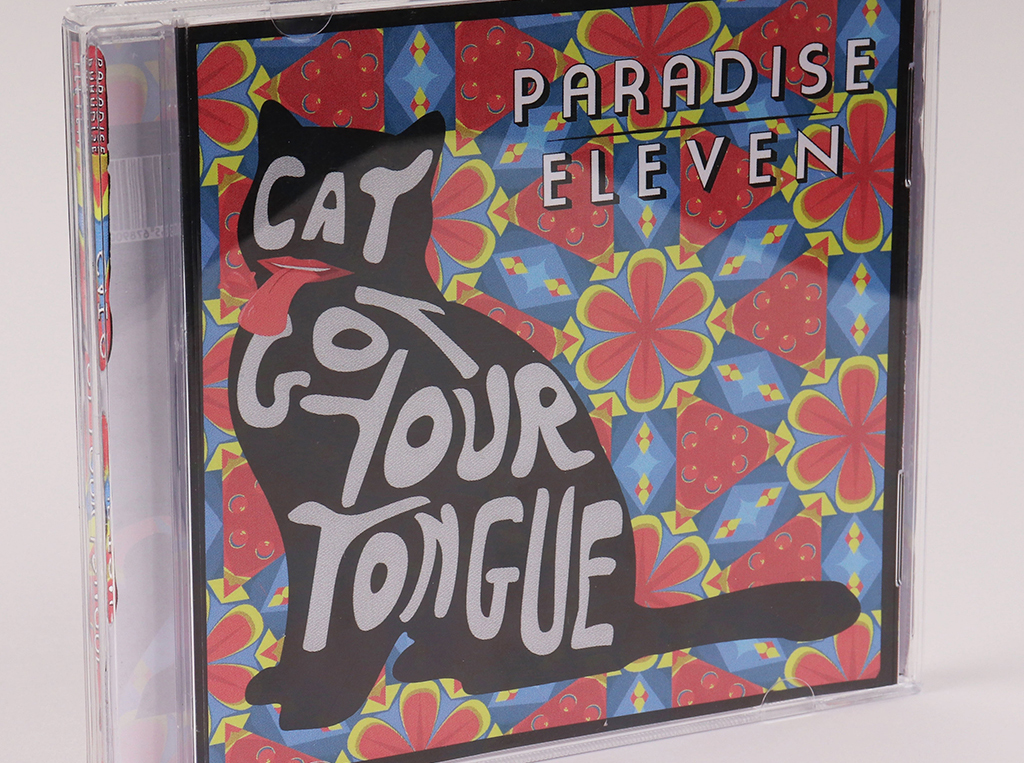
This project involved creating a brand identity and graphics for an upcoming band called ‘Paradise Eleven’. During this project, I created a logo, the front and the back of an album cover, and a poster advertising its new release. The band I was creating for made music in the style of 60s rock and roll, and so I took inspiration from famous 60s art of the time – taking inspiration from artists such as Andy Warhol, Roy Lichtenstein and Wes Wilson. The band wished for a piece that portrays the unique nature of their music, standing out from the crowd of modern music and using the nostalgia of the 60s as a selling point for older individuals. I explored popular art styles in the 60s such as psychedelia, pop art and op art, with most inspiration from psychedelia. Overall, these pieces were made to appeal to both a younger, hipster audience, and an older audience who may have nostalgia for retro styles of music.
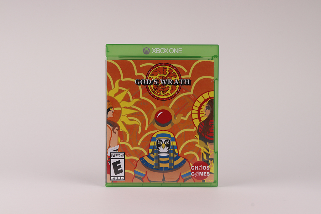
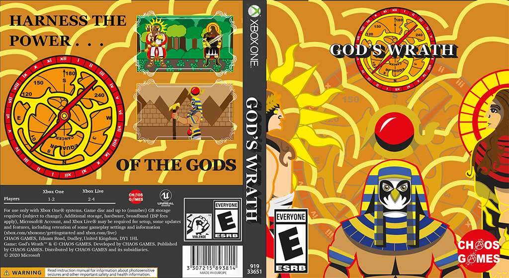
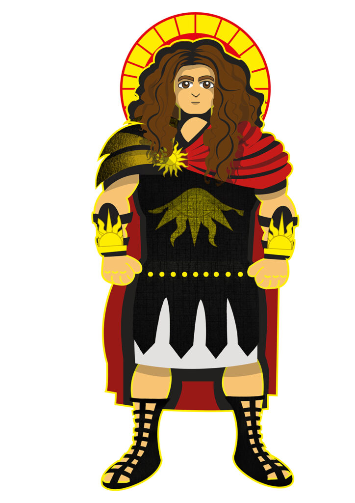
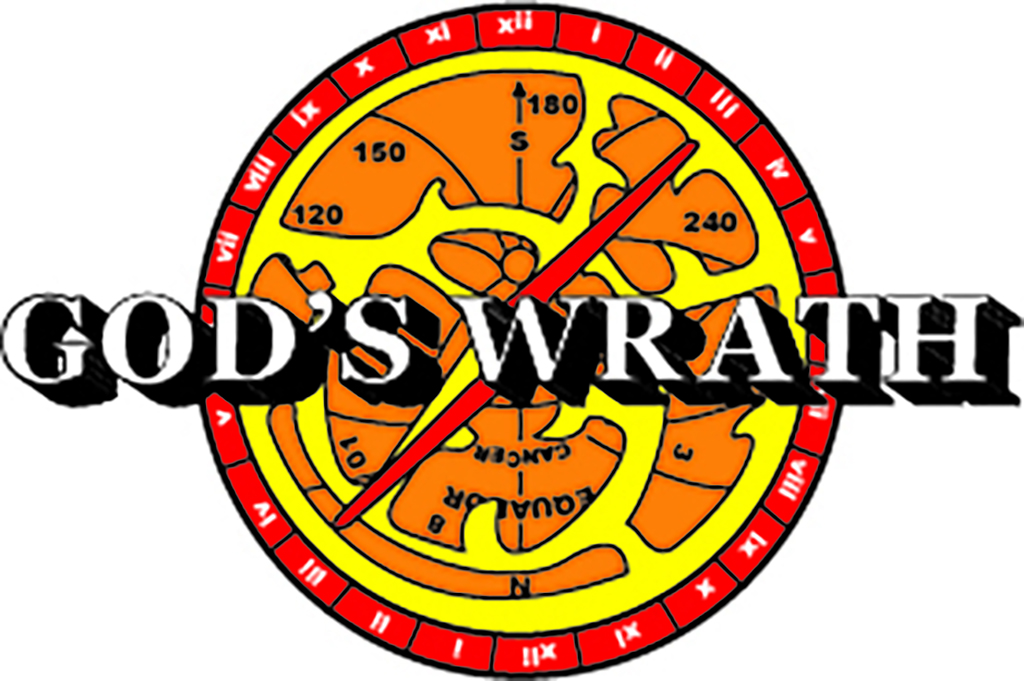
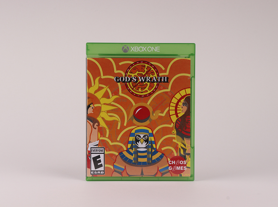
This project is a game targeted at ages six and above. In this project, I created the characters, the logo, and the cover. Each component was created with the target audience in mind hence, the colours are vibrant with bold outlines.
To gain inspiration, I looked at a series of artists and existing covers hence, these aspects are visible in the final outcomes of the project. Moreover, I focused on creating less realistic designs to ensure the aspects were unforgettable.
The characters in the game are existing gods from the Roman, Greek, and Egyptian culture which, all have their own weapons and outfits. Hence, I had a starting point when creating them.
The logo was roughly based off an astrolabe which plays a large role in the game. However, I had to alter it to appeal to my target audience therefore, it possesses more vibrant colours.
In conclusion, the project was successful as, the designs would be attractive to my target audience.
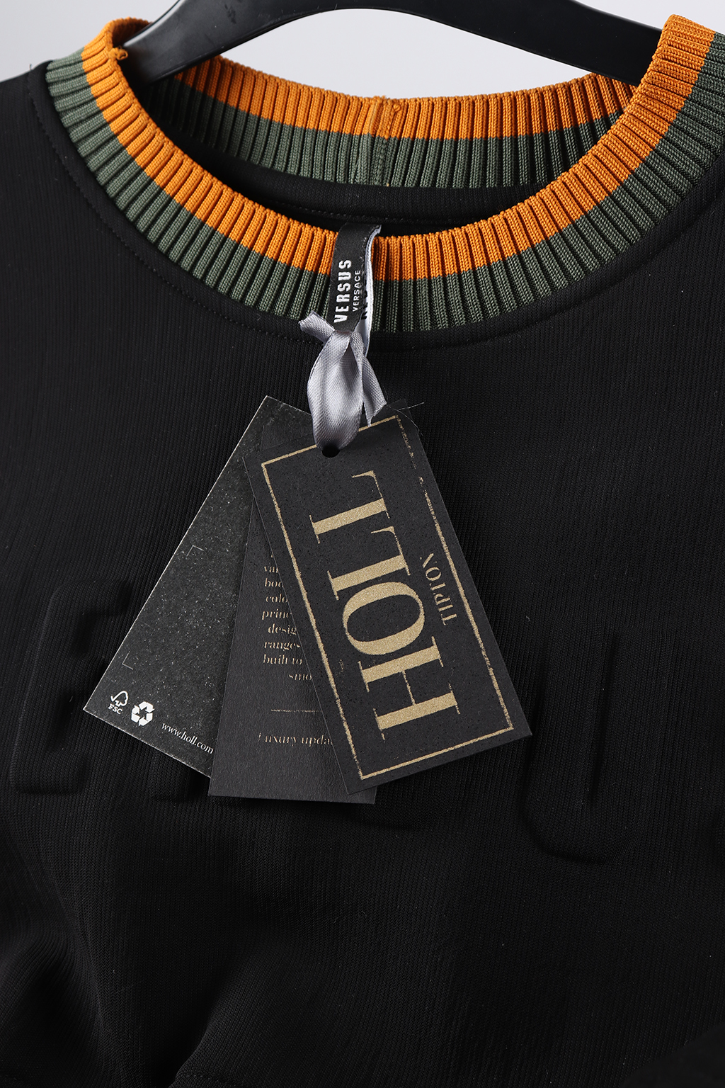
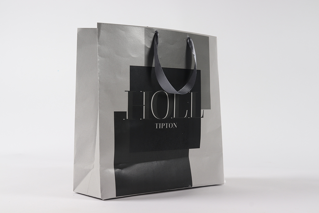
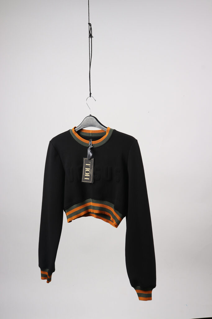
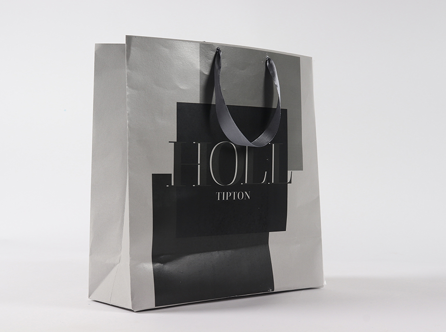
HOLL is a luxury fashion label that strives to include all types of body shapes and ethnicities while keeping in tie with the high-end contemporary style. Today, the need to raise more awareness about these subjects is due to the increase in mental health. In the UK 1 in 4 people will experience mental health problems of some kind each year and it’s on the increase as the reporting’s of self-harm went up by 62% between 2000 and 2014, this has almost doubled. In Today’s society not accepting body inclusivity, ethnicities or races are on the rise within the luxury fashion industry as they don’t provide the correct shape and sized clothing to tailor for plus size and also colour schemes used which don’t compliment all skin tones. My final pieces reflect HOLL ethos by adding layers to reflect the shades of skin, while in keeping with the luxury feel by using complex techniques like screen printing and the use of precious colours such as gold.
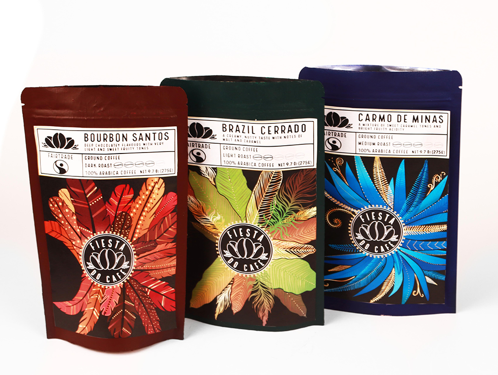
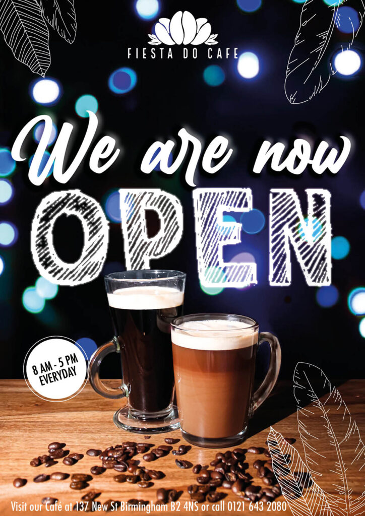
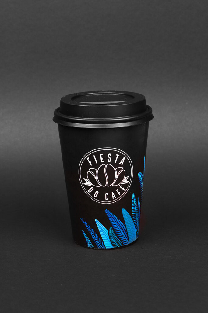
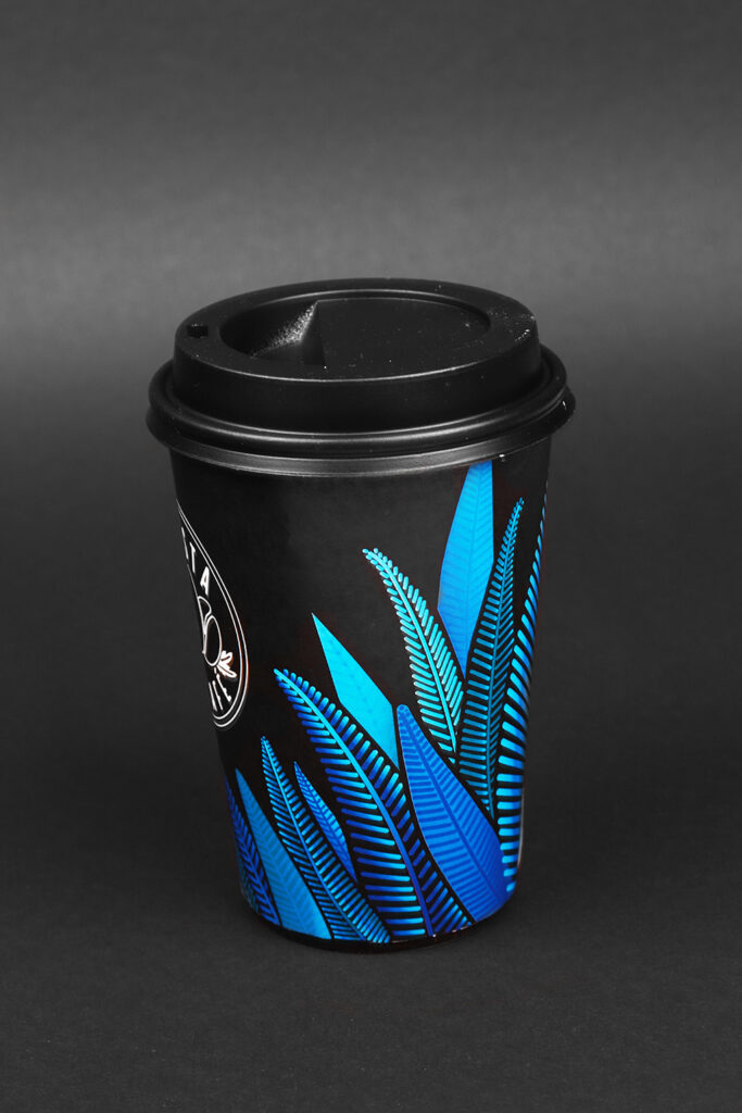
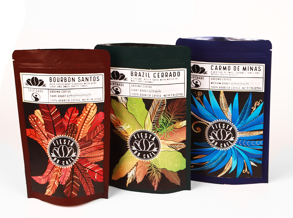
My project, ‘Fiesta Do Café’, has been successful overall in conveying the idea of Brazil’s Carnival, and the excitement of it. My intentions were to present the liveliness and culture of the festival through bright designs that represent this idea, and I feel that the feathers were successful in doing this, as they not only remind us of costume feathers, but also the feathers of birds, and so they are relevant to multiple Brazilian cultures, and my feather styles have varied, which added interest to my project. Colour has been one of the main successful elements in my project; the combination of both bright and earthier, darker colours enabled me to produce vibrant but professional designs throughout the entirety of my brand. Blue became my key brand identity colour, used within my posters and app also; I found this to be the most friendly and welcoming, tropical-looking, and the most eye-catching also.
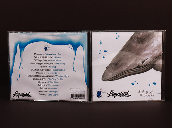
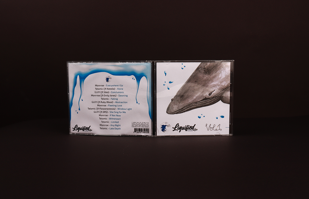
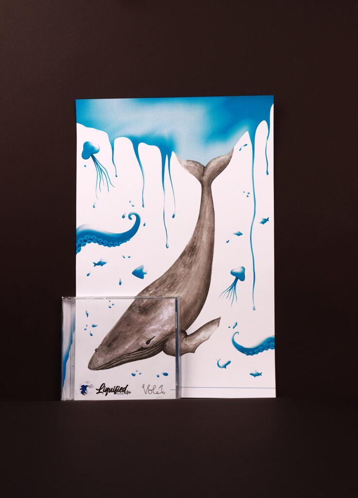
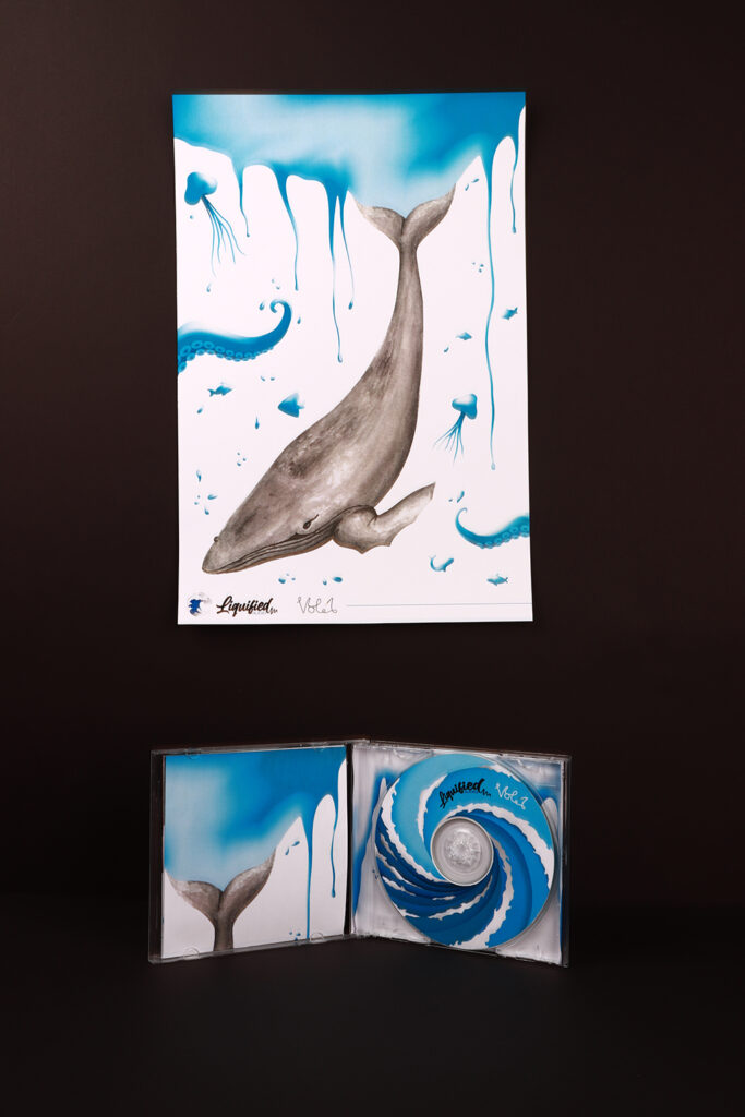
This project is a record label focused around the promotion of liquid drum and bass to the younger generations, bringing in a new audience for the music community. It sets out to design a logo and the elements of a CD cover, including cover art and CD disc design, that have a fresh and modern aesthetic. Due to the liquid nature of the music genre, the designs are centred around the forms and colours of water creating fluid designs and
branching out into sea life and sea creatures later in the project. In order to create designs that appealed to younger audiences, the project extensively used digital design tools and gradients throughout the branding but then contrasted this by combining it with traditional watercolour, which can be seen with the whale in the CD cover design and poster. The designs used modern script and sans-serif fonts, keeping the project appealing and fresh.
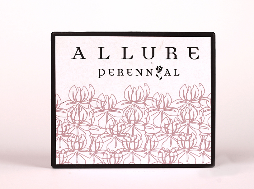
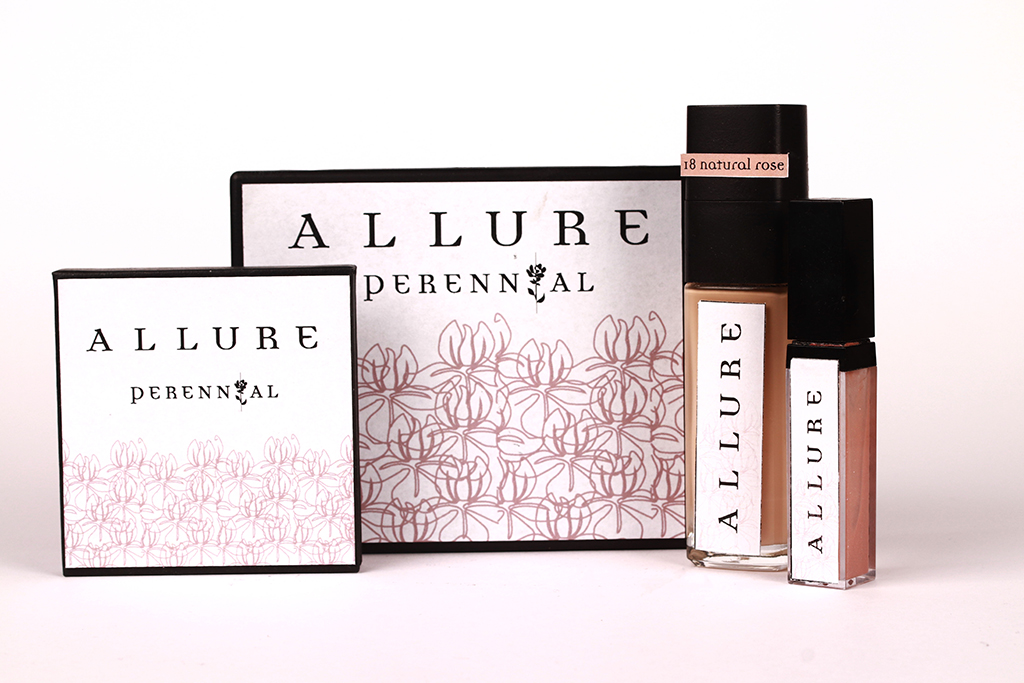
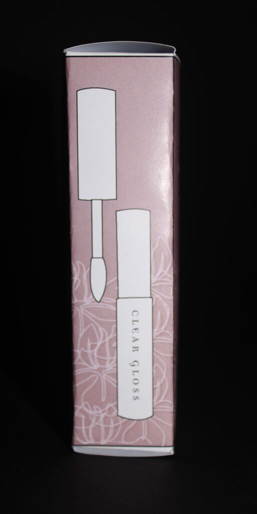
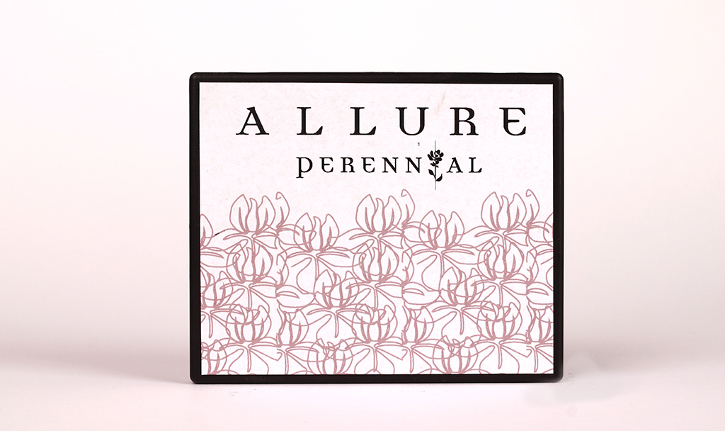
This project was successful as I created graphics for a new makeup brand ‘Allure’. These being the both the outer packaging, a logo as well as labels for four products. A lip gloss, foundation, blusher and bronzer pallet and a eyeshadow pallet. I intended to make my brand cruelty free and clean as well as luxury and timeless in its design.
Throughout the project I took inspiration from artists such as Picasso, William Morris and Frank Stella as well as brands such as Charlotte Tilbury and Fenty Beauty as both of these are luxury brand that have a strong message of women empowerment.
Each of my graphic outcomes are coherent, and they all link together in aesthetic. The soft colour pallet reflects the femininity of the product. I also developed a pattern with the designs of my packaging to link to the range name of ‘Perennial’ and the one line illustration of an iris presents this.
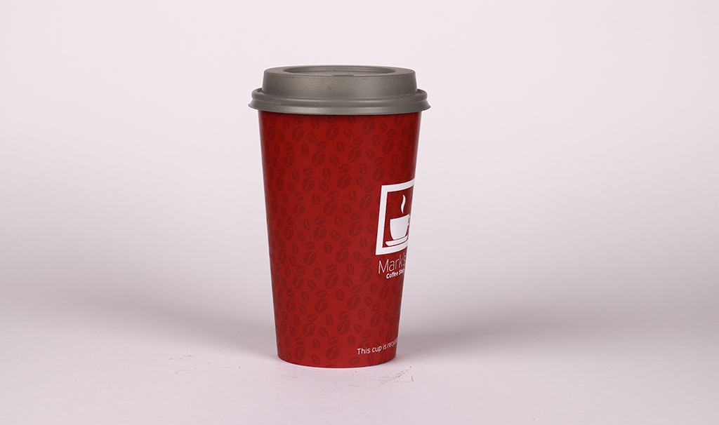
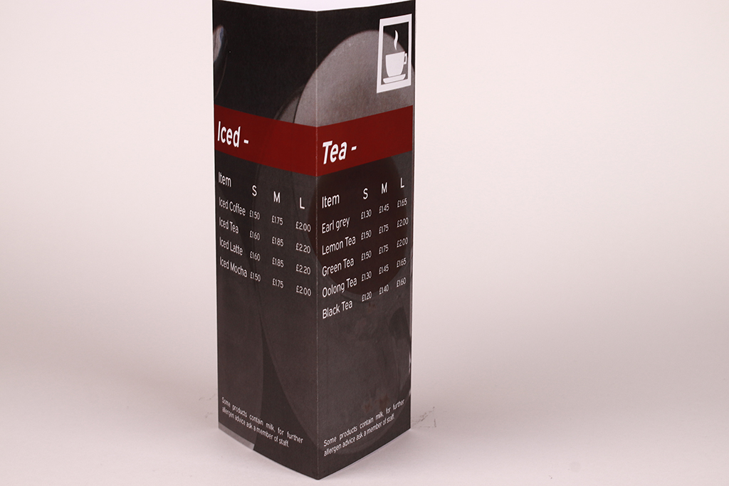
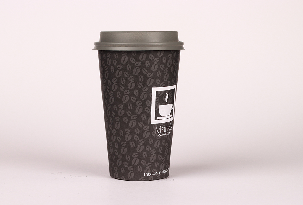
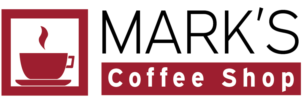
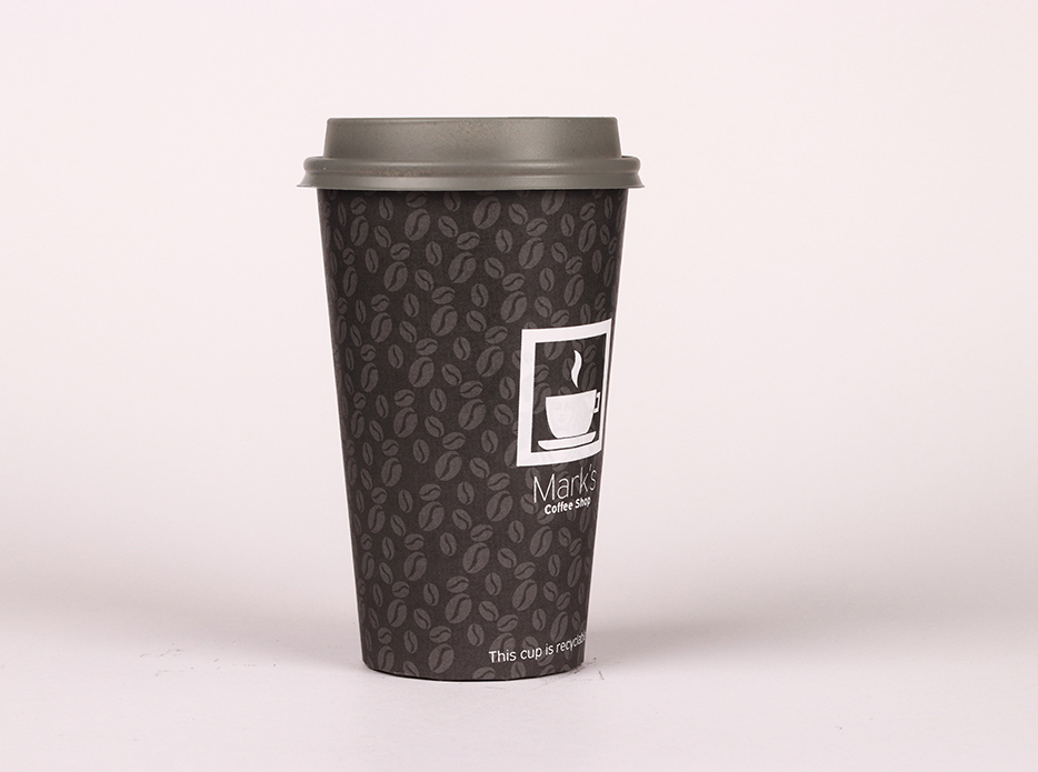
This project is focused on creating a new brand for a company called Mark’s coffee shop and it includes design work for a new logo, menu and coffee cup design to help promote new sales for the brand. The logo is a simple and modern design that is contained within a square so it can easily line up with text and be used on any other business items. The logo makes use of a large bold font to make the logo easy to read. The coffee cup designs created are very minimalist and work well with the logo. The black coffee cup is an ICED coffee cup while the red serves as the regular hot drinks cup. The menu design forms a triangle design and so it can be displayed on a table and easily viewed by any customers and contains an allergen warning for safety concerns and customer health.
The role of a graphic designer is incredibly varied. You may find yourself immersed in a fantasy world while designing a set of illustrations for a book, or exploring complex data to create exciting and vibrant infographics that inform rather than confuse.
Students at Dudley Sixth are introduced to wide range of graphic design processes and techniques. While using a range of both traditional and digital methods, they are encouraged to move beyond their comfort zones to produce a variety of work supported by an understanding of design theory and a developing awareness of contemporary practitioners to inform and influence their ideas.
I believe this year’s projects show the variety and individuality of our students, producing a collection of work tailored to their interests and specialisms. The students have all pushed themselves to get the best results even when the Covid-19 pandemic threw obstacles at them and this is clearly visible in the end outcomes.
In their second year, students begin to develop their own visual identity while becoming increasingly self-directed and independent. This enables them to create a set of work that has both a personal connection but a wider understanding of the subject area. This could be an advertising campaign, design work for a clothing website or a set of illustrations for an album sleeve or book. Throughout the year, students will be pushed to try new approaches and consolidate the skills they have learned in their first year to produce strong, challenging and professionally-produced designs. I believe you will see all of these qualities in this year’s second year work. I hope you enjoy it.
Chris Worley, A-Level Graphics Tutor, Dudley Sixth