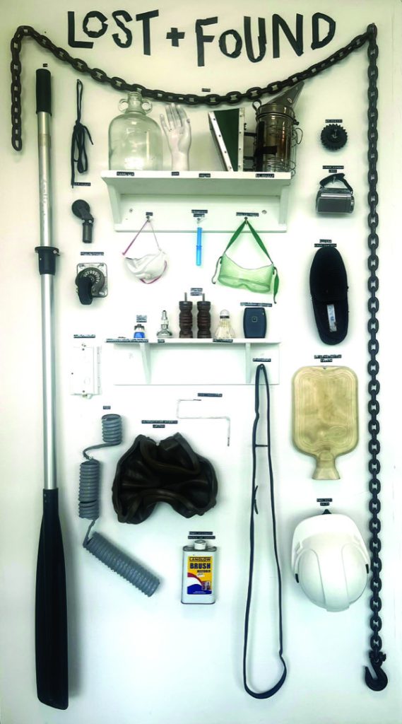
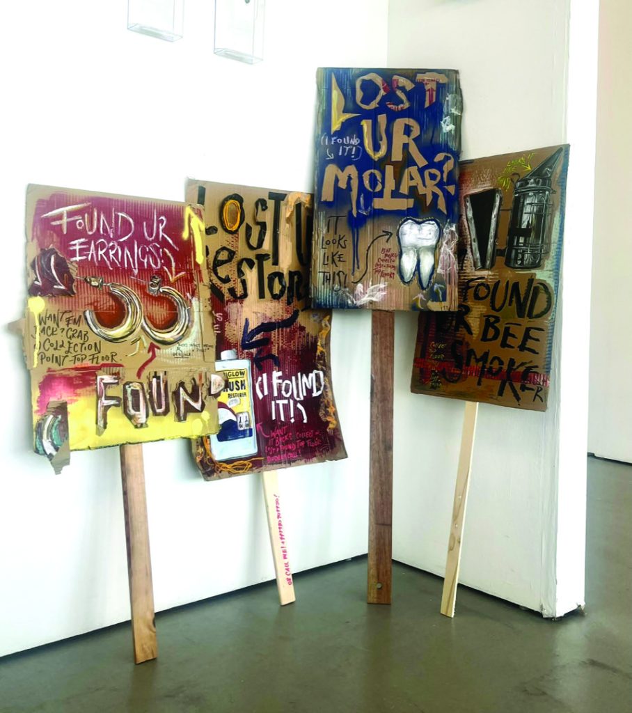
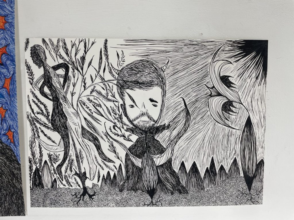
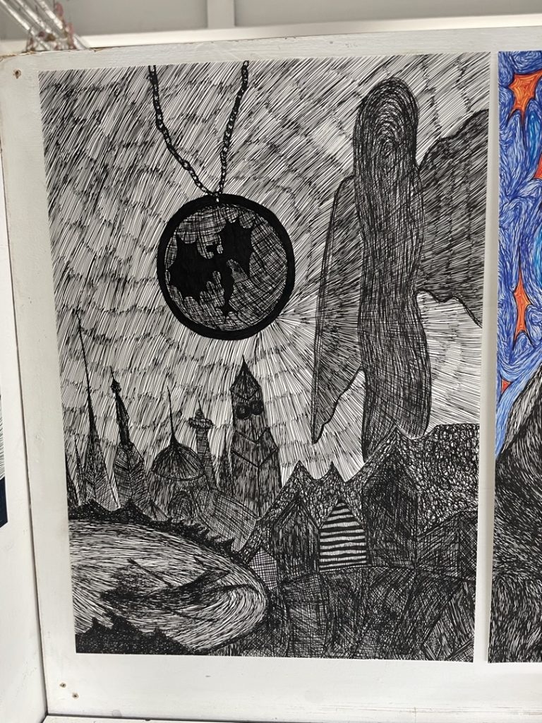
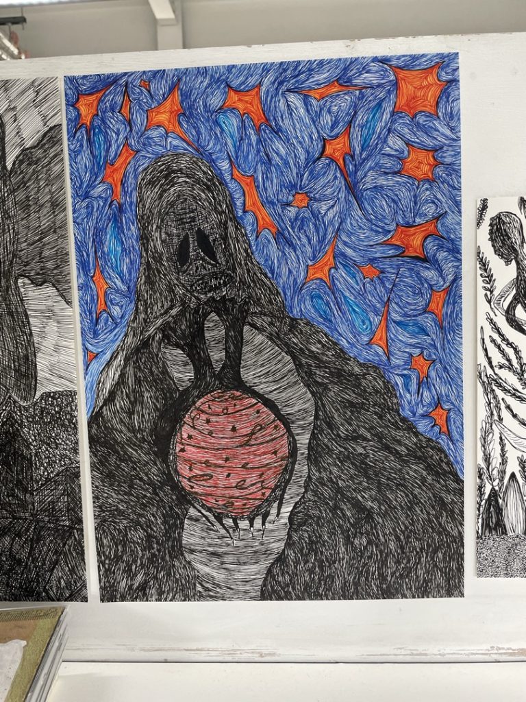
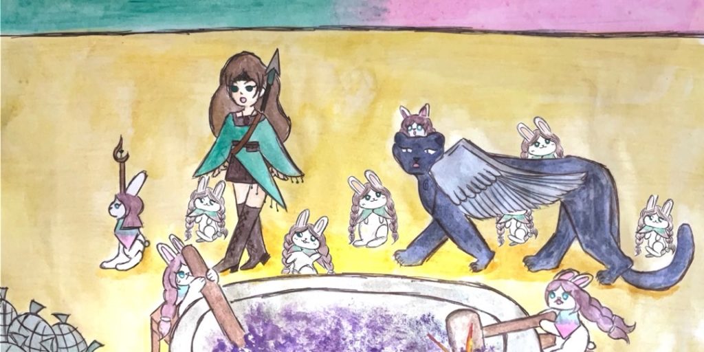
Check out This Showreel of our Foundation Art and Design 2026 Exhibition
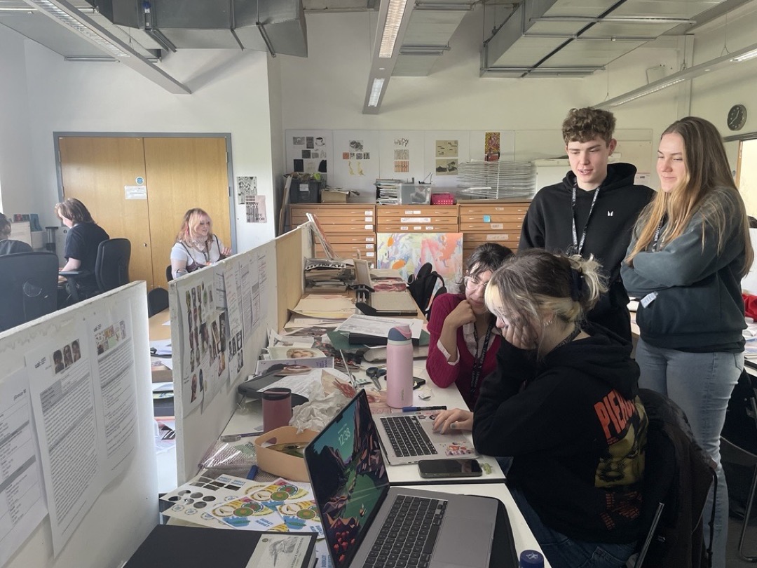
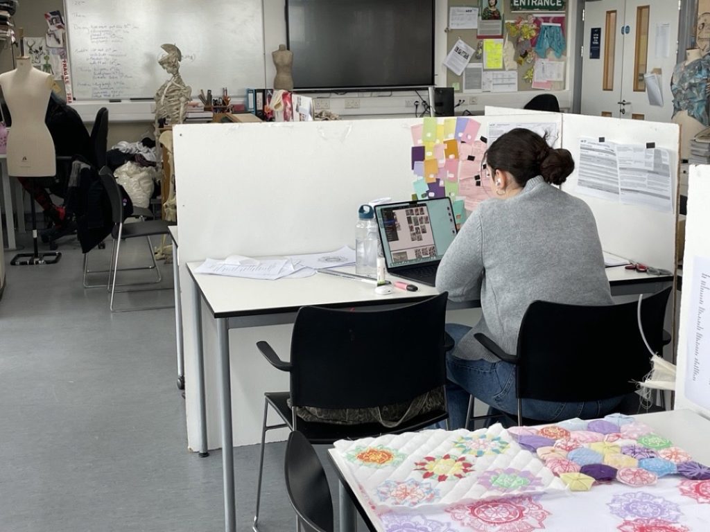
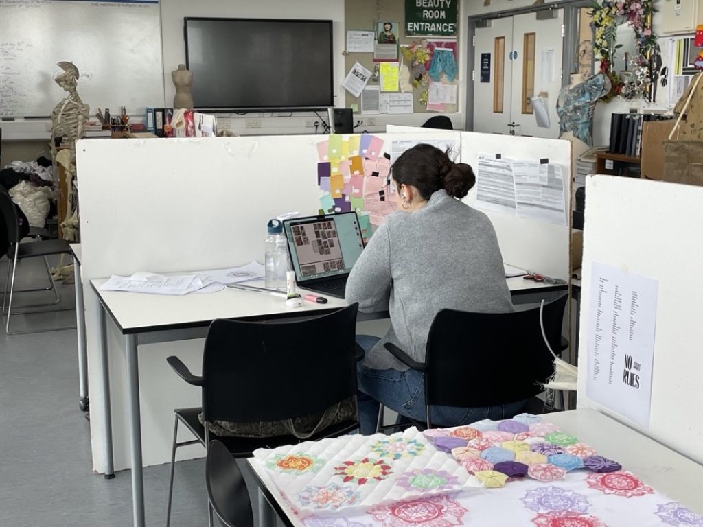
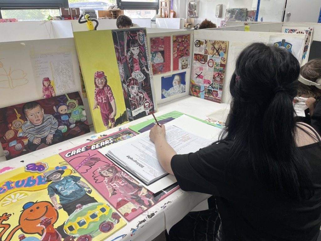
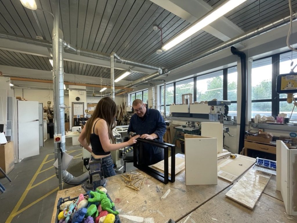
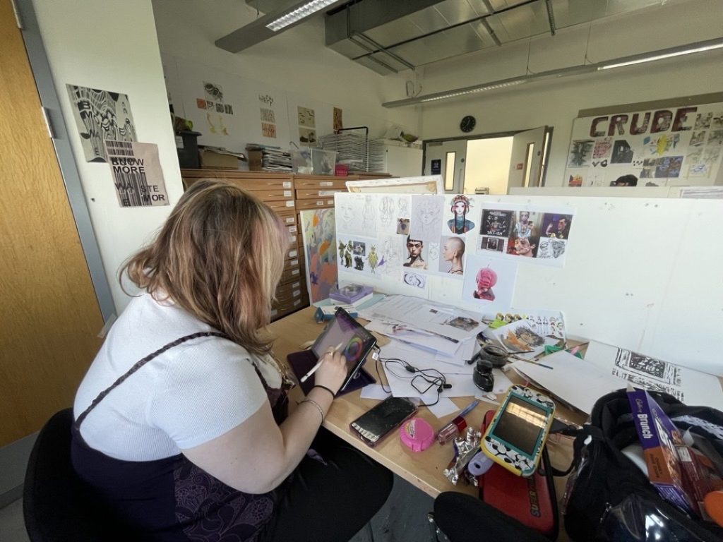
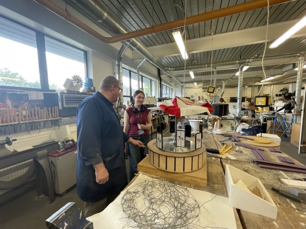
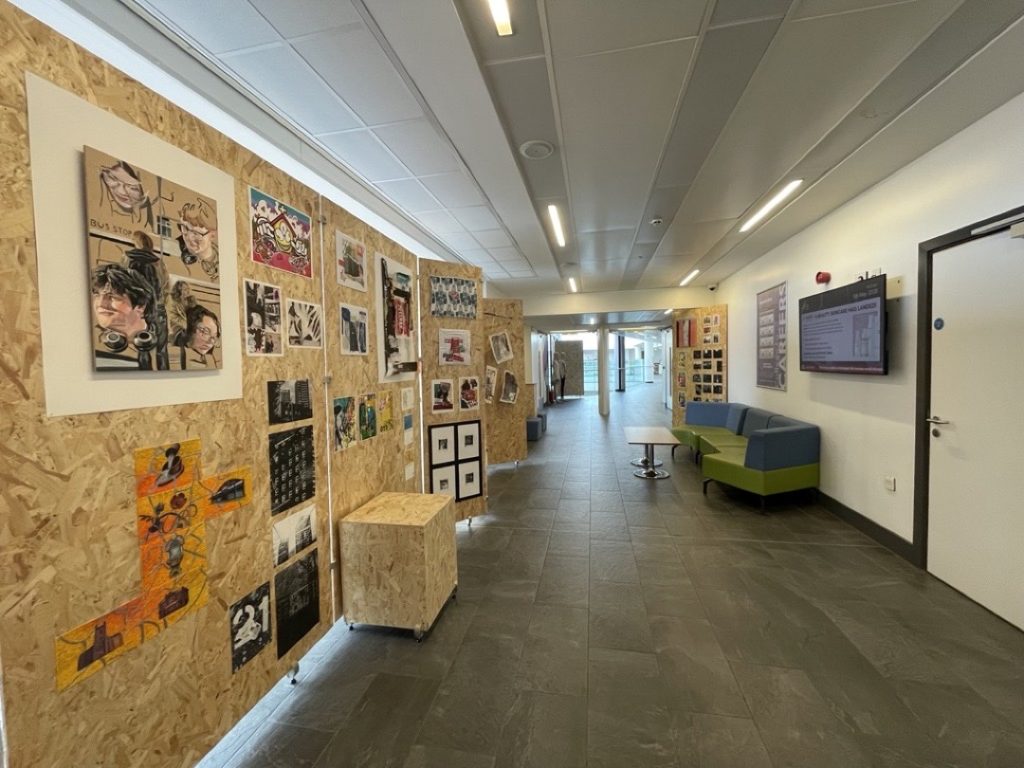
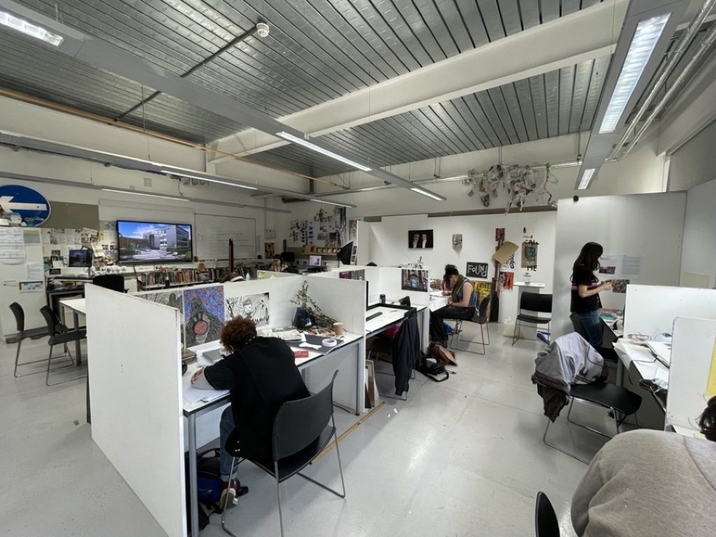
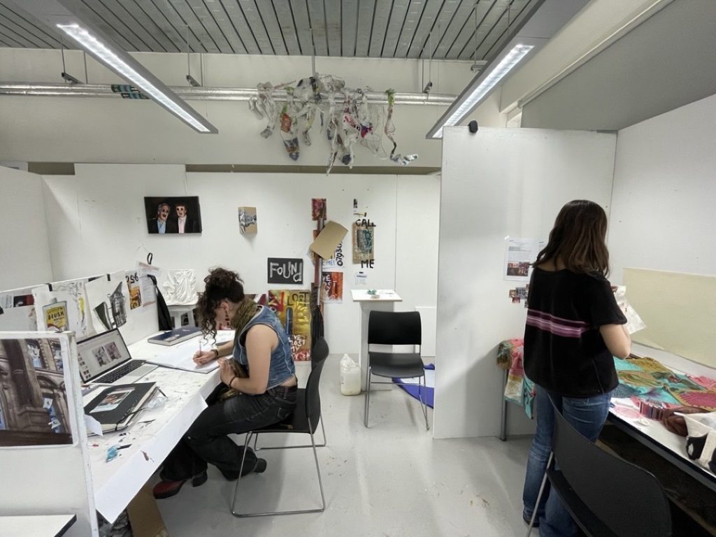
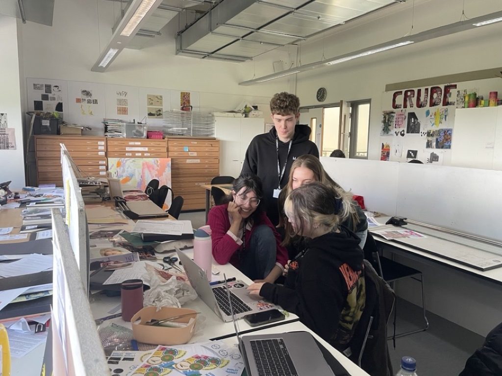
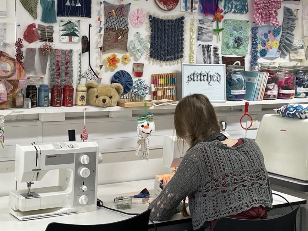
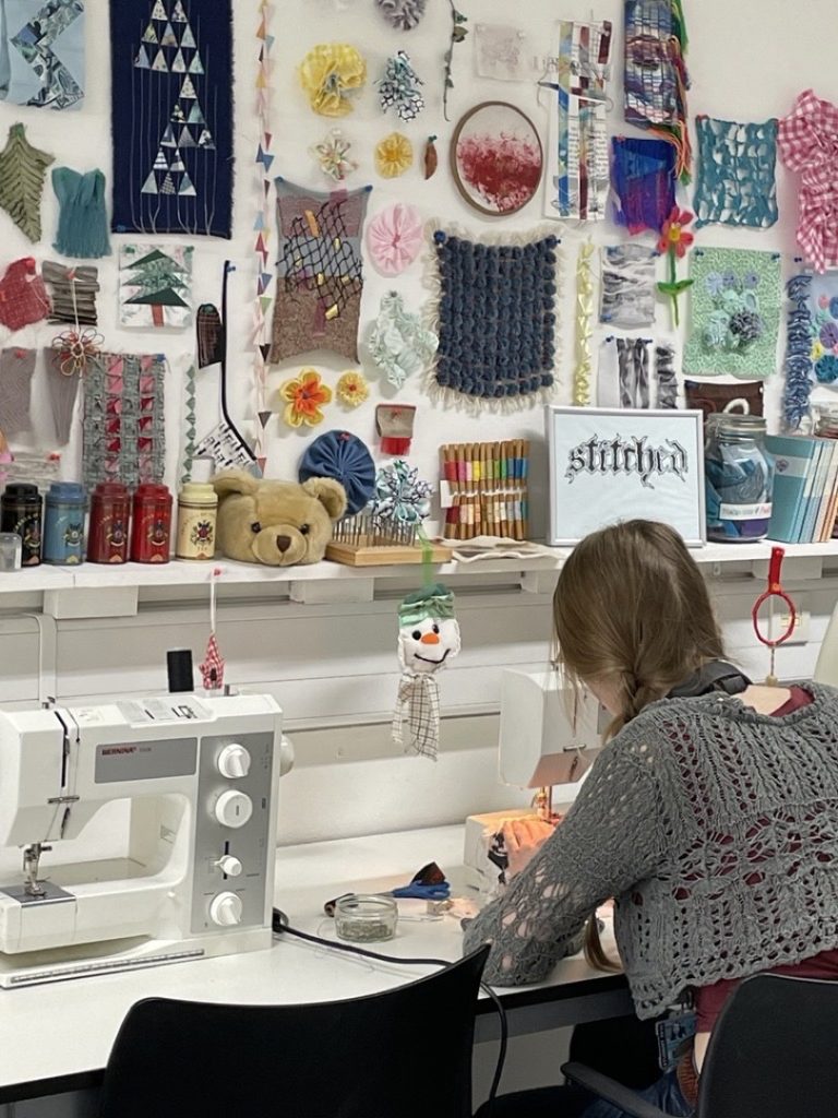
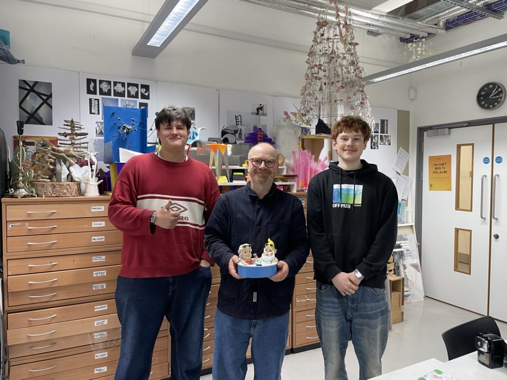
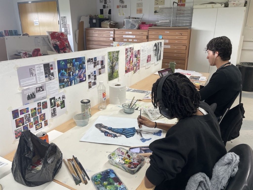
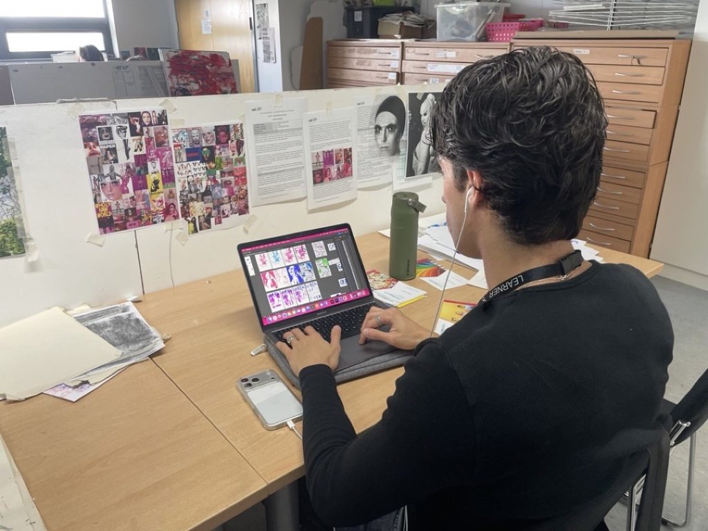
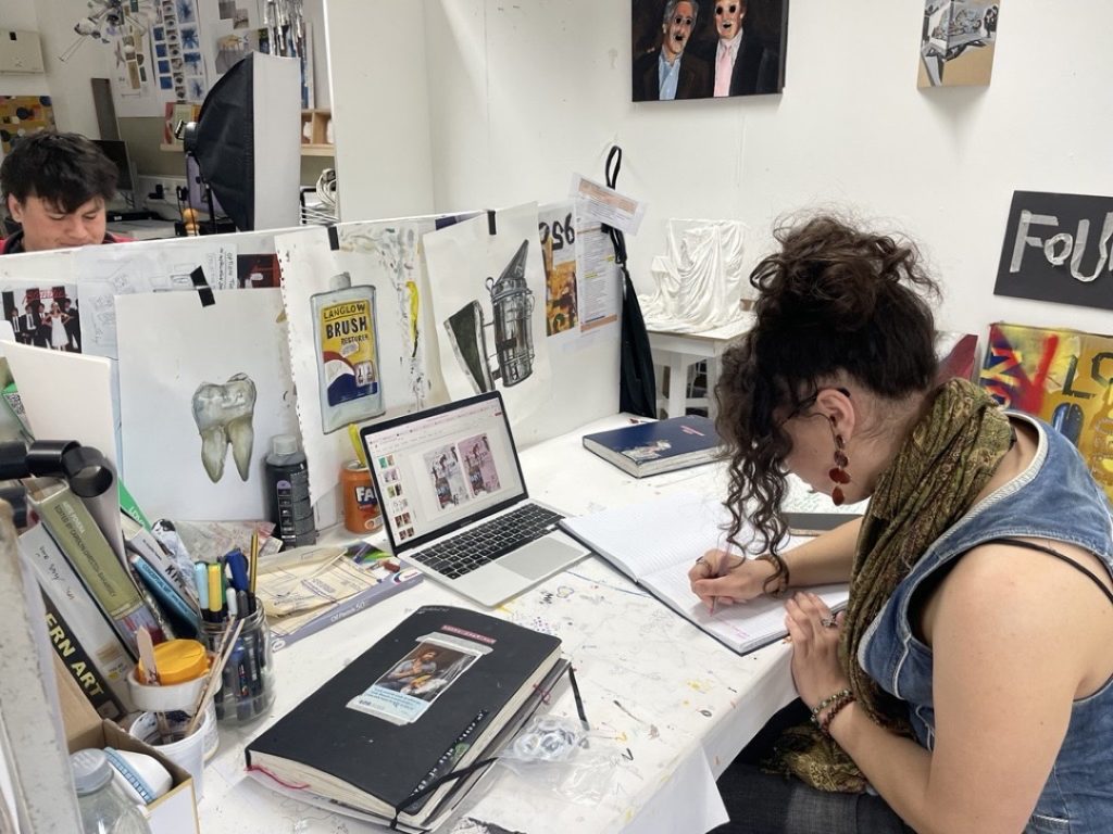
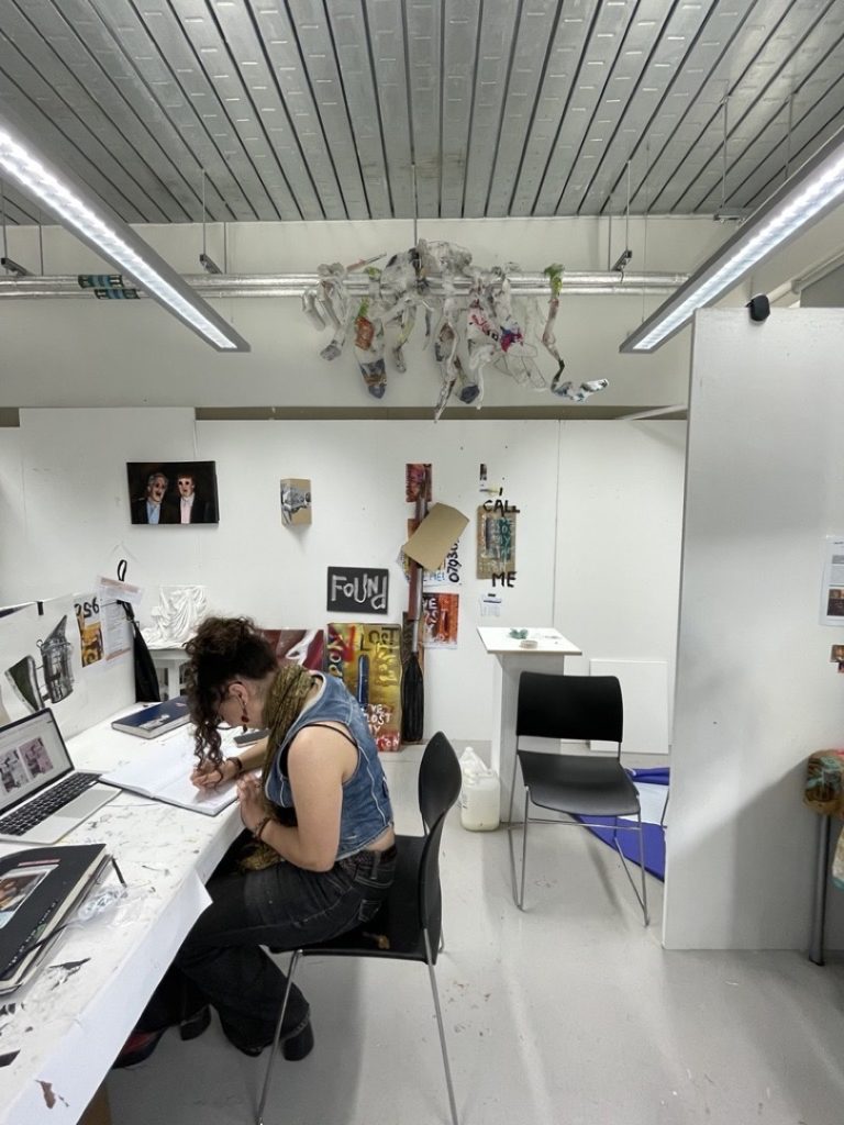
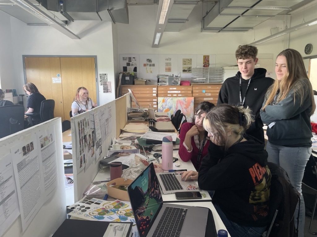
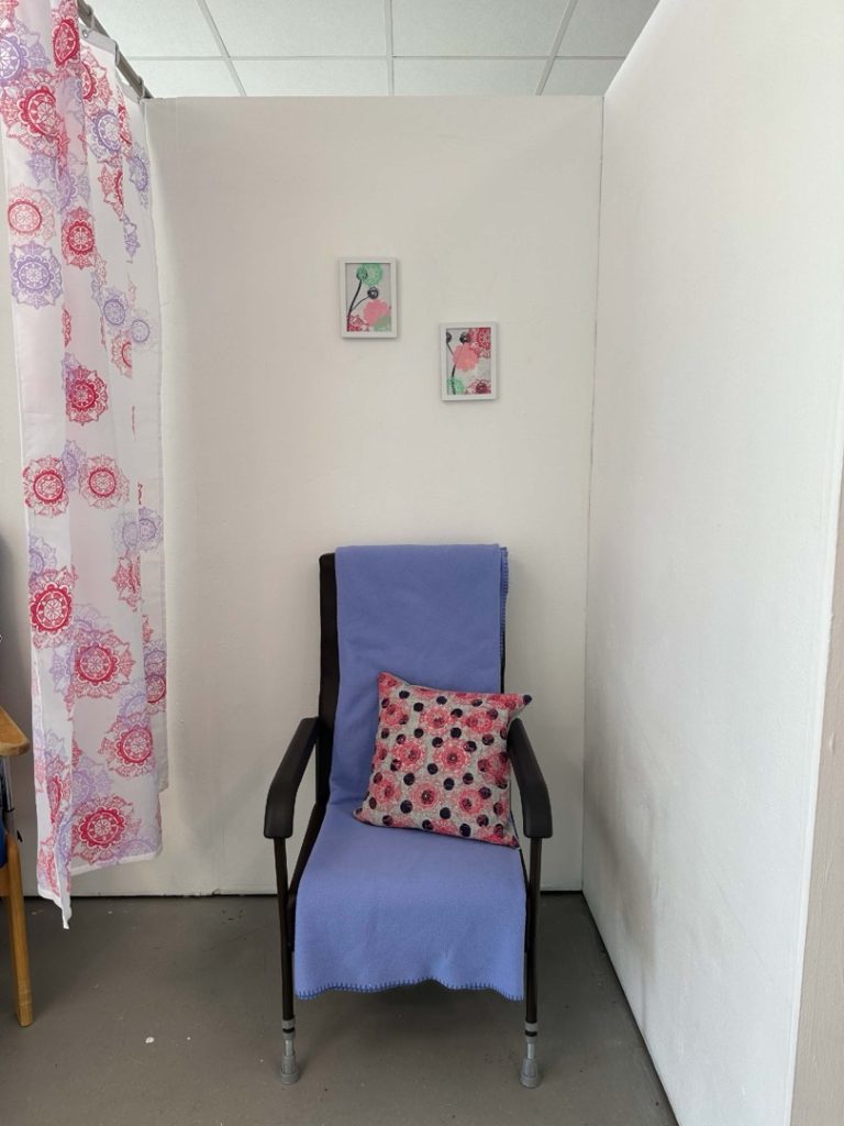
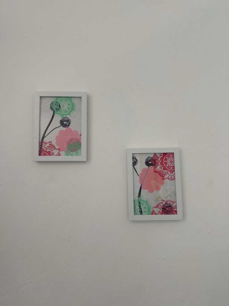
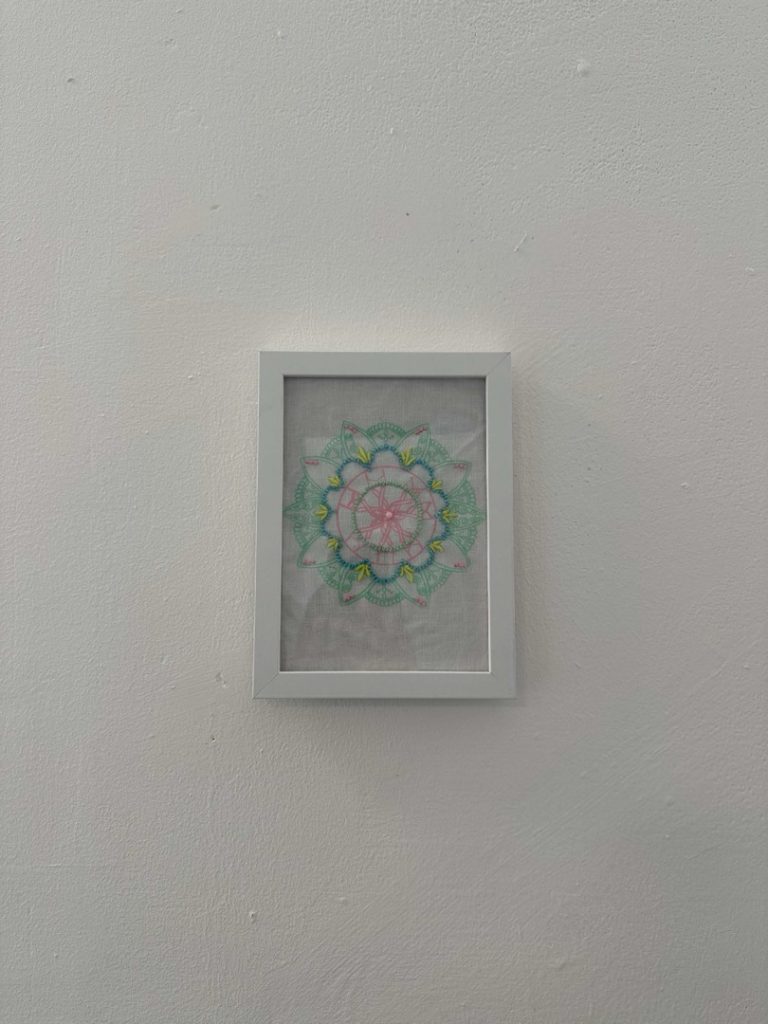
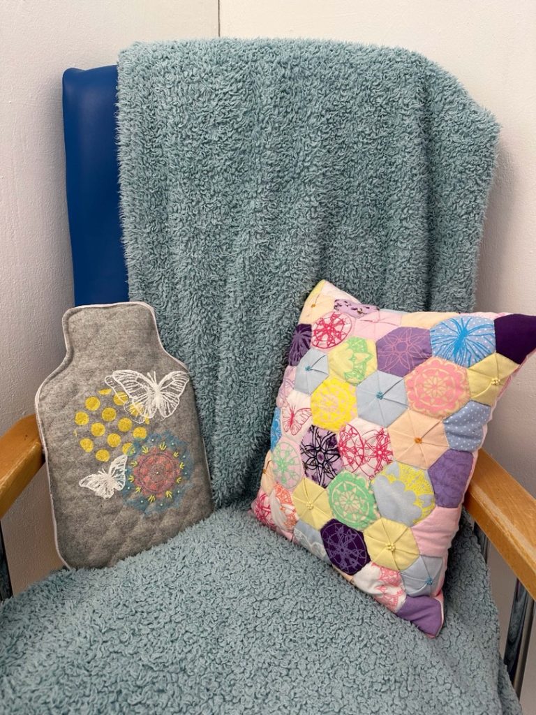
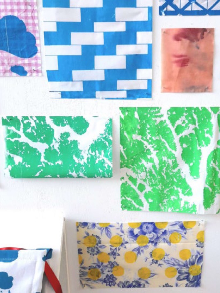
Studio Shots From This Year’s FAD Students
Studying Foundation Art and Design at Dudley College of Technology offers a transformative experience for aspiring artists and designers. This course is designed to nurture creativity, develop technical skills, and prepare students for higher education or careers in the creative industries.
Located at our impressive, purpose-built Inspired campuses in Brierley Hill and in the centre of Dudley, West Midlands, Dudley College of Technology provides state-of-the-art facilities, including modern studios, workshops, and digital labs. Students benefit from access to industry-standard equipment and software, ensuring they are well-prepared for the demands of contemporary art and design practices.
The Foundation Art and Design course covers a broad spectrum of disciplines, including fine art, graphic design, textiles, 3D design, and photography. This diverse curriculum allows students to explore various mediums and techniques, helping them discover their unique artistic voice. Experienced tutors, who are practicing artists and designers, offer personalized guidance and support, fostering an environment of creativity and innovation.
One of the key advantages of studying at Dudley College of Technology is the emphasis on practical, hands-on learning. Students engage in live projects, exhibitions, and collaborations with local businesses and organisations, gaining real-world experience and building a professional portfolio. The college’s strong links with universities and art schools across the UK provide excellent progression opportunities for those wishing to continue their studies.
In addition to academic and technical training, Dudley College of Technology prioritizes personal development. Students are encouraged to develop critical thinking, problem-solving skills, and a professional work ethic, ensuring they are well-rounded individuals ready to succeed in the competitive world of art and design.
Choosing Dudley College of Technology for your Foundation Art and Design studies means embarking on a journey of artistic growth and professional development in a supportive and inspiring environment.
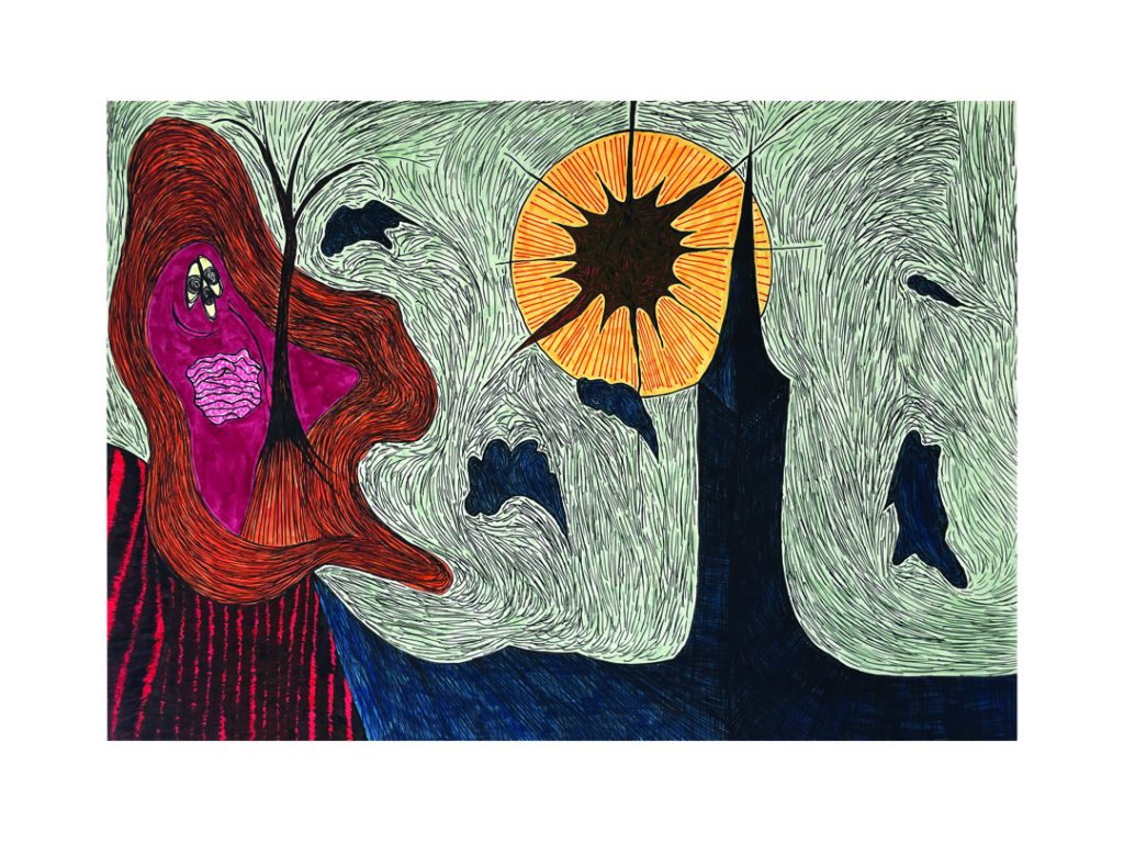
We hope you enjoy looking at this gallery of recent work by our talented Foundation Art and Design students.
Studying Foundation Art and Design at Dudley College of Technology offers a transformative experience for aspiring artists and designers. This course is designed to nurture creativity, develop technical skills, and prepare students for higher education or careers in the creative industries.
Located at our impressive, purpose-built Inspired campuses in Brierley Hill and in the centre of Dudley, West Midlands, Dudley College of Technology provides state-of-the-art facilities, including modern studios, workshops, and digital labs. Students benefit from access to industry-standard equipment and software, ensuring they are well-prepared for the demands of contemporary art and design practices.
The Foundation Art and Design course covers a broad spectrum of disciplines, including fine art, graphic design, textiles, 3D design, and photography. This diverse curriculum allows students to explore various mediums and techniques, helping them discover their unique artistic voice. Experienced tutors, who are practicing artists and designers, offer personalized guidance and support, fostering an environment of creativity and innovation.
One of the key advantages of studying at Dudley College of Technology is the emphasis on practical, hands-on learning. Students engage in live projects, exhibitions, and collaborations with local businesses and organisations, gaining real-world experience and building a professional portfolio. The college’s strong links with universities and art schools across the UK provide excellent progression opportunities for those wishing to continue their studies.
In addition to academic and technical training, Dudley College of Technology prioritizes personal development. Students are encouraged to develop critical thinking, problem-solving skills, and a professional work ethic, ensuring they are well-rounded individuals ready to succeed in the competitive world of art and design.
Choosing Dudley College of Technology for your Foundation Art and Design studies means embarking on a journey of artistic growth and professional development in a supportive and inspiring environment.
We hope you enjoy looking at this gallery of recent work by our talented Foundation Art and Design students.
Watch this video of the UAL Foundation Art & Design 2025 Exhibition
Progression University: Turing Scheme placement to Spain
Progression Course: N/A
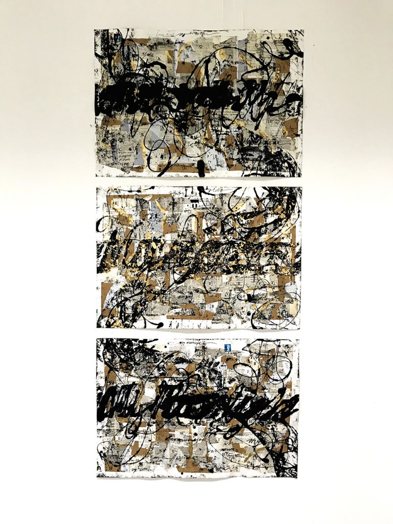
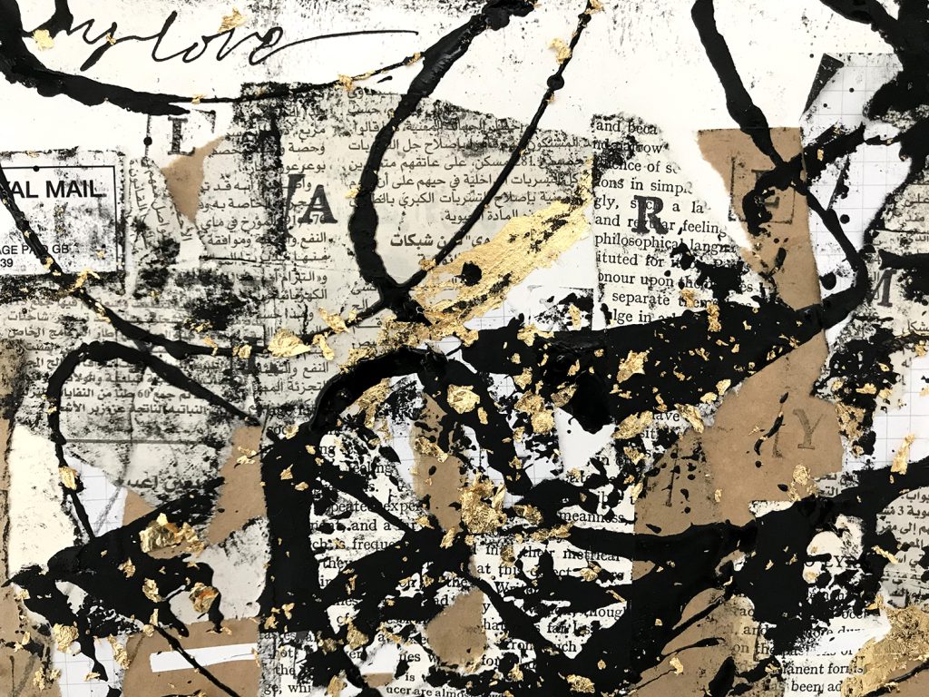
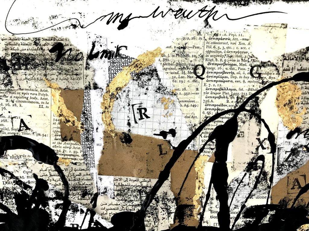
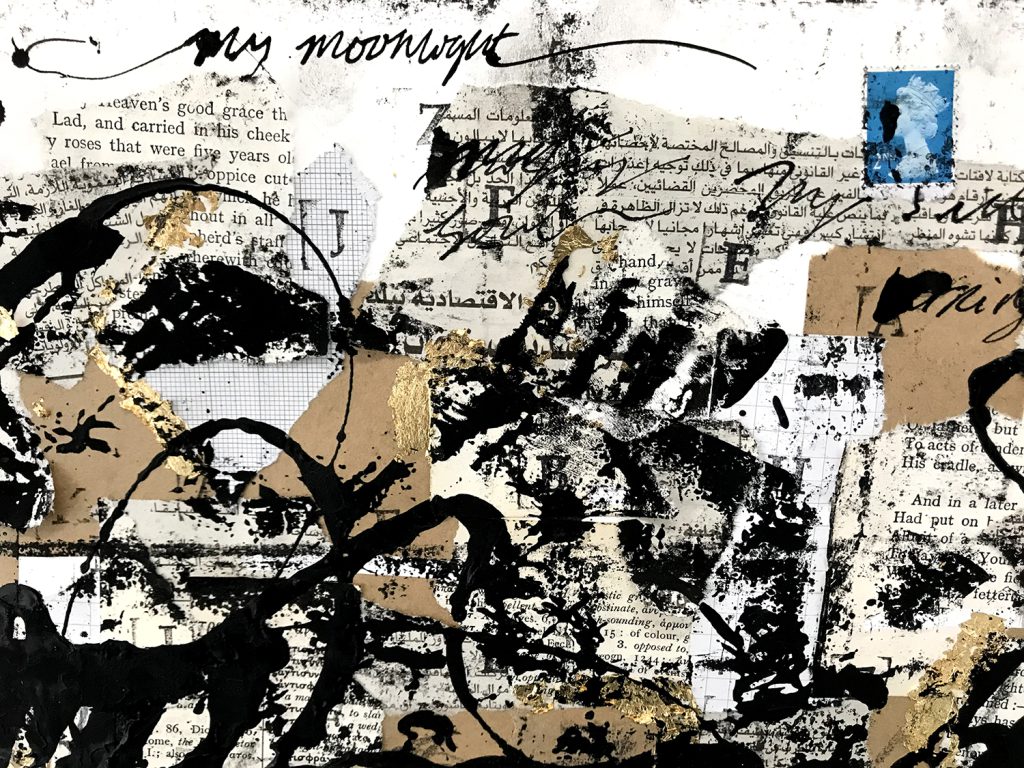
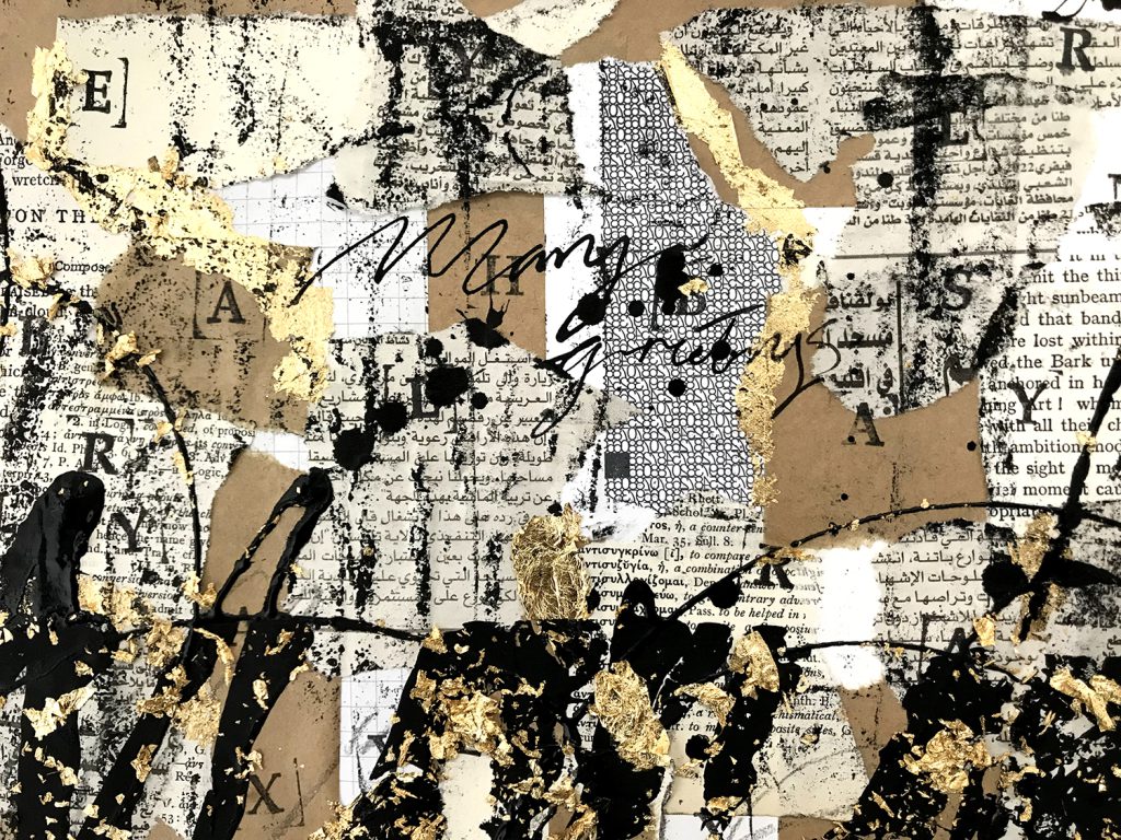
My approach was to explore the history and social impact of written communication especially the forms of handwriting across different cultures. This then led to focusing on letters in particular and exploring the relationships described between sender and receiver. I spent my initial weeks researching collage artists, going to exhibitions and reading books on the history of letter writing. I gained a lot of inspiration from making test pieces and experimenting with printing techniques. This helped me decide to work more with ink and gold leaf to develop my ideas further.
After much researching around the subject, I based my work on a collection of letters sent between Sultan Sulieman and Hurrem in the 16th Century. They were an unlikely couple; defying odds and traditions and their letters capture their love and commitment to each other despite their relationship frowned upon; Hurrem being a former eastern European slave concubine of the renowned leader within the Ottoman Empire.
My three pieces capture the first line of the Sultan’s letter to his wife which is ‘My wealth, My love, My moonlight’. With Hurrem’s responses echoed throughout, sprinkled with gold leaf, representing the spark of love between them whilst simultaneously making a new abstract language.
I see my work as a visual poetic metaphor for the want to express oneself through writing, specifically letters. But it is also about taking a step back and seeing how beautiful writing can be, and how it has enabled us to preserve fleeting moments in history. Writing binds humanity together yet we seldom give it a second thought.
Lucy Binks
Name: Lucy Binks
Title of FMP: Moribund
Previous School: King Edwards VI College
Progression University: UAL: Chelsea
Progression Course: BA (Hons) Product and Furniture Design
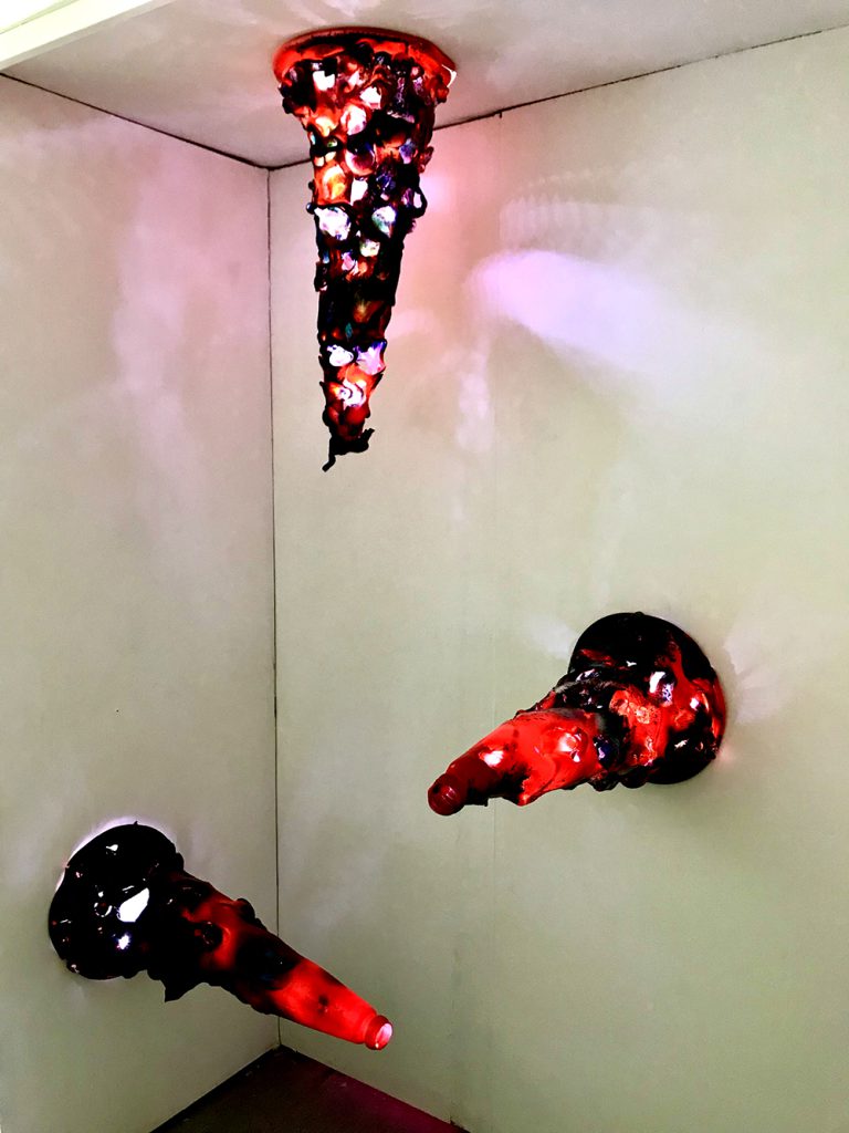
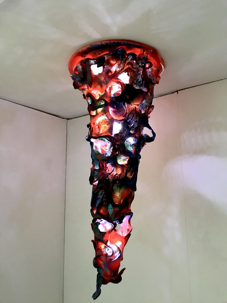
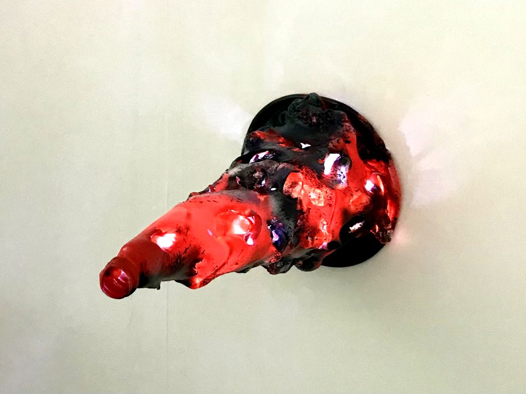
Moribund investigates the detrimental repercussions of human waste upon of the planet, seeking to inform home-owners of their impact on the planet, with the fundamental aim to create a product that intuitively promoted energy saving within the home.
Moribund began through the exploration of zero-waste spaces and intuitive design. The work is titled Moribund, because it alludes to an object in terminal decline which is how I see many household appliances. Initial ideas developed towards more spatial outcomes, yet I became more interested in stimulated awareness of sustainable design through individual objects.
An impactful trip to the Design Museum re-centered the work around that of a product, notably being drawn to ‘Soft Baroque’s’ work which purged plastic to create furniture that is both abstract and sculptural, as well as being functional. Manufacturing plastic has contributed to the heating of the environment and so my response was to re-use and re purpose the plastic we already have for an alternative use.
I became interested in exploring melting points of plastic waste and producing organic sculptures. I recognised that in darker environments the silhouettes of the test pieces I was making became more rigorous and intertwined. Shadows and faint colours that emanate from my eventual traffic cone light suggest natural forms, plants, leaves etc… prompting viewers to question the overwhelming nature of a decaying product and how we as humans have impacted our planet.
Kai Bood
Name: Kai Bood
Title of FMP: Exploring Liminality
Progression University: UAL Central St Martins
Progression Course: BA (Hons) Fine Art
Evie Cooper
Name: Evie Cooper
Title of FMP: Obsession
Previous School: King Edwards VI College
Progression University: Turing Scheme placement to Spain
Progression Course: N/A
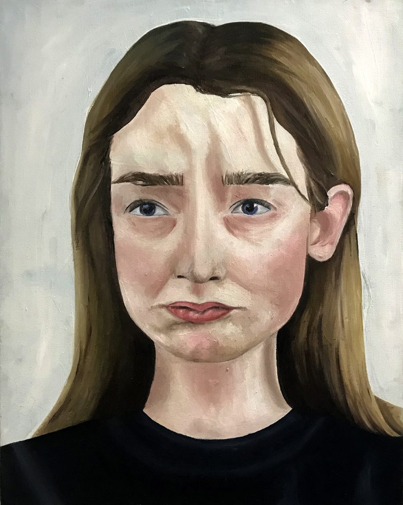
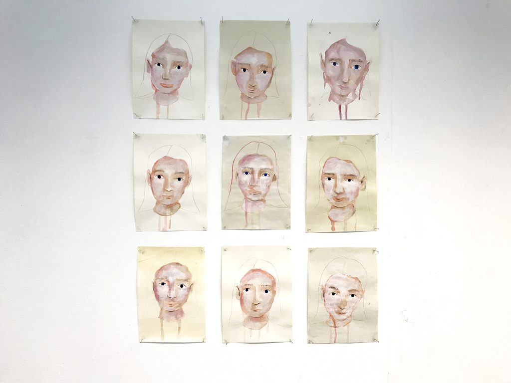
The purpose of my project was to explore the ideas and themes around the emotion ‘obsession’. I wanted to investigate how it influences individuals, spaces, and mindsets, and can be explored in a visual format.
My inspiration stemmed from my old English teacher and a phrase that has stuck with me throughout the years; ‘there is no such thing as a positive addiction’. This steered me into the direction of portraiture and the repetitive and reflective process of painting myself, ‘mirroring’ my expressions.
My visual research into the topic consisted of focusing on this painting process instead of seeking to create a ‘final’ outcome. Bringing my personal values and beliefs into my work was crucial to create depth and meaning and I researched how I could iterate my obsessive and repetitive process within the overall display, linking these ideas to the social construct and disorder of ‘perfectionism’.
To communicate the scale and complexity of feeling ‘obsessed’, I tried to replicate the harsh reality of how obsessive behaviour can affect the younger generation within today’s digital age. By using a grid in the final display, I hope to highlight the repetition and similarities of routine and describe everyday behaviours being repeated in an almost narcissistic way.
By exploring the physiological details of my own micro expressionisms I am therefore attempting to study what I recognise to be a form of my true self.
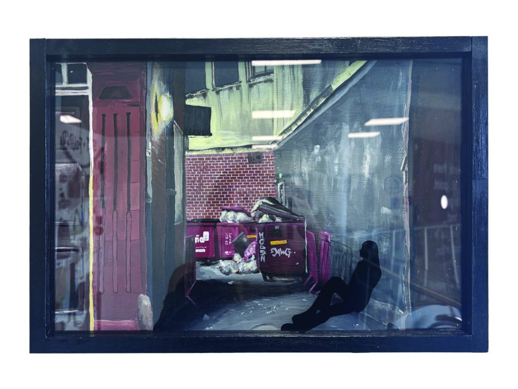
Jack Cutler
Name: Jack Cutler
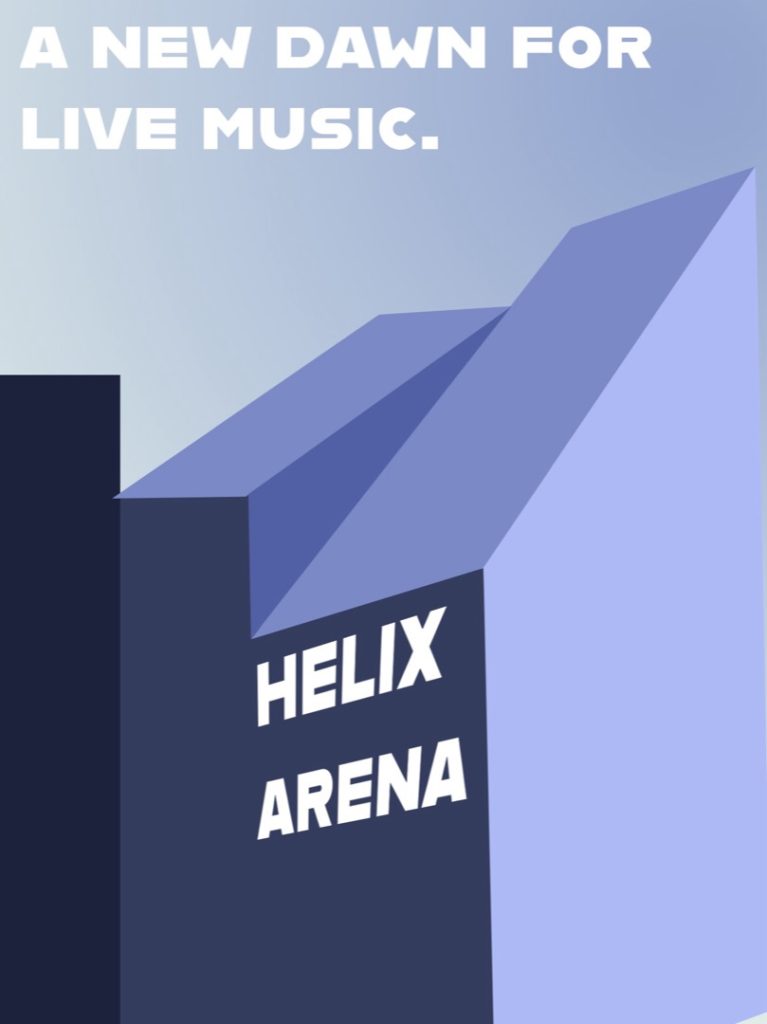
Title of FMP: Facades
Previous School: Dudley College
Progression University: University of Wolverhampton
Progression Course: BA (Hons) Architecture
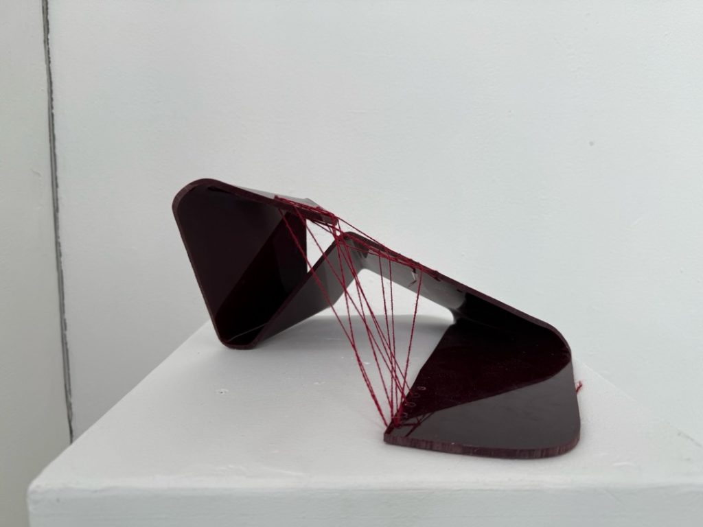
ExFlaSys
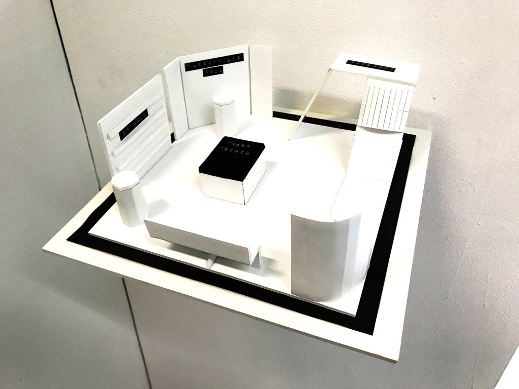
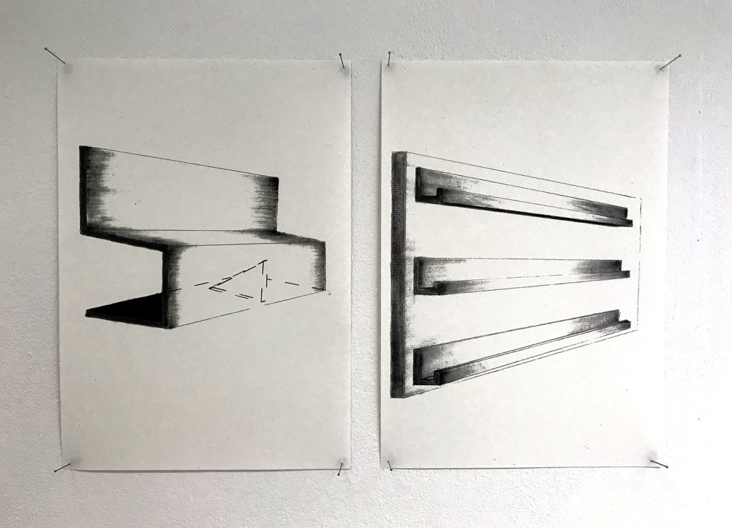
ExFlaSys (Exhibition Flatpack System) is the new display solution for all businesses. A revolutionary new way for companies to display products and communicate their brand. With our modular system and 10 unique structures, there is now a lightweight, easy to assemble and simple to transport system that will accommodate a range of sectors.
ExFlaSys furniture, display and workshop features will entice customers to engage with your brand. This model shows a potential lay out but there are near infinite ways you can create engaging displays.
After researching other trade display products currently on the market, we found that there isn’t an all-in-one system for brands that are looking for a quick, easy and intuitive way to communicate with consumers. Suitable for exhibitions, trade shows and pop-up events ExFlaSys takes the hassle out of displays and doesn’t limit the user to a set layout.
Stand out from the crowd and use ExFlaSys!
Ashley Gregory
Name: Ashley Gregory
Title of FMP: Advocating for Mother Nature
Previous School: Haybridge Sixth Form
Progression University: Southampton University
Progression Course: BA (hons) Fine Art
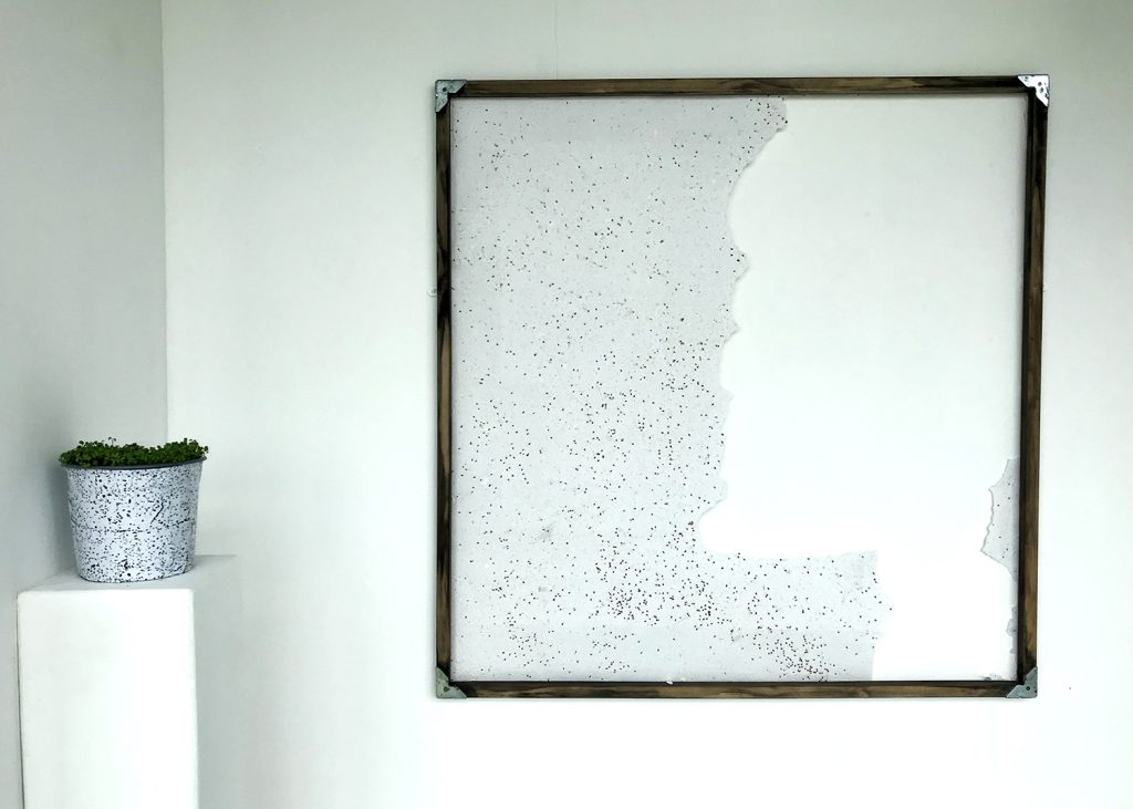
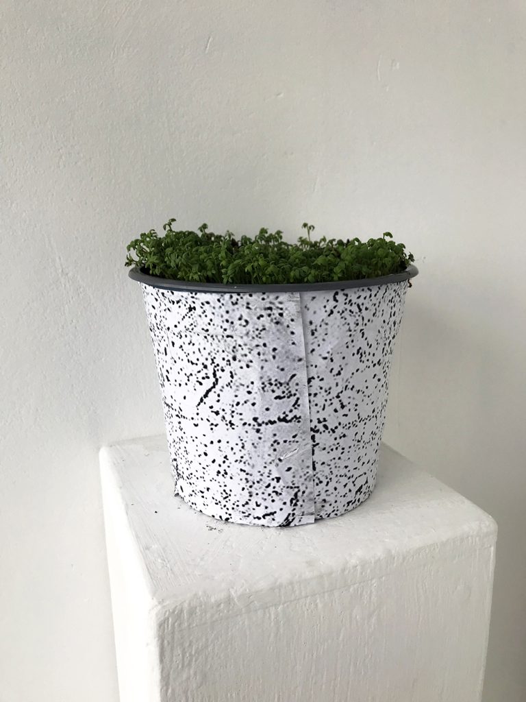
Inspired by the ‘Universal Declaration of The Rights of Mother Earth’, a proposed legislation written by environmental activists at the World People’s conference in 2010, my work advocates for Mother Nature and greater sustainability in art.
By tearing off a piece of paper embedded with cress seeds, you are given the responsibility to provide the space for the plant to grow. This simple act encourages you to become an advocate for Mother Nature; providing an opportunity for you to reflect on your actions and take responsibility for humankind’s impact on the environment. You may decide to either decorate, germinate, grow or throw the paper. The choice is yours.
This project has been a learning experience throughout. The initial planning, critical analysis and development encouraged through peer review led to the process of making my own paper from 100% recycled paper; a skill that I want to take forward with me to create a more sustainable lifestyle.
This piece has evolved throughout its creation, from making my own handmade, Bio-paints through experimentations with Eco-Art which led the final conceptual, large scale plantable piece you see here, but with each change the narrative I wanted to convey has remained clear:
“To build a culture of nature that features regeneration over destruction, sustainability over depletion, nurturing over domination requires input from a diverse collation of thinkers, makers, and doers “ – Mark Dion
Scan the QR code below to see the artwork in its original state:
Bee Hammond
Name: Bee Hammond
Title of FMP: What’s real?
Previous School: University College Birmingham
Progression University: Falmouth University
Progression Course: BA(Hons) Fine Art
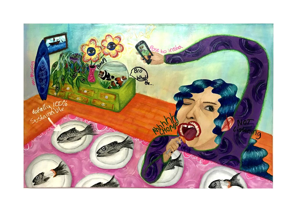
My painting is a look into the life of a woman, a woman who is a representation of our society. We can see that she is taking a photo of a constructed scene in her house whilst bizarrely eating several fish. Like many of us she has no second thought as to where the fish came from or the environmental consequences that her over consumption has. However, from researching intensive fish farming I have learned that simple consumer decisions like this can have a big impact on the natural environment.
The woman is posting an image on to social media to project an image of being ‘eco-friendly’ and a supporter of environmental issues, yet she and others are complicit in the planet’s demise.
I’m trying to build awareness and make people think more about the food they consume. The idea initially sparked from when I watched a documentary on Netflix called Seaspiracy. I watched it a while ago but have remembered it vividly due to the impact it had on me. It has changed my habits and I would like the imagery I make to have a similar impact.
I have tried to be more care-free when it came to making mistakes and experiment with new painting methods in this project. This has led me to work with oil pastels and combine them with acrylic and finger painting. The idea has been to develop a more ‘child like’, spontaneous painting style which has been partly inspired by the artist Jean Michel Basquiat.
Discussions with my friends, family and teachers have really helped develop the work and have allowed me to see it from different perspectives. There have been some challenges, but I have enjoyed discovering new artists and learning how to let go of the perfectionist within me.
Continuing from this course I now know the importance of seeking other’s opinions, pushing myself out of my comfort zone and recognising the impact that my art can have.
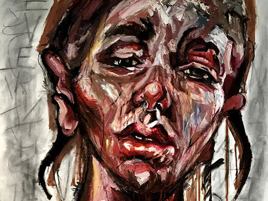
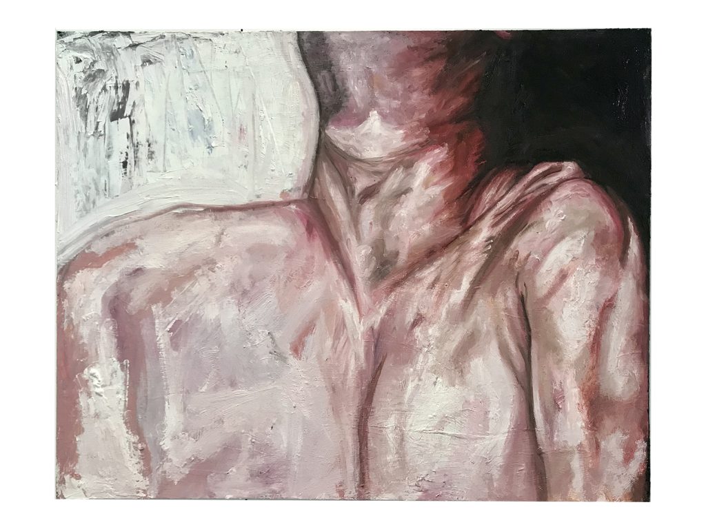
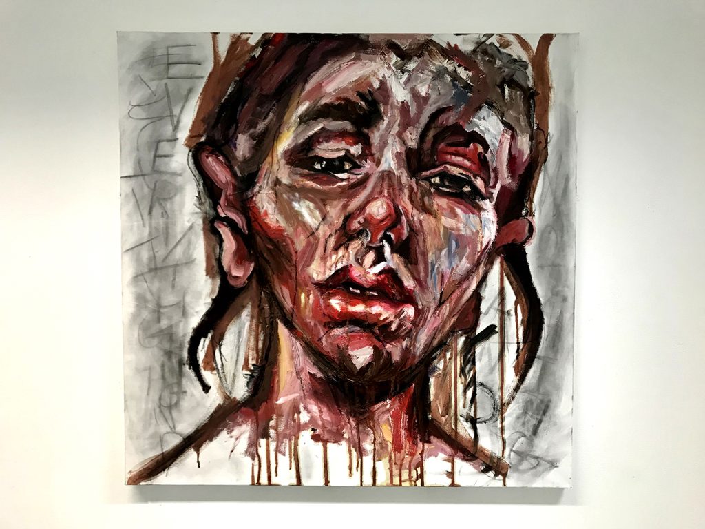
Laura Hasan
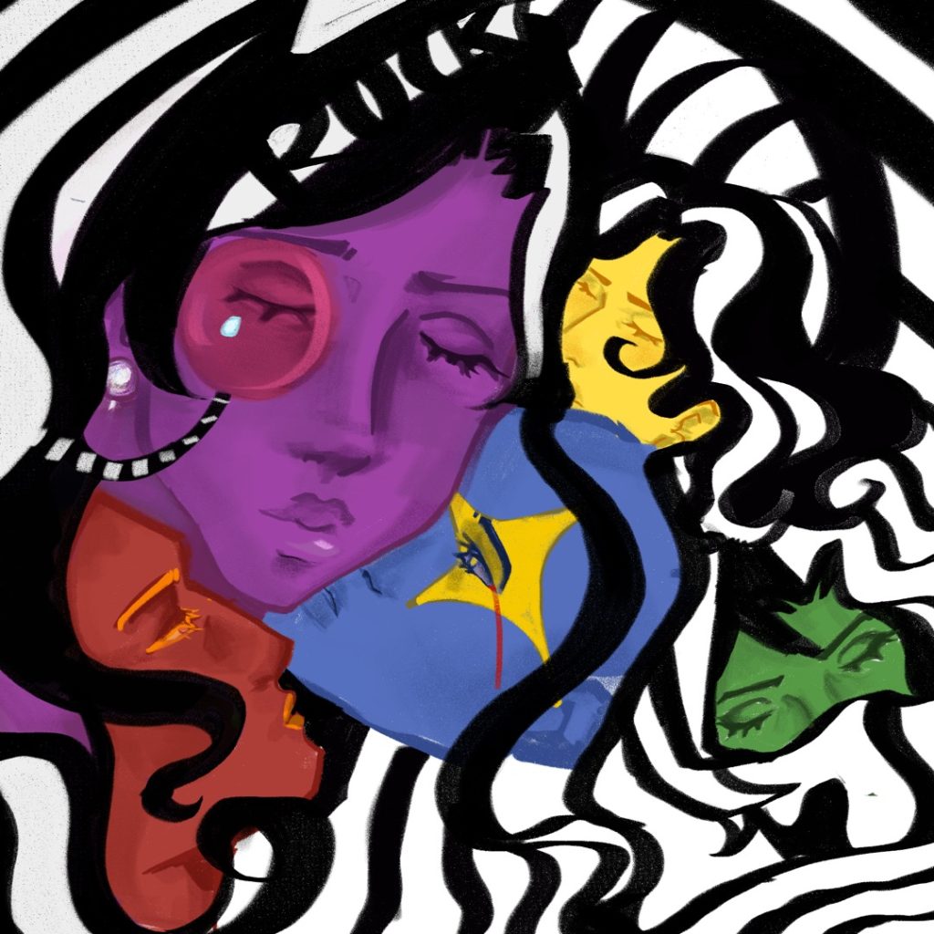
Name: Laura Hasan
Title of FMP: Loss of Self
Previous School: King Edward VI College
Progression University: Central Saint Martins – UAL
Progression Course: BA (hons) Fine Art
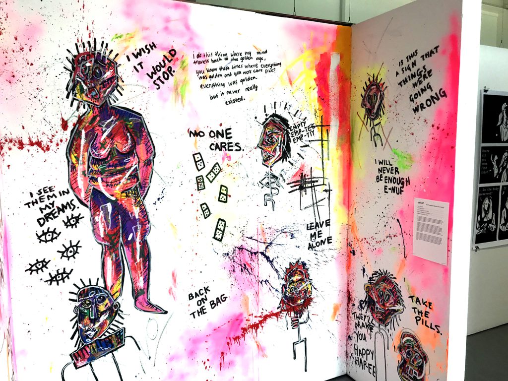
This mural is a space intended for you to step into my mind, or that of anyone experiencing body dysmorphia, depression, alcohol abuse, any form of addiction and those who have lost sight of who they are. Hidden behind the creatures I see; the self-portraits and the bright clashing colours are thoughts on how I perceive myself and some of the things that went wrong and made me lose myself.
My inspiration came from my constant attempts to visualise my mind. I spent years admiring Tracey Emin’s work, and her ability to do just that. Similarly, Christian Boltanski’s ideology and philosophy of art helped me to create meaningful pieces. On many occasions he has stated that art doesn’t come often, and when it does, you must be able to get the idea down in ten minutes. To create something powerful is a luxury, and you cannot expect it to come whenever you want. The main stylistic approach was abstract & neo-expressionism, stemming from my research on Jean-Michel Basquiat. Discussing these artists with my tutor allowed me to further delve into expressionism and understand exactly how I needed to work.
I was challenged by time throughout the entire FMP- I had nine weeks to create a body of work that I truly felt reflected my theme. I initially wanted to go into performance, but my ideas turned towards painting, creating a last challenge for myself. I have always struggled to communicate meaning through paint; however, I have created a piece I am genuinely proud of. Throughout the FAD I have learnt that I am capable of so much more than I let myself believe. I have learnt how to manage my time, research, new mediums, practise and reflect critically, and in my Undergraduate degree I intend to develop all these skills further.
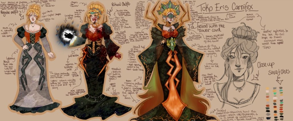
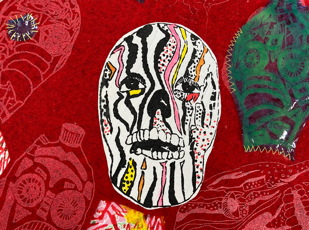
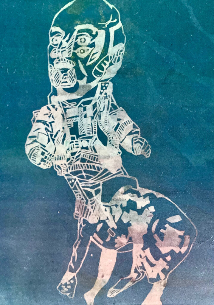
Maximos S Kiosses
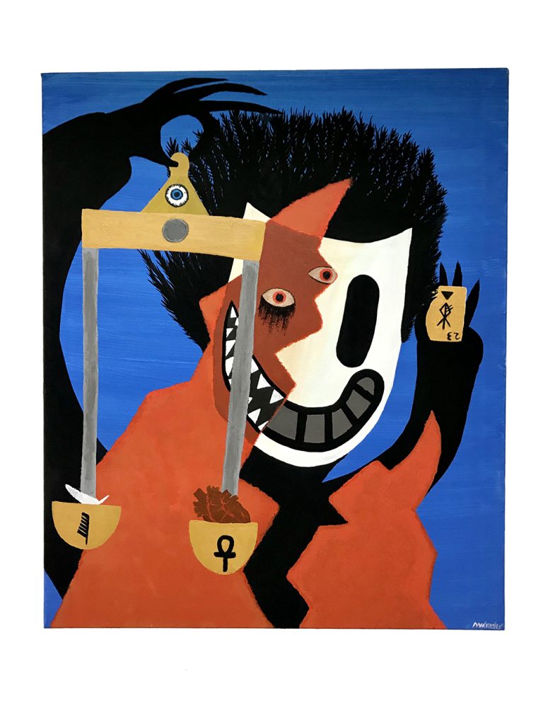
Name: Maximos S Kiosses
Title of FMP: Project Codex A Study of Mysticism
Previous School: BMET Art and Design Centre
Progression University: Hereford College of Art
Progression Course: (BA Hons) Fine art
My work ‘Forever and Always’ is the culmination of my own research into the concept of mysticism. Mysticism is the idea that we, as humans, have the potential to attune our individual selves with the universal energies of the earth through contemplation and self-surrender.
Initially my focus was on mythology, but I deviated towards a more metaphysical approach utilising some aspects of various ancient folk stories and religious symbols. This allowed my work to become more intuitive, and regular self-analysis and daily target setting allowed me to keep track of this.
My initial experiments worked with charcoal, inspired by the work of Odilon Redon whilst whilst taking inspirational attributes from artists like Jean Delville and Alistair Crowley. I incorporated my earlier research on ancient cultures and other surrealist artists to generate my first depiction of an “ego-mask”, with this motif eventually becoming the main focus for my final outcome.
The presentation of a figure in a mask can be sinister, making menacing eyes more prominent. I have pictured my figure alone in a void, an ocean perhaps that represents the seemingly endless depths of existence. The figure is divided in half with one side representing the primitive soul and the other the ego.
The ego is the masked shadow surrounded by the gloomy, azure depths. Juxtaposed with a wide exaggerated grin that ultimately symbolises a counterfeit smile, and a portrayal of the ego’s deceptive façade. The visage of the entity represented in the vivid orange, fire-like formations rising from the bottom of the piece represents the primordial soul. Possessing bigger and more jagged teeth, its countenance is somewhat fiendish and has a much more authentic grimace than the representation of the ego.
Heather Kirby
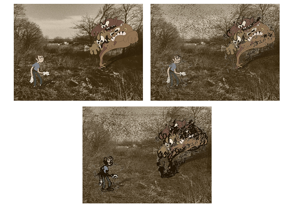
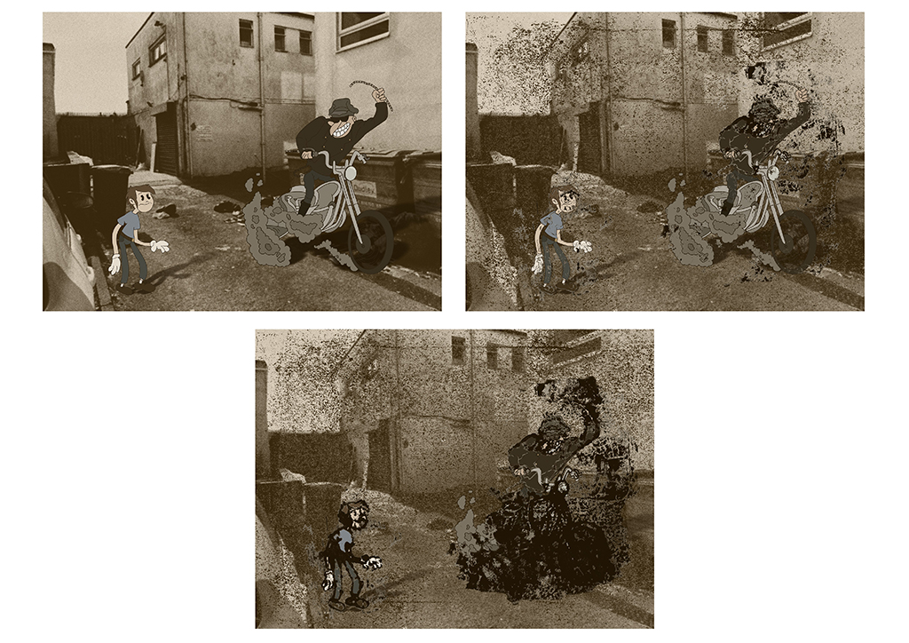
Name: Heather Kirby
Title of FMP: Monsters and Noir
Previous School: King Edward VI College
Progression University: The Northern School of Art
Progression Course: BA(hons) Illustration for Commercial Application
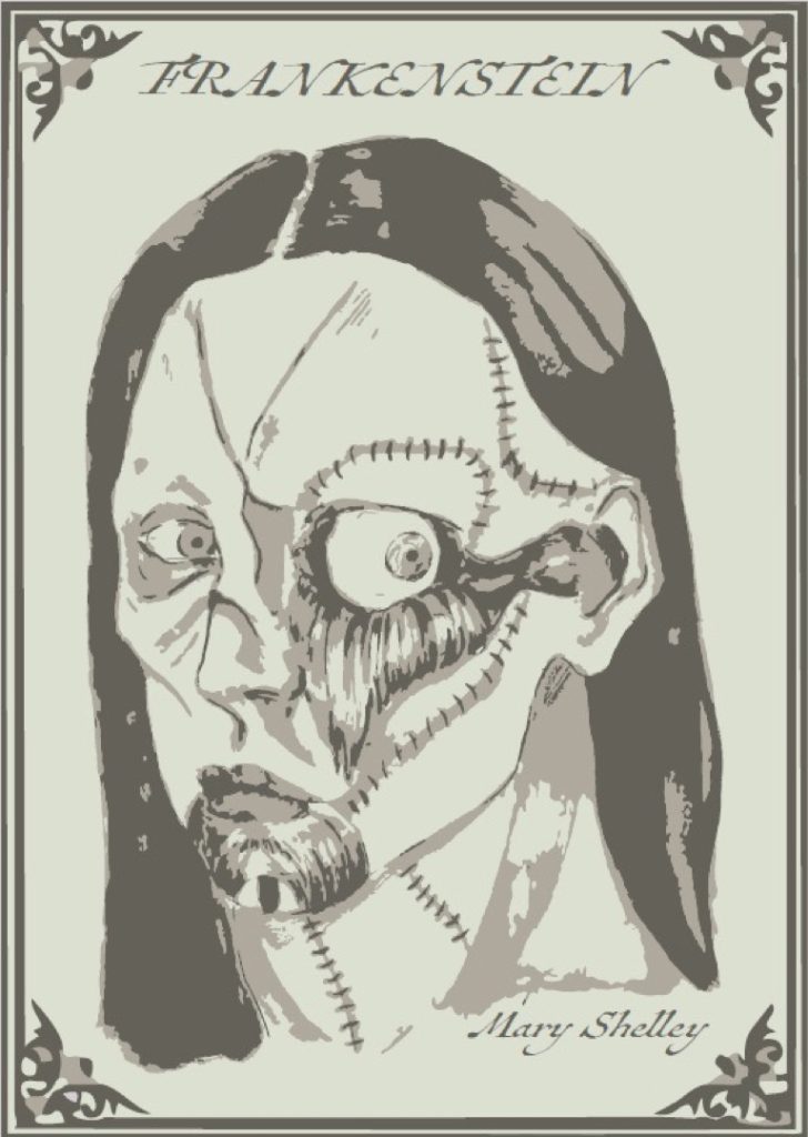
The ‘Noir’ side of my project was inspired by Shawn Martinbrough and my previous knowledge of Mike Mignola and Frank Miller’s work. Thematically, I was inspired by Frankenstein and how the narrative explored the theme of what a ‘monster’ could be. Posing this question from a contemporary angle formed the basis of my project. Throughout the FMP, I have explored photography and self-portraiture, which I have found to be a helpful part of my process. I have also worked largely with ink and have improved my drafting skills.
I have achieved my goal of creating noir comic based on the theme of ‘monsters’ but have weaved in contemporary attitudes to morality, updating the Frankenstein idea of what a monster can be. I intend the work to exist as a series of individual posters and be seen publicly by being flyposted in ‘noir’ locations such as underpasses and under bridges across the Black Country. In this way the marginalised contemporary issues I have introduced to my narrative will find a wider audience than the one who may have bought a conventional comic.
The most significant thing that this foundation course has taught me is how to be an independent, self-motivated artist. I have learned where my weaknesses lie in self-directed projects with a longer time frame so I will work on overcoming these weaknesses and continue to develop my independence and resilience throughout university.
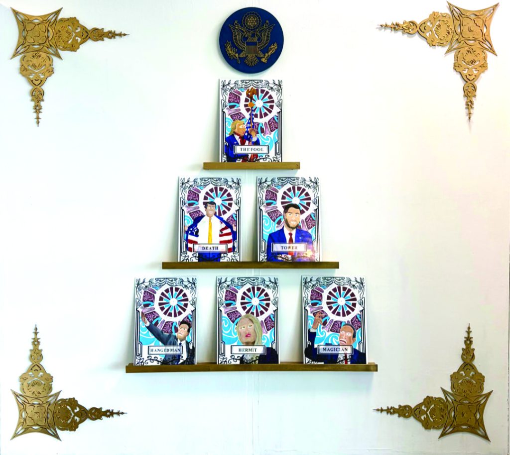
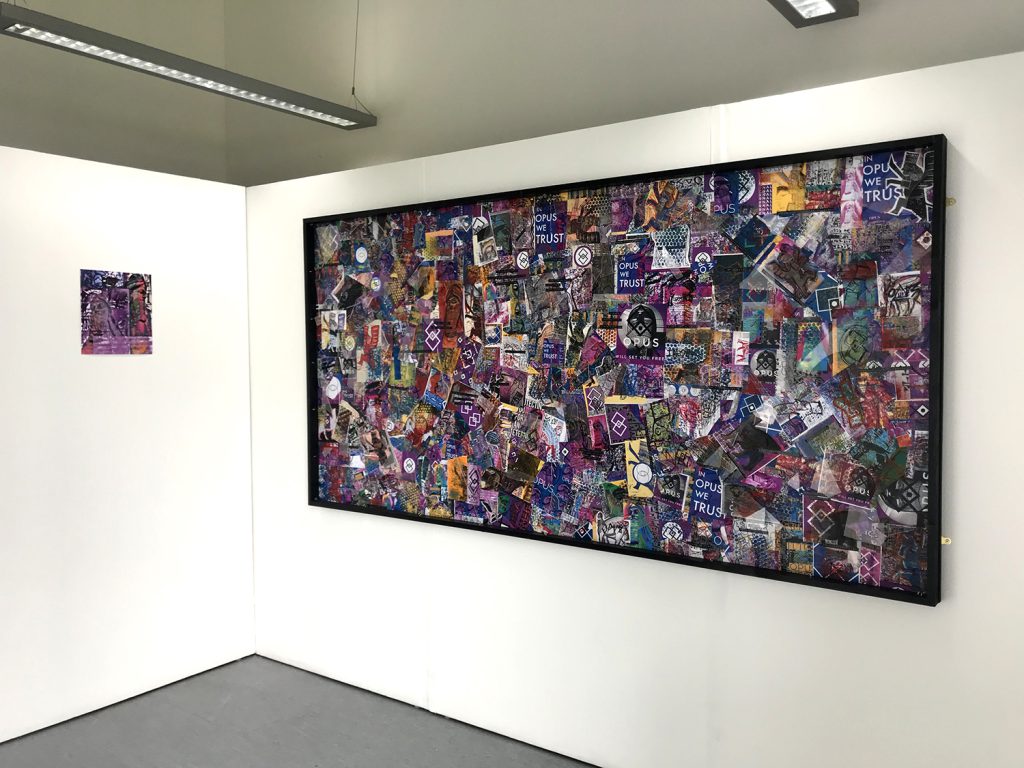
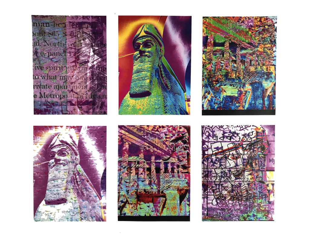
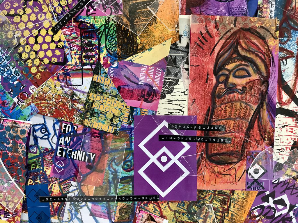
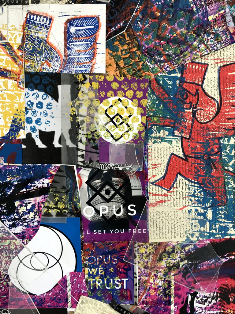
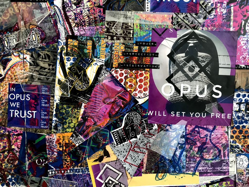
Anna Payne
Name: Anna Payne
Title of FMP: Project Sphinx
Previous School: King Edward VI College
Progression University: Durham University
Progression Course: BA (hons) Classics
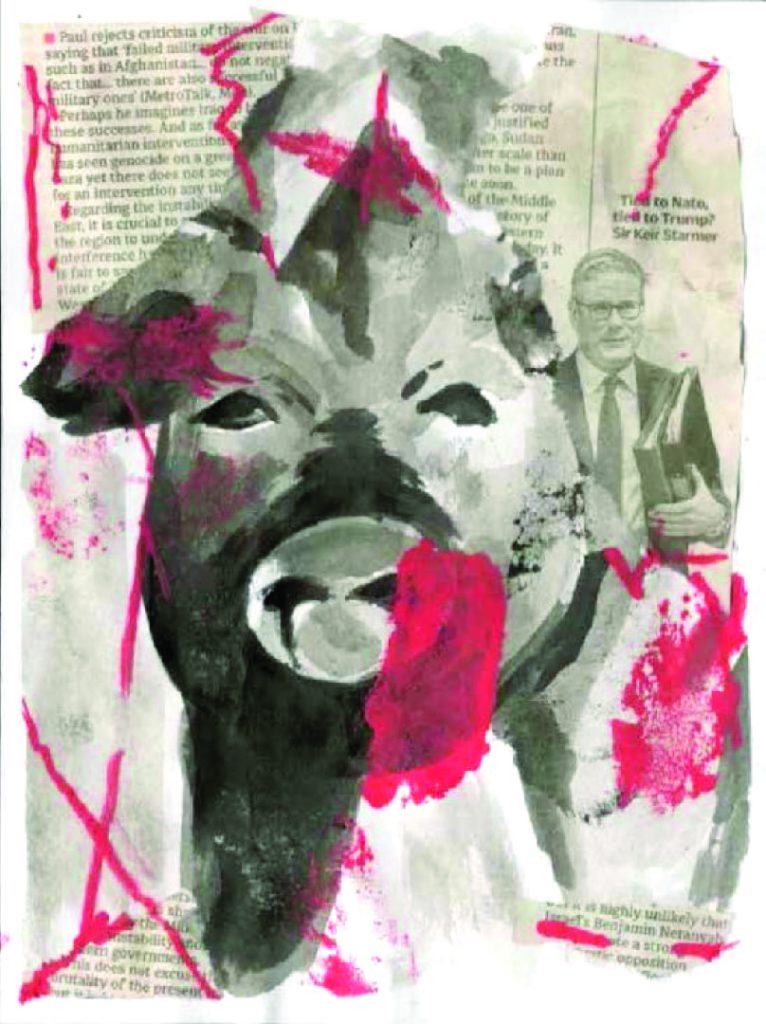
Like many empires before them, Opus use an ancient symbol (in this case the lamassu) to signify their longevity, legacy and divine right to control the populus. My piece is a culmination of propaganda from ‘Opus’, a hypothetical omnipresent authority. I was inspired by the secret elite and their ‘new world order’ as well as previous imperial forces such as the British Empire, the Third Reich and the Soviet Union. The lattice of faux broken glass connotes vandalism, civil unrest and a distinct separation between authority and the people.
I wanted to explore the purpose of statues and why they are created and destroyed in the name of false idols, whether that be political leaders, royals or potent figures in our history. From ancient Assyria and Persia, the lamassu is a sphinx-like mythical beast with the body of either a bull or a lion, the wings of an eagle and the head of a man. Through my research on the lamassu and ancient Persia I was able to write a 2000-word essay guide to refer to throughout the project. I also visited the British museum to see these stunning monoliths in person.
The two artists who have inspired my work the most are Peter Saville’s work with New Order in particular the album cover for “Technique” which inspired me to work digitally. Keith Haring’s work was also simple and graphic and had a cheerful contemporary feel to it whilst maintaining a political meaning. His style directly inspired my lamassu drawings and the lino prints I completed. To develop my ideas, I have explored a wide variety of media including photography, digital photo manipulation, mixed media drawing, lino printing, screen printing and jelly printing.
Discussion with tutors and peers has helped influence alternative outcomes and ways to present them. I believe I have done what I originally set out to do in my proposal, which was to present the lamassu in a contemporary setting. Although if I could develop any element further, I would love to do a series of lino cuts of Opus propaganda, utilising my lamassu illustration.
On this course I have learnt when to try different media to attain my creative vision but the most important thing I have learnt is how to succeed despite adversity which I am sure will be put to the test at university.
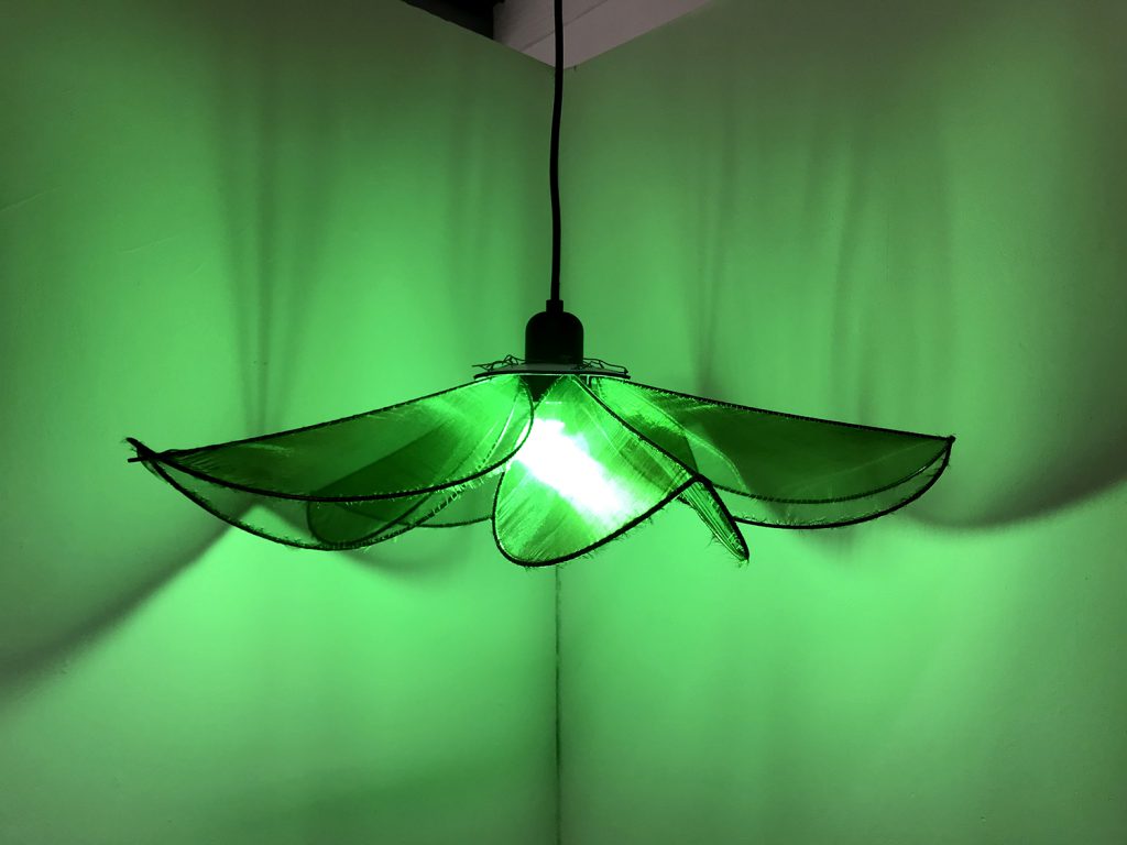
Lauren Roberts
Name: Lauren Roberts
Title of FMP: The Experience Economy
Previous School: King Edwards Stourbridge
Progression University: Birmingham City University
Progression Course: BA (Hons) Interior Architecture and Design
My FMP explores the Experience Economy and how companies use memorable experiences to sell their products.
Inspired by designers such as the Mizzi Studio, Fabio Novembre, Claire de Quenetain and Victor Horta, I’ve designed a bar specialising in the drink ‘absinthe’ and its nickname ‘La Fee Verte’, The Green Fairy, creating a fairytale-esque speakeasy that is hidden below a large oak tree.
I researched the history of absinthe, how it was extremely popular in the late 1800s and early 1900s until it was banned in many countries due to its apparent violent impact on consumers. Artists used absinthe to expand their imagination and increase creativity – most famously the Dada and Surrealists, who used it a basis to explore the subconscious and an adjunct to many parlour games in famous cafes like the Cabaret Voltaire in Zurich.
The colour green allegedly increases creativity and my colour pallete uses various shades to create a theatrical and enchanting social setting. Within this space I have illustrated and designed many ideas for the furniture and fittings such as tables, chairs, glassware, lamps and textiles.
For my exhibition space, I have displayed a prototype of my main flower pendant lamp, that will feature throughout the design. I created this out of copper-coated steel rods which have been bent and soldered into five large petals and then wrapped in two-toned green organza fabric, which shimmers like fairy wings in the light. The bulb is a luminescent green LED that would cast an impactful atmosphere across the bar.
I have also presented 6 design sheets that collate some of my sketches/illustrations, as well as a mood board of inspirational images, so that you can have a greater understanding of the bar and concept.
Abby Staniland
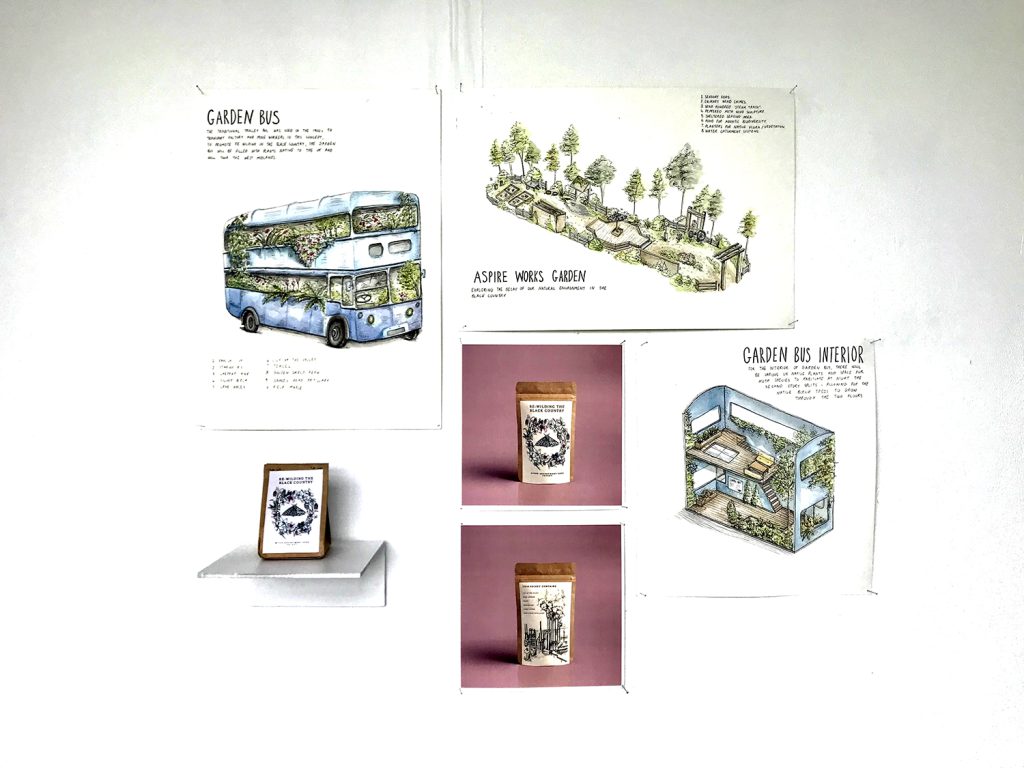
Name: Abby Staniland
Title of FMP: Exploring the decay of our natural environment
Previous School: Dudley Sixth
Progression University: BCU
Progression Course: BA (hons)Interior Architecture and Design / Landscape Architecture
For this project, I initially proposed to design a space that provided a purpose and raised awareness of environmental issues. My subject area started very broad; I knew I wanted to explore environmental decay due to my passion towards the subject area and stuck with this theme however the idea broadened as I researched further into the topic.
I began exploring the juxtaposition between Industry and Nature. This was aided by my research into the Industrial Revolution and in particular the evolution of the Peppered Moth, an insect who had to adapt to the copious amounts of black soot deposited on woodland from industrial factories. This provided me with a renewed context and related theme for me to incorporate, with the evolution of the Peppered Moth highlighting themes of deterioration and renewal.
Following my research into the artist collective ‘Cooking Sections’, I was made aware of the importance of community in art, specifically when the purpose is to enact change. I made it a goal to create a physical space that could be interacted with that would both educate and act as a catalyst for positive change to take place locally. Hence selecting Aspire Works Garden as an initial ‘client’ to create a brief. This was an ideal candidate as the garden space was local, accessible to me, and allowed me to create a space for an audience and cater to specific needs.
Fortunately, I was able to visit the Black Country Living Museum – It was there that I was inspired by the trolley bus which they have on the site and this gave my project a new direction, eventually leading me to create my final concept, the ‘Garden Bus’.
The 1900’s trolley bus will act as a moving garden containing plants native to the UK. It will also provide a habitat for moths, with LED lights being left on during the night to attract local species. Educational workshops will take place within the interior spaces to raise awareness on the importance of moths, specifically the Peppered Moth to the ecosystem and its evolutionary change due to the Industrial Revolution. Seed packets will be given to visitors, providing seeds native to the UK which can be spread over disused brownfield
Industrial sites, to rewild the Black Country and help reverse the environmental impacts of the industrial era whilst also celebrating its importance in history.
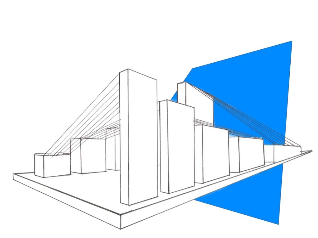
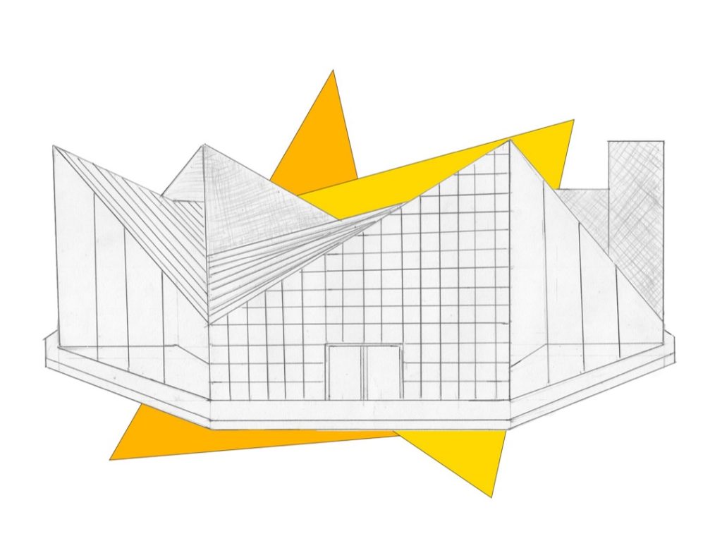
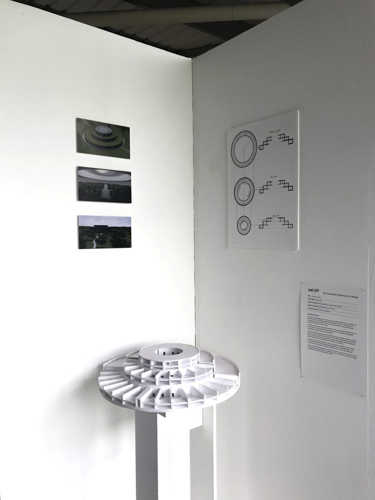
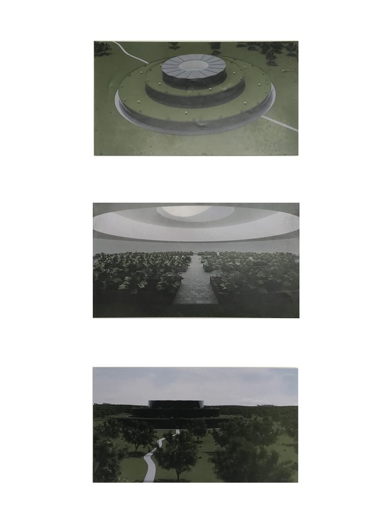
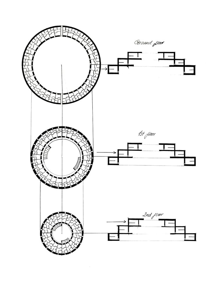
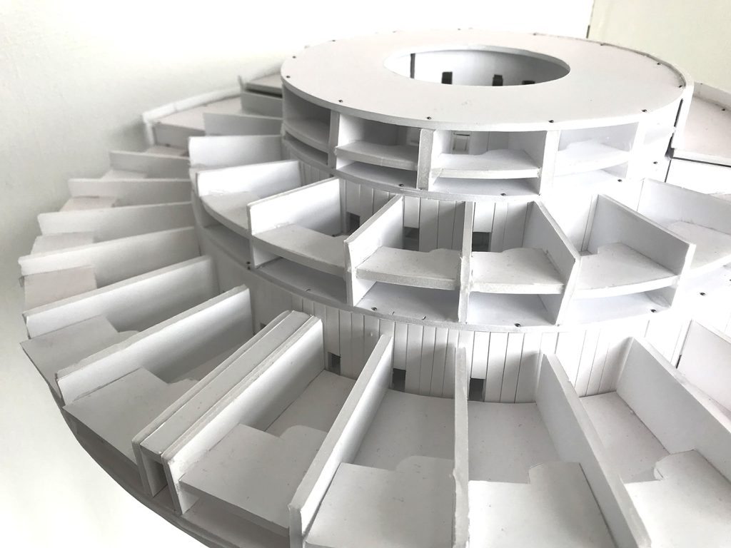
Stefania I. Sterian
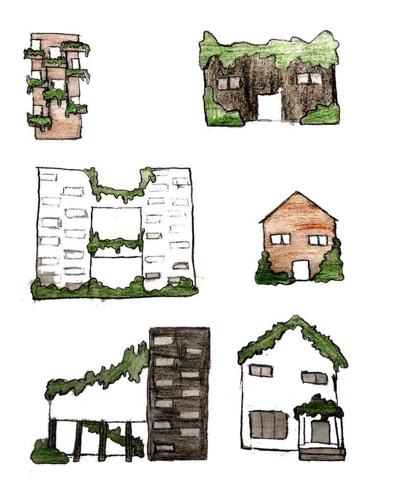
Name: Stefania I. Sterian
Title of FMP: Green Design
Previous School: Dudley College of Technology (Evolve Campus)
Progression University: Birmingham City University
Progression Course: BA (hons) Architecture
Exhibition Statement:
My work is about bringing nature and our day-to-day life together into a concept that will improve our lives. I have always admired buildings and nature, so I wanted to create something that was in between of the two, a concept that was a new and interesting response to the climate crisis we are in.
The idea was to propose a new way for people to live in densely populated buildings. The overall structure would provide food and electricity for the inhabitants and promote sustainable living and energy saving throughout.
I have showcased my concept in 2D and 3D and have used 3D design software to develop my ideas. The 3D model brings the structure to life, while 2D visualisations showcase the wider concept and context of the work. For example, the individual and shared gardens, which will promote self-sustaining and low energy food production.
The main artists that have helped me create this project are Mathilde Roussel and Neri Oxman because of their way of approaching projects from a sustainable angle. I was inspired by how they develop concepts and how they turn to nature for inspiration.
This project and FAD had taught me to take charge and trust my gut and my ideas, which in turn worked very well to develop my confidence as an artist primarily, and then as a future architecture student for my progression course.
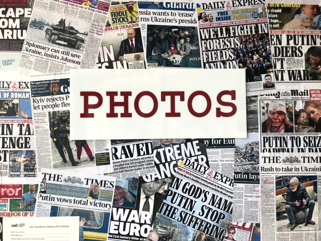
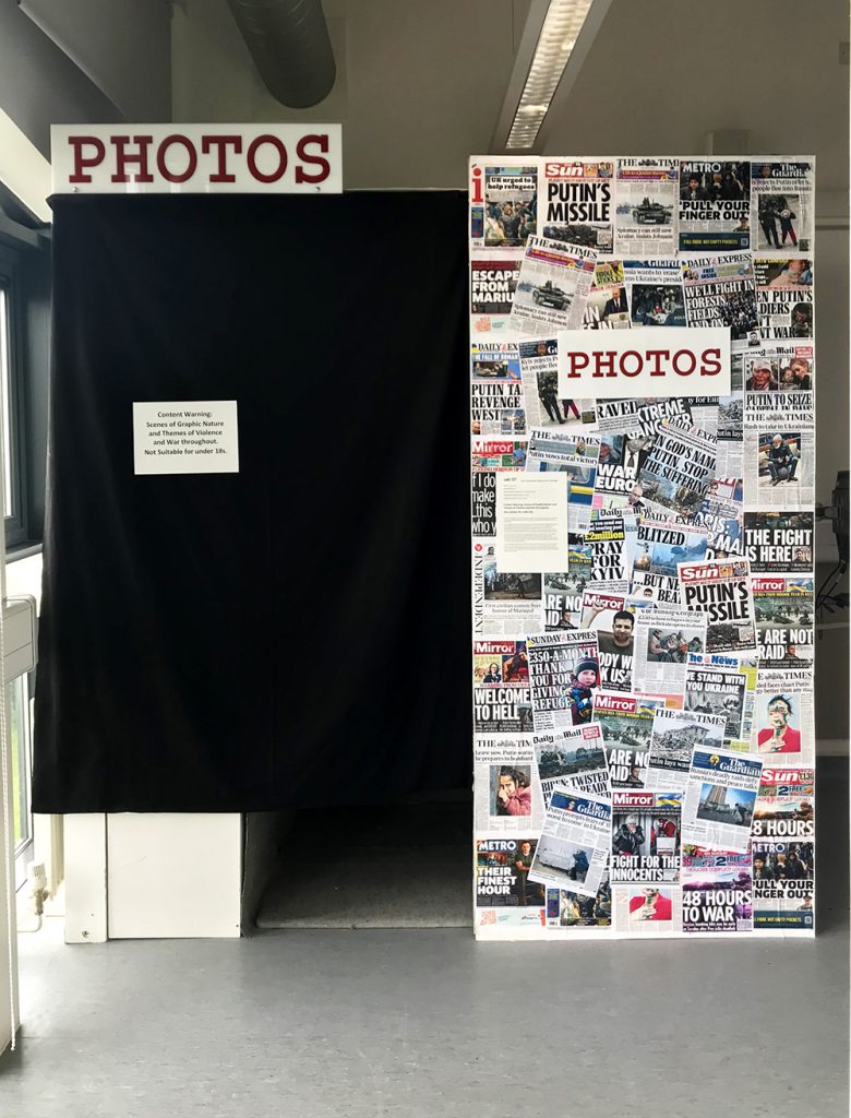
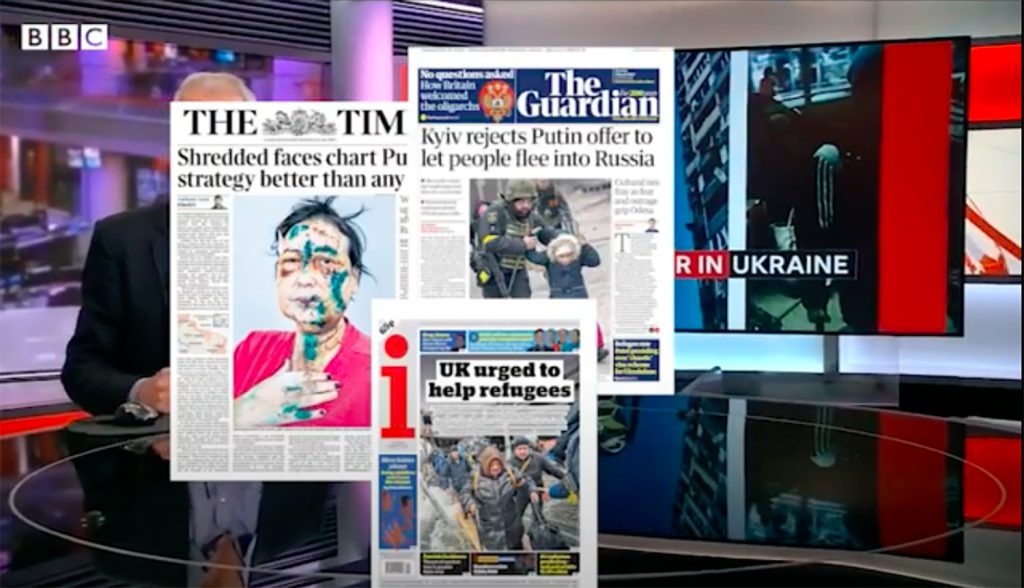
George Stokes
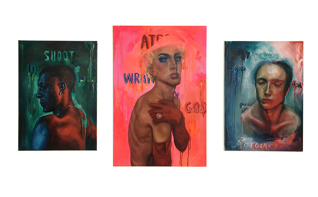
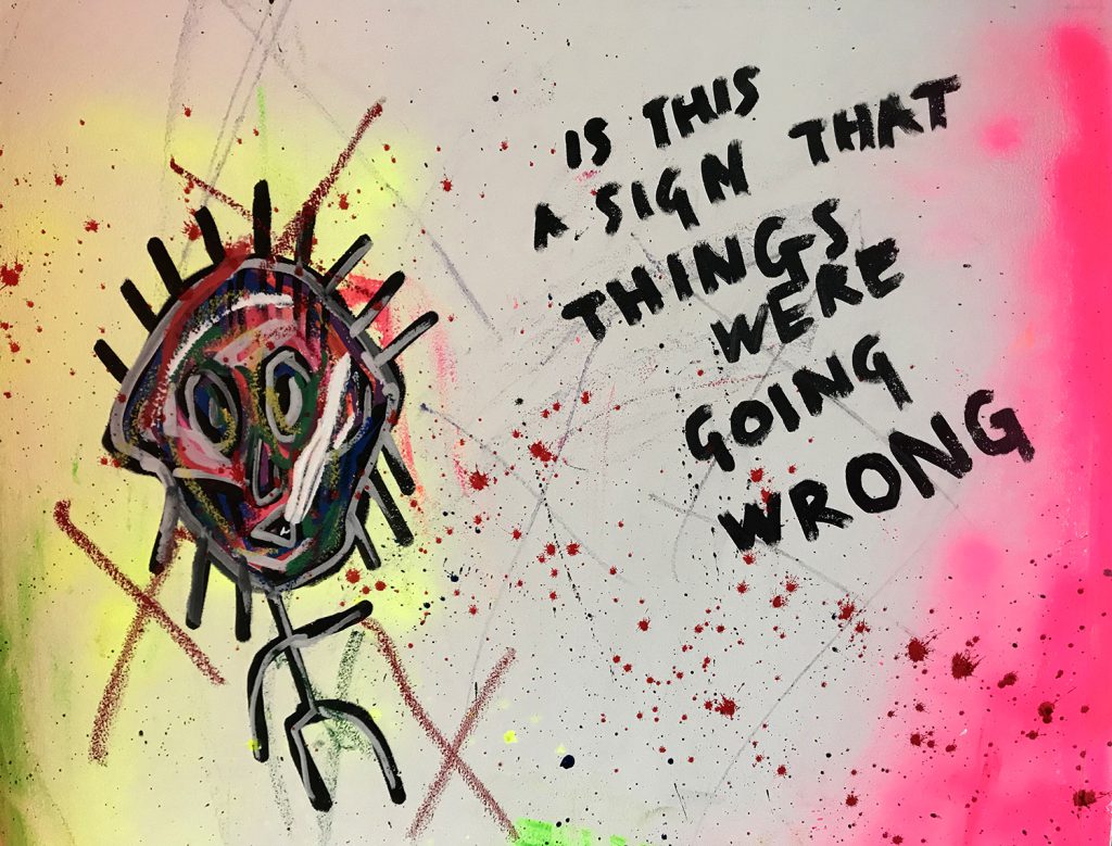
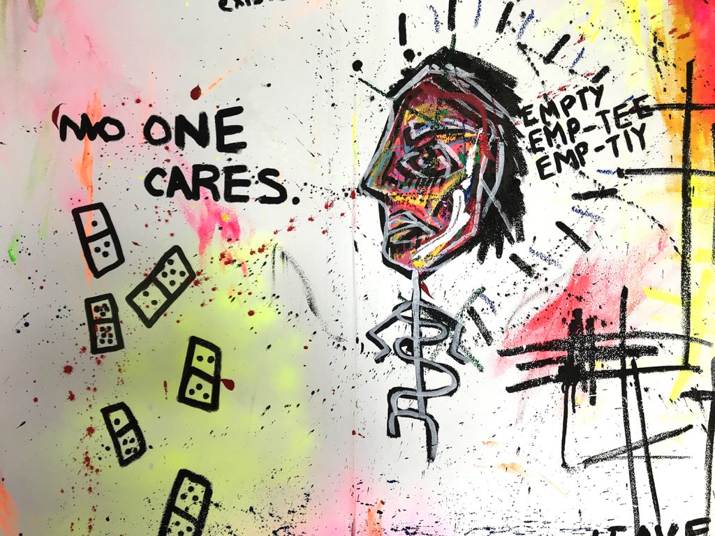
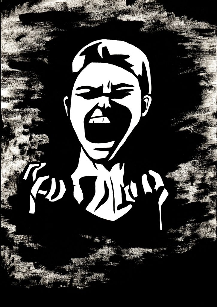
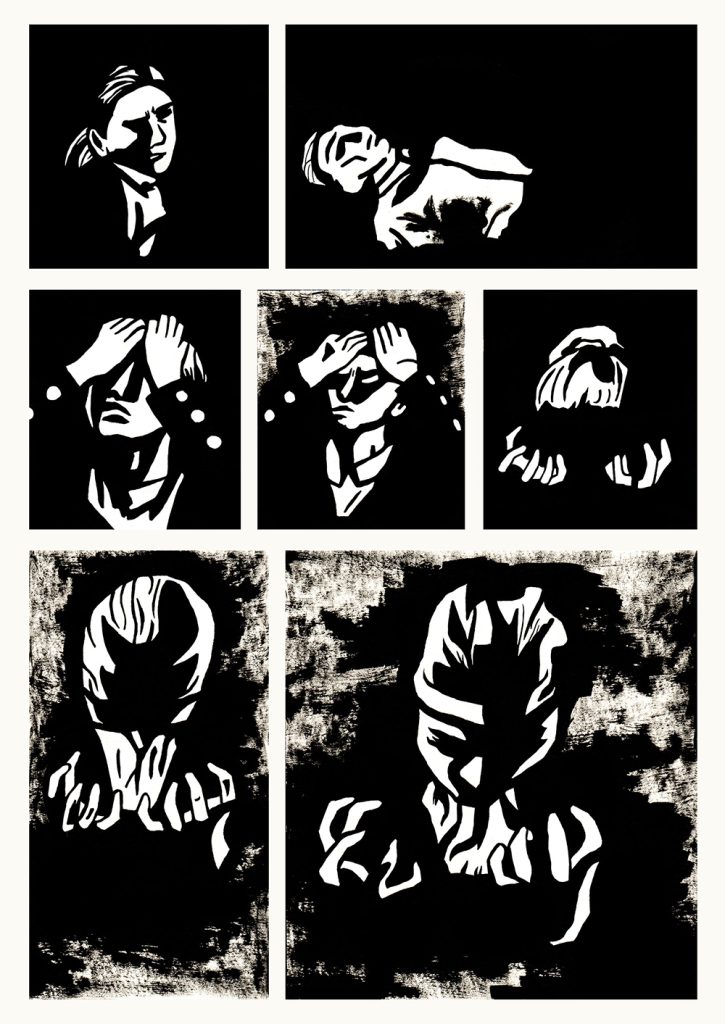
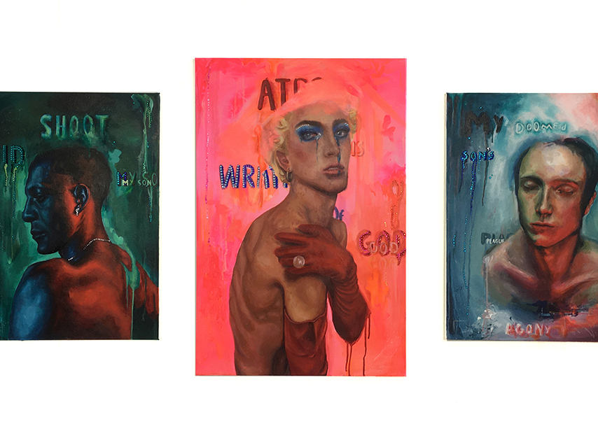
Name: George Stokes
Title of FMP: Ignore
Previous School: King Edwards VI College Stourbridge
Progression University: Kingston University
Progression Course: BA (Hons) Fine Art
Content Warning: Scenes of Graphic Nature and Themes of Violence and War throughout.
Not Suitable for under 18s.
My FMP was inspired by the word ‘ignore’ and the idea of purposeful ignorance. I wanted to explore the Idea that people will ignore situations to make themselves feel better about themselves.
The installation is about how the UK media treat European countries as opposed to those in the Middle East, Africa, Asia, and South America. I chose to focus on the difference in coverage that the Tigray war in Ethiopia gets compared to the war in Ukraine. The photobooth, synonymous with passport photos, aims to explore how the public casually consume news footage of different crises, forever being a tourist to other human’s misery.
The main artists that inspired my work were Mike Nelson, Martha Colburn. Mike Nelson inspired the physical aspects to my FMP, whereas Colburn inspired me to explore filmmaking, which became an important element to the overall installation. I didn’t know I was going to create a film originally, so I didn’t have lots of time to develop, with more time the film could have been improved.
I have managed to achieve a lot of what I wanted to do in my FMP, my main aim was to be as ambitious as possible in terms of size and concept. I am proud of what I have created, and I hope that it will provoke discussion on my theme. One thing that FAD has taught me is to be as ambitious as possible, my work is best when I push myself and I enjoy the challenge that comes with that.
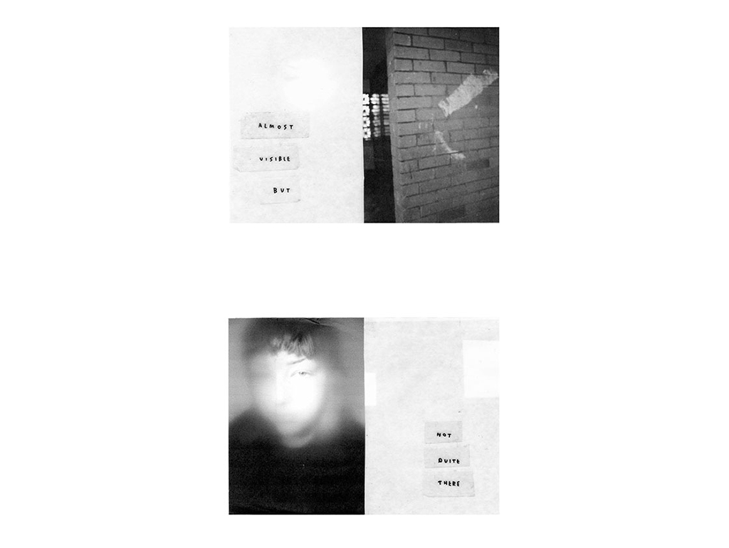
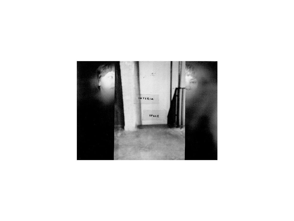
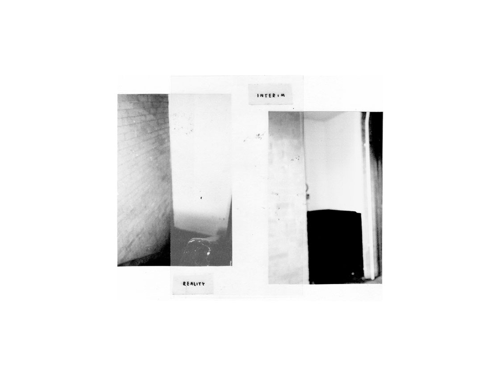
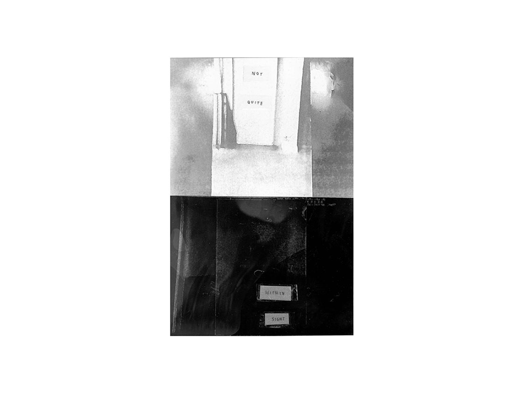
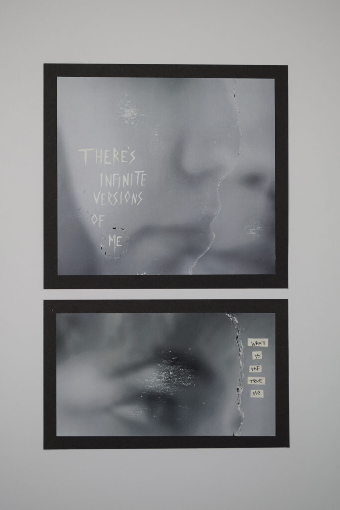
Destination: BA (Hons) Photography Leeds Arts University
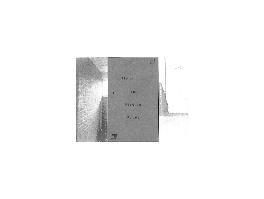
Perception acts as a lens on how we view reality and this can often become distorted. What we choose to focus on can alter everything around us, but what’s not in focus is still slightly visible –not quite there. As we transition between viewpoints, that space between focus that we don’t acknowledge still exists but only as noise in the background. We may think that reality as a whole is how we view it, but we are distracted by this when in actual fact reality isn’t perceived in a certain fixed way. I haddeveloped my concept from the idea that we as individuals can construct our own reality from our own thoughts, feelings and beliefs.
The solipsism theory and term ‘subjective construct’ both explain that there is no fixed reality beyond how we perceive it, that we all view everything differently. Photographer Paul Mpegi Sepuya had inspired the experimental approaches I explored towards my photography. Sepuya manipulated the perspective through reflection and in camera collage composition which fragmented the subject. This inspired me to alter the subject’s perspective whilst taking the photo by using different materials to hold in front of the lens. Video art ‘The space in between’ by Mirza and Butler explores object representation and surface abstraction through a multi-screen edit technique where the images fluctuate vigorously.
This inspired me to create a video assemblage using photographs of liminal like spaces which accompanied the subject and edit them to flicker vigorously emphasising a fast thought process whilst looking between different viewpoints. In my work, the viewpoint emphasises what the subject is perceiving as well as portraying the subject them self. The pieces suggest this thought process between different viewpoints. The photographs of spaces act as liminal transition spaces whilst the areas that are muted out or unfocused represent individual interpretation.The video assemblage stills fluctuate with the flashing on the screen, which emphasises the vigorous transition between different viewpoints in someone’s perspective.
The flashing is that space we don’t focus on, it appears in our vision for a split second but isn’t as acknowledged. The ambience suggests background noise that is still heard even when not focused on.From the FMP, I have learnt a range of skills and expanded my knowledge in the technical side of photography. I have worked in the dark room developing film and have learnt the technical basics of a film SLR camera and I can develop these new skills further when I progress on to Leedsundergraduate course. I’ve also explored new experimental approaches towards my work through techniques such as physically editing and taking the photograph, I have learnt I have a certain visual eye when I take my photographs which I can develop further in the undergraduate course.
Isaac Jones
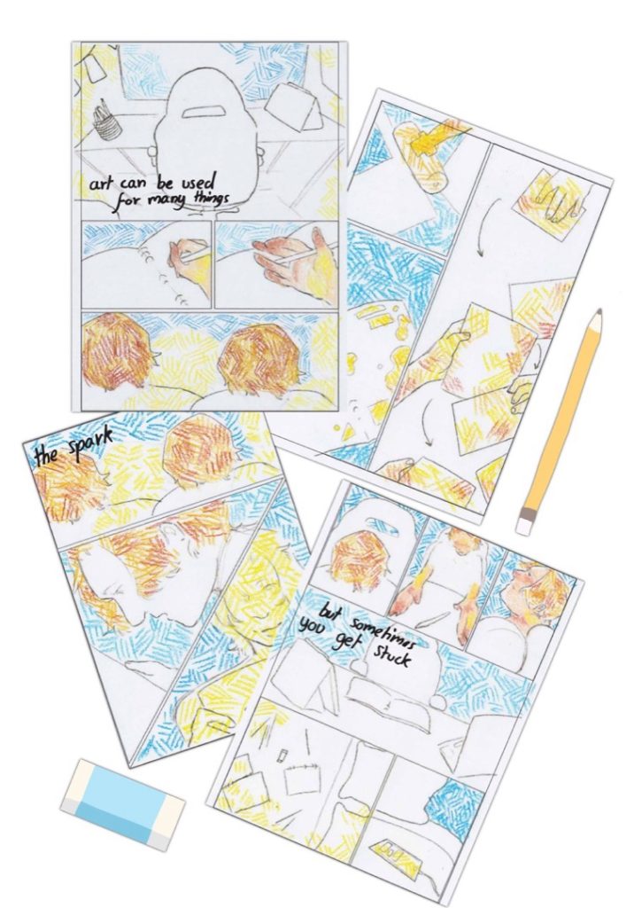
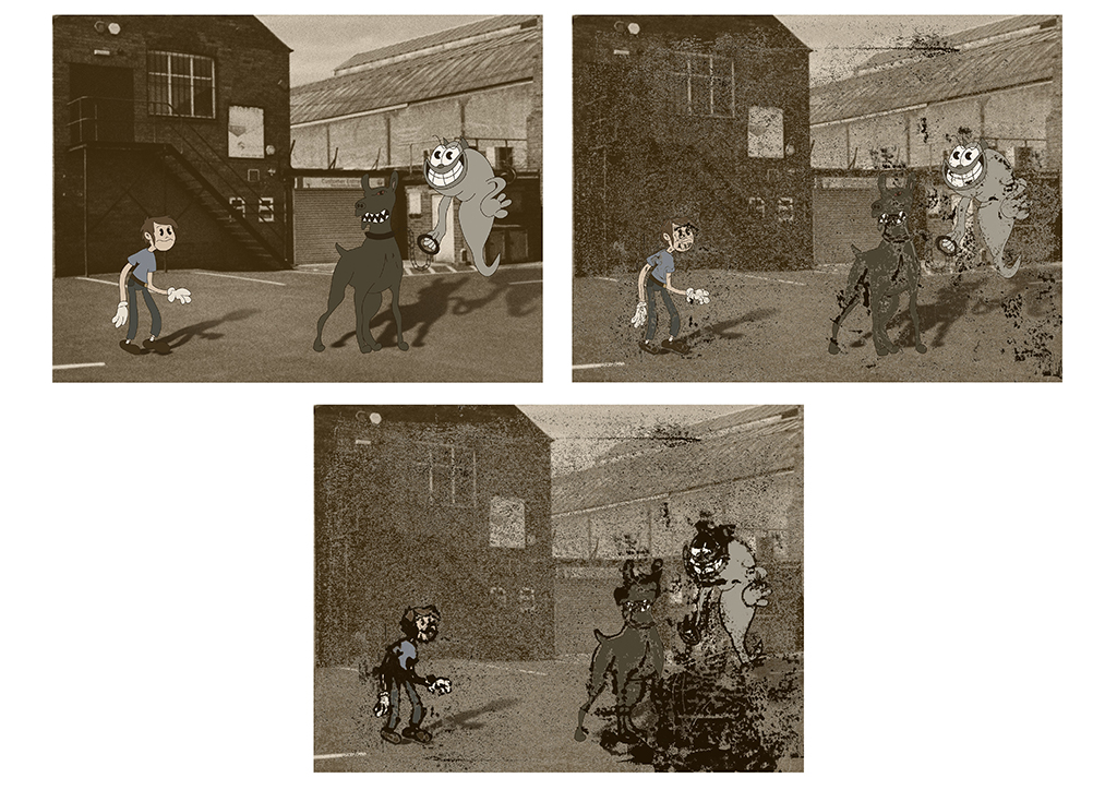
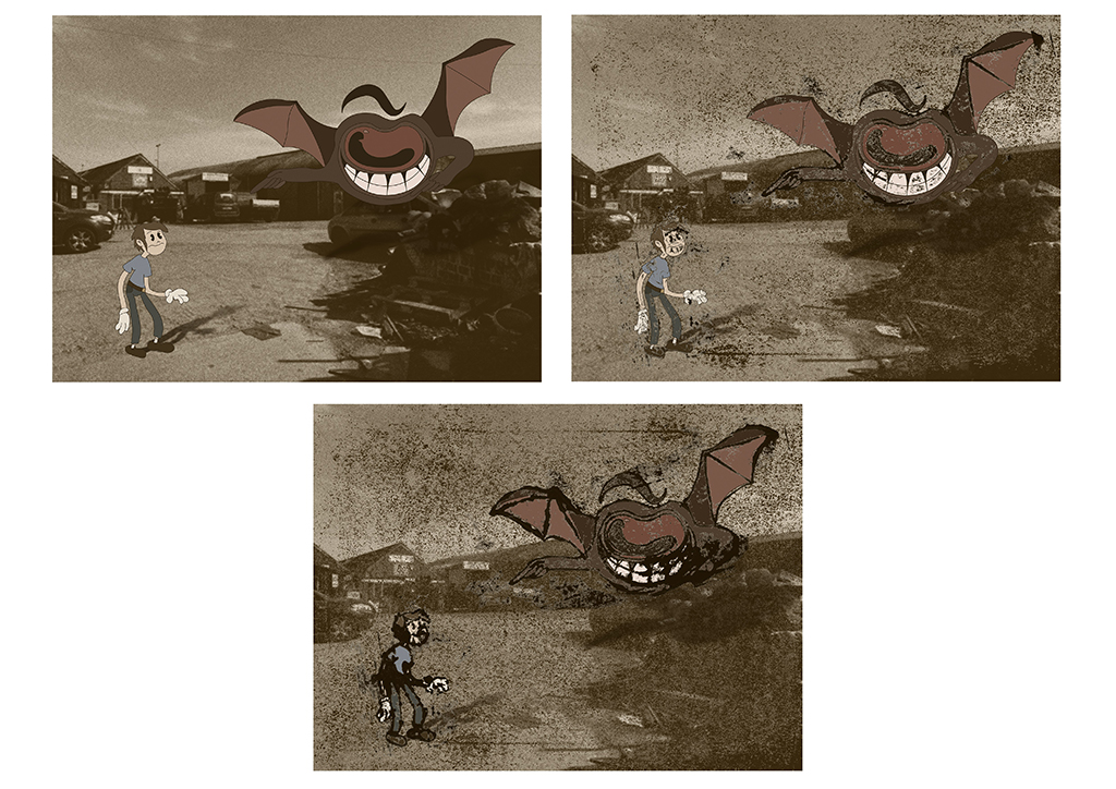
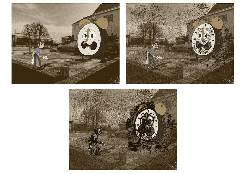
I proposed to make concepts and designs for a game centered on mental health that would use an old-fashioned form of illustration called rubber-hose that dates back to the 1930’s. Mental Health has been something that has been a big thing within my life for the past 5 years in terms of my own well-being as well as family and friends; and it is clear that it is an overlooked issue. Seeing as I want to go into the games industry, I thought it would be good to use the idea of a game as a base to explore mental health (an issue I am passionate about).
This was the initial idea that developed more visually during the initial research and project proposal stage where I looked at various artists and decided on a particular art style. The art-styles used feature many vintage aspects such as the 1930’s cartoon style of illustration for the characters and the sepia-toned photographs for the backgrounds; which I chose to use due to my appreciation of the style as well as the darker and grittier look that it brings, which relates very heavily to the more dark and depressing outlook on mental health issues. I think influence came from many places including peers and tutors who both gave new ideas on how I could explore and develop different aspects of my work as well as ideas on how it could be presented.
However, inspiration also came from my research and I think the game Cuphead has influenced my project and idea the most. The illustration style of Rubberhose is similar with the characters. I feel the idea of having these large monsters that have subtle details about them is something that I have learnt from looking and Cuphead. I think the pathway and exploratory stage was great for trying to representing the ideas that I already had so that others could see visually what I was thinking of. It also showed me new ideas in that area of art that I could bring into my own project. However, I wish I had initially explored other forms of media to get a wider appreciation of the topic I was focusing on.
I did make up for this later looking into TV shows, interviews with artist and exploring more of the mental health side with a variety of mediums but doing this at the start would have made this process easier. During this project, I think I have learnt the most about the importance of reflection and research and how it can positively affect the project. Reflections and research has allowed me develop new ideas that I didn’t have at the start and have been some of the most crucial aspects that have brought the project together, such as the ideas of using different techniques with the fine artist anxiety research as well as research into TV and Cinema with Wandavision and Pleasentville which led me to develop the idea of using monoprints as a shadow.
I think when I move on to my undergraduate course this will help greatly as research and reflection help a lot in terms of planning and keeping track of where the project is going. I will also gain a much wider range of ideas to draw from which will make my work much more interesting.
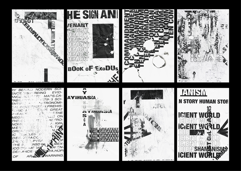
Elliot Luton
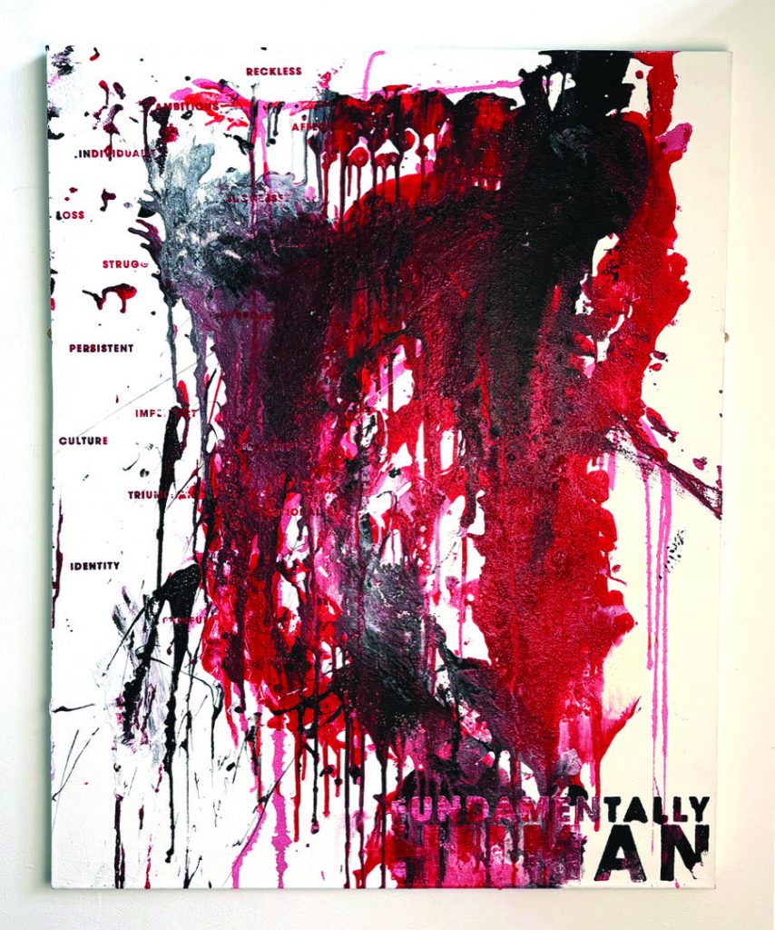
Graham Hancock is a pseudoscientist who researches theories about the early years of life. My fascination with aliens and the unnatural theories in life, lead me to Hancock’s theories of how the pyramids were built and that it would be physically impossible for any normal human to do so. His theories on the hidden sectors of history would evoke amotions in any type of person, from fear to excitement, just the fact that even the top scientists can’t explain everything we know about in history, even before touching on the parts we have yet to discover.
My work examines the way that these types of people are treated, the theories and ideas that can be proven but are outside of explanation, are hidden and defaced as they are not understood. Presenting this idea shows how narrow-minded scientists are and the only understanding we have of our history is the words written in black and white.
Chloe Pritchard
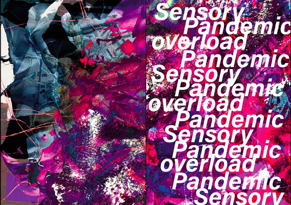
Destination: Illustration-BA(Hons) Birmingham City University (BCU)
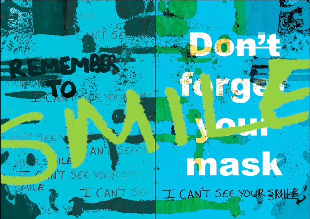
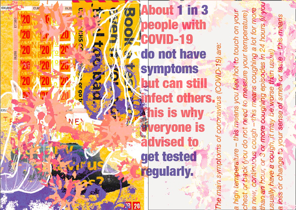
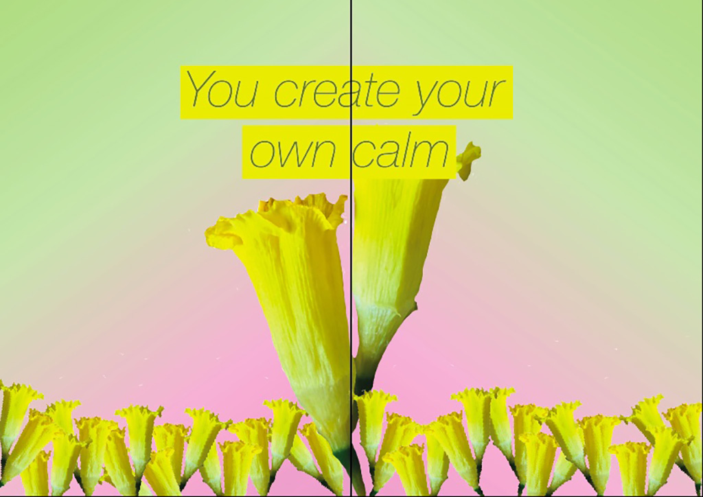
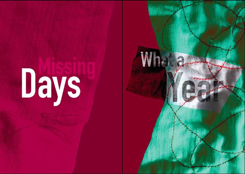
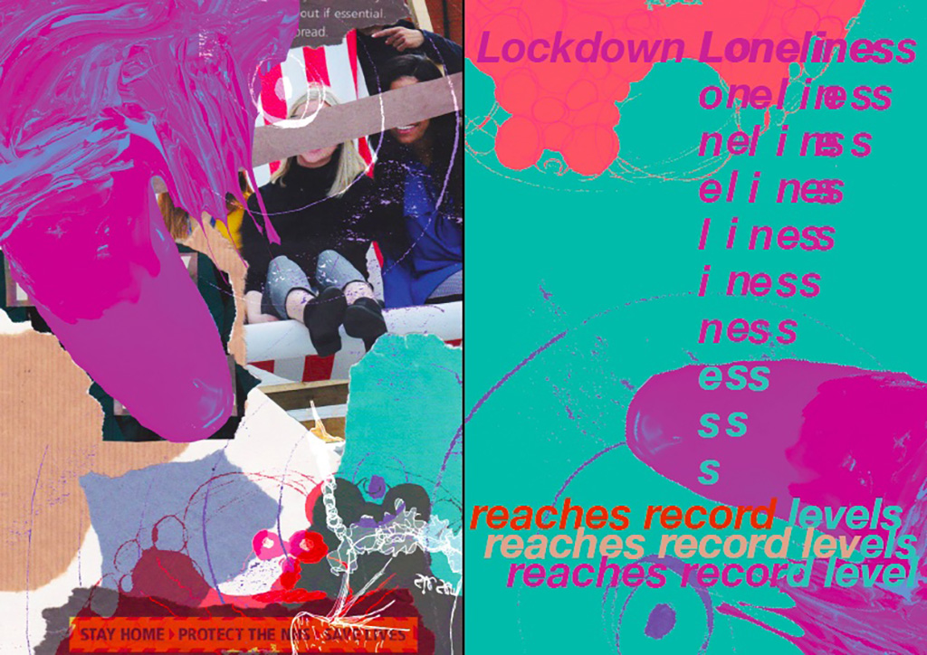
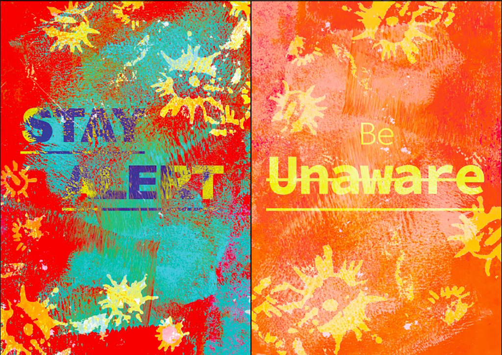
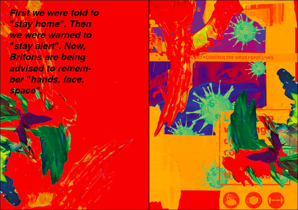
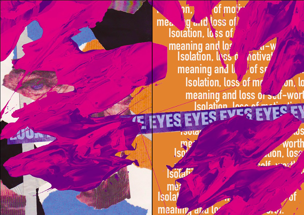
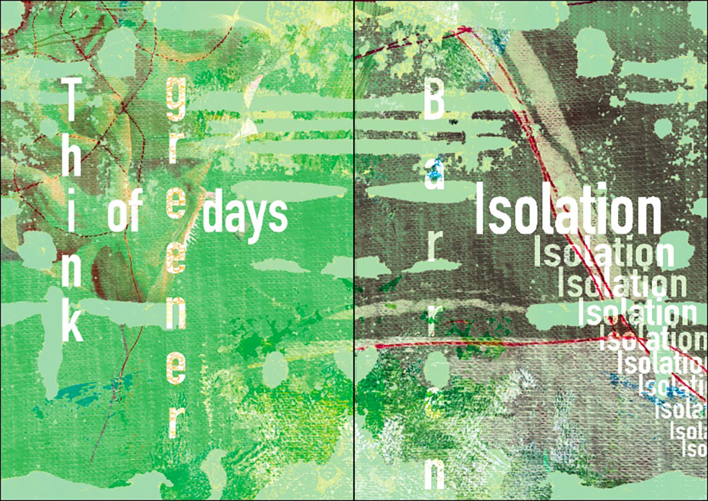
Confusion, fear and entrapment. Instructed by the new laws and informed by the constant flow of misery after misery. Trapped within the confines of 4 walls where our only escape is to find clarity with the screens in front of us, further binding our eyes and ears to more dreaded news. The past year has been insufferable or a blessing, giving those more free time while also making us feel more alone. Connections have been lost where new ones have formed and our lives still continue while adapting to our new situation. This Sensory overload we have been bombarded with and the clarity in-between has affected the way we feel and talk, especially regarding Covid-19.
My work is a collective of emotion, conflict, imagery and information being kept within the confines of four corners. Detailing the bombardment of media and information with the breaks of clarity we have in-between. The sensory overload of colour, text and imagery conveys the emotions felt and informs us as a reminder to not forget but to converse and allow for an open dialogue of interpretation. It aims to be insightful while commemorating my own thoughts and feelings throughout this pandemic. It is an open collection to the youth and how we have faced parameters while being informed of consequences and risks. We have faced the unknown and continue to overcome with resilience within the confusion of it all.
Inspired by collage, illustration and different media, my work evolved into a topic of discussion surrounding Covid-19. This developed through exploring artists relating to colour, design principles and mark making such as Callen Schaub, inspiring me to use traditional media mixed with my graphic design developing my work from simple collage to a chaotic mixture of colour, imagery and text. Inspiration from Sigmar Polke, allowed the utilisation of illustration in a simple and contemporary way incorporated into a mixture of bombarding and simple imagery. Exploring a mixture of artists from all disciplines allowed me to express this sense of bombardment and overload.
Open dialogue with peers and tutors allowed the incorporation of different ideas and ways to further push my theme. Relying heavily on the opinions of others and my own judgement, determined development and pushed the boundaries of my work. My project within Covid-19. With this constant development, I prepared for all eventualities and displayed different outcomes. I achieved the outcome I desired from the start, communicating and opening dialogue for an audience.
Through completing this course and FMP, lockdown and restrictions have added a disadvantage but have also shown the resilience I have to overcome the parameters and restrictions. I have developed my own perspective towards using different media and explored within these fields. Obtaining a more critical mindset has allowed me to spot details in my work that need improving and this mind set is something I will proceed to use, progressing on to University.
Ellie Walker
Previous Education: Dudley College Destination: Wolverhampton University Graphic Design
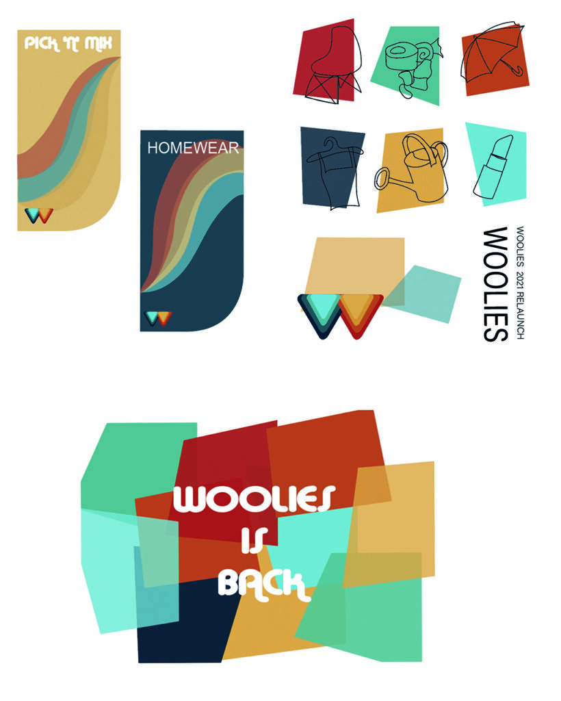
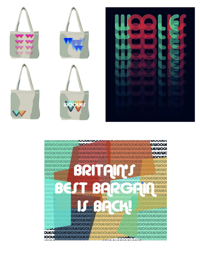
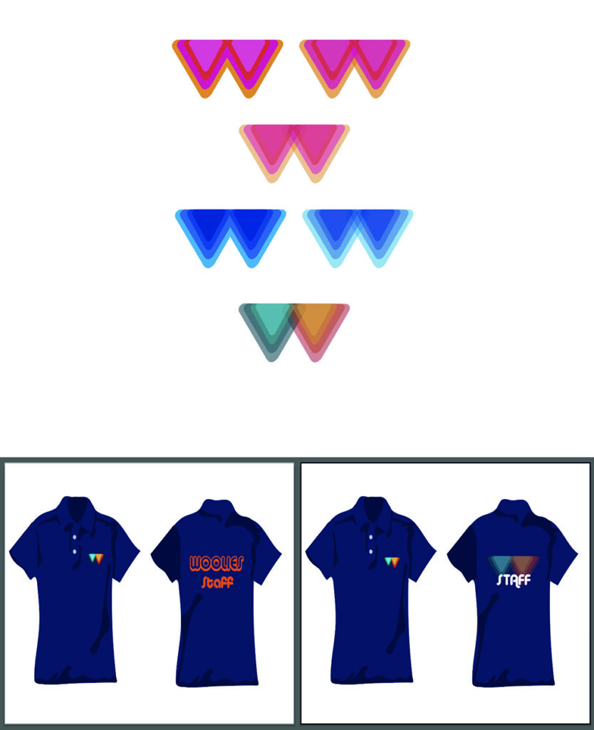
The initial idea for this project was to re-brand the well-known store Woolworth’s. I wanted to create the company in a new light. The idea was to go back to basics and start from scratch with a new company logo, company uniforms, advertisement posters, website, shop signs and shopping bag designs. I initially looked at artists including Saul Bass and Alice Isaac, I found that Isaac’s style wasn’t suited to this project as her work was too complex and abstract. I was hugely inspired by Bass as his work helped me dive deeper into art movement which led me to look at the Bauhaus which became my main inspiration for design. Through this I learnt that using simplistic patterns and shapes worked better as it made the logo design especially more memorable.
I initially didn’t set myself enough targets and for the ones I managed to set I unfortunately didn’t give myself enough time. Through this project I have learnt have to keep up with time scales and set myself aims which I believe will help me for future projects, that I something I will definitely take forward in the future. With help from tutors and peers I was able to get the e feedback I needed in order to make my designs the best they could be, I personally feel critical feedback is key when sharing pieces of work as it helps you see things from other peoples point of views which can also sometimes change your opinion on your own work, for the better.
Through feedback it allowed me to change my logo design completely in the initial design process, for a basic corporate logo, into a quirky retro design. It also allowed me to bring Woolworth’s into the 21st century, changing the name from Woolworth’s to Woollies and changing the idea of creating a website into creating an Instagram page. This was much easier to set up and allowed me to increase my target audience to the younger generation rather than just the older generation for the nostalgic value. Although I liked the idea of the nostalgic feel, I didn’t want that to take over from reality and I wanted the brand to be taken seriously, with the retro aspect I feel as though I captured this perfectly. I believe that despite a few hiccups the project came together well.
From this I will now analyse my work to a better quality making sure my reviews and evaluations of work are in more detail and of better quality and I will also learn how to manage time more efficiently. This year has allowed me to work on my specialist subject in a more mature way and has allowed me to find my own style. I have also learnt to be confident in my own work especially if I am pleased with something I have created and how to make other people believe my work is of a high standard. I hope from this past year I can now take on my skills to university and any future career I am able to achieve.
Joseph Woodcock
Previous Education: Joseph Woodcock Destination: BA Graphic Design with a Placement Year Loughborough University
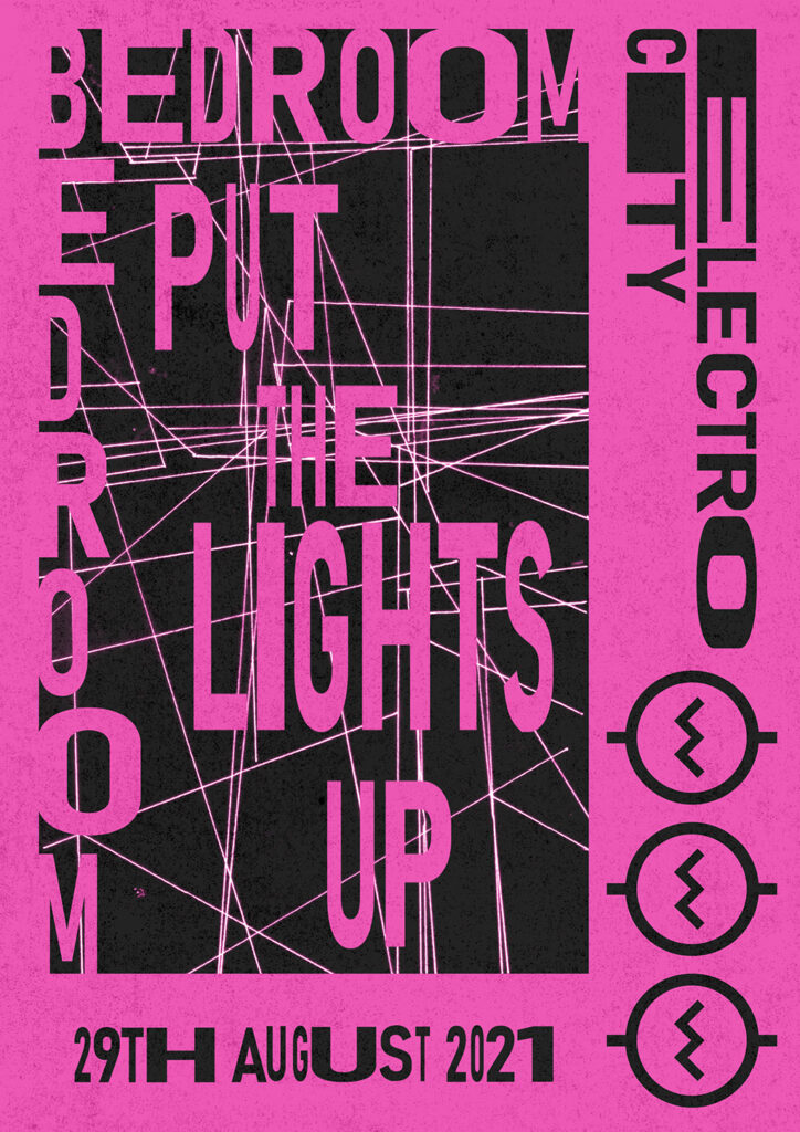
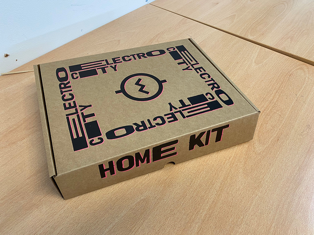
The initial idea for his project was to create branding for a new and upcoming EDM festival that was trying to tackle the issue of coronavirus we face today. As I began to work with the project I found routes around the issue we face today. I wanted to create a box that would be shipped to your house that would contain a range of elements that would allow you to set up your own festival in your house. Through initially looking at artists Harrison Pollock and Jack Teagle, I found my theme of ‘hyper reality’, which developed into my own take on the theme through researching films and multiple other artists. I choose to delve into this as it strongly relates to simulation and have strong futuristic ideology. This worked well inside the genre of my music which pushes electronic noises and have links to both the past and the future, which when mixed together, creates for amazing visuals, and I think I achieved this with great success.
This project had a large influence from others around me and they all helped push my project further. Initially I set myself a rough timetable. However, through constantly reviewing work and talking with my three tutors, I managed to refine this and found a great pattern of work then review that helped keep me on track. I have managed to achieve my main goal in my project by doing this however, I did have a range of opponents that didn’t end up being formulated. These include: a website, virtual tickets, VR headset and a range of other promotional work. The time I spent focusing on the four elements of this project allowed me to create a far better quality of work that held strong references, and allowed me to explore a diverse range of techniques that helped develop my skills. I do however, feel as though I could have started stronger in terms of this and this may have allowed me to create a wider range of final piece. Overall, I am extremely pleased with my management of this project and if I was to do it again I would have put more time into configuring my initial timetable.
One of the main things I will take away from this project is an ability to integrate far more hand rendered work into my digital works. This year has allowed me to develop my specialist practice and my own unique style which has informed what I want to create as I move to the next stage of university. I have also learnt how to review and look back at my project. It’s taught me to not veer away from the project at hand and to keep focus on what I want. I think at the start of this year I was susceptible to this but my focus has changed and I have a far more knowledge on how to keep a structure to my time and how I can distribute my time around. This is a great skill to have developed at this stage and will only grow as I head towards my career.
The title of this project was ‘Expect the Unexpected’ and develops work produced for my Extended Diploma course. I wanted to create strange beings inspired by the work of Surrealist Max Ernst and contemporary illustrator Linder Sterling. Both make strange compositions collaging together animals, humans and objects to create bizarre and weird imagery. Another artist that I was inspired by was J Semp because his work is bizarre and futuristic looking.
If the national lockdown didn’t happen I could have developed the idea of using peers as models for me to photograph and use in my collages, this didn’t happen so I had to use only magazines.
Back in college I did manage to develop my ideas by transferring tracings of my collages into silk screens. I used a mixture of different brightly coloured fabrics, viylene, existing printed fabrics and PVC. I could have potentially applied more refined details and definition through the sewing techniques, hand and machine stitch and applique but there wasn’t enough time.
The different images, surfaces and colour palettes all helped me convey my idea of ‘Expect the Unexpected’, due to the unusual mix and clash of colour on various surfaces. I have developed my confidence in printing and machine embroidery and want to broaden my skill set at university.
Ellie Bloomfield
Cabin Fever’ was inspired by the uninspired. My FMP began during a Covid-19 lockdown and I was struggling to get motivated due the claustrophobic feeling of being trapped indoors. However, rather than allowing this to negatively affect my project, I decided to embrace these feelings and allow them to direct my work, pushing me to be creative whilst stuck in a small office. Self-reflection realised that to cope with the disorder and unknown of the circumstances, I relied on repetition, order, and control of the space around me.
The Outsider Art heavily influenced my project. I found comparisons between some of the artist’s dispositions and methods, and my own ideas and emotions during the lockdown period. Heinrich Reisenbauer’s organised grid paintings of identical subjects reminded me of my own coping methods, for example, eating the same foods during isolation. His work also emulates the feeling of endlessness, and the repetition of lockdown life, whilst the low-tech materials, remind me of the lack of resources I had at home. In contrast, August Walla’s explosive and expressive murals evokes the feeling of disorder and claustrophobia that I felt at that time, the crushing feeling of cabin fever. The vast distinction between the techniques used by these troubled artists became the basis for my ‘project of two halves’. The work I produced from home was inspired by Reisenbauer’s simple line drawings of subjects around me. However, once I returned to college, I decided to explode my small initial drawings into a large exhibition space, to challenge my creativity and to use my return to the studio space from home to the best of my ability.
My biggest challenge for this project was to trust the process and to allow myself to react as I go without a structured plan for an outcome. I was able to achieve this by having frequent tutor discussions which allowed me to create bite sized plans that provided the control I needed in order to cope and create order within disorder.
This project could have continued forever, and I feel as if the creativity and curiosity I learnt from it will. There are many ways it could have developed, from textiles print to embroidered samples, however I am pleased with where it did conclude as it remains ambiguous and my use of mostly paper-based materials links back to my original resources. In my proposal I had planned to create a ‘range of textiles’ and although my final space and samples do not resemble a traditional example of textiles it holds all of the key elements and explores the idea of a modern take on textiles.
This project not only enhanced my practical skills and creativity but taught me about myself. The purpose of the project was to explore the personal effects of Covid by emulating my emotions through large scale motifs and repetition in an installation environment, but that space itself trapped me and pushed me to work through my struggles and allow the lack of motivation at times to inspire new work
FAD has given me the opportunity to explore a large range of specialities and combine aspects of them all to create my own creative individuality. I have learnt to be more experimental and to not be to be caught up on the outcome and forget to explore the process. I will take these fundamentals on with me into my creative career.
Nathaniel Buffery
Previous Education: King Edward VI College Stourbridge Destination: BSc Psychology, University of Liverpool
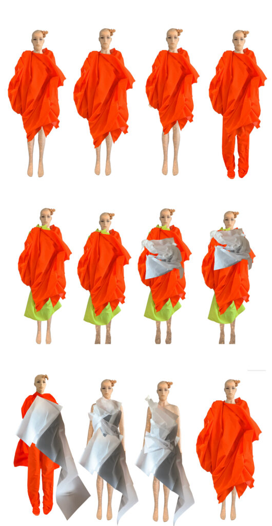
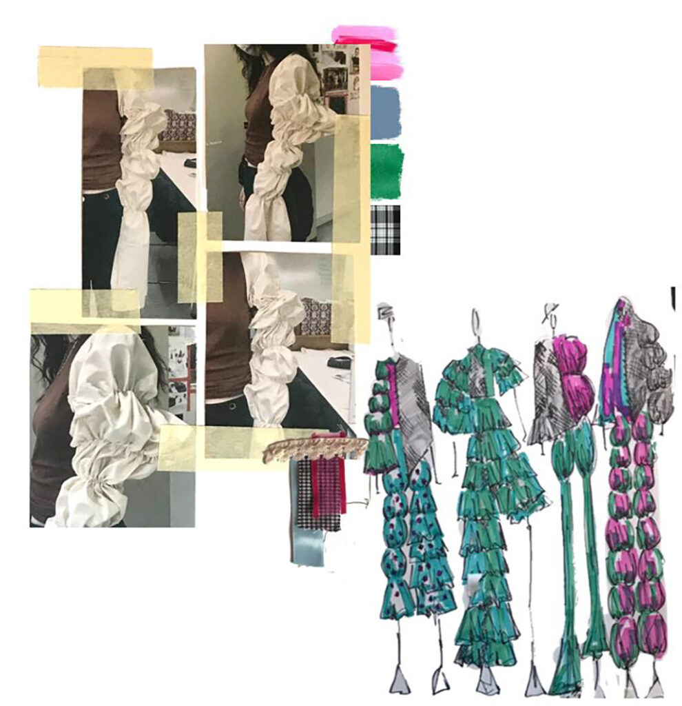
“Space and Fashion” was an investigation both into the historical roots of Space Age but, also a look at more contemporary print techniques and technological innovation. My aim was to create a series of simple 1960s silhouettes with astronomy inspired printed fabrics for a Space-themed garment collection. The idea came from renewed international interest in space travel and personal interest in aesthetics of planetary surfaces and how they may be applied to fashion. I developed my initial ideas in lockdown through research and sketches and then moved onto printing techniques.
My main inspiration for this project were the fashion designers of Space Age such as Pierre Cardin, Paco Rabanne, Andre Courreges etc. Their use of unconventional materials and ‘looking to the future’ in a time scarred by the fear of a world-ending nuclear war was something I could relate to given the limited supplies I had in lockdown and being in a world event where the only outlook to have was to look to the future. Another source of inspiration was Mary Quant and the work of activists in the 1960s who pushed against modesty and prudish culture of the 1950s, allowing for more ‘scandalous’ silhouettes such as the mini skirt and more exposed skin.
Tutor and student comments did influence my ideas a lot. In the early stages, tutor discussions helped me pull all my research into one cohesive idea. Had time not been so tight that I could have developed further ideas such as expanding my collection to look at other 60s silhouettes (e.g., the A-Line or the cape/poncho) or looking at accessories outside of the hypothetical (e.g., shoes or cuffs).
There are many things I have learnt from my FMP project. The main one is improving my practical skills in both textile and fashion design, I specialized in fashion without any prior experience of this field. Although it has been a steep learning curve it has been incredibly useful, not only learning skills for personal use but also how the industry works and how the skills I was using translated onto an industrial scale.
I also learnt more skills in organization and recording my work, that the end-product is not just the finished garment but the journey to get to that work. The most significant thing the FAD has taught me is to go outside my comfort zone, to try new things because it’s better to be rewarded for doing something new rather than doing something mundane that you always do. I would like to apply that to my undergraduate as although it’s a different subject, there are many fields to explore, opportunities to try something new.
Evie Burgess
Destination: BA Hons Creative Direction for Fashion London College of Fashion UAL
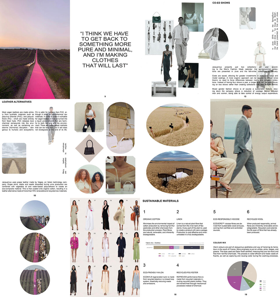
The coronavirus pandemic and how it has affected the fashion industry influenced my initial ideas for this project. I wanted to consider how fashion will change in the future and create work communicating this.
Fashion must become more sustainable, and this is something I wanted to explore in my work. I found an article on Forbes outlining how the fashion industry will be data-driven, sustainable, digital, and simplified in the future. It discusses how new technology and changing customer demands will begin to transform the industry.
My approach in previous projects has always involved photography, an area in which I feel confident, but lockdown meant that opportunities for this were limited. I was able to experiment with hand-rendered techniques such as collage in the initial stages of my project. My experimentation informed the type of practical work I wanted to produce, directing me towards new ideas.
After extensive research into the brand Jacquemus, I created a publication, working in a hypothetical style as if I was producing this for them. Its purpose is to inform potential customers about sustainable practices and methods used in production. I wrote about the brand’s decision to slow down the company through co-ed shows. Doing this allows a reduction of wastage fabrics, being able to take control of energy expenditure. I was able to educate myself on sustainability, which I found was the most rewarding part of my project.
Being on FAD, I have learned that experimentation is a significant process. I feel it allows me to devise ideas that I may not have had if I jumped straight into practical work. I also found I could allow more time to consider the presentation of my outcomes. I wanted to grow my InDesign skills and investigate new techniques that combine text with images. My approach has worked well for this project, and I have the confidence to develop this finesse when I progress to university.
Molly Cartwright
Previous Education: UAL Foundation Diploma in Art & Design, UAL London College of Fashion Destination: BA (Hons) Fashion Design Technology: Womenswear
My Final Major Project was a reaction to the pandemic I am living in, specifically the effects of the lockdown being anxious, distressed, alienated and frustrated feelings. When stimulating ideas for what my project could be, aware that fashion designers collections are normally a reaction to what is happening in the world around them I decided to look to my own experiences of the current world I’m living in. My initial idea was mainly developed from researching Outsider Art. This work is made by the untrained, and includes work by the mentally ill, child art, work mad by prisoners and those who live in isolation. I wanted to see how being isolated effected their art to inspire how I present my isolated, lockdown feelings through art. Here I discovered motifs of outsider artwork including overlapping, communicating through repetitive words and numbers, and illegibility, which I applied to my initial drawings which then went on to inform garment design.
Outsider artists including Emma Hauck who inspired me to explore my feeling by writing them down in manners that explored the outsider motifs. My drawings reminded me of Gosia Wlodarczak’s work who went on to inspire a significant amount of my practical work, I applied the same fluidity to explore the lack of control felt in lockdown, applied my drawings directly onto silhouettes to see how they would distort the drawing, distortion being something I wanted to achieve to further convey anxiety and alienation and finally experimenting similarly in a performative manner and filming this experimentation to explore another lockdown feeling of mine in a more abstract way, the desire for human touch and connection.
Discussion with tutors and peers was vital for the development of my work, as they suggested interesting artist research and ideas. For example, I had all these ideas of feelings in lockdown and how art has been used as a coping mechanism, thinking about the psychological effects of being confined and even OCD in the pandemic. My tutor’s suggestion of looking into outsider art bound all of my ideas together and led to how I would explore my own time in isolation.
In my proposal my aim was to design a minimum of one garment, however, as ideas developed I realised I did not want my work to result to one garment I wanted my final outcome to be a collection of all my experimentation and fashion films to demonstrate what I was able to achieve in these difficult times.
One of the most significant things I have learnt on FAD is problem solving. Having a lack of resources to work with but, still stimulating alternative ideas, and design development are very valuable skills for both university and industry. FAD has also taught me how to collect my own relevant research from different sources and a range of artists. I think the most successful aspect of my project has been my ability to then stimulate lots of ideas from my research, using my research to inform my practical work and the continuation of this throughout my project.
At university, I want to be able to take my approach to mind mapping, lateral thinking and research and ideas from beyond my specialism and use my planning, resilience and problem-solving skills to work independently and negotiate support from my peers and tutors.
Chloesue Hartill
Destination: Kingston University BA (Hons) Fashion Design
“Fade to Grey” is a project inspired by fascination with the New Romantic Era and how open and how all gender stereotypes were forgotten about. I wanted to look back into the 80s and explore what inspired their flamboyant fashion choices.
Through research I discovered many influences on the New Romantics such as; 19th English Romantic Era, Glam Rock and Sci-Fi. The New Romantic took all of these influences and through clashing and contrasting different styles together created bold, over the top garments.
I created fashion collages to inspire draping and fabric manipulation on the mannequin. I produced a collection of that mismatched and clashed menswear with womenswear and pattern, colour and texture. This project has given me a greater understanding of Fashion throughout the 80s and how it was influenced by many different things which shows fashion is constantly evolving and how the younger generation is constantly looking up to the older generation to inspire their fashion choices.
The foundation course has increased my confidence which can be seen throughout my work as it shows a growing confidence in experimentation and a more varied style than I had at the beginning of the course. I will continue to push my boundaries and to go out of my comfort zone.
Alister Kidger
Previous Education: UAL Foundation Diploma in Art & Design Destination: Further Education
I think that there is a pressure on people to be perfect and beyond cool from film, TV and social media, especially with celebrities and Instagram models where they are pictured as living the dream and being the centre of everything 24/7, which can make people feel like they need to be more than they already are in a negative way.
For my Final Major Project intend to create a menswear collection titled ‘Unseen’, which is based on the feeling of anxiety in social situations that introverts like myself can feel. The pressure of desperately trying to stand out and be seen as the life of the party, and hiding who you really are for fear that people won’t accept you for as you actually are is a problem for many young people.
I was interested in extremes of constructed personality; the introvert and extrovert and wanted to try and convey those feelings through the fashion design. I was drawn to extroverts like Prince, who was very experimental and wild with his choice of fashion as well as fashion collections like Balmain Fall 2016.
Hiding the body through layering and a dark colour palette informed my early designs. I was also drawn to the idea of censoring the face without it looking like it was done intentionally, and so I was drawn to the idea of covering the face with black cloth which was inspired by the work of Juha Arvid Helminen called The invisible empire.
Due to lockdown, I was unable to construct any garments but feel that this FMP has given me more confidence in fashion illustration and a greater understanding of fabrication.
Sarah Lewis
‘Covid-19’ is a project that portrays the horrific pandemic that hit the world in 2020. Lockdown has had a huge impact affecting everybody’s day to day lives. The experience of being trapped inside and repeating the same routine is what inspired me.
My initial ideas were developed through researching Artists and Designers that were inspired by the pandemic. The influence of Coronavirus can be seen in Fine Art, Fashion. My research extended to investigating how the pandemic was spreading and what the virus looked like. It was a shock to see how beautiful these deadly virus were under a microscope! As a textile designer I was drawn to the patterns and colours in these microscopic images as well as wanting to reference medical equipment.
I am a very hands on designer and enjoy the challenges of developing work practically, so not having access to the textile print resource I instead had time to really experiment and explore drawing in much more depth than I would have done had college been open. This is something significant that I have learnt.
My confidence has grown through being able to communicate my ideas through drawing and in discussing my work with others. Working on my communication skills have certainly prepared me to talk about my work more broadly in future projects at university.
I believe that I managed to achieve all I set out to do. This is through the variety of hangings that could be featured for interiors. Pattern and colour have also been explored massively to create vibrant elements in my designs.
Commitment and resilience to producing my very best work is shown throughout the project and I was dedicated to work hard and focus on developing my ideas, even though at times I found it hard to stay motivated.
Although lockdown has been difficult to cope with, I am so grateful for how it has improved the way I work. I believe that I have pushed myself through working outside of my comfort zone, and I will continue to test my experimentation on my undergraduate course. Overall, it has been a challenging but exciting experience, and it will be the project that I shall always refer to if I am ever struggling in future projects.
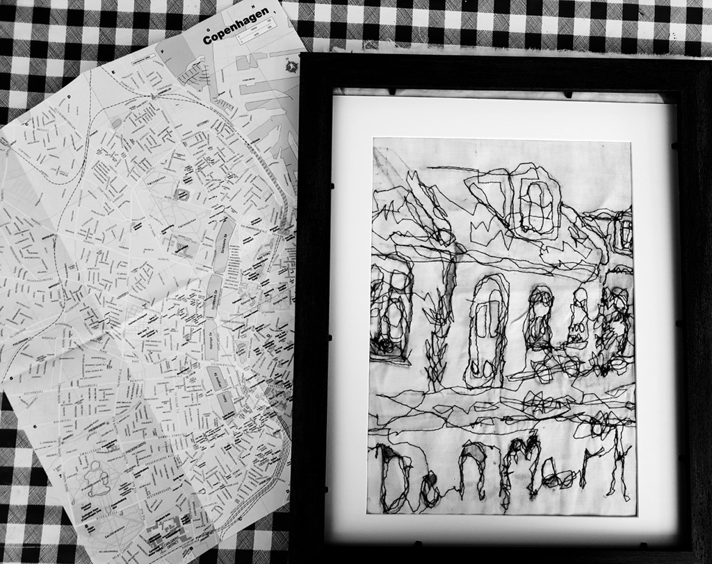
Isabella Loveridge
Previous Education: Kinver High school Destination: Employment
My work is based on Danish Architecture, I thought the contrast between the old and the new was very stark and different to my own surroundings. I have never visited Denmark but if I ever did, like any tourist, I would want a souvenir to remind me of time spent in a different country. I decided that my textile work would take the form of holiday keepsakes, fabric postcards!
My work has been inspired by a range of textile artists and designers, I particularly drawn to the work of Harriet Popham and Ruth Chalk – these are textile artists who explored architecture using textile techniques and processes. Harriet Popham is an illustrative print designer whose work is complex and very detailed using print and embroidery. Artist working in recycled textile and waste plastic. Chalk is inspired by the urban landscape and works with knit, machine embroidery and collage. I had hope to use some of these techniques but due to the lockdowns and having limited access to textile resources I decided to focus on small scale pieces in techniques I could work on from home. Also working on a small scale meant my work would be more suitable as keepsakes if they were small and easily packed in holiday luggage!
When working from home it was important that I kept in contact with tutor and my peers to help keep me on track and motivated. Whenever I had a one to one or a student gave me advice or feedback on my project, I made notes and reflected on what was discussed. Sometimes I was given ideas or other techniques to try. On one occasion, I had a meeting on Microsoft Teams and a group of us showed a PowerPoint of our work in progress, we talked through our project, and got feedback from each other, ideas of what we could do next, what they liked, what they didn’t like. I found this very supportive and useful.
I have learnt new skills as the work I produced had to be presented digitally. I was initially a bit nervous about using computer but now I use it a lot more. The most useful thing I learnt in my Final Major Project was to be more inventive in using whatever I had around to make work and not worry about having to use traditional materials and techniques. I think this pushed me to think of new ways to work this helped my project develop a lot more than it usually does, as I was forced to try new ways of making work that I would not normally think about. I did a lot more drawing at the beginning so I had lots of work to use to insure my textiles pieces. I planned much better in this project, so I was able make the most of the time when I was in college.
I managed to produce a range of fabric postcards, some figurative, others with text and some that were more abstract to appeal to a wider market. I also made some badges that could be sewn onto clothing.
I think FAD has made me more confident in my work and more confident in myself. I now have a set of skills that I will develop after leaving college, hopefully selling through craft fairs maybe even online!
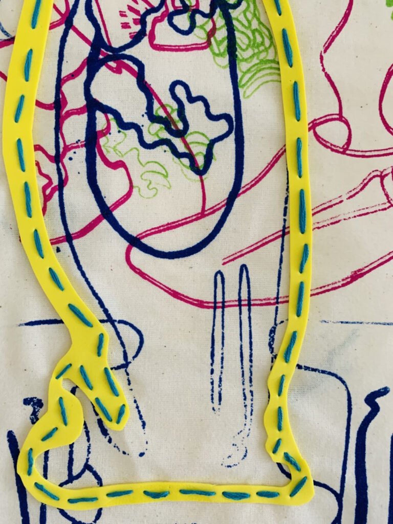
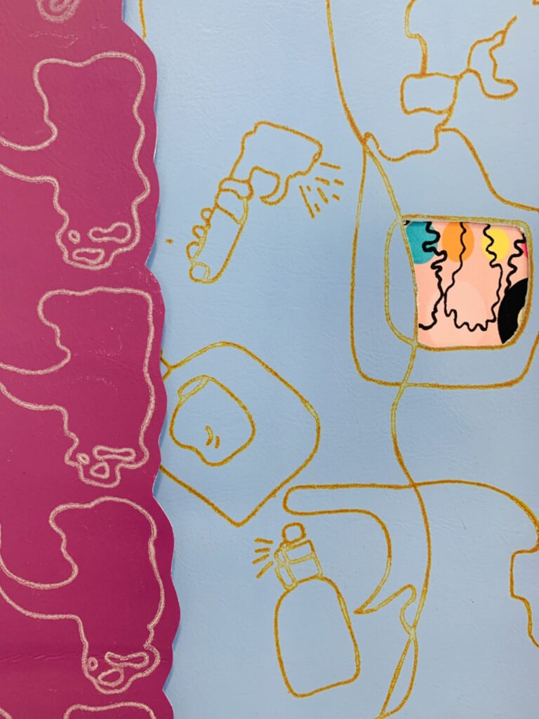
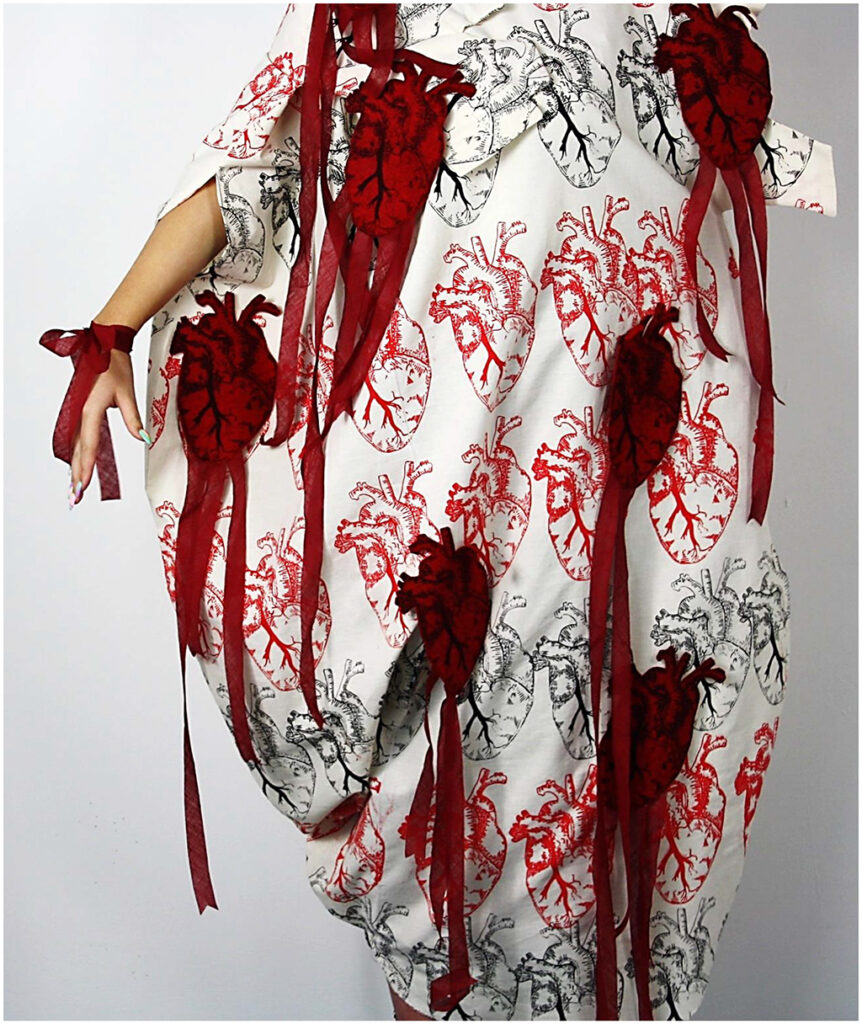
Ailish McCay
“Anatomy – (between sizes)” is an exploration of the unjust sizing systems in retail clothing stores. I also wanted to challenge what people would consider beautiful by aiming to make something beautiful out of something gruesome. The initial ideas stemmed from personal difficulties of being between two sizes in retail sizing myself and rather than this being strange is actually how most women actual are. I decided that the best way to show this would be to explore the inner working of the body which everyone shares, eluding to the fact that we are all the same no matter the size we wear.
From this research I found certain fashion designers to share the same aesthetic as me, for example Comme des Garçons, Iris Van Herpen etc. Van Herpen’s 2021 London Fashion week display had looks that, to me, looked similar to vein structures, which linked to my idea of using internal organs as a surface decoration. I began to create detailed linear of internal organs and skin structures. I then explored how these organs would look if they were to be used to inform the silhouette of the garment as well as its surface. I explored print and embroidery. I printed heart onto calico and projected a heart shape onto the stretched calico as my pattern for the oversized silhouette.
The idea of the garment being oversized is to hide the natural figure of those who decide to wear it, regardless of what size they are.
As a result of lockdown, starting this project was really difficult for me, my mental health had plummeted and I had absolutely no motivation. It became really important for me to have regular contact with my tutor so I could continue to take small steps to get this project off the ground and not be overwhelmed by what I had to do to complete the project. These talks with my tutor helped me to really grasp where I wanted to go with this project, and what work I could produce until we were able to create something spectacular once reintroduced to the college facilities.
In an ideal world I would have loved to have explored multiple outcomes of this project and create multiple garments, however with the current global status and aforementioned personal problems, this was just not possible. Once reflecting on my initial proposal I feel that I have created a project that has exceeded what I set out for myself. I have proved myself wrong and have proved to myself that I am more than capable in any situation.
Naomi Reynolds
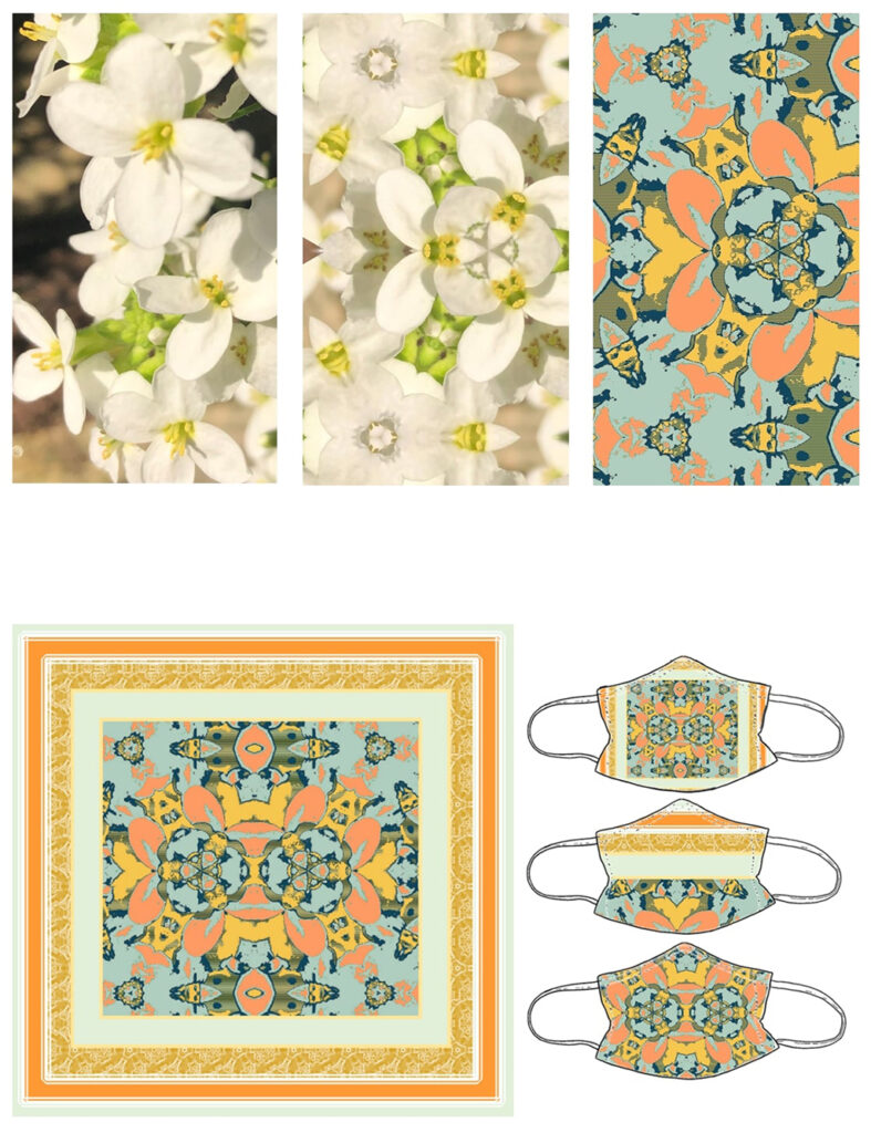
“Beyond the surface” is an exploration of digitally and physically manipulating photographs of natural surfaces such as textured fruit skin, leaves and flowers. From my own photographs I wanted to create abstract patterns and repeat prints, inspired by predicted 2020 and 2021 spring/summer pattern trends. I was interested in the juxtaposition of natural and geometric forms featuring in patterns. There was also a trend that looked at surreal patterns found in nature that were contrasted with a vibrant colour palette creating a new abstract surface. The choice to explore this as my theme was inspired by lockdown partly as I could turn photographs of natural things I could find around the house into patterns moreover, this paired well with working digitally and from home which I think enhanced the work as I could create photographic prints using vibrant and vivid colours which would be hard to achieve in the studio.
I experimented with hand rendered and digitally produced collages, enhancing the colours which juxtaposed the initial image with vibrant and unnatural colours. I was inspired by Sonia Delaunay’s use of geometric shapes and solid primary and secondary colours. I also looked at various photographers of microscopic natural surfaces such as Wojtek Plonka to help me develop my colour palette and designers Margaret Howell and Snow Xue Gao to see the practical applications of the vibrant patterns on garments. The design of the Hermès scarf to help develop my patterns into designs. If I had the opportunity to develop this project further, I think it could be interesting to turn some of my more graphic style patterns into screen prints and experiment with scale, layering, printing and then manipulating, positioning and photographing the printed fabric to see how the patterns distort.
I believe I have achieved all I set out to do in my proposal as I ended up creating a wide range of patterns incorporating the predicted pattern trends and developed those into face mask and silk scarf designs. However, I did not experiment as much with geometric shapes and hand-rendered elements within my work since, working digitally was more successful.
The key things I learnt on Foundation is the importance of time management as well as reviewing your work. Some of my favourite patterns in this project came from revisiting unsuccessful collages or heat transfers, photographing them and digitally manipulating the image. Developing this in my undergraduate course I want to work digitally more and I think this has proved successful.
Sophie Smart
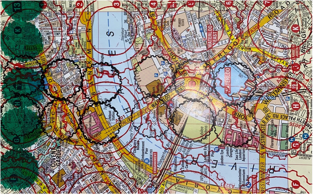
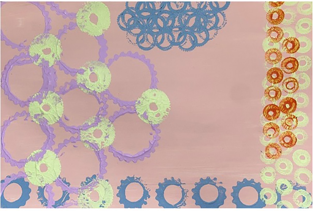
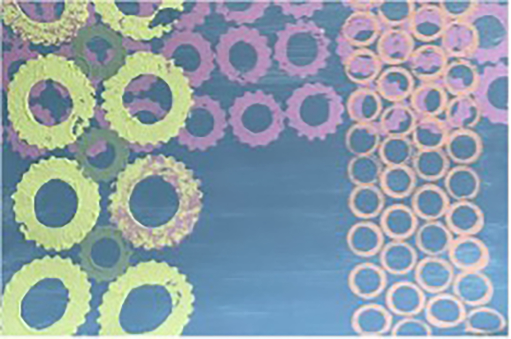
For my FMP project I wanted to design fashion prints exploring the theme of ‘Maps and Journeys’. I want to incorporate telescopes, compasses and their internal mechanical workings. In my last project the range of what I drew inspiration from was narrow and this had an impact on the variety of drawings I produced, this had to be avoided on my FMP.
I have been inspired by textile artist Valerie Goodwin use of intricate lines and shapes which create complex fibre art maps. Closer inspection of her work shows that these patterns are city blocks and landscapes inspired by aerial views of real and imaginary places.
I also referred to The London tube map, ordinance survey maps A-Z as part of my initial research and experimentation.
I also looked into other printed textile designers who have created a simple garments including Susan Stockwell and I have produced a range of printed samples informed by extensive drawing. I explored screen print but also using cogs and wheels to print directly onto my samples. The colour palette I chose was inspired by contemporary trend forecasts. I feel I have developed my subject specific skills in readiness for university.
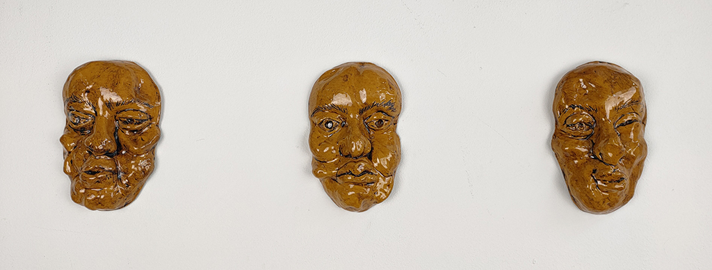
Previous Education: The Earls High School and King Edward VI College Destination: BA (Hons) Fine Art at Manchester Metropolitan University
“Narcissism” is a project exploring the way we criticise our observations of our reflections. Due to lockdown, communication has altered significantly. Video calling and sending messages through photographs and short videos has become more prominent. However, our images on screens are not authentic as there is a slight distortion of features. Whether it be the nose looking slightly wider, the forehead looking slightly bigger or the chin looking too wide, there is something you want to change or hide in the image. This could be by altering the image through editing or using filters. This self-judgement causes us to constantly act in a way that abides to social norms by putting on a mask, a way to conceal our true selves through a persona.
This inspired me to look at exaggerating and manipulating the face, firstly through photoshoots, influenced by Ana Mendieta and Wes Namen, by pushing and pulling the skin. I developed this theme into working with clay to form masks of the face. This led to creating a persona with an Instagram account for the mask, named “Clayton”, inspired by Grayson Perry’s “Claire”. On the Instagram page, I explored the use of filters to show how we try to look our best to fit in by hiding behind these “beautifying” filters. Laura Mulvey’s “Male Gaze” theory is applicable to my project as the idea of depicting a person in a way to satisfy others is prominent through the development of ideas.
By having regular one-to-ones with teachers, I received suggestions for more artists and theories to research and explore. This was useful for the development of my contextual research, which gave me more of an understanding on my topic. Group crits were extremely useful in ensuring my work conveyed what I wanted it to. This feedback informed me on how “Clayton’s” Instagram could be developed further by amplifying the filters to increase the distortion. Unfortunately, I have not been able to present the ceramics masks in a mock up exhibition setting, such as exhibiting the masks on sticks, or on a wall in front of a front facing camera encouraging viewers to take selfies with the ceramics exploring the filters, due to the lack of time, space, and resources.
This project has given me a greater understanding of the process of making ceramics of a face, including the initial casting procedure of my own face, creating a negative mould using rubber, using specialist clay tools to shape the clay, and learning the science behind glazing and oxides. Considering I have not worked with clay prior to this project, I am pleased with the results, and I continue to plan to improve and use these new skills at degree level. The Foundation Art and Design course had taught me how to independently manage a project by showing me how to be confident in my decisions and experiment with ideas and materials that I may not have thought of at first.
Ikhlars Bashir
Previous Education: Orminston Forge Academy and King Edward VI College Destination: BA (Hons) Architectural Engineering at Loughborough University
My project “Connections” focusses on the different ways public spaces can be enhanced to create a better environment for society and design in COVID safe behaviours. I have explored different areas of both psychology and sociology that are not considered in modern public design. It is about improving these spaces and areas of interaction so that it can be safer, controlled but also give the user a better experience.
Transport Hubs were the initial model I had in mind, places where there is a high and consistent flow of people. I envisaged my designs for these spaces would hopefully also change behaviour in other public realm spaces. Development began with seeing different designs and concepts where I initially focused on Industrial Design.
My contextual research started with research into prestigious companies such as Grimshaw Architects and Zaha Hadid and looking at their work made me think more practically at what my ideas could do. Further research introduced me to different technologies I could incorporate into my design to improve the user experience as well as making the current spaces more COVID safe. Research into Philippe Starck prompted a design for an interactive ‘totem’ information panel. This became my focus and further reflection and research pushed me to expand upon the idea.
The designers I researched helped not only with inspiration for my designs and concepts but also with the mindset I needed to adopt to solve problems. I needed to change my outlook towards my work, to focus on how best my design skills could help the public. The graphics needed to be intuitive and send messages with clarity and assertion. I used the NHS format so the messages presented were coherent and consistent with national information but my ideas could be adapted locally. With this in mind he User Interface design was modelled with the brand colours of the West Midlands Railway in mind.
My project quickly developed from a single idea to a design for a public environment, which took into more consideration into psychology of how the public interact in congested spaces. Input from my tutor and peers has informed me when I have gone too far down a path, using a second perspective to smooth out my design and I have benefitted from taking many perspectives on board.
Throughout my FMP I have learnt that multiple software and visualisation techniques can help communicate my ideas to a broader public. I feel that my overall design answers the questions I outlined in the beginning of this and poses more questions to answer that I have expanded upon in my final reflection. Timing and managing my work ethic have been an important skill the FMP has taught me and I feel more confident now as I enter Higher education to produce work of a consistent quality and meet deadlines more comfortably.
Daisy Dodson
Previous Education: Perryfields Academy Destination: Employment
“Ex Circo Ludios a Profundis Inferni” is a horror circus created within my refined horror theme. Initial ideas included experiments with ticket design, poster design and manipulating versions of traditional ideas of the circus.
Through simple illustration and drawing techniques, I was exploring the distortion of reality and incorporating horror into what is supposed to be friendly and fun. I was inspired by a simple circus ticket; and through manipulation was able to connect to what was ‘typical’, with dreams, sleep, nightmares and vulnerability.
What is it that makes fear friendly? What makes us go back watch horror movies again and again? Submerging ourselves in another world watching a movie or reading a book; feeling the apprehension before the climax, feeling the frustration during the dilemma; the relief when the credits roll, even if that feeling of apprehension stays with you. It is the familiarity, how we know what is coming, but are there, feeling it anyway. It is that familiarity I am fascinated by.
Through the project I developed a deeper understanding of how imagery can affect an audience. That within the expectancy, you can still surprise people.
It was group crits and tutorials that helped me with this understanding. Group crits were extremely useful for practical reflection and getting feedback about, “What could I do next? Where could I take this?”. Tutorials were helpful because I picked up the names of artists that would influence my work. The combination of both meant I was able to steadily work through my project and bring it together in an intelligent and coherent manner.
Martha Hipkiss
Previous Education: Redhill School and King Edward VI College Destination: BA Hons) Architecture at Nottingham Trent University
“Landfill Innovation” is a project to encourage upcycling solutions for discarded objects and showing how these mundane items could acquire innovative, new purposes. Deterring the use of landfill is paramount in preserving the fragile world, so finding sustainable solutions to everyday problems limits discarded waste. I have always been interested in eco-conscious ideas and have always incorporated these into my designs. Not only is this concept positive from an environmental stance, but it also forced me to create alternative designs based around the materials I had to expend. I chose to explore this idea through furniture design and how unwanted items could be manipulated to become a useful asset in the home.
After collecting various odd items, I started to experiment with how these could be combined to perform a function for the home. “Messgewand Maximalist Furniture” is a series of surreal furniture pieces made from collaged found objects. The form these objects create when united intrigued me, prompting me to consider shape and structure in my own design. As well as being visually appealing, functional seating is incorporated which interests me from a practical perspective. Advocating the importance of sustainability meant portraying this concept through the materials I had gathered by being recycled, given a new purpose and rebelling against consumerism. Artist Bill Woodrow follows a concept of creating sculptural pieces with metaphorical messages commenting on society, consumerism and subverting typical functions of the found objects used. This went with my final piece, the Car Door Side Table, of undermining the classic meanings of found objects and placing them in an opposing context.
Considering contrasting views from my peers and tutors, helped me refine my ideas to what practically and visually works in my design. Further suggestions to what artists, concepts, or artworks I could explore, helped me to develop my understanding of the topic by collating different views and interpretations of the design and environmental world. I feel I could have developed my practical experimentations further by including solutions that were not all seating pieces. This would explore the extent of what these items could become and allow their natural form to decide their best function. If I had had more space, time, and resources to let the process of this happen, I would have spent more time experimenting with this.
My FMP has allowed me to develop my practical skills in working with different materials in the workshop and performing different processes. I feel more confident in my abilities and feel I can now apply these learnt processes to my designs in the future with certainty. FAD has taught me to critically evaluate myself, taking time to reflect on my decisions to better my concept and design results. This will be a skill that can be applied to my undergraduate course, as scrutinizing my work allows me to progress as a designer by informing my decisions and problem solving any issues.
Abigail Jefferson
Previous Education: The Earls High School and King Edward VI College Destination: Education and Psychology BA (Hons) at University of Worcester
Within my project ‘Mundane Time’, my ideas came from lockdown and being at home. At the start of the project, I gathered quotes from friends and family members to get their thoughts on it. The idea of it being difficult and repetitive came to my attention. I gained inspiration from Richard Billingham’s photographs of everyday life at home and took my own photos which helped me to show how repetitive life had become, being in the same places. I created a lino print of a view out a window at home. I thought this felt like a barrier between us being inside and the outside world. I printed this several times to create a series, fading the colour each time to show lockdown gradually feeling duller.
As my work developed, it was mainly about time, as we seemed to notice the time more in lockdown, noticing clocks and realising how we can no longer spend our limited time how we want to in lockdown. The idea of memento mori became significant and Marclay’s twenty-four-hour film ‘The Clock’ inspired me to begin taking photos that include the time in them, from scenes at home and also whilst out in my local area.
Regular discussions with tutors during my project helped with my contextual and artist research as I was introduced to many artists such as Giorgio Morandi. His work made me think about my use of colour. Blended learning tasks we were set and discussions on these introduced me to concepts too such as memento mori and NFT’s which helped with my contextual research. Feedback on work from tutors and peers gave me ideas on what I could try out to improve and helped me to reflect on my choices. For example, the group crits gave me suggestions on how I could improve my final prints onto mail.
I think I could have developed my project further by trying to print with coloured ink, carving out my designs in layers, as I could have experimented with colour this way too. I achieved what I proposed to as my different studies explore the repetitiveness of lockdown and how we are more aware of time. I planned for most of my outcomes, however some ideas came to my attention after I’d produced my final outcome, such as how I could make my prints blend in more to the mail. I wanted to do this so it would take longer for the audience to see the print, taking more time and emphasising the time we felt that we wasted in lockdown.
Key things that my FMP has taught me include how it is important to regularly review my ideas and decisions so I know how to move forward. It has enabled me to improve on explaining my work and ideas more confidently to others. FAD has also taught me how to independently direct my work through my projects. I will take forward these skills which will help my learning to develop at university.
Lucy Blue Lloyd
Destination: BA (hons) Fine Art Liverpool John Moores University
“A Media’s Portrayal of HIV/AIDS” is a project about the discrimination and segregation of homosexual men during the 1980’s AIDS epidemic. In this project I wanted to explore the damaging effects that were created by the homophobic and prejudice media that were reporting on the virus. Therefore after briefly researching this, it became evident that we as a society have improved drastically in regards to being more accepting and understanding. When the AIDS/HIV virus started to infect more people the media blamed homosexuals for the disease, even going as far as naming it the ‘Gay Plague’. This was a major catalyst in regards to homophobic behaviour within our society, gay men were being removed and alienated from their communities and abandoned by friends and family. Initially, I was inspired to research the epidemic after observing how the media reported the Coronavirus, I was curious to compare how society has changed when reporting victims. The concept of this project was also inspired by channel 4’s ‘It’s a Sin’, a program in which explored the direct effects of the social injustice during the AIDS/HIV epidemic. The programme allowed us as the audience to witness just how much homosexual men at that time had to suffer through. Whilst watching the show I was able to see the effects from a more personal perspective, this helped me massively as I was then able to paint the emotions that I had seen through the characters giving my paintings a greater sense of authenticity.
Inspired by photographer Nan Goldin, I wanted to create a body of work which explores the intimate aspects of men within the LGBTQ+ community. I was also inspired by contemporary artist Marlene dumas after reading her book ‘One Hundred Models and Endless Rejects’, she is another artist who similar to me paints the people who have been rejected from society. I have also looked at Conor Harrington and Kathleen Ryan for aesthetic inspiration, Harrington’s use of contrasting colours definitely influenced me when creating my final portraits. Throughout my work I have consistently used red and blue hues to portray the varied emotions in which my subjects would’ve been experiencing, creating a vulnerability within each composition.
When sharing my work with other peers and teachers I have always been recommended new artists to look at or techniques to try. Group crits have allowed me to view my project through other people’s perspective, this has enabled me to see whether my work is still effective to a different audience. This itself has given me the confidence to present my ideas in a more coherent manner. The quotes that I had incorporated within each painting from news articles from the 1980’s, became increasing more important in allowing people to see just how much the words had impacted people’s lives. Unfortunately I have had limited sources due to Covid-19 restrictions, therefore if I had more time I would love to visit specific library’s in which archive more rare media coverage of the AIDS/HIV virus. This project has given me a greater understanding of how different painting techniques can alter the overall impact of a composition, I plan to develop this knowledge at degree level and beyond.
Ella May Miller
Previous Education: Ounsdale High School Destination: Apprenticeship
My Final Major Project is all about the negatives of living in England, particularly the issues associated with social housing. I have made a series of drawn and sculptural proposals that look at how old buildings can be sub-divided in to houses of multiple occupancy and how this can affect basic human rights to light, space and privacy.
I wanted to create a piece that inspired people to learn more, to lesser the ignorance that we have here and to maybe suggest ideas on how I would go about trying fixing problems of inequality, both an artist and an individual.
I was inspired by two previous projects in particular: First the fashion and textiles Final Major Project (FMP) on my previous course ‘The Genderless Collection’. This project highlighted to me the restrictions and pressures that are put on people over something as trivial as clothes. Dismantling these structures is something that personally interests me.
Talking to staff or peers often gave me further artists to look at or approaches to take in order for my project to develop further. It was interesting to listen to the different ways that people interpreted my project as it helped gain insight on whether my project was working in the way I had intended, as well as possible ways to improve it that I might have overlooked.
During this year we had to complete the previous assignment and start the FMP at home, both of these projects have improved my resourcefulness and ability to prioritise when working on practical work. I hope to further develop these skills as well as improve on my time management and working in a group in the future.
Emellia Neale
Previous Education: Stoke Damerel Community College Destination: Gap Year with part time employment to explore further education options
“Distortion” is a project about the manipulation and distortion of image and sound. Within this project I wanted to explore how the distortion of things can make them familiar yet unknown creating a sense of confusion for the viewer. I wanted my work to enforce a liminal space and communicate the uncanny, a term first used to describe work by the surrealists.
Through the development of ideas and context I decided to explore how different sounds and visuals from around my house have changed through being in lockdown for so long. Through research this idea developed into investigating how the house has become a guard or shield between the inside and outside world due to Covid-19. I have wanted to communicate my thoughts and feelings of how I have experienced lockdown and the way it has made me feel. Doing this has enabled me to present my own perspective to the audience and allowed them to experience the work through my eyes.
I was initially inspired by the work of Greg Sand and Anthony Gerace and how the way their work visually communicates the look of a glitched or pixelated image by sectioning an image into individual squares. I felt that exploring this technique would allow me to signify how lockdown and covid-19 has felt like a ‘glitch’ in reality.
Initially my project was developing into more of a photographic and sound piece that was going to become a static image, however through development and problem solving I decided to develop it by pushing it out of photography and into 3D I did this by transferring my images onto different textured materials such as wood and plaster. This allowed me to create a link between images of a house being printed onto materials a house is made out of.
Speaking to my peers or my tutors has allowed me to get suggestions of different artists and designers that have given me inspiration or helped aid the development of ideas within my work. It has also been useful to get the opinions of others as this allows me to see if my work is communicating what I want it to.
On reflection, I believe my photographical distortions communicate my original message of the liminal space between familiar/ unknown however, I feel this message has been lost slightly though the development and transfer of my images onto different materials.
Throughout the FMP I have learnt and developed a range of skills such as; photoshop, image transfer and how to develop and expand on an idea through technique or context. The most important skill fad has taught me is how to manage my time most effectively. This has allowed me to work independently, be in charge of my own learning, and work to a timescale that ensures the work made best illustrates my intentions.
Rose Priest
Previous Education: Pedmore High School Destination: BA (Hons) Fine Art Leeds Arts University
‘There’s Infinite Versions of Me’ is a project that attempts to explore identity and the complexities of it.
The body of work I have presented is a series of photocollages that I have produced through cutting up, moulding and abstracting close-up portraiture photography. The work includes instinctive mark making and typography and uses traditional dark room processes as well as digital manipulation.
I have tried to talk about my identity from other perspectives than my own, how truth is subjective, and how the ‘true’ version of you in someone’s reality is their truth but not yours. An example of this is if someone hasn’t seen you for a long amount of time, they still have a ‘past’ image of you that could be very different to how you now are. Their image of you still however ‘exists’.
I have tried to explore how everyone has a different perception of their own identity and how we are different in everyone else’s reality. I have also been intrigued by how I feel about the different versions of myself that I present to others.
At the beginning of the project, I was asking broad ranging questions surrounding truth and whether there is a ‘true’ version of us. I wanted to home in on the fact that there may be a ‘true version’ of me and speculate how presenting this may alter the other versions people may have of me. As I researched further and developed practical aspects of the project, I searched for new techniques to visualise these quite abstract ideas.
The main artist’s inspiration for this project has been Frank Lebon, he is a mix media graphic designer who physically edits his images through meticulous processes.
This project has given me a greater understanding of film photography and dark room procedures, it developed my skills within my photographic and video background and prepared me well for higher level study.
Molly Thompson
Previous Education: St Michael’s Church of England School Destination: BA (Hons) Degree: Fine Art – Chelsea School of Art
I took on the idea of a skewed and personal perspective of my own mental health by abstracting the language and emotions I felt during lockdown and as lockdown restrictions were easing. I wanted to portray in my project the art and artist and the connection between them to create highly interpersonal piece. I’ve explored the links between abstract expressionism, abstract language and techniques used by the Surrealists and Dada artists. The investigation into these processes help me to explore the subconscious mind practically and theoretically. Artists like Mark Rothko made me see how colour could be explored and through sporadic mark making to allowing me to be spiritually connected to the piece.
Through simple and expressive drawing techniques, this helped explore how work might appear intense to the viewer but I wanted it to be a true reflection of me and my mental state at the time of creation. The audience perspective was heavily considered while making choices but through development I found that I wanted it to be a connection to the art, artist and the audience. The intention for the audience would be for people to comprehend and potentially connect to the meaning of the work. I wanted my audience to view my work with an open mind set to current mental health issues, emphasising on my own experiences, breaking through the barrier of public portrayal of mental health as a whole; opening the doors to my own perspective and vulnerability.
When making decisions based on feedback by tutors and students, I had been recommended to look and investigate a range of practical and research possibilities. Formal decisions were made by what I felt would be relevant to develop my project into the higher marking categories. The feedback around final presentations of my work helped me to visualise how intense/ what the journey did the audience go on whilst looking at my work and helped me to determine that sounds be played at the same time for it to be multisensory. I had gained knowledge of what clashed and how to let my final stage of the project to breathe while communicating my intentions. All this allowed me to visually see the process of my work.
The progress I found while testing a range of techniques were both successful and unsuccessful in some aspects but overall made me develop my project and experimentation. The digital submission was successful especially in presenting to a diverse audience the journey and my intentions as it was visually impactful. I overcame lots of barriers while creating these films as I had to be open minded and test my creative skills. FAD has taught me to be expressive and work with various materials and to push ambitions. FAD has taught me how to look at work; what could be the resolution to a creative block through different media and narrative. This could be further developed on my Undergraduate course through refining my skills and approaches, keeping an open mind to everything.
Imogen Whittle
Previous Education: The Kingswinford Academy Destination: University of Wolverhampton – BA (Hons) Fine Art Degree Year 1
My work is about spiritualty, paranormal energy and religion. The ideas for my work came from contextual research and sketchbook experimentation, of which I developed through use of different drawing and painting medias and styles.
Research on spirituality has informed my practical work as the course has porgressed. It has influenced what colours I use in my painting and how I apply them. For example, the glittery colours used in my work represents the Chakra colours, which is believed to be a person’s Aura in religions like Buddhism, as well as suggest the paranormal. This interest in glitter links back to my research into crystals, as it represents the shine you get from crystal.
The research in to religion has influenced my compositions, as the figures and hand gesture of my paintings hint at religious narrative such as the New Testament story of the ‘Pharisees and Tax Collector’.
From a contemporary art point of view I have been mostly inspired by the illustrator Matthew Tak. The message he portrays in his work is often about spirits and being calming, which was also what I wanted to portray in my final outcome. The artist Lydia McGrigor inspired the media and style of which I painted my ideas as I found her painting style unique and something I wanted to attempt to replicate in my own work to my own. Youqing Wang much like McGrigor also inspired my painting media, tone, and style. Andy Warhol inspired the bright combination of colours I used on the left figure.
Group discussion helped me gain other opinions and viewpoints, which further helped me adapt and develop my work. In my project I could have used a broader range of medias like, photography, projection, and printmaking.
I have achieved everything I had set myself to complete in my proposal. However, I could have developed how I planned my practical work, as I did not question possible outcomes.
For example, if the finished piece were to look different than my original idea.
My final outcome is pictured to the right, I have named it ‘Manifestation of a loved one’, as it depicts a friendly and related spirit that brings comfort after passing. Again, this links back to Matthew Taks work names ‘Calming Spirit’. This painting if the final developed piece, from a journey of experimentation and research. This encapsulates all of my research done through the project and also makes links to artists I have inspired from. As well as feedback from peers, which helped me when planning this piece beforehand.
The key things I felt I have learnt are; to link my work to research more, use a broader range of medias, keep experimenting and developing work, question what I would do if this piece’s outcome differed from intention. The most significant thing FAD has taught me is to keep trying different methods of practical work, and always experiment and develop work. As well as ask for peers’ input/opinions. I could develop this learning in my course at University by being more open minded to changed and development in my project.
Aaisha Yasir
Previous Education: Thorns Community and King Edwards VII Destination: BA (Hons) Product Design and Technology in Aston University
Are You Human’ is my take on how Artificial Intelligence (A.I.) is slowly advancing to the point where it is difficult to distinguish between real life, and man-made, I wanted to explore this theme by creating technological objects such as a computer mouse, telephone and a USB stick that were disguised as hyper-realistic body parts. This idea of A.I. stemmed from my fear and fascination with A.I. as well as the portrayal of technology in movies and games. I wanted to take a futuristic approach, but also create something unsettling for the audience.
My ideas began with sketches of body parts and matching them to different items I wanted to combine them with, soon after I began sculpting features using clay leading me on to molding using alginate and plaster, as I expanded my range of products, I started to develop a ‘quirky’ theme in my work influenced by Shishido Mazafaka and Gina D’Aloisio, both sculpturists who play with the human form by giving them new properties. I also began noticing surrealist themes in my work, taking inspiration from well-known works such as the ‘Lobster Telephone’ by Salvador Dali, which influenced the ‘Foot Telephone’. Prosthetist David Cronenberg also pushed me to break boundaries and explore different materials and techniques as well as looking at my work from a prosthetist’s perspective.
Throughout my project, I had regular discussions with tutors and peers which helped me expand my ideas as well opening to new artists. This was especially useful for me in the contextual sector, as I was able to learn about issues outside the art world which I could also implement into my work. Regular group crits were particularly important in my project because it allowed me to present my work, which will benefit me professionally, as well as receiving feedback and ideas from many different people. Much of the feedback I received was to think about the presentation of my final pieces and the photographing sector of my work, which later I made a dedicated webpage for.
Planning the timescale for my project and creating deadlines, was probably one of the things I struggled the most with my FMP, especially because most of the work had to be done at the studio, however, I was able to resolve this by coming in extra days as well as sorting out priorities, of what work could be done in studio and what could be done at home, I also didn’t consider the drying time of the plaster.
This FMP has given me an insight into what a product designer does as well as an idea of what I’ll be doing in college, this project has also allowed me to work under difficult situations such as the pandemic as well as my laptop breaking, which I feel has challenged me. This Foundation Art and Design course has allowed me to gain responsibility for my work as well as independently generating my ideas, I feel that this course has also allowed me to develop my style and confidence which help me develop as an artist.