UAL Foundation Diploma Visual CommunicationUAL Foundation Diploma Visual Communication
UAL FOUNDATION DIP VISUAL COMMUNICATION
Hannah Alfrey
Name: Hannah Alfrey
Title of FMP: ‘The Creation of Hannah’
Previous School: Redhill School
Progression: FullTime Employment
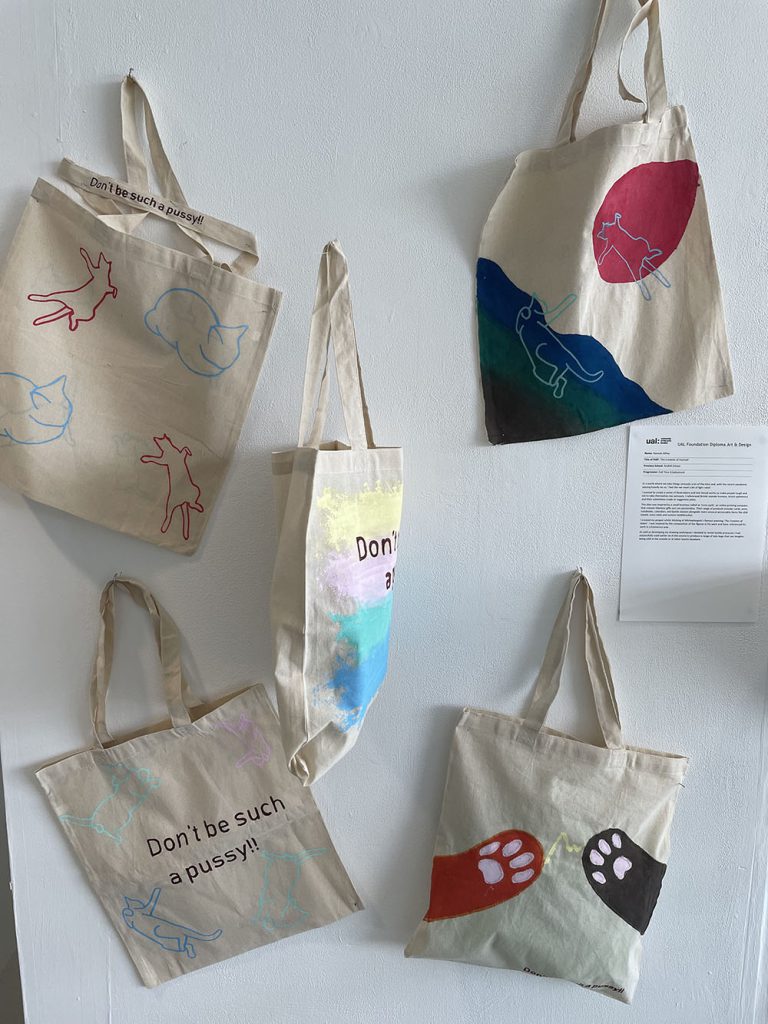
In a world where we take things seriously a lot of the time and, with the recent pandemic weighing heavily on us, I feel like we need a bit of light relief.
I wanted to create a series of illustrations and text-based works to make people laugh and not to take themselves too seriously. I referenced British seaside humour, kitsch ephemera and its sometimes crude or suggestive jokes.
This idea was inspired by a small business called as ‘Love Layla’, an online printing company that creates hilarious gifts you can personalise. Their range of products include; cards, pens, notebooks, calendars, and bottle stickers alongside more unusual personable items like dish towels, oven mitts and custom toothbrushes.
I created my project whilst thinking of Michaelangelo’s famous painting ‘The Creation of Adam’. I was inspired by the composition of the figures in his work and have referenced his work in a humorous way.
As well as developing my drawing techniques I decided to revisit textile processes I had successfully used earlier on in the course to produce a range of tote bags that can imagine being sold at the seaside or at other tourist locations.
Ffion Bessey
Name: Ffion Bessey
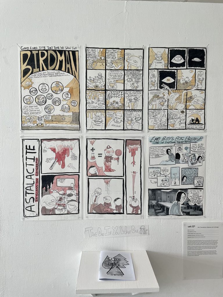
Title of FMP: Slice Of Life
Previous School: Dudley College (Evolve)
Progression University: Staffordshire University
Progression Course: BA (Hons) Comic & Cartoon Arts
Slice Of Life is a comic project that spawned from many conversations with my peers, about some wacky times they’ve had in their lives. I was inspired primarily by the works of Evan Dorkin and Vera Brosgol. Their work is incredibly personal, in some cases autobiographical, and shares a bizarre sense of realism. While I would have liked to extend the project into a few more stories, I felt it would be better to keep it to the three you’re seeing right now.
Originally, I’d wanted to illustrate all three comics using ink & brush, but as soon as I began this, I figured that it wouldn’t be feasible for all my noodle-armed weirdo characters and their beady little eyes. There was a bit of a rush at the end of the project about colour, specifically choosing between keeping them.
Over the course of the FAD, I’ve learned mostly about the joys of sharing my work with others, or, to appease the examining bodies, to manage my time to the maximum result. Going into my next course, I’d like to continue to develop the distribution and sharing aspects of my work, because I feel like there’s not much point in writing comics if nobody’s ever going to end up reading them.
Caitlyn Bowker
Name: Caitlyn Bowker
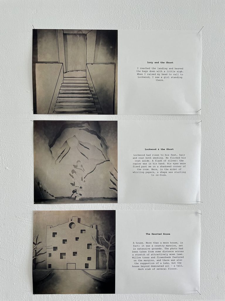
Title of FMP: 3D Ghost Illustrations
Previous School: Dudley College of Technology
Progression University: N/A
Progression Course: N/A
Inspired by the book series Lockwood & Co, this piece of work is my interpretation of the scenes. The series by Lockwood & Co is written by Jonathan Stroud and is based on the following premise; ‘There is an epidemic of ghosts in Britain. Their touch brings death, and only children have the power to fight them’. As an illustrator I have centred the three pieces around book 1, titled; the Screaming Staircase. My unique response reimagines specific scenes from my personal interpretation, based on the descriptions provided within the text. It was my intention to reveal the visual potential of the narrative, as there are no illustrations within the books themselves.
During the construction of these three-dimensional illustrations, I encountered problems with the initial paper that I used as this was too fragile and did not allow the type of folds I wanted. I then considered the issues and moved onto card, which was ironically to thick to cut through. On reflection and after contemplating ideas with both staff and peers, I decided to move onto foam board, which held its shape perfectly. The next challenge was to create a separate a frame to piece it all together. After consulting the technician, we decided to use thin wood, which housed the images effectively.
Additional inspiration for the three-dimensional aspect of the work came from a YOUTUBER called Jazza. He demonstrated different methods for constructing 3D artwork, from resin to acrylic sheets and paper. The website titled ‘4 corners books’ promoted a series of artists books where artists created a new edition of a classic novel. These contemporary examples have conceptually informed the final ideas.
Ultimately my series of images are successful as they reflect a personal and unique perspective on familiar narratives, bringing text to life.
Liam Brookes
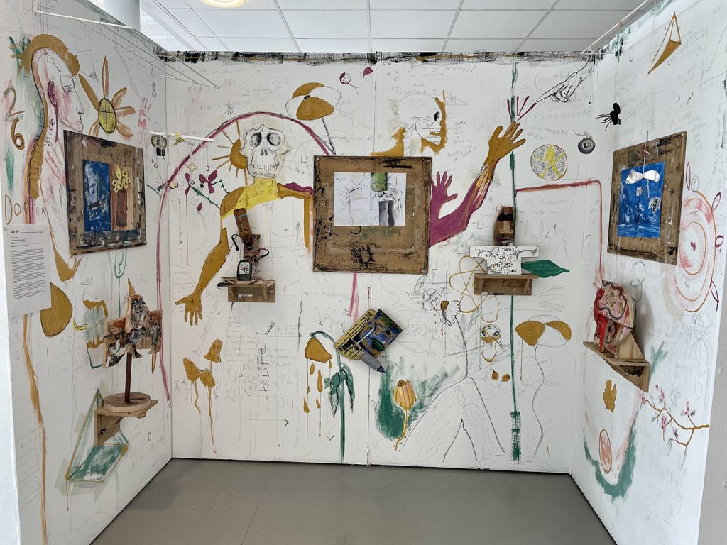
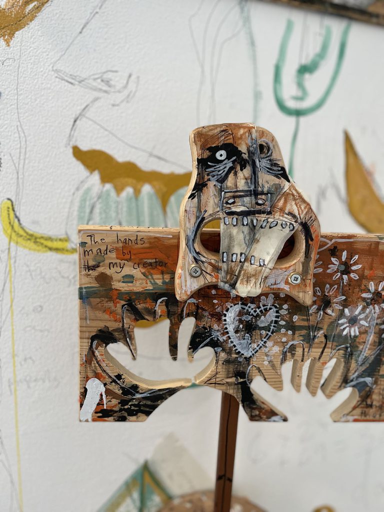
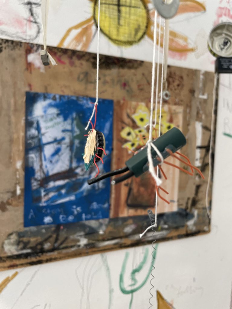
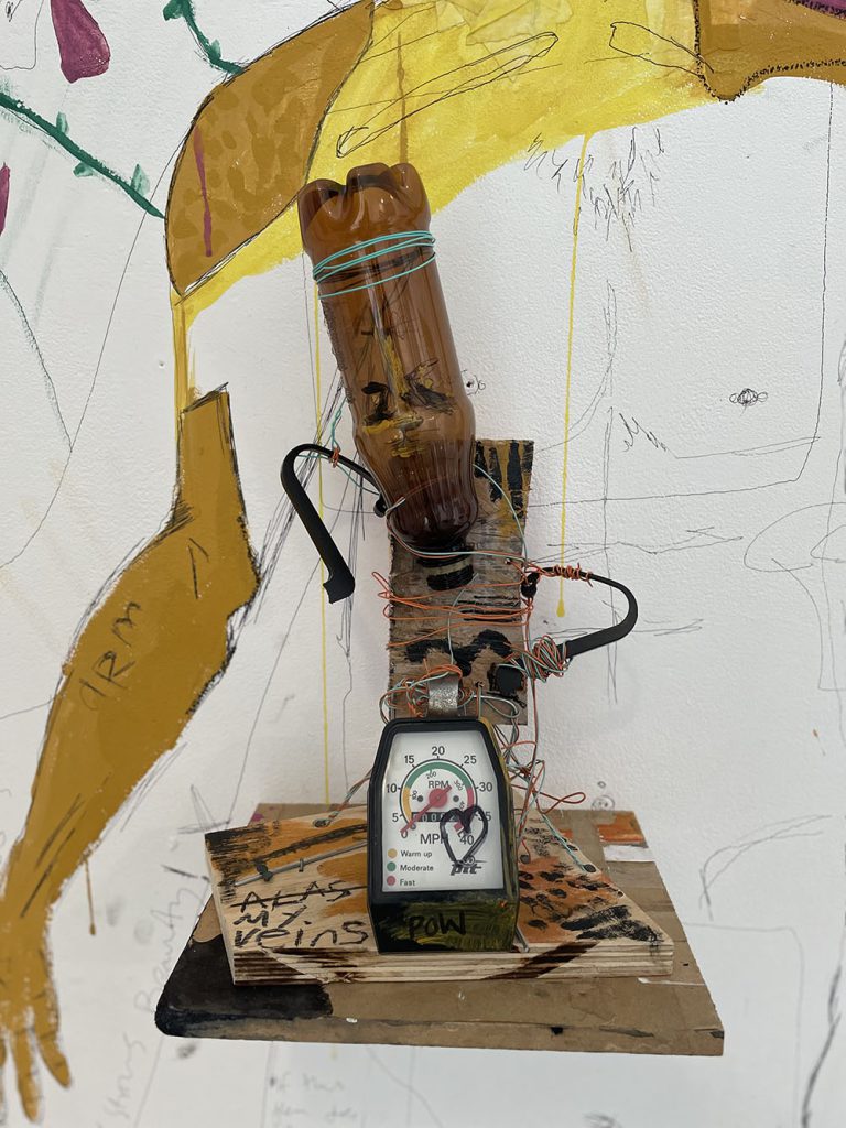
Name: Liam Brookes
Title of FMP: Frankenstein Reimagined
Previous School: Hagley Catholic High
Progression University: Full time employment
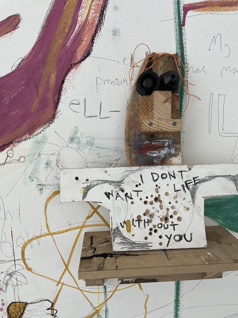
My work took as its starting point the connection between a book and its cover. I felt a lot of contemporary covers of new and traditional stories have little or no creativity or haven’t taken an imaginative approach to entice the reader to buy the book. I challenged myself to produce illustrations for a classic novel, Mary Shelly’s ‘Frankenstein’.
I chose to develop my ideas within drawing and 3D processes, such as model making and junk sculpture. I worked with materials intuitively and combined recycled materials with my own drawings and paintings. The rawness of the mark making and my lack of experience in 3D added to the mismatched feel of the work which I liked.
The most significant artist to my project was David Hughes for the way he combined illustration and used a mishmash of 3D processes and techniques. His work resonated well with my idea to create a 3D collage of a monster from disparate parts. The resulting installation has developed to show individual models together as a whole work. For me this metaphorically represented the idea that Frankenstein’s monster was not one set character but could instead be interpreted differently by readers.
Discussion with tutors had made me realise that illustration didn’t have to be limited to two dimensions and that I could combine sculpture with illustration techniques. I did not tightly plan how the work would look but let it develop as I investigated three-dimensional outcomes. I altered and refined the installation to help communicate and present the work more fully.
The major challenge I faced was avoiding stereotypes and trying to find a new language to work with. Originally, I went with the archetypal ‘green monster’ look, which was exactly what I set out not to do. I leant to trust my instincts and make work that surprised me. I feel I achieved everything I wanted from my concept and am pleased that it evolved in a direction I didn’t predict. I think this shows the flexible and adaptable approach I have to developing my ideas.
The key thing that I have learnt from the course is to be open minded and try new things but, to also play to your strengths. I have learnt to build on what has worked well so I can refine these methods and make more engaging outcomes.
Lewis Edwards
Name: Lewis Edwards
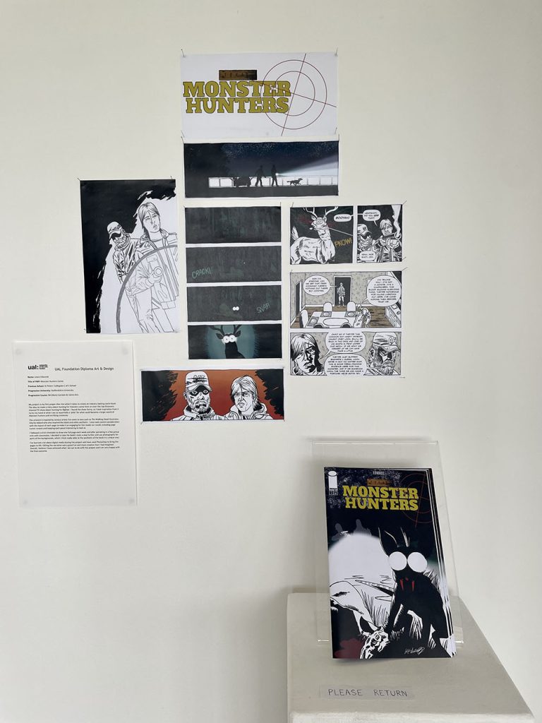
Title of FMP: Monster Hunters Comic
Previous School: St Peters’ Collegiate C of E School
Progression University: Staffordshire University
Progression Course: BA (Hons)Cartoon & Comic Arts
My project is my first proper dive into what it takes to create an industry looking comic book. The idea to make a story about hunting for monsters came from an over-the-top Discovery channel TV show about hunting for Bigfoot. I found the show funny, so I took inspiration from it to try my hand at what I see as essentially a ‘pilot’ for what could become a larger world of Monster hunters and terrifying creatures.
The artwork is inspired by various artists I’ve come to love such as The Walking Dead illustrator, Charlie Adlard who also inspired the black and white aesthetic. I also took careful consideration with the layout of each page to make it as engaging for the reader as I could, including page turner reveals and keeping each panel interesting to look at.
I followed a strict timetable to draw one full page each week and after partaking in a few group crits with classmates, I decided to take the book’s style a step further and use photography for parts of the backgrounds, which I think really adds to the aesthetic of the book in a unique way.
I’ve learned a lot about digital media during this project and have used Photoshop to bring the pages to life. Editing the narrative was a great fun and more creative than I had imagined. Overall, I believe I have achieved what I set out to do with this project and I am very happy with the final outcome.
Dylan Elms
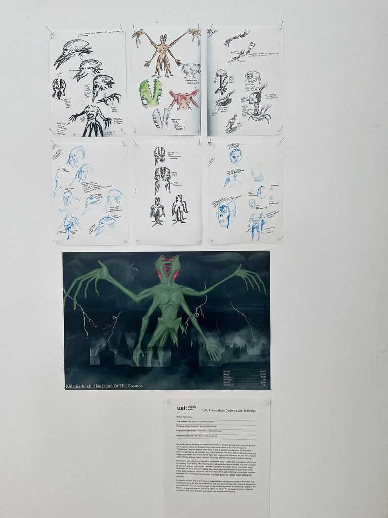
Name: Dylan Elms
Title of FMP: The Art of Character Creation
Previous School: Pedmore Technology College
Progression University: University of Gloucestershire
Progression Course: BA (Hons)Video Game Art
My work is about showing my capability and skills in designing a character from the ground up, as being a character designer for games is what I want to do. The video game “Bloodborne” was my biggest inspiration, as that is a game based around ‘Lovecraftian horror’, a genre that explores the fear of the unknown. The artist Adam Adamowicz was my biggest inspiration due to our similar styles and tastes within character art. For this project I explored ink painting, colour theory/ Psychology, charcoal drawing and digital drawing.
Discussions with peers have helped to solidify the ideas I had for the characters and the idea for creating a stat menu. I feel like my plan had worked quite well overall, as I had managed to stick to it and get most things I wanted to get done by certain times. One of the major challenges for me in this was shading all parts of my character as this proved to be really tricky, but I overcame this as the character was submerged within the background. Another challenge was connecting my character to a video game, but I solved this by adding the statistics.
During this project I have developed my capabilities in designing an original character, and some methods to do this more effectively such as experimenting with various drawing styles and techniques. I have also developed my digital drawing, which is something I believe will help me on my next course. The most significant thing FAD has taught me is not to doubt myself as I now have the skills which I can now develop at University.
Holly Fellows
Name: Holly Fellows
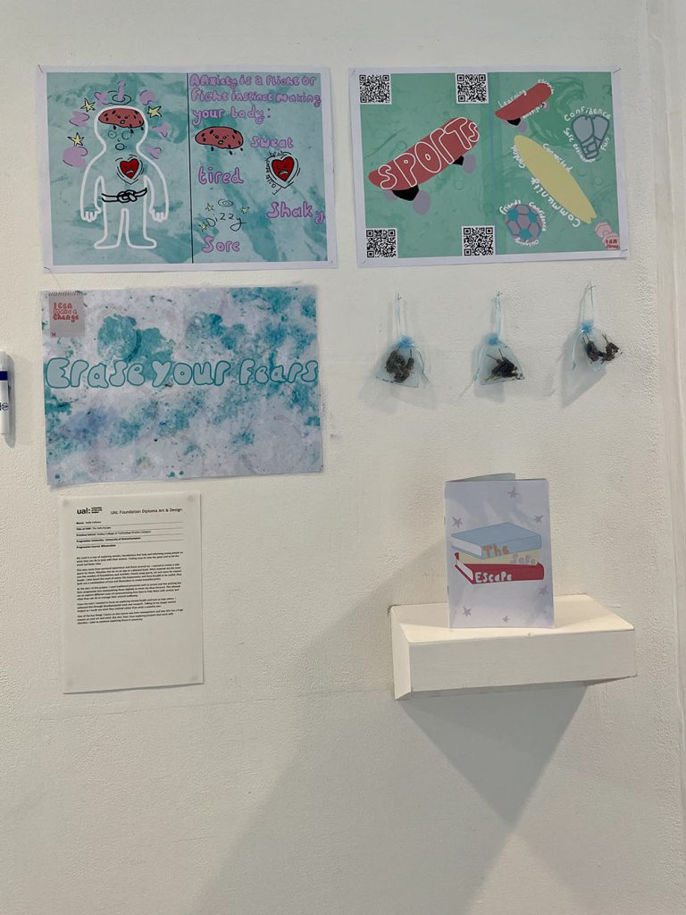
Title of FMP: The Safe Escape
Previous School: Dudley College of Technology (Evolve Campus)
Progression University: University of Wolverhampton
Progression Course: BA Illustration
My work is a way of exploring anxiety, foundations that help and informing young people on what they can do to help with their anxiety. Finding ways to stop the panic and to let the mind and body relax.
This idea came from personal experience and those around me, I wanted to create a safe space for them. Whether this be on an app or a physical book. What inspired me the most was the number of foundations and charities I found using sports, art and more for mental health. I also found the work of artists Ella Kasperowicz and Rosa Kusabb to be useful, they both use a combination of text and illustration to create beautiful prints.
At the start of this project, I used traditional processes such as screen and lino printing but then progressed into manipulating these digitally to move my ideas forward. This allowed me to explore different ways of communicating how best to help those with anxiety and what they can do to manage their mental wellbeing.
From the start I wanted to focus on exploring mental health and how to help others. I achieved this through developmental work and research. Talking to my target market helped as I could see what they wanted rather than what a website says.
One of the key things I learnt on this course was time management and how this has a huge impact on your art and mind. But also, how I love exploring projects that work with charities. I plan to continue exploring these in university.
Charlotte Graver
Name: Charlotte Graver
Title of FMP: Children’s Book Illustration
Previous School: King Edward VI College
Progression University: Falmouth University
Progression Course: Illustration BA(Hons)
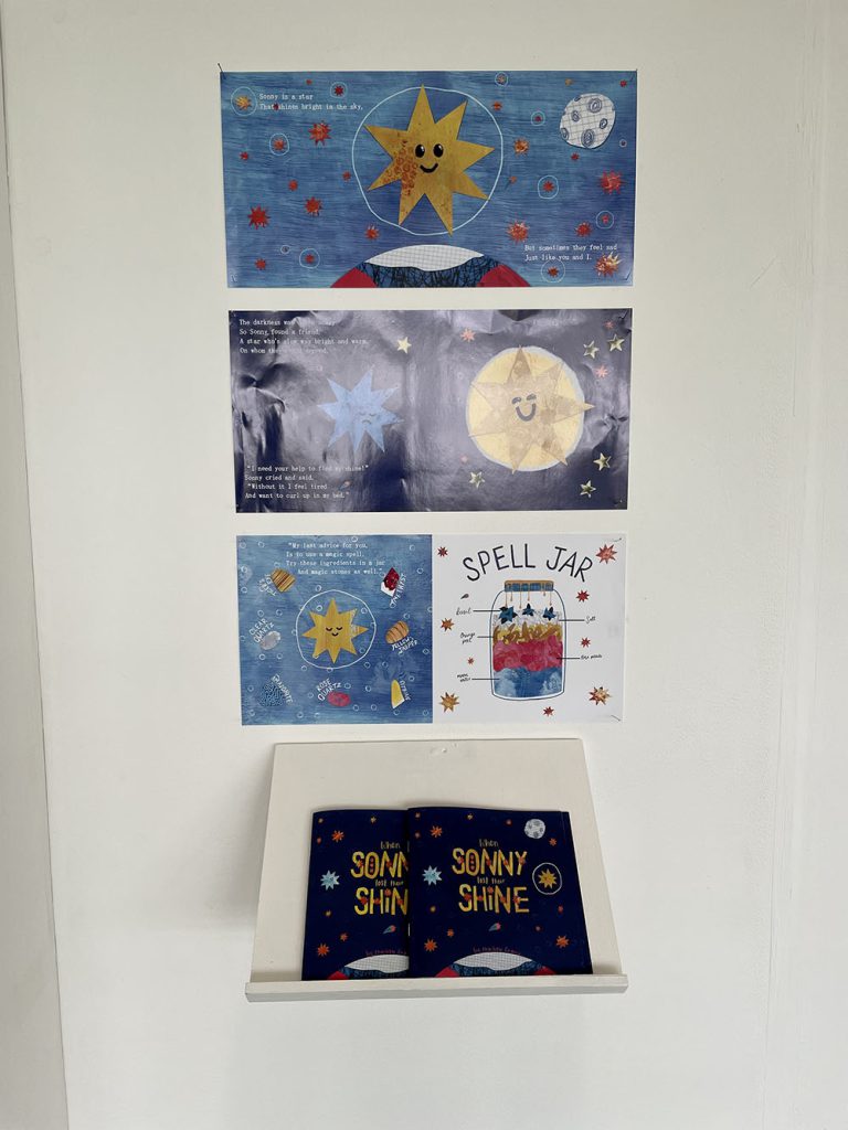
My FMP is children’s picture book which aims to help children better understand mental health issues and cope with complex emotions. The book is designed to be an introduction to self-care for children, and a reminder for adults, which I think is necessary in a stressful post-pandemic world.
I have included self-care and wellness practices, like breathing exercises, forest bathing, and positive affirmations, which are all recommended by the NHS. I also included more unique ideas like using crystals and spell jars for a fun activity and a sense of magic. My writing mirrors the NHS advice about how to talk to children about their feelings.
Oliver Jeffers influenced me significantly with his distinctive character designs, emotive colour palettes, and mindset that when illustrating a children’s book, you should look at the world from a child’s perspective. I considered how scary big feelings must be for children who do not know why they feel that way or how to feel better.
I have mostly used digital collage for this project but have explored mark-making, screen-printing and gelli printing for the textures and patterns because I think handmade textures add a more heartfelt and charming feel. I have experimented with fun but easily readable type as well as handwriting inspired by primary school worksheets. As the project progressed, the book became more interactive with breathing exercises and a shooting star to find on each page. This helps capture a child’s attention and makes reading the book a self-care activity in itself.
During this course I have learned to value experimentation and not be afraid to try new techniques and processes. I will continue experimenting to find my own way of working on my undergraduate course where I will have access to more exciting facilities and expertise.
Jessica Heath
Name: Jessica Heath
Title of FMP: Promotion of The Melting Pot
Previous School: King Edward VI College
Progression University: N/A
Progression: Part time employment
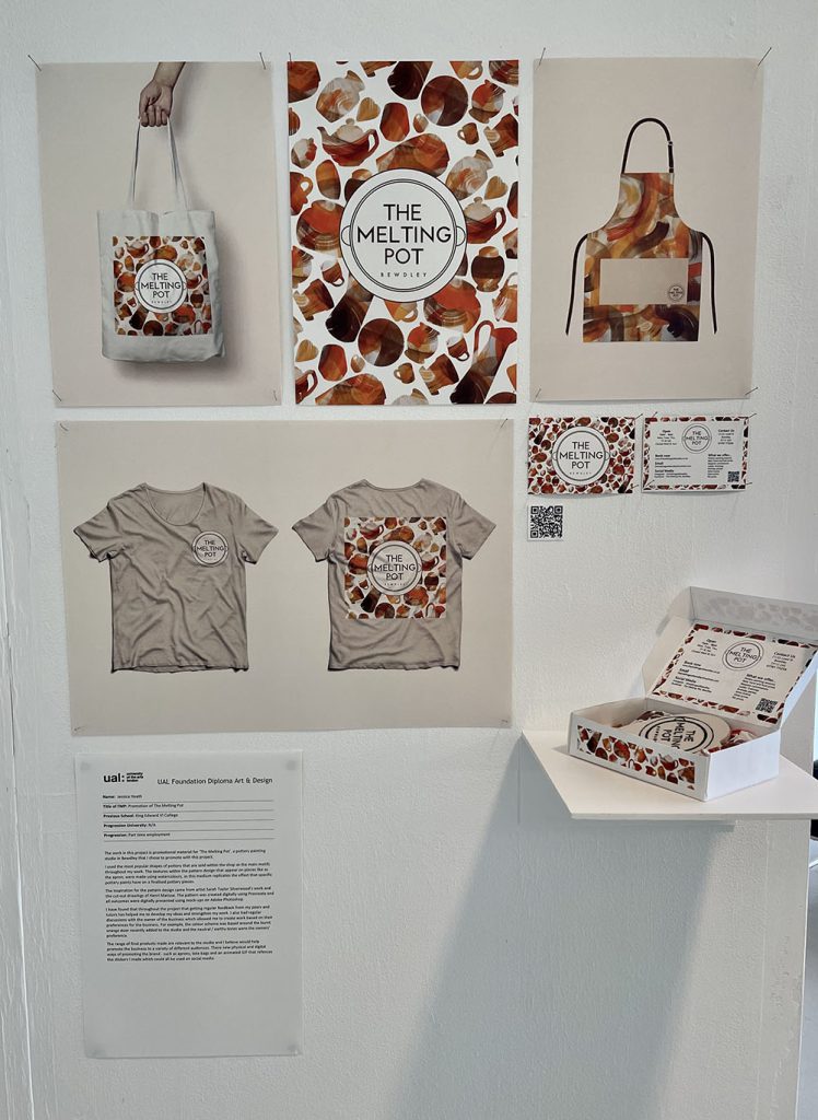
The work in this project is promotional material for ‘The Melting Pot’, a pottery painting studio in Bewdley that I chose to promote with this project.
I used the most popular shapes of pottery that are sold within the shop as the main motifs throughout my work. The textures within the pattern design that appear on pieces like as the apron, were made using watercolours, as this medium replicates the effect that specific pottery paints have on a finalised pottery pieces.
The inspiration for the pattern design came from artist Sarah Taylor Silverwood’s work and the cut-out drawings of Henri Matisse. The pattern was created digitally using Procreate and all outcomes were digitally presented using mock-ups on Adobe Photoshop.
I have found that throughout the project that getting regular feedback from my peers and tutors has helped me to develop my ideas and strengthen my work. I also had regular discussions with the owner of the business which allowed me to create work based on their preferences for the business. For example, the colour scheme was based around the burnt orange door recently added to the studio and the neutral / earthy tones were the owners’ preference.
The range of final products made are relevant to the studio and I believe would help promote the business to a variety of different audiences. Their new physical and digital ways of promoting the brand – such as aprons, tote bags and an animated GIF that references the stickers I made which could all be used on social media.
Alfie Hicks
Name: Alfie Hicks
Title of FMP: Social-environmental Narrative
Previous School: King Edward VI College Stourbridge
Progression University: Birmingham City University
Progression Course: BA(hons) Illustration
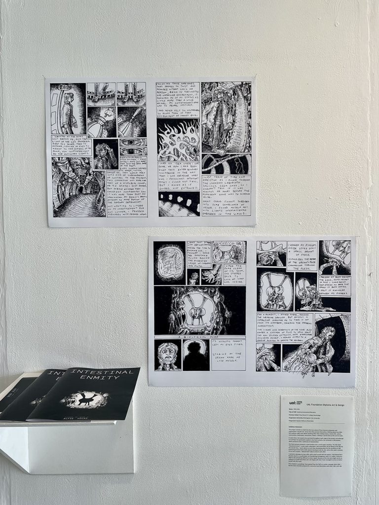
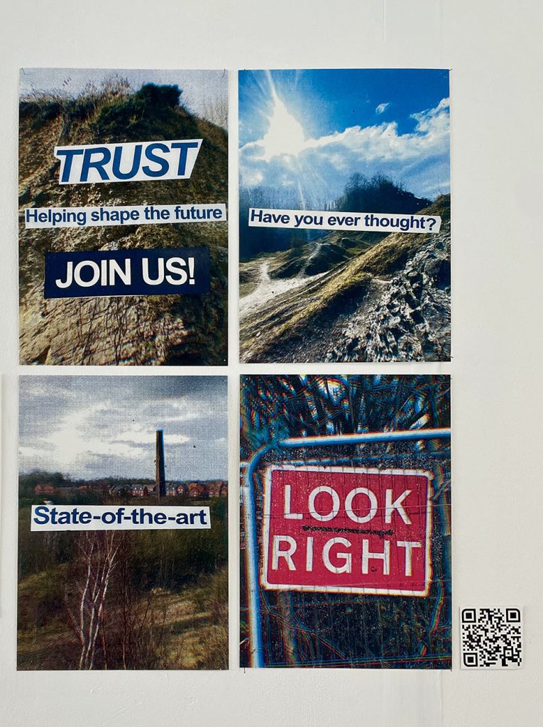
The project started as a look into the true nature of how massive companies and organisations actually act, versus how they present themselves, thinking about how little the machine really cares about anything other than making money. Human life, culture, communities, landscapes, ecosystems, history: nothing is sacred when profit can be made.
In some form, this enquiry has persisted throughout each stage of the project and although it is perhaps not particularly explicit in the final outcome, the sentiment is still present, albeit entwined with a subtheme of existentialism.
The final outcome presents a small window into a much larger narrative. The title itself, “Intestinal Enmity”, is only really a descriptor, and would likely not be fitting as the title for the overall story. I spent about as much time developing ideas for the narrative as I did producing practical work; both aspects developed side-by-side, and as this work is entirely of my own creation, I allowed both sides to inform each other.
I wanted to develop my own skills, and to push myself with this project. I had feared that I became stuck in a comfortable rut of producing homogenous work, so I made a conscious effort to do something different in every regard. Because of this the work might not be as refined as it could have been, but I am happy with how I have managed to strive to better myself with this work.
This mindset is something I have gained from the FMP as a whole, amongst other skills. I feel far more mentally prepared for university-level illustration work than I did a year ago.
Olivia Meese
Name: Olivia Meese
Title of FMP: Separated in Rot
Previous School: King Edward VI College
Progression University: Cardiff Metropolitan University
Progression Course: BA (Hons) Illustration
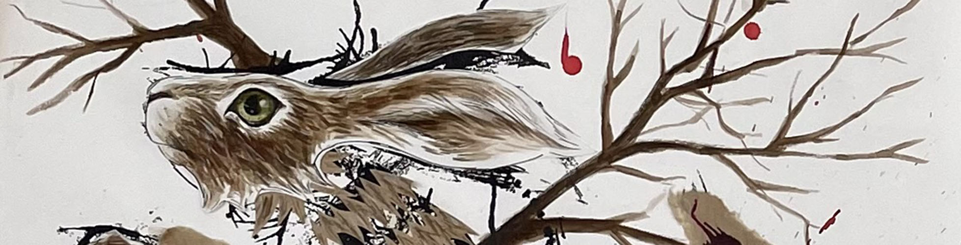
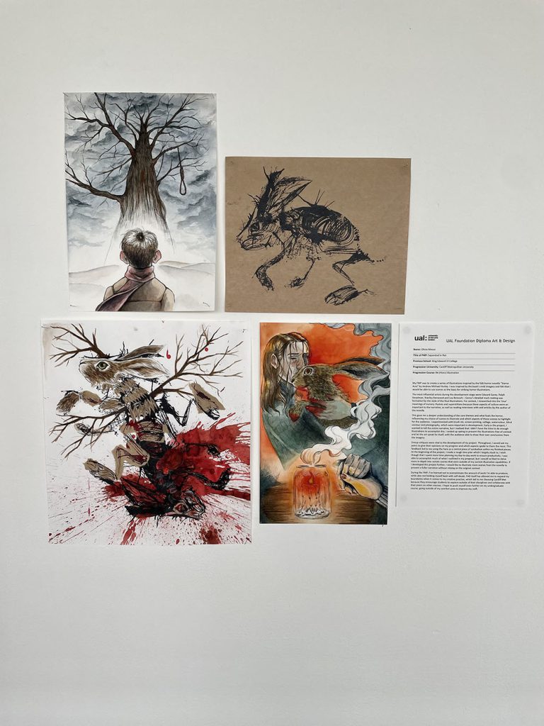
My FMP was to create a series of illustrations inspired by the folk horror novella “Starve Acre” by Andrew Michael Hurley. I was inspired by the book’s vivid imagery and felt that I would be able to use scenes as the basis for striking horror illustrations.
The most influential artists during the development stage were Edward Gorey, Ralph Steadman, Stanley Donwood and Lou Benesch – Gorey’s detailed mark making was formative for the style of the final illustrations. For context, I researched into the ‘true’ meanings of nursery rhymes and superstitions because these aspects of culture were an important to the narrative, as well as reading interviews with and articles by the author of the novella.
This gave me a deeper understanding of the core themes and what fuels the horror, influencing my choice of scenes to illustrate and which aspects of those scenes to highlight for the audience. I experimented with brush ink, screen-printing, collage, watercolour, blind contour and photography, which were important in development. Early in the project, I wanted to tell the entire narrative, but I realised that I didn’t have the time to do enough illustrations to accomplish this. I ended up opting to present the illustrations free of context and let the art speak for itself, with the audience able to draw their own conclusions from the imagery.
Group critiques were vital to the development of my project. Throughout, I would ask my peers to give their opinions on my progress and which aspects spoke to them the most. This feedback led to me using the hare as a central piece of symbolism within my finished pieces. At the beginning of the project, I made a rough time plan which I largely stuck to; I wish though that I spent more time planning my day-to-day work to ensure productivity. I was able to accomplish much of what I outlined in my proposal, but I would’ve liked to delve more in-depth into certain scenes that were outside of my current illustrative capabilities. If I developed this project further, I would like to illustrate more scenes from the novella to present a fuller narrative without relying on the original context.
During the FMP, I’ve learned not to overestimate the amount of work I’m able to produce, while also not holding myself back with self-doubt. FAD itself has allowed me to expand my boundaries when it comes to my creative practice, which led to me choosing Cardiff Met because they encourage students to explore outside of their disciplines and collaborate with their peers on other courses. I hope to push myself even further on my undergraduate course, going outside of my comfort zone to improve my craft.
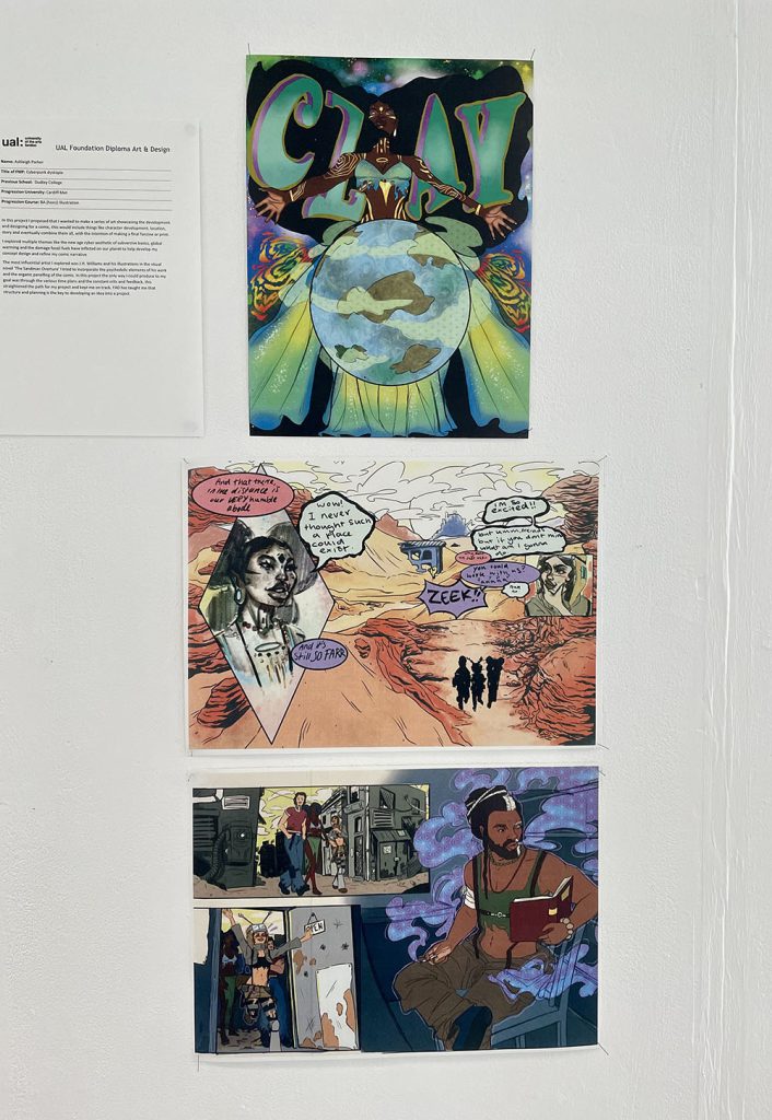
Ashleigh Parker
Name: Ashleigh Parker
Title of FMP: Cyberpunk dystopia
Previous School: Dudley College
Progression University: Cardiff Met
Progression Course: BA (hons) Illustration
In this project I proposed that I wanted to make a series of art showcasing the development and designing for a comic, this would include things like character development, location, story and eventually combine them all, with the intention of making a final fanzine or print.
I explored multiple themes like the new age cyber aesthetic of subversive basics, global warming and the damage fossil fuels have inflicted on our planet to help develop my concept design and refine my comic narrative
The most influential artist I explored was J.H. Williams and his illustrations in the visual novel ‘The Sandman Overture’ I tried to incorporate the psychedelic elements of his work and the organic panelling of the comic. In this project the only way I could produce to my goal was through the various time plans and the constant crits and feedback, this straightened the path for my project and kept me on track. FAD has taught me that structure and planning is the key to developing an idea into a project.
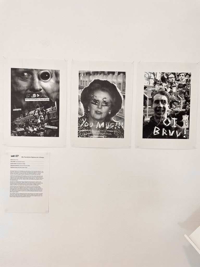
Nathan Priest
Name: Nathan Priest
Title of FMP: The Great British Identity
Previous School: King Edward VI College
Progression University: University of the Arts London
Progression Course: BA (Hons) Graphic Design
This project began as an investigation into what makes up ‘The Great British Identity’. From Bake off to crisps flavours, the ‘Great British’ branding has been applied to numerous things without much debate. In a Jubilee year where the widespread adoption of a national identify is present throughout society it interested me to consider what it all means.
I looked at the stereotypes of British people as seen from other countries (bad teeth, posh, drunks, etc) and the stereotypes created within UK society, such as the south being full of middle-class posh people, people from Birmingham being stupid, etc… However, with all the political scandal in the news now I shifted my focus onto looking at how people in the UK view political leaders.
This led me to making satirical images of things like the government’s response to the Ukrainian war, the ‘Party-gate’ scandal and the current cost of living crisis. A process I have enjoyed throughout the Foundation course is mixing analogue and digital methods of making, in particular zine design, which I decided to pursue for my FMP project.
I felt that the best way of designing the zine would be to use photomontage/collage because it allowed me to exaggerate features and stereotypes by creating scenes that I would not be able to make with any other process. To create the zine, I was inspired by the 70’s and 80’s Punk scene and used scanned in collages alongside printed and hand cut out type. This handmade aesthetic inspired me to use hand binding and embroidery thread to join the pages together.
The Foundation course has allowed me to fully understand how to mix analogue and digital media which I will be able to develop further at university. Without the course I would not have otherwise taken this direction, as before I had only focused on digital processes, and I feel this change of approach has benefitted my work well.
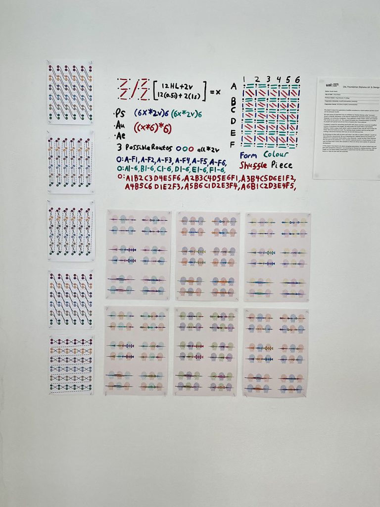
Joseph Saxon
Name: Joseph Saxon
Title of FMP: Visual Noise
Previous School: King Edwards VI College
Progression University: Cardiff Metropolitan University
Progression Course: BA (hons)Graphic Communication
My project is about the exploration of audible sensations in a visual medium and how sound can be portrayed visually.
My main source of inspiration was an exhibition by Christian Marclay called ‘Surround Sound’ at MACBA, Barcelona. In this show he explored the connection between sound and language in an immersive installation. I have explored a range of other artists and analysed how sound can be used in art. This research has given me a strong foundation to develop my project and opened several new lines of enquiry that I have explored.
I invented a system for connecting sound pitch with colours and then converted simplified versions of waveforms into images. By using royalty free sound effects and Audacity software I made 6 unique tracks which I used in a variety of ways. My aim was to make the viewer feel unnerved by my work. The soothing visuals combine with the jarring audio creating a disconnect between what you can see and what you hear.
By discussing my ideas with my peers and tutors I was able to explore methods I would not have otherwise encountered. My use of planning was a definite boost to my project as it allowed me to experiment freely within a clear timescale. I would say that I have achieved the core goal of my proposal as I have certainly explored sound in a visual manner. It’s the type of project that is never fully complete as there are always more options for potential development.
In this project I have learnt a lot about managing expectations. My analysis helped stop and gain some perspective whenever I was becoming too focused on making outcomes. FAD has taught me a lot about feeling comfortable to experiment and this will be a very valuable lesson as I take my next step into university.
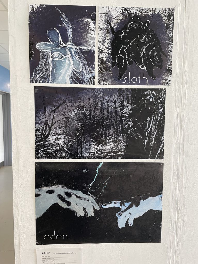
Subour Sayed
Name: Subour Sayed
Title of FMP: Eden game concept
Previous School: Dudley College
Progression University: Staffordshire University
Progression: BA (Hons) Concept Art or Full Time Employment
My work portrays a series of surreal illustrative pieces that present an adventure role player game idea that I have come up with. The game is unusual in that it attempts to discuss religious concepts like the afterlife, the 7 deadly sins and explores aspects of mental health and well-being.
Games such as ‘Limbo’, ‘Diablo 3’ and ‘Journey’ have influenced the art direction of my ideas. I have also taken inspiration from music videos of hardcore band ‘Knocked Loose’ and artists Zdzisław Beksiński and John Walker. I have researched Christian beliefs from medieval times and have taken inspiration from religious art such as ‘Adam and Eve’ by Lucas Cranach the Elder, as well as gathering quotes from the Bible. By analysing and critiquing the research/ work I’ve looked at, I have been able to pinpoint different aspects of medieval beliefs to help me develop concepts designs for the characters and the game’s narrative.
This project’s main art style includes an important amount of mono printing, collages and illustration techniques that I have rendered and refined on photoshop. This results in a body of work that merges a lot of techniques and processes together, which I think adds to the overall surreal aesthetic.
have been ahead of my planner in some respects and behind in some others. Some of the biggest challenges were coming up with original ideas and finding the right colour palette for my final outcomes. I figured going for a cold tone would add to the depressing atmosphere of the game, which I think turned out looking good.
Overall, I have learnt that by experimenting with different processes, even ones that are not my favourite can help with developing ideas and aesthetics. I have taken a lot of advice from my tutors and it has paid off with me delivering a unique portfolio of work.

Aimee Simpson
Name: Aimee Simpson
Title of FMP: Endangered Species
Previous School: Bishop Milner Catholic College
Progression University: University of Wolverhampton
Progression Course: BA (Hons) Graphic Design with 1 year Sandwich Placement
I made my piece in the hopes to raise awareness for endangered animals, specifically tigers, as they are now critically endangered in the wild.I wanted to make a series of posters to show why they are endangered and how we can help them, utilising and developing my digital skills to create a look of the tigers roaming in the wild being affected by forest fires.
Forest fires are a huge problem, and as a result, the tigers are dying out. I wanted to make my posters to show people what is happening to the tigers, and what we can do to help them, such as raising money, adopting and helping to preserve their habitats.
I explored digital drawing to really bring out an image in people’s mind of what is happening to the tigers. I tested out different effects with editing to create posters that really show the message of my campaign, researching about tigers and brining in my newfound knowledge to create a thought-provoking piece.
I learnt more about how important tigers are to us, and I cannot imagine a world without them, and therefore I want my piece to have the same impact on others as the message did for me.
Kian Smith
Name: Kian Smith
Title of FMP: Perception
Previous School: Dudley College of Technology (Evolve Campus)
Progression University: BIMM Institute (Screen and Film School Birmingham)
Progression Course: BA (Hons) Filmmaking
The piece is about how our perception of existence changes based on what we surround ourselves with, particularly the media we consume. I wanted to develop my knowledge and skills where I left off with my previous film ‘Intermundium’, where I explored the concept of ‘Man vs Nature’. This time around I decided to build a narrative using editing as the main technique, using overlays and motion graphics to guide the tone of the film, along with sound design to build tension. A key inspiration for this was Alex Kister’s ‘The Mandela Catalogue’ particularly the way he edits and creates a horror aesthetic for his films.
I tried various methods of displaying the film, for exhibition, like on a computer screen or a projector, but to fit the theme of the film I opted to use a QR Code that people can scan to watch the video on their phones, distracted from their surroundings.
Peer discussion helped the film develop from the initial concept. In the beginning I realised people were keen on my ideas and had useful initial thoughts. Later, help continued, particularly in finalising the film, by discussing the end sequence and how it should look/sound.
The challenge I set myself was to make something that people can access without any prior knowledge but also embed deeper references that some may pick up on. This led me to stray away from my initial ideas with more philosophical and reflective shots of nature being broken up by chaos being added.
The experimental nature of this course allowed me to be playful with the piece, allowing me to generate ideas when needed. I wasn’t afraid to try out new things and have created different visuals and sound design than I originally had in mind for the film.
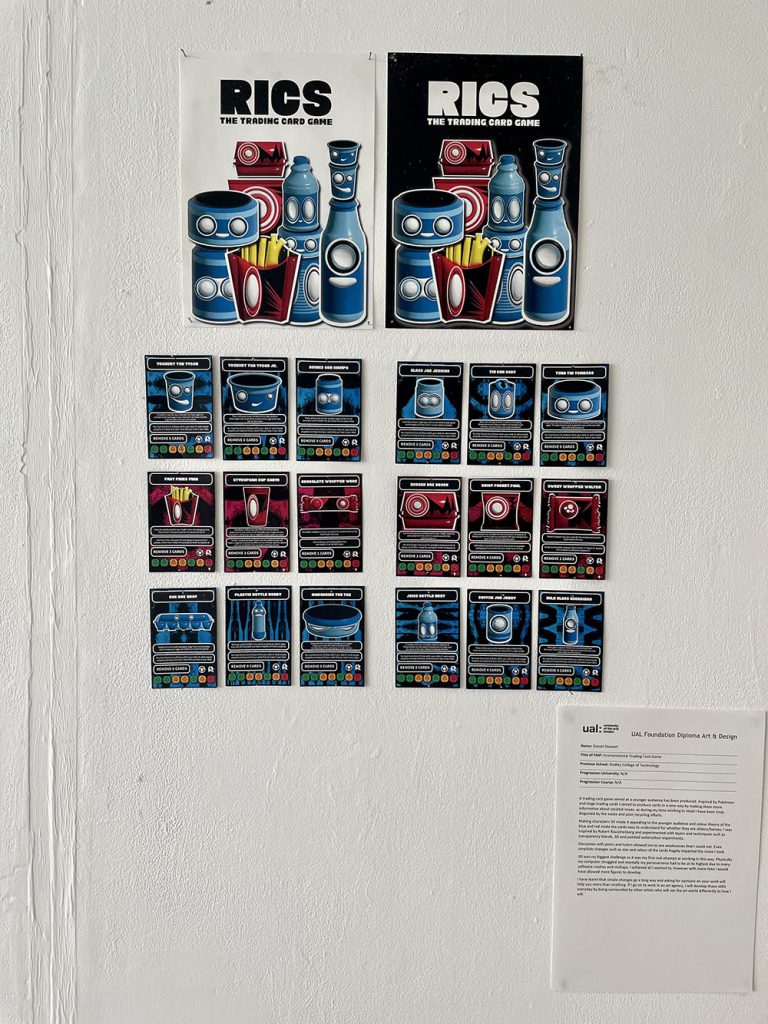
Daniel Stewart
Name: Daniel Stewart
Title of FMP: Environmental Trading Card Game
Previous School: Dudley College of Technology
Progression University: N/A
Progression Course: N/A
A trading card game aimed at a younger audience has been produced. Inspired by Pokémon and Gogo trading cards I aimed to produce cards in a new way by making them more informative about societal issues, as during my time working in retail I have been truly disgusted by the waste and poor recycling efforts.
Making characters 3D made it appealing to the younger audience and colour theory of the blue and red made the cards easy to understand for whether they are villains/heroes. I was Inspired by Robert Rauschenberg and experimented with layers and techniques such as transparency blends, 3D and painted watercolour experiments.
Discussion with peers and tutors allowed me to see weaknesses that I could not. Even simplistic changes such as size and colour of the cards hugely impacted the route I took.
3D was my biggest challenge as it was my first real attempt at working in this way. Physically my computer struggled and mentally my perseverance had to be at its highest due to many software crashes and mishaps. I achieved all I wanted to, however with more time I would have allowed more figures to develop.
I have learnt that simple changes go a long way and asking for opinions on your work will help you more than anything. If I go on to work in an art agency, I will develop these skills everyday by being surrounded by other artists who will see the art world differently to how I will.
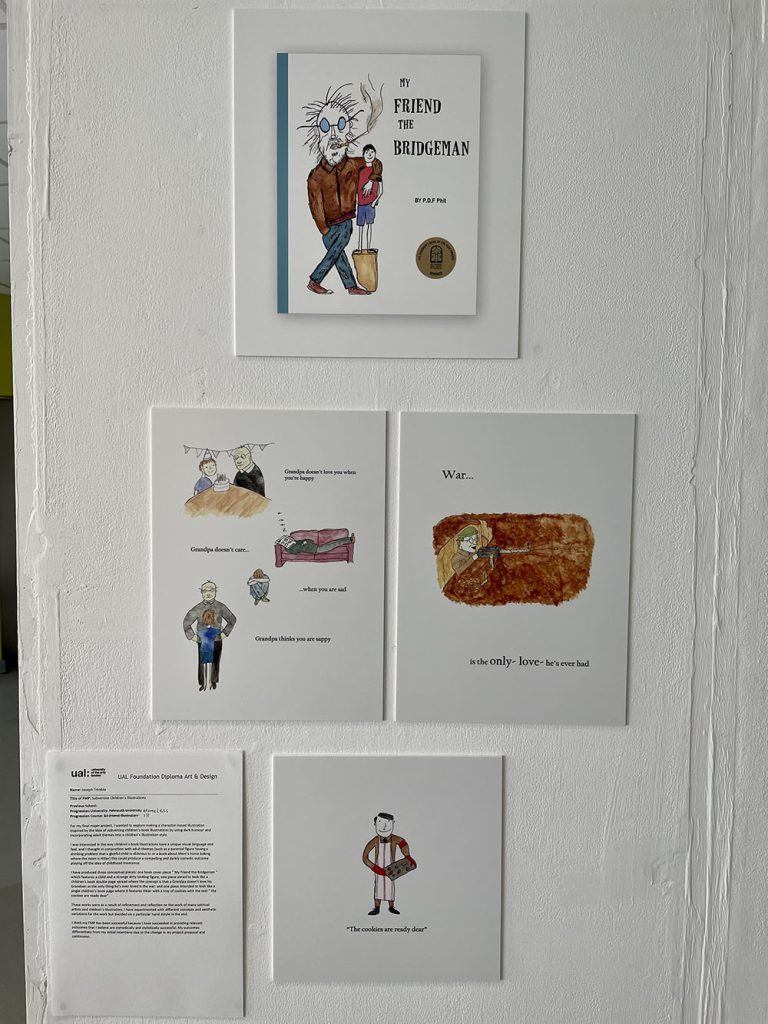
Joseph Trimble
Name: Joseph Trimble
Title of FMP: Subversive Children’s Illustrations
Previous School:
Progression University: Falmouth University
Progression Course: BA (Hons) Illustration
For my final major project, I wanted to explore making a character-based illustration inspired by the idea of subverting children’s book illustrations by using dark humour and incorporating adult themes into a children’s illustration style.
I was interested in the way children’s book illustrations have a unique visual language and feel; and I thought in conjunction with adult themes (such as a parental figure having a drinking problem that a gleeful child is oblivious to or a book about Mom’s home baking where the mom is Hitler) this could produce a compelling and darkly comedic outcome playing off the idea of childhood innocence.
I have produced three conceptual pieces: one book cover piece “ My Friend the Bridgeman “ which features a child and a strange dirty looking figure; one piece aimed to look like a children’s book double page spread where the concept is that a Grandpa doesn’t love his Grandson as the only thing he’s ever loved is the war; and one piece intended to look like a single children’s book page where it features Hitler with a tray of cookies with the text “ the cookies are ready dear”.
These works were as a result of refinement and reflection on the work of many satirical artists and children’s illustrators. I have experimented with different concepts and aesthetic variations for the work but decided on a particular hand dstyle in the end.
I think my FMP has been successful because I have succeeded in providing relevant outcomes that I believe are comedically and stylistically successful. My outcomes differentiate from my initial intentions due to the change in my project proposal and continuous.

Layton Woods
Nevaeha Yearwood
Name: Nevaeha Yearwood
Title of FMP: The symbiotic relationship with technology
Previous School: Matthew Boulton college
Progression University: Nottingham University
Progression Course: Illustration
My work is about the evolution we have had with technology. I was inspired by the work I had previously curated in my first unit on fashion promotion as the brief was to create a zine, this prior knowledge helped me understand what I wanted to portray. I also pulled inspiration from my own experiences with technology and what I had observed. The inspirations that impacted me the most were I-d and dazed magazine, BailBoyz zine, Harley weir and electronic superhighway. The methods I explored were collaging, animating, illustrating and using graphic design approaches.
Discussing with my tutors how I can layout out my work, so my pages can create a narrative within itself, and how I can construct my pages to create a cohesive zine because of this my outcome is cohesive and has an impact. My planning did impact my outcome as I did not adequately keep track of time or my timetable. I have managed to achieve what I had set myself such as the animation, QR code, exhibition space and zine. I could develop my project further by creating a more dynamic/elaborate exhibition space.
I have learnt how to create my own typefaces, the layout to print your own magazines, how to create narratives within my work, I need to be able to keep track of time. The thing FAD has taught me is how to push myself to excel further. An example of a critical review impacting me is when my tutor and I, discussed my work in general and how I needed to expand on these smaller ideas to create a finalised idea. I can develop this learning on my undergraduate course by using my timetable, expanding on my ideas, using my time outside of classes, and workshops to create work.