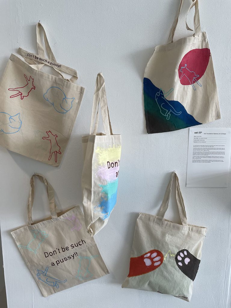
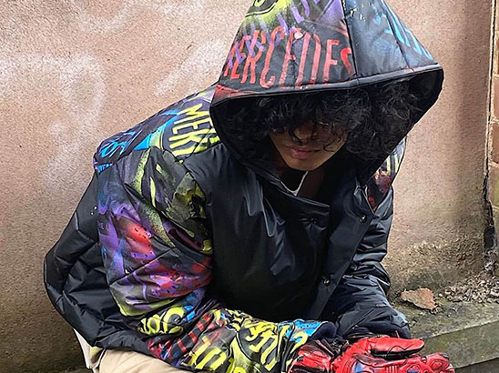
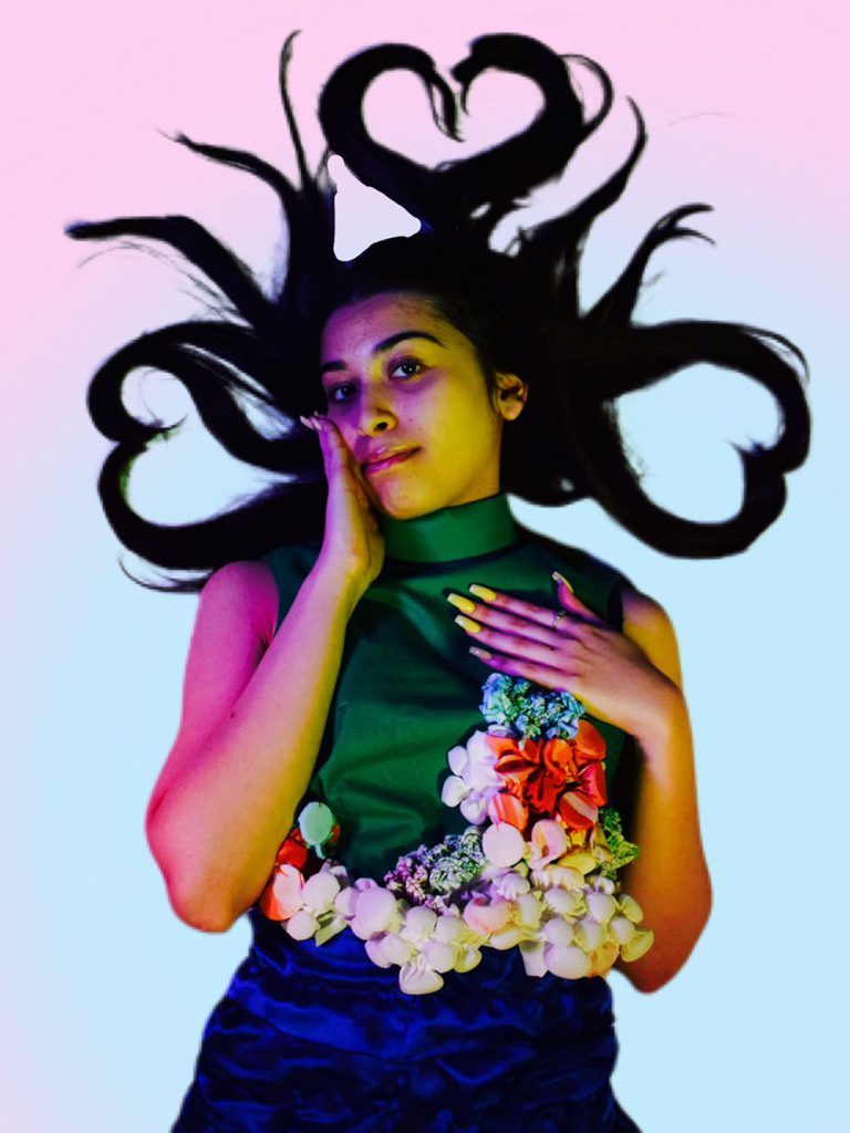
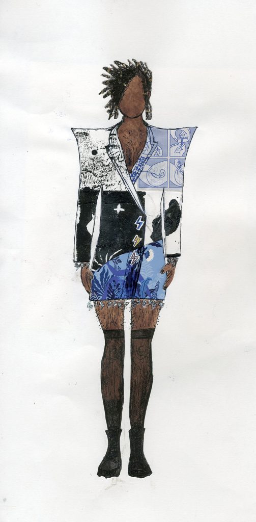
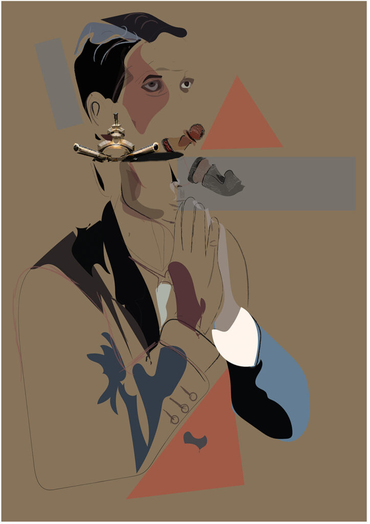
In a world where we take things seriously a lot of the time and, with the recent pandemic weighing heavily on us, I feel like we need a bit of light relief.
I wanted to create a series of illustrations and text-based works to make people laugh and not to take themselves too seriously. I referenced British seaside humour, kitsch ephemera and its sometimes crude or suggestive jokes.
This idea was inspired by a small business called as ‘Love Layla’, an online printing company that creates hilarious gifts you can personalise. Their range of products include; cards, pens, notebooks, calendars, and bottle stickers alongside more unusual personable items like dish towels, oven mitts and custom toothbrushes.
I created my project whilst thinking of Michaelangelo’s famous painting ‘The Creation of Adam’. I was inspired by the composition of the figures in his work and have referenced his work in a humorous way.
As well as developing my drawing techniques I decided to revisit textile processes I had successfully used earlier on in the course to produce a range of tote bags that can imagine being sold at the seaside or at other tourist locations.
Ffion Bessey
Name: Ffion Bessey
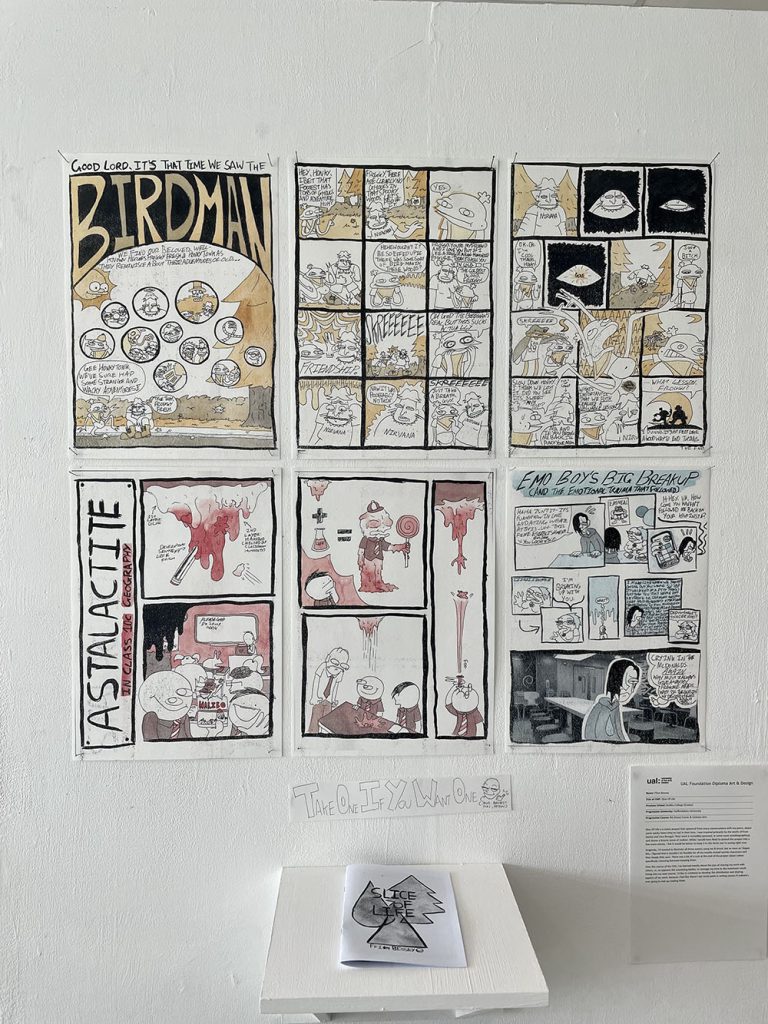
Title of FMP: Slice Of Life
Previous School: Dudley College (Evolve)
Progression University: Staffordshire University
Progression Course: BA (Hons) Comic & Cartoon Arts
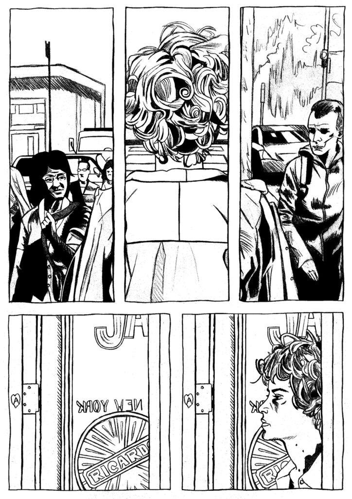
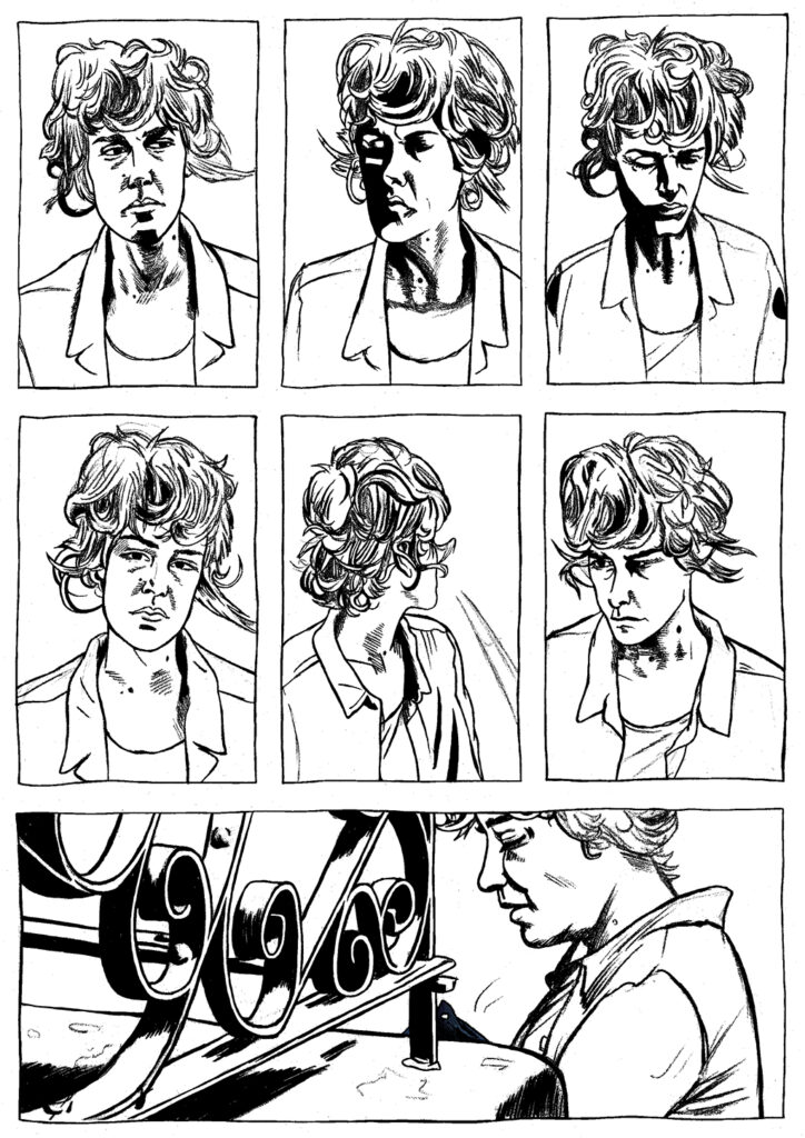
Slice Of Life is a comic project that spawned from many conversations with my peers, about some wacky times they’ve had in their lives. I was inspired primarily by the works of Evan Dorkin and Vera Brosgol. Their work is incredibly personal, in some cases autobiographical, and shares a bizarre sense of realism. While I would have liked to extend the project into a few more stories, I felt it would be better to keep it to the three you’re seeing right now.
Originally, I’d wanted to illustrate all three comics using ink & brush, but as soon as I began this, I figured that it wouldn’t be feasible for all my noodle-armed weirdo characters and their beady little eyes. There was a bit of a rush at the end of the project about colour, specifically choosing between keeping them.
Over the course of the FAD, I’ve learned mostly about the joys of sharing my work with others, or, to appease the examining bodies, to manage my time to the maximum result. Going into my next course, I’d like to continue to develop the distribution and sharing aspects of my work, because I feel like there’s not much point in writing comics if nobody’s ever going to end up reading them.
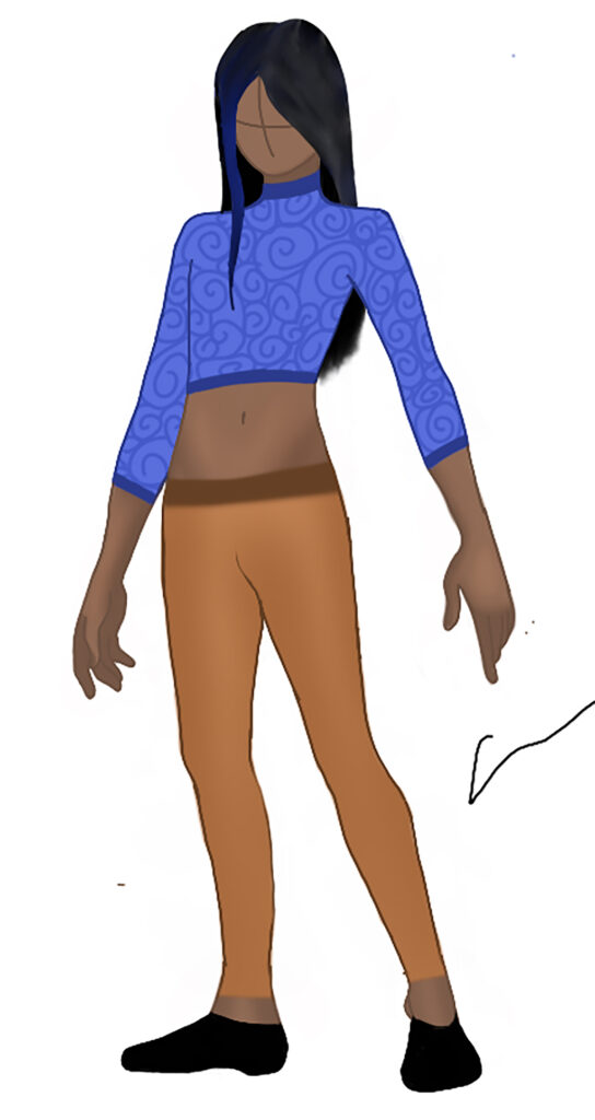
Caitlyn Bowker
Name: Caitlyn Bowker
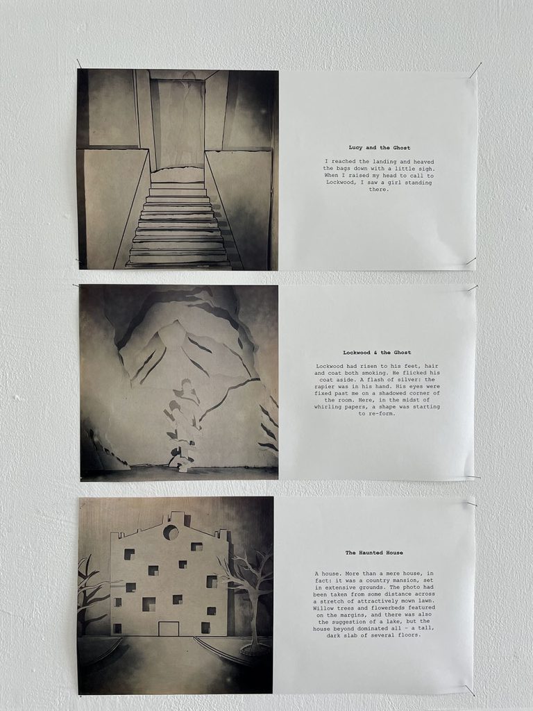
Title of FMP: 3D Ghost Illustrations
Previous School: Dudley College of Technology
Progression University: N/A
Progression Course: N/A
Inspired by the book series Lockwood & Co, this piece of work is my interpretation of the scenes. The series by Lockwood & Co is written by Jonathan Stroud and is based on the following premise; ‘There is an epidemic of ghosts in Britain. Their touch brings death, and only children have the power to fight them’. As an illustrator I have centred the three pieces around book 1, titled; the Screaming Staircase. My unique response reimagines specific scenes from my personal interpretation, based on the descriptions provided within the text. It was my intention to reveal the visual potential of the narrative, as there are no illustrations within the books themselves.
During the construction of these three-dimensional illustrations, I encountered problems with the initial paper that I used as this was too fragile and did not allow the type of folds I wanted. I then considered the issues and moved onto card, which was ironically to thick to cut through. On reflection and after contemplating ideas with both staff and peers, I decided to move onto foam board, which held its shape perfectly. The next challenge was to create a separate a frame to piece it all together. After consulting the technician, we decided to use thin wood, which housed the images effectively.
Additional inspiration for the three-dimensional aspect of the work came from a YOUTUBER called Jazza. He demonstrated different methods for constructing 3D artwork, from resin to acrylic sheets and paper. The website titled ‘4 corners books’ promoted a series of artists books where artists created a new edition of a classic novel. These contemporary examples have conceptually informed the final ideas.
Ultimately my series of images are successful as they reflect a personal and unique perspective on familiar narratives, bringing text to life.
Liam Brookes
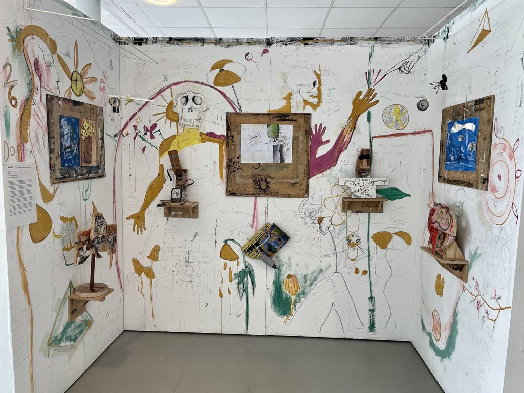
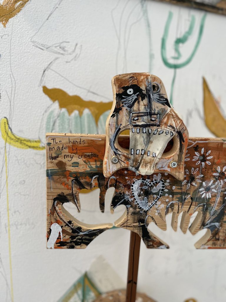
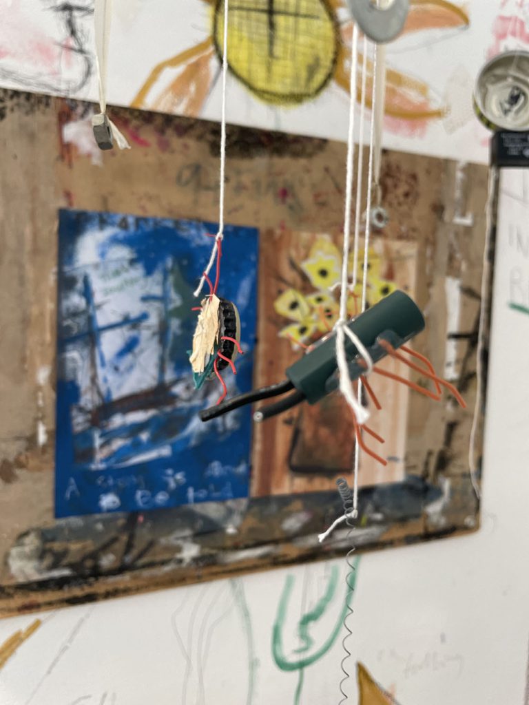
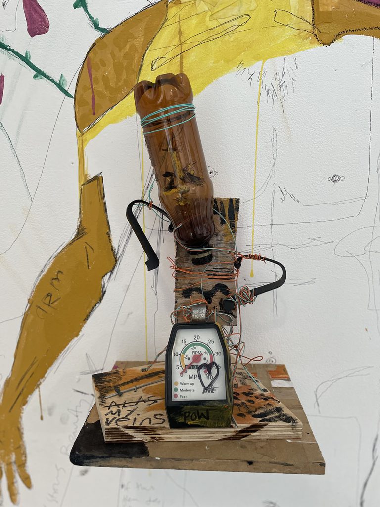
Name: Liam Brookes
Title of FMP: Frankenstein Reimagined
Previous School: Hagley Catholic High
Progression University: Full time employment
My work took as its starting point the connection between a book and its cover. I felt a lot of contemporary covers of new and traditional stories have little or no creativity or haven’t taken an imaginative approach to entice the reader to buy the book. I challenged myself to produce illustrations for a classic novel, Mary Shelly’s ‘Frankenstein’.
I chose to develop my ideas within drawing and 3D processes, such as model making and junk sculpture. I worked with materials intuitively and combined recycled materials with my own drawings and paintings. The rawness of the mark making and my lack of experience in 3D added to the mismatched feel of the work which I liked.
The most significant artist to my project was David Hughes for the way he combined illustration and used a mishmash of 3D processes and techniques. His work resonated well with my idea to create a 3D collage of a monster from disparate parts. The resulting installation has developed to show individual models together as a whole work. For me this metaphorically represented the idea that Frankenstein’s monster was not one set character but could instead be interpreted differently by readers.
Discussion with tutors had made me realise that illustration didn’t have to be limited to two dimensions and that I could combine sculpture with illustration techniques. I did not tightly plan how the work would look but let it develop as I investigated three-dimensional outcomes. I altered and refined the installation to help communicate and present the work more fully.
The major challenge I faced was avoiding stereotypes and trying to find a new language to work with. Originally, I went with the archetypal ‘green monster’ look, which was exactly what I set out not to do. I leant to trust my instincts and make work that surprised me. I feel I achieved everything I wanted from my concept and am pleased that it evolved in a direction I didn’t predict. I think this shows the flexible and adaptable approach I have to developing my ideas.
The key thing that I have learnt from the course is to be open minded and try new things but, to also play to your strengths. I have learnt to build on what has worked well so I can refine these methods and make more engaging outcomes.
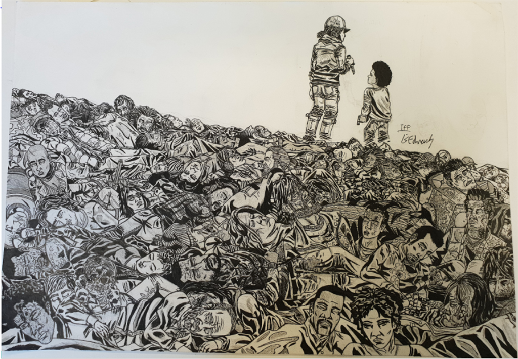
Lewis Edwards
Name: Lewis Edwards
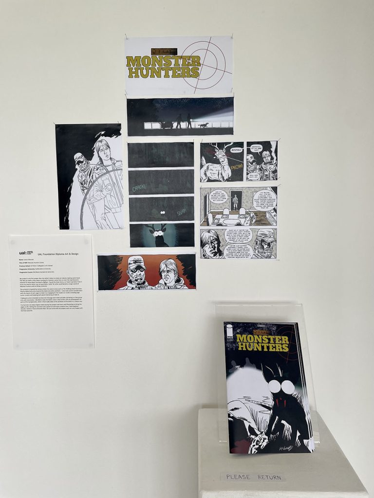
Title of FMP: Monster Hunters Comic
Previous School: St Peters’ Collegiate C of E School
Progression University: Staffordshire University
Progression Course: BA (Hons)Cartoon & Comic Arts
My project is my first proper dive into what it takes to create an industry looking comic book. The idea to make a story about hunting for monsters came from an over-the-top Discovery channel TV show about hunting for Bigfoot. I found the show funny, so I took inspiration from it to try my hand at what I see as essentially a ‘pilot’ for what could become a larger world of Monster hunters and terrifying creatures.
The artwork is inspired by various artists I’ve come to love such as The Walking Dead illustrator, Charlie Adlard who also inspired the black and white aesthetic. I also took careful consideration with the layout of each page to make it as engaging for the reader as I could, including page turner reveals and keeping each panel interesting to look at.
I followed a strict timetable to draw one full page each week and after partaking in a few group crits with classmates, I decided to take the book’s style a step further and use photography for parts of the backgrounds, which I think really adds to the aesthetic of the book in a unique way.
I’ve learned a lot about digital media during this project and have used Photoshop to bring the pages to life. Editing the narrative was a great fun and more creative than I had imagined. Overall, I believe I have achieved what I set out to do with this project and I am very happy with the final outcome.
Dylan Elms
Name: Dylan Elms
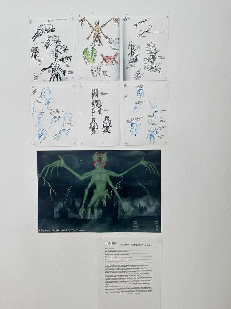
Title of FMP: The Art of Character Creation
Previous School: Pedmore Technology College
Progression University: University of Gloucestershire
Progression Course: BA (Hons)Video Game Art
My work is about showing my capability and skills in designing a character from the ground up, as being a character designer for games is what I want to do. The video game “Bloodborne” was my biggest inspiration, as that is a game based around ‘Lovecraftian horror’, a genre that explores the fear of the unknown. The artist Adam Adamowicz was my biggest inspiration due to our similar styles and tastes within character art. For this project I explored ink painting, colour theory/ Psychology, charcoal drawing and digital drawing.
Discussions with peers have helped to solidify the ideas I had for the characters and the idea for creating a stat menu. I feel like my plan had worked quite well overall, as I had managed to stick to it and get most things I wanted to get done by certain times. One of the major challenges for me in this was shading all parts of my character as this proved to be really tricky, but I overcame this as the character was submerged within the background. Another challenge was connecting my character to a video game, but I solved this by adding the statistics.
During this project I have developed my capabilities in designing an original character, and some methods to do this more effectively such as experimenting with various drawing styles and techniques. I have also developed my digital drawing, which is something I believe will help me on my next course. The most significant thing FAD has taught me is not to doubt myself as I now have the skills which I can now develop at University.
Holly Fellows
Name: Holly Fellows
Title of FMP: The Safe Escape
Previous School: Dudley College of Technology (Evolve Campus)
Progression University: University of Wolverhampton
Progression Course: BA Illustration
My work is a way of exploring anxiety, foundations that help and informing young people on what they can do to help with their anxiety. Finding ways to stop the panic and to let the mind and body relax.
This idea came from personal experience and those around me, I wanted to create a safe space for them. Whether this be on an app or a physical book. What inspired me the most was the number of foundations and charities I found using sports, art and more for mental health. I also found the work of artists Ella Kasperowicz and Rosa Kusabb to be useful, they both use a combination of text and illustration to create beautiful prints.
At the start of this project, I used traditional processes such as screen and lino printing but then progressed into manipulating these digitally to move my ideas forward. This allowed me to explore different ways of communicating how best to help those with anxiety and what they can do to manage their mental wellbeing.
From the start I wanted to focus on exploring mental health and how to help others. I achieved this through developmental work and research. Talking to my target market helped as I could see what they wanted rather than what a website says.
One of the key things I learnt on this course was time management and how this has a huge impact on your art and mind. But also, how I love exploring projects that work with charities. I plan to continue exploring these in university.
Charlotte Graver
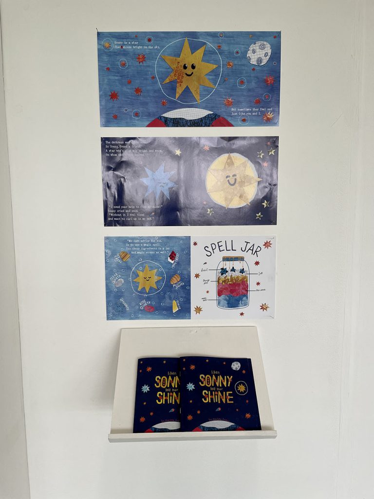
Name: Charlotte Graver
Title of FMP: Children’s Book Illustration
Previous School: King Edward VI College
Progression University: Falmouth University
Progression Course: Illustration BA(Hons)
My FMP is children’s picture book which aims to help children better understand mental health issues and cope with complex emotions. The book is designed to be an introduction to self-care for children, and a reminder for adults, which I think is necessary in a stressful post-pandemic world.
I have included self-care and wellness practices, like breathing exercises, forest bathing, and positive affirmations, which are all recommended by the NHS. I also included more unique ideas like using crystals and spell jars for a fun activity and a sense of magic. My writing mirrors the NHS advice about how to talk to children about their feelings.
Oliver Jeffers influenced me significantly with his distinctive character designs, emotive colour palettes, and mindset that when illustrating a children’s book, you should look at the world from a child’s perspective. I considered how scary big feelings must be for children who do not know why they feel that way or how to feel better.
I have mostly used digital collage for this project but have explored mark-making, screen-printing and gelli printing for the textures and patterns because I think handmade textures add a more heartfelt and charming feel. I have experimented with fun but easily readable type as well as handwriting inspired by primary school worksheets. As the project progressed, the book became more interactive with breathing exercises and a shooting star to find on each page. This helps capture a child’s attention and makes reading the book a self-care activity in itself.
During this course I have learned to value experimentation and not be afraid to try new techniques and processes. I will continue experimenting to find my own way of working on my undergraduate course where I will have access to more exciting facilities and expertise.
Jessica Heath
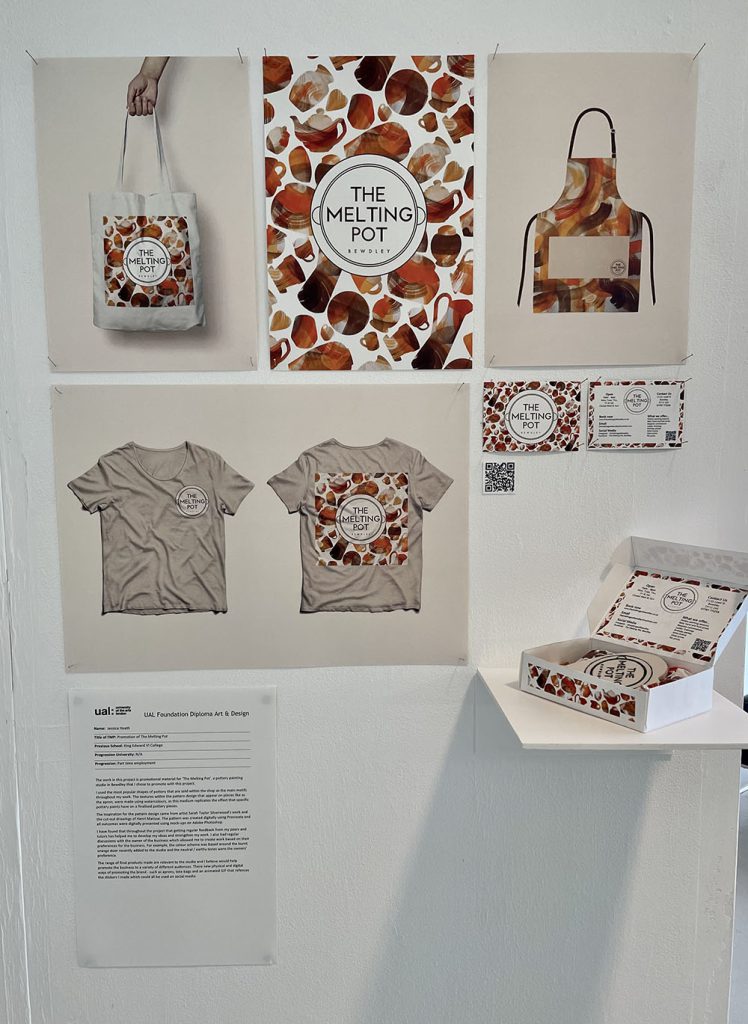
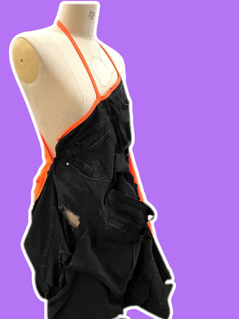
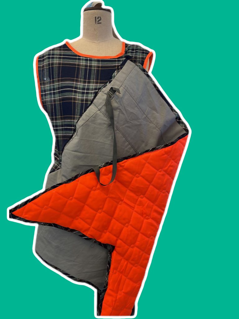
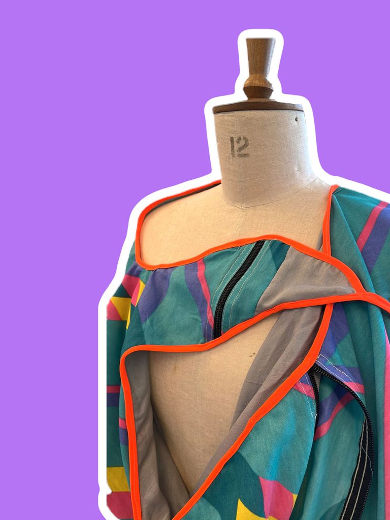
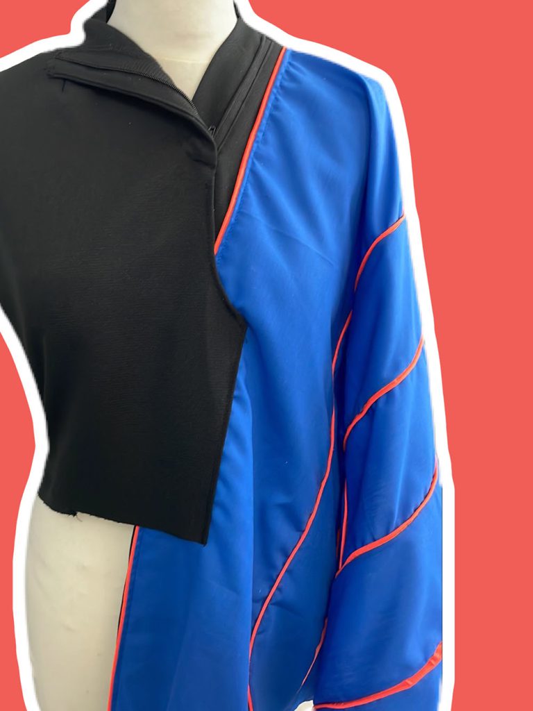
Name: Jessica Heath
Title of FMP: Promotion of The Melting Pot
Previous School: King Edward VI College
Progression University: N/A
Progression: Part time employment
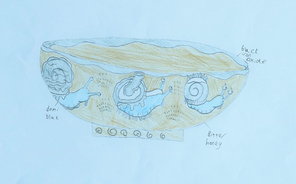
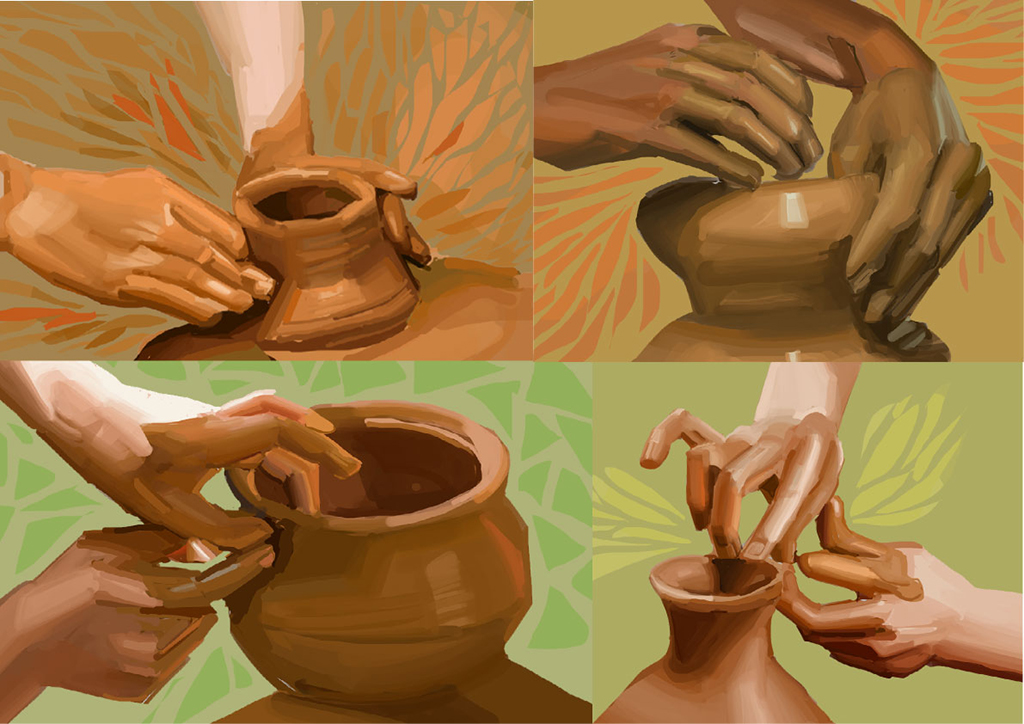
The work in this project is promotional material for ‘The Melting Pot’, a pottery painting studio in Bewdley that I chose to promote with this project.
I used the most popular shapes of pottery that are sold within the shop as the main motifs throughout my work. The textures within the pattern design that appear on pieces like as the apron, were made using watercolours, as this medium replicates the effect that specific pottery paints have on a finalised pottery pieces.
The inspiration for the pattern design came from artist Sarah Taylor Silverwood’s work and the cut-out drawings of Henri Matisse. The pattern was created digitally using Procreate and all outcomes were digitally presented using mock-ups on Adobe Photoshop.
I have found that throughout the project that getting regular feedback from my peers and tutors has helped me to develop my ideas and strengthen my work. I also had regular discussions with the owner of the business which allowed me to create work based on their preferences for the business. For example, the colour scheme was based around the burnt orange door recently added to the studio and the neutral / earthy tones were the owners’ preference.
The range of final products made are relevant to the studio and I believe would help promote the business to a variety of different audiences. Their new physical and digital ways of promoting the brand – such as aprons, tote bags and an animated GIF that references the stickers I made which could all be used on social media.
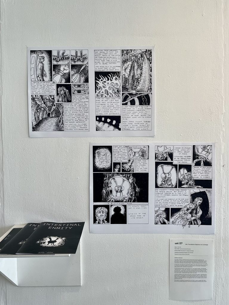
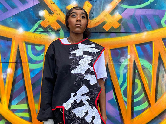
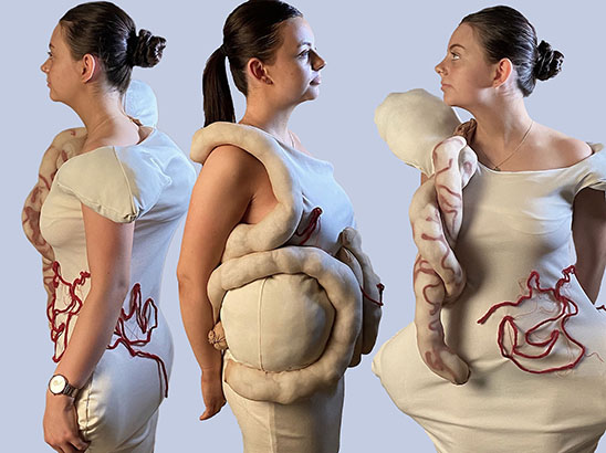
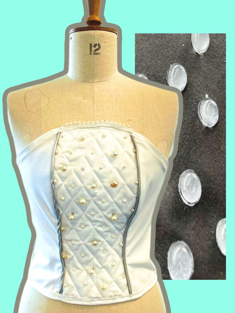
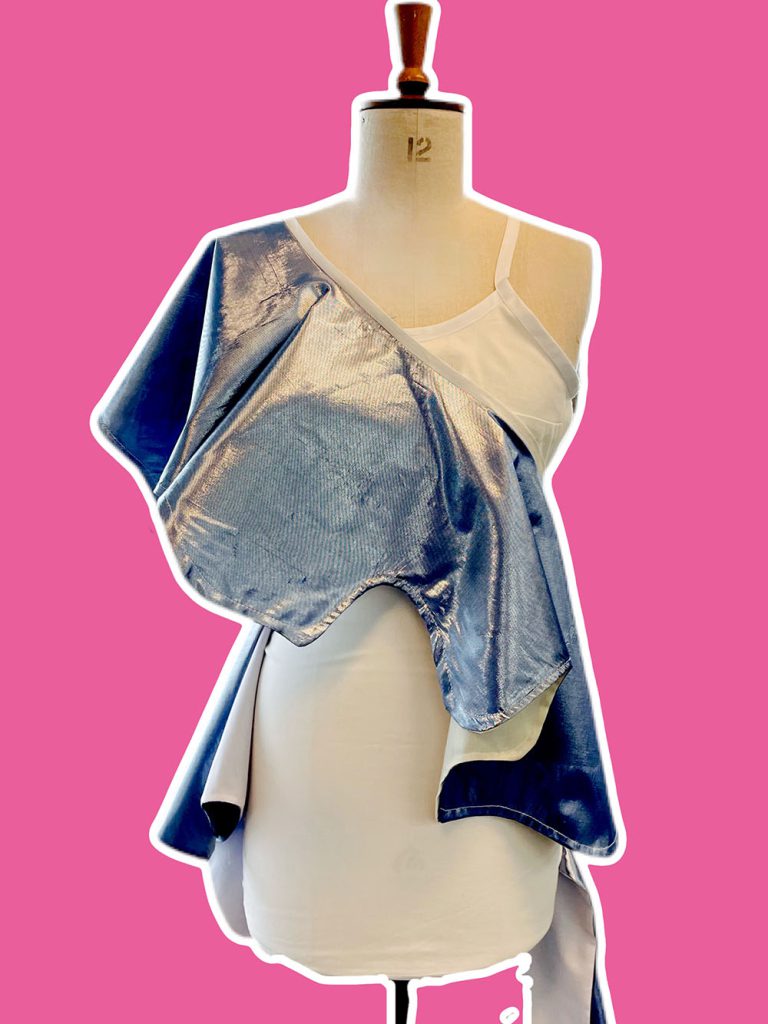
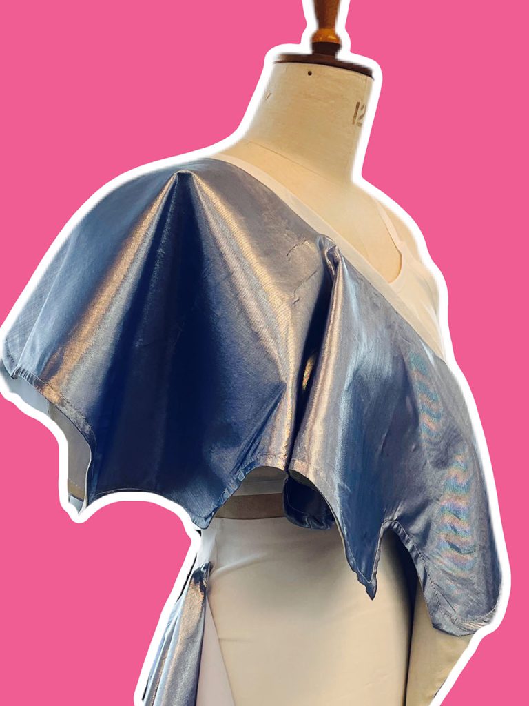
Alfie Hicks
Name: Alfie Hicks
Title of FMP: Social-environmental Narrative
Previous School: King Edward VI College Stourbridge
Progression University: Birmingham City University
Progression Course: BA(hons) Illustration
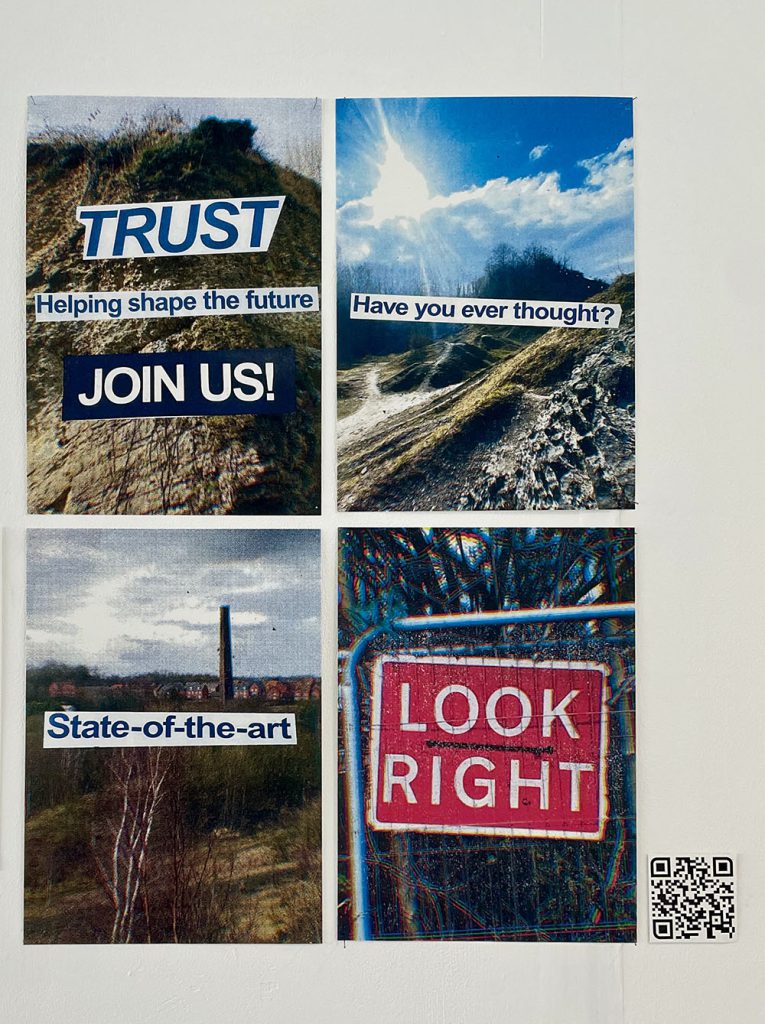
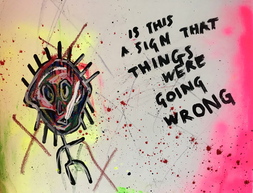
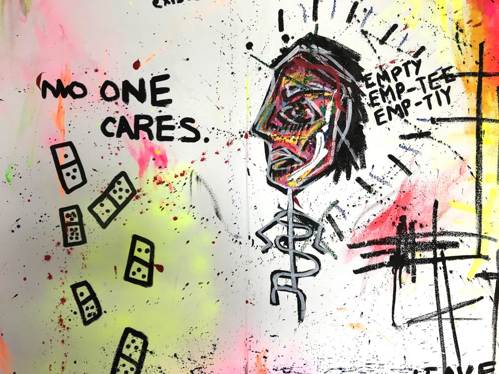
The project started as a look into the true nature of how massive companies and organisations actually act, versus how they present themselves, thinking about how little the machine really cares about anything other than making money. Human life, culture, communities, landscapes, ecosystems, history: nothing is sacred when profit can be made.
In some form, this enquiry has persisted throughout each stage of the project and although it is perhaps not particularly explicit in the final outcome, the sentiment is still present, albeit entwined with a subtheme of existentialism.
The final outcome presents a small window into a much larger narrative. The title itself, “Intestinal Enmity”, is only really a descriptor, and would likely not be fitting as the title for the overall story. I spent about as much time developing ideas for the narrative as I did producing practical work; both aspects developed side-by-side, and as this work is entirely of my own creation, I allowed both sides to inform each other.
I wanted to develop my own skills, and to push myself with this project. I had feared that I became stuck in a comfortable rut of producing homogenous work, so I made a conscious effort to do something different in every regard. Because of this the work might not be as refined as it could have been, but I am happy with how I have managed to strive to better myself with this work.
This mindset is something I have gained from the FMP as a whole, amongst other skills. I feel far more mentally prepared for university-level illustration work than I did a year ago.
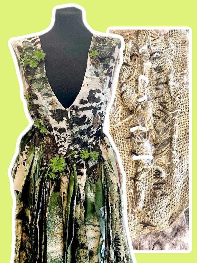
Olivia Meese
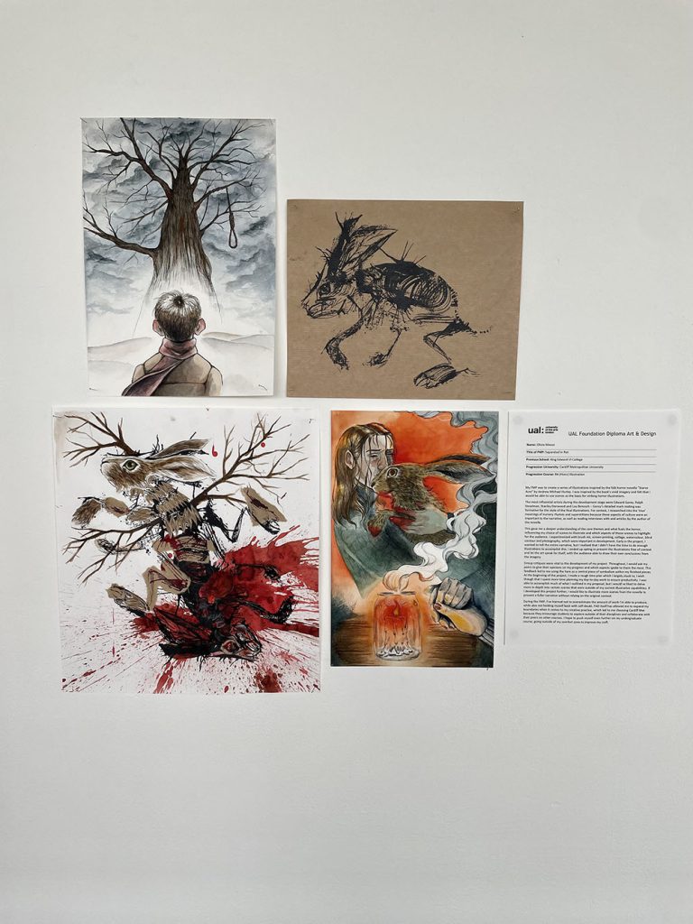
Name: Olivia Meese
Title of FMP: Separated in Rot
Previous School: King Edward VI College
Progression University: Cardiff Metropolitan University
Progression Course: BA (Hons) Illustration
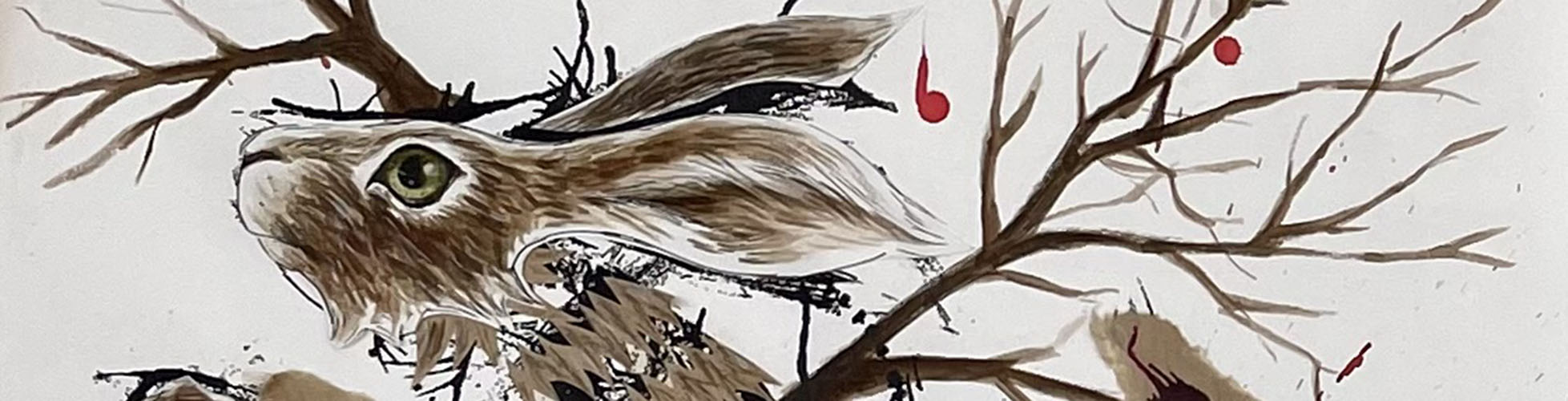
My FMP was to create a series of illustrations inspired by the folk horror novella “Starve Acre” by Andrew Michael Hurley. I was inspired by the book’s vivid imagery and felt that I would be able to use scenes as the basis for striking horror illustrations.
The most influential artists during the development stage were Edward Gorey, Ralph Steadman, Stanley Donwood and Lou Benesch – Gorey’s detailed mark making was formative for the style of the final illustrations. For context, I researched into the ‘true’ meanings of nursery rhymes and superstitions because these aspects of culture were an important to the narrative, as well as reading interviews with and articles by the author of the novella.
This gave me a deeper understanding of the core themes and what fuels the horror, influencing my choice of scenes to illustrate and which aspects of those scenes to highlight for the audience. I experimented with brush ink, screen-printing, collage, watercolour, blind contour and photography, which were important in development. Early in the project, I wanted to tell the entire narrative, but I realised that I didn’t have the time to do enough illustrations to accomplish this. I ended up opting to present the illustrations free of context and let the art speak for itself, with the audience able to draw their own conclusions from the imagery.
Group critiques were vital to the development of my project. Throughout, I would ask my peers to give their opinions on my progress and which aspects spoke to them the most. This feedback led to me using the hare as a central piece of symbolism within my finished pieces. At the beginning of the project, I made a rough time plan which I largely stuck to; I wish though that I spent more time planning my day-to-day work to ensure productivity. I was able to accomplish much of what I outlined in my proposal, but I would’ve liked to delve more in-depth into certain scenes that were outside of my current illustrative capabilities. If I developed this project further, I would like to illustrate more scenes from the novella to present a fuller narrative without relying on the original context.
During the FMP, I’ve learned not to overestimate the amount of work I’m able to produce, while also not holding myself back with self-doubt. FAD itself has allowed me to expand my boundaries when it comes to my creative practice, which led to me choosing Cardiff Met because they encourage students to explore outside of their disciplines and collaborate with their peers on other courses. I hope to push myself even further on my undergraduate course, going outside of my comfort zone to improve my craft.
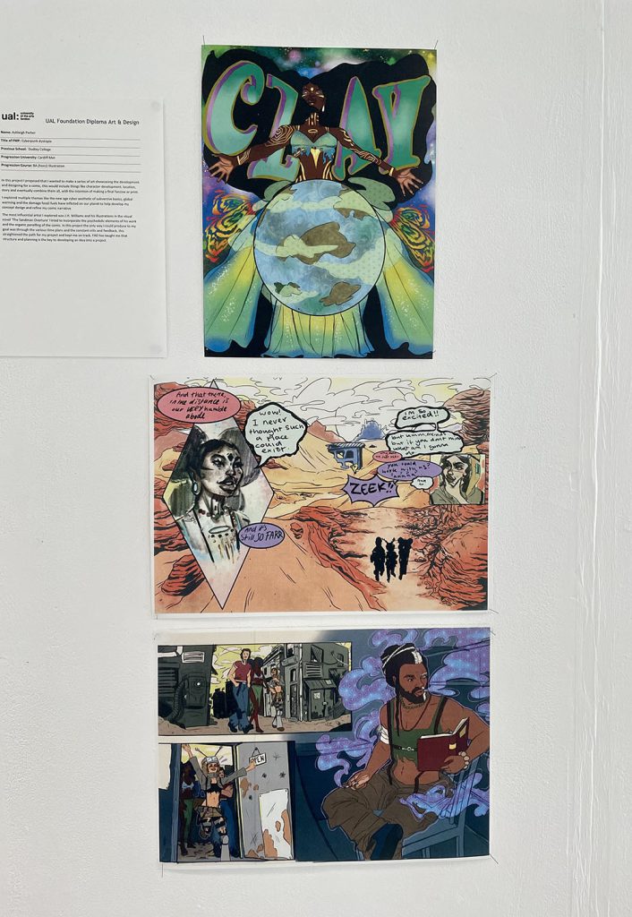
Ashleigh Parker
Name: Ashleigh Parker
Title of FMP: Cyberpunk dystopia
Previous School: Dudley College
Progression University: Cardiff Met
Progression Course: BA (hons) Illustration
In this project I proposed that I wanted to make a series of art showcasing the development and designing for a comic, this would include things like character development, location, story and eventually combine them all, with the intention of making a final fanzine or print.
I explored multiple themes like the new age cyber aesthetic of subversive basics, global warming and the damage fossil fuels have inflicted on our planet to help develop my concept design and refine my comic narrative
The most influential artist I explored was J.H. Williams and his illustrations in the visual novel ‘The Sandman Overture’ I tried to incorporate the psychedelic elements of his work and the organic panelling of the comic. In this project the only way I could produce to my goal was through the various time plans and the constant crits and feedback, this straightened the path for my project and kept me on track. FAD has taught me that structure and planning is the key to developing an idea into a project.
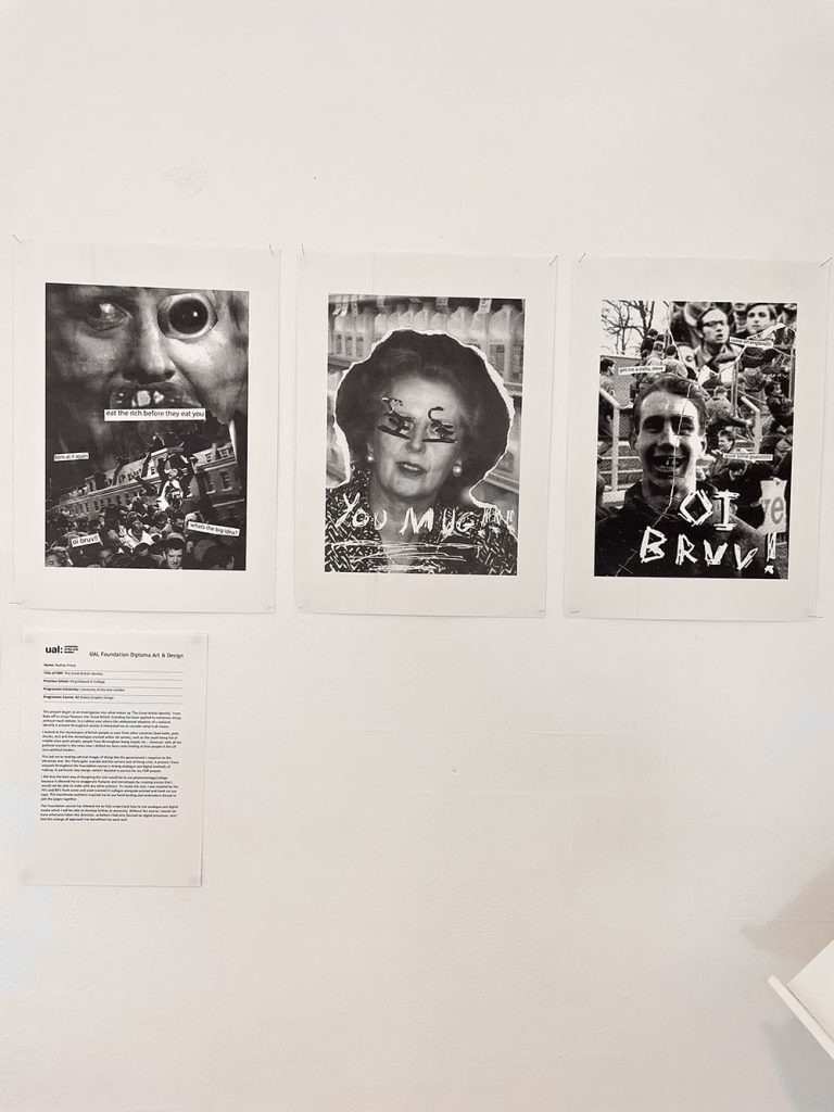
Nathan Priest
Name: Nathan Priest
Title of FMP: The Great British Identity
Previous School: King Edward VI College
Progression University: University of the Arts London
Progression Course: BA (Hons) Graphic Design
This project began as an investigation into what makes up ‘The Great British Identity’. From Bake off to crisps flavours, the ‘Great British’ branding has been applied to numerous things without much debate. In a Jubilee year where the widespread adoption of a national identify is present throughout society it interested me to consider what it all means.
I looked at the stereotypes of British people as seen from other countries (bad teeth, posh, drunks, etc) and the stereotypes created within UK society, such as the south being full of middle-class posh people, people from Birmingham being stupid, etc… However, with all the political scandal in the news now I shifted my focus onto looking at how people in the UK view political leaders.
This led me to making satirical images of things like the government’s response to the Ukrainian war, the ‘Party-gate’ scandal and the current cost of living crisis. A process I have enjoyed throughout the Foundation course is mixing analogue and digital methods of making, in particular zine design, which I decided to pursue for my FMP project.
I felt that the best way of designing the zine would be to use photomontage/collage because it allowed me to exaggerate features and stereotypes by creating scenes that I would not be able to make with any other process. To create the zine, I was inspired by the 70’s and 80’s Punk scene and used scanned in collages alongside printed and hand cut out type. This handmade aesthetic inspired me to use hand binding and embroidery thread to join the pages together.
The Foundation course has allowed me to fully understand how to mix analogue and digital media which I will be able to develop further at university. Without the course I would not have otherwise taken this direction, as before I had only focused on digital processes, and I feel this change of approach has benefitted my work well.
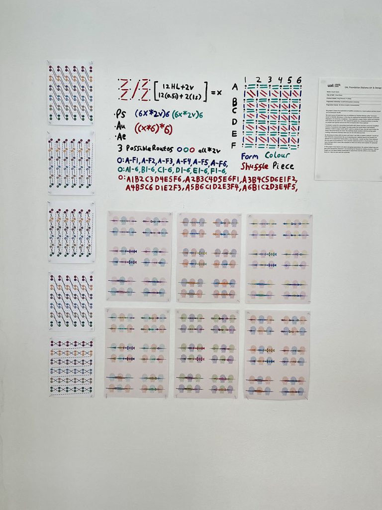
Joseph Saxon
Name: Joseph Saxon
Title of FMP: Visual Noise
Previous School: King Edwards VI College
Progression University: Cardiff Metropolitan University
Progression Course: BA (hons)Graphic Communication
My project is about the exploration of audible sensations in a visual medium and how sound can be portrayed visually.
My main source of inspiration was an exhibition by Christian Marclay called ‘Surround Sound’ at MACBA, Barcelona. In this show he explored the connection between sound and language in an immersive installation. I have explored a range of other artists and analysed how sound can be used in art. This research has given me a strong foundation to develop my project and opened several new lines of enquiry that I have explored.
I invented a system for connecting sound pitch with colours and then converted simplified versions of waveforms into images. By using royalty free sound effects and Audacity software I made 6 unique tracks which I used in a variety of ways. My aim was to make the viewer feel unnerved by my work. The soothing visuals combine with the jarring audio creating a disconnect between what you can see and what you hear.
By discussing my ideas with my peers and tutors I was able to explore methods I would not have otherwise encountered. My use of planning was a definite boost to my project as it allowed me to experiment freely within a clear timescale. I would say that I have achieved the core goal of my proposal as I have certainly explored sound in a visual manner. It’s the type of project that is never fully complete as there are always more options for potential development.
In this project I have learnt a lot about managing expectations. My analysis helped stop and gain some perspective whenever I was becoming too focused on making outcomes. FAD has taught me a lot about feeling comfortable to experiment and this will be a very valuable lesson as I take my next step into university.
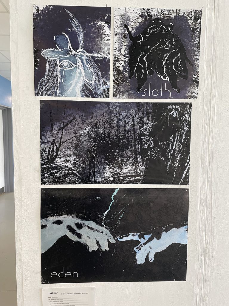
Subour Sayed
Name: Subour Sayed
Title of FMP: Eden game concept
Previous School: Dudley College
Progression University: Staffordshire University
Progression: BA (Hons) Concept Art or Full Time Employment
My work portrays a series of surreal illustrative pieces that present an adventure role player game idea that I have come up with. The game is unusual in that it attempts to discuss religious concepts like the afterlife, the 7 deadly sins and explores aspects of mental health and well-being.
Games such as ‘Limbo’, ‘Diablo 3’ and ‘Journey’ have influenced the art direction of my ideas. I have also taken inspiration from music videos of hardcore band ‘Knocked Loose’ and artists Zdzisław Beksiński and John Walker. I have researched Christian beliefs from medieval times and have taken inspiration from religious art such as ‘Adam and Eve’ by Lucas Cranach the Elder, as well as gathering quotes from the Bible. By analysing and critiquing the research/ work I’ve looked at, I have been able to pinpoint different aspects of medieval beliefs to help me develop concepts designs for the characters and the game’s narrative.
This project’s main art style includes an important amount of mono printing, collages and illustration techniques that I have rendered and refined on photoshop. This results in a body of work that merges a lot of techniques and processes together, which I think adds to the overall surreal aesthetic.
have been ahead of my planner in some respects and behind in some others. Some of the biggest challenges were coming up with original ideas and finding the right colour palette for my final outcomes. I figured going for a cold tone would add to the depressing atmosphere of the game, which I think turned out looking good.
Overall, I have learnt that by experimenting with different processes, even ones that are not my favourite can help with developing ideas and aesthetics. I have taken a lot of advice from my tutors and it has paid off with me delivering a unique portfolio of work.
Aimee Simpson
Name: Aimee Simpson
Title of FMP: Endangered Species
Previous School: Bishop Milner Catholic College
Progression University: University of Wolverhampton
Progression Course: BA (Hons) Graphic Design with 1 year Sandwich Placement
I made my piece in the hopes to raise awareness for endangered animals, specifically tigers, as they are now critically endangered in the wild.I wanted to make a series of posters to show why they are endangered and how we can help them, utilising and developing my digital skills to create a look of the tigers roaming in the wild being affected by forest fires.
Forest fires are a huge problem, and as a result, the tigers are dying out. I wanted to make my posters to show people what is happening to the tigers, and what we can do to help them, such as raising money, adopting and helping to preserve their habitats.
I explored digital drawing to really bring out an image in people’s mind of what is happening to the tigers. I tested out different effects with editing to create posters that really show the message of my campaign, researching about tigers and brining in my newfound knowledge to create a thought-provoking piece.
I learnt more about how important tigers are to us, and I cannot imagine a world without them, and therefore I want my piece to have the same impact on others as the message did for me.
Kian Smith
Name: Kian Smith
Title of FMP: Perception
Previous School: Dudley College of Technology (Evolve Campus)
Progression University: BIMM Institute (Screen and Film School Birmingham)
Progression Course: BA (Hons) Filmmaking
The piece is about how our perception of existence changes based on what we surround ourselves with, particularly the media we consume. I wanted to develop my knowledge and skills where I left off with my previous film ‘Intermundium’, where I explored the concept of ‘Man vs Nature’. This time around I decided to build a narrative using editing as the main technique, using overlays and motion graphics to guide the tone of the film, along with sound design to build tension. A key inspiration for this was Alex Kister’s ‘The Mandela Catalogue’ particularly the way he edits and creates a horror aesthetic for his films.
I tried various methods of displaying the film, for exhibition, like on a computer screen or a projector, but to fit the theme of the film I opted to use a QR Code that people can scan to watch the video on their phones, distracted from their surroundings.
Peer discussion helped the film develop from the initial concept. In the beginning I realised people were keen on my ideas and had useful initial thoughts. Later, help continued, particularly in finalising the film, by discussing the end sequence and how it should look/sound.
The challenge I set myself was to make something that people can access without any prior knowledge but also embed deeper references that some may pick up on. This led me to stray away from my initial ideas with more philosophical and reflective shots of nature being broken up by chaos being added.
The experimental nature of this course allowed me to be playful with the piece, allowing me to generate ideas when needed. I wasn’t afraid to try out new things and have created different visuals and sound design than I originally had in mind for the film.
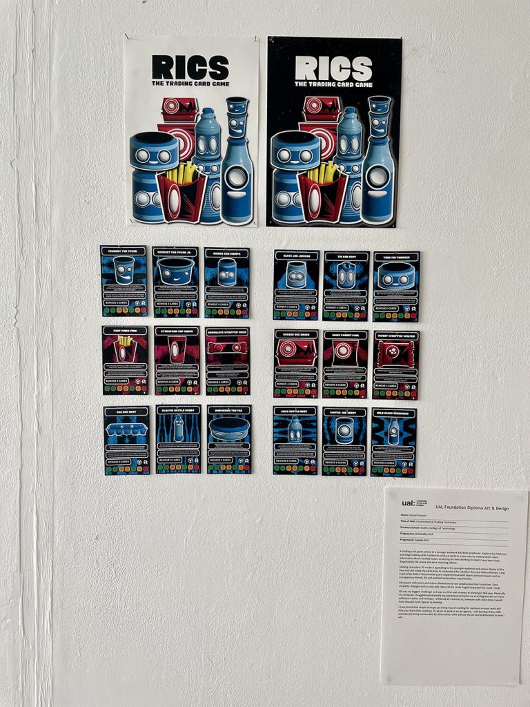
Daniel Stewart
Name: Daniel Stewart
Title of FMP: Environmental Trading Card Game
Previous School: Dudley College of Technology
Progression University: N/A
Progression Course: N/A
A trading card game aimed at a younger audience has been produced. Inspired by Pokémon and Gogo trading cards I aimed to produce cards in a new way by making them more informative about societal issues, as during my time working in retail I have been truly disgusted by the waste and poor recycling efforts.
Making characters 3D made it appealing to the younger audience and colour theory of the blue and red made the cards easy to understand for whether they are villains/heroes. I was Inspired by Robert Rauschenberg and experimented with layers and techniques such as transparency blends, 3D and painted watercolour experiments.
Discussion with peers and tutors allowed me to see weaknesses that I could not. Even simplistic changes such as size and colour of the cards hugely impacted the route I took.
3D was my biggest challenge as it was my first real attempt at working in this way. Physically my computer struggled and mentally my perseverance had to be at its highest due to many software crashes and mishaps. I achieved all I wanted to, however with more time I would have allowed more figures to develop.
I have learnt that simple changes go a long way and asking for opinions on your work will help you more than anything. If I go on to work in an art agency, I will develop these skills everyday by being surrounded by other artists who will see the art world differently to how I will.
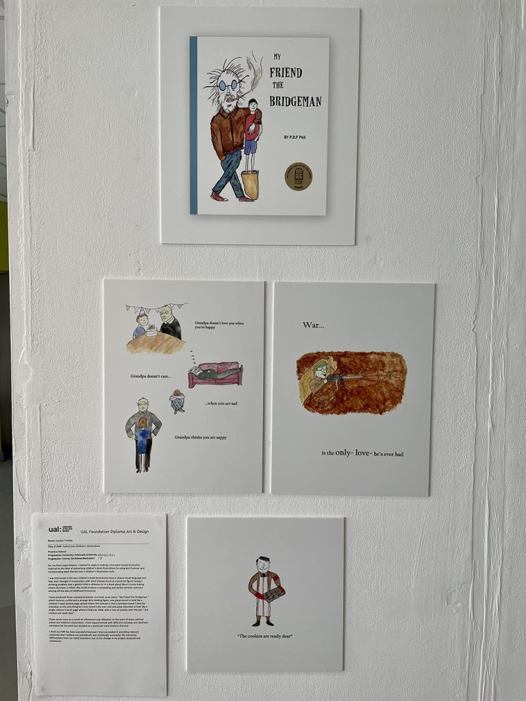
Joseph Trimble
Name: Joseph Trimble
Title of FMP: Subversive Children’s Illustrations
Previous School:
Progression University: Falmouth University
Progression Course: BA (Hons) Illustration
For my final major project, I wanted to explore making a character-based illustration inspired by the idea of subverting children’s book illustrations by using dark humour and incorporating adult themes into a children’s illustration style.
I was interested in the way children’s book illustrations have a unique visual language and feel; and I thought in conjunction with adult themes (such as a parental figure having a drinking problem that a gleeful child is oblivious to or a book about Mom’s home baking where the mom is Hitler) this could produce a compelling and darkly comedic outcome playing off the idea of childhood innocence.
I have produced three conceptual pieces: one book cover piece “ My Friend the Bridgeman “ which features a child and a strange dirty looking figure; one piece aimed to look like a children’s book double page spread where the concept is that a Grandpa doesn’t love his Grandson as the only thing he’s ever loved is the war; and one piece intended to look like a single children’s book page where it features Hitler with a tray of cookies with the text “ the cookies are ready dear”.
These works were as a result of refinement and reflection on the work of many satirical artists and children’s illustrators. I have experimented with different concepts and aesthetic variations for the work but decided on a particular hand dstyle in the end.
I think my FMP has been successful because I have succeeded in providing relevant outcomes that I believe are comedically and stylistically successful. My outcomes differentiate from my initial intentions due to the change in my project proposal and continuous.
Layton Woods
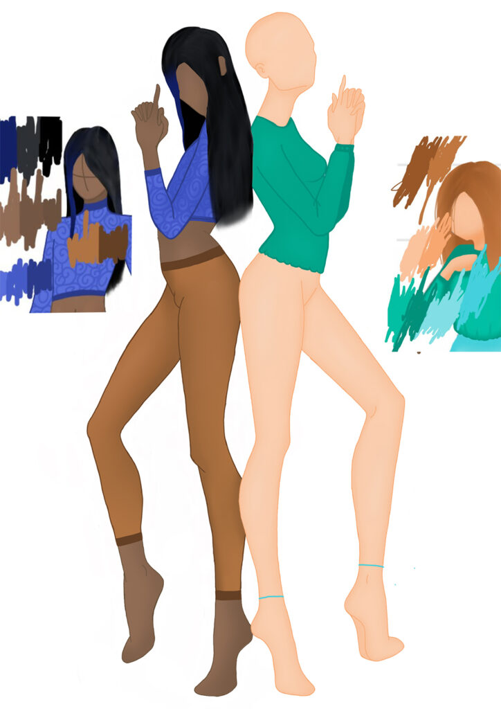
Nevaeha Yearwood
Name: Nevaeha Yearwood
Title of FMP: The symbiotic relationship with technology
Previous School: Matthew Boulton college
Progression University: Nottingham University
Progression Course: Illustration
My work is about the evolution we have had with technology. I was inspired by the work I had previously curated in my first unit on fashion promotion as the brief was to create a zine, this prior knowledge helped me understand what I wanted to portray. I also pulled inspiration from my own experiences with technology and what I had observed. The inspirations that impacted me the most were I-d and dazed magazine, BailBoyz zine, Harley weir and electronic superhighway. The methods I explored were collaging, animating, illustrating and using graphic design approaches.
Discussing with my tutors how I can layout out my work, so my pages can create a narrative within itself, and how I can construct my pages to create a cohesive zine because of this my outcome is cohesive and has an impact. My planning did impact my outcome as I did not adequately keep track of time or my timetable. I have managed to achieve what I had set myself such as the animation, QR code, exhibition space and zine. I could develop my project further by creating a more dynamic/elaborate exhibition space.
I have learnt how to create my own typefaces, the layout to print your own magazines, how to create narratives within my work, I need to be able to keep track of time. The thing FAD has taught me is how to push myself to excel further. An example of a critical review impacting me is when my tutor and I, discussed my work in general and how I needed to expand on these smaller ideas to create a finalised idea. I can develop this learning on my undergraduate course by using my timetable, expanding on my ideas, using my time outside of classes, and workshops to create work.
Progression University: Turing Scheme placement to Spain
Progression Course: N/A
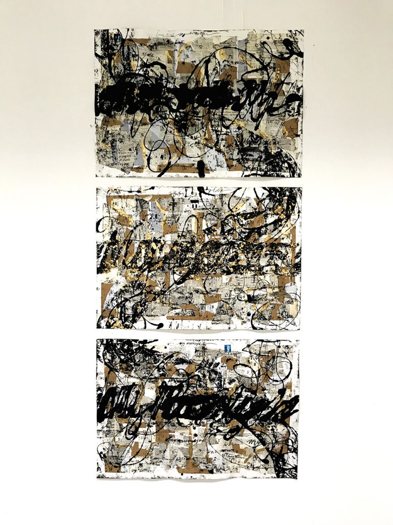
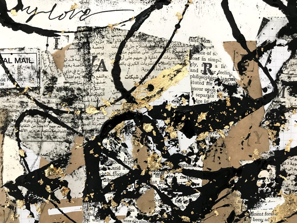
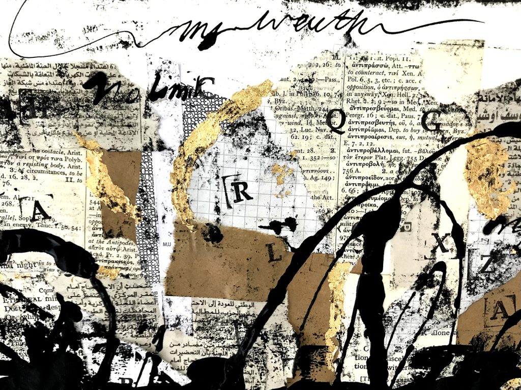
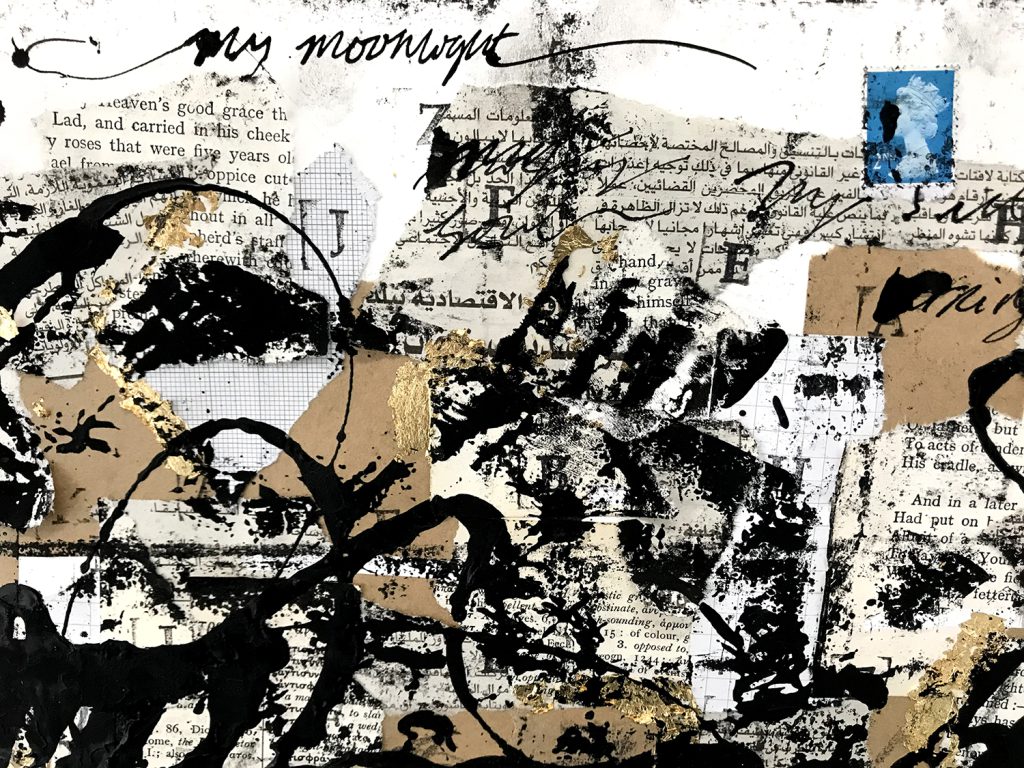
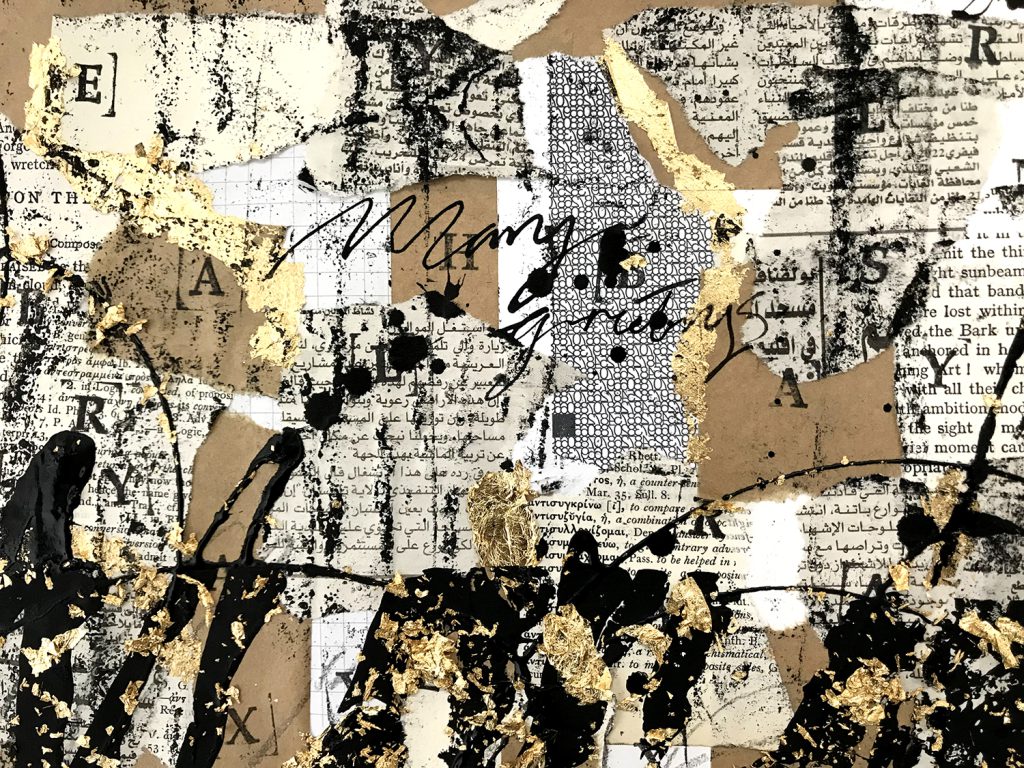
My approach was to explore the history and social impact of written communication especially the forms of handwriting across different cultures. This then led to focusing on letters in particular and exploring the relationships described between sender and receiver. I spent my initial weeks researching collage artists, going to exhibitions and reading books on the history of letter writing. I gained a lot of inspiration from making test pieces and experimenting with printing techniques. This helped me decide to work more with ink and gold leaf to develop my ideas further.
After much researching around the subject, I based my work on a collection of letters sent between Sultan Sulieman and Hurrem in the 16th Century. They were an unlikely couple; defying odds and traditions and their letters capture their love and commitment to each other despite their relationship frowned upon; Hurrem being a former eastern European slave concubine of the renowned leader within the Ottoman Empire.
My three pieces capture the first line of the Sultan’s letter to his wife which is ‘My wealth, My love, My moonlight’. With Hurrem’s responses echoed throughout, sprinkled with gold leaf, representing the spark of love between them whilst simultaneously making a new abstract language.
I see my work as a visual poetic metaphor for the want to express oneself through writing, specifically letters. But it is also about taking a step back and seeing how beautiful writing can be, and how it has enabled us to preserve fleeting moments in history. Writing binds humanity together yet we seldom give it a second thought.
Lucy Binks
Name: Lucy Binks
Title of FMP: Moribund
Previous School: King Edwards VI College
Progression University: UAL: Chelsea
Progression Course: BA (Hons) Product and Furniture Design
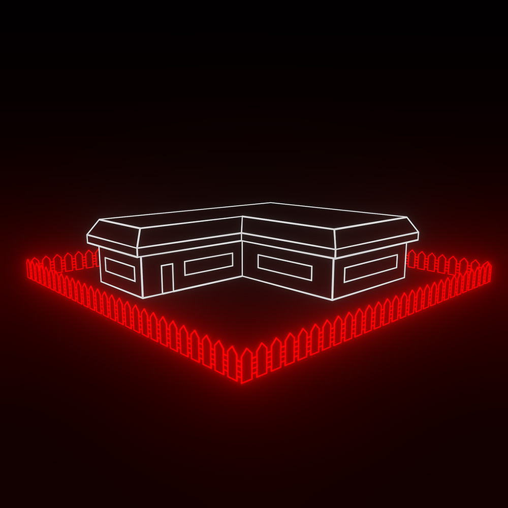
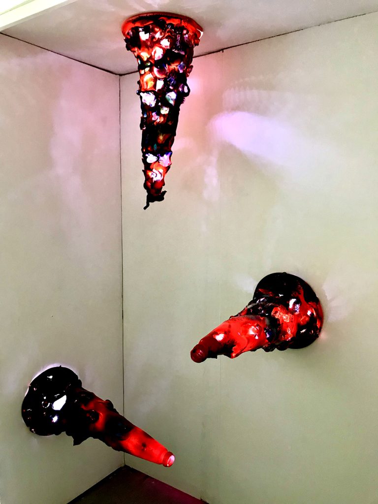
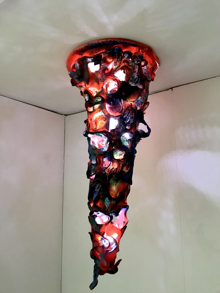
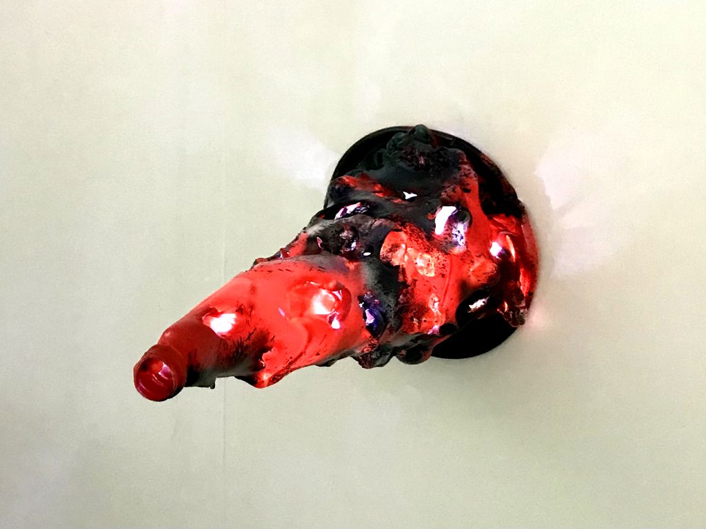
Moribund investigates the detrimental repercussions of human waste upon of the planet, seeking to inform home-owners of their impact on the planet, with the fundamental aim to create a product that intuitively promoted energy saving within the home.
Moribund began through the exploration of zero-waste spaces and intuitive design. The work is titled Moribund, because it alludes to an object in terminal decline which is how I see many household appliances. Initial ideas developed towards more spatial outcomes, yet I became more interested in stimulated awareness of sustainable design through individual objects.
An impactful trip to the Design Museum re-centered the work around that of a product, notably being drawn to ‘Soft Baroque’s’ work which purged plastic to create furniture that is both abstract and sculptural, as well as being functional. Manufacturing plastic has contributed to the heating of the environment and so my response was to re-use and re purpose the plastic we already have for an alternative use.
I became interested in exploring melting points of plastic waste and producing organic sculptures. I recognised that in darker environments the silhouettes of the test pieces I was making became more rigorous and intertwined. Shadows and faint colours that emanate from my eventual traffic cone light suggest natural forms, plants, leaves etc… prompting viewers to question the overwhelming nature of a decaying product and how we as humans have impacted our planet.
Kai Bood
Name: Kai Bood
Title of FMP: Exploring Liminality
Progression University: UAL Central St Martins
Progression Course: BA (Hons) Fine Art
Evie Cooper
Name: Evie Cooper
Title of FMP: Obsession
Previous School: King Edwards VI College
Progression University: Turing Scheme placement to Spain
Progression Course: N/A
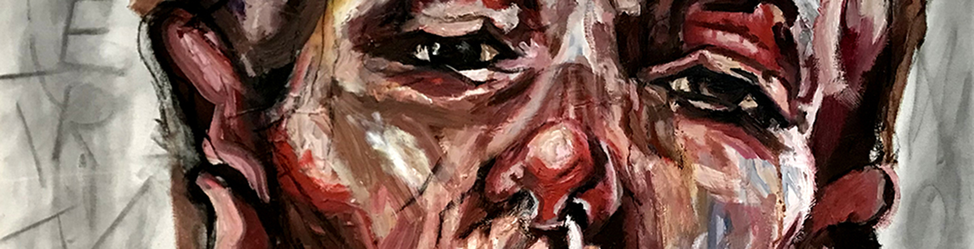
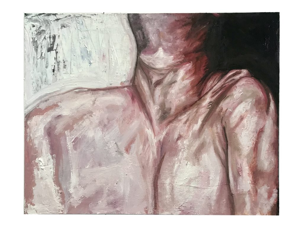
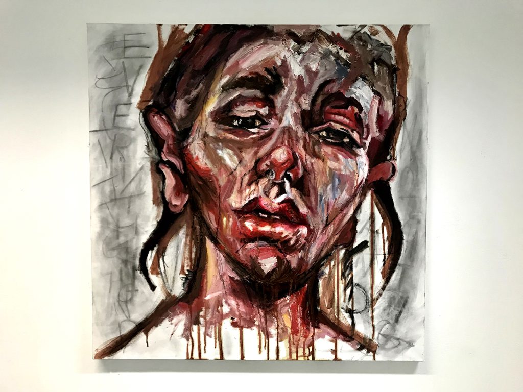
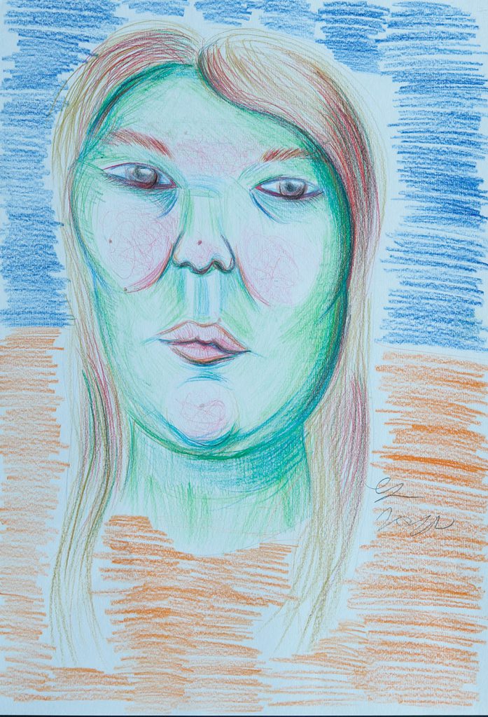
The purpose of my project was to explore the ideas and themes around the emotion ‘obsession’. I wanted to investigate how it influences individuals, spaces, and mindsets, and can be explored in a visual format.
My inspiration stemmed from my old English teacher and a phrase that has stuck with me throughout the years; ‘there is no such thing as a positive addiction’. This steered me into the direction of portraiture and the repetitive and reflective process of painting myself, ‘mirroring’ my expressions.
My visual research into the topic consisted of focusing on this painting process instead of seeking to create a ‘final’ outcome. Bringing my personal values and beliefs into my work was crucial to create depth and meaning and I researched how I could iterate my obsessive and repetitive process within the overall display, linking these ideas to the social construct and disorder of ‘perfectionism’.
To communicate the scale and complexity of feeling ‘obsessed’, I tried to replicate the harsh reality of how obsessive behaviour can affect the younger generation within today’s digital age. By using a grid in the final display, I hope to highlight the repetition and similarities of routine and describe everyday behaviours being repeated in an almost narcissistic way.
By exploring the physiological details of my own micro expressionisms I am therefore attempting to study what I recognise to be a form of my true self.
Jack Cutler
Name: Jack Cutler
Title of FMP: Facades
Previous School: Dudley College
Progression University: University of Wolverhampton
Progression Course: BA (Hons) Architecture
ExFlaSys
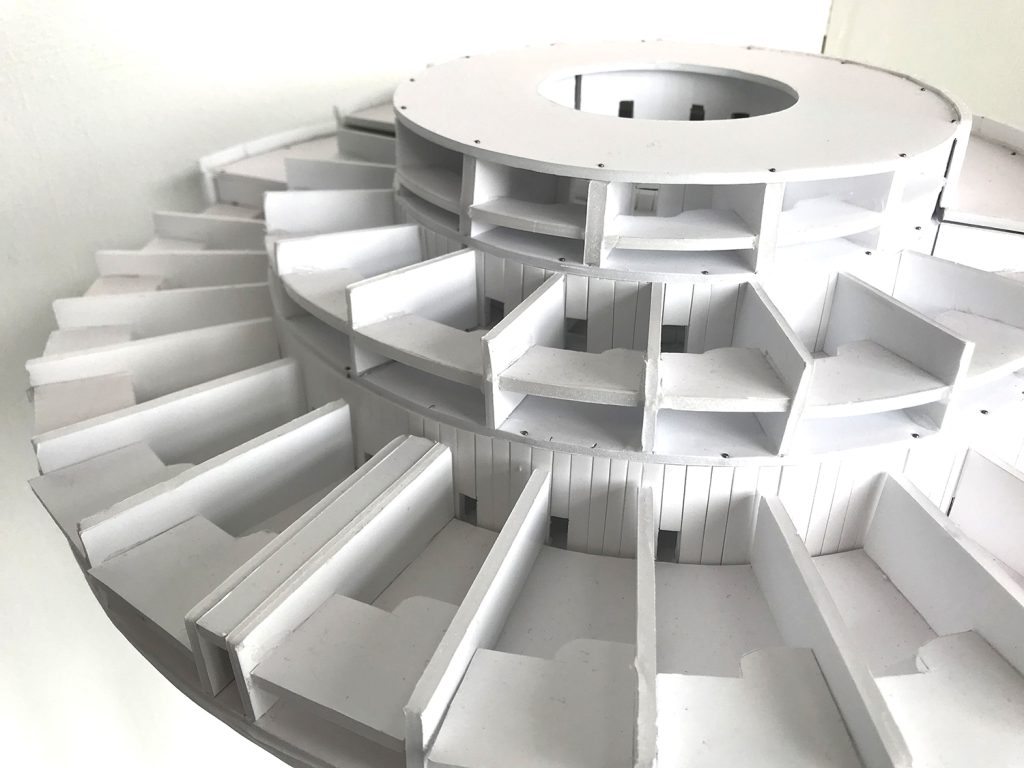
ExFlaSys (Exhibition Flatpack System) is the new display solution for all businesses. A revolutionary new way for companies to display products and communicate their brand. With our modular system and 10 unique structures, there is now a lightweight, easy to assemble and simple to transport system that will accommodate a range of sectors.
ExFlaSys furniture, display and workshop features will entice customers to engage with your brand. This model shows a potential lay out but there are near infinite ways you can create engaging displays.
After researching other trade display products currently on the market, we found that there isn’t an all-in-one system for brands that are looking for a quick, easy and intuitive way to communicate with consumers. Suitable for exhibitions, trade shows and pop-up events ExFlaSys takes the hassle out of displays and doesn’t limit the user to a set layout.
Stand out from the crowd and use ExFlaSys!
Ashley Gregory
Name: Ashley Gregory
Title of FMP: Advocating for Mother Nature
Previous School: Haybridge Sixth Form
Progression University: Southampton University
Progression Course: BA (hons) Fine Art
Inspired by the ‘Universal Declaration of The Rights of Mother Earth’, a proposed legislation written by environmental activists at the World People’s conference in 2010, my work advocates for Mother Nature and greater sustainability in art.
By tearing off a piece of paper embedded with cress seeds, you are given the responsibility to provide the space for the plant to grow. This simple act encourages you to become an advocate for Mother Nature; providing an opportunity for you to reflect on your actions and take responsibility for humankind’s impact on the environment. You may decide to either decorate, germinate, grow or throw the paper. The choice is yours.
This project has been a learning experience throughout. The initial planning, critical analysis and development encouraged through peer review led to the process of making my own paper from 100% recycled paper; a skill that I want to take forward with me to create a more sustainable lifestyle.
This piece has evolved throughout its creation, from making my own handmade, Bio-paints through experimentations with Eco-Art which led the final conceptual, large scale plantable piece you see here, but with each change the narrative I wanted to convey has remained clear:
“To build a culture of nature that features regeneration over destruction, sustainability over depletion, nurturing over domination requires input from a diverse collation of thinkers, makers, and doers “ – Mark Dion
Scan the QR code below to see the artwork in its original state:
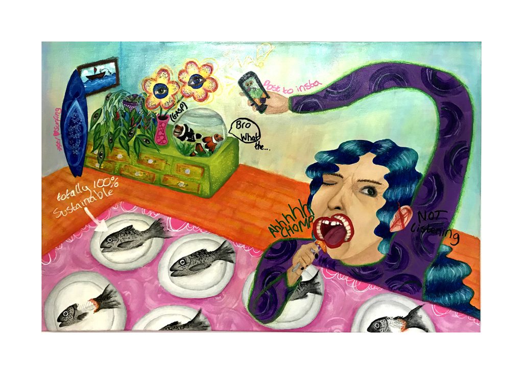
Bee Hammond
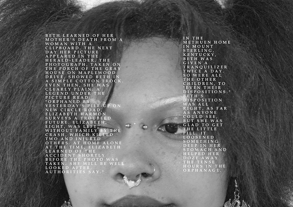
Name: Bee Hammond
Title of FMP: What’s real?
Previous School: University College Birmingham
Progression University: Falmouth University
Progression Course: BA(Hons) Fine Art
My painting is a look into the life of a woman, a woman who is a representation of our society. We can see that she is taking a photo of a constructed scene in her house whilst bizarrely eating several fish. Like many of us she has no second thought as to where the fish came from or the environmental consequences that her over consumption has. However, from researching intensive fish farming I have learned that simple consumer decisions like this can have a big impact on the natural environment.
The woman is posting an image on to social media to project an image of being ‘eco-friendly’ and a supporter of environmental issues, yet she and others are complicit in the planet’s demise.
I’m trying to build awareness and make people think more about the food they consume. The idea initially sparked from when I watched a documentary on Netflix called Seaspiracy. I watched it a while ago but have remembered it vividly due to the impact it had on me. It has changed my habits and I would like the imagery I make to have a similar impact.
I have tried to be more care-free when it came to making mistakes and experiment with new painting methods in this project. This has led me to work with oil pastels and combine them with acrylic and finger painting. The idea has been to develop a more ‘child like’, spontaneous painting style which has been partly inspired by the artist Jean Michel Basquiat.
Discussions with my friends, family and teachers have really helped develop the work and have allowed me to see it from different perspectives. There have been some challenges, but I have enjoyed discovering new artists and learning how to let go of the perfectionist within me.
Continuing from this course I now know the importance of seeking other’s opinions, pushing myself out of my comfort zone and recognising the impact that my art can have.
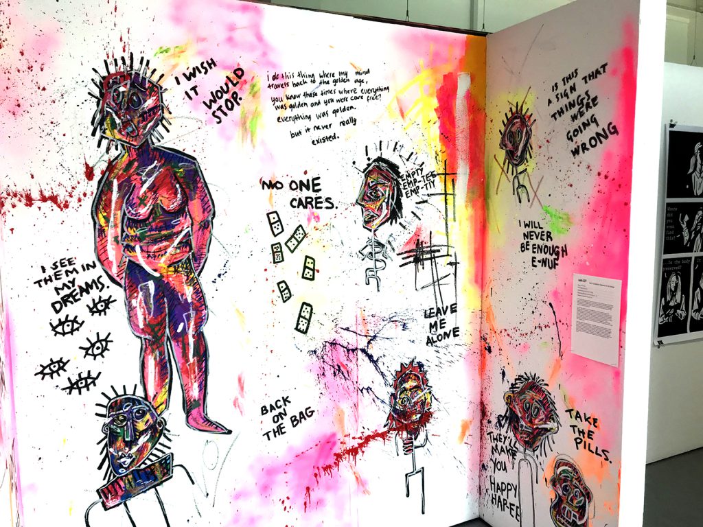
Laura Hasan
Name: Laura Hasan
Title of FMP: Loss of Self
Previous School: King Edward VI College
Progression University: Central Saint Martins – UAL
Progression Course: BA (hons) Fine Art
This mural is a space intended for you to step into my mind, or that of anyone experiencing body dysmorphia, depression, alcohol abuse, any form of addiction and those who have lost sight of who they are. Hidden behind the creatures I see; the self-portraits and the bright clashing colours are thoughts on how I perceive myself and some of the things that went wrong and made me lose myself.
My inspiration came from my constant attempts to visualise my mind. I spent years admiring Tracey Emin’s work, and her ability to do just that. Similarly, Christian Boltanski’s ideology and philosophy of art helped me to create meaningful pieces. On many occasions he has stated that art doesn’t come often, and when it does, you must be able to get the idea down in ten minutes. To create something powerful is a luxury, and you cannot expect it to come whenever you want. The main stylistic approach was abstract & neo-expressionism, stemming from my research on Jean-Michel Basquiat. Discussing these artists with my tutor allowed me to further delve into expressionism and understand exactly how I needed to work.
I was challenged by time throughout the entire FMP- I had nine weeks to create a body of work that I truly felt reflected my theme. I initially wanted to go into performance, but my ideas turned towards painting, creating a last challenge for myself. I have always struggled to communicate meaning through paint; however, I have created a piece I am genuinely proud of. Throughout the FAD I have learnt that I am capable of so much more than I let myself believe. I have learnt how to manage my time, research, new mediums, practise and reflect critically, and in my Undergraduate degree I intend to develop all these skills further.
Maximos S Kiosses
Name: Maximos S Kiosses
Title of FMP: Project Codex A Study of Mysticism
Previous School: BMET Art and Design Centre
Progression University: Hereford College of Art
Progression Course: (BA Hons) Fine art
My work ‘Forever and Always’ is the culmination of my own research into the concept of mysticism. Mysticism is the idea that we, as humans, have the potential to attune our individual selves with the universal energies of the earth through contemplation and self-surrender.
Initially my focus was on mythology, but I deviated towards a more metaphysical approach utilising some aspects of various ancient folk stories and religious symbols. This allowed my work to become more intuitive, and regular self-analysis and daily target setting allowed me to keep track of this.
My initial experiments worked with charcoal, inspired by the work of Odilon Redon whilst whilst taking inspirational attributes from artists like Jean Delville and Alistair Crowley. I incorporated my earlier research on ancient cultures and other surrealist artists to generate my first depiction of an “ego-mask”, with this motif eventually becoming the main focus for my final outcome.
The presentation of a figure in a mask can be sinister, making menacing eyes more prominent. I have pictured my figure alone in a void, an ocean perhaps that represents the seemingly endless depths of existence. The figure is divided in half with one side representing the primitive soul and the other the ego.
The ego is the masked shadow surrounded by the gloomy, azure depths. Juxtaposed with a wide exaggerated grin that ultimately symbolises a counterfeit smile, and a portrayal of the ego’s deceptive façade. The visage of the entity represented in the vivid orange, fire-like formations rising from the bottom of the piece represents the primordial soul. Possessing bigger and more jagged teeth, its countenance is somewhat fiendish and has a much more authentic grimace than the representation of the ego.
Heather Kirby
Name: Heather Kirby
Title of FMP: Monsters and Noir
Previous School: King Edward VI College
Progression University: The Northern School of Art
Progression Course: BA(hons) Illustration for Commercial Application
The ‘Noir’ side of my project was inspired by Shawn Martinbrough and my previous knowledge of Mike Mignola and Frank Miller’s work. Thematically, I was inspired by Frankenstein and how the narrative explored the theme of what a ‘monster’ could be. Posing this question from a contemporary angle formed the basis of my project. Throughout the FMP, I have explored photography and self-portraiture, which I have found to be a helpful part of my process. I have also worked largely with ink and have improved my drafting skills.
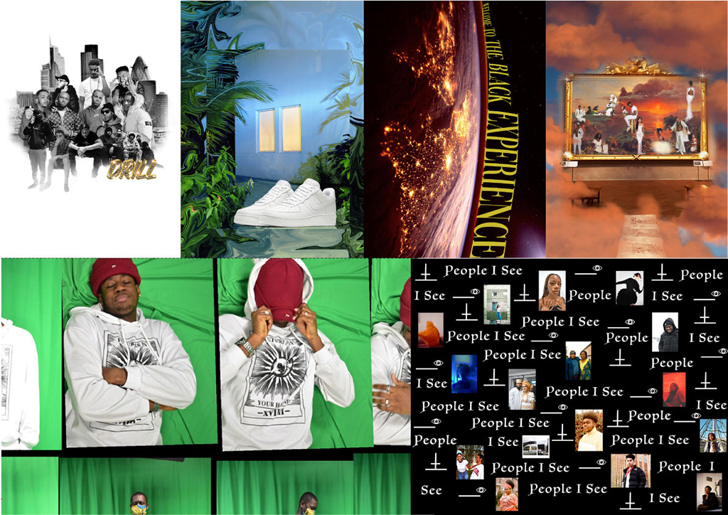
I have achieved my goal of creating noir comic based on the theme of ‘monsters’ but have weaved in contemporary attitudes to morality, updating the Frankenstein idea of what a monster can be. I intend the work to exist as a series of individual posters and be seen publicly by being flyposted in ‘noir’ locations such as underpasses and under bridges across the Black Country. In this way the marginalised contemporary issues I have introduced to my narrative will find a wider audience than the one who may have bought a conventional comic.
The most significant thing that this foundation course has taught me is how to be an independent, self-motivated artist. I have learned where my weaknesses lie in self-directed projects with a longer time frame so I will work on overcoming these weaknesses and continue to develop my independence and resilience throughout university.
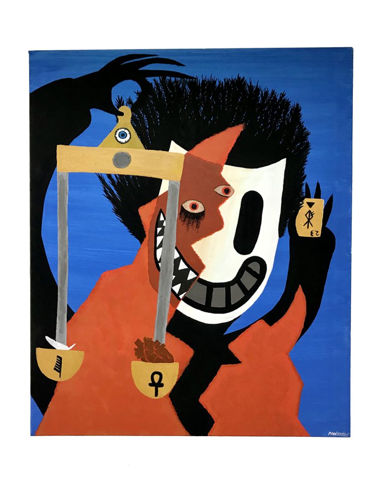
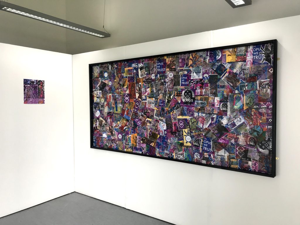
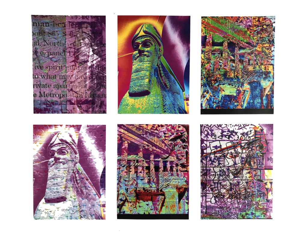
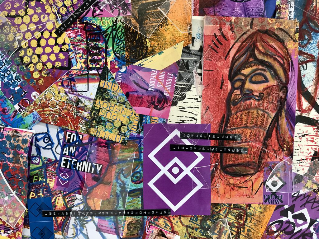
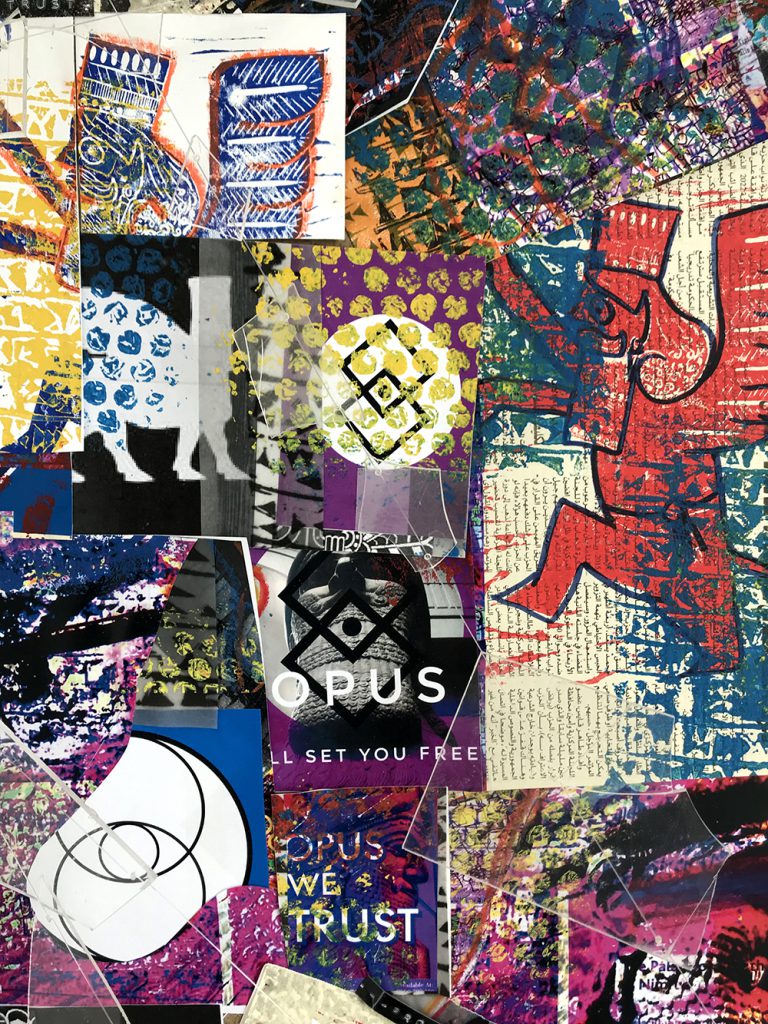
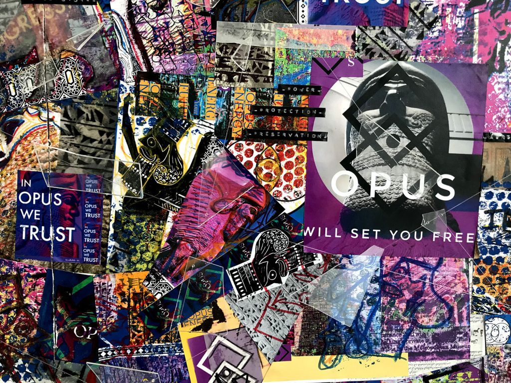
Anna Payne
Name: Anna Payne
Title of FMP: Project Sphinx
Previous School: King Edward VI College
Progression University: Durham University
Progression Course: BA (hons) Classics
Like many empires before them, Opus use an ancient symbol (in this case the lamassu) to signify their longevity, legacy and divine right to control the populus. My piece is a culmination of propaganda from ‘Opus’, a hypothetical omnipresent authority. I was inspired by the secret elite and their ‘new world order’ as well as previous imperial forces such as the British Empire, the Third Reich and the Soviet Union. The lattice of faux broken glass connotes vandalism, civil unrest and a distinct separation between authority and the people.
I wanted to explore the purpose of statues and why they are created and destroyed in the name of false idols, whether that be political leaders, royals or potent figures in our history. From ancient Assyria and Persia, the lamassu is a sphinx-like mythical beast with the body of either a bull or a lion, the wings of an eagle and the head of a man. Through my research on the lamassu and ancient Persia I was able to write a 2000-word essay guide to refer to throughout the project. I also visited the British museum to see these stunning monoliths in person.
The two artists who have inspired my work the most are Peter Saville’s work with New Order in particular the album cover for “Technique” which inspired me to work digitally. Keith Haring’s work was also simple and graphic and had a cheerful contemporary feel to it whilst maintaining a political meaning. His style directly inspired my lamassu drawings and the lino prints I completed. To develop my ideas, I have explored a wide variety of media including photography, digital photo manipulation, mixed media drawing, lino printing, screen printing and jelly printing.
Discussion with tutors and peers has helped influence alternative outcomes and ways to present them. I believe I have done what I originally set out to do in my proposal, which was to present the lamassu in a contemporary setting. Although if I could develop any element further, I would love to do a series of lino cuts of Opus propaganda, utilising my lamassu illustration.
On this course I have learnt when to try different media to attain my creative vision but the most important thing I have learnt is how to succeed despite adversity which I am sure will be put to the test at university.
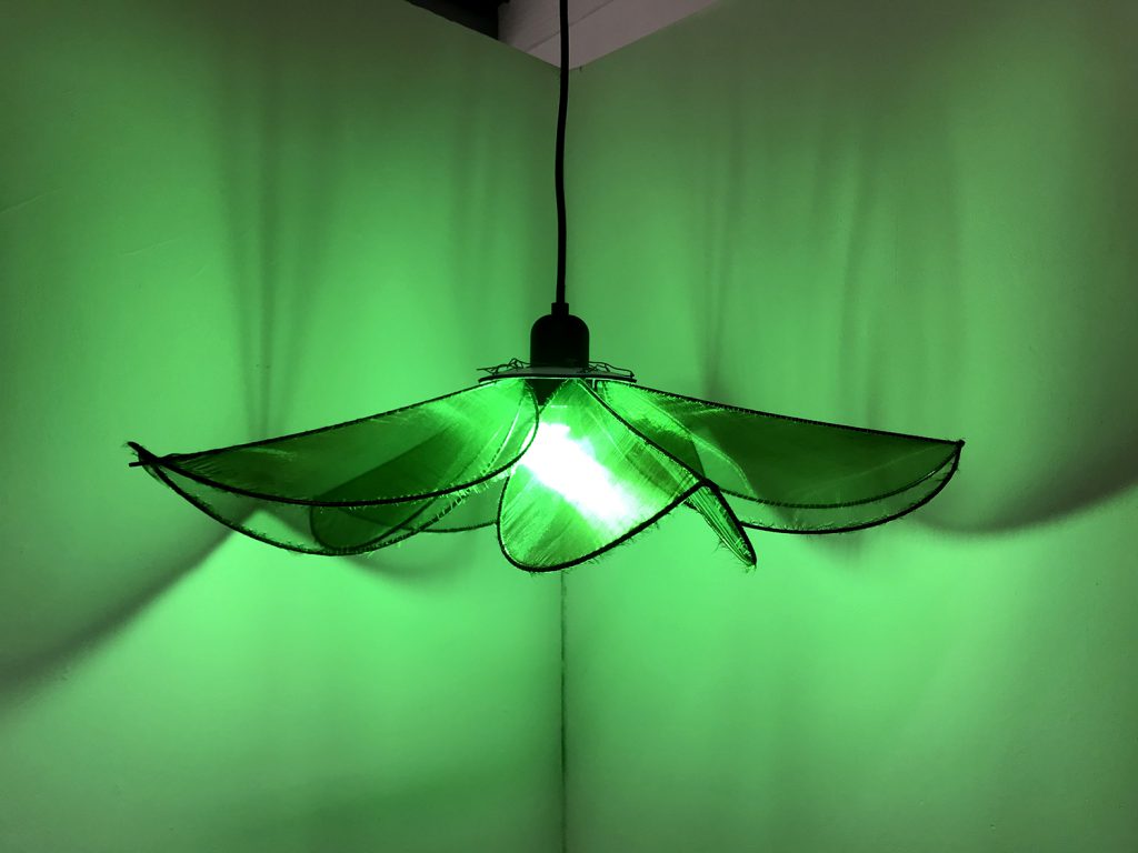
Lauren Roberts
Name: Lauren Roberts
Title of FMP: The Experience Economy
Previous School: King Edwards Stourbridge
Progression University: Birmingham City University
Progression Course: BA (Hons) Interior Architecture and Design
My FMP explores the Experience Economy and how companies use memorable experiences to sell their products.
Inspired by designers such as the Mizzi Studio, Fabio Novembre, Claire de Quenetain and Victor Horta, I’ve designed a bar specialising in the drink ‘absinthe’ and its nickname ‘La Fee Verte’, The Green Fairy, creating a fairytale-esque speakeasy that is hidden below a large oak tree.
I researched the history of absinthe, how it was extremely popular in the late 1800s and early 1900s until it was banned in many countries due to its apparent violent impact on consumers. Artists used absinthe to expand their imagination and increase creativity – most famously the Dada and Surrealists, who used it a basis to explore the subconscious and an adjunct to many parlour games in famous cafes like the Cabaret Voltaire in Zurich.
The colour green allegedly increases creativity and my colour pallete uses various shades to create a theatrical and enchanting social setting. Within this space I have illustrated and designed many ideas for the furniture and fittings such as tables, chairs, glassware, lamps and textiles.
For my exhibition space, I have displayed a prototype of my main flower pendant lamp, that will feature throughout the design. I created this out of copper-coated steel rods which have been bent and soldered into five large petals and then wrapped in two-toned green organza fabric, which shimmers like fairy wings in the light. The bulb is a luminescent green LED that would cast an impactful atmosphere across the bar.
I have also presented 6 design sheets that collate some of my sketches/illustrations, as well as a mood board of inspirational images, so that you can have a greater understanding of the bar and concept.
Abby Staniland
Name: Abby Staniland
Title of FMP: Exploring the decay of our natural environment
Previous School: Dudley Sixth
Progression University: BCU
Progression Course: BA (hons)Interior Architecture and Design / Landscape Architecture
For this project, I initially proposed to design a space that provided a purpose and raised awareness of environmental issues. My subject area started very broad; I knew I wanted to explore environmental decay due to my passion towards the subject area and stuck with this theme however the idea broadened as I researched further into the topic.
I began exploring the juxtaposition between Industry and Nature. This was aided by my research into the Industrial Revolution and in particular the evolution of the Peppered Moth, an insect who had to adapt to the copious amounts of black soot deposited on woodland from industrial factories. This provided me with a renewed context and related theme for me to incorporate, with the evolution of the Peppered Moth highlighting themes of deterioration and renewal.
Following my research into the artist collective ‘Cooking Sections’, I was made aware of the importance of community in art, specifically when the purpose is to enact change. I made it a goal to create a physical space that could be interacted with that would both educate and act as a catalyst for positive change to take place locally. Hence selecting Aspire Works Garden as an initial ‘client’ to create a brief. This was an ideal candidate as the garden space was local, accessible to me, and allowed me to create a space for an audience and cater to specific needs.
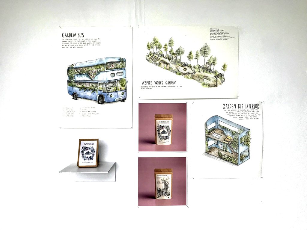
Fortunately, I was able to visit the Black Country Living Museum – It was there that I was inspired by the trolley bus which they have on the site and this gave my project a new direction, eventually leading me to create my final concept, the ‘Garden Bus’.
The 1900’s trolley bus will act as a moving garden containing plants native to the UK. It will also provide a habitat for moths, with LED lights being left on during the night to attract local species. Educational workshops will take place within the interior spaces to raise awareness on the importance of moths, specifically the Peppered Moth to the ecosystem and its evolutionary change due to the Industrial Revolution. Seed packets will be given to visitors, providing seeds native to the UK which can be spread over disused brownfield
Industrial sites, to rewild the Black Country and help reverse the environmental impacts of the industrial era whilst also celebrating its importance in history.
Stefania I. Sterian
Name: Stefania I. Sterian
Title of FMP: Green Design
Previous School: Dudley College of Technology (Evolve Campus)
Progression University: Birmingham City University
Progression Course: BA (hons) Architecture
Exhibition Statement:
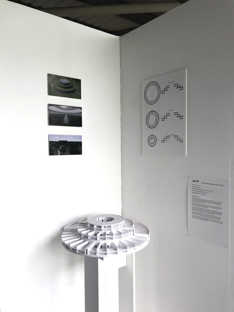
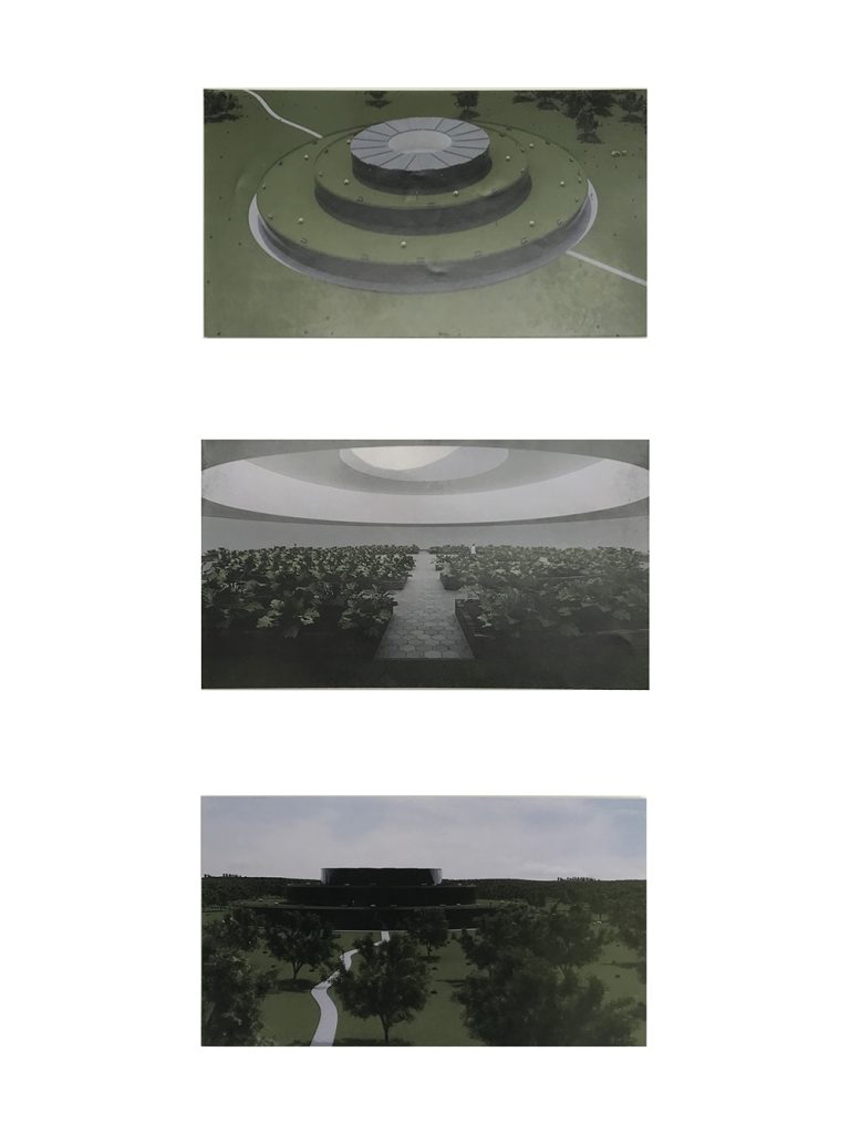
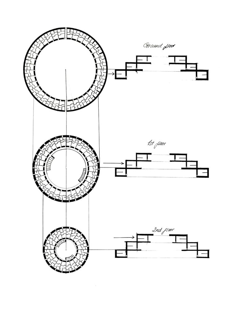
My work is about bringing nature and our day-to-day life together into a concept that will improve our lives. I have always admired buildings and nature, so I wanted to create something that was in between of the two, a concept that was a new and interesting response to the climate crisis we are in.
The idea was to propose a new way for people to live in densely populated buildings. The overall structure would provide food and electricity for the inhabitants and promote sustainable living and energy saving throughout.
I have showcased my concept in 2D and 3D and have used 3D design software to develop my ideas. The 3D model brings the structure to life, while 2D visualisations showcase the wider concept and context of the work. For example, the individual and shared gardens, which will promote self-sustaining and low energy food production.
The main artists that have helped me create this project are Mathilde Roussel and Neri Oxman because of their way of approaching projects from a sustainable angle. I was inspired by how they develop concepts and how they turn to nature for inspiration.
This project and FAD had taught me to take charge and trust my gut and my ideas, which in turn worked very well to develop my confidence as an artist primarily, and then as a future architecture student for my progression course.
George Stokes
Name: George Stokes
Title of FMP: Ignore
Previous School: King Edwards VI College Stourbridge
Progression University: Kingston University
Progression Course: BA (Hons) Fine Art
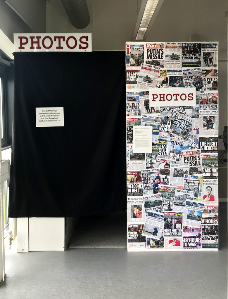
Content Warning: Scenes of Graphic Nature and Themes of Violence and War throughout.
Not Suitable for under 18s.
My FMP was inspired by the word ‘ignore’ and the idea of purposeful ignorance. I wanted to explore the Idea that people will ignore situations to make themselves feel better about themselves.
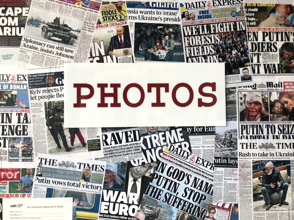
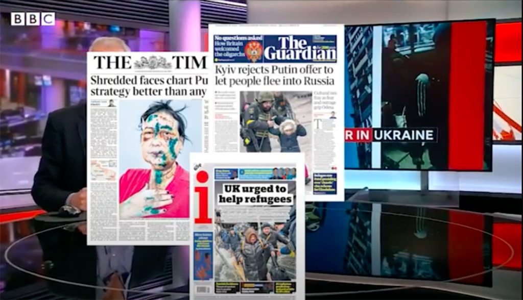
The installation is about how the UK media treat European countries as opposed to those in the Middle East, Africa, Asia, and South America. I chose to focus on the difference in coverage that the Tigray war in Ethiopia gets compared to the war in Ukraine. The photobooth, synonymous with passport photos, aims to explore how the public casually consume news footage of different crises, forever being a tourist to other human’s misery.
The main artists that inspired my work were Mike Nelson, Martha Colburn. Mike Nelson inspired the physical aspects to my FMP, whereas Colburn inspired me to explore filmmaking, which became an important element to the overall installation. I didn’t know I was going to create a film originally, so I didn’t have lots of time to develop, with more time the film could have been improved.
I have managed to achieve a lot of what I wanted to do in my FMP, my main aim was to be as ambitious as possible in terms of size and concept. I am proud of what I have created, and I hope that it will provoke discussion on my theme. One thing that FAD has taught me is to be as ambitious as possible, my work is best when I push myself and I enjoy the challenge that comes with that.
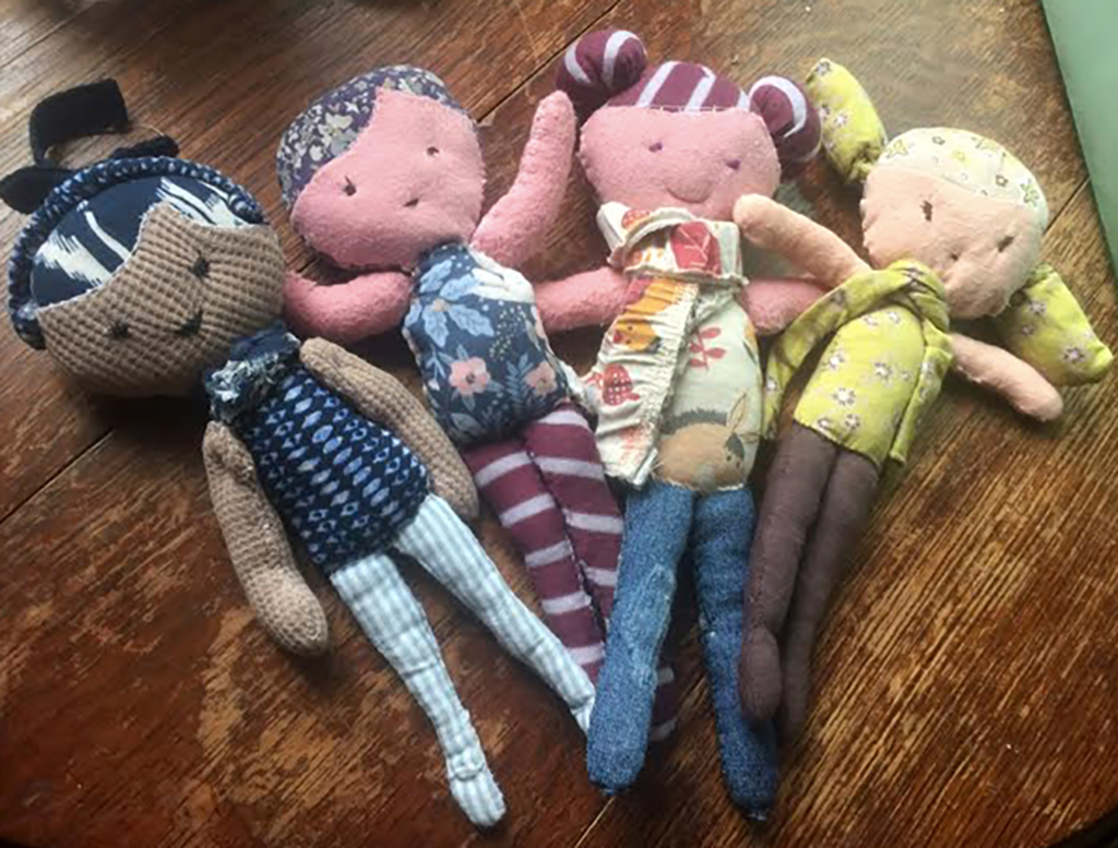
‘Violet’s Pirates’ is the name of my creative business. Named after my daughter who was born prematurely, the business is the unity of my past, present and hopeful future
I propose to run workshops in healthcare settings that help give the parents and siblings of premature babies the reassurance that they are not alone. When a child is born prematurely, they need to be kept in an incubator, which means the natural urge to hold and cuddle them is limited. Memory dolls can help with the mental anxiety this separation can create.
I have developed my business by combining the skills learnt from many years of employment in the textile industry with the experience of being a parent of a premature baby. I know how stressful a time this can be, and my dream is to help other families who find themselves in a similar situation.
I aim to teach other parents and siblings affected by premature births how to make their own memory dolls. This will not only help occupy the long days spent in hospital wards and waiting rooms, but also provide them with the opportunity to learn a new craft.
The workshops are though not only about making the dolls because they will also provide a safe space for families to re-connect with one another, discuss how they are feeling and try to solve the many practical problems that having a child in an intensive care facility may create.
Violet’s Pirates will also provide opportunities for other people such, as healthcare professionals and social workers, to attend workshops and offer further practical and emotional support to families going through what is a traumatic experience. I am certain of the positive impact my business would have and am applying for funding to start delivering workshops as soon as possible.
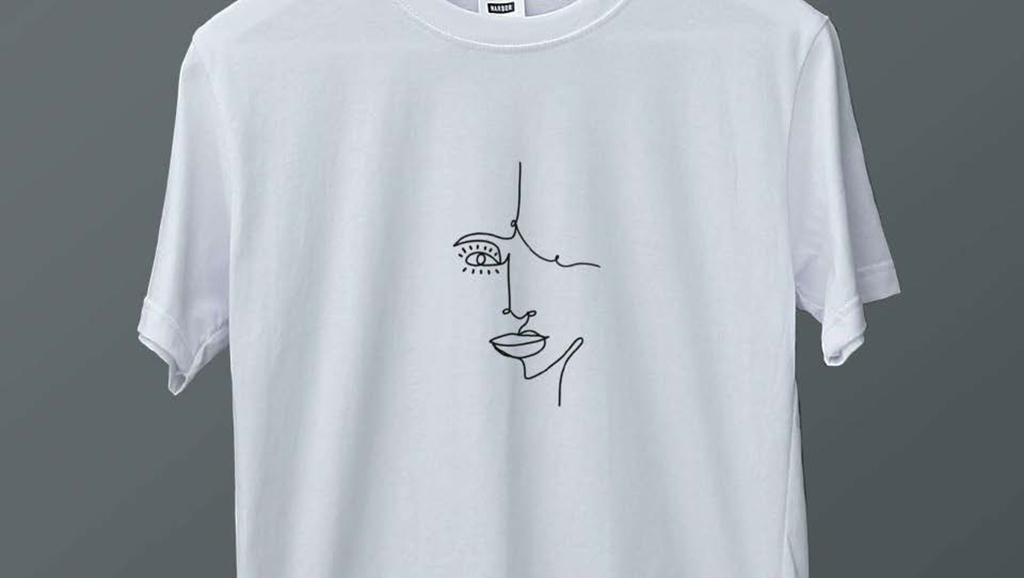
Josie Smart
I am hoping to start my own creative business ‘nude.prints’ which will sell urban style clothes and accessories. The garments will all be designed and hand crafted by me, inspired by abstract and line art.
Fashion is something I’ve always been into, but I never previously thought I could create my own brand. I have been excited to see my ideas develop this year and the concept for my business grow.
I hope to make a range of different t-shirts that I can sell through Instagram, Etsy or my own website. Eventually I would like to expand my designs into a range of colours and styles and sell other items such as bags and accessories.
Designing my fashion brand has meant making sure my illustration ideas are on trend. Fashion is a very competitive business and in 2021 streetwear has become one of the most popular trends. This is where I am aiming my clothing brand, as I feel there will be significant interest in what I’m make.
Buying something made by an independent artist gives more meaning to the clothes you wear. Most people also like to have things which are unique, and I want to generate that feeling of exclusivity with my brand identity.
My business will focus on an age range from 18-28. I have picked this age range because typically when you get to the age 18 you start to explore in the fashion industry and become more confident with bolder fashion choices.
Art is something I have always had a passion for, but I realised I needed more experience in the business side of things and this qualification has helped me towards my goals.
2 months from now I aim to be selling my t-shirts and bags online through Etsy, whilst advertising my brand Nude.prints through social media.
6 months from now I will have my own website up and running so that I am able to sell to a wider range of people.
I am passionate about my career in art and design and hope my business will be a success. I am currently working in the service industry but after a year I hope to be running my creative business full time.
It’s important to have ambition and ever since I’ve been financially independent, I wanted to run my own business. I enjoy creating something that I love doing and that other people also love.
You can look at my work on my Instagram account @nude.prints
Diana Waldron
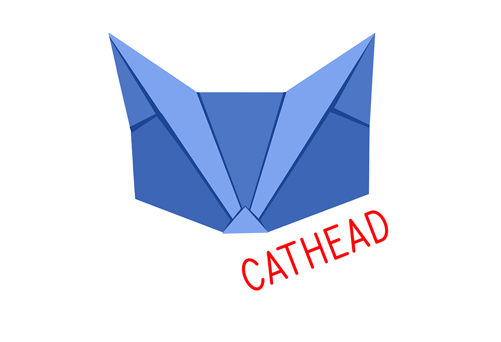
Cathead is my creative business idea that I have developed on the Level 4 Creative Practitioner course. I have been inspired to try and do what I love for a living and that for me is origami and paper related art. I am now on a mission to make origami the next big craft making craze!
Paper folding has always helped me calm my nerves and I’ve wanted to show how it can become integrated more with seasonal events such as Halloween and Christmas.
Origami is fun but can get complicated quickly. Cathead Kits will have a specially designed pattern on the paper that makes it really easy to create origami animals and get professional looking sculptures fast.
My aim is for people to become confident enough to make ambitious and quality designs that decorate their home and create an amazing atmosphere. Cathead products will take the stress of folding and worrying if you’re doing it right. You can simply follow the instructions or watch one of my online tutorials.
A key product Cathead is large scale origami kits. Origami packs are often so small and fiddly, so I am developing large-scale screen-printed origami kits. Going big is the perfect way to inspire children and give new life to seasonal decorations and celebrations. You can even get everyone involved in the making. I am planning to launch Do it Yourself kits online and run regular workshops and online tutorials.
I have looked into how other businesses operate and understand now how it all works. I am confident in large scale origami and digital work and have begun to approach local businesses, either to run drop in workshops or sell my products in their gift shops.
Personally, the course has boosted my confidence. I have needed to look at the business side of running a creative business – pricing – sales, budgets etc… and now have much more confidence in my ability to make my creative business a success.
Our Level 1 Art and Design learners have worked on a range of exciting projects this academic year, from Natural Forms, Portraits and Mini Monuments. Learners developed a range of skills working in ceramics, digital illustration, print making and fine art practices.
Below is a select of work from our fantastic learners. We wish them all the best as they progress to the next stage of their education here with us at Dudley College of Technology.
Previous Education: Level 3 Extended diploma Art & Design Destination: HND Art Practice
Sensory Rooms
I was influence by Edward Walker’s lava lamps and initially of the “Psychedelic Movement” and the “Love Generation”. Lava lamps came about in the 60’s and It was the perfect light for modern times,
Walker declared: “If you buy my lamp, you won’t need to buy drugs because the lava lamps are meant to calm and relax people.
This video still screen shot is part of a project which was based on the role of technology in art & design. This is my FMP project, and the work is an illustration of projection utilising handmade lava lamps. The intentions here were to communicate sensory room experiences as an artist medium, for an audience with and without complex health needs, becoming a ubiquitous creative space that promotes the reduction of stress and anxiety. A safe environment where audience become participants, through the physicality of simply being present, interacting through simple movements.
Grace Gajsler
Previous Education: The Academy of Kidderminster Destination: University of Wolverhampton
Collaboration and Technology
The themes of my project are connections via the internet and creative remixes. Art viewers and critics have their own interpretations of artworks based on their experiences, ideas and tastes, and I wanted to explore my peers’ ideas and interpretations by creating remixes of original pieces I sent to them. This project is a collaboration of ideas from a variety of artists of different media and specialisms with the outcome of a diverse collection of work, and a collaboration between close friends through a personal and public digital connection.
Barbara Miller
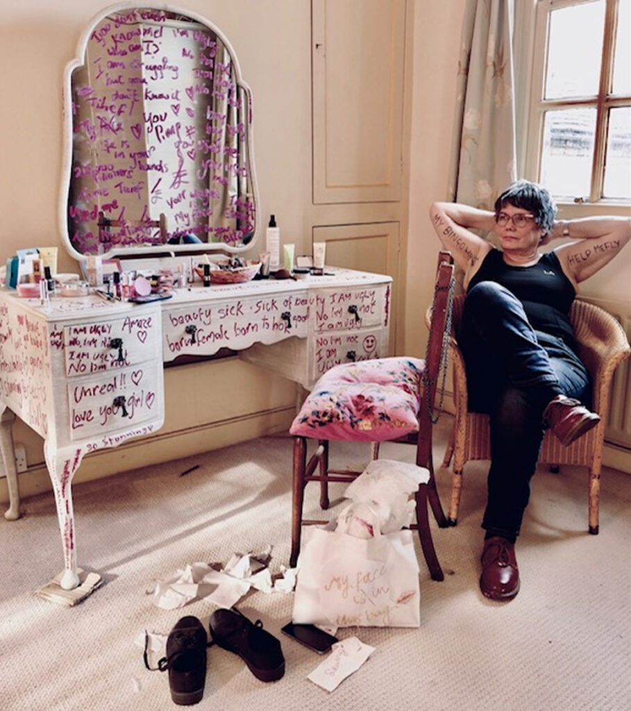
One is Too Many
One is Too Many is an installation rooted in a body language crisis created by the use of filter apps that can manipulate and enhance an image to enable the ‘perfect appearance’. For many, this allows a filtered version of reality, one that is hard to find flaws in and that enables them to hide their own insecurities and imagined flaws. The installation is my response to bring about awareness to this practise and its links to a mental health illness known as ‘face and body dysmorphia’. The individuals that have this illness see a distorted image of themselves when looking in the mirror. This illness can lead to depression, self – harm and even suicide in young women. I found this evidence shocking and it was this that gave me the impetus to produce this artwork.
The installation was inspired by Tracey Emin’s ‘My Bed’ and Elaine Shemilt’s “Doppelganger. Two artists that challenge socio-political and feminist issues as part of their practise.
My intention is to confront the viewer and challenge this practise that pressurizes young women to conform to society’s obsession with beauty.
The main brief for this project was that it should be conceptual, where the idea involved takes precedence over the aesthetics of the final piece.
One of the principles of conceptual art is to break away from consumerism and capitalism and to achieve this I used paper in all my experiments; Paper is a low grade and throwaway material. My experiments involved trying various drawing techniques, making face masks and distorting images to suggest human fragility. It was through this process of experimentation that ideas emerged.
My aim through my installation is to invite the viewer to interact by questioning, connecting and interpreting and to evoke feelings about gender inequality and to realise that the true cost of beauty is not through money but through the cost of women’s mental wellbeing.
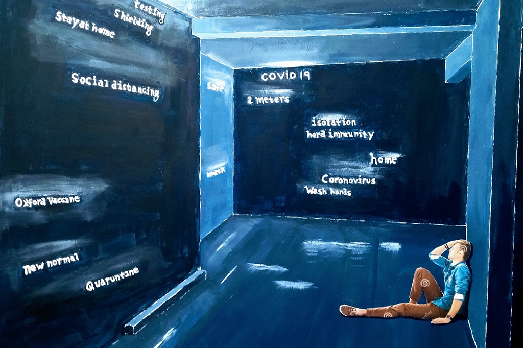
Steve Sheasby
Previous Education: Foundation Certificate in Art and Design Destination: Independent practice
Word Room
“Word room” is a concept that is intended to reflect many individuals’ state of mind given the current worldwide Coronavirus pandemic.
Never in living memory has our society faced such a threat to our personal freedoms and mental well – being, I therefore wanted to create a concept that captured some of these anxieties.
So, I started to think of our living spaces and how we felt about them pre – pandemic, i.e., places of refuge of safety and places where we could relax and rest.
Our living spaces are almost like the spaces that occupy our heads, a private space where our true self exists.
So how has the pandemic affected our true self spaces?
It has made us fearful of acting in the ways in which we are so used to in today’s society, it has threatened our very mortality, and it has filled our heads with words that would have meant nothing in the past. Words that now fill us with caution, distrust, and fear.
Our worlds have been forcibly shrunk to the spaces in which we live.
Legendary creatures have often been incorporated into heraldry and architectural decoration. This is particularly the case with those symbolizing great strength or other powers. In contemporary times, many legendary creatures appear prominently in fantasy fiction. These creatures are often claimed to have supernatural powers or knowledge or to guard some object of great value.
Mythical creatures have been part of human culture throughout the ages and across all parts of the world. They are not just the “talking” creatures, animals able to communicate using language and also rather clever, as in Aesop’s fables. Mythical creatures are in themselves beyond normal reality, often composites of existing animals or animals and humans.
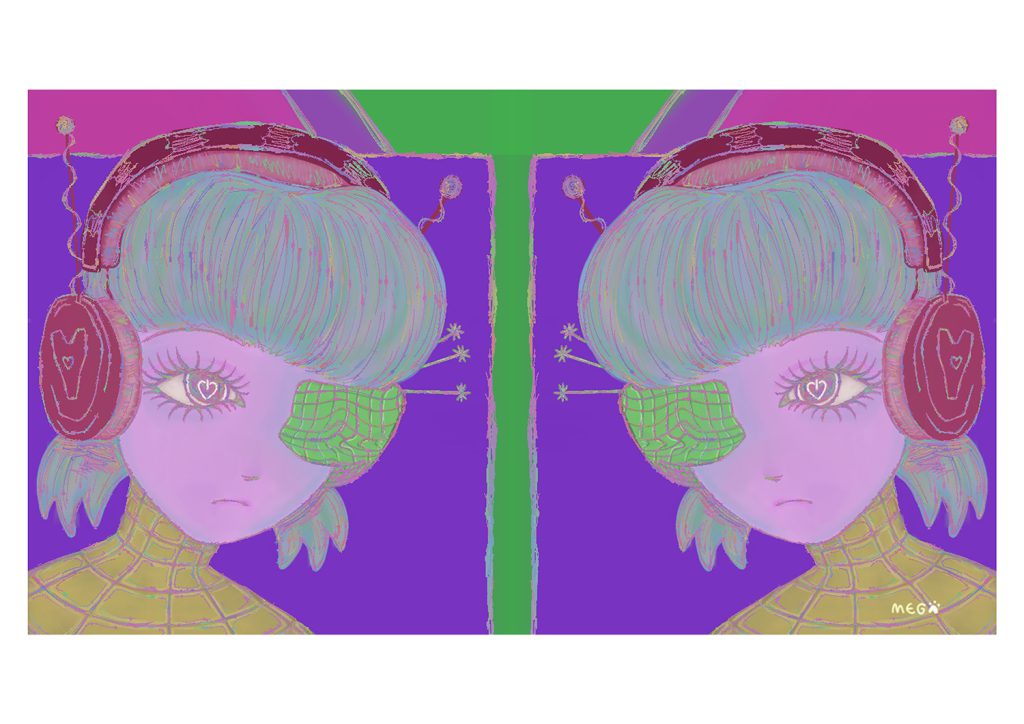
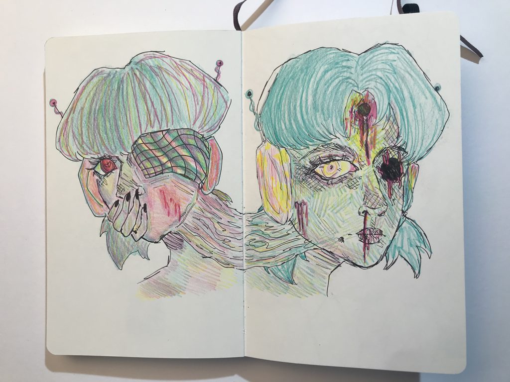
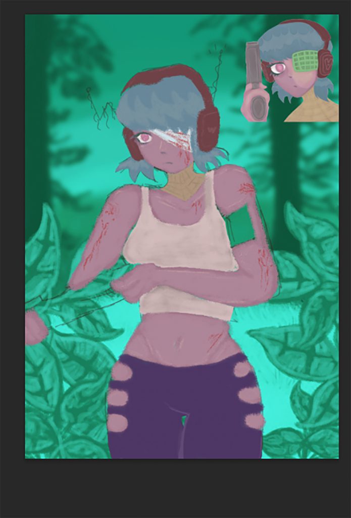
Caitlyn Bowker
Part of my ‘journey’ to overcome dyslexia has been writing a story. This started as quick little descriptions and scenes and eventually developed into a full story.
I decided to use this as the basis of my FMP, imagining quite child-focused illustrations.
A full analysis of my text and deep, sustained research into the teen-fiction genre, however, led me on a different path.
My initial reaction to recognizing my narrative as teen fiction rather than children’s fiction was that I would have to adapt it into a graphic novel, if I wanted to create illustrations. The work of the Folio Society mad me realized that readers of books such as War Horse, Noughts& Crosses and Sophie’s World, enjoy full page illustrations accompanying the text.
I set myself the challenge of working in watercolour or inks, but had to admit after some tests that the experimental way I enjoy working and find most successful is digital.
Lockdown has meant I was not able to plan my work to include a printed book, but the work will continue and that will be the eventual outcome.
Lewis Edwards
As an artist, I work hard to develop illustrations that are presented exactly how I envision them during the creative process. Part of my process before I begin working is to take several photographs of myself and/or others to gather reference material for my ever-growing portfolio of expressions, posture and form which I can use to help me in areas I find difficult and later recycle and adapt to other projects. I rarely deviate too far from my original vision for a piece, but I like to try new techniques regularly and occasionally experiment with different medias though the latter is a recent development.
For my FMP I challenged myself to create my first short illustration-focused comic book in a professional quality using techniques and formats I’ve researched and taken from bestselling books. I chose to adapt a music video rather than create my own narrative, due to it being my first tactically-planned and executed attempt and wanting to focus my efforts and attention on the art, research and quality of the project rather than creating commentary. I believe this effectively worked out in my favour and the experience has provided me with a new lens to view my creative process through.
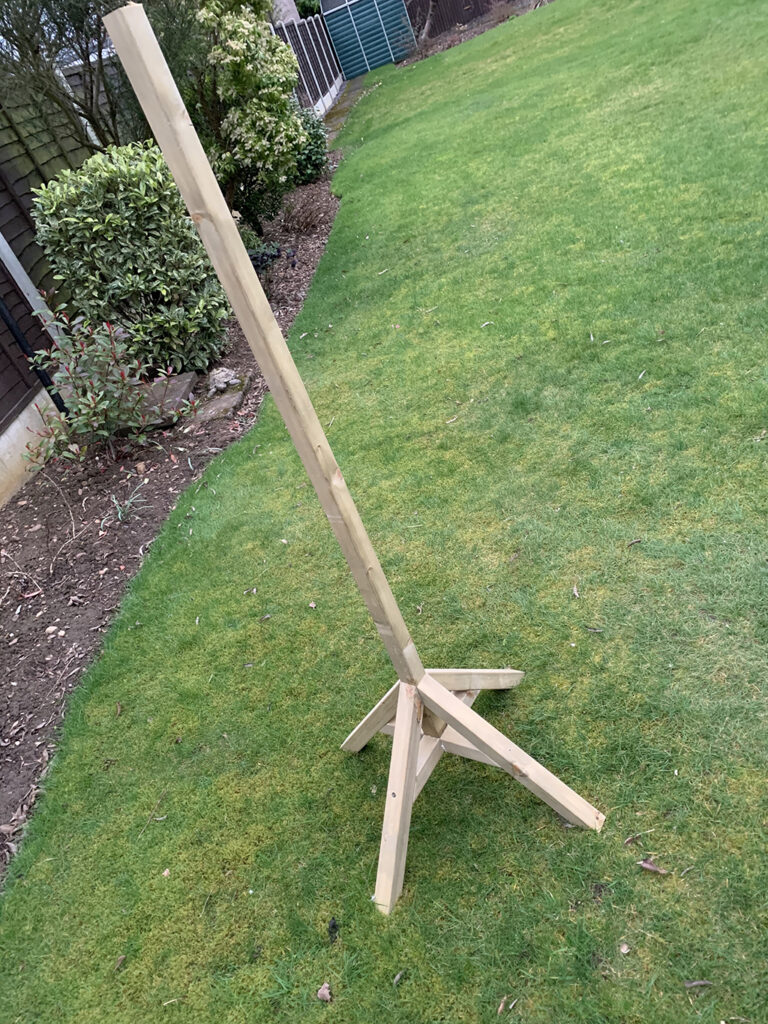
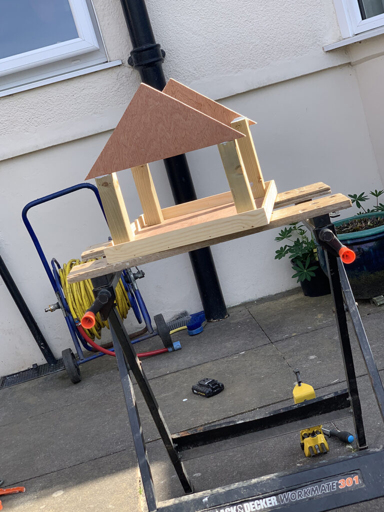
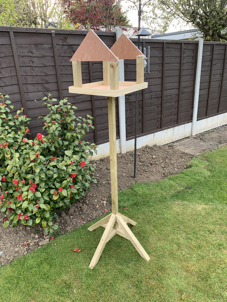
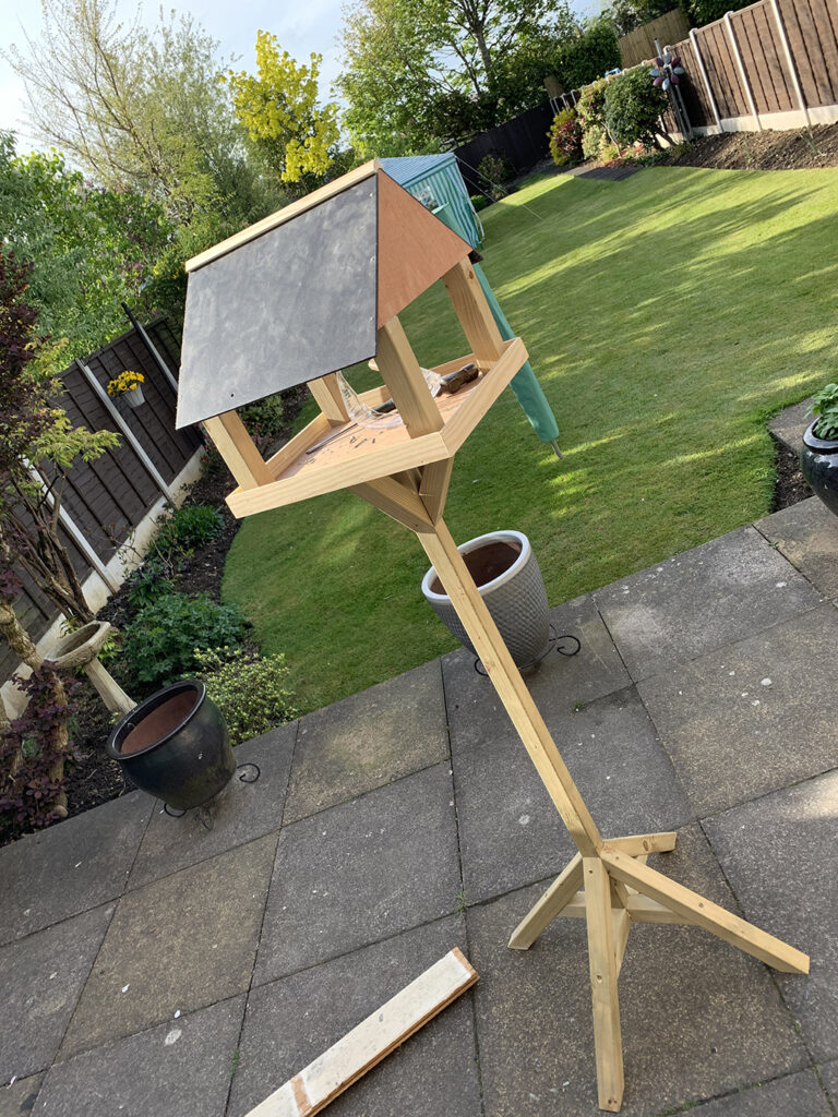
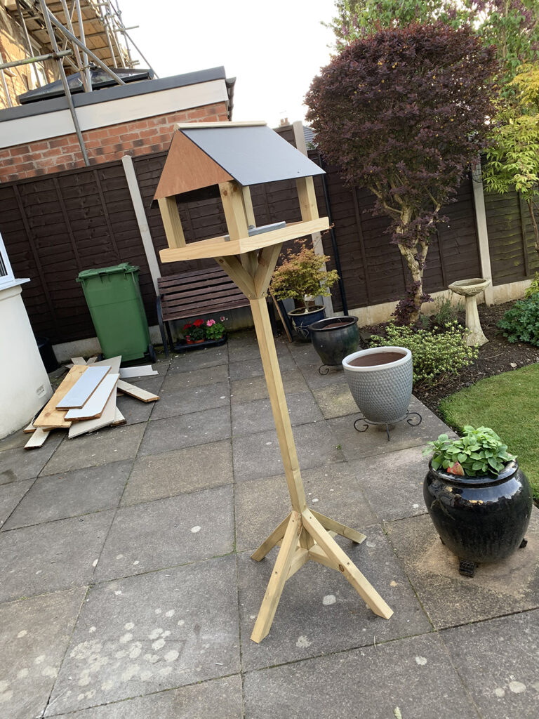
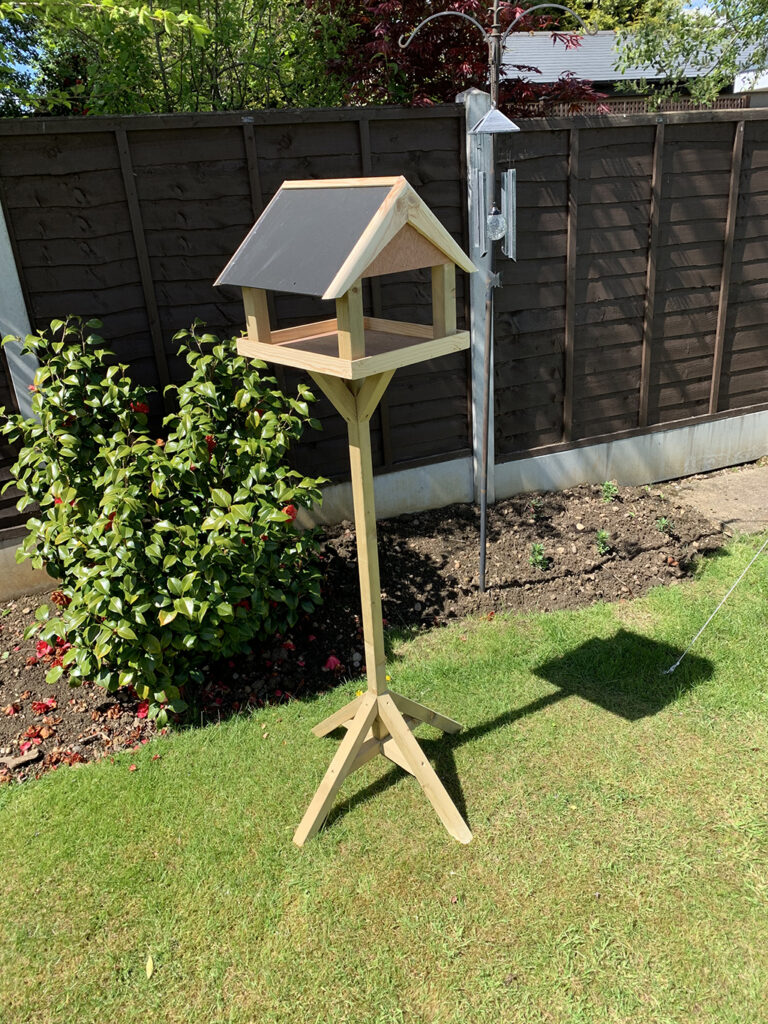
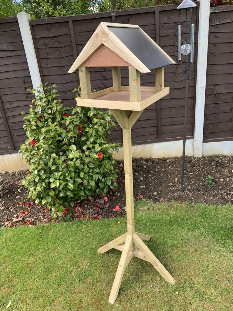
Lewis Forrest
The theme of my Project has been influenced by not being able to go out for months because of the virus.As being limited on where to go and things to do, having a garden made lockdown easier for me and it inspired me to make something to go into the garden that would last a number of years.I decided to design and create a high-quality bird table. I used this FMP to concentrate on my practical skills because it kept me focused during lockdown. With lockdown and only being able to work from home with no workshop made this project much harder but made me a much better problem solver and made me realise at what a high standard I can work. I visited various places to collect research in the form of taking photographs of different bird tables of all different designs and sizes. This then gave me different ideas on how to design my own and the different practical skills I could use. To draw out my design, I decided to use a 3D CAD software called sketchup, this was useful because I had a visual representation on what it was going to look like throughout and helped me plan each stage throughout the project.
Kami Hall
I have found the lockdown periods boring more than anything and as a person who naturally draws and creates, I have found those two aspects of my character have been hard at work.
But I have noticed that regarding the subject matter, following a brief has not been as important as usual – it’s the actual process that provides the satisfaction.
I seem to choose techniques that follow a repetitive process. This would be very obvious if I was sewing or knitting, but I would say that the creation of digital work, particularly if I am creating several versions of a decided theme, is a definite set of technique procedures, varying only slightly, that are repeated. The work is never gestural or expressive, but limited, focused and complementary.
This has been my theme in my illustrations – the people and the objects involved in making and marking as a mindful exercise.
Alexander Healy
For my FMP, I was inspired by The Rolling Stones and their album, Exile on Main Street. This inspired me, as this album cover shows a collage of so-called ‘circus freaks’ which then inspired me to create work inspired by them. I used appropriation in this project to create Illustrations inspired by these ‘circus freaks’, incorporated ‘found’ images of the Rolling Stones and utilised different physical and digital methods to distort and change them. I then presented the illustrations I had created in this project within a zine.
To do this, I had found already existing images which I then developed using paint, embroidery, collage, typography and distorted digitally. This was inspired by multiple artists such as Andy Warhol, Hannah Hoch and Rossana Taormina. I took inspiration from their work and used this to create a variety of designs using digital and hand-rendered techniques. I was able to successfully communicate my concept of body altering and distortion throughout my work due to the mediums and techniques I had used. This then led me to creating a successful 20-page zine.
My aim for this project was to communicate the idea of ‘circus freaks’ and to raise awareness of them while also raising awareness of people with deformities and how they are treated within society.
Simbi Junon Sulaiman
I have spent this academic year on an ambitious mission. I set myself the target of getting into Central St Martin’s college to study graphic design. I, like many young black British people, also had another matter on my mind. I had to ask myself where I stood and what I felt as a Nigerian British girl. How could I communicate this, when I was still finding out myself? That was the problem to solve and I feel I must have made a good attempt as I will be going off to CSM in September.
During the period of FMP, I developed my research while still finishing off my portfolio, so within the timescale I completed a range of work that explored what it feels to be a young black girl in Britain, the ambitions of young people of colour, our heroes and aspirations, the impact of the pandemic on mental health, a multi-cultural examination of typography and all this culminated in a project that takes a curious approach to Face Blindness.
Emma Swinbourne
My work explores Wales and its importance to everyone living there. Having been here for several years on holiday, I want to express why I like visiting this country so much. And, by doing this, I aim to show all the different places you can visit.
My ideal audience for this project is people who want to go somewhere different on holiday. In my opinion, Wales fits the bill perfectly, due to its many unique, fascinating and historic locations – all of which I was keen to incorporate into my work. This process was important in my project, because I wanted to show the creative process from beginning to end.
Killian Crossan Wale
This body of work explores a world within a world that blends magical, mythical creatures with familiarised human forms, seen in everyday settings.
I have chosen a style of artistic presentation that I am passionate about which is comic book/graphic novel/story board format. However, within the development of the project I have explored a range of styles and skills to further enhance my artistic range and ability.
When pondering on this theme a phrase that I find conjures inspiration and images in my head is the famous quote from author, Arthur C. Clarke, who states: “Two possibilities exist: either we are alone in the Universe or we are not. Both are equally terrifying.”
I have experimented and explored a familiar world that the audience will relate to, where mythical creatures take on personas the reader can identify with.
Within the theme, I have brought to life familiar mythical creatures such as The Loch Ness Monster, The Kracken, Bigfoot and a host of other diverse creatures from folklore, presenting them in an innovative, exciting manner.
Beth Williams
Throughout the course, I have developed a range of digital skills and techniques through my use of the Adobe suite. These are skills which I applied to my year two FMP, based around the theme of Juxtaposition- juxtaposing the narrative of The Queen’s Gambit with the concept of chess being a manifestation of human nature and social hierarchy. Throughout this project, I took inspiration from a range of artists such as Andy Warhol and Loui Jover to develop illustrative collages and graphic designs, which I presented in my own magazine and zine.
My aim for this project was to create digital illustrations and graphics, which communicated not only my concept but also the concept of familiarity to my audience, allowing them to see themselves or situations relevant to their lives within my work. Shown within my digital collages, created using Illustrator and Photoshop – combining my illustrations inspired by the incomplete portraiture style of Sam Green and the collage style of Loui Jover to create a series of collages based around the main characters of the show. Utilising my ability to address my concept, retaining control through chess and manifesting their demons of addiction or trauma into the game. This allowed me to address societal issues such as mental health and addiction alongside the powerful control of chess – the hierarchy of chess. Visually exploring the idea of ‘It’s an entire world of just 64 squares. I feel safe in it. I can control it.’ To inform and support the development of my collage series.
Alongside my illustrations, I also worked with photography and typography inspired by Andy Warhol’s Stills. This allowed me to juxtapose the modernity of my peers with the 50s and 60s time of the show to create simple yet visually interesting pages for my magazine.
Aiden Whitehouse
A comprehensive, environmentally-based project that has links to tradition and the aesthetics behind packaging design.
Initial ideas for this project came from the book ‘How to wrap five eggs’ which celebrates traditional, sustainable Japanese packaging, known to be innovative and aesthetically pleasing.
The message is one that cannot be ignored – the need for a modern society to be a sustainable society. The fact that 70% of pollution is plastic-based packaging spurs me on to not only consider aesthetic challenges in my work, but to be attentive to the materials on which my designs are printed. Graphic designers must learn and communicate the efficacy of packaging and product materials that are sustainable and eco-aware, such as non-carbon based plant ingredients, algae, seaweed and fungi – materials that have always been used in Japan.
My course has not only given me the opportunity to expand my design knowledge but develop a social and political point of view, which I have used as source material for my ideas throughout this year.