Previous Education: Wolverhampton College Destination: Employment
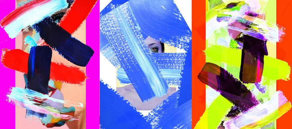
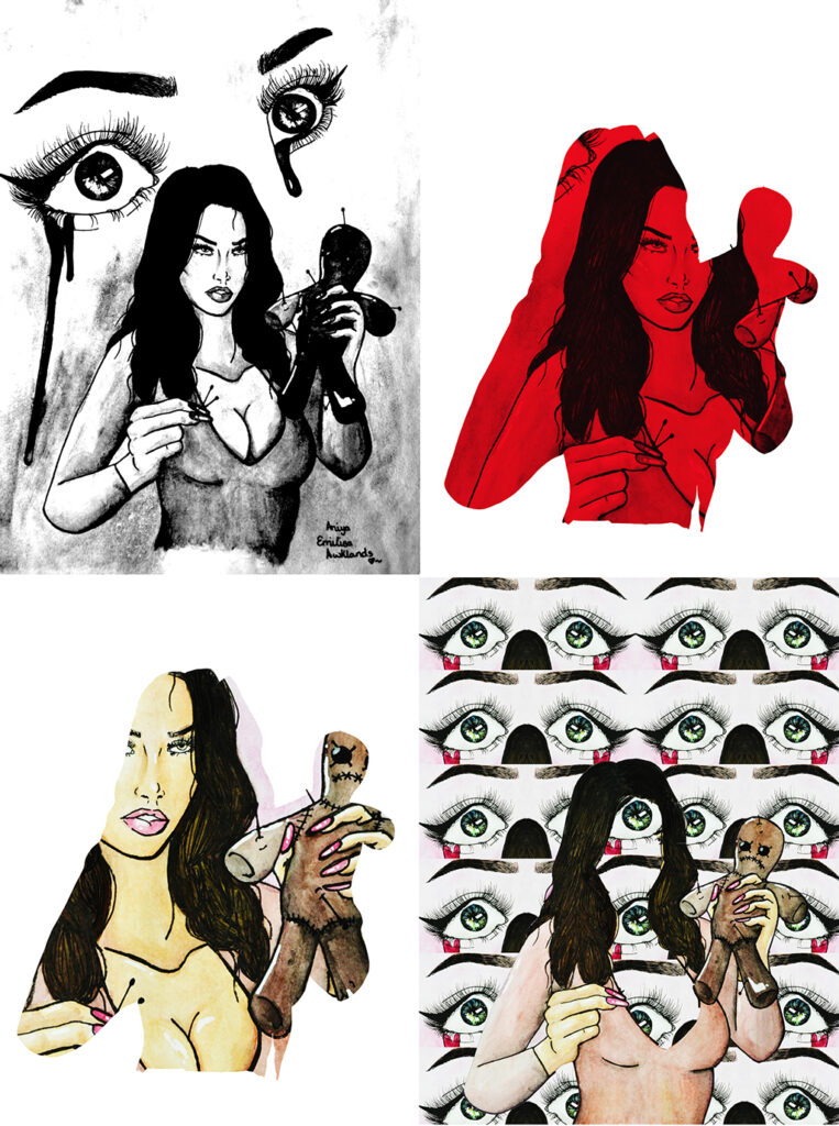
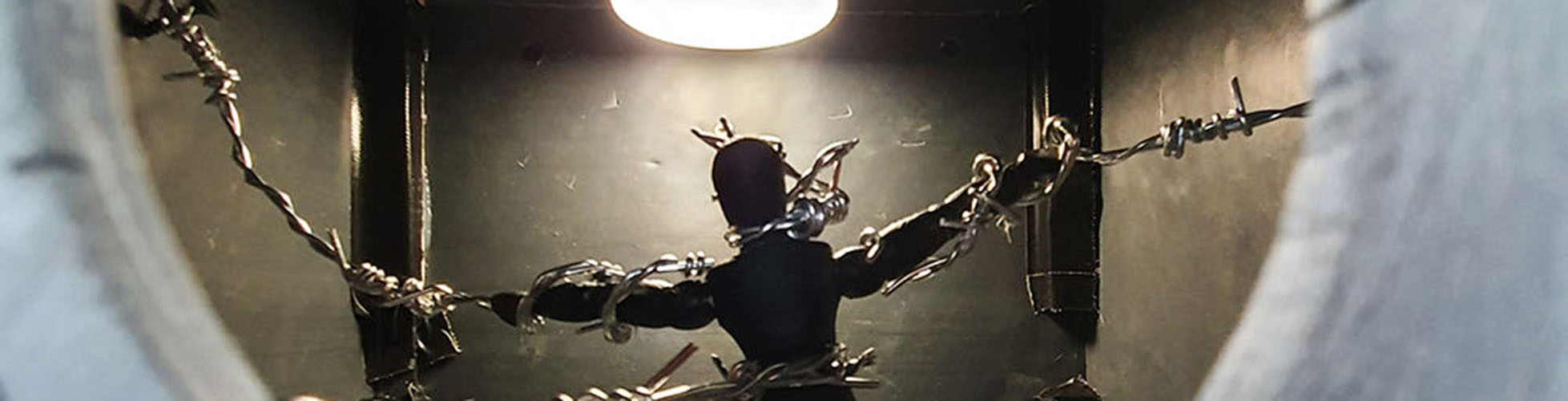
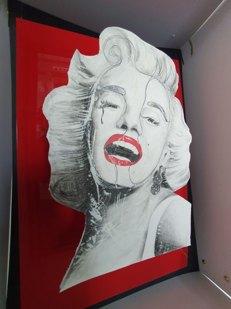
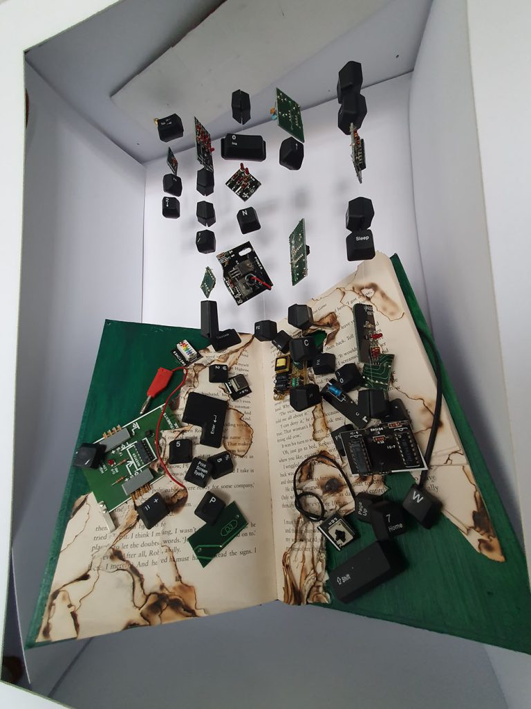
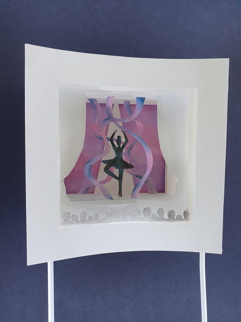
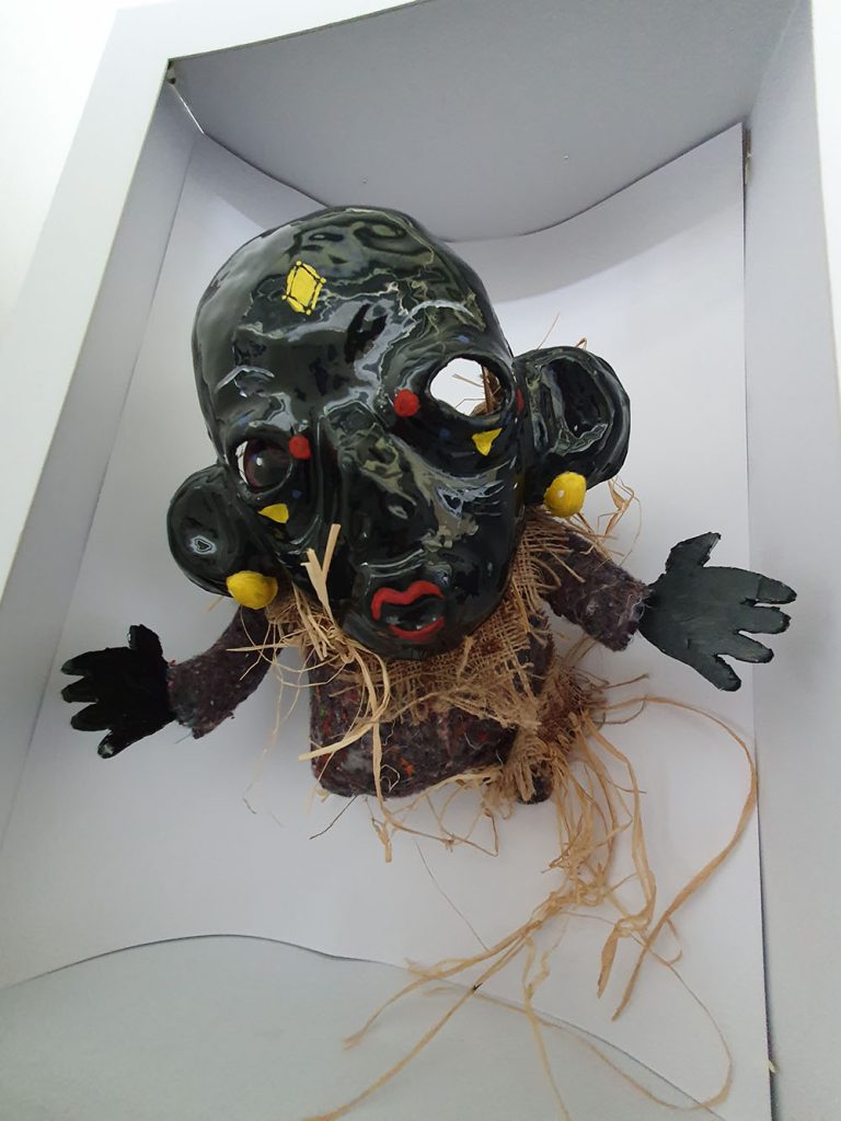
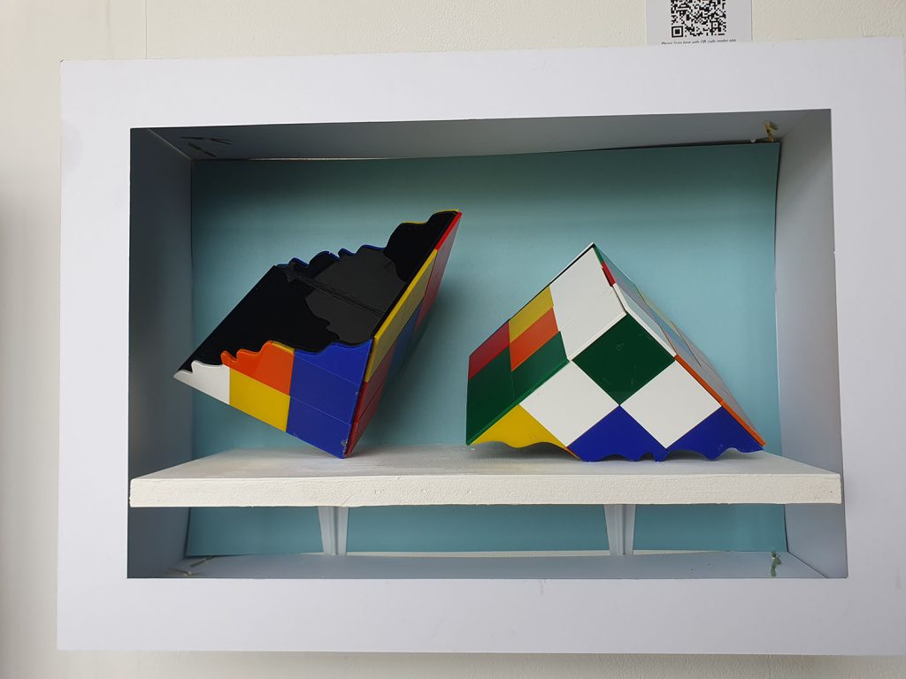
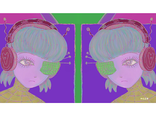
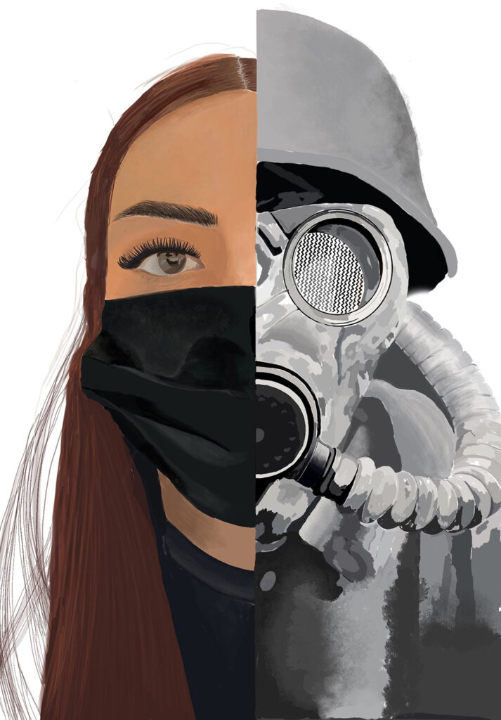
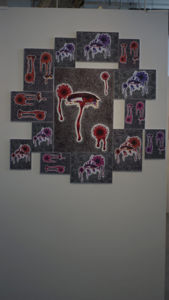
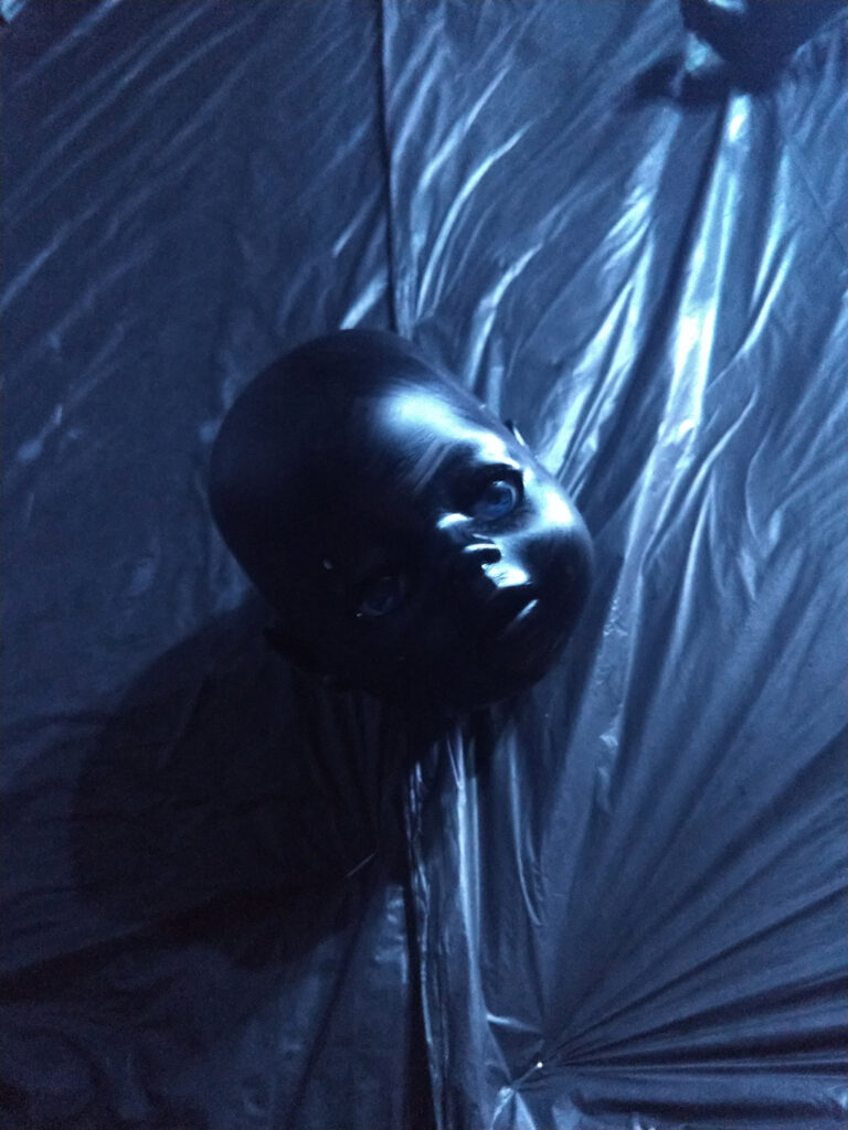
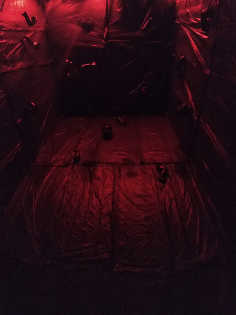
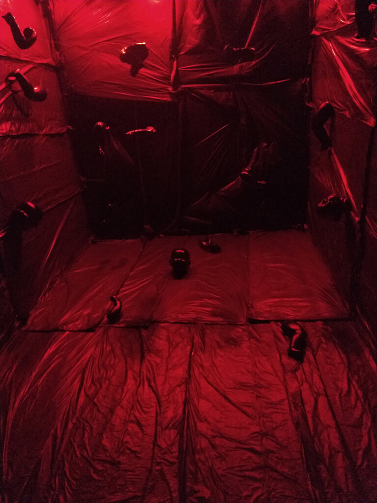
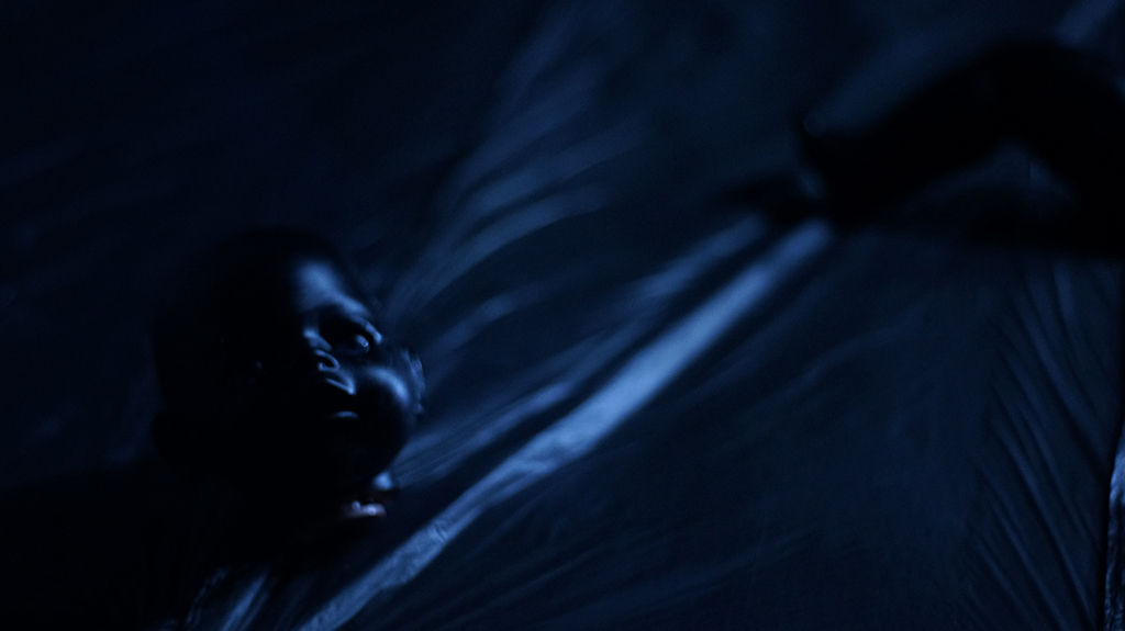
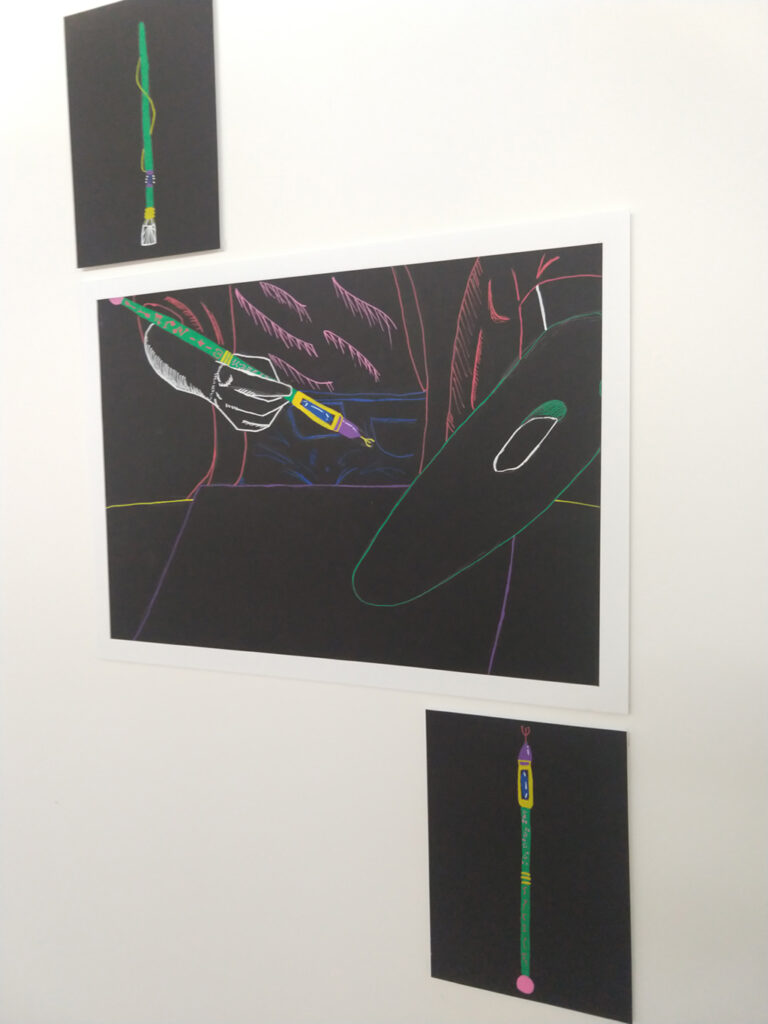
Duality
This project developed from a previous theme where I was creating illustrations for tarot cards. Here I have explored multiple dualities, looking at the most powerful approach to visualise two differences within one image. The image included here explores the idea of love and hate, where the voodoo doll makes you imagine someone else’s pain, maybe distracting you from your own. I work illustratively, always trying to produce detailed representations of the objects I’m drawing, and merging different images to create new ideas and to provoke new thoughts. I’m not afraid to challenge expectations and to highlight stereotypes.
Charlie Benton
Previous Education: Wolverhampton College Destination: Employment
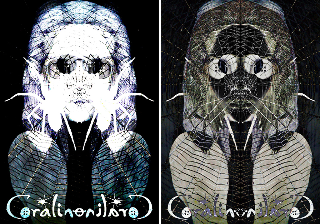
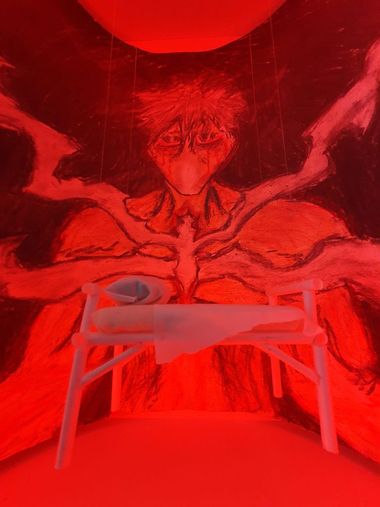
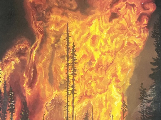
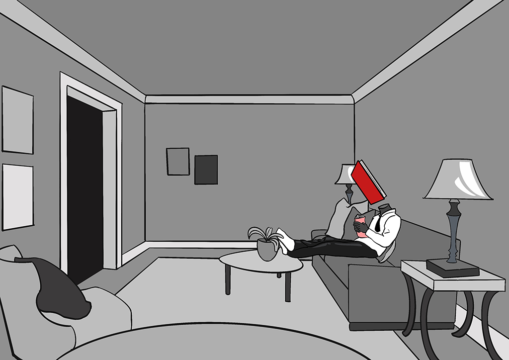
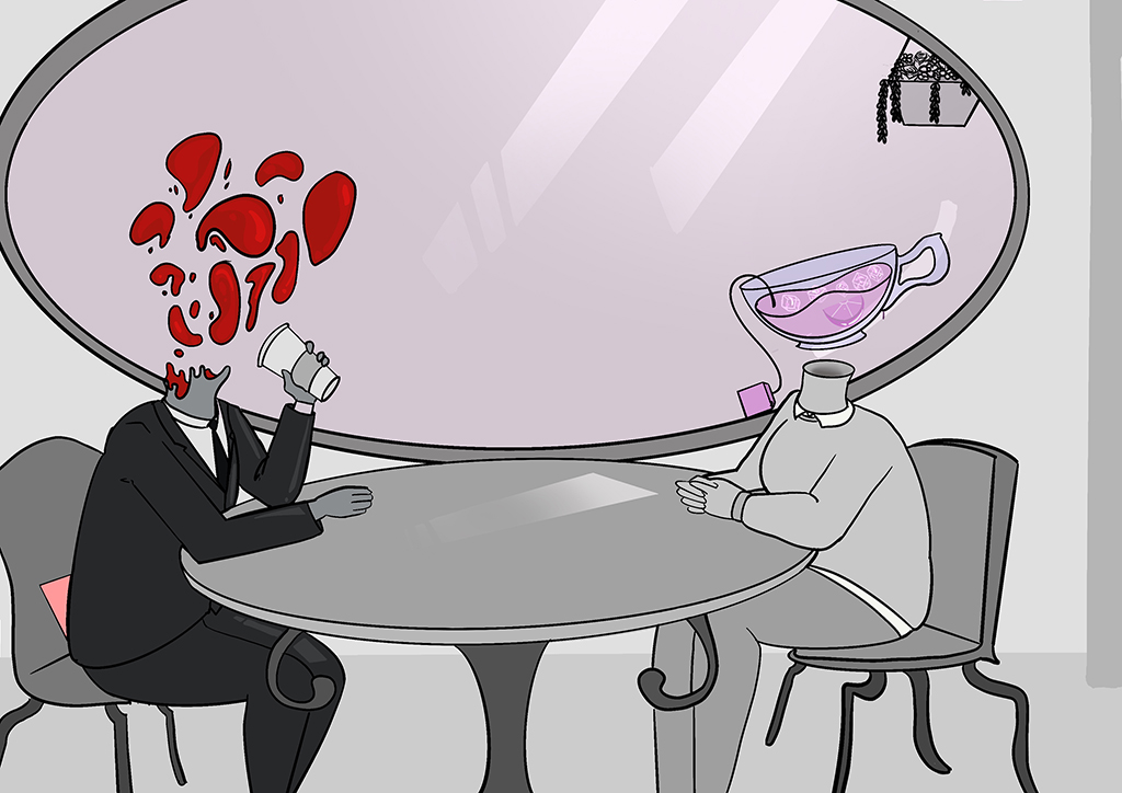
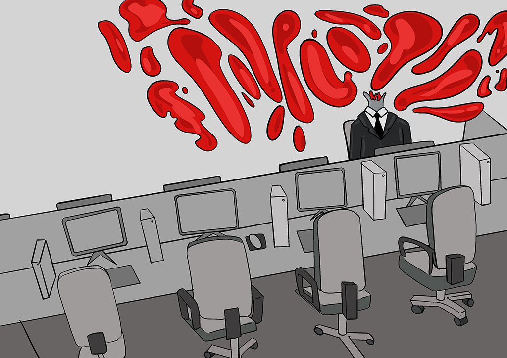
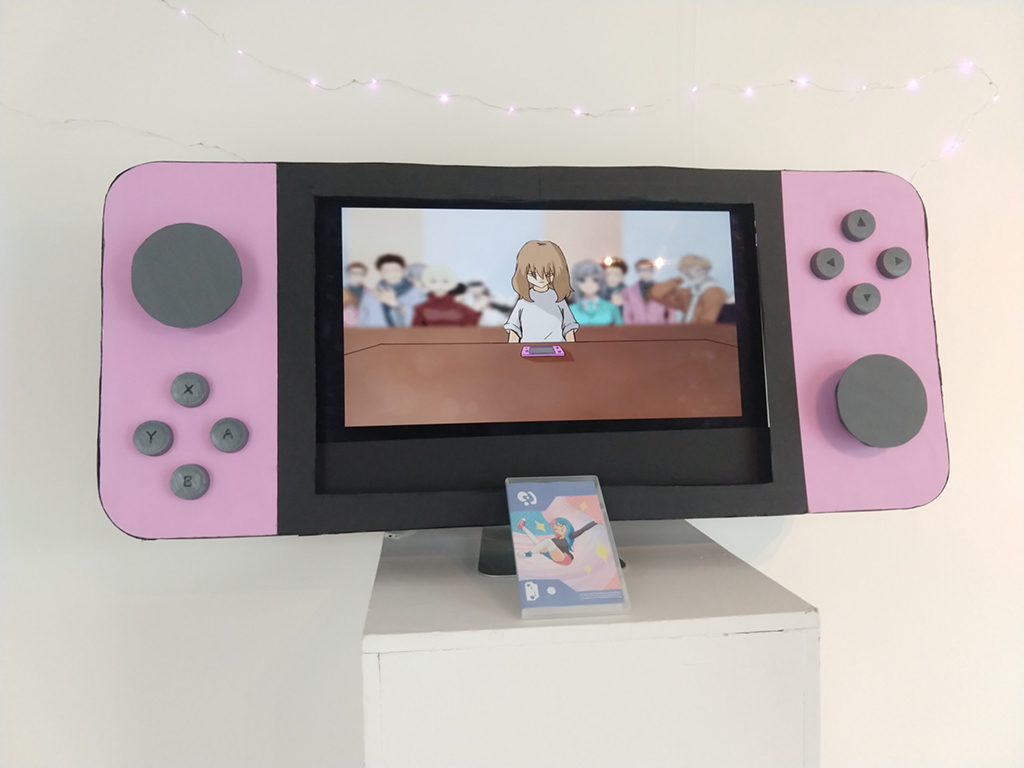
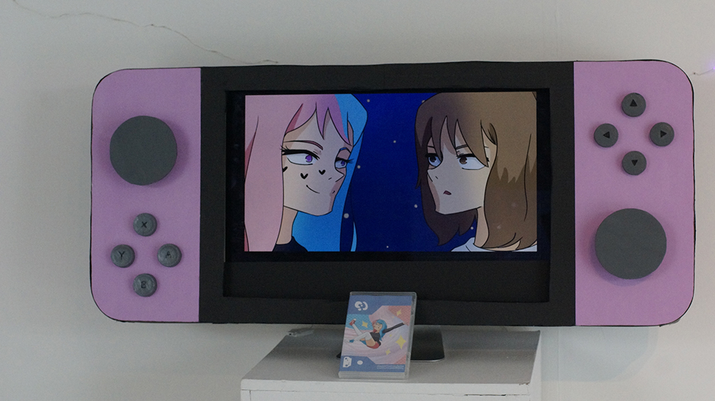
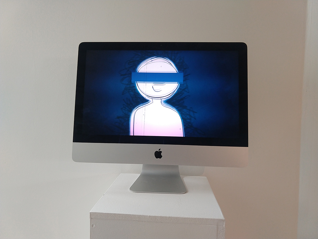
Coraline
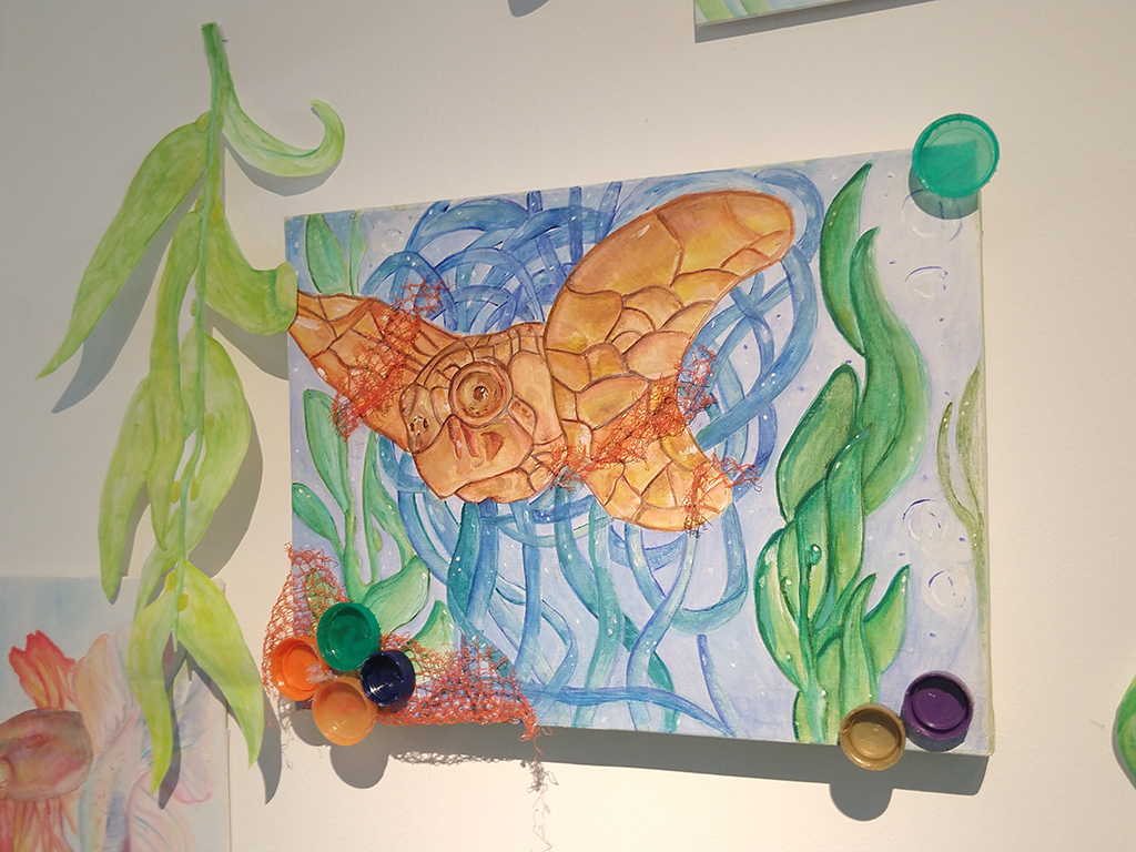
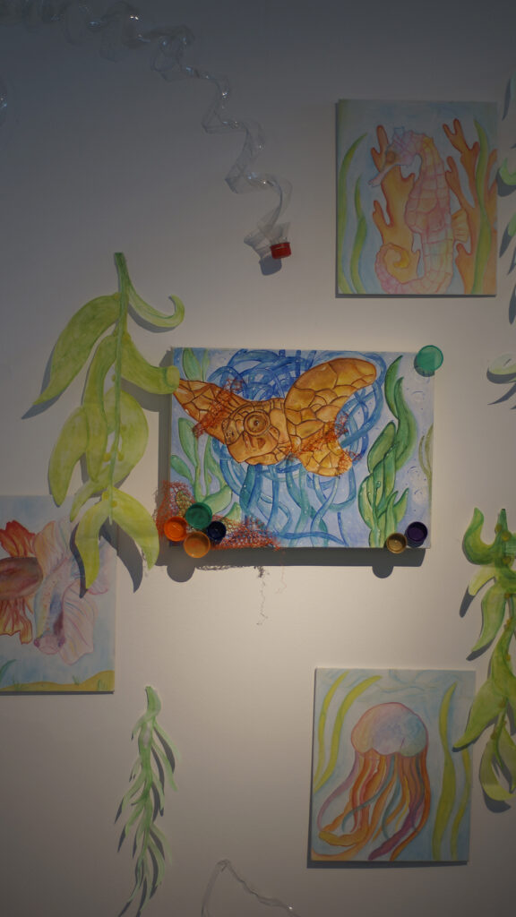
The digitally manipulated work presented here is part of a wider body of work taken from the popular animation titled ‘ Coraline.’ The work aims to reimagine characters from the animation, exploring new colours, shapes and forms. My response to this stop motion animation is entirely linked to the myriad of mental health conditions, that are clearly prevalent in the narrative. Research will focus largely on the descriptions of mental health conditions and how these relate to each character. Illustrators that I will explore include Cath Riley and Dave Mckean, as they directly relate to the story and could inspire both a conceptual approach and drawing/image making techniques. I started the project by analysing social media logos, with the intention of drawing issues affecting teenagers and young people and their mental health. I’m focusing on two characters, Coraline and The Other Mother, from which I will reimagine through drawing and digital manipulation and text. Primary photos have also informed aspects of the final response, such as flames and other symbolic objects.
Lauren Clinton
Previous Education: Pedmore High School Destination: Birmingham City University BA (hons) Fine Art
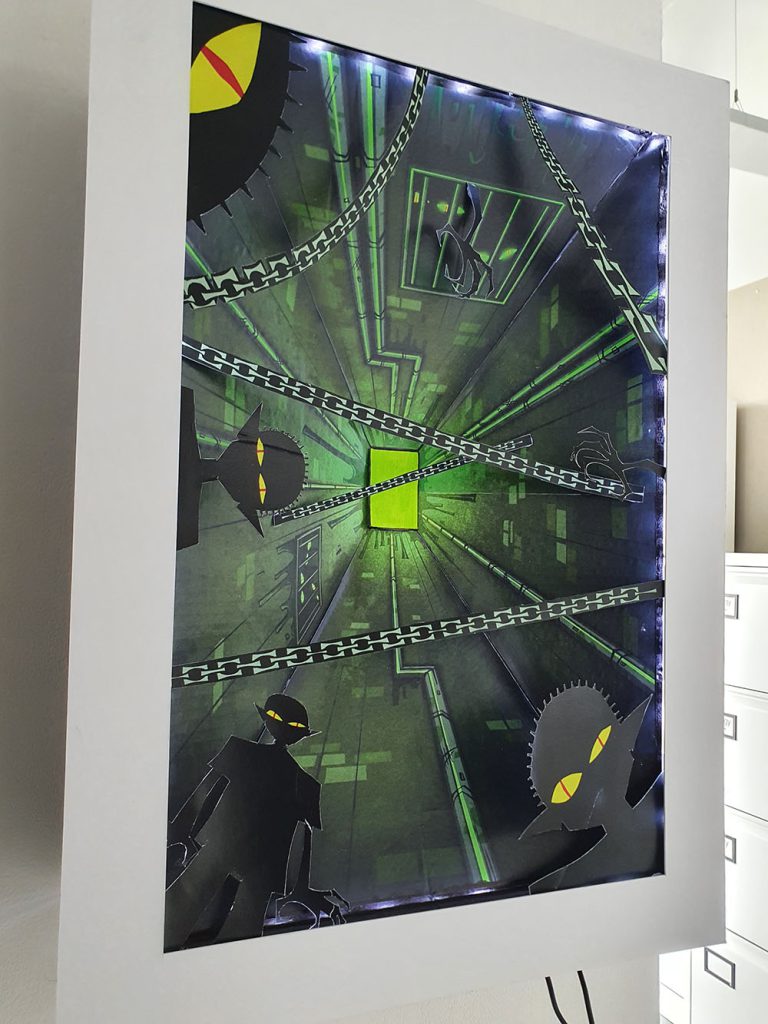
Chilling Adventures of Sabrina
My project is based on a reimagining of a popular NETFLIX series ‘Chilling Adventures of Sabrina.’ This ‘reimagining’ intends to provide a new visualization of the Eldritch Terrors. I chose to do a final piece on the eldritch terror ‘The Imp of the Perverse’ as I felt like it has the most detail in the drawings that I did, and I feel like it matches the theme the most out of all of the eldritch terror drawings. The artist that influenced my work is Joyce Pensato based on how she interprets popular and familiar images from cartoons and comics in large scale paintings and drawings through fine art.
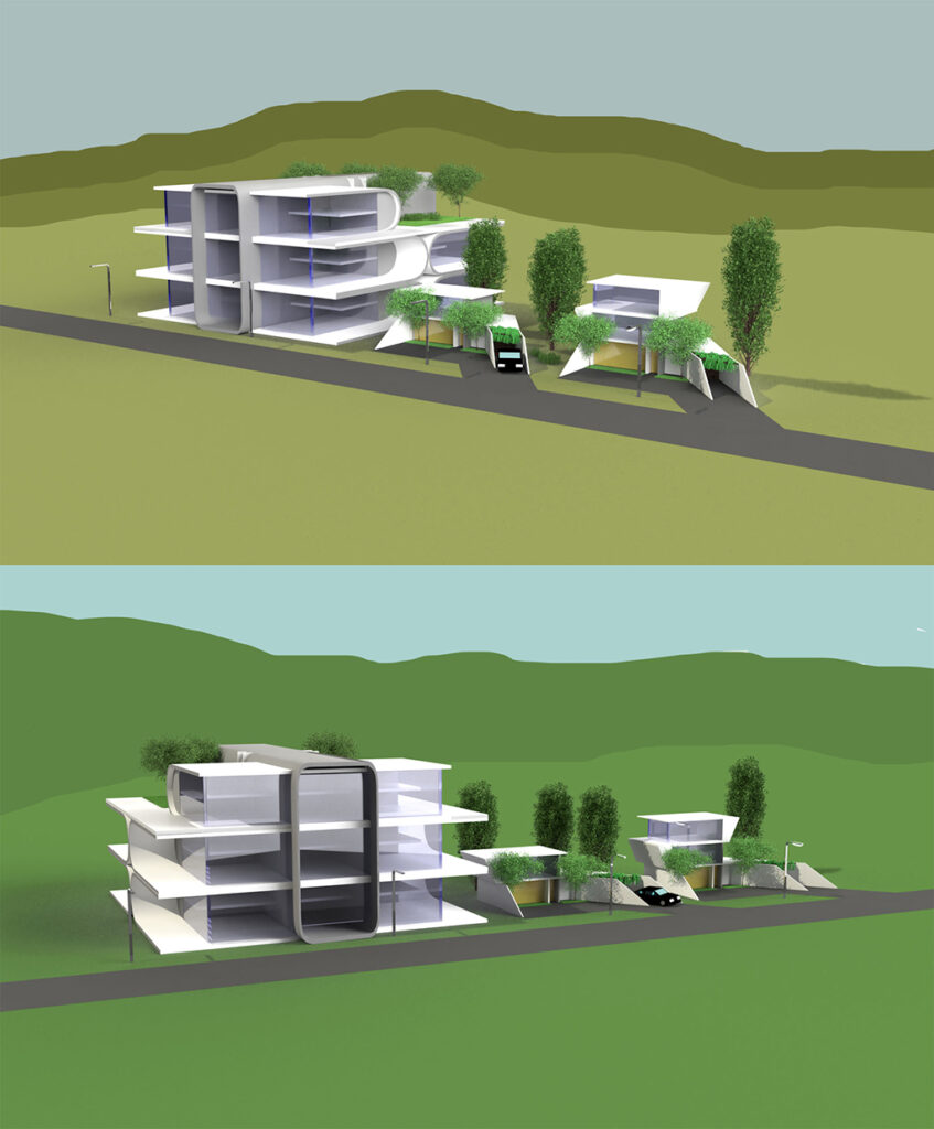
Bartlomiej Dziadula
Previous Education: Birmingham, Quinton – Four Dwellings Academy Destination: Birmingham City University – Architecture
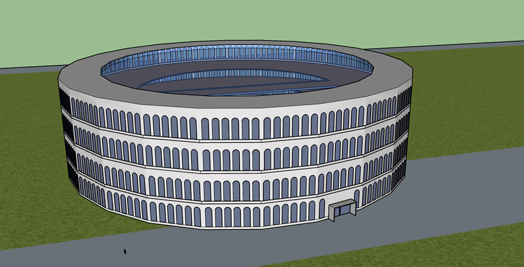
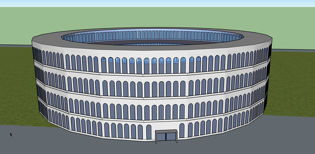
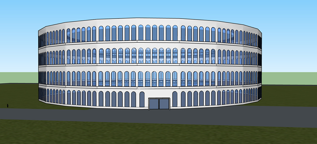
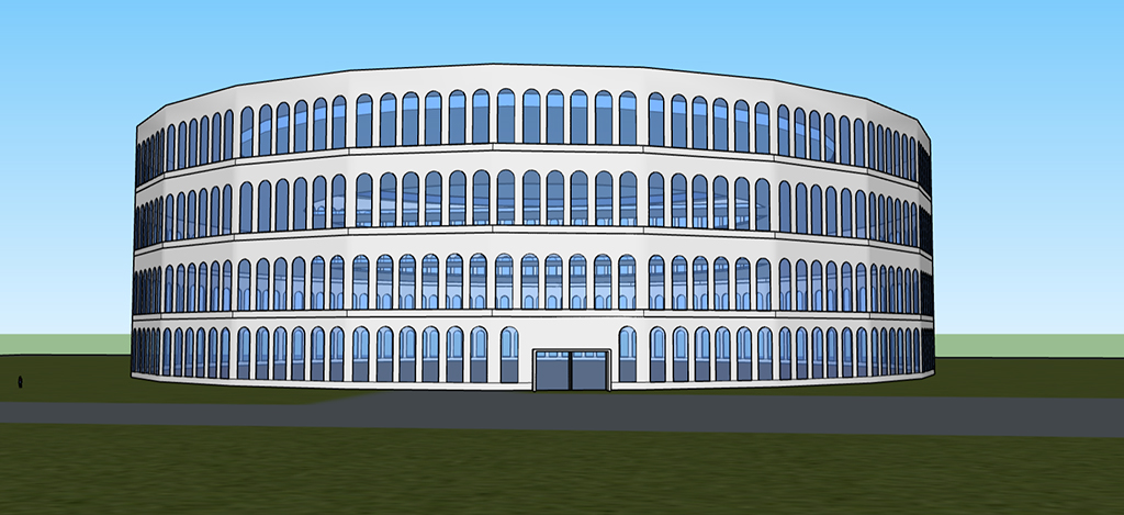
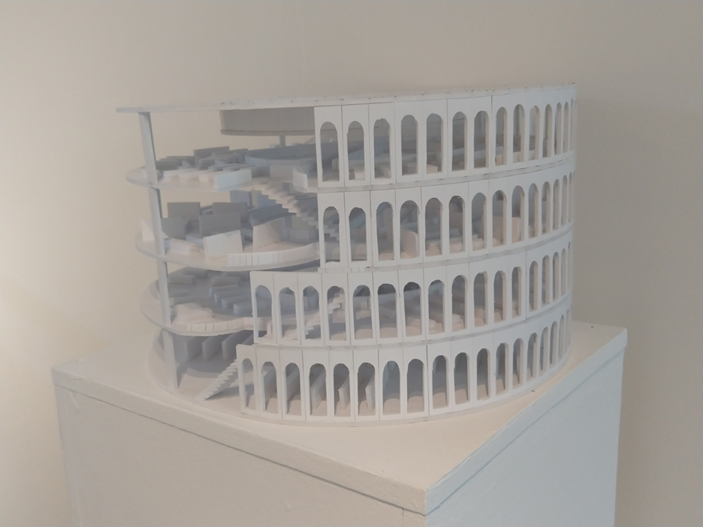
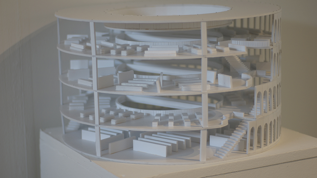
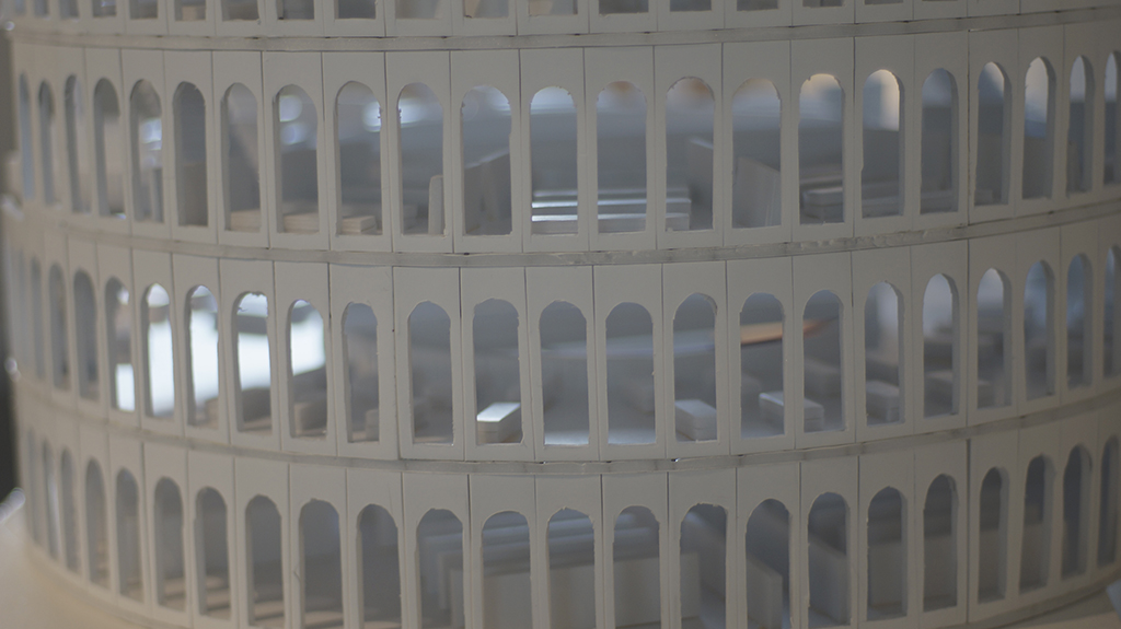
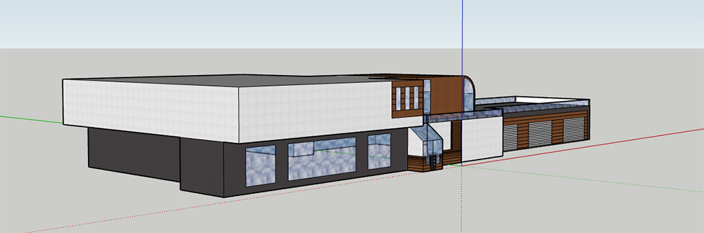
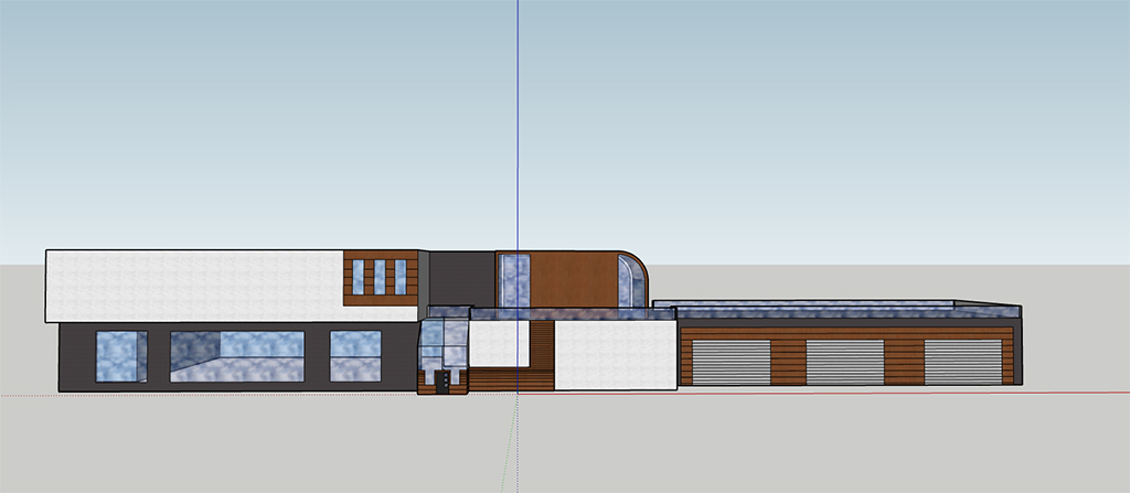
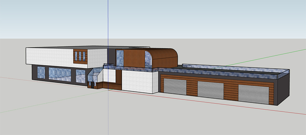
Architectural Utopia
The concept for this project was to produce a vision of architecture that resembles today’s ideas of Utopia. I was trying to achieve this impression of utopia by adding these elements to the buildings I was designing.
For example, nature, that some of us are missing living in some housings/apartments or improved energy consumption by creating bigger windows, to let more natural light in, and use less electricity. The two artists that I took the most inspiration from, were architects: Zaha Hadid and Tom Wiscomb. They allowed me to come up with the ideas for the shapes of the architecture I produced, which their work was the most beneficial to look at, since they presented Utopian architecture. Through my work I am presenting ideas of Utopia, which is the constant want and greed of humanity to achieve something better, but unreachable, in architectural form. From the audience, looking at my work, I would like them to recognize something that is missing in real life buildings, that could be found in my work. If this concept was to become reality it would be made out of concrete, steel, glass and wood for the interiors. Since it’s just a concept, there would be regulations applied, to make it as energy efficient as possible. The apartment building itself, I would imagine being surrounded with a car park and a green belt surrounding it.
Dylan Elms
Previous Education: PTC Destination: Foundation Art and Design
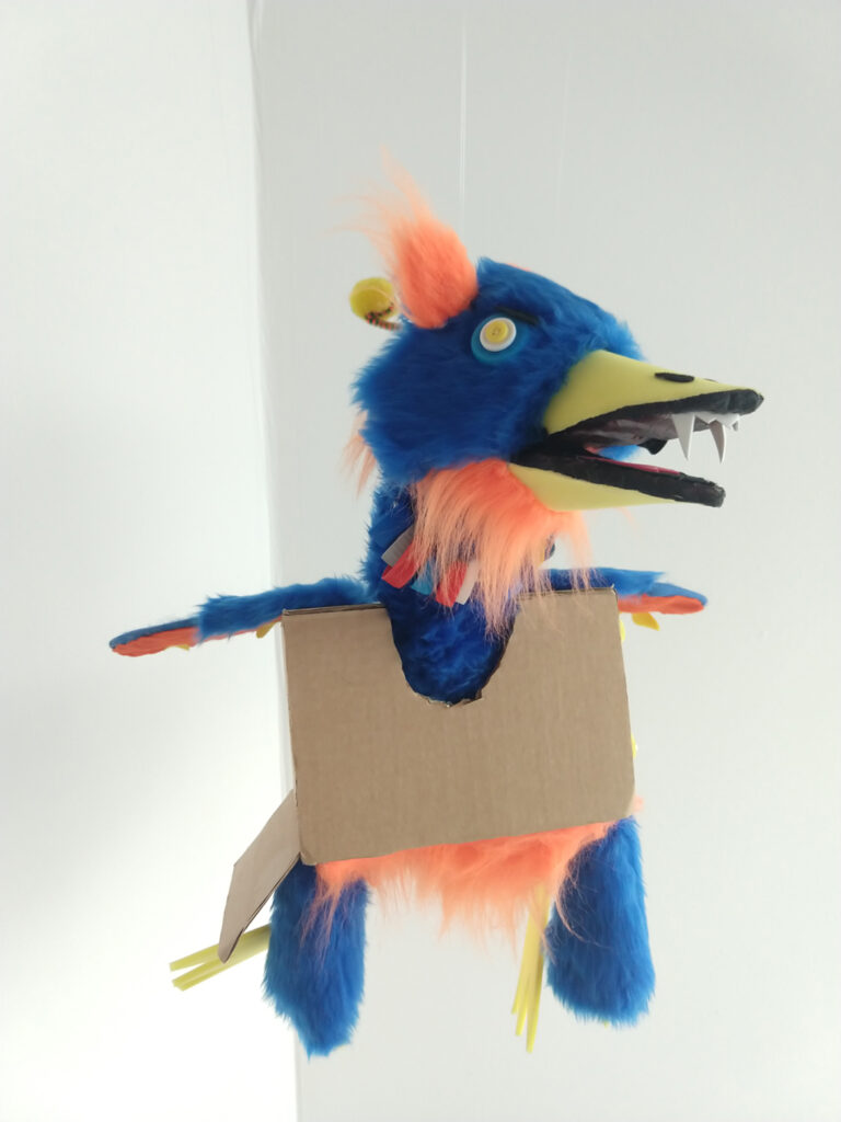
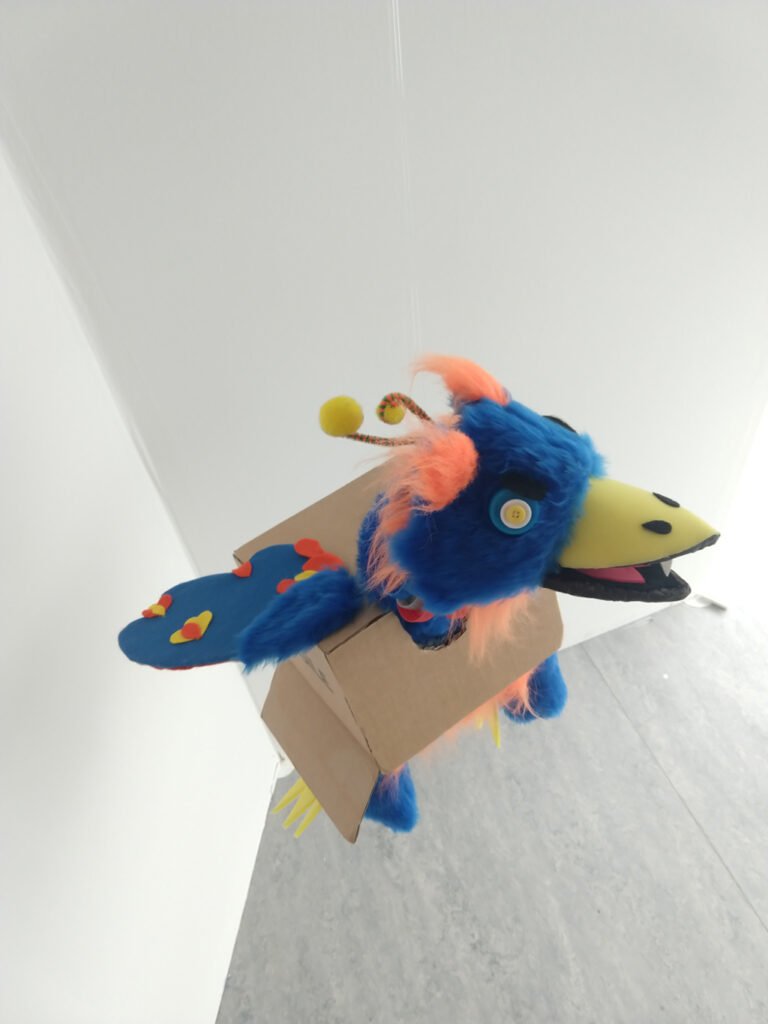
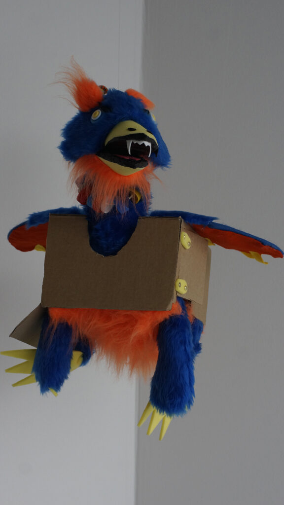
Uncanny Cryptids
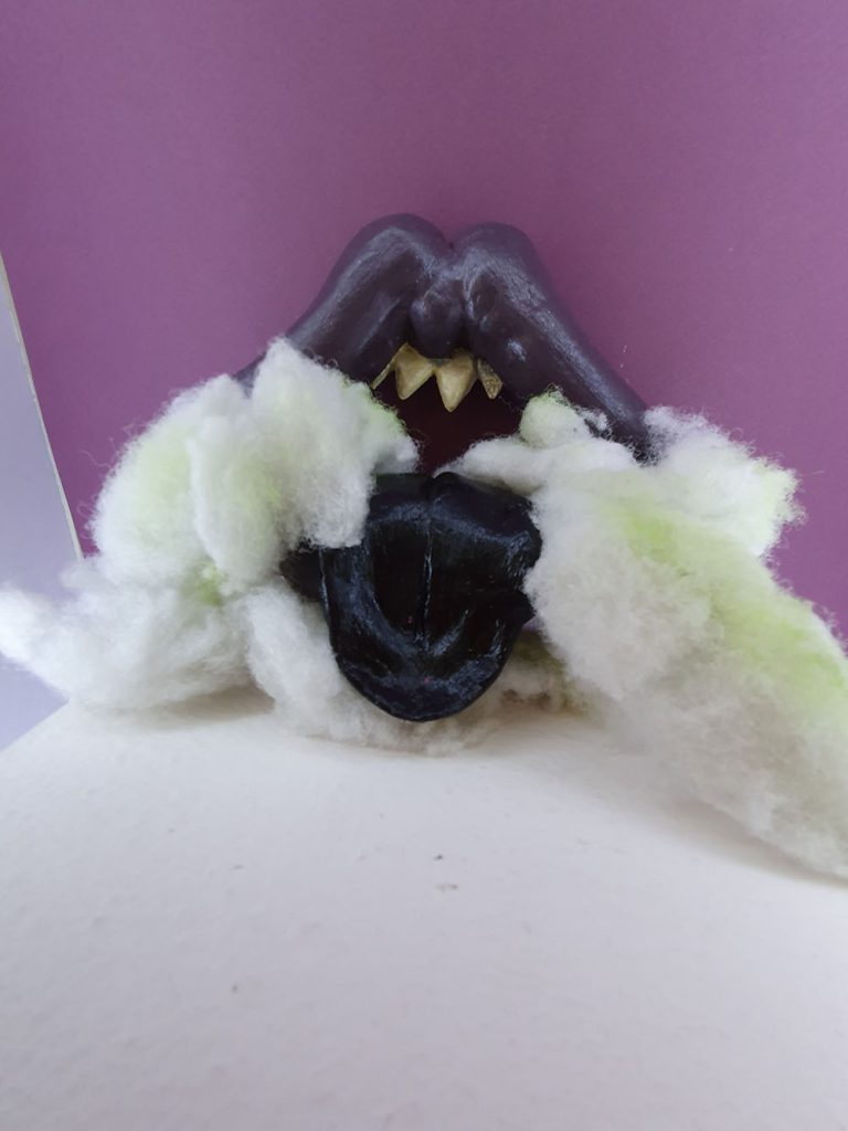
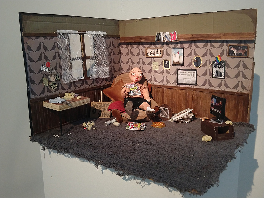
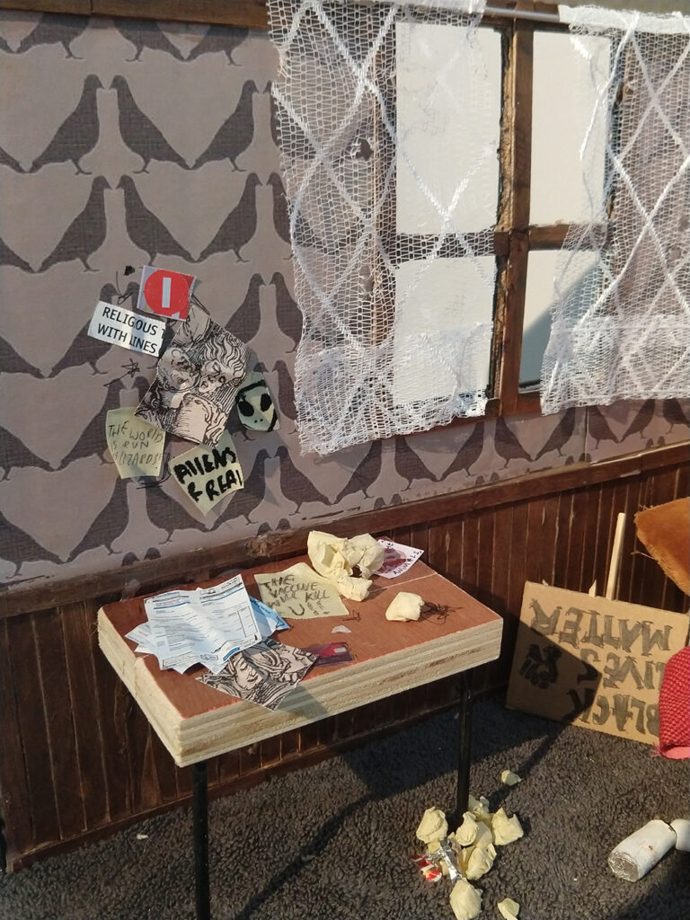
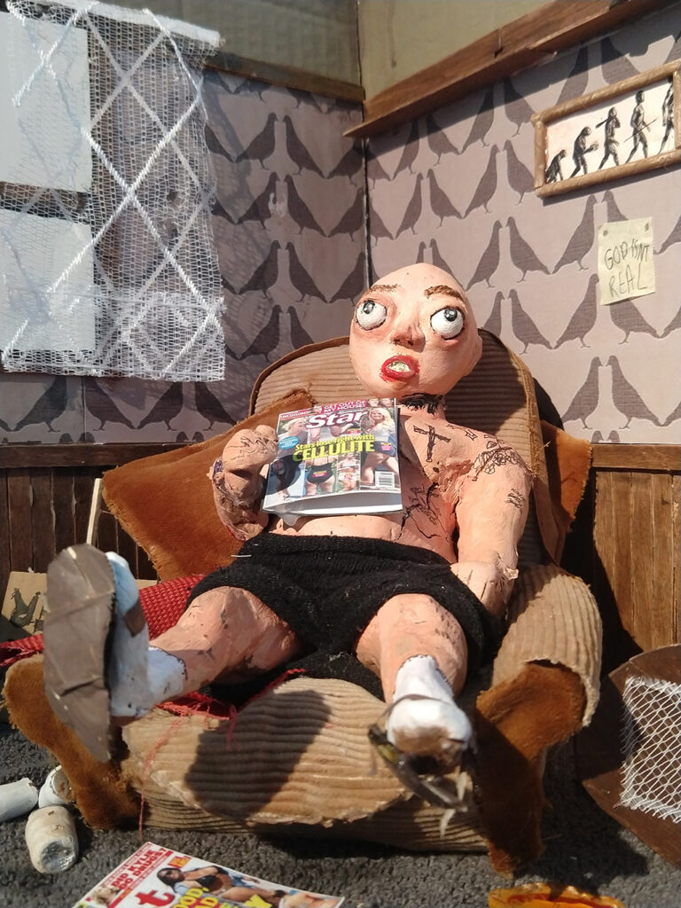
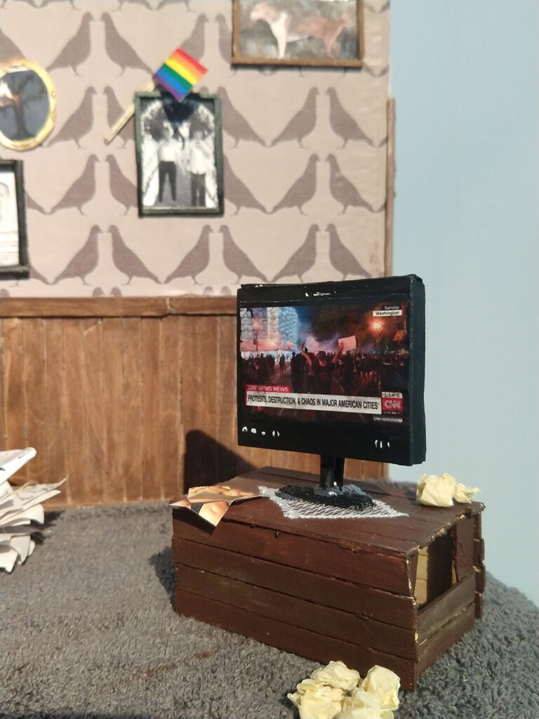
For this project, I had decided that I would create a body of work based on folklore creatures which make people feel uneasy in the place they feel the safest, their own home. For the project, I had decided that I would create four of my very own folklore creatures from scratch, with their own backstories included, as well as a list of what they do, where they can be found. I then produced multiple drawings of each and smaller developmental model sculptures of each. I have designed the creatures based around domesticity, in places such as the bedroom, kitchen and then living room, which are by far the most commonly used places in a house hold. By doing this I will trigger an uneasy feeling from the audience. I had created my sculptures out of clay, as well as using a range of materials and objects which are typically found in the home to further cement my work into the uncanny valley.
I believe that the Chapman Brothers and Clive Barker were the two most influential artists to me and my work because of the specific artworks styles they produce and work in. The Chapman Brother produce heavily detailed models of gruesome and scary scenarios and creatures, it was these models which had inspired me to work in a 3D sculpture medium. Clive Barker has inspired me from the many drawings he had done, ranging from the nightmarish landscapes, to his demented creatures. The creatures specifically were what inspired the design for one my sculptures entirely, as well as attempting to achieve a similar style to his own with my drawings which i had produced of models.
Sophie Fenney
Previous Education: Year 1 Diploma BMET Destination: Employment
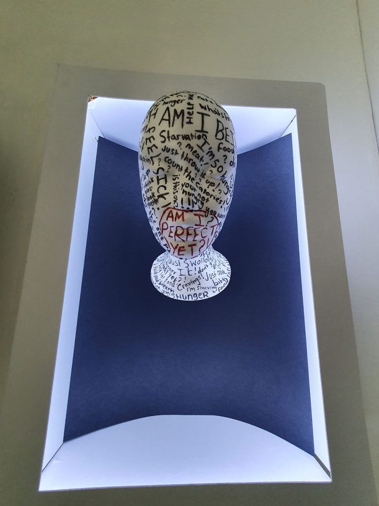
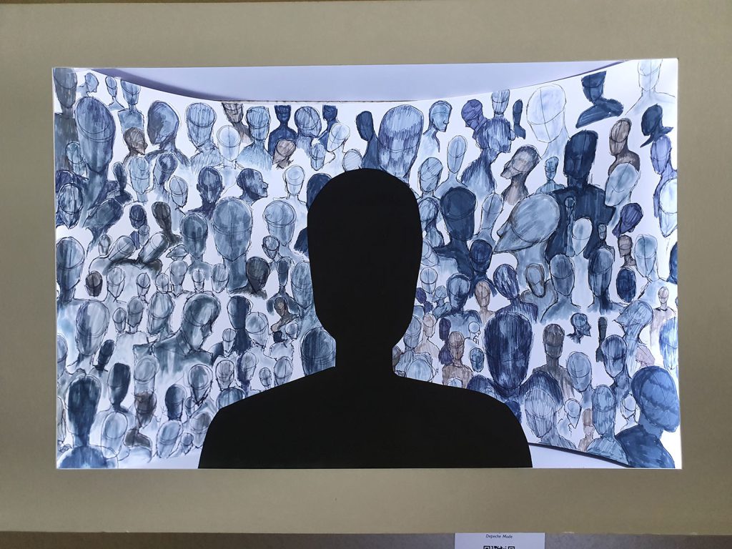
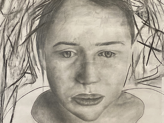
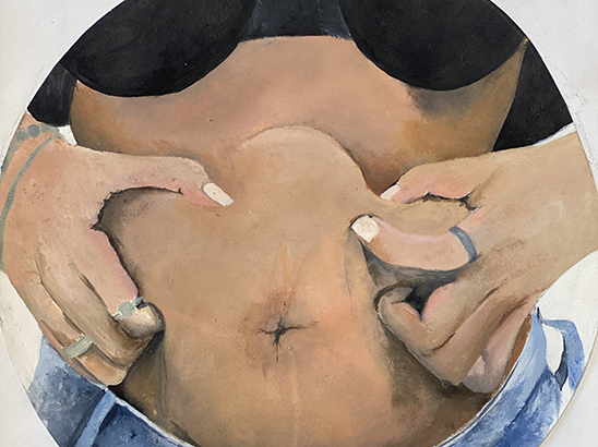
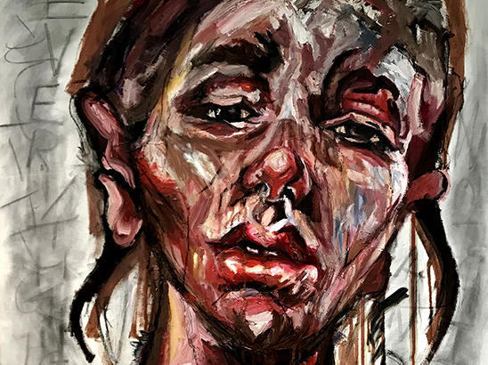
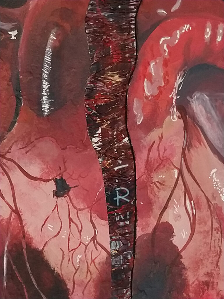
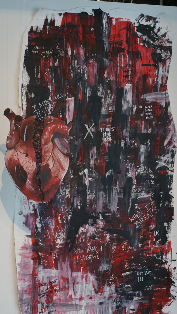
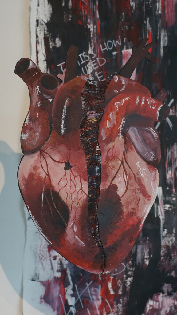
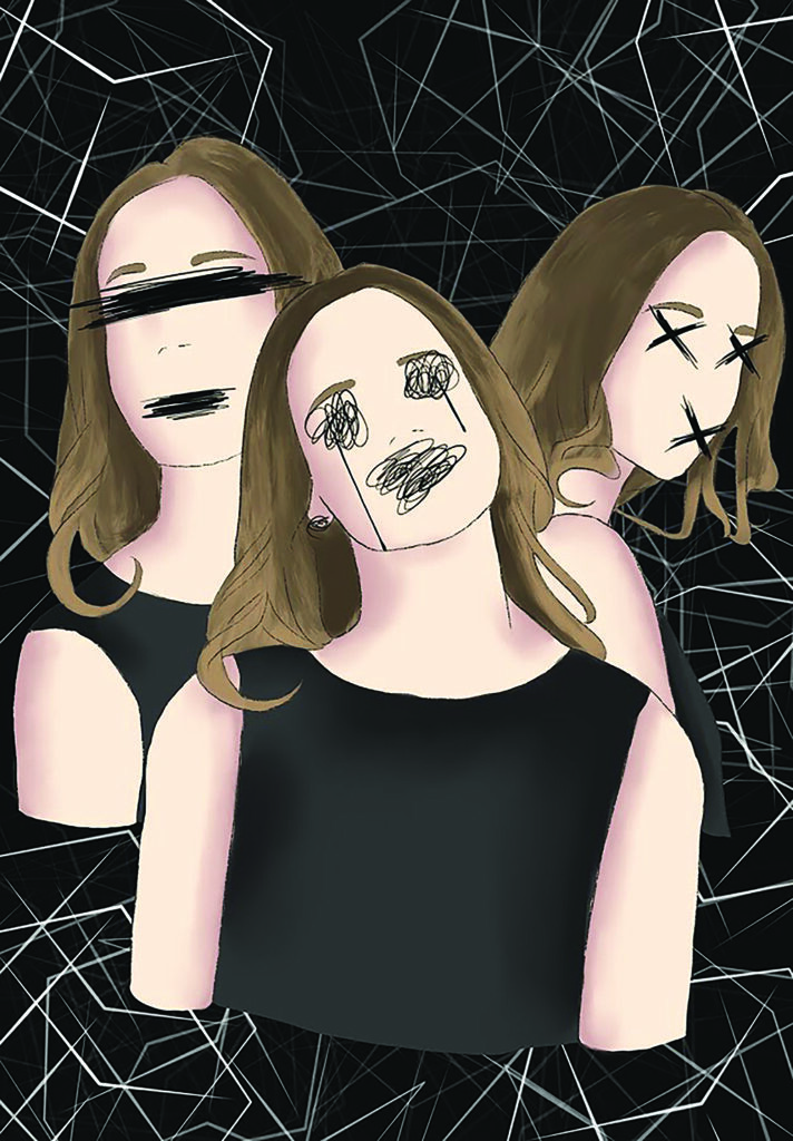
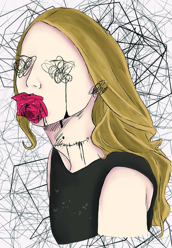
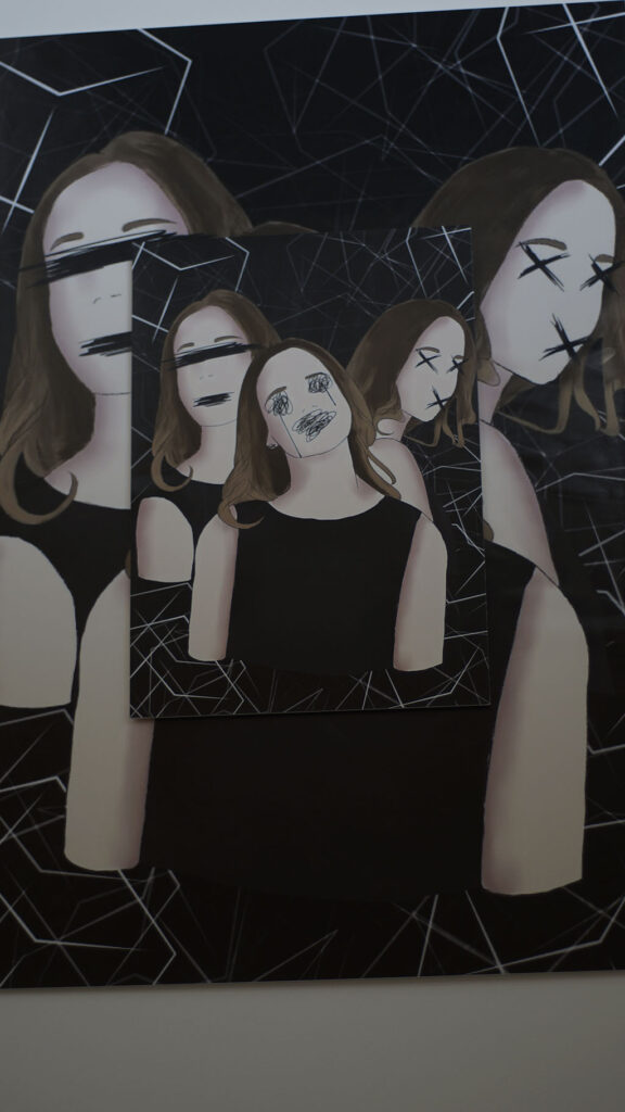
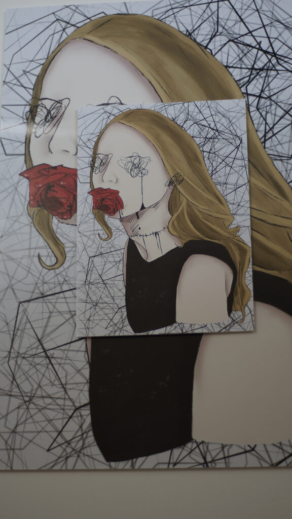
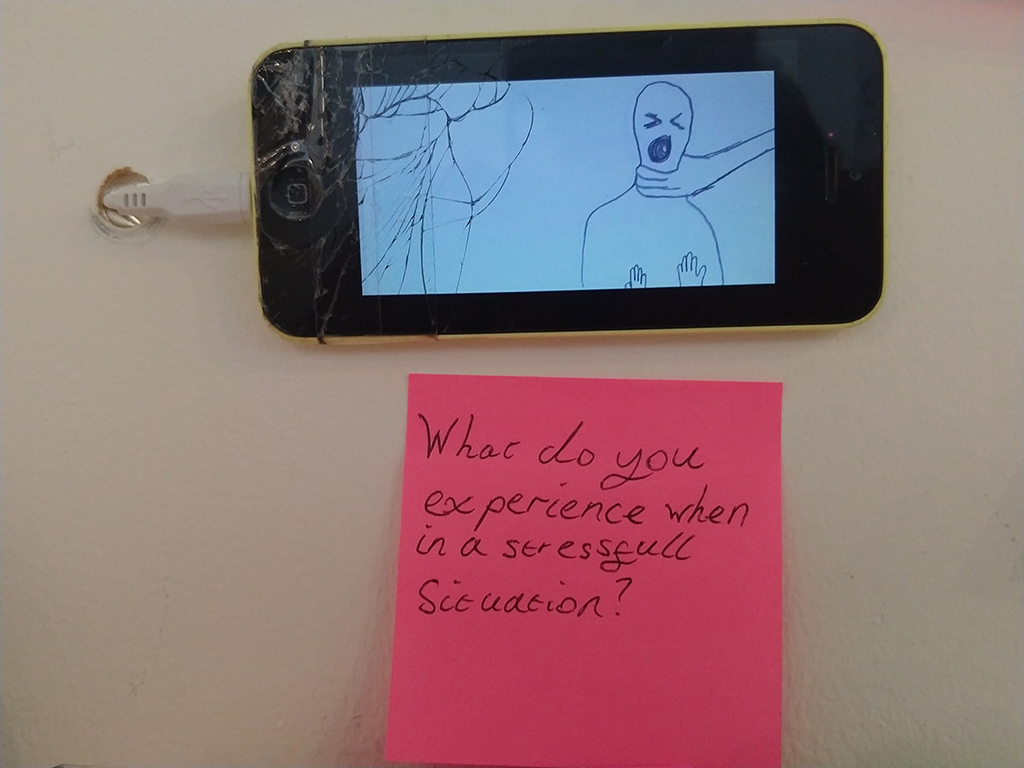
Mental Health
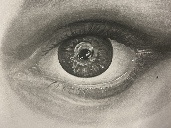
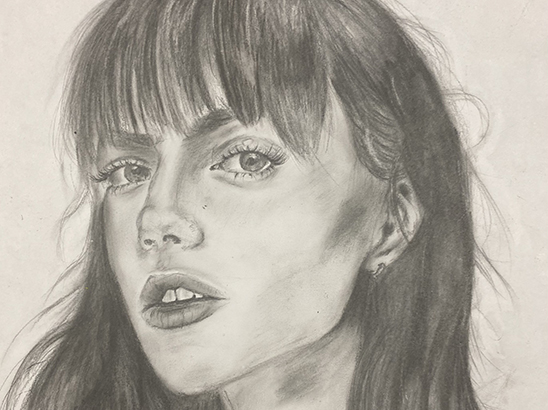
The concept of my final piece revolves around mental health and how it affects people. I wanted to capture how it may look from an inside point of view, seeing what other people may not notice. I used a range of different materials and media to come up with my final pieces. Both digital and physical to produce these portraits. The heavy, expressive brush strokes are designed to reveal the internal ‘mental health’ that we all have. Marlene Dumas and Urs Fischer were my two biggest inspirations. The use of Dumas style of portraits and the way Fischer collages his work together were incredibly significant in my work. I enjoyed the way Dumas created her work using ridiculously small amount of detail, focusing more on the emotion it conveys. Using this and the surreal collage techniques Fischer used in his work allowed me to create multiple different portraits in my own style trying to portray how someone may feel on the inside. I want to communicate how mental health can look so different for different people and it is not just one thing. I also wanted to display how it may look on the inside when someone seems “normal” using something everyone has (like a face) to show this but distorting it into something bizarre, and how mental health makes you feel like you are someone else. I want people viewing my work to think about how mental health affects people, and how many people are affected by it. I want people to think about the effects it has on other people and hopefully start a conversation and to show other people that its normal to feel like this.
Luke Harper
Previous Education: The Wordsley School Destination: Foundation Art and Design
Dystopian Video Game Concept
The concept for my FMP was inspired by the past events of lockdown and the global pandemic, inspired by games and films. I was playing and viewing Cyberpunk 2077 and and the seminal movie Blade Runner during lockdown and considered how I could visualise my own dystopian type video game through characters and environments. Throughout the project I experimented with a variety of techniques because of the limitations and time, I managed to experiment with pencil, fine liner and digital programs such as photoshop and aftereffects. The significant artists that informed the work included Syd Mead and Stanley Donwood as their art styles and work interested me the most and had a powerful influence when creating the artwork for the cityscapes. The fine liner drawing technique was inspired by Donwood’s Linocut work and how the images looked after the process was completed. Bold and wavy lines highlighting small details which paired well with Syd Meads futuristic cityscapes that helped inspire my own designs.
Niamh Holland
Previous Education: Year 1 Diploma Art & Design Destination: Employment
Gargoyles
I am fascinated by Gargoyles as their aesthetic intrigues, amuses and confuses me. The two paintings presented here form part of the development stage, where I was experimenting with how to create a contemporary gargoyle, linked to historical ideas yet new and dynamic. Gargoyles were created initially as creative water spouts on cathedrals and historical buildings and were popularised in the 13th century, they were also thought to ward off evil spirits. During this project I want to create my own gargoyles by exploring collage, drawing and sculpture. I want to create artworks that seem monstrous, disturbing or unsettling. I want to exaggerate, and combine disparate elements to form a new and sinister response, using the Gargoyle as a start point. I also want to experiment with using political figures like Boris Johnson, Nigel Farage, Margret Thatcher and many more. I’d like to poke fun of these people by turning them in to a gargoyle sculpture through the art of satire and mockery.
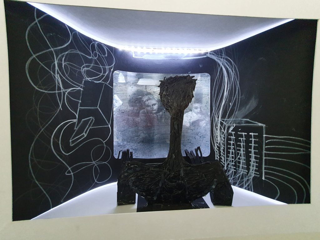
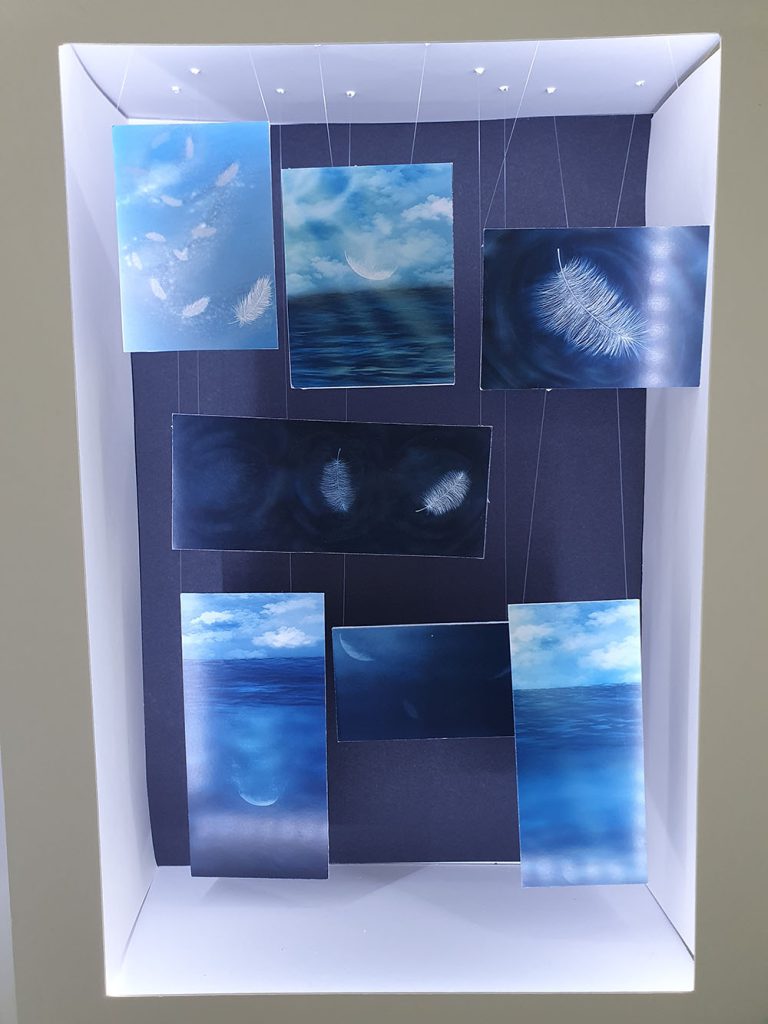
Maximos Kiosses
Previous Education: Art and Design Level 1 Diploma, Art and Design Level 2 Diploma Destination: Foundation Art and Design
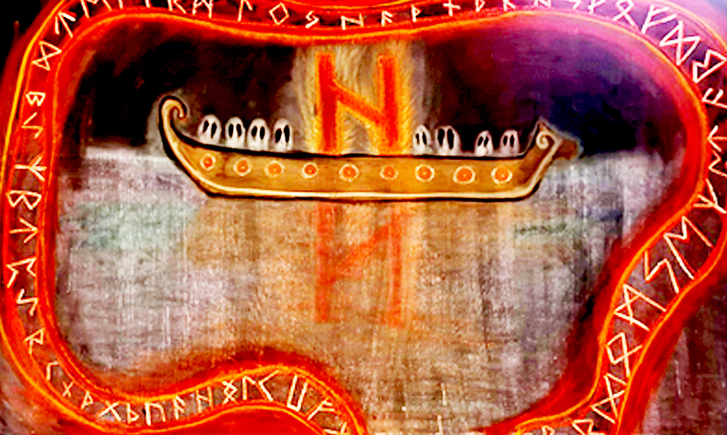
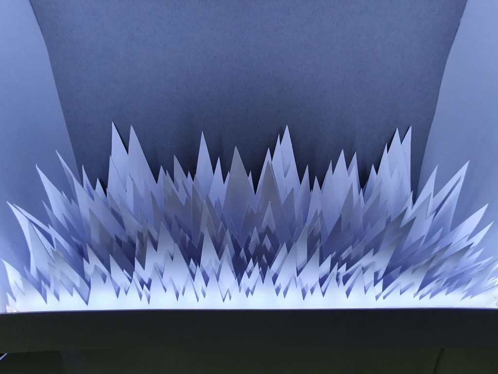
The Helhiem Longboat
To acknowledge the hindsight of this piece the “Helhiem Longboat” is one that may, at a glance, appear distorted and disproportional creating an underlying sense of uneasiness. This imbalance is, however, intended due to the premise of the piece being a personal recreation of the Viking Underworld “Helhiem.” Therefore the key aspects of this play a part it summarising a feeling that presents a sense of caustic reality and existential questioning. The ‘Sea’ for which is the foundation for this Artwork, is almost metallic in appearance with streaks of dark blues and purple to contribute to the overall unfamiliarity of it all. The ghostly Sea dissipates into the infinite black void and instead of having our usual Sun shine brightly in the centre, the horizons only source of light is an off-centre Longboat, carrying the dead through the Abyss. The longboat is reminiscent of historical design based on the ones we have recovered in the modern era, with the Ghosts of the long dead being ever watchful as they stare into darkness for eternity. The giant burning effigy is actually one of the Viking “Runes” which each symbolise different specific aspects of life in a general sense, with this one being the rune of destruction, hence why its the sole shining light in the infinite dark of Hel, as destruction, chaos and death all unify under one conceptualization of this specific belief on the afterlife.
Other than the lonely boat with the burning rune, the misty Sea of Helheim shows us nothing, but the reflection of the damned in the murky waters. Surrounded with an expanding and contracting banner of Runes that encircle the fate of the lonely longboat. The Runes in their design are inspired by the rune stones that exist all over Scandinavia which have the same encircling banner that represent an esoteric story and meaning.
Also note how the Runes don’t encircle the entire piece, this is intentional and whilst it may not be entirely obviously at a glance, this is done for the metaphorical aspect. The Runes in Viking Lore dictate our fate, and the inclusion of leaving a gap at the bottom of the piece is to signify a change in fate. Weather that may be a way out of Helhiem for the lost souls, or just further into the darkness, it shows us things can change and our fate can always change, provided we go on the right course.
This piece was made by utilizing Blackboard paint and different colours of Chalk, the reasons for doing so can be incorporated into two different answers: Number one being the textures and blending that are beneficial with using Chalk provide strong colourful outlines whilst also being able to develop almost transparent effects, this was useful in the creation of the ghostly Sea and the encircling Runes. Secondly, I was inspired by an artist called Tacita Dean who specializes in Chalk pieces with an unparalleled attention to detail. I also think it’s worth mentioning that Tacita Dean has done several Chalk pieces with giant boats in the water clashing with waves and being blown around in the wind, completely different from my own work of course but was ultimately the inspiration for using Chalk in my final outcome. I’d also like to mention that each and every other artist I’ve researched for the project has been beneficially inspirational not necessarily in terms of context (Besides the ancient Rune masters, Föt and Asamund who inspired the encircling runes) but in terms of colours and proportional value, not to mention mythological value and how to translate the ancient mythological Norse poems into decipherable art like many have done before me and achieved it with such a high standard.
Thomas Rhooms
Previous Education: Year 1 Diploma BMET Destination: Employment
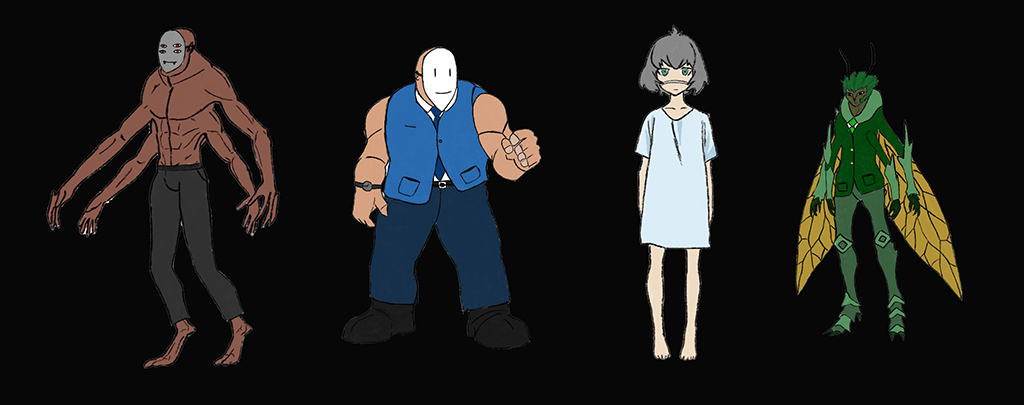
Character Design
For this project, my idea is to create drawings of characters which embody an exaggerated emotion with different designs for each one in an anime/ manga style. I also looked at different career roles which may have a good link to the emotion, for example a butcher could represent rage or anger, and a doctor could represent kindness or joy. I wanted to implement special weapons or half human hybrids which have links to certain job role. I also intended to make characters which embody aspects of a mental illnesses such as depression or anxiety. I started by researching emotions and what different types there are to help me develop with ideas. I will then research a range of artists such as Edward Munch and Manga artists such as Sui Ishida. I experimented with drawing to create characters and will also use photoshop and procreate to add colour and detail. I looked at backgrounds for these characters and used painting, collage and photography. The enduring connection between art and mental health and wellbeing is well documented, especially where artists and illustrators have attempted to document and communicate their own experiences of mental health struggles and or insights. Hollywood may well use caricatures and stereotypes of mental health to provide a character with an edge, or belonging to a subcategory or subgenre within society, which also happens in anime. I also felt it might be useful to provide a brief summary of the difference between anime and manga, as explained in the following quote, ‘Put simply, manga is the term given to Japanese comic books and graphic novels, whereas anime is the name given to Japanese animation. … Although both tend to be considered genres in the West, in reality they are a description of how the content is produced.’
Emily Southwick
Previous Education: Pedmore High School Destination: Birmingham City University
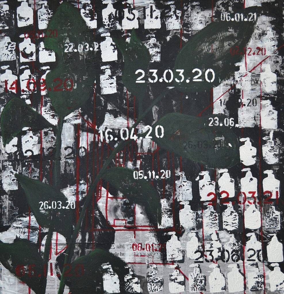
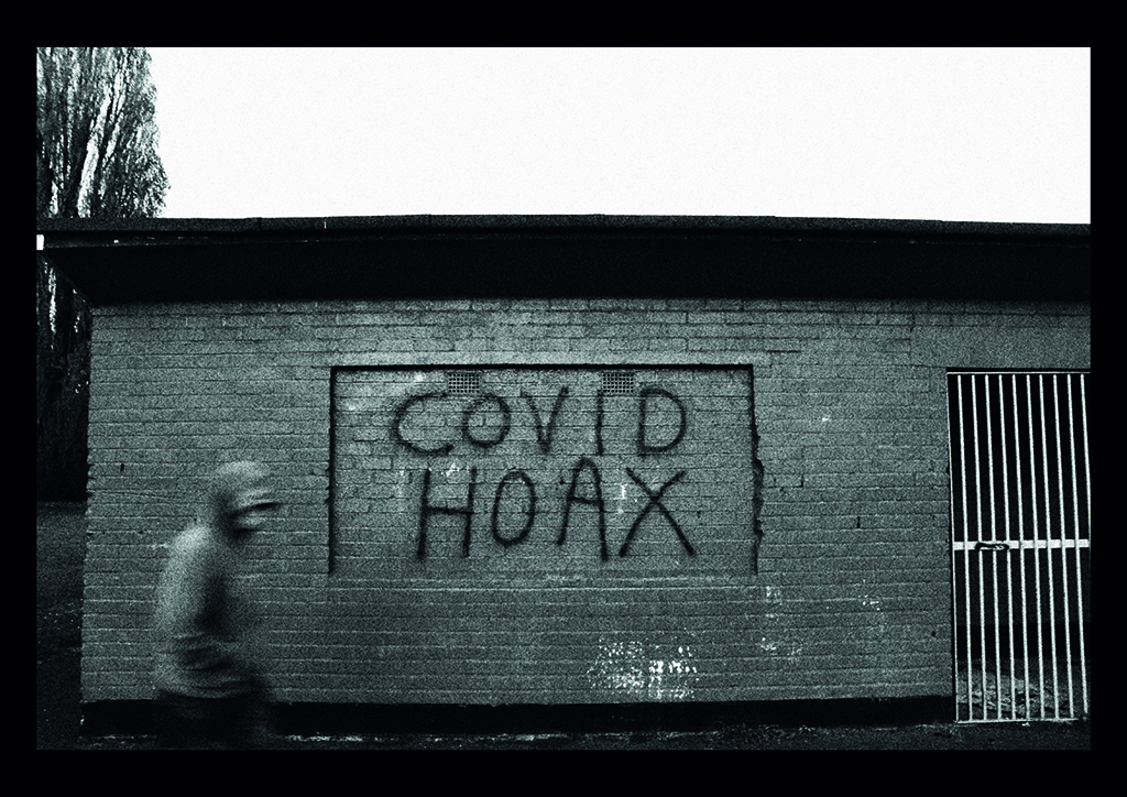
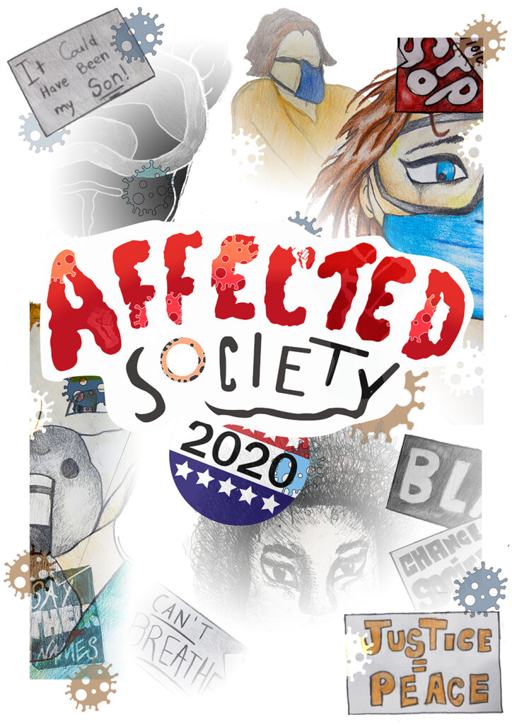
Timelessness
My project theme is ‘Timelessness’, and during this project, I have used various mediums to express my emotions. I choose timelessness as my theme because it associates with my sentiments towards the pandemic. My aim for this project was to create a visual representation of how I felt about the lockdown and covid-19. I wanted to express that we as people are just walking another path, and when it ends, we will only walk another. My concept is all about Covid-19 and the problems and issues it has brought to people’s mental health and stability. In my eyes, I see covid-19 almost like a curse, it’s like we as a society are getting punished for taking advantage of things, we would usually be able to do every day without cost; for example meeting up with friends or going shopping. Especially in the modern generation full of technology, we seem to detach ourselves from the nature around us; Ignoring the beauty and tranquillity behind the natural cycle of life as we stare at our digital screens. It’s only now that some people have noticed how much we miss the little things in life, and how our timeless development in advanced technology has almost, made us blind. We can only miss something until it’s gone and I believe this ‘curse’ can only be broke until we all notice our senselessness towards the little things and work together as one instead of multiple different groups.
For my final piece, I used soft pastel, graphite, newspaper, and acrylic paint. My backdrop was a collage of newspaper pages about covid and lockdown. I decided to do this to reference what my concept is about but also create an intricate background. I used a stamp I made out of cardboard to create an alinement of hand sanitiser prints across the painting to refer to repetition and the rise in PPE (Personal Protection Equipment). My final piece was crowded and manic because I wanted to communicate how stressful and confusing everything has been.
Benjamin murphy was someone I found on the Saatchi gallery website. He was hosting a new exhibition during lockdown called antisocial isolation, which was intriguing. My acknowledgement of the upcoming exhibition ‘antisocial isolation’ lead to my discovery of his work. I was interested in his plant charcoal drawings, and I used them as inspiration throughout the project. My concept for my project was to create dark and lifeless drawings of plants and nature to communicate how time and life has almost stopped because of lockdown; this ultimately leaves everything to become dull. Benjamin Murphy’s charcoal drawings was a great start point for my project, and soon enough, I was creating/developing this idea into prints and even paintings. Franz Kline was another painter that got recommend to me, his work was bold and defined, and that factor inspired me to create black acrylic paint paintings and prints. I didn’t work with abstract but instead aimed to achieve the dark, bold and thick line-work he possessed in his abstract paintings.
The second year commenced with COVID 19 measures suggesting that we had been through the worst and that the educational landscape was returning to normal. And so, began, for many second years, the creative boot-camp of refocusing upon finding their creative pathway, exploring progression options and getting their work portfolio and exhibition ready. This was no mean feat, considering no-one could be sure what potential impact remote-learning and unprecedented assessment procedures may have had upon their social and skills development.
It would appear that the previous 18 months has made them into more curious and questioning individuals. Their return to studio has allowed them to embrace the physical space and access the materials, techniques and processes that ‘lockdown’ had denied them. Released from their confines, they had rediscovered ‘beginner’s mind’ and as the year progressed their work became more personal to them and showed us qualities we, and perhaps they, hadn’t seen before.
With so much of their educational time having been achieved through the medium of near-instantaneous digital communication and social media platforms, there has perhaps been a resurgence in the analogue. What is clear is that art students communicate most effectively through their creative practice. It is a sincere, insightful and effective language that society needs to experience again.
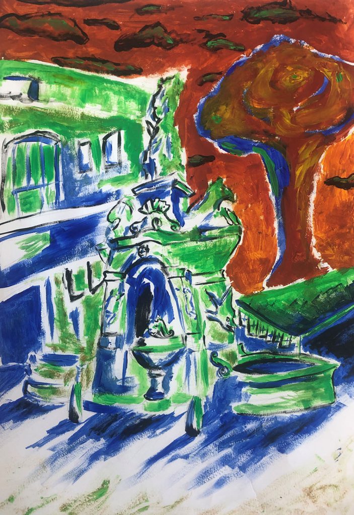
This is a painting of Dudley Fountain. I used greens, blues and reds to create a contrast.
In September I would like to progress to Level 1 Media, because I want to learn how to do video editing and animation.
Nancy Edebiri
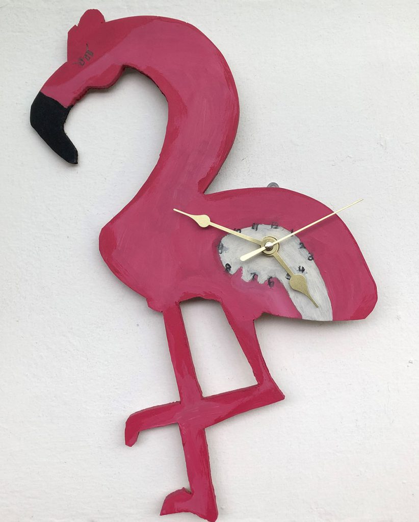
In this project we are asked to design and make a product. I decided to create a Flamingo inspired clock.
When I finish this course, I will be progressing to level 1 art and design, I am looking forward to learning more about different artists and developing my skills in tonal shading.
Kyle Ratcliffe
I have been exploring tie dye techniques, it’s fun to do and its relaxing. I like how the dye stains the fabric in an original and unique way.
In September I will be progressing to level 1 media as I want to learn about digital design and photography.
Shane Smith
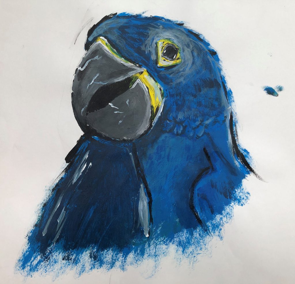
This project is titled ‘What do you care about?’. I choose parrots because I like how colourful they are and I wanted to make people aware that some parrots are endangered. I decided to use acrylic paint so I could create the right colours of a parrot.
Next year I will be progressing to level 1 art and design because I want to be a tattoo artist in the future.
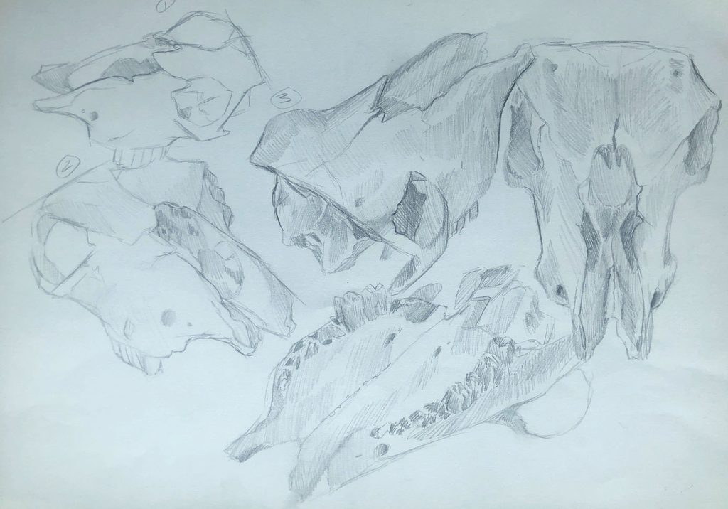
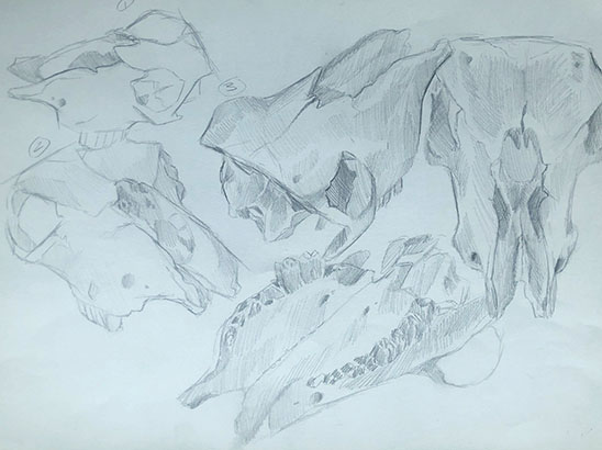
Wade Smith
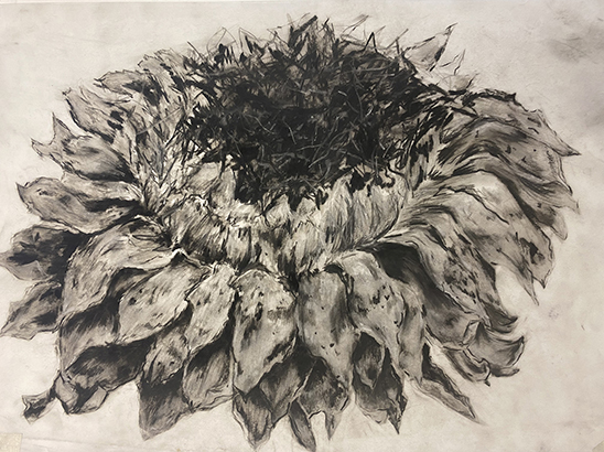
This is a study of a cow skull. I chose this because I enjoy oddities and taxidermy and find the form of skulls interesting. I used a hatching style to add depth and texture making sure to add a sketch from every angle to properly understand the subject. In September I am progressing to Level 1 Art and Design.
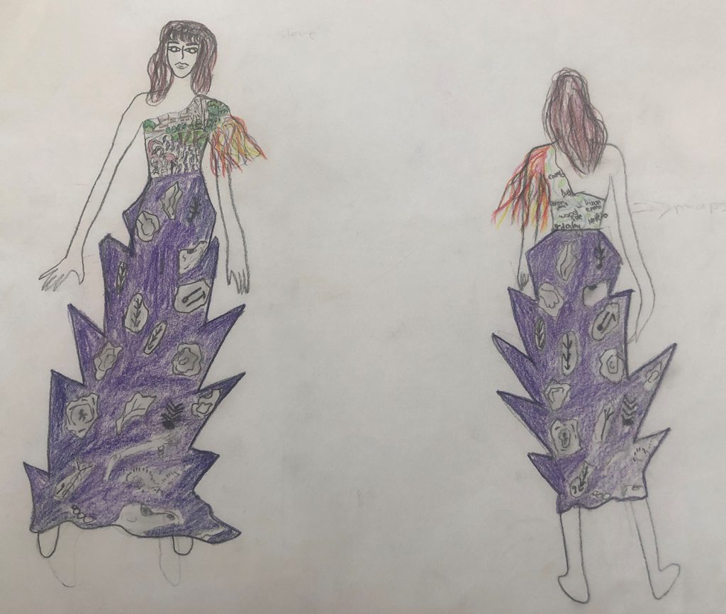
Adela Trota
This project was called ‘Design and make’. I designed a series of dresses inspired by Dudley, its history, and people. I tried to do something special and somewhat difficult and to how capable I am. I searched the web on various topics about Dudley Town, for example: fossils, animals from the zoo, statues and maps of the Dudley. All of these inspired me to design this dress.
Next year I will be progressing to Level 1 vocational media as I want to continue to develop my digital skills. In the future I want to work as a fashion designer.
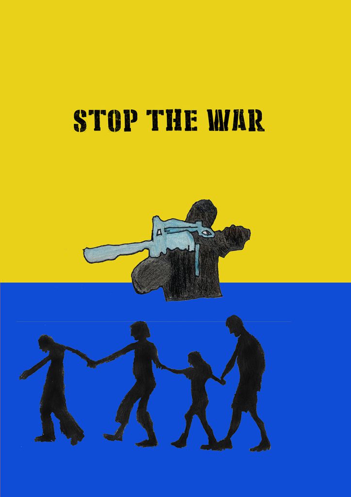
Otuya Ugboh
This project is called What do you care about? I choose the war in Ukraine. I made a anti war poster using hand drawn art and photoshop.
In September I will be progressing to Level 1 Vocational media because I want to learn how to do animations.
In a usual year, A-Level fine art students would have the opportunity to complete two projects over the duration of year two – one self-set, the other selected from externally-set topics released by the exam board and whose final outcome would be produced during an exam. These would normally form a 60/40 split.
This year, the students have been completing one project for the whole year. The pieces of work you see here are the results of a very difficult year, both academically and generally. The results are a real testament to my students’ resilience, willingness to engage with online learning and the sheer determination of every single one of them. They should be extremely proud of their achievements – as am I – and I wish them all the luck for the future.
Gillian Worley, A-Level Fine Art Tutor, Dudley Sixth
The work on show here is just a snapshot of some of the work produced over the past two years. While our students are taught digital skills, they also learn traditional art and design skills in order to develop a broad portfolio of art and design for their progression onto higher education.
Some of our recent students have gone on to study at degree level in subject areas such as visual communication or graphic design, but also illustration, animation, fashion illustration, automotive design, architecture, interior architecture, jewellery design, digital media, and many other creative pathways.
Over the past few months all our students who made university applications were accepted (as usual), and generally on their first choice. Some have chosen to begin their studies at degree level, and others have decided to stay on at Dudley College for a Foundation Year. Well done all – it’s been great working with you. Good luck for the future.
Paul Oldnall, graphics tutor
Seamus Bayne
Progression: University of Chester, BA Graphic Design & Photography
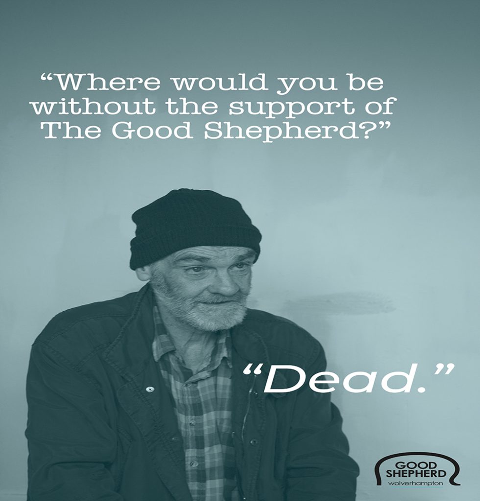
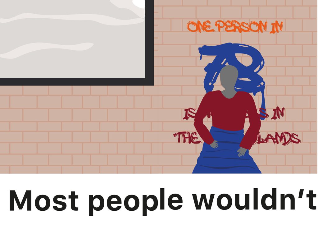
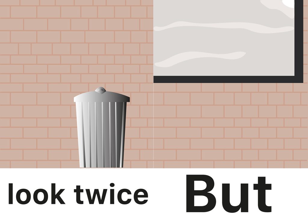
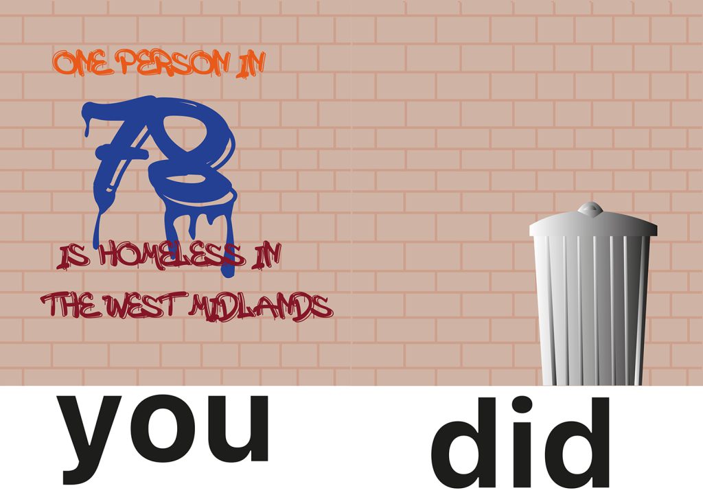
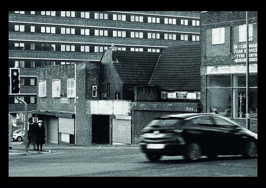
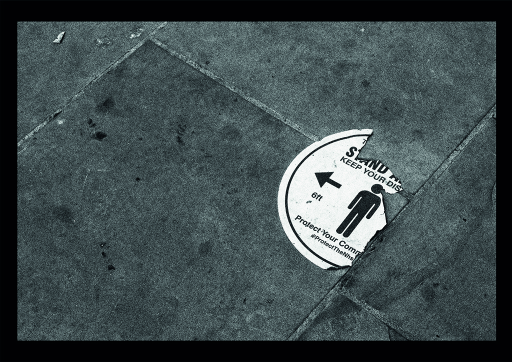
Poverty Britain is an attempt to highlight the everyday examples of poverty and despair in modern Britain. Homeless people now litter the streets alongside overflowing bins; once thriving high streets now feature many derelict buildings and vandalised storefronts.
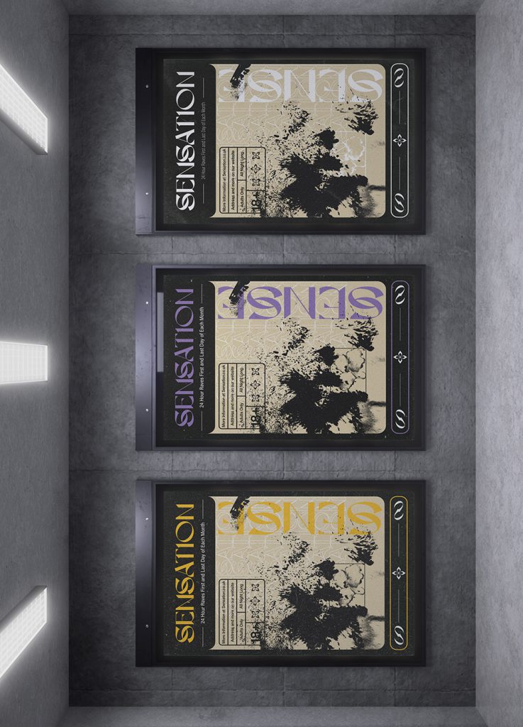
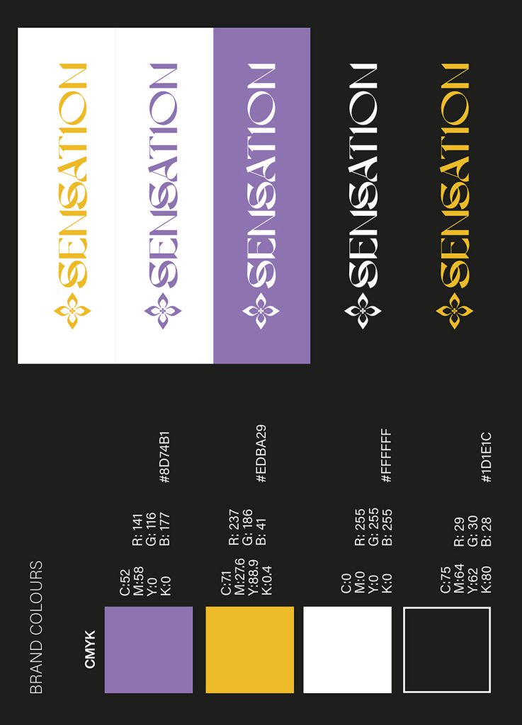
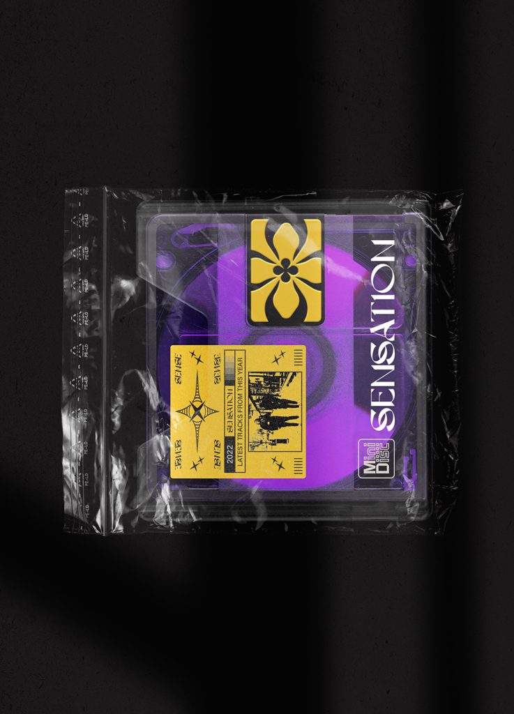
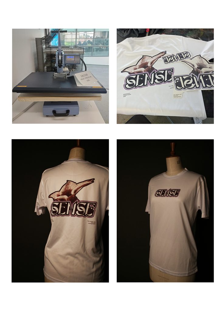
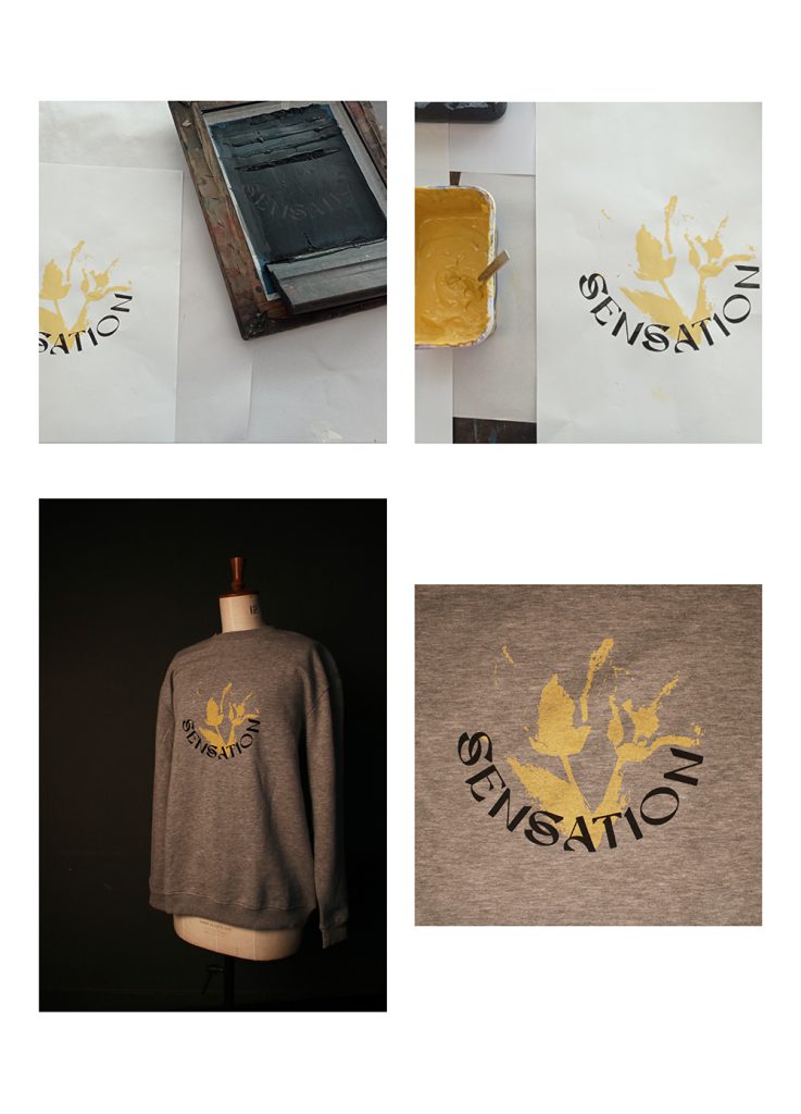
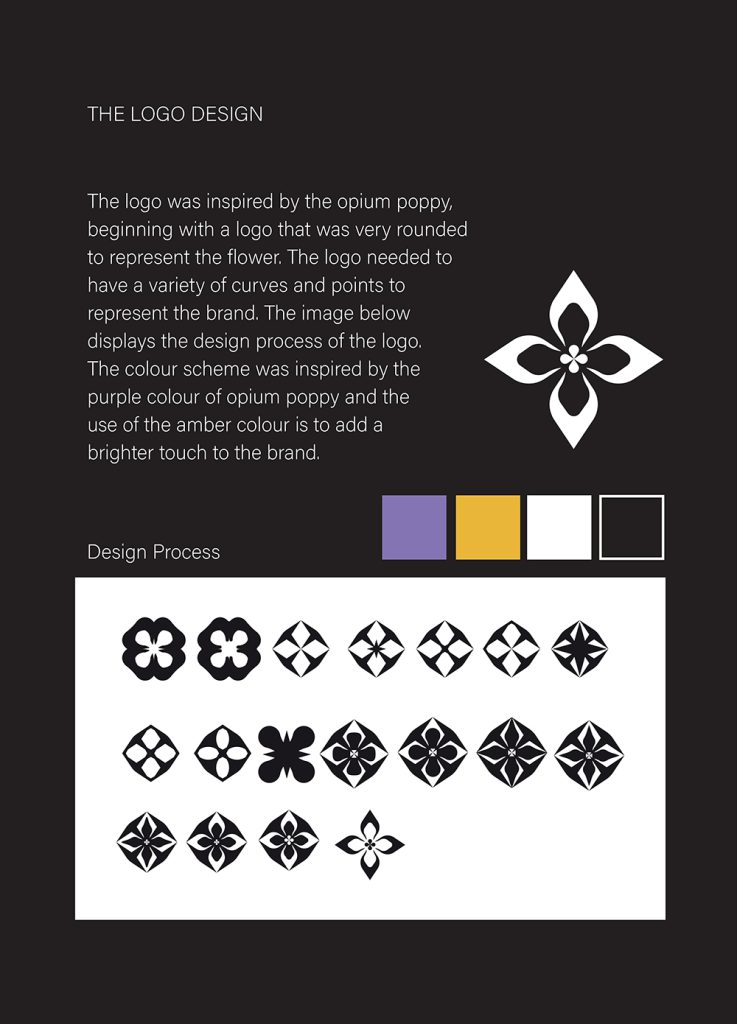
Maxim Diacov
Progression: Dudley College of Technology, Foundation Diploma
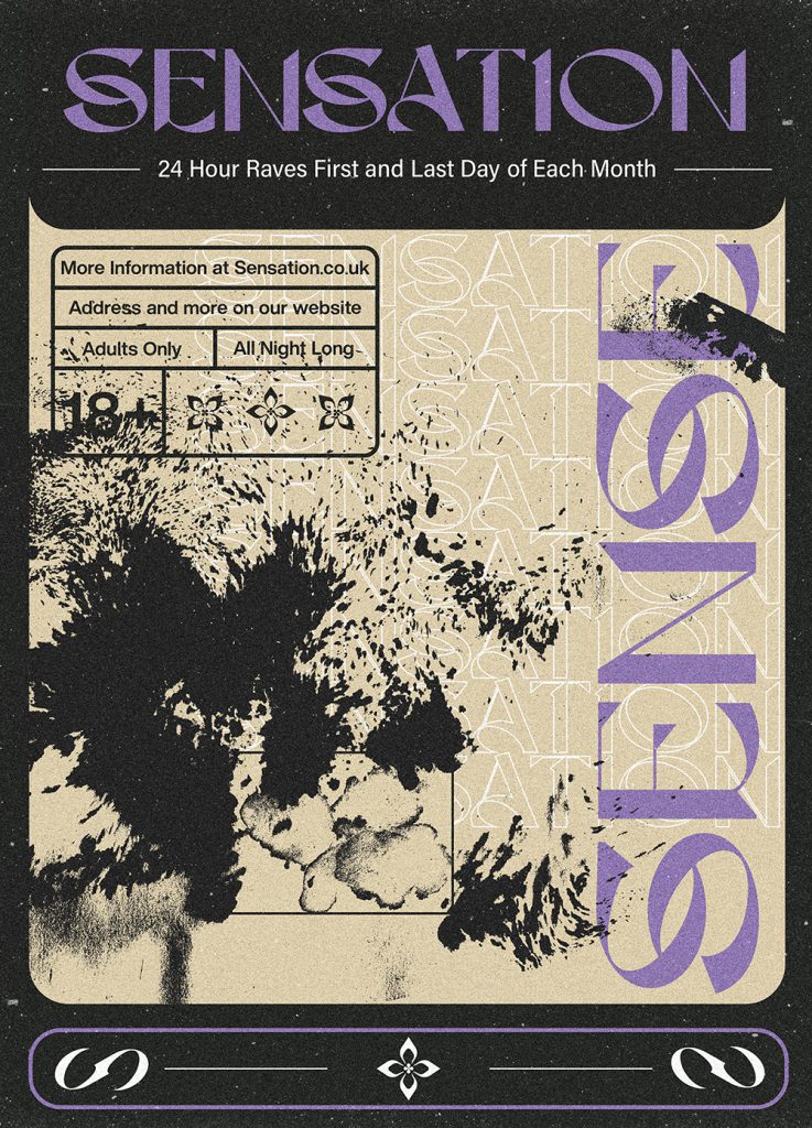
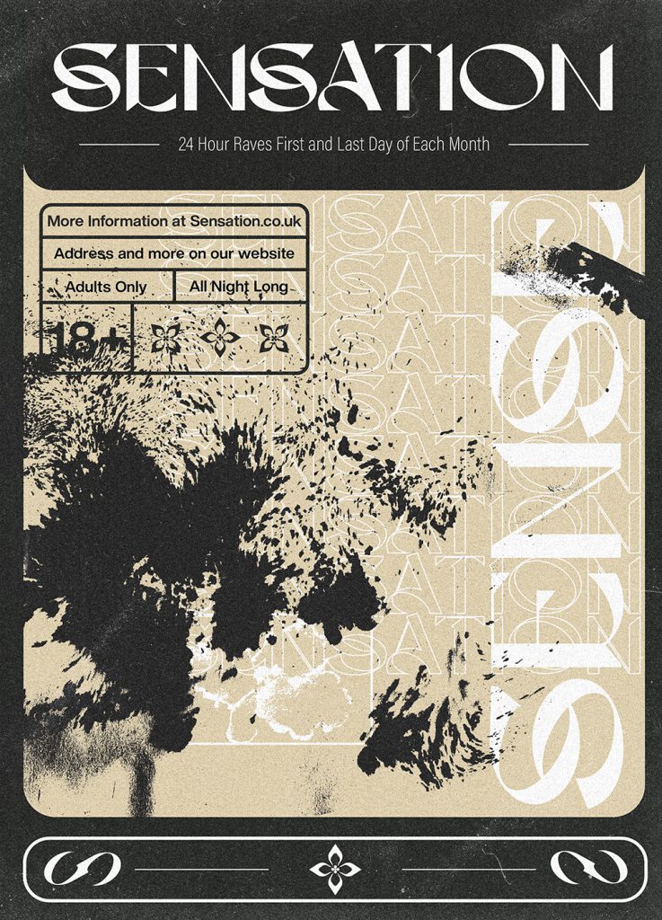
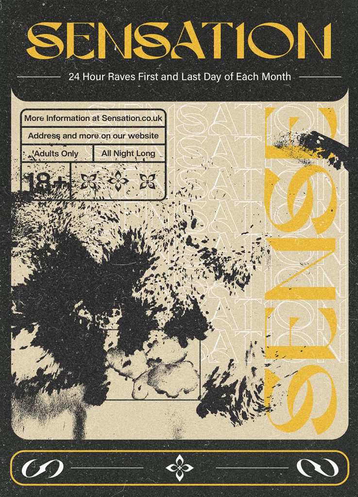
Sensation is a rave brand inspired by the 90s with a modern twist. My project includes a printed magazine which includes posters, mockups and clothing, as well as explanations about the processes used to make each design.
Leah Hamilton
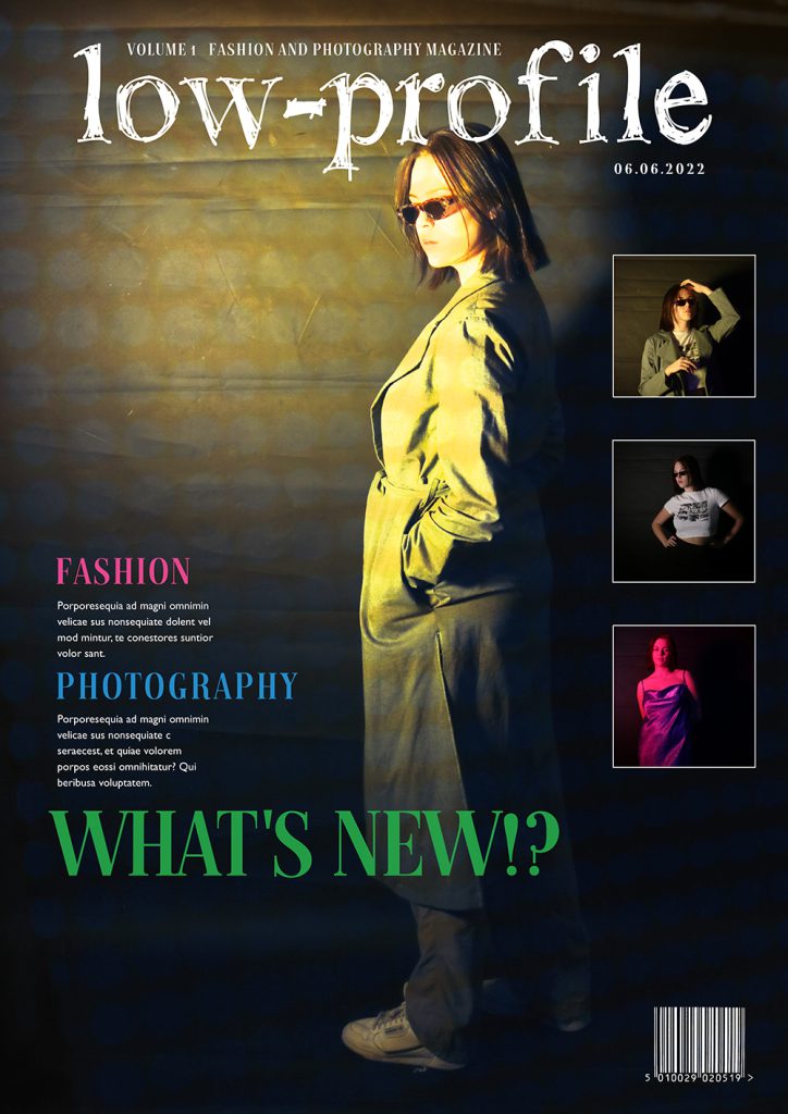
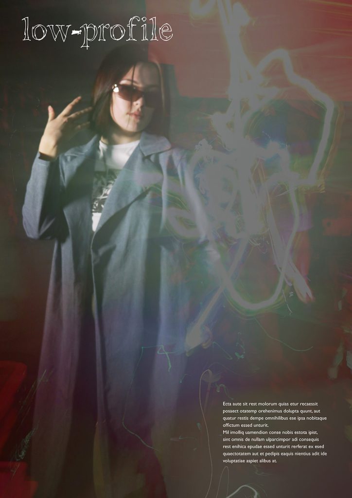
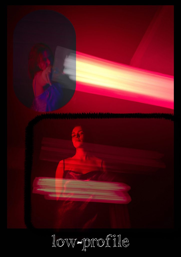
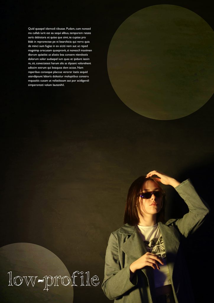
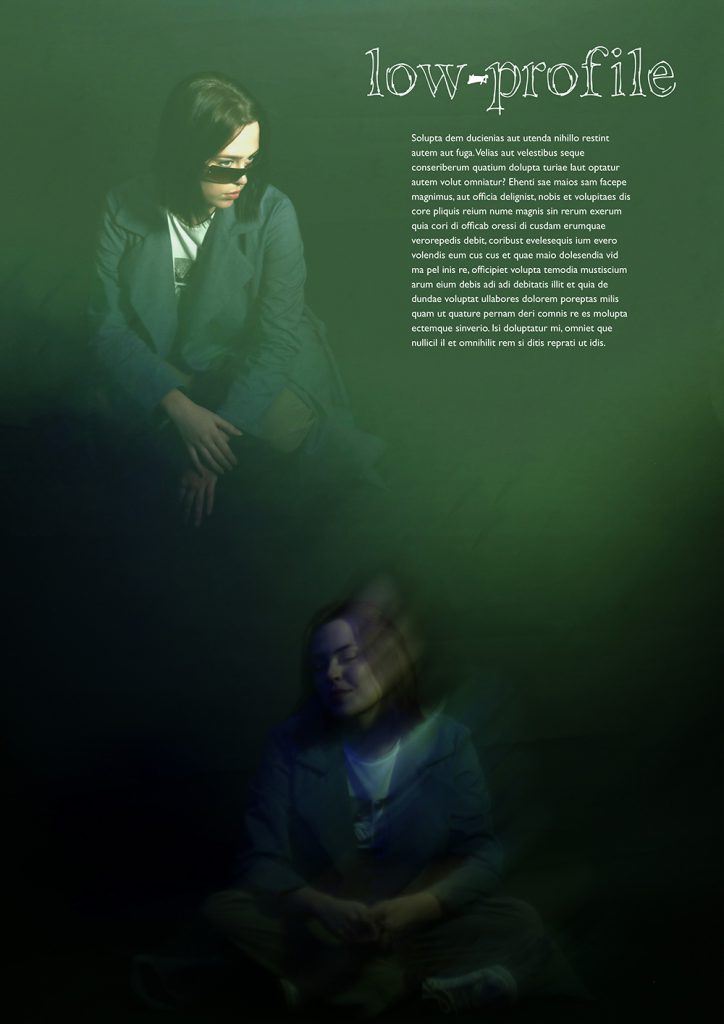
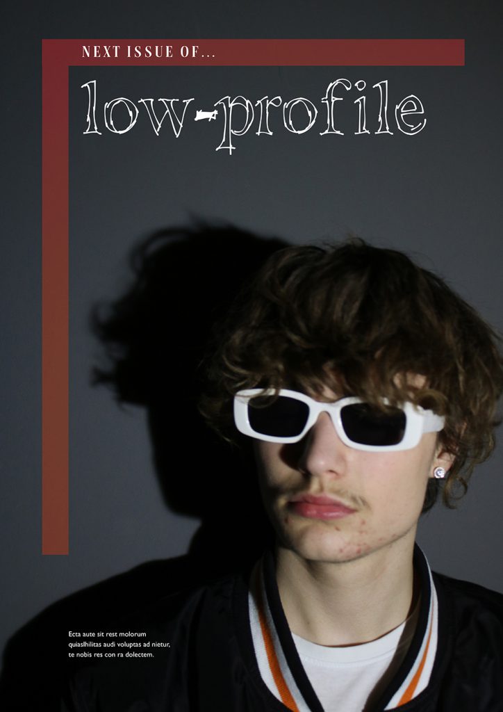
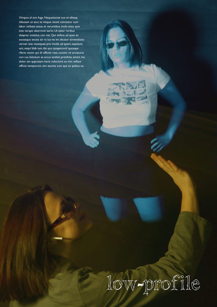
Progression: Dudley College of Technology, Foundation Diploma
My FMP is a fashion and photography magazine called low-profile. It is a 7 page magazine that consists of different photography and editing techniques.
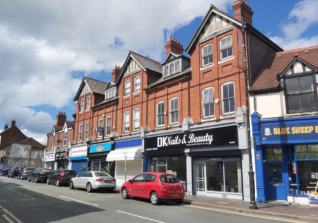
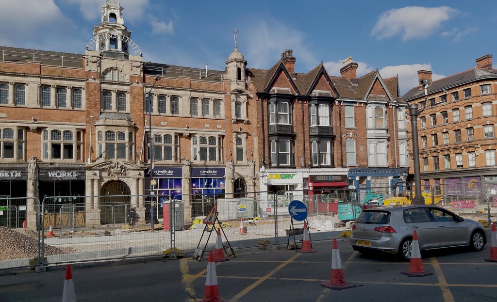
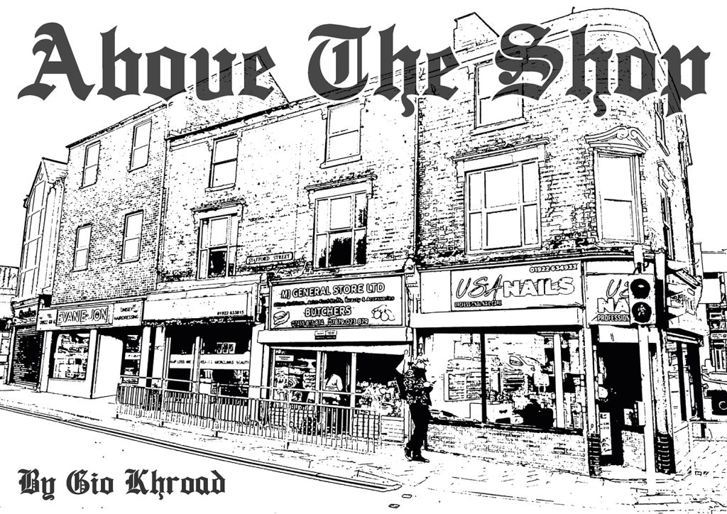
Gio Khroad
Progression: Dudley College of Technology, Foundation Diploma
My FMP is an architectural photobook. I made it to show how towns in the Black Country and the UK as a whole, generally look the same!
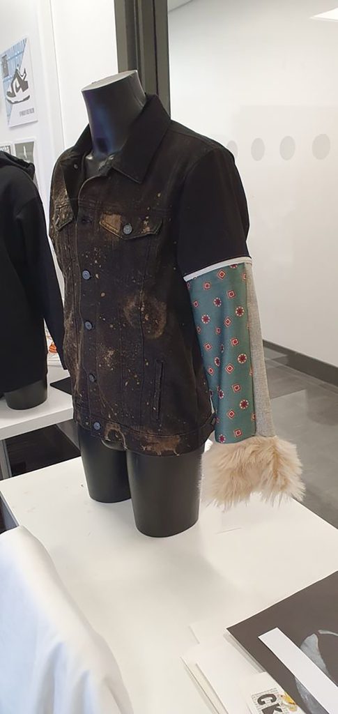
Miroslav Kosik
Progression: Dudley College of Technology, Foundation Diploma
My FMP is about taking old clothes and materials and re-purposing them. The process is called Upcycling – using other fashion artists and their methods as inspiration
Alexander Jones
Progression: Aston University, BSc Transport Management
My project is based on the continuously growing problem of homelessness in the UK, and consists of a series of concepts on perspective, to make the viewer think more about what they chose to see, and choose to ignore.
Aimee McKnight – Reaper’s Game
Progression: University of Wolverhampton, BA Animation
“Reapers Game” is my original comic that I’m currently working on in my spare time. For my FMP, I decided to create an animation based on this.
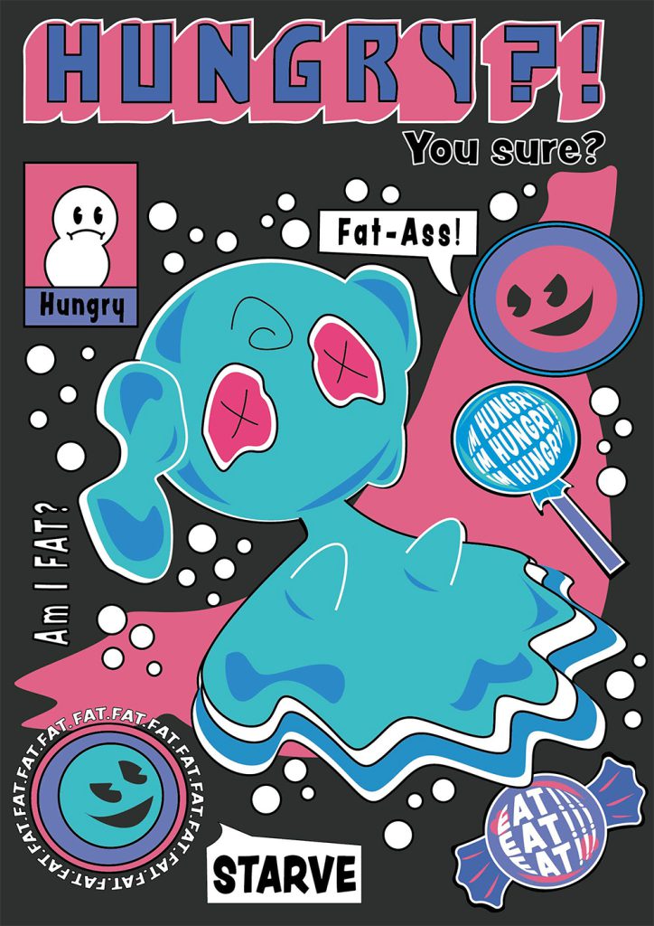
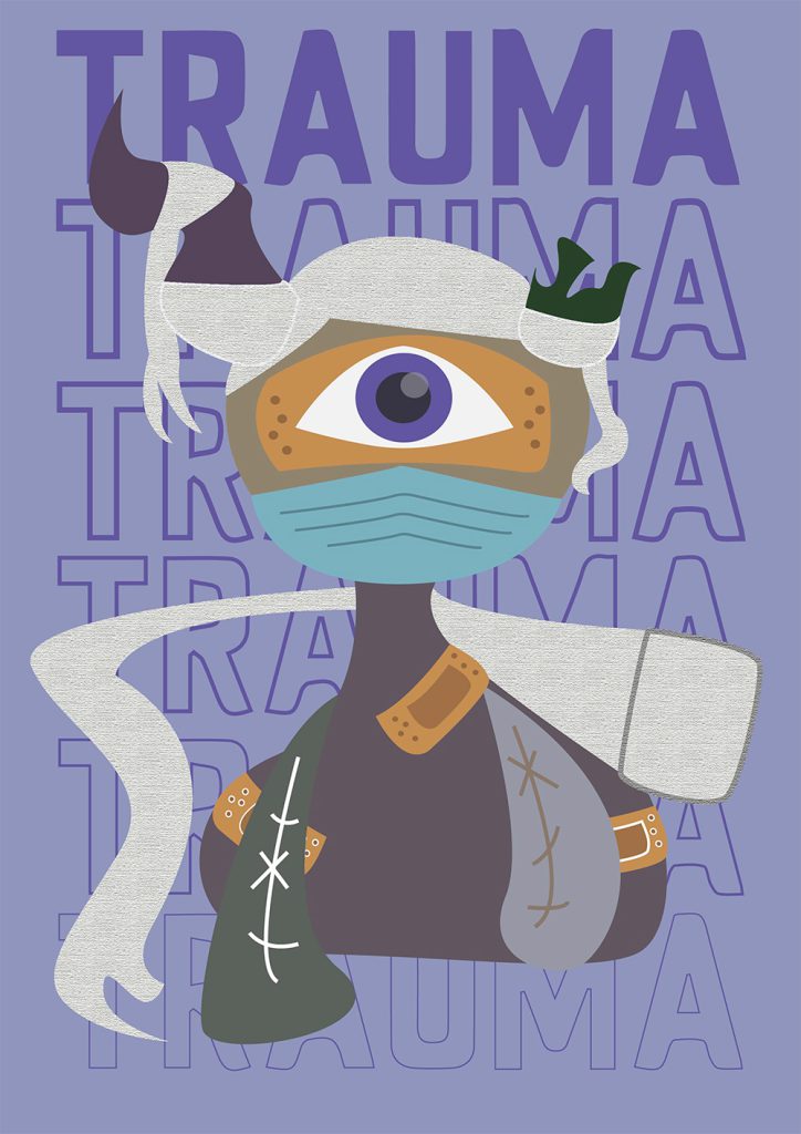
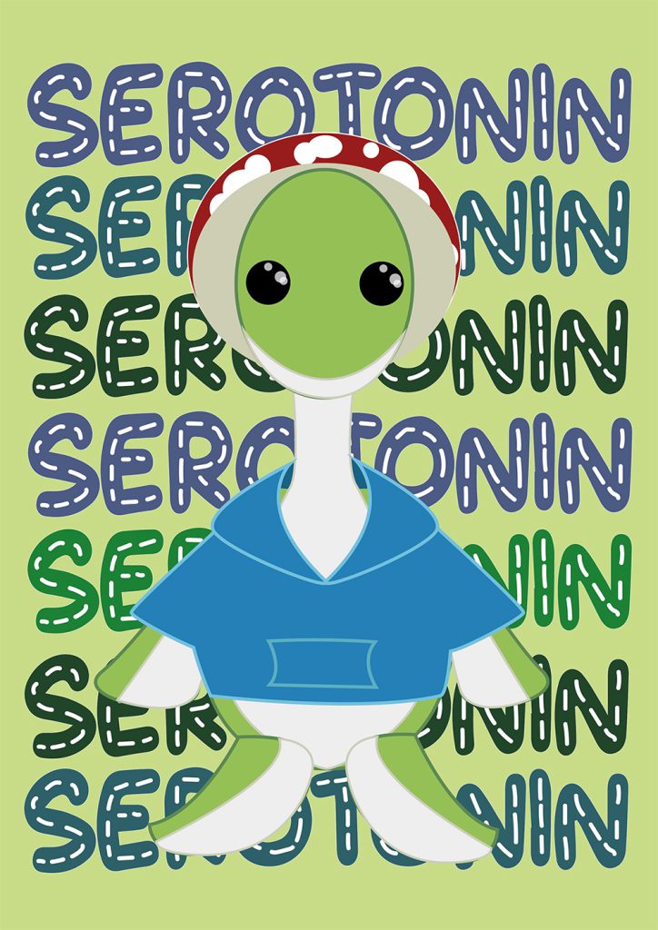
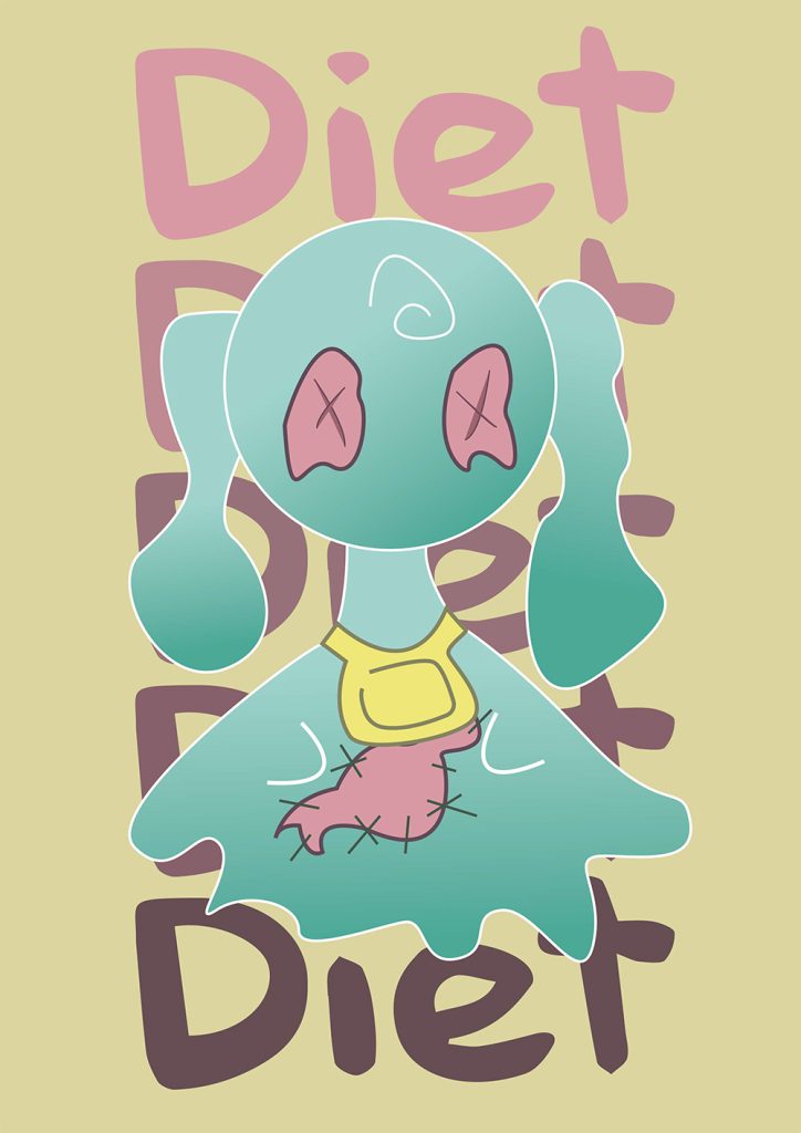
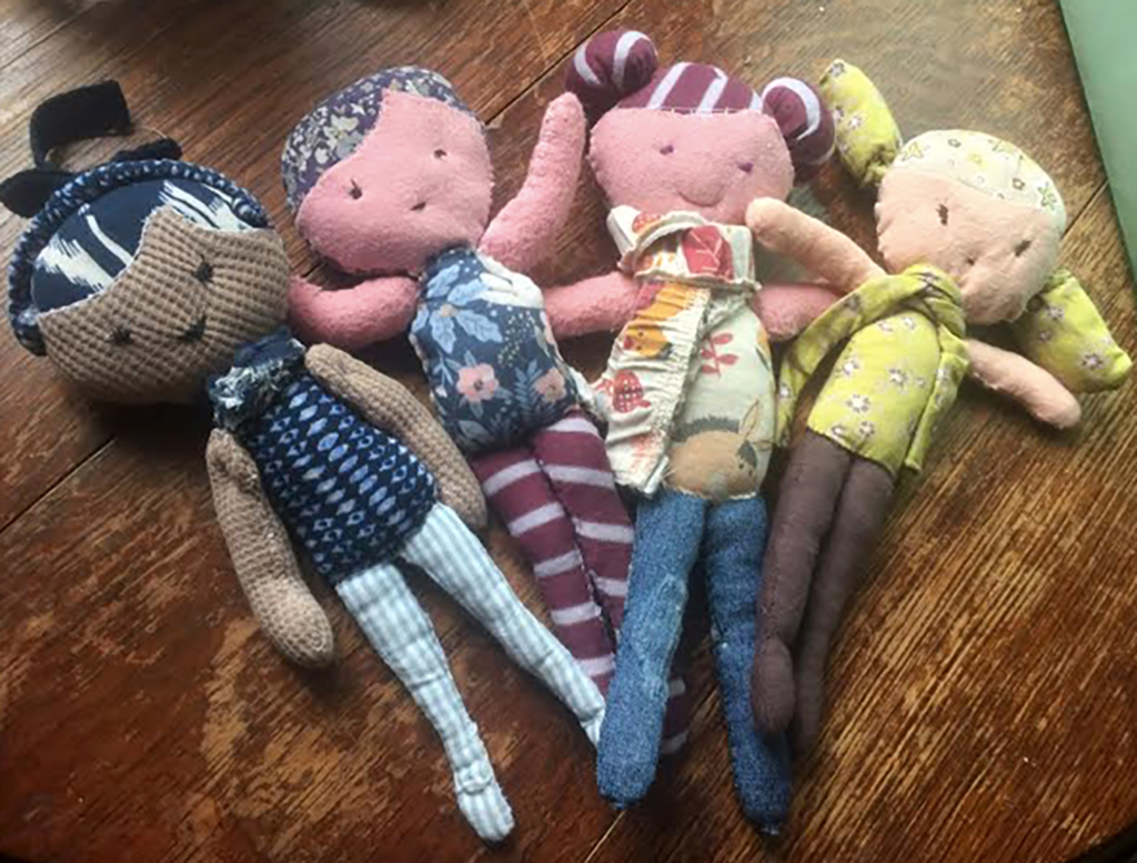
Bryony Nock
Progression: Dudley College of Technology, Foundation Diploma
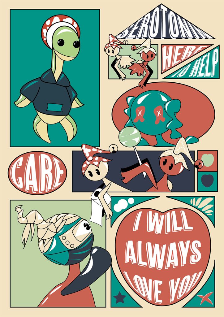
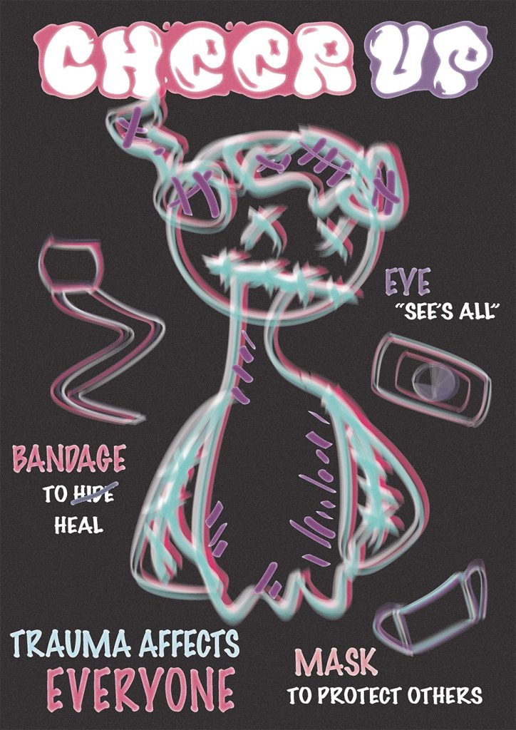
“Cheer up” is a project that spreads awareness of Anxiety and the effect it has on victims through cute and wonderful dolls. Meet the dolls of Trauma, Diet, and Serotonin.
Tiegan Pearce
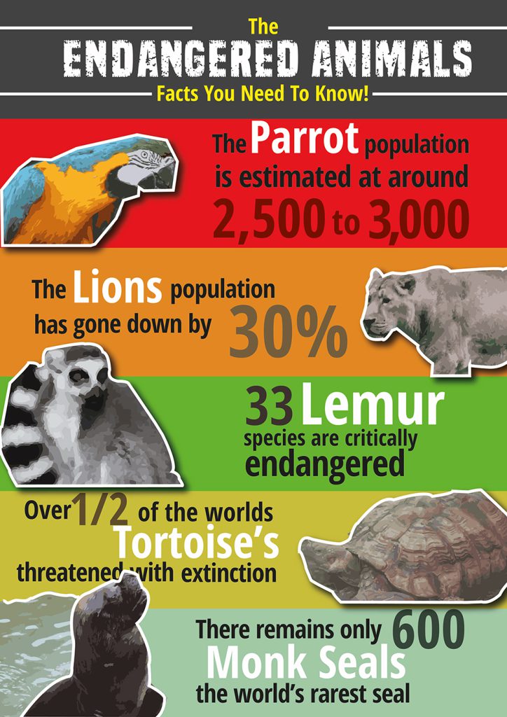
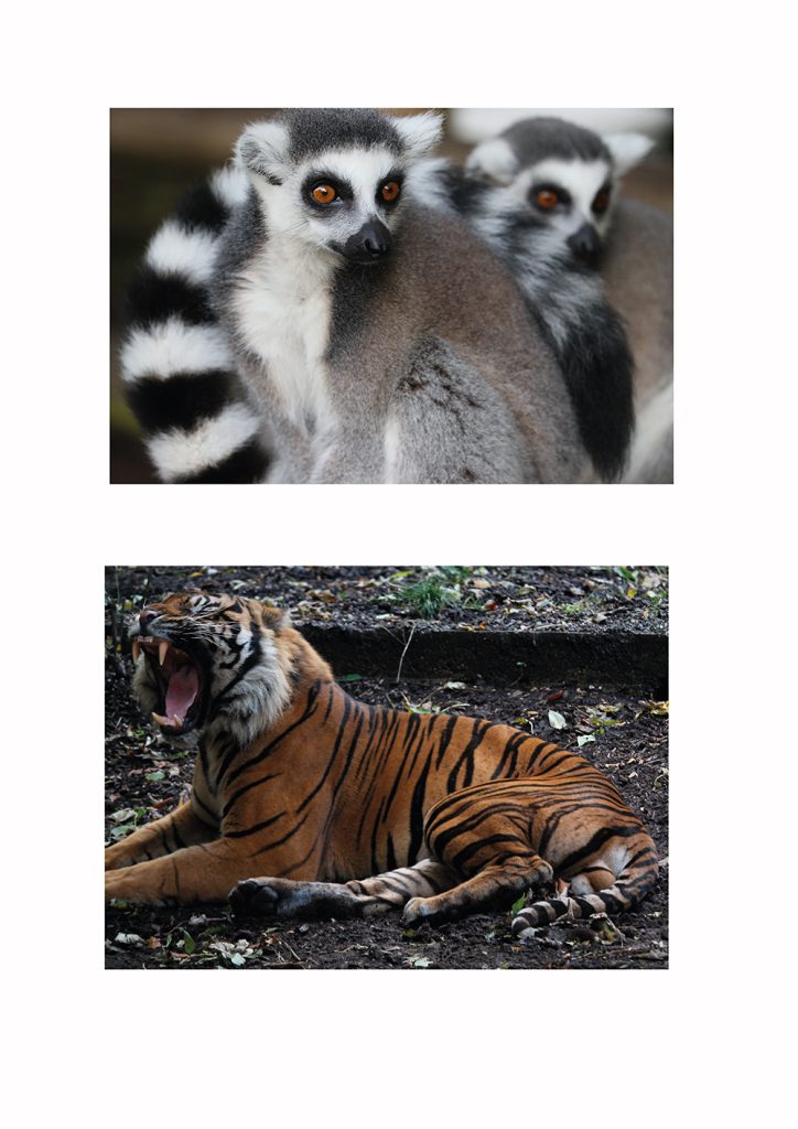
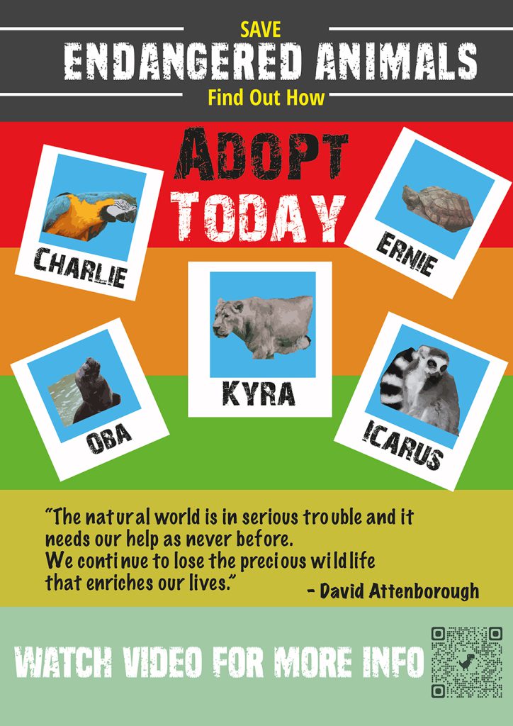
Progression: Dudley College of Technology, Foundation Diploma
My FMP is to create awareness of animal species that are likely to become extinct in the near future. I became interested in this subject after recent visits to Dudley Zoo as part of my Graphic Design course.
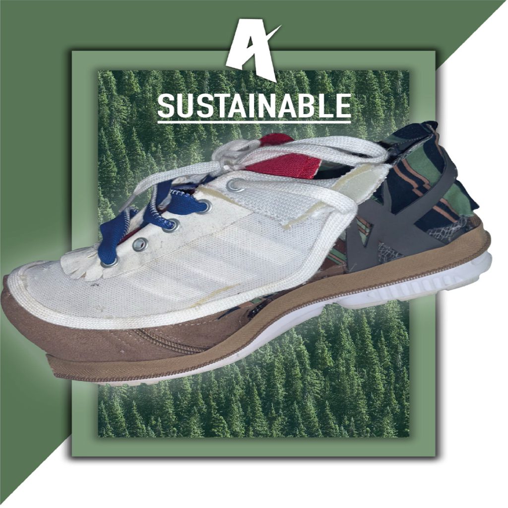
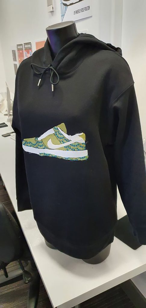
Amberley Poulton
Progression: Dudley College of Technology, Foundation Diploma
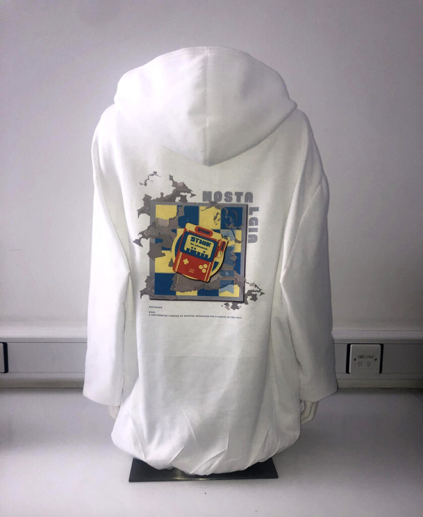
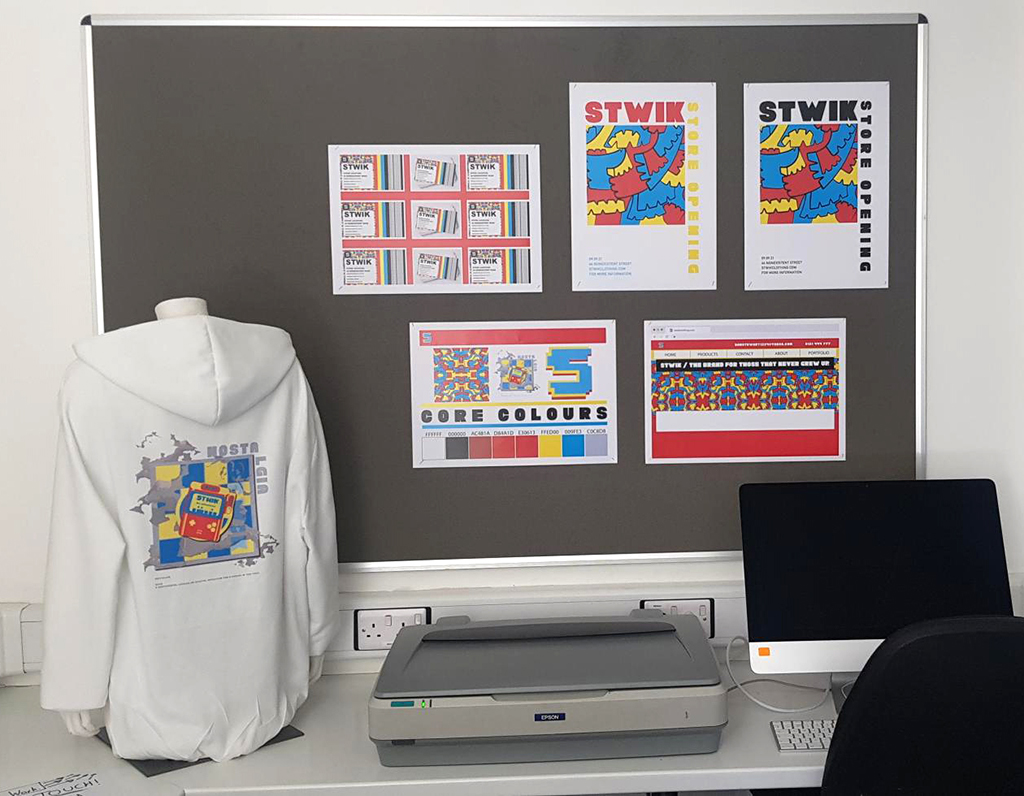
My Final Major Project is about creating sustainable wearable items. I chose to create my own trainer and hoodie design fully made out of repurposed materials.
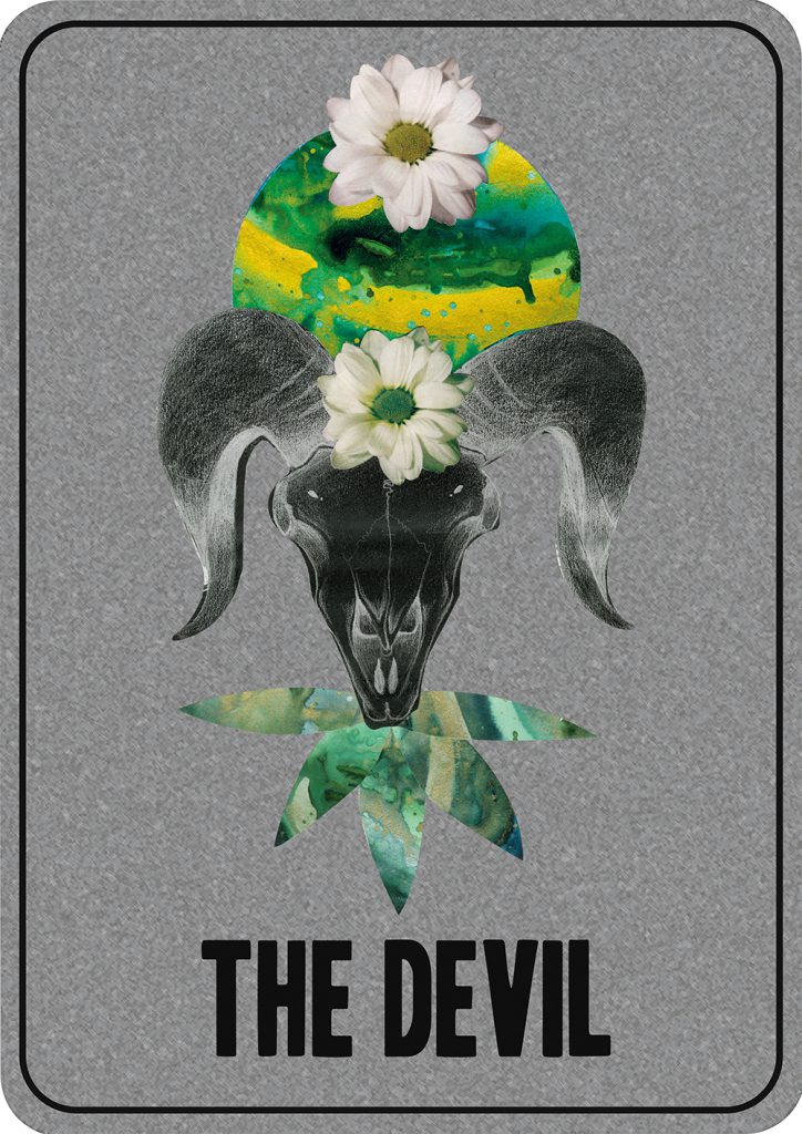
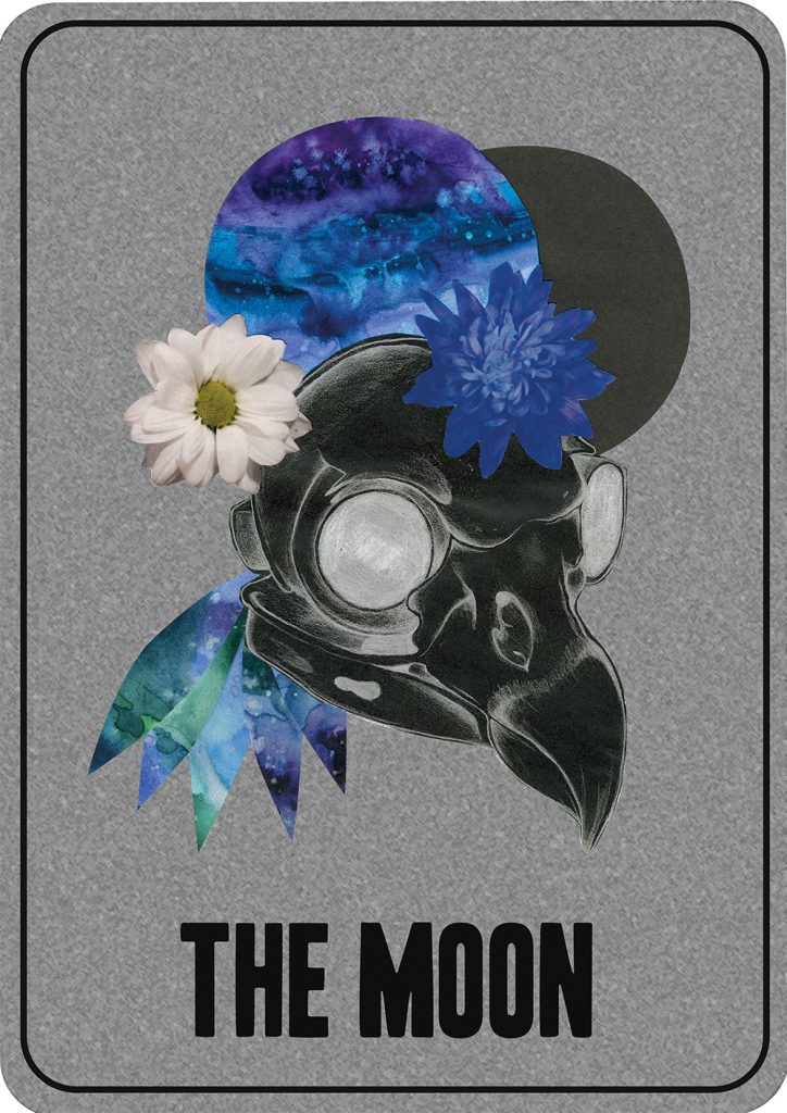
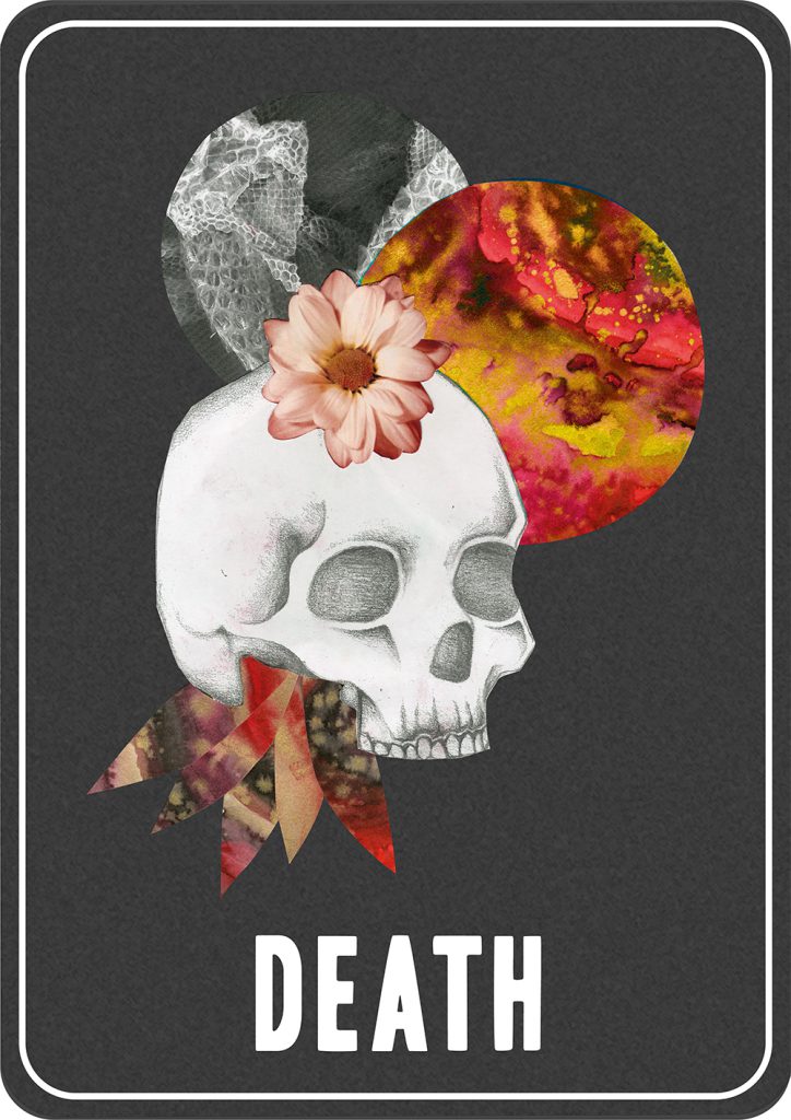
Lani Raybould
Progression: Birmingham City University, BA Graphic Communication
The four Tarot cards designs on show have been created by combining traditional art and design techniques with digital methodologies.
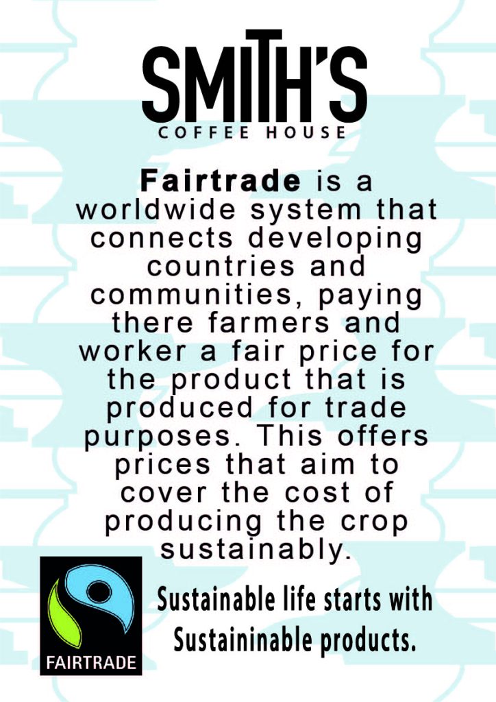
Jake Smith
Progression: Employment or Further Education
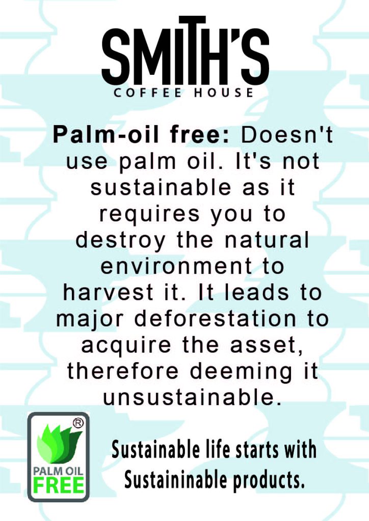
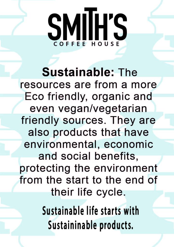
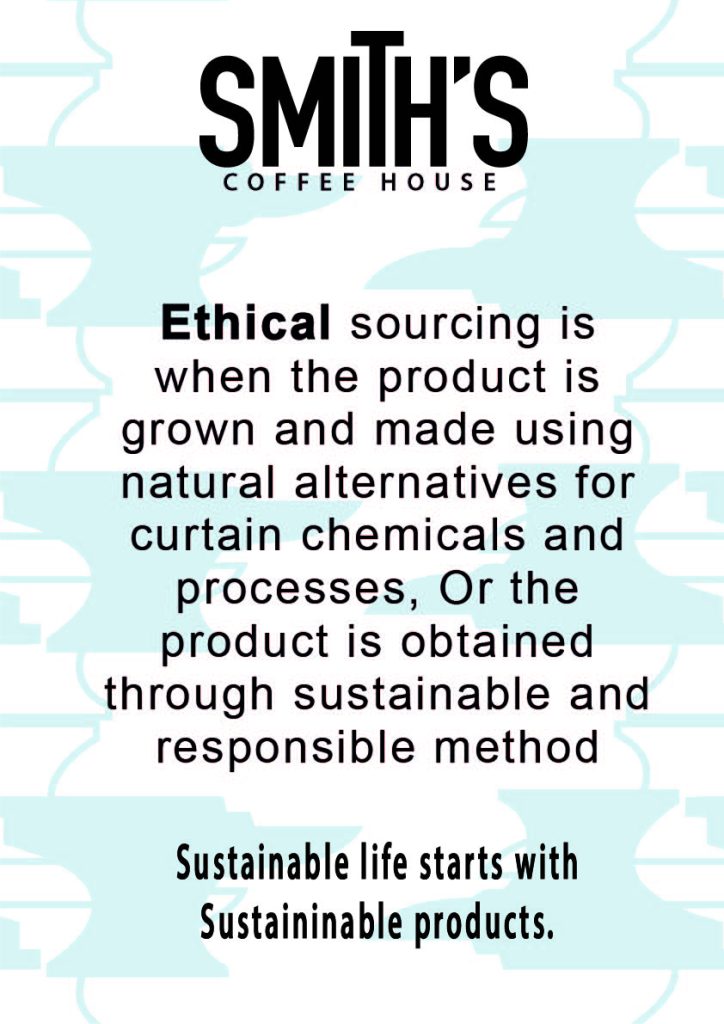
My FMP’s main focus is to educate people about more sustainable alternatives in the form of a coffee brand.
Sam Smith
Progression: Bournemouth University
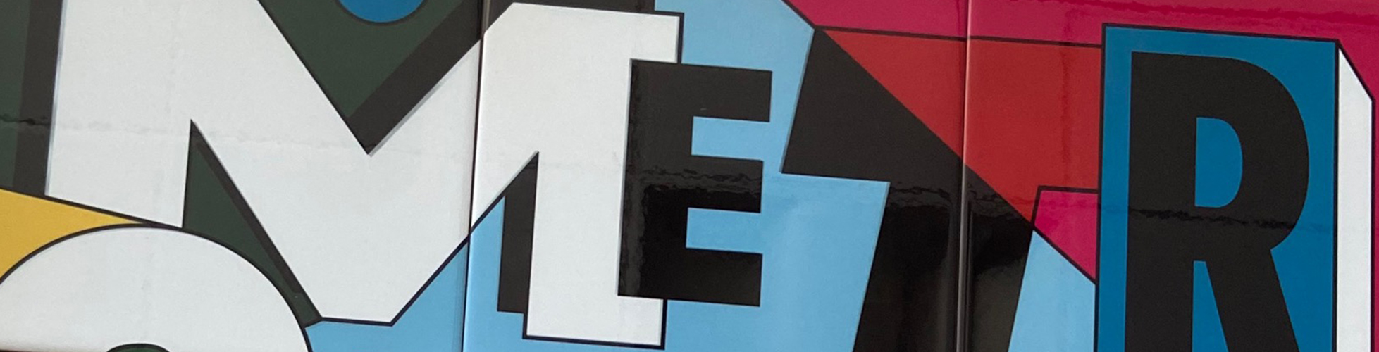
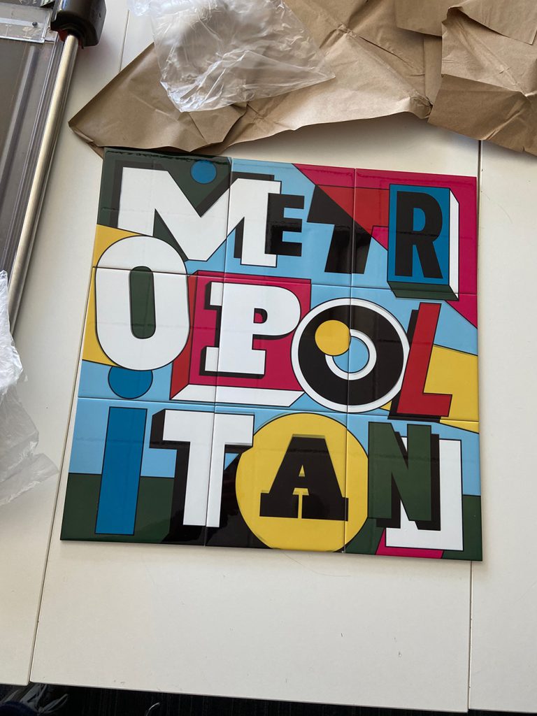
For my project ‘The Metro’ I wanted to highlight through my work the community of Dudley, providing an essence of our town, both old and new. I was keen to show different techniques that I have accrued at Dudley College within my work, but still push myself to try new things. I was particularly interested in the Midland Metro line that will soon shape Dudley’s future, whilst still using my work to look at Dudley’s rich history and its wonderful people.
Brooke Totney
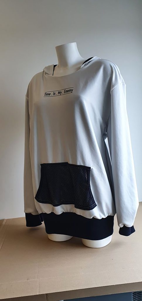
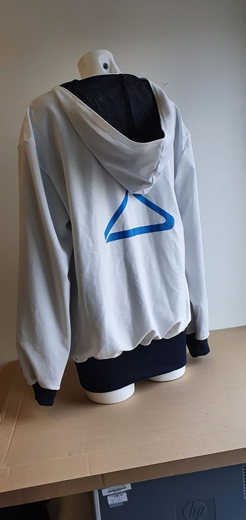
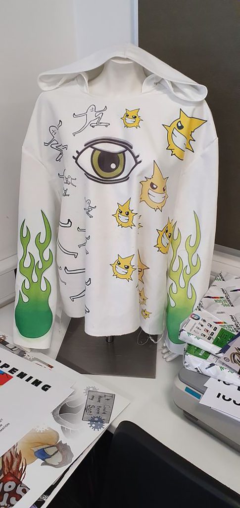
Progression: Birmingham City University, BA Graphic Communication
My FMP was based around swimming, as I am a British Championship swimmer. The hoodie was designed to keep swimmers’ muscles and body warm as it is vital to stay warm when racing. The materials used to make the hoodie dry quickly and use water resistant materials.
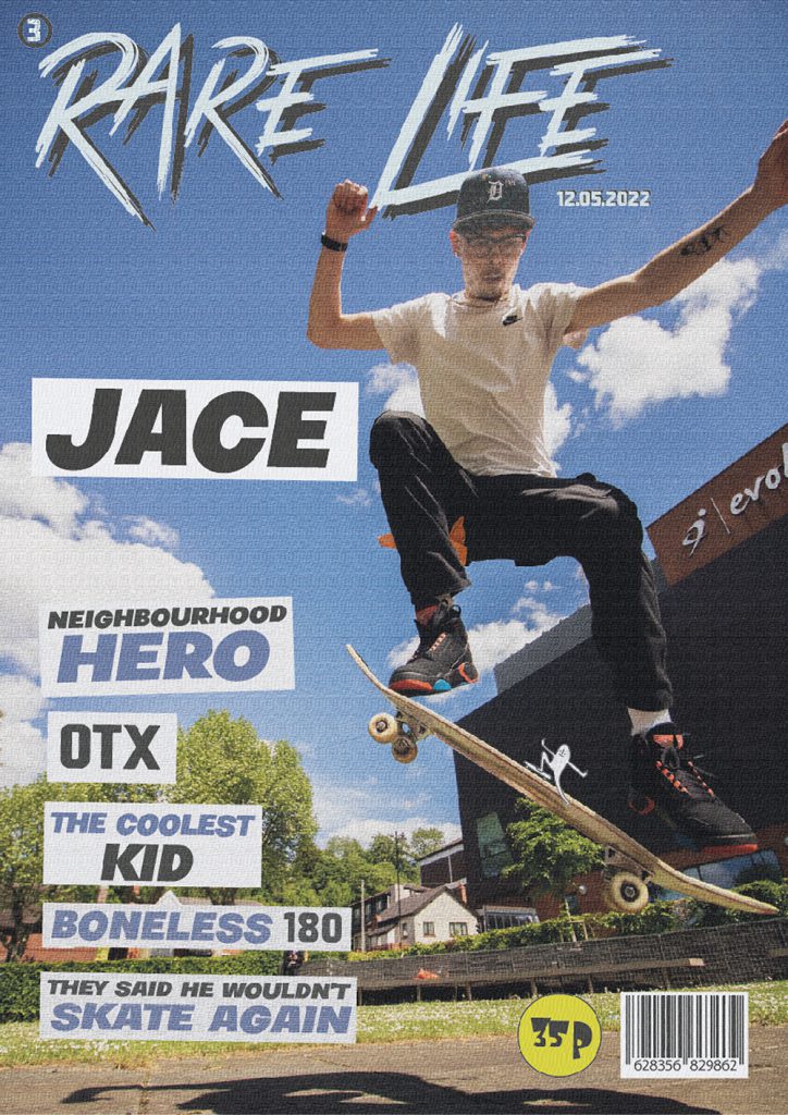
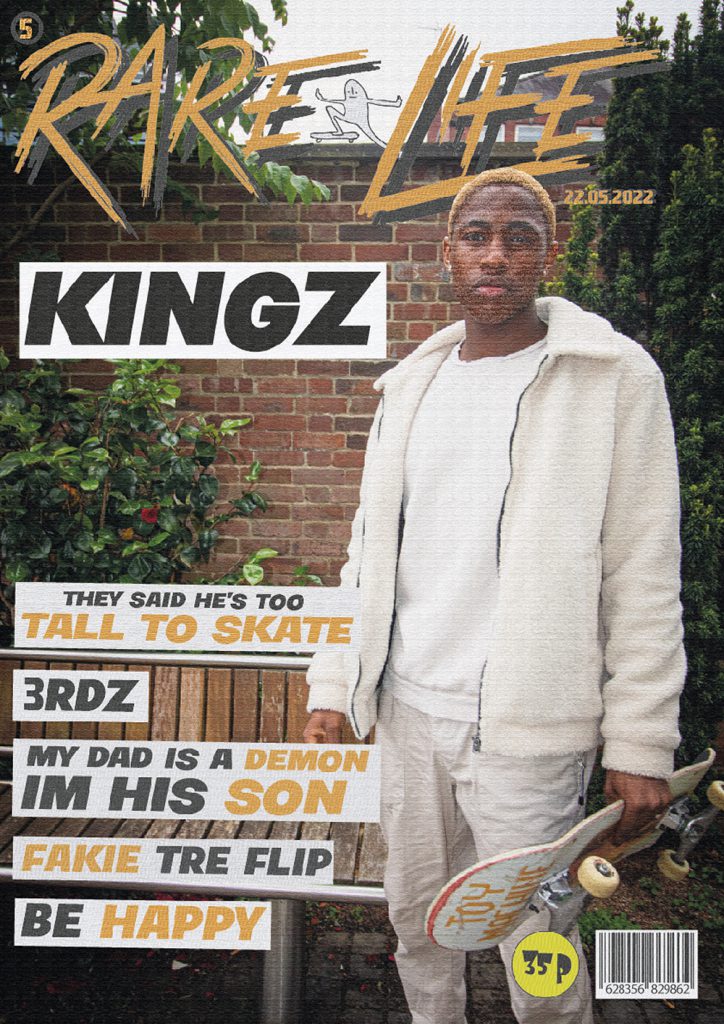
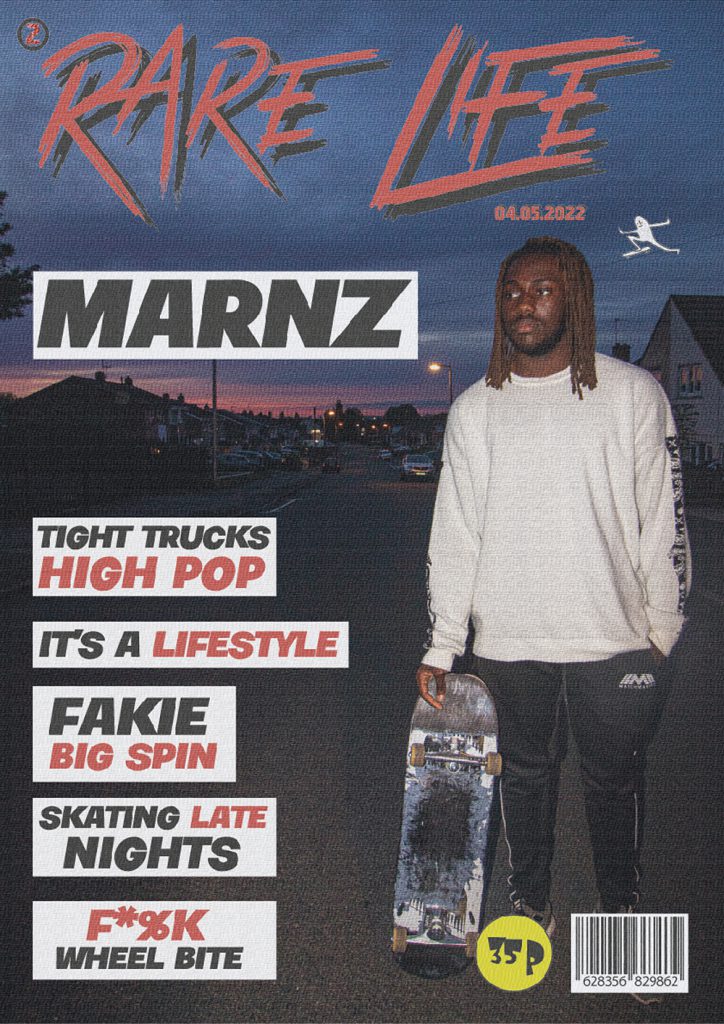
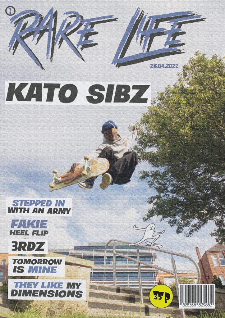
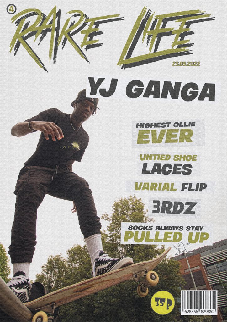
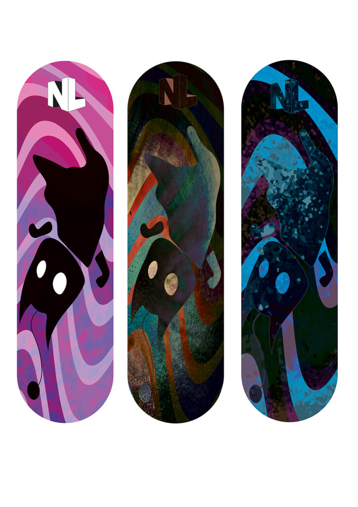
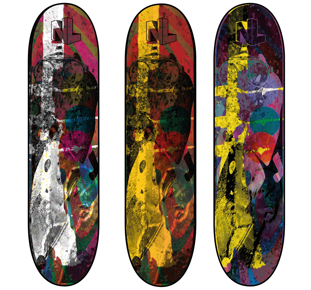
Liam Warden
Progression: Birmingham City University, BA Graphic Communication
My FMP is based on of my skateboarding brand called ‘Rare Life’. My brand philosophy is to live a life so different from anyone else’s that it is seen as ‘Rare’.
‘Violet’s Pirates’ is the name of my creative business. Named after my daughter who was born prematurely, the business is the unity of my past, present and hopeful future
I propose to run workshops in healthcare settings that help give the parents and siblings of premature babies the reassurance that they are not alone. When a child is born prematurely, they need to be kept in an incubator, which means the natural urge to hold and cuddle them is limited. Memory dolls can help with the mental anxiety this separation can create.
I have developed my business by combining the skills learnt from many years of employment in the textile industry with the experience of being a parent of a premature baby. I know how stressful a time this can be, and my dream is to help other families who find themselves in a similar situation.
I aim to teach other parents and siblings affected by premature births how to make their own memory dolls. This will not only help occupy the long days spent in hospital wards and waiting rooms, but also provide them with the opportunity to learn a new craft.
The workshops are though not only about making the dolls because they will also provide a safe space for families to re-connect with one another, discuss how they are feeling and try to solve the many practical problems that having a child in an intensive care facility may create.
Violet’s Pirates will also provide opportunities for other people such, as healthcare professionals and social workers, to attend workshops and offer further practical and emotional support to families going through what is a traumatic experience. I am certain of the positive impact my business would have and am applying for funding to start delivering workshops as soon as possible.
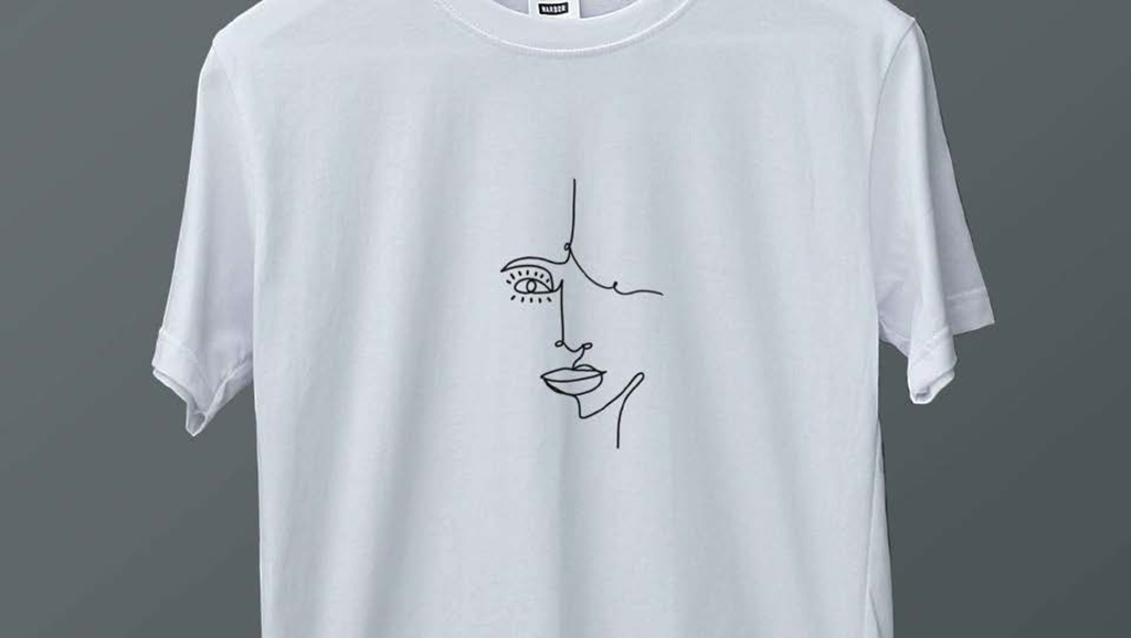
Josie Smart
I am hoping to start my own creative business ‘nude.prints’ which will sell urban style clothes and accessories. The garments will all be designed and hand crafted by me, inspired by abstract and line art.
Fashion is something I’ve always been into, but I never previously thought I could create my own brand. I have been excited to see my ideas develop this year and the concept for my business grow.
I hope to make a range of different t-shirts that I can sell through Instagram, Etsy or my own website. Eventually I would like to expand my designs into a range of colours and styles and sell other items such as bags and accessories.
Designing my fashion brand has meant making sure my illustration ideas are on trend. Fashion is a very competitive business and in 2021 streetwear has become one of the most popular trends. This is where I am aiming my clothing brand, as I feel there will be significant interest in what I’m make.
Buying something made by an independent artist gives more meaning to the clothes you wear. Most people also like to have things which are unique, and I want to generate that feeling of exclusivity with my brand identity.
My business will focus on an age range from 18-28. I have picked this age range because typically when you get to the age 18 you start to explore in the fashion industry and become more confident with bolder fashion choices.
Art is something I have always had a passion for, but I realised I needed more experience in the business side of things and this qualification has helped me towards my goals.
2 months from now I aim to be selling my t-shirts and bags online through Etsy, whilst advertising my brand Nude.prints through social media.
6 months from now I will have my own website up and running so that I am able to sell to a wider range of people.
I am passionate about my career in art and design and hope my business will be a success. I am currently working in the service industry but after a year I hope to be running my creative business full time.
It’s important to have ambition and ever since I’ve been financially independent, I wanted to run my own business. I enjoy creating something that I love doing and that other people also love.
You can look at my work on my Instagram account @nude.prints
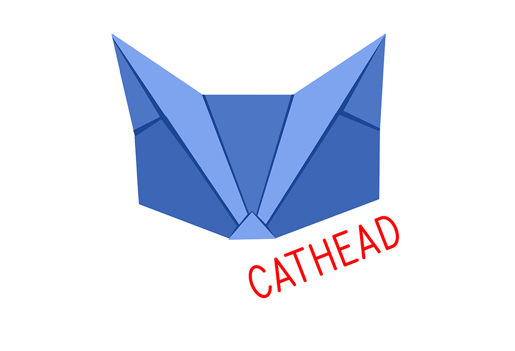
Diana Waldron
Cathead is my creative business idea that I have developed on the Level 4 Creative Practitioner course. I have been inspired to try and do what I love for a living and that for me is origami and paper related art. I am now on a mission to make origami the next big craft making craze!
Paper folding has always helped me calm my nerves and I’ve wanted to show how it can become integrated more with seasonal events such as Halloween and Christmas.
Origami is fun but can get complicated quickly. Cathead Kits will have a specially designed pattern on the paper that makes it really easy to create origami animals and get professional looking sculptures fast.
My aim is for people to become confident enough to make ambitious and quality designs that decorate their home and create an amazing atmosphere. Cathead products will take the stress of folding and worrying if you’re doing it right. You can simply follow the instructions or watch one of my online tutorials.
A key product Cathead is large scale origami kits. Origami packs are often so small and fiddly, so I am developing large-scale screen-printed origami kits. Going big is the perfect way to inspire children and give new life to seasonal decorations and celebrations. You can even get everyone involved in the making. I am planning to launch Do it Yourself kits online and run regular workshops and online tutorials.
I have looked into how other businesses operate and understand now how it all works. I am confident in large scale origami and digital work and have begun to approach local businesses, either to run drop in workshops or sell my products in their gift shops.
Personally, the course has boosted my confidence. I have needed to look at the business side of running a creative business – pricing – sales, budgets etc… and now have much more confidence in my ability to make my creative business a success.
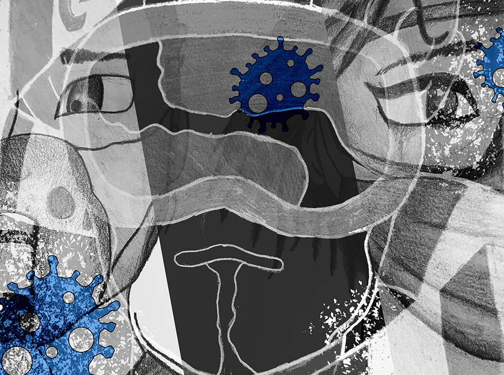
I decided to do a stop-motion animation because I wanted to challenge myself by doing something more involved and more practical than a painting.
I used clay for the stop-motion animation because it was the most efficient material for movement. I also used it because it is easier to make models out of clay and the cost of materials is cheaper, I made the backgrounds out of paper because it would take too long to make a set.
The backgrounds and colours used are meant to represent different emotions such as red for anger or blue for sadness.
I was inspired to do the topic of BPD (Borderline Personality Disorder) because it interested me and I wanted to talk more about the mood disorder since it is not widely known about.
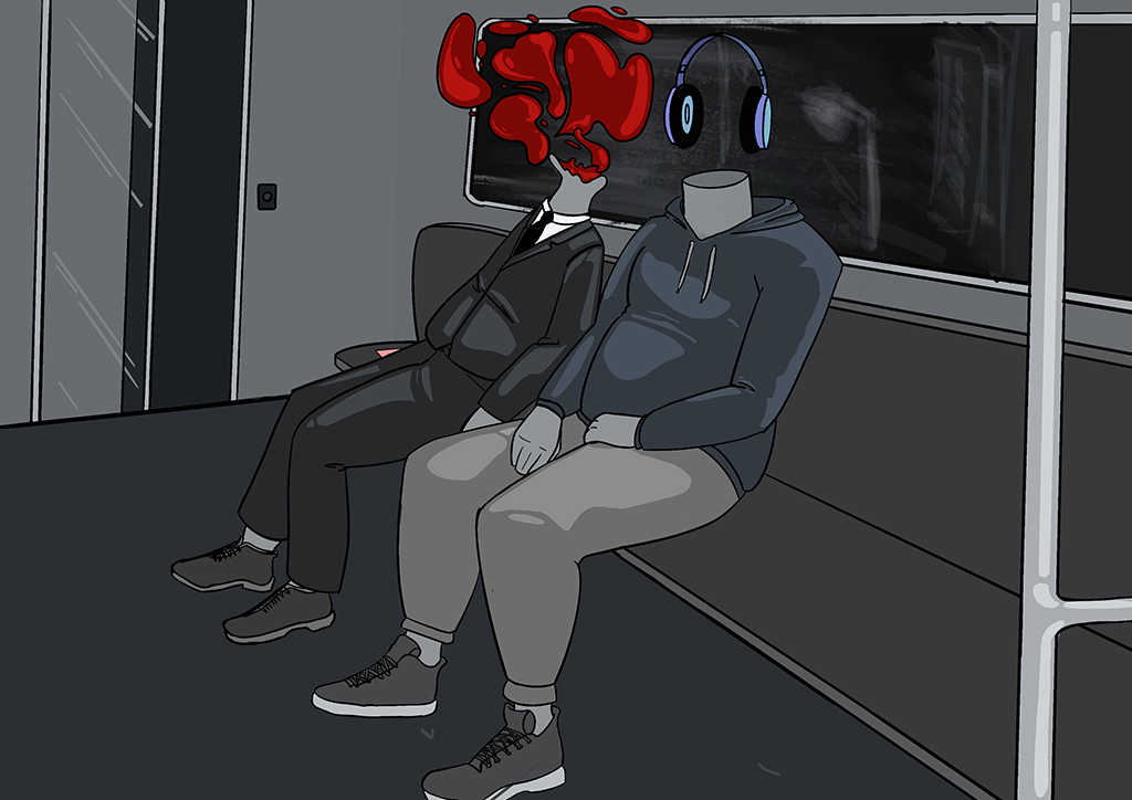
Ben Brant
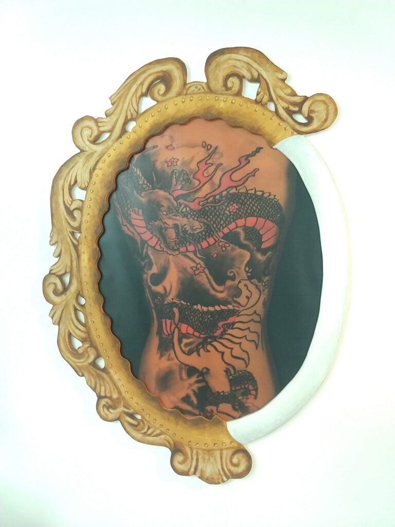
The Mirror Knows You!
This design is all the sadness caused by discrimination that the LGBTQ community have been getting over the years.
When people are talking about you, and they do not understand just remember the mirror knows how you are feeling. Know that one day you will be the big star that you will be. The sadness and the fear that is there now will be in the past when you are a super star.
An old friend used to say, “Never Let Fare Strike You Out It Will Just Stop You from Playing the Game”.
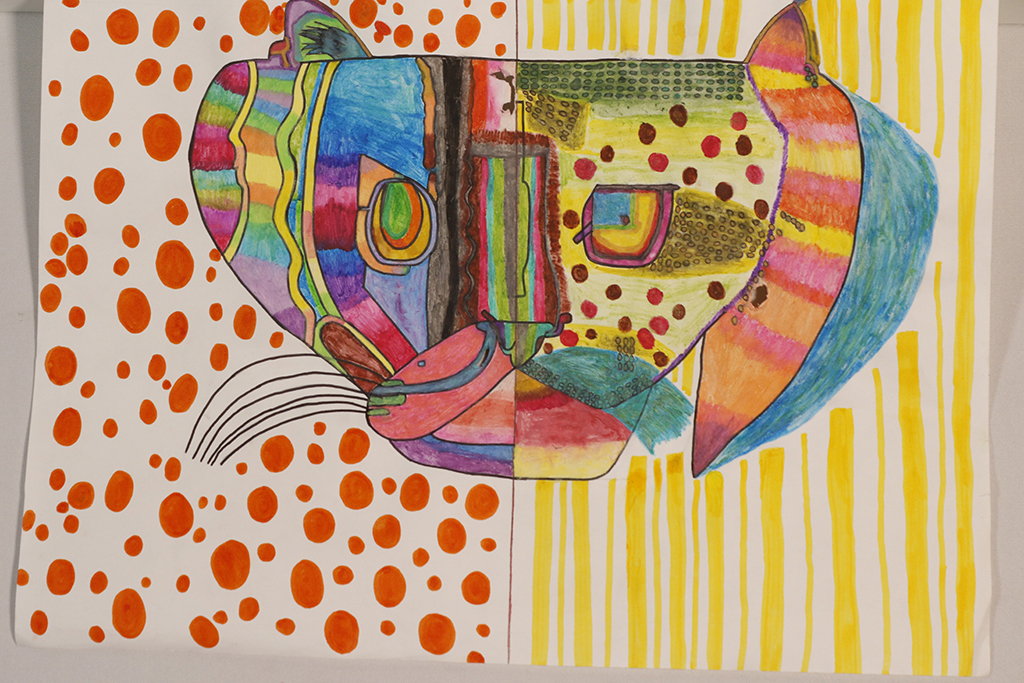
Madeleine Darby
My thought was to help to raise awareness about endangered species of wildcats. My final piece is a drawing, of a half of two endangered Wildcat species, I thought this would be more interesting than doing two whole pictures. I used watercolour pencil crayons to blend the colours in and I made my drawing multicoloured, because it would be bright, bold and stand out nicely.
Amelia Grainger
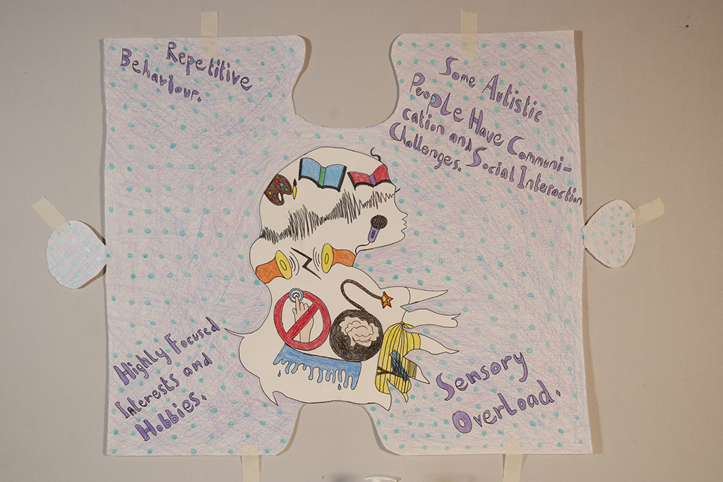
Autism is Like a Superpower
My work is based on Autism Awareness. I chose to do autism because I was diagnosed with it and I wanted to learn more about it. I learnt more about what makes me, me. To be proud of the differences of how my mind works and not thinking of myself as a hindrance.
I did not get diagnosed with Autism until I was in secondary school and proof says that it is harder to tell in girls than it is in boys 1:4. I want people to look at autism as a superpower because everyone is on the autistic spectrum whether you need more help or not so much help in our lives.
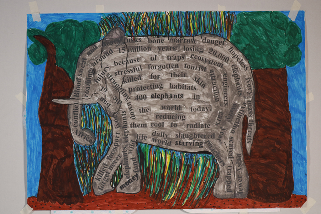
Jason Jones
Blood, Sweat and Tusks
20,000 elephants every year get slaughtered. Daily elephants die of injury because of traps. They can live up to 70 years in their natural ecosystem. I wanted to raise awareness of this.
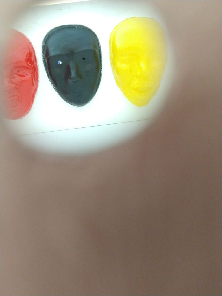
Connor Perkins
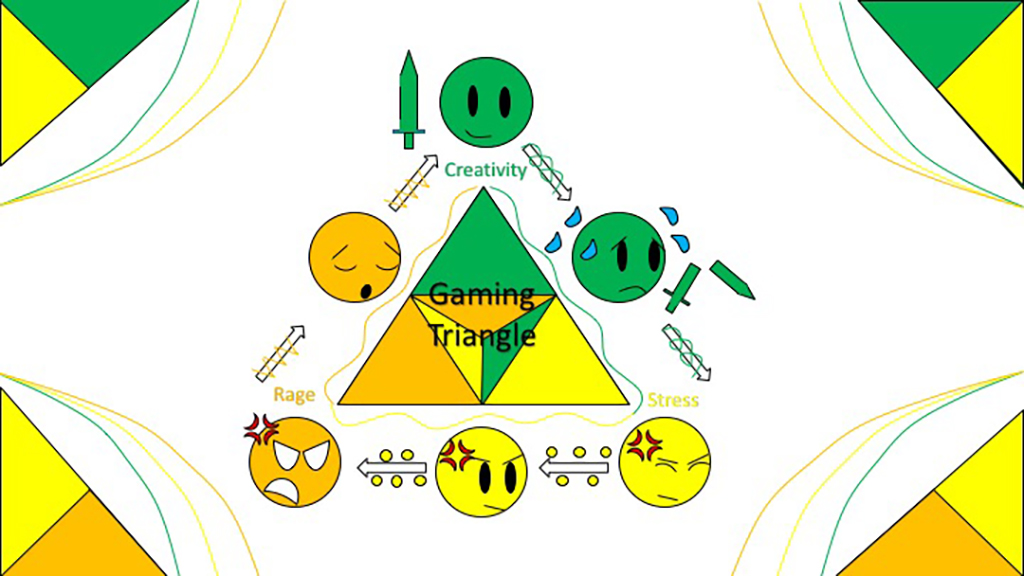
The Gaming Triangle
This Artwork Project is about the gaming triangle. It’s all about the benefits of the positives and negatives of gaming. The colours represent common feelings about gaming.
Yellow = Joyful, excited, creative
Green= Powerful, aware, confident
Orange = Scared, anxious, embarrassed.
Within the options I’ve chosen creativity stress and rage – the effects of gaming.
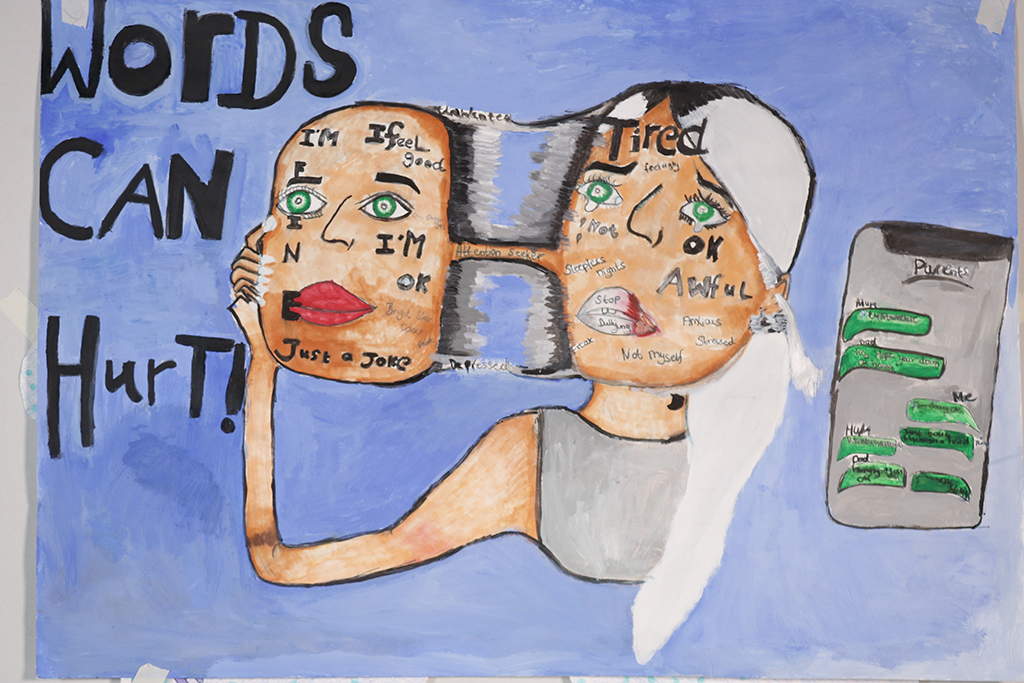
Ginny Whitehouse
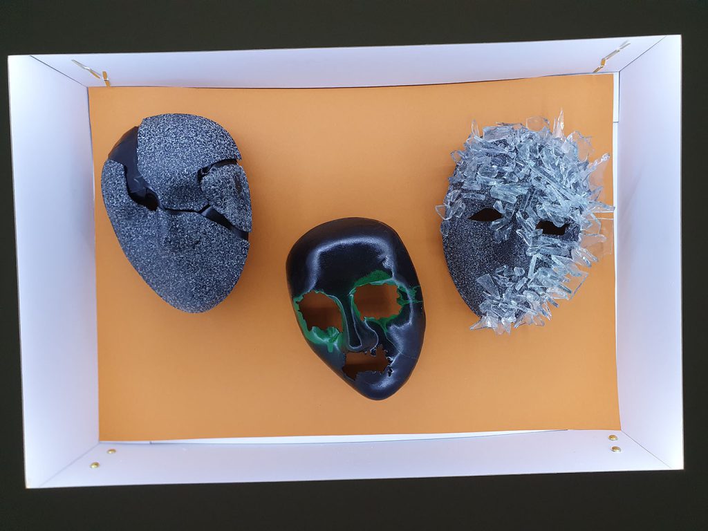
The Truth behind the Mask
My design is based on bullying – I want to emphasise the imagery from a personal point of view of what that person is feeling inside. I believe this will be an eye opener to the public, to show how bullies make that person feel inside and that words can hurt.
The inspiration for the mask idea came from the No Tears Left to cry music video by Ariana Grande where she takes off the mask to show the truth that she’s not okay after what she experienced mentally. That came up as an idea for bullying as I experienced bullying for who I was as a person. I listened to other people’s personal experiences and it just made me think that this needs to be addressed some way or another so I decided to do a painting based on this situation and so that people can relate to it.
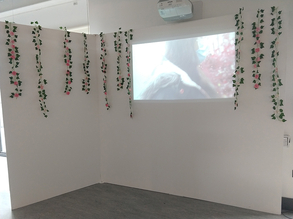
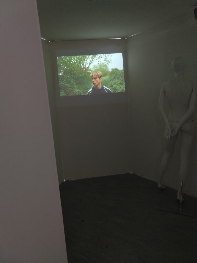
Watch the Video of This Exhibition Filmed by Student, Rhys Atkinson
It is fair to say that Extended Diploma Art & Design has its challenges. No one could have anticipated the impact Covid would have on the last two years. The students on the second year Extended Diploma art and design have embraced this challenge with creativity, imagination, determination and good spirits. Having experienced a significant part of their first year with limited access to studios and equipment, they tackled industry-level project briefs using whatever materials and resources they had at home. The second year began with the hope that they might explore their creative pathways accessing the full college’s facilities. Lo and behold they went back into lockdown at what is often the most crucial point in their creative journey. It was heartening to see them continue undeterred and produce their university portfolios and coursework with little change in pace. Much of the last few months has been conducted in preparing them for the first professional exhibitions. They ably demonstrated that they could produce and exhibit work commencing with the entirely digital Silent Gallery. Returning to the studio they then had a very short space of time to conceive, produce and exhibit their first physical show despite the fact there was every chance the public would never be able to see it in person. This did not dissuade them from producing imaginative and thought-provoking pieces, showcasing the creative resilience and professionalism they have developed in these atypical times. It is testament to the dedication that the following work can at least be enjoyed in the digital realm.
We are delighted once again this year to have had Hereford College of Art support our learners’ progression into HE via their ‘One To Watch’ initiative. Tutors from their Fine Art, Graphics, Photography and Fashion/Textiles areas have judged entries from our corresponding courses and awarded those learners whose work shows potential for excellence beyond FE. Look out for the banners next to the recipients’ work who will also receive a book for their efforts. This recognition undoubtedly motivates learners to aspire to greater things.
Martin Doyle, lecturer, visual arts
Mina Akhtar
Interior Design – Living Room
Interior design of a spacious living room, home space. Targeted at those who love a spacious and comfortable living space with cultural, modern/contemporary design. I am interested in marbling and repeat work.
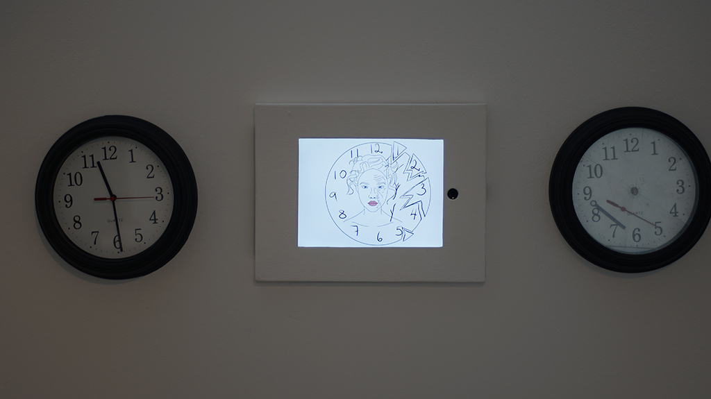
Naomi Celine Kennedy Armstrong
Time Passing
The passing of time and events are constant and is not altered for anyone. No one gets more or less time.
Eden Charlotte Beaven
Calamity
You will never truly understand someone’s internal emotions
Adelina Briceva
Flow Of Life
We reflect ourselves on time which makes us regret afterwards that we dont have time to fulfil our small or big requests. As time passes we think about what we done in the past and how can we improve in the future but never do anything properly in the present.
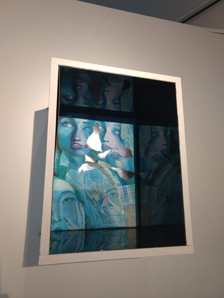
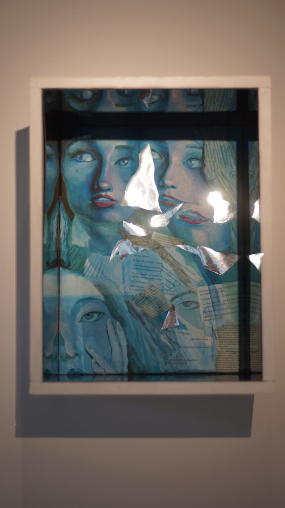
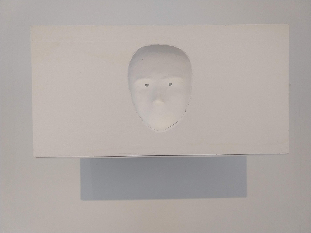
Lisa Lorette Bullows
Self-Reflection
The way we see ourselves can be distorted, different to what others see and media can have a negative effect on this.
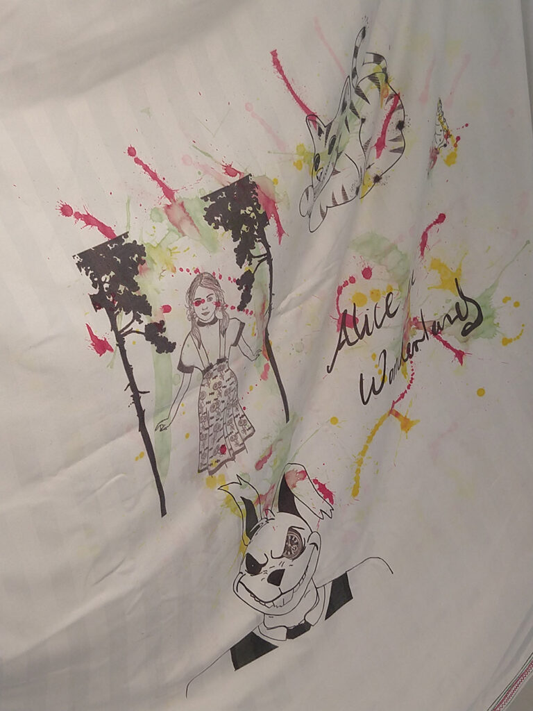
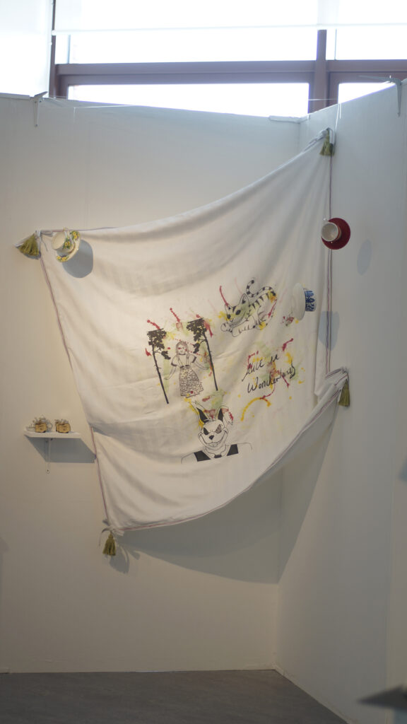
Hannah Louise Cole
How do you run from what’s inside your head?
This is my interpretation of Alice in Wonderland where the characters are on a tablecloth along with home-made scented candles that I feel remind me of these characters and the story in general.
Neve Dangerfield
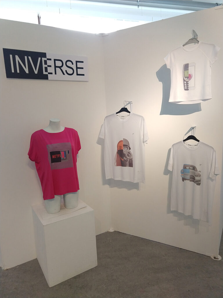
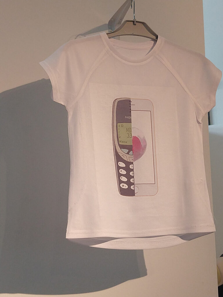
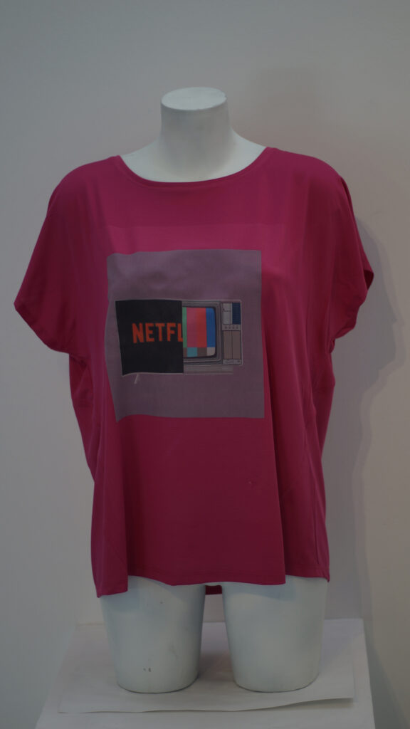
Inverse
Researching into adverts and the reality behind them inspired this range of clothing graphics for ‘Inverse’ – a new brand that celebrates both new and old.
Shannon Davies
Daylight Hours
What do people use to escape reality? With stress being a main point, most people try to escape by using things such as Music, Art or books.
Lauren Jane Evans
Pistanthrophobia
The fear of trusting others.
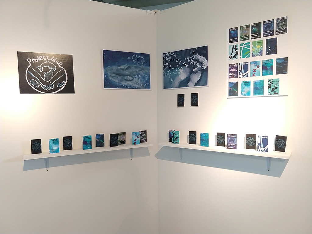
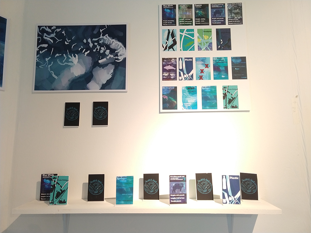
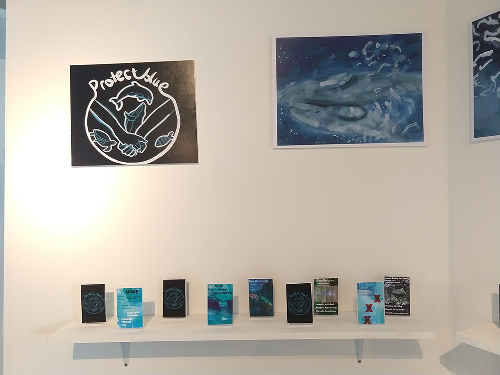
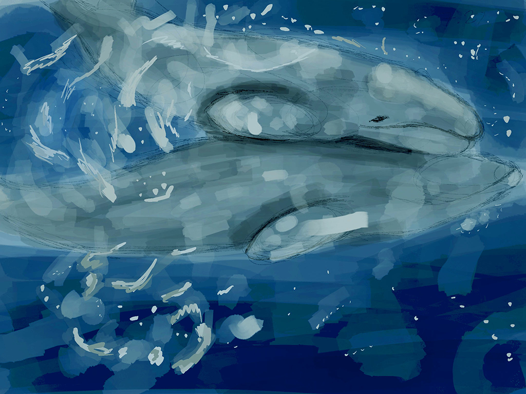
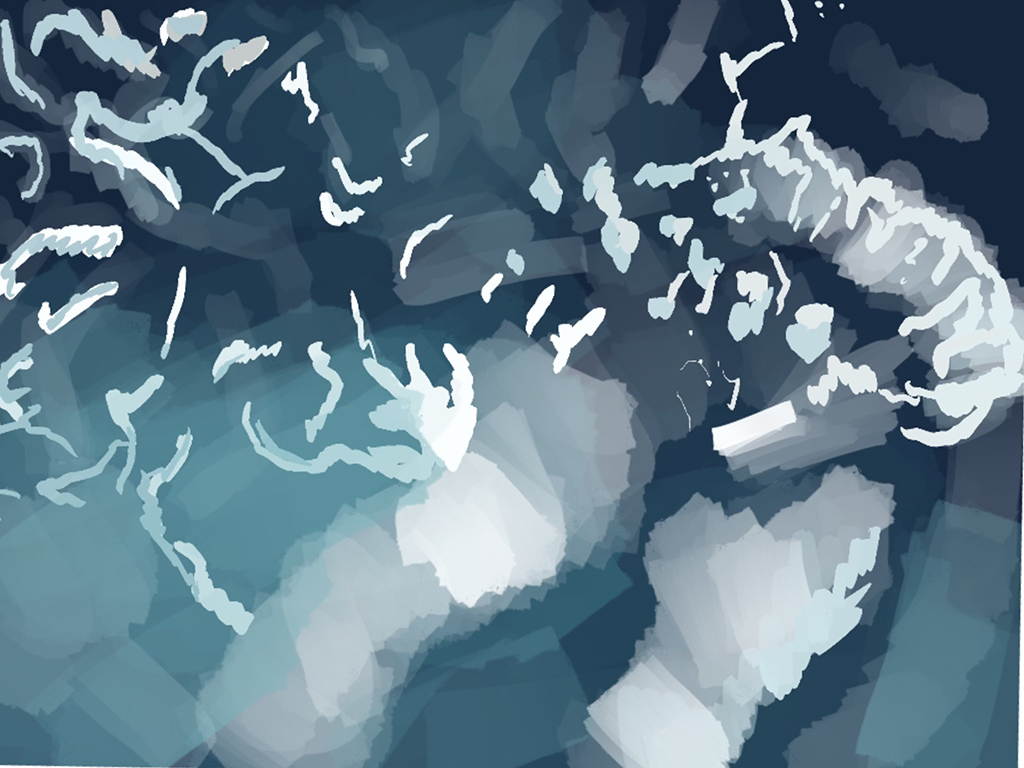
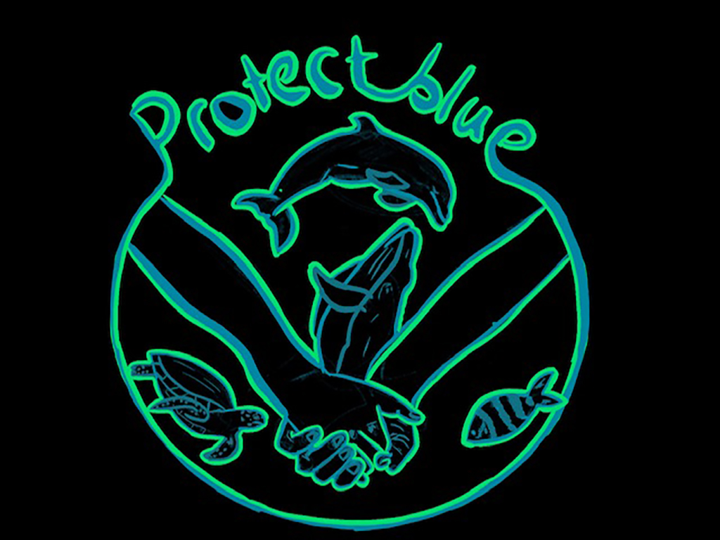
Holly Isabella Fellows
Protect Blue
My work is about showing the beauty of the world that we continue to destroy everyday through simple things. It raises awareness for all ages to get involved and learn how we can make a change. Because as Sylvia Earle said “Start with someone. Some “one.” And no one can do everything but everyone can do something”.
Lucy Graham
Ever Changing
From a shamanistic practice within the roots of both love and war, to now modern times it’s always been a show of self-expression.
Rosa Amora Hans
Mr Doe
I want to create a piece of work about the idea that no matter how small or insignificant a controversial topic may seem to some people it can completely change your perception of a person. I want people who view my piece to have a moment ambiguity and to challenge their own thoughts and develop new ways of thinking.
Nicole Lane
Haunted Mansion
As an interior designer, I want to push the ‘scare maze / tour’ to a different level.
Emma Lee
Bright Side of the Moon
I’m learning to fall in love with the twilight, spent a lifetime trying to.
Alfie James Masters
Mahu Werk Room
For my project I looked at drag queens, taking into consideration the culture of Hawaii and how ‘mahu’ (the third gender) could be the future of drag.
Cody Nock
Clutter!
Similarly to Muppet style characters in media, I have created a mascot to teach young children the creative side of recycling and how it helps the environment. Clutter, the Gryphon!
Jill O’Callaghan
Detachment from Reality
What if you over-thought until you can’t distinguish assumptions from reality? The lines between the real world and a fictitious world conjured from your mind becomes blurred. When you lose touch with the reality around you, the atmosphere can become sinister; plaguing your thoughts and emotions.
Emily O’Rourke
Speed Limit 165
“Those kids with their spray paint, God love ’em” A physical demonstration of trashy teenage rebellion & the ageing process.
Aimee Louise Simpson
Hidden Ocean
What we do impacts the ocean
Leo Slaidina
(Delusional) MASK
Set in the near future of 20XX, Morgan escapes to a world which they consider their perfect world
Kian Nathan Smith
Sap
A short film exploring how a sense of uneasiness can be achieved through sound and visuals. The character explores a forest that has a strange aura, causing him to get increasingly more paranoid as the film continues.
Stefania Ioana Sterian
Domus de Libris
Translating to “House of books”, the design is a reminder of where society began and that knowledge and learning are part of our fundamental growth as humans.
Shanikqua Stewart
Insanity
My work is a visual representation of anxiety, and how it can feel isolating and take over your mind.
Kaiyan Swan
Concept Art
Developing my art skills to help me get better with my future in becoming a concept artist.
Alexandra Teed
Inciter
What you wear never justifies ‘asking for it’.
Zoe Yasmin Thatcher
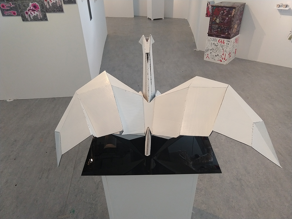
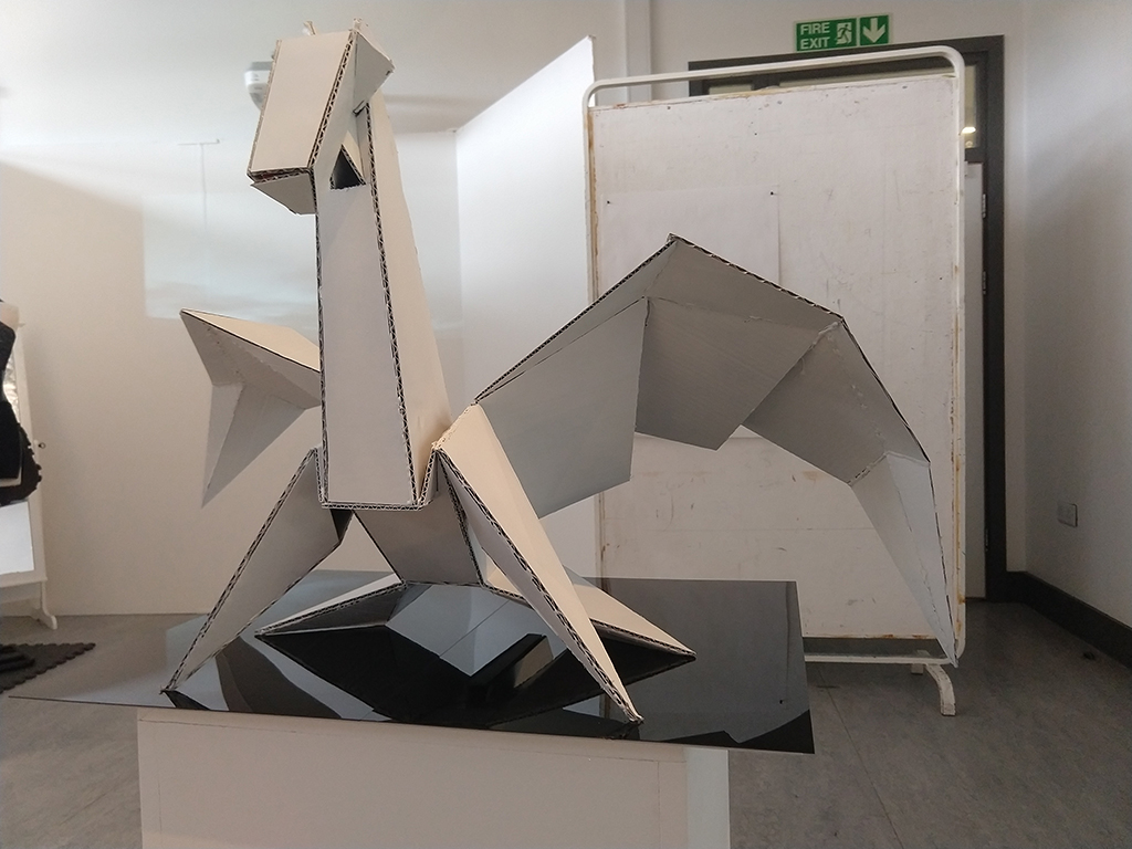
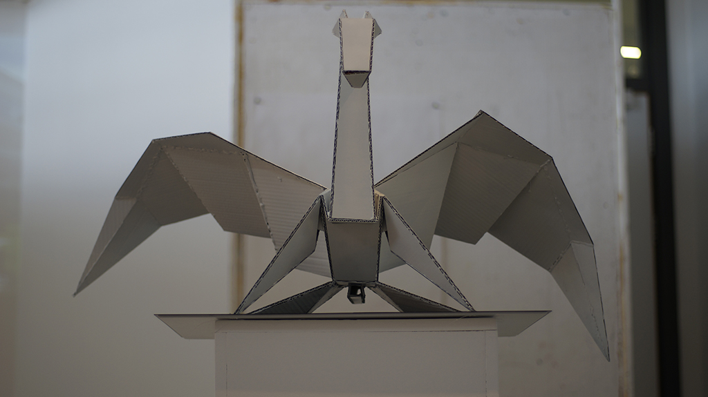
A Simple Pegasus
In the style of Kirigami, I have created a piece that combines the spiritual meaning of the Pegasus with the peacefulness and creative freedom that making an Origami piece provides.
Ellie Jayne Turner
A Closer Look
I want spread awareness of what anger is like in a creative way. Anger issues can cause severe mood swings and you can go from really angry to really happy quickly, I want to use masks to show this.
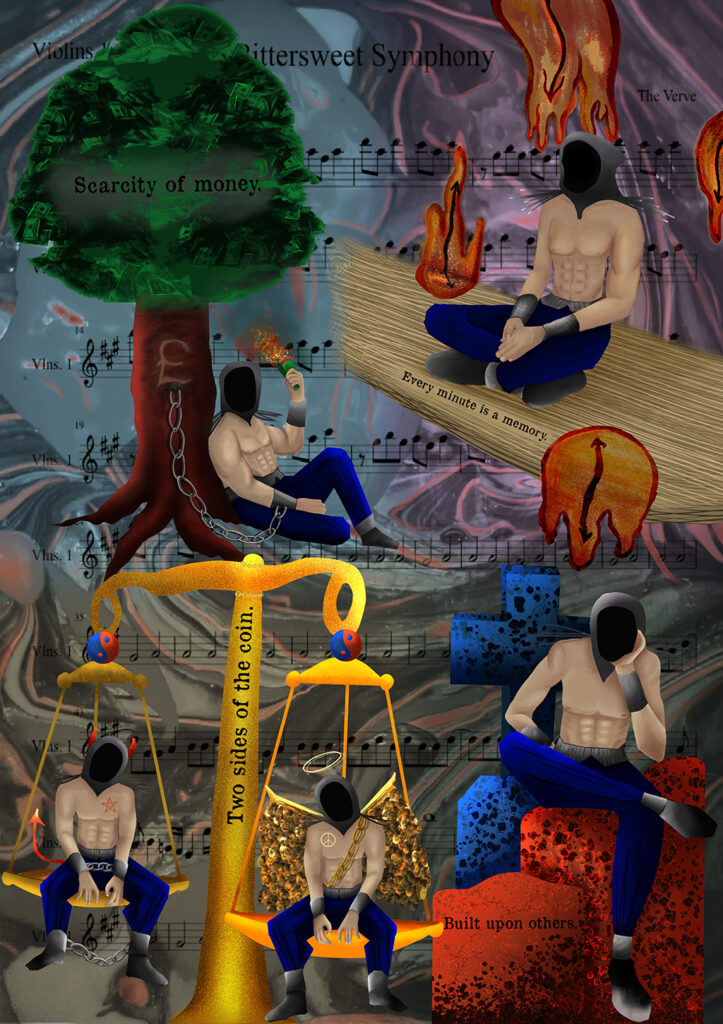
Marcielle Dyami Wade
Life’s Certainties
Currency’s deplete. Memories made. Human nature undefined. Built on others.
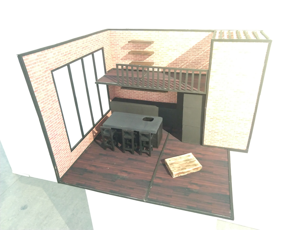
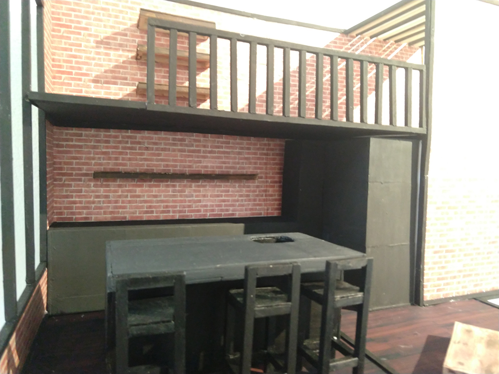
Aleksandra Wierzbicka
Is Industrial The New Modern?
In this project I worked to achieve a proposal / 3D model design for a living studio space. The reason why I chose a studio space is because when searching for a studio apartment online the square footage size is very miniature with almost no room to move around.
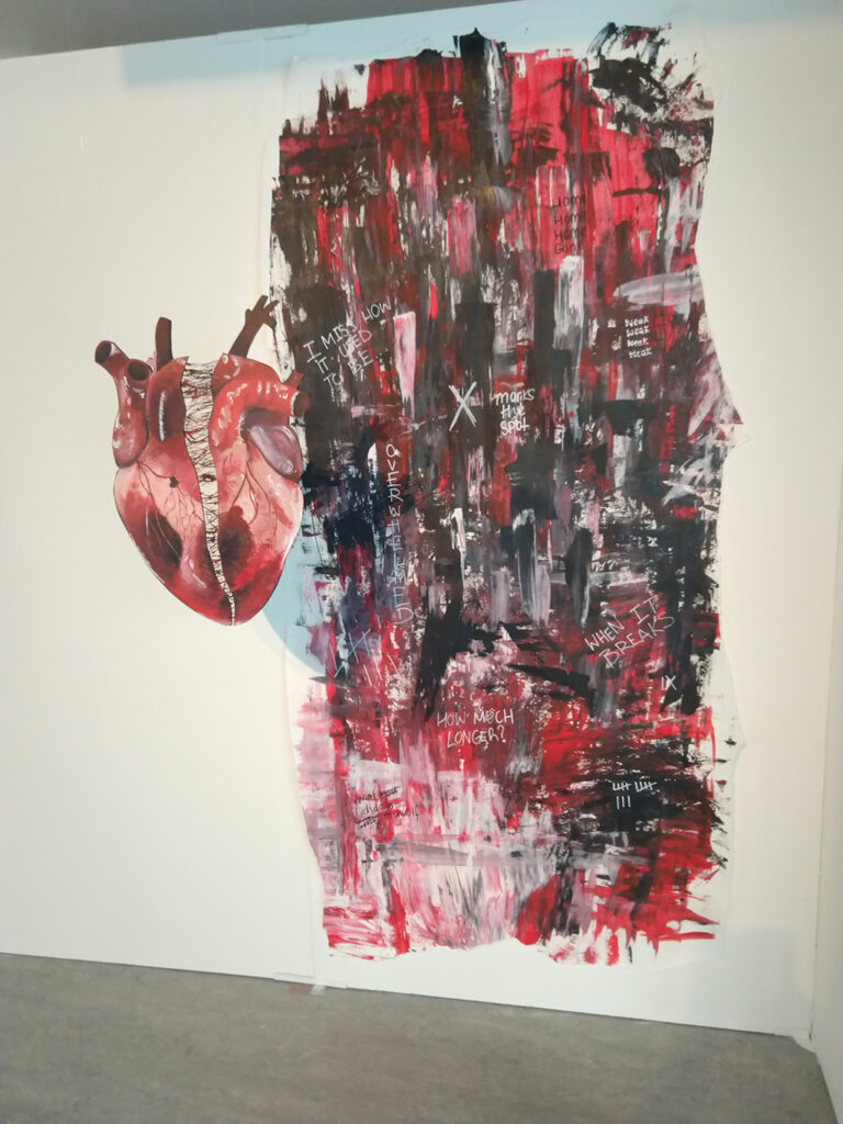
Eve Wilmot
Panic
Panic attacks suck. Simple as. They are humiliating and painful. For me my breathing speeds up and my heartbeat becomes all I can hear.
Although ‘Covid’ has had an impact on much of the curriculum, our Graphic Design students have continued with their studies using Adobe Creative Suite at home during periods of lockdown. Dudley College has made sure that all art students have access to Adobe software for the duration of their course in order to support their studies both in college and at home. The work on show here is just a snapshot of some of the work produced over the past two years. While our students are taught digital skills, they also learn traditional art and design skills in order to develop a broad portfolio of art and design for their progression onto higher education. Some of our recent students have gone on to study at degree level in subject areas such as visual communication or graphic design, but also illustration, animation, fashion illustration, automotive design, architecture, interior architecture, jewellery design, digital media, and many other creative pathways.
Over the past few months all our students who made university applications were accepted (as usual), and generally on their first choice. Some have chosen to begin their studies at degree level, and others have decided to stay on at Dudley College for a Foundation Year. Well done all – it’s been great working with you. Good luck for the future.