
EXTENDED ART AND DESIGN: FINE ART
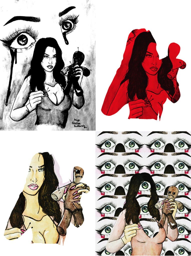
Aniya Awklands
Previous Education: Wolverhampton College
Destination: Employment
Duality
This project developed from a previous theme where I was creating illustrations for tarot cards. Here I have explored multiple dualities, looking at the most powerful approach to visualise two differences within one image. The image included here explores the idea of love and hate, where the voodoo doll makes you imagine someone else’s pain, maybe distracting you from your own. I work illustratively, always trying to produce detailed representations of the objects I’m drawing, and merging different images to create new ideas and to provoke new thoughts. I’m not afraid to challenge expectations and to highlight stereotypes.
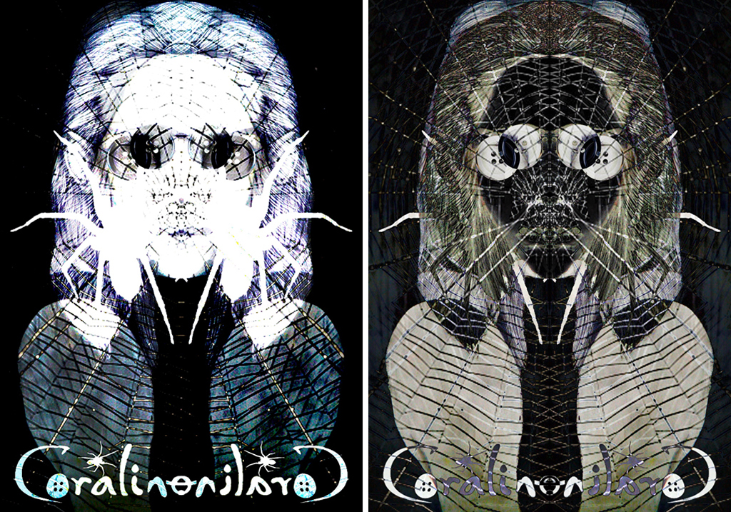
Charlie Benton
Previous Education: Wolverhampton College
Destination: Employment
Coraline
The digitally manipulated work presented here is part of a wider body of work taken from the popular animation titled ‘ Coraline.’ The work aims to reimagine characters from the animation, exploring new colours, shapes and forms. My response to this stop motion animation is entirely linked to the myriad of mental health conditions, that are clearly prevalent in the narrative. Research will focus largely on the descriptions of mental health conditions and how these relate to each character. Illustrators that I will explore include Cath Riley and Dave Mckean, as they directly relate to the story and could inspire both a conceptual approach and drawing/image making techniques. I started the project by analysing social media logos, with the intention of drawing issues affecting teenagers and young people and their mental health. I’m focusing on two characters, Coraline and The Other Mother, from which I will reimagine through drawing and digital manipulation and text. Primary photos have also informed aspects of the final response, such as flames and other symbolic objects.
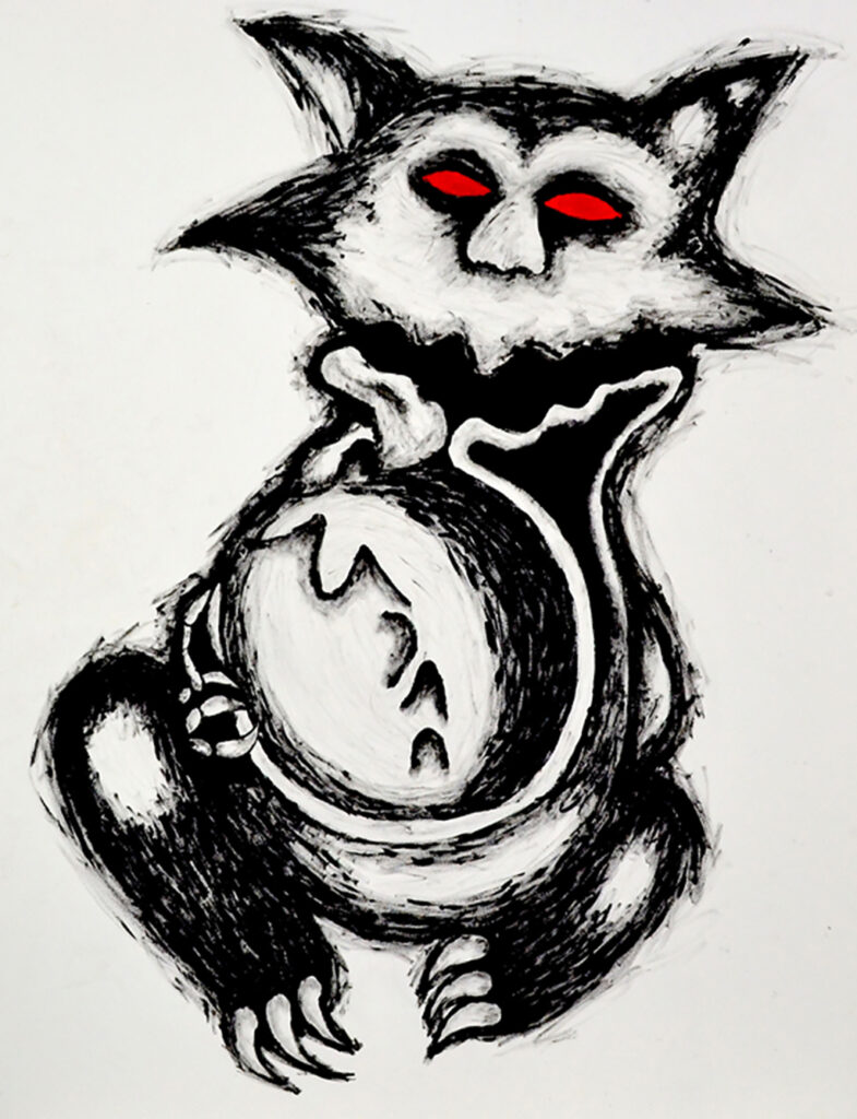
Lauren Clinton
Previous Education: Pedmore High School
Destination: Birmingham City University BA (hons) Fine Art
Chilling Adventures of Sabrina
My project is based on a reimagining of a popular NETFLIX series ‘Chilling Adventures of Sabrina.’ This ‘reimagining’ intends to provide a new visualization of the Eldritch Terrors. I chose to do a final piece on the eldritch terror ‘The Imp of the Perverse’ as I felt like it has the most detail in the drawings that I did, and I feel like it matches the theme the most out of all of the eldritch terror drawings. The artist that influenced my work is Joyce Pensato based on how she interprets popular and familiar images from cartoons and comics in large scale paintings and drawings through fine art.
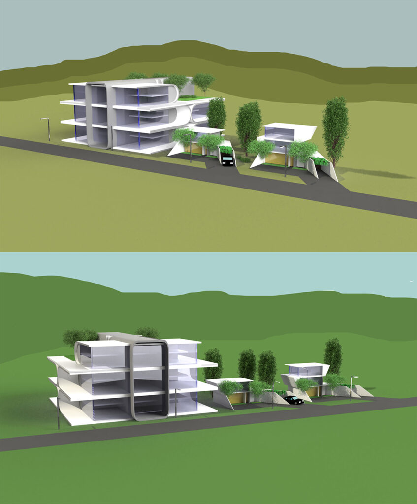
Bartlomiej Dziadula
Previous Education: Birmingham, Quinton – Four Dwellings Academy
Destination: Birmingham City University – Architecture
Architectural Utopia
The concept for this project was to produce a vision of architecture that resembles today’s ideas of Utopia. I was trying to achieve this impression of utopia by adding these elements to the buildings I was designing.
For example, nature, that some of us are missing living in some housings/apartments or improved energy consumption by creating bigger windows, to let more natural light in, and use less electricity. The two artists that I took the most inspiration from, were architects: Zaha Hadid and Tom Wiscomb. They allowed me to come up with the ideas for the shapes of the architecture I produced, which their work was the most beneficial to look at, since they presented Utopian architecture. Through my work I am presenting ideas of Utopia, which is the constant want and greed of humanity to achieve something better, but unreachable, in architectural form. From the audience, looking at my work, I would like them to recognize something that is missing in real life buildings, that could be found in my work. If this concept was to become reality it would be made out of concrete, steel, glass and wood for the interiors. Since it’s just a concept, there would be regulations applied, to make it as energy efficient as possible. The apartment building itself, I would imagine being surrounded with a car park and a green belt surrounding it.
Dylan Elms
Previous Education: PTC
Destination: Foundation Art and Design
Uncanny Cryptids
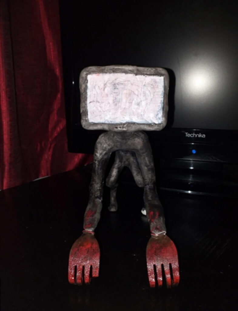
For this project, I had decided that I would create a body of work based on folklore creatures which make people feel uneasy in the place they feel the safest, their own home. For the project, I had decided that I would create four of my very own folklore creatures from scratch, with their own backstories included, as well as a list of what they do, where they can be found. I then produced multiple drawings of each and smaller developmental model sculptures of each. I have designed the creatures based around domesticity, in places such as the bedroom, kitchen and then living room, which are by far the most commonly used places in a house hold. By doing this I will trigger an uneasy feeling from the audience. I had created my sculptures out of clay, as well as using a range of materials and objects which are typically found in the home to further cement my work into the uncanny valley.
I believe that the Chapman Brothers and Clive Barker were the two most influential artists to me and my work because of the specific artworks styles they produce and work in. The Chapman Brother produce heavily detailed models of gruesome and scary scenarios and creatures, it was these models which had inspired me to work in a 3D sculpture medium. Clive Barker has inspired me from the many drawings he had done, ranging from the nightmarish landscapes, to his demented creatures. The creatures specifically were what inspired the design for one my sculptures entirely, as well as attempting to achieve a similar style to his own with my drawings which i had produced of models.
Sophie Fenney
Previous Education: Year 1 Diploma BMET
Destination: Employment
Mental Health
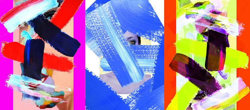
The concept of my final piece revolves around mental health and how it affects people. I wanted to capture how it may look from an inside point of view, seeing what other people may not notice. I used a range of different materials and media to come up with my final pieces. Both digital and physical to produce these portraits. The heavy, expressive brush strokes are designed to reveal the internal ‘mental health’ that we all have. Marlene Dumas and Urs Fischer were my two biggest inspirations. The use of Dumas style of portraits and the way Fischer collages his work together were incredibly significant in my work. I enjoyed the way Dumas created her work using ridiculously small amount of detail, focusing more on the emotion it conveys. Using this and the surreal collage techniques Fischer used in his work allowed me to create multiple different portraits in my own style trying to portray how someone may feel on the inside. I want to communicate how mental health can look so different for different people and it is not just one thing. I also wanted to display how it may look on the inside when someone seems “normal” using something everyone has (like a face) to show this but distorting it into something bizarre, and how mental health makes you feel like you are someone else. I want people viewing my work to think about how mental health affects people, and how many people are affected by it. I want people to think about the effects it has on other people and hopefully start a conversation and to show other people that its normal to feel like this.
Luke Harper
Previous Education: The Wordsley School
Destination: Foundation Art and Design
Dystopian Video Game Concept
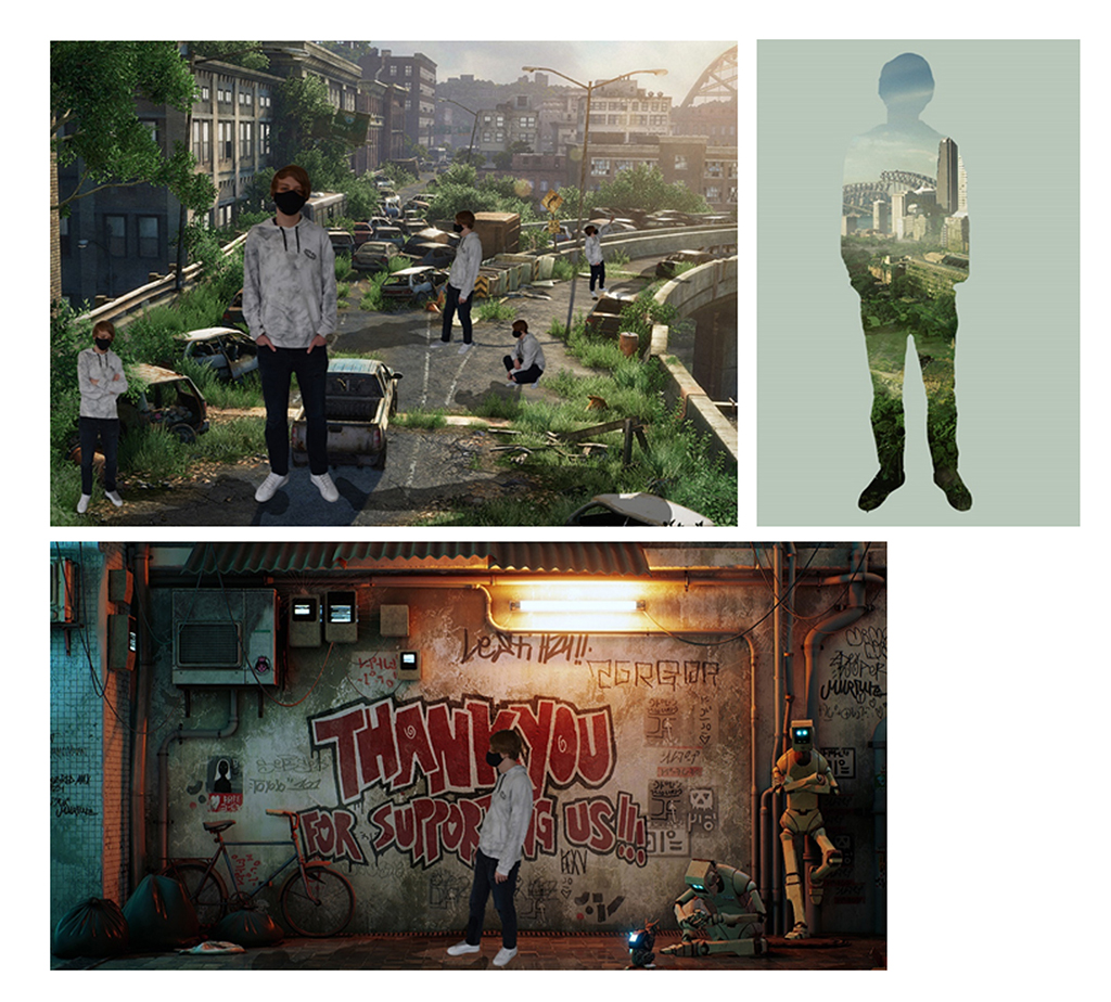
The concept for my FMP was inspired by the past events of lockdown and the global pandemic, inspired by games and films. I was playing and viewing Cyberpunk 2077 and and the seminal movie Blade Runner during lockdown and considered how I could visualise my own dystopian type video game through characters and environments. Throughout the project I experimented with a variety of techniques because of the limitations and time, I managed to experiment with pencil, fine liner and digital programs such as photoshop and aftereffects. The significant artists that informed the work included Syd Mead and Stanley Donwood as their art styles and work interested me the most and had a powerful influence when creating the artwork for the cityscapes. The fine liner drawing technique was inspired by Donwood’s Linocut work and how the images looked after the process was completed. Bold and wavy lines highlighting small details which paired well with Syd Meads futuristic cityscapes that helped inspire my own designs.
Niamh Holland
Previous Education: Year 1 Diploma Art & Design
Destination: Employment
Gargoyles
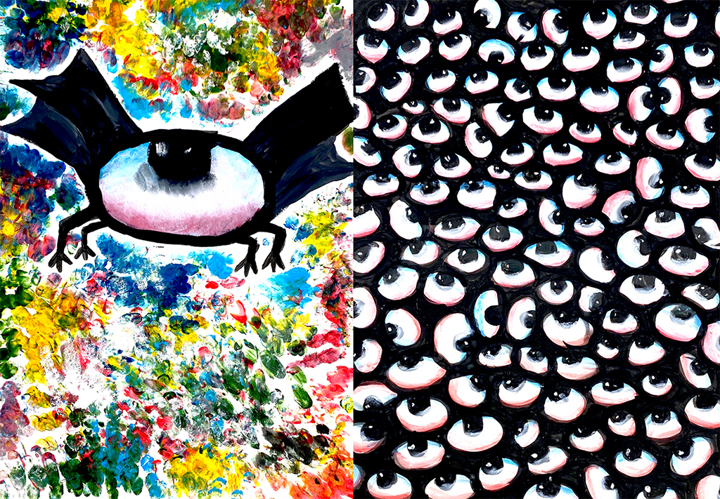
I am fascinated by Gargoyles as their aesthetic intrigues, amuses and confuses me. The two paintings presented here form part of the development stage, where I was experimenting with how to create a contemporary gargoyle, linked to historical ideas yet new and dynamic. Gargoyles were created initially as creative water spouts on cathedrals and historical buildings and were popularised in the 13th century, they were also thought to ward off evil spirits. During this project I want to create my own gargoyles by exploring collage, drawing and sculpture. I want to create artworks that seem monstrous, disturbing or unsettling. I want to exaggerate, and combine disparate elements to form a new and sinister response, using the Gargoyle as a start point. I also want to experiment with using political figures like Boris Johnson, Nigel Farage, Margret Thatcher and many more. I’d like to poke fun of these people by turning them in to a gargoyle sculpture through the art of satire and mockery.
Maximos Kiosses
Previous Education: Art and Design Level 1 Diploma, Art and Design Level 2 Diploma
Destination: Foundation Art and Design
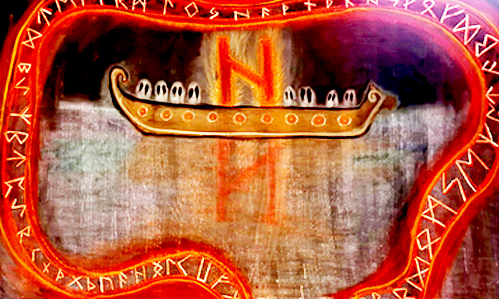
The Helhiem Longboat
To acknowledge the hindsight of this piece the “Helhiem Longboat” is one that may, at a glance, appear distorted and disproportional creating an underlying sense of uneasiness. This imbalance is, however, intended due to the premise of the piece being a personal recreation of the Viking Underworld “Helhiem.” Therefore the key aspects of this play a part it summarising a feeling that presents a sense of caustic reality and existential questioning. The ‘Sea’ for which is the foundation for this Artwork, is almost metallic in appearance with streaks of dark blues and purple to contribute to the overall unfamiliarity of it all. The ghostly Sea dissipates into the infinite black void and instead of having our usual Sun shine brightly in the centre, the horizons only source of light is an off-centre Longboat, carrying the dead through the Abyss. The longboat is reminiscent of historical design based on the ones we have recovered in the modern era, with the Ghosts of the long dead being ever watchful as they stare into darkness for eternity. The giant burning effigy is actually one of the Viking “Runes” which each symbolise different specific aspects of life in a general sense, with this one being the rune of destruction, hence why its the sole shining light in the infinite dark of Hel, as destruction, chaos and death all unify under one conceptualization of this specific belief on the afterlife.
Other than the lonely boat with the burning rune, the misty Sea of Helheim shows us nothing, but the reflection of the damned in the murky waters. Surrounded with an expanding and contracting banner of Runes that encircle the fate of the lonely longboat. The Runes in their design are inspired by the rune stones that exist all over Scandinavia which have the same encircling banner that represent an esoteric story and meaning.
Also note how the Runes don’t encircle the entire piece, this is intentional and whilst it may not be entirely obviously at a glance, this is done for the metaphorical aspect. The Runes in Viking Lore dictate our fate, and the inclusion of leaving a gap at the bottom of the piece is to signify a change in fate. Weather that may be a way out of Helhiem for the lost souls, or just further into the darkness, it shows us things can change and our fate can always change, provided we go on the right course.
This piece was made by utilizing Blackboard paint and different colours of Chalk, the reasons for doing so can be incorporated into two different answers: Number one being the textures and blending that are beneficial with using Chalk provide strong colourful outlines whilst also being able to develop almost transparent effects, this was useful in the creation of the ghostly Sea and the encircling Runes. Secondly, I was inspired by an artist called Tacita Dean who specializes in Chalk pieces with an unparalleled attention to detail. I also think it’s worth mentioning that Tacita Dean has done several Chalk pieces with giant boats in the water clashing with waves and being blown around in the wind, completely different from my own work of course but was ultimately the inspiration for using Chalk in my final outcome. I’d also like to mention that each and every other artist I’ve researched for the project has been beneficially inspirational not necessarily in terms of context (Besides the ancient Rune masters, Föt and Asamund who inspired the encircling runes) but in terms of colours and proportional value, not to mention mythological value and how to translate the ancient mythological Norse poems into decipherable art like many have done before me and achieved it with such a high standard.
Thomas Rhooms
Previous Education: Year 1 Diploma BMET
Destination: Employment
Character Design
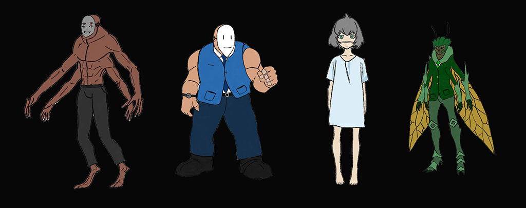
For this project, my idea is to create drawings of characters which embody an exaggerated emotion with different designs for each one in an anime/ manga style. I also looked at different career roles which may have a good link to the emotion, for example a butcher could represent rage or anger, and a doctor could represent kindness or joy. I wanted to implement special weapons or half human hybrids which have links to certain job role. I also intended to make characters which embody aspects of a mental illnesses such as depression or anxiety. I started by researching emotions and what different types there are to help me develop with ideas. I will then research a range of artists such as Edward Munch and Manga artists such as Sui Ishida. I experimented with drawing to create characters and will also use photoshop and procreate to add colour and detail. I looked at backgrounds for these characters and used painting, collage and photography. The enduring connection between art and mental health and wellbeing is well documented, especially where artists and illustrators have attempted to document and communicate their own experiences of mental health struggles and or insights. Hollywood may well use caricatures and stereotypes of mental health to provide a character with an edge, or belonging to a subcategory or subgenre within society, which also happens in anime. I also felt it might be useful to provide a brief summary of the difference between anime and manga, as explained in the following quote, ‘Put simply, manga is the term given to Japanese comic books and graphic novels, whereas anime is the name given to Japanese animation. … Although both tend to be considered genres in the West, in reality they are a description of how the content is produced.’
Emily Southwick
Previous Education: Pedmore High School
Destination: Birmingham City University
Timelessness
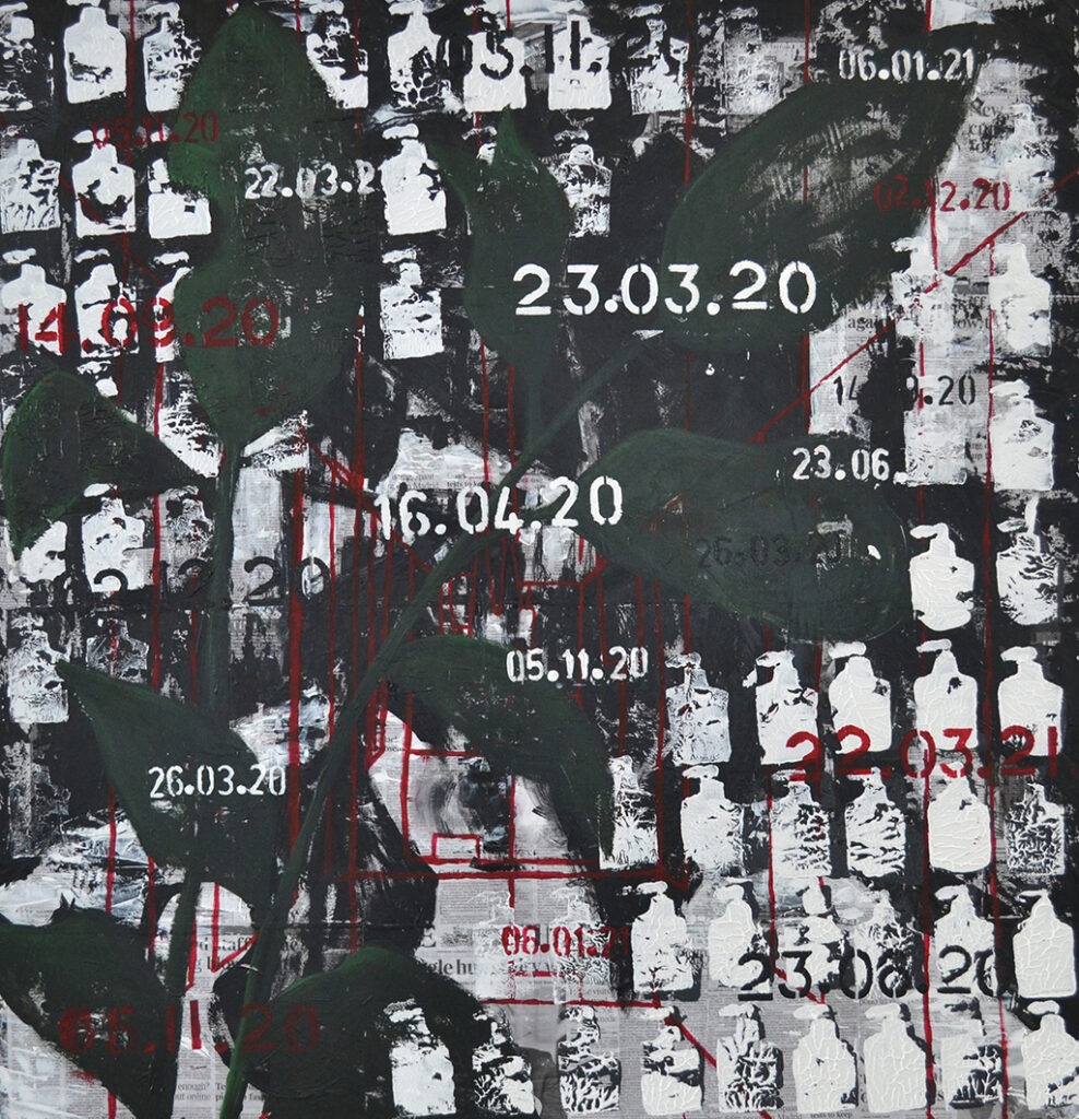
My project theme is ‘Timelessness’, and during this project, I have used various mediums to express my emotions. I choose timelessness as my theme because it associates with my sentiments towards the pandemic. My aim for this project was to create a visual representation of how I felt about the lockdown and covid-19. I wanted to express that we as people are just walking another path, and when it ends, we will only walk another. My concept is all about Covid-19 and the problems and issues it has brought to people’s mental health and stability. In my eyes, I see covid-19 almost like a curse, it’s like we as a society are getting punished for taking advantage of things, we would usually be able to do every day without cost; for example meeting up with friends or going shopping. Especially in the modern generation full of technology, we seem to detach ourselves from the nature around us; Ignoring the beauty and tranquillity behind the natural cycle of life as we stare at our digital screens. It’s only now that some people have noticed how much we miss the little things in life, and how our timeless development in advanced technology has almost, made us blind. We can only miss something until it’s gone and I believe this ‘curse’ can only be broke until we all notice our senselessness towards the little things and work together as one instead of multiple different groups.
For my final piece, I used soft pastel, graphite, newspaper, and acrylic paint. My backdrop was a collage of newspaper pages about covid and lockdown. I decided to do this to reference what my concept is about but also create an intricate background. I used a stamp I made out of cardboard to create an alinement of hand sanitiser prints across the painting to refer to repetition and the rise in PPE (Personal Protection Equipment). My final piece was crowded and manic because I wanted to communicate how stressful and confusing everything has been.
Benjamin murphy was someone I found on the Saatchi gallery website. He was hosting a new exhibition during lockdown called antisocial isolation, which was intriguing. My acknowledgement of the upcoming exhibition ‘antisocial isolation’ lead to my discovery of his work. I was interested in his plant charcoal drawings, and I used them as inspiration throughout the project. My concept for my project was to create dark and lifeless drawings of plants and nature to communicate how time and life has almost stopped because of lockdown; this ultimately leaves everything to become dull. Benjamin Murphy’s charcoal drawings was a great start point for my project, and soon enough, I was creating/developing this idea into prints and even paintings. Franz Kline was another painter that got recommend to me, his work was bold and defined, and that factor inspired me to create black acrylic paint paintings and prints. I didn’t work with abstract but instead aimed to achieve the dark, bold and thick line-work he possessed in his abstract paintings.