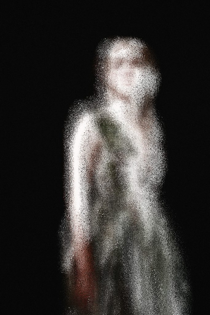
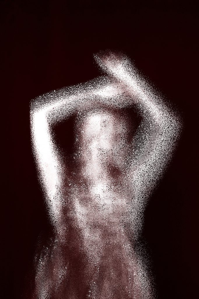
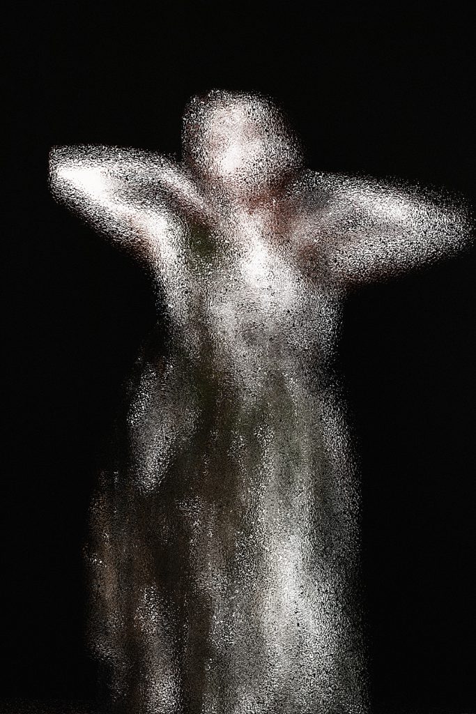
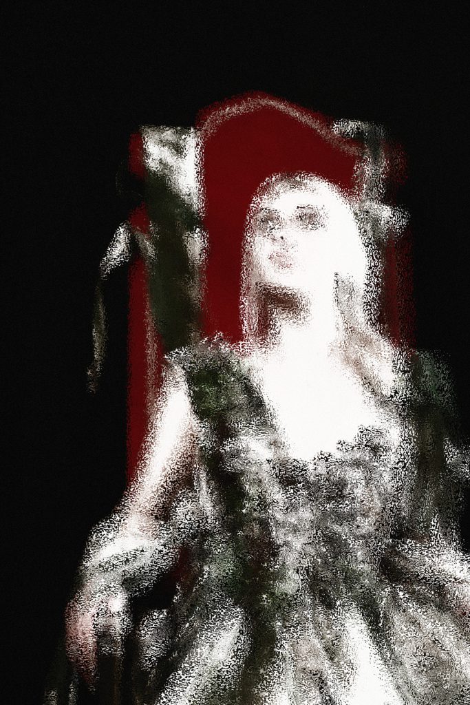
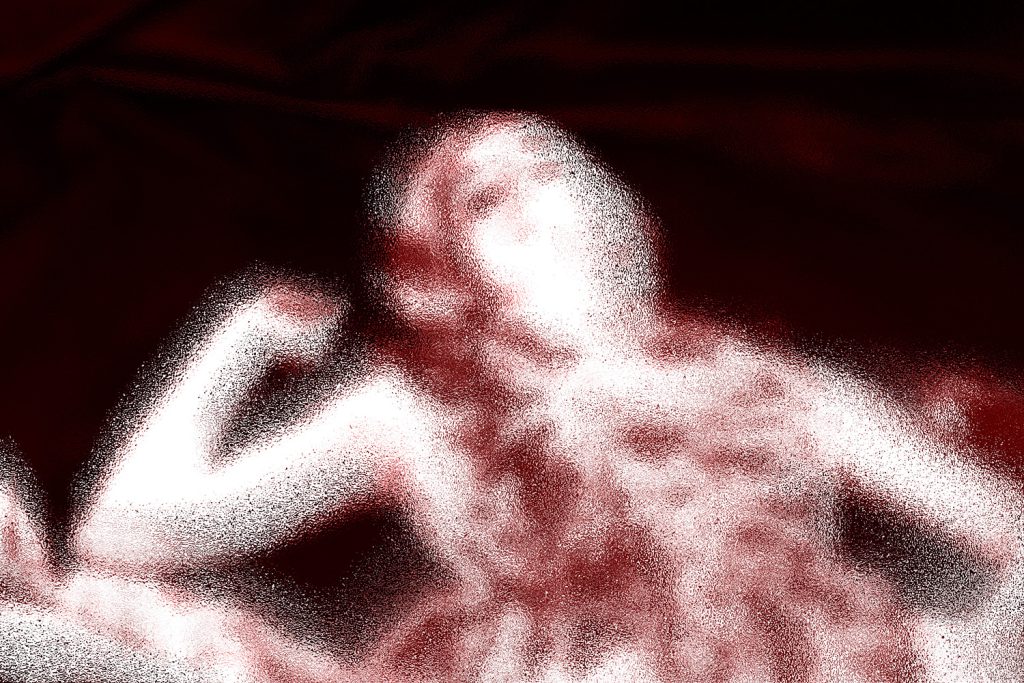
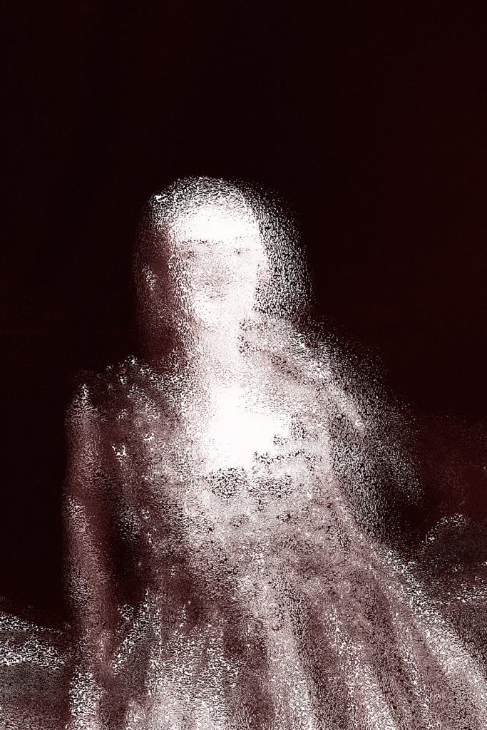
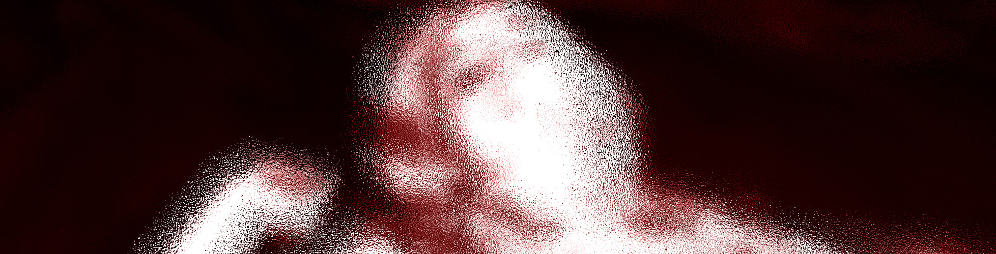
For my creative independent project, I decided to focus on the theme of “Ethereality”. I have chosen this theme because it has always been something that I have had a keen interest in, what has interested me the most is the idea of innocence allowing me to pursue this in my future career as a photographer.
For research I have looked at variety of fashion photographers such as Miles Aldridge and Tim Walker, I have also collaborated with fashion students to experiment with projection and a variety of intrepid designs. My body of work for the exhibition was based on the idea of documenting a subject that visualises the surreal and creating a fictional narrative using various props, colour schemes and styles. I want to create an atmosphere within the image that suggests something ‘otherworldly’ and uncanny.
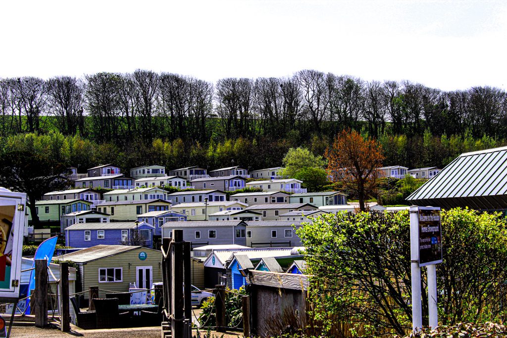
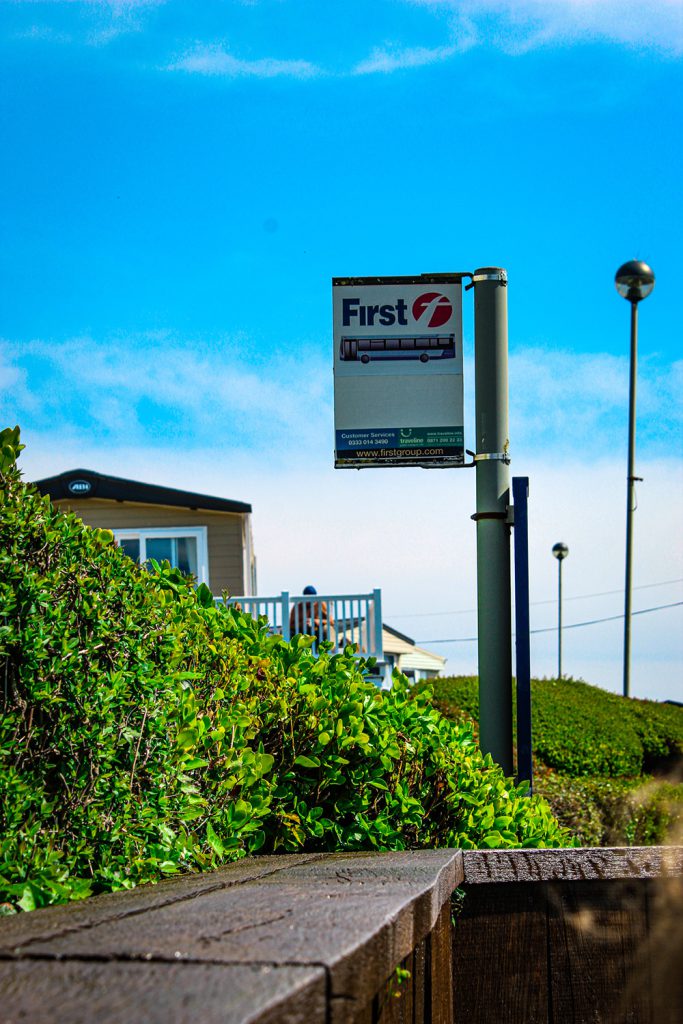
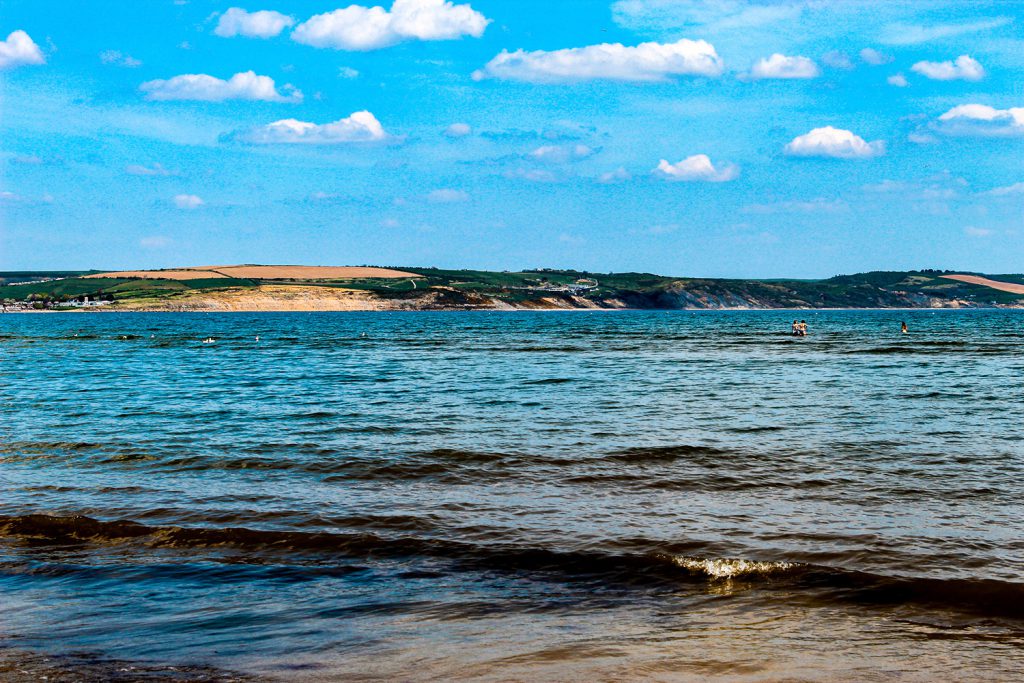
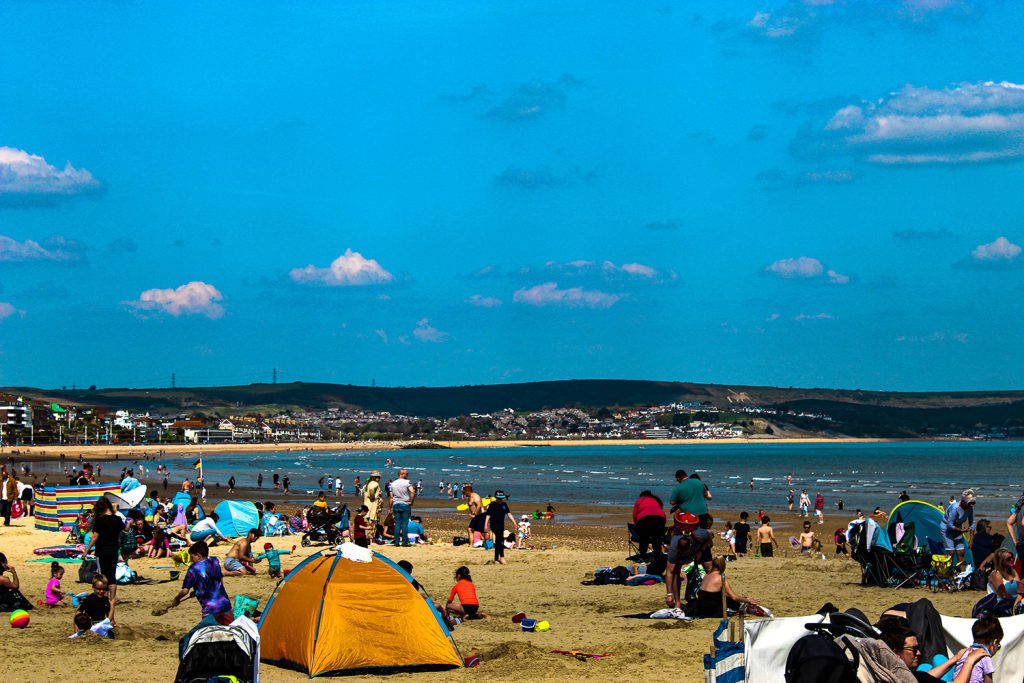
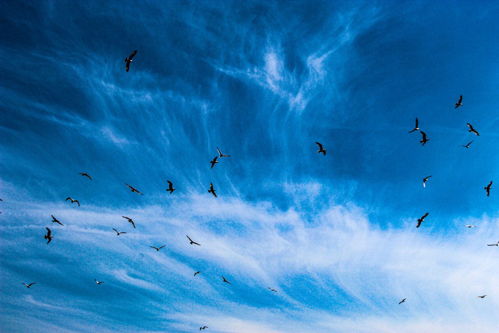
For my Creative Independent project, I’ve set myself the challenge to take as many landscape pictures as possible and edit them for an online showcase called “Artsfest”, at the end of the year. The images include landscapes of fields, nature, the beach and caravan sites, with seagulls and loads of trees surrounding them, representing Weymouth, the holiday resort.
The reason I chose to do landscapes for my project is purely because I have a strong connection to nature and like to feel close to rivers and trees, as they weirdly make me feel somewhat comforted and safe. Just to be able to stand in the sea gave me the sense of relaxation as hearing the waves, birds and sounds of children playing in the sand, made me feel very calm.
I also felt very brave and confident afterwards. The research I’ve completed includes Martin Parr and Peter Mckinnon, because they make pictures based on landscapes and people in those landscapes, to make it feel more natural. The artist who’s inspired me the most has to be Martin Parr.
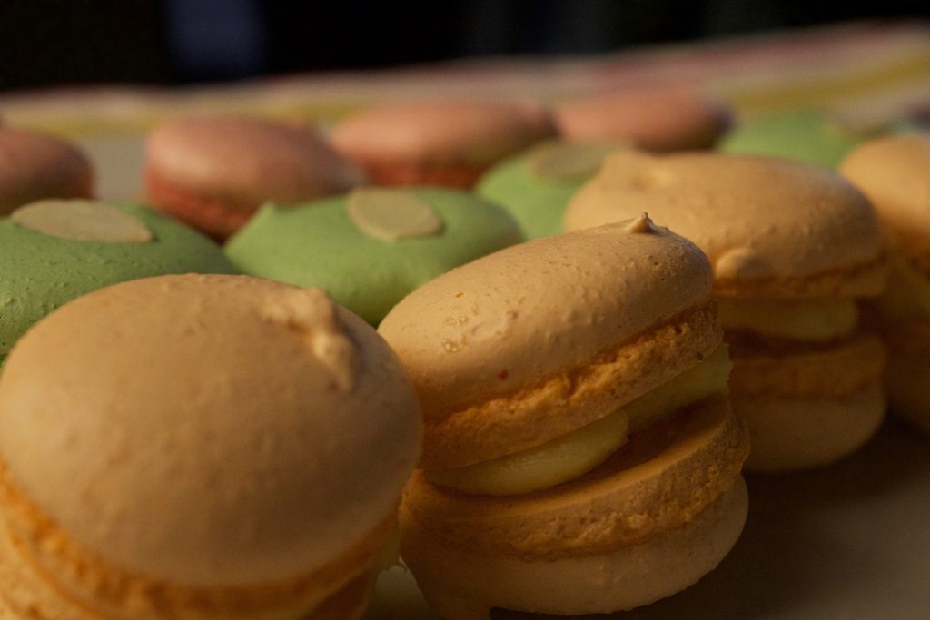
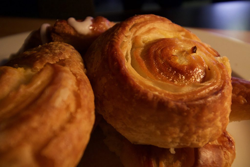
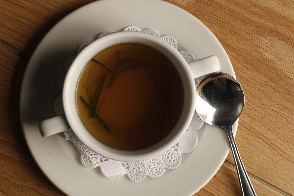
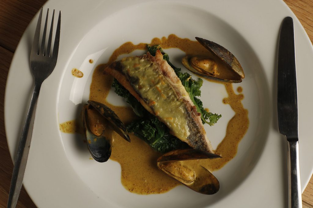
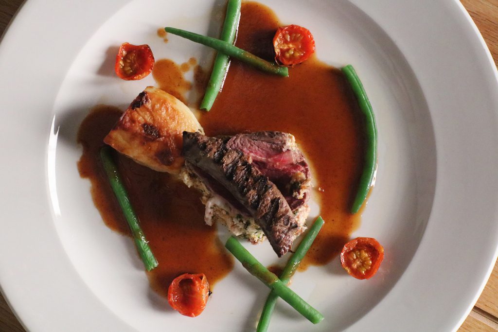
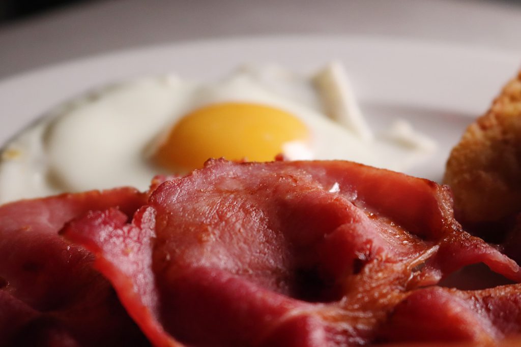
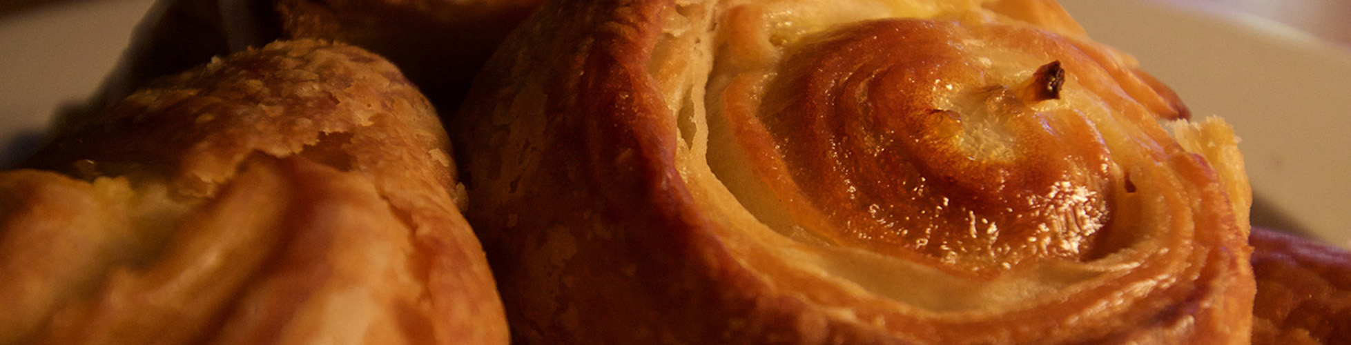
Growing up with a mother who has years of experience in the catering industry underneath her belt, I have had an interest in food from an early age. However, despite my love for cooking, I was dissuaded from taking a course in cooking due to several allergies that would impede my progress. Because of this, I wanted to use this opportunity to use the skills I have learnt in photography to appreciate food in my own way. I have been experimenting with angles commonly seen in photos published on food blogs or in cookbooks.
However, I am predominantly hoping to capture up-close details of certain aspects or ingredients of the dishes. For the most part, I want people to find the food I’m photographing to be delicious. But I also want people to try and appreciate food outside of just imagining the taste; I want people to take a good look at the certain areas I’m focusing on and appreciate it visually.
I have researched five food photographers whose work I believe accentuates the visual appeal of food. Those are Romulo Yanes, Aran Goyoaga, Mowie Kay, Skyler Burt, and Joanie Simon. Out of all of them, I believe that Yanes and Kay are the two that have most inspired my technique the most. They incorporate key techniques and make exceptional use of colour and lighting tones that I believe make for exceptional photo work.
While all five of these photographers have inspired me, those two have given me the ideas needed to make the most of this project. At the least, I wanted my final photos to span every major meal of the day. I’ve always found that food is at its best when there’s variety to it, if you stuck to just one thing, it wouldn’t be interesting at all.
For my creative independence project, I am focusing on photographing objects that are familiar and often seen within advertisements. The reason why I have chosen this theme is because I feel you can be creative, inventive and highlight our desire to consume products. Through this still life project, I will be showcasing a myriad of skills, techniques and processes.
What I want to communicate through my work is this sense of how advertising can control, influence and direct our own habits towards specific products, through subliminal techniques. The photographers I have been inspired by are Taryn Simpson and Andre Kertesz; the reason why these photographers have inspired me is the contrast between their work and the overall aesthetic.
I like the difference between them because they both communicate their work in a unique way. Taryn Simpson shows this idea of fragmenting politics and the government of the country through her work. Whereas Andre Kertesz uses this idea of contrast in his work, such as between black and white society, culture and politics, including mortality. Within this idea he showcases it perfectly, allowing us viewers to see the clear difference within his photographs.
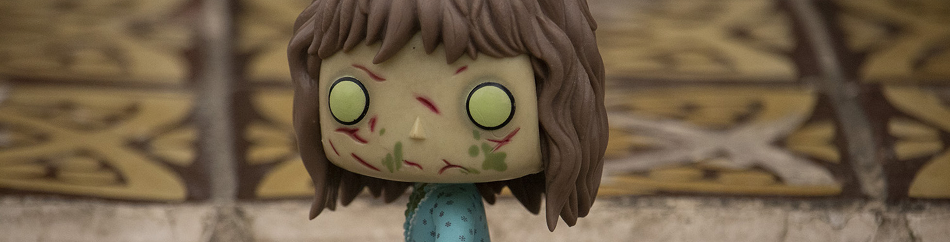
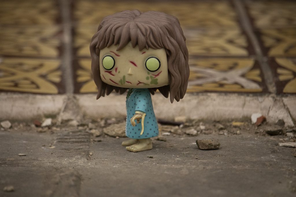
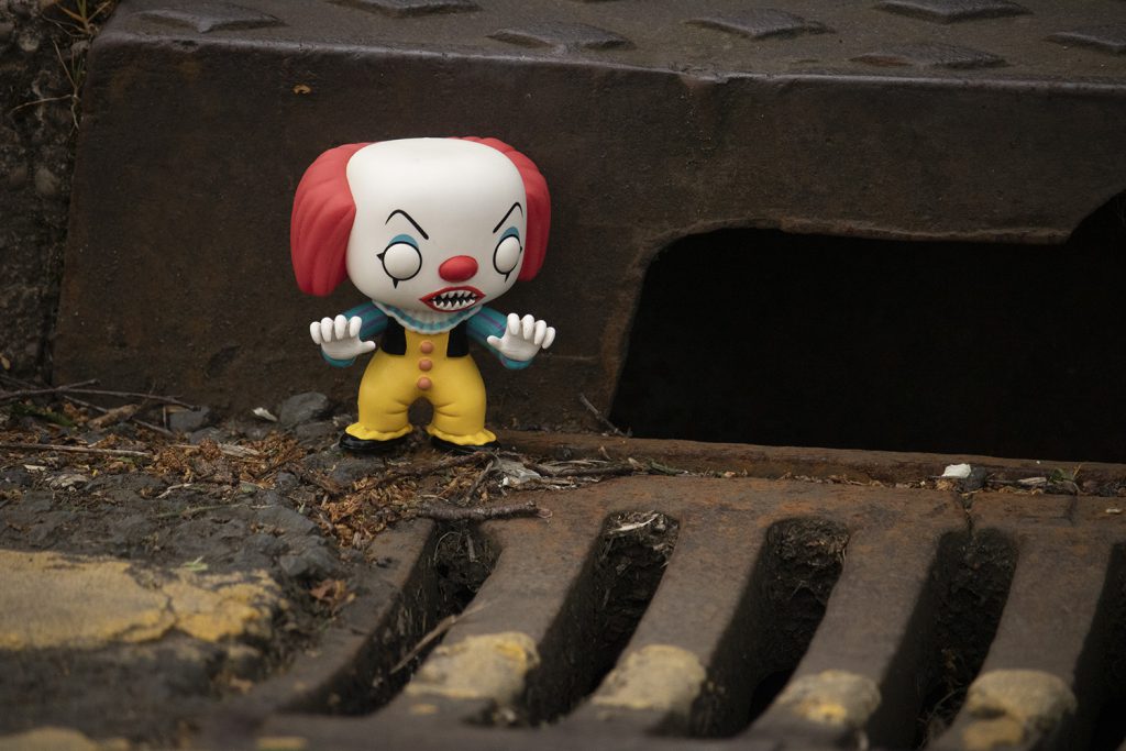
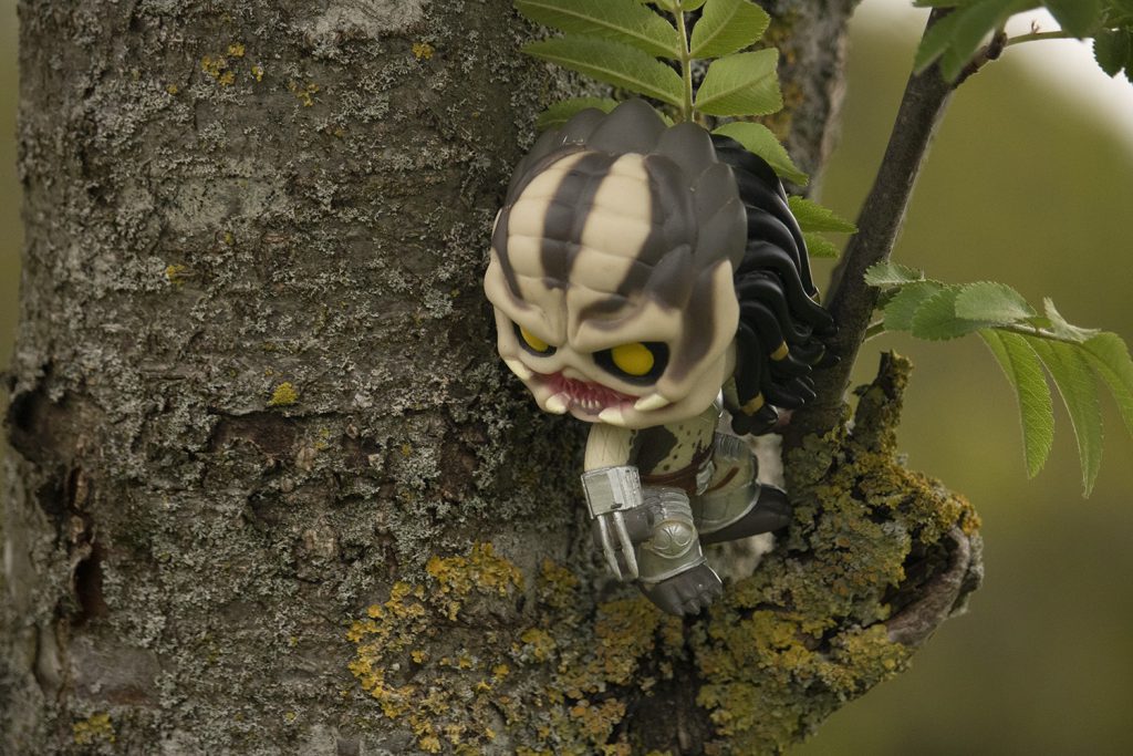
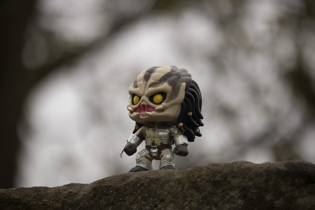
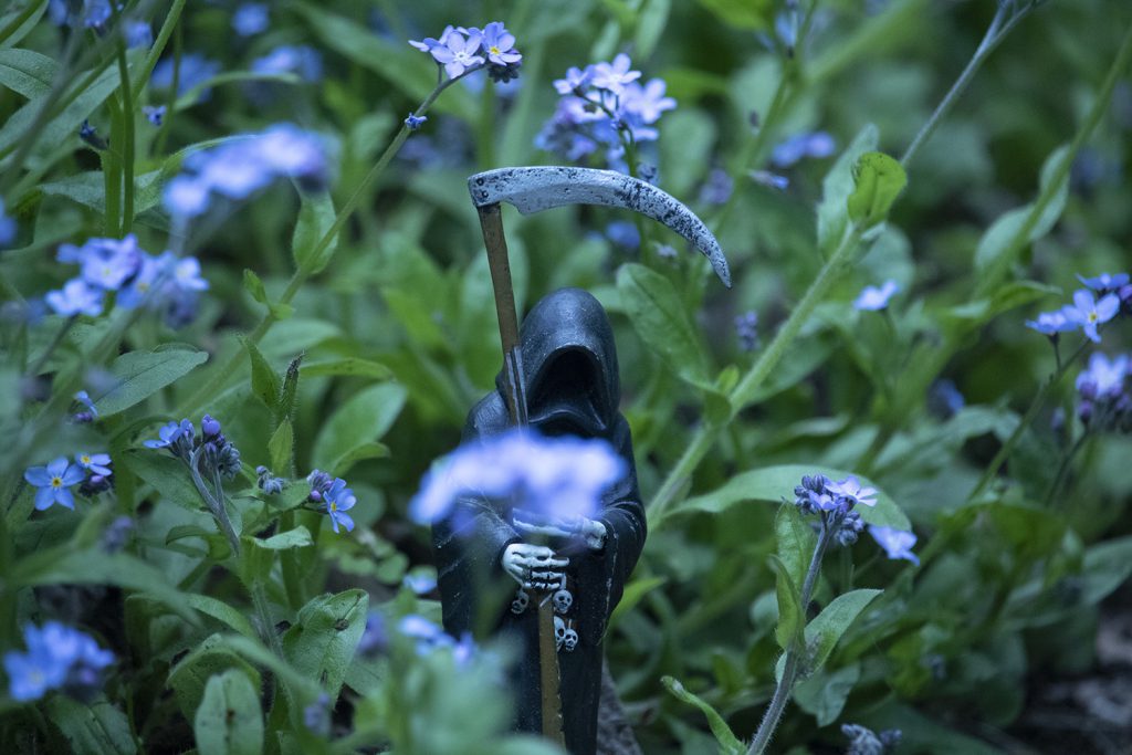
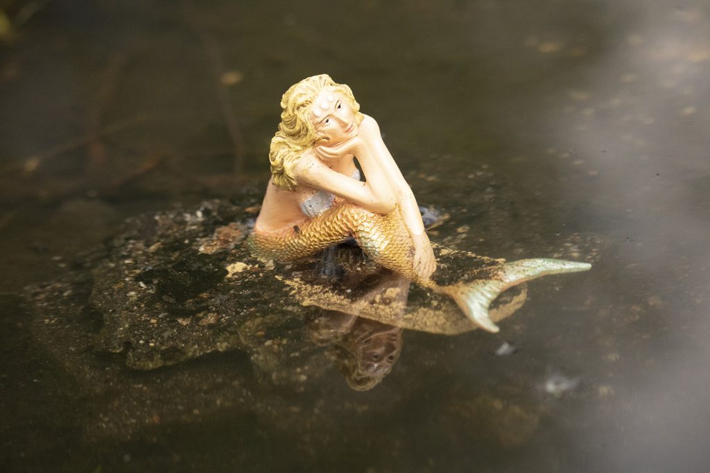
My images represent on almost locked piece of our mind of when we were younger and interacted with toys differently from how we do today. Most adults nowadays see toys as just plastic and worthless things with nothing connected to them, whereas children see them as individual characters with personality.
My images attempt to show a funny interaction between the 3D figures and the natural world. I have used a close-up macro lens and a wide aperture to give split focus. I have used bright colours and a low angle. These images make me smile in a world of stress and anxiety.
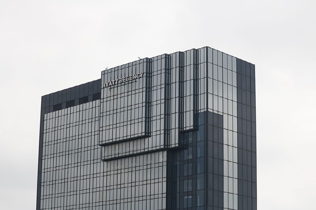
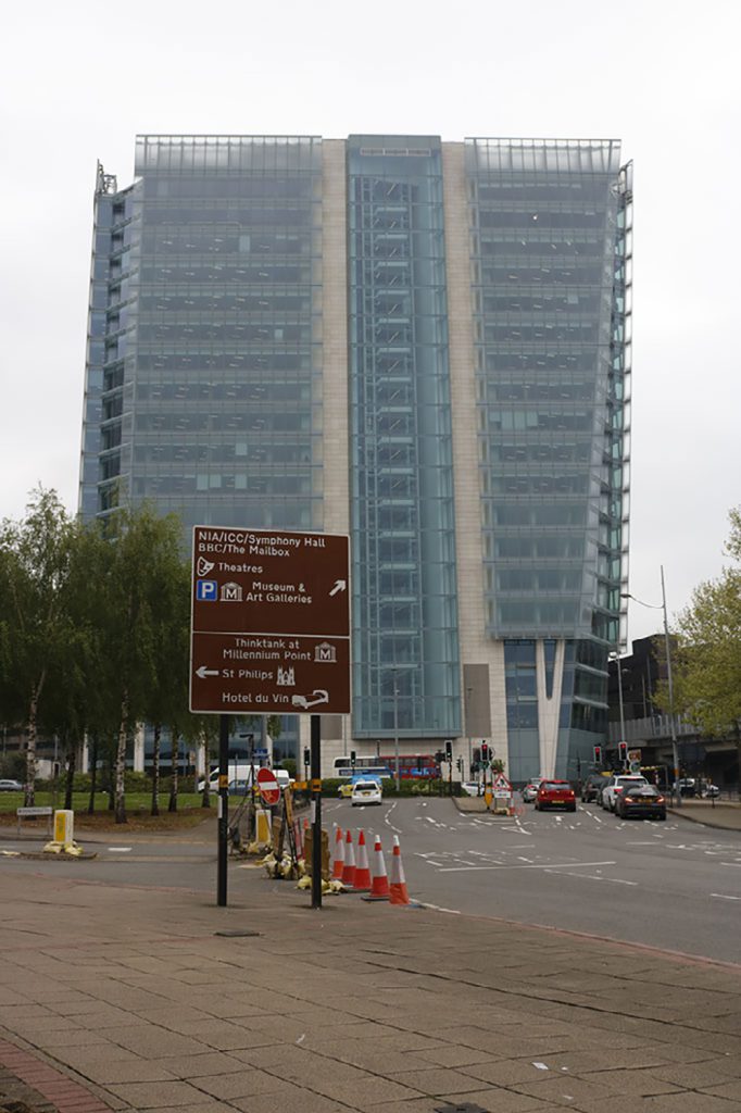
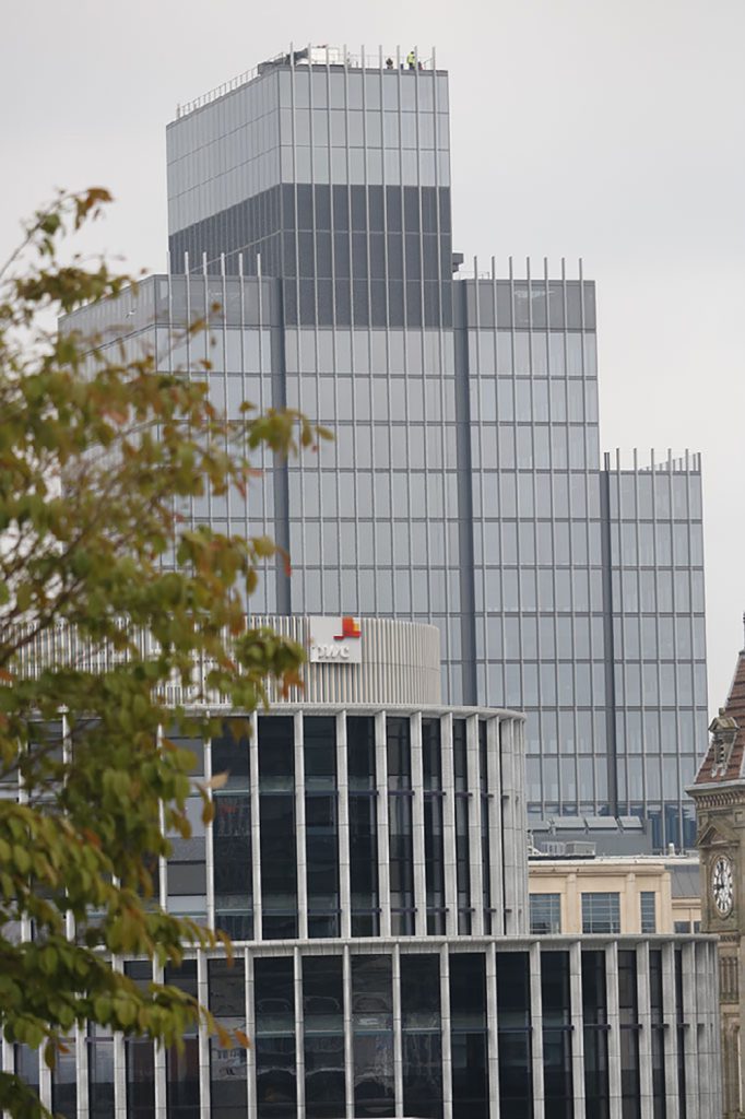
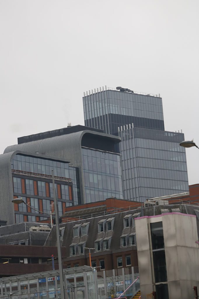
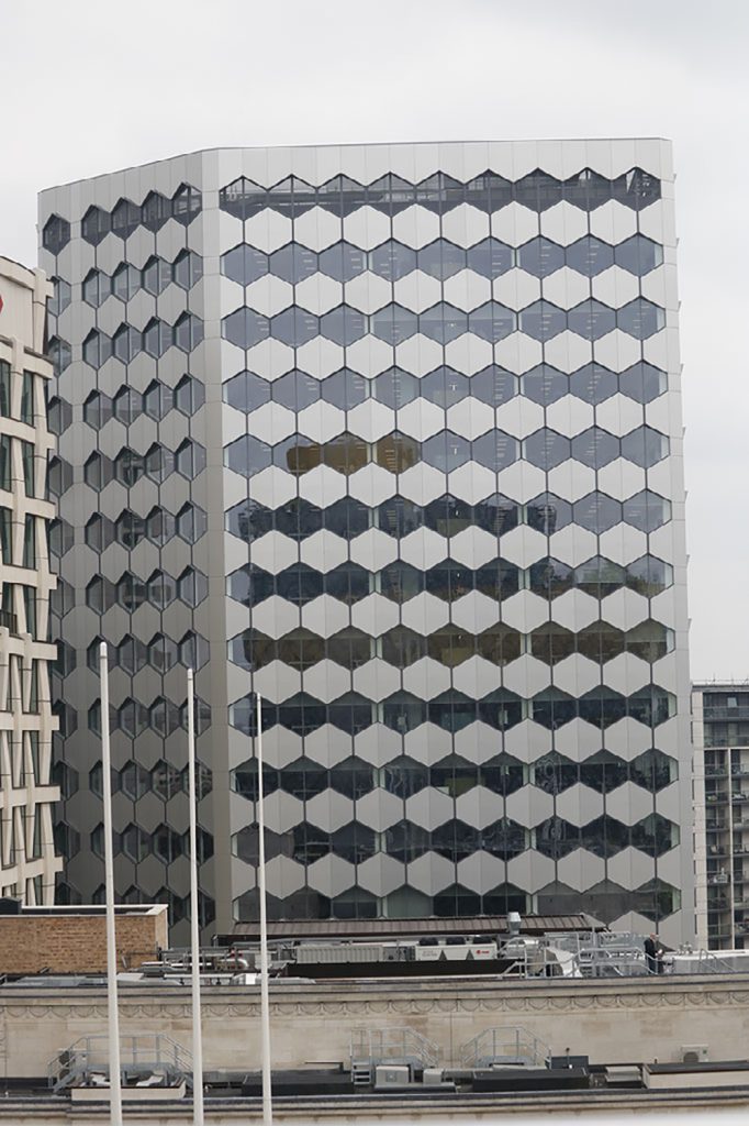
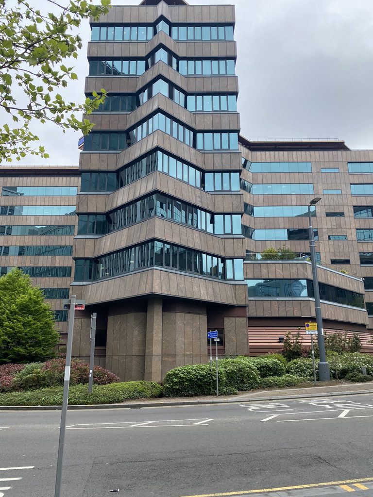
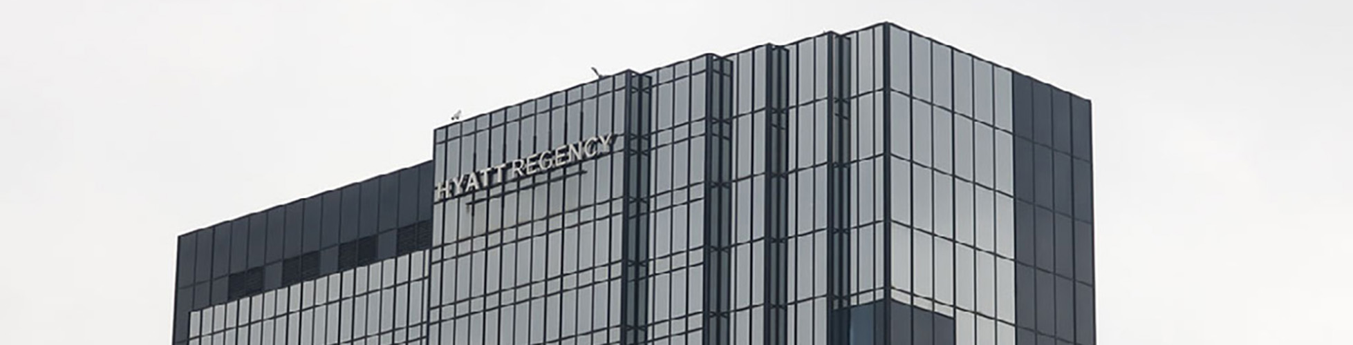
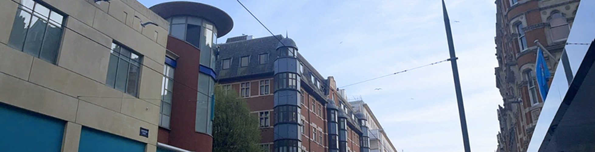
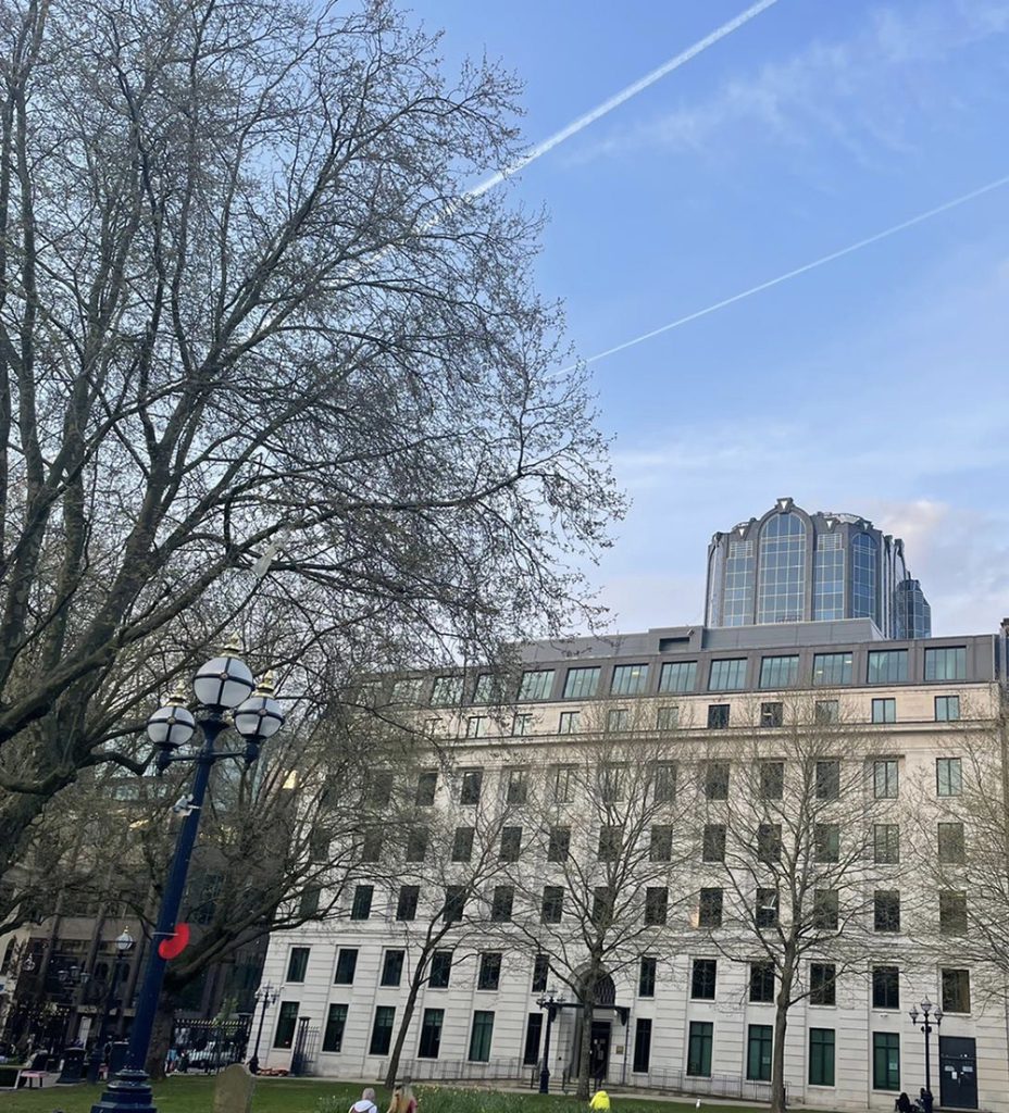
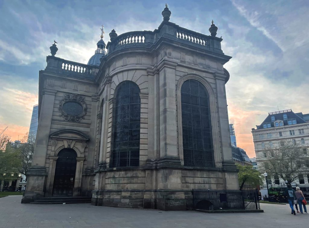
Skyscrapers represent the power and prestige of our city Birmingham. These skyscrapers show the regeneration of Birmingham. Also, Birmingham seems to be known as a bad place and I am here to show how beautiful the city is and show our best architecture in the second city, with a specific focus on our skyscrapers. My aim in these pictures is to show how Birmingham has developed as a city, with amazing architecture. I am trying to show that Birmingham is not as bad as some may believe.
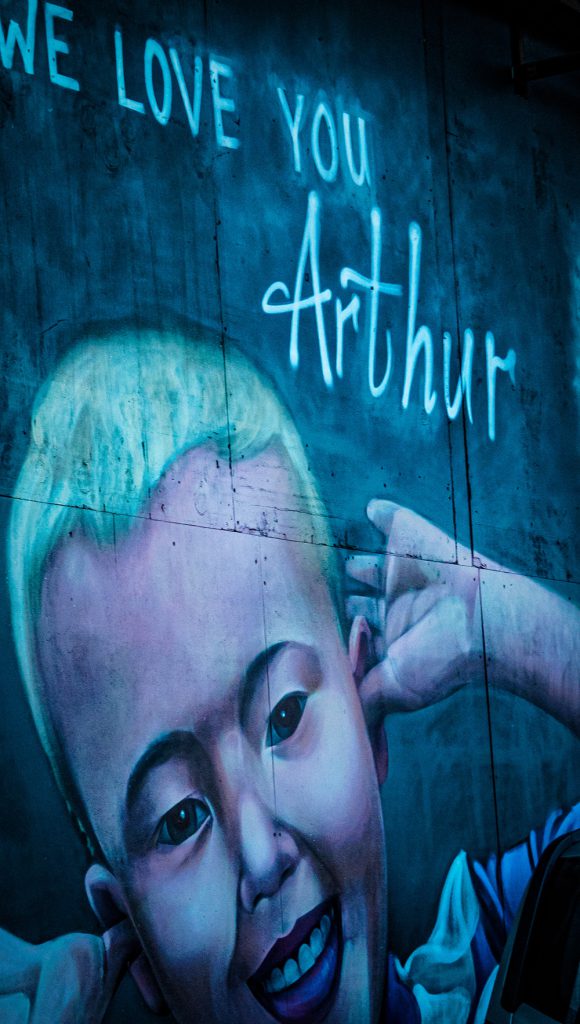
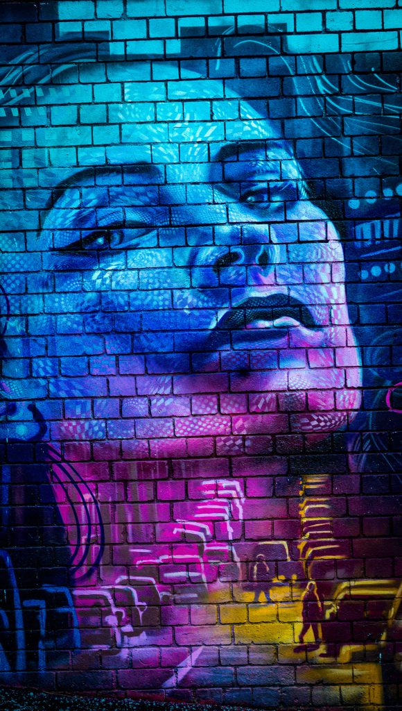
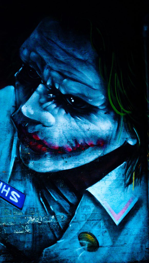
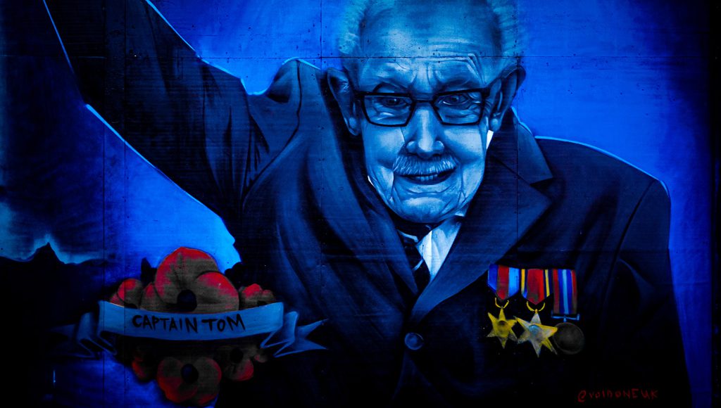
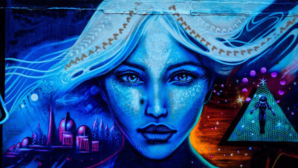
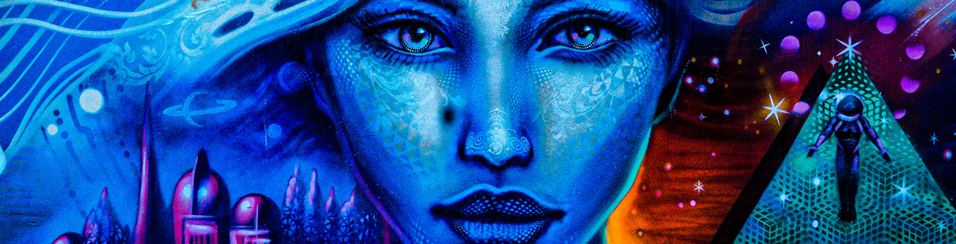
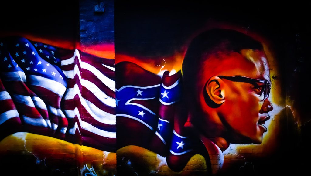
For my creative independent project, I set myself the challenge of documenting a specific location in Birmingham called Digbeth. The focus of these images was to capture graffiti, murals and wall drawings depicting a wide range of subjects and themes. The rational for doing this was to highlight the topic issues and themes within this street art.
I’ve tried to capture the atmosphere within each environment, through the art work. By capturing the street and the art work I have attempted to frame the environment in which the work was done. Instead of being simple documents I wanted to provide more of a story behind the street art. The research I have completed includes the following, Keegan Gibbs, Martha Cooper, Jürgen Große, Henry Chalfant. these photographers are some of the best photographers that does graffiti and art pictures.
These street art pictures can raise awareness for mental health and political problems. The reason why I have chosen street art pictures around Digbeth is to raise awareness for mental health and political problems. Street based Illustration and art can provoke memories, compel action and raise awareness within the community.
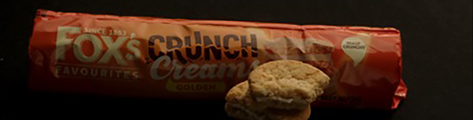
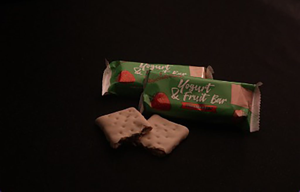
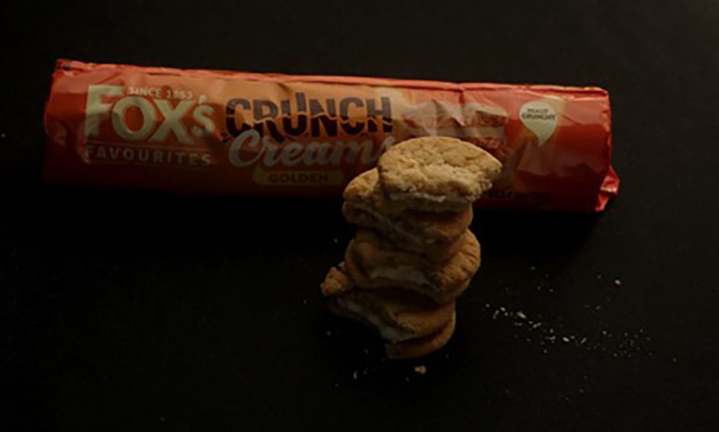
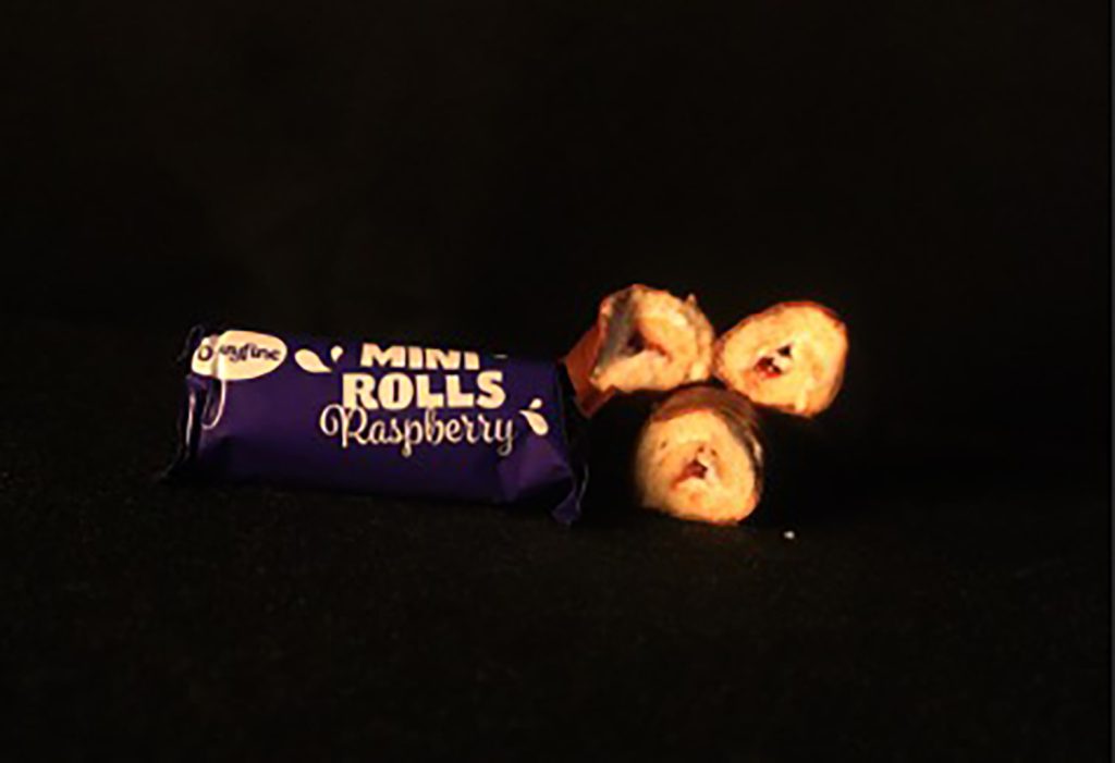
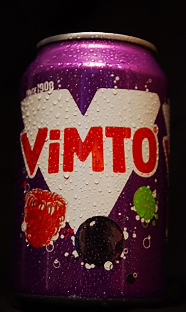
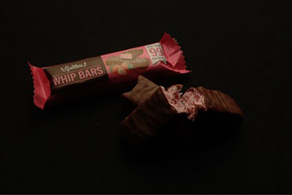
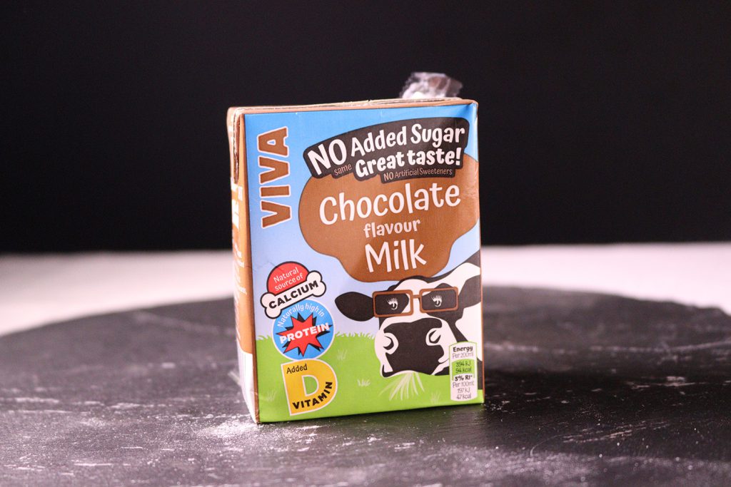
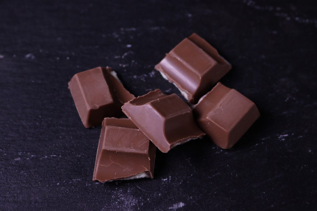
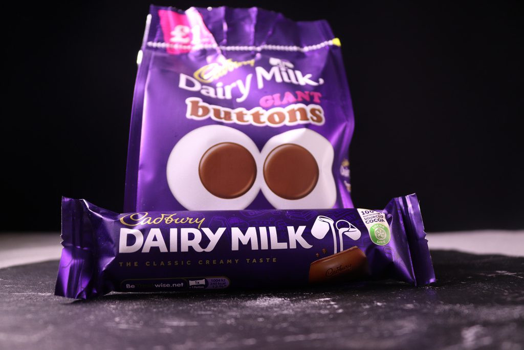
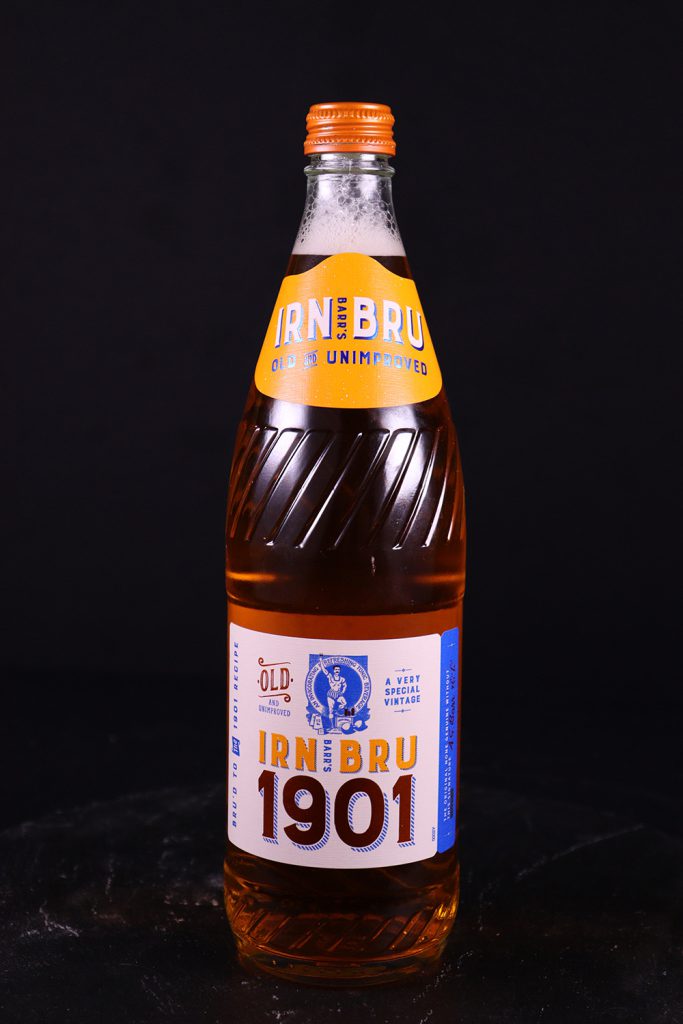
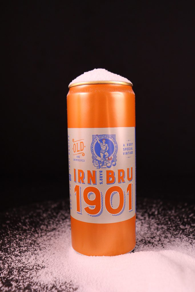
The theme was chosen after I was inspired by an Instagram artist called Folkawolf, as he mocks brands and companies using unique and dark humour. In response to this I have created my own campaign focused on the impact and use of sugar and the excesses used within many food and drink products. This campaign is designed to provoke opinions, comments and responses from the audience, and to raise awareness of food and dietary practices.
The general public are still largely unaware or simply not fully appreciative of the actual, scientific and health based significance of sugar consumption. My photographic project aims to change this. Artists that have inspired the work include Folkawolf based on his conceptual and physical campaign that appears as gurellia advertising, where the actual branding, logo and colour schemes are incorporated into his work.
This makes the impact more significant and rememberable as the public are often easily misguided. Techniques and approaches that were used included still life photography, lighting and composition, within the studio. I have selected the images of sweets and pop because it best reflects the theme I have chosen which is sugar.
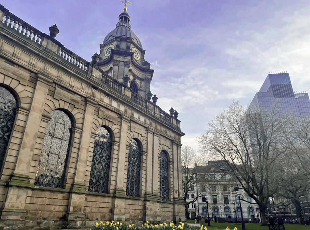
The following images celebrate the regeneration of Britain’s second city. I have attempted to show the diversity of the architecture. I’ve used wide-angle, bold colours, and strong composition. I am promoting the buildings of Birmingham.
I want to reveal the beautiful sides of these buildings, historical and modern buildings. The images that I produced are not just buildings, but they have a story behind it. My aim has been to explore that. Birmingham has seen much regeneration in recent years, with exciting modern architecture, yet its older, more historic buildings also retain a charm and sense of history.
Though it often gets a bad press nationally, I am proud of our second city!