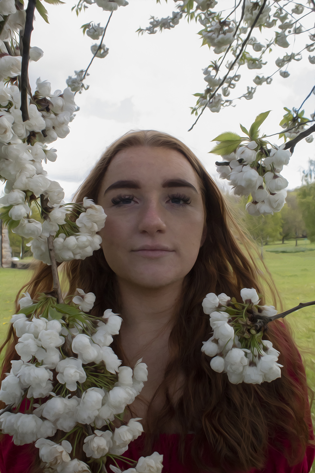
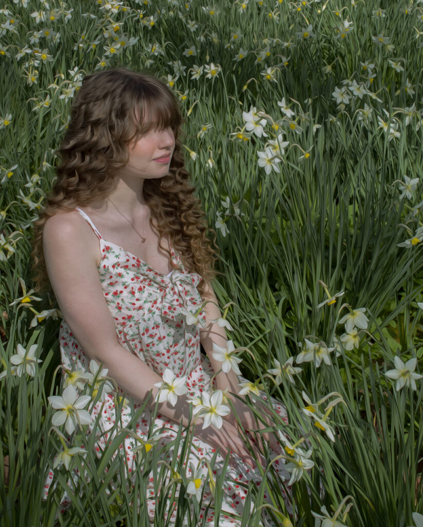
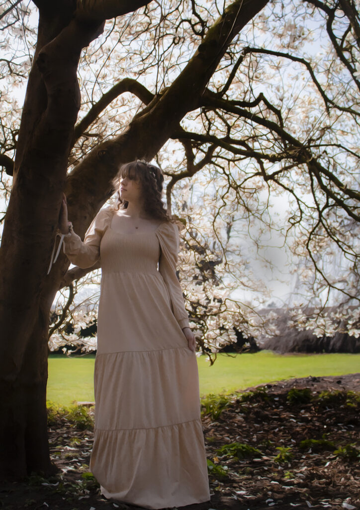
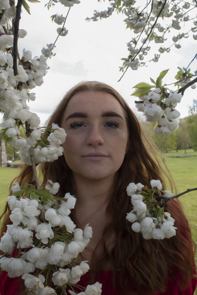
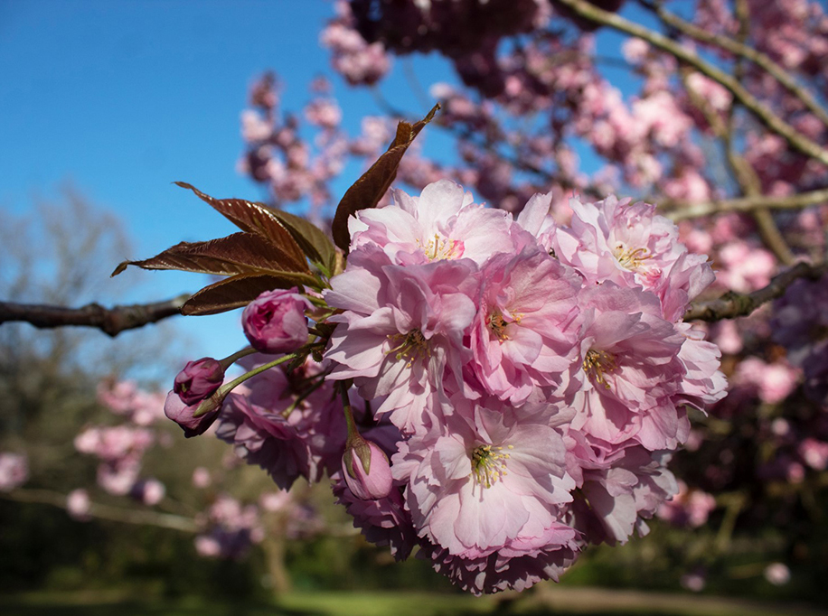
In the western philosophical tradition, the gendering of nature as female can be traced back to the writings of Aristotle. I have explored the romantic, feminine perspective prevalent in the 19th century Pre-Raphaelite movement and feel a need to re-imagine this tradition from a modern perspective, through the lens of a less gender binary society. In addition, technology advancements in our world have lessened the need for artists in some ways, and photography can sometimes be considered an ‘easier’ way to capture the details we wish of memories remembered for a long time. Therefore, I wanted to bring back to life the aesthetics and importance of the details that are hard to capture in paintings whilst also combining all that I have learnt about photography as they are both mediums which keep the creativeness in our lives apparent.
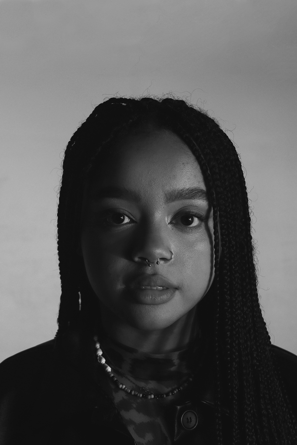
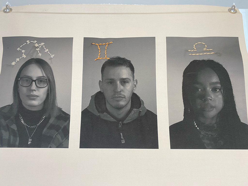
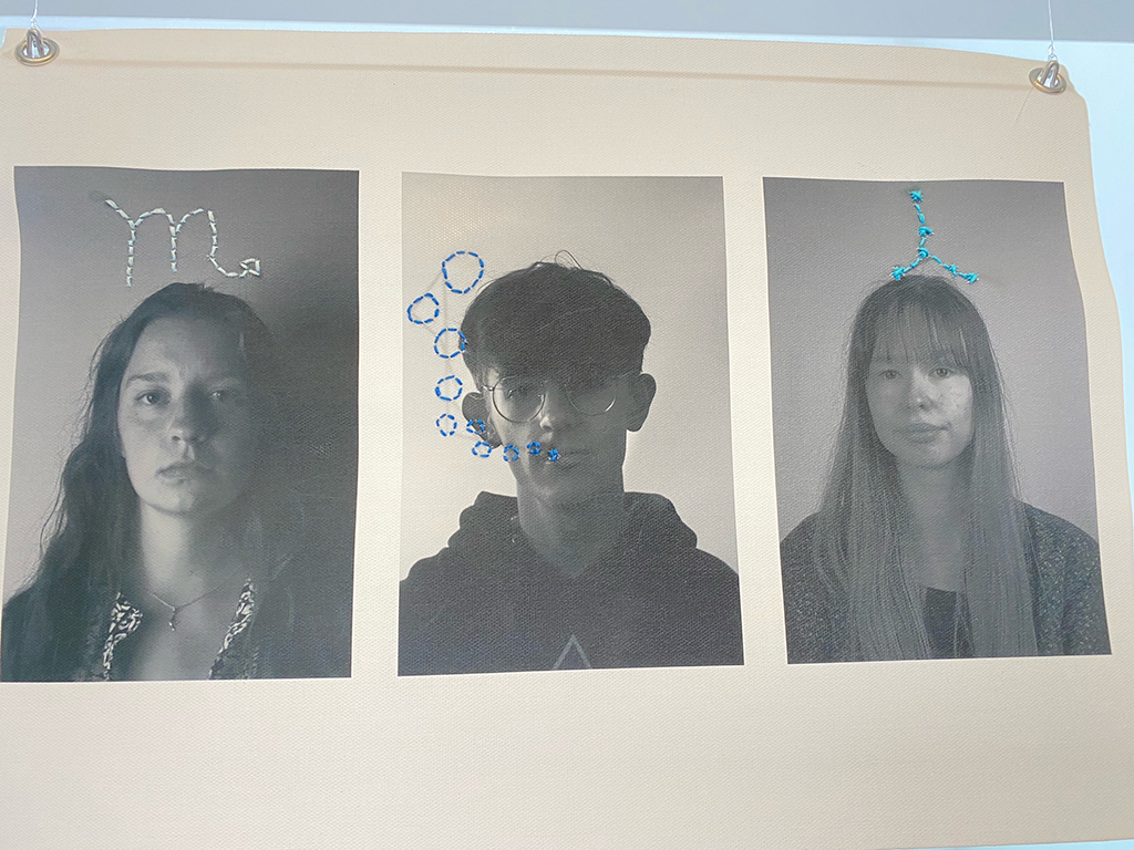
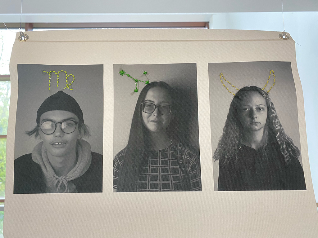
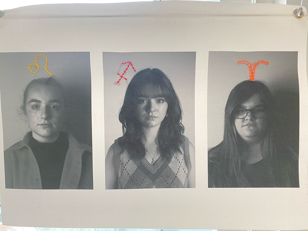
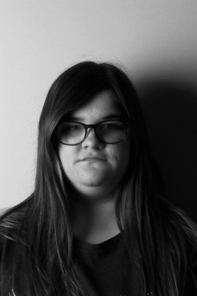
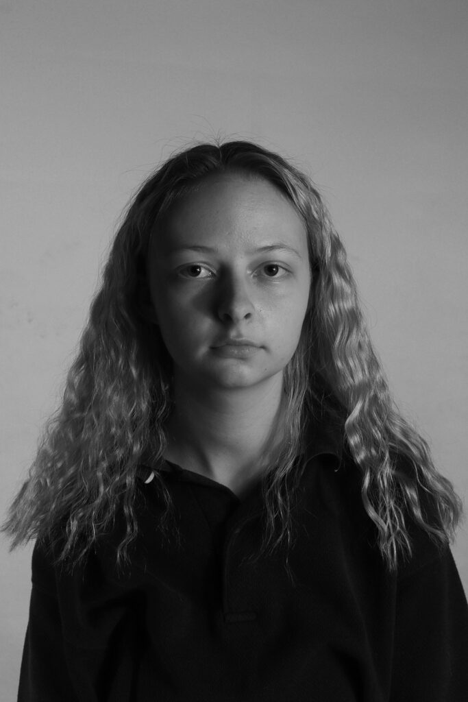
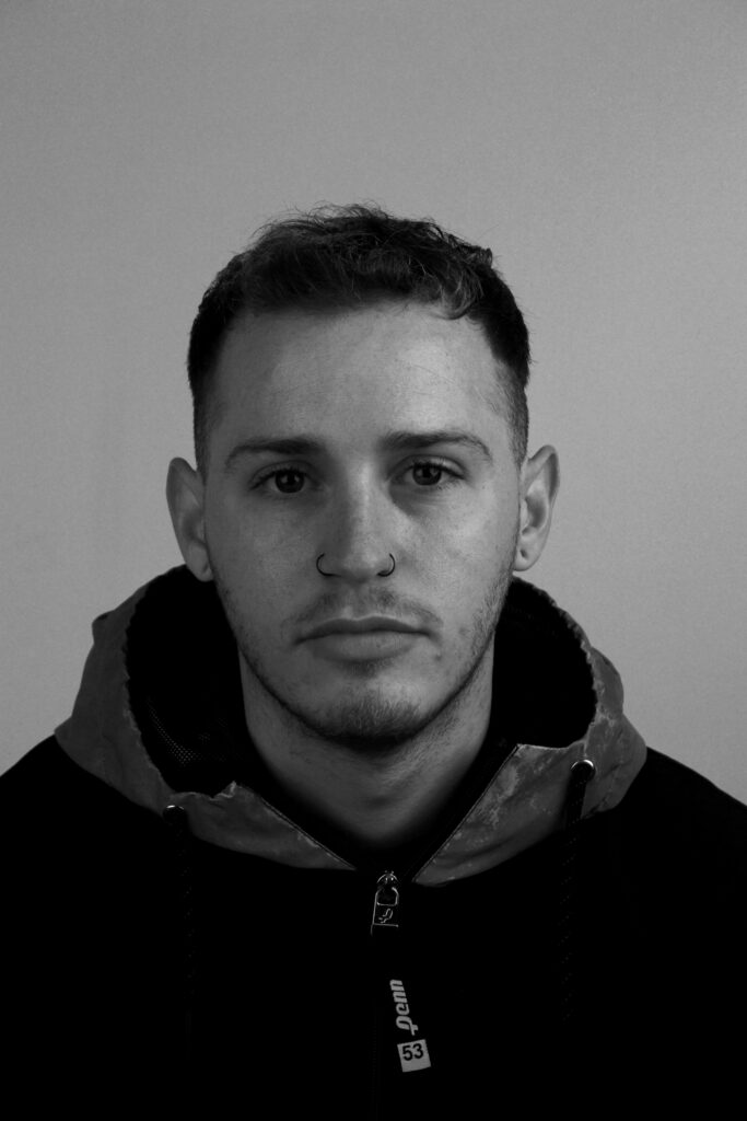
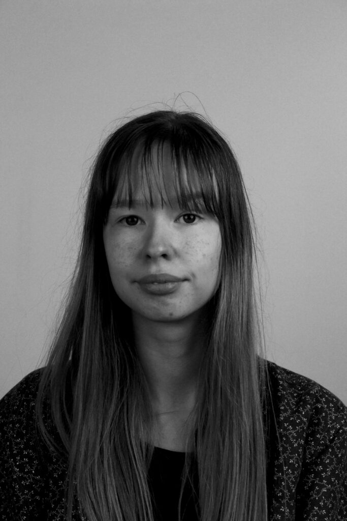
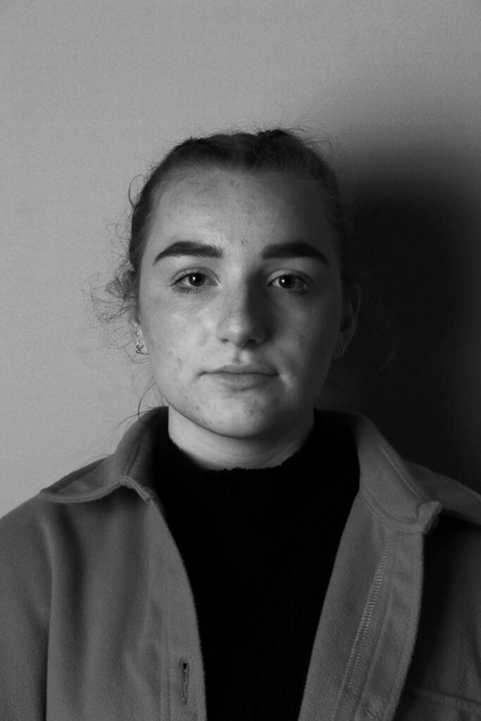
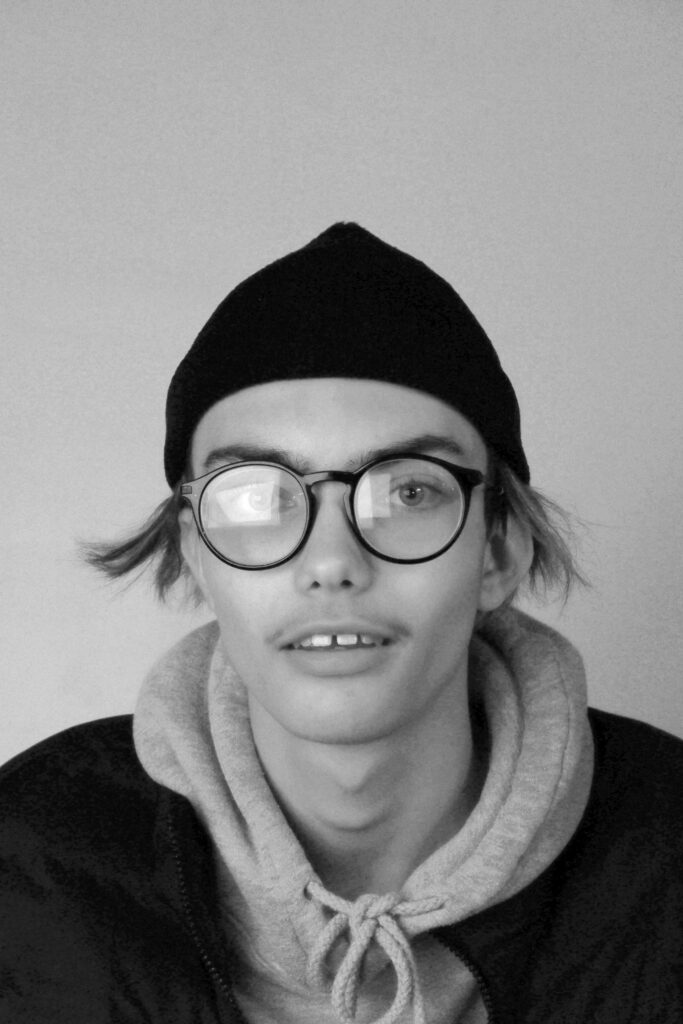
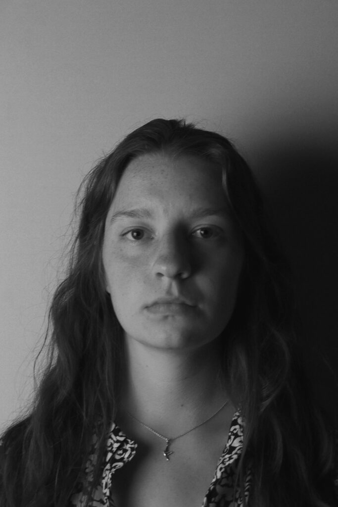
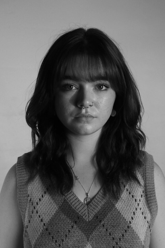
My project explores the zodiacs. Ever since a young age, I have been fascinated with astrology and the stars. I wanted to bring this interest forward and produce a project relating to it. Through mixed media, I have been able to represent the twelve astrological signs. I have chosen to display my monochrome portraits on canvas, to enable mixed media stitching, relating to each star sign. Each model falls under a different astrological sign therefore every part of the zodiac is displayed in my work.
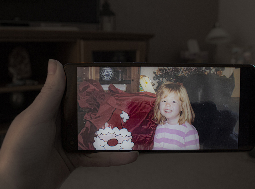
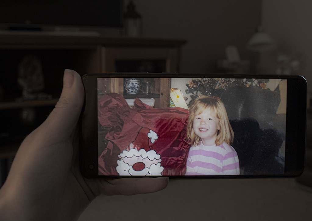
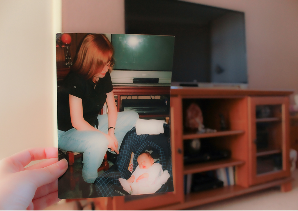
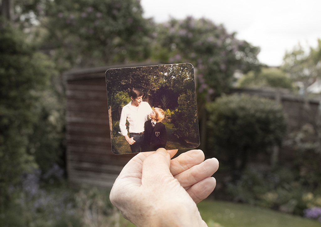
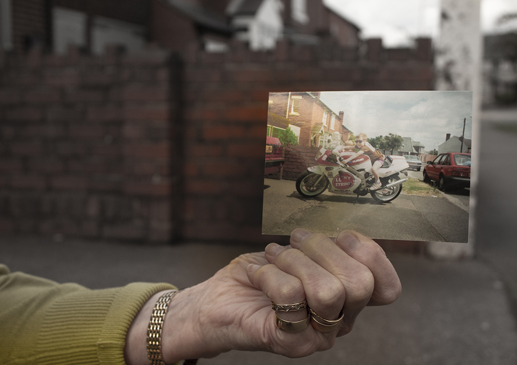
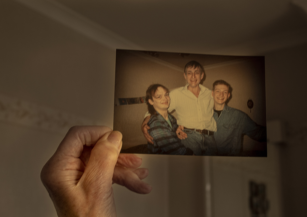
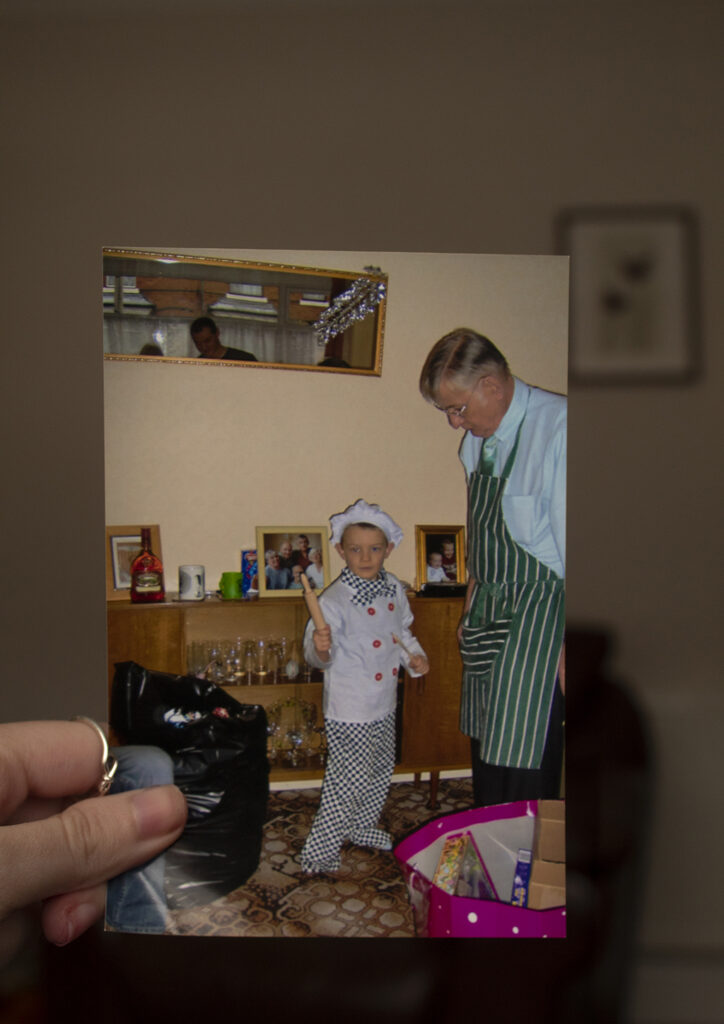
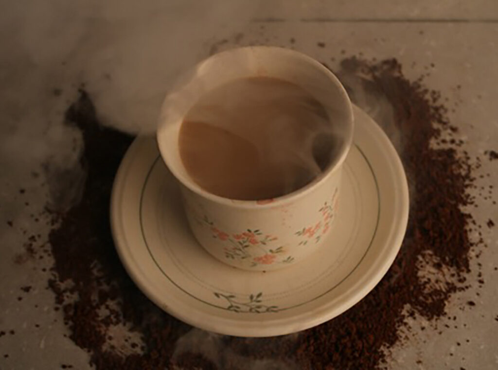
Photography is the best medium for remembering, conveying meaning and bearing witness to people and places, family and friends, past and present. Today we are bombarded by digital images. Nearly two-hundred years since its inception and despite its recent convergence with the world of high tech, photography remains our most important memory making medium. The family album has effectively become the family hard-drive or social media account. I attempt to re imagine and reconsider family photographs in a personal and contemporary way. So for my project I wanted to so how much environments change why we have to preserve these memories and print them so the future generations can look into the past and bond over the images with their family’s like I have spend with mine creating happy memories that will never be forgotten. I believe that these memories are already fading away so I would like for other to see this exhibition and realise the importance of this beautiful part of personal history.
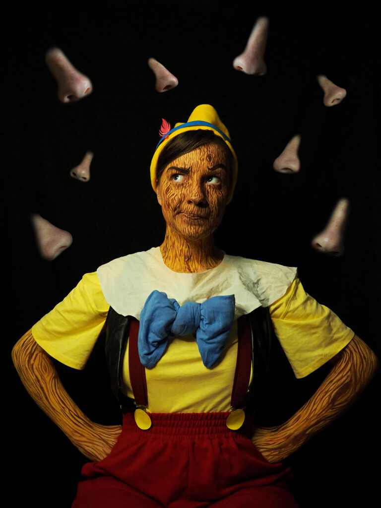
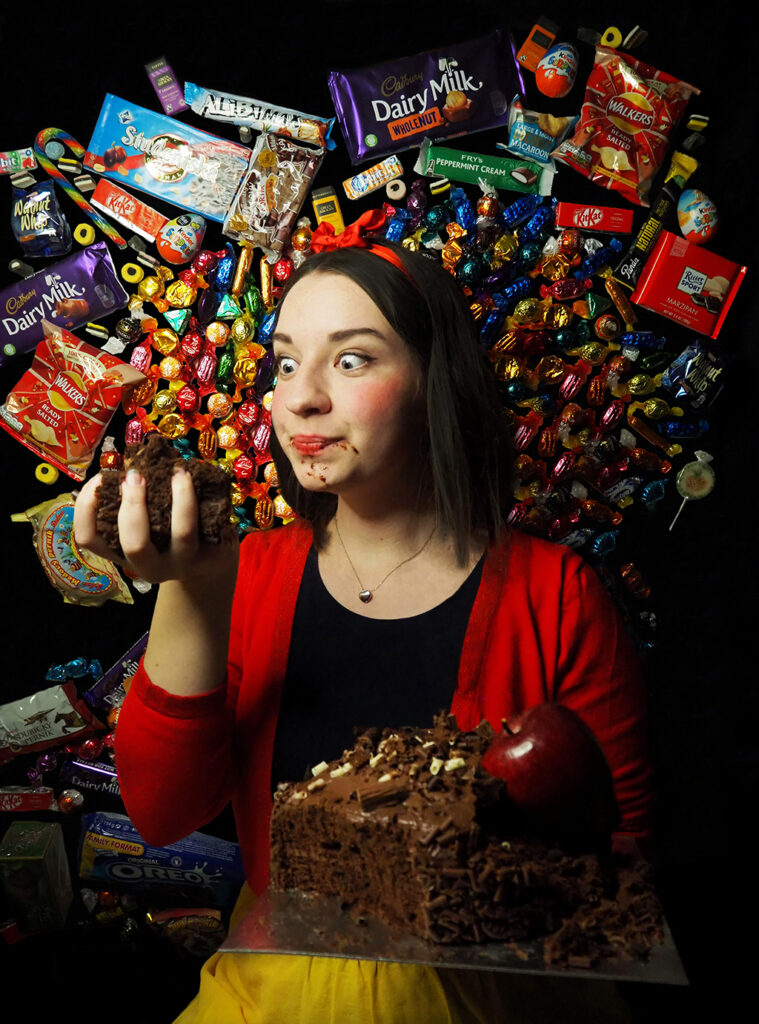
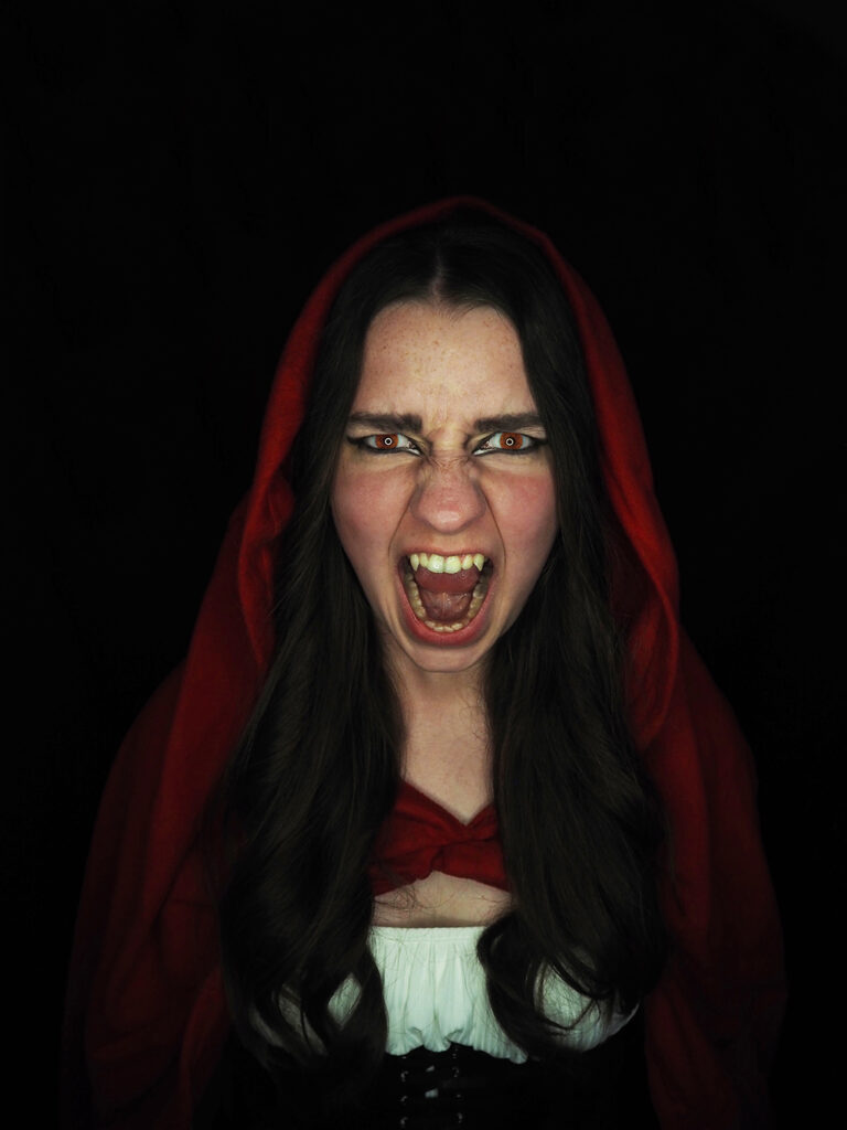
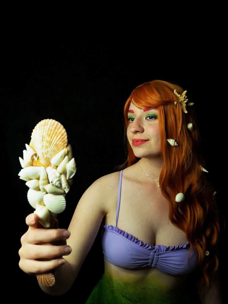
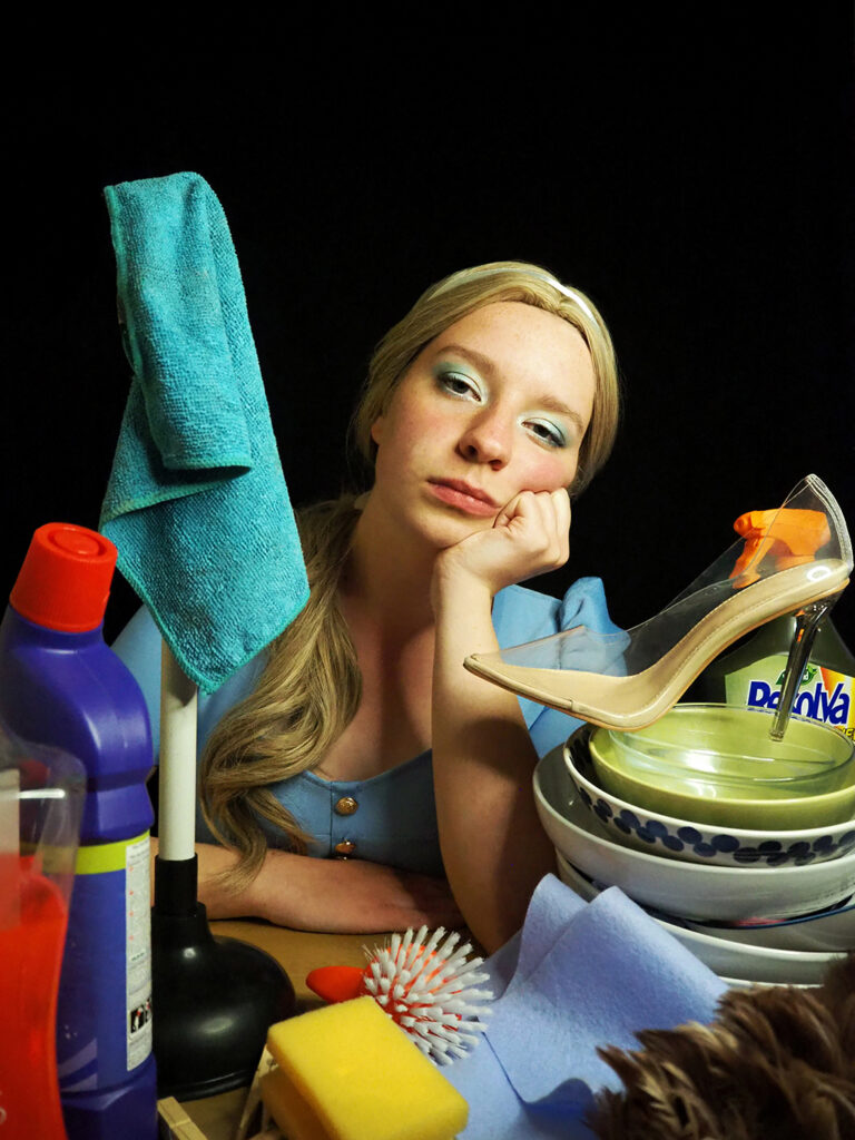
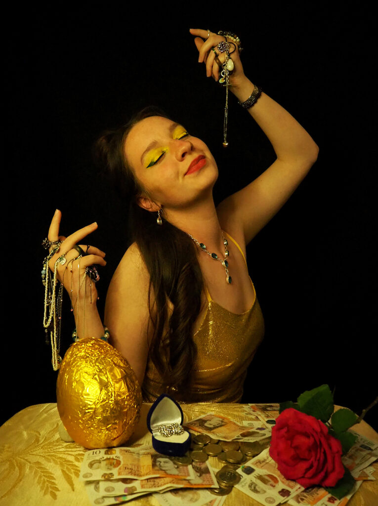
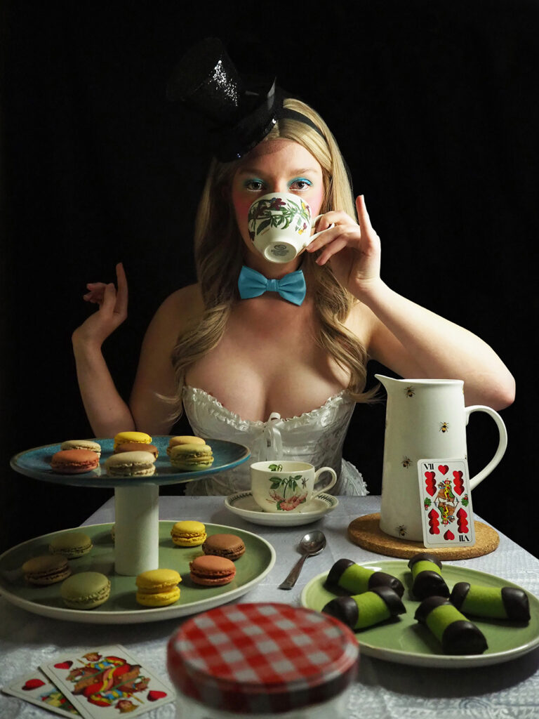
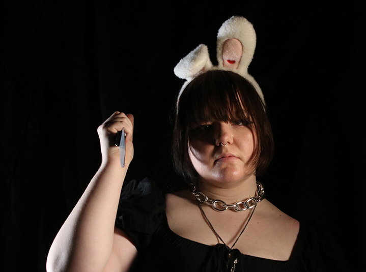
The name of my project is ‘The Seven Deadly Sins’ which I wanted to create with a slight twist by also including fairy tale characters. We grow up on hearing fairy tales about these perfect characters with great qualities, pureness and innocence, and the villains with qualities that are seen as bad or something we should be ashamed of, even though they are normal human behaviours that each of us at some point in our lives experience. I wanted to show that it is normal to have ‘bad’ habits or qualities and that nobody is perfect. Not even fairy tale characters.
Can you guess which character is which sin? (Wrath, Greed, Gluttony, Lust, Pride, Sloth, Envy)
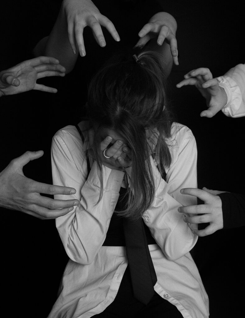
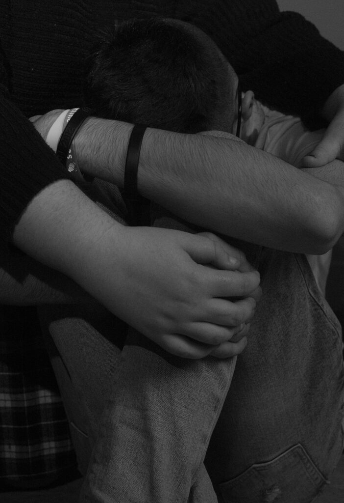
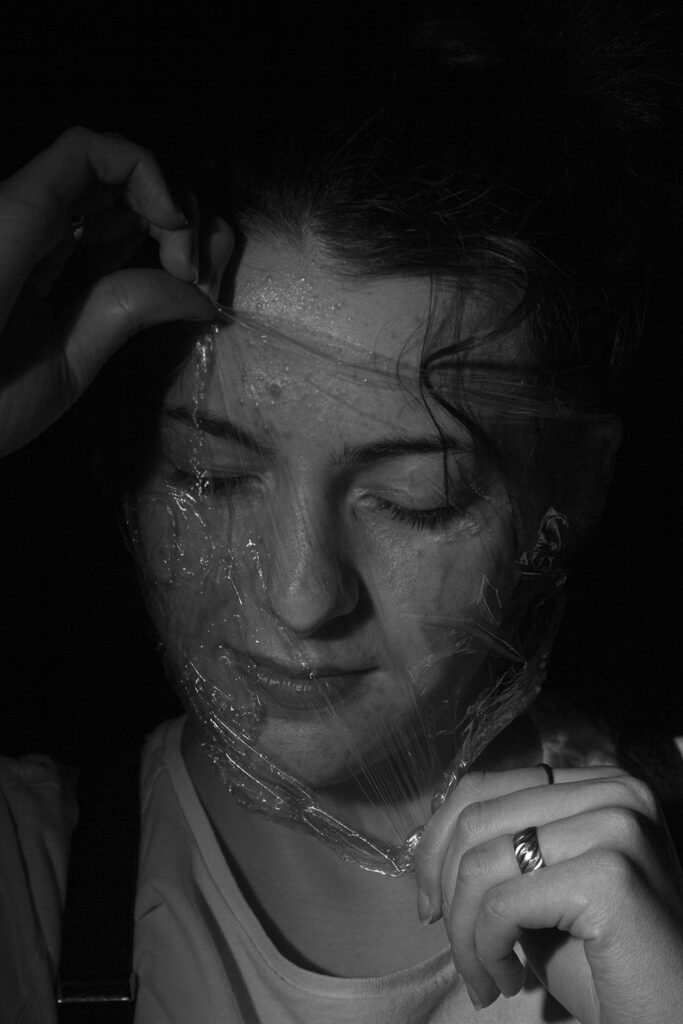
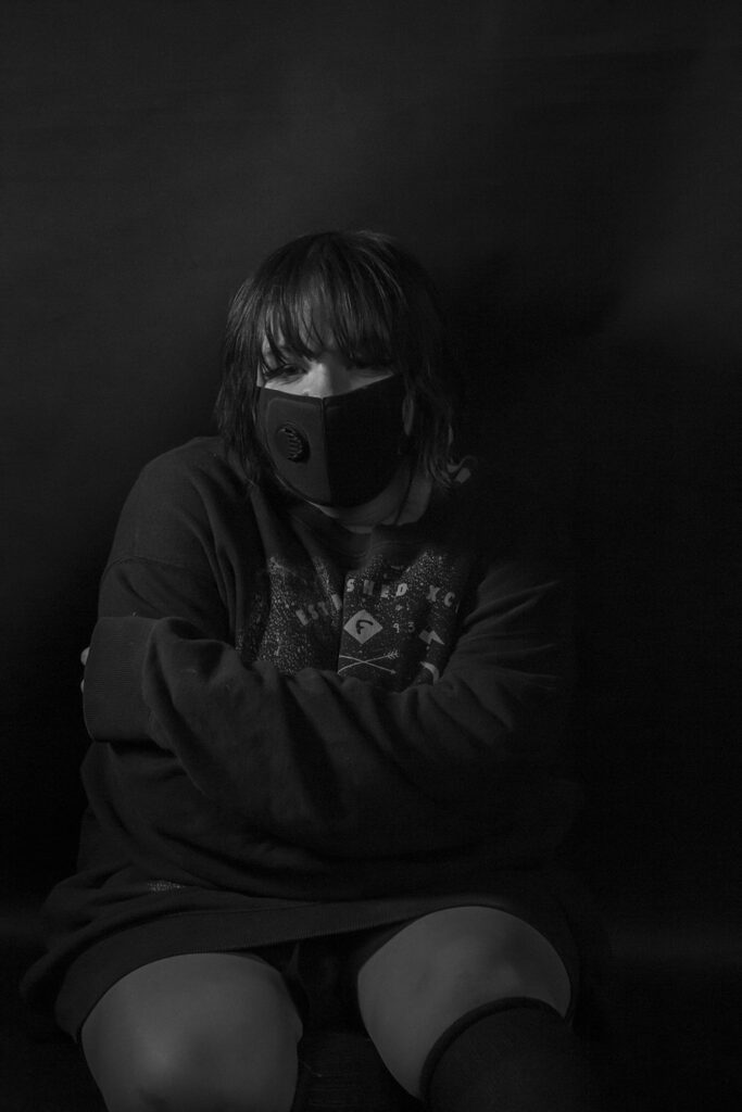
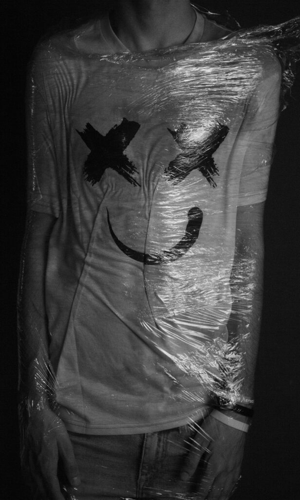
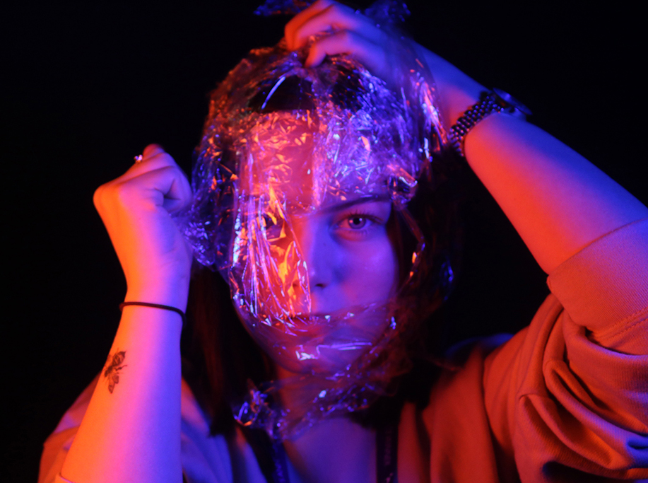
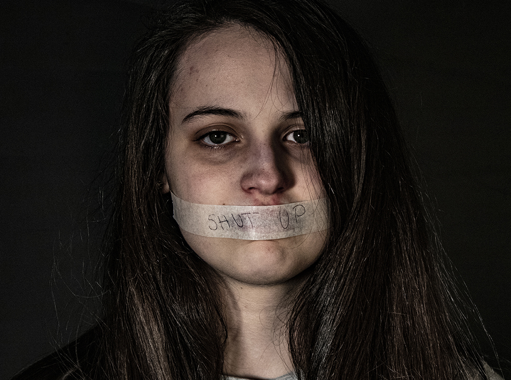
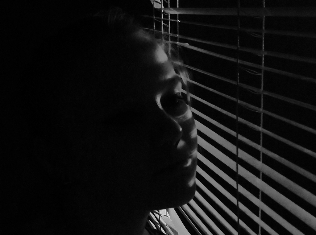
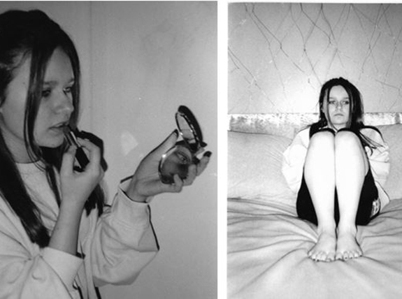
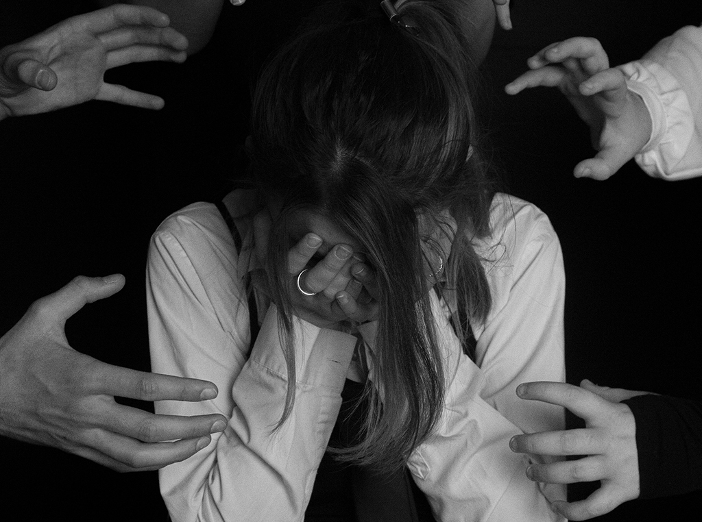
My intentions for my project was to raise awareness and reduce stigma surrounding mental health. Many of us have or know someone who has struggled with a mental illness, but we still avoid the topic or shy away from the conversation. Through my images, I narrated feelings of anxiety and isolation as well as also showing images associated with seeking help. I wanted the images to be something that people can feel connected to, and like someone has visually shown how they’ve felt. I wanted people to know that they aren’t alone, and that their mental health matters.
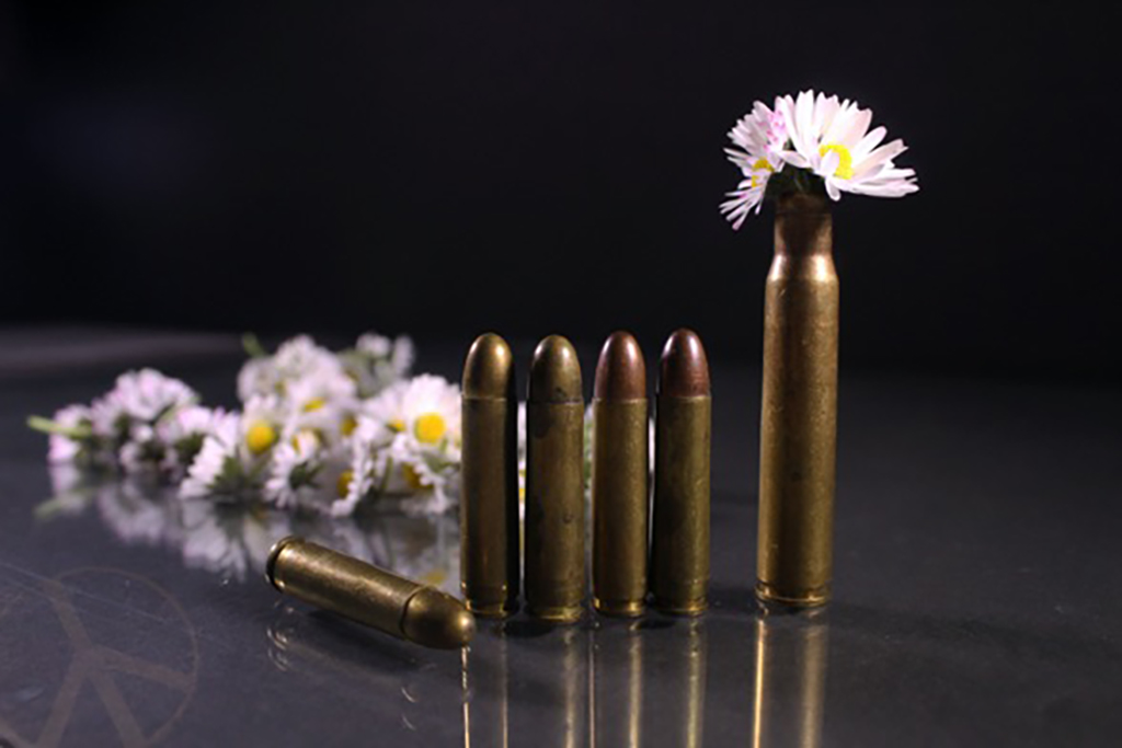
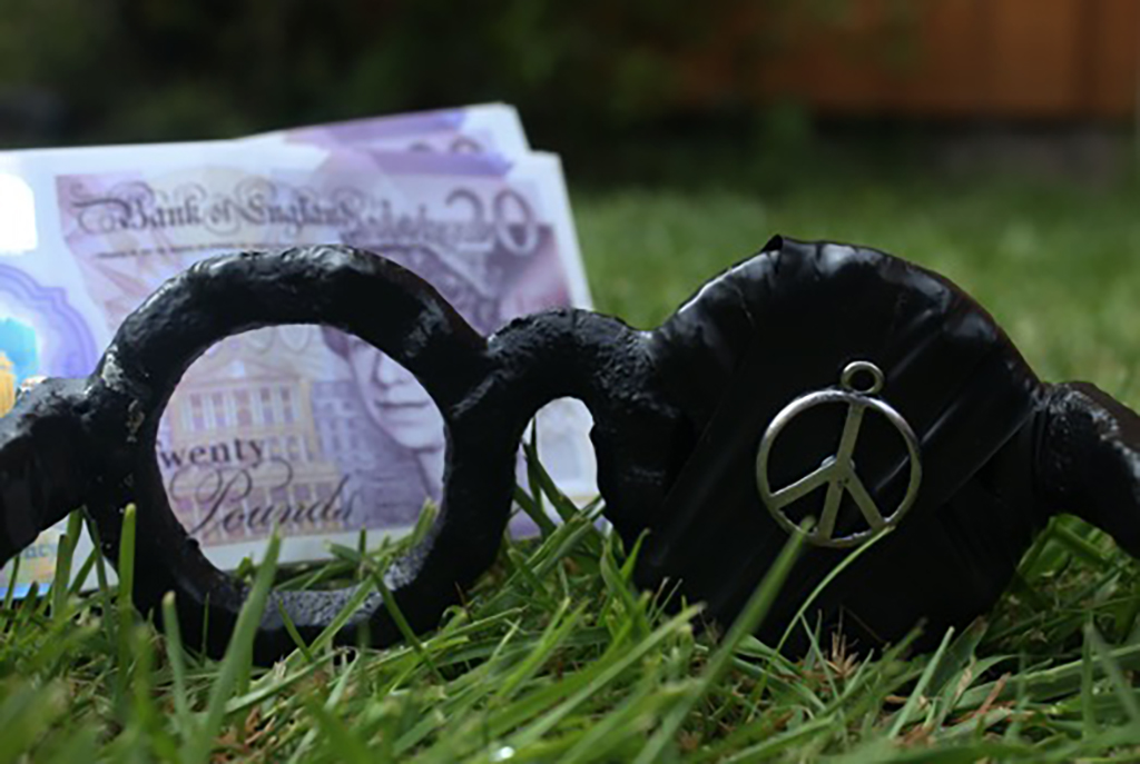
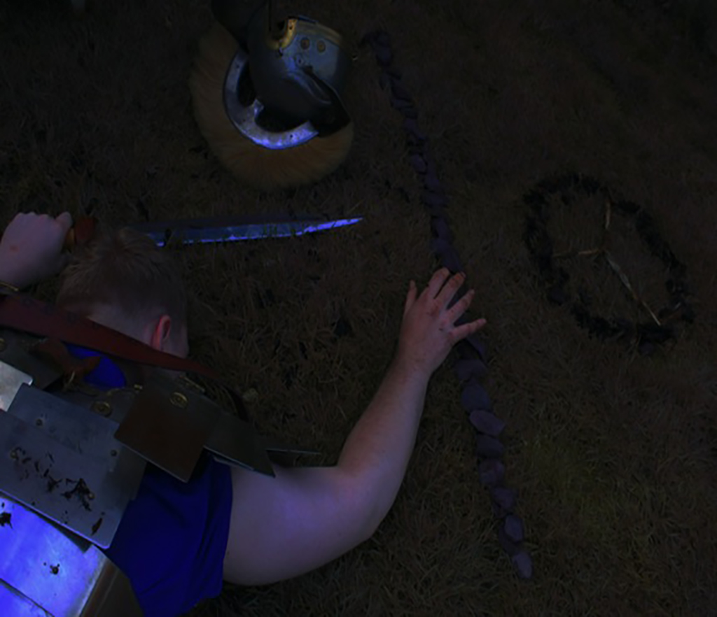
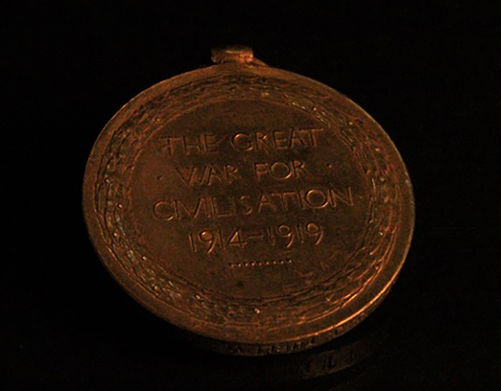
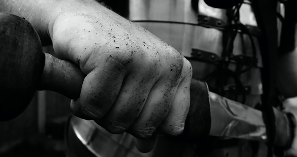
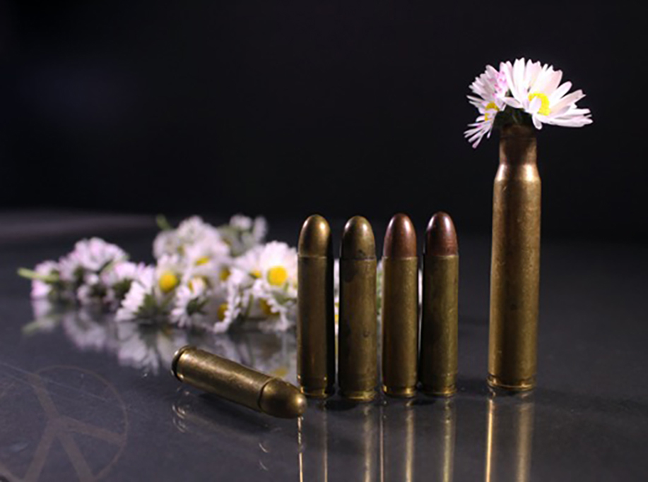
To challenge myself I wanted to create a series including artefacts from different Wars. I aimed to show that war was unnecessary. Throughout the series, I aimed to continuously show themes of peace. With a minimalistic approach to the work, the soft lighting relates directly to the sensitivity I aim to convey. My images have a simple aesthetic. War embodies chaos and I wanted the complete opposite for this series. I want my audience to feel at peace when viewing this work, this represents how there could have been a peaceful solution that would have saved the world from so much despair.
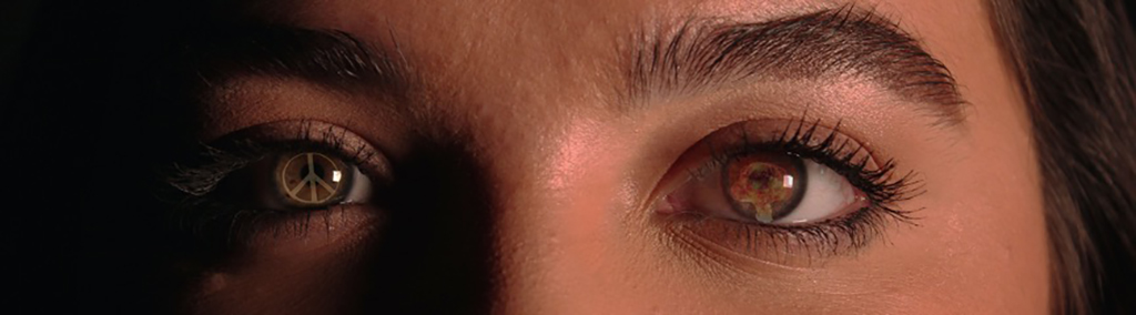
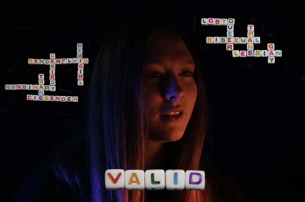
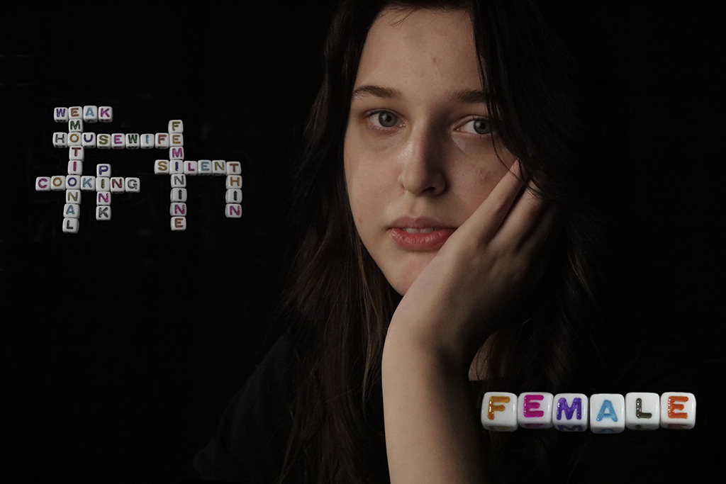
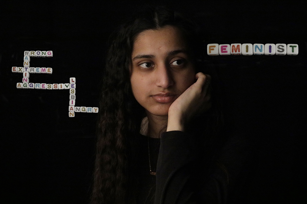
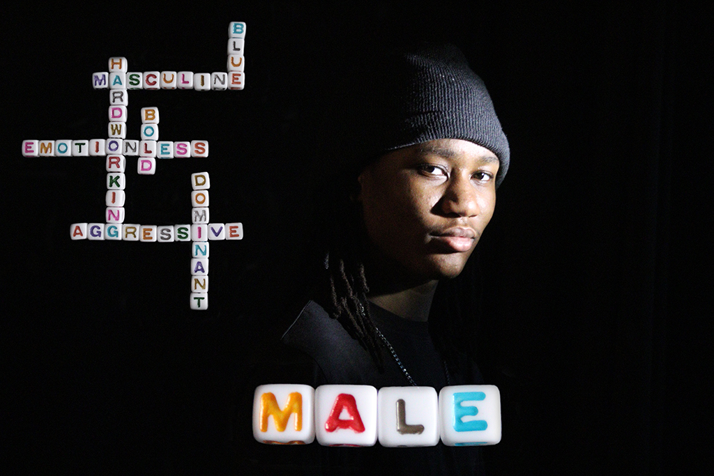
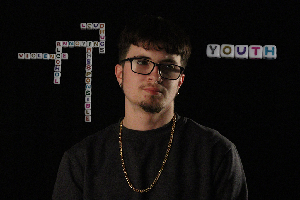
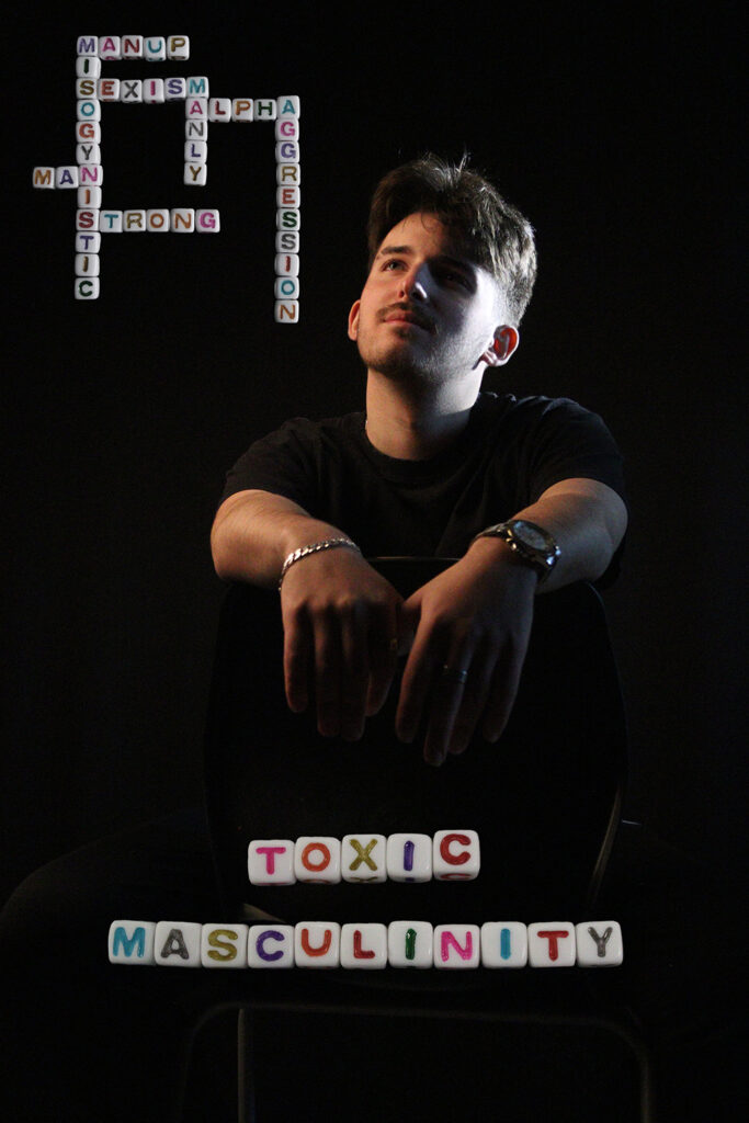
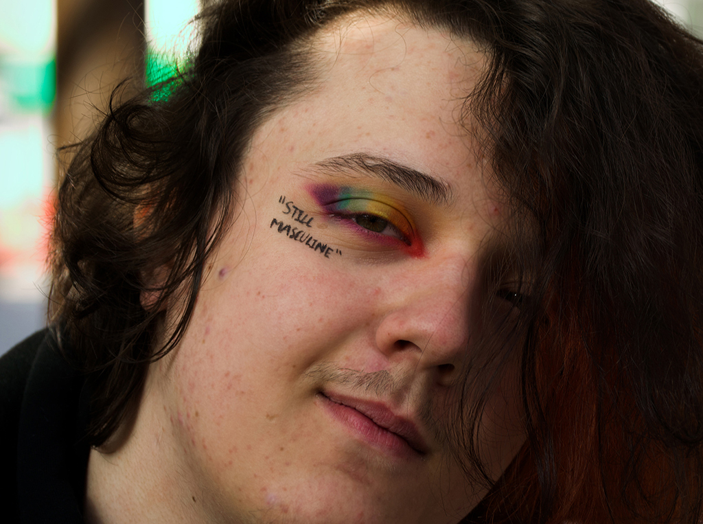
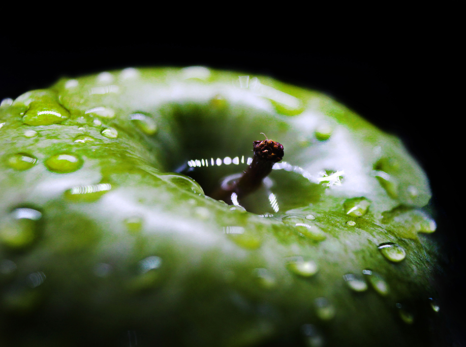
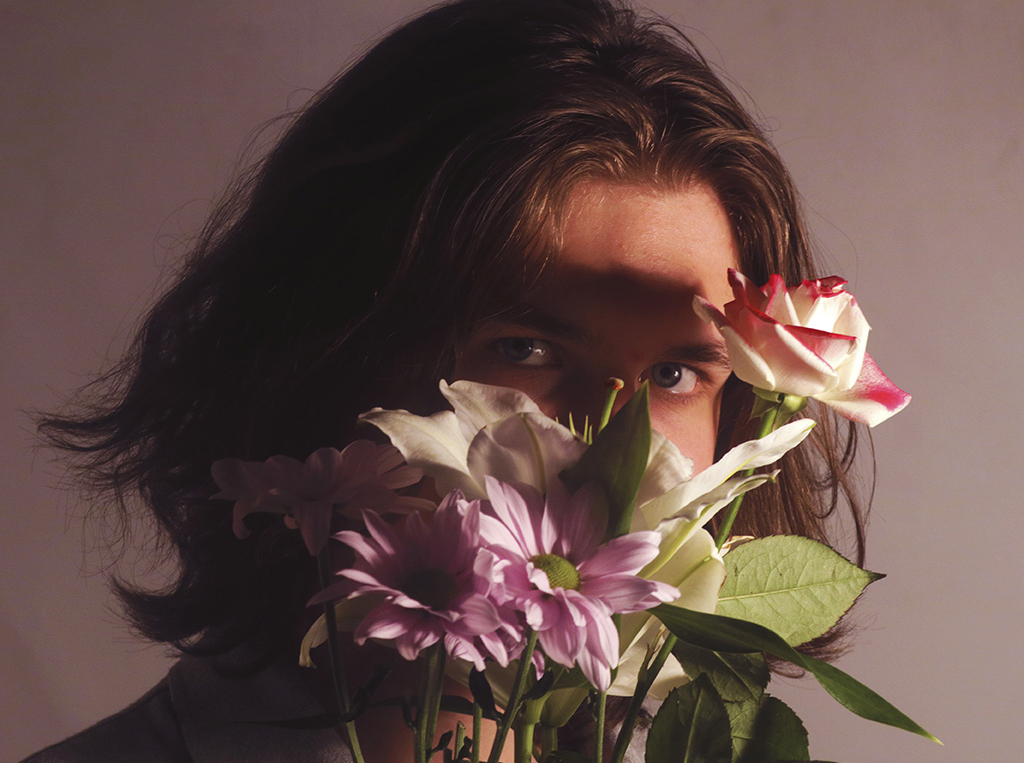
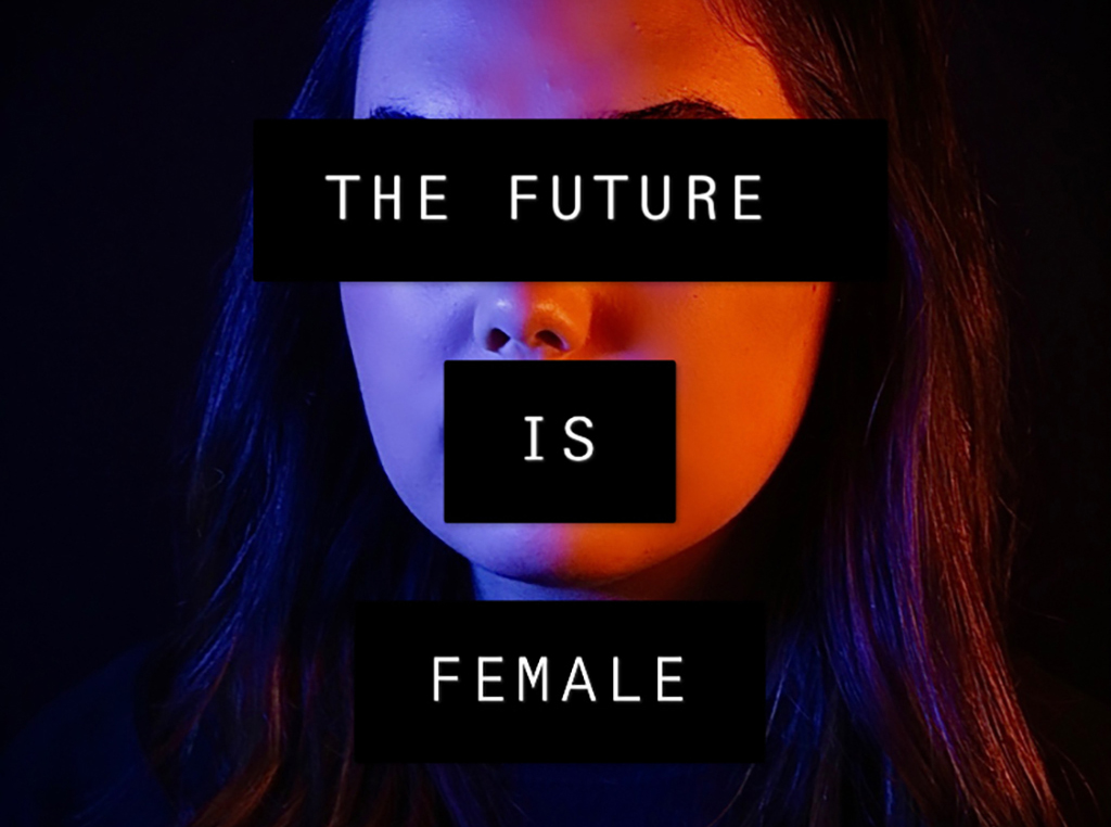
My creative independent project title is Perspective. The project includes topics such as feminism, gender stereotypes, toxic masculinity, and LGBTQ+ community. Raising awareness about these topics is important in my eyes as it needs more recognition. I have included macro photography within my portraiture work as this is what I started with and it developed into my project. I want to raise awareness about these serious subjects. I want to show the negative stereotypes of some of these topics and show that we need to change our views on this and start looking for the positives.
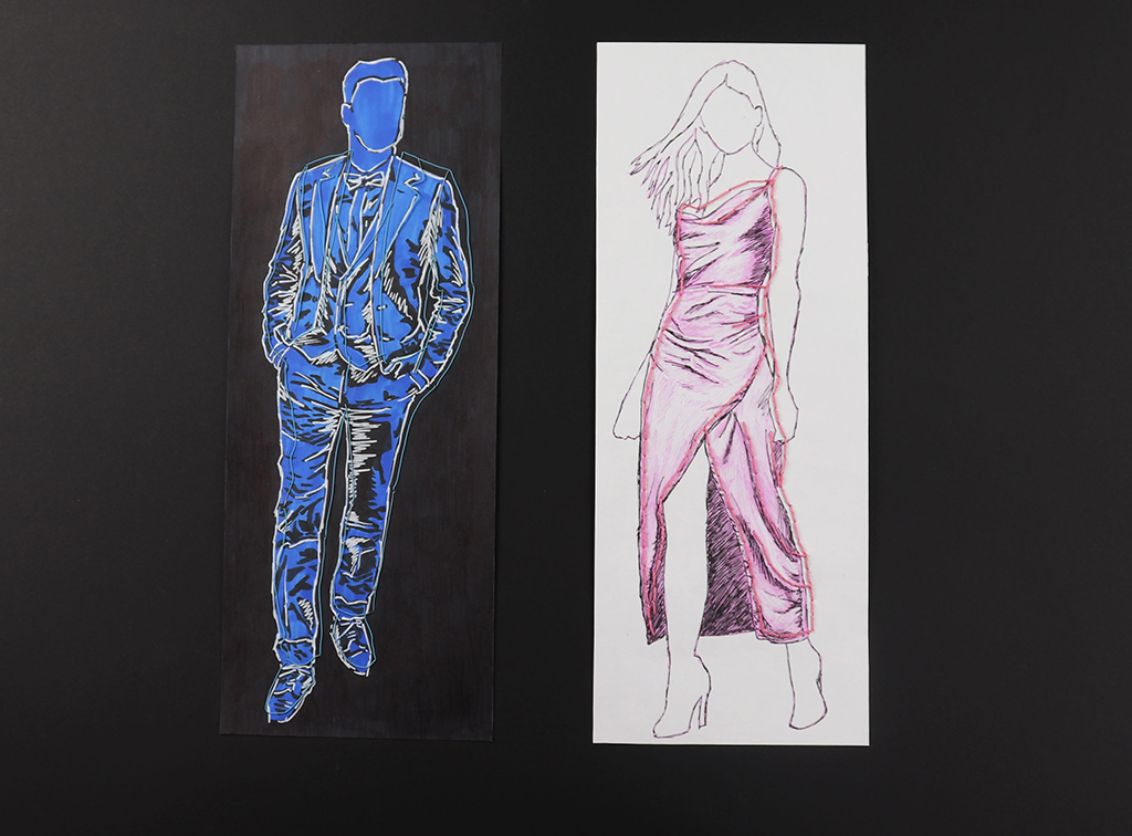
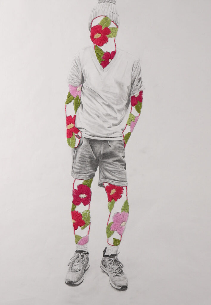
My project explores the negative effects of forced gender roles in society, how we are expected to dress, speak and behave in a certain way. I love drawing the fabrics and textures of clothes so decided to focus on stereotypically gendered outfits. I combined this with the artist Jose Romussi to created layered embroidery artworks to represent he disconnect between how people want to express themselves, and what people choose to wear. I also created a series of life drawings to explore physical differences between people of different genders and body types to show how we are immediately perceived judged by others.
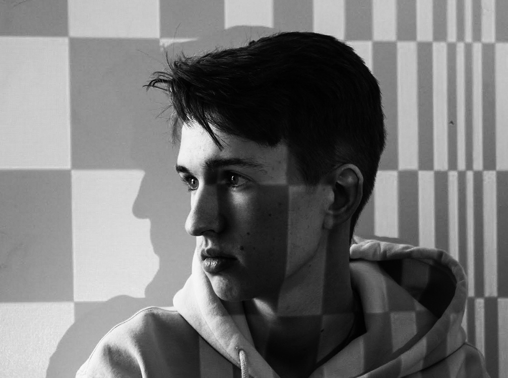
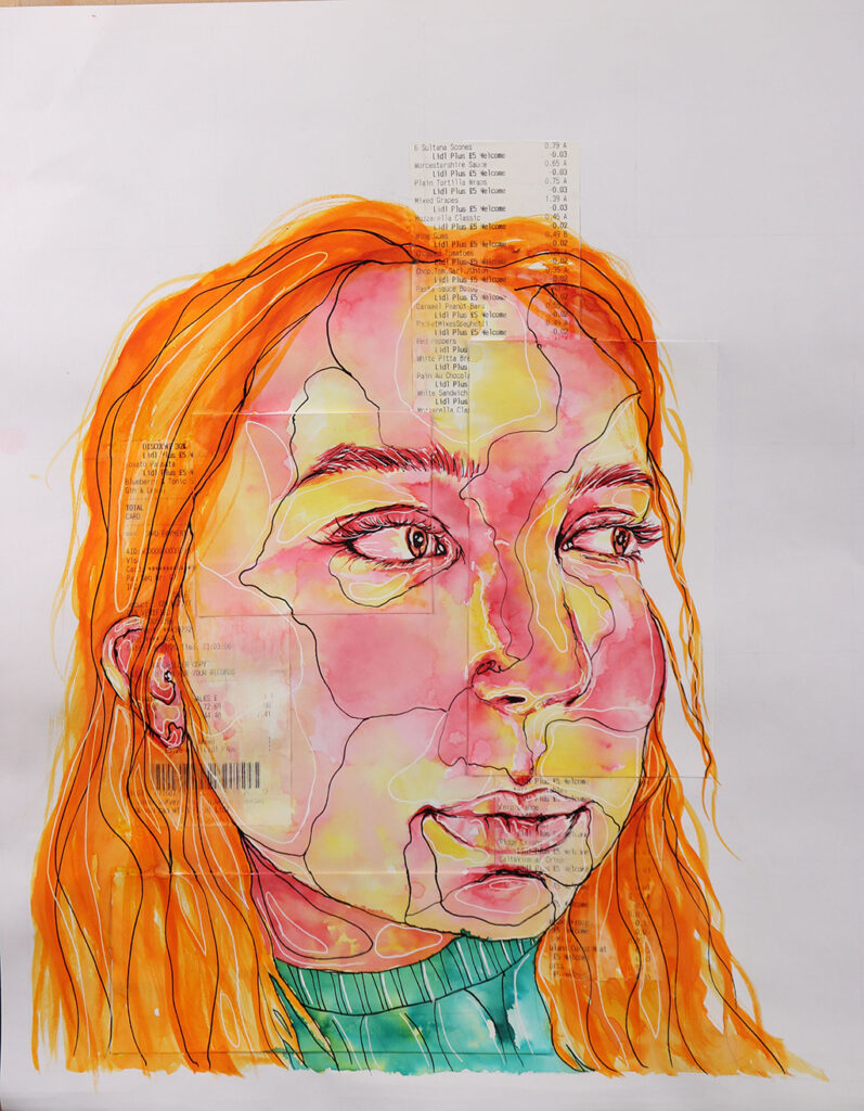
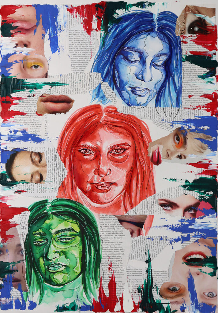
The theme for my project was ‘expression through abstraction’. I wanted to look at how techniques such as collaging, and abstraction of portraiture can give a piece an expressionist aesthetic. I started by looking at portraiture and the different ways in which I could abstract an image/portrait. I also wanted to incorporate the colour theory into my work as I believe that this helped me grasp the ideas behind giving my work more of an ‘emotional’ approach.