Level 2 Art and Design 2022Level 2 Art and Design 2022
LEVEL 2 ART AND DESIGN
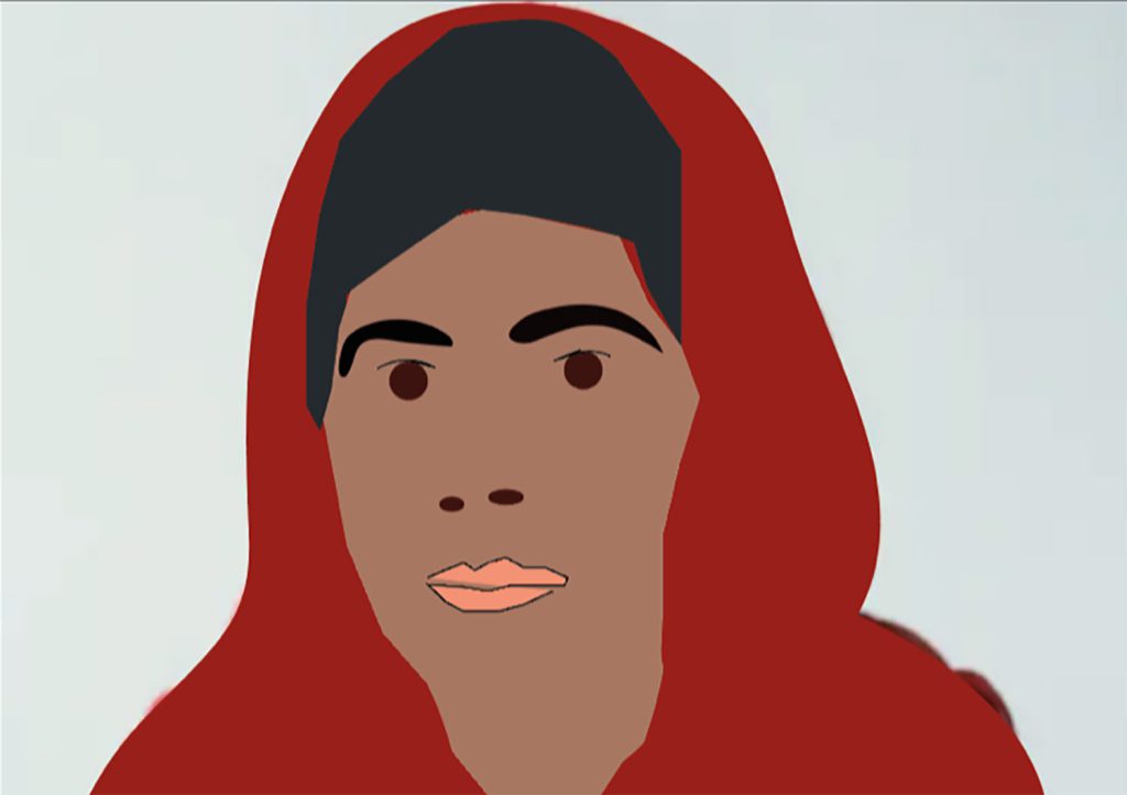
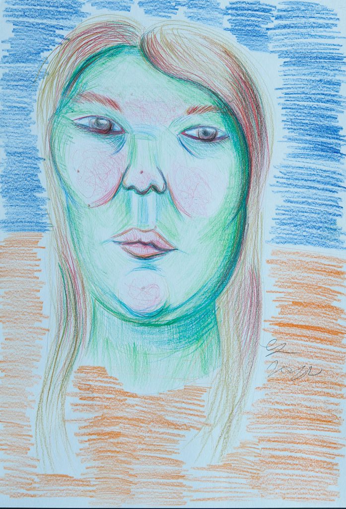
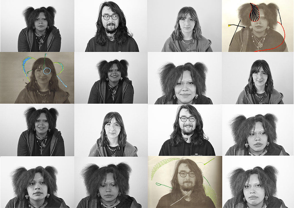
Rayne Allen
Ryan Ball

Bradley Colley
Erin Corbishley
Dayzel Fernandes
Megan Finch
Angle Gee
Riyad Imran

Reeda Sherazi
Caitlin Taylor
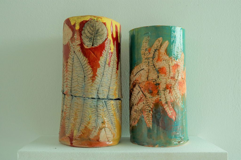
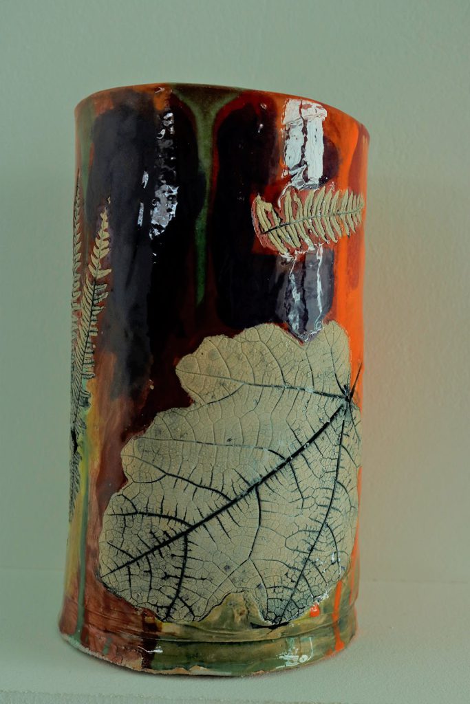
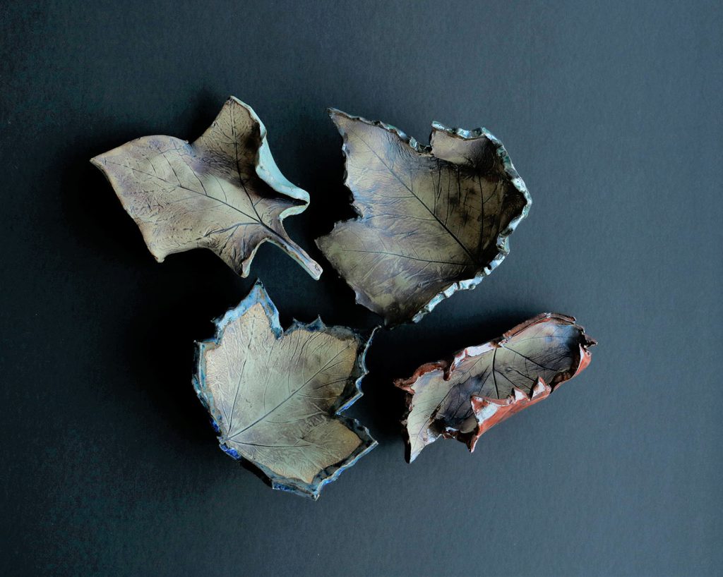
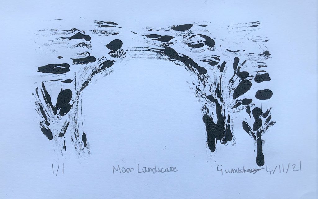
Our Level 1 Art and Design learners have worked on a range of exciting projects this academic year, from Natural Forms, Portraits and Mini Monuments. Learners developed a range of skills working in ceramics, digital illustration, print making and fine art practices.
Below is a select of work from our fantastic learners. We wish them all the best as they progress to the next stage of their education here with us at Dudley College of Technology.
Jo Davis (Level 1 Art & Design Tutor)


Previous Education: Level 3 Extended diploma Art & Design
Destination: HND Art Practice
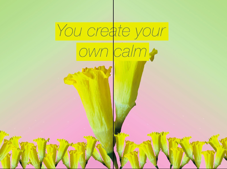
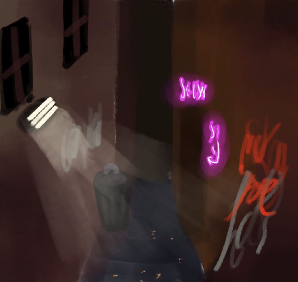
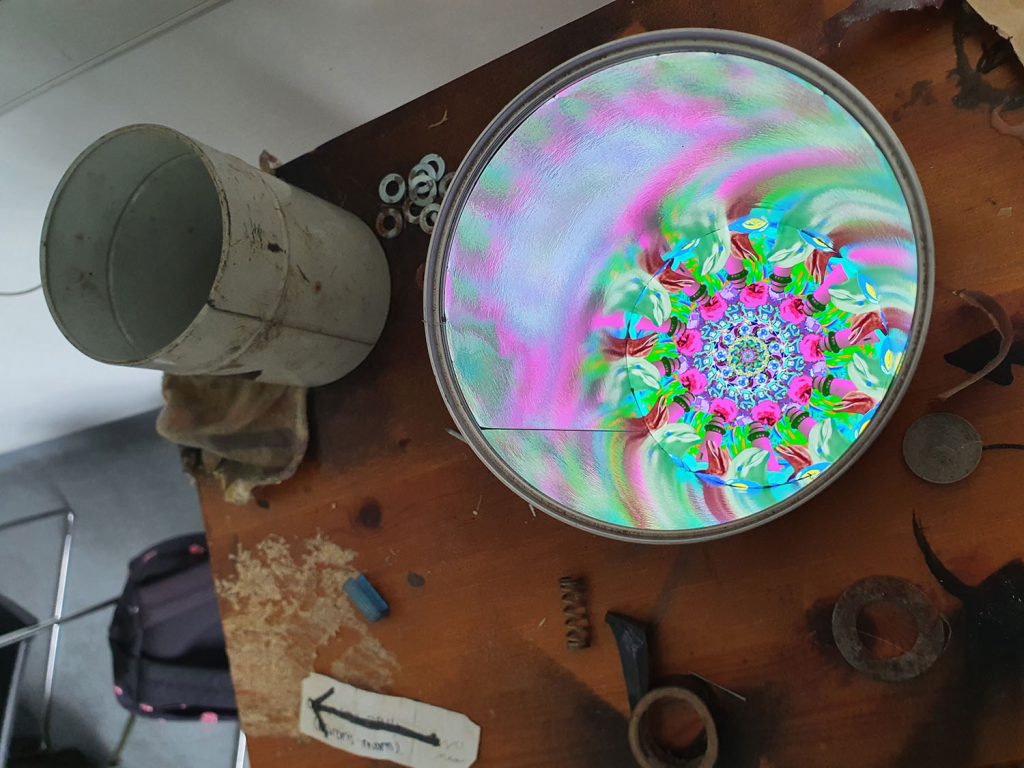
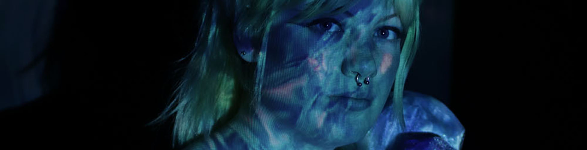
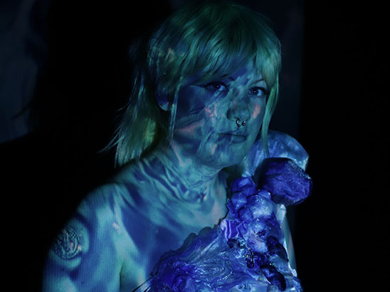
I was influence by Edward Walker’s lava lamps and initially of the “Psychedelic Movement” and the “Love Generation”. Lava lamps came about in the 60’s and It was the perfect light for modern times,
Walker declared: “If you buy my lamp, you won’t need to buy drugs because the lava lamps are meant to calm and relax people.
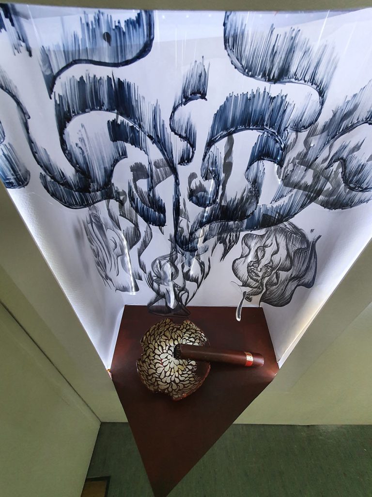
This video still screen shot is part of a project which was based on the role of technology in art & design. This is my FMP project, and the work is an illustration of projection utilising handmade lava lamps. The intentions here were to communicate sensory room experiences as an artist medium, for an audience with and without complex health needs, becoming a ubiquitous creative space that promotes the reduction of stress and anxiety. A safe environment where audience become participants, through the physicality of simply being present, interacting through simple movements.
Previous Education: The Academy of Kidderminster
Destination: University of Wolverhampton
The themes of my project are connections via the internet and creative remixes. Art viewers and critics have their own interpretations of artworks based on their experiences, ideas and tastes, and I wanted to explore my peers’ ideas and interpretations by creating remixes of original pieces I sent to them. This project is a collaboration of ideas from a variety of artists of different media and specialisms with the outcome of a diverse collection of work, and a collaboration between close friends through a personal and public digital connection.
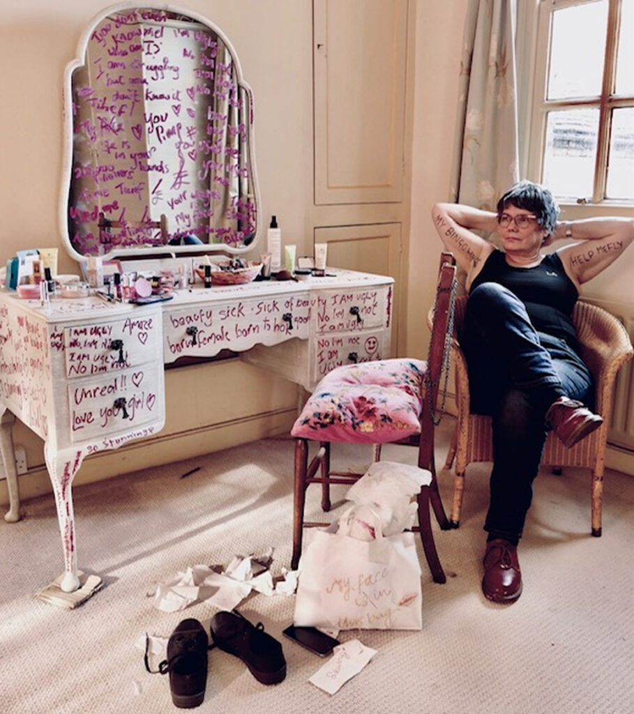
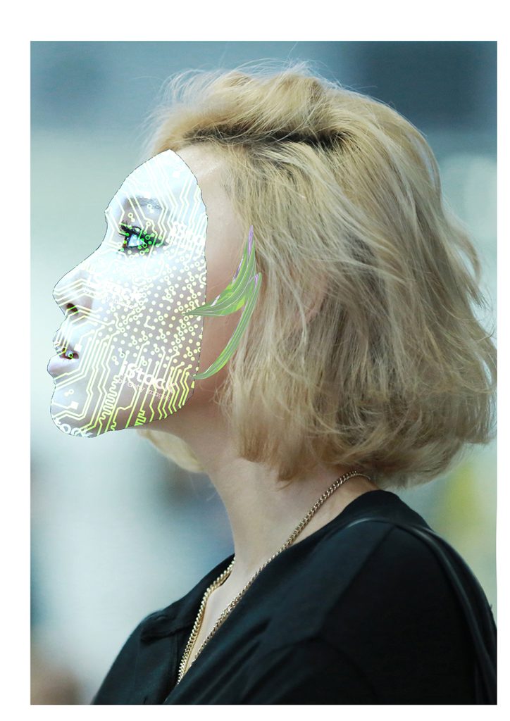
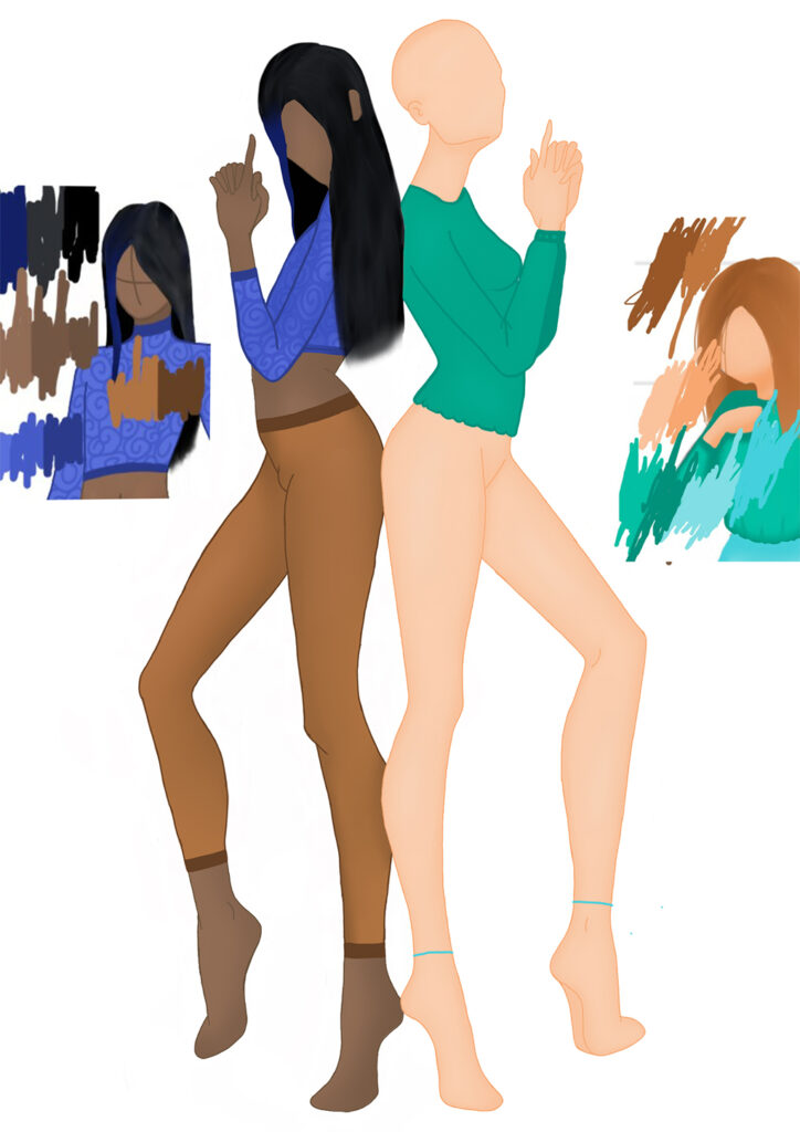
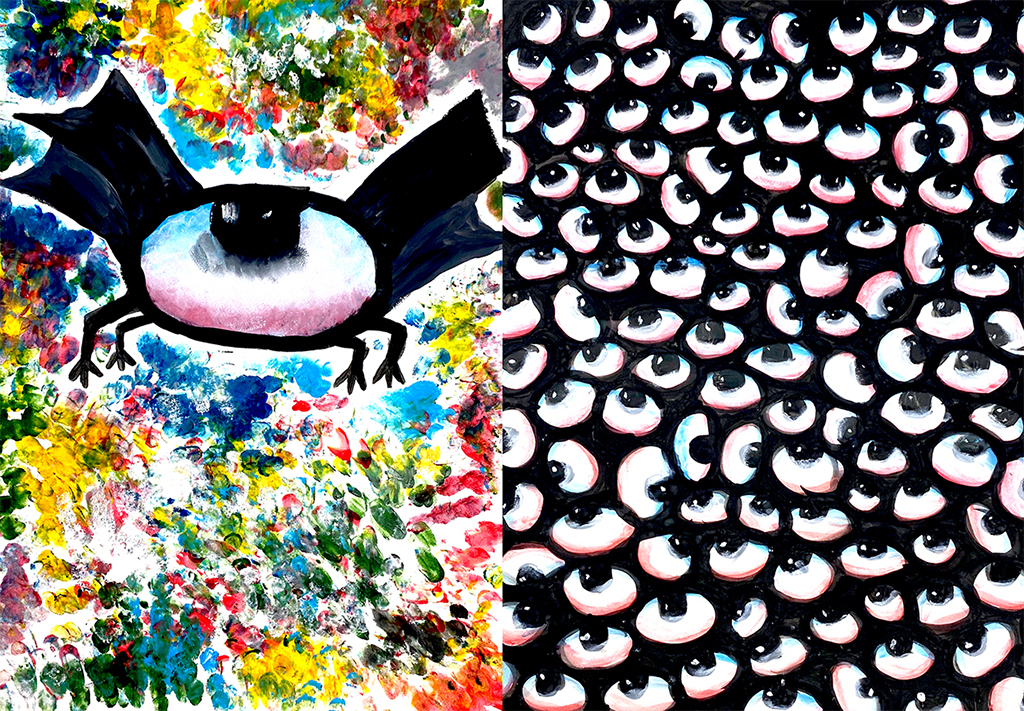
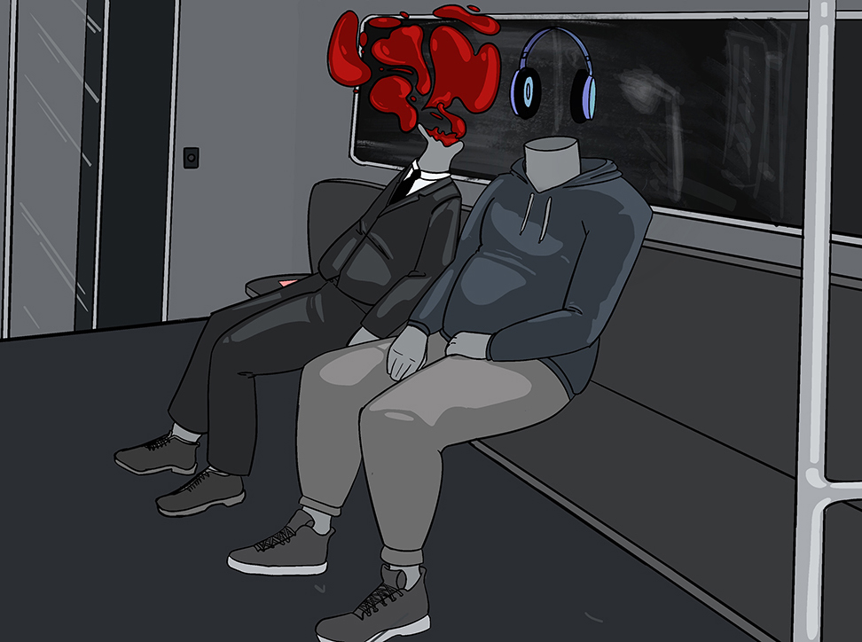
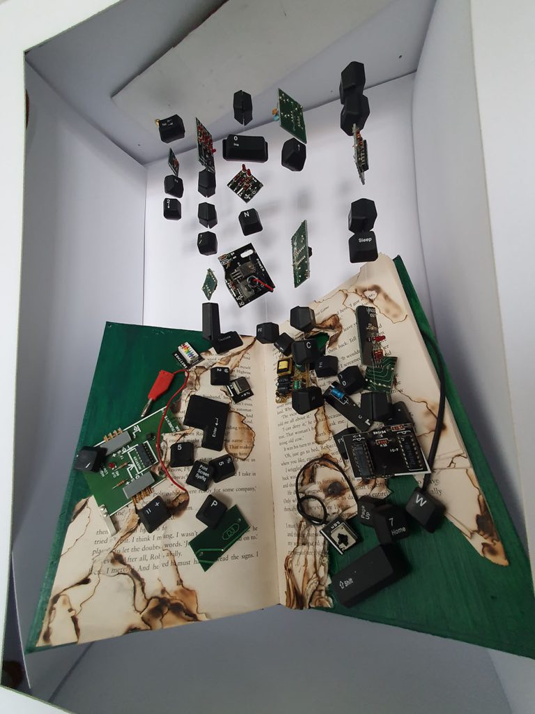
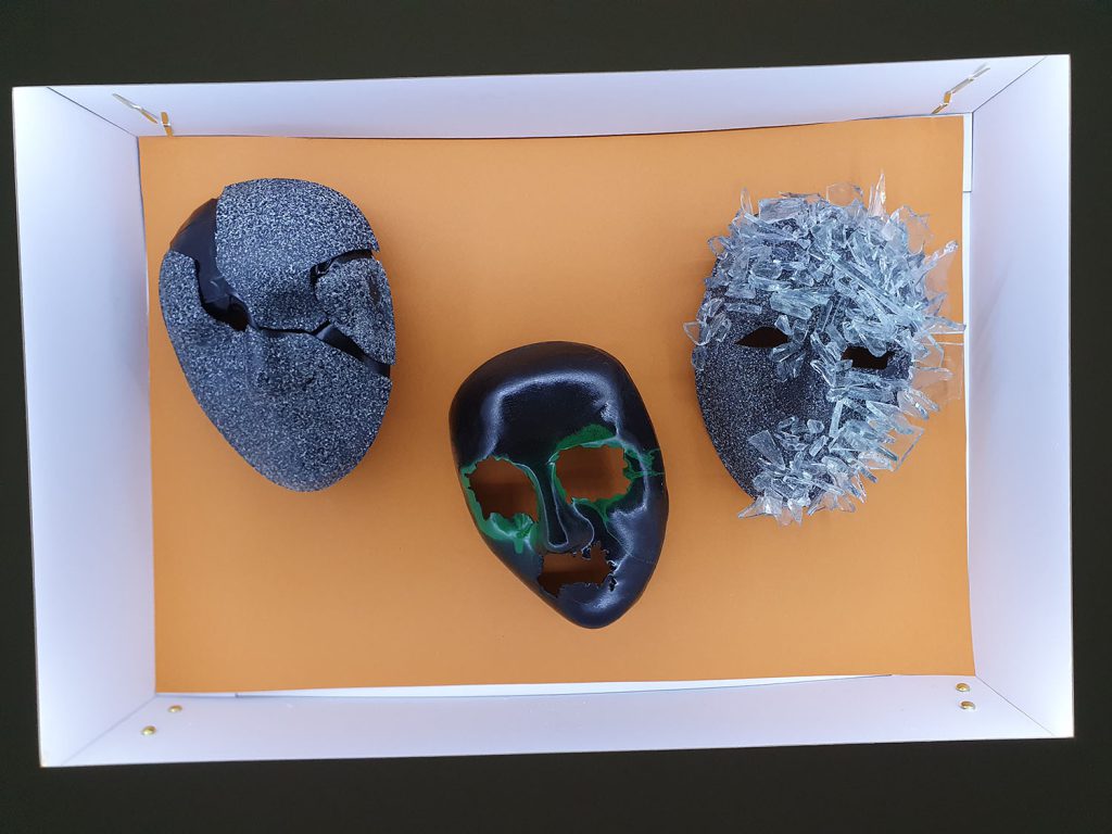
One is Too Many is an installation rooted in a body language crisis created by the use of filter apps that can manipulate and enhance an image to enable the ‘perfect appearance’. For many, this allows a filtered version of reality, one that is hard to find flaws in and that enables them to hide their own insecurities and imagined flaws. The installation is my response to bring about awareness to this practise and its links to a mental health illness known as ‘face and body dysmorphia’. The individuals that have this illness see a distorted image of themselves when looking in the mirror. This illness can lead to depression, self – harm and even suicide in young women. I found this evidence shocking and it was this that gave me the impetus to produce this artwork.
The installation was inspired by Tracey Emin’s ‘My Bed’ and Elaine Shemilt’s “Doppelganger. Two artists that challenge socio-political and feminist issues as part of their practise.
My intention is to confront the viewer and challenge this practise that pressurizes young women to conform to society’s obsession with beauty.
The main brief for this project was that it should be conceptual, where the idea involved takes precedence over the aesthetics of the final piece.
One of the principles of conceptual art is to break away from consumerism and capitalism and to achieve this I used paper in all my experiments; Paper is a low grade and throwaway material. My experiments involved trying various drawing techniques, making face masks and distorting images to suggest human fragility. It was through this process of experimentation that ideas emerged.
My aim through my installation is to invite the viewer to interact by questioning, connecting and interpreting and to evoke feelings about gender inequality and to realise that the true cost of beauty is not through money but through the cost of women’s mental wellbeing.
Previous Education: Foundation Certificate in Art and Design
Destination: Independent practice
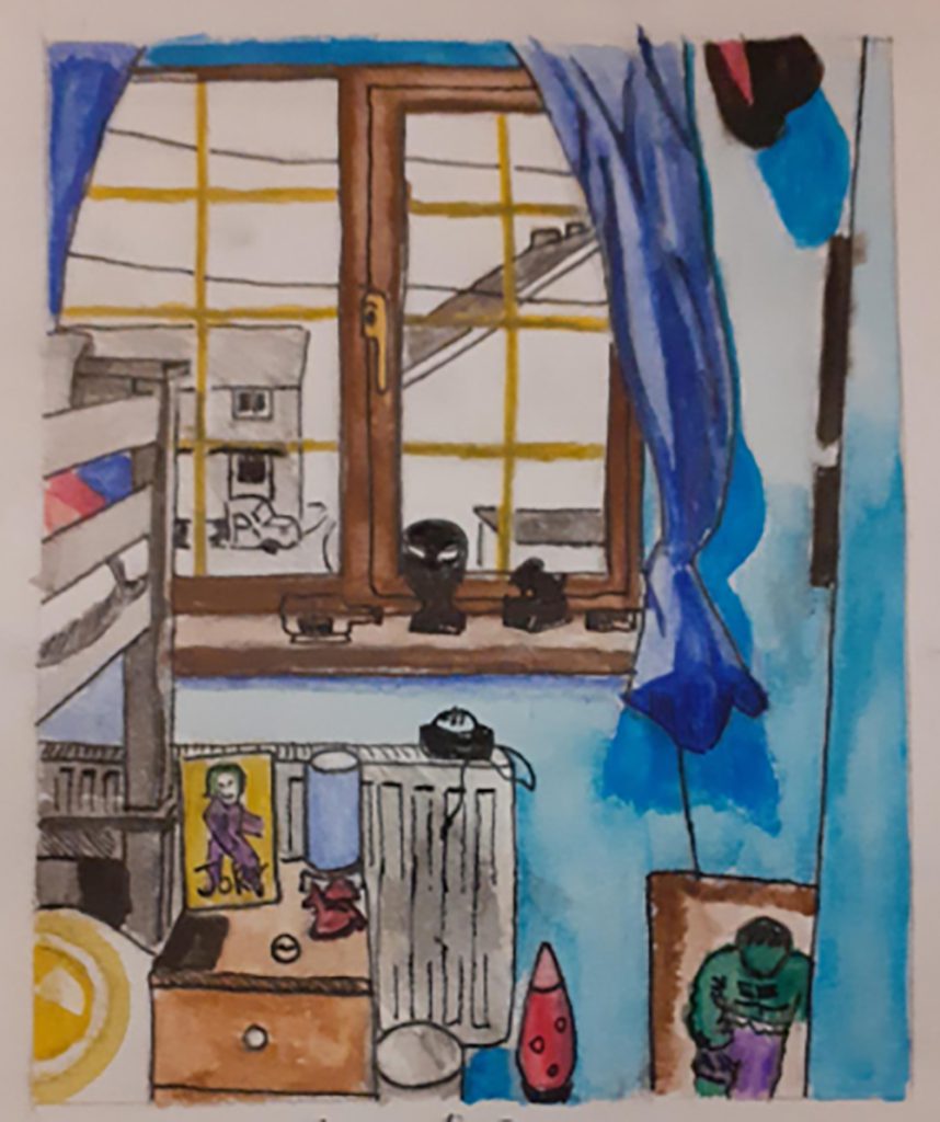
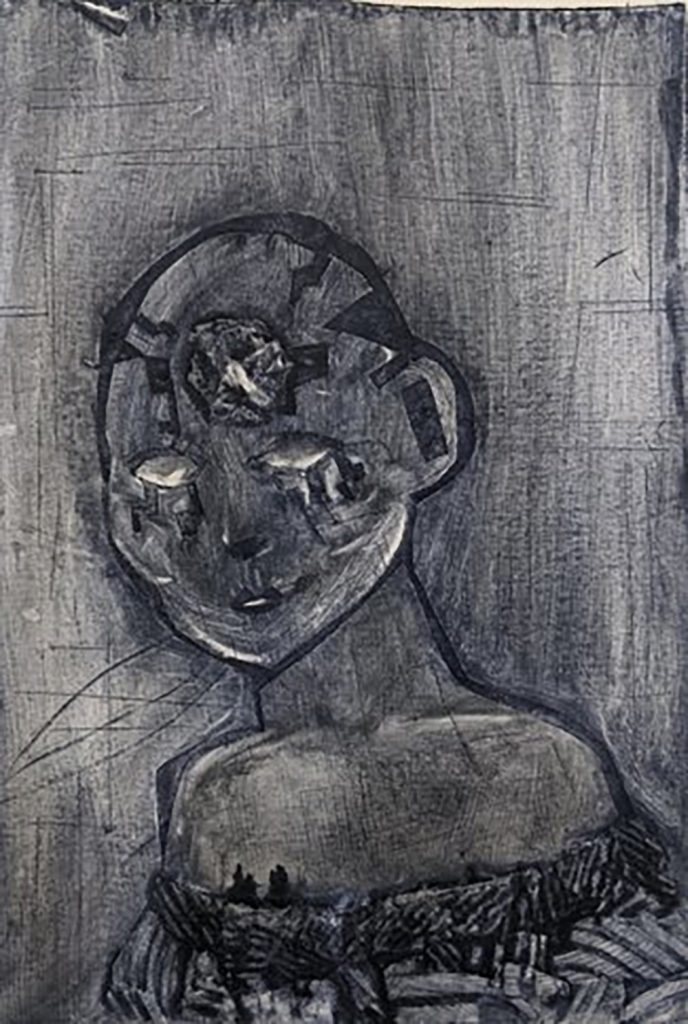
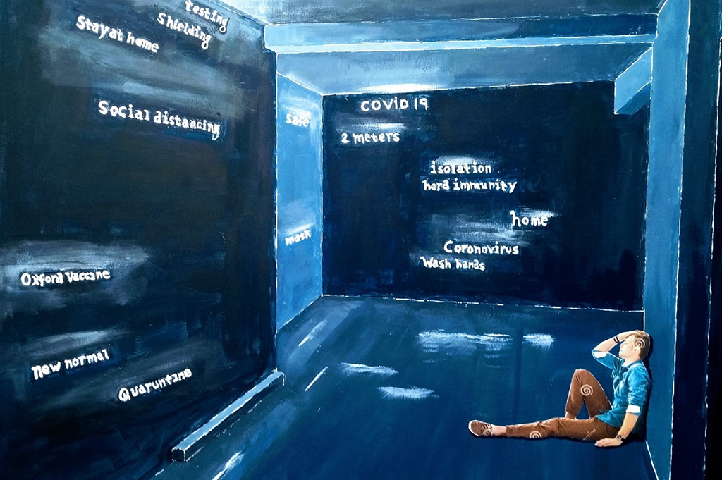
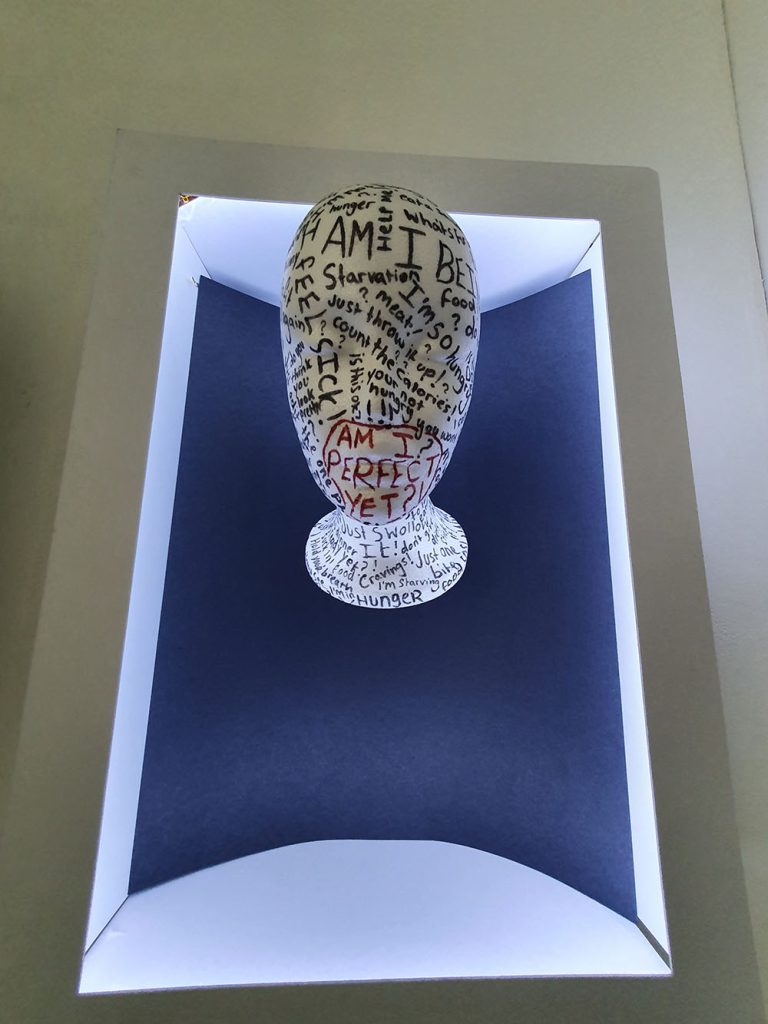
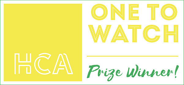
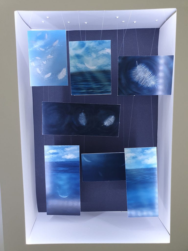
“Word room” is a concept that is intended to reflect many individuals’ state of mind given the current worldwide Coronavirus pandemic.
Never in living memory has our society faced such a threat to our personal freedoms and mental well – being, I therefore wanted to create a concept that captured some of these anxieties.
So, I started to think of our living spaces and how we felt about them pre – pandemic, i.e., places of refuge of safety and places where we could relax and rest.
Our living spaces are almost like the spaces that occupy our heads, a private space where our true self exists.
So how has the pandemic affected our true self spaces?
It has made us fearful of acting in the ways in which we are so used to in today’s society, it has threatened our very mortality, and it has filled our heads with words that would have meant nothing in the past. Words that now fill us with caution, distrust, and fear.
Our worlds have been forcibly shrunk to the spaces in which we live.
It is the 4 walls of reality.

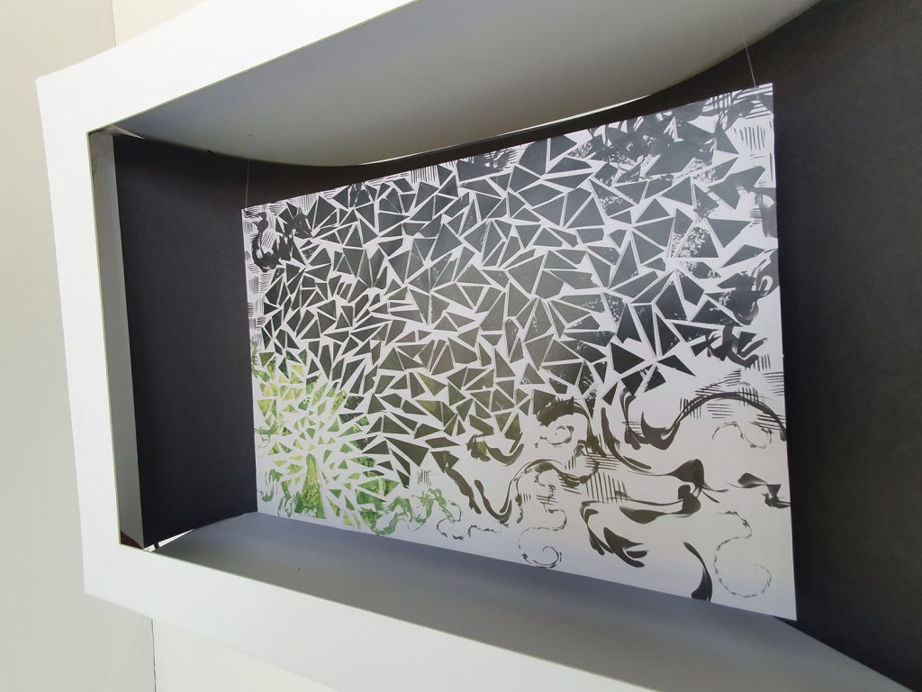
Legendary creatures have often been incorporated into heraldry and architectural decoration. This is particularly the case with those symbolizing great strength or other powers. In contemporary times, many legendary creatures appear prominently in fantasy fiction. These creatures are often claimed to have supernatural powers or knowledge or to guard some object of great value.
Mythical creatures have been part of human culture throughout the ages and across all parts of the world. They are not just the “talking” creatures, animals able to communicate using language and also rather clever, as in Aesop’s fables. Mythical creatures are in themselves beyond normal reality, often composites of existing animals or animals and humans.
Part of my ‘journey’ to overcome dyslexia has been writing a story. This started as quick little descriptions and scenes and eventually developed into a full story.
I decided to use this as the basis of my FMP, imagining quite child-focused illustrations.
A full analysis of my text and deep, sustained research into the teen-fiction genre, however, led me on a different path.
My initial reaction to recognizing my narrative as teen fiction rather than children’s fiction was that I would have to adapt it into a graphic novel, if I wanted to create illustrations. The work of the Folio Society mad me realized that readers of books such as War Horse, Noughts & Crosses and Sophie’s World, enjoy full page illustrations accompanying the text.
I set myself the challenge of working in watercolour or inks, but had to admit after some tests that the experimental way I enjoy working and find most successful is digital.
Lockdown has meant I was not able to plan my work to include a printed book, but the work will continue and that will be the eventual outcome.
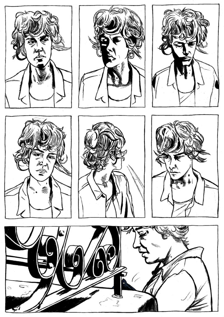
As an artist, I work hard to develop illustrations that are presented exactly how I envision them during the creative process. Part of my process before I begin working is to take several photographs of myself and/or others to gather reference material for my ever-growing portfolio of expressions, posture and form which I can use to help me in areas I find difficult and later recycle and adapt to other projects. I rarely deviate too far from my original vision for a piece, but I like to try new techniques regularly and occasionally experiment with different medias though the latter is a recent development.
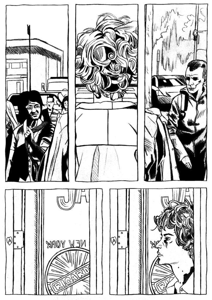
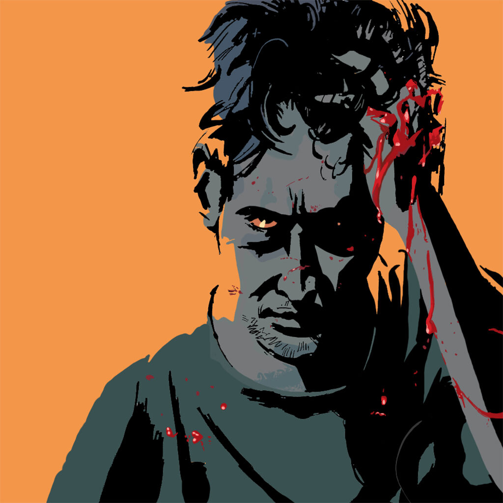
For my FMP I challenged myself to create my first short illustration-focused comic book in a professional quality using techniques and formats I’ve researched and taken from bestselling books. I chose to adapt a music video rather than create my own narrative, due to it being my first tactically-planned and executed attempt and wanting to focus my efforts and attention on the art, research and quality of the project rather than creating commentary. I believe this effectively worked out in my favour and the experience has provided me with a new lens to view my creative process through.
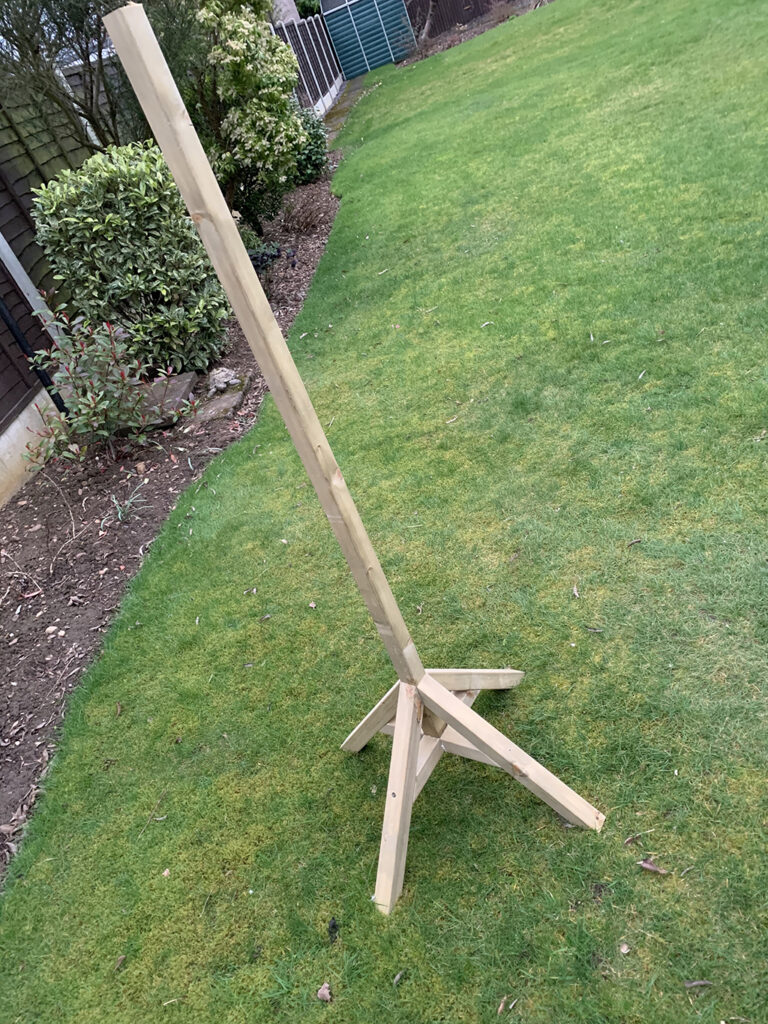
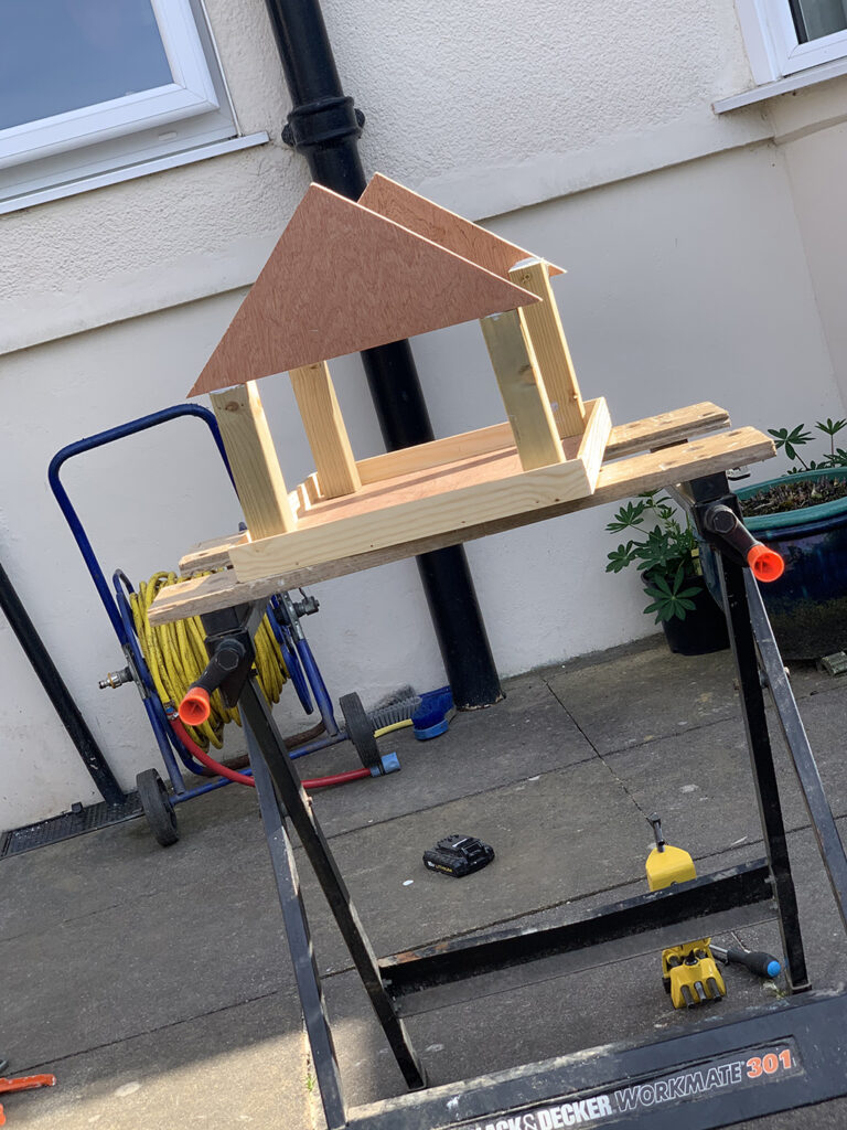
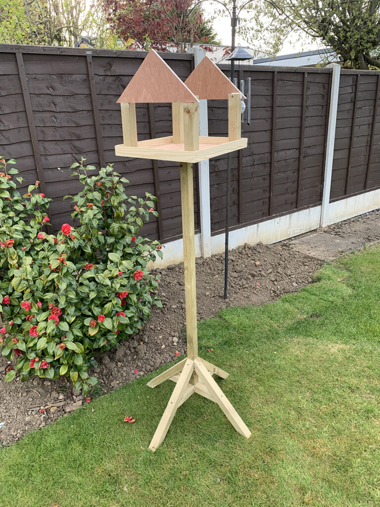
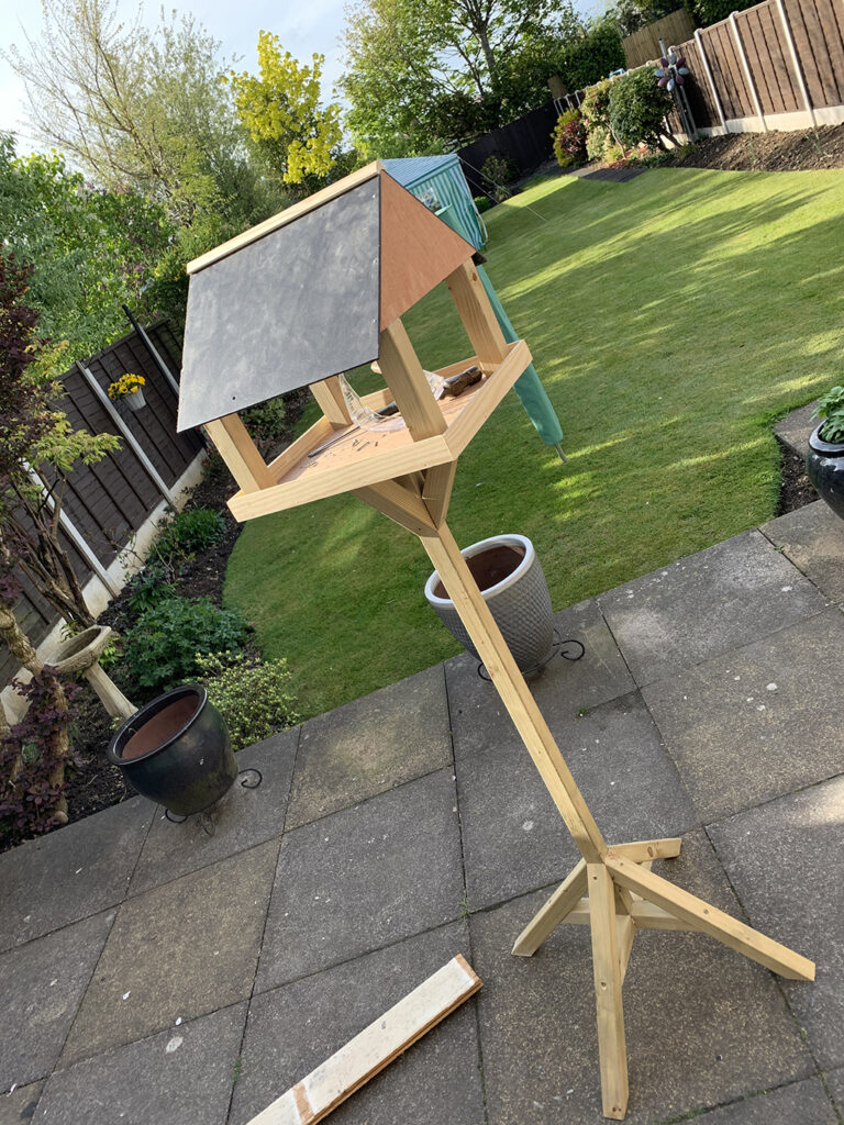
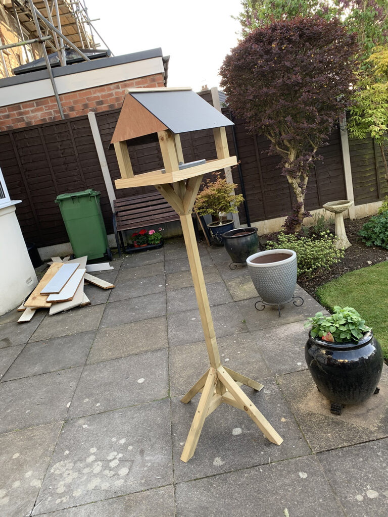
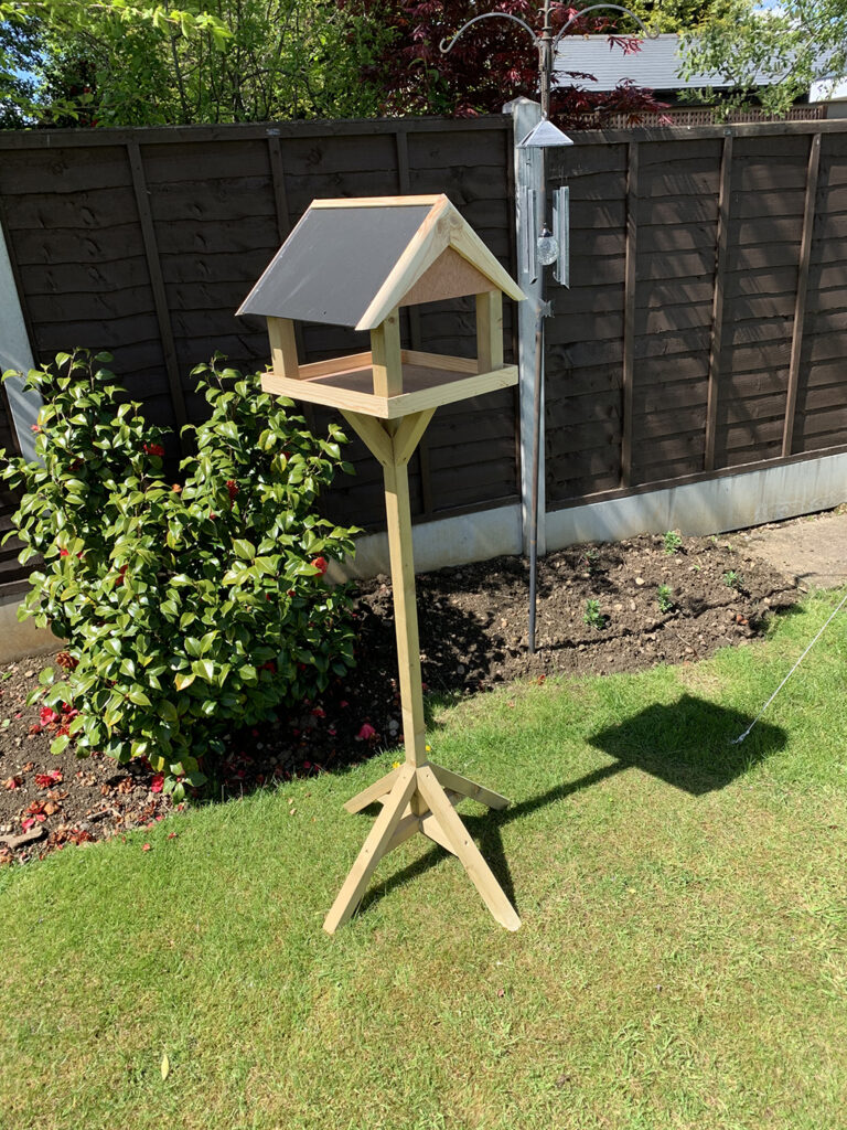
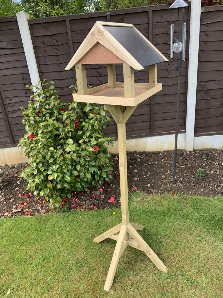

The theme of my Project has been influenced by not being able to go out for months because of the virus. As being limited on where to go and things to do, having a garden made lockdown easier for me and it inspired me to make something to go into the garden that would last a number of years. I decided to design and create a high-quality bird table. I used this FMP to concentrate on my practical skills because it kept me focused during lockdown. With lockdown and only being able to work from home with no workshop made this project much harder but made me a much better problem solver and made me realise at what a high standard I can work. I visited various places to collect research in the form of taking photographs of different bird tables of all different designs and sizes. This then gave me different ideas on how to design my own and the different practical skills I could use. To draw out my design, I decided to use a 3D CAD software called sketchup, this was useful because I had a visual representation on what it was going to look like throughout and helped me plan each stage throughout the project.
I have found the lockdown periods boring more than anything and as a person who naturally draws and creates, I have found those two aspects of my character have been hard at work.
But I have noticed that regarding the subject matter, following a brief has not been as important as usual – it’s the actual process that provides the satisfaction.
I seem to choose techniques that follow a repetitive process. This would be very obvious if I was sewing or knitting, but I would say that the creation of digital work, particularly if I am creating several versions of a decided theme, is a definite set of technique procedures, varying only slightly, that are repeated. The work is never gestural or expressive, but limited, focused and complementary.
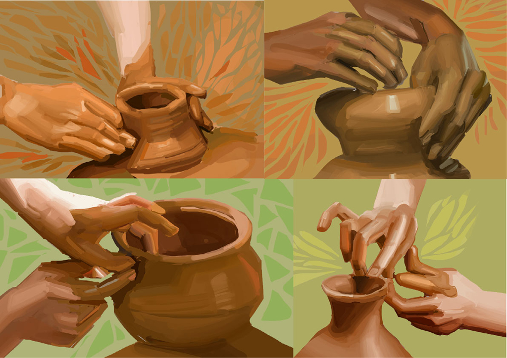
This has been my theme in my illustrations – the people and the objects involved in making and marking as a mindful exercise.
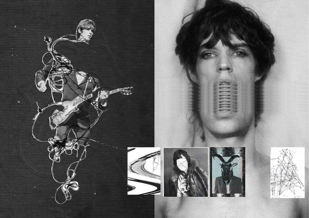
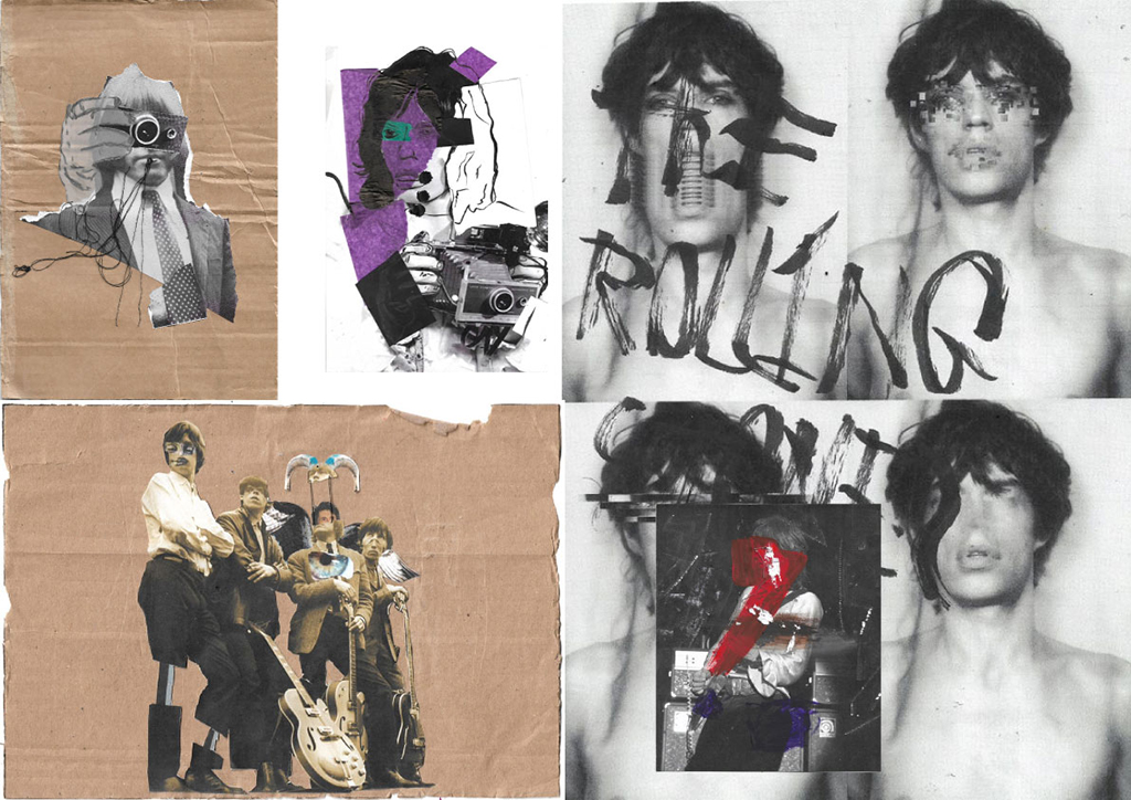
For my FMP, I was inspired by The Rolling Stones and their album, Exile on Main Street. This inspired me, as this album cover shows a collage of so-called ‘circus freaks’ which then inspired me to create work inspired by them. I used appropriation in this project to create Illustrations inspired by these ‘circus freaks’, incorporated ‘found’ images of the Rolling Stones and utilised different physical and digital methods to distort and change them. I then presented the illustrations I had created in this project within a zine.
To do this, I had found already existing images which I then developed using paint, embroidery, collage, typography and distorted digitally. This was inspired by multiple artists such as Andy Warhol, Hannah Hoch and Rossana Taormina. I took inspiration from their work and used this to create a variety of designs using digital and
hand-rendered techniques. I was able to successfully communicate my concept of body altering and distortion throughout my work due to the mediums and techniques I had used. This then led me to creating a successful
20-page zine.
My aim for this project was to communicate the idea of ‘circus freaks’ and to raise awareness of them while also raising awareness of people with deformities and how they are treated within society.
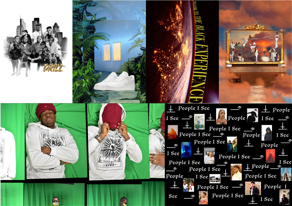
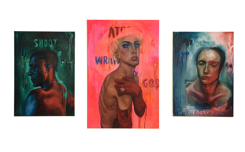
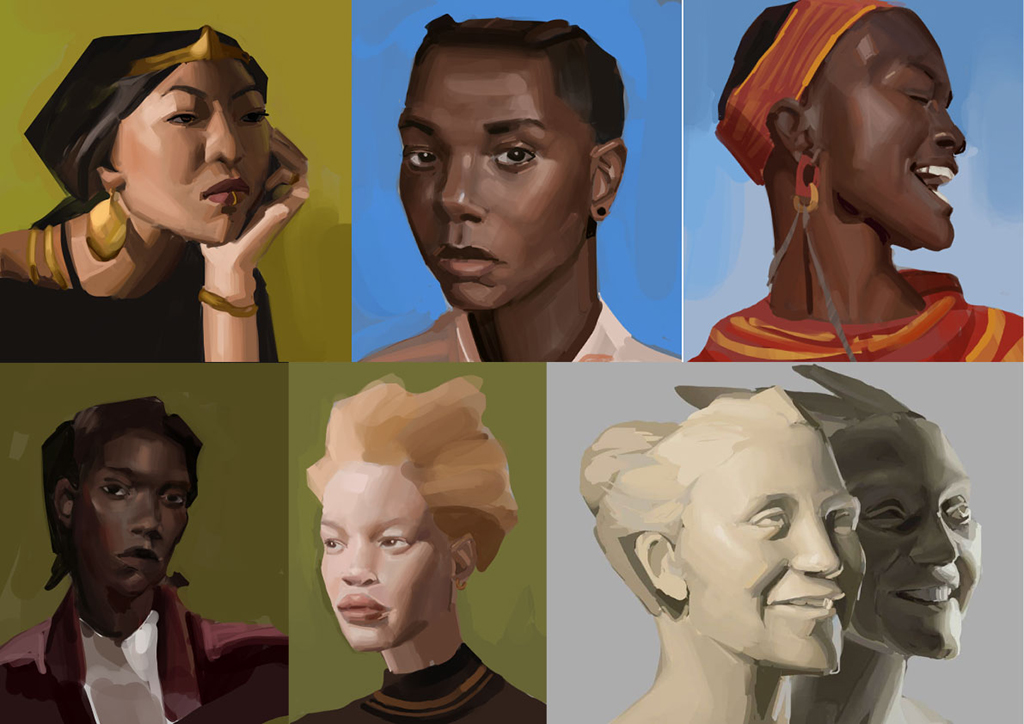
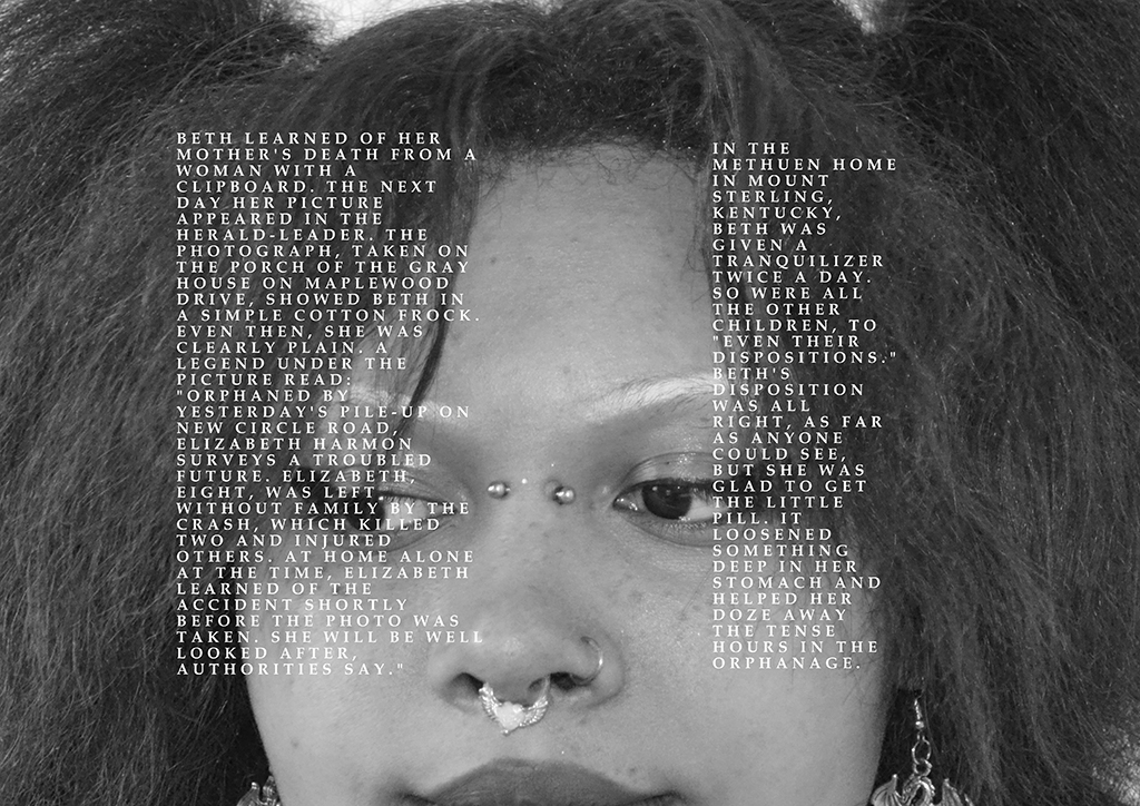
I have spent this academic year on an ambitious mission. I set myself the target of getting into Central St Martin’s college to study graphic design. I, like many young black British people, also had another matter on my mind. I had to ask myself where I stood and what I felt as a Nigerian British girl. How could I communicate this, when I was still finding out myself? That was the problem to solve and I feel I must have made a good attempt as I will be going off to CSM in September.
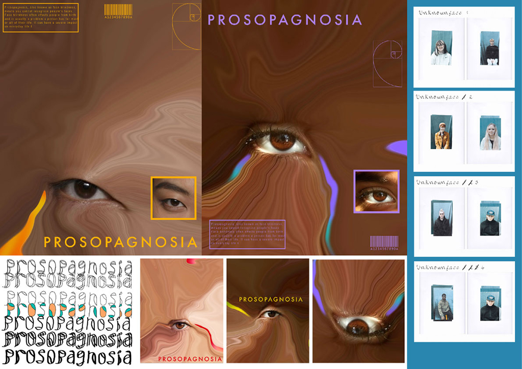
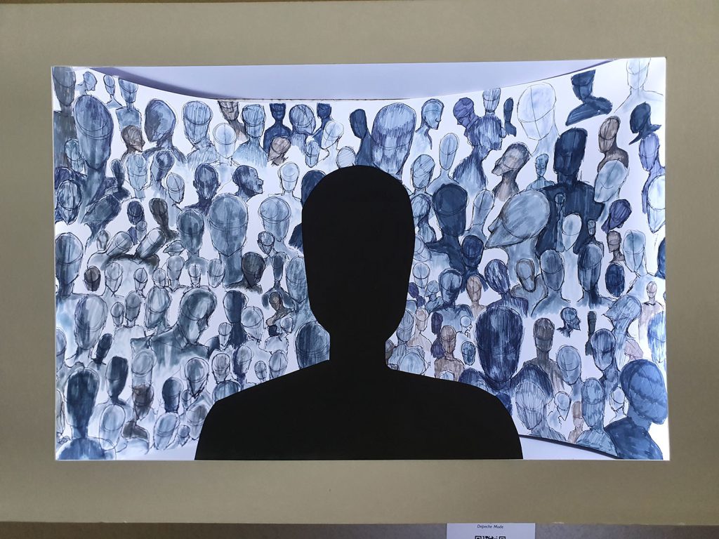
During the period of FMP, I developed my research while still finishing off my portfolio, so within the timescale I completed a range of work that explored what it feels to be a young black girl in Britain, the ambitions of young people of colour, our heroes and aspirations, the impact of the pandemic on mental health, a multi-cultural examination of typography and all this culminated in a project that takes a curious approach to Face Blindness.
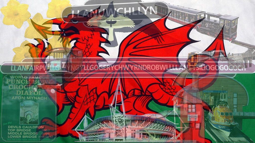
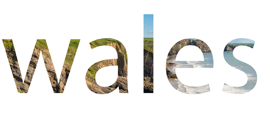
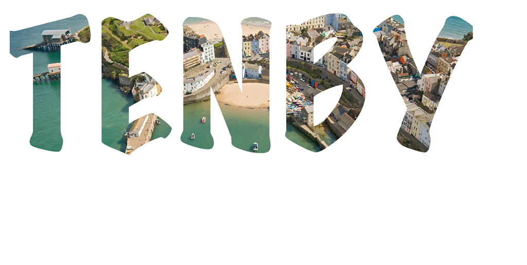
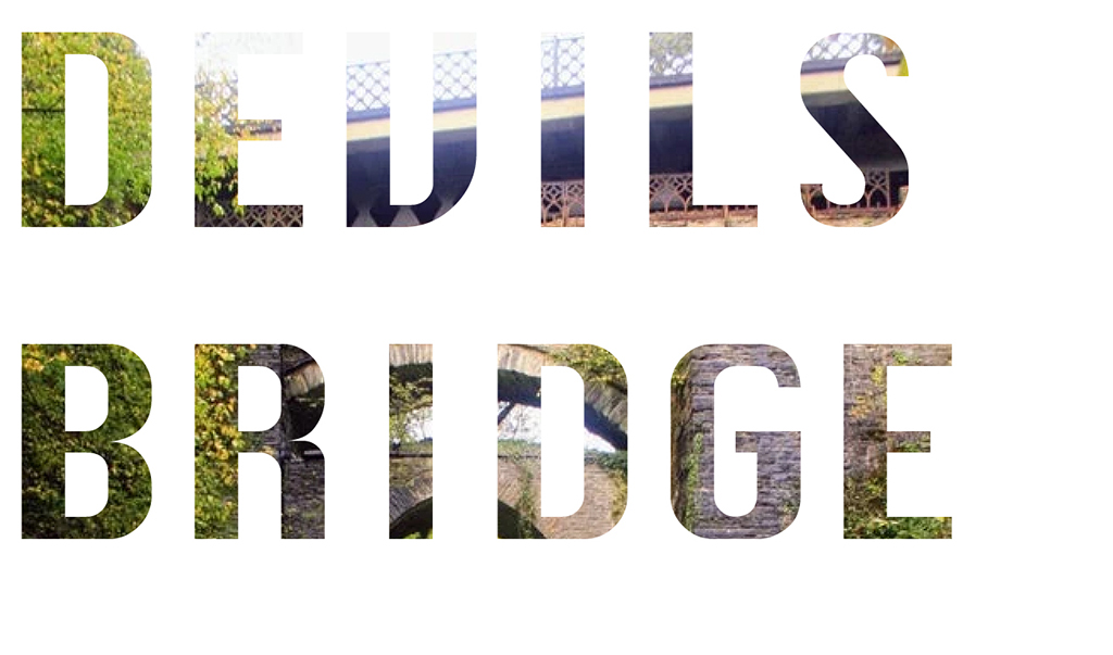
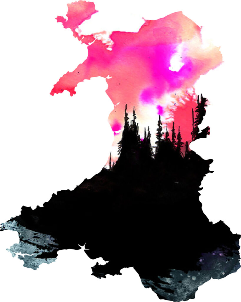
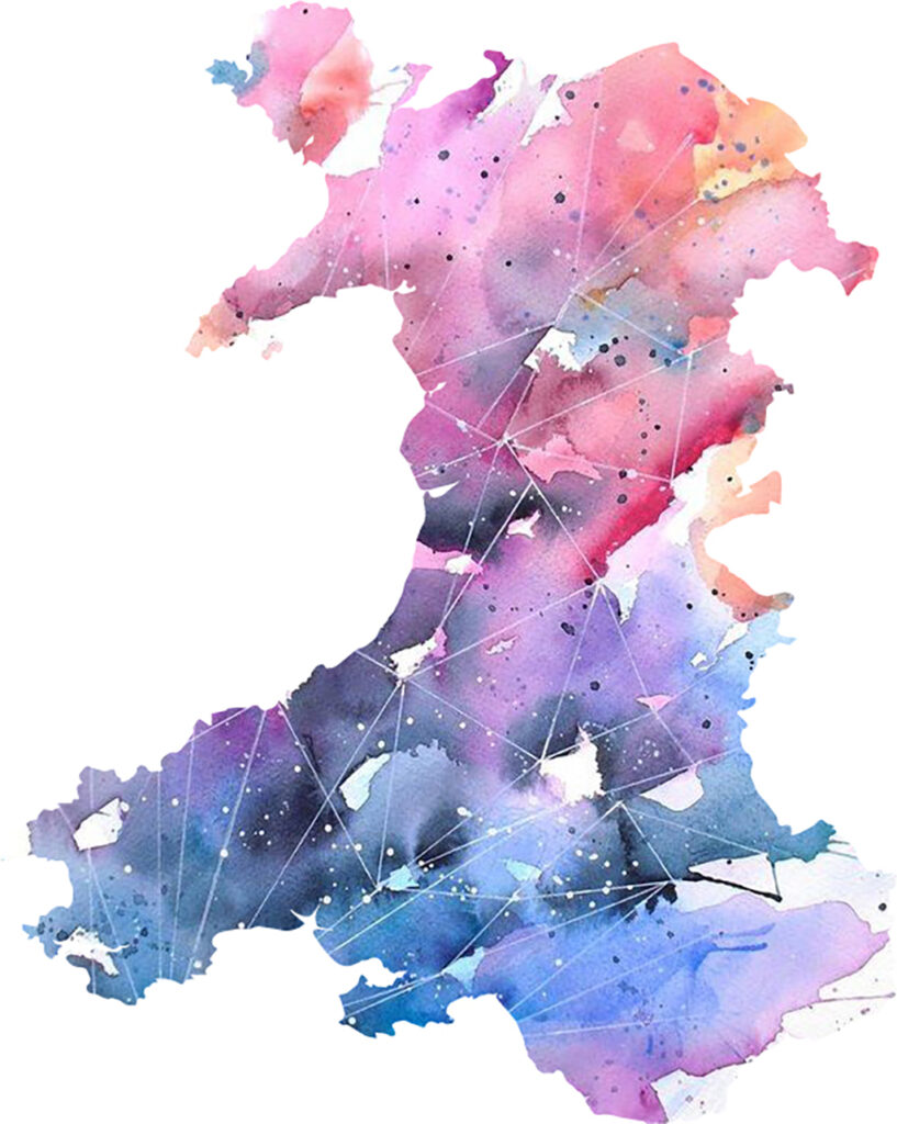
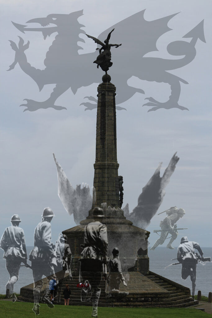
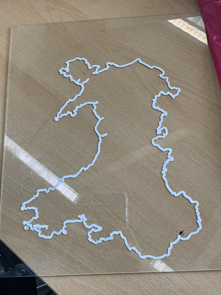
My work explores Wales and its importance to everyone living there. Having been here for several years on holiday, I want to express why I like visiting this country so much. And, by doing this, I aim to show all the different places you can visit.
My ideal audience for this project is people who want to go somewhere different on holiday. In my opinion, Wales fits the bill perfectly, due to its many unique, fascinating and historic locations – all of which I was keen to incorporate into my work. This process was important in my project, because I wanted to show the creative process from beginning to end.
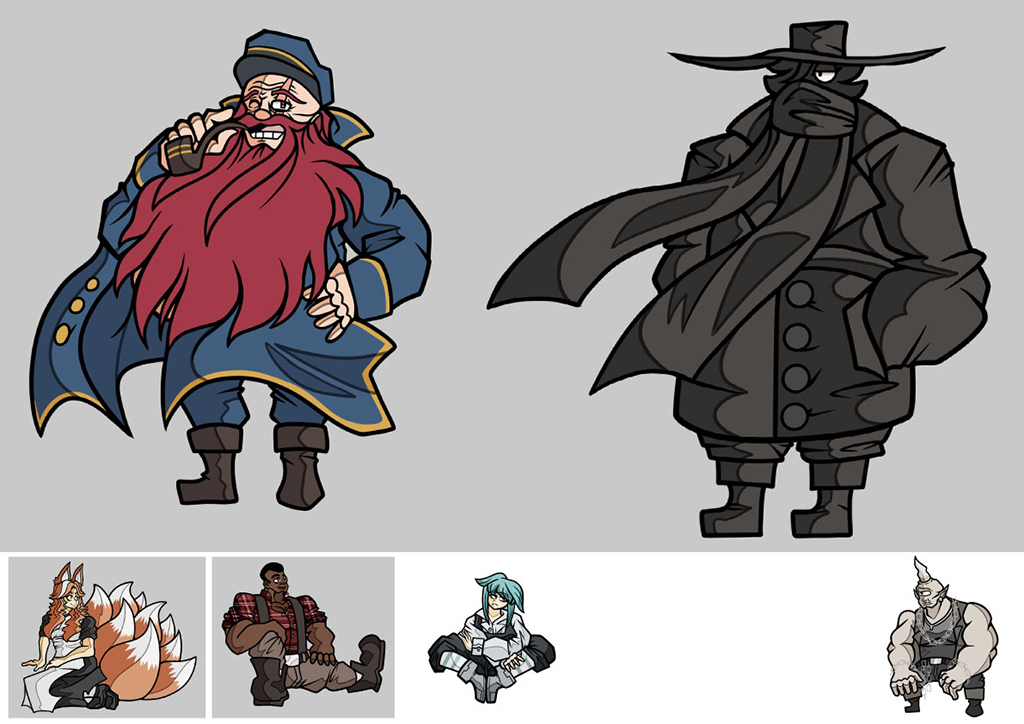
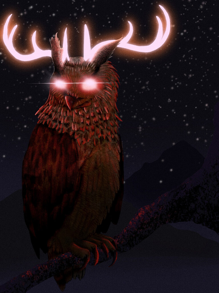
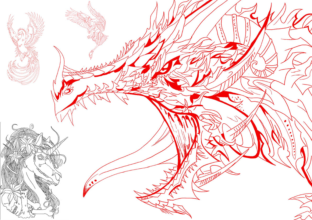
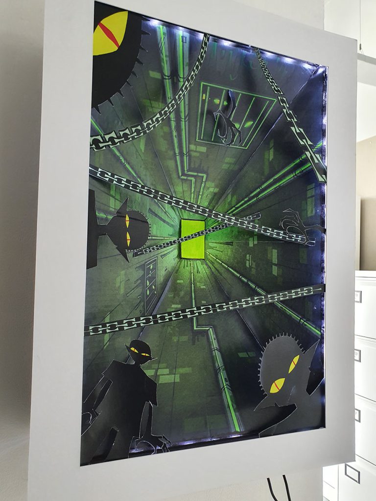
This body of work explores a world within a world that blends magical, mythical creatures with familiarised human forms, seen in everyday settings.
I have chosen a style of artistic presentation that I am passionate about which is comic book/graphic novel/story board format. However, within the development of the project I have explored a range of styles and skills to further enhance my artistic range and ability.
When pondering on this theme a phrase that I find conjures inspiration and images in my head is the famous quote from author, Arthur C. Clarke, who states: “Two possibilities exist: either we are alone in the Universe or we are not. Both are equally terrifying.”
I have experimented and explored a familiar world that the audience will relate to, where mythical creatures take on personas the reader can identify with.
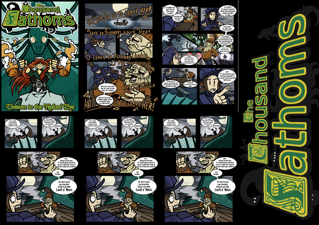
Within the theme, I have brought to life familiar mythical creatures such as The Loch Ness Monster, The Kracken, Bigfoot and a host of other diverse creatures from folklore, presenting them in an innovative, exciting manner.
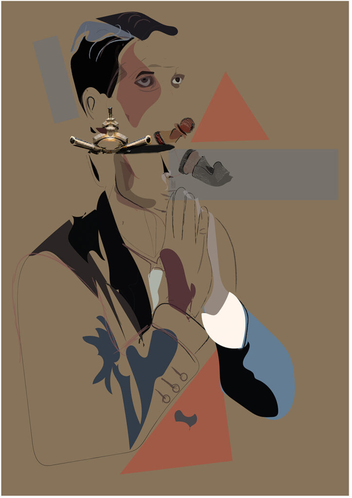
Throughout the course, I have developed a range of digital skills and techniques through my use of the Adobe suite. These are skills which I applied to my year two FMP, based around the theme of Juxtaposition- juxtaposing the narrative of The Queen’s Gambit with the concept of chess being a manifestation of human nature and social hierarchy. Throughout this project, I took inspiration from a range of artists such as Andy Warhol and Loui Jover to develop illustrative collages and graphic designs, which I presented in my own magazine and zine.
My aim for this project was to create digital illustrations and graphics, which communicated not only my concept but also the concept of familiarity to my audience, allowing them to see themselves or situations relevant to their lives within my work. Shown within my digital collages, created using Illustrator and Photoshop – combining my illustrations inspired by the incomplete portraiture style of Sam Green and the collage style of Loui Jover to create a series of collages based around the main characters of the show. Utilising my ability to address my concept, retaining control through chess and manifesting their demons of addiction or trauma into the game. This allowed me to address societal issues such as mental health and addiction alongside the powerful control of chess – the hierarchy of chess. Visually exploring the idea of ‘It’s an entire world of just 64 squares. I feel safe in it. I can control it.’ To inform and support the development of my collage series.
Alongside my illustrations, I also worked with photography and typography inspired by Andy Warhol’s Stills. This allowed me to juxtapose the modernity of my peers with the 50s and 60s time of the show to create simple yet visually interesting pages for my magazine.
A comprehensive, environmentally-based project that has links to tradition and the aesthetics behind packaging design.
Initial ideas for this project came from the book ‘How to wrap five eggs’ which celebrates traditional, sustainable Japanese packaging, known to be innovative and aesthetically pleasing.
The message is one that cannot be ignored – the need for a modern society to be a sustainable society. The fact that 70% of pollution is plastic-based packaging spurs me on to not only consider aesthetic challenges in my work, but to be attentive to the materials on which my designs are printed. Graphic designers must learn and communicate the efficacy of packaging and product materials that are sustainable and eco-aware, such as non-carbon based plant ingredients, algae, seaweed and fungi – materials that have always been used in Japan.
My course has not only given me the opportunity to expand my design knowledge but develop a social and political point of view, which I have used as source material for my ideas throughout this year.

Previous Education: Wolverhampton College
Destination: Employment
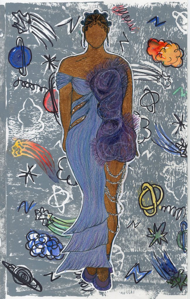
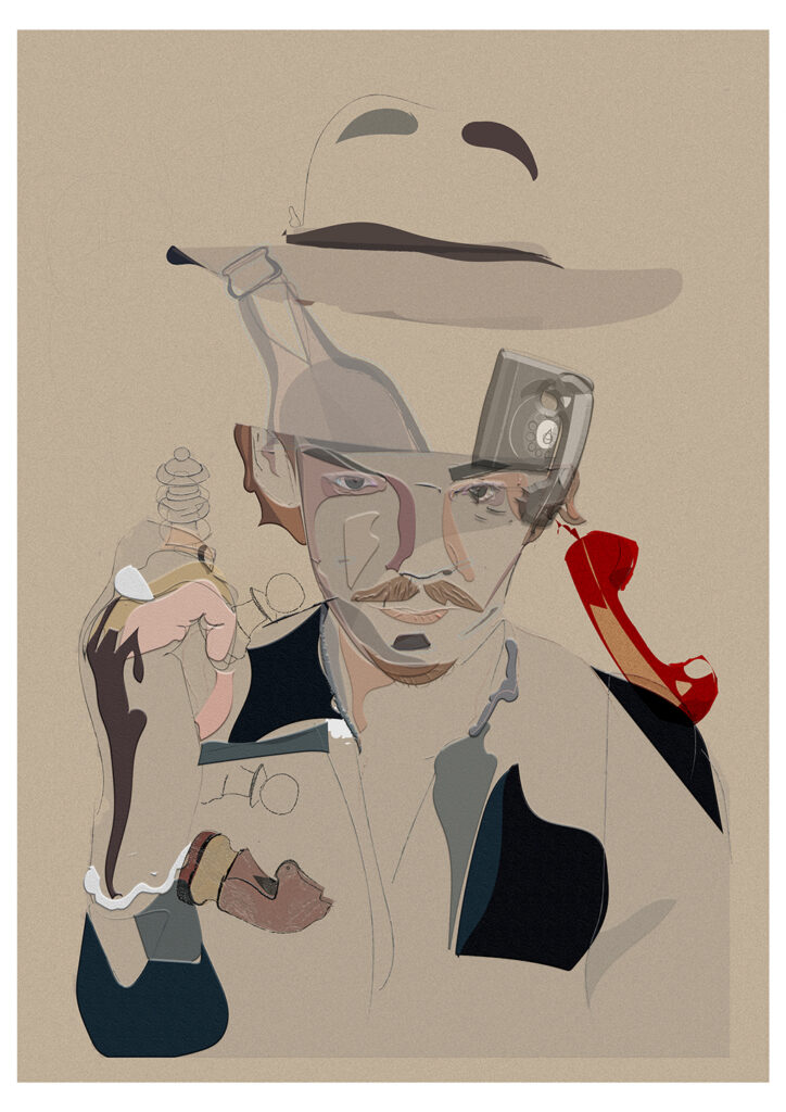
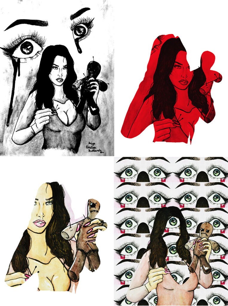
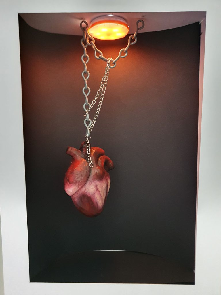
This project developed from a previous theme where I was creating illustrations for tarot cards. Here I have explored multiple dualities, looking at the most powerful approach to visualise two differences within one image. The image included here explores the idea of love and hate, where the voodoo doll makes you imagine someone else’s pain, maybe distracting you from your own. I work illustratively, always trying to produce detailed representations of the objects I’m drawing, and merging different images to create new ideas and to provoke new thoughts. I’m not afraid to challenge expectations and to highlight stereotypes.
Previous Education: Wolverhampton College
Destination: Employment
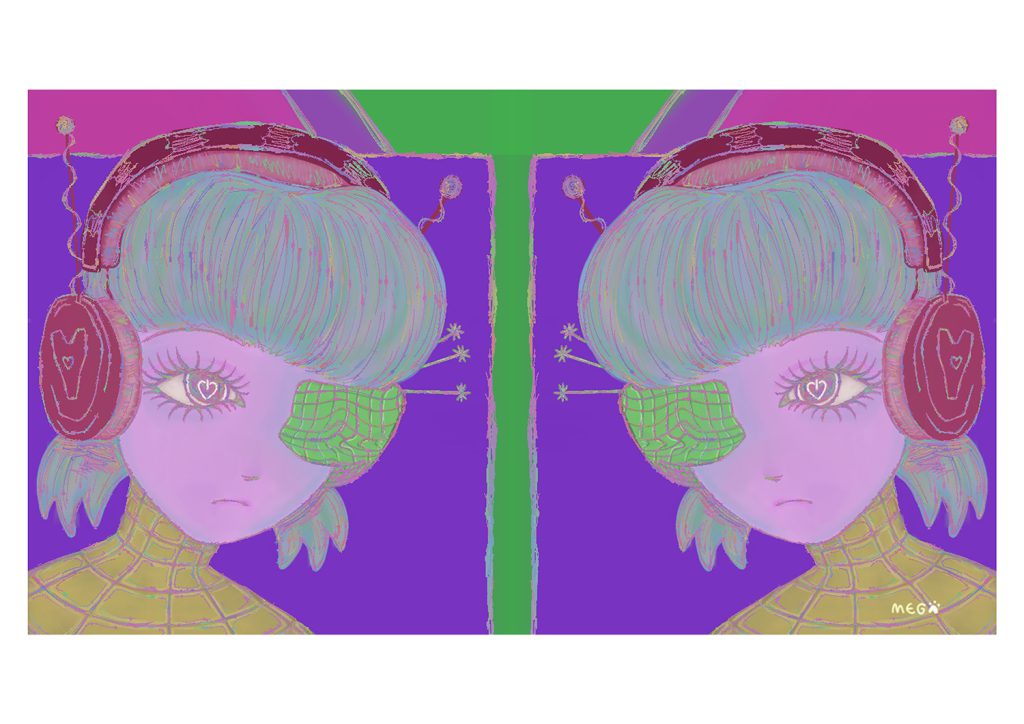
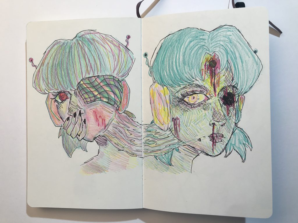
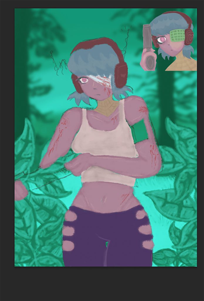
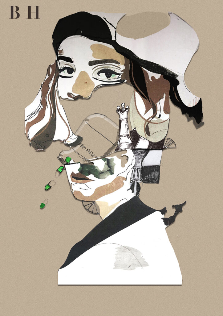
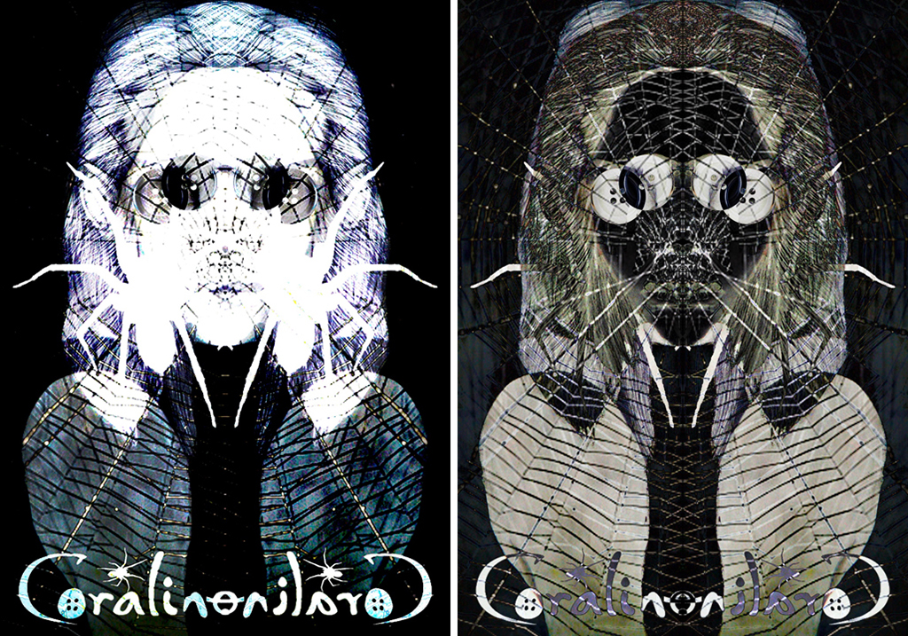
The digitally manipulated work presented here is part of a wider body of work taken from the popular animation titled ‘ Coraline.’ The work aims to reimagine characters from the animation, exploring new colours, shapes and forms. My response to this stop motion animation is entirely linked to the myriad of mental health conditions, that are clearly prevalent in the narrative. Research will focus largely on the descriptions of mental health conditions and how these relate to each character. Illustrators that I will explore include Cath Riley and Dave Mckean, as they directly relate to the story and could inspire both a conceptual approach and drawing/image making techniques. I started the project by analysing social media logos, with the intention of drawing issues affecting teenagers and young people and their mental health. I’m focusing on two characters, Coraline and The Other Mother, from which I will reimagine through drawing and digital manipulation and text. Primary photos have also informed aspects of the final response, such as flames and other symbolic objects.
Previous Education: Pedmore High School
Destination: Birmingham City University BA (hons) Fine Art
My project is based on a reimagining of a popular NETFLIX series ‘Chilling Adventures of Sabrina.’ This ‘reimagining’ intends to provide a new visualization of the Eldritch Terrors. I chose to do a final piece on the eldritch terror ‘The Imp of the Perverse’ as I felt like it has the most detail in the drawings that I did, and I feel like it matches the theme the most out of all of the eldritch terror drawings. The artist that influenced my work is Joyce Pensato based on how she interprets popular and familiar images from cartoons and comics in large scale paintings and drawings through fine art.
Previous Education: Birmingham, Quinton – Four Dwellings Academy
Destination: Birmingham City University – Architecture
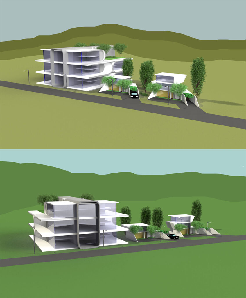
The concept for this project was to produce a vision of architecture that resembles today’s ideas of Utopia. I was trying to achieve this impression of utopia by adding these elements to the buildings I was designing.
For example, nature, that some of us are missing living in some housings/apartments or improved energy consumption by creating bigger windows, to let more natural light in, and use less electricity. The two artists that I took the most inspiration from, were architects: Zaha Hadid and Tom Wiscomb. They allowed me to come up with the ideas for the shapes of the architecture I produced, which their work was the most beneficial to look at, since they presented Utopian architecture. Through my work I am presenting ideas of Utopia, which is the constant want and greed of humanity to achieve something better, but unreachable, in architectural form. From the audience, looking at my work, I would like them to recognize something that is missing in real life buildings, that could be found in my work. If this concept was to become reality it would be made out of concrete, steel, glass and wood for the interiors. Since it’s just a concept, there would be regulations applied, to make it as energy efficient as possible. The apartment building itself, I would imagine being surrounded with a car park and a green belt surrounding it.
Previous Education: PTC
Destination: Foundation Art and Design
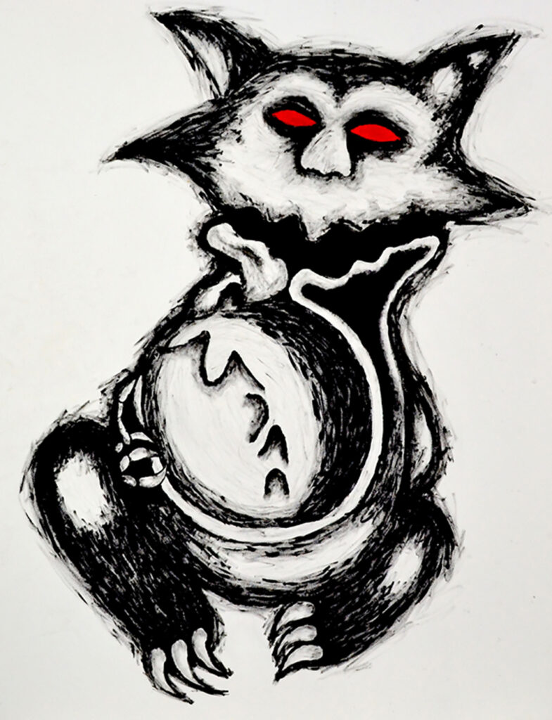
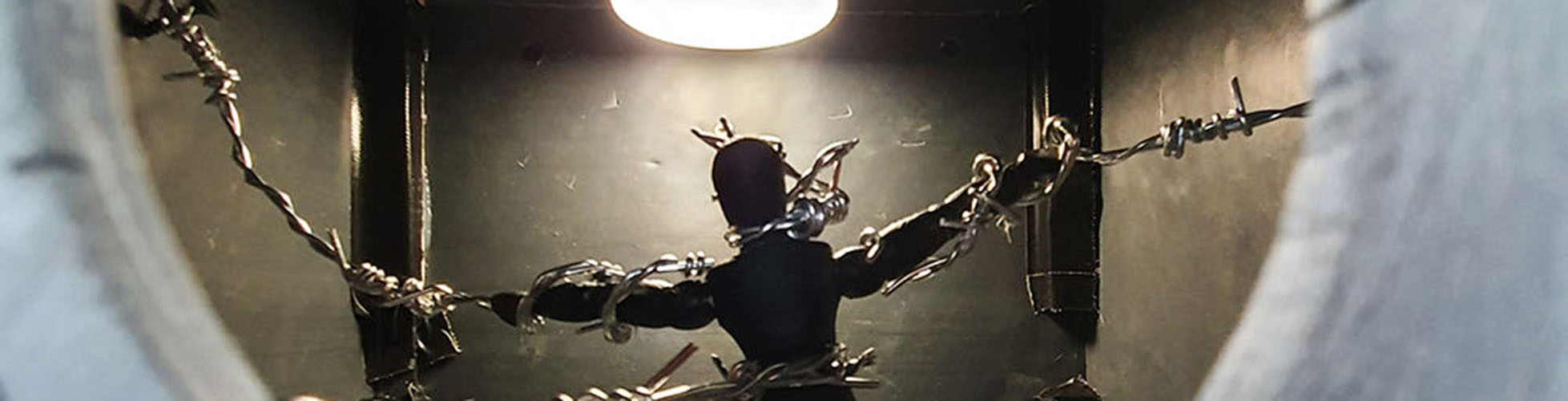
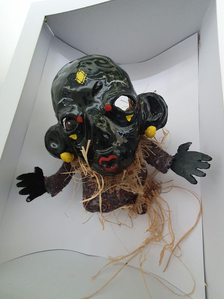
For this project, I had decided that I would create a body of work based on folklore creatures which make people feel uneasy in the place they feel the safest, their own home. For the project, I had decided that I would create four of my very own folklore creatures from scratch, with their own backstories included, as well as a list of what they do, where they can be found. I then produced multiple drawings of each and smaller developmental model sculptures of each. I have designed the creatures based around domesticity, in places such as the bedroom, kitchen and then living room, which are by far the most commonly used places in a house hold. By doing this I will trigger an uneasy feeling from the audience. I had created my sculptures out of clay, as well as using a range of materials and objects which are typically found in the home to further cement my work into the uncanny valley.
I believe that the Chapman Brothers and Clive Barker were the two most influential artists to me and my work because of the specific artworks styles they produce and work in. The Chapman Brother produce heavily detailed models of gruesome and scary scenarios and creatures, it was these models which had inspired me to work in a 3D sculpture medium. Clive Barker has inspired me from the many drawings he had done, ranging from the nightmarish landscapes, to his demented creatures. The creatures specifically were what inspired the design for one my sculptures entirely, as well as attempting to achieve a similar style to his own with my drawings which i had produced of models.
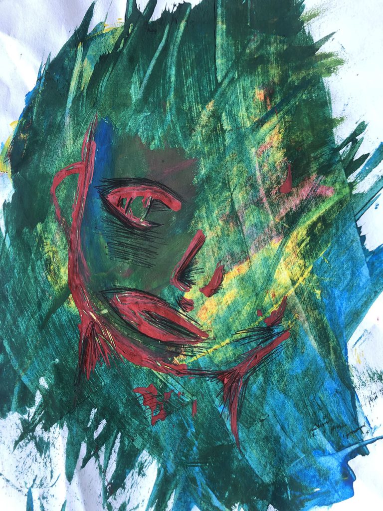
Previous Education: Year 1 Diploma BMET
Destination: Employment
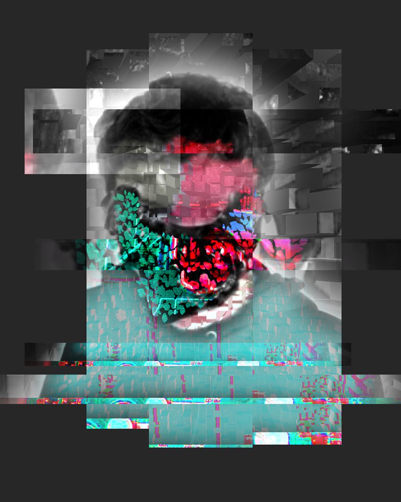
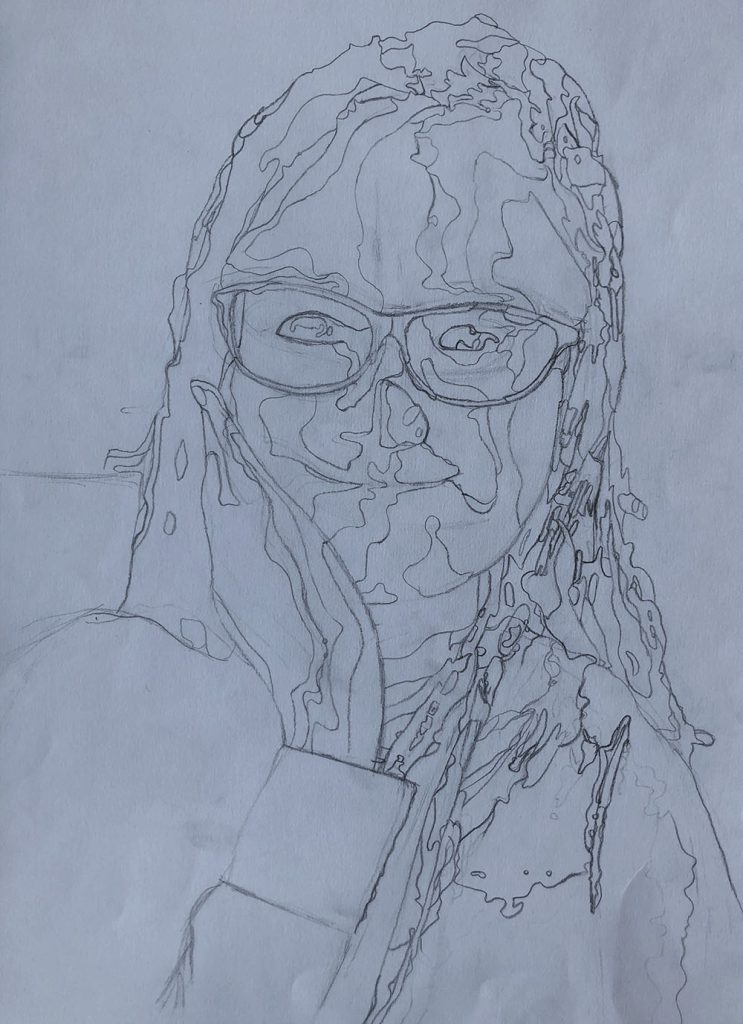
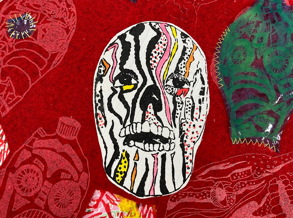
The concept of my final piece revolves around mental health and how it affects people. I wanted to capture how it may look from an inside point of view, seeing what other people may not notice. I used a range of different materials and media to come up with my final pieces. Both digital and physical to produce these portraits. The heavy, expressive brush strokes are designed to reveal the internal ‘mental health’ that we all have. Marlene Dumas and Urs Fischer were my two biggest inspirations. The use of Dumas style of portraits and the way Fischer collages his work together were incredibly significant in my work. I enjoyed the way Dumas created her work using ridiculously small amount of detail, focusing more on the emotion it conveys. Using this and the surreal collage techniques Fischer used in his work allowed me to create multiple different portraits in my own style trying to portray how someone may feel on the inside. I want to communicate how mental health can look so different for different people and it is not just one thing. I also wanted to display how it may look on the inside when someone seems “normal” using something everyone has (like a face) to show this but distorting it into something bizarre, and how mental health makes you feel like you are someone else. I want people viewing my work to think about how mental health affects people, and how many people are affected by it. I want people to think about the effects it has on other people and hopefully start a conversation and to show other people that its normal to feel like this.
Previous Education: The Wordsley School
Destination: Foundation Art and Design
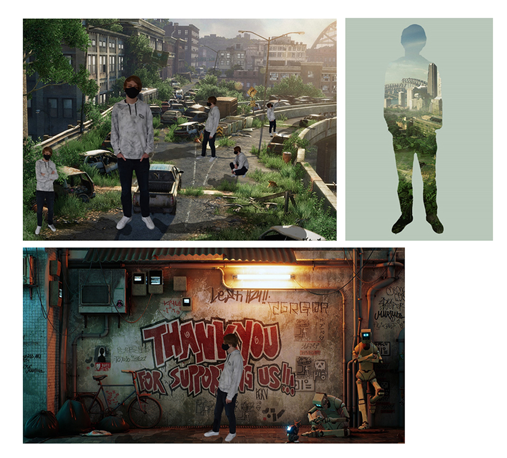
The concept for my FMP was inspired by the past events of lockdown and the global pandemic, inspired by games and films. I was playing and viewing Cyberpunk 2077 and and the seminal movie Blade Runner during lockdown and considered how I could visualise my own dystopian type video game through characters and environments. Throughout the project I experimented with a variety of techniques because of the limitations and time, I managed to experiment with pencil, fine liner and digital programs such as photoshop and aftereffects. The significant artists that informed the work included Syd Mead and Stanley Donwood as their art styles and work interested me the most and had a powerful influence when creating the artwork for the cityscapes. The fine liner drawing technique was inspired by Donwood’s Linocut work and how the images looked after the process was completed. Bold and wavy lines highlighting small details which paired well with Syd Meads futuristic cityscapes that helped inspire my own designs.
Previous Education: Year 1 Diploma Art & Design
Destination: Employment
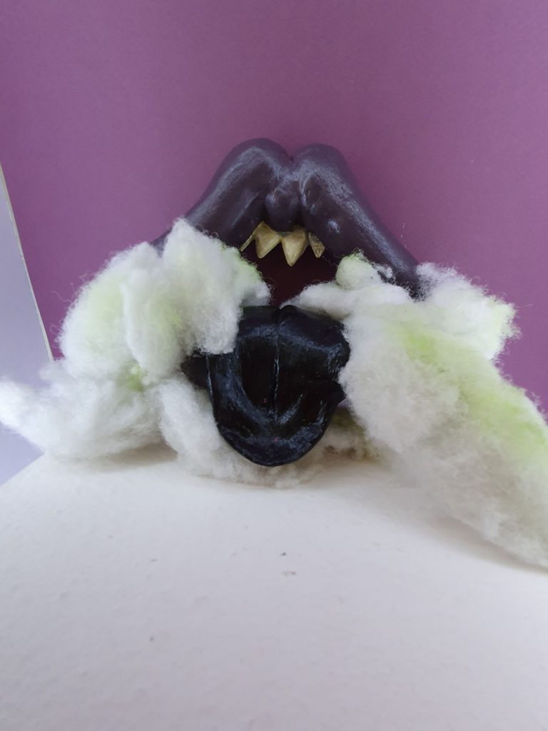
I am fascinated by Gargoyles as their aesthetic intrigues, amuses and confuses me. The two paintings presented here form part of the development stage, where I was experimenting with how to create a contemporary gargoyle, linked to historical ideas yet new and dynamic. Gargoyles were created initially as creative water spouts on cathedrals and historical buildings and were popularised in the 13th century, they were also thought to ward off evil spirits. During this project I want to create my own gargoyles by exploring collage, drawing and sculpture. I want to create artworks that seem monstrous, disturbing or unsettling. I want to exaggerate, and combine disparate elements to form a new and sinister response, using the Gargoyle as a start point. I also want to experiment with using political figures like Boris Johnson, Nigel Farage, Margret Thatcher and many more. I’d like to poke fun of these people by turning them in to a gargoyle sculpture through the art of satire and mockery.
Previous Education: Art and Design Level 1 Diploma, Art and Design Level 2 Diploma
Destination: Foundation Art and Design
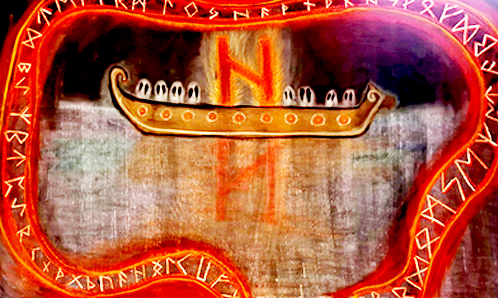
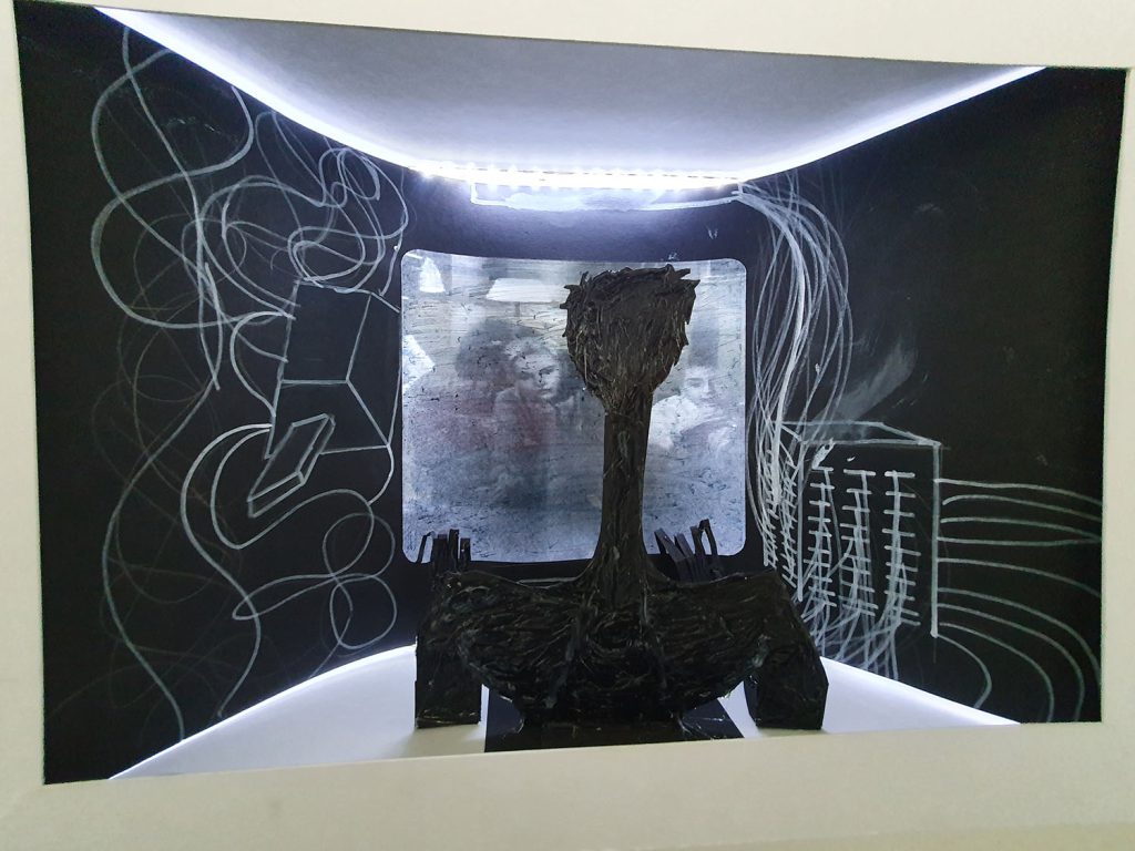
To acknowledge the hindsight of this piece the “Helhiem Longboat” is one that may, at a glance, appear distorted and disproportional creating an underlying sense of uneasiness. This imbalance is, however, intended due to the premise of the piece being a personal recreation of the Viking Underworld “Helhiem.” Therefore the key aspects of this play a part it summarising a feeling that presents a sense of caustic reality and existential questioning. The ‘Sea’ for which is the foundation for this Artwork, is almost metallic in appearance with streaks of dark blues and purple to contribute to the overall unfamiliarity of it all. The ghostly Sea dissipates into the infinite black void and instead of having our usual Sun shine brightly in the centre, the horizons only source of light is an off-centre Longboat, carrying the dead through the Abyss. The longboat is reminiscent of historical design based on the ones we have recovered in the modern era, with the Ghosts of the long dead being ever watchful as they stare into darkness for eternity. The giant burning effigy is actually one of the Viking “Runes” which each symbolise different specific aspects of life in a general sense, with this one being the rune of destruction, hence why its the sole shining light in the infinite dark of Hel, as destruction, chaos and death all unify under one conceptualization of this specific belief on the afterlife.
Other than the lonely boat with the burning rune, the misty Sea of Helheim shows us nothing, but the reflection of the damned in the murky waters. Surrounded with an expanding and contracting banner of Runes that encircle the fate of the lonely longboat. The Runes in their design are inspired by the rune stones that exist all over Scandinavia which have the same encircling banner that represent an esoteric story and meaning.
Also note how the Runes don’t encircle the entire piece, this is intentional and whilst it may not be entirely obviously at a glance, this is done for the metaphorical aspect. The Runes in Viking Lore dictate our fate, and the inclusion of leaving a gap at the bottom of the piece is to signify a change in fate. Weather that may be a way out of Helhiem for the lost souls, or just further into the darkness, it shows us things can change and our fate can always change, provided we go on the right course.
This piece was made by utilizing Blackboard paint and different colours of Chalk, the reasons for doing so can be incorporated into two different answers: Number one being the textures and blending that are beneficial with using Chalk provide strong colourful outlines whilst also being able to develop almost transparent effects, this was useful in the creation of the ghostly Sea and the encircling Runes. Secondly, I was inspired by an artist called Tacita Dean who specializes in Chalk pieces with an unparalleled attention to detail. I also think it’s worth mentioning that Tacita Dean has done several Chalk pieces with giant boats in the water clashing with waves and being blown around in the wind, completely different from my own work of course but was ultimately the inspiration for using Chalk in my final outcome. I’d also like to mention that each and every other artist I’ve researched for the project has been beneficially inspirational not necessarily in terms of context (Besides the ancient Rune masters, Föt and Asamund who inspired the encircling runes) but in terms of colours and proportional value, not to mention mythological value and how to translate the ancient mythological Norse poems into decipherable art like many have done before me and achieved it with such a high standard.
Previous Education: Year 1 Diploma BMET
Destination: Employment
For this project, my idea is to create drawings of characters which embody an exaggerated emotion with different designs for each one in an anime/ manga style. I also looked at different career roles which may have a good link to the emotion, for example a butcher could represent rage or anger, and a doctor could represent kindness or joy. I wanted to implement special weapons or half human hybrids which have links to certain job role. I also intended to make characters which embody aspects of a mental illnesses such as depression or anxiety. I started by researching emotions and what different types there are to help me develop with ideas. I will then research a range of artists such as Edward Munch and Manga artists such as Sui Ishida. I experimented with drawing to create characters and will also use photoshop and procreate to add colour and detail. I looked at backgrounds for these characters and used painting, collage and photography. The enduring connection between art and mental health and wellbeing is well documented, especially where artists and illustrators have attempted to document and communicate their own experiences of mental health struggles and or insights. Hollywood may well use caricatures and stereotypes of mental health to provide a character with an edge, or belonging to a subcategory or subgenre within society, which also happens in anime. I also felt it might be useful to provide a brief summary of the difference between anime and manga, as explained in the following quote, ‘Put simply, manga is the term given to Japanese comic books and graphic novels, whereas anime is the name given to Japanese animation. … Although both tend to be considered genres in the West, in reality they are a description of how the content is produced.’
Previous Education: Pedmore High School
Destination: Birmingham City University
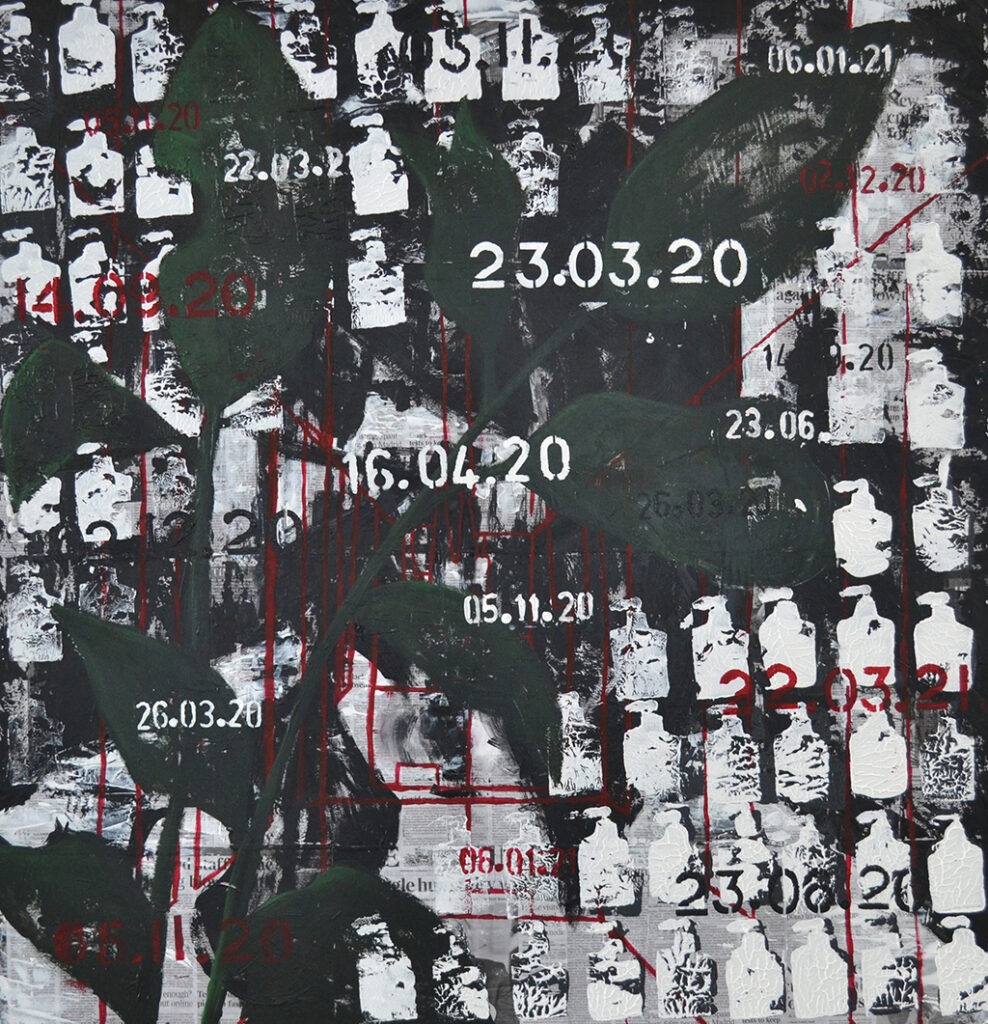
My project theme is ‘Timelessness’, and during this project, I have used various mediums to express my emotions. I choose timelessness as my theme because it associates with my sentiments towards the pandemic. My aim for this project was to create a visual representation of how I felt about the lockdown and covid-19. I wanted to express that we as people are just walking another path, and when it ends, we will only walk another. My concept is all about Covid-19 and the problems and issues it has brought to people’s mental health and stability. In my eyes, I see covid-19 almost like a curse, it’s like we as a society are getting punished for taking advantage of things, we would usually be able to do every day without cost; for example meeting up with friends or going shopping. Especially in the modern generation full of technology, we seem to detach ourselves from the nature around us; Ignoring the beauty and tranquillity behind the natural cycle of life as we stare at our digital screens. It’s only now that some people have noticed how much we miss the little things in life, and how our timeless development in advanced technology has almost, made us blind. We can only miss something until it’s gone and I believe this ‘curse’ can only be broke until we all notice our senselessness towards the little things and work together as one instead of multiple different groups.
For my final piece, I used soft pastel, graphite, newspaper, and acrylic paint. My backdrop was a collage of newspaper pages about covid and lockdown. I decided to do this to reference what my concept is about but also create an intricate background. I used a stamp I made out of cardboard to create an alinement of hand sanitiser prints across the painting to refer to repetition and the rise in PPE (Personal Protection Equipment). My final piece was crowded and manic because I wanted to communicate how stressful and confusing everything has been.
Benjamin murphy was someone I found on the Saatchi gallery website. He was hosting a new exhibition during lockdown called antisocial isolation, which was intriguing. My acknowledgement of the upcoming exhibition ‘antisocial isolation’ lead to my discovery of his work. I was interested in his plant charcoal drawings, and I used them as inspiration throughout the project. My concept for my project was to create dark and lifeless drawings of plants and nature to communicate how time and life has almost stopped because of lockdown; this ultimately leaves everything to become dull. Benjamin Murphy’s charcoal drawings was a great start point for my project, and soon enough, I was creating/developing this idea into prints and even paintings. Franz Kline was another painter that got recommend to me, his work was bold and defined, and that factor inspired me to create black acrylic paint paintings and prints. I didn’t work with abstract but instead aimed to achieve the dark, bold and thick line-work he possessed in his abstract paintings.
The second year commenced with COVID 19 measures suggesting that we had been through the worst and that the educational landscape was returning to normal. And so, began, for many second years, the creative boot-camp of refocusing upon finding their creative pathway, exploring progression options and getting their work portfolio and exhibition ready. This was no mean feat, considering no-one could be sure what potential impact remote-learning and unprecedented assessment procedures may have had upon their social and skills development.
It would appear that the previous 18 months has made them into more curious and questioning individuals. Their return to studio has allowed them to embrace the physical space and access the materials, techniques and processes that ‘lockdown’ had denied them. Released from their confines, they had rediscovered ‘beginner’s mind’ and as the year progressed their work became more personal to them and showed us qualities we, and perhaps they, hadn’t seen before.
With so much of their educational time having been achieved through the medium of near-instantaneous digital communication and social media platforms, there has perhaps been a resurgence in the analogue. What is clear is that art students communicate most effectively through their creative practice. It is a sincere, insightful and effective language that society needs to experience again.
Martin Doyle, lecturer, visual arts
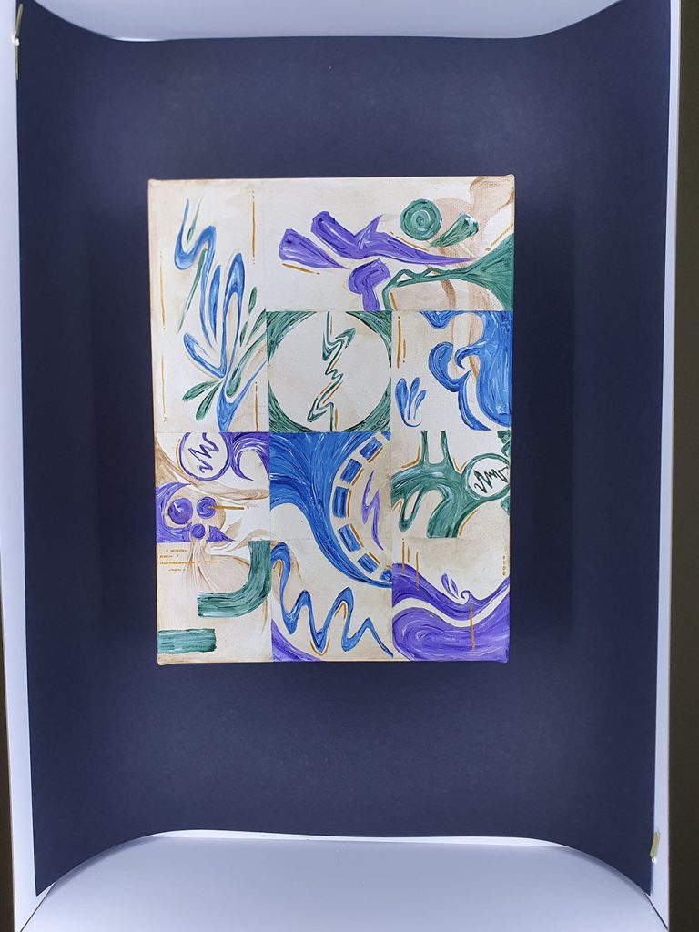

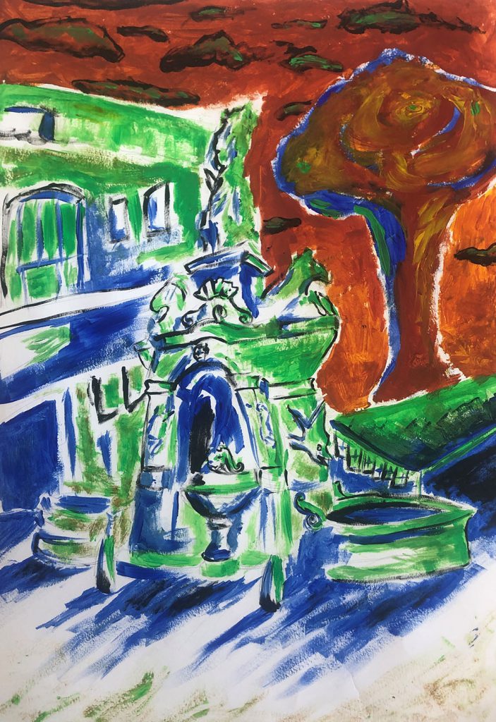
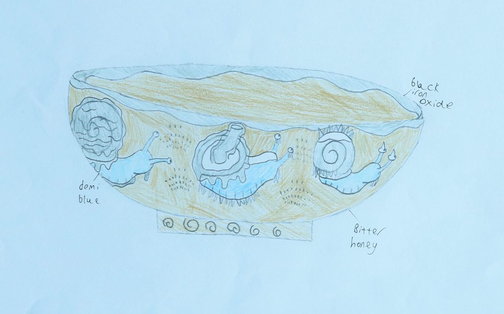
This is a painting of Dudley Fountain. I used greens, blues and reds to create a contrast.
In September I would like to progress to Level 1 Media, because I want to learn how to do video editing and animation.
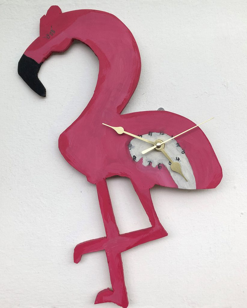
In this project we are asked to design and make a product. I decided to create a Flamingo inspired clock.
When I finish this course, I will be progressing to level 1 art and design, I am looking forward to learning more about different artists and developing my skills in tonal shading.

I have been exploring tie dye techniques, it’s fun to do and its relaxing. I like how the dye stains the fabric in an original and unique way.
In September I will be progressing to level 1 media as I want to learn about digital design and photography.
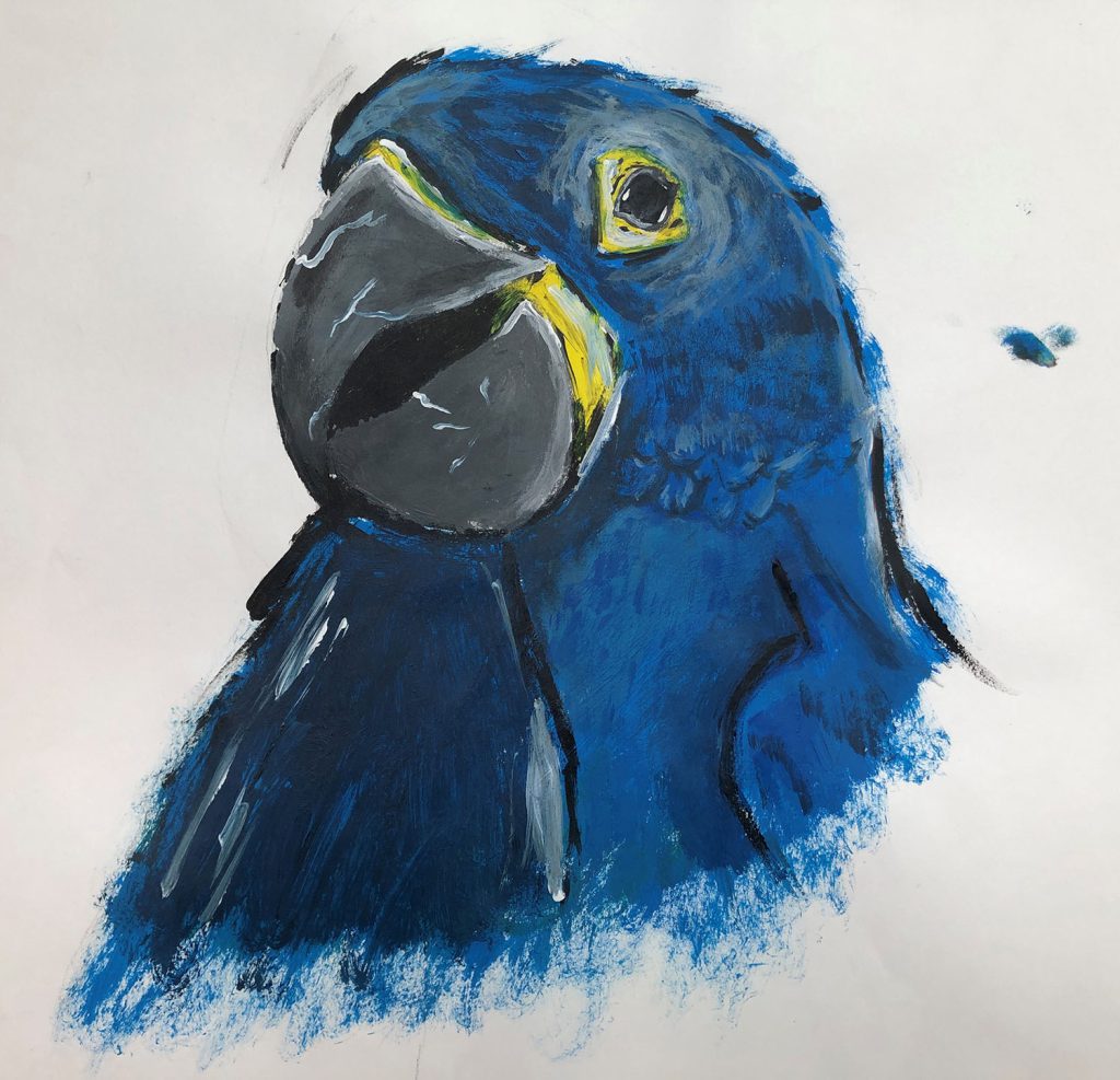
This project is titled ‘What do you care about?’. I choose parrots because I like how colourful they are and I wanted to make people aware that some parrots are endangered. I decided to use acrylic paint so I could create the right colours of a parrot.
Next year I will be progressing to level 1 art and design because I want to be a tattoo artist in the future.
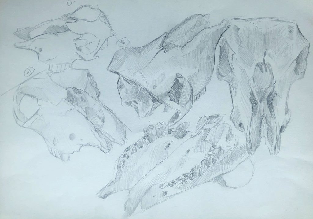
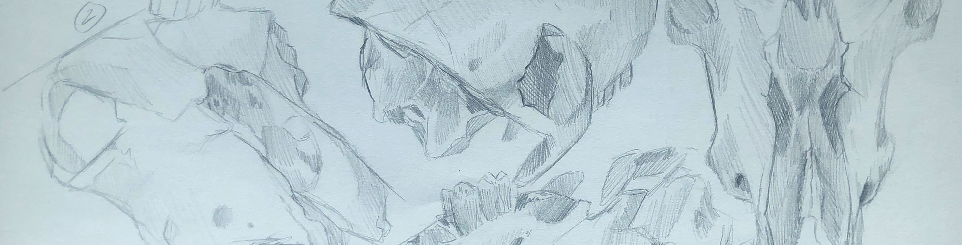
This is a study of a cow skull. I chose this because I enjoy oddities and taxidermy and find the form of skulls interesting. I used a hatching style to add depth and texture making sure to add a sketch from every angle to properly understand the subject. In September I am progressing to Level 1 Art and Design.
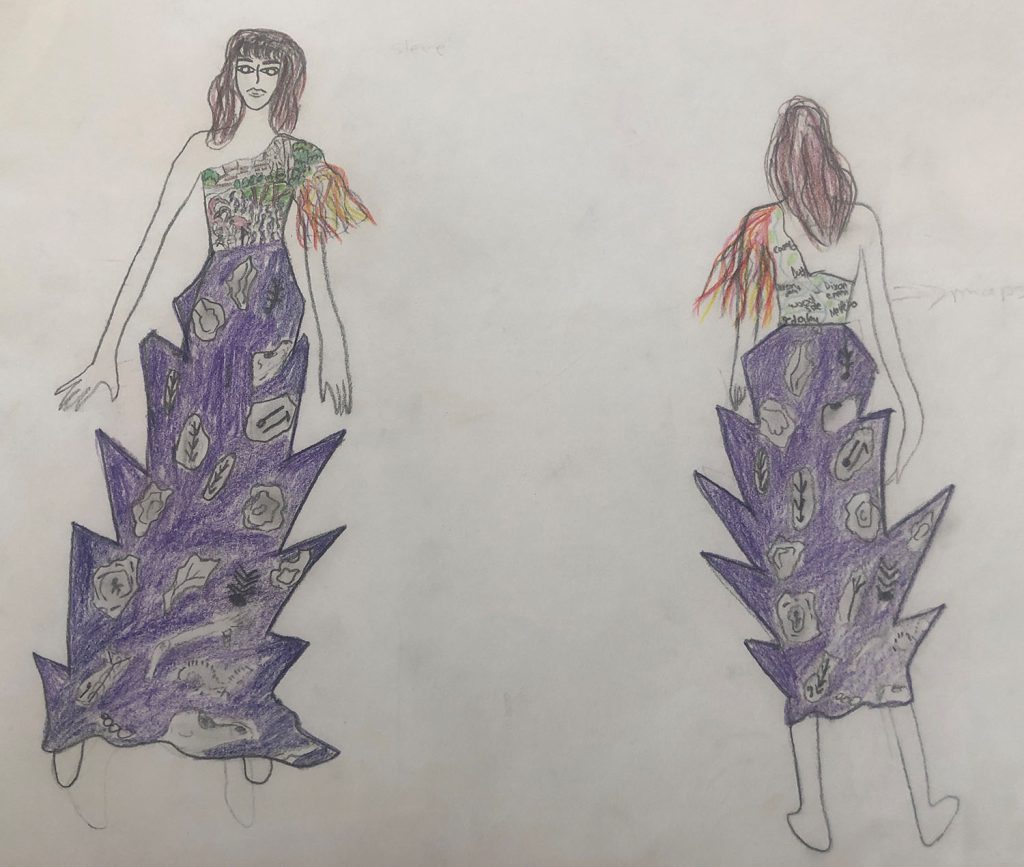
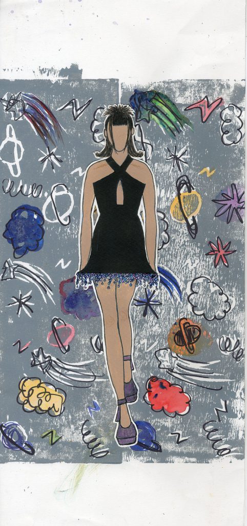
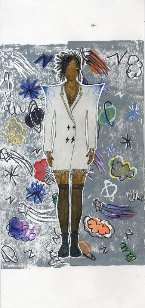
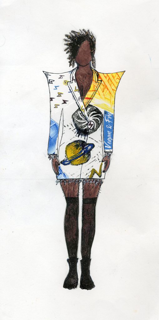
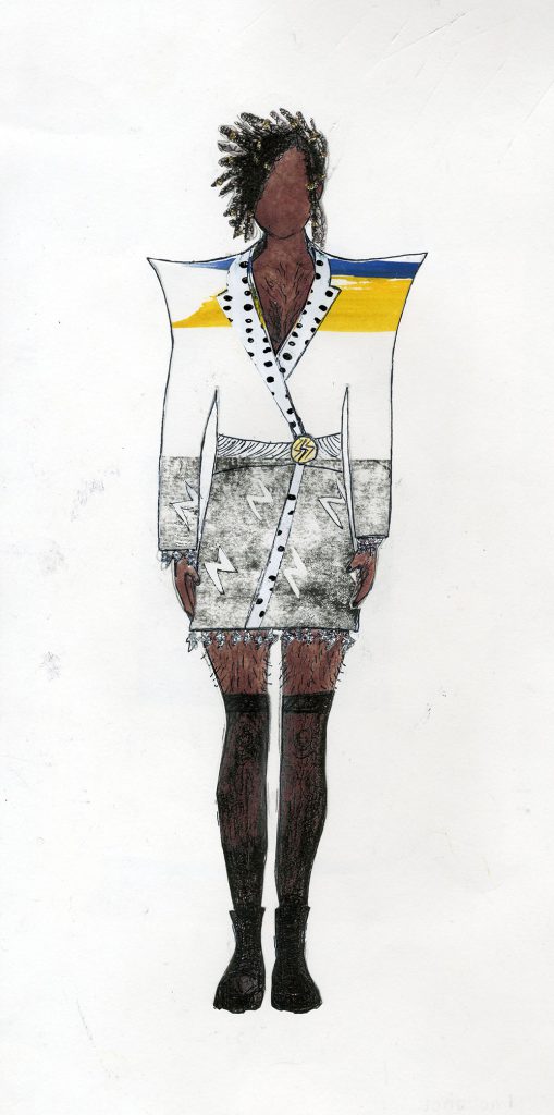
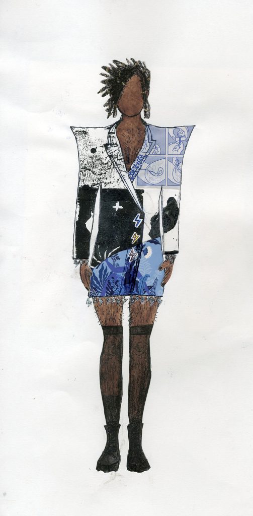
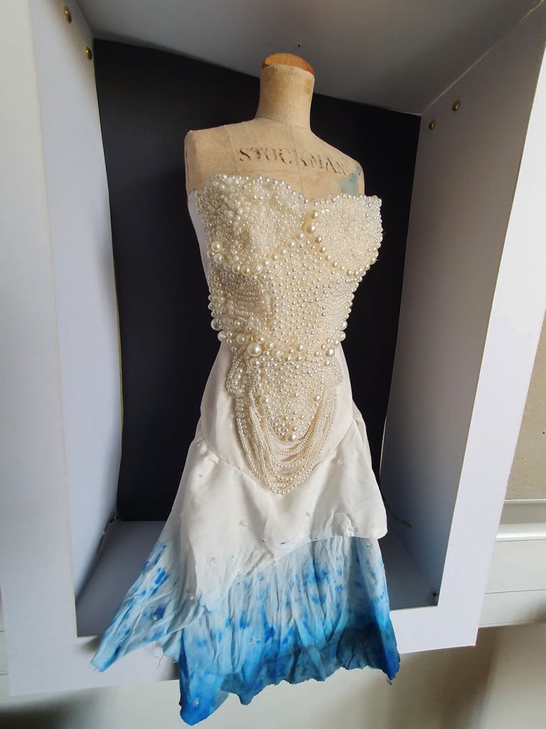
This project was called ‘Design and make’. I designed a series of dresses inspired by Dudley, its history, and people. I tried to do something special and somewhat difficult and to how capable I am. I searched the web on various topics about Dudley Town, for example: fossils, animals from the zoo, statues and maps of the Dudley. All of these inspired me to design this dress.
Next year I will be progressing to Level 1 vocational media as I want to continue to develop my digital skills. In the future I want to work as a fashion designer.
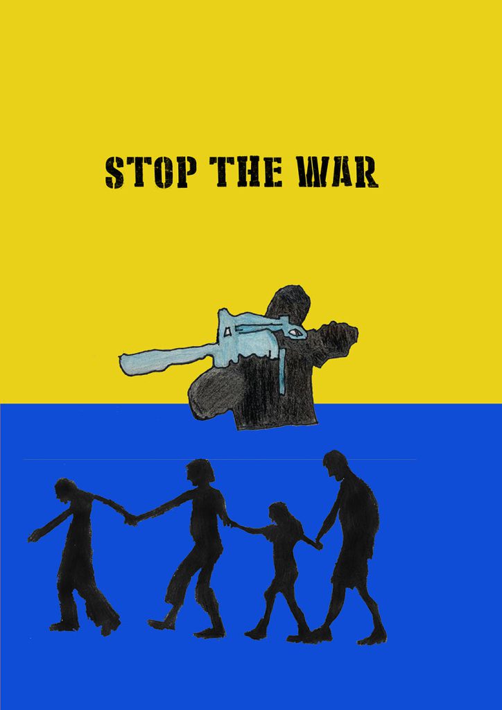
This project is called What do you care about? I choose the war in Ukraine. I made a anti war poster using hand drawn art and photoshop.
In September I will be progressing to Level 1 Vocational media because I want to learn how to do animations.
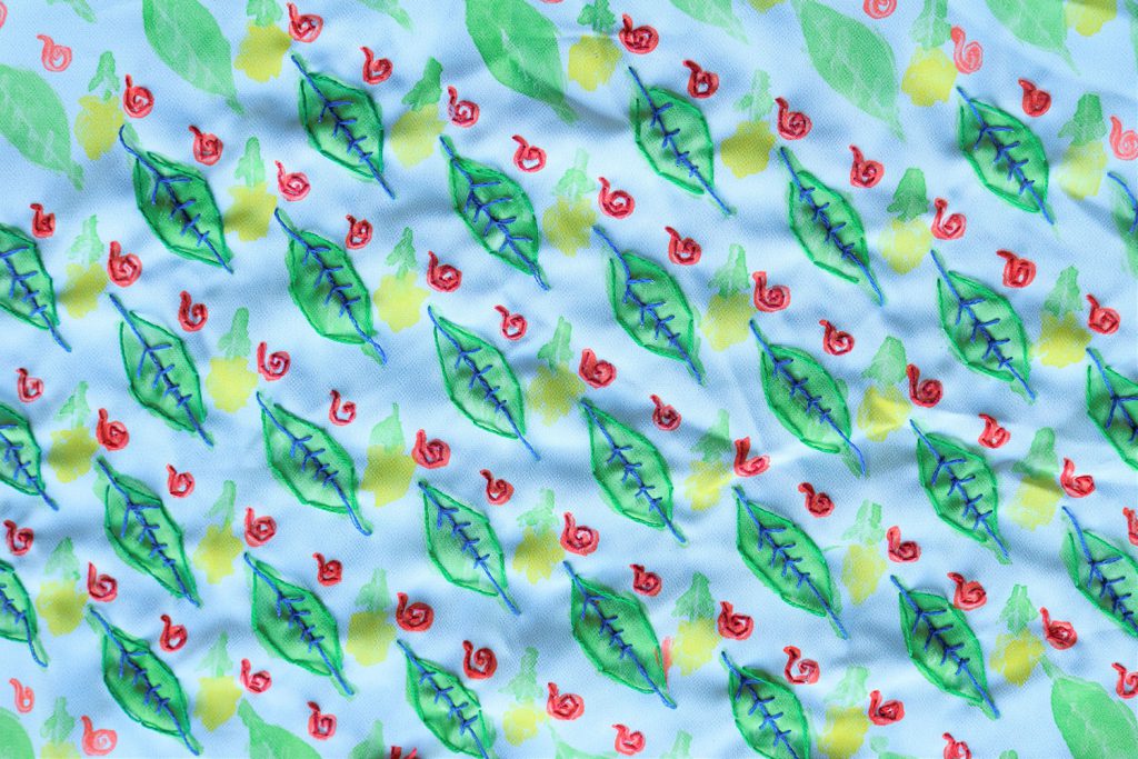
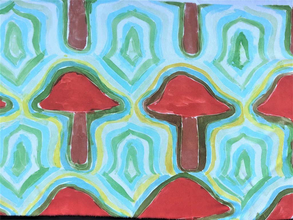
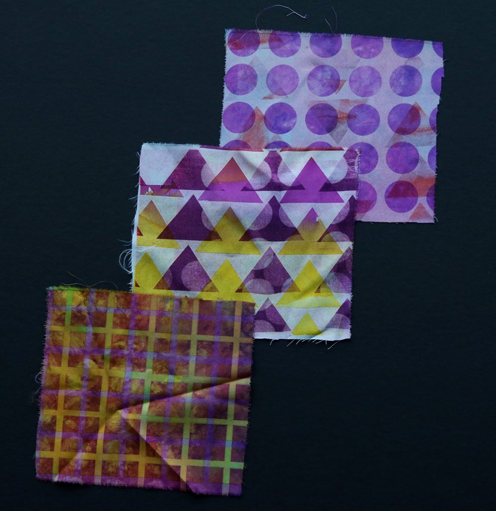
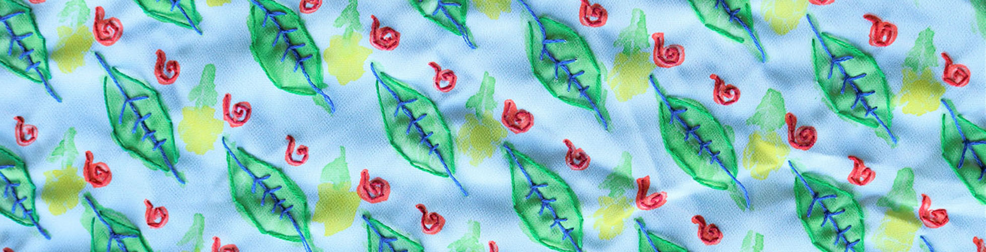
A-Level textile design encourages students to work with a wide variety of skills and processes across the fields of textiles, fashion and interiors. This includes printed textiles, constructed textiles, embroidery, fashion construction, weaving and fabric manipulation. Students are introduced to different techniques which they are then able to develop into personal outcomes. This can be clearly seen within the variety of imaginative outcomes produced by the students.
Learners are encouraged to explore both historical and contemporary techniques and to support their work with research into a range of suitable artists, designers, and trends. They are prepared for industry or Higher Education and all the students from this year are continuing their education by pursuing degrees in fashion and textiles or progressing onto the art foundation diploma course.
I hope that you find the work inspiring. I am very proud of what the learners have achieved this year, particularly due to the additional challenges that Covid has presented.
Clare Buchanan, A level Textile Design Tutor
Congratulations to all of the 8 students in GCE Product Design this year for being a brilliant group and keeping motivated throughout lockdown. Myself and Richard have enjoyed teaching, supporting and spending time with you over the last two years. You have taken the timetable changes in your stride and made the most of online learning sessions. All of the students have produced a wide range of creative and innovative design solutions to user-centred problems working with real life clients. I want to give special thanks to Darren Roberts and his talented welding students for technical assistance with 2 of the projects. Also big thanks to Horace Dennis and Simon Morris for feedback on the design concept for an extension to Dudley Sixth. We wish all of you the best at university and in your chosen careers.
Adrian Eynon, GCE Product Design Tutor

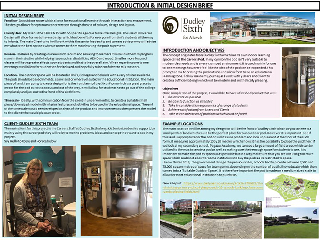
Amman decided to look at how he could design an outdoor educational space as an extension to Dudley Sixth Form that could be used as a multi-purpose environment for education and relaxation. He carried out thorough investigation and gained useful advice from Horace and other members of Sixth form staff to guide his thoughts.
The architectural concept was designed for a specific site by the side of Priory Villa in front of the Sixth Form block. The prototype model was built to 1:100th scale using a range of relevant materials to represent the actual building. This is an outstanding project and Amman has worked exceptionally well to create very high standard CWK and finished prototype model. Well done!
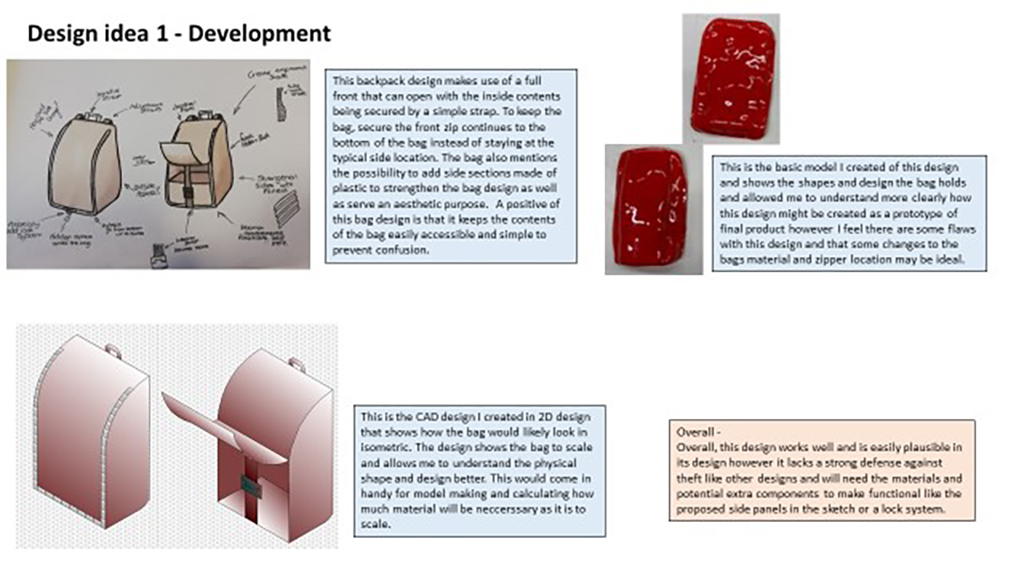
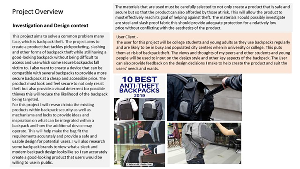
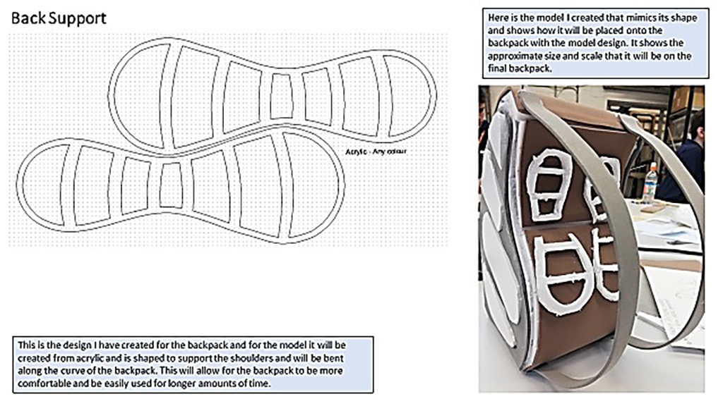
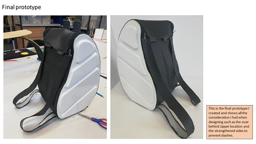
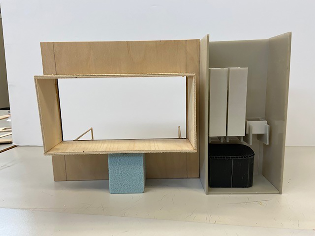
Joshua identified a need to improve the design of ruck-sacks as there is a high level of theft suggesting that current designs are not designed with security in mind. He investigated existing products, carried out tests which led to design sketches and small scale model-making. He made some excellent small scale detailed models and a 1: 5 final prototype from foam board.
What is impressive is that Joshua decided to make the full-size version from similar materials as may be used in a commercial version. He worked carefully to produce detailed moulds to vacuum form for the sides. The completed model reflects his high level of attention to detail and the end product is excellent. Well done!
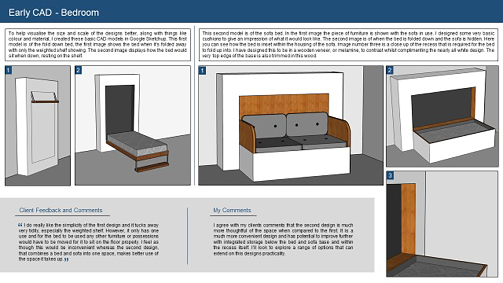
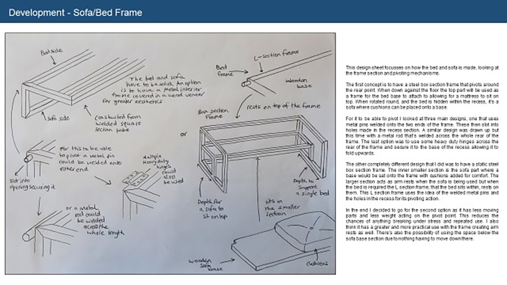
Oliver decided to investigate modern solutions to urban living. He researched into the area and saw how the cost of living had increased and there is a trend to live in smaller spaces. This led him to look at designing this efficient and stylish interior. The aesthetic style is based on minimalist and modernist design and architecture influenced by Japanese interiors.
His brother, a University student acted as the user/client for feedback for evaluation. Oliver worked on a 1:10 scale to produce a realistic model using relevant materials and processes. Many of the components were laser-cut and other parts were made by hand with great skill. The final model is of a very high standard and combined with the CAD modelling represent an outstanding project. Well done!
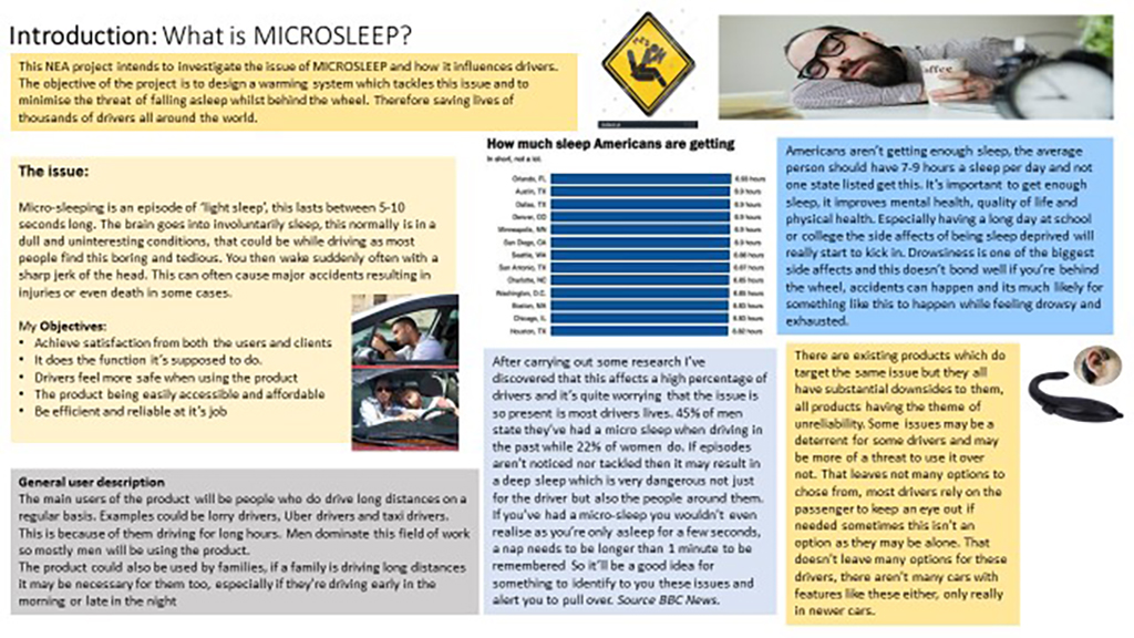

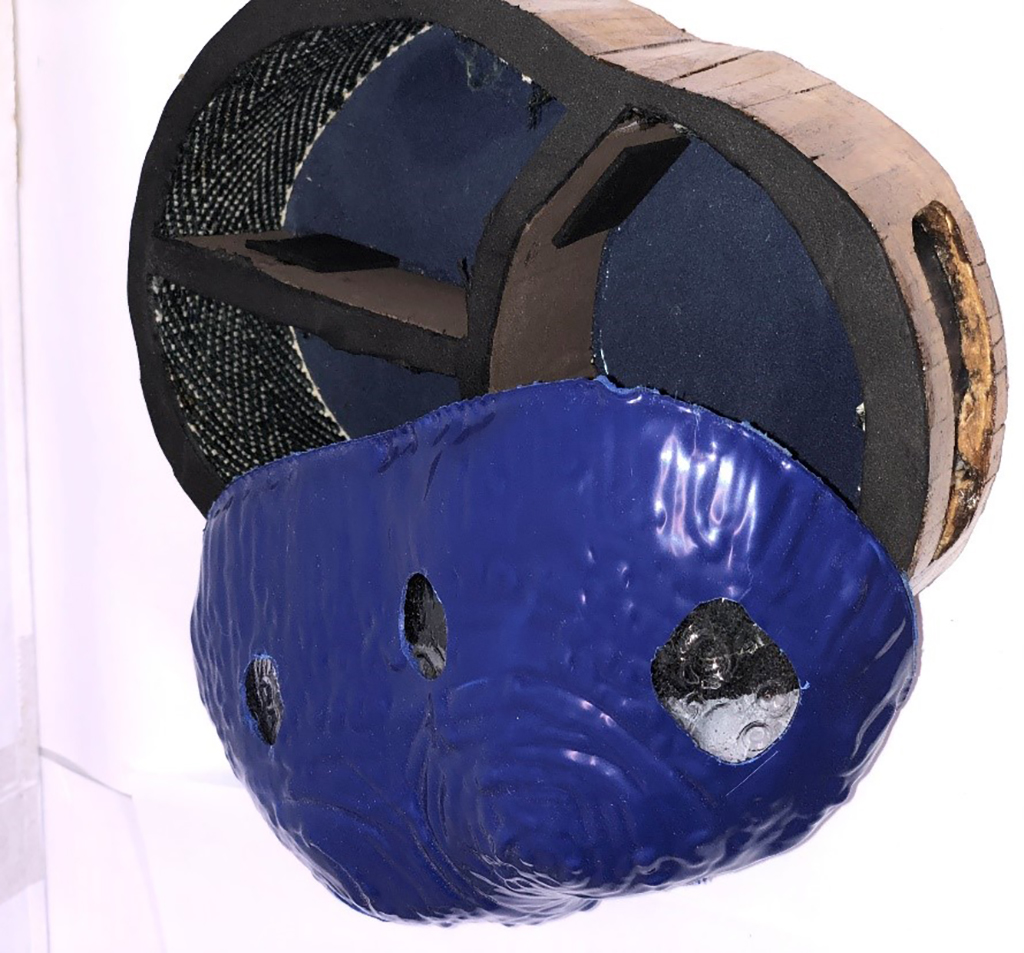
Alex has tackled the serious issue of Micro-sleep. This is when drivers can drift off, become unconscious behind the wheel, potentially resulting in serious or sometimes fatal accidents. He identified this design problem in a 1st year project and decided to extend it into a much more detailed investigation.
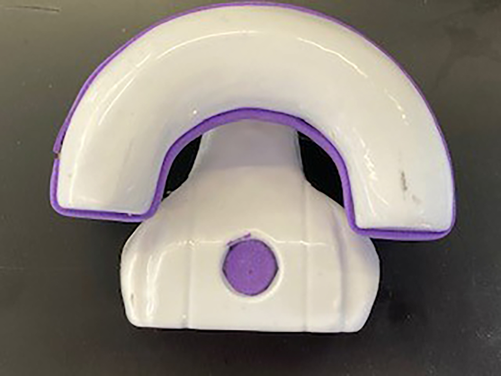
This year he created two devices including a smart wristwatch and a dashboard mounted camera-sensorwhich he has modelled full scale and also made a carry bag to contain these as a finished product. During the research Alex realised he also wanted to make the products more customisable and based his designs on the style of Memphis with bright colours and patterns. This is a good project which has tried to tackle a serious challenge, creating aesthetically pleasing products. Well done!
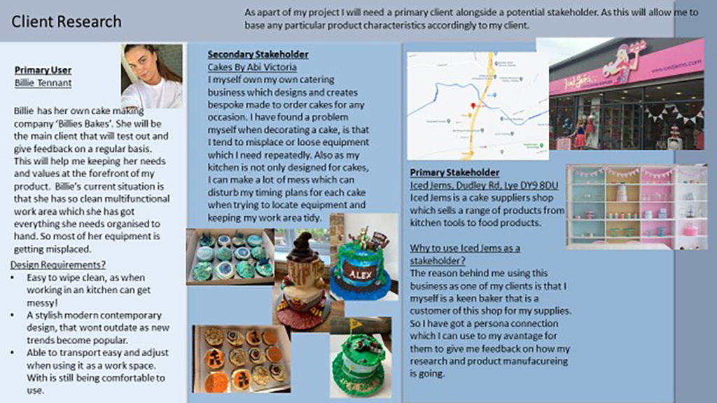
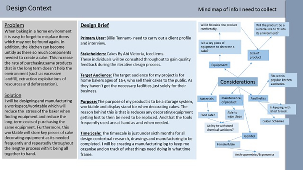
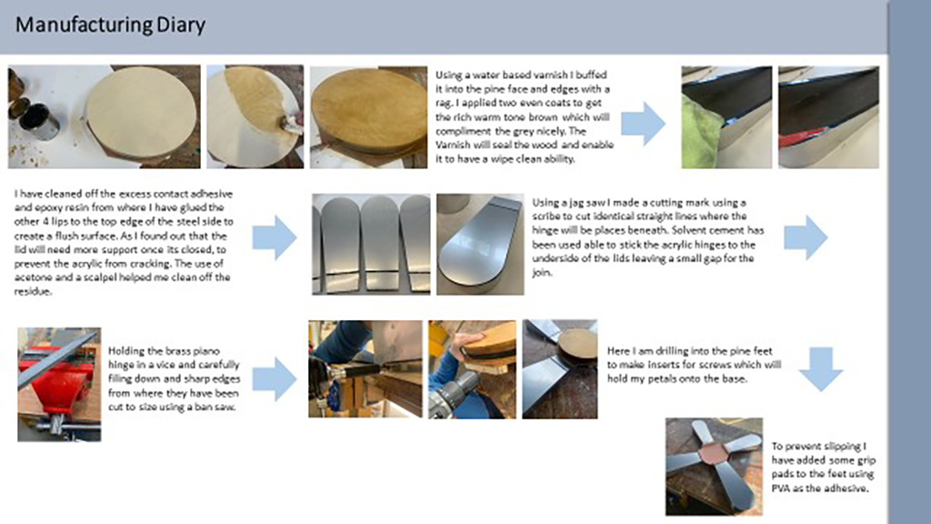
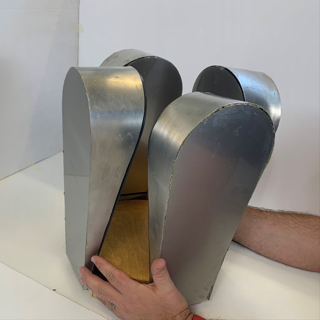
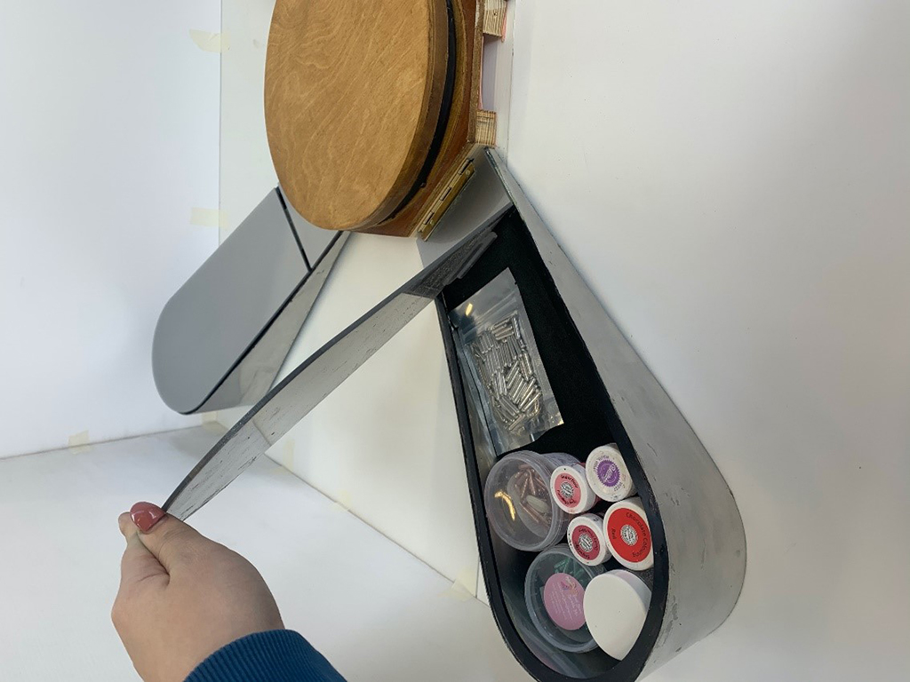
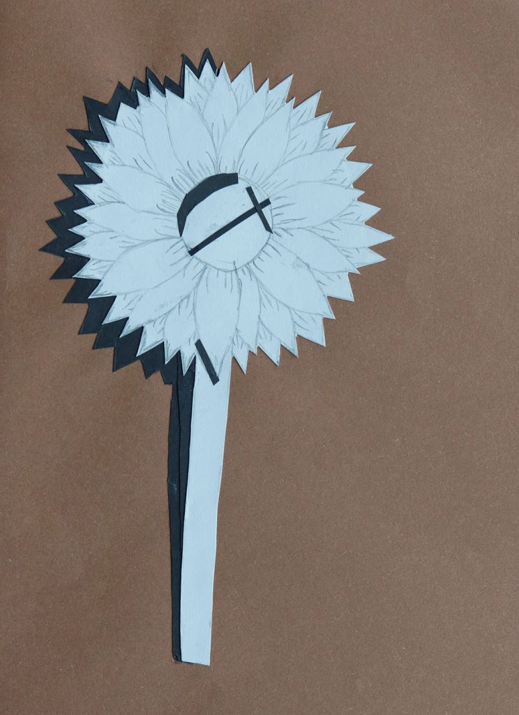
Abi is a keen amateur baker who runs her own successful cake making business. She identified a need to design an improved bakery storage unit for equipment and also included a display stand for her decorated cakes.
She has created a design that combines form and function based on the shape of the stylised petals of a flower. The storage unit holds equipment effectively and is also a very aesthetically pleasing focal point for a kitchen or market stand.
This is an outstanding project both in CWK and the standard of the end product and should be well used by Abi in years to come. Well done!
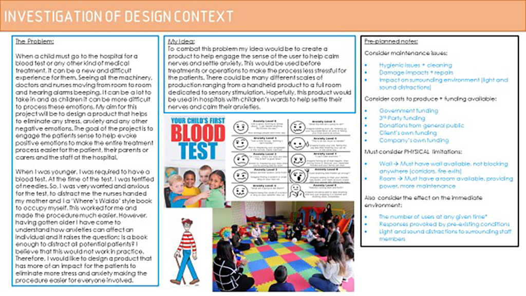
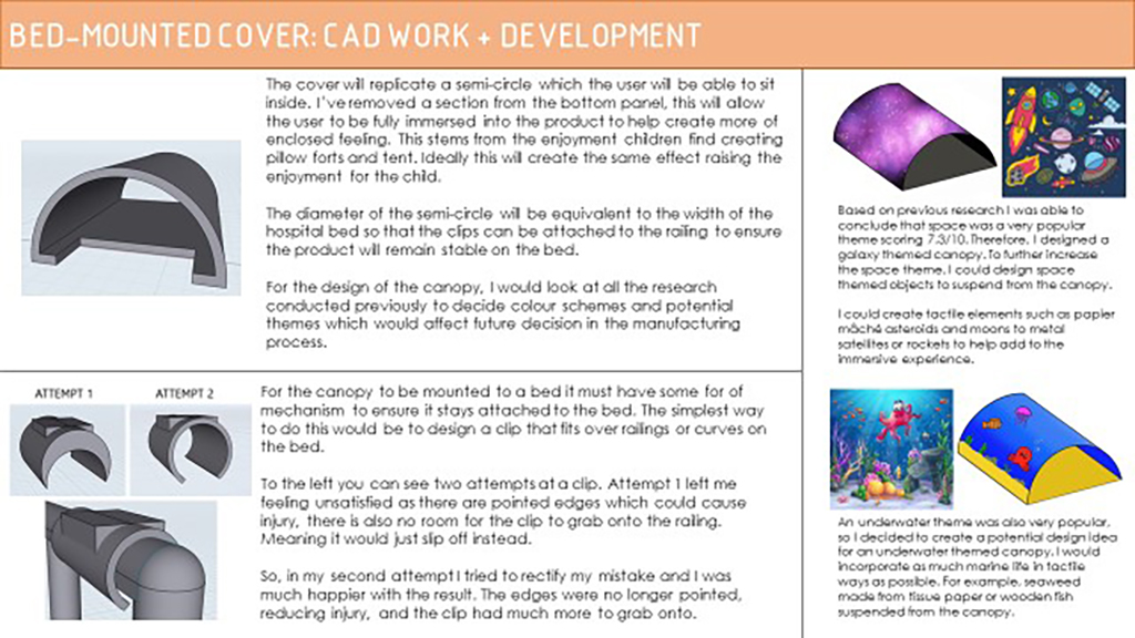
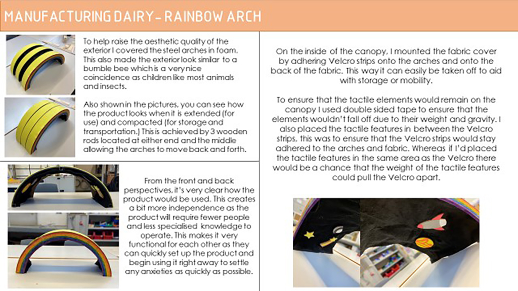
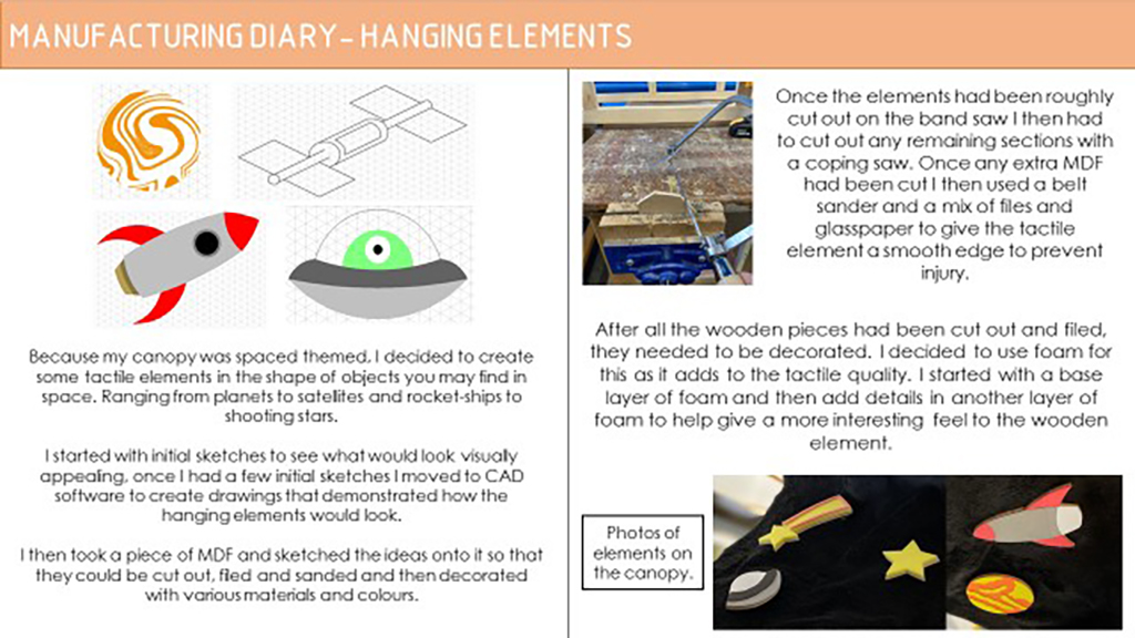
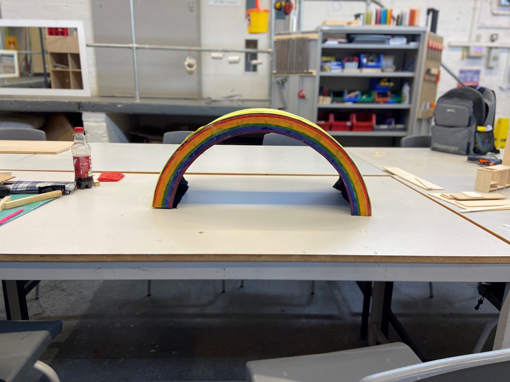
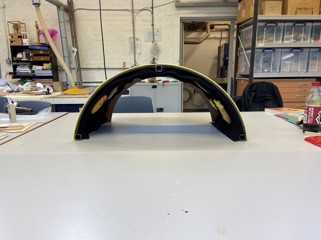
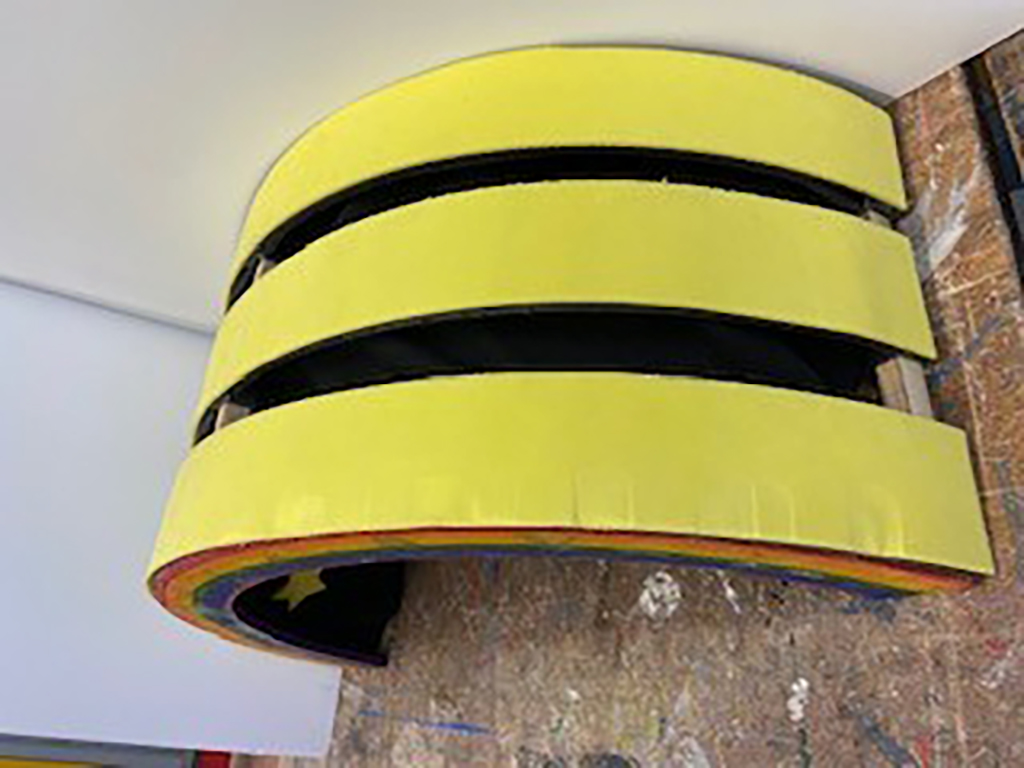
Owen originally intended to design this for the Birmingham Children Hospital, but die to COVID restrictions was unable to gain feedback, Instead we contacted Aspire Dudley and gained useful feedback from staff. Once it is safe we will be giving the finished multi-sensory Rainbow Arch to a hospital.
The product has been made full-size and is fully functioning. It is fabricated from steel and was assisted by staff and students at Advance 2. Many thanks to you! This project is an excellent result considering the challenge of designing without the necessary client feedback. Owen has stayed motivated and completed a very good CWK project with a good final prototype. Well done!
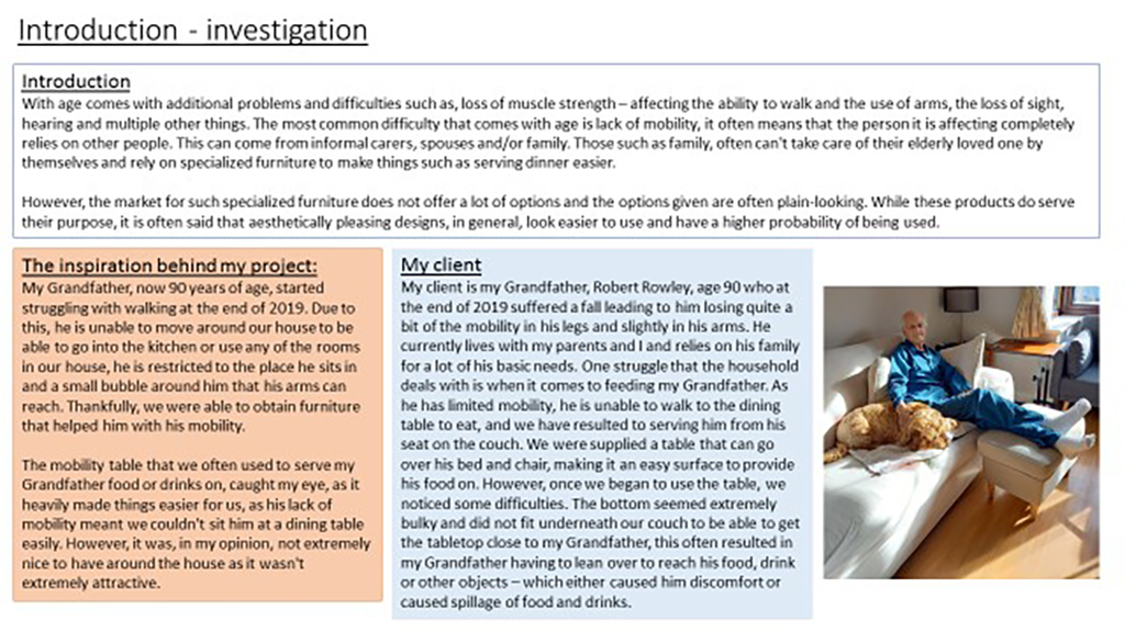
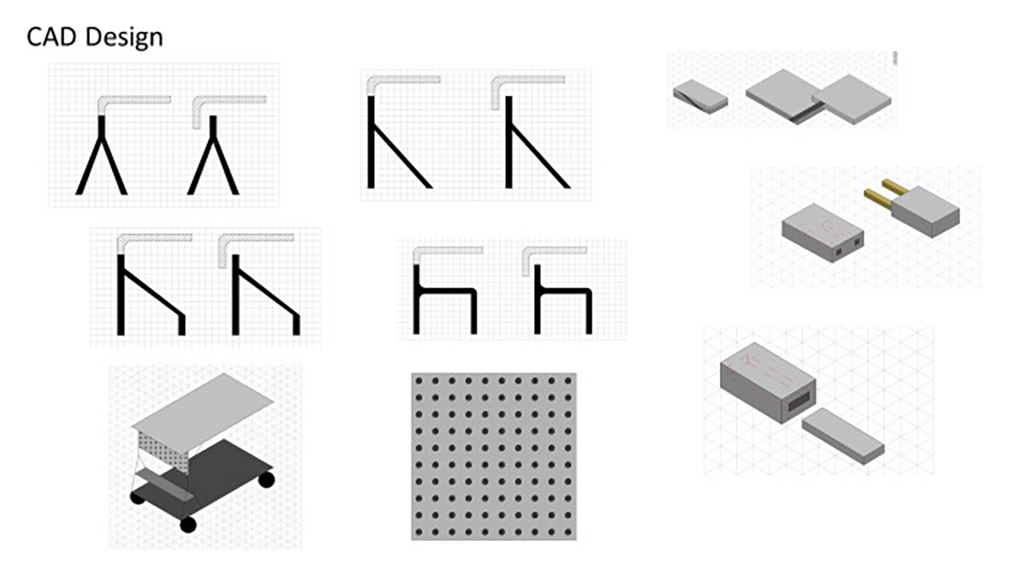
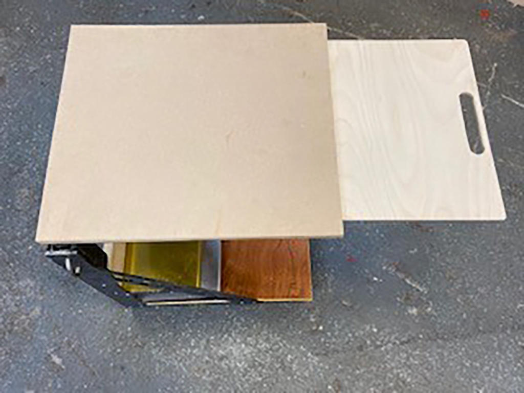
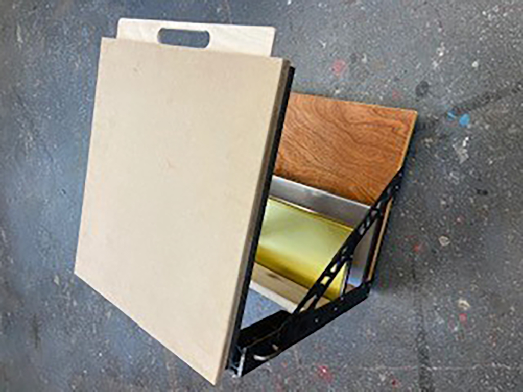
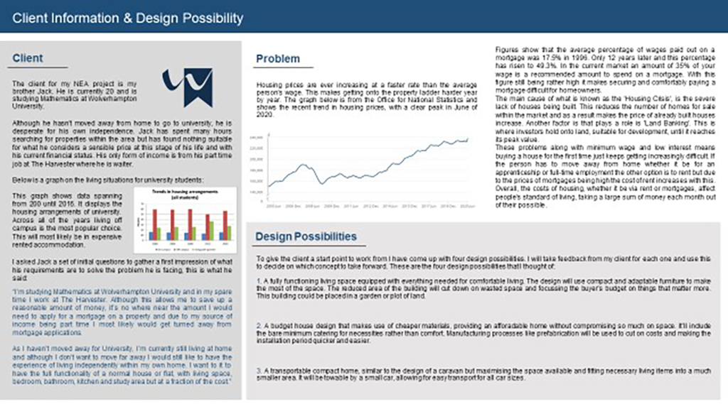
Nuria designed her over-bed desk for her own grand-father as she had seen design faults in the existing product they owned. In simple terms the existing desk was ugly, over-engineered and not fit for purpose.
Throughout the project she gained good client research and has created innovative designs leading to an aesthetically pleasing product. Without much modification this could be sold commercially and is an outstanding working prototype. Well done!
Many thanks to the staff and students in Advance 2 who assisted with production.
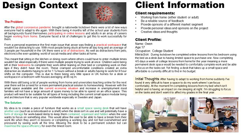
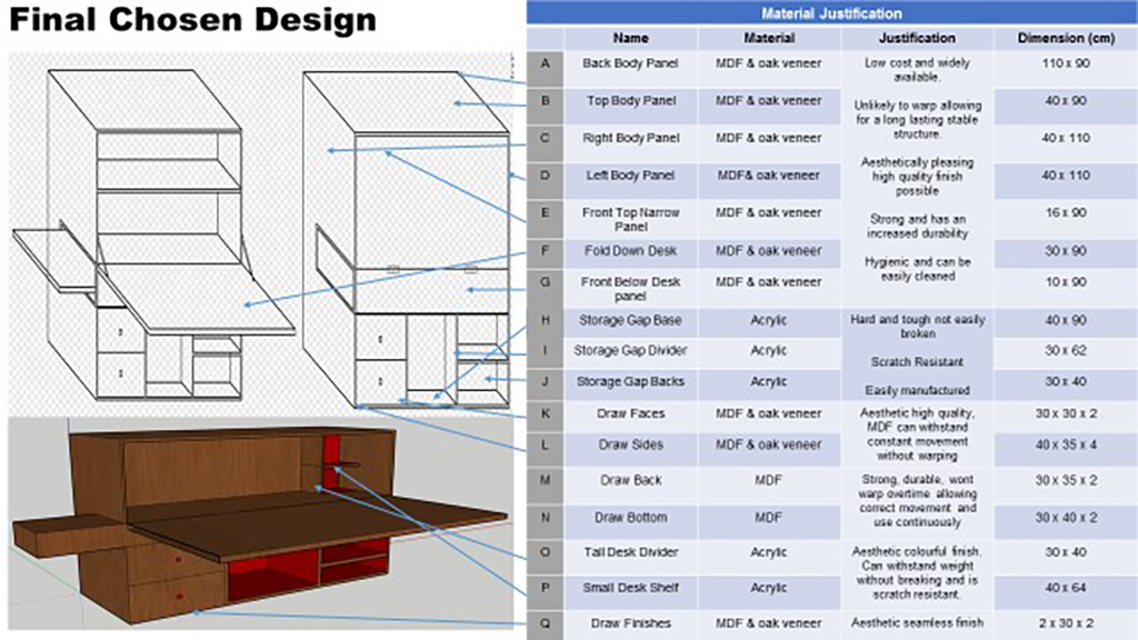
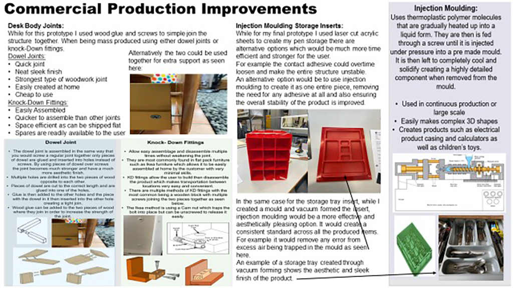
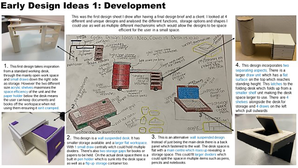
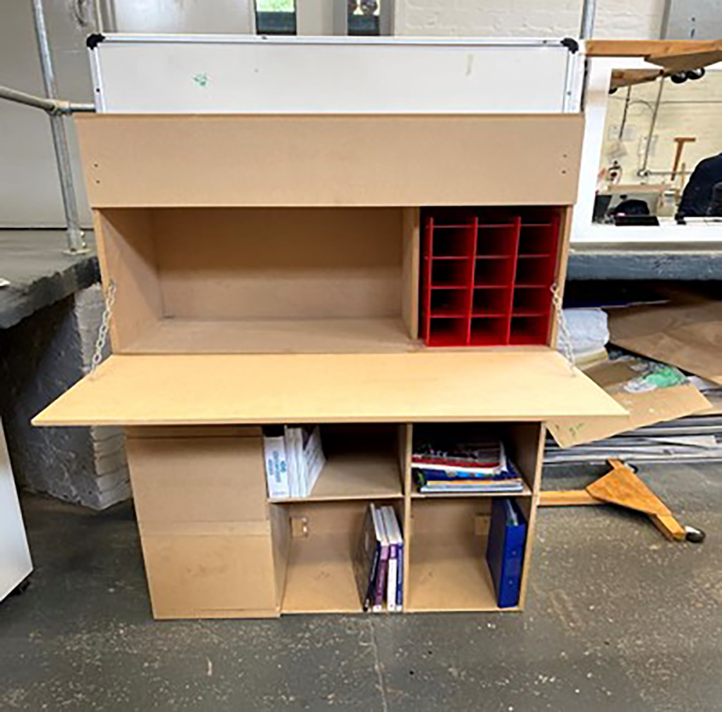
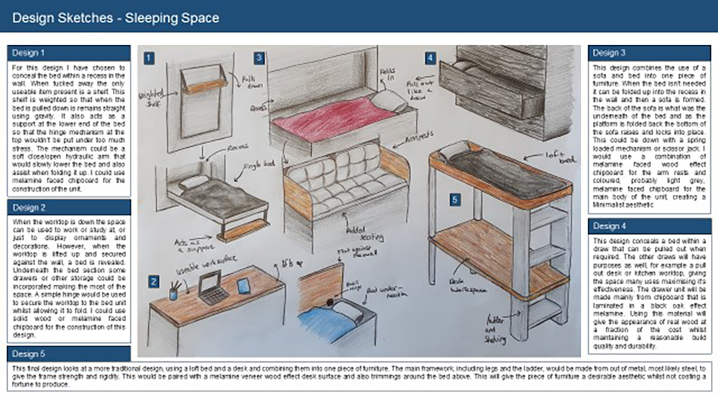
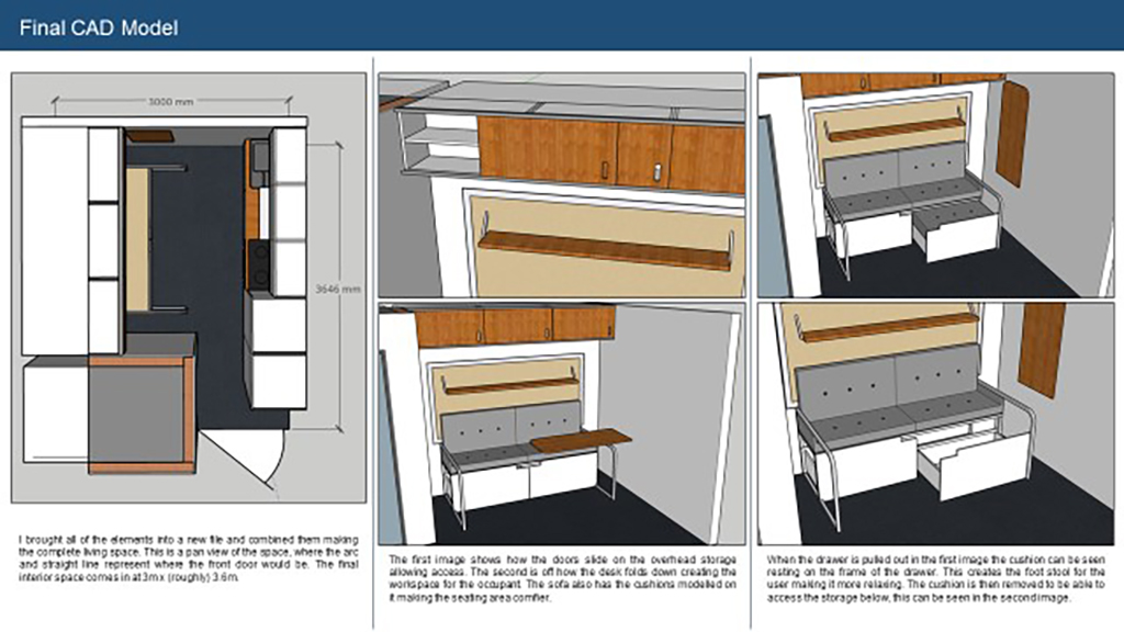
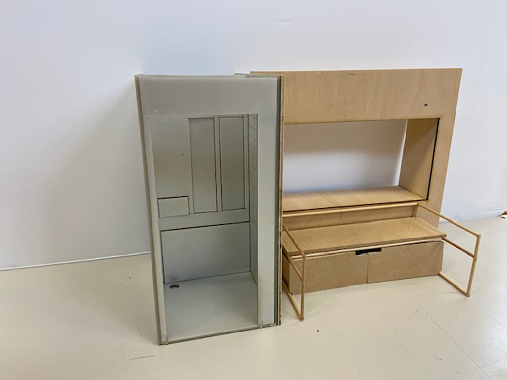
Caitlin recognised that over lockdown it was quite difficult to find space to work from home and saw the opportunity to design a compact multi-use work desk for a home-working office. This is an exception piece of design work both in CWK and the end practical project. She carried out detailed initial research with a real client, which led to outstanding design sketches and development.
The final model is made full-size and fully-functioning including a laser-cut storage system and a vacuum formed tray insert for equipment. What has impressed most is that Caitlin has worked for the main independently with minimum support. Well done!