Category: A-Levels
EMILY DAVIES
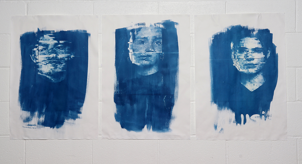
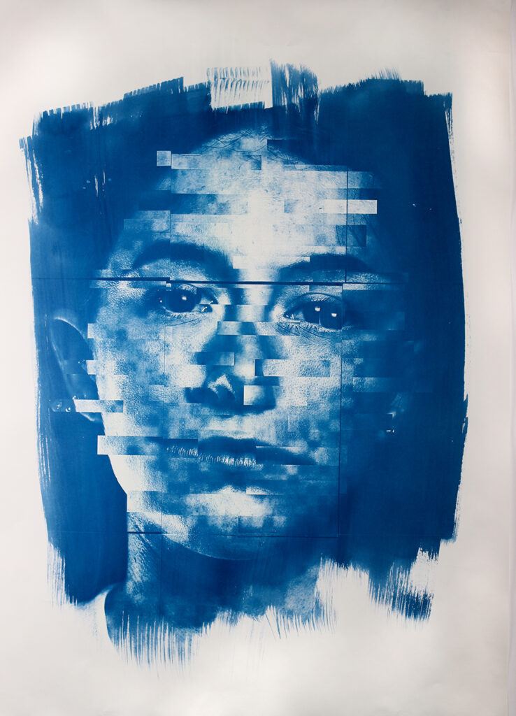
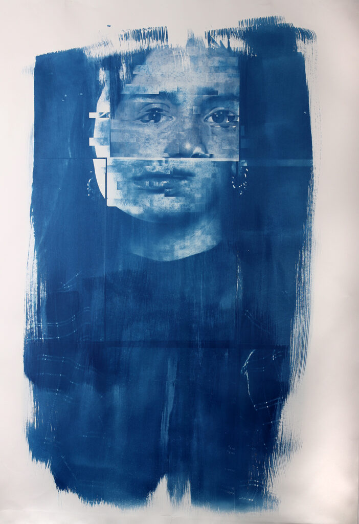
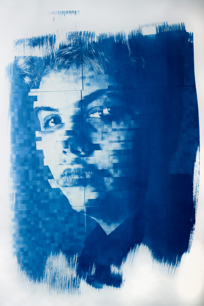
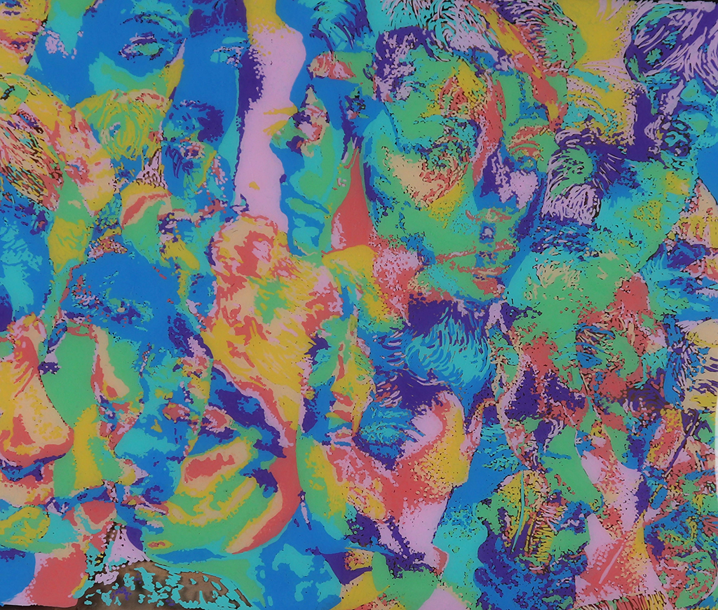
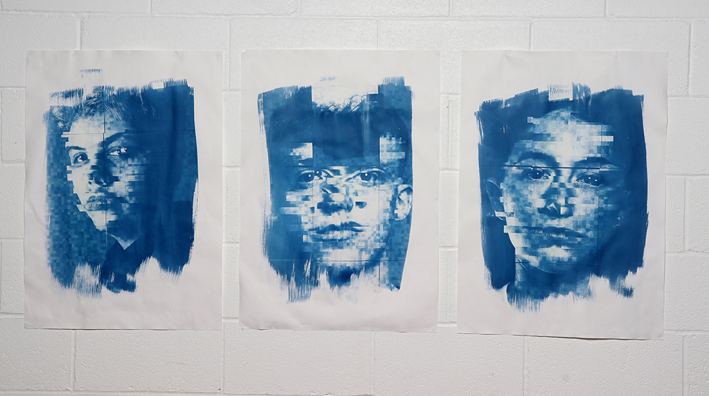
Project Title: Social Media and Identity
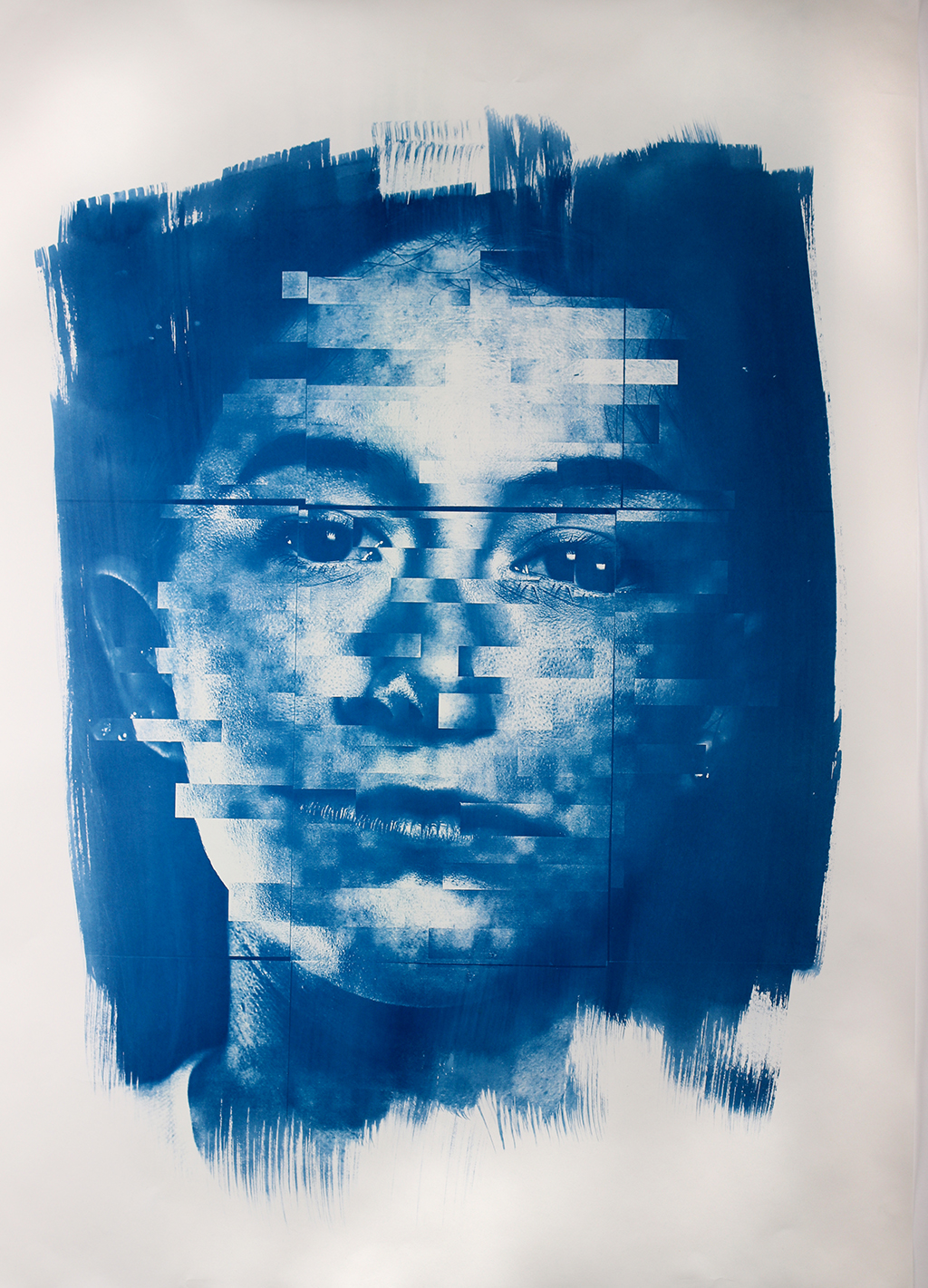
Social media consumes us and affects our lives without us even realising. My project explores how these social media platforms impact young people’s identity. I used cyanotypes and digital editing in order to portray elements of a concealing and revealing nature as well as corruption of identity.
I used both manual and digital techniques throughout the project in order to understand what worked the most successfully in order to present the theme of identity. I then went onto produce six large scale cyanotypes in response to this concept and by having six outcomes this gave me an opportunity to highlight to broad scope of how many young people this affects.
I am going on to study fashion communication and promotion at Manchester Metropolitan University. I am aiming to utilise my photography skills in this course as it is an ongoing passion of mine.
MILLIE COOPER
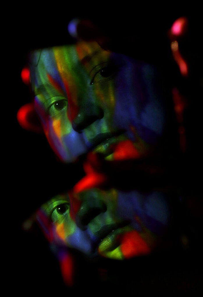
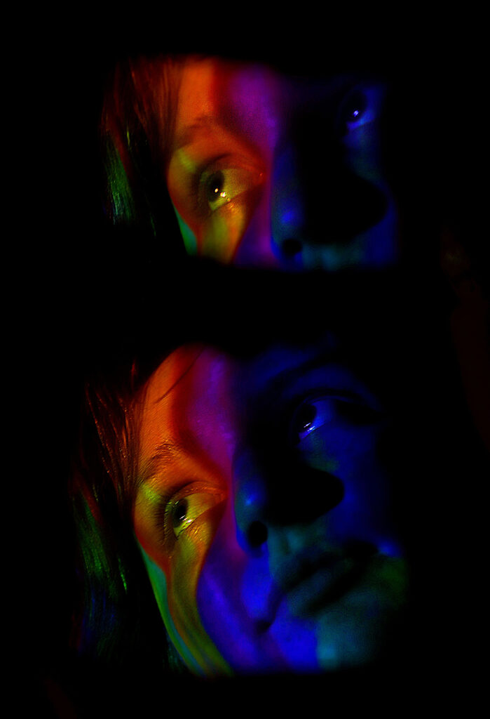
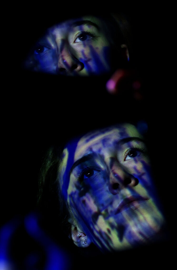
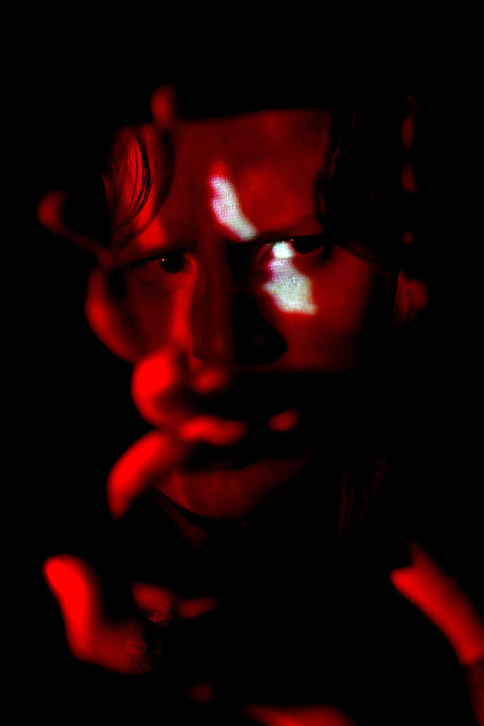
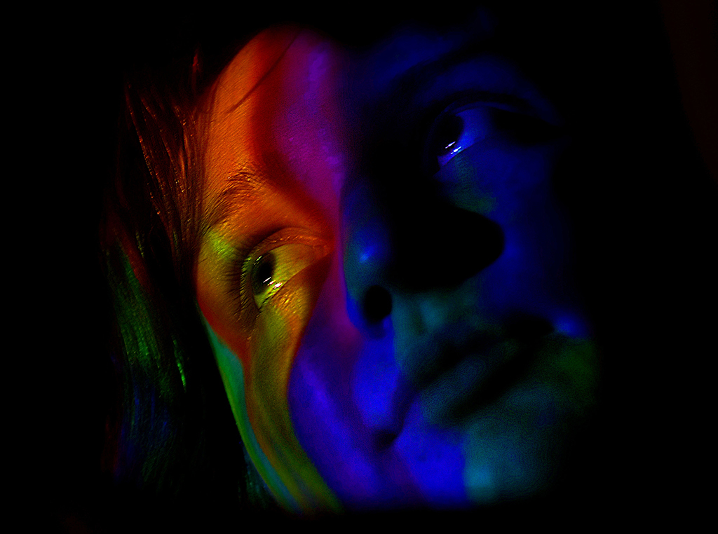
Project Title: Artificial Lighting
Within my project I explored the theme of Artificial lighting. Using a wide variety of lighting techniques I explored the ability photographers have to dramatise their work focusing on portraiture and the application of colour. After exploring a range of techniques I refined the use of flash lighting and coloured gels in my work concluding with projections of my own manipulated images in order to respond to this concept.
Furthermore, I was intrigued to look more closely into the way artificial lighting can having drastic impacts on the aesthetic of an image, as well as the way different types of lighting can differ to each other when working with a model.
I am going off to study the arts further.

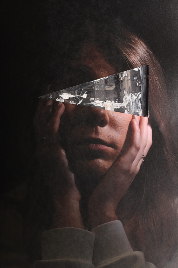
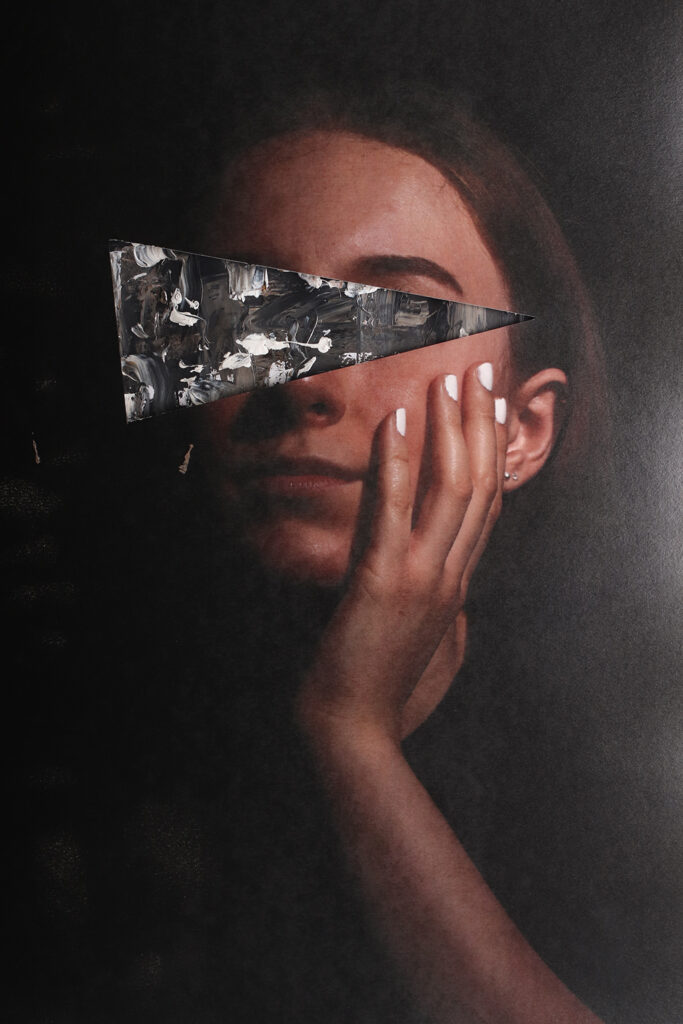
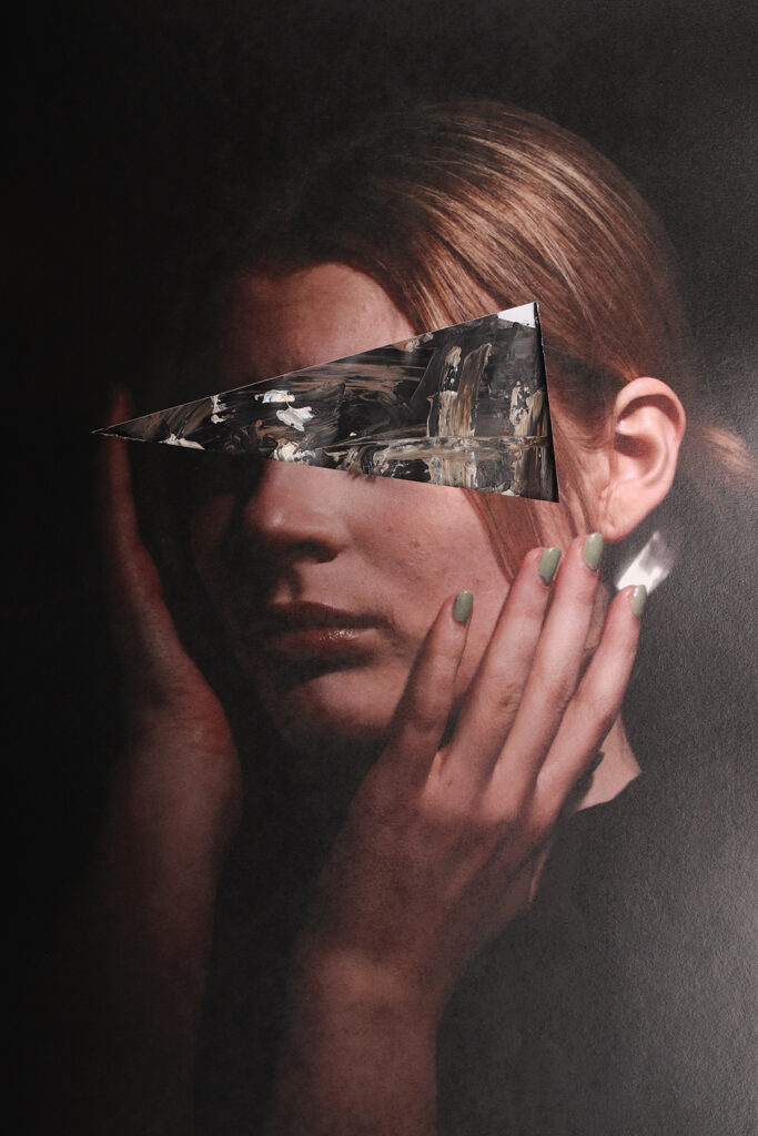
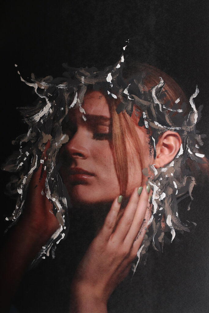
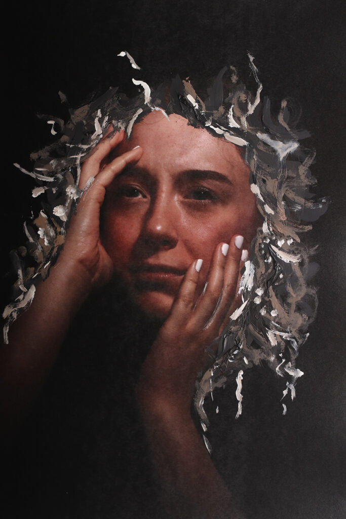
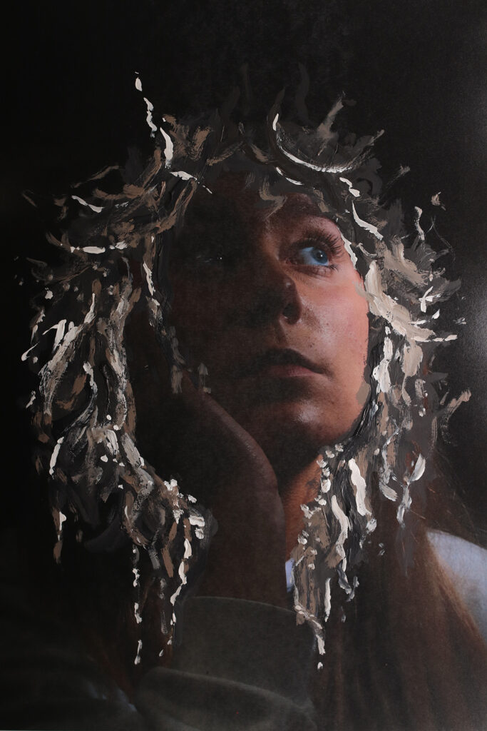
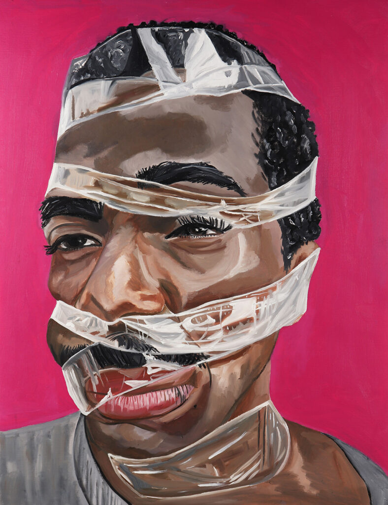
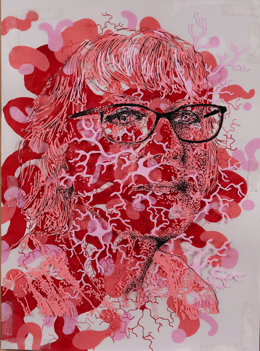
STEPHANIE CLEAVER
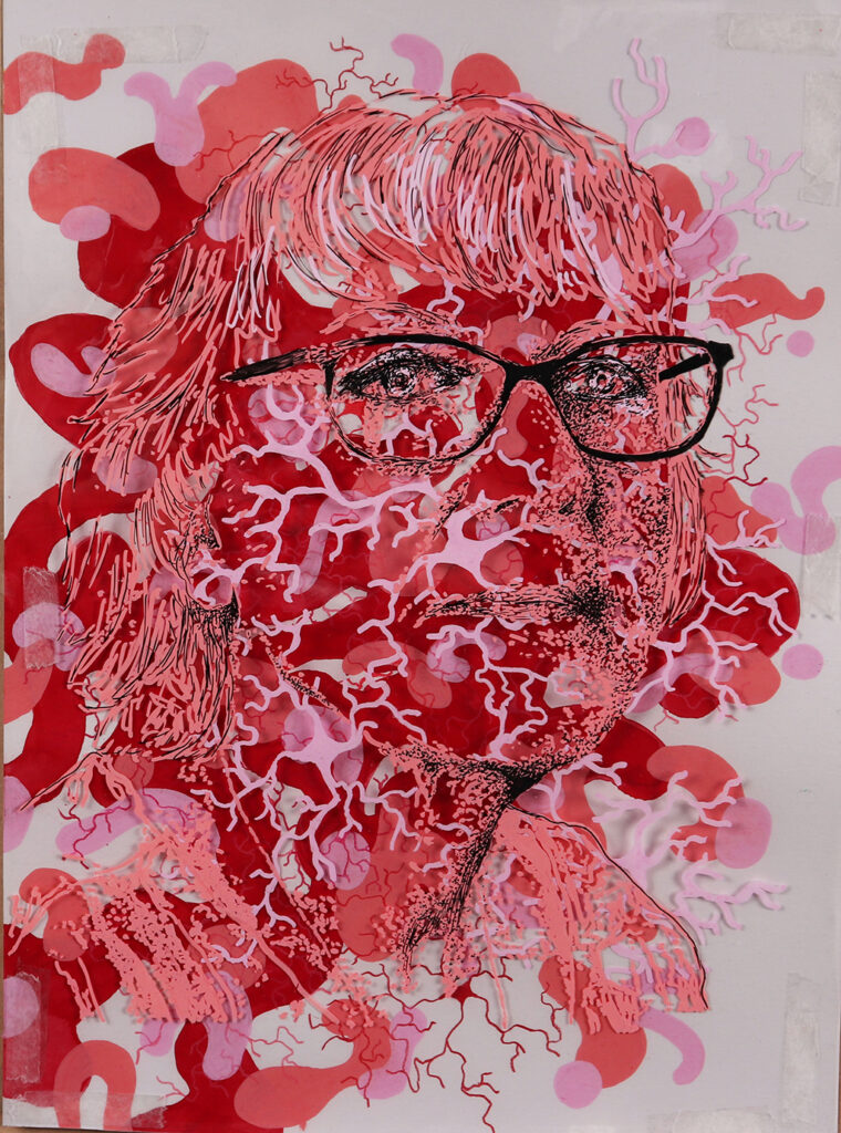
Project Title: Mental Health
Within my project, I explored the concept of ‘Mental Health’ through digital manipulation and mixed media. Incorporating ideas predominantly from Edward Honaker and Rosanna Jones, I used a multitude of techniques to support my work. I was able to develop new ways to present the idea of struggle and everyday feelings of a person. Some of these include distortion through application of materials, blurring, fragments, paint and more.
The main focus of my project was to symbolise the importance of mental health, presenting an alternative and new perception of this concept. When deciding on a final piece, I chose to use multiple models to present this idea through paint. I took into consideration technique and colour to link to the idea of mental health along with working at a larger scale.
I am now going onto study History at the University of Chester.

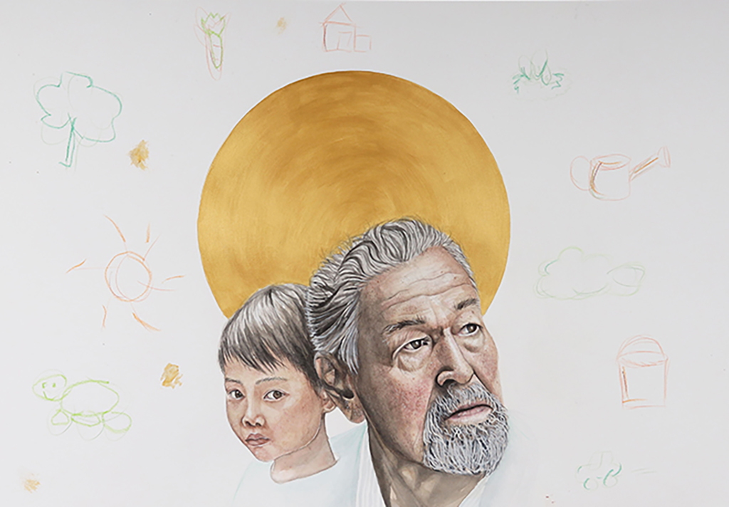
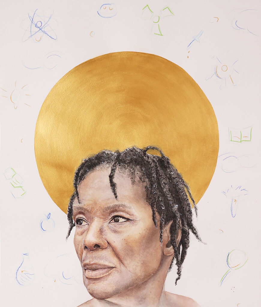
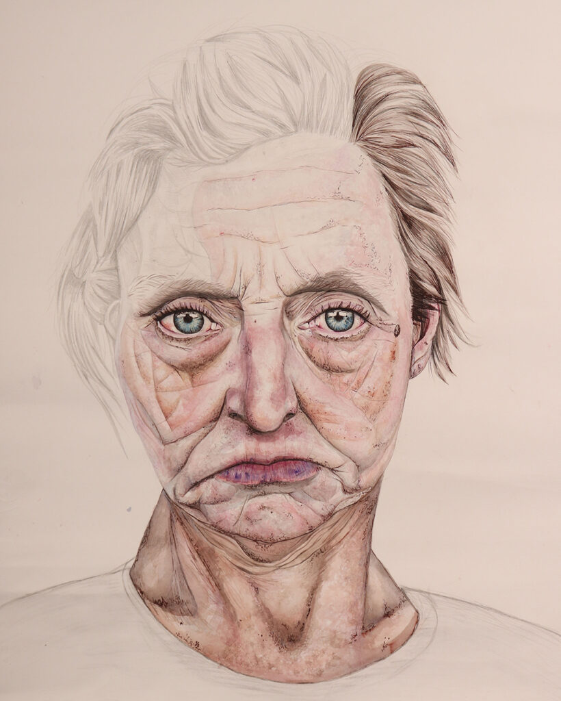
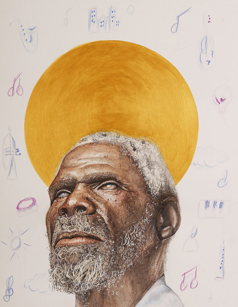
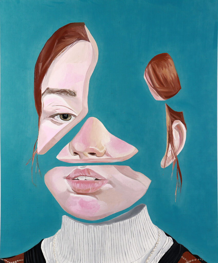
ABBY STANILAND
Project Title: Identity, Memories and age
My project explores the concept of identity, memories and age. I viewed how one’s younger self could still shine through besides their aged exterior and physical appearance – and what is deemed to be their ‘golden point’ in life.
I researched into the history of gold in art and its representation in religious art and how the viewer could interpret its meaning in various ways. I also looked at the development of childhood drawings and how the development of children’s artwork can reflect their own personal experiences hence being a visual representation of their identity.
My intent was to explore highly detailed portraiture with multiple layers of mixed media – which this mainly consisted of watercolour, coloured pencil, fine liner and gouache to further reflect to layers to ones identity and personality.
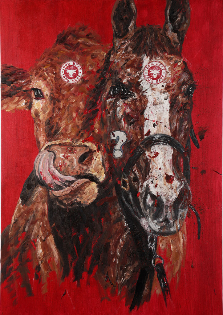
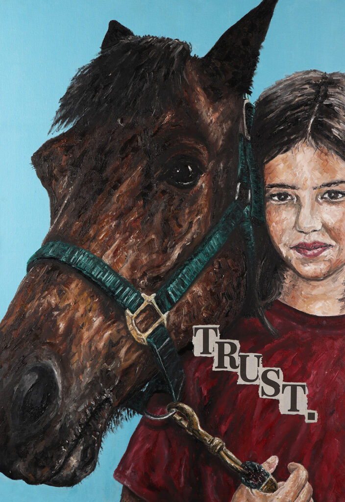
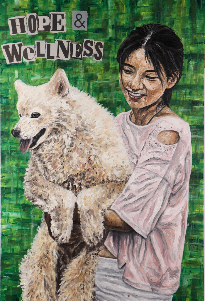
JAMES STACEY
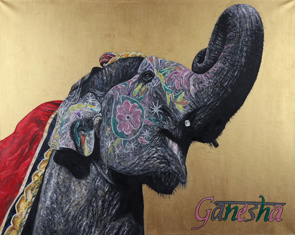
Project Title: Animals and Humans
My art project explores human perception of animals and how these different attitudes inform the relationships we have with them.
This theme has given me great scope to explore different strands in my project varying from companionship with owners to the horrendous meat markets in China. I have also looked into how culture and religion can elevate certain animal’s status as gods, such as the elephant god Ganesha.
Within this project i have been able to depict different atmosphere to reflect the mood of the piece. This was heavily influenced by my research into shock art and the work of Jenny Savile who highlights real life pain and struggle in an impactful and realistic manner.
By using a final series i was able to finalise the different strands of my project whilst being able to highlight the vast contrast in the way we view animals and how our views can be moulded and altered.
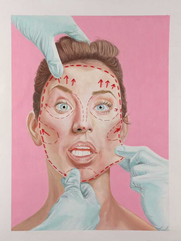
MYRA KHAN
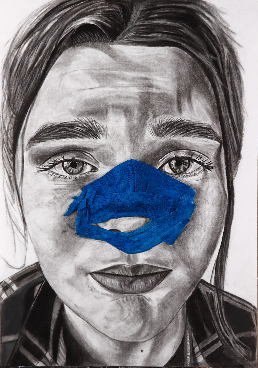
Project Title: Unconventional Beauty
I have produced range of A2 portraits communicating the concept of unconventional beauty, through distortion and representation of unattractive portraiture as well as appearances pre and post plastic surgery. I aimed to capture the beauty existing in contemporary ugliness.
I found working with oil paints and charcoal allowed me to achieve realism, demonstrating an abstract concept in a more traditional style.
Upon producing responses inspired by artists Gillian Lambert and Martin Higgs, I began experimenting with 3-D elements, using materials such as bandages and stitching onto portraits using string to emulate the realities of cosmetic procedures. My abstract use of brighter colours within my work are inspired by the striking backgrounds often seen in editorial magazines featuring beauty models; emphasising my portrayal of unappealing features in a beautified manner.
GEORGINA GUY
Project Title: Dreams and the Subconscious Mind
My project explores dreams and the subconscious mind, my final pieces serving as abstract depictions of three of four separate pathways of this project, replica five of the dreams and subconscious thoughts unique to each of the subjects I interviewed. My in-depth research into dream content inspired each separate section, and each subject chosen relayed dreams that led to very distinct pathways; one suffered from insomnia, another had very vibrant dreams that incorporated warped versions of people they knew in their waking life. Subject 3 had unrealistic and fantastical dream content.
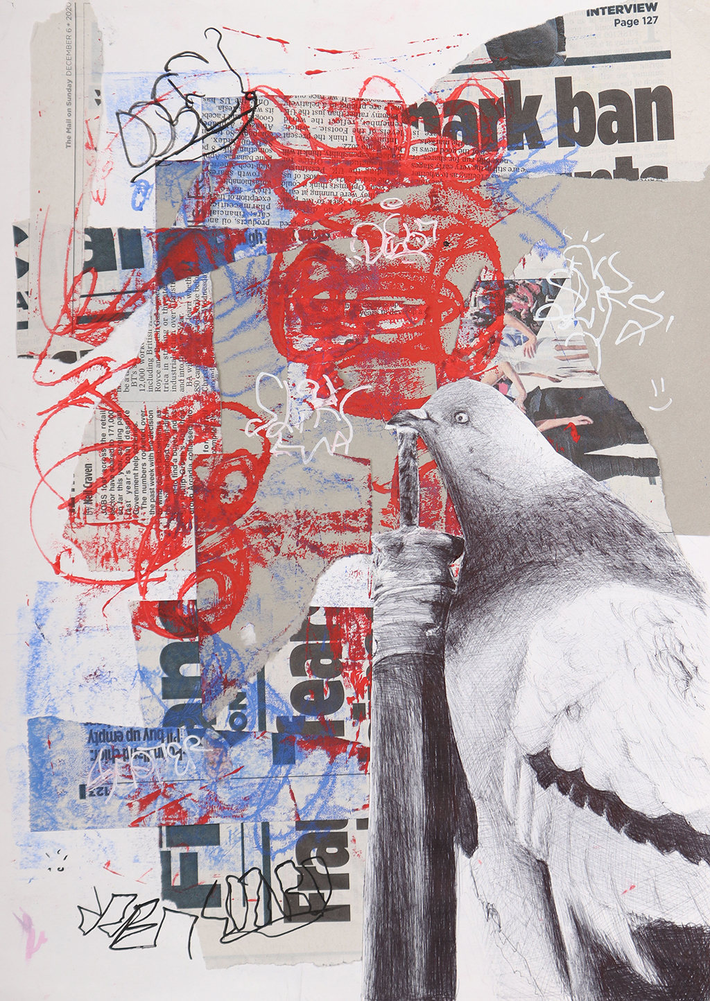

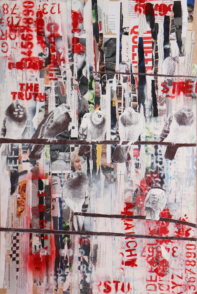
WILLIAM EDWARDS
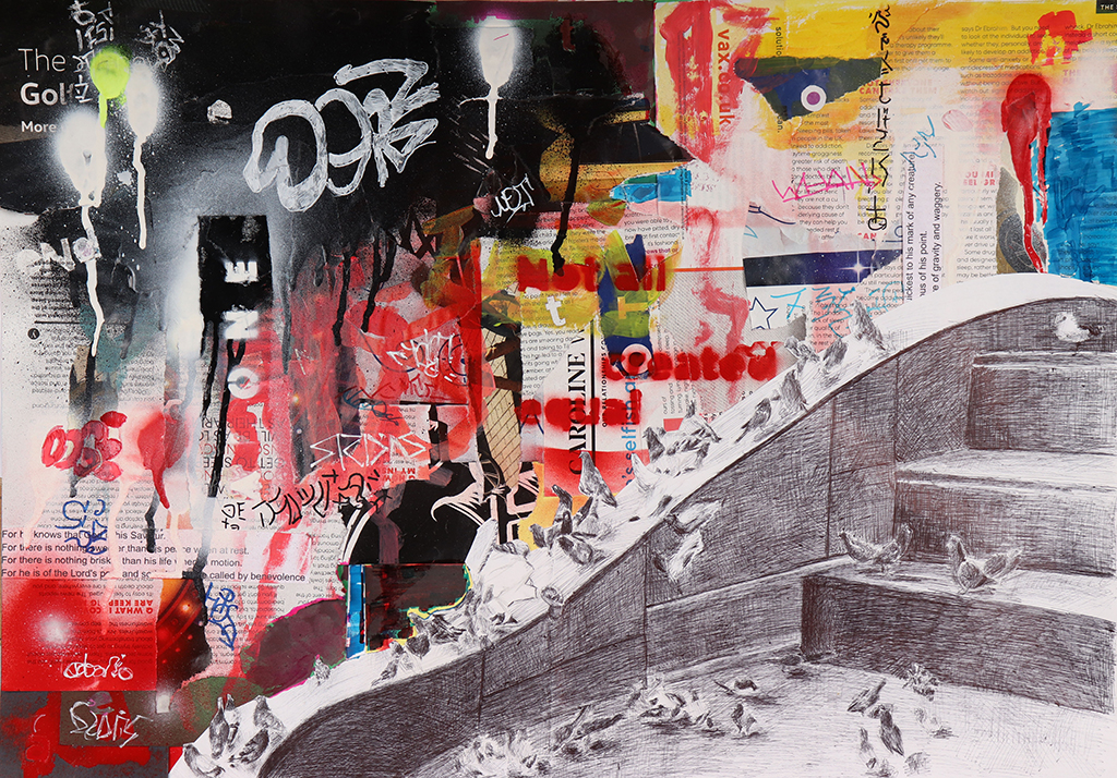
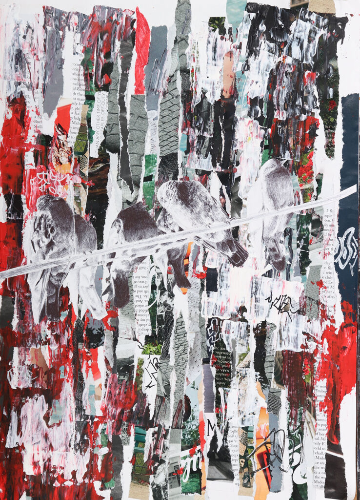
Project Title: Urban Environments
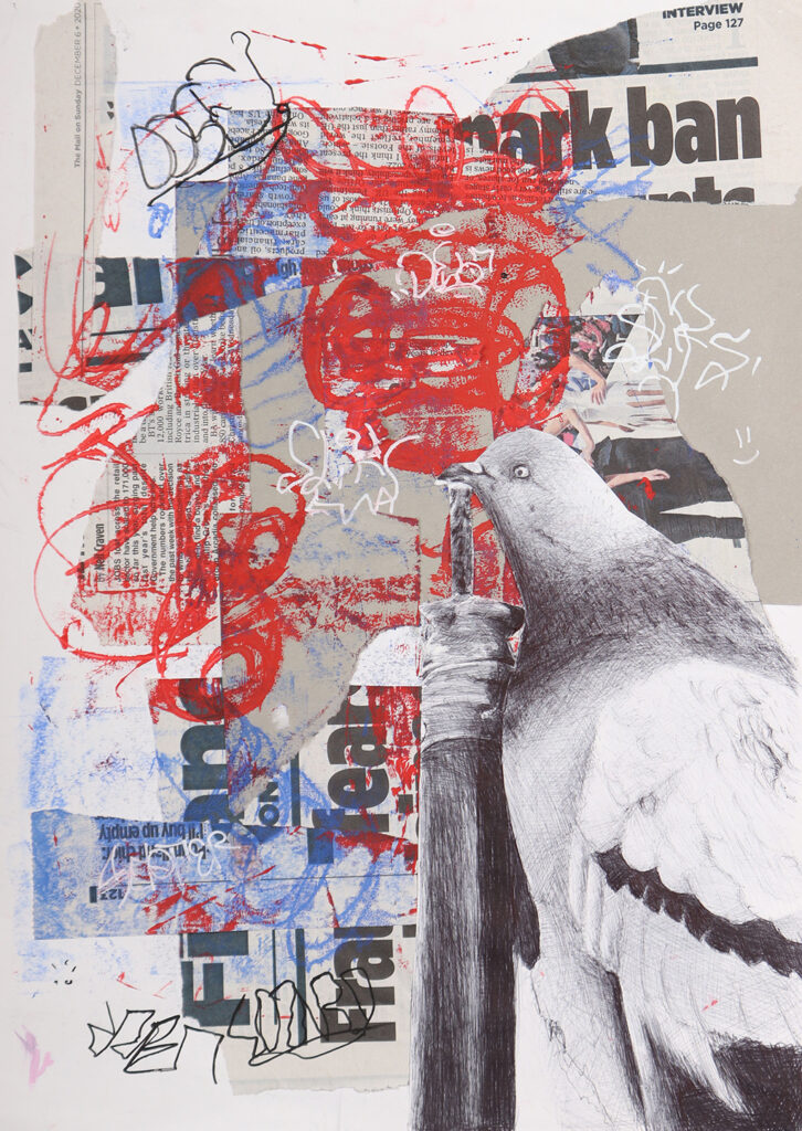
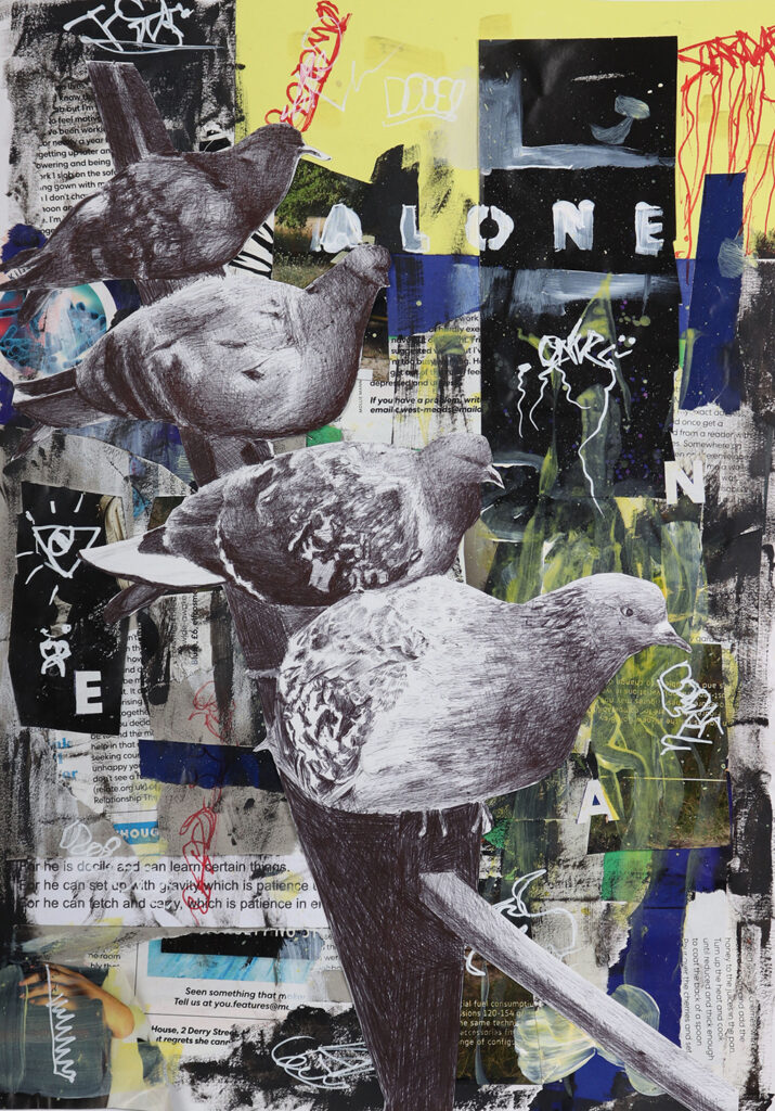
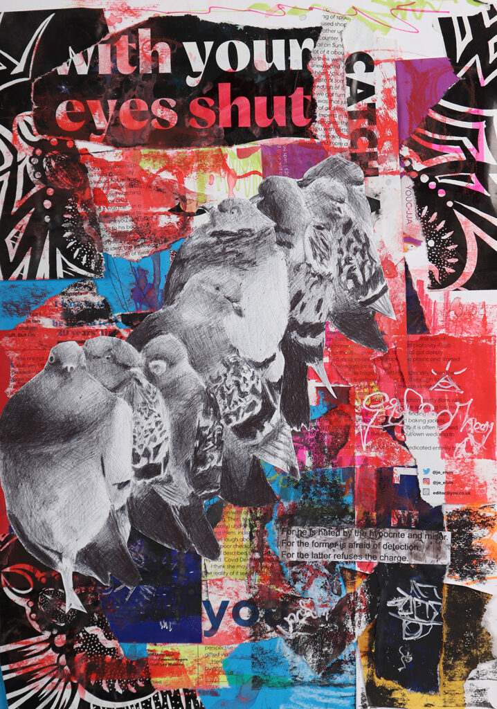
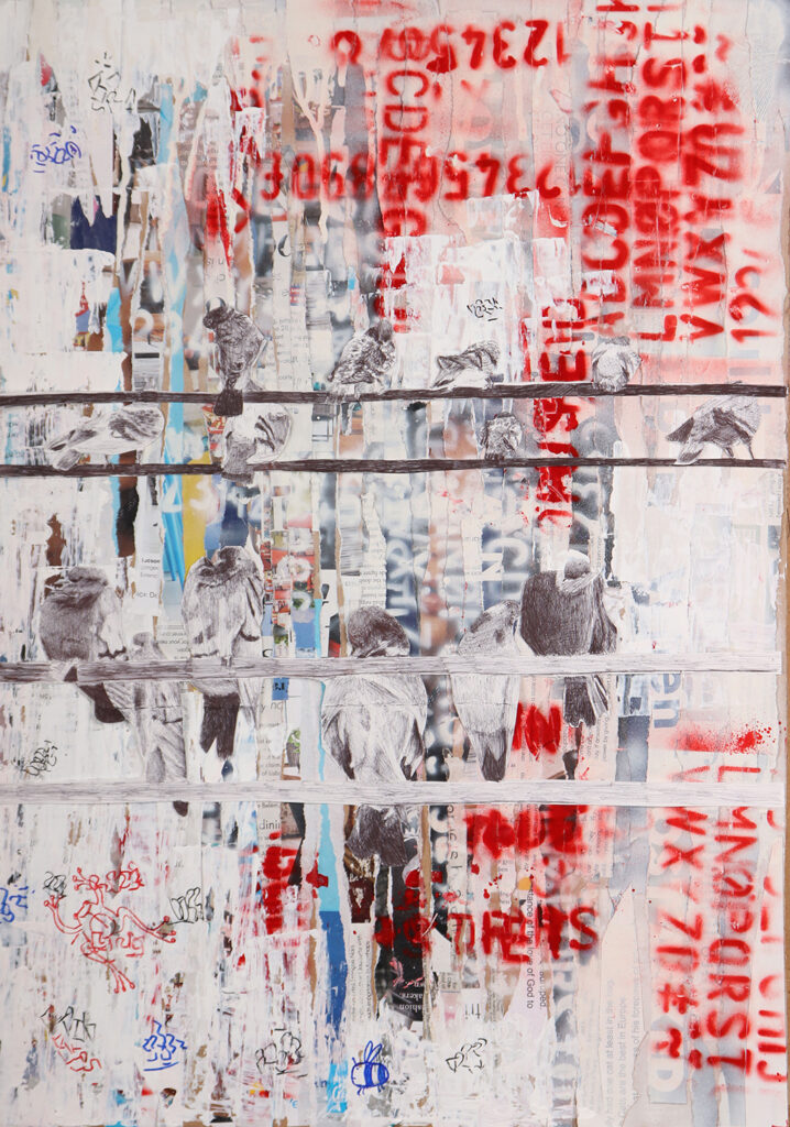
My project ended up being inspired by gritty urban environments, dilapidated streets and the graffiti that appears within these places. I used animals as a broad starting point to explore different styles and techniques; I ended up being drawn towards the erratic, expressive and gritty styles. I narrowed the focus towards Pigeons, as they tend to inhabit these areas most often. My final pieces used a combination of collage work, spray-paint, graffiti marks and biro drawing. My aim was to recreate the sense of anarchy and doom found in the graffiti in these run down areas.
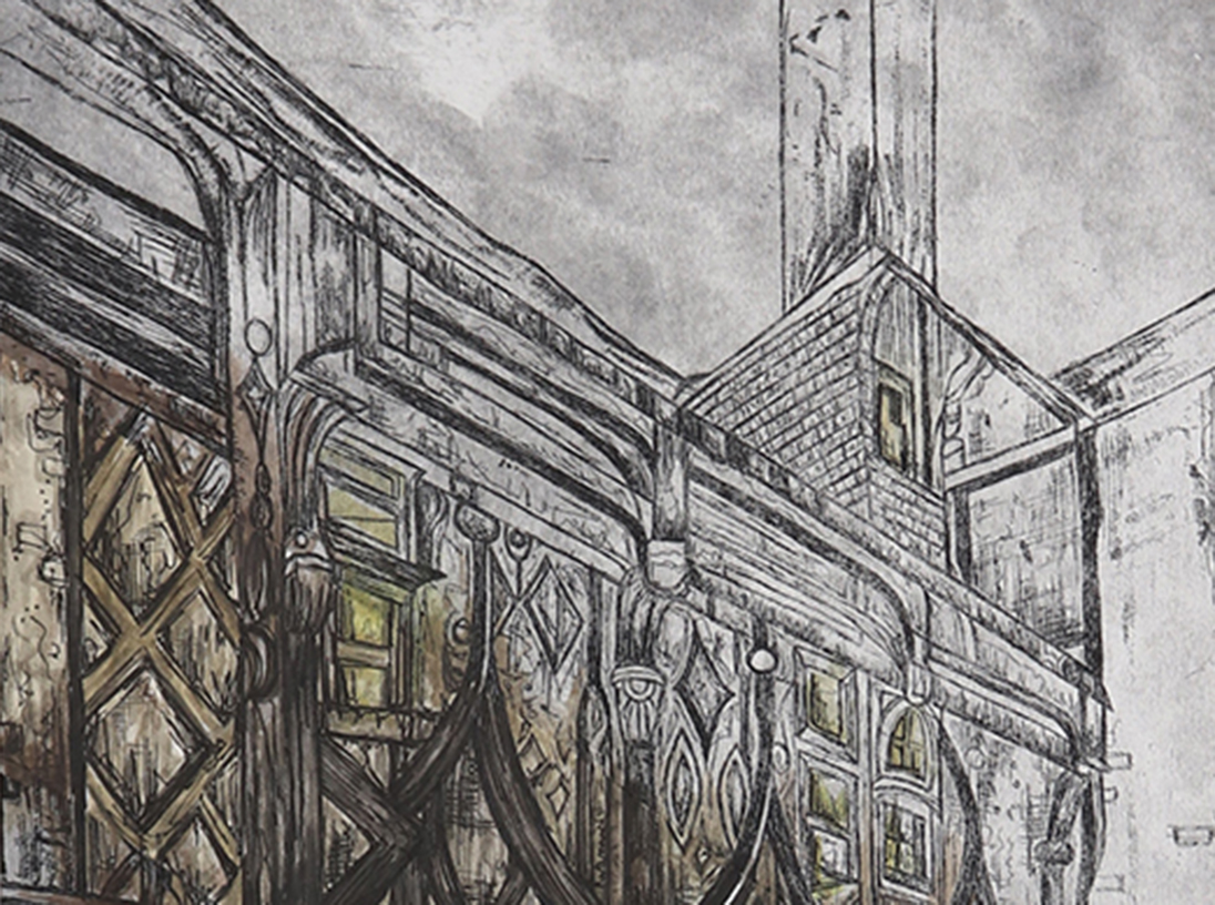
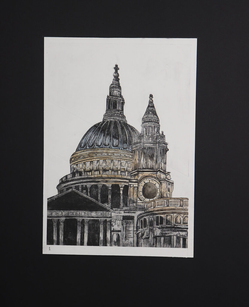
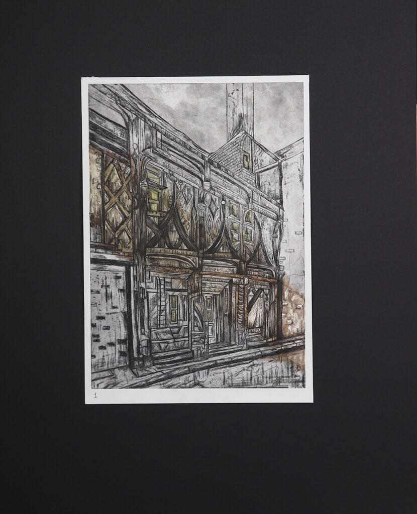
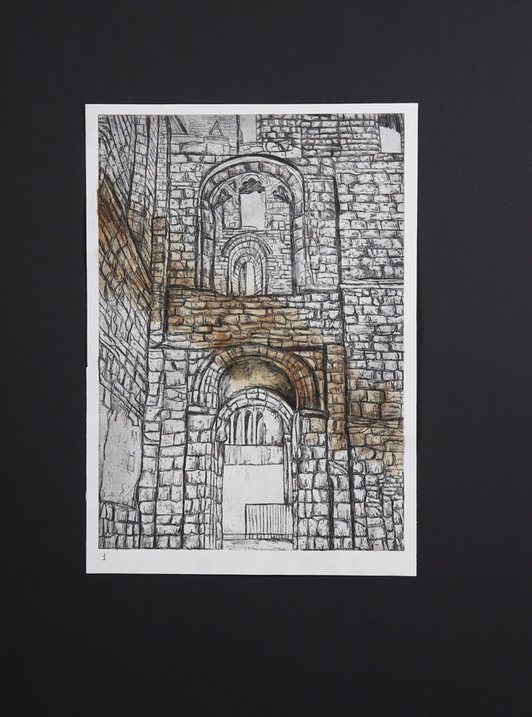
STEPHANIE CLEAVER
Project Title: Architecture in Colour
In my project, I explored how colour has an impact on how different types of architecture. For example, using two contrasting styles of architecture such as Christian and Victorian styles allowed me to experiment with different materials.
When looking at Christian style architecture, I was influenced by artists such as John Piper where I looked at similar colour schemes. I used mediums like fine liner and biro. However, for the Victorian style, I was inspired by Michael Goro and John Atkinson Grimshaw. Mediums like charcoal, ink and printing allowed me to convey this style in my work. This supported the development of my project looking at how colour can have an impact on how architecture can be perceived.
A defining point in my project was the introduction of dry-point etching which influenced a major part of my project. I went onto create a3 pieces using this technique incorporating colour schemes that reflect the different types of architecture.
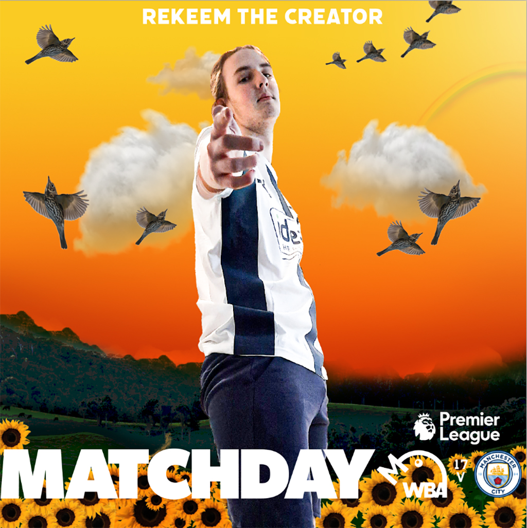
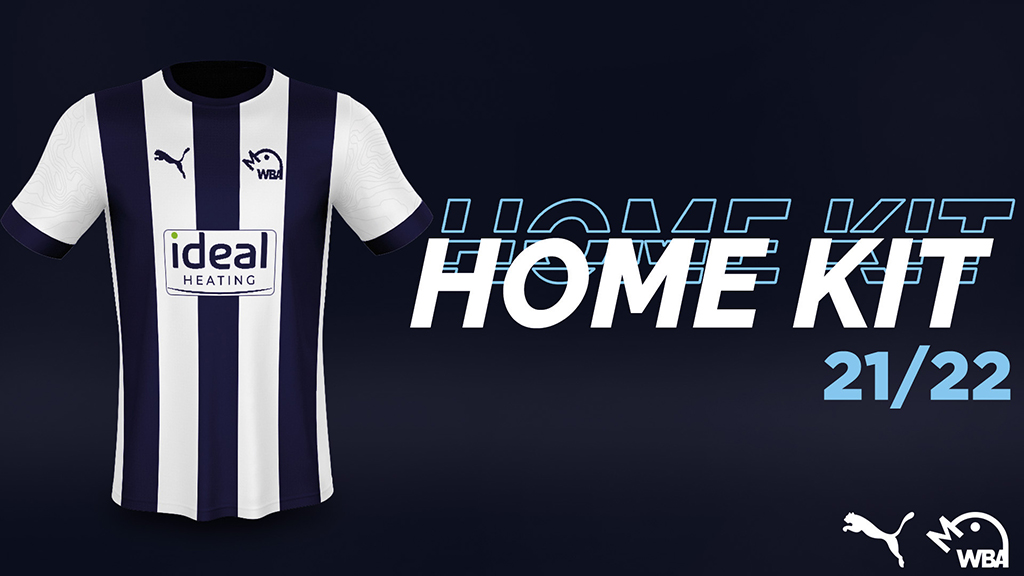
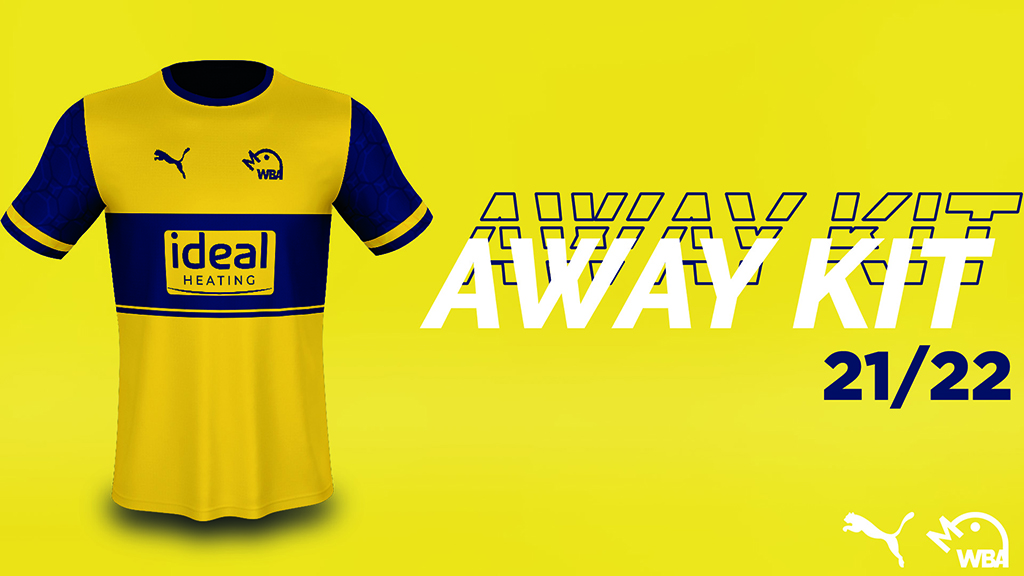
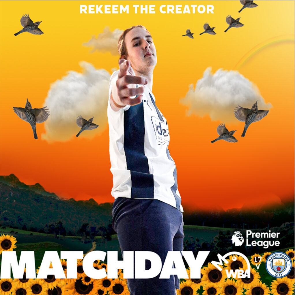
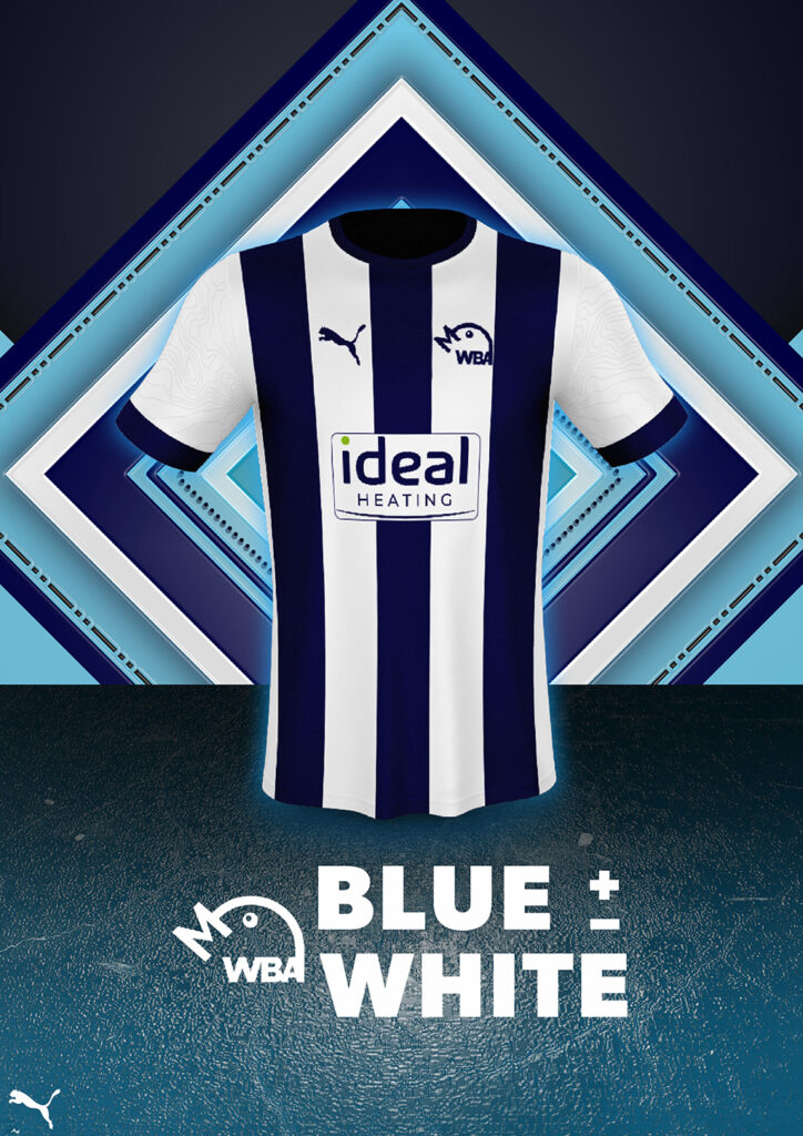
BENJAMIN SOUTHALL
WBA Rebrand
West Bromwich Albion is a football club that felt that they wanted a rebrand going into their next season. They mainly wanted a new logo, alongside two new kit designs and the accompanying announcement posts for social media, as well as other social media posts such as themed ‘matchday’ posts to be posted in the morning of each matchday. The club has a massive influence in the local community, and are aiming to become a more modern, sleek brand through how their logo looks, alongside embracing a rich history of success within the branding of the football club. The club is traditional and iconic within England, being a founding member of the Football League, alongside being an established Premier League team at time in the recent past.