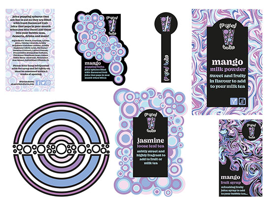
In this project I have designed and produced a set of graphics and designs for a company called Twisted Boba. Twisted Boba is a new company that wants to bring a bright and colourful atmosphere to the streets of London as they bring Bubble Tea to a global audience.
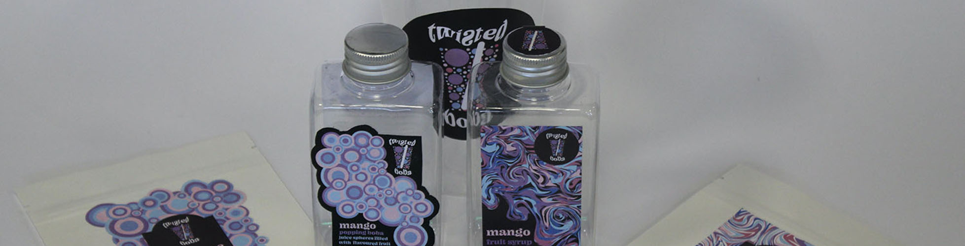
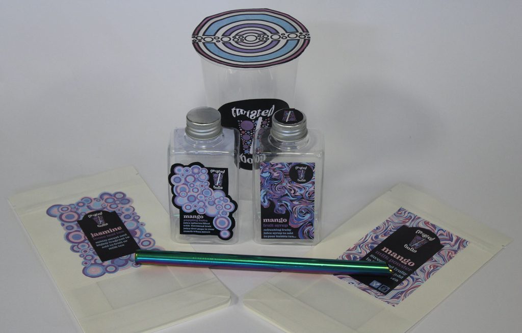
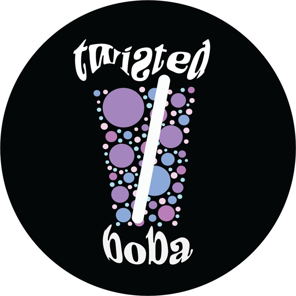
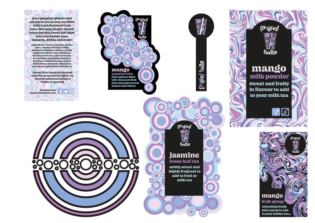
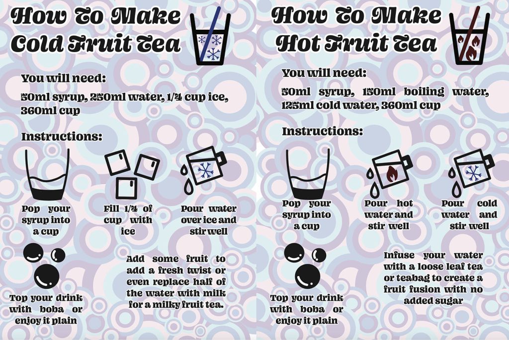
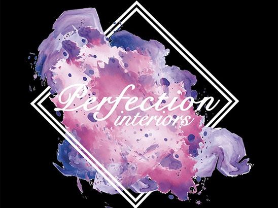
Twisted Boba is reinventing Bubble Tea with new and exciting flavours that have inspired the designs and branded that I have created to promote their products. These designs include producing the logo with has been created with circles and negative space to achieve the look to appear to make up to be a Bubble Tea cup. The overall logo will help to bring to life the ideas from Twisted Boba with bright and bold colours to attract an audience of all ages.
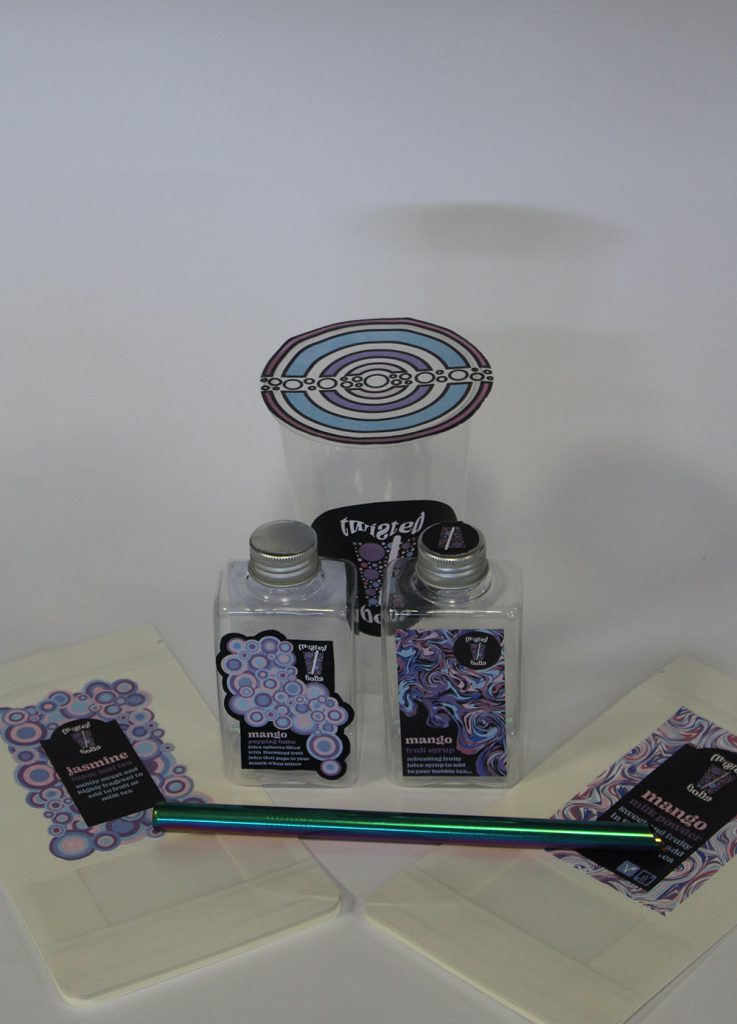
This logo will be used as the main form to be on the Bubble Tea cup along with a different design to be placed on the top of the lid that can be pierced with a straw. I have taken inspiration from being ‘twisted’ and different to the usual branding for Bubble Tea companies, and therefore created designs for the packaging to include circles from the original logo as well as acrylic fluid art inspired designs for the overall packaging of the boba, tea and syrup labels.
All the packaging labels will be used for products that will be sold and then received by the customer in the custom designed shipping box that follows the colours of Twisted Boba. I have used digital techniques to create the graphics for the designs so that there is a high quality for printing to be used on the Twisted Boba products as well as giving the designs scalability.
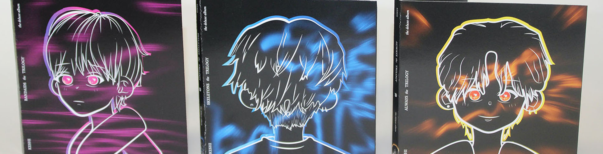
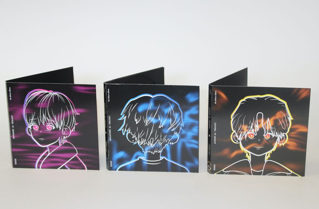
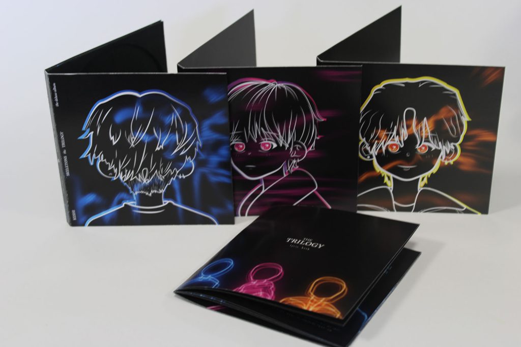
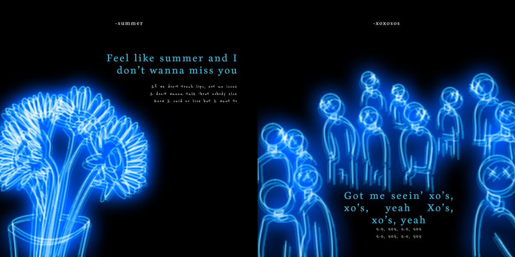
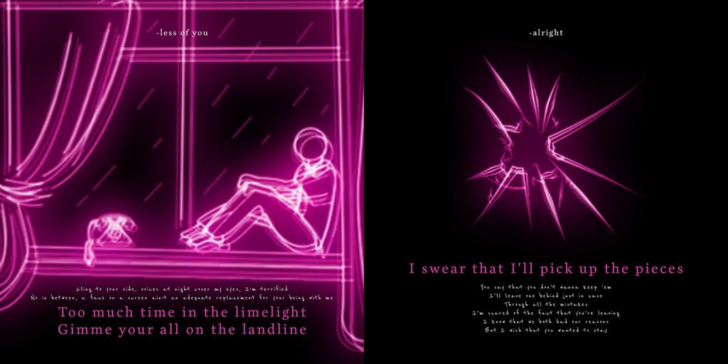
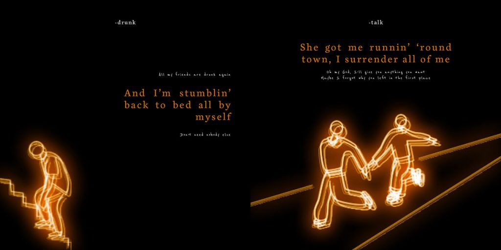
I have decided to pursue an album re-design and re-package for Vietnamese American musician Keshi signed with ‘Island Records, a division of UMG Recordings, Inc,’ formally known as Casey Luong, for his ‘Trilogy’ records/ EP’s: ‘skeletons’, ‘bandaids’ and ‘always’. Currently, this trilogy exists primarily on Spotify and in physical form as a vinyl that was sold for a limited amount of time as a special edition item.
My aim is to bring all three EPs together into a deluxe album in which the design will be upgraded and refined from something that is relatively minimal and basic with the additional reason being that listeners can listen to the entire trilogy in a single CD. Three different versions of this Trilogy album will be produced in the theme of each EP which will potentially increase consumers’ desire to buy the new refined album.
Bubble and Squeak go Travelling (Children’s Book Project)
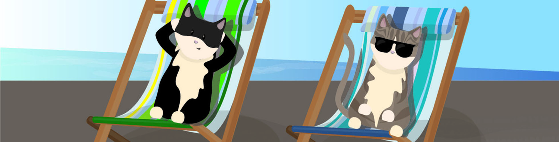
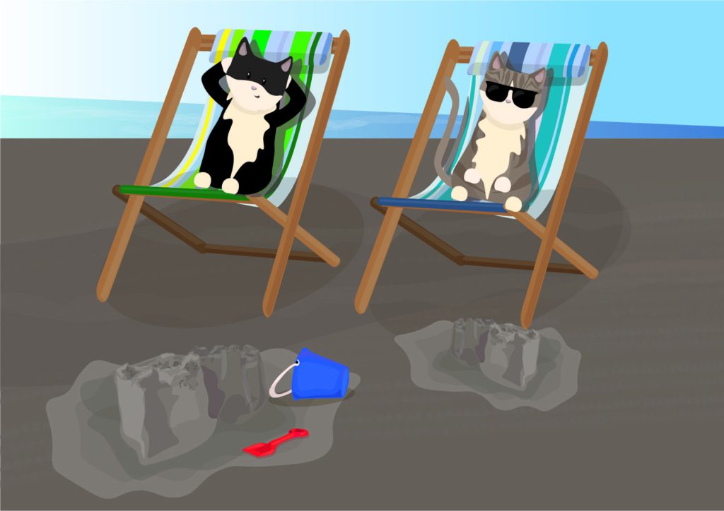
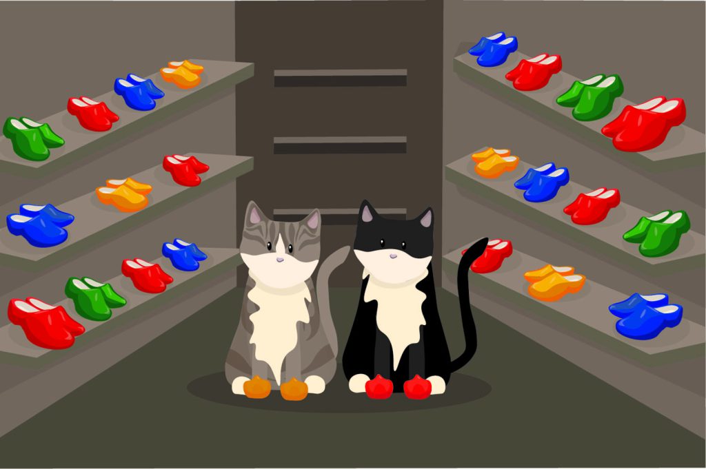
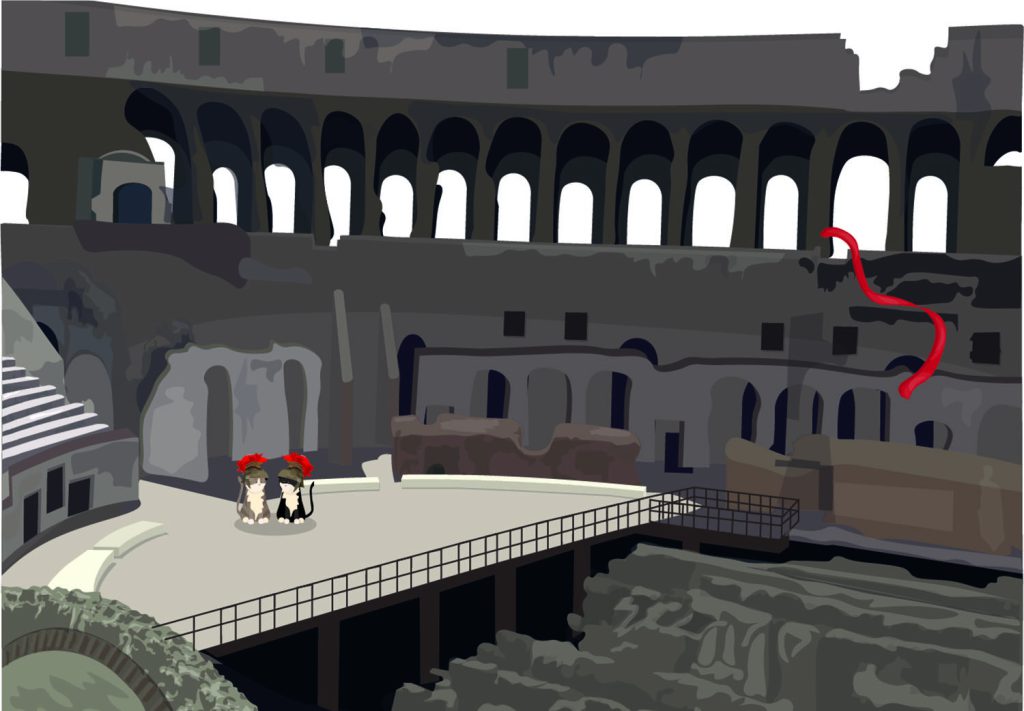
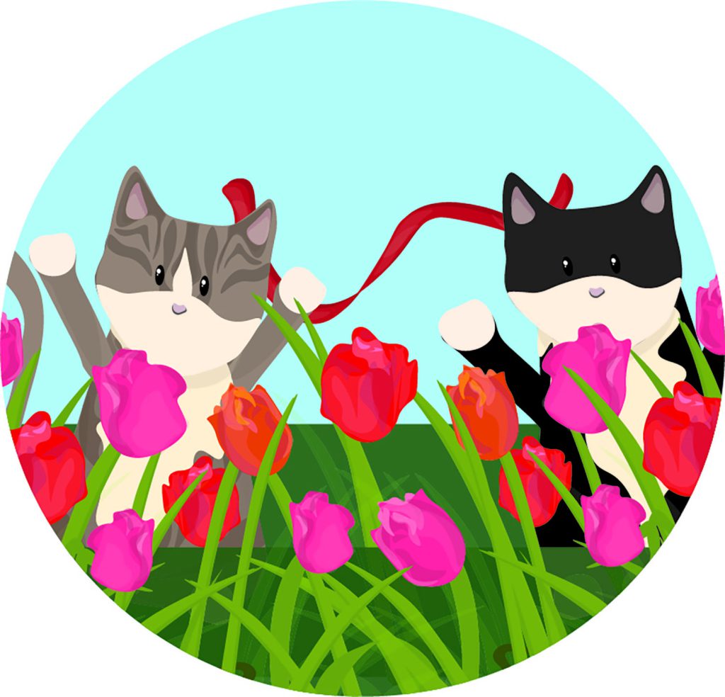
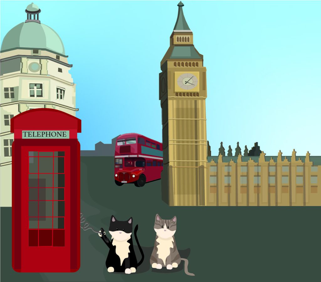
The aim for this story is to encourage children to learn about embracing and learning about other cultures and countries. This story focuses on the introduction of the kittens to European cities. This particularly allows for the fact that many children haven’t been able to travel at all over the past few years and may be understandably apprehensive at the prospect of going somewhere new. I wanted to create a book that was gently reassuring, educational and above all else, fun to read.
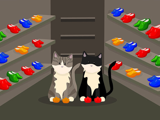
The concept behind the story is from the inspiration of my own kittens, when we first rescued, they were very shy and the only thing that brought them out of their shell was a ribbon. They played with the ribbon as it was comforting for them. This is where the main idea for the story stemmed from and plan to use these ideas throughout my work.
The specific places features in the book were epitomised by iconic landmarks, that are real, that are recognisable. I wanted to create a series of illustrations that tell a story of the kittens on and adventure, these illustrations are collaborated within a book and justified with simple text.
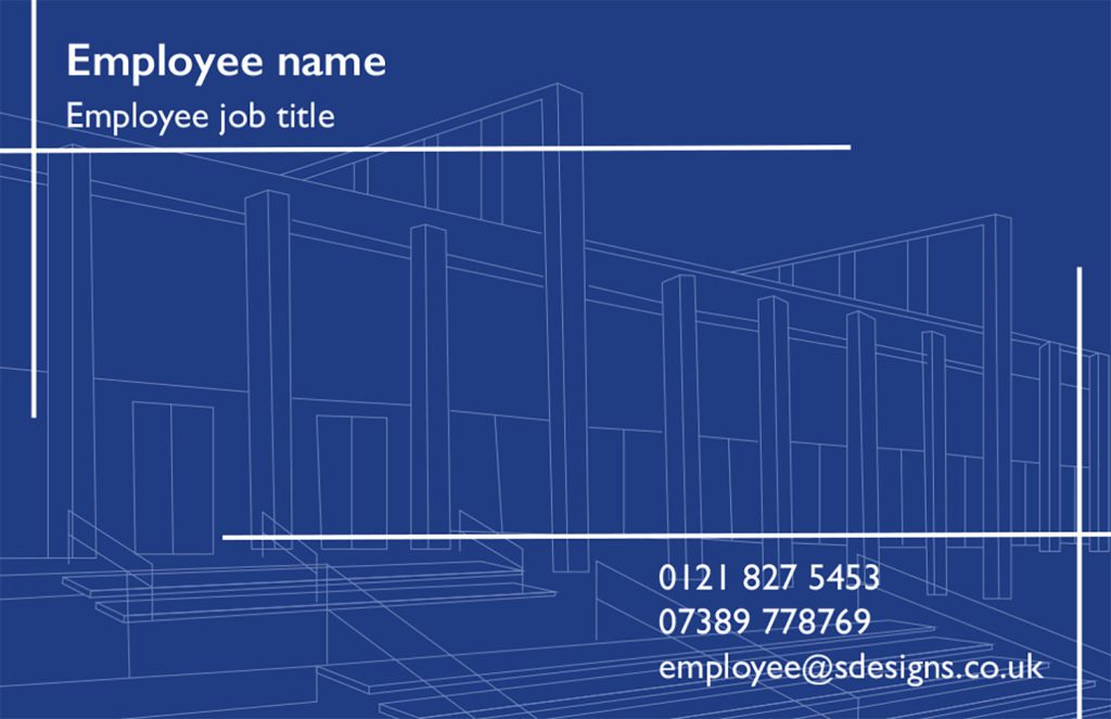
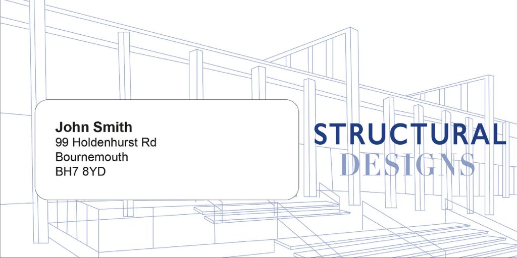
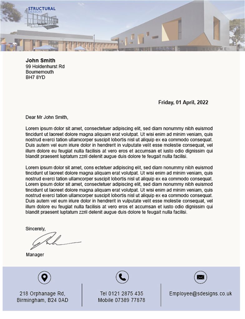
This project is about a company ‘Structural Designs’ who are an architecture firm opening in the West Midlands, Birmingham. The company itself, specialises in both residential and commercial architecture as well as restorations and even shows the client the design on VR so that the client can experience the design to see how it would look like when created.
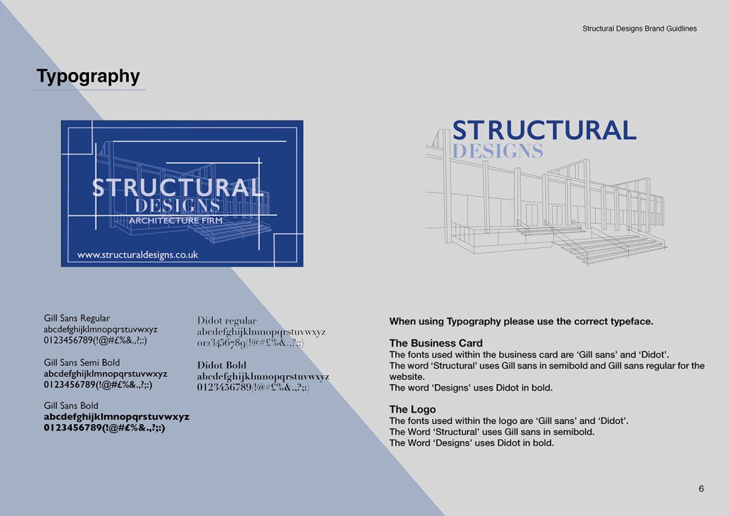
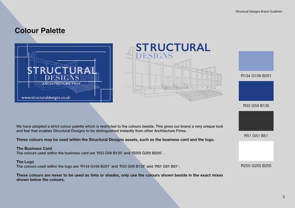
I have been allocated the design work for their brand and they have given me the task of creating a brand identity for them, in which they requested that I create for them a logo, a business card, a letterhead and an envelope for the letterhead, and a brand style guideline.
The company wants me to create this brand identity for them that makes them comes across as sophisticated and modern like throughout all the pieces I produce. They also want me to hold this high standard throughout my work and to depict them with professionalism and sophistication as well as holding them with good quality.
The role of a graphic designer is incredibly varied. You may find yourself immersed in a fantasy world while designing a set of illustrations for a book, or exploring complex data to create exciting and vibrant infographics that inform rather than confuse.
Graphic communication students at Dudley Sixth are introduced to a wide selection of processes and techniques. Using a range of both traditional and digital methods, they are encouraged to move beyond their comfort zones to produce a variety of work supported by an understanding of design theory and a developing awareness of contemporary practitioners to inform and influence their ideas.
In their second year, students begin to develop their own visual identity while becoming increasingly self-directed and independent, producing a collection of work tailored to their interests and specialisms. This could be an advertising campaign, design work for a clothing website or a set of illustrations for an album sleeve or book. Throughout the year, students will be encouraged to try new approaches and consolidate the skills they have learned in their first year to produce strong, challenging and professionally-produced designs. I believe you will see all of these qualities in this year’s second year work. I hope you enjoy it.
Chris Worley, A-Level Graphics Tutor, Dudley Sixth
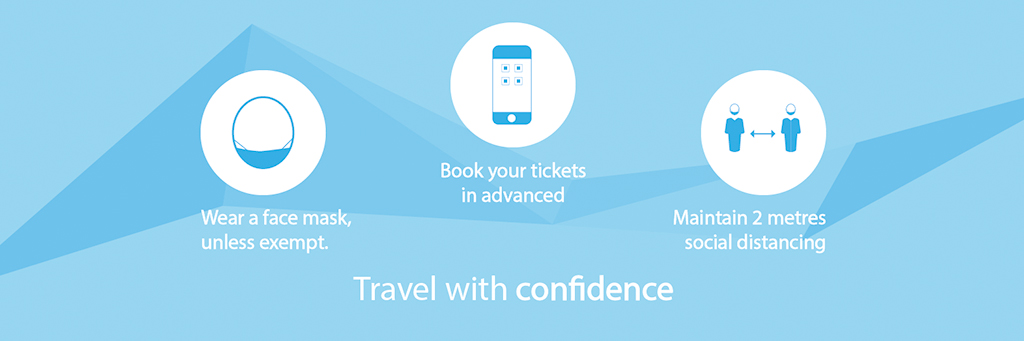
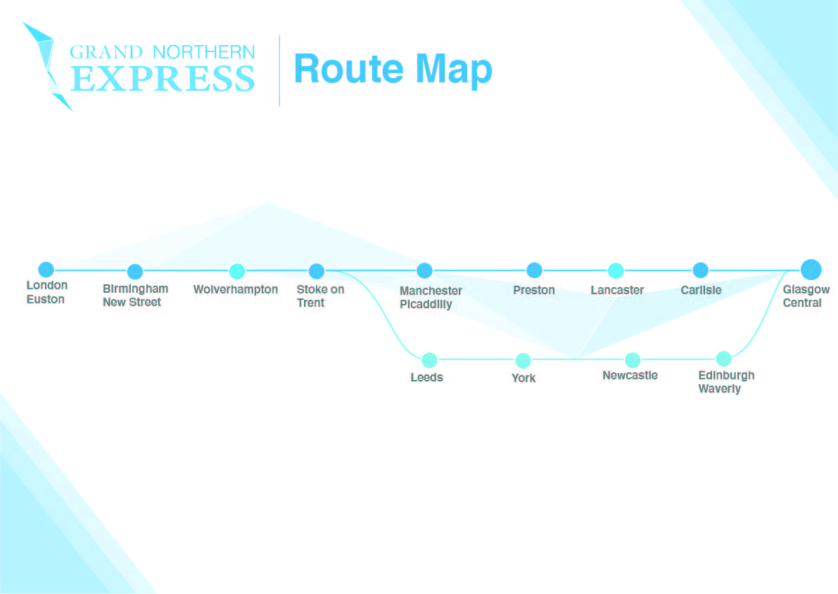
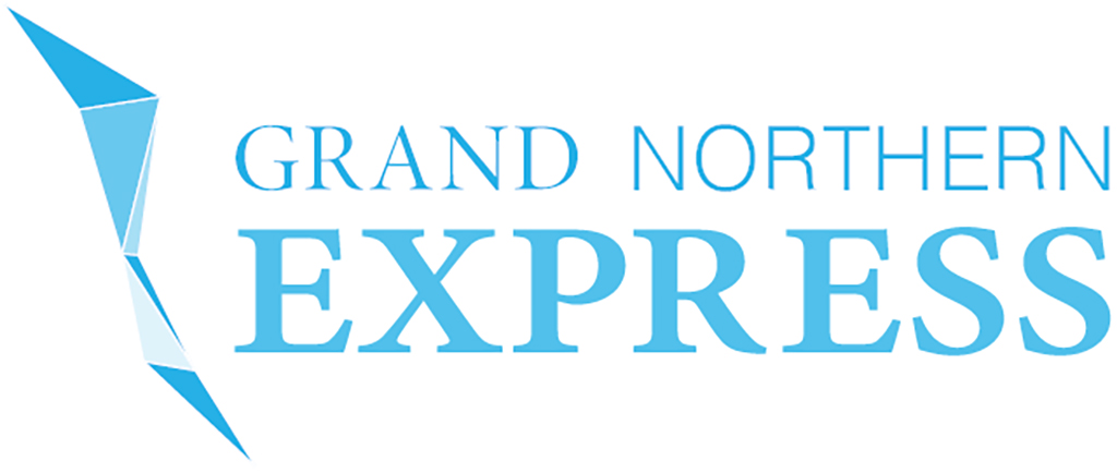
My project was to design a brand-new train operator which will be replacing and running multiple new routes, the goal was to design the routes which it will operating, and to provide a map for people with intermediate stops listed on there as well as the brand identity for the operator; a key image for it which will be used across all the designs.
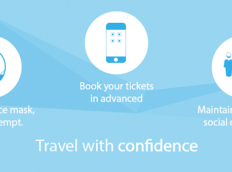
Aside from these things, I wanted to make a website where people can easily get answers to questions, the website needed to be a key point of support for people so making sure that it is easily understandable is key.
Main bits of the operator will also include a social media branding kit as to which I will needed to design a banner and a disruption map as this will allow people to obtain information quickly and easily.
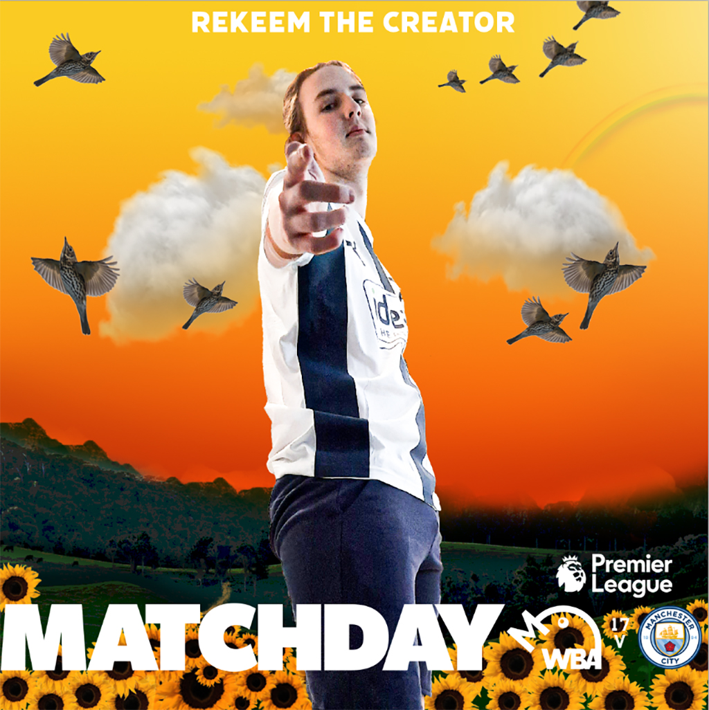
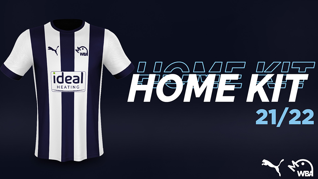
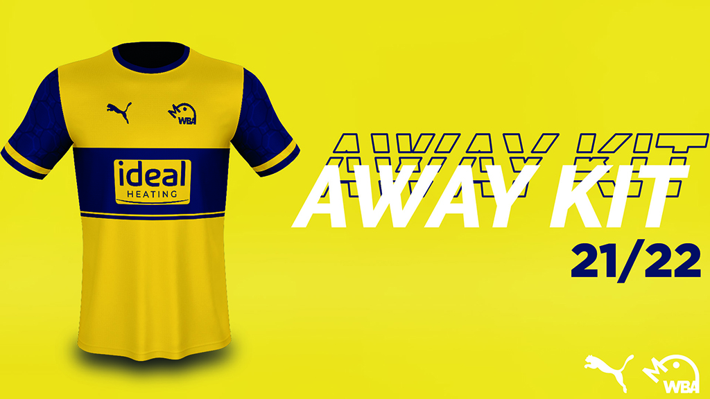
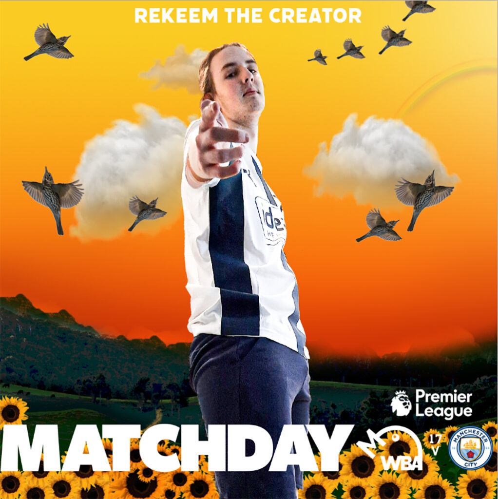
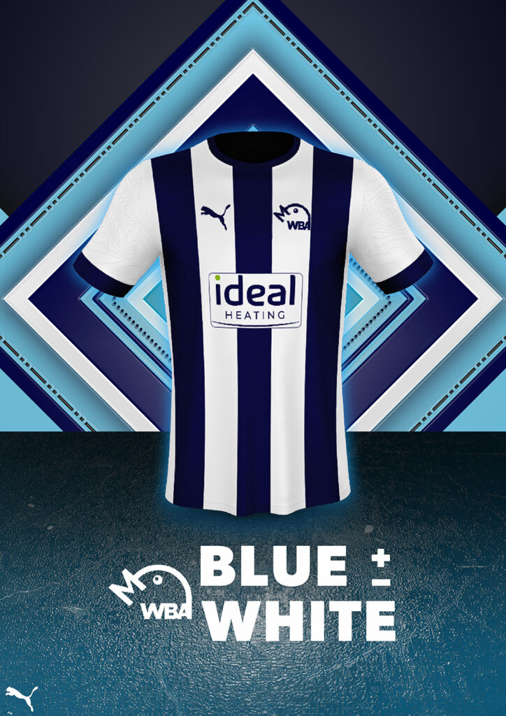
West Bromwich Albion is a football club that felt that they wanted a rebrand going into their next season. They mainly wanted a new logo, alongside two new kit designs and the accompanying announcement posts for social media, as well as other social media posts such as themed ‘matchday’ posts to be posted in the morning of each matchday. The club has a massive influence in the local community, and are aiming to become a more modern, sleek brand through how their logo looks, alongside embracing a rich history of success within the branding of the football club. The club is traditional and iconic within England, being a founding member of the Football League, alongside being an established Premier League team at time in the recent past.
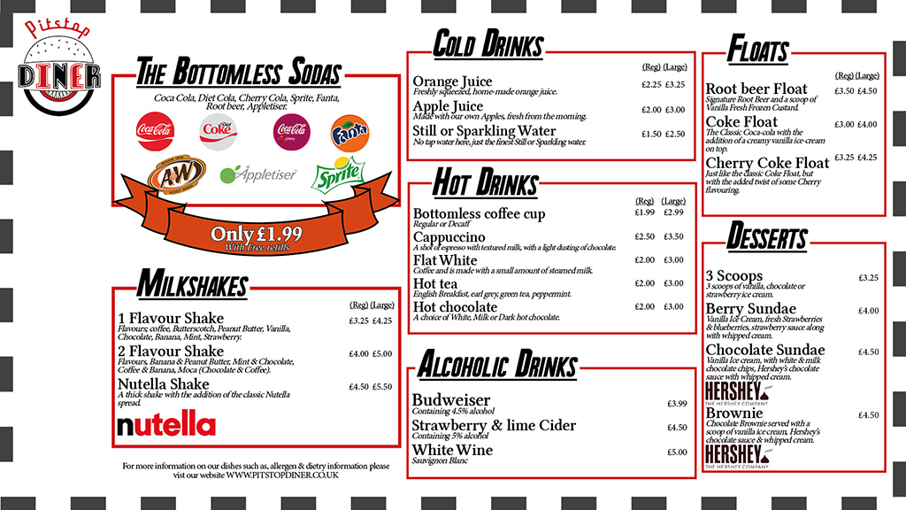
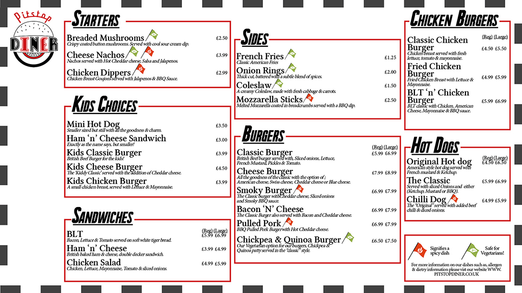
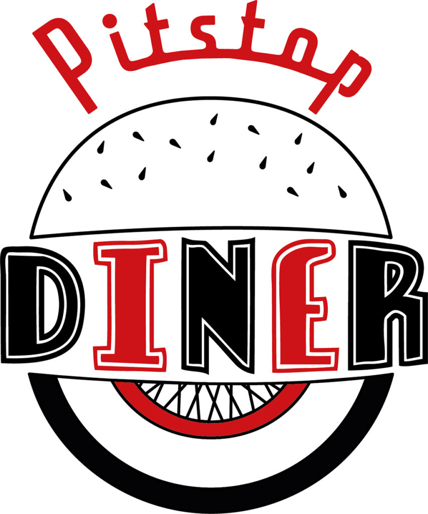
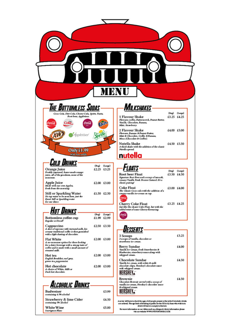
My Project was to create a corporate identity for a branch of Diner. I was inspired by modern Diner’s based on 1950’s aesthetics such as Ed’s Diner, Five guys and OK diner. To create accurate graphics for the diner in depth research into these branches and into the period of the 1950’s had to be done, this included looking into processes that were often used to create menus, logos and overhead boards. Throughout the project, I stuck as close to my intentions from the beginning as I could, creating a Logo, menu and Overhead board for a diner called “Pitstop”, a 1950’s inspired diner with a theme of racing/cars, by using a white walled wheel in the logo (a popular wheel used in the 50s) and including the front of a Cadillac in the menu. Overall, I was able to accurately create components that suit the 1950s theme and create a Diner that would be appealing to a wide variety of customers.
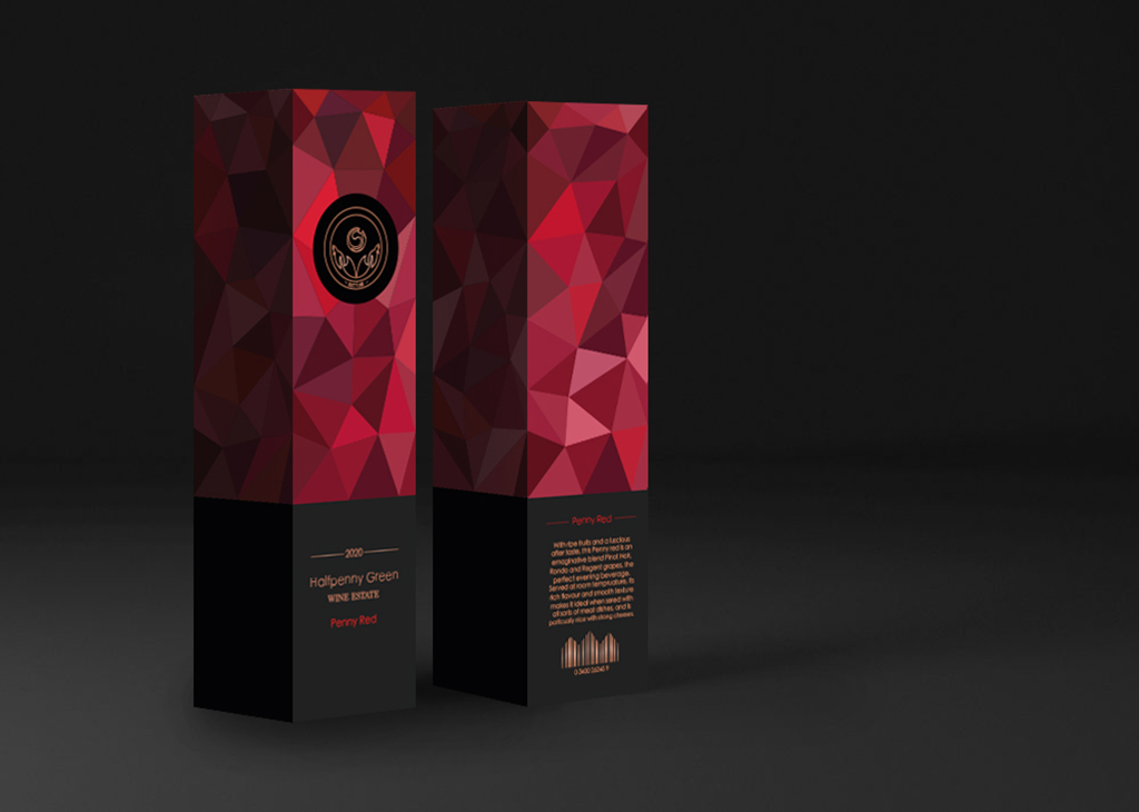
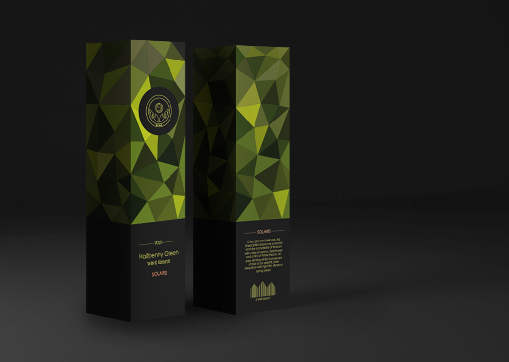
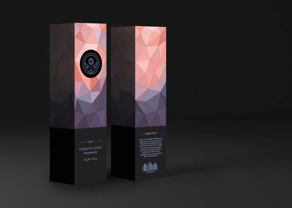
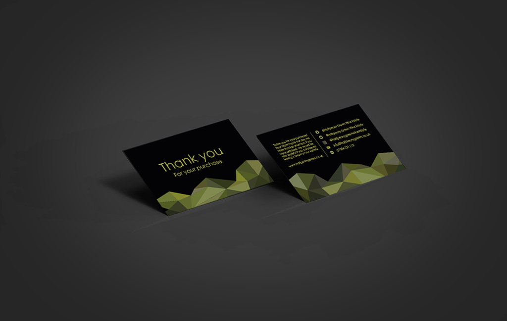
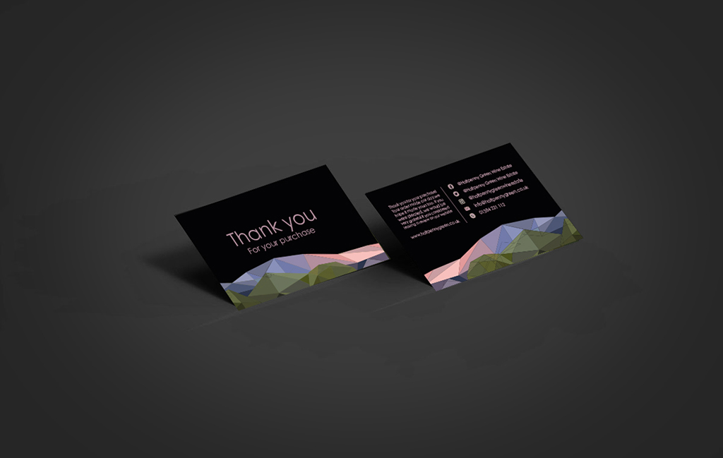
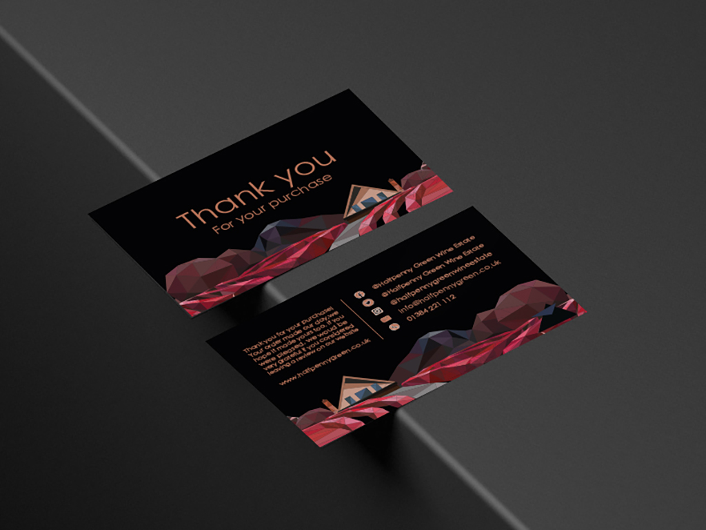
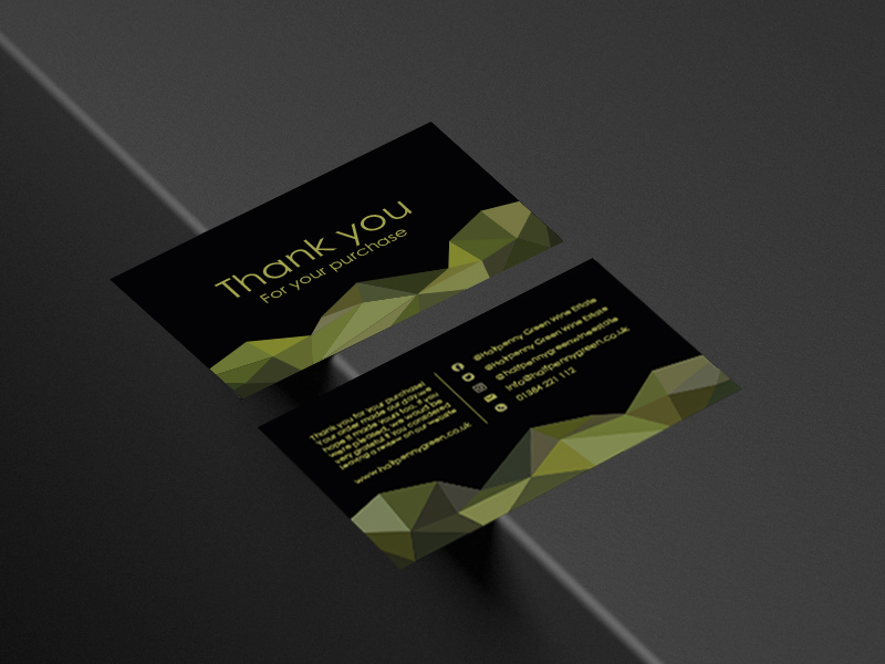
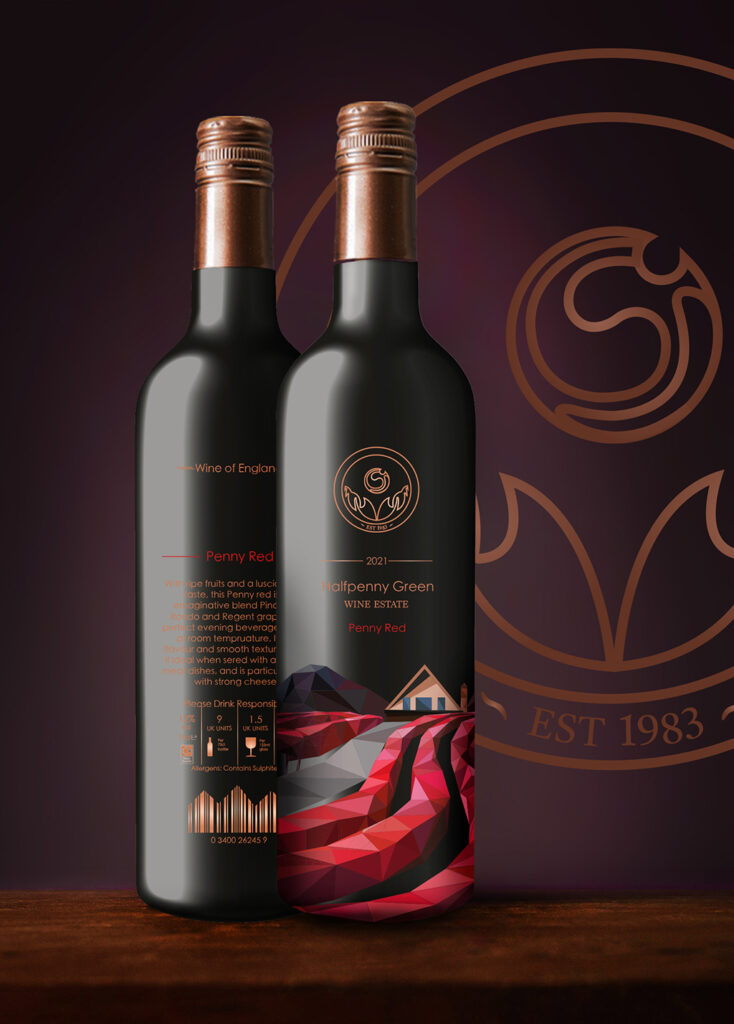
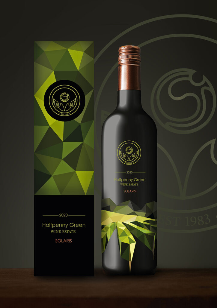
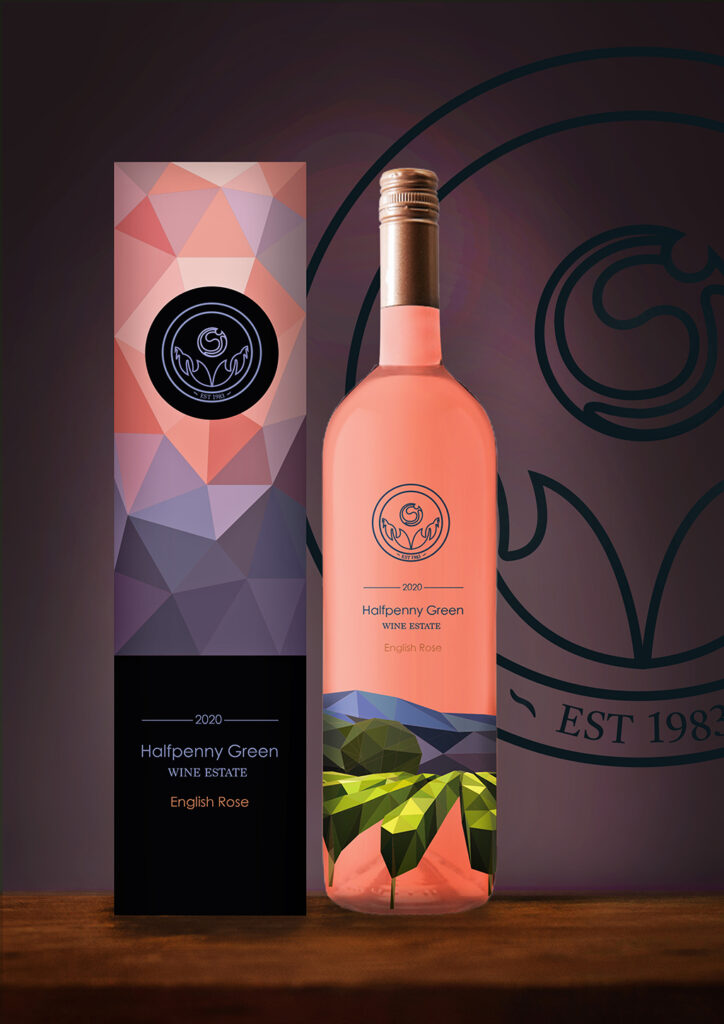
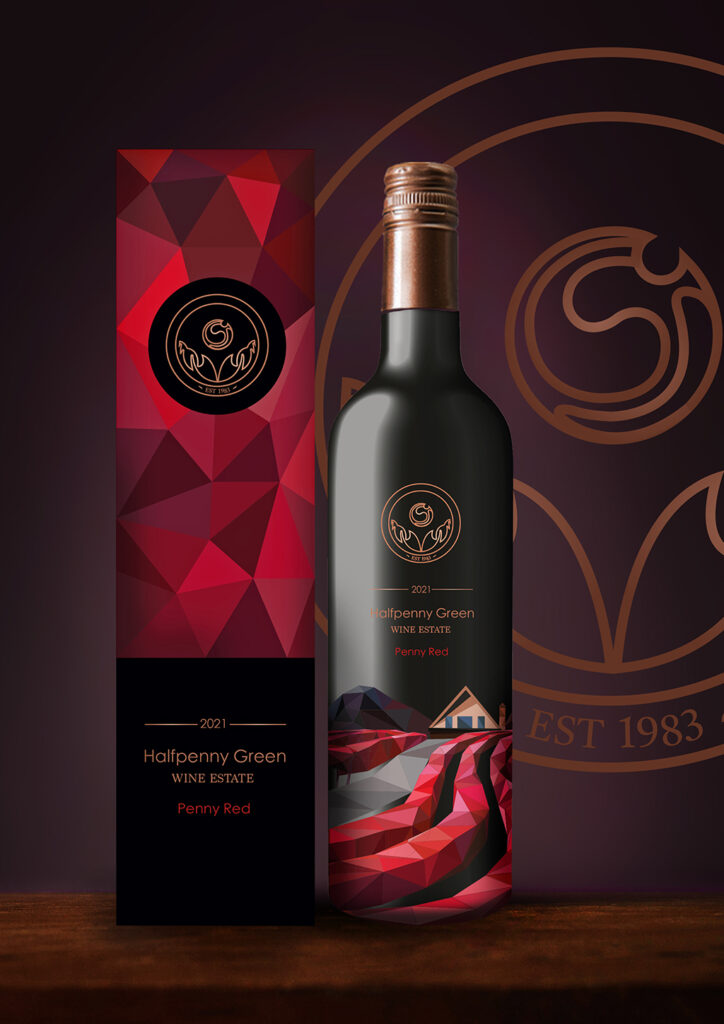
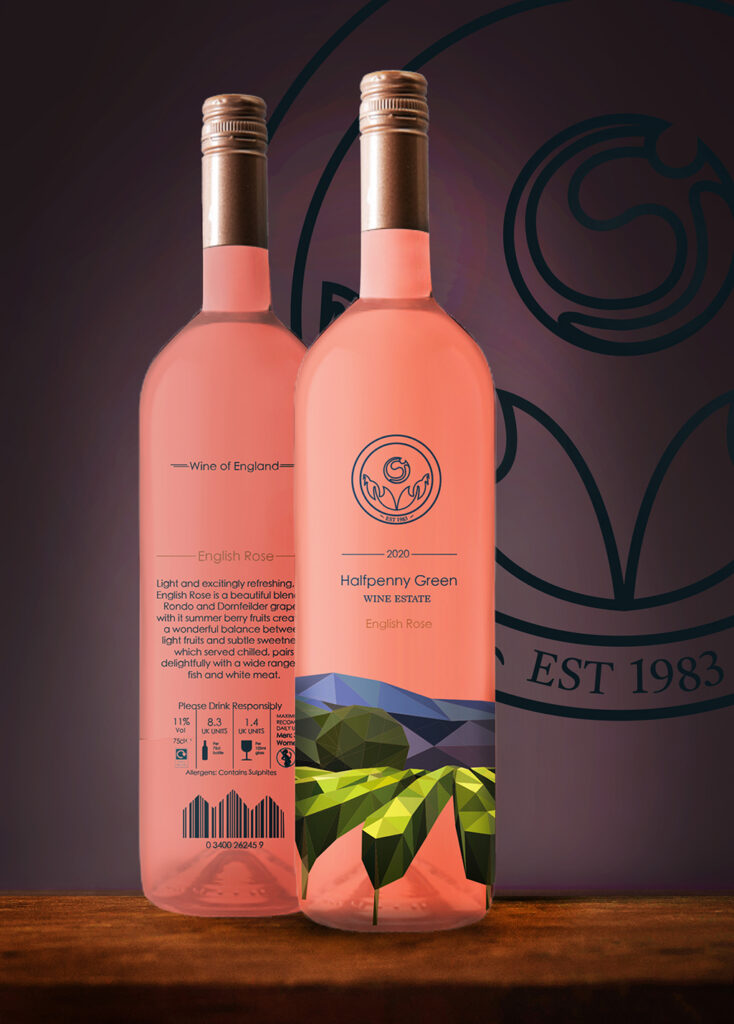
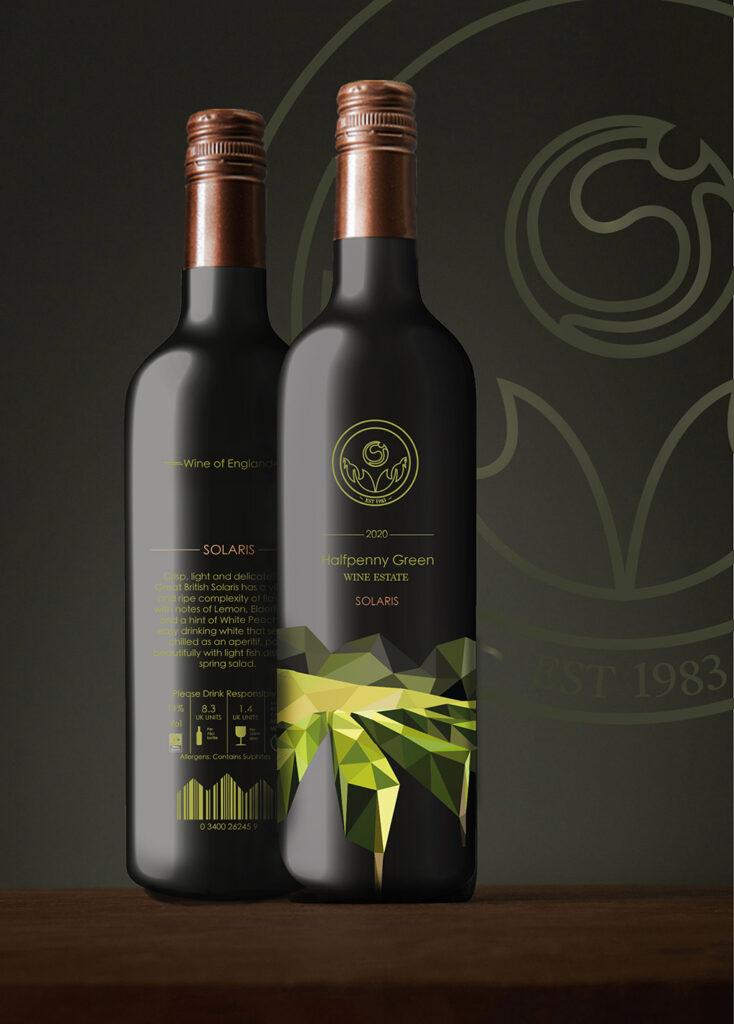
As part of my project, I created a range of graphics for a local vineyard, the Halfpenny Green Vineyard and Wine Estate. These graphics included a brand-new modern logo, a set of labels for 3 flavours of wine, Solaris, English Rose and Penny red, as well as complementary wine boxes which would keep each of the bottles safe and secure. The final pieces I designed were ‘Thank you’ Business cards, tailored for the flavour of wine purchased, following the luxurious Morales of the brand. The Vineyards landscape is a large selling point of the business, so this was an element which I chose to focus my designs around, creating a range of beautiful illustrations in the minimalistic form of art, geometric art, inspired by artist Elyse Dodge a style which would make up the identity of the brand.