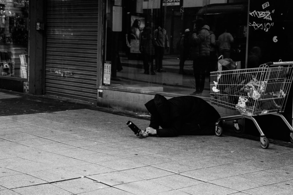
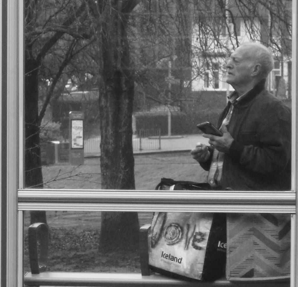
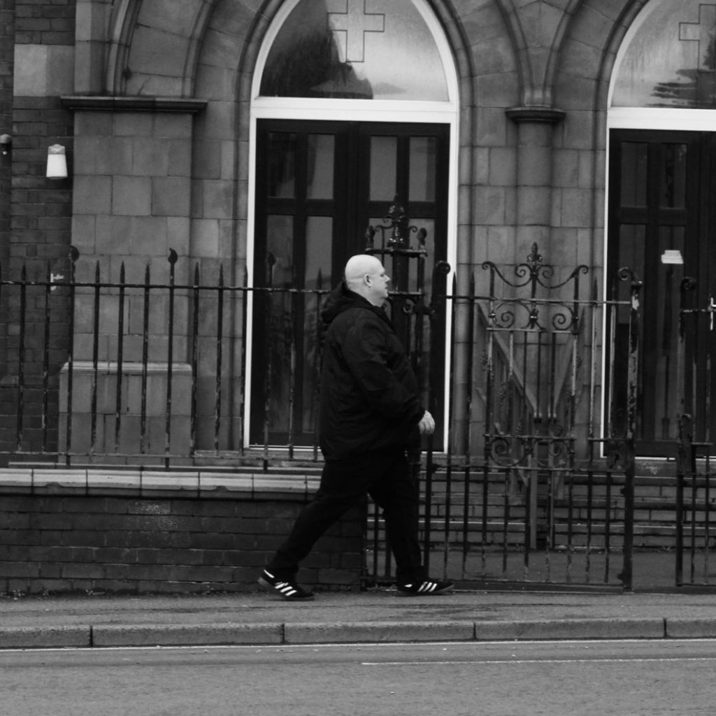
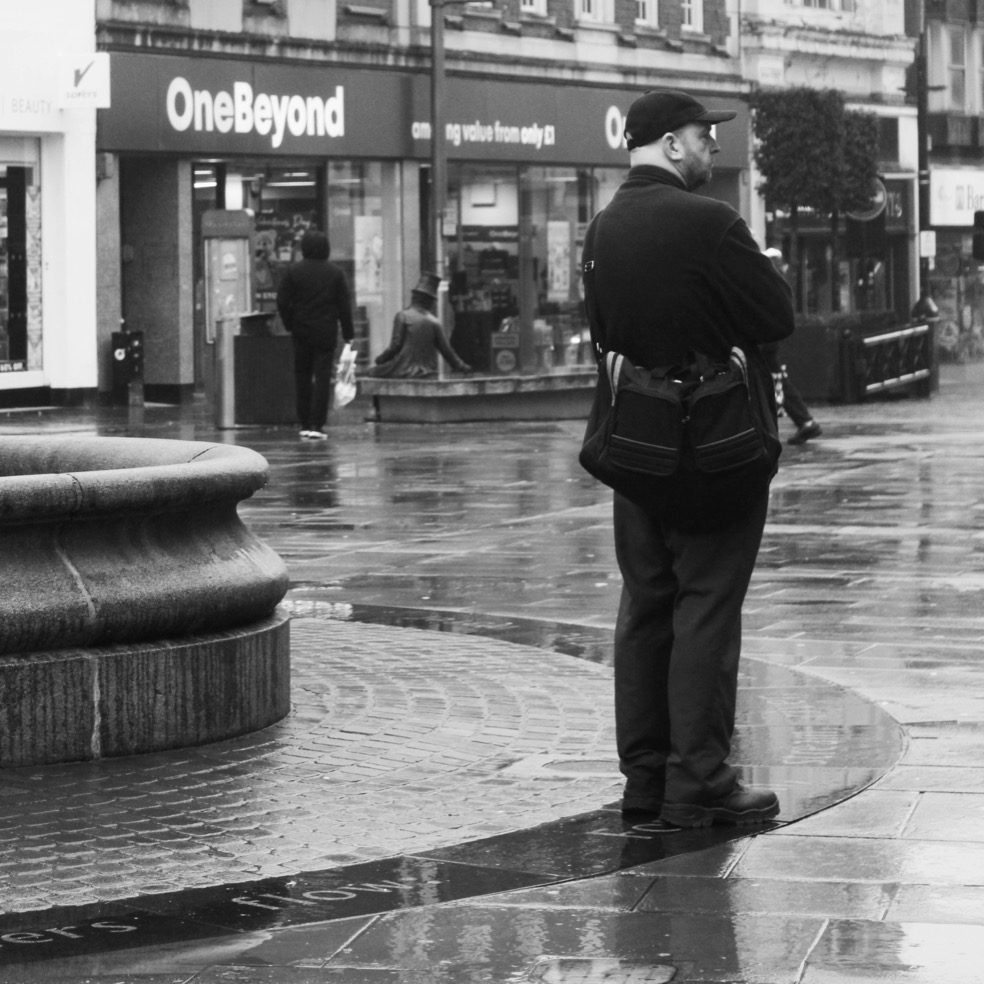
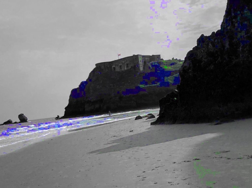
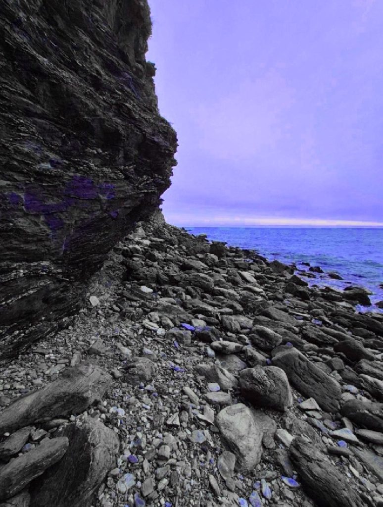
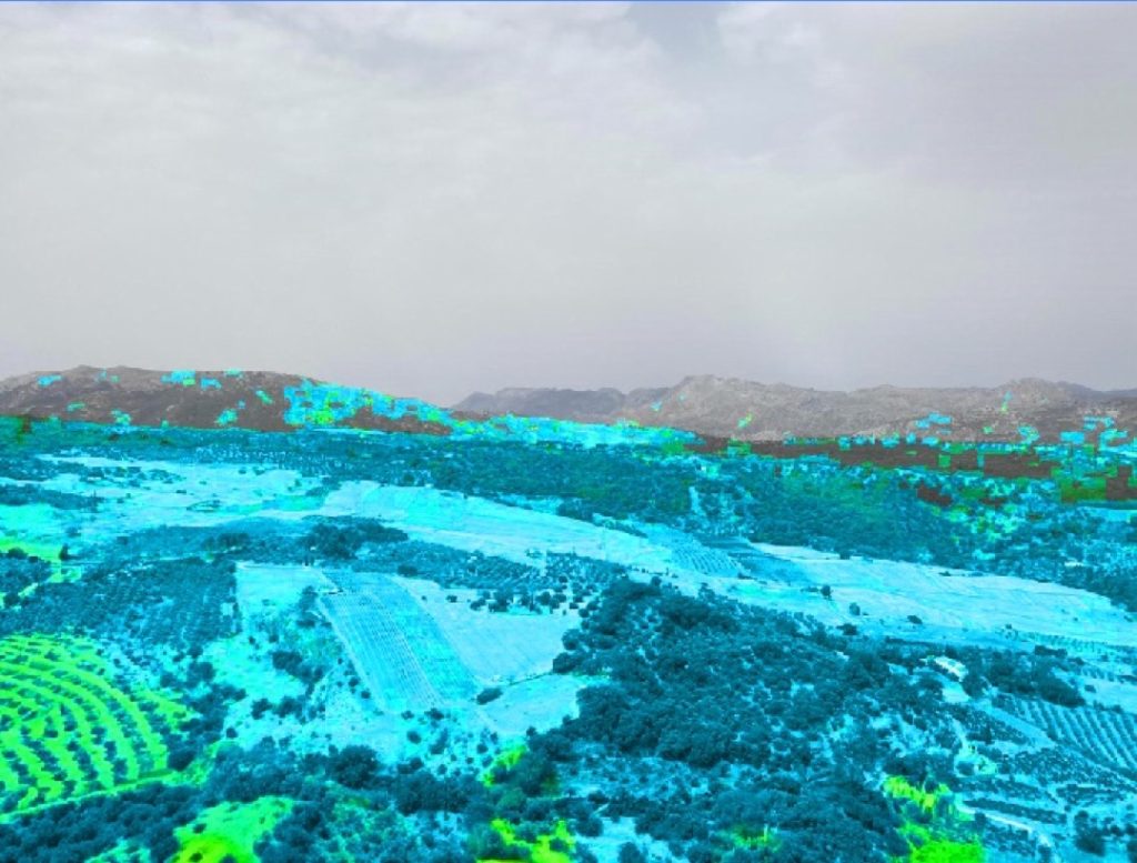
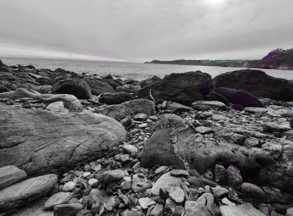
Check out This Video of the BTEC L3 Photography Exhibition Filmed and Edited by Elijah Cottingham
This year marks the 200th anniversary of the first permanent photograph. 2026 is exactly 200 years since the French amateur inventor – Nicéphore Niépce, made the first lens-based likeness, the first lasting grainy scene, which happened to be the view from his window. It was made on metal and took eight hours to expose.
Like an unassuming scientific alchemist, he magically conjured up a golden cultural moment in our quest to record and understand the world around us. Despite its recent convergence with the world of ‘high tech’, photography is still essentially about communicating creative ideas, eloquently through the capture of light and time.
With 200 years of photographic history behind us though, it becomes increasingly difficult for photographers to surprise us with ‘effective novelty’ as creativity is sometimes defined.
This year’s cohort has had its share of ups and downs. We recently had a trip to Derbyshire, where we climbed Thorpe Cloud, as well as completing a 10-mile hike to Thor’s Cave. Last year we also represented the college in the Lessons from Auschwitz program. In January we exhibited our Diversity project as part of our Culture Day.
This was about exploring and conveying positivity and acceptance within themes of diversity, focusing on areas such as age, gender, sexuality, ethnicity, race, hair colour, disability, etc. We feel that it is very important to celebrate individuality and personal expression within our work. To succeed together, we believe we need to value what makes us different.
In March last year we also managed to exhibit our positive-image portraits of Dudley’s Refugees in The Upper Waiting Hall of The House of Commons, as well as making some strong street photography in the capital. We also continued our conservation photography partnership with Dudley Zoo, which next year will become our biggest collaboration yet, as we mark the zoo’s 90th anniversary, with a wider visual and oral history, heritage project.
This cohort are clearly a creative bunch; they have had exhibitions and won competitions, even nationally, with our Association of Colleges exhibition and globally, with our recent World Skills accolade. We have continued to build close relationships with local universities too, many of whom we visited for workshops, or they visited us. Half of our young people are heading for undergraduate study, many locally, but some further afield. Others are seeking creative employment.
We were proud to welcome back Ellie Avison of the class of 2022, this year, a graduate of University of the Arts, London (one of the top universities in the world for art and photography) who during her teacher training with us, has helped transform this academic year. In the end, the class of 2026 have solved problems and come together to make this yearbook, showcasing their talents and aspirations.
We wish them luck, as they leave us to make their mark and embark on the next chapter of their lives; but let’s take a moment to reflect on their journeys together with us. I have learnt, that at critical moments in time, you can significantly raise the aspirations of young people, sometimes, simply by suggesting that they can do something bigger or better or more ambitious than what they thought was possible or what they felt they could achieve.
We hope you find our students’ work interesting, thought-provoking, authentic and relevant, especially in this image-saturated age of instant communication and deep fake, AI digital trickery. Despite the importance of our trips, it’s not always necessarily to go far, no need to canoe down the Amazon to create great photography. The trick it seems to me is to retain a sense of wonder about the world around us. We all take pictures now, but how many of us really look? Really, see?
As the seminal contemporary photographer of our time, the recently departed Martin Parr, so astutely pointed out, why are many of us drawn to photographic cliches, subjects that rarely change? Why not instead, as we did with our Show Me A Secret project, turn your attention to the high street, the view from the bus or the interior of your local shop? Thanks to the whole team, including Ellie and Chris!
As a purpose built, self-contained A-Level centre with the goal to educate and enthuse the next generation of learners, Dudley Sixth is fast gaining a reputation for being one of the best places to study A-Levels in the Black Country, Birmingham and the wider West Midlands region.
Our A-Level courses in Fine Art, Graphic Communication, Photography and Textile Design are your gateway to Higher Education, Higher Apprenticeships or employment. The majority of our learners plan to progress onto university and many accept places at a range of Russell Group universities, including Birmingham, King’s College London and Manchester, as well as other local prestigious universities including Aston and Keele.
With subject specialists guiding you through your two-year A-Level programme, you will receive the highest quality education. Our aspiration is for you to achieve your potential and have a very successful future.
This qualification offers learners the opportunity to develop their technical fashion & textiles skills through a process of self-evaluation, practice and review. In addition to the specialist fashion & textiles content available in this qualification, learners will develop the transferable and higher-order skills that are highly regarded by higher education and employers, for example communication, project management and problem solving.
You will develop practical skills and knowledge in fashion and textiles through lessons taught in specialist studios. From initial ideas and concepts, you will learn how to pattern cut, create your own textiles and construct garments. You will have the chance to see your fashion collections come to life during public fashion shows and a final exhibition.
Dudley College now also offers a Textiles and Fashion T Level qualification that will provide you with the knowledge, skills and behaviours needed to progress into skilled employment or higher-level technical training or study in the Fashion and Textiles sector. The core knowledge and understanding will be assessed through an examination and core skills through a practical employer-set project.
Check out this Catwalk Video of Fantastic Creations by our Yr1 and Yr2 Students
The work on show here is just a snapshot of some of the work produced over the past two years. While our students are taught digital skills, they also learn traditional art and design skills in order to develop a broad portfolio of art and design for their progression onto higher education.
Some of our recent students have gone on to study at degree level in subject areas such as visual communication or graphic design, but also illustration, animation, fashion illustration, automotive design, architecture, interior architecture, jewellery design, digital media, and many other creative pathways.
Over the past few months all our students who made university applications were accepted (as usual), and generally on their first choice. Some have chosen to begin their studies at degree level, and others have decided to stay on at Dudley College for a Foundation Year. Well done all – it’s been great working with you. Good luck for the future.
The role of a graphic designer is incredibly varied. You may find yourself immersed in a fantasy world while designing a set of illustrations for a book, or exploring complex data to create exciting and vibrant infographics that inform rather than confuse.
Graphic communication students at Dudley Sixth are introduced to a wide selection of processes and techniques. Using a range of both traditional and digital methods, they are encouraged to move beyond their comfort zones to produce a variety of work supported by an understanding of design theory and a developing awareness of contemporary practitioners to inform and influence their ideas.
In their second year, students begin to develop their own visual identity while becoming increasingly self-directed and independent, producing a collection of work tailored to their interests and specialisms. This could be an advertising campaign, design work for a clothing website or a set of illustrations for an album sleeve or book. Throughout the year, students will be encouraged to try new approaches and consolidate the skills they have learned in their first year to produce strong, challenging and professionally-produced designs. I believe you will see all of these qualities in this year’s second year work. I hope you enjoy it.
Chris Worley, A-Level Graphic Communication Tutor, Dudley Sixth
See our students’ awesome FMP designs in their fashion catwalk videos
Chloi Bate
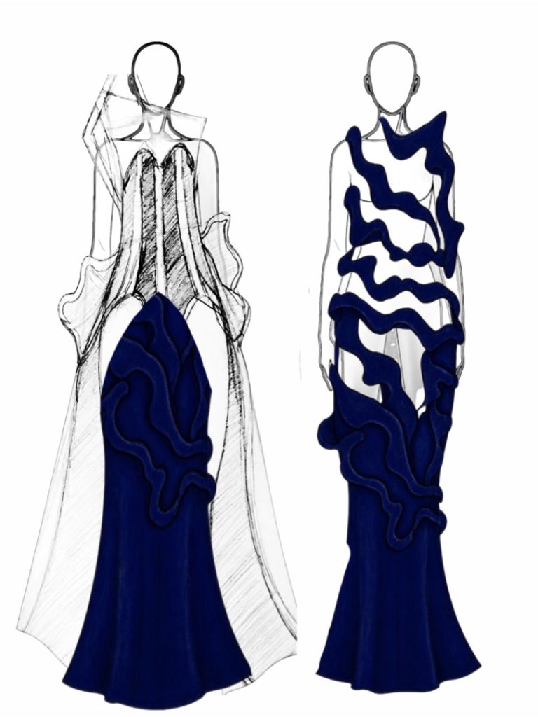
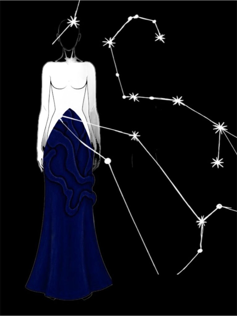
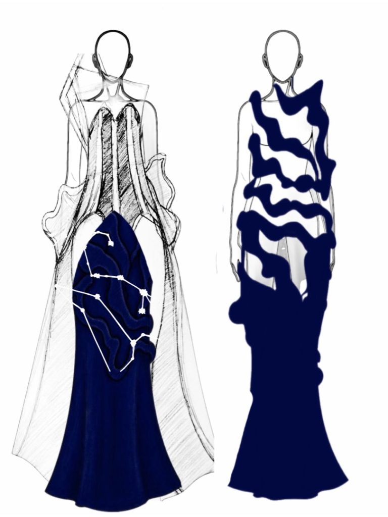
Final Major Project – Spirituality Progression: Art & Design Foundation Diploma
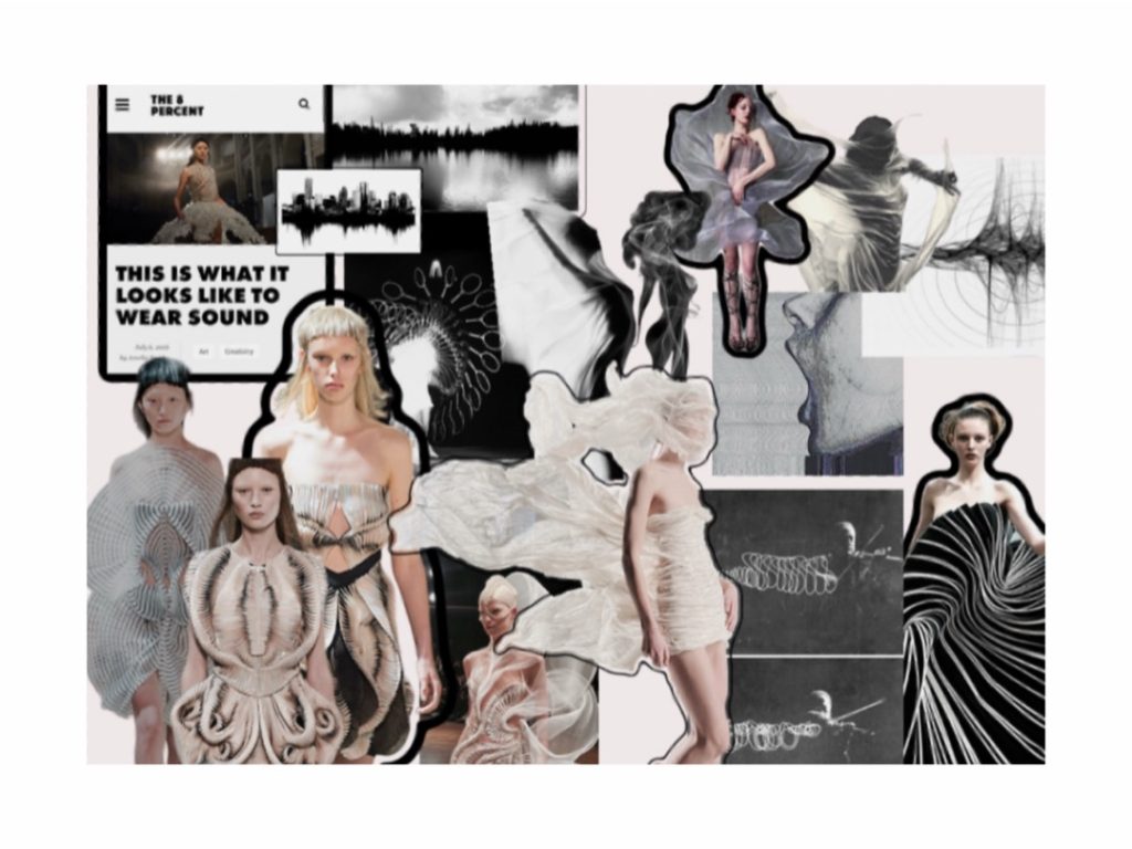
For my Final Major Project, I explored the concept of spirituality through fashion and textiles. My work focuses on creating a sense of mystery, encouraging viewers to form their own interpretations before discovering the meaning. I approached the project with an open mind, taking inspiration from peers and designers such as Emilio Pucci, Winde Rienstra, and Iris Van Herpen. This helped me develop new techniques, expand my skills, and apply these ideas to my final garment.
Natasha Birch
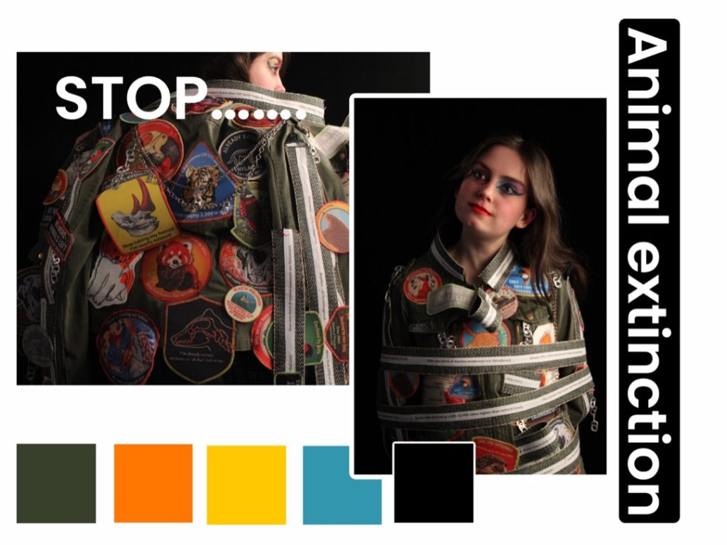
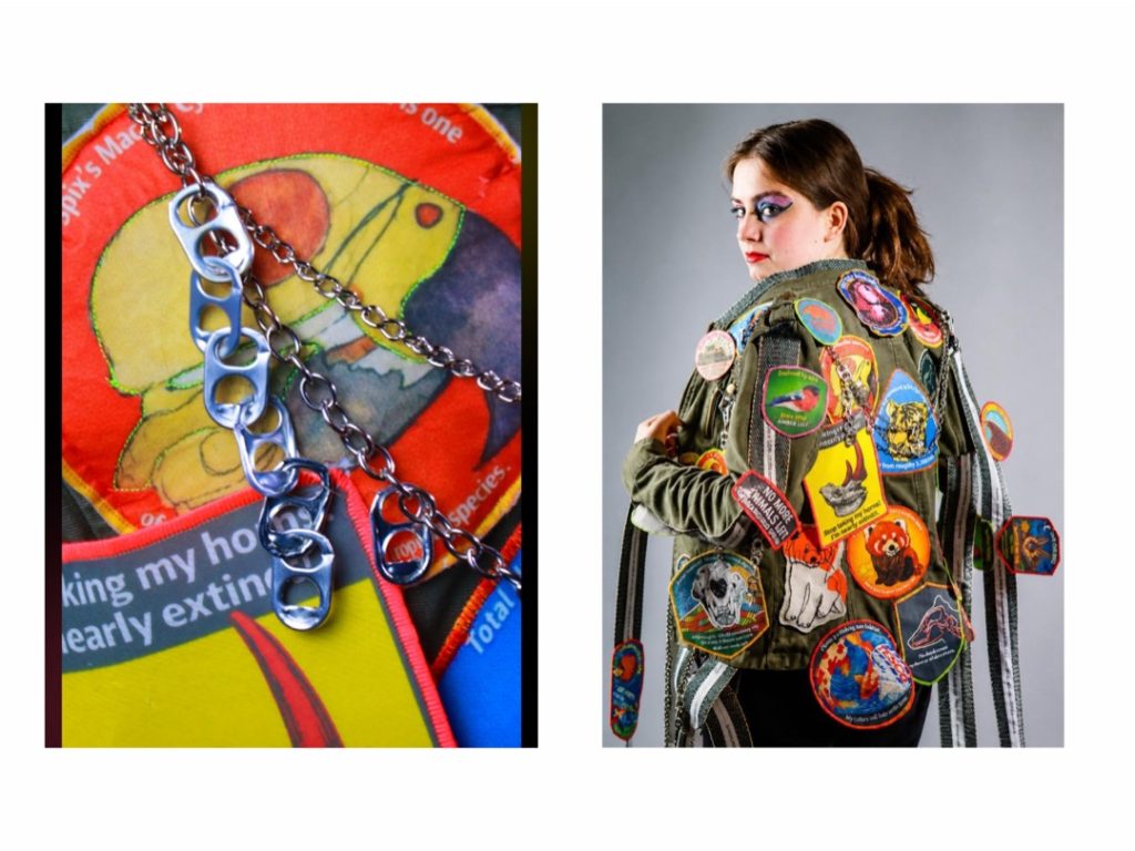
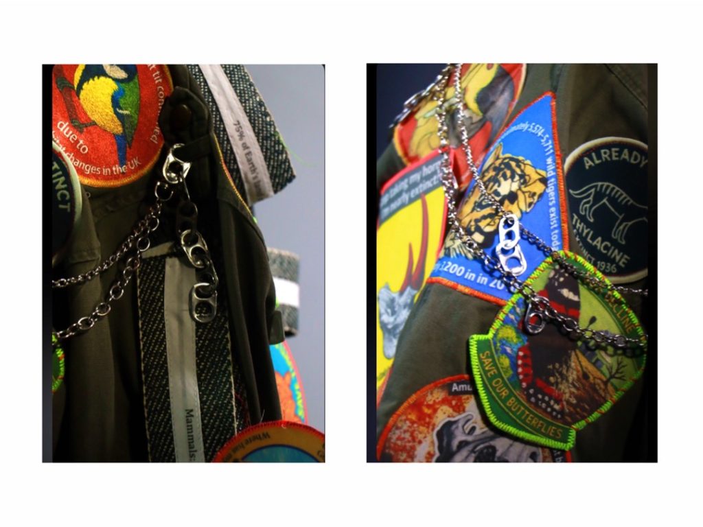
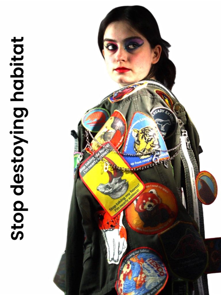
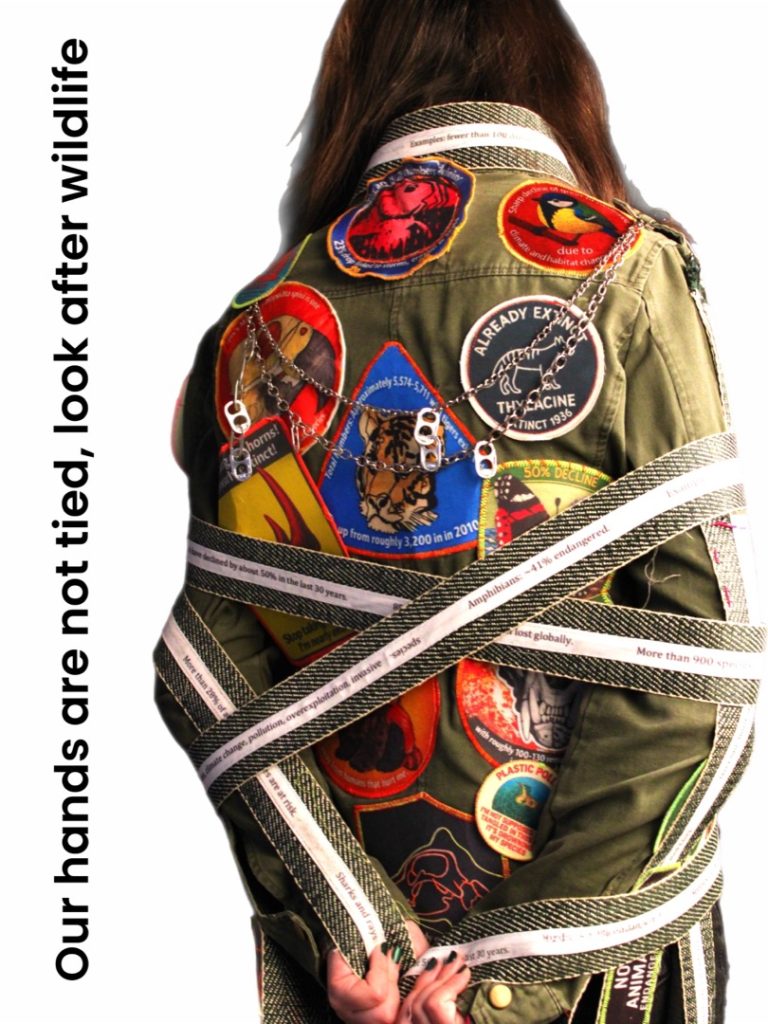
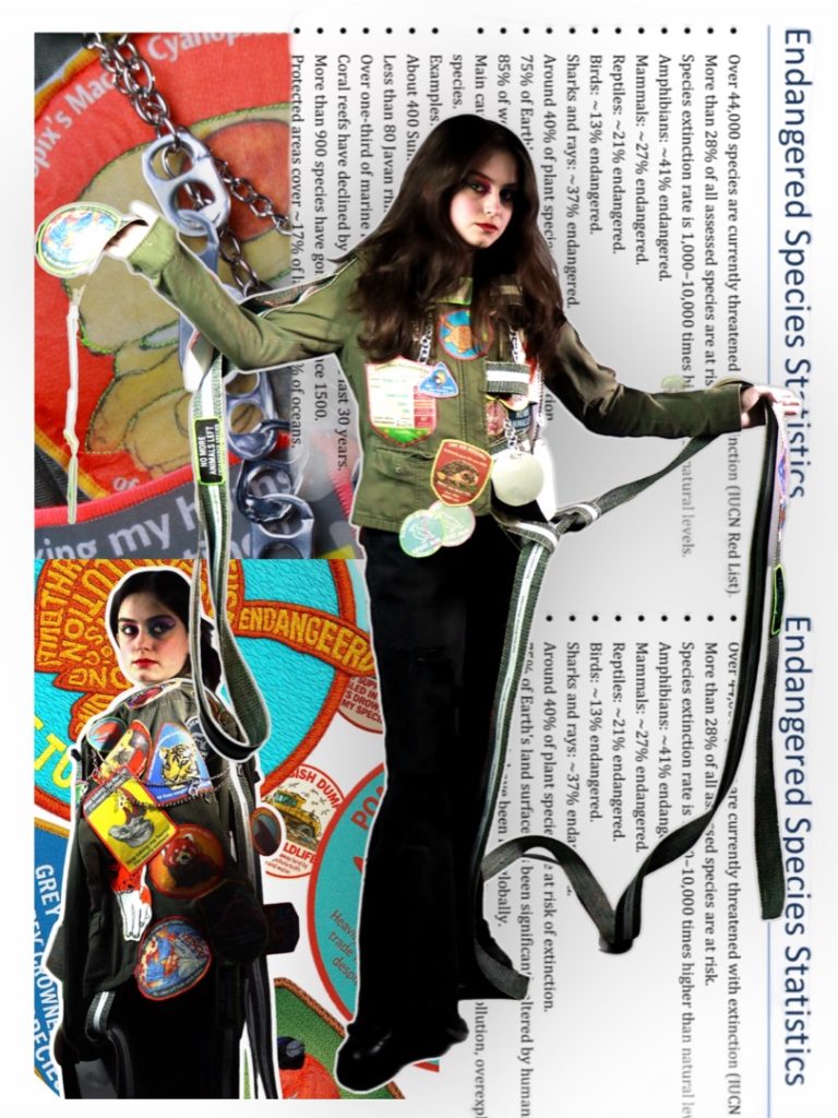
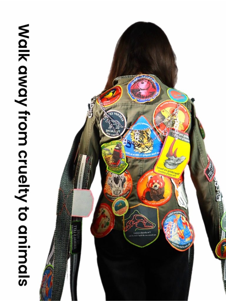
Final Major Project: Animal Extinction
Progression: BA Hons Fashion
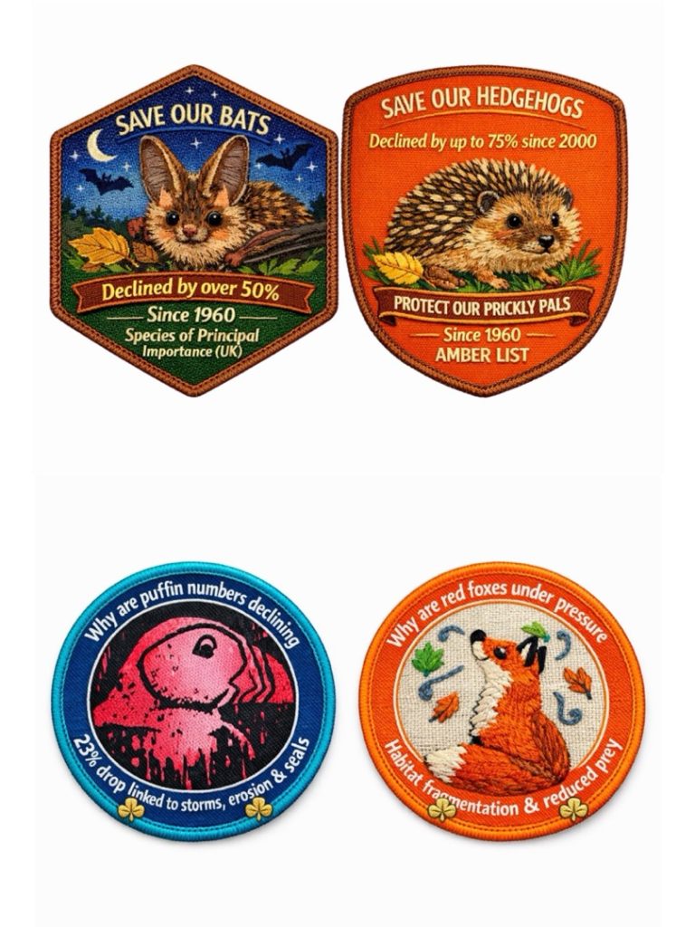
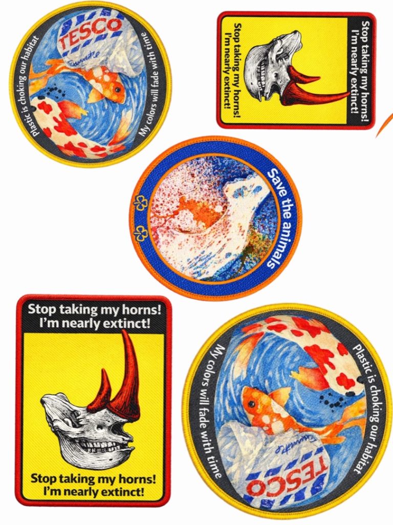
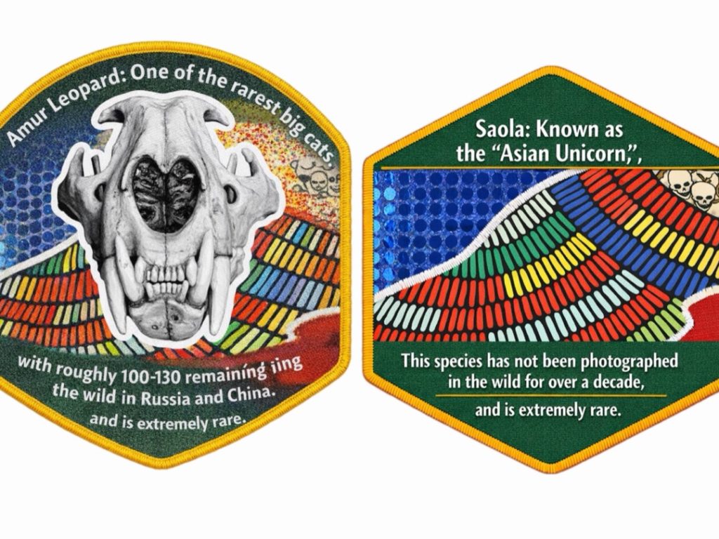
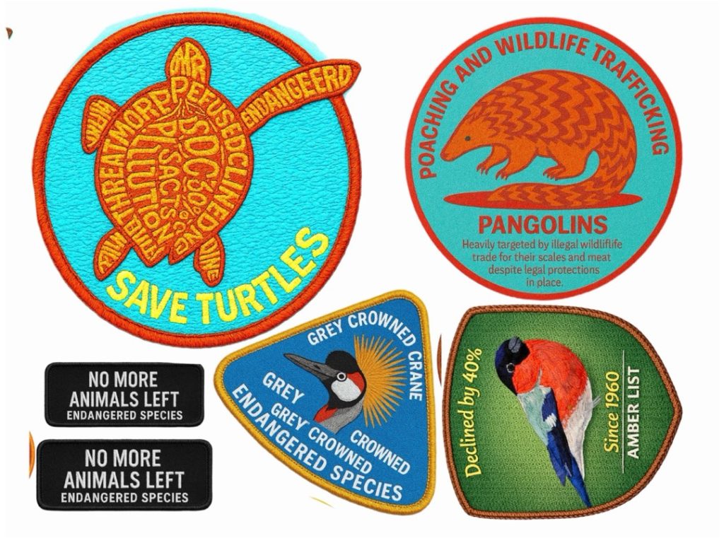
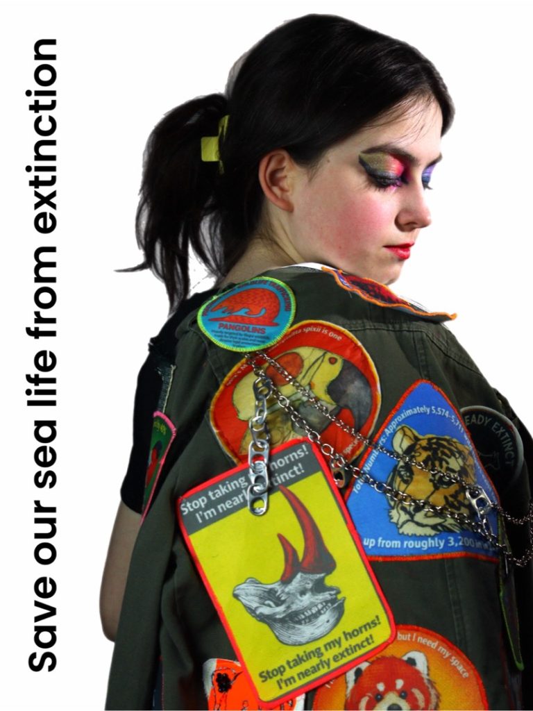
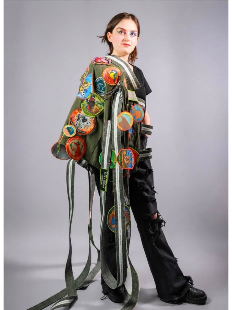
For my FMP, I explored the theme of extinction and the loss of animal species, combining environmental concerns with personal narrative. Inspired by artists such as Tracey Emin, I used an autobiographical approach, reflecting on my journey from Brownies to Cubs and my sense of an “explorer spirit.”
I became interested in badges as symbols of achievement, identity, and memory, using their format as a key visual motif. I developed my practice through hand-rendered painting, digital design, and sewing, combining these techniques to create layered and personal outcomes.
My work brings together autobiographical storytelling and ecological awareness, communicating themes of loss, identity, and belonging.
Hatice Bishop
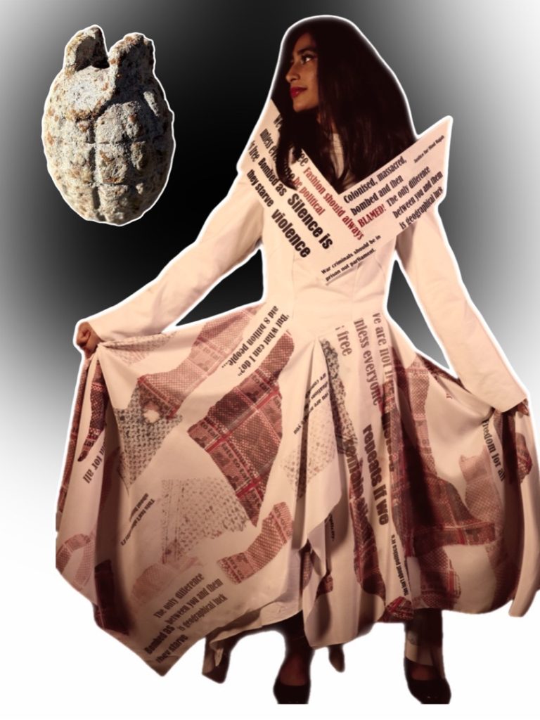
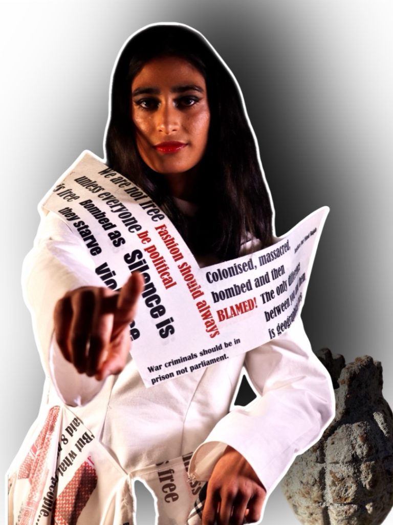
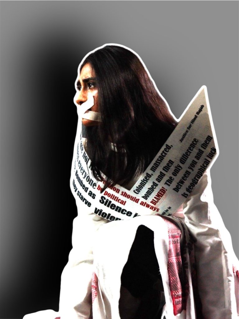
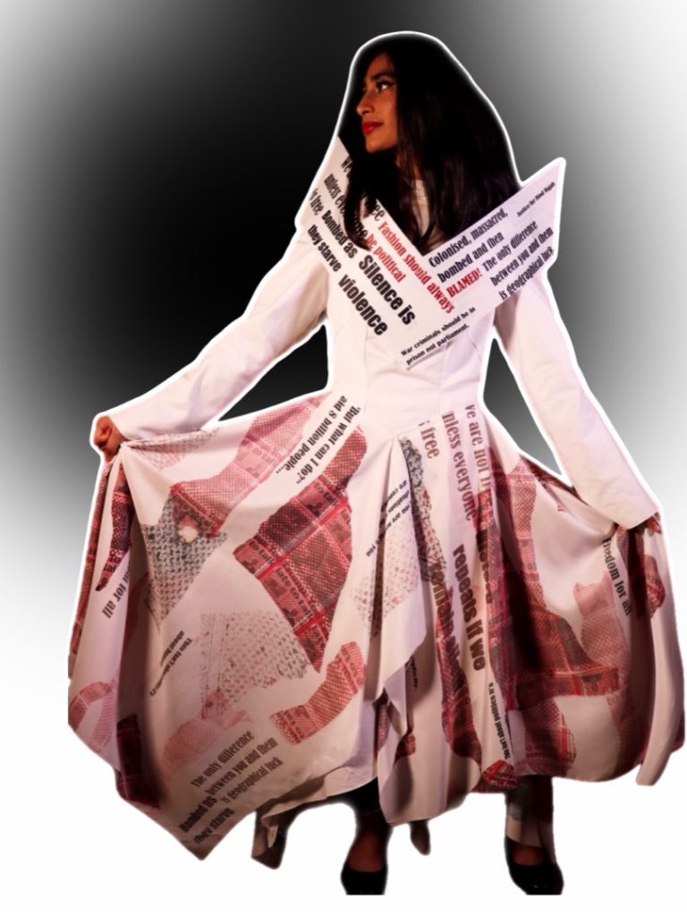
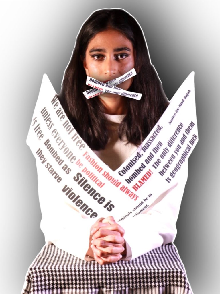
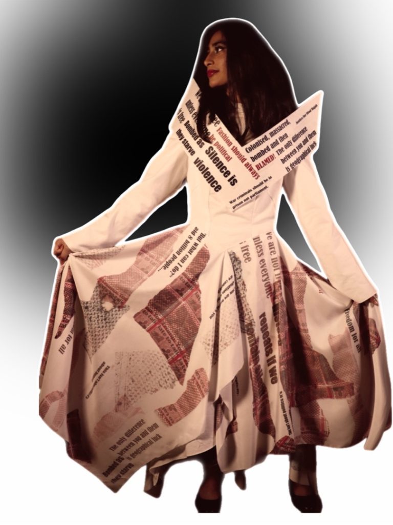
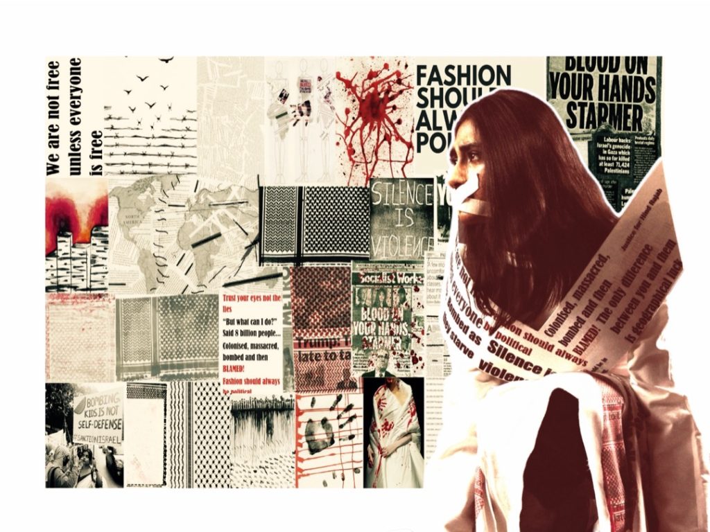
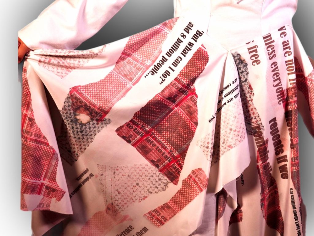
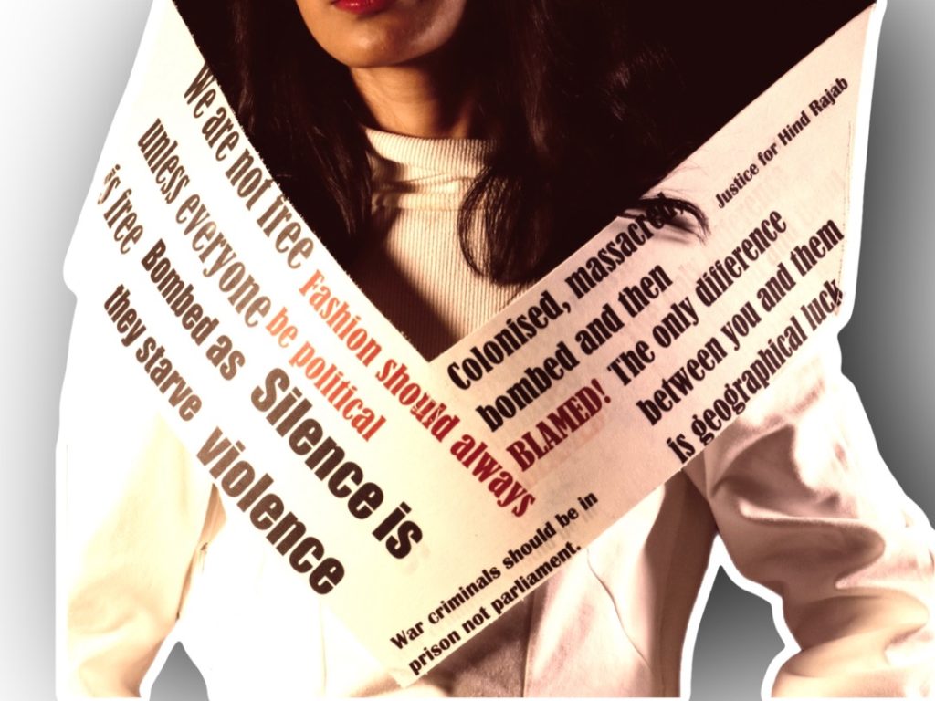
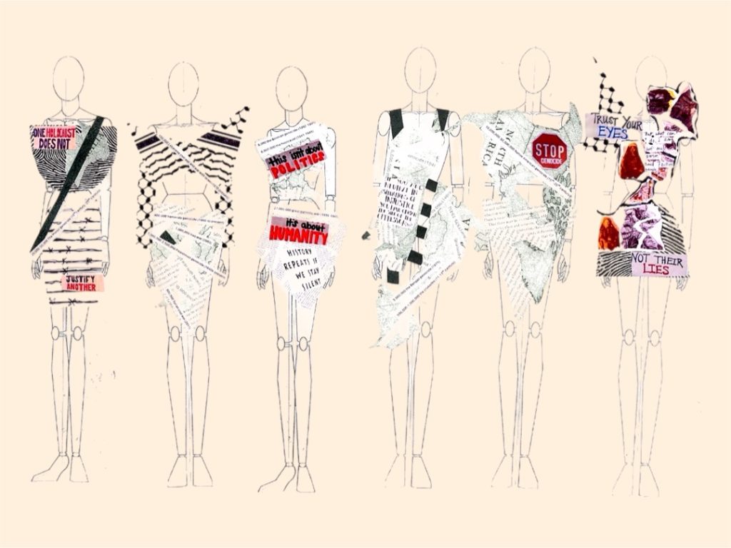
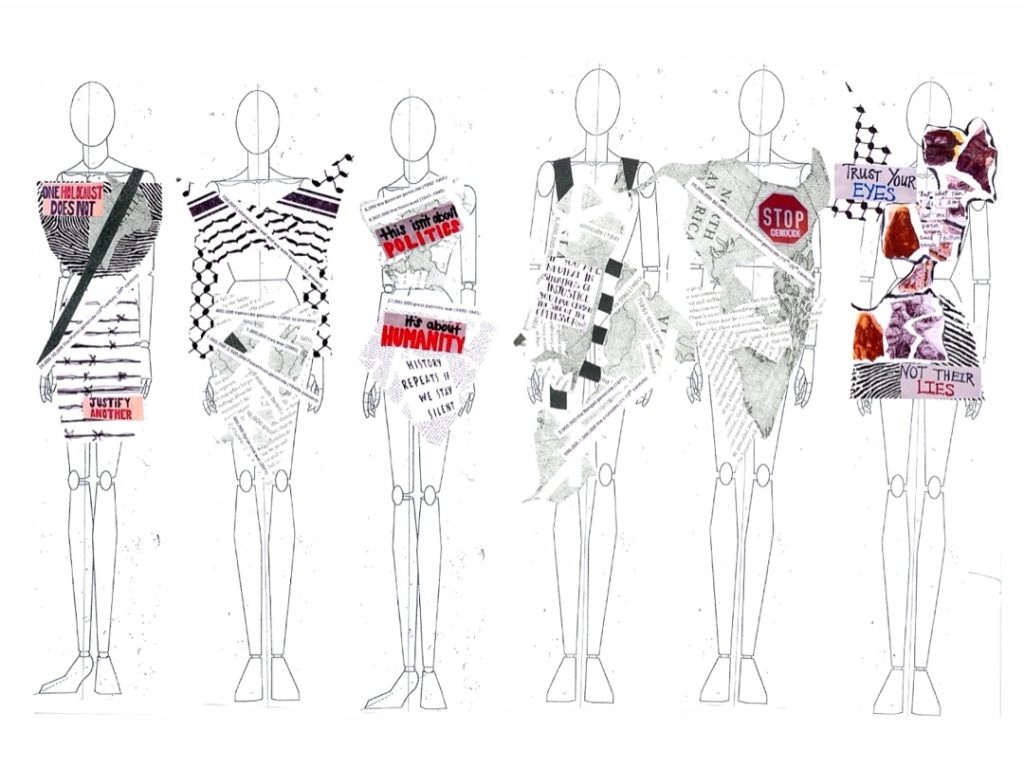
My FMP project explores human rights through themes of oppression, displacement, and social unrest, with a focus on the lived realities of people once displaced due to conflict. I created a structured, bold garment that communicates political urgency and resilience.
Inspired by Vivienne Westwood and artists such as Malak Mattar, Emily Jacir, and Hazeem Harb, the piece uses form and visual impact to express trauma, resistance, and the power of creative activism, using the power of textiles and print.
Naila Centane
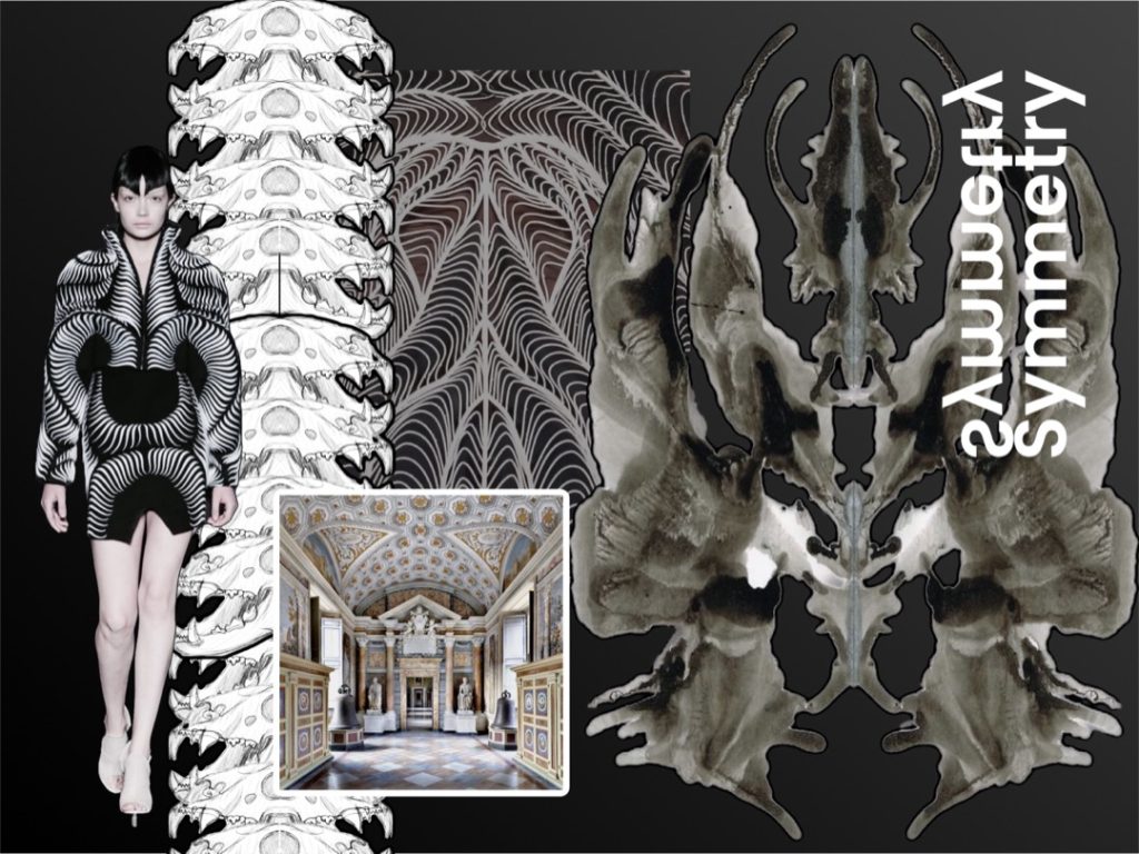
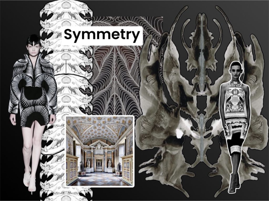
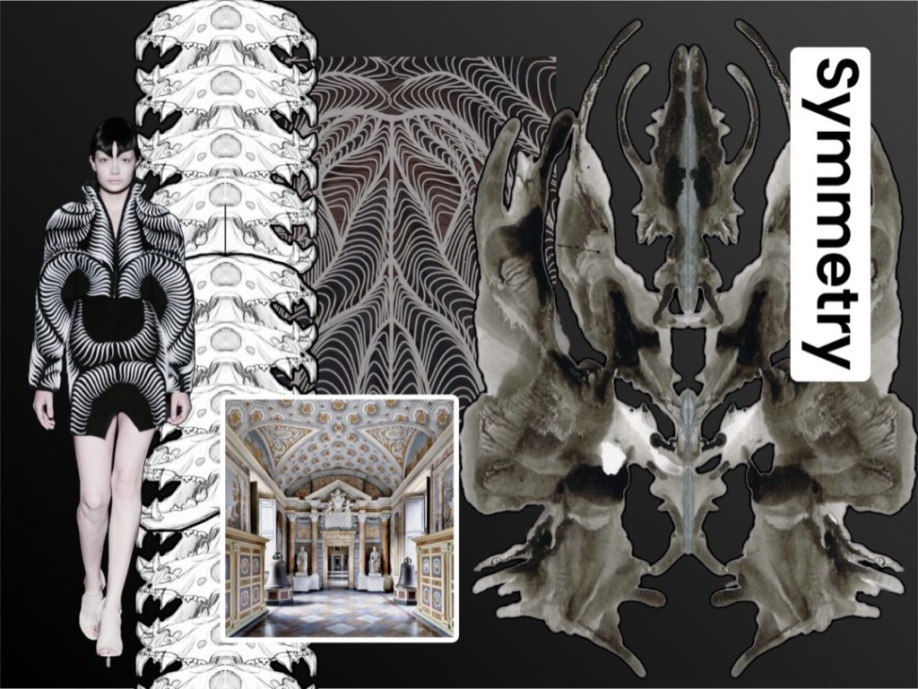
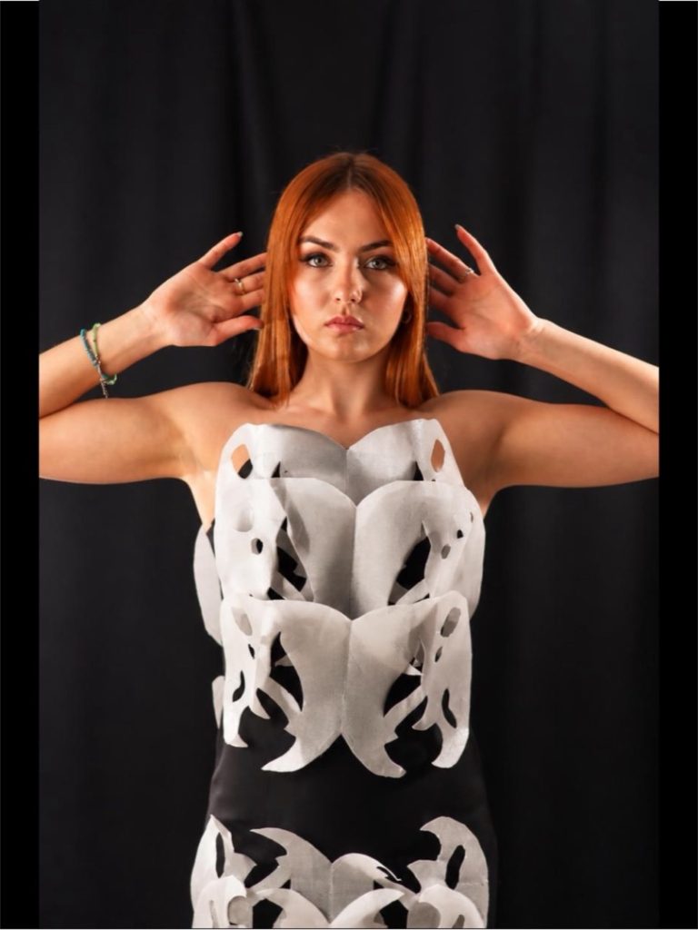
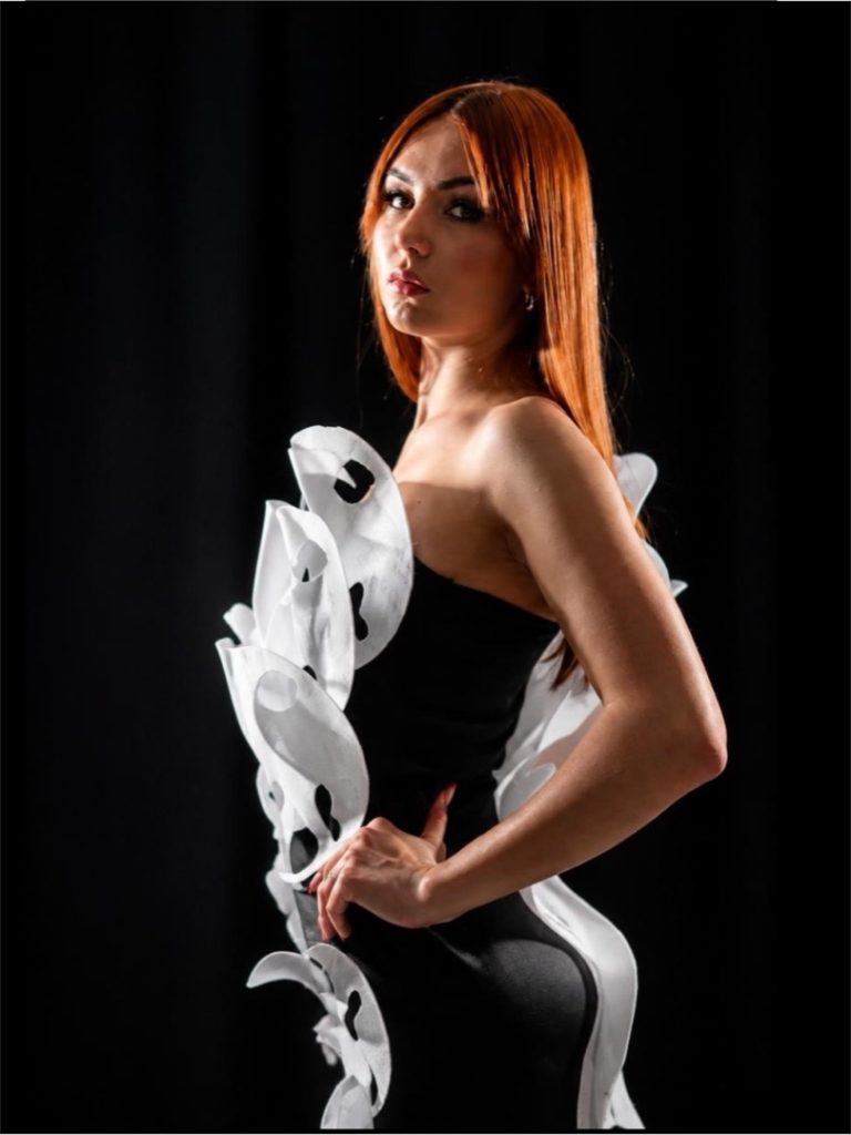
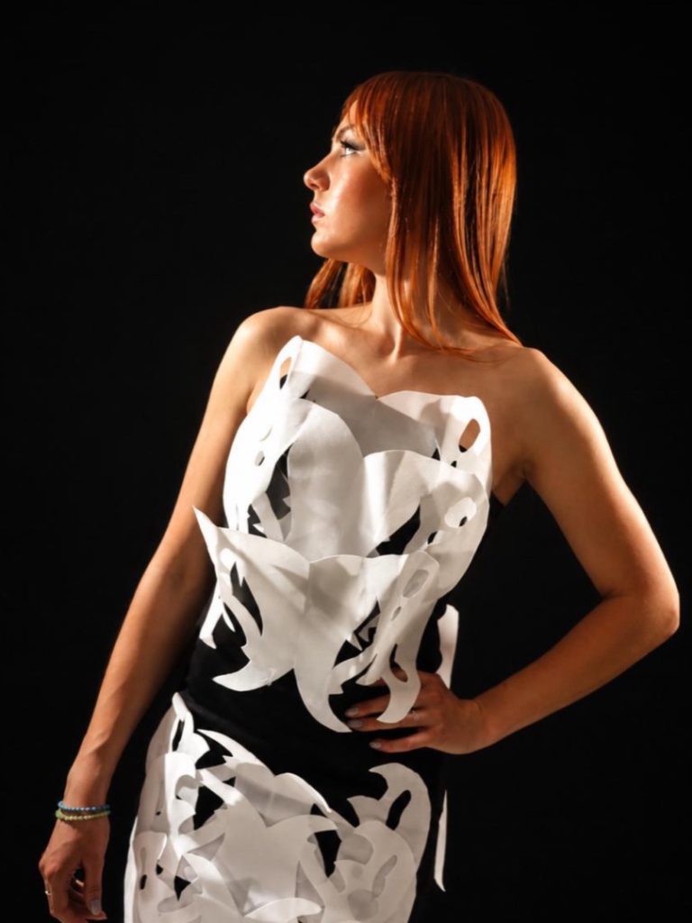
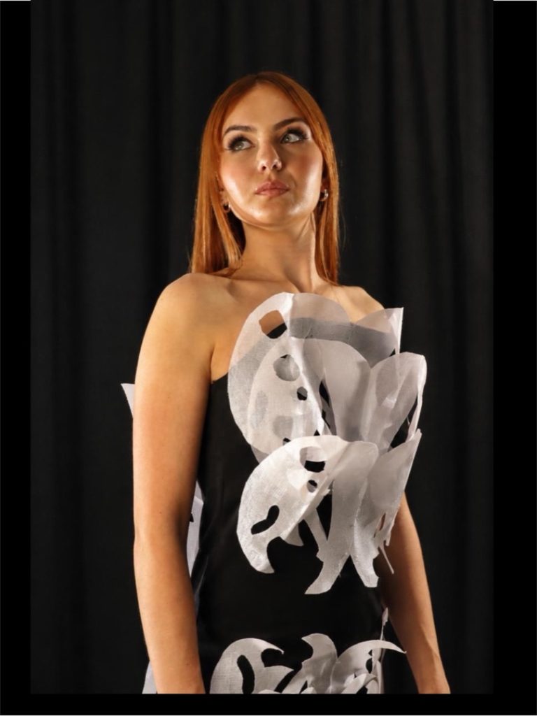
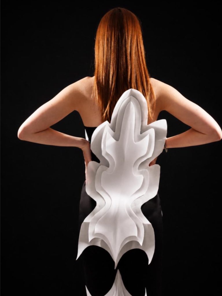
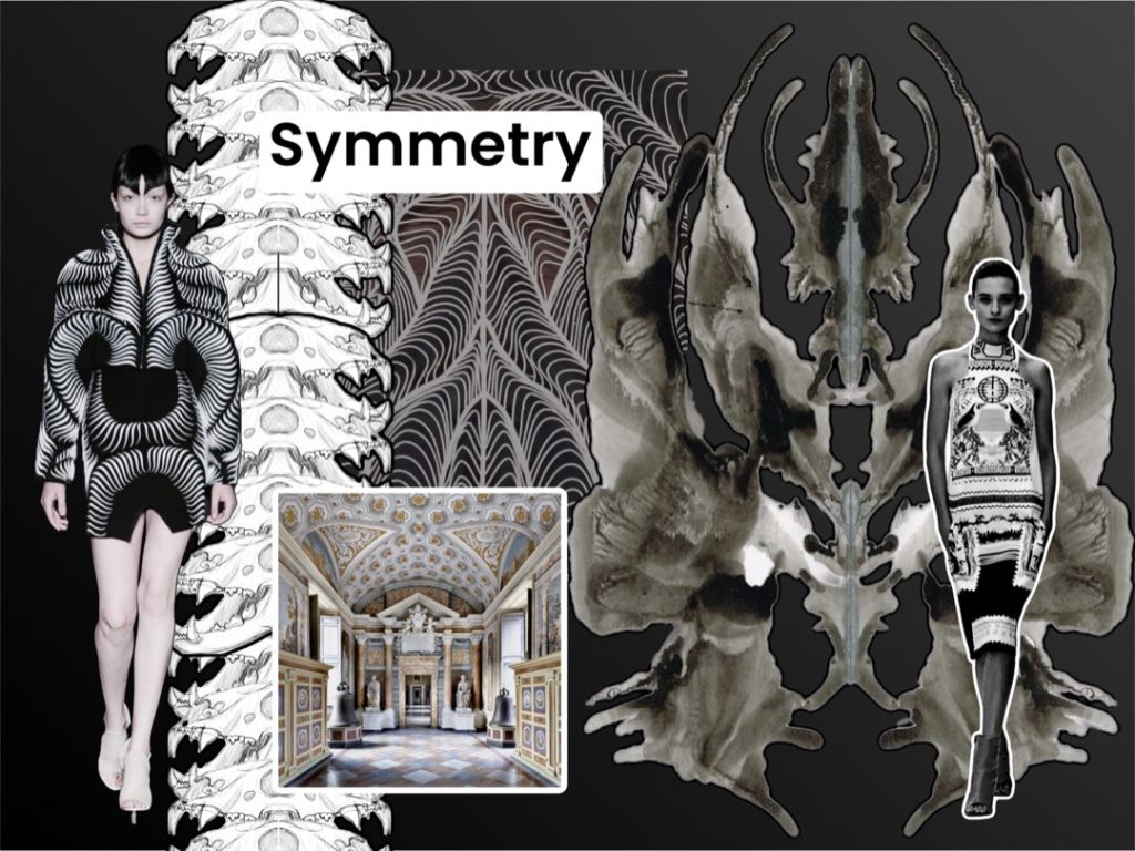
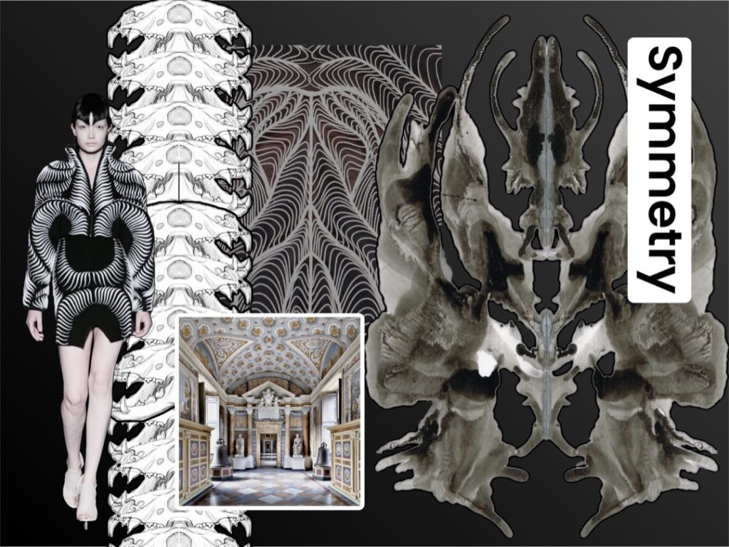
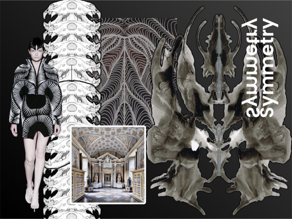
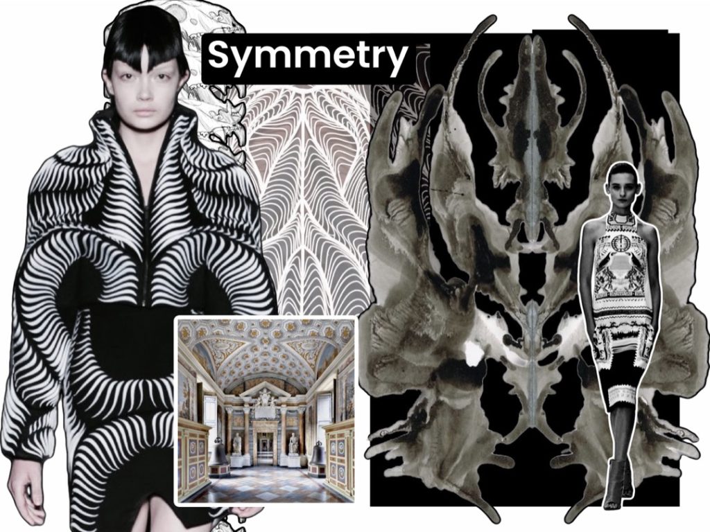
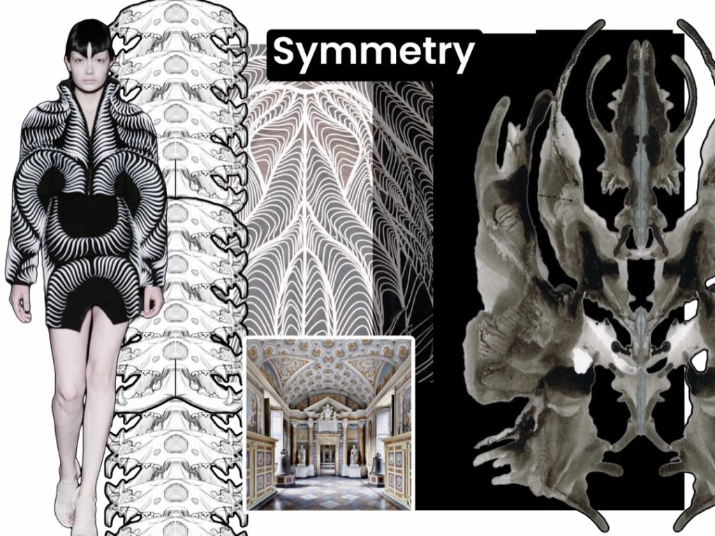
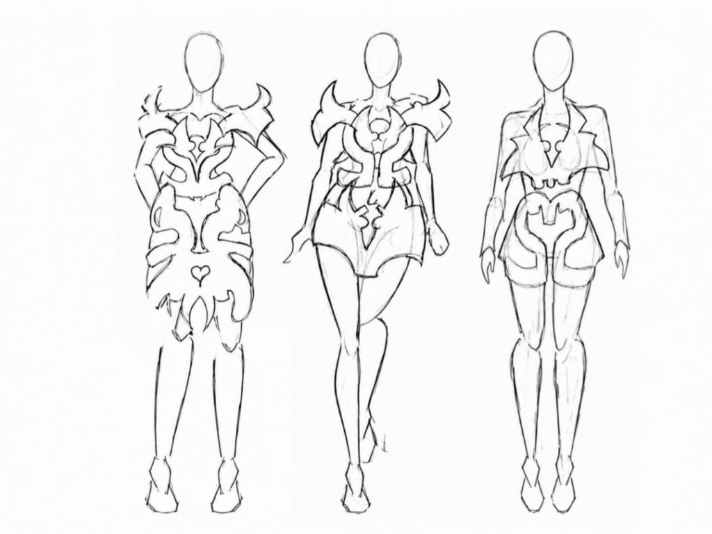
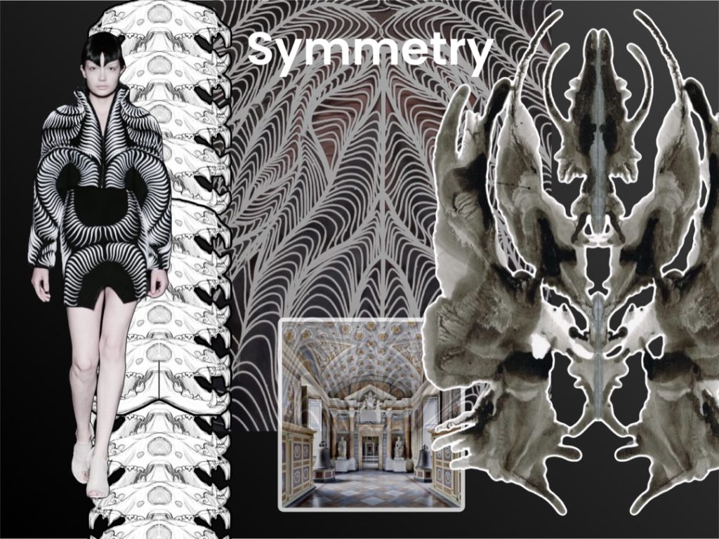
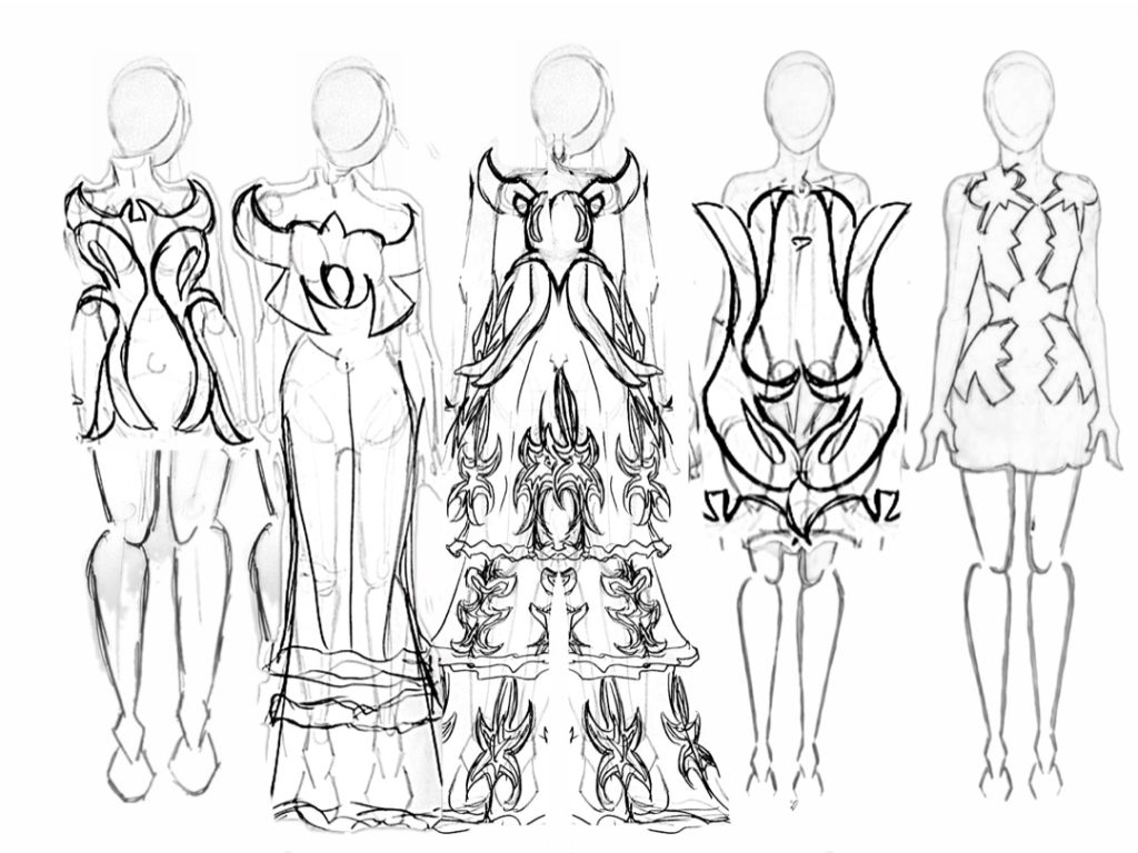
Final Major Project – Symmetry Progression: BA (Hons) Fashion Design at Birmingham City University.
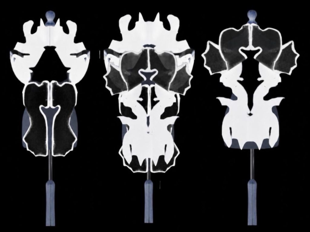
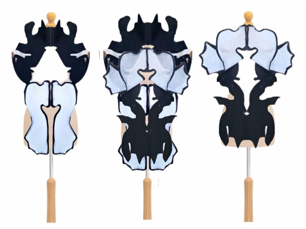
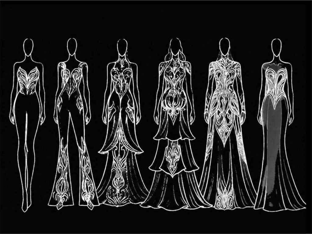
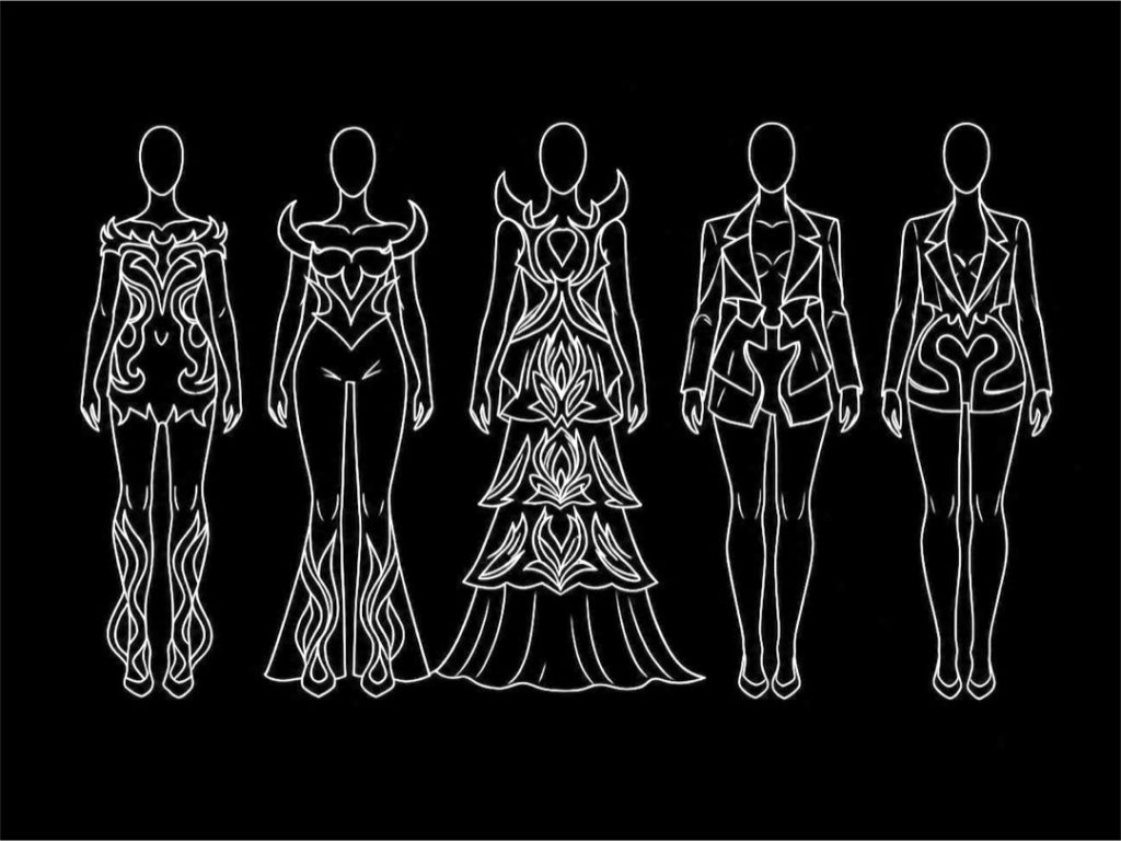
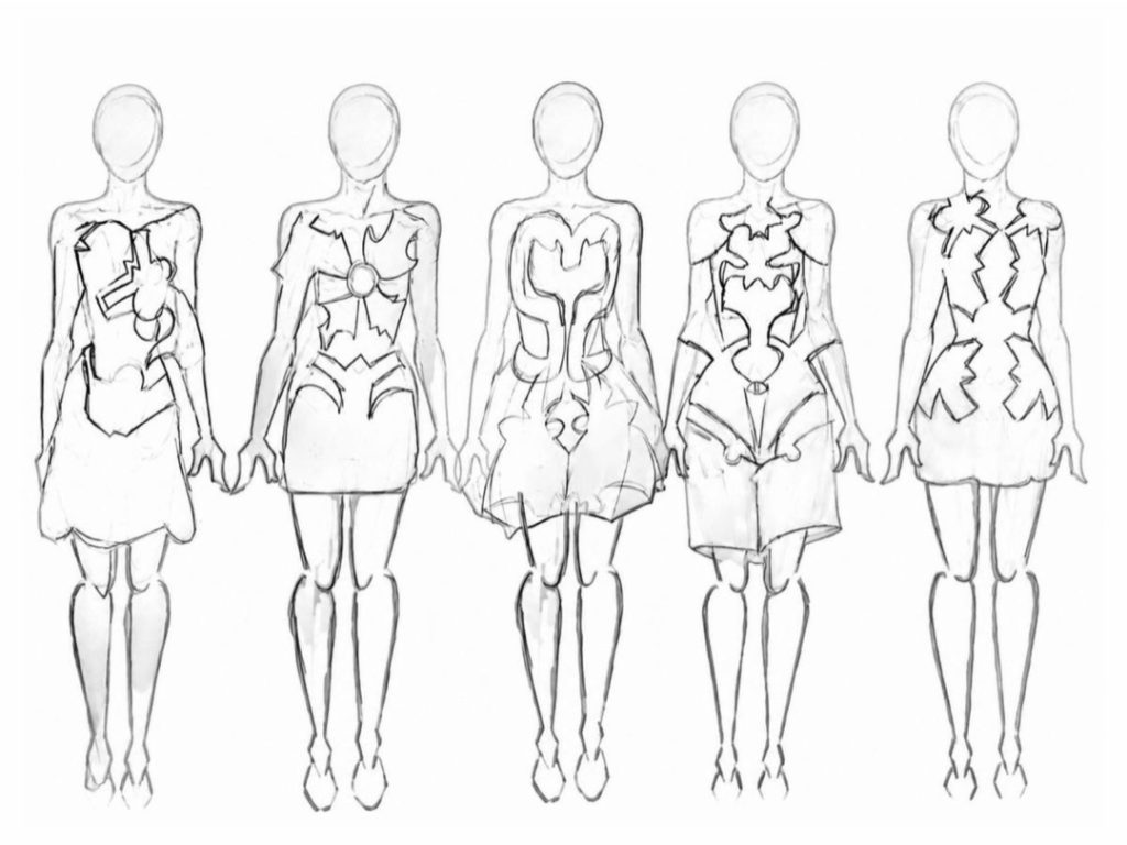
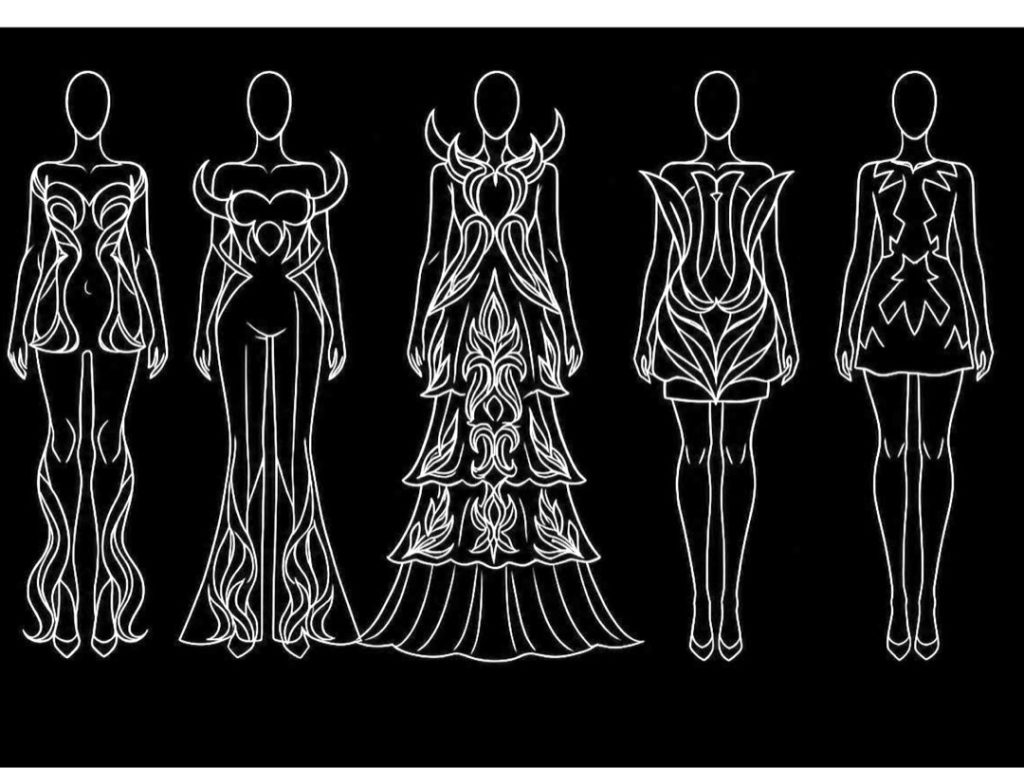
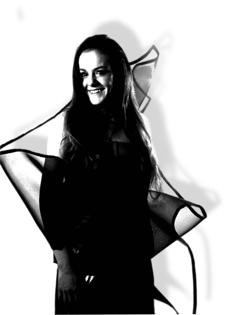
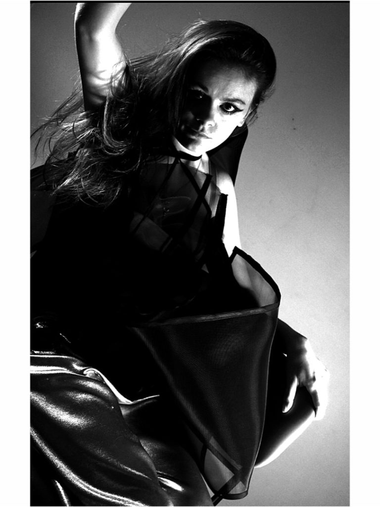
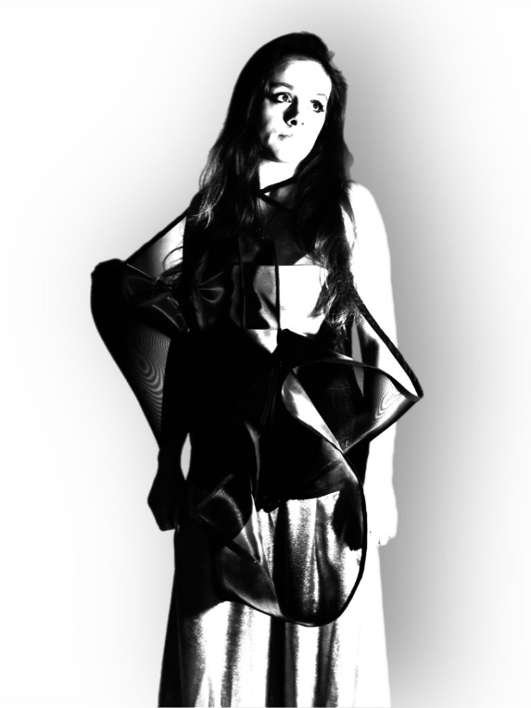
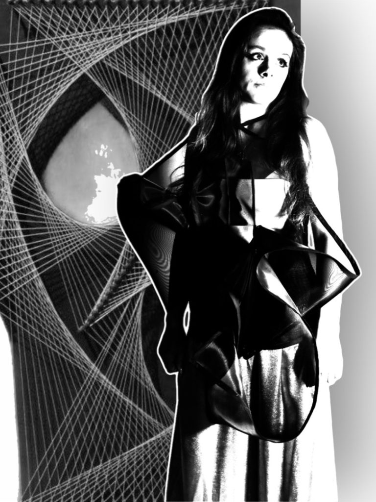
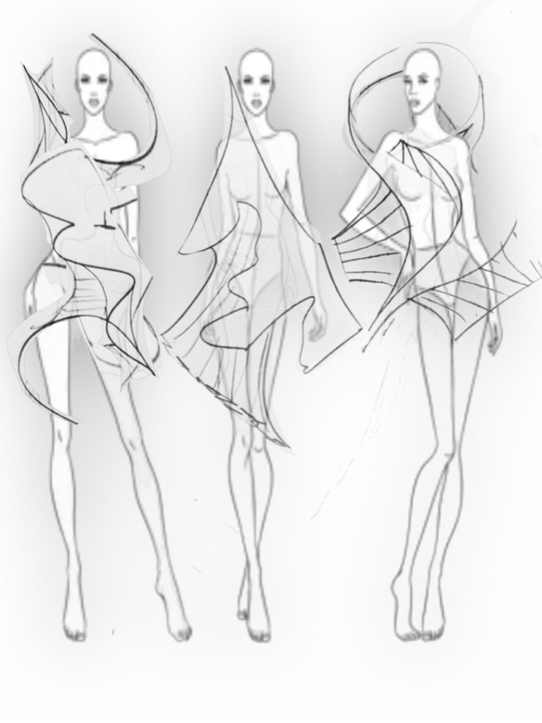
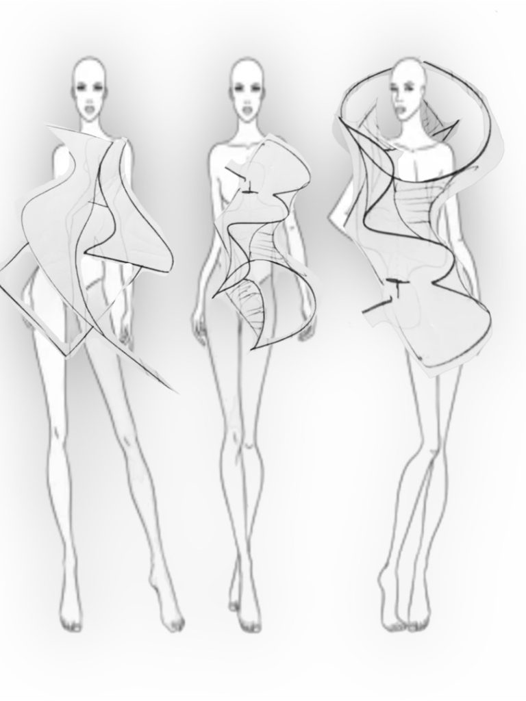
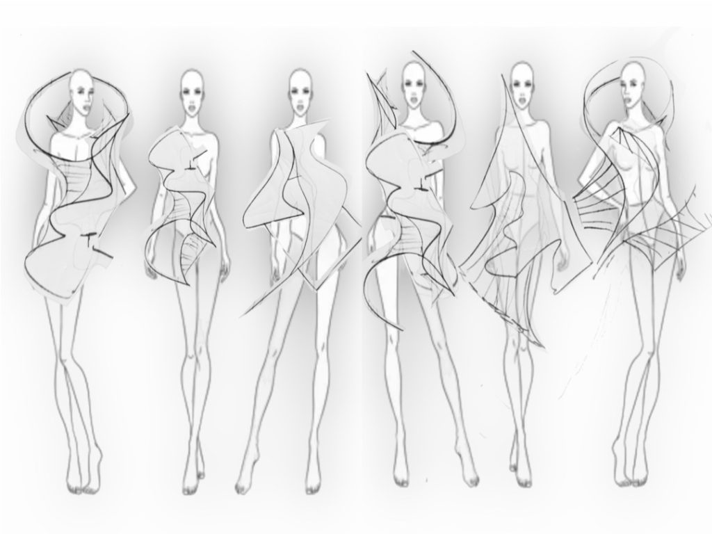
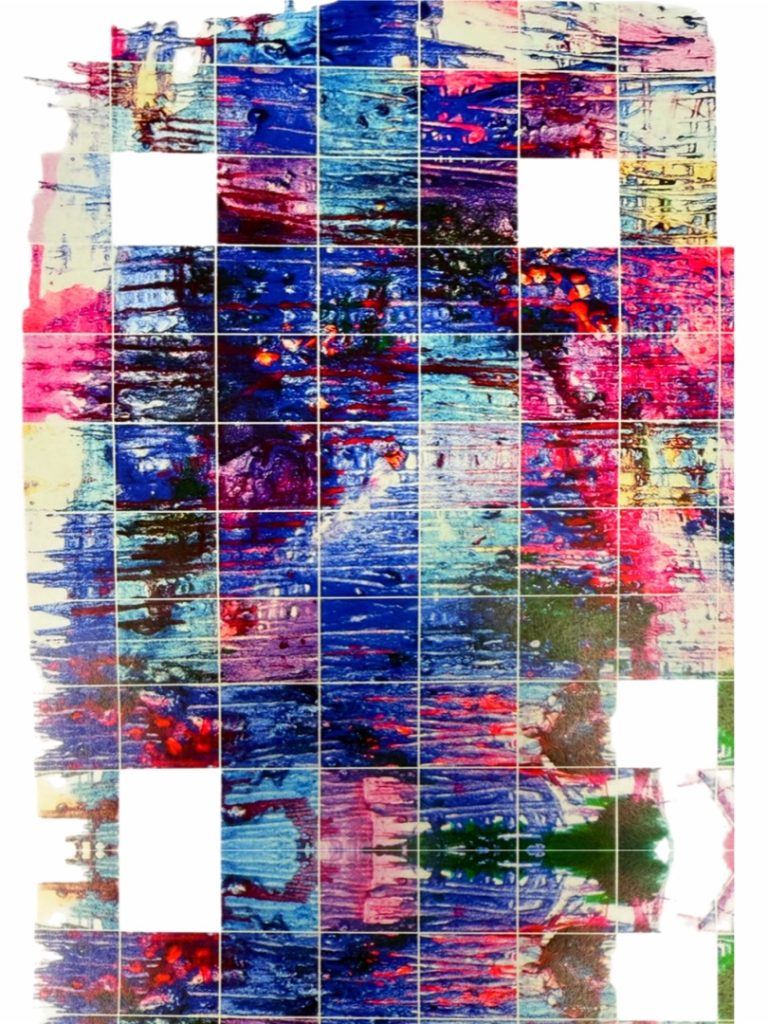
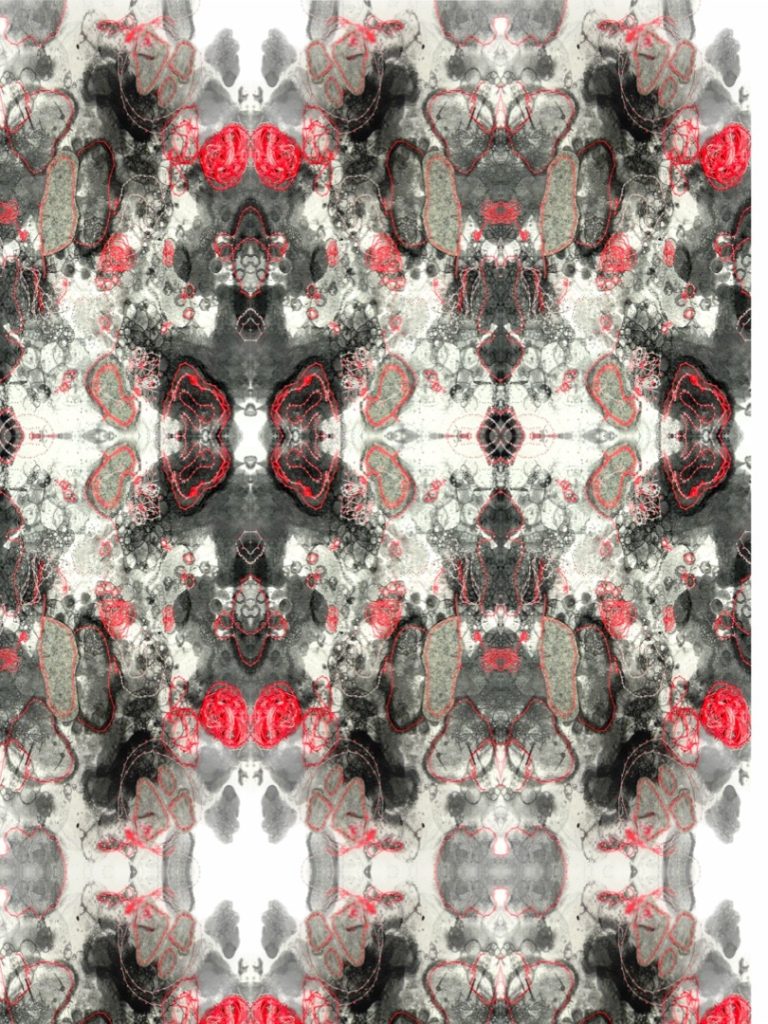
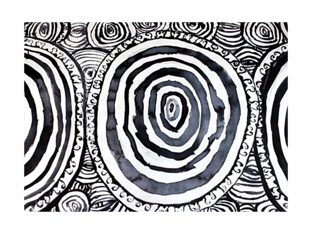
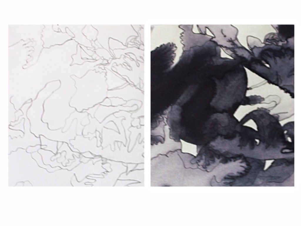
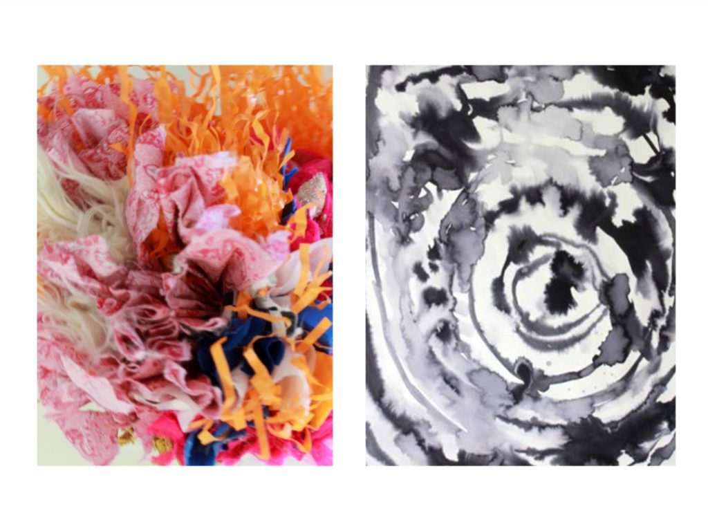
My Final Major Project explores symmetry as a complex force present across nature, art, and the universe. Through techniques such as inkblot, kirigami, and textile manipulation, I experimented with structure, balance, and contrasting textures to create visual harmony.
Influenced by artists including Hermann Rorschach and Michael Hansmeyer, I developed a sculptural garment that reflects both the beauty and depth of symmetry. This project has strengthened my creative and technical skills, preparing me to progress onto a BA course.
Eleanor Cookson
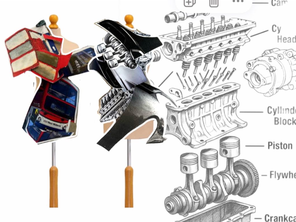
Final Major Project: Automotive
Progression: Employment
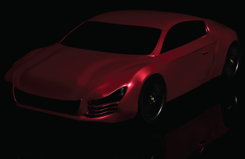
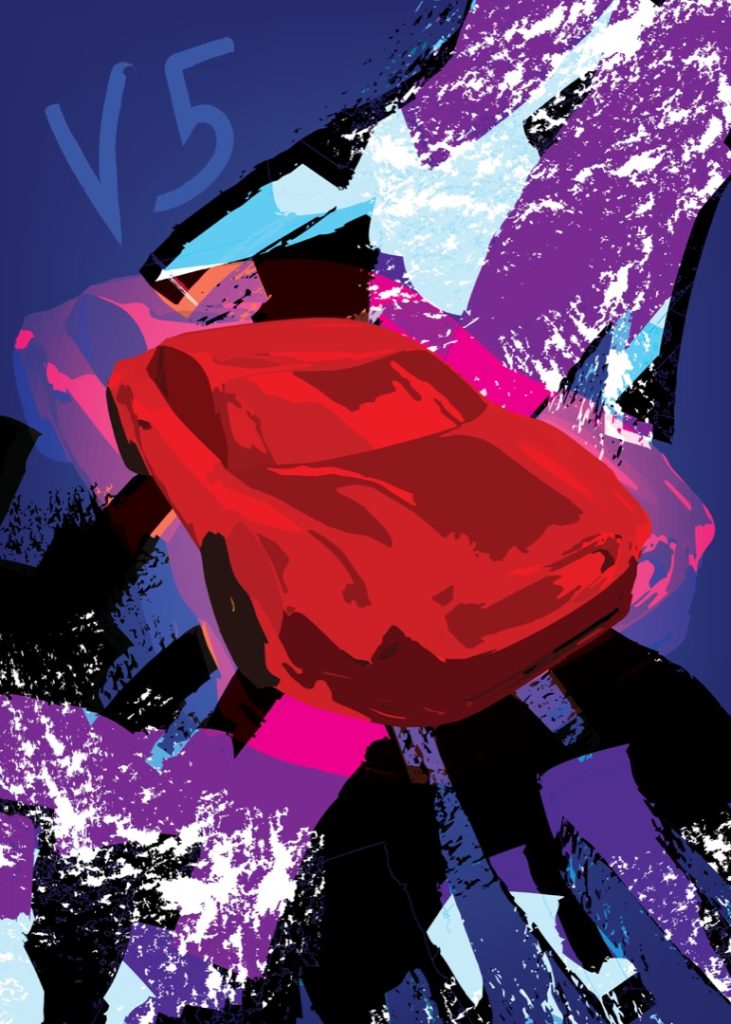
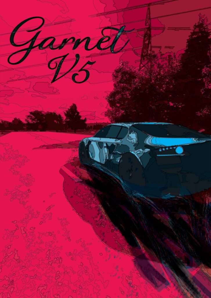
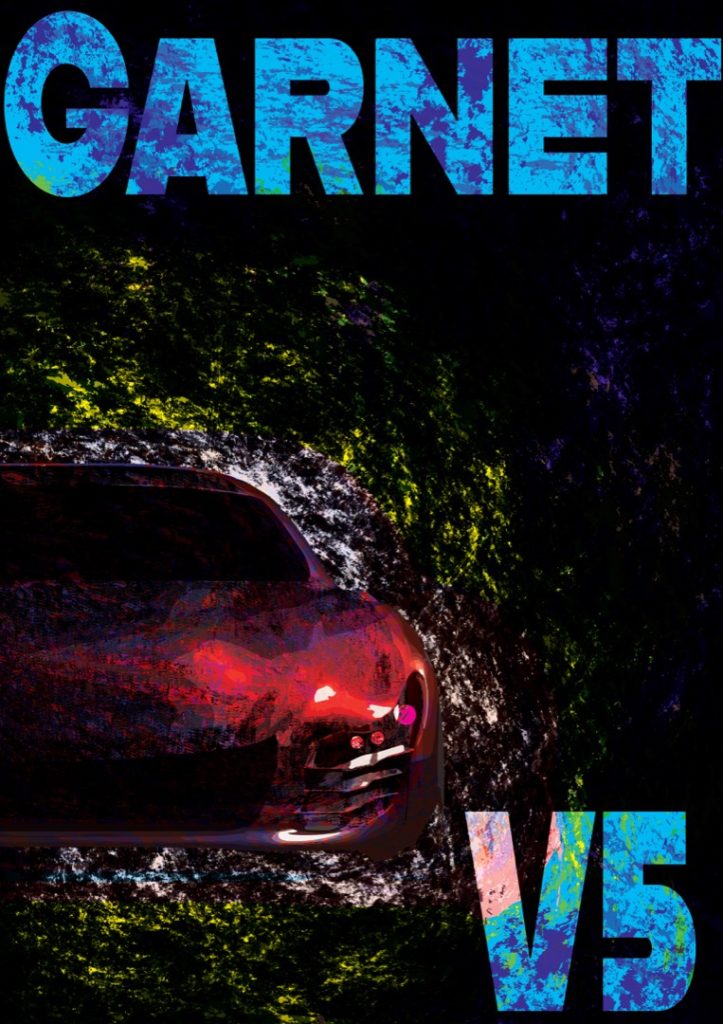
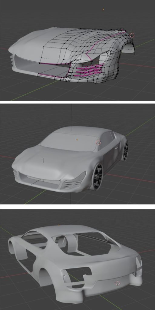
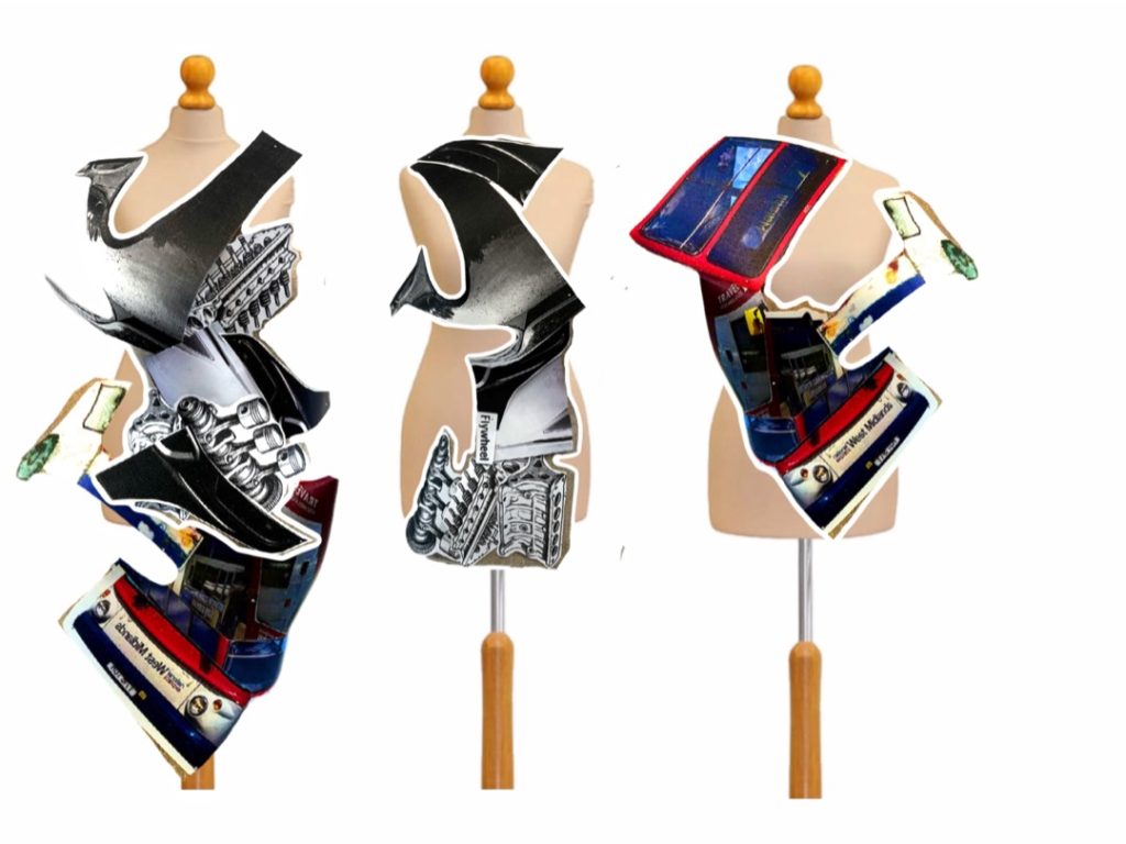
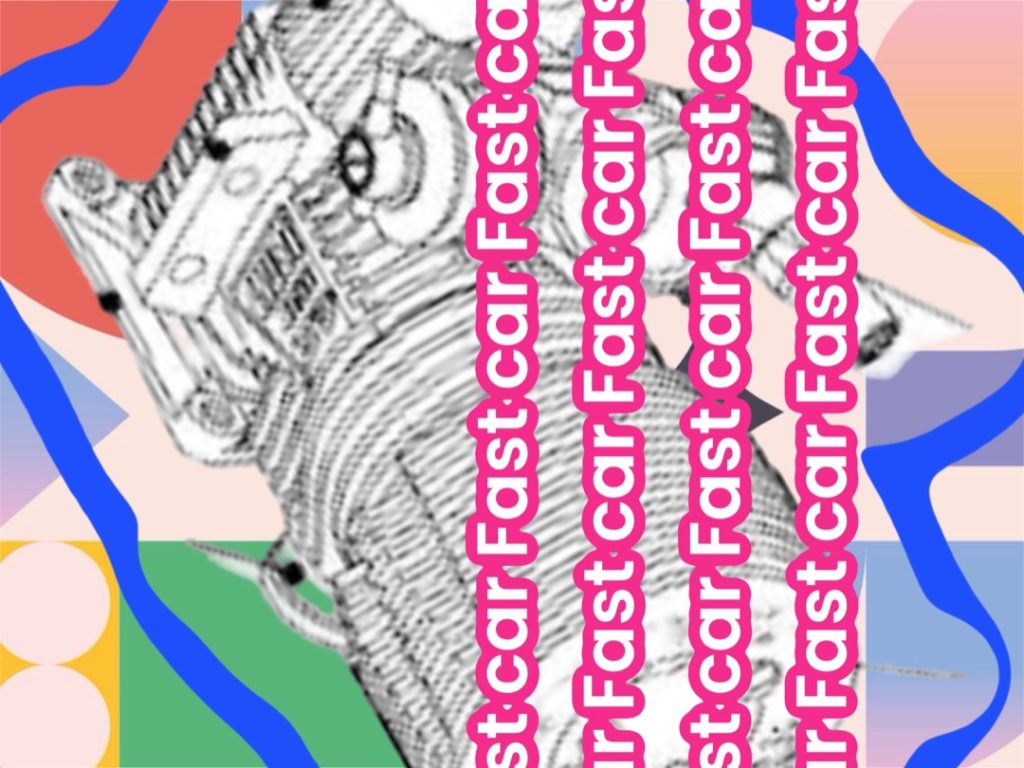
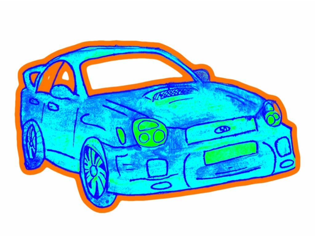
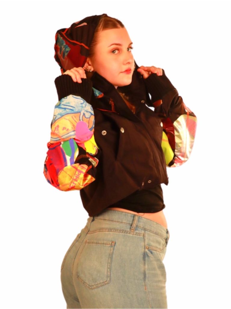
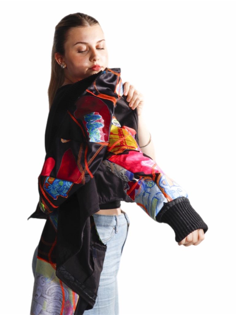
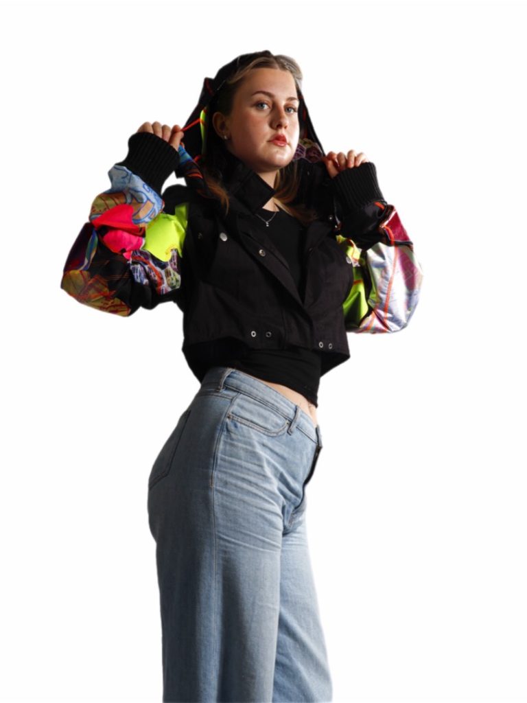
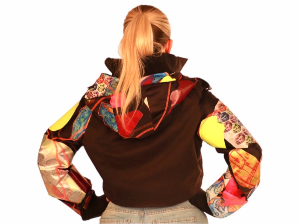
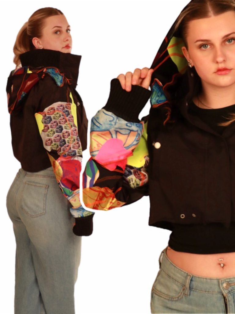
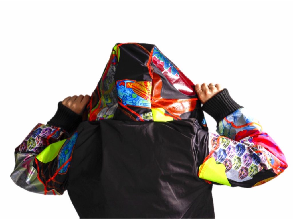
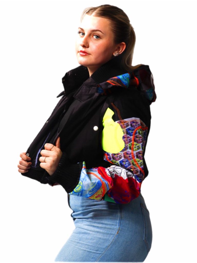
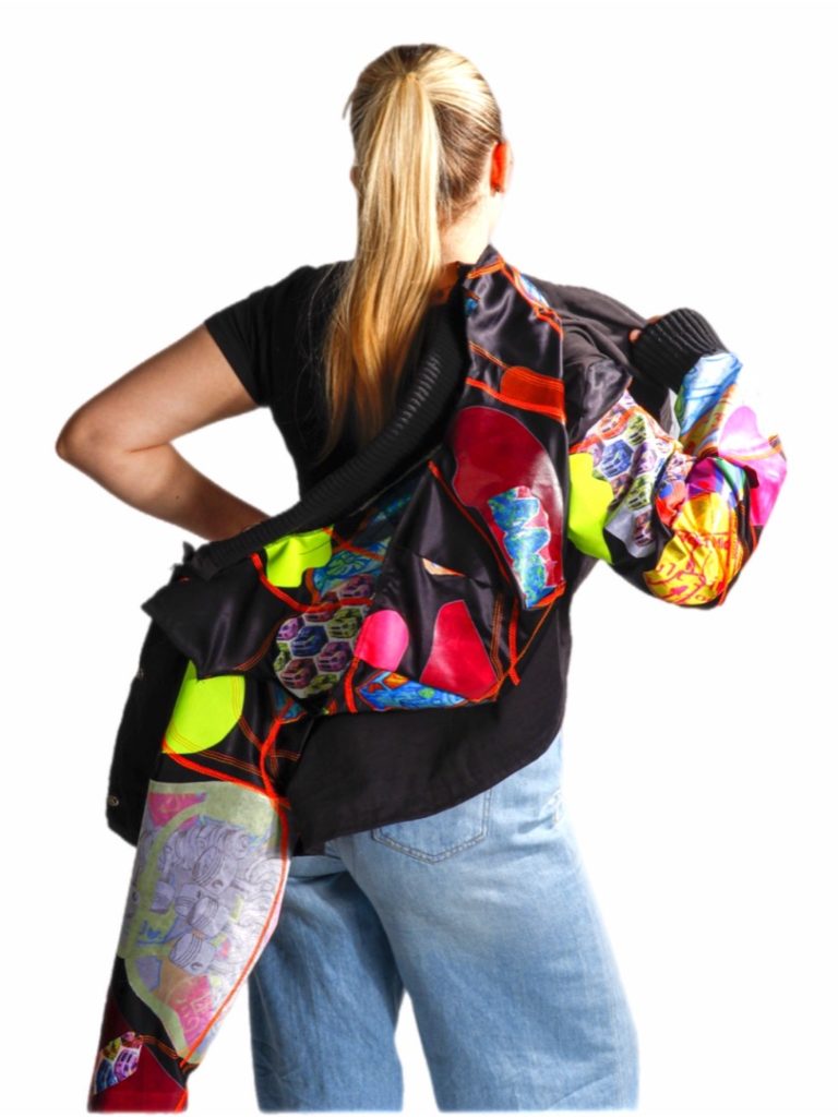
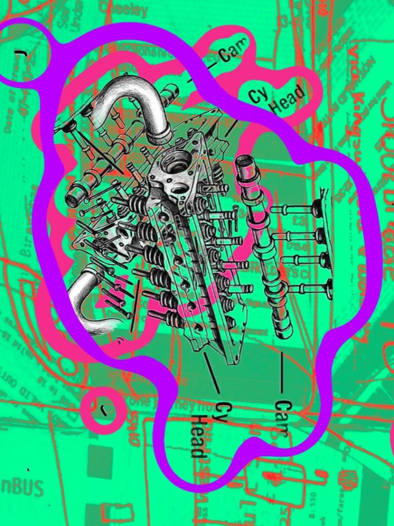
My work is inspired by my passion for automotive design and transport. In my Final Major Project, I explore this through bold print-based outcomes, combining digital and hand-rendered techniques. I focus on capturing the form and energy of cars and public transport, allowing my enthusiasm for the subject to drive my creative decisions. This project reflects both my technical development and my personal identity as an artist, resulting in work I am proud of.
Ellie May Cooper
Final Major Project – Architecture Progression: FAD
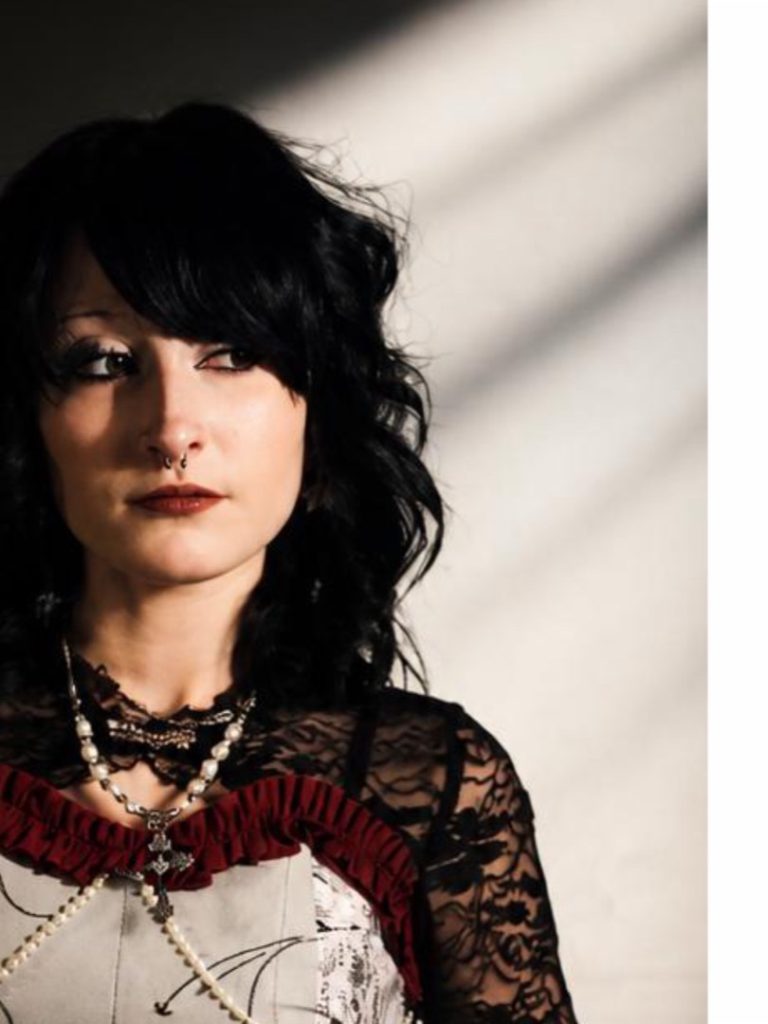
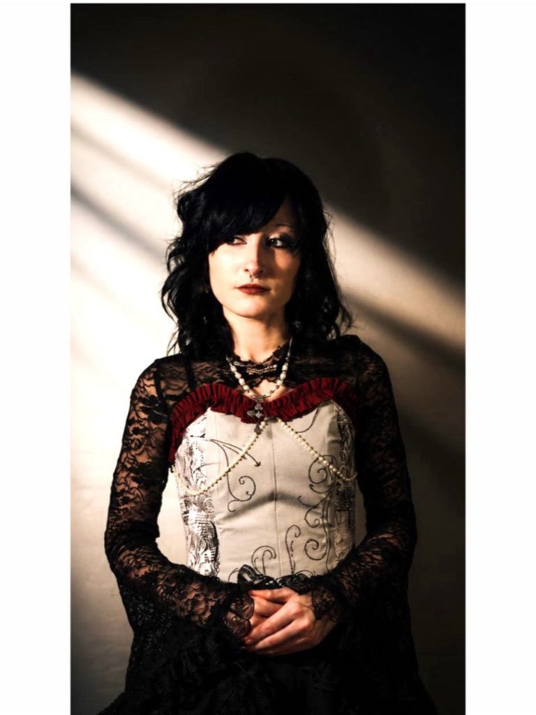
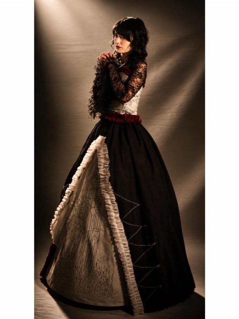
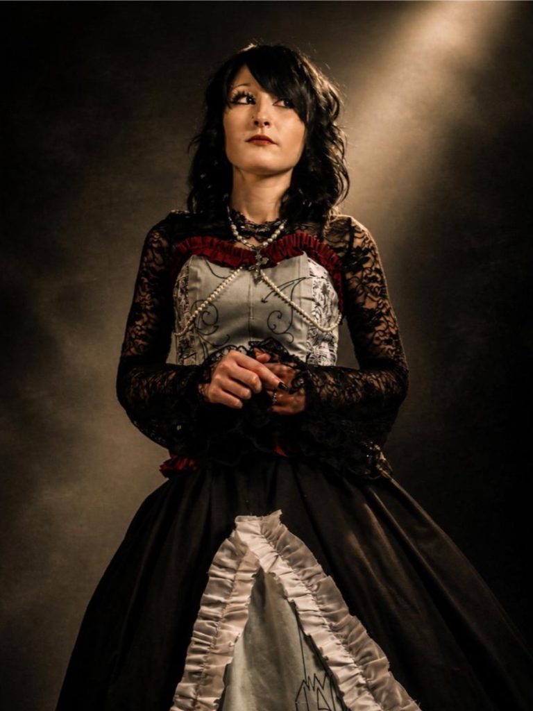
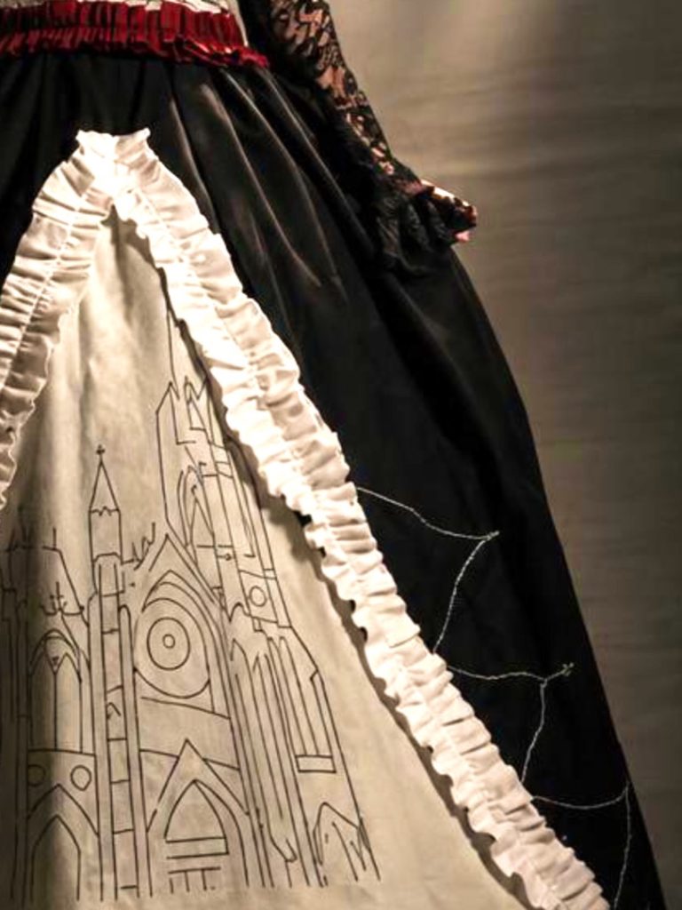
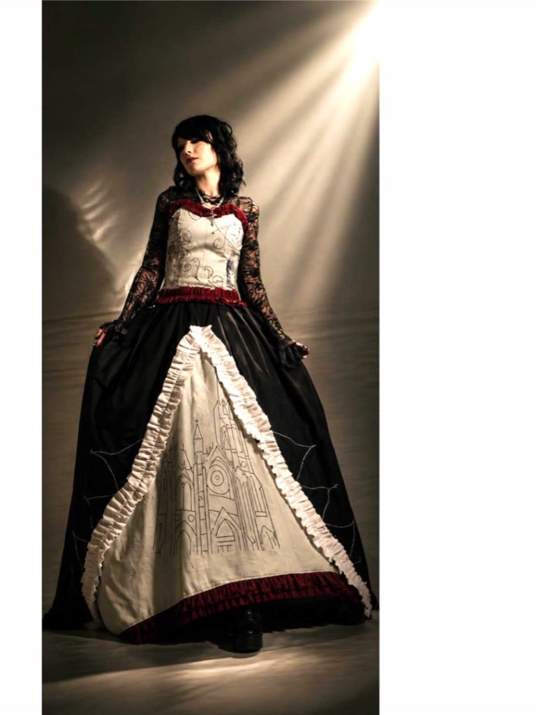
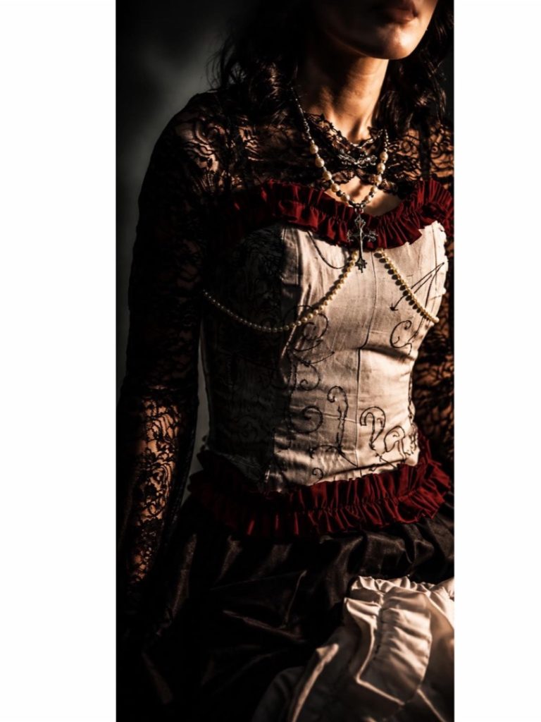
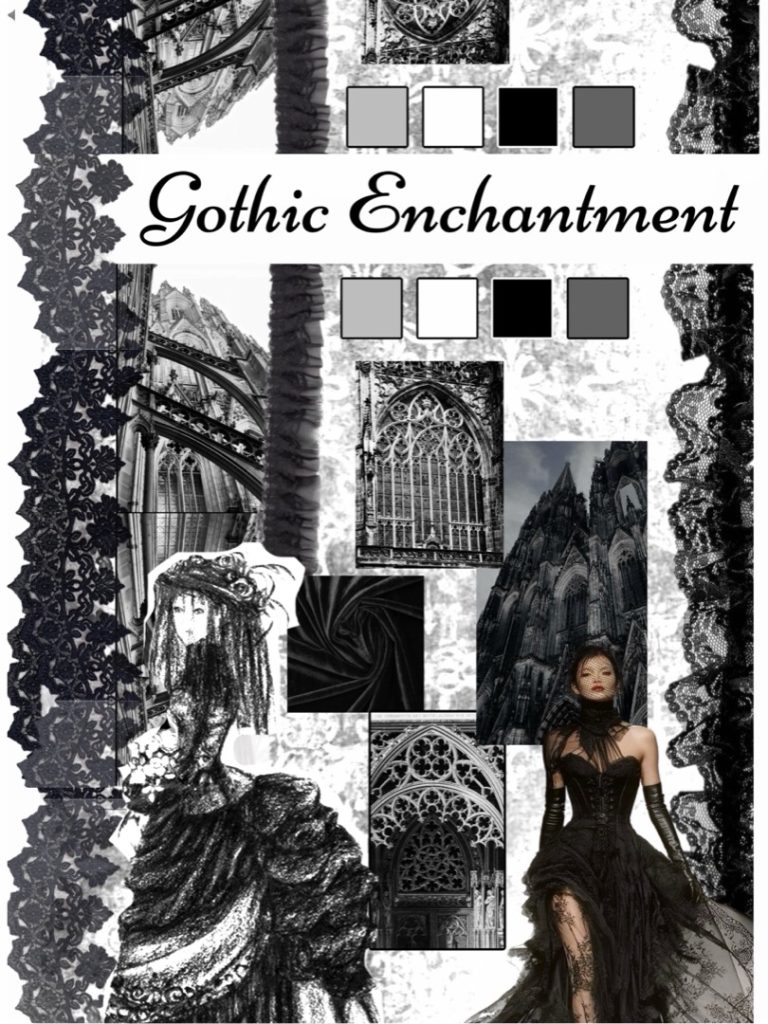
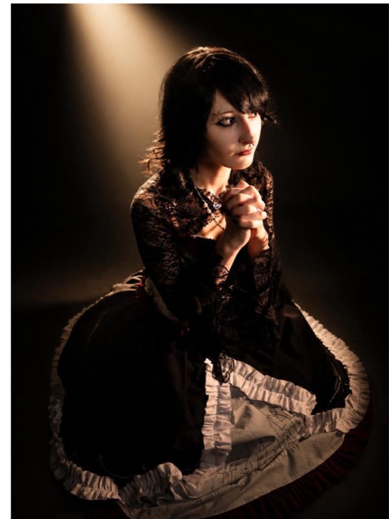
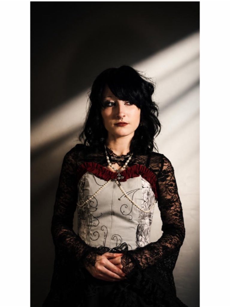
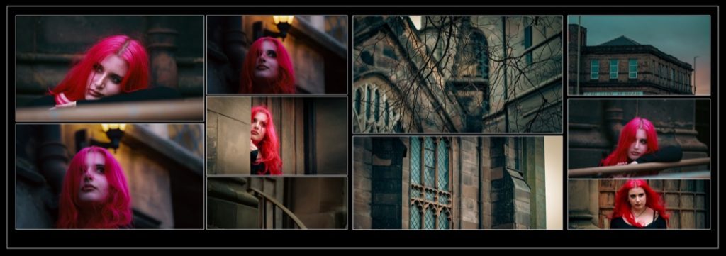
For my Final Major Project, I explored Victorian fashion (1800–1900) and Gothic cathedral architecture. Inspired by my alternative style, I combined these themes to create a design influenced by structure, detail, and historical context. I researched designers such as Alexander McQueen, alongside Victorian garments and ecclesiastical architecture, to inform my work.
I translated architectural features like arches, vertical lines, and ornamentation into a wearable garment, reflecting both the elegance of Victorian fashion and the grandeur of Gothic design. This project helped me develop my research, design, and construction skills while maintaining a strong historical and conceptual link.
Emma Ferguson
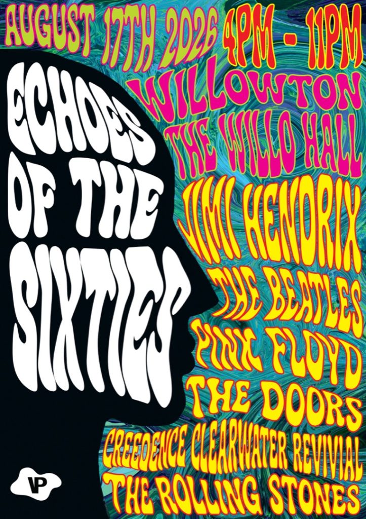
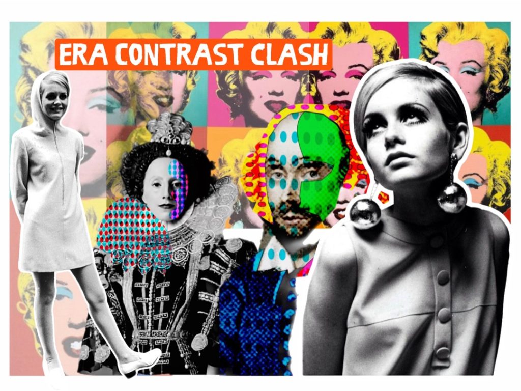
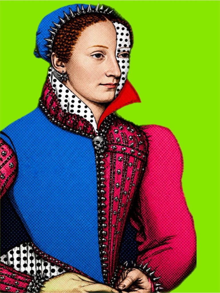
Final Major Project: 1960s Pop Art and the Elizabethan Era
Progression: BA Fashion History Brighton
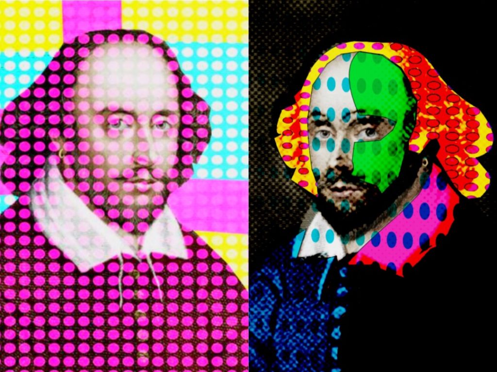
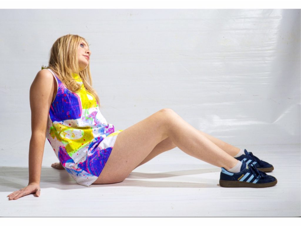
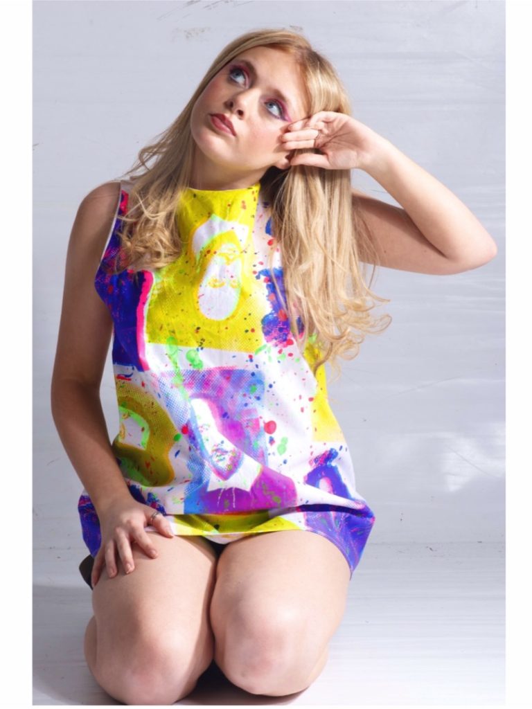
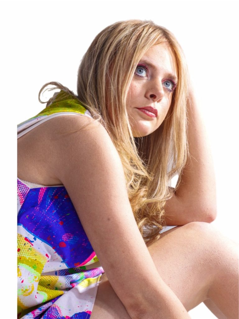
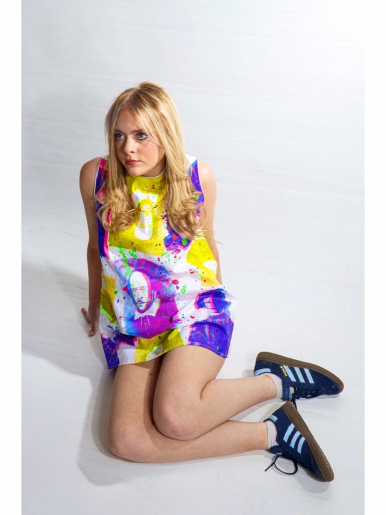
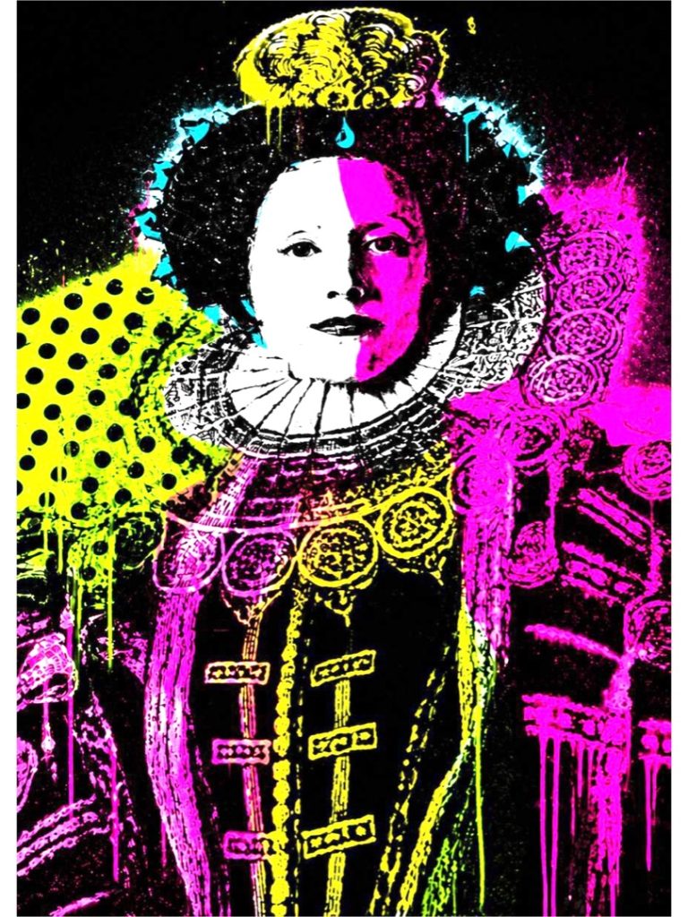
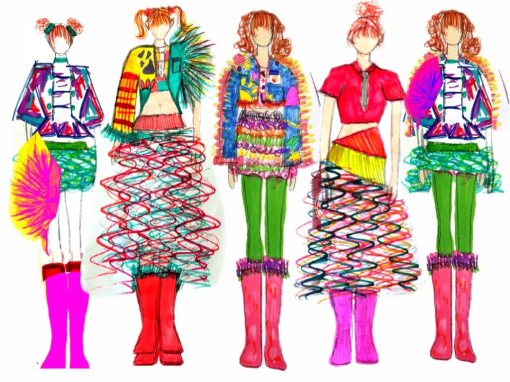
For my Final Major Project, I created a garment inspired by 1960s Pop Art and the Elizabethan era, combining two distinct periods that have influenced my interest in fashion and history. The piece is based on a 1960s mini dress silhouette, reflecting the bold and experimental style of the decade.
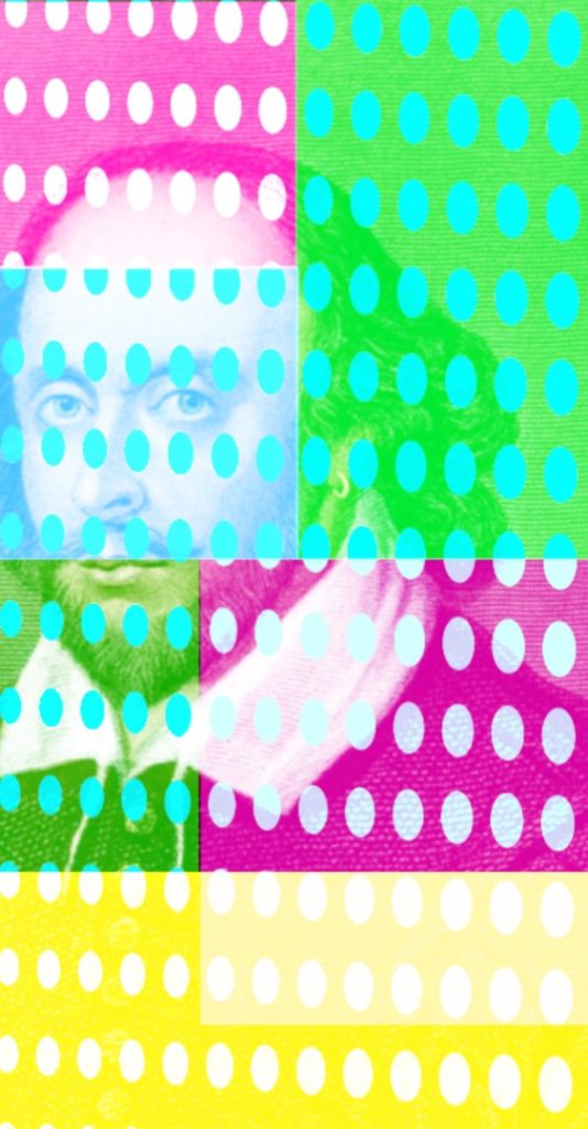
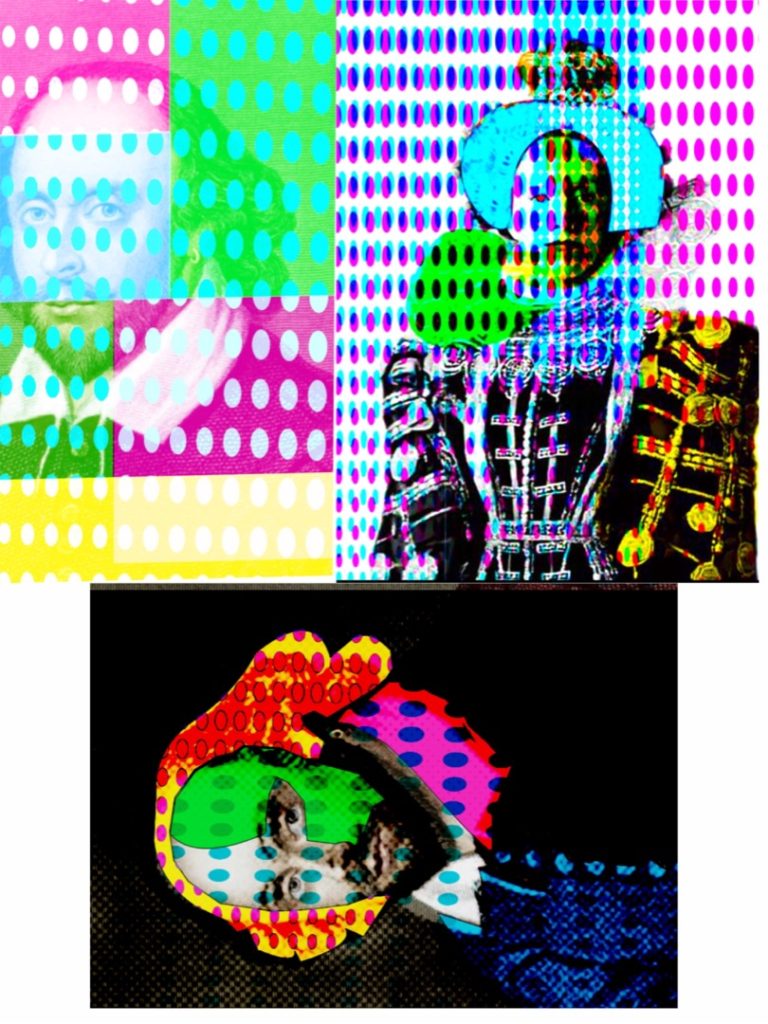
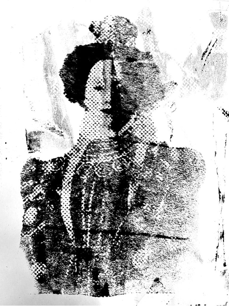
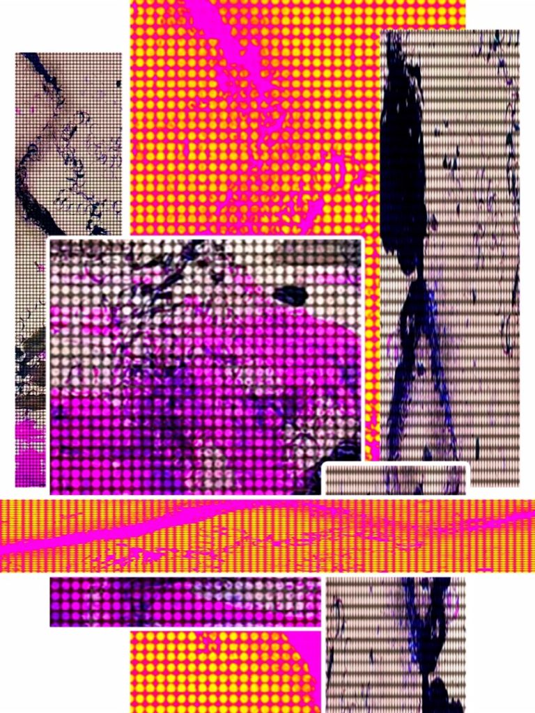
I used vibrant neon colours and developed a digitally manipulated image of Queen Elizabeth I, transforming it into a Pop Art graphic. This was applied through screen printing to create a strong visual contrast between historical imagery and modern design.
This project reflects my interest in exploring how fashion evolves over time and has supported my progression towards studying BA Fashion Design in the future.
Screenshot
Ellis Hocknull
Final Major Project: Fantasy
Progression: FAD
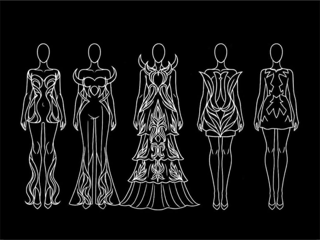
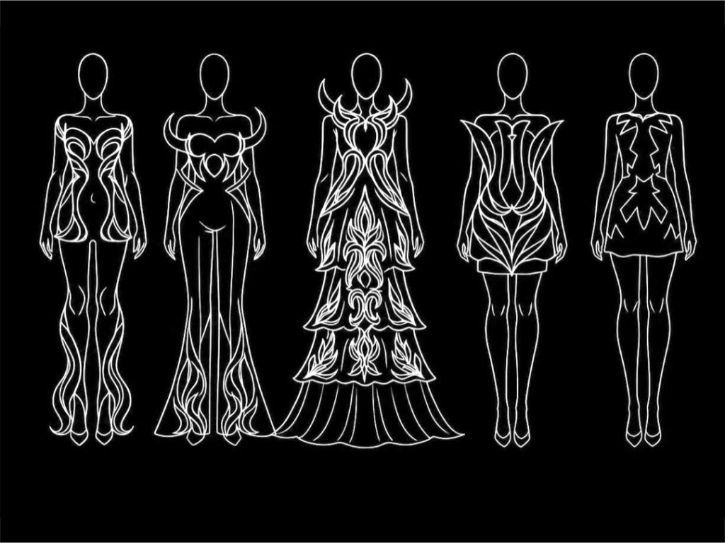
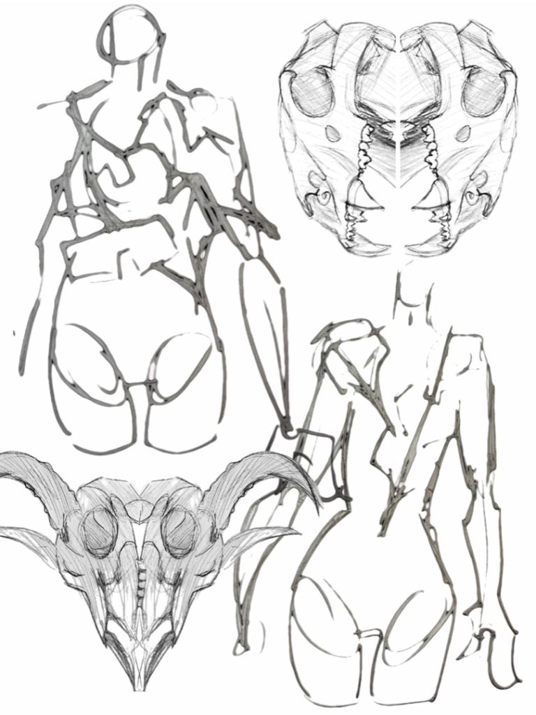
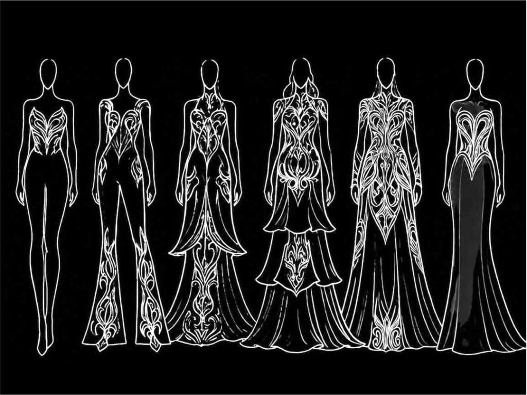
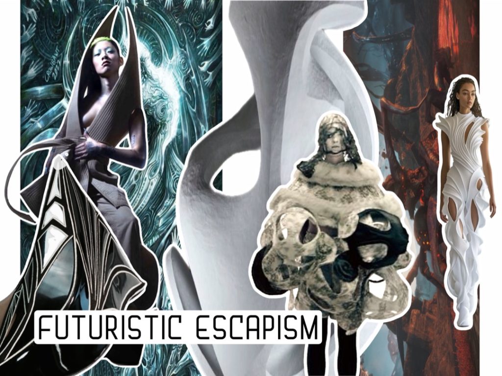
Rooted in fantasy and online gaming, my work explores the body as a site of transformation. Influenced by Robert Wun, Thierry Mugler, and surrealism, I distort structure and silhouette into something unfamiliar, almost unreal.
I let the fabric lead—folding, resisting, shaping itself—forming garments that feel instinctive and unpredictable. These pieces sit between physical and digital worlds, where fantasy leaks into reality.
In an age shaped by AI and virtual spaces, fashion becomes a boundaryless language. My work exists within that shift—imagined, constructed, and slightly untethered.
Hughey Hopkins
Final Major Project: Layers and texture
Progression: BA Hons Fashion Design BCU
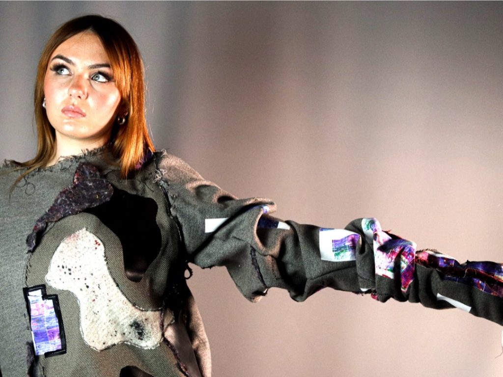
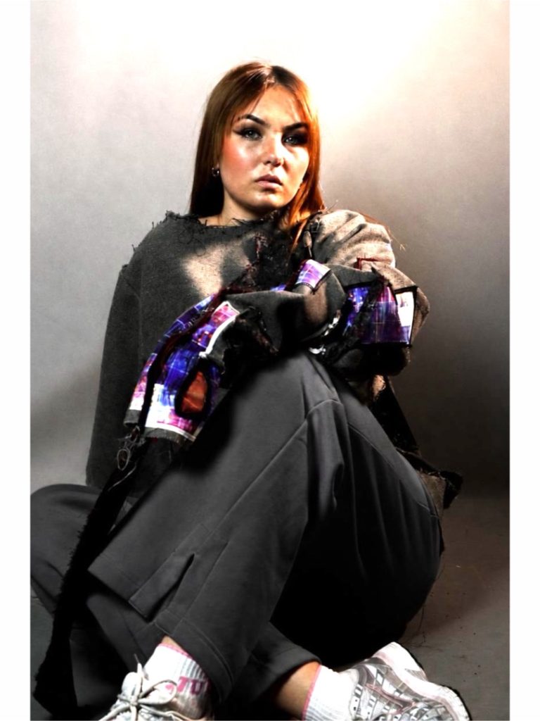
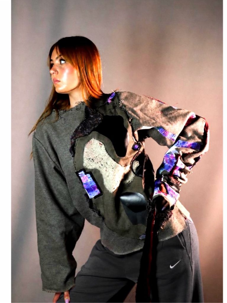
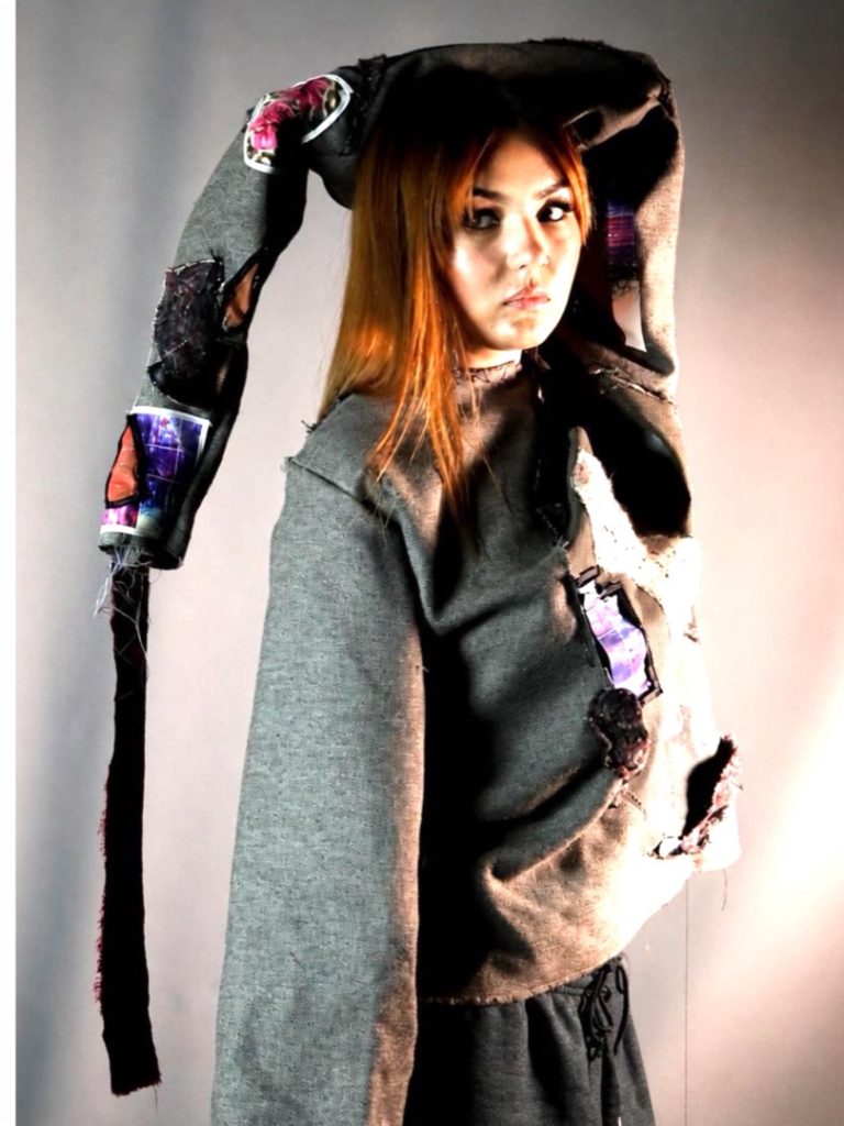
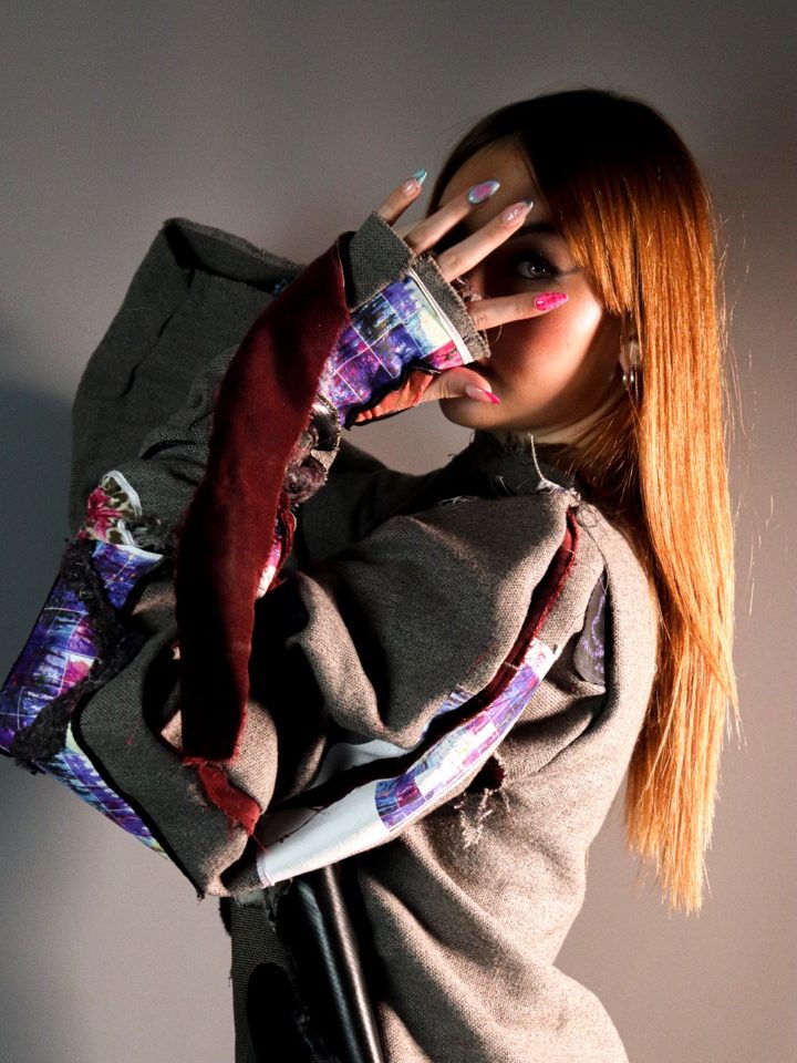
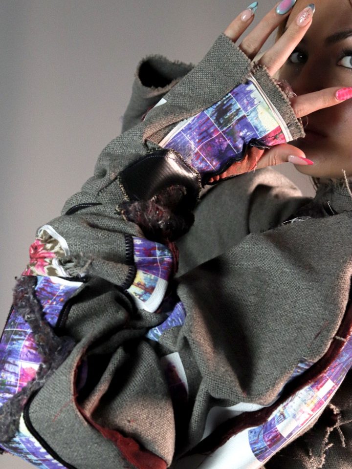
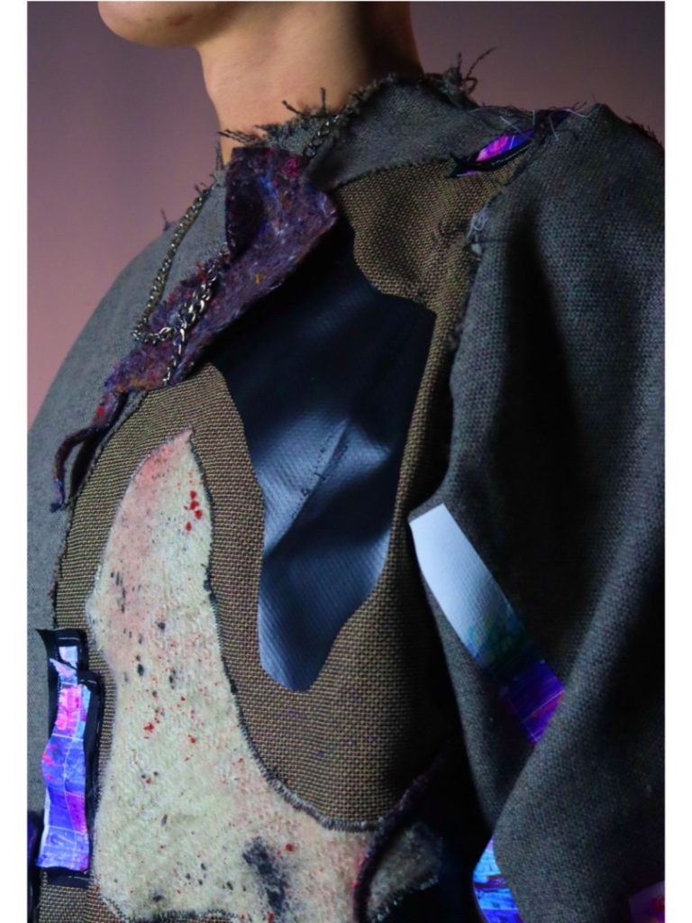
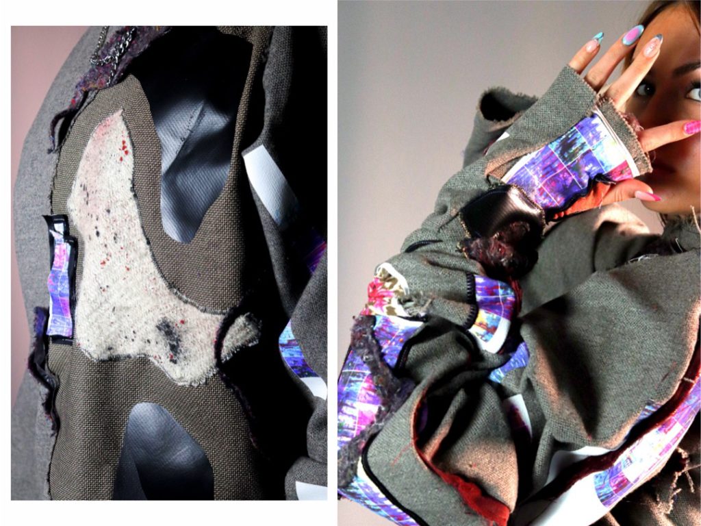
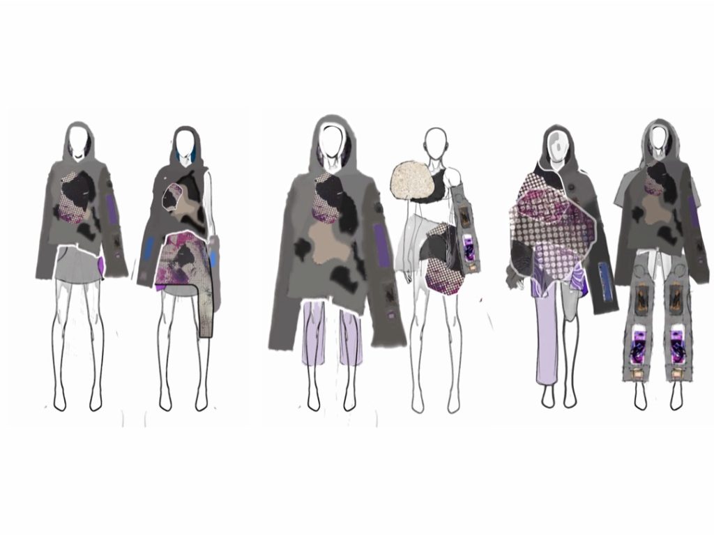
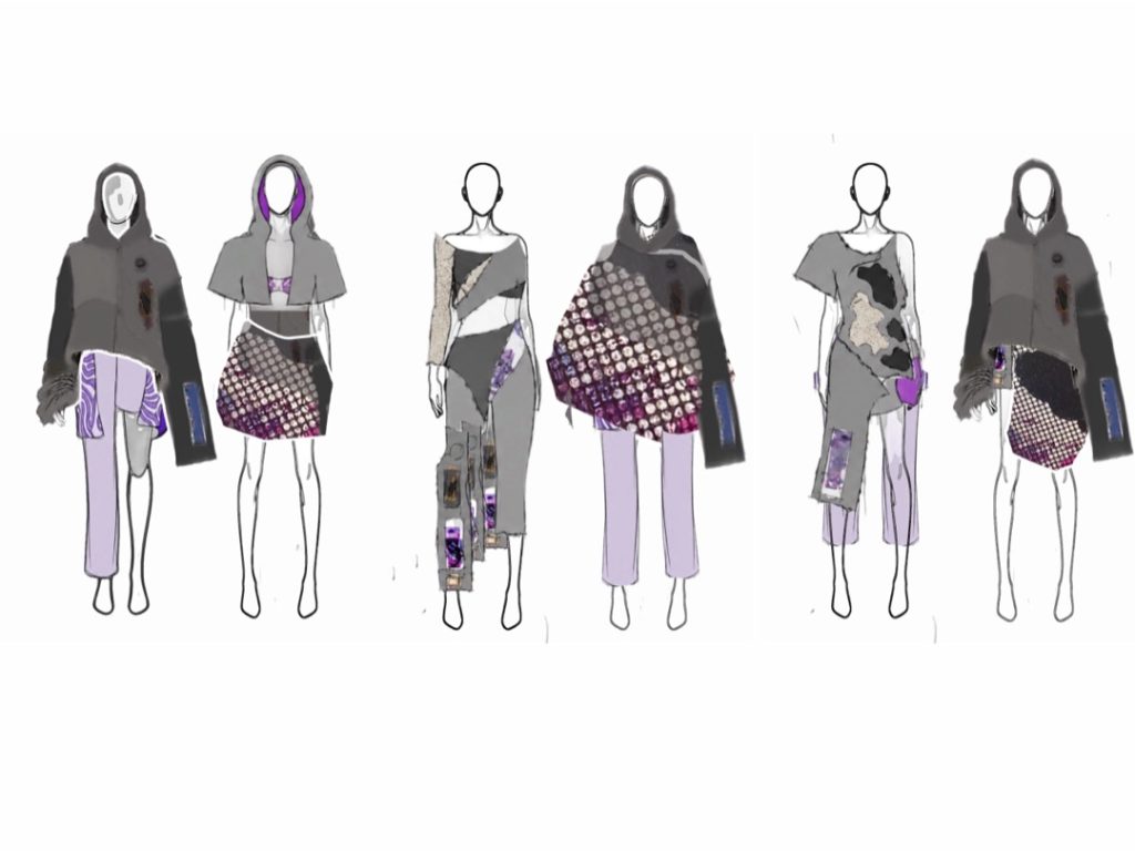
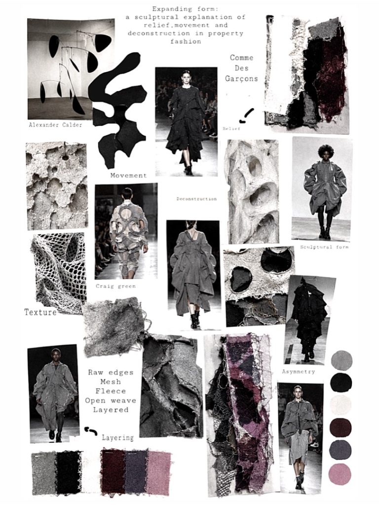
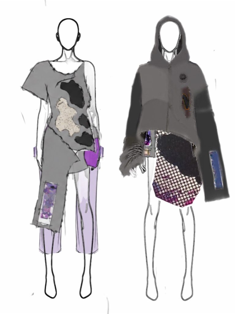
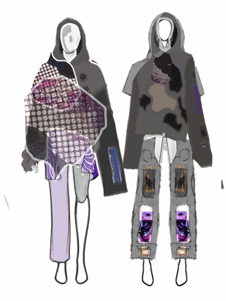
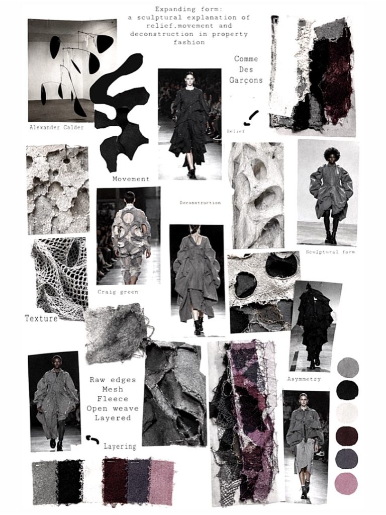
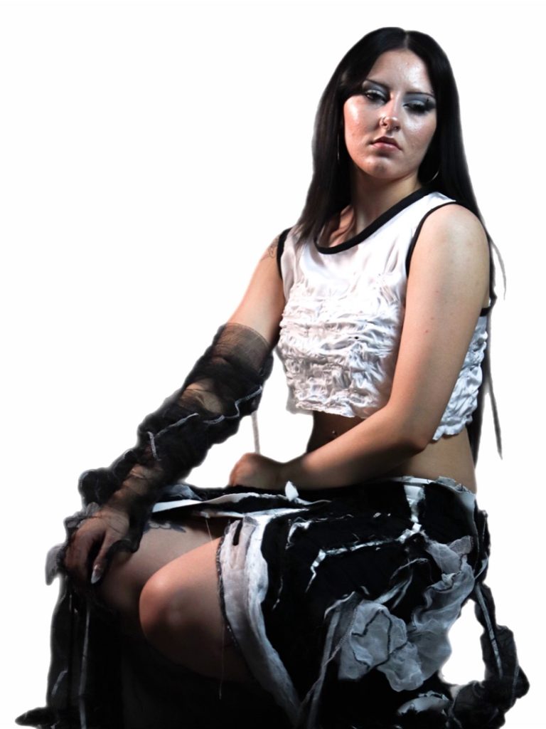
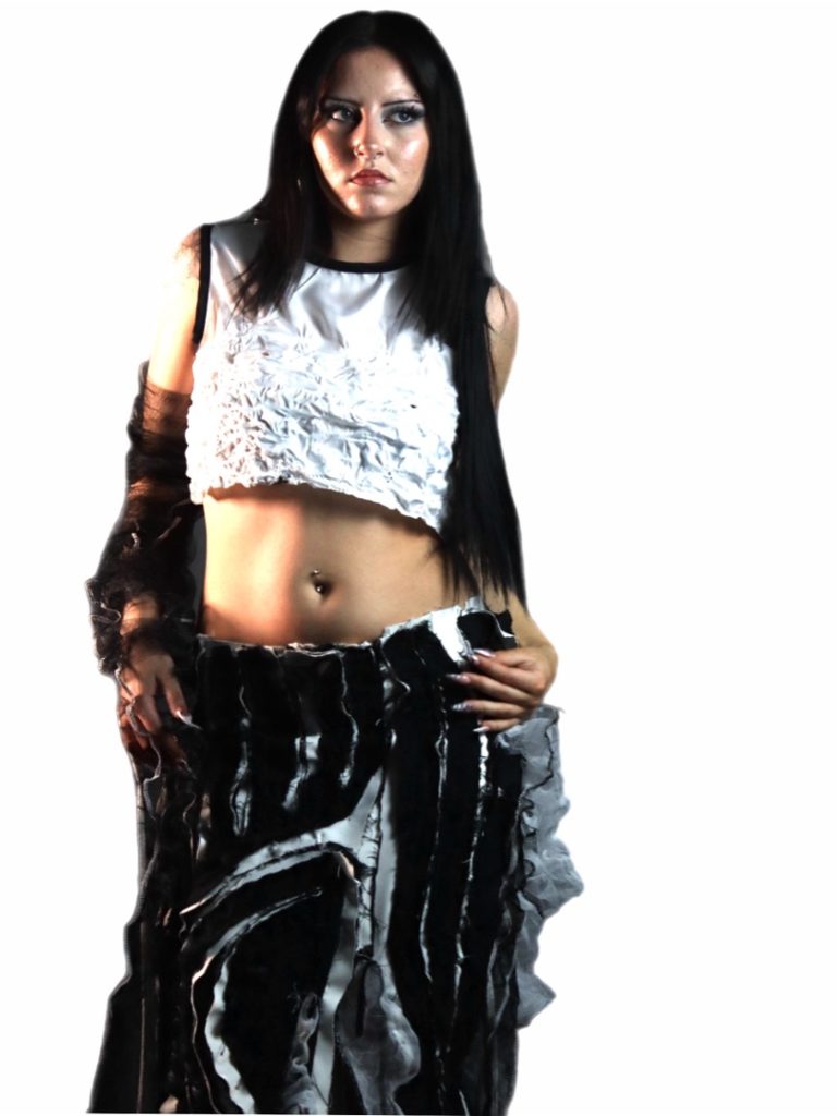
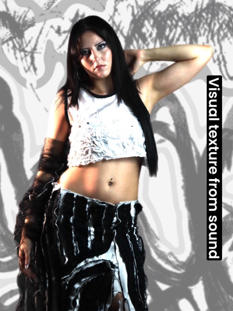
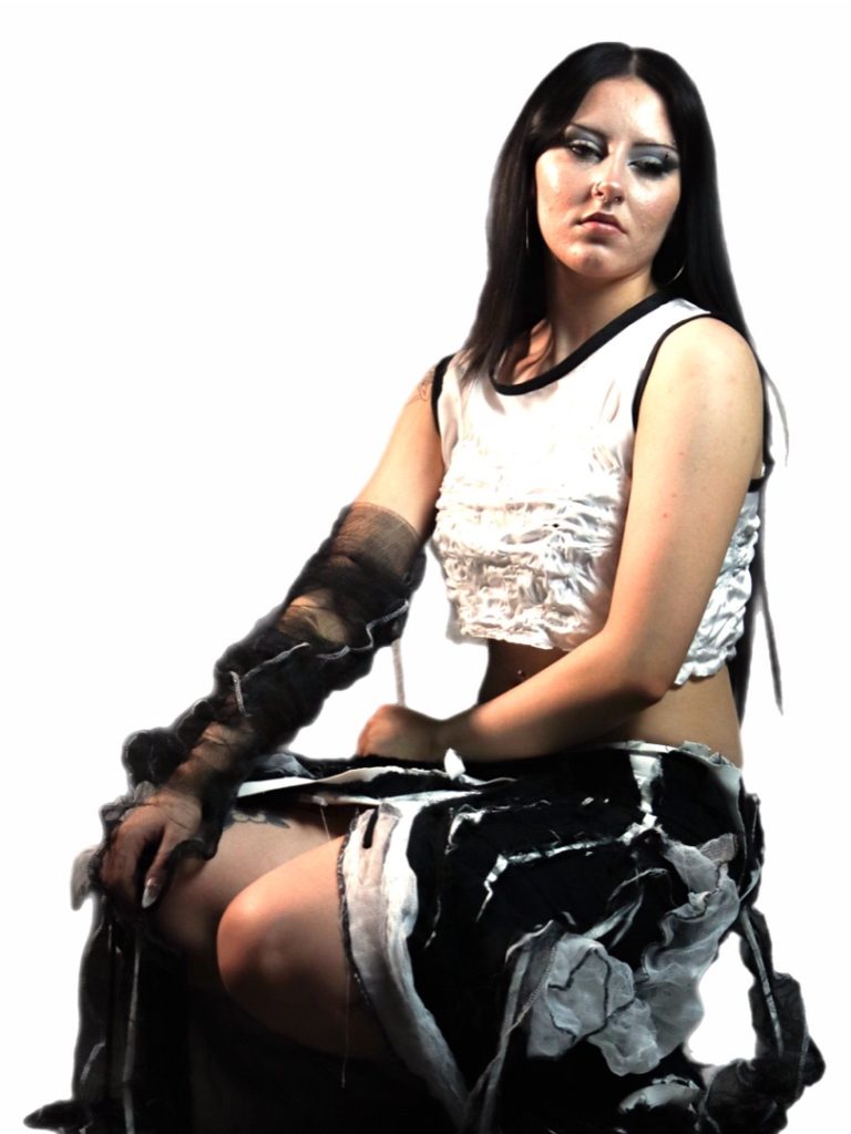
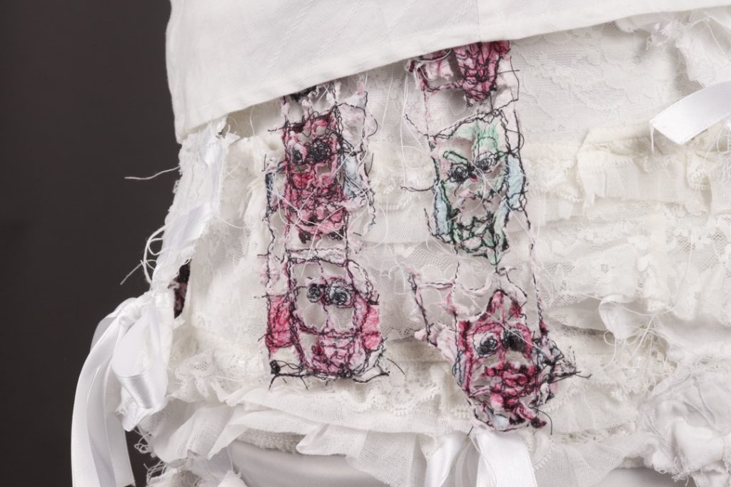
For my Final Major Project, I explored transforming a familiar garment into a sculptural, concept-led piece. I challenged traditional construction through layering, asymmetry, and surface manipulation to emphasise texture, movement, and three-dimensional form.
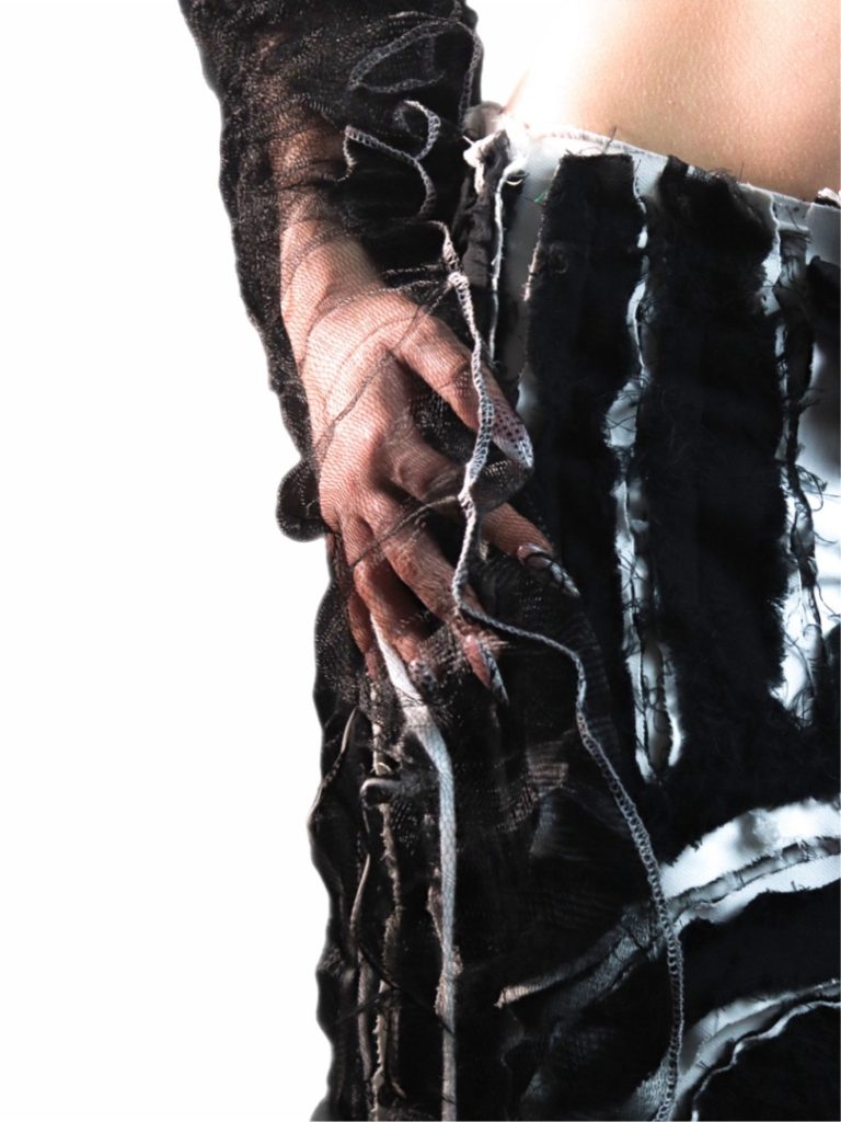
Influenced by Alexander Calder, Jean Tinguely, Craig Green, and Comme des Garçons, I approached fashion as a sculptural medium that interacts with the body and space. I experimented with layered fabrics, reverse appliqué, raw edges, and exaggerated silhouettes to create depth and distortion.
This project strengthened my confidence in concept-driven design and developed my skills in construction and textile manipulation, which I plan to continue refining in future study.
Abbie Louise Jarman
Final Major Project: Movement
Progression: BA Hons Fashion Design BCU
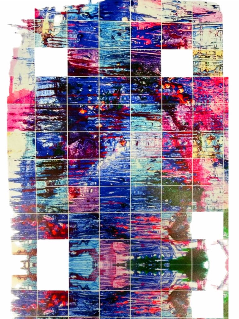
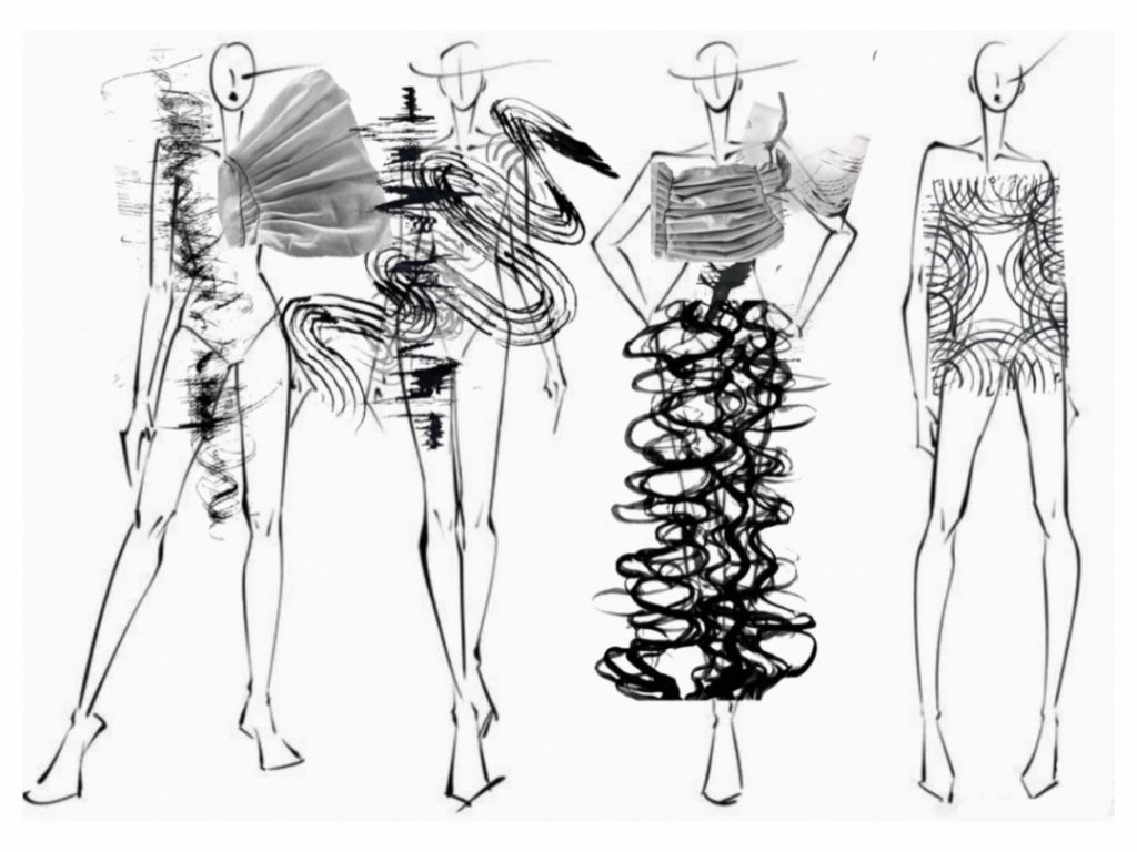
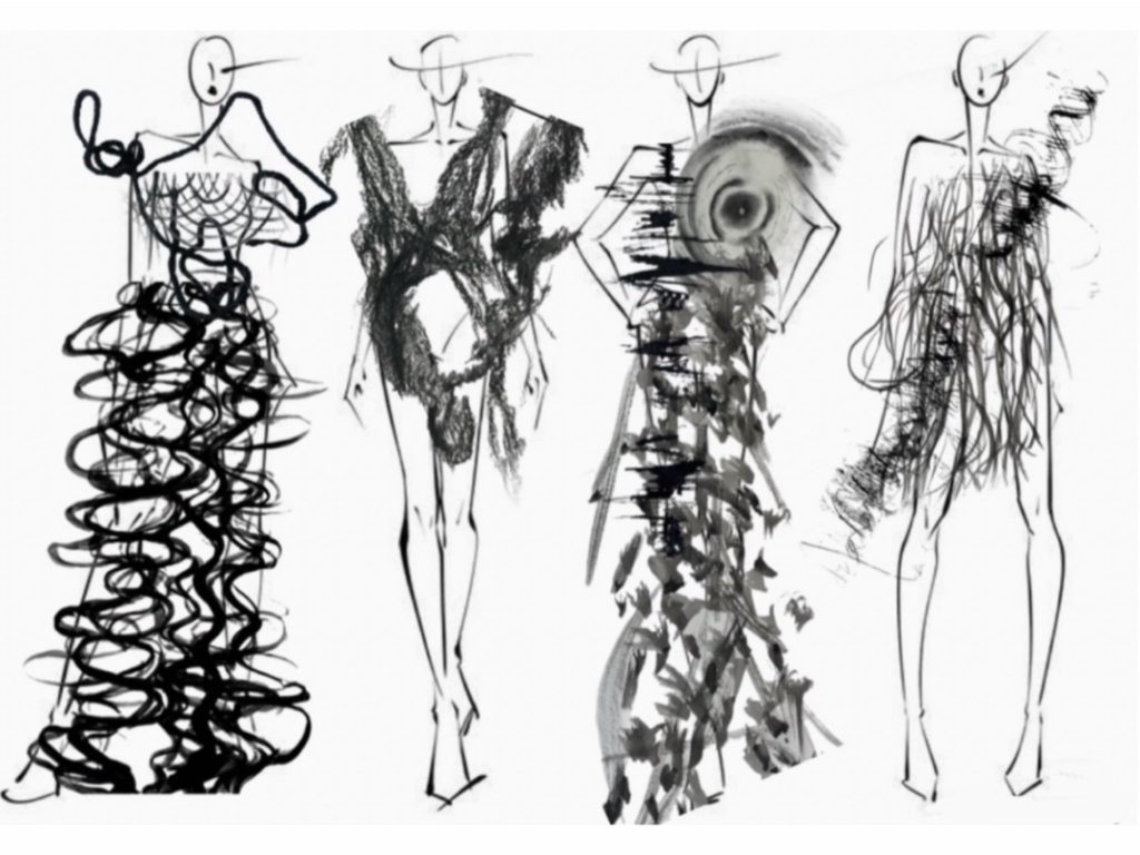
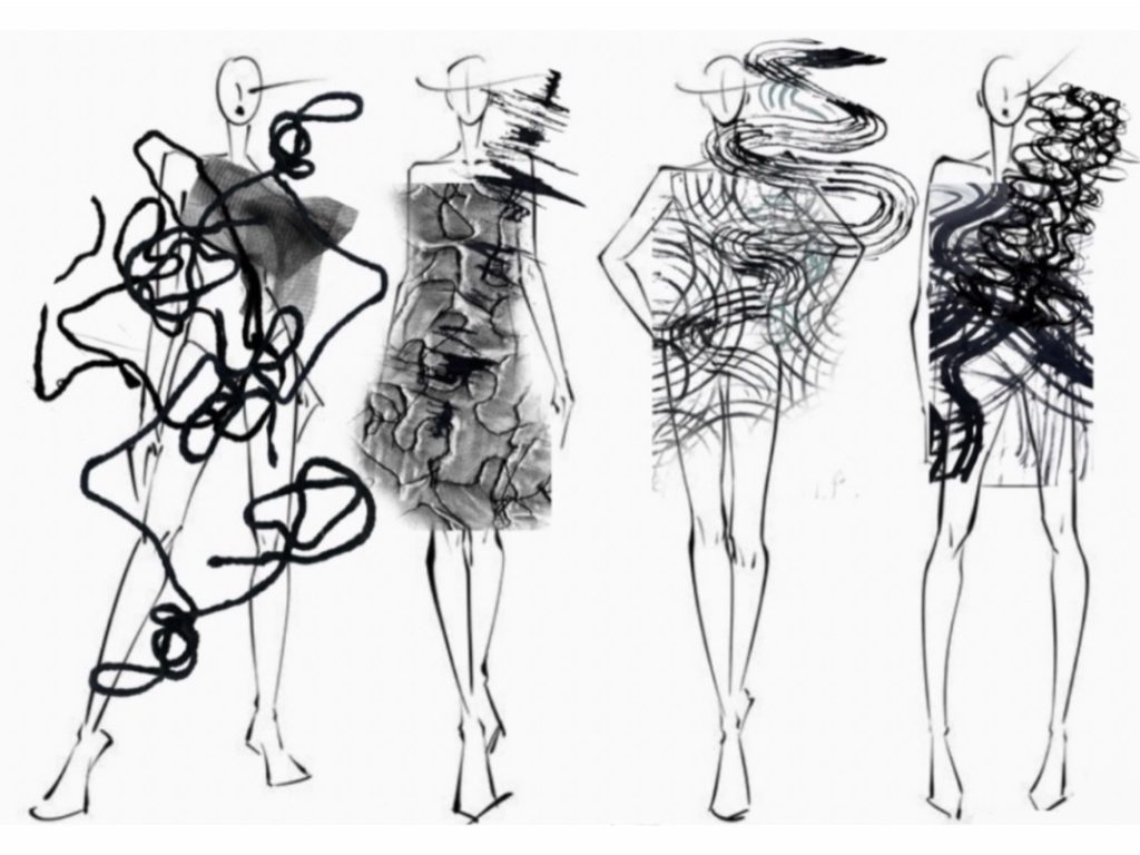
For my Final Major Project, I explored the concept of movement and how it can be expressed through Texture in fashion. Inspired by natural forms such as bird murmurations and dripping paint, I investigated both controlled and organic motion.
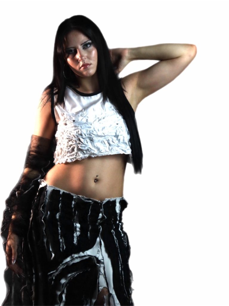
I used techniques like fabric manipulation and slashing to create texture and a sense of flow within the garment. The structured, minimal top contrasts with the dynamic, torn skirt, symbolising a transition from stillness to chaos. This contrast reflects movement as both calm and unpredictable
Phoebe Jones
Final Major Project: Sensory
Progression: Employment
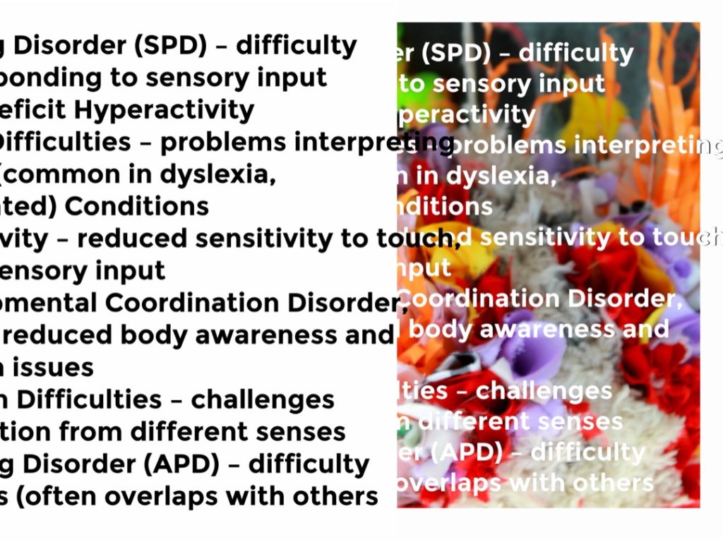
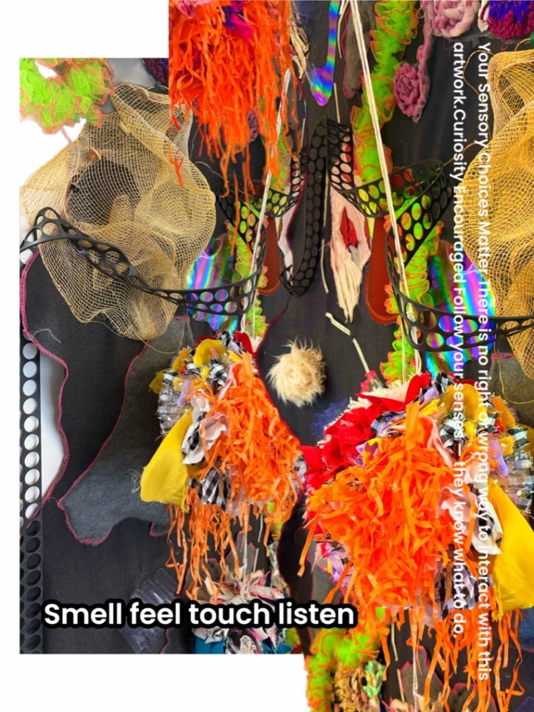
For my Final Major Project, I explored sensory stimulation and sensitivity, focusing on how different disabilities and behaviours influence sensory experiences. This research helped me develop a broader understanding of how overstimulation can impact individuals and highlighted how these experiences are often overlooked in society.
Through textile experimentation, inspired by textures found in everyday home environments, I investigated how materials can express and respond to sensory needs. This project has strengthened my awareness of inclusive design and the importance of considering accessibility within fashion.
Amelia Kurzynska
Final Major Project: Culture Clash
Progression: Forensic Science, University of Wolverhampton
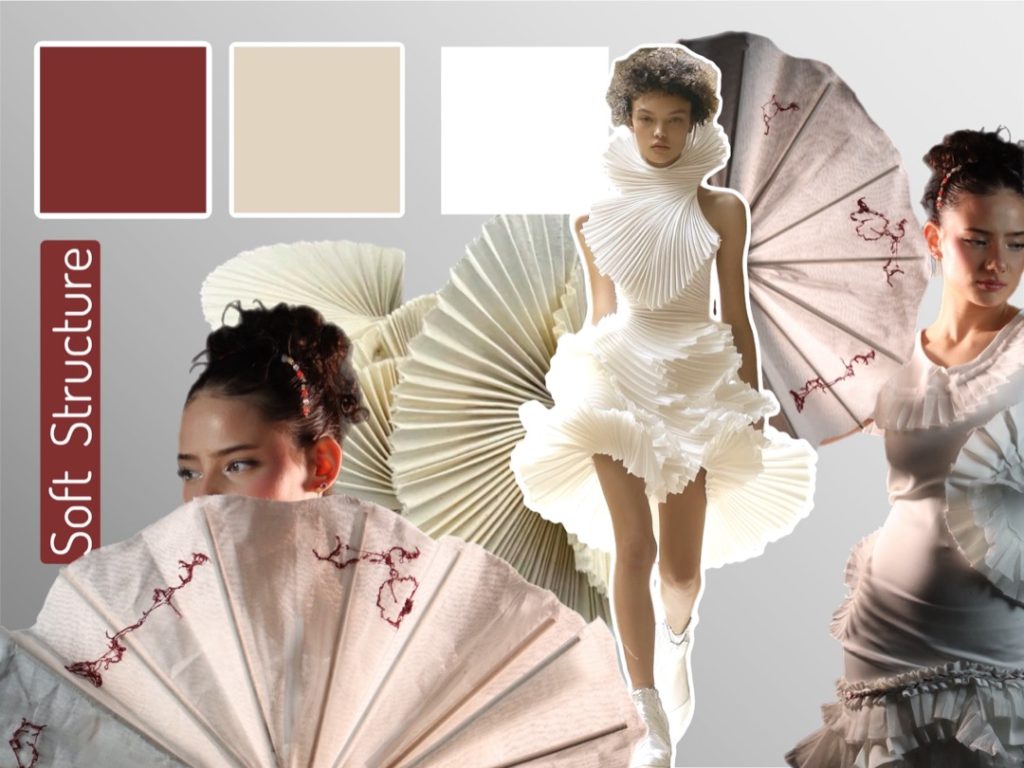
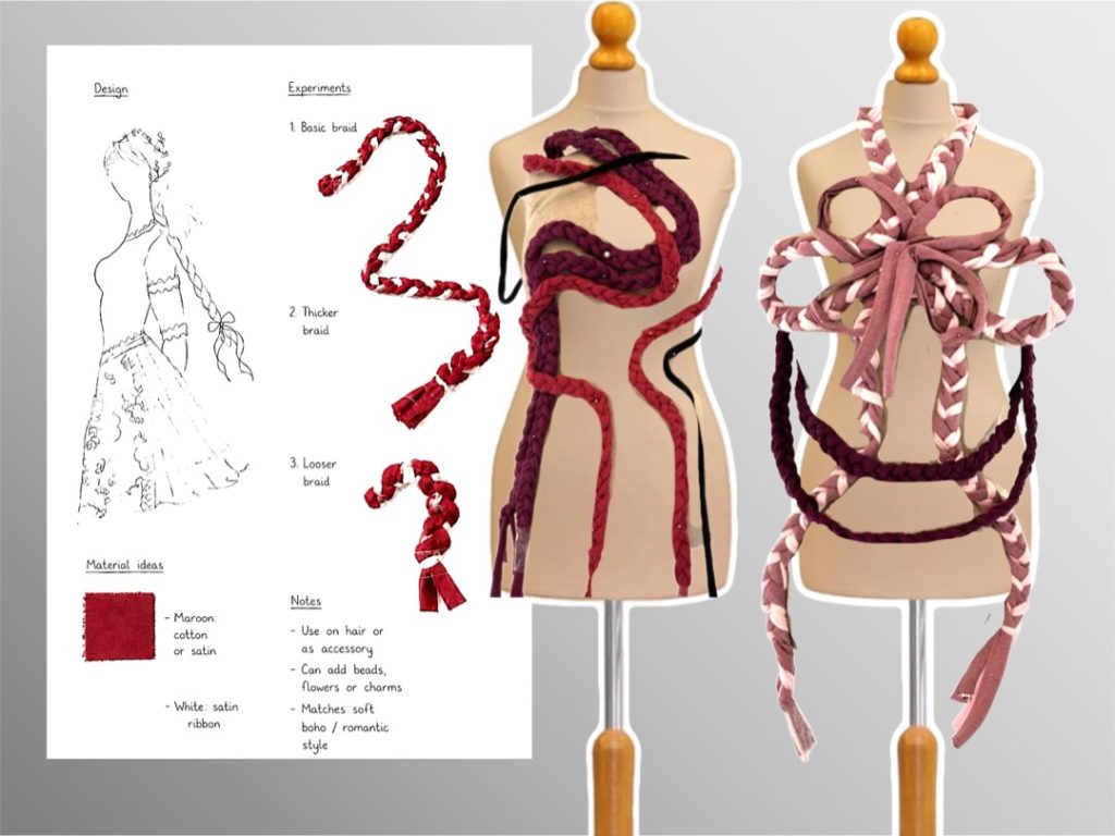
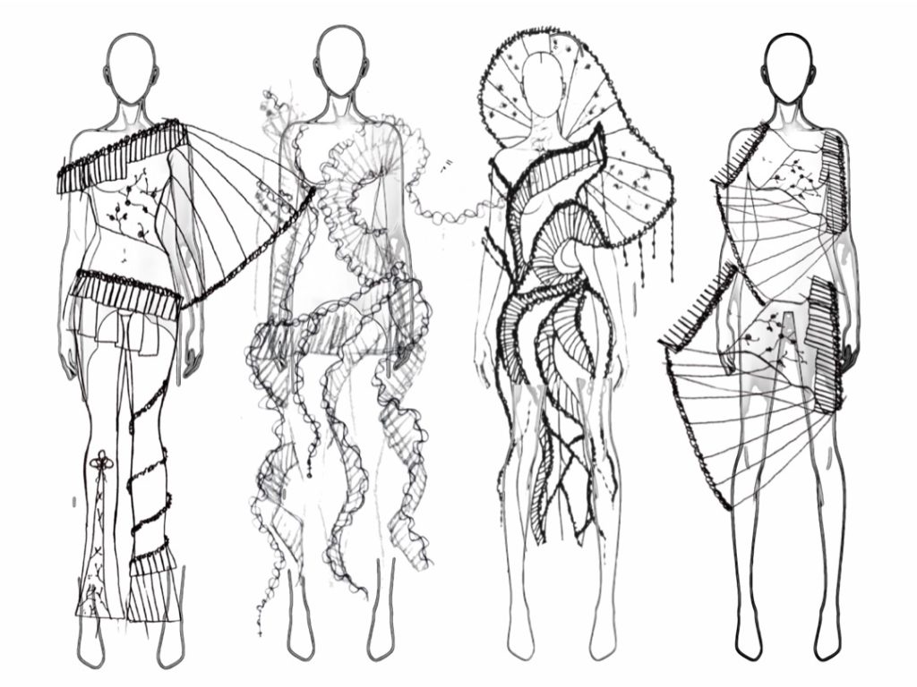
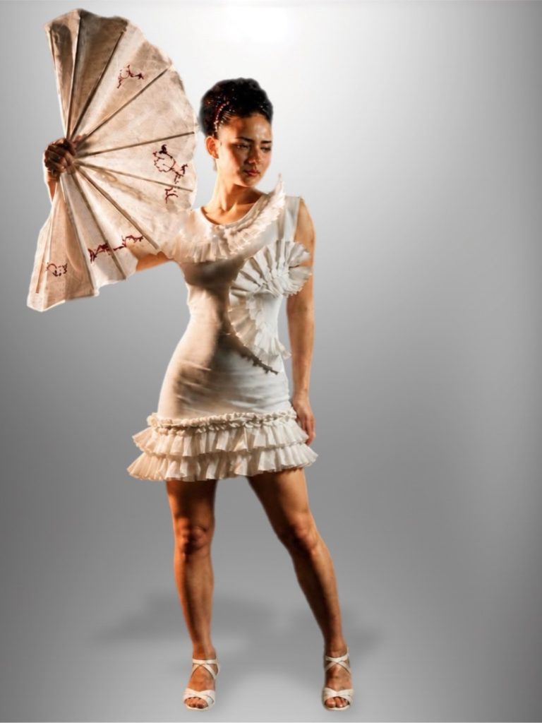
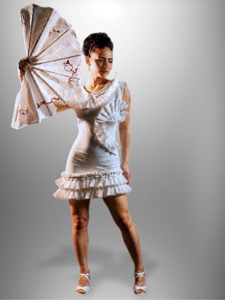
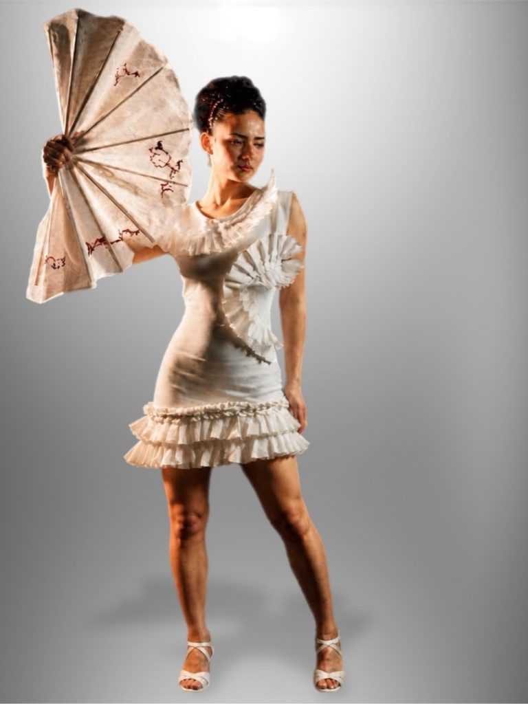
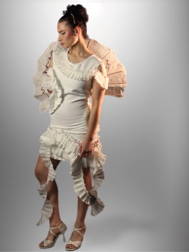
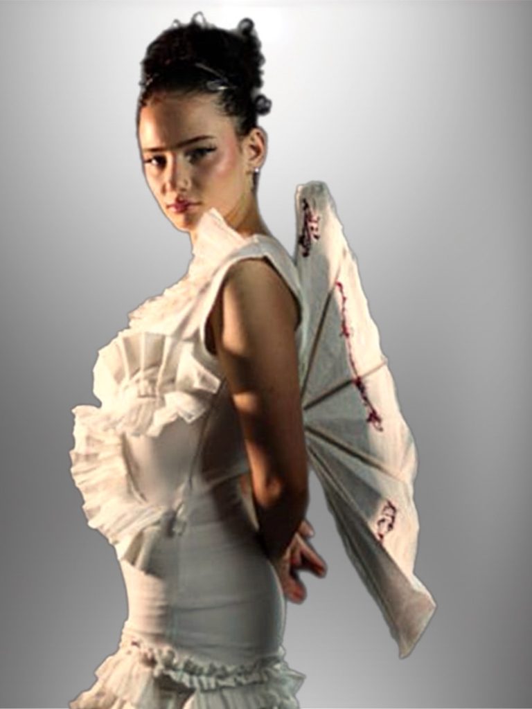
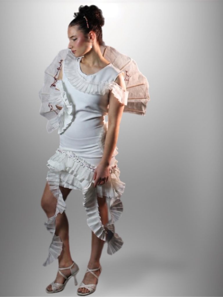
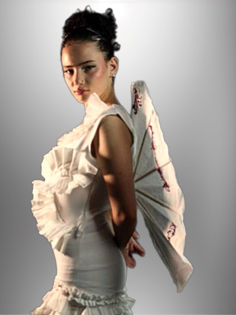
For my final major project, I explored the concept of ‘culture clash’ by highlighting influential women whose contributions to society are often overlooked. I focused on Polish and Japanese cultures, inspired by Marie Curie and Ann Tsukamoto, whose scientific achievements have had lasting global impact.
The aim was to merge these cultures to promote unity and recognition of women in history. Visually, I represented this through Japanese fans and Polish braided ribbons as symbolic elements of each culture.
Ellie Pargeter
Project Title: Final Major Project – Childhood Nostalgia
Future Progression: London College of Fashion UAL – BA Styling and Production
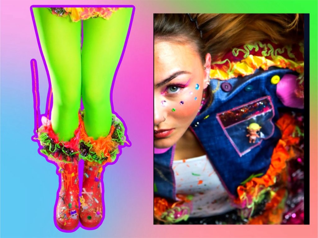
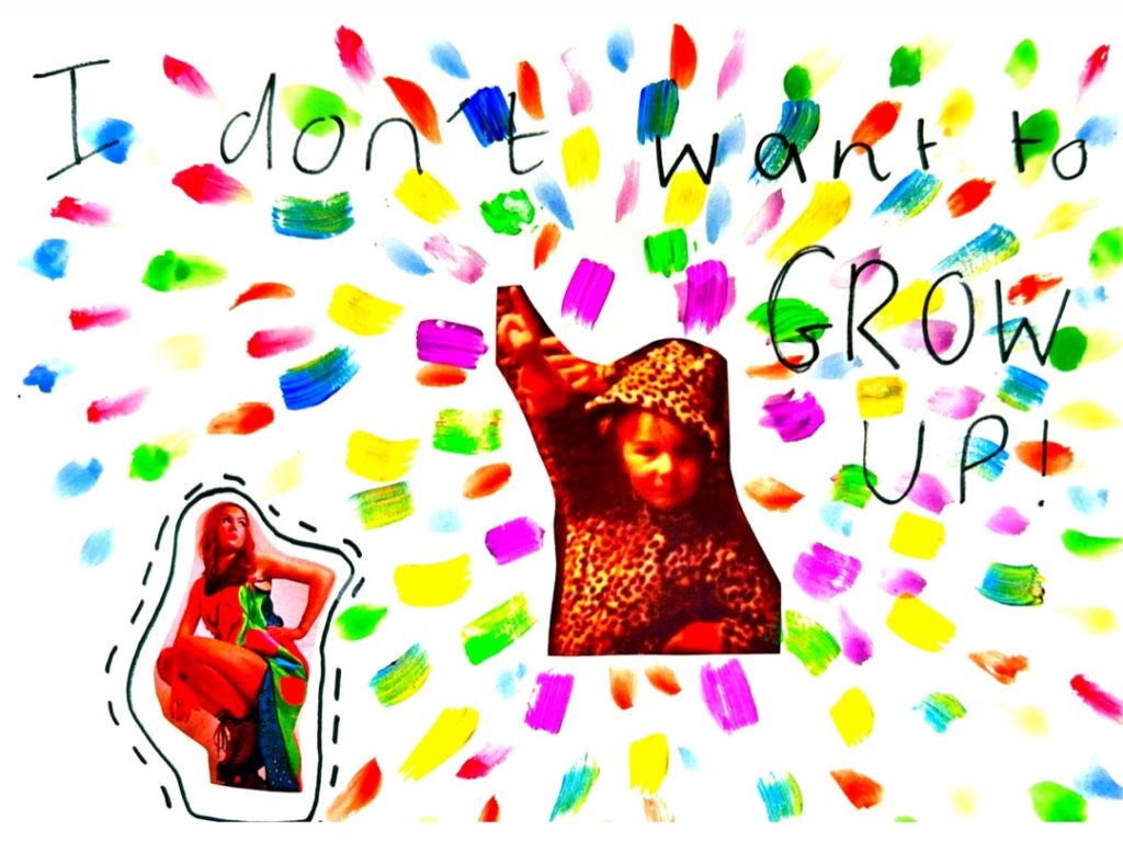
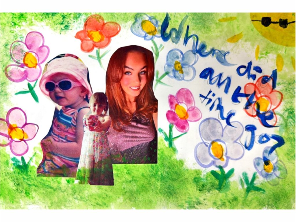
My Final Major Project explores Childhood Nostalgia and how early memories continue to influence us through fashion. I believe clothing can hold strong emotional connections, offering comfort and a sense of identity as we move into adulthood.
This project allowed me to express my personal style while focusing more on styling rather than design, developing my interest in creative direction and visual storytelling.
Ella Powell-Perry
Project Title: Making shapes
Future Progression: BA Fashion BCU
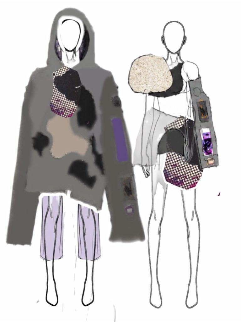
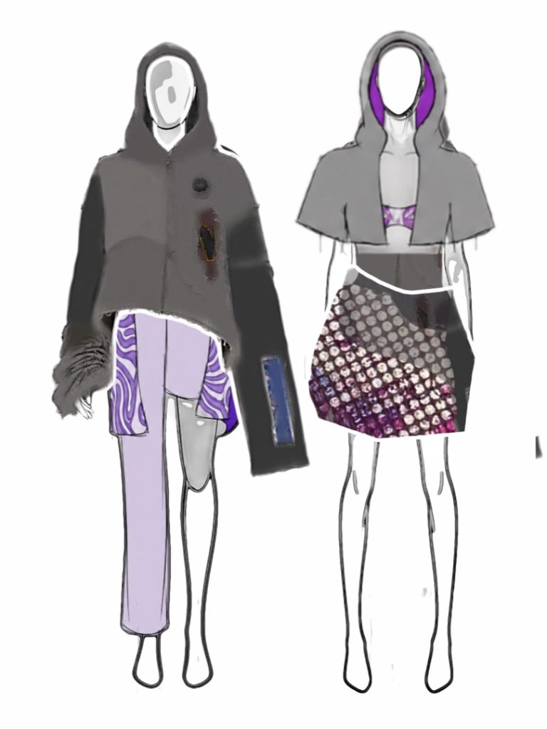
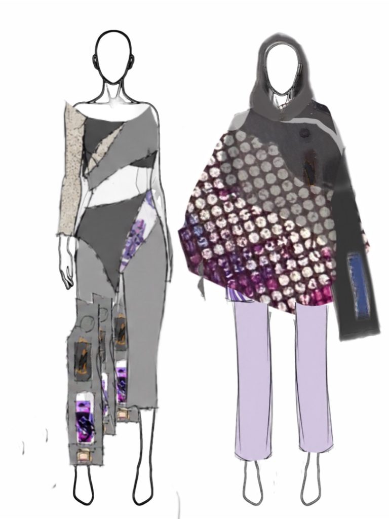
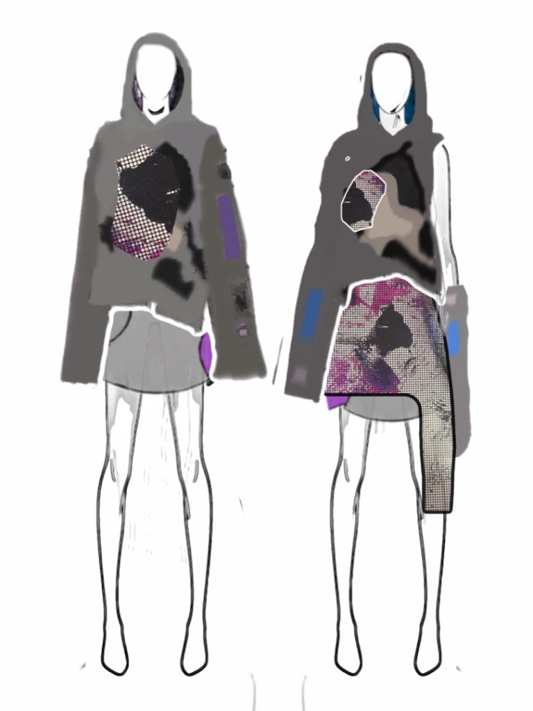
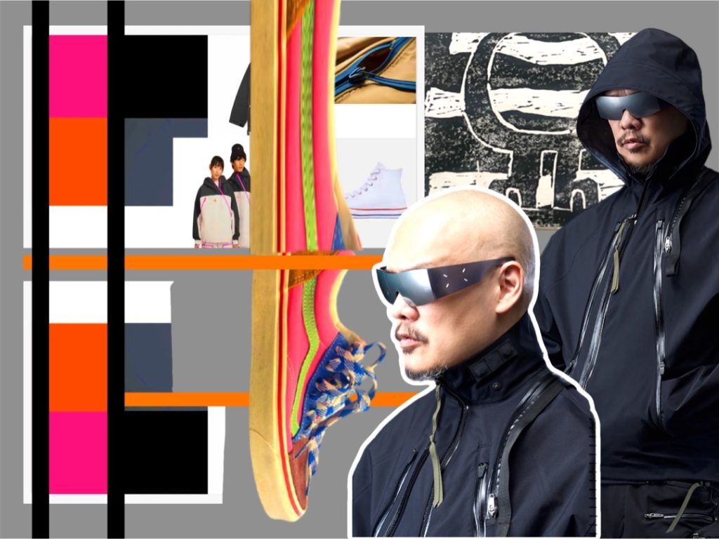
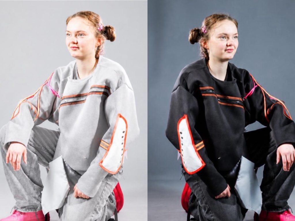
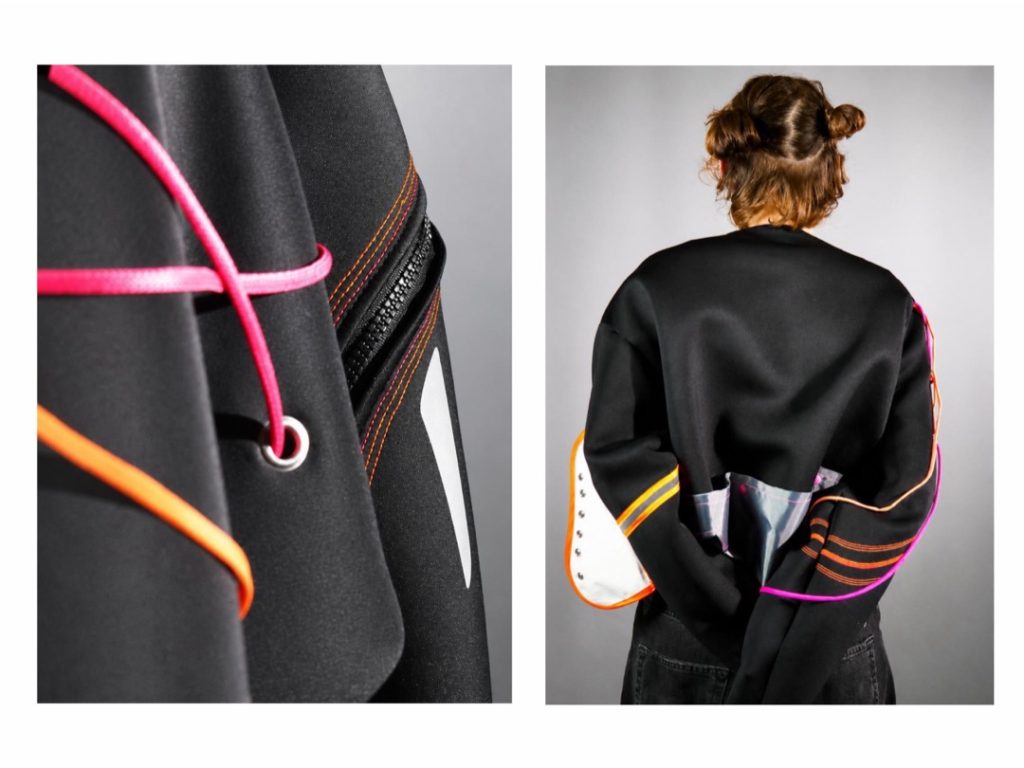
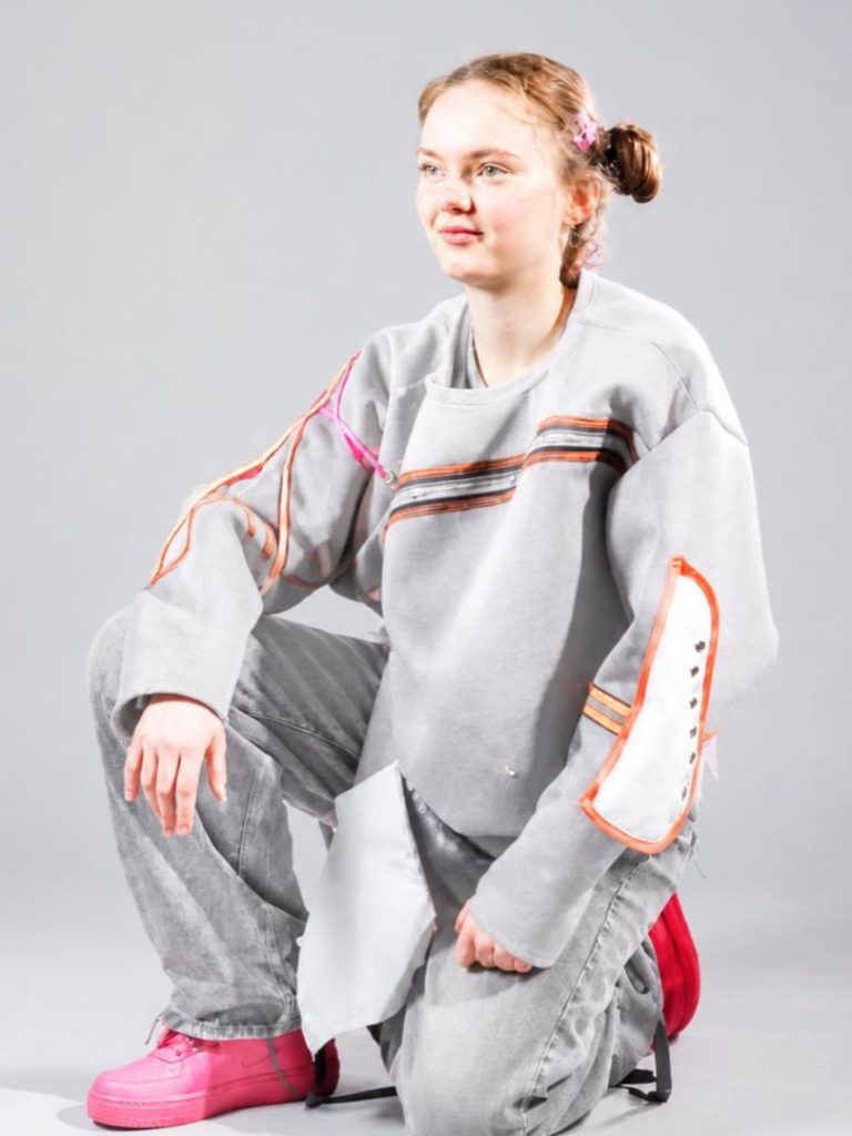
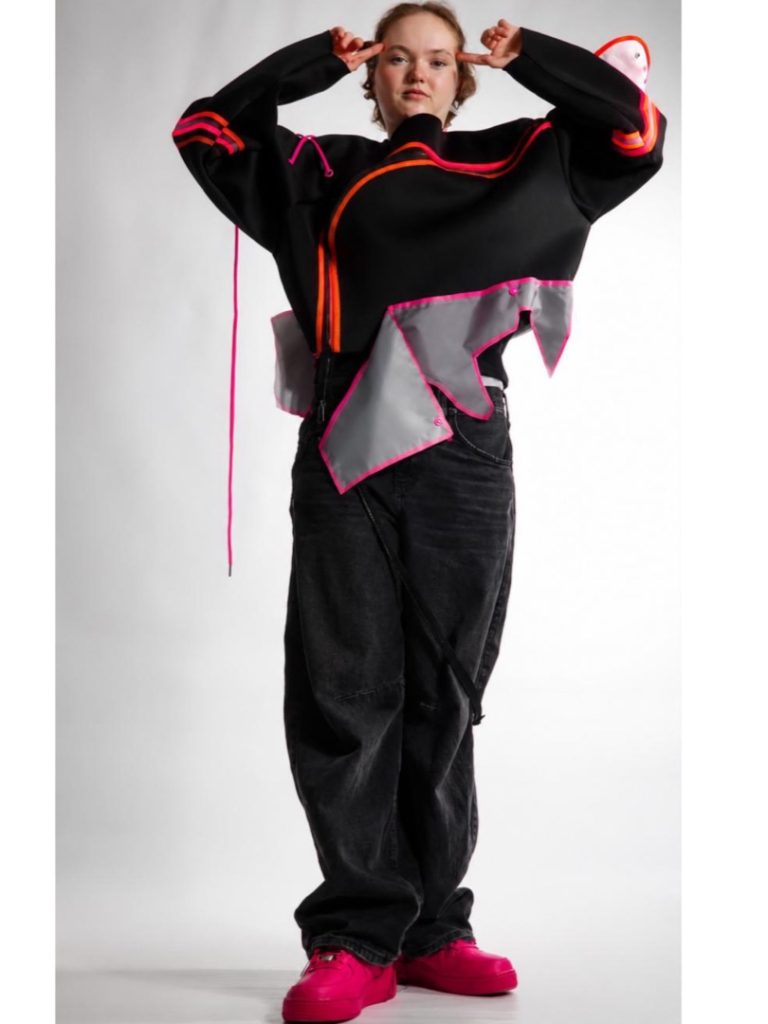
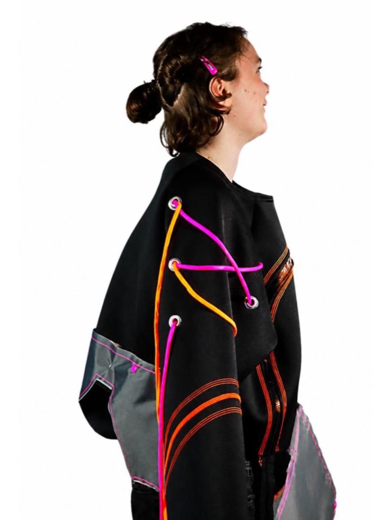
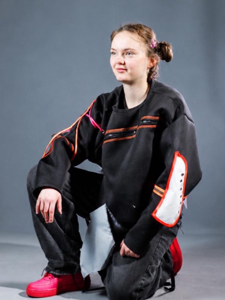
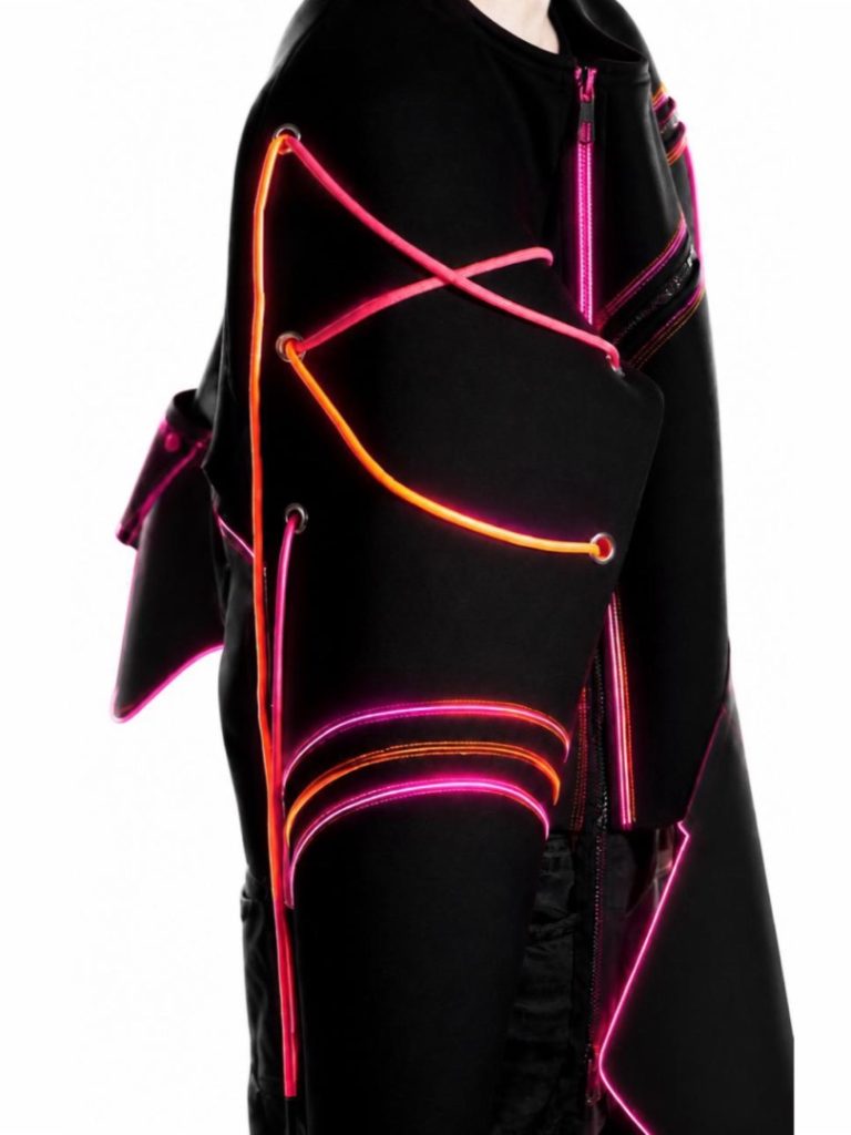
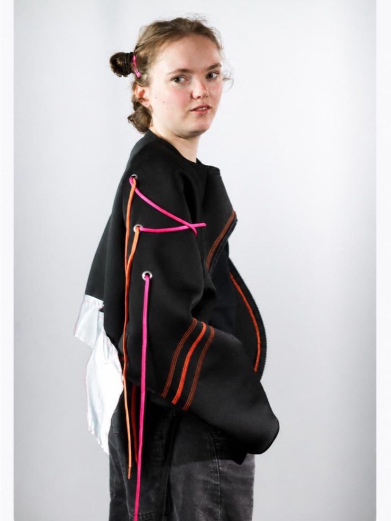
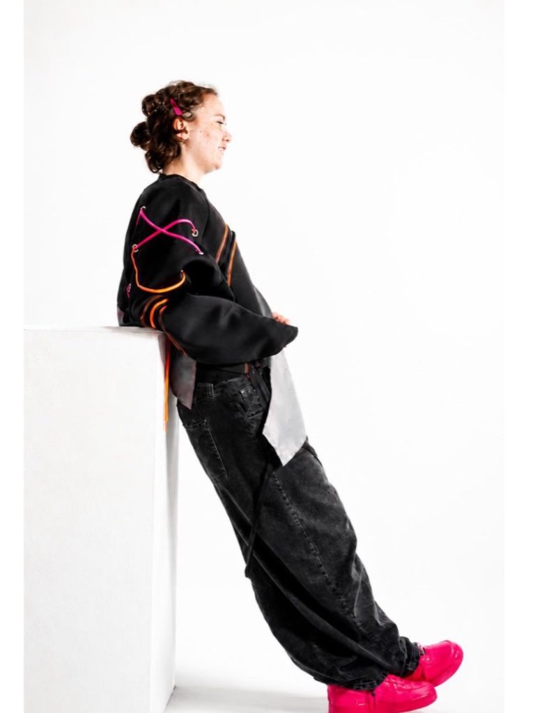
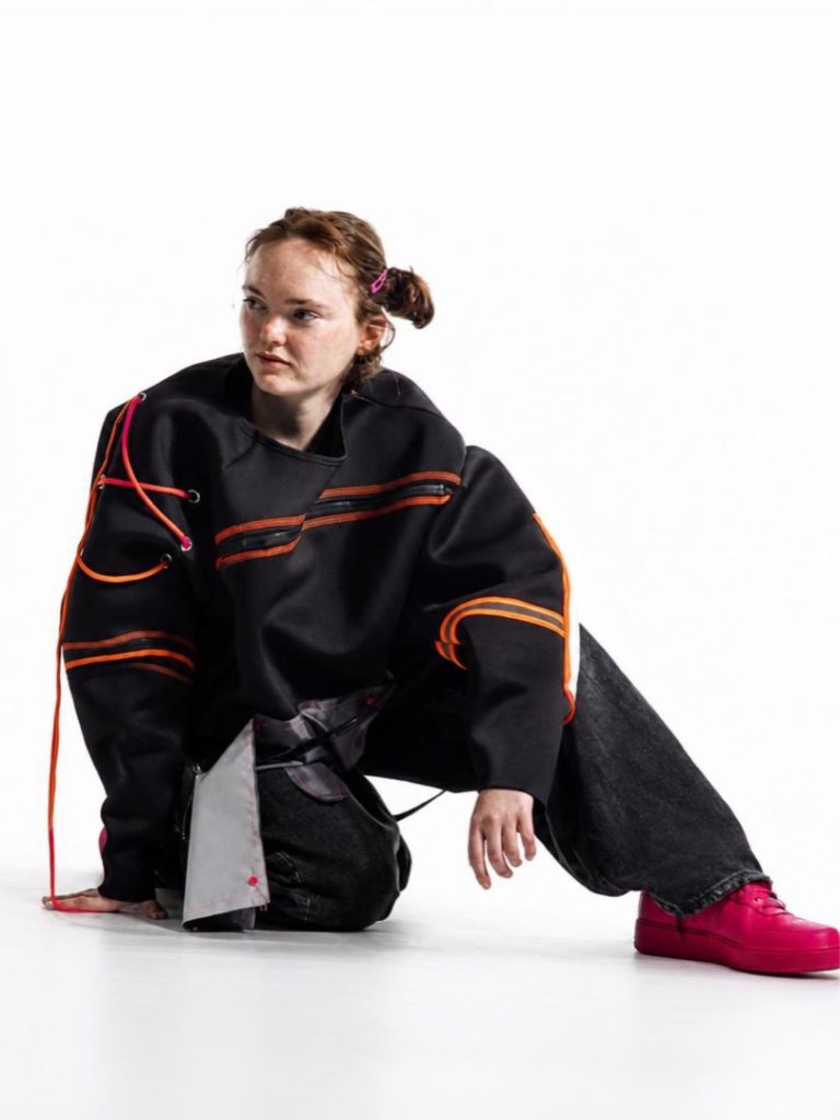
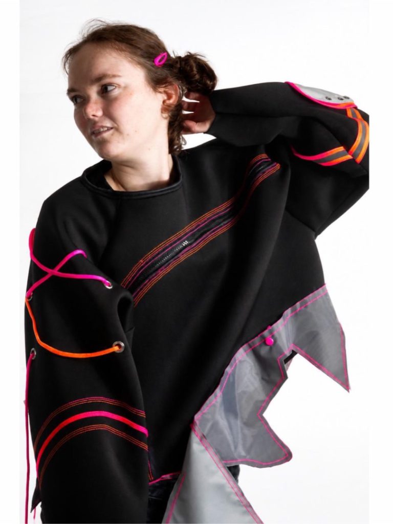
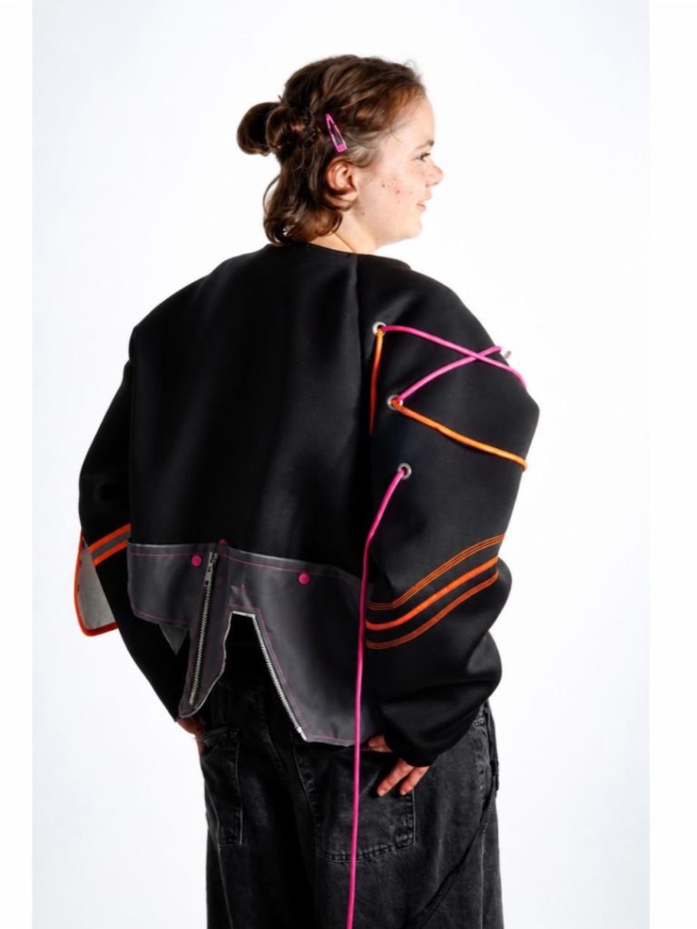
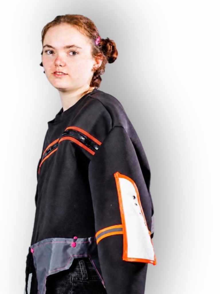
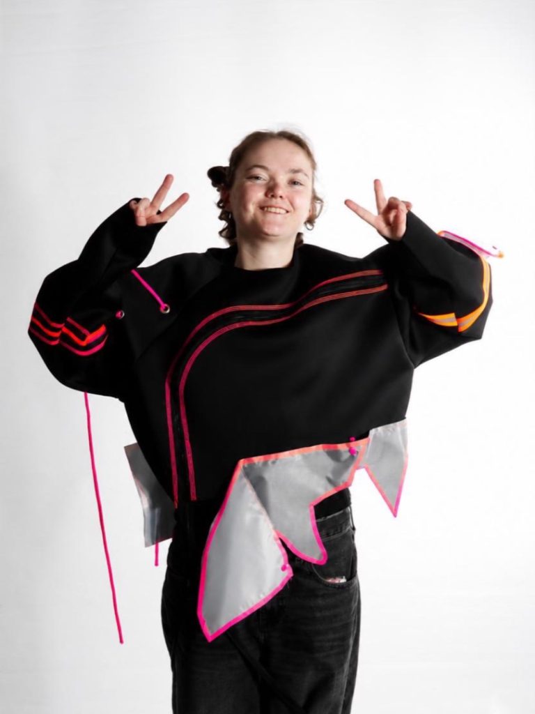
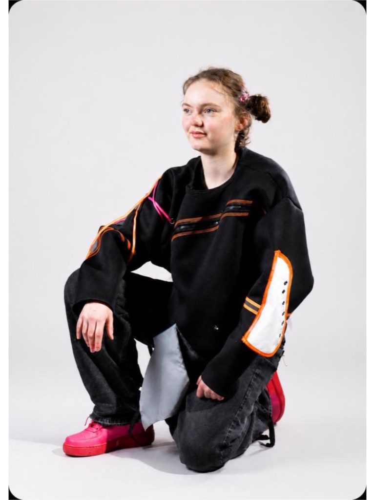
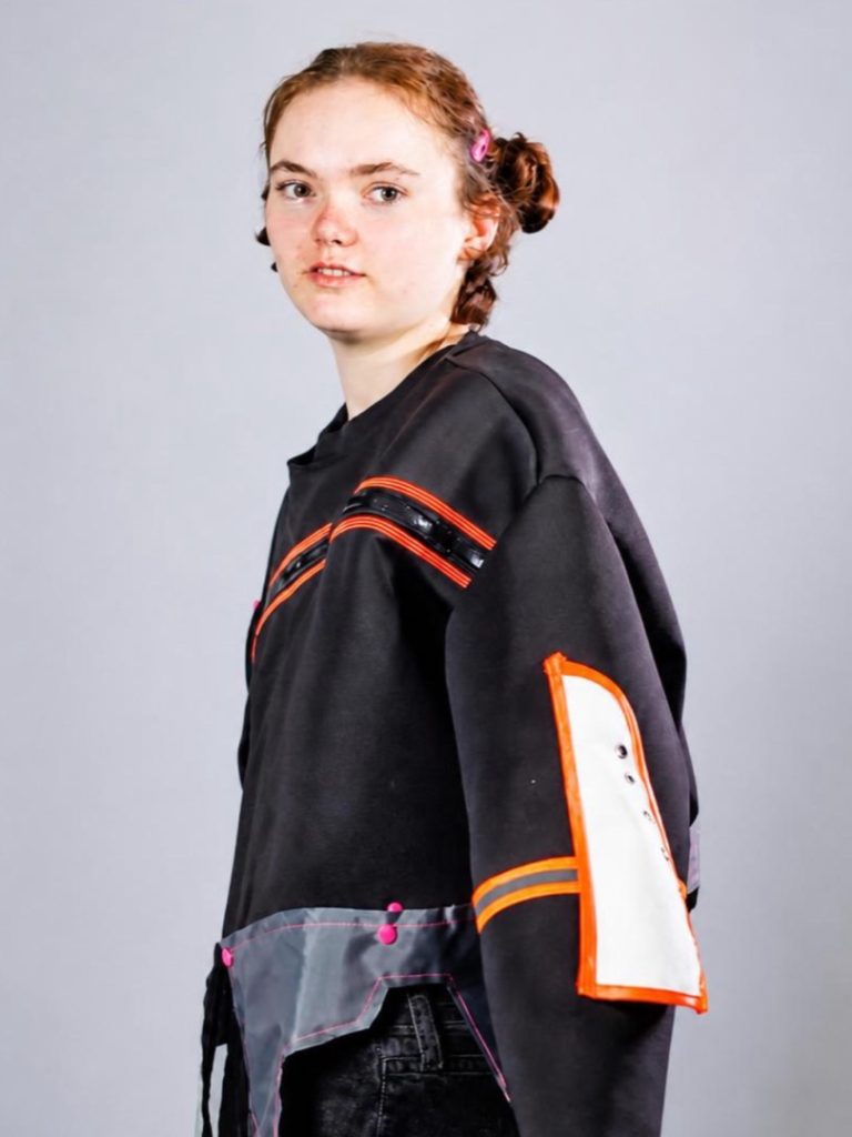
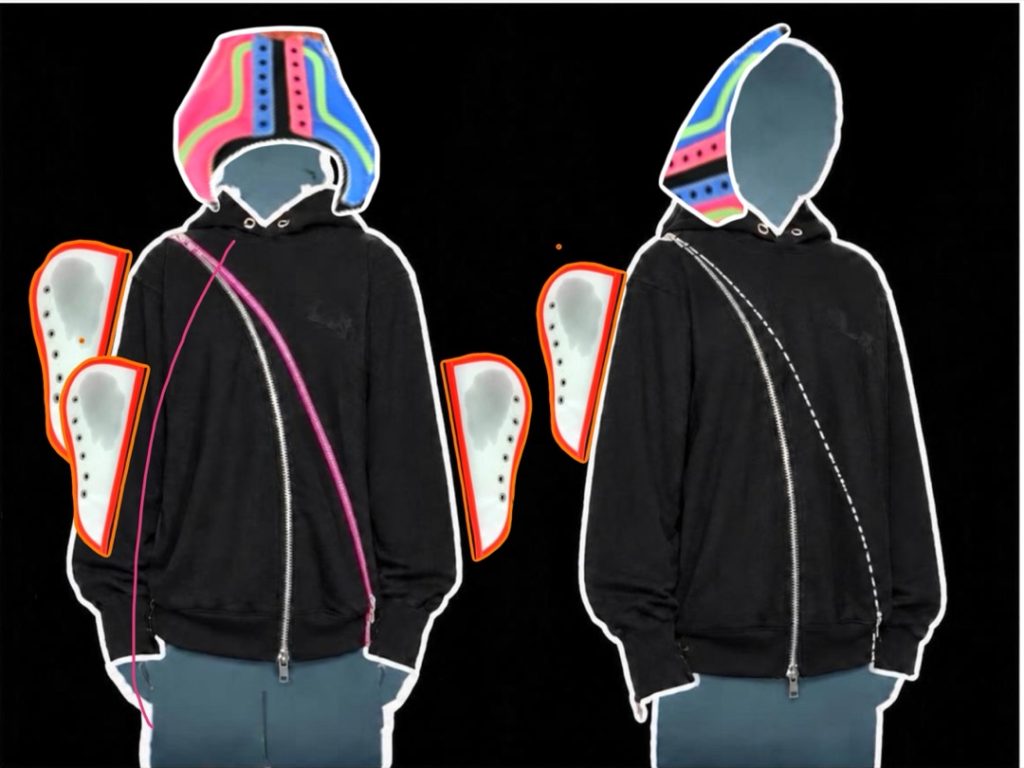
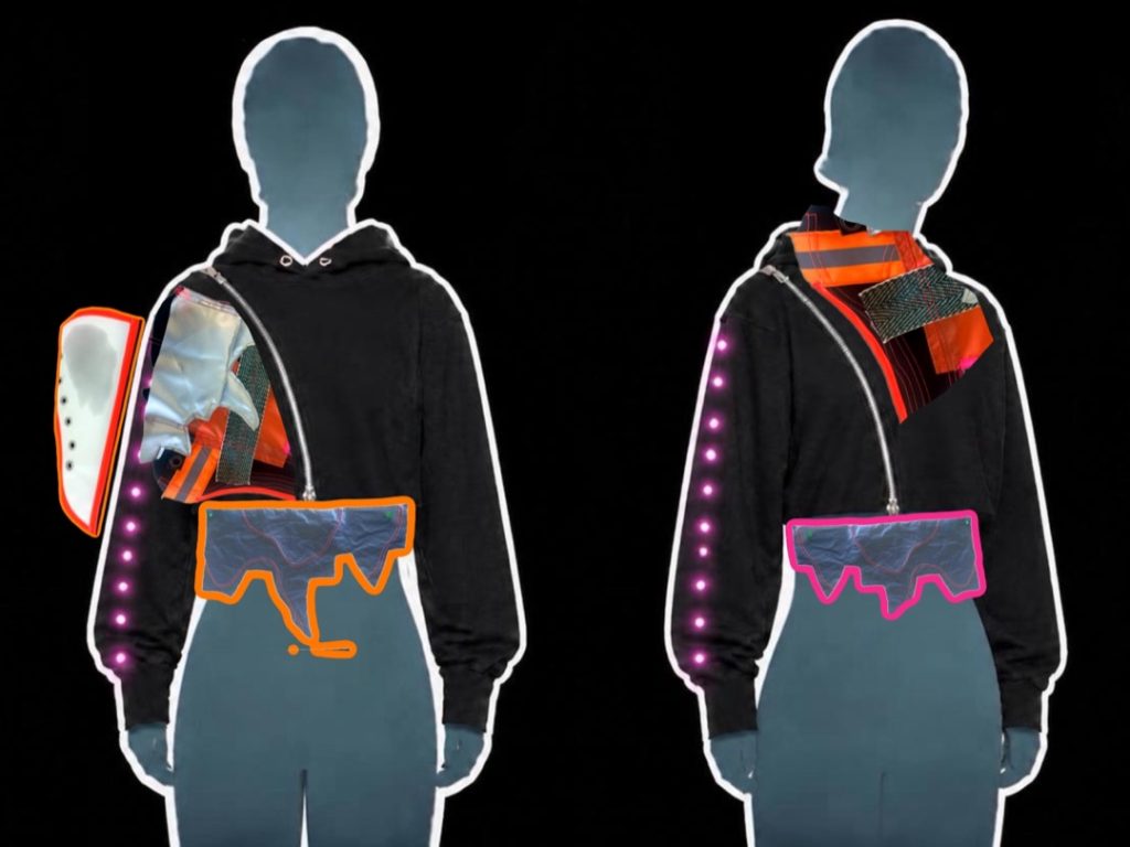
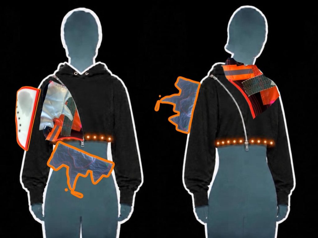
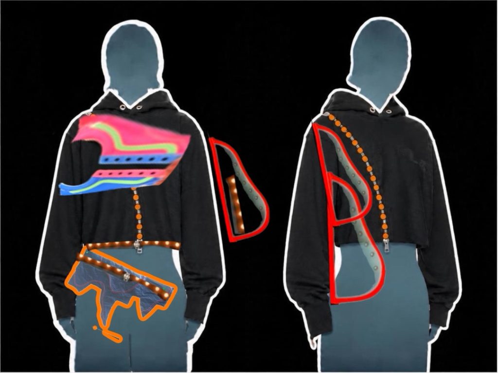
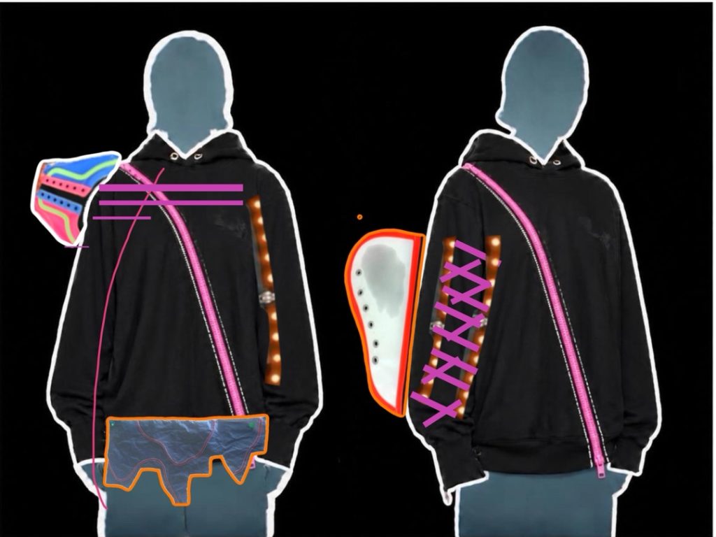
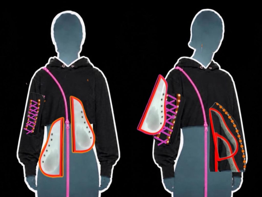
For my Final Major Project, I explored the impact of fast fashion by designing a versatile, adaptable garment that can be worn in multiple ways throughout the year. Inspired by designers such as Errolson Hugh, I incorporated functional elements including a curved zip and press studs to allow sections to be detached and reconfigured.
Influenced by my interest in footwear and streetwear, I focused on bold shape and silhouette, combining practicality with contemporary design. This project reflects my commitment to creating more sustainable and expressive fashion.
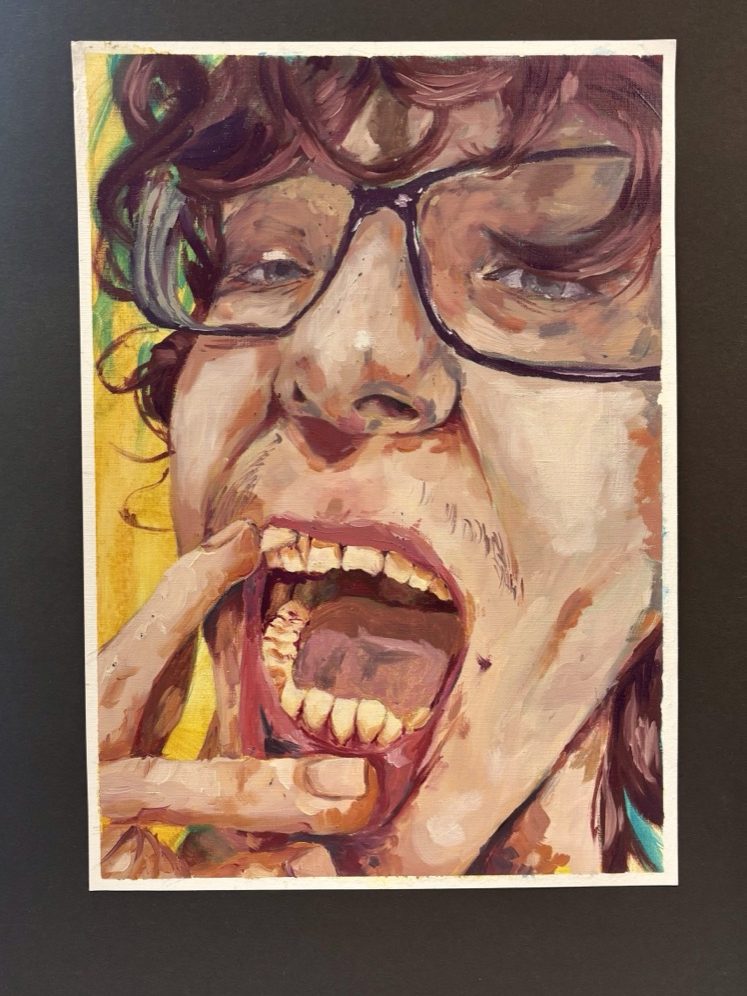
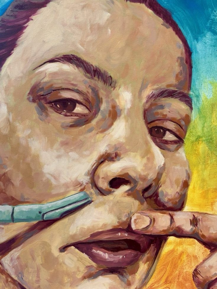
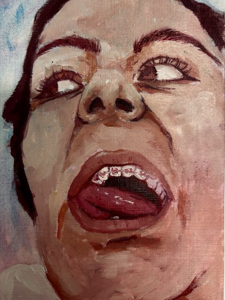
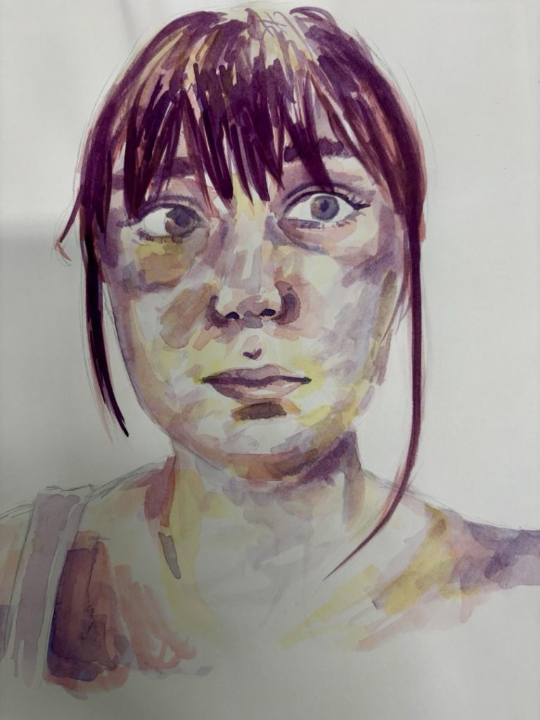
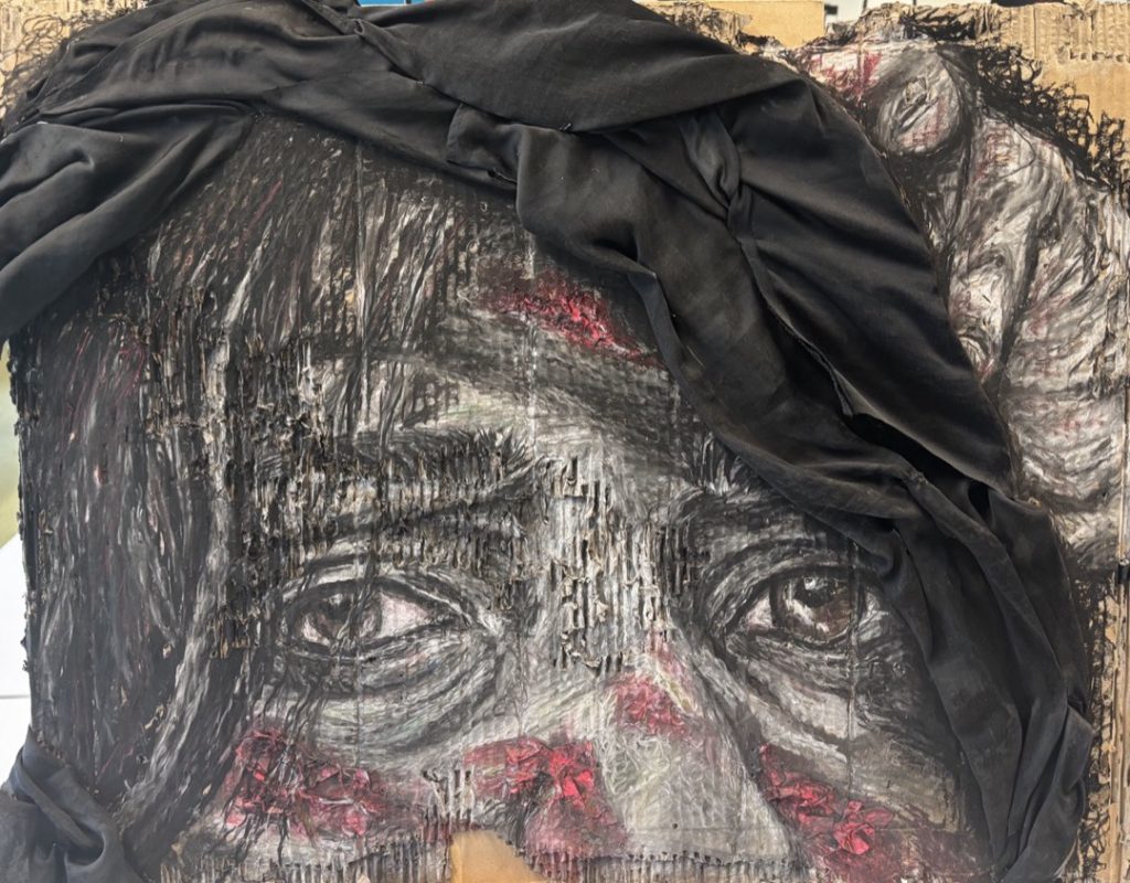
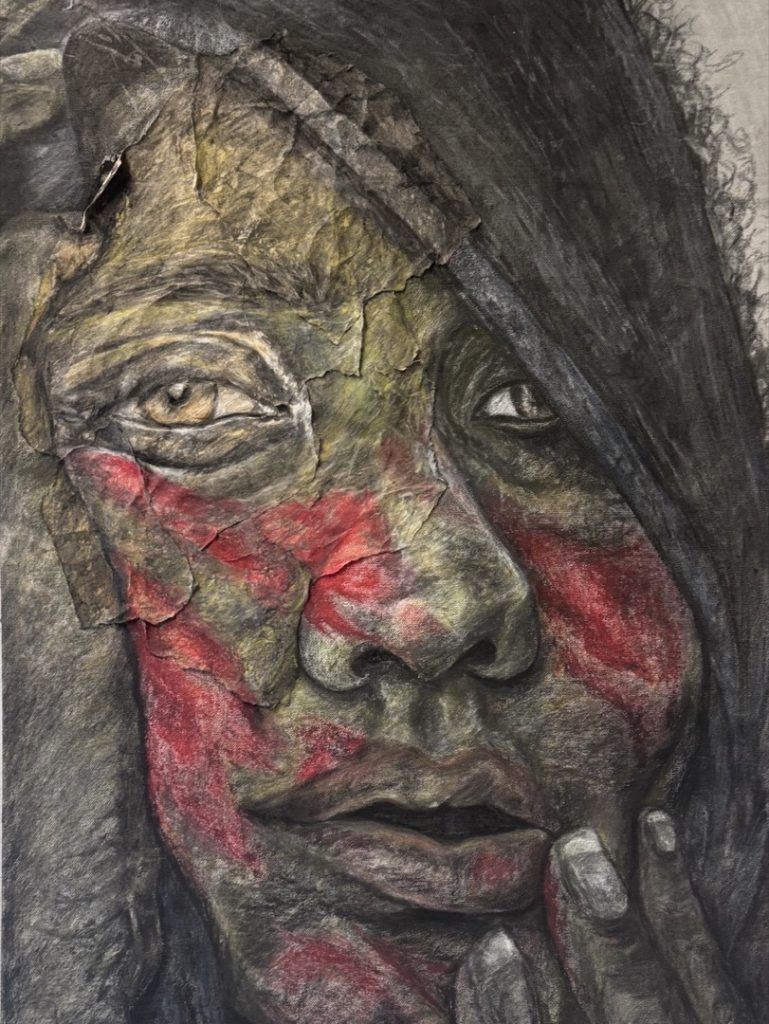
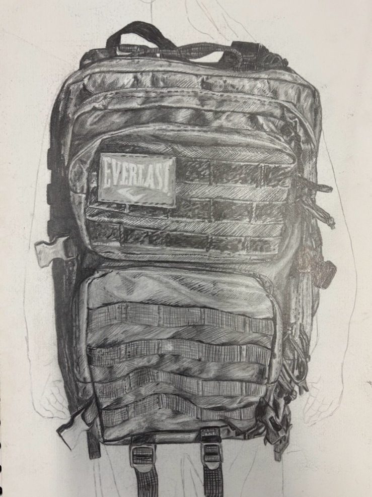
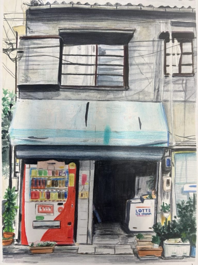
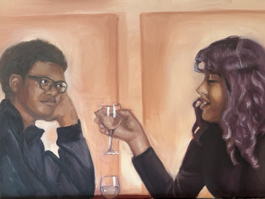
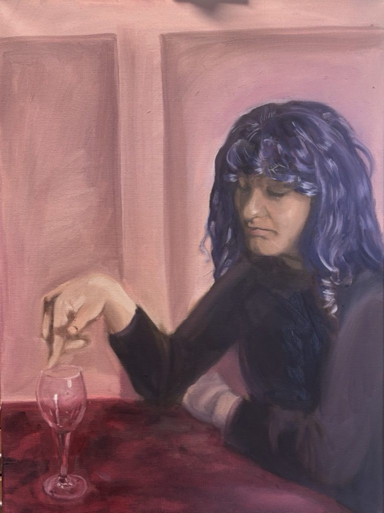
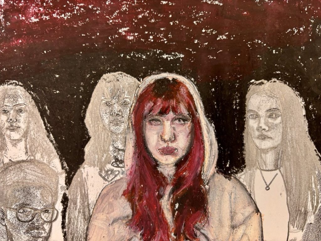
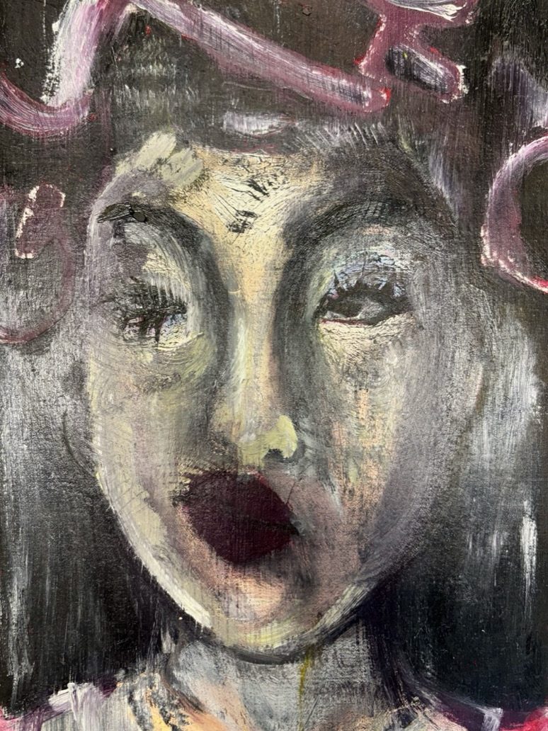
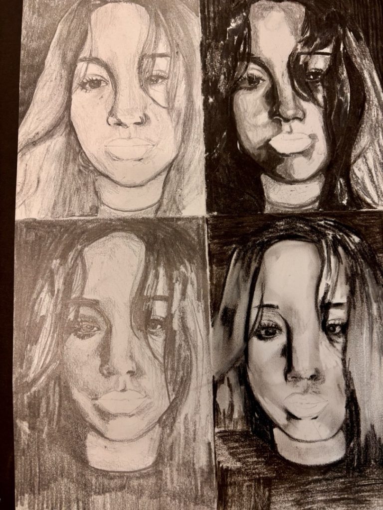
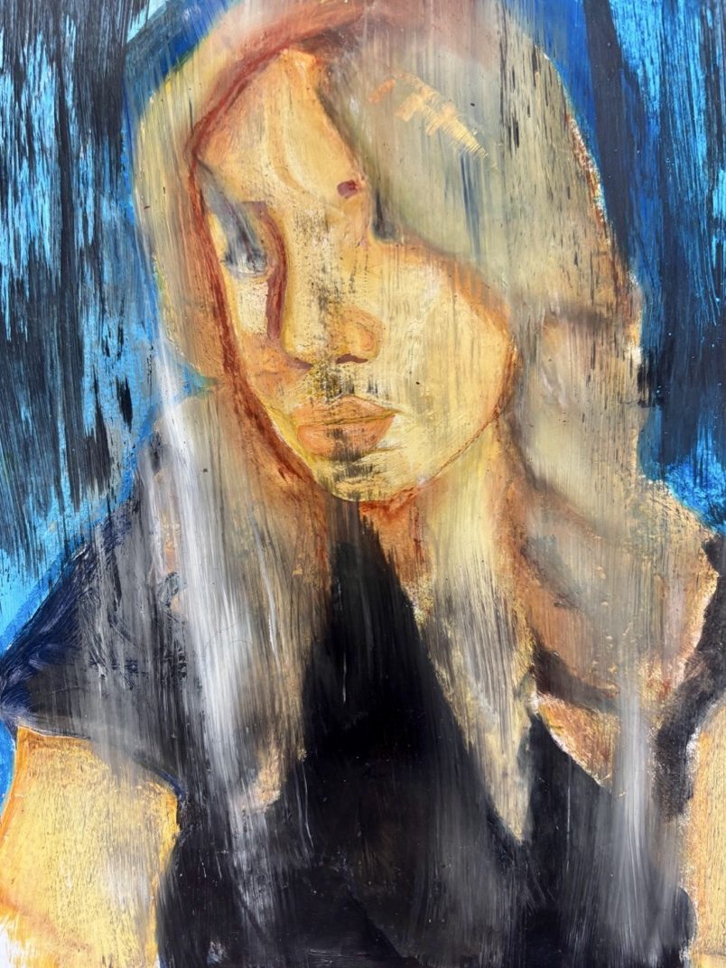
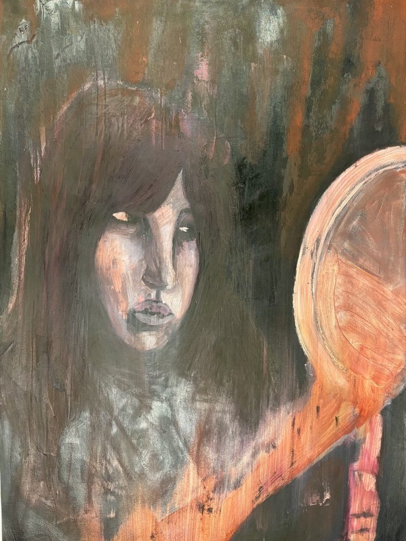
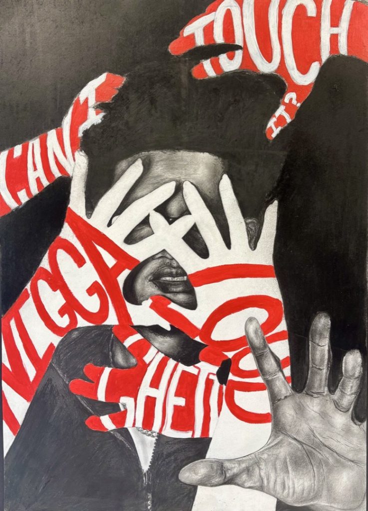
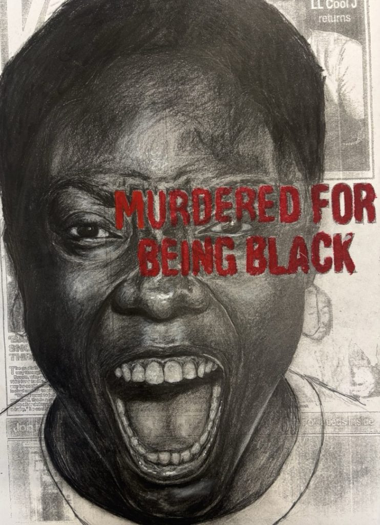
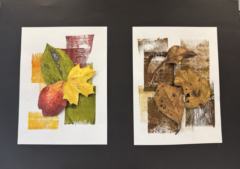
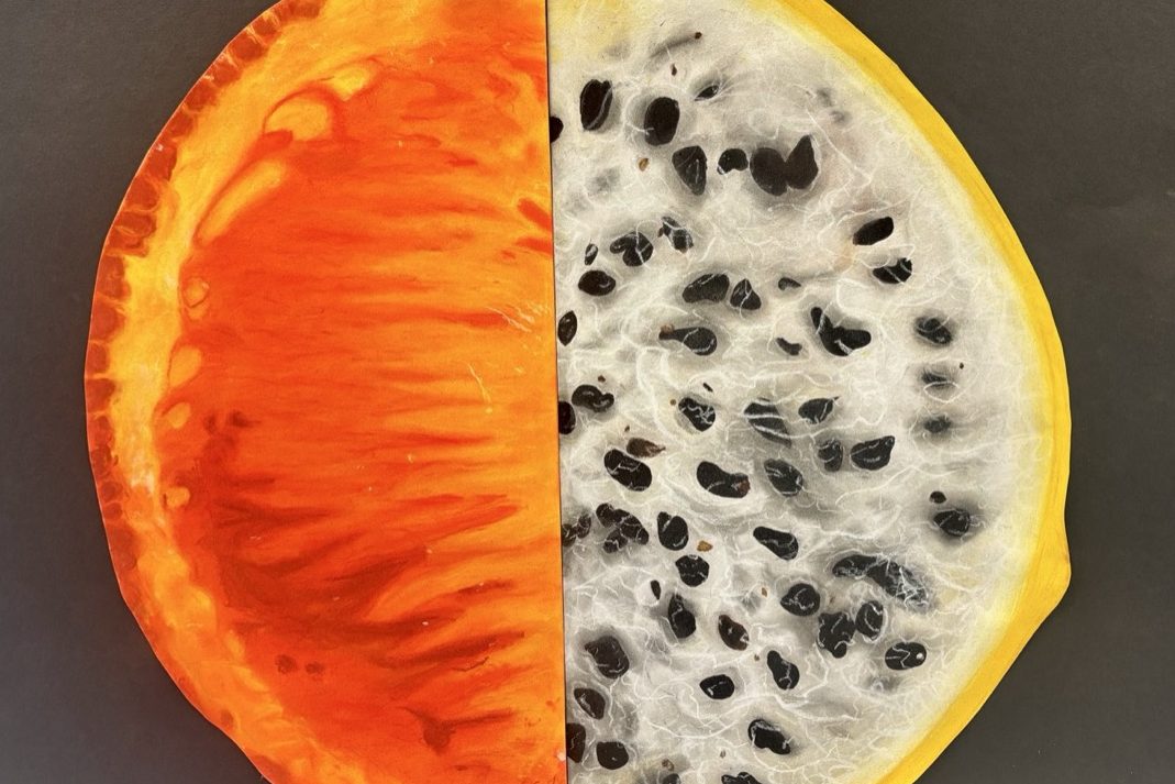
This year has seen some adventurous work come from the A-Level Fine art cohort. The organisational skills and motivation of the students has really been tested. Working with found objects and sometimes huge canvases the patience and skill level of the students has been pushed to their limits. However, all the students have risen to the challenges presented over the year and produced high quality work they should be proud of.
A-Level Photography allows learners the opportunity to express themselves creatively while exploring ideas and concepts that are personal and meaningful. This is clearly demonstrated across the wonderful work created by this years A-Level cohort. I could not be prouder of the work and achievements made by each member of the Photography group.
Learners often choose issues within society as a means to connect their Photography to an audience. The course consistently challenges them to problem solve and improve both quality and concept as they progress. This ultimately prepares them for both industry and Higher Education.
Industry-standard software and equipment are embedded throughout the course to again support progression, exploring the Creative Cloud Adobe Suite with programs such as Photoshop and Lightroom for image editing, along with InDesign to create their stunning portfolios and project work. To allow for a deeper understanding of photography, learners are encouraged to work with both modern and traditional techniques such as darkroom and Cyanotypes. This 2-year programme builds theoretical and practical knowledge to allow our learners the creative means to express themselves through Photography.
I hope you enjoy exploring the work from this year’s Photography learners.
Simon Morris, A-Level Photography Tutor, Dudley Sixth
Safia Ali
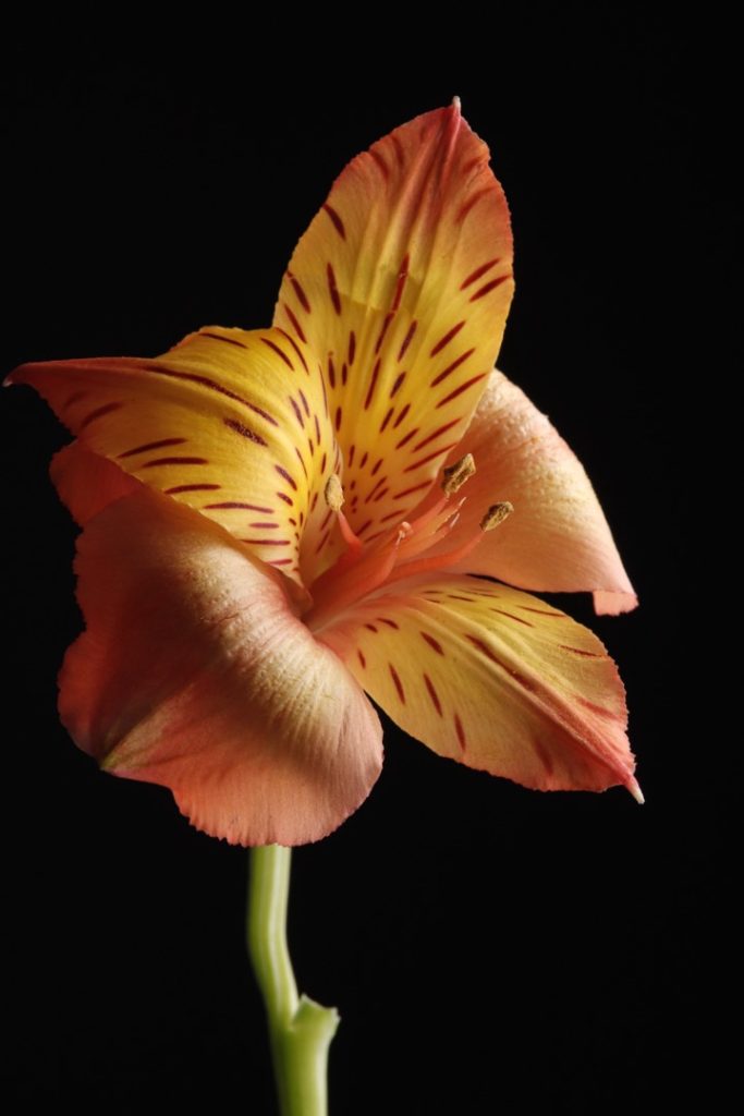
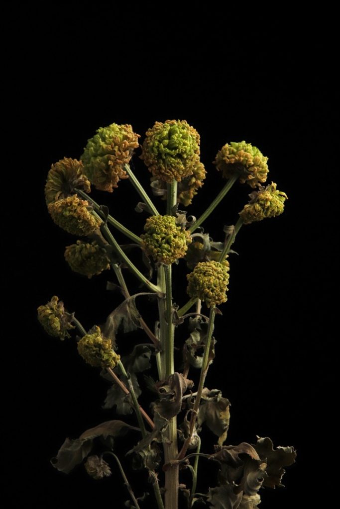
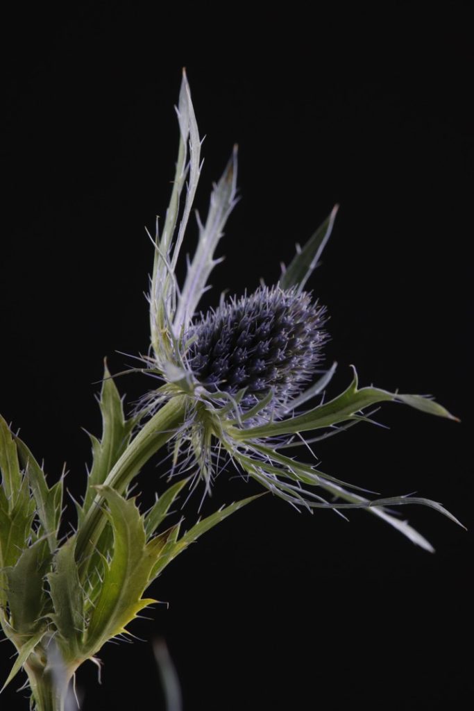
This collection features some of my best outcomes from Components 1 and 2, showcasing a mixture of flowers and architecture. I wanted to capture the cycle of life, and flowers were the perfect subject for this; in full bloom, they are visually striking with deep tones and vibrant colours, whereas in death, they become faded and shrivelled.
Meanwhile, my images of buildings explore the contrast between modern and traditional design. They juxtapose the intricate craftsmanship of older structures against the flat surfaces and unique geometries of contemporary architecture.
Looking ahead, after finishing college, I aspire to study at Aston University to train as a pharmacist.
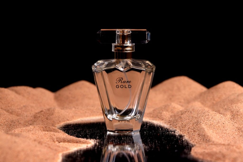
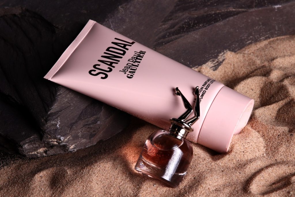
This collection features some of my most successful outcomes from Component 1, which focused on commercial photography and highlighting the hidden beauty of products that often go unappreciated by customers.
For my final piece, I investigated how texture and lighting can enhance a photograph, making the subjects stand out and ultimately elevating the perceived quality of the product.
Xavier Brozda
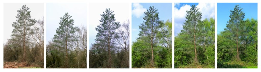
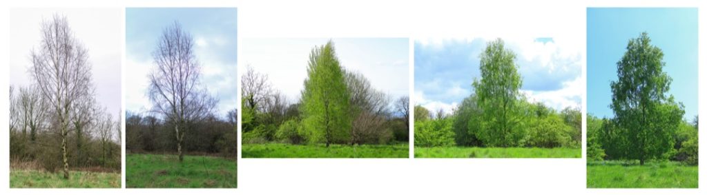
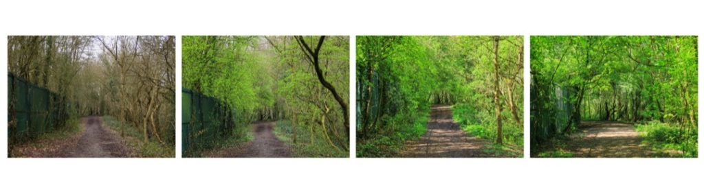
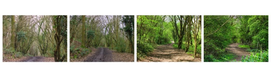
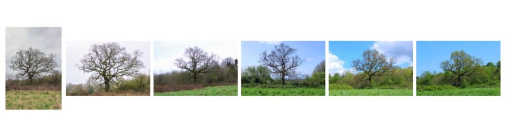
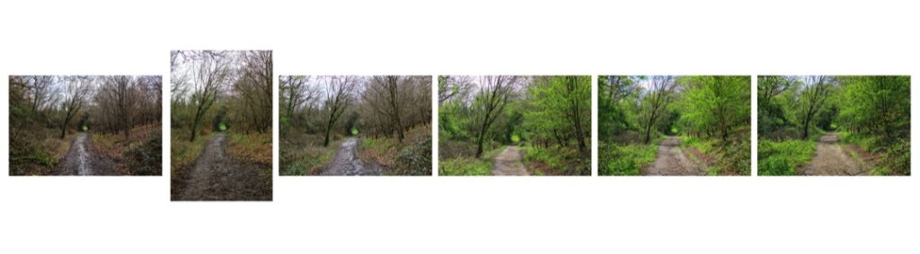
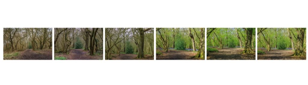
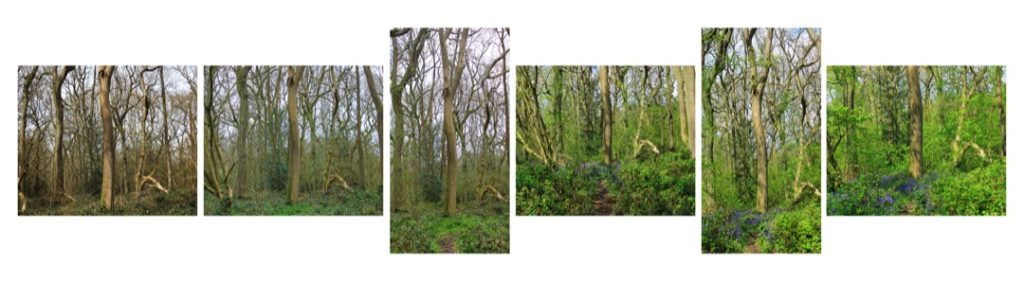
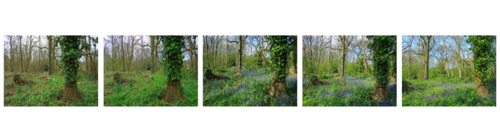
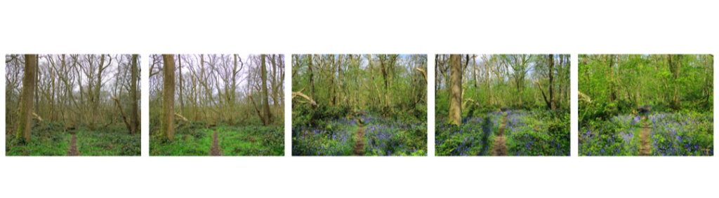
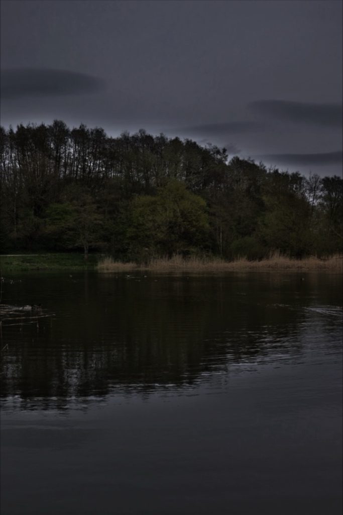
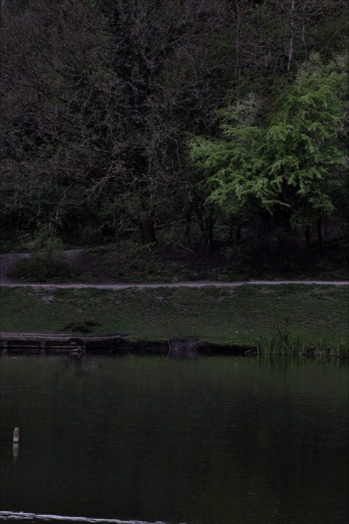
For Component Two in Photography, I selected the brief ‘Change’, aiming to capture the transition from the harshness of winter into the vibrant beginnings of spring. My images explore the shifting tones and structures of nature, emphasising the profound visual impact of the changing seasons.
Throughout each sequence, I wanted to draw a parallel between nature’s ability to regenerate after the near-death of winter and our own human resilience to grow from past experiences.
Ultimately, I am very pleased with how the project and final images turned out. It was a highly enjoyable process that significantly developed my photography skills.
Looking ahead, I plan to attend the University of Birmingham to study Computer Science, where my creative background in photography will be incredibly beneficial for fields such as Game Design and UX Design.
Alexia Curry
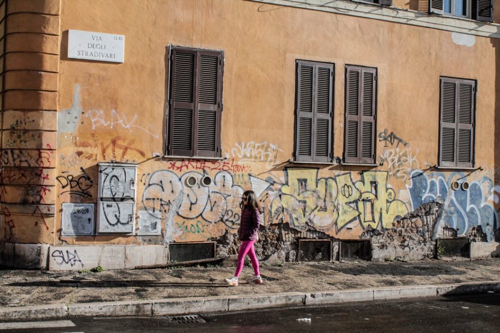
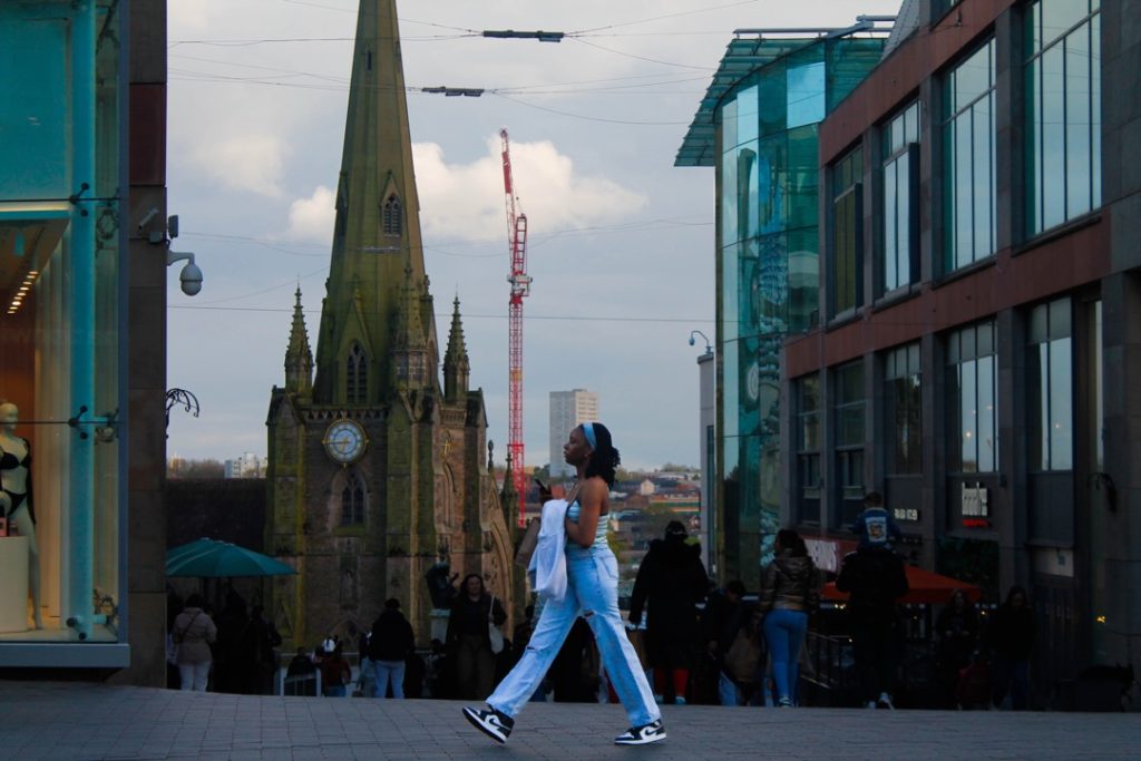
For both of my projects, I delved deep into the world of street photography. I focused on exploring various locations and techniques through a series of images, which I then carefully edited to create my successful final pieces. To build these projects, I travelled to a wide range of locations, including Greece, Birmingham, Dudley, and several smaller towns. Ultimately, I found that my most successful images came from Birmingham, as the scenic areas there truly made my shoots stand out.
I believe I have completed both projects to a high standard, and I am incredibly happy with the final outcomes. To present my images and demonstrate the breadth of my work, I curated two comprehensive photobooks. During the editing process, I experimented with multiple styles and themes to offer my audience a diverse array of visuals, ensuring there were many different perspectives to explore across both shoots.
Now that I have successfully completed my Photography A-Level, I plan to go straight into the workplace.
Brooke Edwards-Dalley
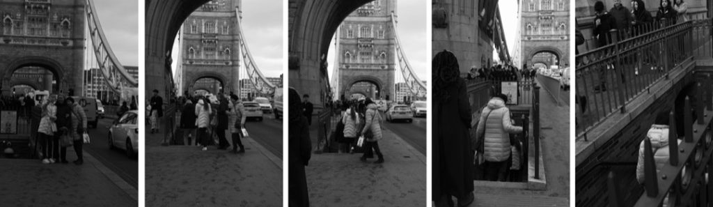
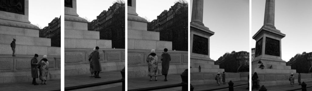
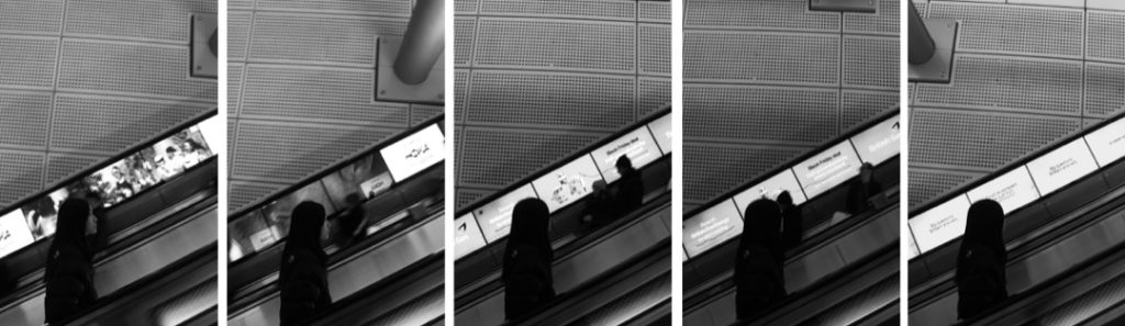
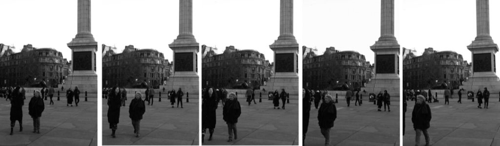
In my first project, I explored the concept of location, following subjects through a series of images to create a story-like sequence. I travelled to several different locations, including London, Manchester, Plymouth, and Bridgnorth. I found the most success in London and ultimately decided to return there to capture my final images.
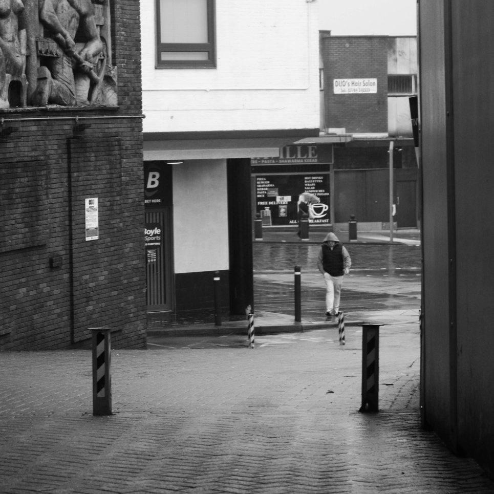
I chose to edit the images in black and white to encourage the audience to form their own assumptions about the narrative, such as the emotions portrayed and the weather conditions. This extended the audience’s engagement, keeping them interested for much longer. I found that longer sequences worked better, as they felt higher in quality and much more personal to the subject.
For my second project, I focused on combining images. Drawing inspiration from cinematography, I created a sequence of still images. I experimented with a few different colour palettes, analysing how they altered the aesthetic and the emotions conveyed. Ultimately, I chose to give my final piece a warm feel with orange hues to evoke feelings of nostalgia and comfort.
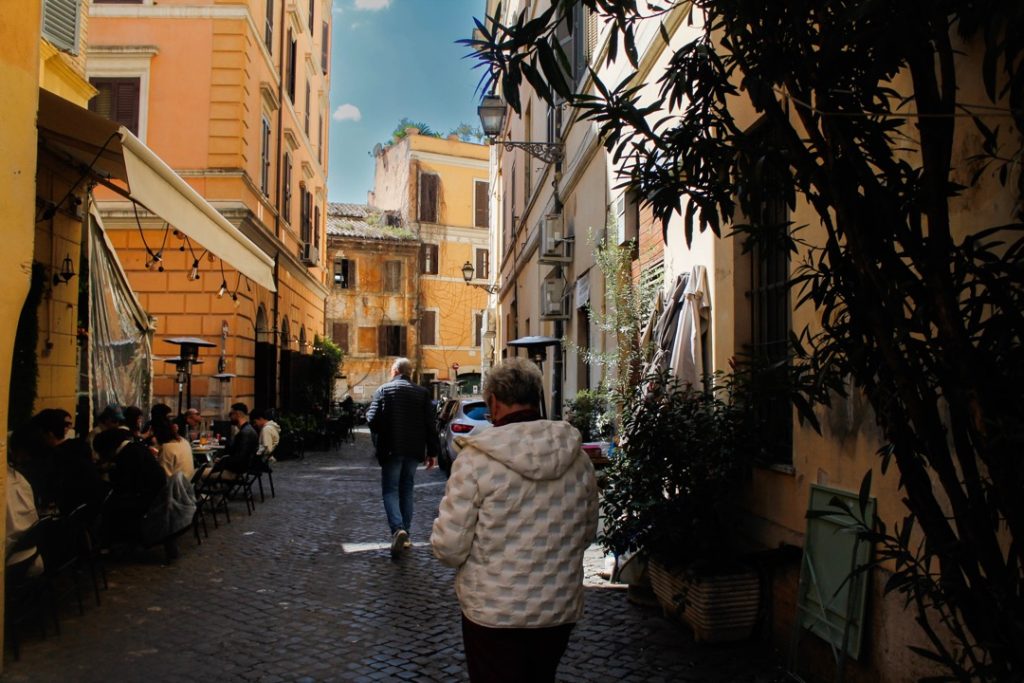
I shot my final images in Rome; the busy city provided the perfect backdrop for a dynamic sequence, and the ancient architecture beautifully complemented the warm tones I was aiming for. The final piece is displayed as a large film strip, which serves as the best way to view this collection of still images.
Destination: Foundation Art and Design
Erin Lawley
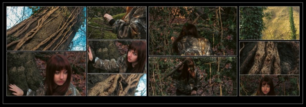
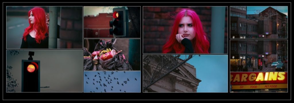
IMy work in the first project was focused on cinematography. The concept I explored was creating sequences that looked cinematic in composition, lighting, and colour. Due to this, I was more focused on these features in my project around change as well, leaving my editing style quite similar whilst still having stark differences. I like to make images look exaggerated and dream-like whilst keeping the actual bones of the photo the same. The final sequences gave a cinematic view of people and the surroundings.
Destination: Newman University, to study Primary Education.
Emerald O’Brien
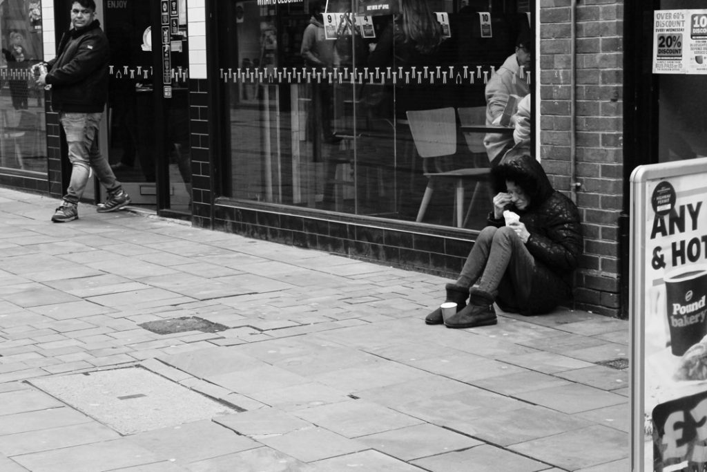
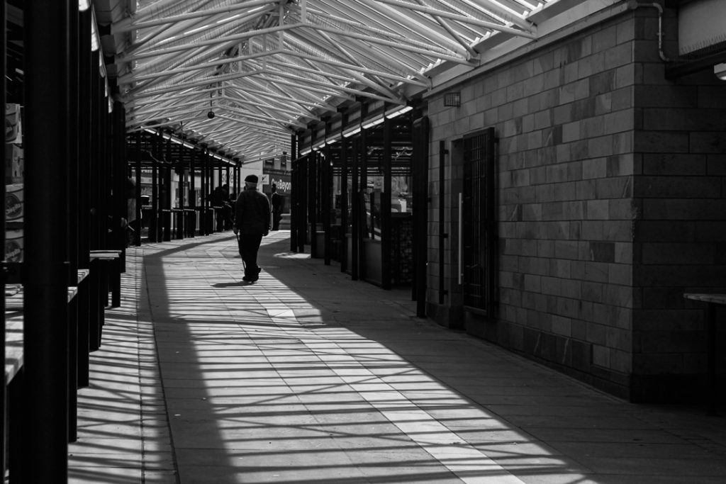
My project explores street photography and the theme of solitude through both positive and negative perspectives. I wanted to show how solitude can be comforting and peaceful, allowing time for reflection and independence, while also highlighting how it can lead to feelings of loneliness and isolation.
Throughout the project, I explored the different emotions and experiences connected to being alone, and how these feelings can vary from person to person. Completing this project has allowed me to develop both creatively and personally.
Destination: After finishing Sixth Form, I aspire to undertake a teaching apprenticeship, where I hope to build a future helping and inspiring others through education.
As part of this year’s Dudley College ArtsFest, Level 2 Creative Media Skills learners proudly present their final major project, inspired by the powerful and enduring theme The Four Elements.
Commissioned to produce work for digital exhibition, learners have embraced this brief with imagination, ambition and creativity, developing original responses that celebrate both the natural world and personal interpretation.
The collection showcases a vibrant range of digital media, including photography, film, graphics and concept art. Each piece reflects a journey of exploration and experimentation, demonstrating growing technical skill, creative confidence and a strong sense of visual storytelling.
Natalya Barton, Creative Media L2 Tutor
GROUP A
Mohammed Ahmed
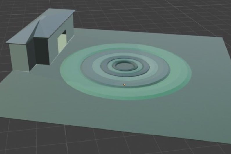
For this project, I chose to tackle all four elements to challenge myself and allow for complete creative freedom. My primary objective was to step out of my comfort zone to develop my existing skills in Blender while mastering entirely new techniques.
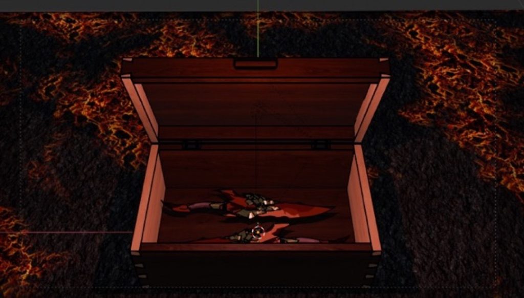
Throughout the process, I experimented extensively; for instance, I utilised the Grease Pencil tool to give 3D objects a 2D, illustrated appearance and to emphasise a highly artificial aesthetic. I also pushed myself to adopt tools I had previously avoided, setting my ego aside to grow as a digital artist.
While I initially attempted to animate the project—which was an incredibly fun learning process—hardware limitations unfortunately meant I could not render the final animation. However, I successfully taught myself how to build immersive scenes for each individual asset.
Driven by a desire to explore new technical territory, I also learned how to build custom shaders to achieve my final, highly stylised look.
Dwaine Bauwise-Haywood
I created this project because I was heavily inspired by the photographer Edward Burtynsky. I felt that focusing on photography would be the best way to explore my ideas.
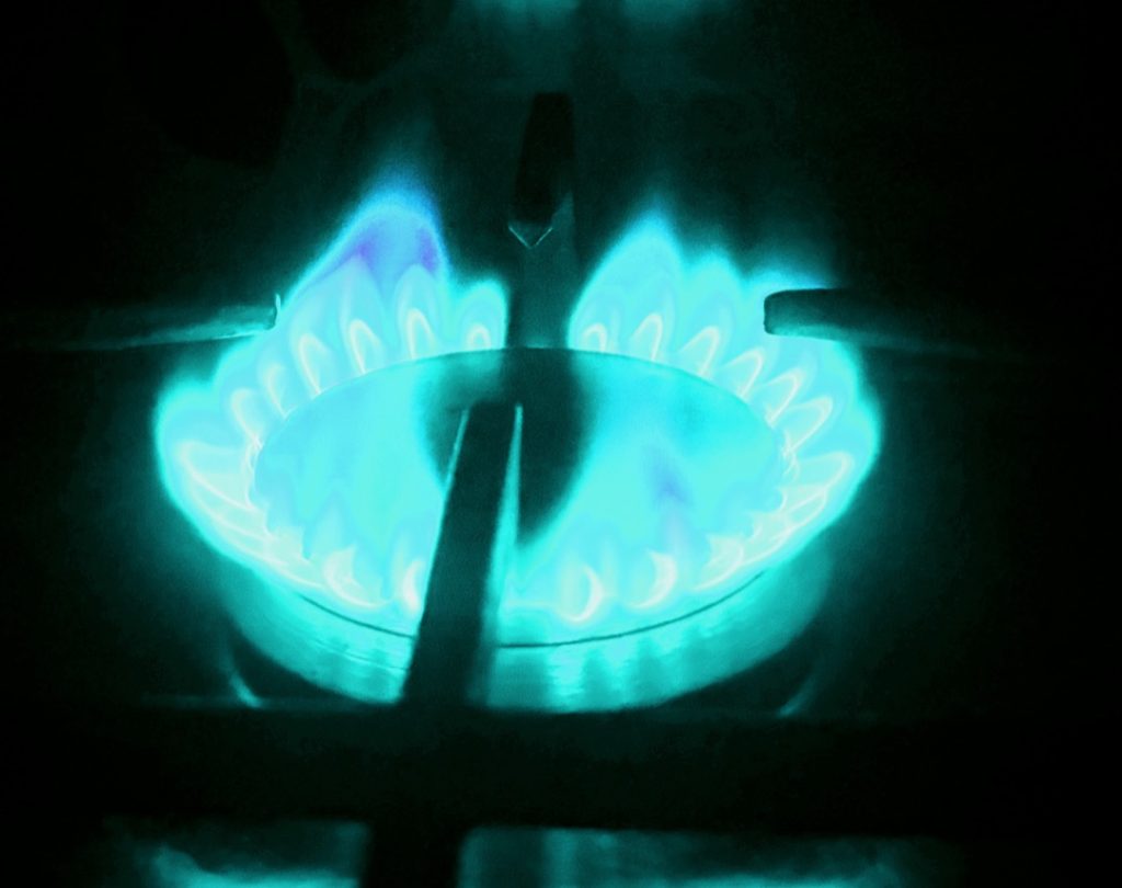
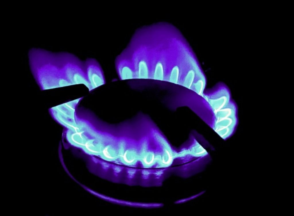
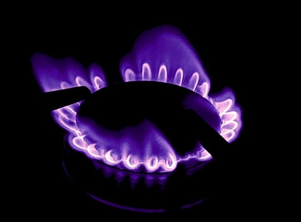
The element that inspired me the most was fire. I feel that fire is excellent for capturing intricate detail, making the photographs much more interesting for the viewer.
During the process, I used various techniques such as dark lighting and experimented with different camera angles. I chose these techniques to make the images more engaging for the audience, as I feel it creates a much more unique and distinct style compared to others’ work.
Overall, I think the entire project went really well. I am particularly proud of the variety of pictures I produced and feel that my chosen photographic style was very successful. Next time, however, I would definitely aim to improve my editing skills in Adobe Photoshop. I feel I could have added more detail to the images to make them even better.
My initial ideas changed throughout the project, largely due to the peer feedback I received. Janna and Meredith provided really helpful advice that shaped my final piece; Janna suggested cropping my images more to make them easier to view, while Meredith also gave me solid constructive feedback. Ultimately, my biggest professional influence remained Edward Burtynsky, as his unique and inspiring photography pushed me to create better work.
Demi Bourne
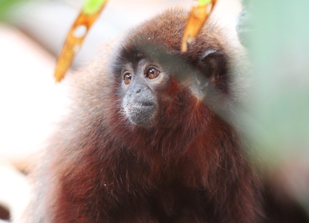
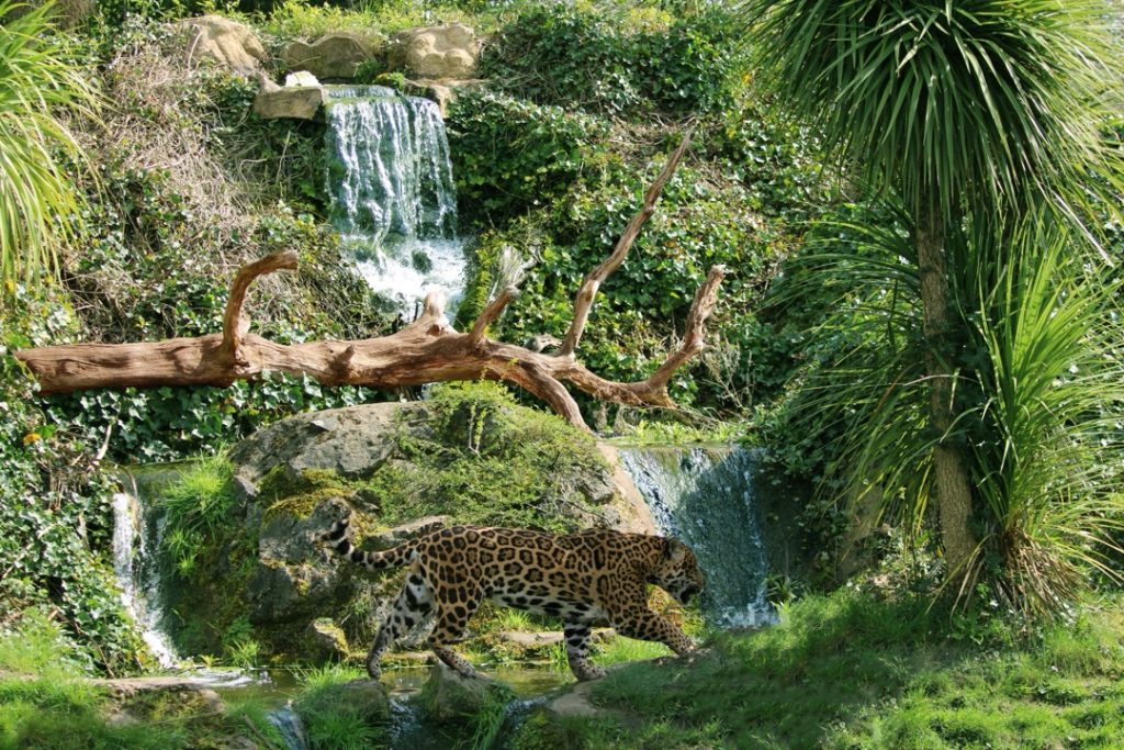
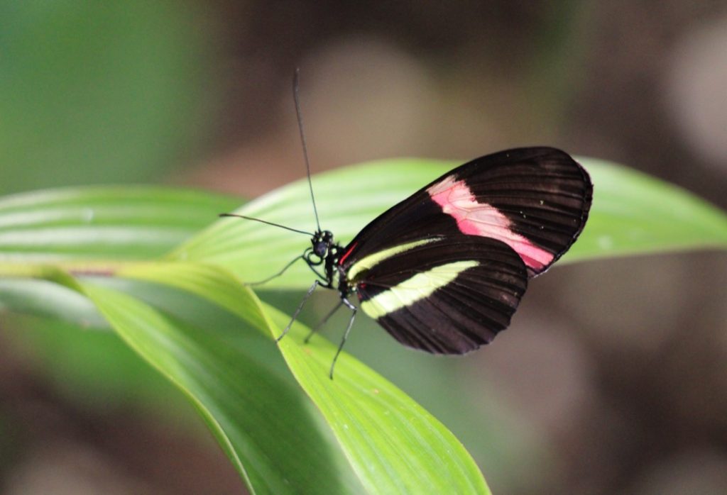
For my final project, I took inspiration from the photographer Danny Green, which led me to focus on all four elements. This seemed the most fun and fulfilling concept to try and achieve, especially as I want to go into wildlife and nature photography; it taught me a lot about editing and camera settings for those types of photos.
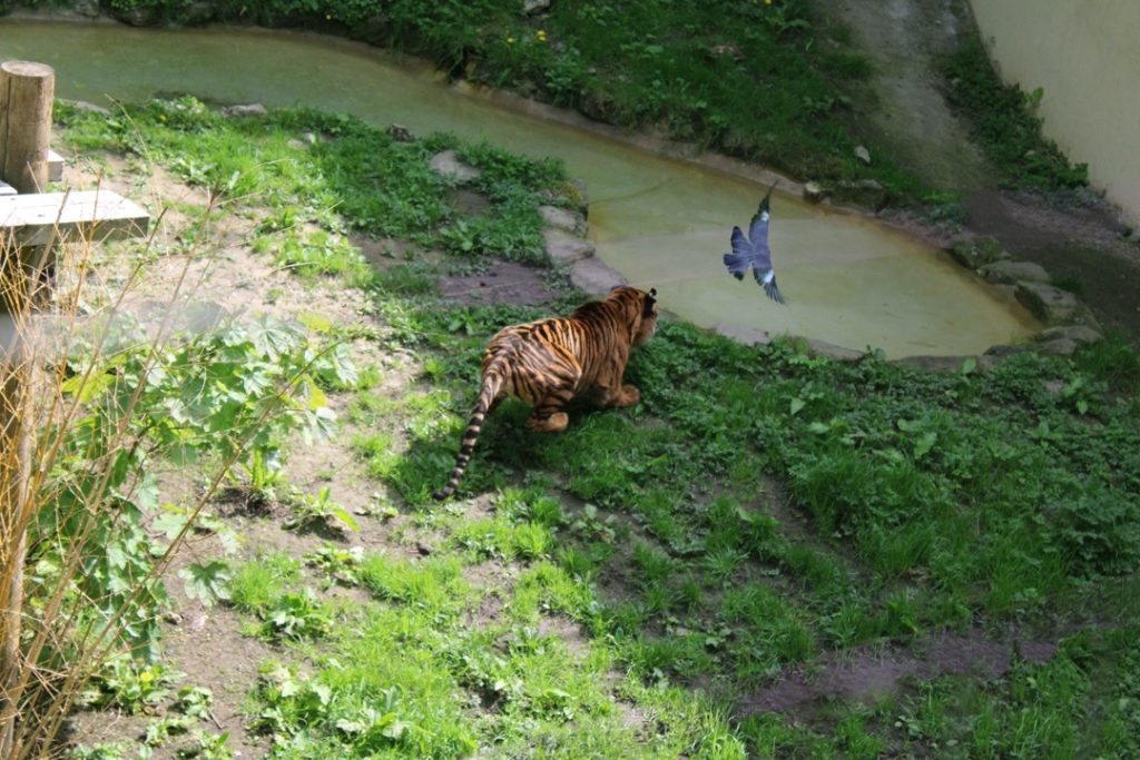
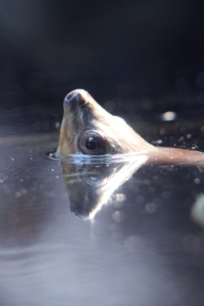
I wanted to show the connections between animals and the elements, as all animals have personality traits that link to them, much like humans do. I represented this through my chosen photos. For example, my ‘fire’ photo features a tiger pouncing at a pigeon, showing a fierce predatory response. In other shots, such as the photo I took of a coppery titi monkey, I made sure to capture catchlights in the subject’s eyes—a technique that can also be seen in the painted batagur photo.
Donique Clarke-Mason
I made this because I wanted to feature fire and water and represent them in a metaphorical way. I used two characters to portray them, with two distinct personalities: Fire being angry and passionate, and Water being calm and chill.
The elements that inspired me were fire and water; I just feel they are the best elements to choose to highlight the stark differences between them.
The techniques I used in my film included close-ups, tracking shots, medium shots, and wide shots. I used these to show more of the surroundings, and utilised close-ups so the audience could see the emotions on the characters’ faces more clearly.
What went well was definitely the camera work, particularly the end scene when Fire got angry and started crashing out everywhere. Next time, I could improve by adding more dialogue for Water. Having Water speak more would help to show his emotions better, which I think would be a good addition.
During the project, my idea changed. Initially, it was just going to be me playing both Fire and Water, but I obviously needed an extra student to make it more realistic. I couldn’t just have myself on screen; it wouldn’t have looked as authentic. So, I changed my plan by bringing in a background character.
A professional influence that helped me was a short film called The Weatherman and the Shadowboxer. It shows the differences between two characters and links closely to my own work. Finally, the feedback that made me change my piece came from Janna. She gave me great advice, and I acted on it.
Freya Cook
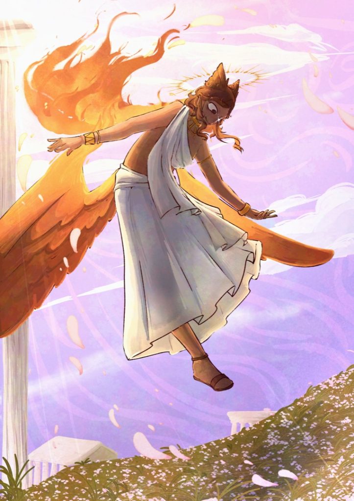
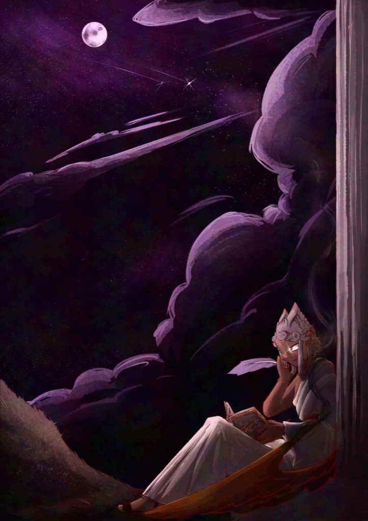
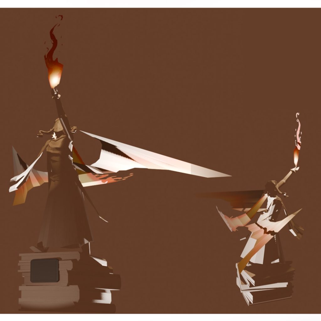
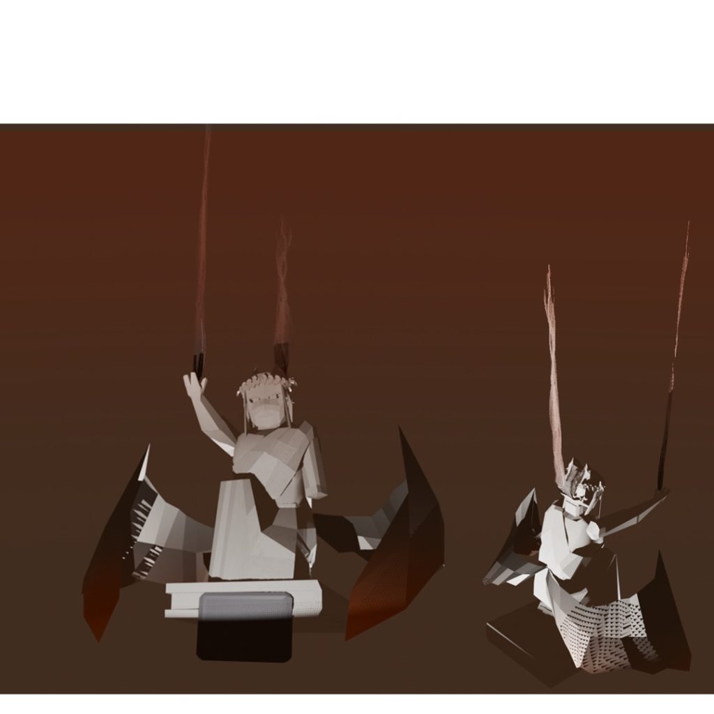
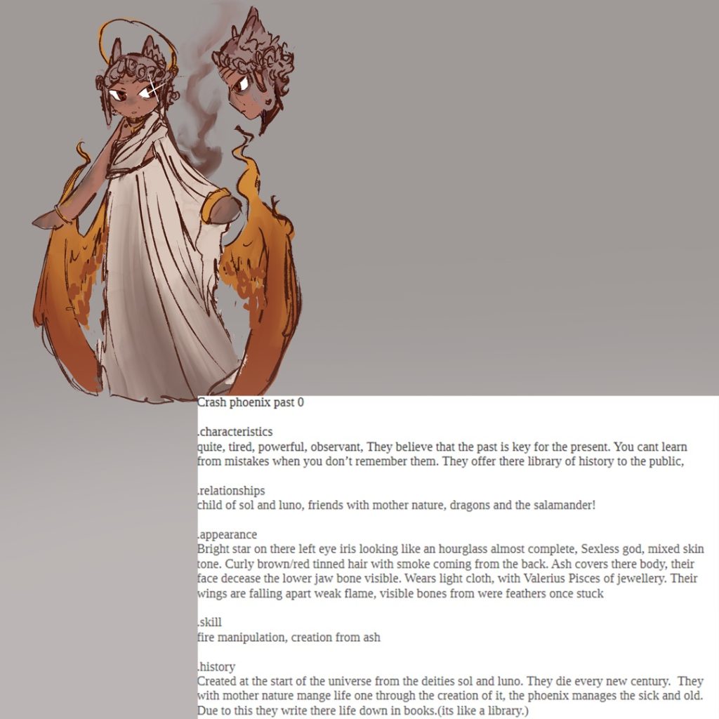
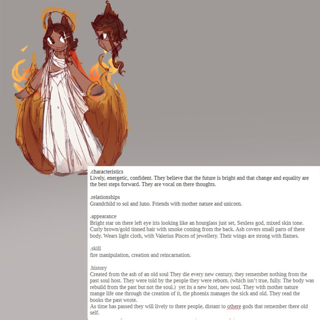
For this project, I’ve created two characters, illustrations, and 3D models, all based on the elemental theme of fire. I chose this element as I find fire more interesting because of how it stands out from the other elements. Nature and wind were already here; fire was discovered.
I represented this element through folklore, mainly the phoenix. I wanted to show the life of fire—its beginning and its end. The phoenix is a great example of that through being a symbol of mortality and rebirth. I thought it would be interesting to explore this theme within my character designs as well.
I used multiple techniques across the 3D models, character art, and illustrations. When refining the 3D models, I used the extrusion tool, loop cuts, and the occasional knife tool, too. I based the character designs on striking silhouettes and a warmer colour palette to make them visually interesting. For the illustrations, I used custom brushes to speed up the workflow, alongside layer effects like ‘outline’ and ‘add (glow)’.
Finally, I learned how important it is to plan out my art efficiently to make the most of my available time. It speeds up the process, and I think if I hadn’t done this, I wouldn’t have loved the project as much!
Alan Czerwinski
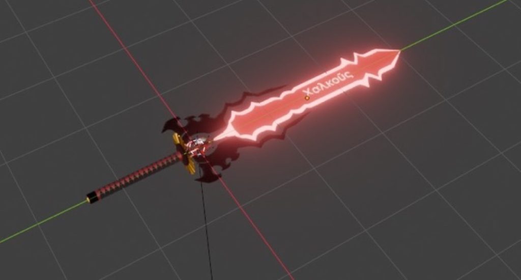
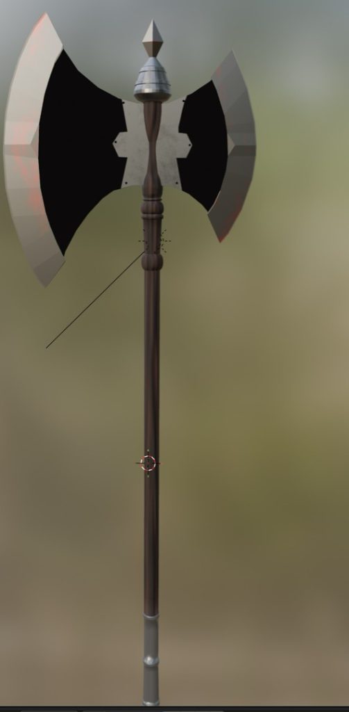
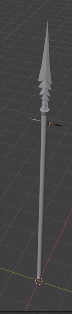
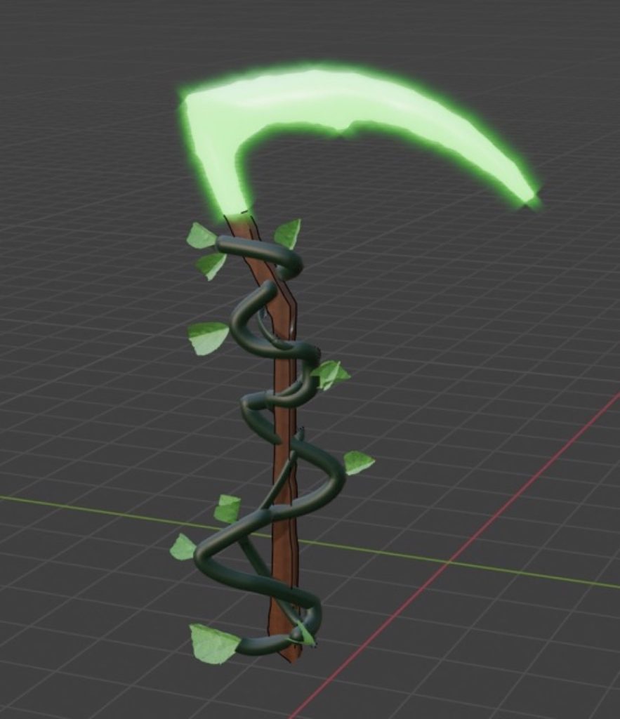
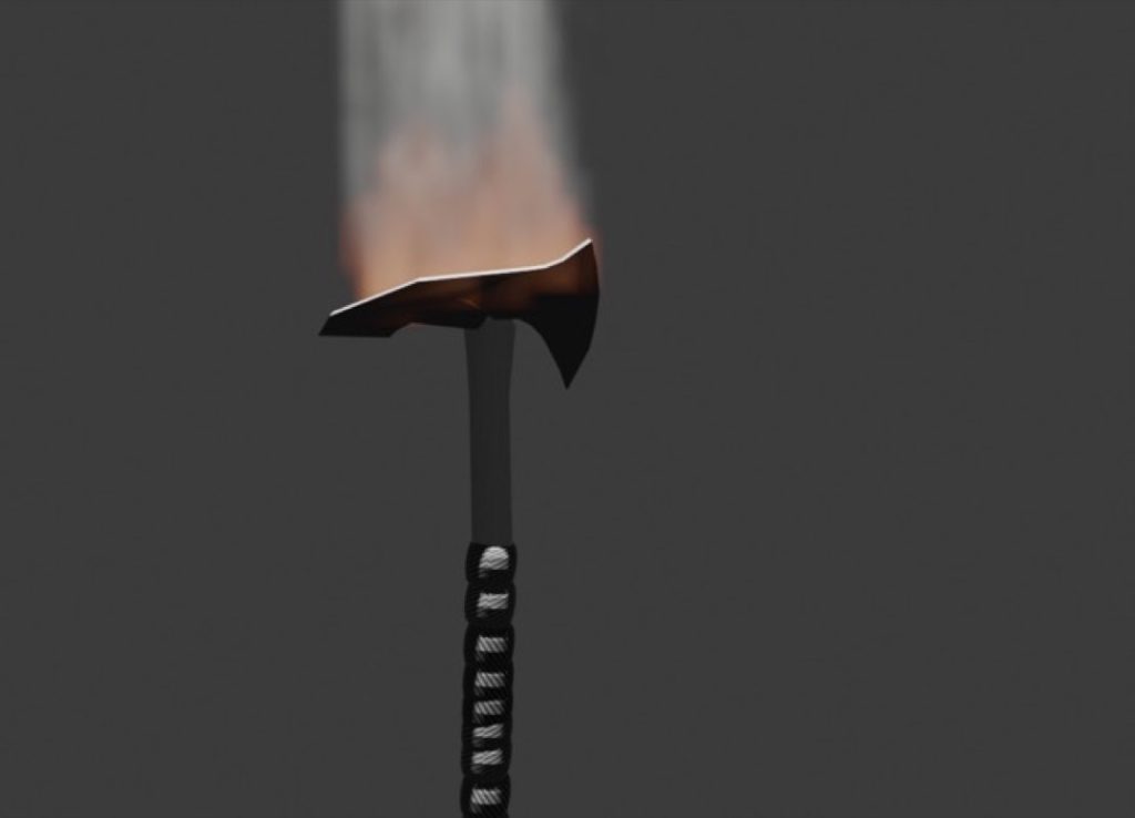
For this project, I chose to focus on medieval-era weaponry, drawing direct inspiration from my previous work. I wanted my models to embody the element of fire, representing themes of aggression, power, and destruction. To convey this, I utilised sharp, jagged edges and bold, imposing designs. My ultimate goal was to ensure the weapons felt intense, dangerous, and infused with heat energy.
To design and model the assets, I primarily utilised 3D modelling techniques such as extruding, mirroring, and loop cuts. I then used timeline editing tools to bring the models to life through animation. I focused heavily on shaping the weapons to strike a balance between creative fantasy and grounded realism.
While I attempted to integrate fire effects, I found the process technically challenging and could not fully realise my initial vision for the flames. As I had limited access to tutor support during this phase, I relied on peer review, seeking constructive feedback from my classmate, Mohammed, which proved incredibly helpful in refining my work.
Overall, the animations were successful, the core design is strong, and the models effectively communicate the theme of fire. If I were to revisit and improve this project, I would dedicate more time to mastering realistic fire simulations and further develop my shading skills to achieve a higher-quality finish. While my core concept remained consistent throughout the project, I continually refined the details in response to the peer feedback I received.
Rhyley Davis
Leah Davies
I chose the element ‘Earth’ because I wanted to create a short film that shows the beauty of Barbados. The meaning of my work is to show the culture and what you can get up to in Barbados. The techniques I used included different shot types, such as long shots, close-ups, and medium shots. The lighting was bright and sunny, which connotes the happiness that Barbados brings to you.
I used a range of different editing techniques, such as the cutting tool and adding text. I also added music from Pixabay and a range of transitions, which I did using Premiere Pro. From this project, I have learned how to successfully create a film by using a range of editing and filming techniques, so that my audience can get an insight into the beauty of Barbados and the culture behind it.
Jana Edwards
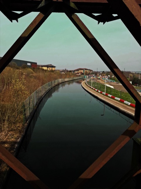
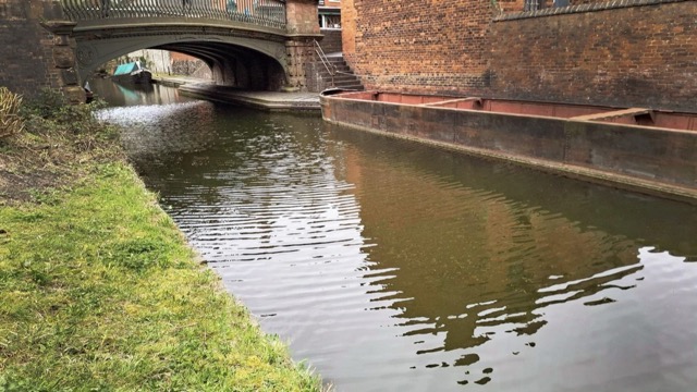
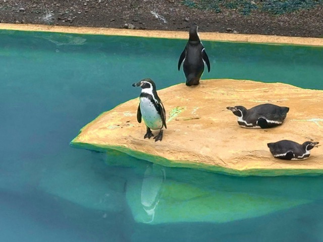
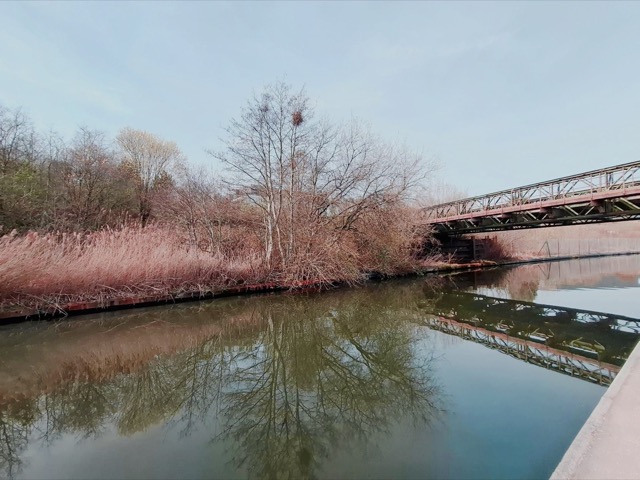
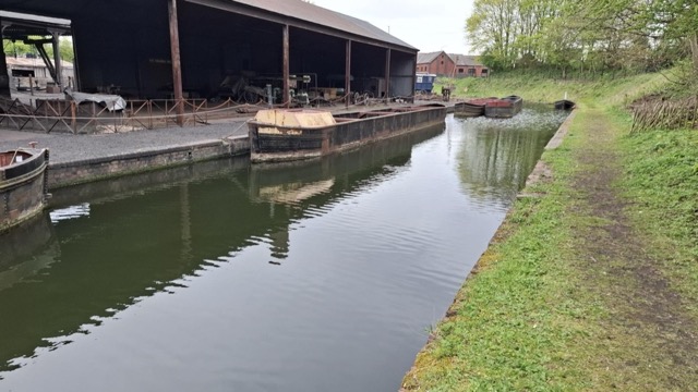
For this project, I chose to look at the elements of water and earth—with water being the primary focus of my photography. I wanted to highlight that there are many water sources in Dudley, a key part of the industrial Black Country. My work is centred on the Dudley No. 1 Canal, the Dudley No. 2 Canal, and the waterways at Dudley Zoo. The Black Country Living Museum features a canal as well, which was also a major source of inspiration for me.
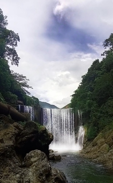
I was inspired by Toshio Shibata; his work showcases the ‘intersection of nature and man-made infrastructure’, such as dams and bridges, a theme I have mirrored with my own refinements. I drew further inspiration from his work by ensuring water remained the dominant element in my frames. I took my photographs at key waterways around Dudley and the wider Black Country, as well as across the Caribbean. These locations included the Black Country Living Museum, Dudley Zoo, and a spot in the heart of St Thomas in Jamaica.
Meredith Holland
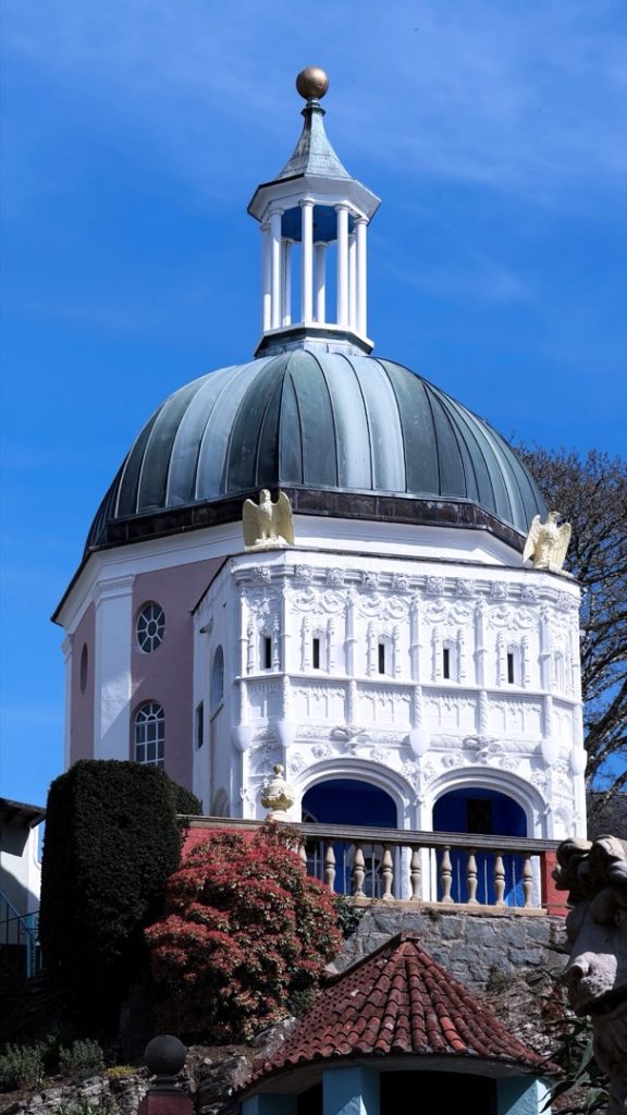
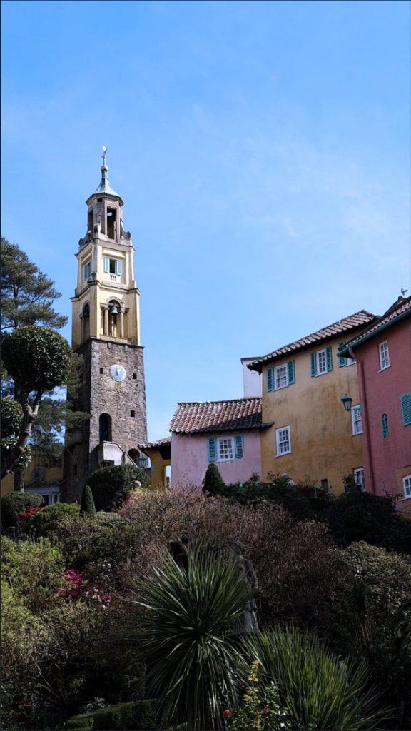
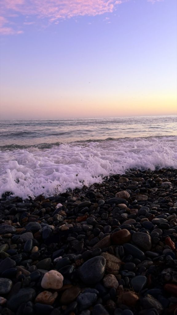
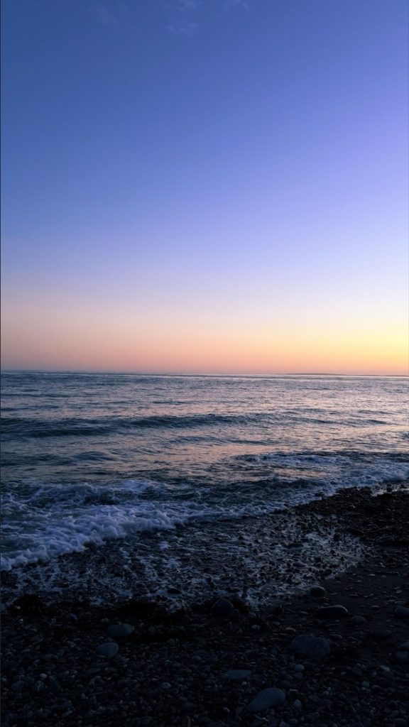
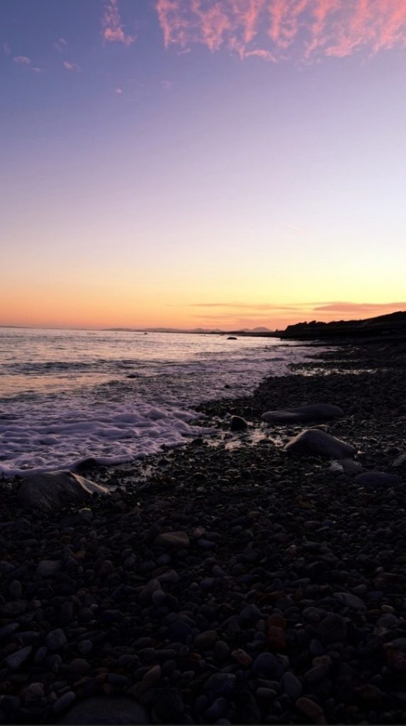
For my final project, I have chosen to explore both earth and water, as I felt these elements would work best for my concept. To represent the element of earth, I decided to create a triptych featuring the architecture of Portmeirion. I chose this Welsh landmark as it is very close to my heart; I have been visiting it since I was very young. For the element of water, I created a second triptych focusing on a beach in Criccieth. This location holds many fond memories for me, particularly of skimming stones with my parents.
The meaning behind my photography is to evoke a sense of joy and calmness, while also showcasing these locations as wonderful holiday destinations.
When shooting the coastal images, I focused on capturing bright natural light, the waves crashing onto the shore, and the colourful sky above. For my architectural triptych, I took a similar approach by also utilising natural lighting. I chose not to alter the colour saturation of the original images in order to truly highlight the vibrant, authentic colours of Portmeirion.
Josh Moseley
I chose to focus on the element of water because I felt it would be the most approachable, and it is the one that interests me the most.
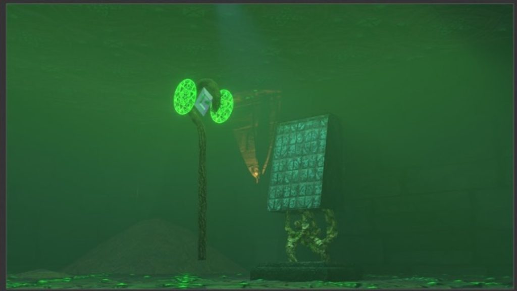
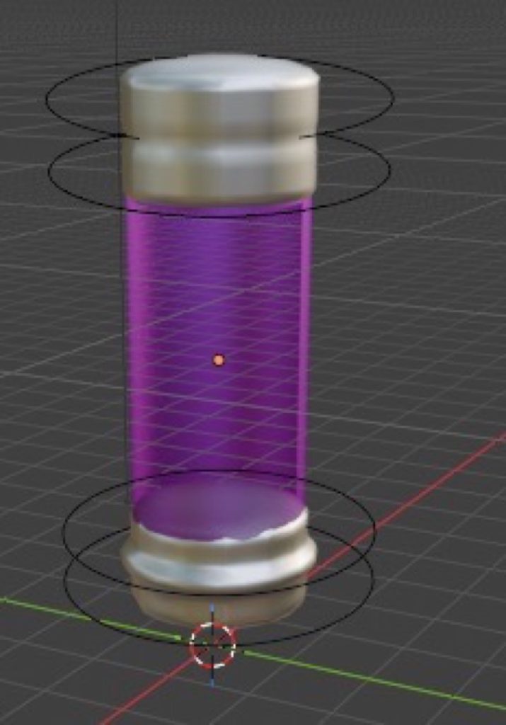
I will explore this by creating a mood board of inspirational images based on a rough idea for a water-themed setting, or anything surrounding the concept of water. From there, I will sketch items and characters that fit this setting, adding notes on the textures I plan to use. These sketches will later be turned into 3D models in Blender, and I will document my creation process at each step.
I used multiple techniques, such as working from reference images, to create high-quality 3D models.
Throughout this project, I have fully learnt how to use the Shader Editor in Blender, allowing me to adjust materials and textures exactly as I see fit.
Martins Oliobi Omali
I chose the elements of fire and water because I wanted to highlight the contrast between them within a football match. The emotions portrayed by the actors demonstrated both anger and calmness during the game. Fire represents intense emotions like desire and rage, whereas water symbolises growth and tranquillity. The central meaning behind my work is to illustrate that fire and water reflect two completely different emotional states.
I represented this on film by using various camera techniques, such as medium close-ups and tracking shots. I filmed and produced the project myself using a standard camera. The tracking shots effectively followed the ball and the actors on screen, and I made sure to utilise natural lighting throughout the shoot.
Finally, I used Adobe Premiere Pro to edit my film, incorporating fades, custom text fonts, and various other effects. In conclusion, the audience will easily recognise the difference between fire and water, as the two actors clearly embody these contrasting personas during the match.
Tanesh Patel
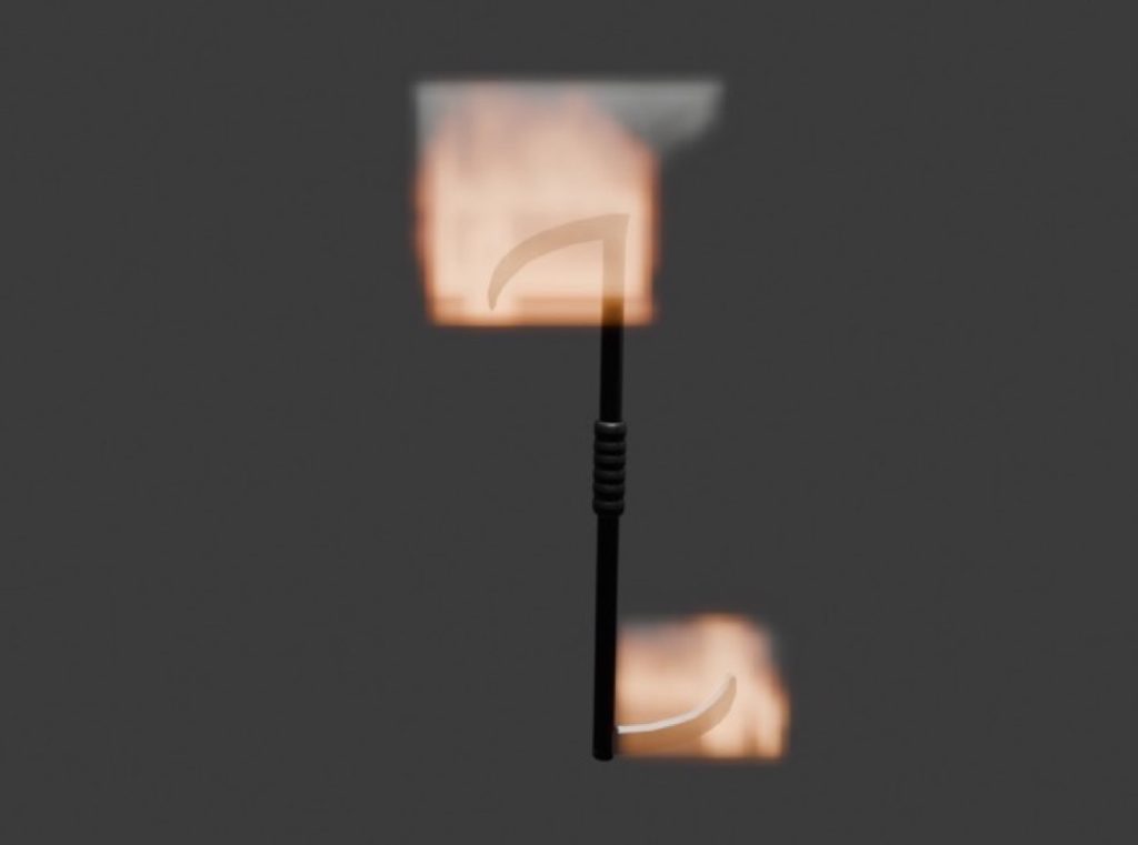
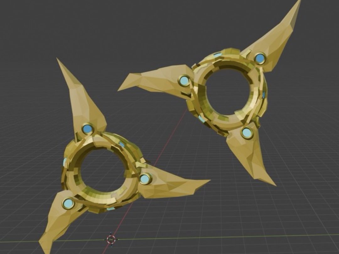
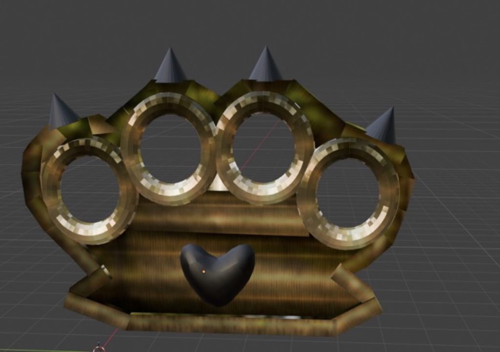
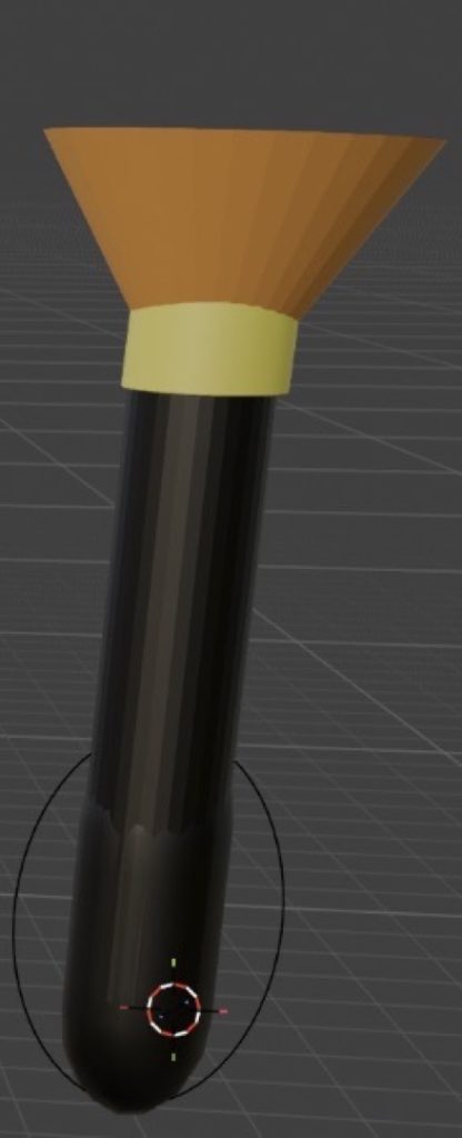
For this project, I chose to explore all four elements to challenge myself and create a diverse range of 3D models. I represented this theme by designing and modelling unique weapons for each element in Blender.
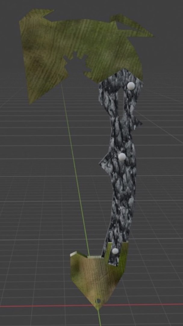
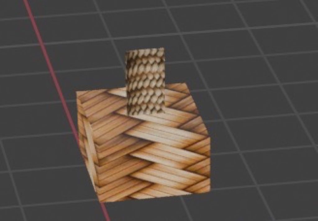
This approach provided me with a solid foundation in 3D modelling basics, which will be highly beneficial if I pursue further studies in this field. Throughout the creation process, the UV Editor became my most frequently used tool, allowing me to accurately texture my assets.
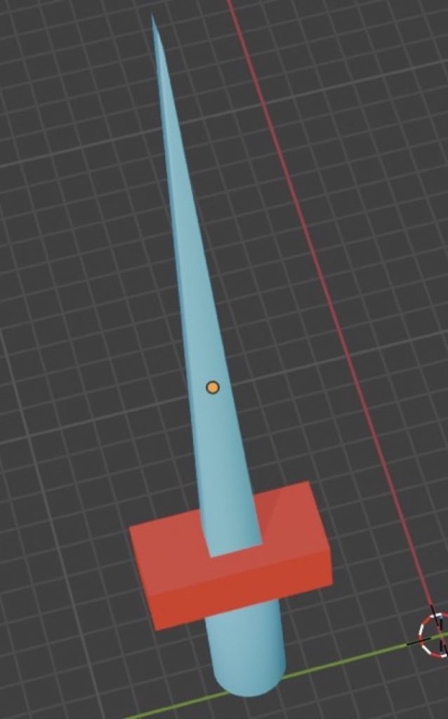
I also acquired several new technical skills, such as mastering the Knife tool to carve intricate shapes and closely replicate my reference images. To improve my workflow in the future, I aim to expand my technical repertoire and rely on a wider variety of modelling tools beyond just the Knife tool.
Jack Terry
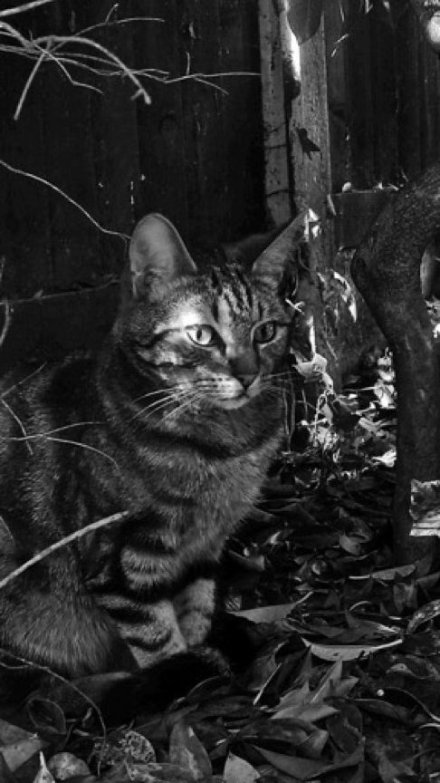
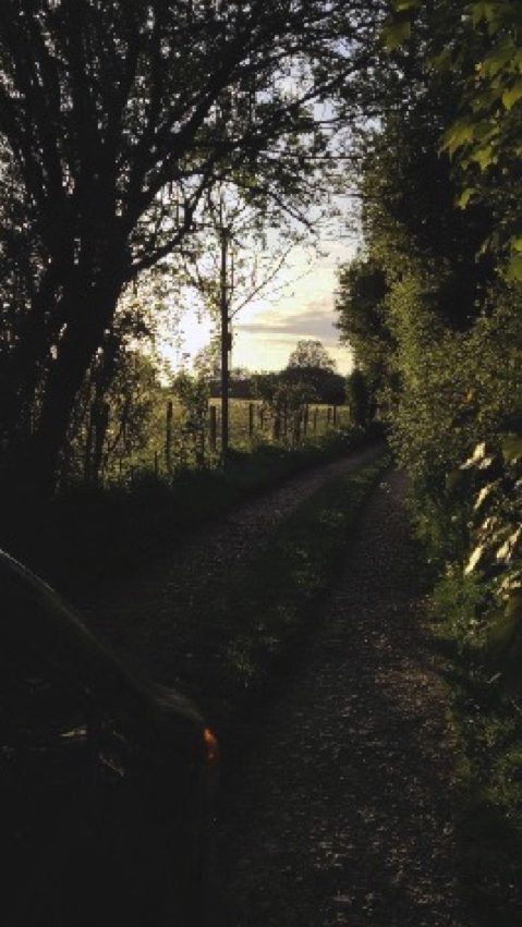
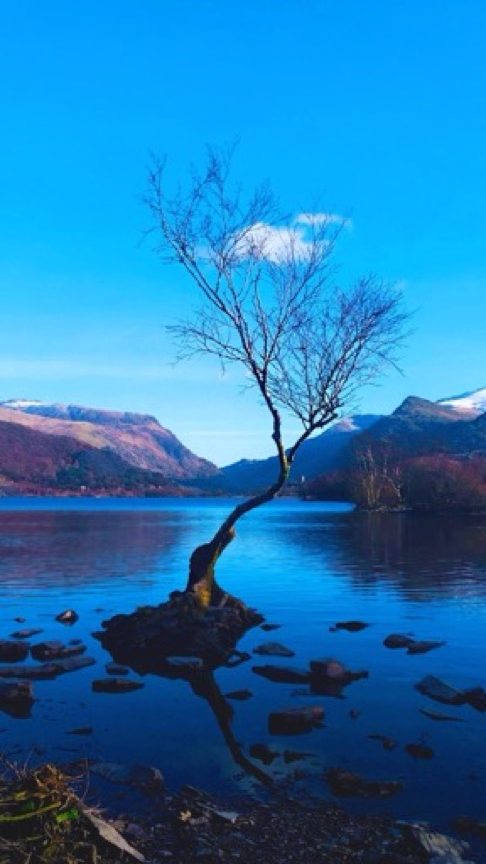
For this project, I chose to focus on the elements of water and earth, as they are the fundamental components of our planet. I represented these themes in my photography by capturing vast bodies of water alongside both sweeping and intimate natural landscapes.
My ultimate intention with this body of work is to inspire viewers to step outside and actively interact with the natural world. I am highly satisfied with the editing process across the collection, particularly with the ‘lonely tree’ and the black-and-white cat photographs, which remain my two standout favourites.
Throughout the creation of this project, I learnt the importance of connecting with my immediate surroundings rather than being solely focused on my phone or camera lens. This shift in perspective allowed me to truly live in the moment.
Furthermore, constructive peer review from my classmates (Jana, Euan, and Rhyley) was instrumental in elevating my work. Gaining outside perspectives helped me refine my final pieces to ensure they resonate with a much wider audience.
GROUP B
Kinzah Ajaz
I created a short film based on the elements of water and earth, focusing on the immense power of nature and the beauty of its capabilities. I chose this concept because it deeply interested me, and I found myself flooded with creative ideas for various shot types and camera angles.
Water and earth were the elements that stood out and inspired me the most. I was drawn to the idea of producing a piece that was calm and soothing on the surface, yet held a much deeper underlying meaning.
During the editing process, I incorporated audio elements such as music and sound effects, alongside smooth transitions between clips to ensure the visual narrative flowed seamlessly. I utilised these transitions intentionally to prevent the final edit from feeling plain or unengaging.
While I successfully completed my film project and efficiently organised all my assets within my project folders, I did submit the final piece slightly past the deadline.
Moving forward, improving my time management and keeping closer track of production schedules will be a primary focus for me, as this project was submitted three days late. Additionally, in future projects, I will actively seek out peer feedback during the editing phase—an invaluable step that I missed this time around.
Archie Byfield
I made these images because I’ve always wanted to take photos for a business and wanted to produce high-quality content for them. Having the experience and the ability to replicate this has been a dream.
Earth has inspired me for this one. I like how the Earth is different anywhere you go. Mountains peak up, caves lead to the abyss, and every hill is different. It’s like a drag path. I love how everything has its own personality—how trees grow their leaves back in spring, and flowers bloom. Everything is like a cycle.
I have used multiple techniques, using a drone to get aerial shots of places that nobody else can get. Having that view from above is something I really like; it gives this zero-gravity effect to the image and makes everything feel like it’s out of this world.
I feel that the photoshoot went well, and some parts of the editing went well. I really enjoyed taking the drone shots because it’s a hobby of mine, and I just like flying it around seeing different angles of the places I am in.
Aaliyah Christine Gordon
My work explores the relationship between nature and people. I used high angles, filters, and professional editing to give it a summery feel. It presents a simplistic short film about a young couple exploring nature in the summer; the mood and the vibe represent the movie as a whole. The significance of the ‘Earth’ element brings my project together, as it represents how I feel towards the earth and how it reflects my personality.
The techniques I used were high-angle shots, establishing shots, and medium eye-level shots. I used these techniques as I wanted to try something new while filming and practice my camera skills. Some of the things that went well were that we worked well in a team, and each of us participated in the lighting, directing, and audio.
The meaning of the whole project is to bring people together and encourage them to enjoy their surrounding national parks, which can boost their mental health and well-being. My inspiration for the project was David Attenborough. He is a famous TV presenter who makes documentaries similar to the product I’m making, and being inspired by him made me use similar camera work and techniques to those his crew uses.
Islam Al Haj Hamoud
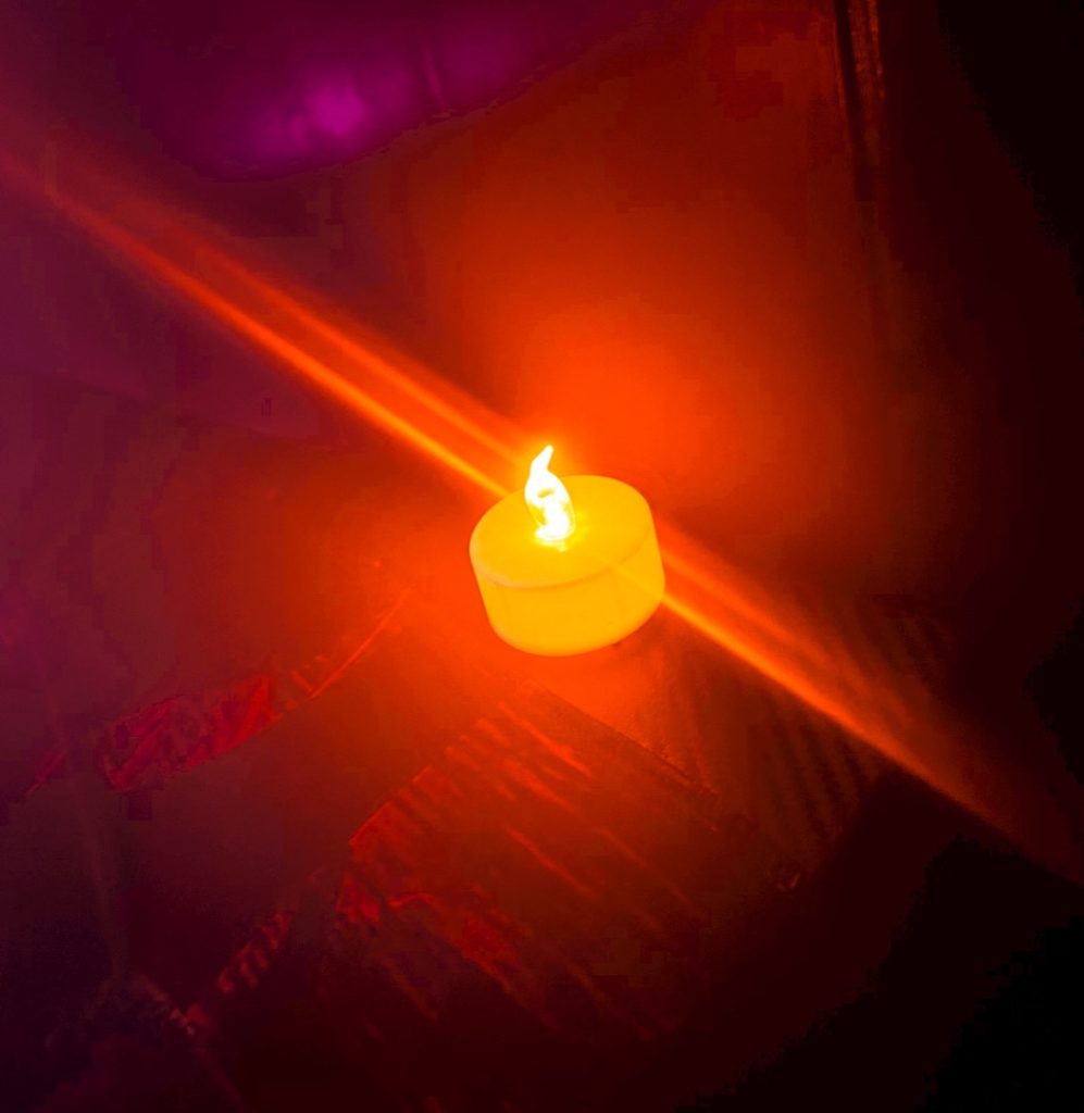
I made a short film inspired by the four elements. While they are all important, I chose to focus on just two—Fire and Water—so I could explore them clearly. I really liked the contrast between them, using fire to represent anger and water to represent fear. I portrayed water through rain and fire with a lit candle, trying to create an overall cosy vibe.
My original idea had to change when the weather didn’t cooperate; it wasn’t raining, and I didn’t have time to wait. To complete my film, I found some inspiring stock clips on Pexels to fill in the gaps.
The project really helped me focus on my editing skills. The process went smoothly, and using techniques like transitions, music, and sound effects made the final piece much better.
In the future, I will try to manage my time better and always have a backup plan ready in case my main idea doesn’t work out, ensuring I can submit my work on time.
Nicolas Latka
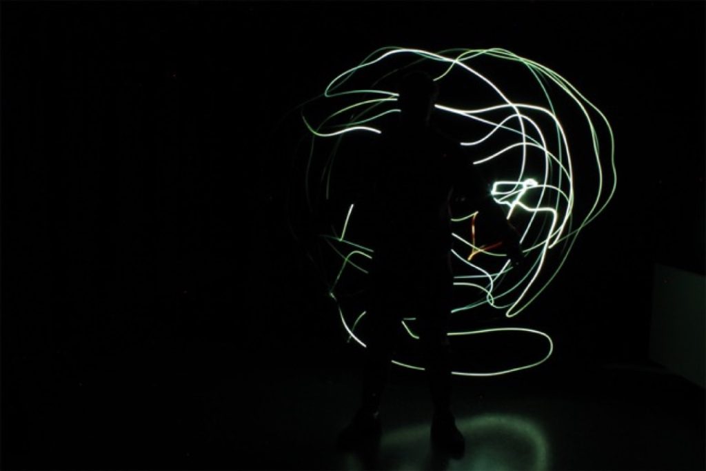
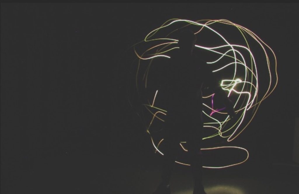
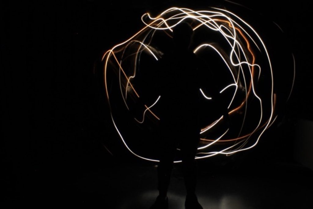
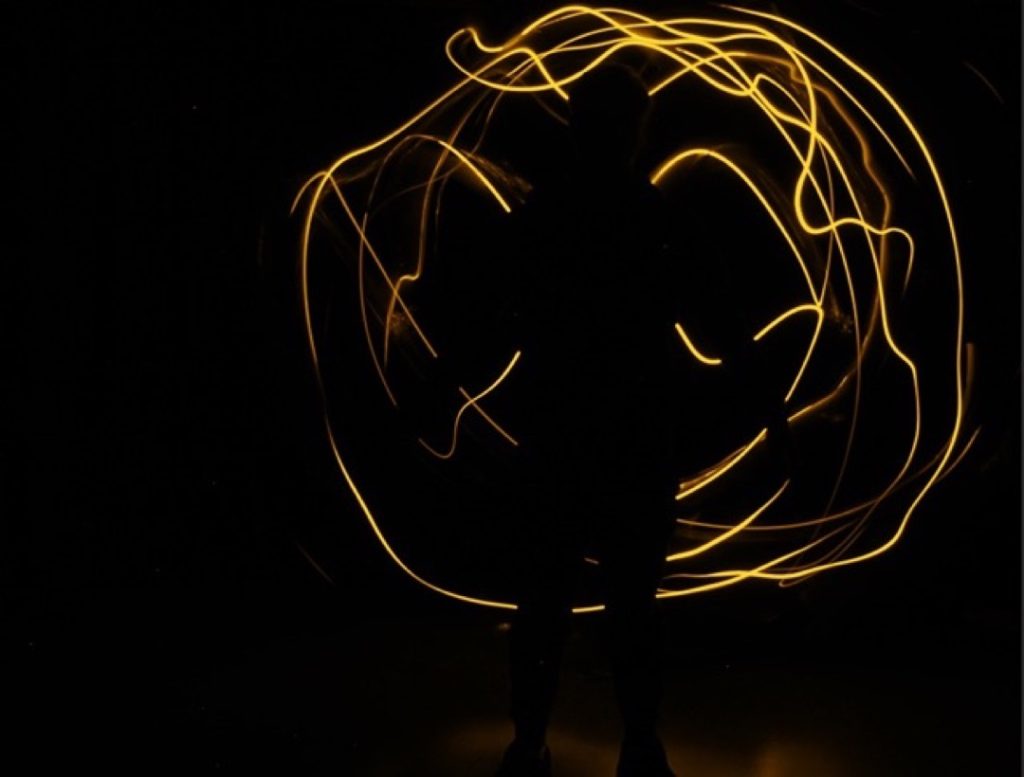
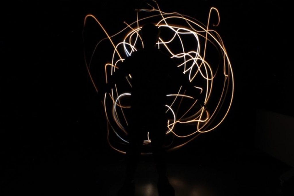
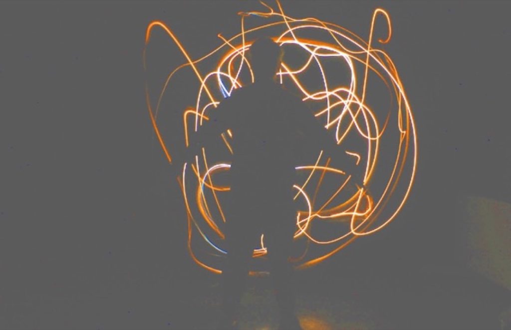
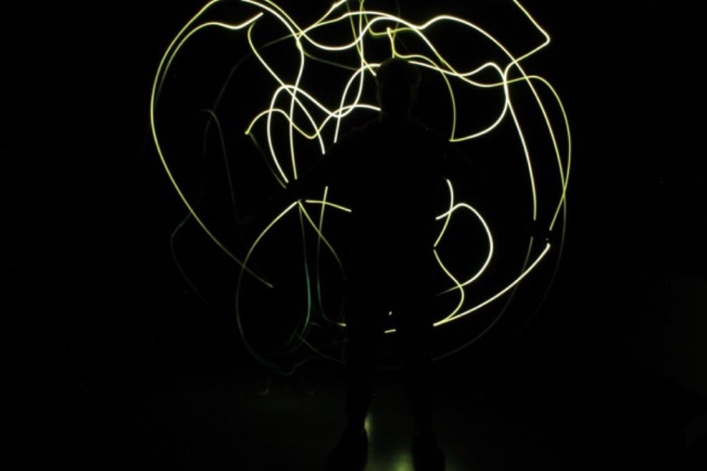
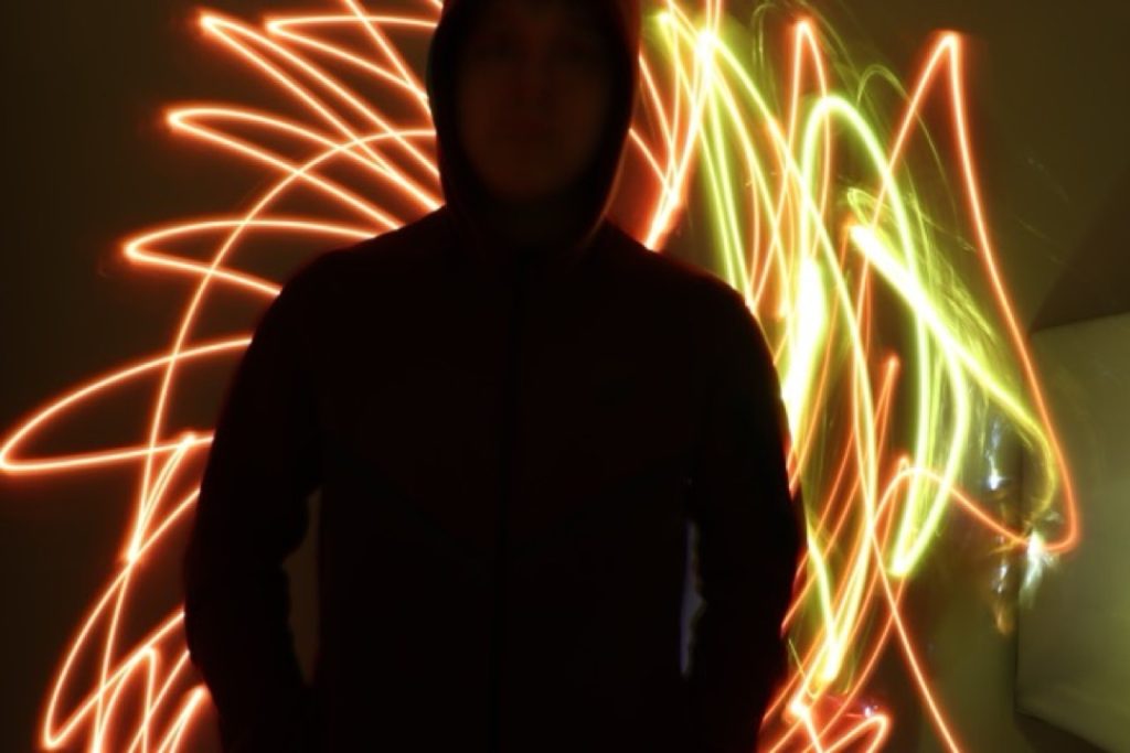
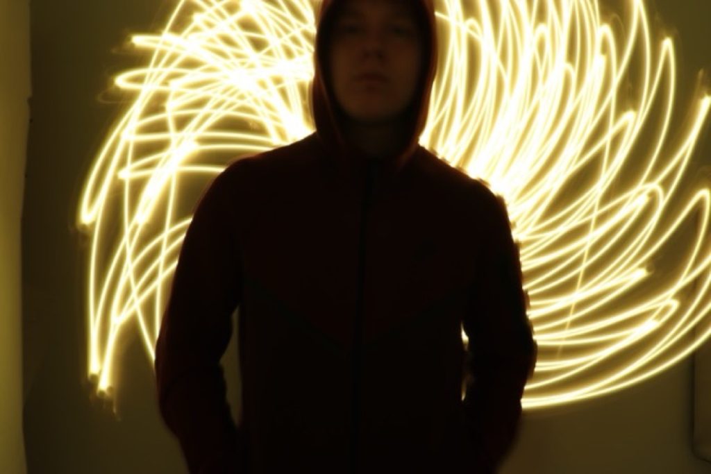
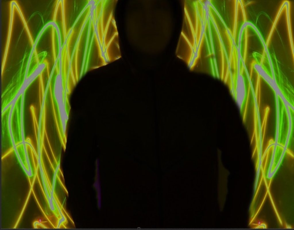
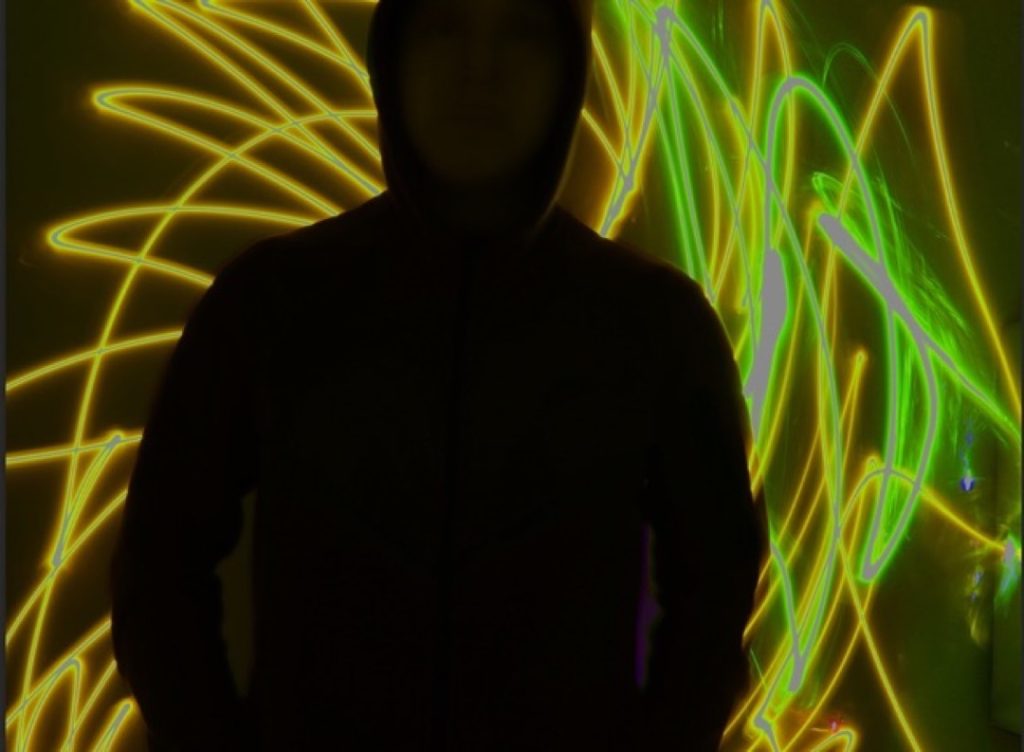
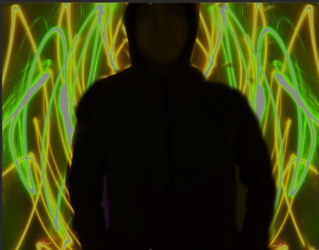
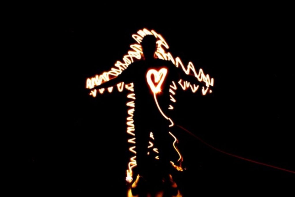
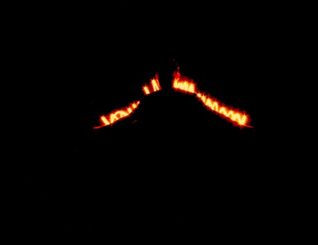
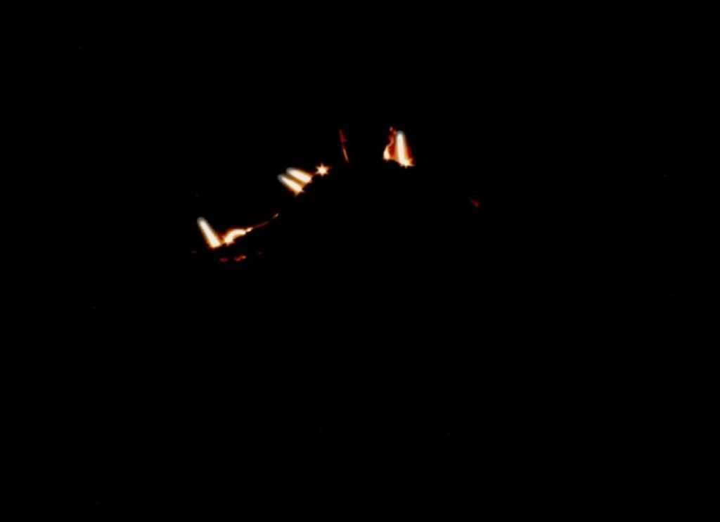
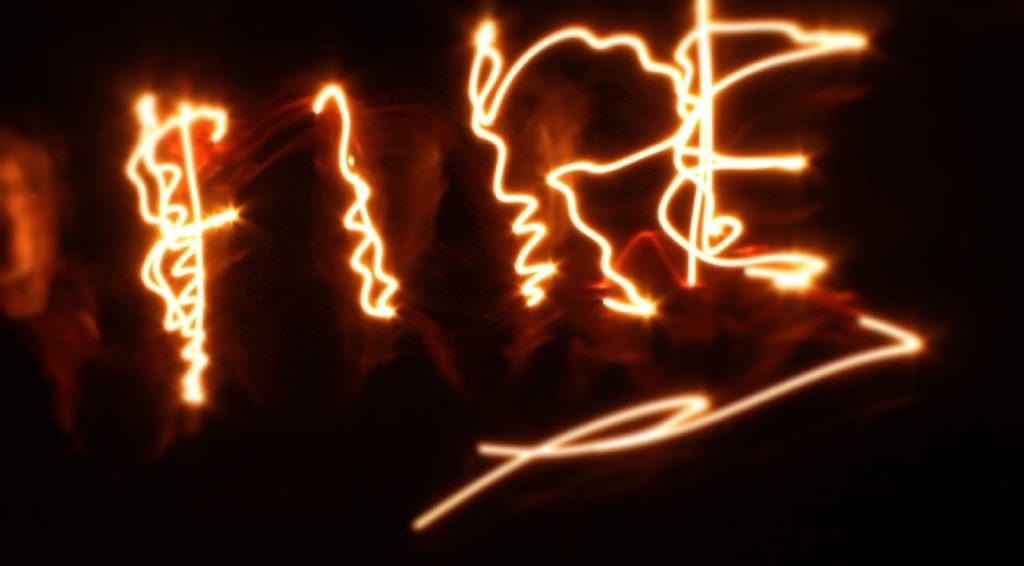
For this project, I created ‘light painting’ photography linked to the element of fire. I chose this technique because light painting is a process I thoroughly enjoy and wish to explore further. While fire was my primary inspiration, I also considered exploring water, given its vital importance to the Earth.
Technically, I utilised adjustment layers in Photoshop to manipulate the colours in my photographs and experiment with different visual outcomes. The shoot was highly successful; the light painting effects turned out exactly as I had envisioned, and I managed to capture unique, varied patterns in every single frame rather than repeating the same shapes. I am also very pleased with how the final colour grading enhanced each image.
To improve my work in the future, I would experiment with a much broader colour palette. For this project, I primarily stuck to traditional fire tones—red, orange, and yellow—with only a couple of exceptions where I introduced green. Additionally, I aim to develop my Photoshop skills further, allowing me to work more independently rather than relying on others for technical support.
My overarching intention was to represent the dynamic nature of fire through the medium of light painting. After researching numerous images online, I was driven to create my own interpretations. My primary influence was the artist Michael Bosanko, whose spectacular light painting photography heavily informed my approach. All final pieces are entirely original, consisting of my own primary photography and post-production editing.
Tyler Martin
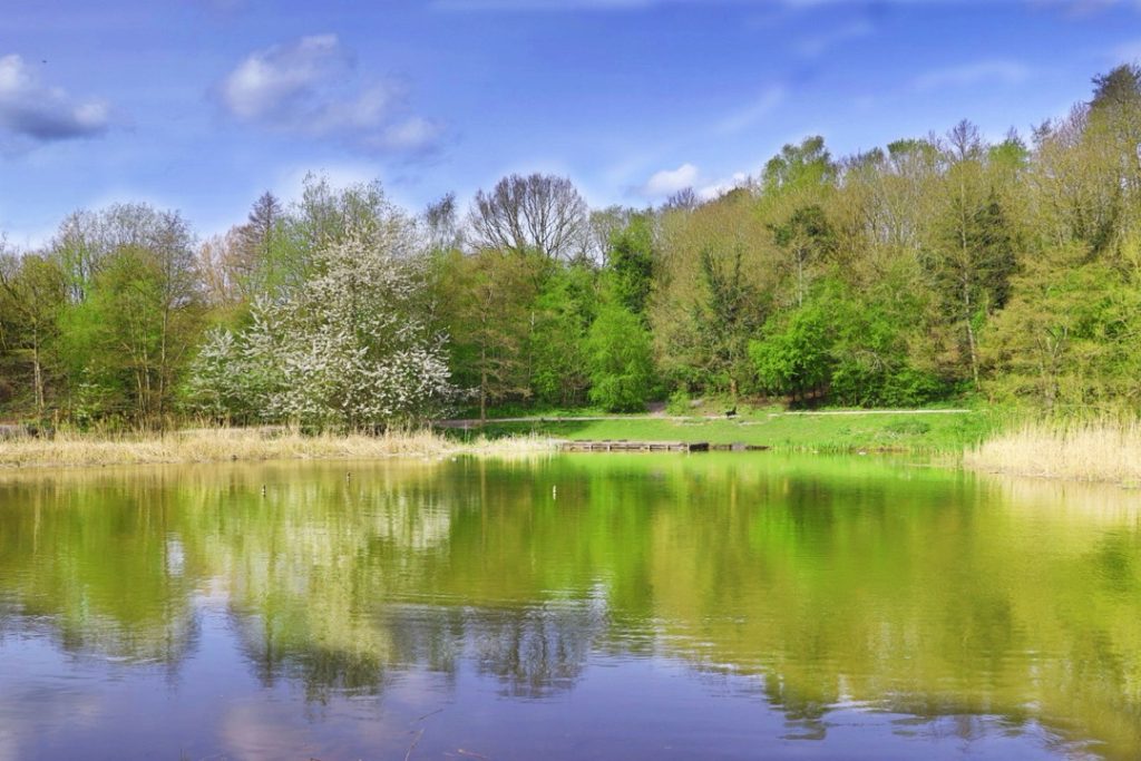
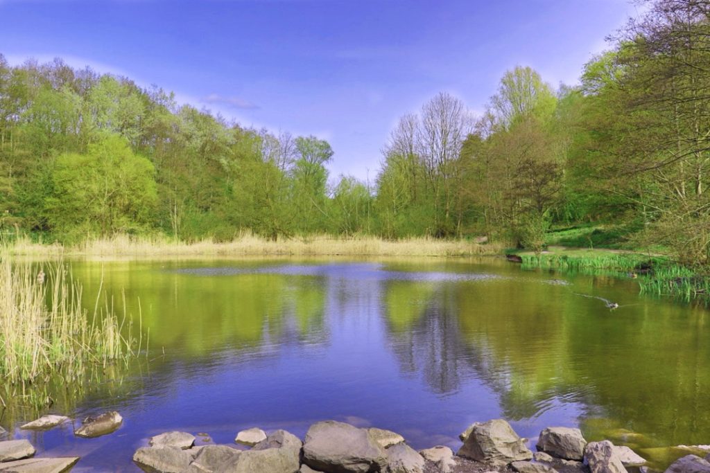
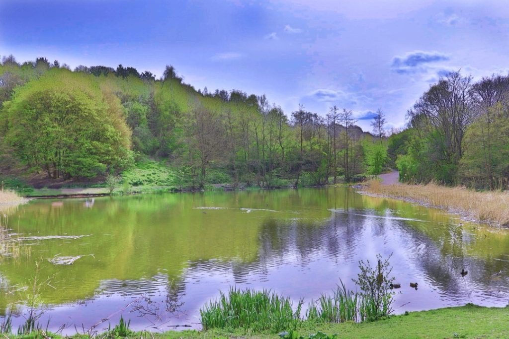
The name of my project is New Perspective. My intention was to take a subject which in this case is a pool of water at Baggeridge Park, and take it from different perspectives and styles to symbolise how our experiences as individuals make us view the world in a different way.
My inspirations for the project was the Japanese photographer Toshiya Shibata and the British photographer Adam Bunten. I was also inspired by the aesthetic physical era and how I remember things looking from when I was a kid. I used that particular one in my landscape ones. And I used the general sense of black and white photographers for the portrait sides.
For production I used a DSLR camera with a wide lens and I used the landscape method for the first three camera shots and then use the portrait for the rest. I then used Photoshop to intensify what was already present in the photos.
For example, with the landscape ones which were already intended to be vibrant, I used filters and adjusted the hue and saturation to make them much more saturated in the greens. I also used stuff like the burn tool to make the clouds a bit more darker than they were to make them stand out more. I then used the other way to make the portrait ones appear darker than they were.
Ben Middleton
For my final major project, I decided to create a holiday video advert establishing some destinations tied to the four elements. The reason for doing this is because I want to showcase to the audience the positive aspects of the elements during the holiday season. The elements that inspired me the most would have to be all four of them.
A technique I utilised was an orange filter I applied to the Tiede volcano and African safari sections to reflect the hot climate these locations are in. One aspect of the project that went well in my opinion, would have to be the information I incorporated into the holiday location sections. A section of the project that could have been improved would have to be the non-capitalisation of certain words in the holiday location sections.
One idea I’d like to go in-depth with would have to be the information video idea. I was going to discuss the negative aspects of the elements, such as natural disasters. This was changed because of the depressing themes that idea presented. An industry professional who influenced me would have to be Wong Kar-Wai. He utilized the fire elements using a candle that was on the dining table to represent the connection the characters have in this screenshot of that scene.
The piece of feedback that helped shape the final product was Cody’s feedback, which he gave me on Tuesday, 24th March 2026. He mentioned to me that Jet2 Holidays doesn’t offer flights to the USA or Australia.
Oliver Nicholl
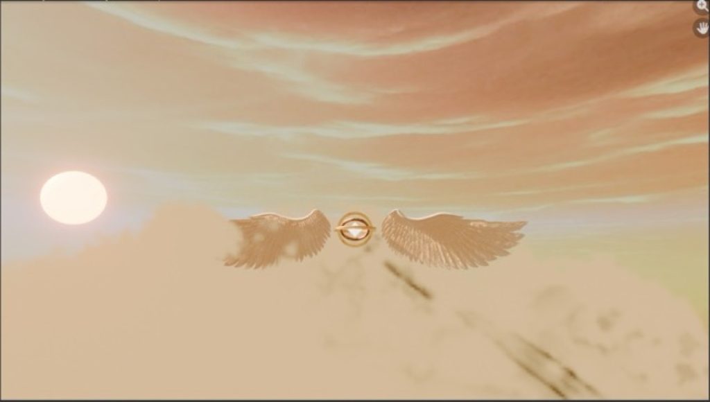
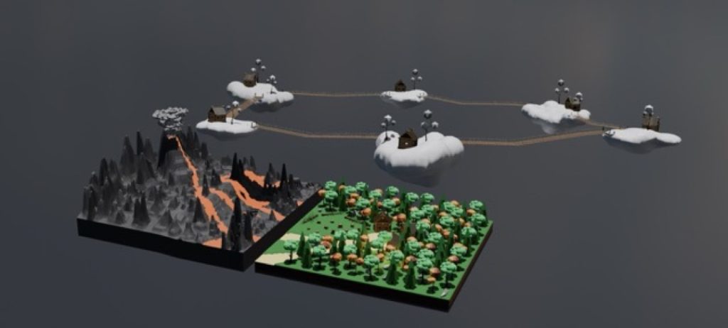
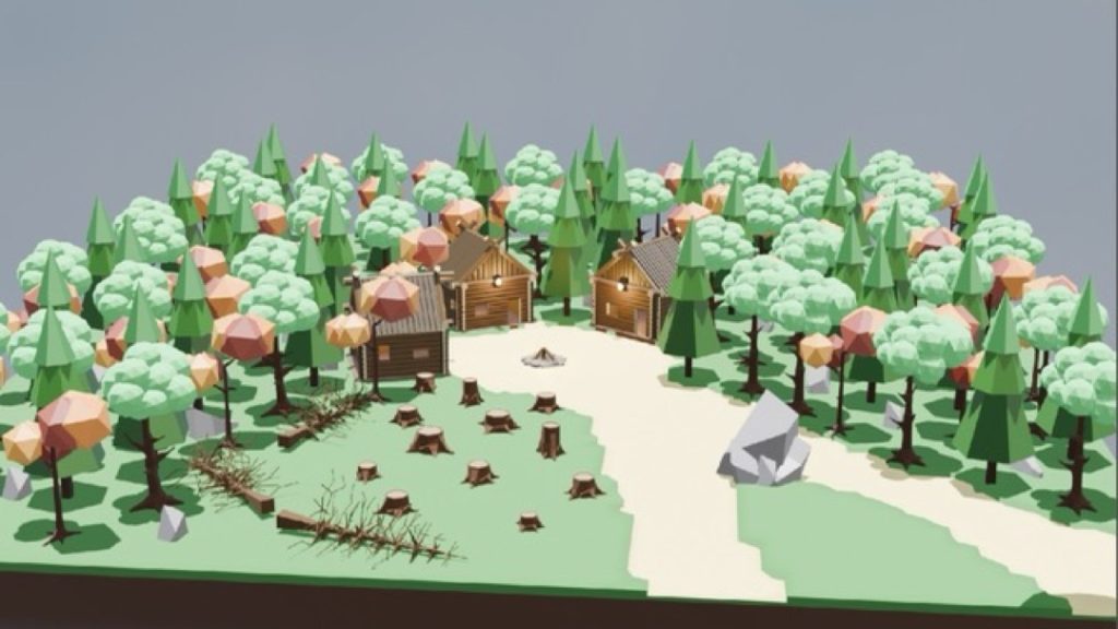
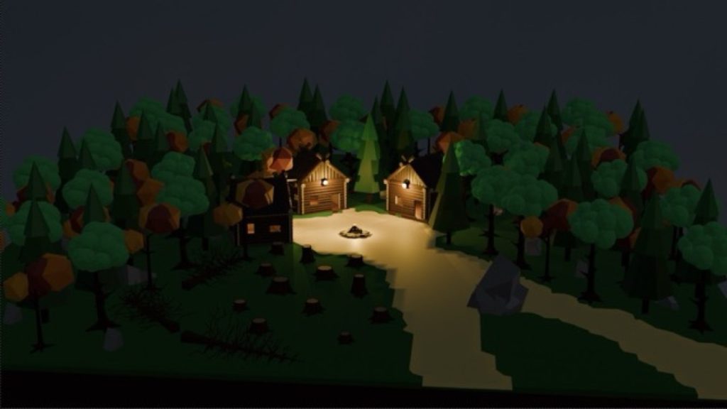
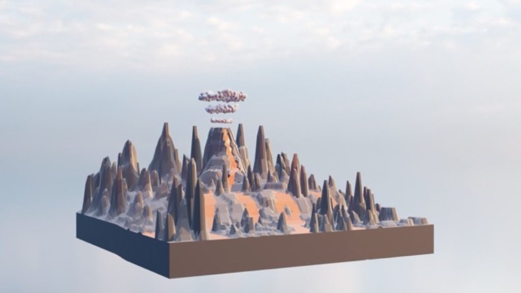
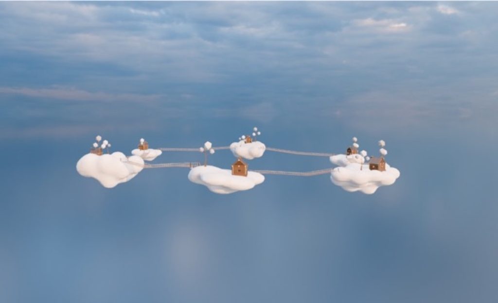
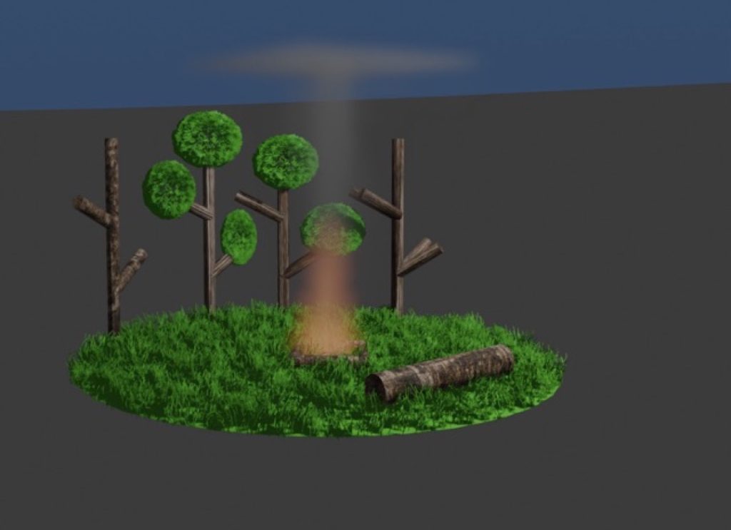
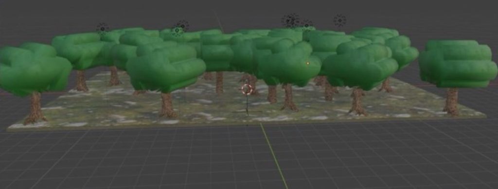
For my Final Major Project, I made three scenes in Blender, each representing one of three of the four major elements: a volcano to represent fire, a forest to represent earth, and islands of clouds to represent air. I chose these specific models for their respective elements to represent certain things typically associated with them.
Fire (the volcano) stands for anger and destruction. Earth (the forest) stands for life, as shown by the cabins dwelling inside. Air (the cloud islands) stands for freedom, as shown by the cabins atop each cloud, living free from the worries below.
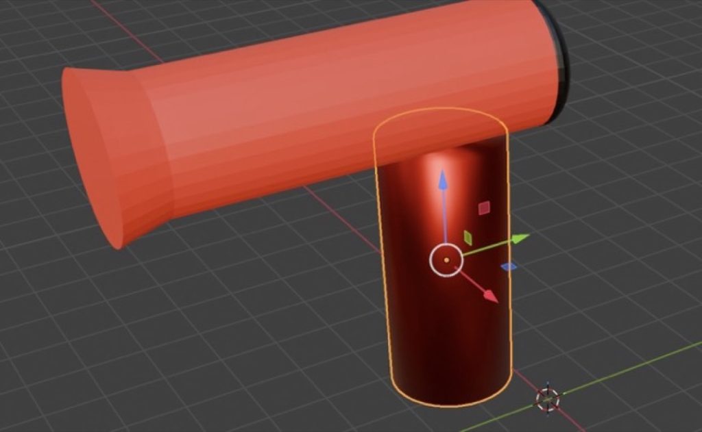
I used a variety of tools during production, including scaling my objects to accurate sizes, extruding faces and points, rotating objects, subdividing objects, the Knife tool, merging vertices at the centre, the Screw modifier, the Skin modifier, the Simple Deform modifier, the Volume to Mesh modifier, adding HDRIs to my scene, sorting my assets into different scene collections based on element, and duplicating objects with Alt + D. One tool I really enjoyed using was ‘merge vertices at centre’—using this, I learnt a quick and easy method to make trees.
The general production of my project went smoothly with almost no issues. The only issue that came up was having to give up on making my originally planned fourth scene. Other than that, everything went well. If I had the chance to make this again, I’d like to try and incorporate my scenes all into one, as well as include my fourth planned scene.
Dylan Norton
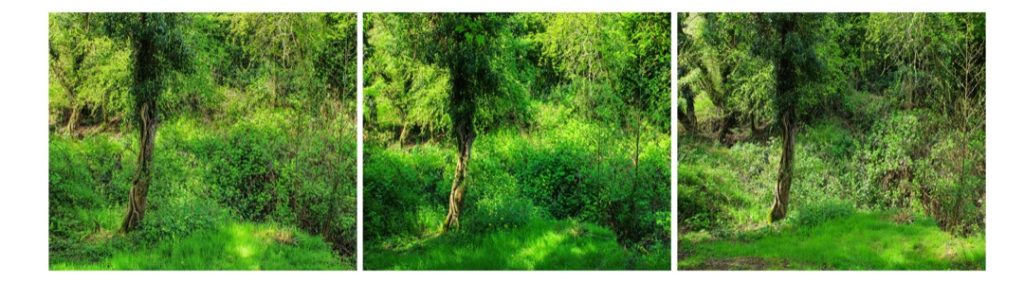
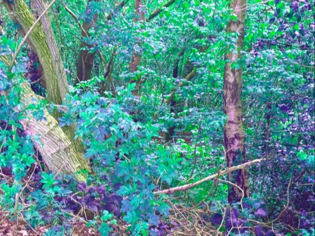
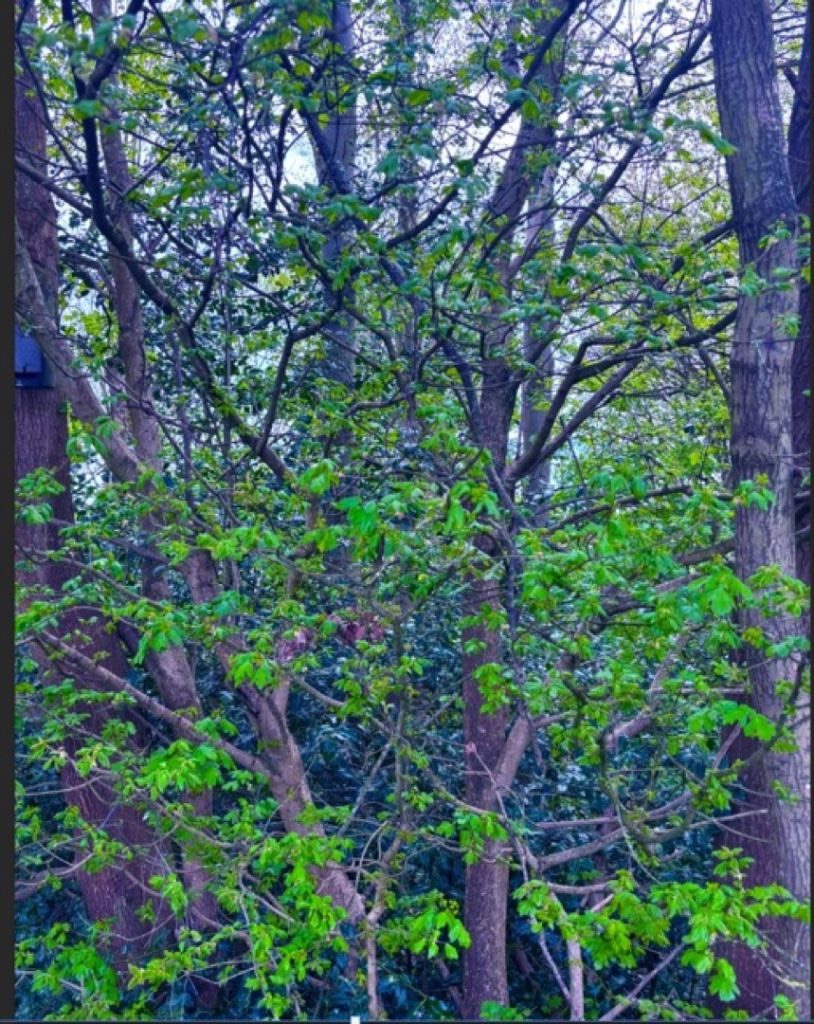
For my project, I decided to focus on photography. I wanted to showcase the element of earth by capturing the power of nature. I chose this theme because nature is a fundamental part of the earth, demonstrating just how beautiful our world can be.
I experimented with different camera angles of trees and leaves to highlight how crucial trees are to our environment. During the post-production stage, my aim was to make the images more uplifting and to create a calming mood for the viewer. I adjusted the saturation and vibrance to give the photographs a happier, more vibrant atmosphere.
The most successful part of my project was changing the colour balance of my first image to give it a mythical feel. This aligns perfectly with my overall goal, as I want my audience to reflect on how these visual changes make them feel.
Camran Perera
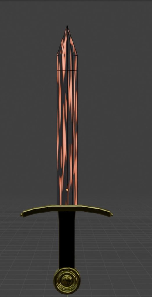
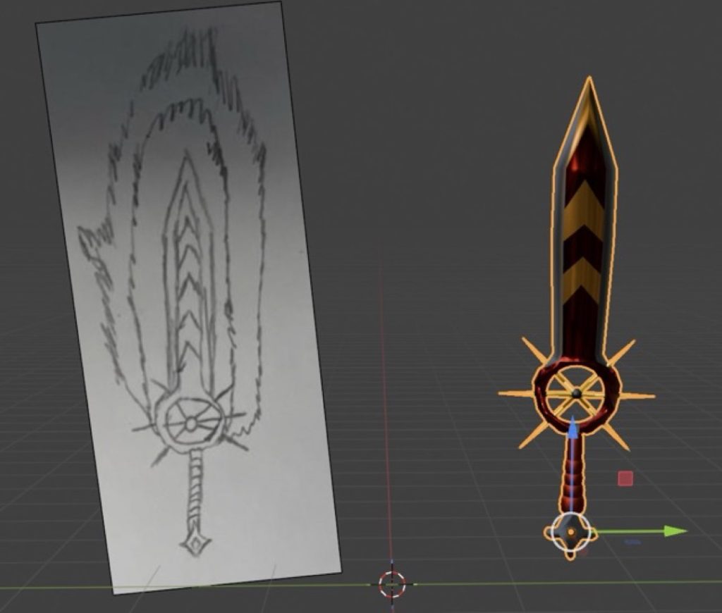
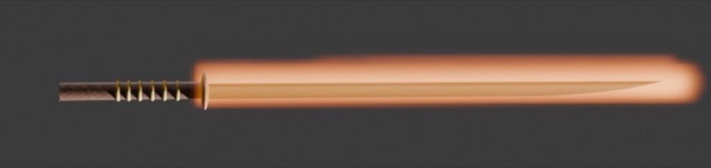
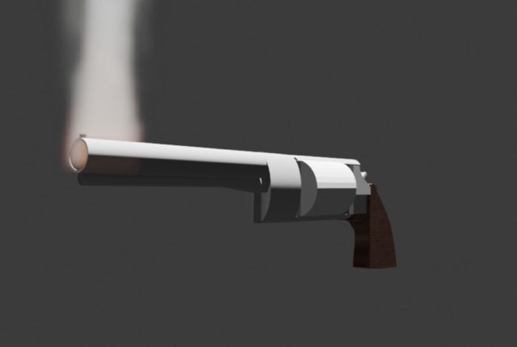
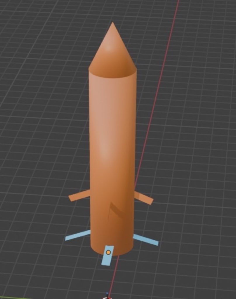
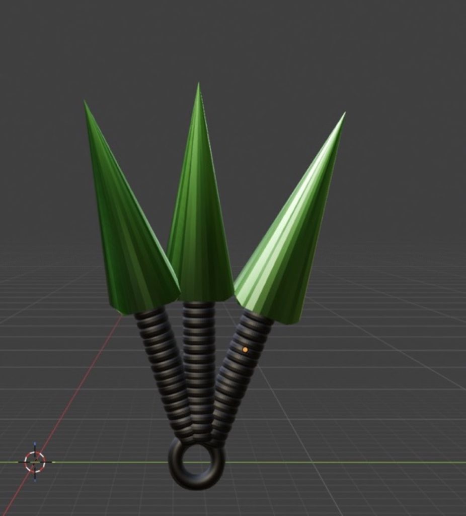
I created a series of 3D weapons in Blender inspired by the element of fire, aiming to portray the cultural links between these weapons and other anomalies found during my research. The element of fire inspired me to make these weapons because its main symbolism revolves around danger.
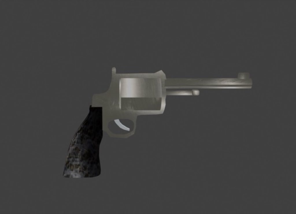
During the creation process, I used a range of different tools and techniques, including the knife tool, extrusion, bevelling, and UV mapping, alongside a rendering engine. When making the revolver and the sword, I combined various aspects of my initial designs. This meant I also had to manipulate the vertices to add a realistic 3D curvature to my work, preventing the blocky look it would have otherwise had.
A lot of my design relied on a tool that I particularly enjoyed using: the Push/Pull tool. This method gave me free rein to work on the projects and allowed for much of the depth and verticality visible in my final pieces.
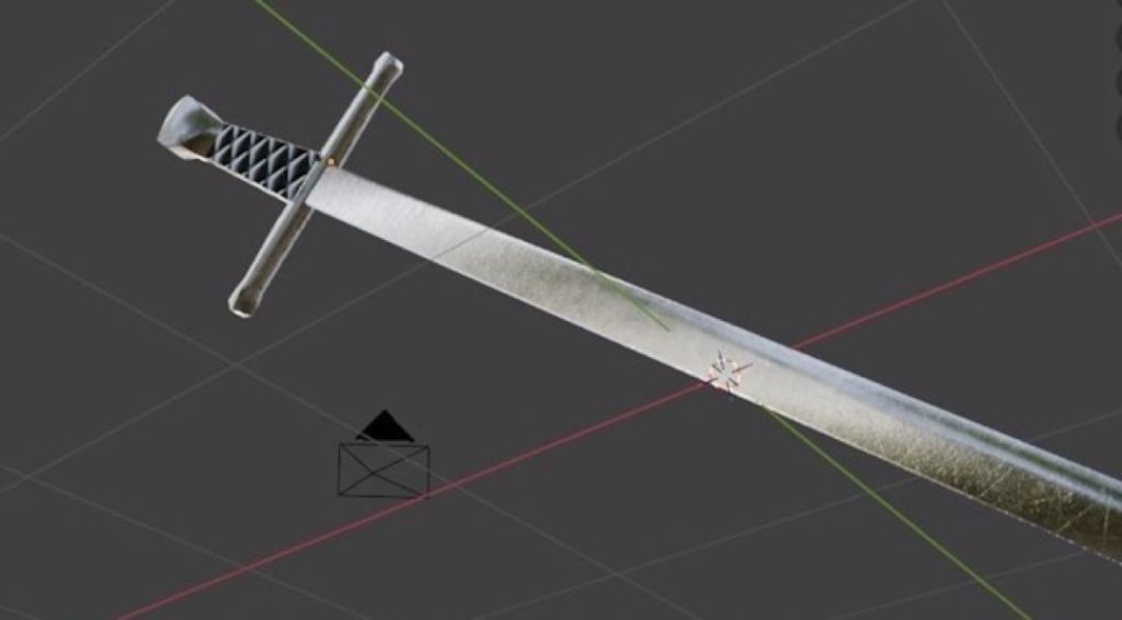
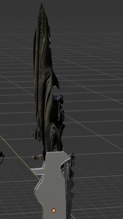
Personally, I think the production and overall thought process behind my designs went well. However, if I could change one thing, it would be the katana. The sword wasn’t my best work and could definitely use a retexture; it felt slightly messy and out of place, and could have been executed much better with a little more time.
Jack Pitt
I made a 2-minute short film about the four elements so I can visualise each element in different contexts. All four elements, water, fire, earth and air, really inspired me because we are made up from these elements.
I used simple dissolves because that’s how we transition from one context to another in film, and dynamic typography in After Effects to make the video more appealing to the audience. My usage of video editing software and After Effects went outstanding as I put a lot of effort into my production.
Next time, I would make a longer version of the video and take more original footage myself. How my final piece of work differentiated from the storyboard is that I was originally going to put in the star signs into their associated element chapter cards, but I chose not to and instead put in the slogans formatted like this: “can be as [ADJECTIVE] as…”, and some clips not seen in the storyboard were replaced with something different, like a beach in Cornwall instead of Blackpool.
Additionally, the canal scene was replaced with a river in Trentham Monkey Forest and swapped it around with the pond scene, filmed at Bumble Hole.
Matthew Slater
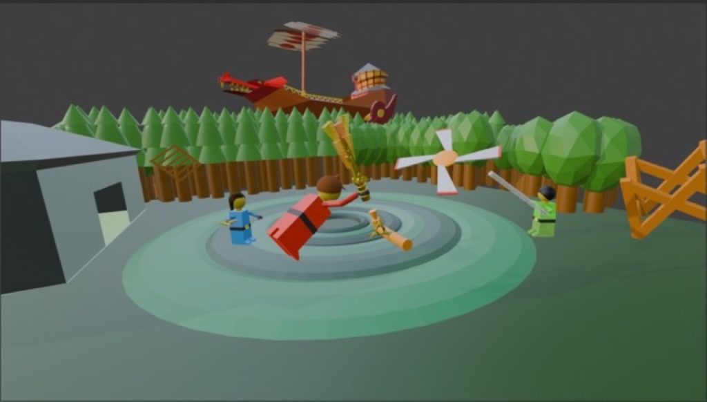
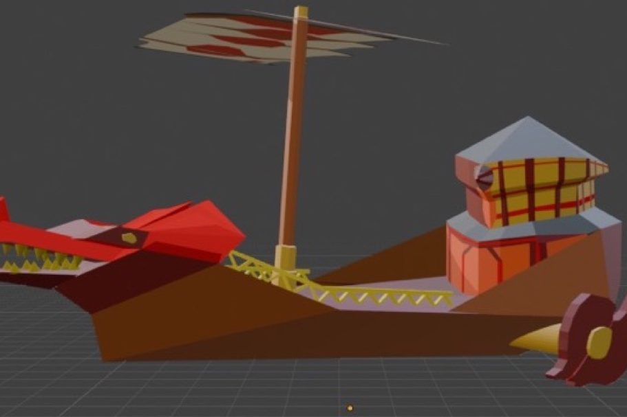
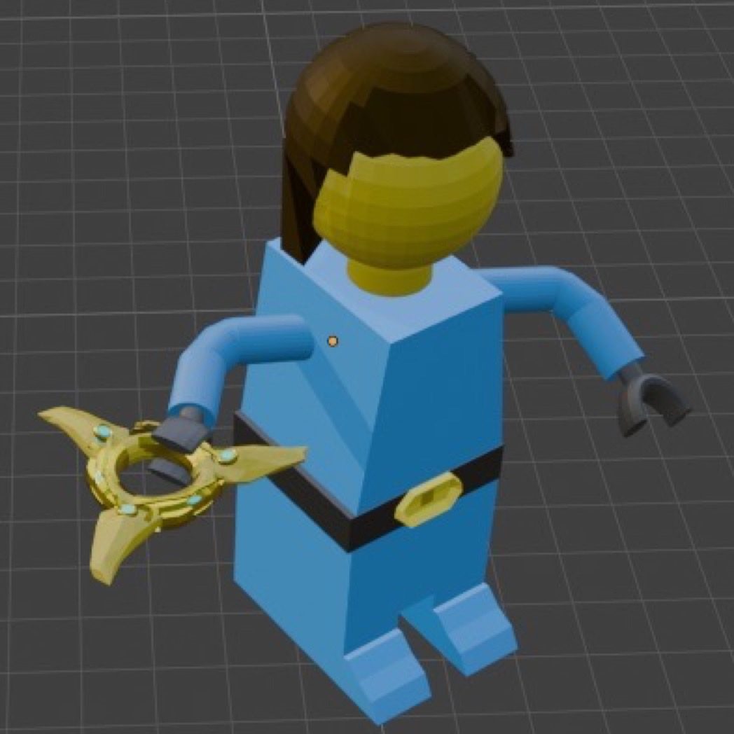
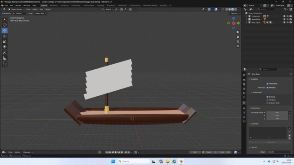
I made a scene freeze-frame inspired by the animated series Lego Ninjago. The elements that inspired me are fire, water, and air. The techniques I utilised included using a camera to make the perspective consistent and keeping the scale in mind.
I think that the models came out well, and the final freeze-frame scene looks good. The detail that I added to the ship seemed to transform it from just any normal boat into the Flying Bounty.
Given another chance, I would have improved the more minor details within the project. My idea changed slightly from making a couple of simple designs to making a few more complex and unique designs.
My area and characters were based on the real character and level design from the show. I got some feedback and then changed how it all came out, which made it seem much more realistic.
Cody Smith
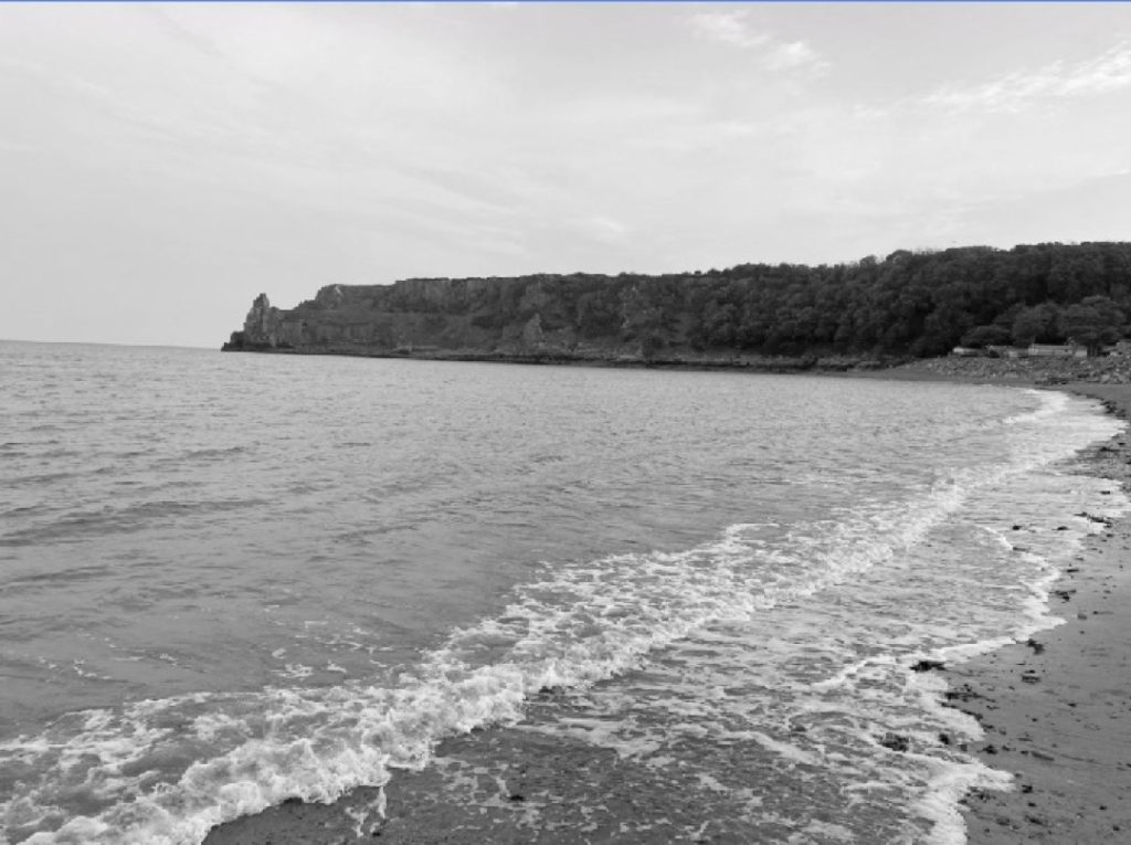
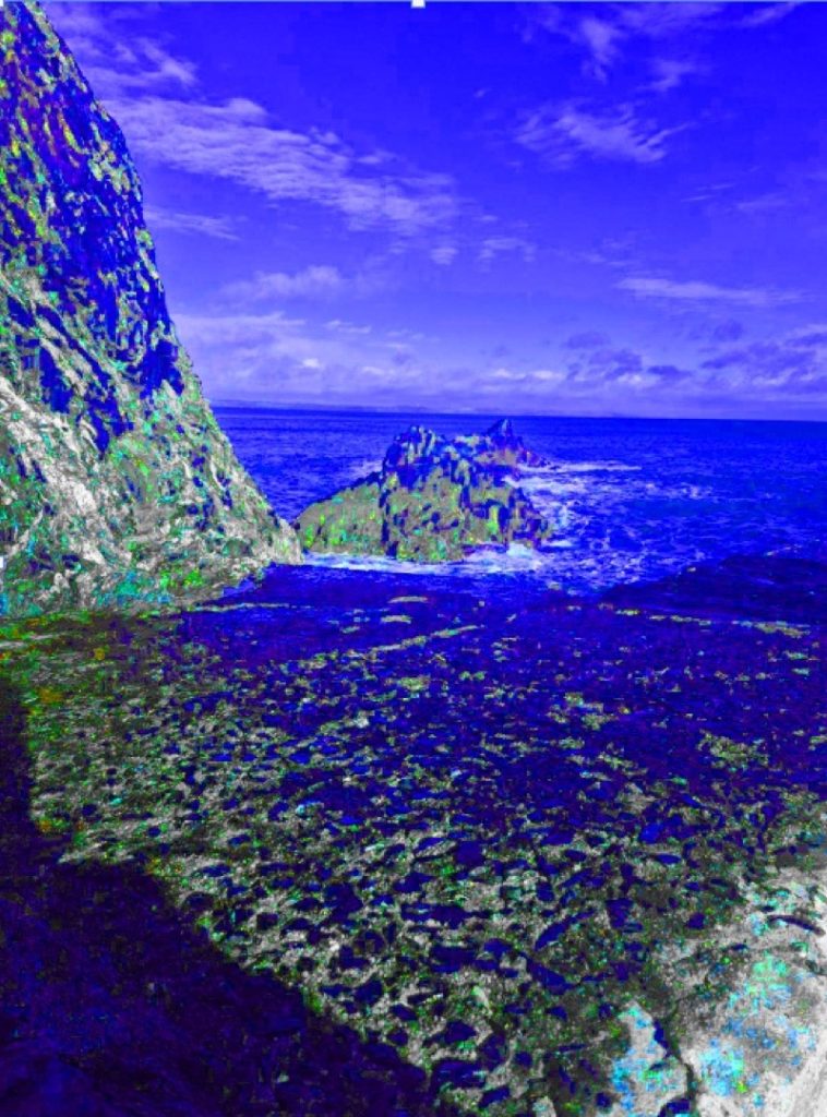
For my final project, I have produced six photographs based on the four elements; however, I decided to focus specifically on earth, wind, and water. I chose photography because I really enjoy capturing scenery. I chose to take photos mainly of the sea because it conveys a sense of relaxation and calmness. I took inspiration from John Blakemore’s work, as he photographs the sea beautifully, often using techniques that make the water look like mist. I would also love to live on the coast one day, as it is such a nice place to be. The element of earth inspired me as well, because nature is fascinating to be around and significantly reduces stress levels.
During the shooting phase of my project, one of the main techniques I used was a long exposure, so that I could capture all the moving aspects of the scene in a single photograph. In another one of my photos, I also incorporated leading lines. All of the locations I chose perfectly fit the type of photography I enjoy. However, the locations I picked were quite far away, so in hindsight, it might have been more practical to choose closer spots.
Originally, my plan was to take pictures of the countryside, but I then realised it would be a better idea to adjust my project to focus on the coast. As I mentioned, this is where I would like to live, and I find the sea very calming. Lizzy Davis’s photographs also inspired me, so I decided to integrate elements of her style into my own photography.
Steven Williams
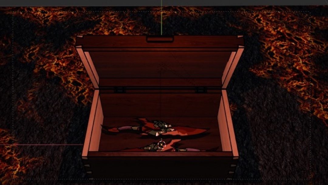
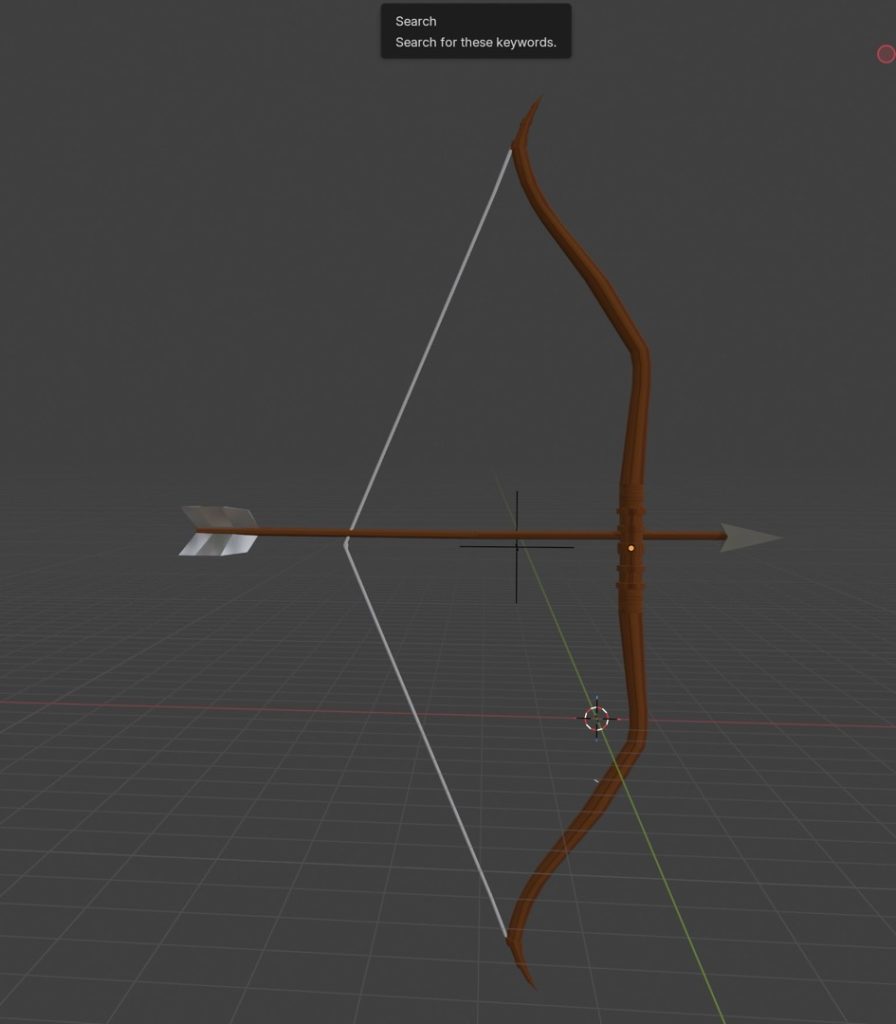
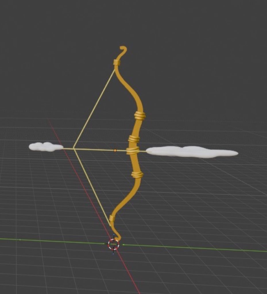
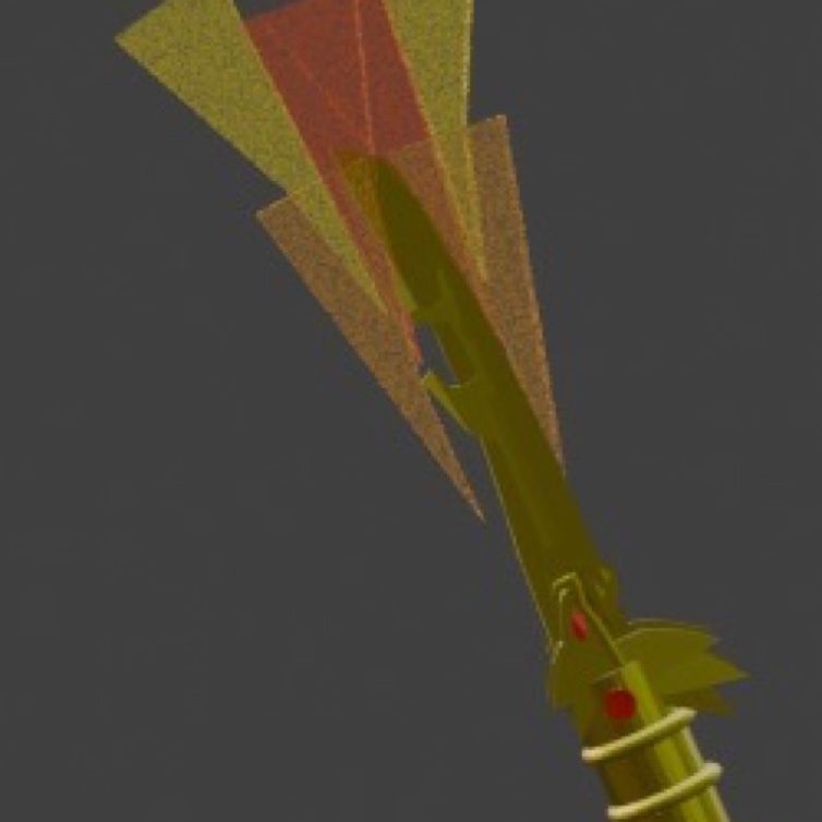
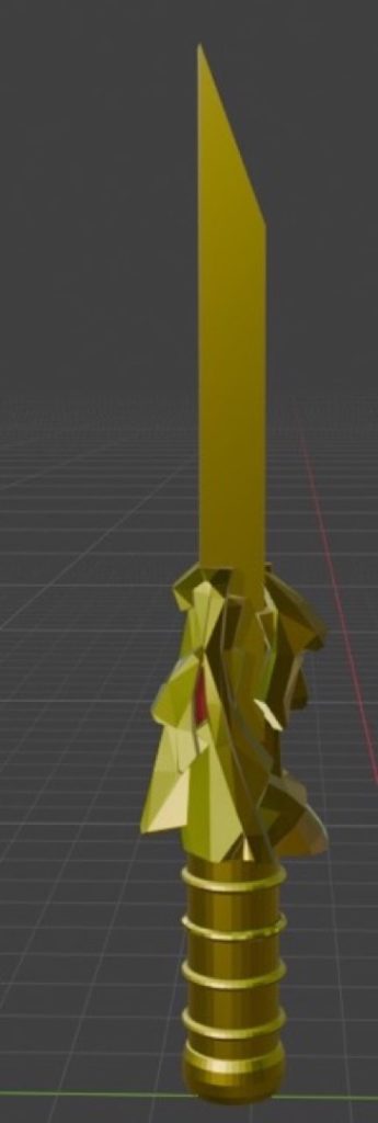
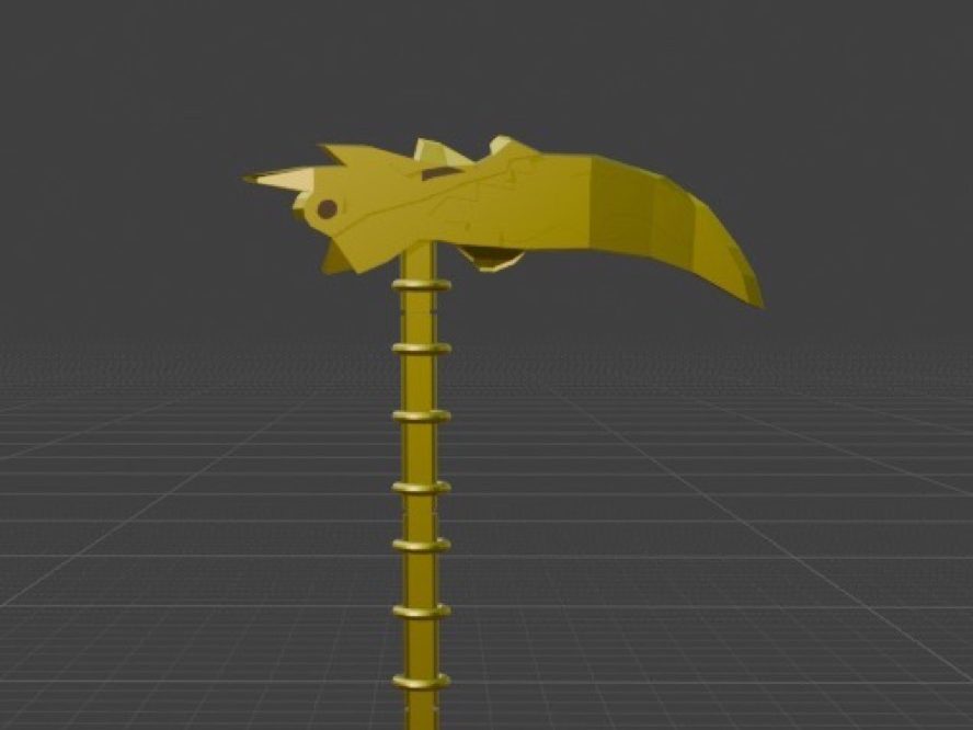
For my Blender project, I made four weapons and a boat to represent the four elements. I was inspired by all four elements (water, fire, earth, and air), and I made various things for them all. The techniques that I used included loop cuts, the Knife tool, and adding shapes and reference images.
The things that went well are the actual bases of the 3D models that I created. The thing that I struggled with was the dragon heads on my models, as it required quite a lot of trial and error. The thing that I would improve for next time is the detail of most of my 3D models; some parts of them don’t look as detailed as they should, as I thought I didn’t have enough skill to complete them down to the exact level of detail they were supposed to have.
My intention in the project was to include enough detail to get at least a Pass or a Merit grade, and maybe a Distinction, as I wanted to do as well as I could at my current skill level. My inspiration for my models was the show Ninjago, which I really enjoyed watching as a kid and is also related to the four elements. I produced my work by using various reference images and a few online models to base my designs on, creating them inside of Blender.
GROUP C
Adam Abraham
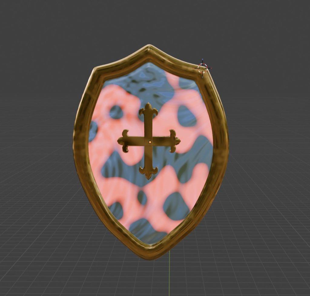
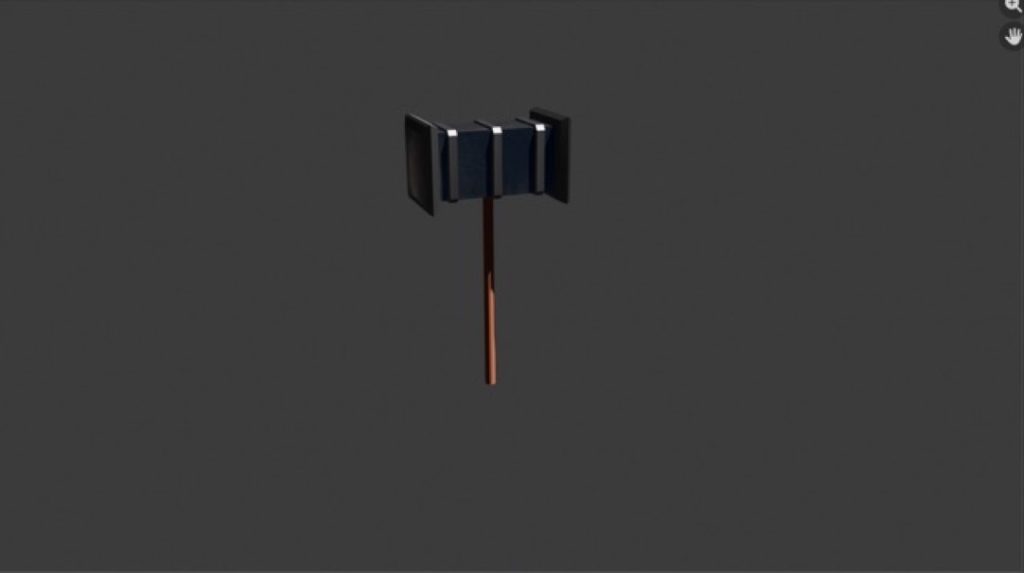
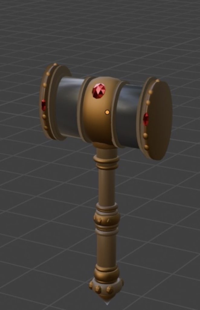
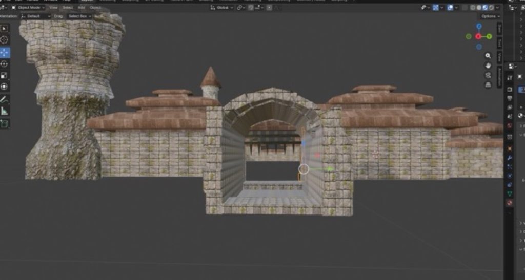
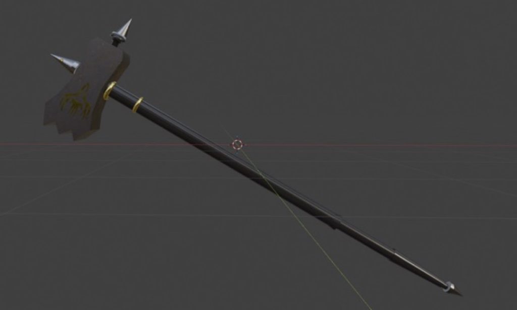
My favourite technique to use in Blender is the tracing tool. I find it very intuitive, and it significantly helps me improve my skills within the software. The hammer was my most successful asset, especially when I used material nodes to texture it and give it a highly realistic finish.
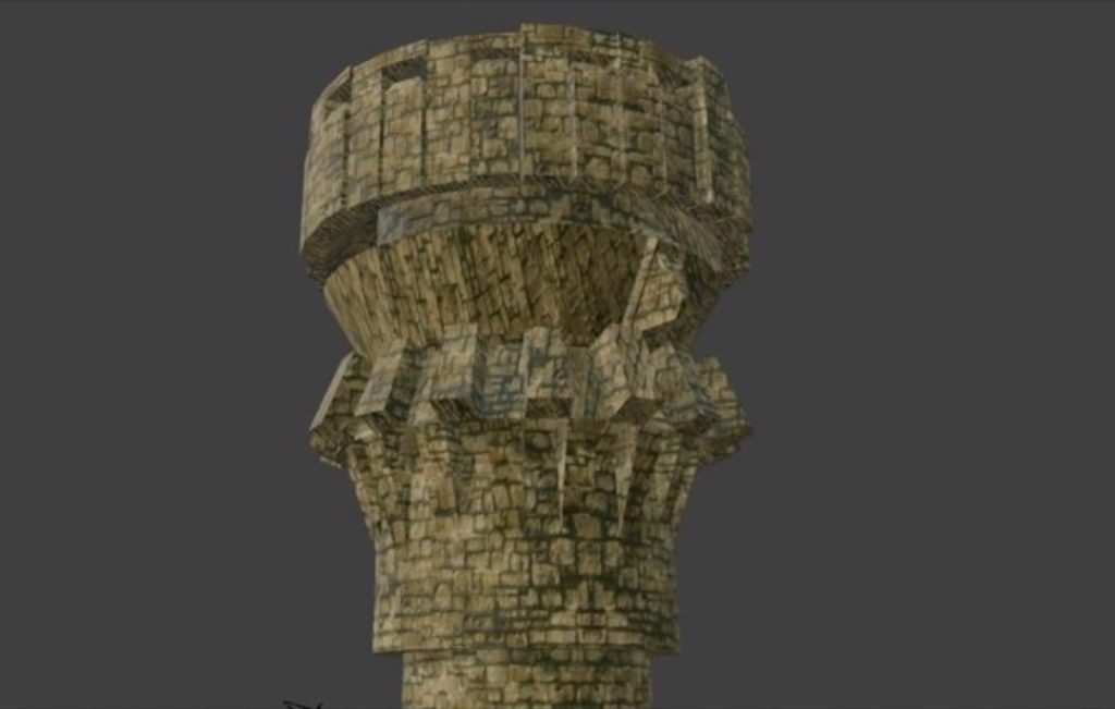
However, I would like to improve my castle by adding more detailed texturing to increase its realism and visual clarity. I changed my mind about the castle’s design a few times. Initially, I planned to keep it basic and low-poly to avoid any difficulties during the modelling process.
A major professional influence for this project was Hidetaka Miyazaki, the director of Elden Ring. The incredible detail he puts into his game environments inspired me to go much more in-depth with my own designs.
Finally, peer feedback really helped shape my final piece, particularly regarding the castle. The person reviewing my work was impressed by the modelling and texturing, but they pointed out some issues with the proportions. This prompted me to go back and adjust the scale, and overall, the project went very well.
Daniel Adams
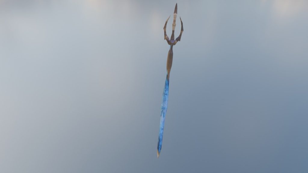
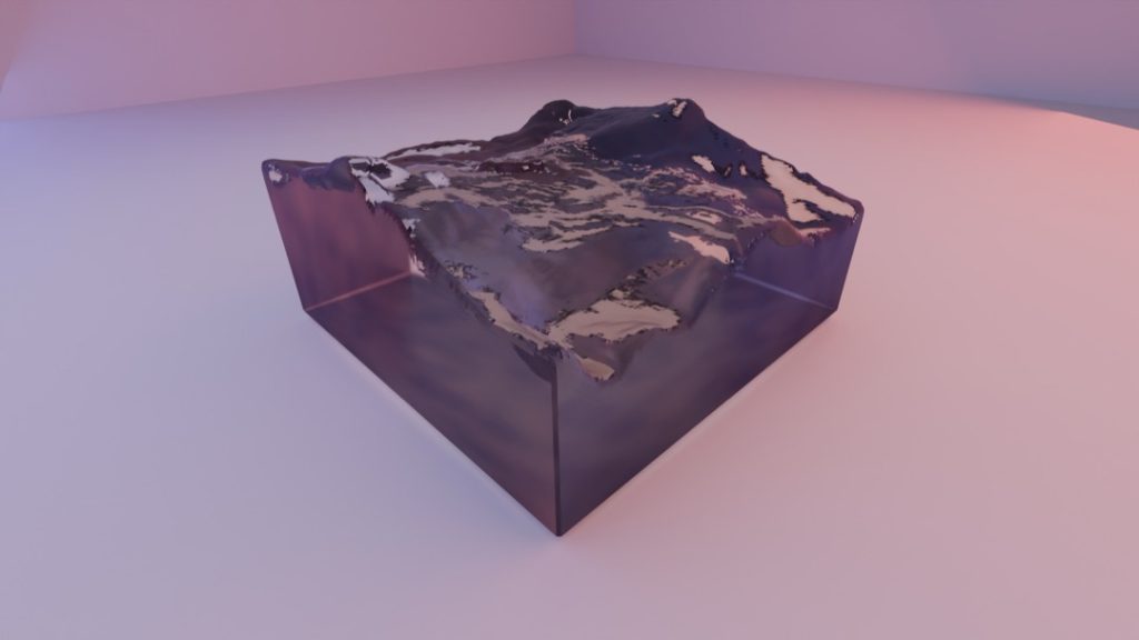
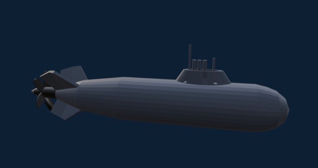
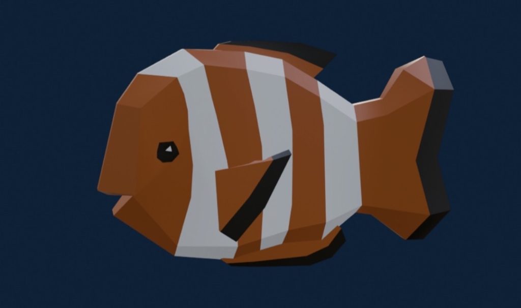
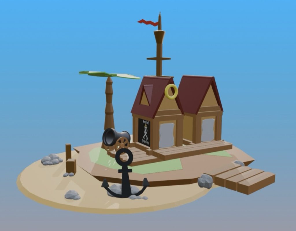
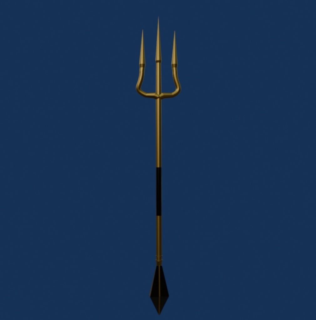
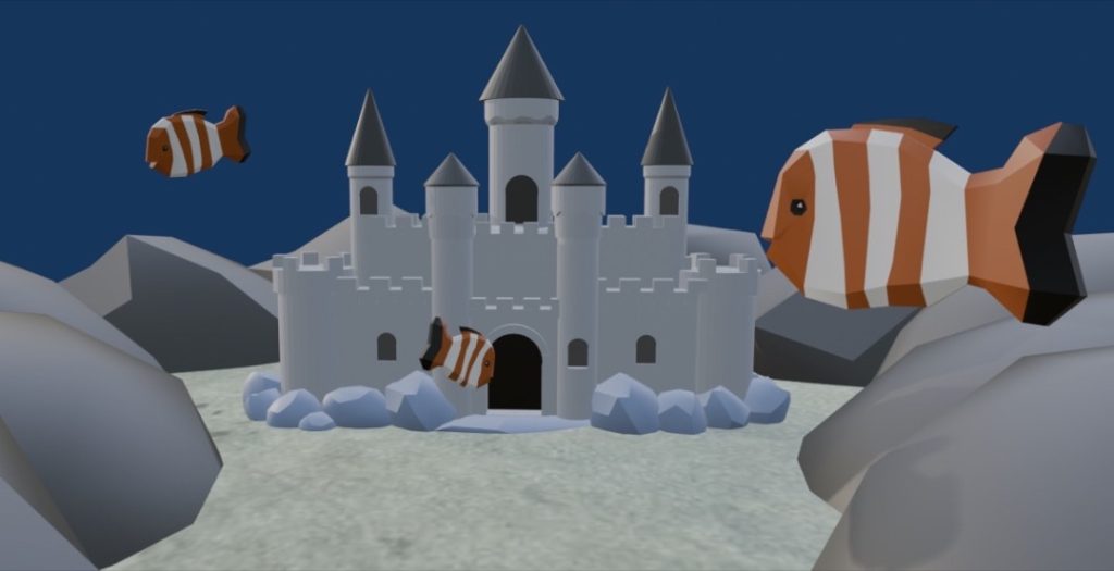
I have completed five 3D models in Blender: a trident, a castle, an island, a submarine, and a clownfish. I chose these specific assets because they each have a unique meaning and purpose. For example, the trident represents power as a weapon both in and out of the water; the castle serves as an underwater habitat; the submarine acts as underwater transport; the clownfish symbolises marine life; and the island represents an environment entirely surrounded by water.
Water was the element that inspired me the most, as it really stood out and immediately sparked ideas for me.
During the modelling process, I found Boolean modifiers incredibly useful for cutting holes into shapes. I also joined faces together using multiple cuts to achieve smooth, curved surfaces on my models. Ultimately, the project went very well; I was successfully able to create detailed, low-poly assets that all perfectly captured the theme of water.
Abdullah Alokozai
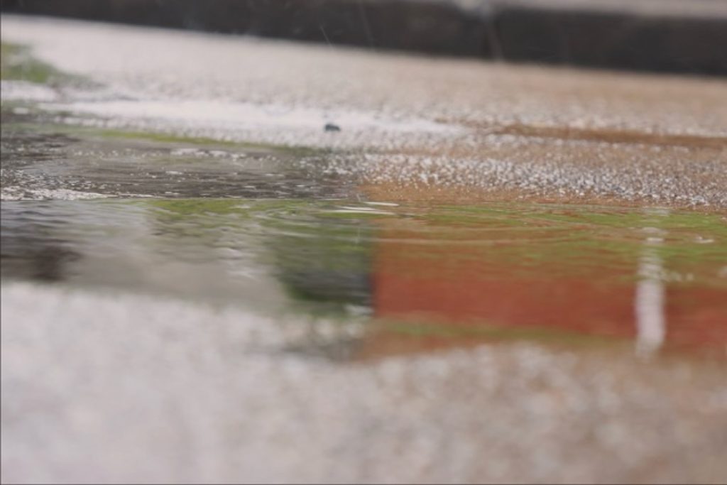
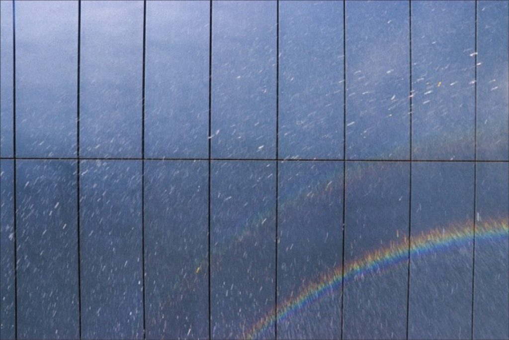
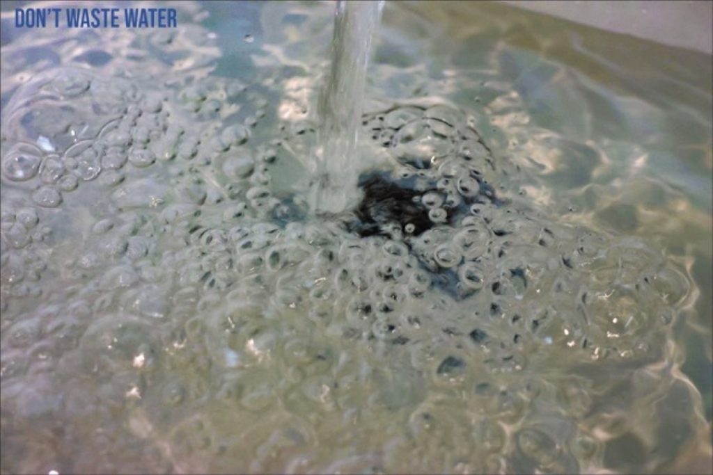
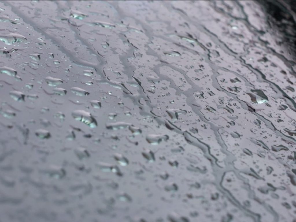
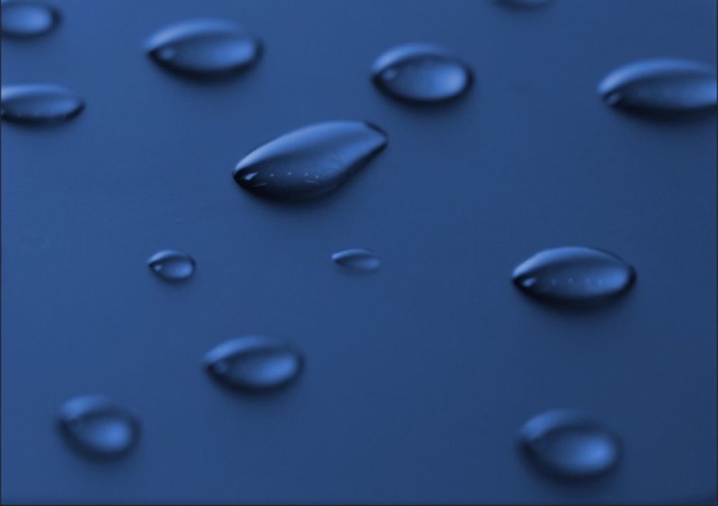
I am a photography and media student exploring the theme of water through creative images. My work focuses on textures, reflections, and movement found in everyday situations. I aim to show water in a simple but visually interesting way.
For this project, I created a photography series based on the element of water. I chose water because it can represent different ideas, such as calmness, movement, and reflection. I wanted to show how water can look in everyday situations, but in a more creative way.
My work was inspired by the different forms of water, including rain, puddles, water droplets, and flowing water. I also looked at how water can change shape and create intricate patterns.
To create my images, I used my Canon EOS R6 camera, taking many photos using different angles and lighting setups. I focused on close-up shots to capture finer details, before editing my photos using Adobe Photoshop. I adjusted the brightness, contrast, sharpness, and colour to improve the images and make the water stand out more. I also incorporated cool tones, like blue, to match the theme.
I feel the project went well, as I successfully created a variety of images showing different aspects of water. My editing improved the overall quality and made the images much clearer.
If I were to do this again, I would experiment with better lighting and try more advanced techniques. My initial idea also evolved during the project, as I started focusing more on close-up details instead of wider shots.
Jack Cox
I was inspired to focus on the element of water because I feel it is the most calm, relaxing, and peaceful out of the four.
Additionally, I believe that out of all four elements, water is the one we damage the most. This environmental concern drew me closer to the topic and solidified my decision to explore it for my project.
Screenshot
Maison Edwards
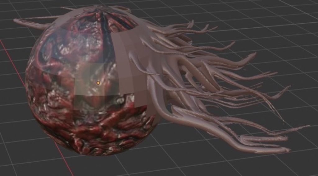
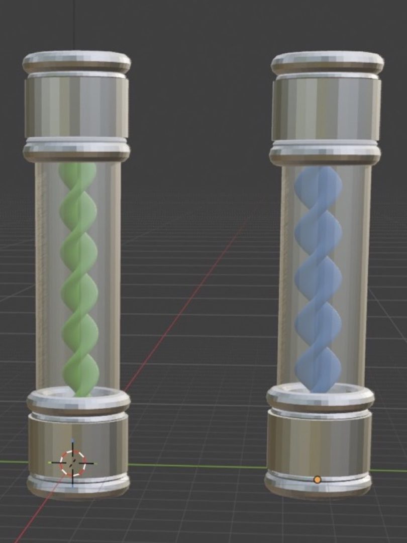
For this project, I was inspired by the element of earth. This theme allowed me to generate a vast amount of ideas, as it can be easily linked to concepts such as the beginning of life, animals, plants, and biology. This ultimately inspired me to create models based on the hit horror gaming franchise, Resident Evil. Since I already had a wealth of knowledge on this subject, I began to design models and write lore linked to biology and the earth element. Through this, I was able to incorporate elements such as viruses, zombies, and mutated, animal-like creatures (including Las Plagas, the T-Virus, Hunter Bs, Lickers, and Tyrants).
For my models, I was inspired to design weapons embedded with specific anti-viruses. These weapons are capable of stunning, defeating, or curing these grotesque creatures, giving the host vessel a second chance at life. Whoever is worthy enough to wield such a weapon becomes a symbol of hope for those impacted by the harmful Bio Organic Weapons (B.O.W.s) unleashed by the depraved and malevolent pharmaceutical company, the Umbrella Corporation.
Brandon Foster
The purpose of my designs is to explore my chosen element, air, drawing inspiration from air-based video game characters. I chose this element because it aligns with my zodiac sign. Air can represent lightness, movement, and spirituality, and it is often visually depicted through clouds and wind. It can also symbolise freedom and the unknown.
Throughout the years, air has been utilised in so many different ways across entertainment. For instance, physical games like air hockey rely on it to function, while movies, television series, and video games frequently feature it as a superpower.
While the air element has been used in a multitude of exciting ways, reflecting on my own work, I think I could have improved the level of detail to create better-looking designs overall. In the future, I will aim to spend more time refining the designs as a whole.
Jac Hickman
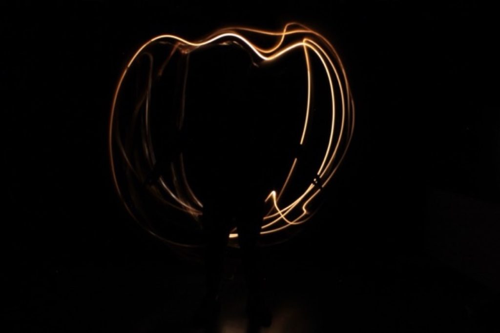
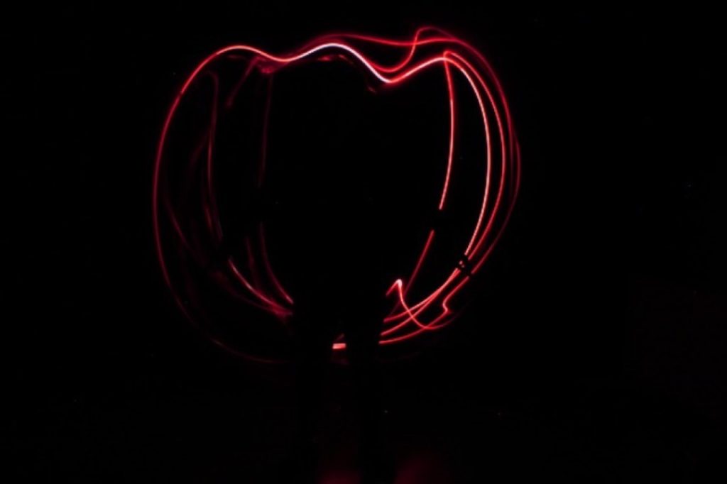
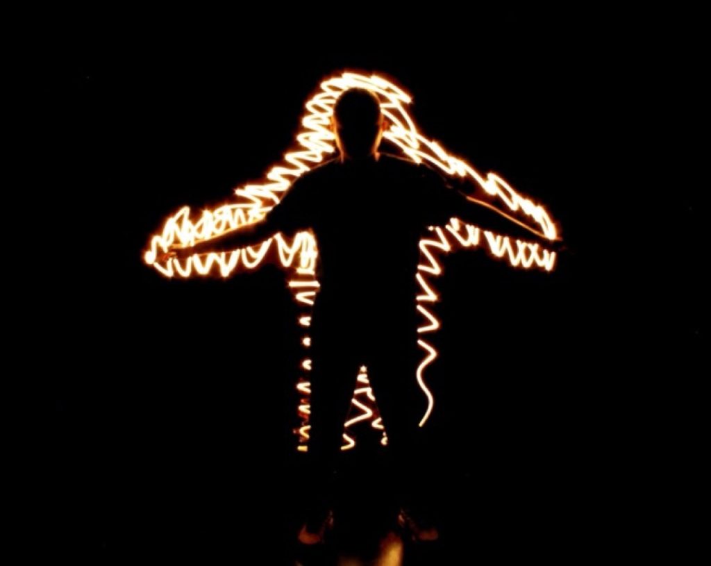
Fire has always existed as a dual symbol: creation and destruction, warmth and danger, light and chaos. I explored these contrasts through light photography, capturing long-exposure images and using coloured gels to mimic the natural hues of fire.
Across six images, I shaped light into forms that echo the emotional and symbolic weight of fire: its capacity to create and destroy, to direct, to warn, and to consume. Each of my images showcases the different symbolic meanings of fire while focusing on the core energy that it naturally exudes.
By removing physical flames and replacing them with light, my aim wasn’t to show fire as a physical phenomenon, but as a structured metaphor.
The resulting images allow the audience to use their imagination, inviting them to reflect on the internal meaning of fire.
This project became an exploration into the multifaceted nature of fire, delving into its history within mythology alongside its positive and negative traits. Through light and colour, I sought to capture and visualise the very energy that fire represents.
Ella Mcnaney
I took these photographs because they fit perfectly with my overall concept and creative process. I chose the element of earth because of how calming and relaxing nature is. Being outdoors is incredibly peaceful, fosters a deeper connection with the environment, and acts as a natural mood enhancer that is highly beneficial for mental health. Spending enough time outdoors can significantly strengthen our relationship with the natural world.
The techniques I used included experimenting with different lighting and camera angles. I chose these methods to ensure the photos looked their best—playing with both bright and dull lighting to create realistic, sharp images rather than blurry ones. Another technical aspect I focused on was the shutter speed, making sure it was set correctly to 1/1000th of a second.
Holly Walker
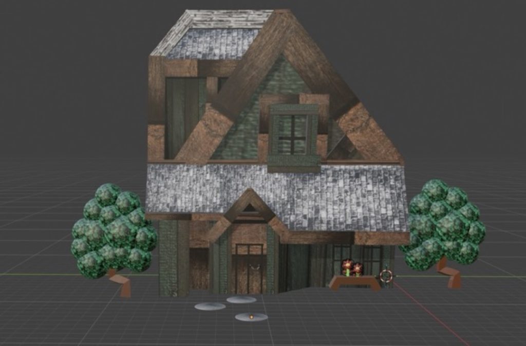
For my project, I was inspired by the element of earth. This theme allowed me to create six 3D models that link to the film Tangled; specifically, the tower hidden in a secret forest inspired me to create my own magical forest cottage.
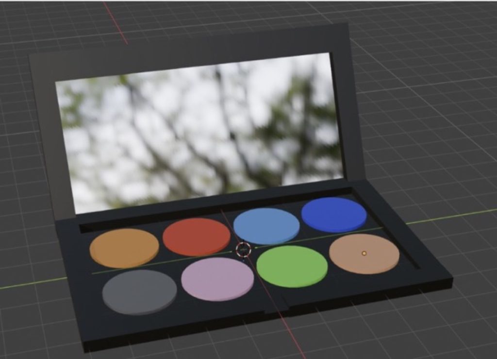
Building these 3D models helped me develop new skills and techniques, and I now feel much more confident and inspired to design even more. One of my standout models is a makeup palette where each colour represents a different element, possessing unique magical effects depending on which colour decides your fate!
Kaylee Wood
I chose to photograph fire because its warm colours evoke feelings that are simultaneously relaxing and powerful. Fire represents a duality of positive and negative forces; it stimulates plant growth and maintains ecological balance, but it can also cause atmospheric pollution, water contamination, and pose hazards to life and property.
This element inspired me through its symbolisation of personal growth and change, burning away the old to make space for new beginnings. It also embodies passion, energy, and enthusiasm, often igniting feelings of inspiration.
For my photography techniques, I experimented with various angles and lighting sources. Changing the light sources helped to make the pictures look more realistic, while adjusting the angles ensured each shot felt unique.
The standout parts of this project were taking the photos and editing them exactly how I envisioned. During the editing process, I experimented with different techniques, such as dimming the lighting to see how it affected the mood.
In hindsight, I might have chosen nature over fire, as it offers a wider variety of photography opportunities.
My ideas evolved throughout the project as I thought critically about my colour grading and workflow. I took the time to carefully test each editing tool and technique, deciding which ones best fit the visual style I was aiming to achieve.
A-Level textile design encourages students to work with a wide variety of skills and processes across the fields of textiles, fashion and interiors. This includes printed textiles, constructed textiles, embroidery, fashion construction, weaving and fabric manipulation. Learners are introduced to different techniques which they are then able to develop into personal final work. This can be clearly seen within the variety of imaginative outcomes produced this year.
Learners are encouraged to explore both historical and contemporary techniques and processes and to support their work with research into a range of suitable artists, designers, and trends. They are prepared for industry or Higher Education and all the learners from this year are continuing by pursuing degrees, employment or progressing onto the art foundation diploma course here at Dudley College.
I hope that you find the work inspiring. I am very proud of what the learners have achieved this year.
Clare Buchanan, A level Textile Design Tutor
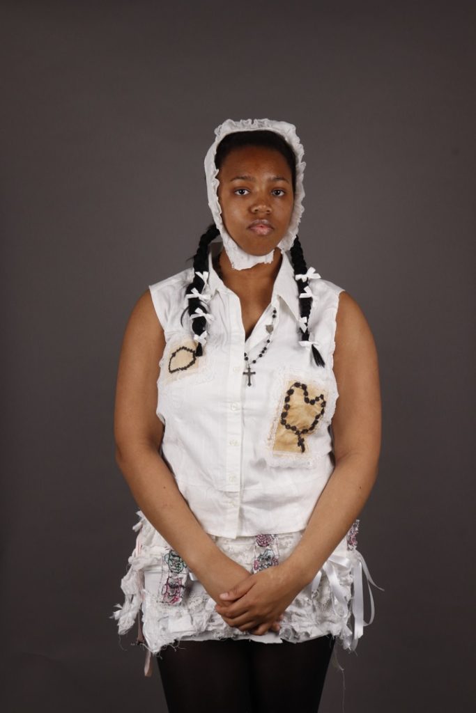
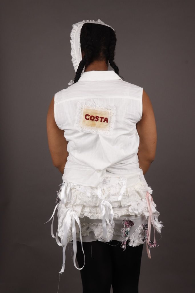
Precious Anozie
My project explores the emotional significance of personal possessions following my dad’s passing. Inspired by the theme ‘Surplus & Discarded’, I wanted to investigate how everyday objects can become memorial keepsakes that preserve memory and identity.
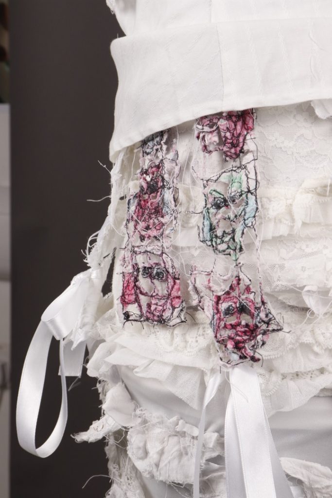
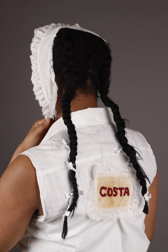
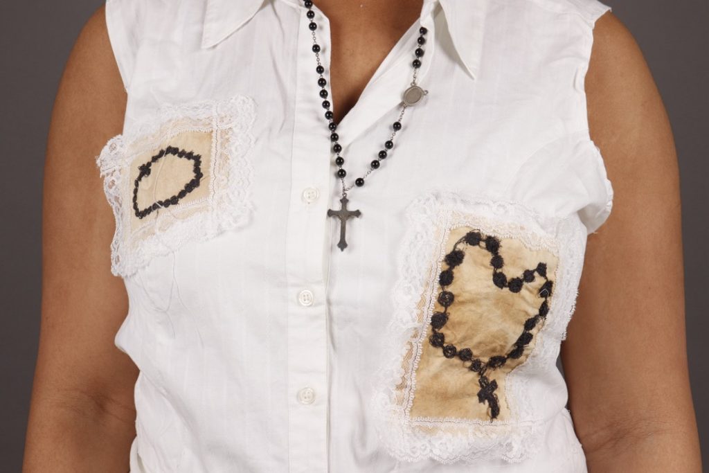
My final piece is a reconstructed waistcoat inspired by Martin Margiela, featuring embroidered imagery connected to my dad, including his rosary and the Costa logo, referencing a place we loved visiting together.
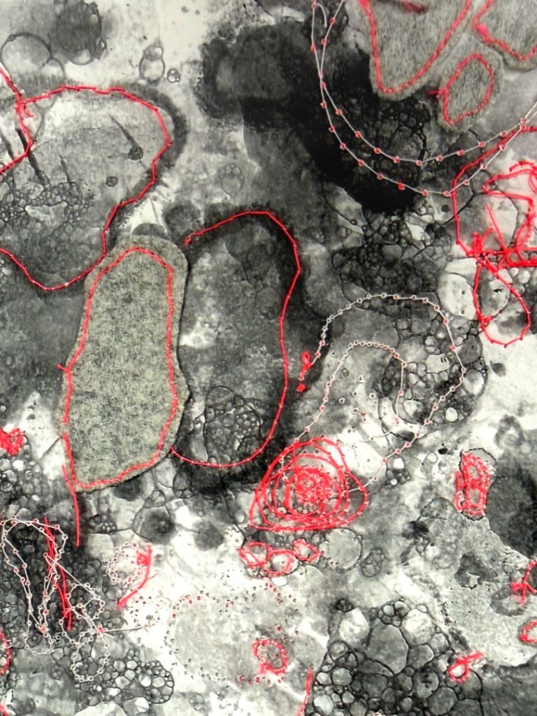
To create the piece, I used embroidery, machine stitching, and assemblage techniques with discarded fabrics and second-hand materials. I layered and reconstructed textile fragments to reflect themes of repair, remembrance, and transformation.
My intention was to transform personal memories into a wearable textile artwork that honours my dad’s presence through objects and shared experiences. By reworking discarded materials into something meaningful, I aimed to explore how textiles can preserve emotional connections and give new life to memories that might otherwise feel lost.
Charlotte Corbett
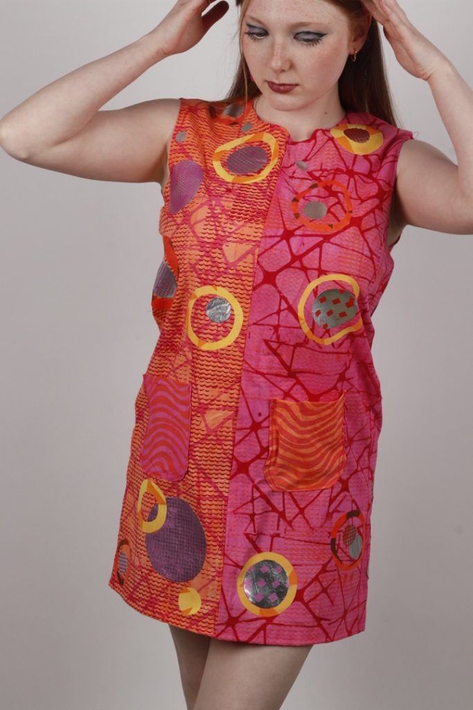
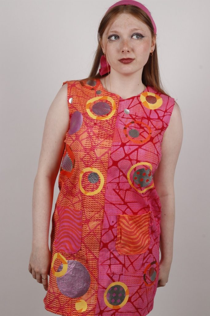
My project explores colour combinations inspired by 1960s and ’70s hippie and psychedelic fashion, with a strong focus on bold patterns and self-expression. I researched designers such as Mary Quant, Emilio Pucci, and Verner Panton, analysing how they use geometric shapes, repetition, and vibrant colours to create visually striking designs.
I was particularly interested in how circles, lines, and organic forms could be repeated and layered to generate movement and energy across a sample. This research deepened my understanding of how pattern and colour can be utilised to create powerful surface designs.
During the development phase, I experimented with multiple textile techniques, including fabric painting, printmaking, tie-dye, and appliqué. I developed both geometric and organic patterns, playing with the scale and placement of shapes to see how they affected the overall composition.
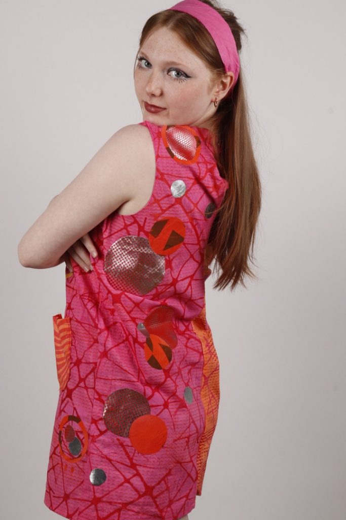
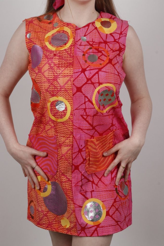
Driven by colour theory, I selected a sunset-inspired palette of oranges, pinks, and warm tones, which kept the collection cohesive while remaining bold and eye-catching. I also drew inspiration from disco imagery—particularly the mirrored surfaces of disco balls—which led me to incorporate layered shapes and reflective fabrics for added texture and movement.
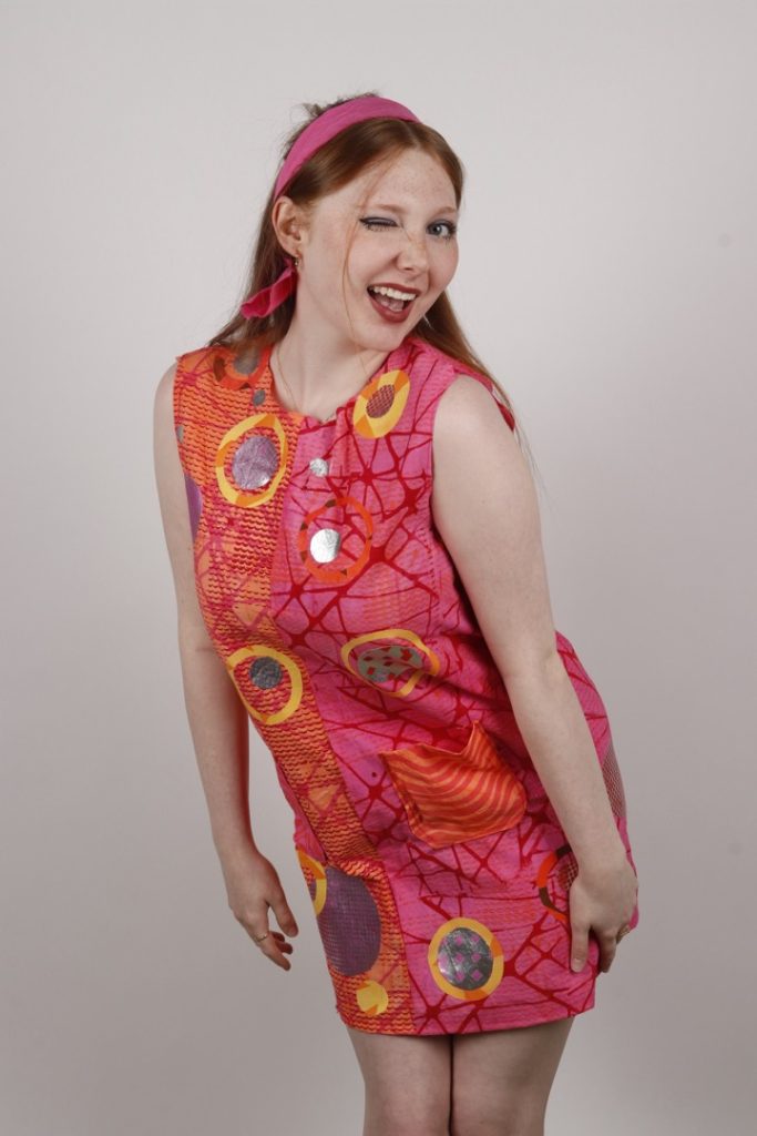
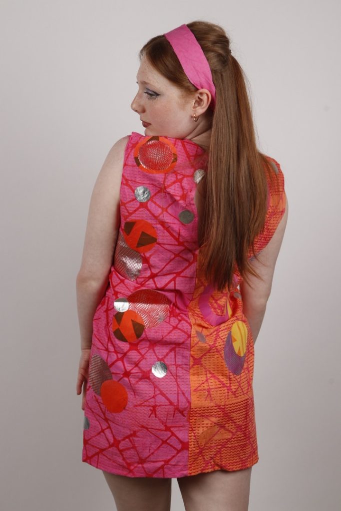
My final piece is a shift dress that marries a classic 1960s Mary Quant-inspired silhouette with 1970s colour and pattern influences. I chose a simple silhouette to ensure the surface design remained the focal point. Using appliqué, I layered various fabrics and shapes to build depth. The repeated circular motifs and contrasting panels proudly reflect my artist research whilst maintaining an original flair.
Overall, my project is successful in demonstrating a clear evolution from initial research to the final outcome. I have synthesised influences from multiple artists and tested various techniques to develop my own unique ideas.
To refine my work further in the future, I would experiment with a wider range of techniques and machine-stitch around the appliqué shapes to achieve a more polished, professional finish.
Brooke Edwards-Dalley
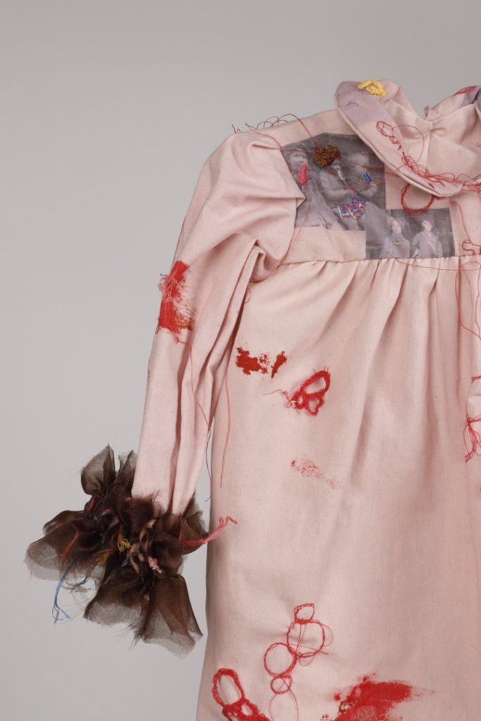
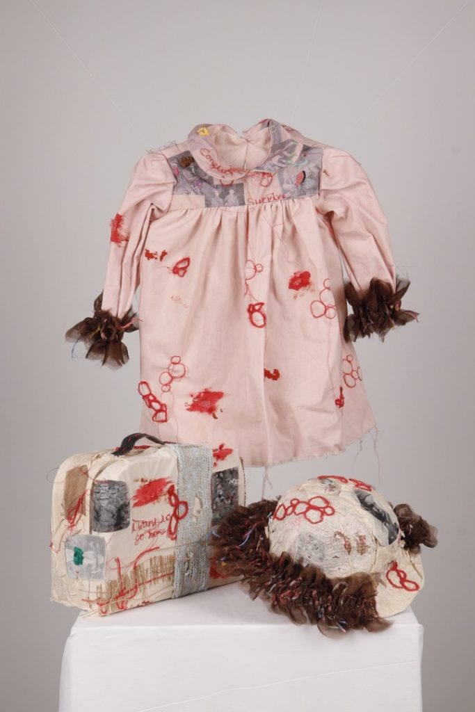
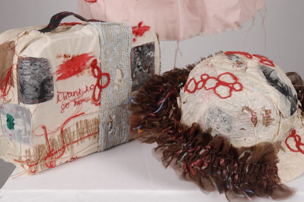
In this project, I explored the theme of protection from a unique perspective: how British children needed safeguarding during the Second World War and their journeys as they fled to safety.
I researched images taken from this era to see what was popular and found that features such as collars, floral prints, dark colours, and gathering were very common during this period.
I created a little girl’s dress incorporating some of these features, adding smocking and embroidery to put my own spin on the style. The smocking is inspired by the dirty, muddy floors the children had to endure, while the colourful embroidery draws attention to the youth and innocence present throughout this period.
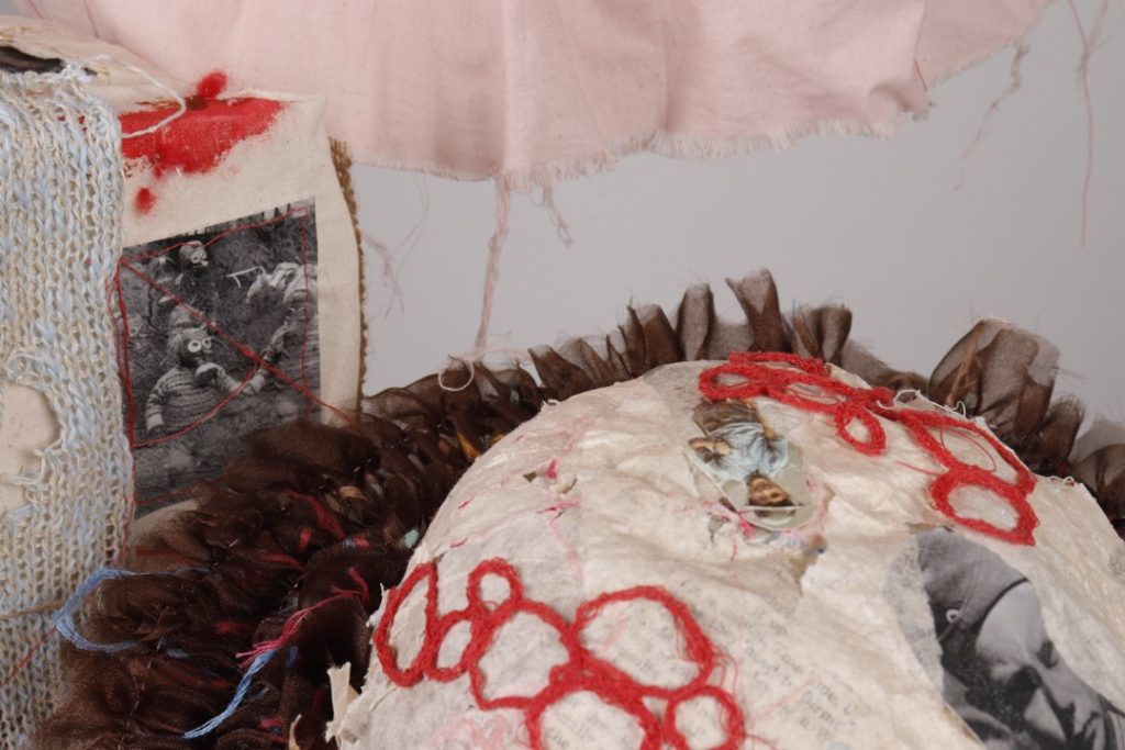
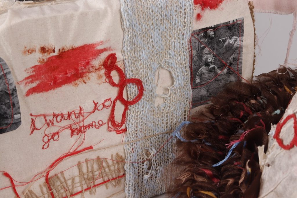
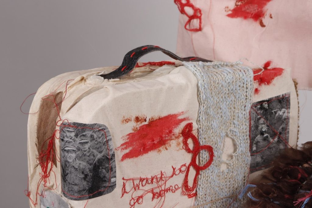
Furthermore, I created a suitcase to illustrate the children fleeing from their homes, alongside a helmet—something many children had to carry around with them for protection during unexpected emergencies.
I incorporated a running theme of red throughout all the pieces to symbolise the bloodshed. I also messily machine-embroidered words onto the objects; this was to make them feel more personal to an individual, as though they had been taken straight from a child living through the war.
Erin Lawley
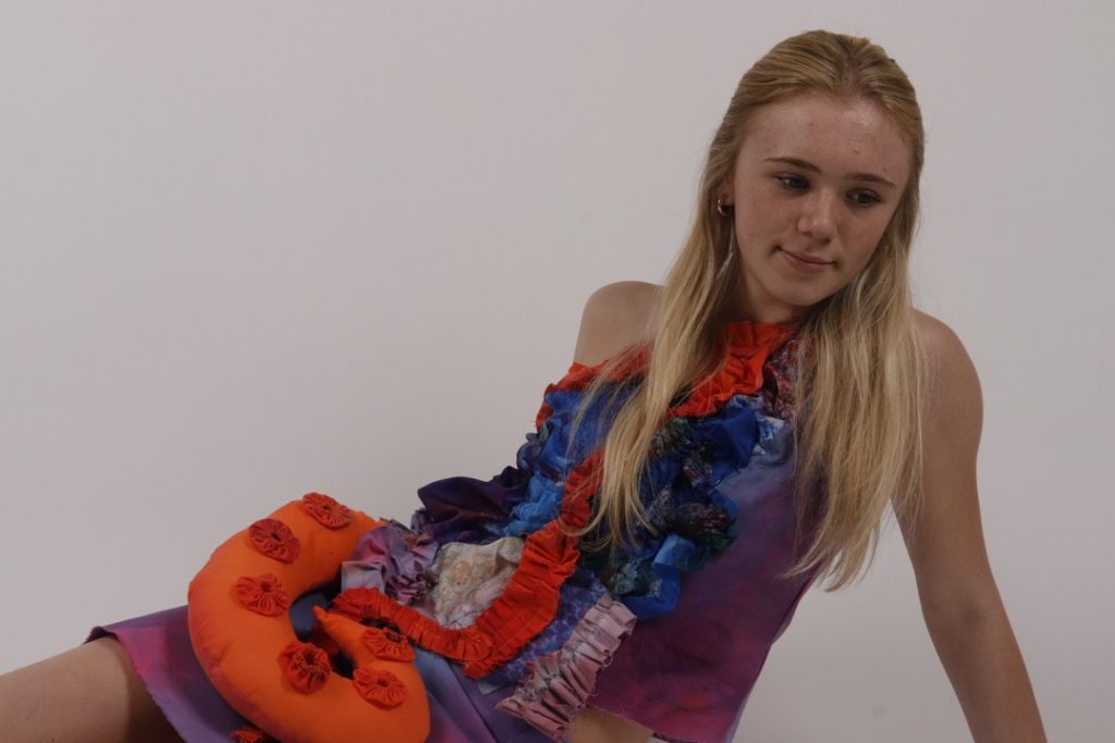
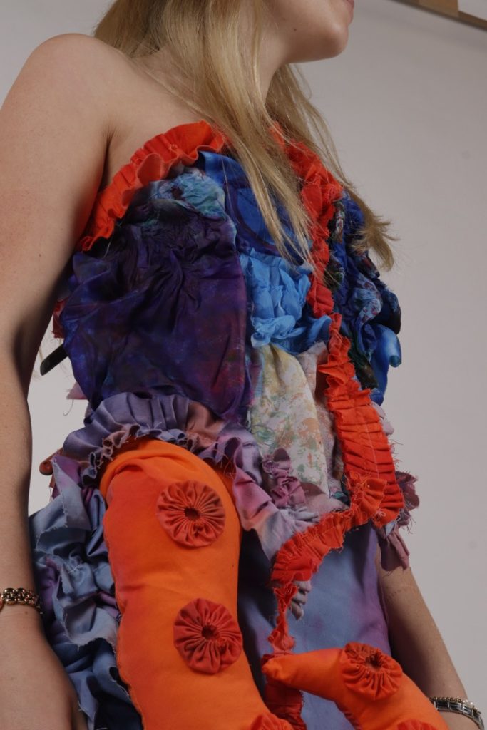
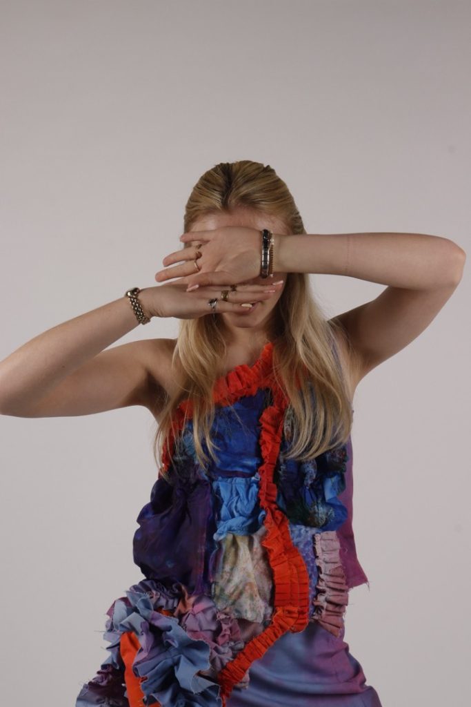
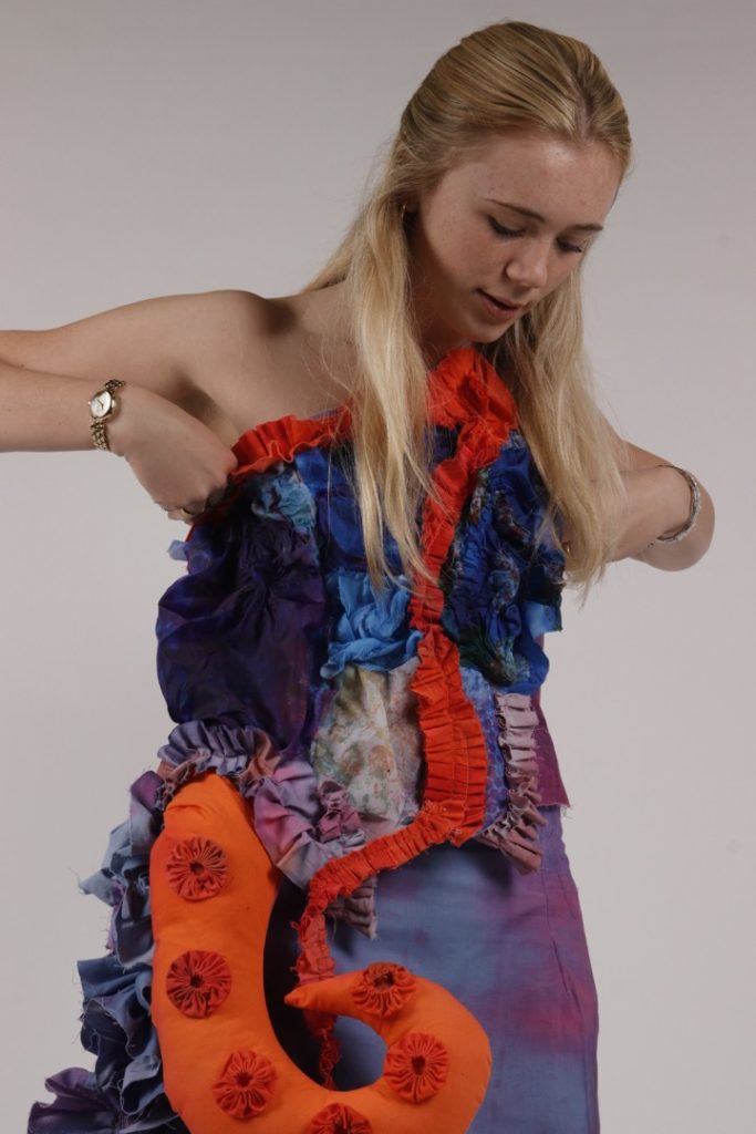
For Component 1, I chose to explore a highly personal theme: my lifelong love for the sea. I developed my sketchbook by experimenting with various textile samples, drawing direct inspiration from the anatomical traits of marine life, particularly octopuses.
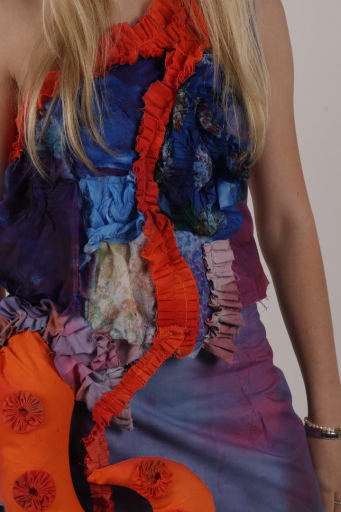
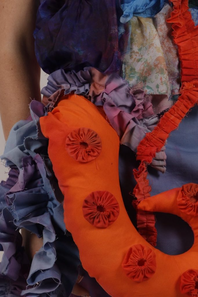
The tentacle became a dominant motif throughout my research, heavily influencing the drafts for my final designs. I knew I wanted to incorporate three-dimensional elements to make the garment visually striking whilst ensuring it remained entirely wearable. Integrating sculptural tentacles alongside voluminous ruffles proved to be a highly effective way to achieve this.
I am immensely proud of the final piece and believe it perfectly captures the essence and movement of sea creatures, just as I originally intended.
Erica Northam
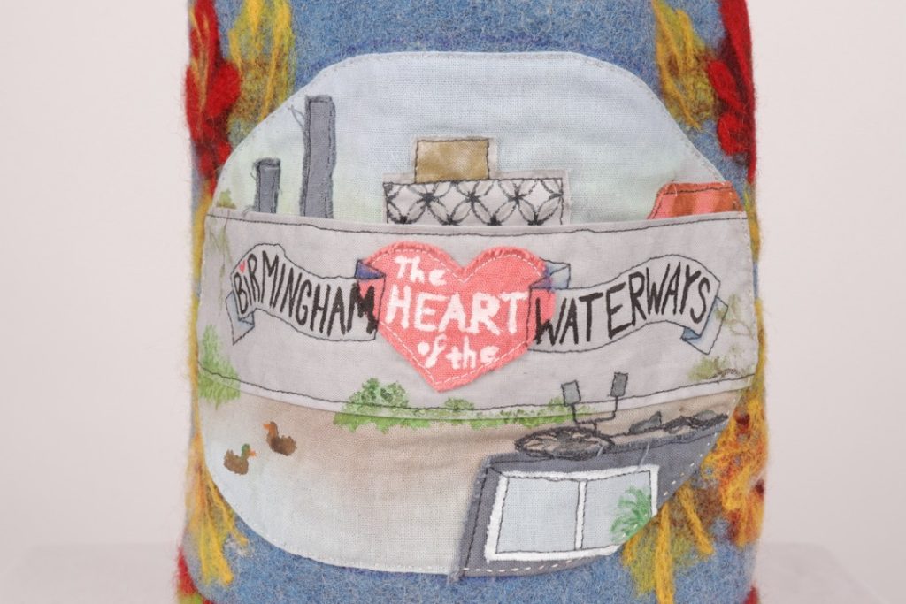
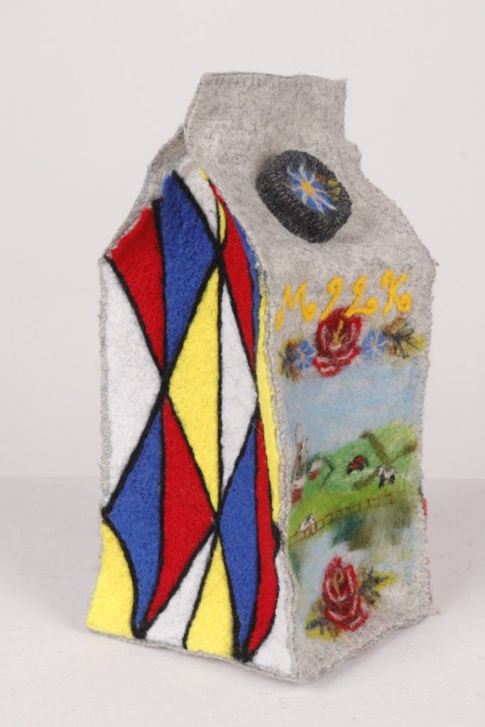
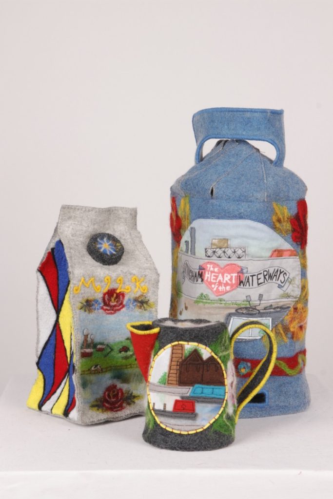
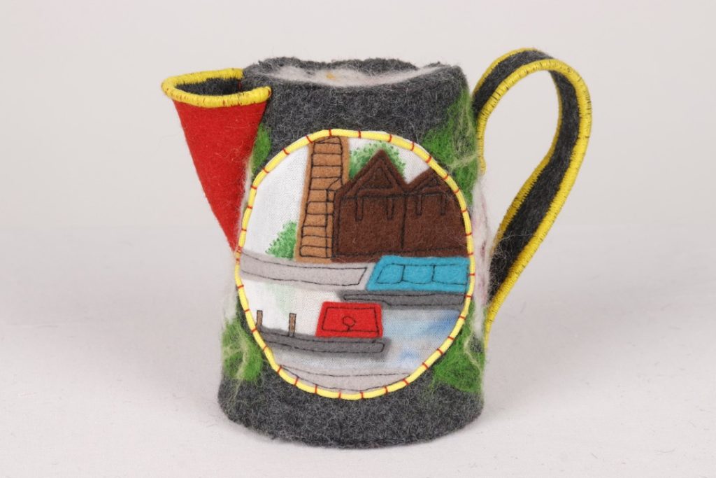
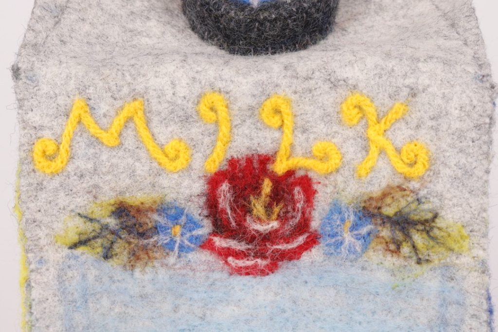
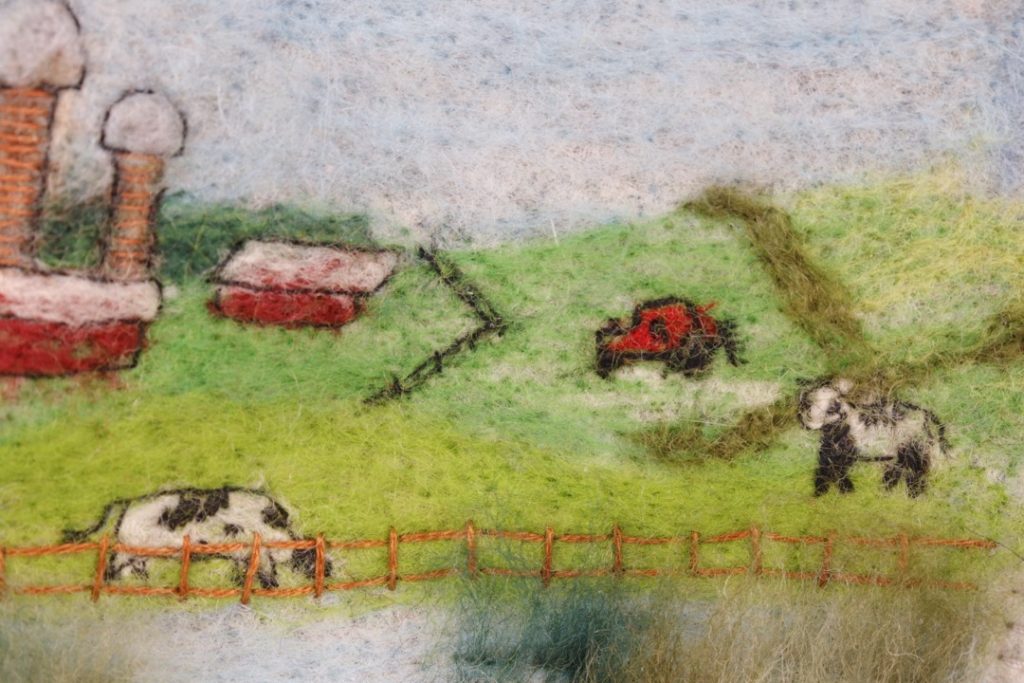
This project explores the theme of ‘Canals and Narrowboats’, which is one of my personal fascinations. I wanted to investigate both rural and urban canal imagery, different boat types and interiors, vivid boat painting, ‘Roses and Castles’ canal folk art, and the industrial history of waterways.
These felt objects were designed to resemble historical bargeware (a ‘Buckby’ watering can) as well as objects that might be found on a modern narrowboat (a butane canister and a milk carton), embellished with patterns inspired by Roses and Castles. Relevant canal landscapes are featured on them, with details such as animals, plants, and local buildings.
I used dyed and printed fabric for my backgrounds, alongside appliqué, painting, and embroidery to create detail, and lots of hand felting for the floral patterns. Having experimented with multiple techniques and investigated many aspects of my theme, I synthesised them into a collection of appealing, colourful, detailed items that celebrate life and history on the waterways.
Caitlin Quaife
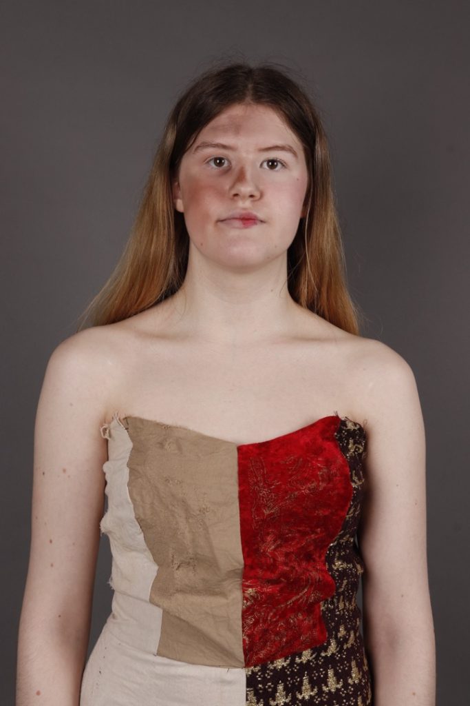
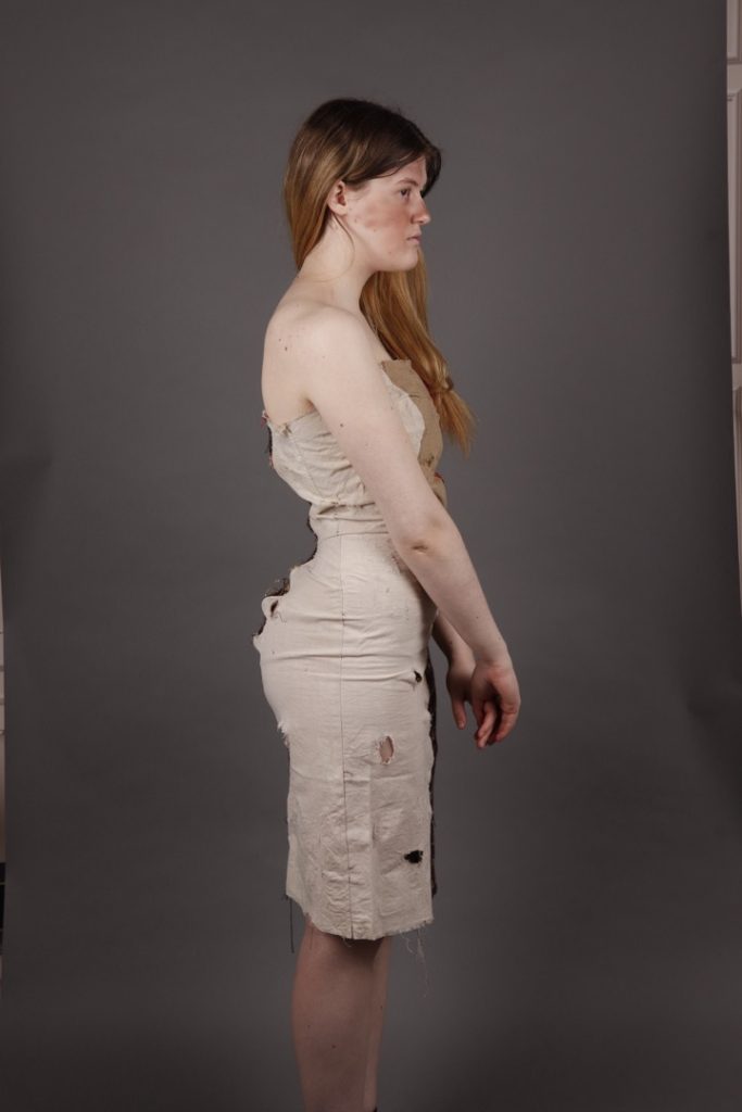
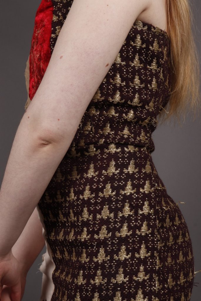
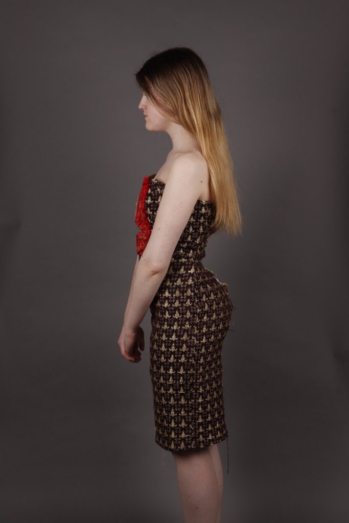
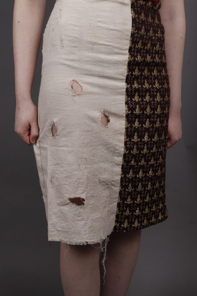
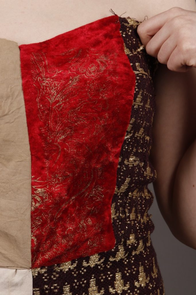
This piece is about opulence and the contrast between the poor and the rich.
I wanted to create something that looked magnificent. The reason rich clothing looked so beautiful in the past was due to the time taken to make it, but also the extreme separation between the poor and the rich.
I decided on a half-and-half dress, which shows that separation with a line down the middle. The poor side has rips and holes all over and uses tan fabric, showing the difficulty of keeping clothes clean, whereas the rich side has intricate hand-woven fabric with gold, alongside detailing on the front of the bodice which has taken a lot of time.
In the past, the quality of life was so different, and I really wanted to show that in this piece; alongside the lavishly rich, you also had the underpaid, terrible working conditions of the poor.
Madison Thornsbury
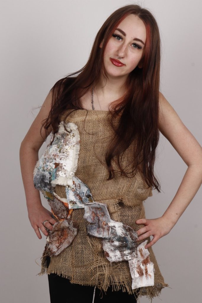
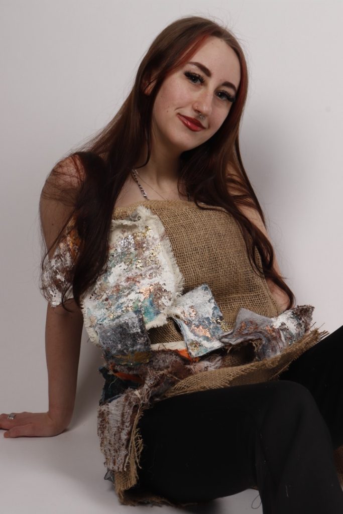
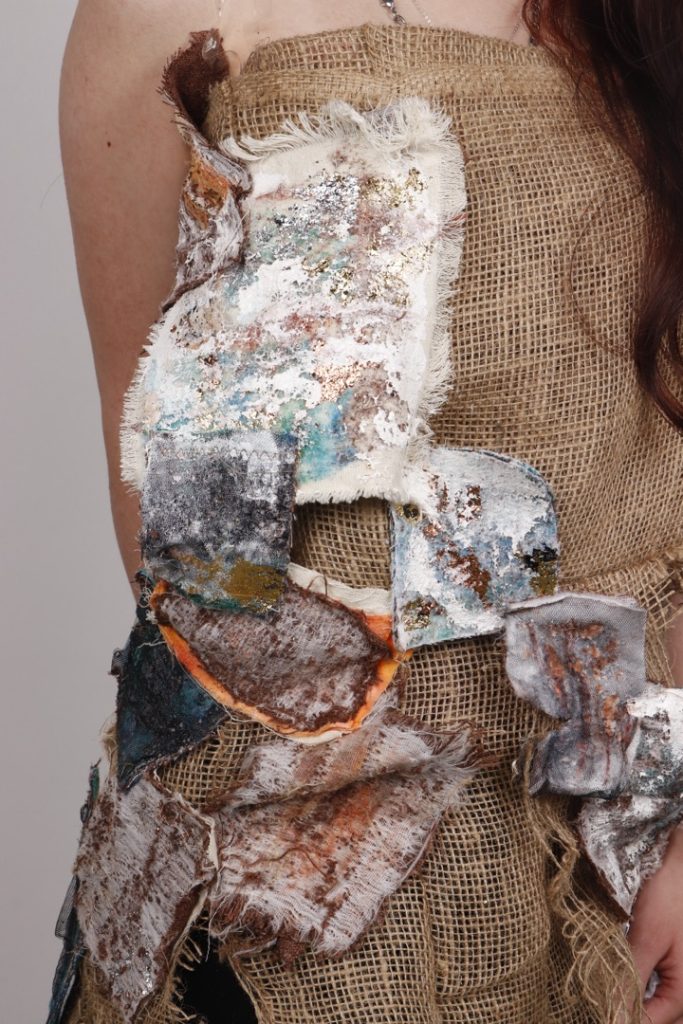
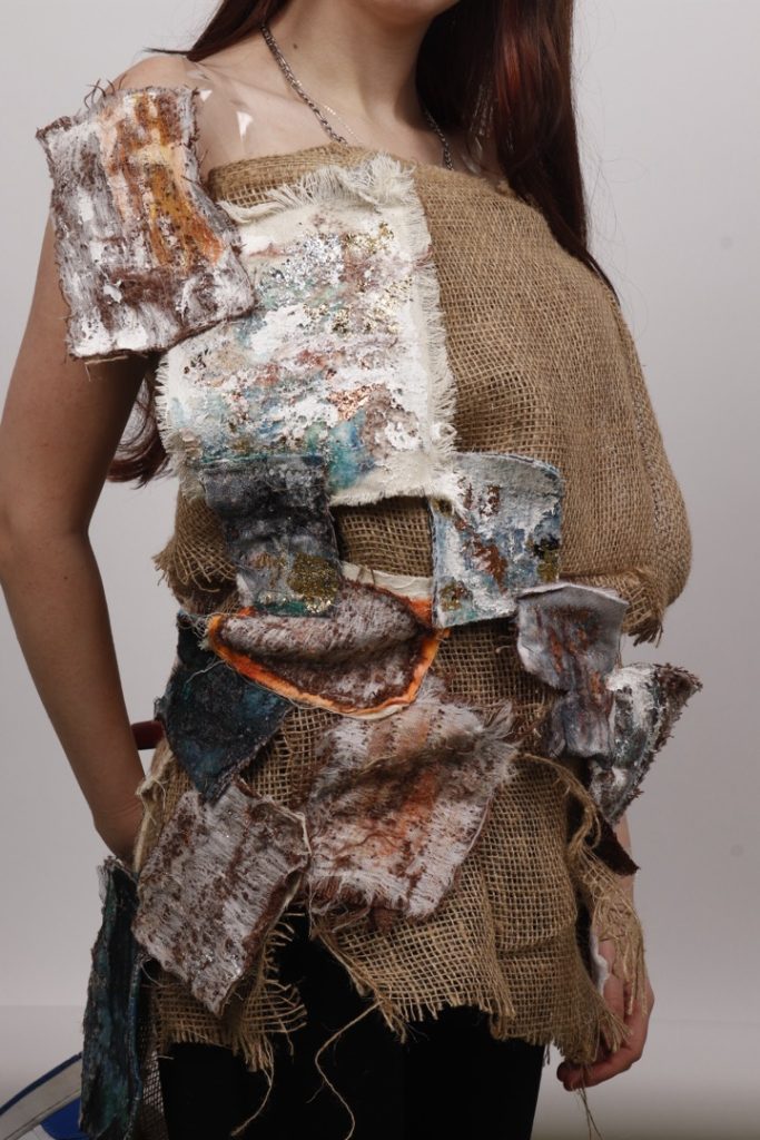
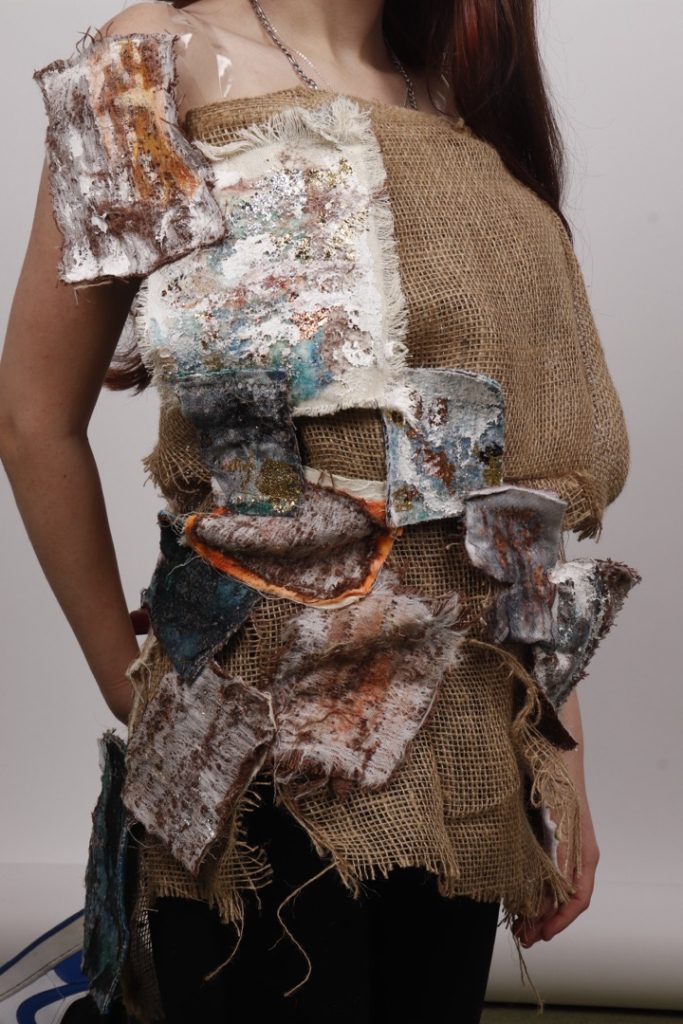
This textile garment explores the concept of surplus and discarded materials, and how they can have patterns and textures that make for beautiful and unique garments. This was done by treating the visual effects of erosion and rust as a symbol that anything can be considered beautiful.
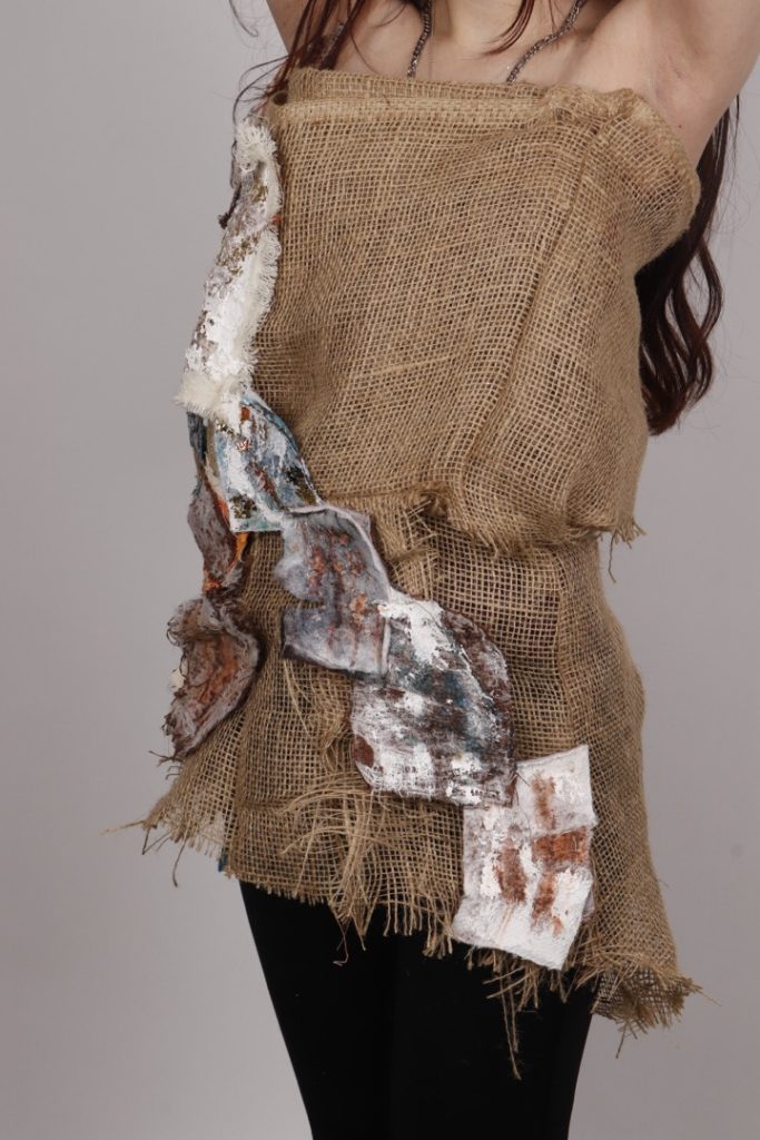
To capture the organic beauty of neglected products, I used hessian fabric—something that would typically be used to transport items such as potatoes and then discarded—as a layered base. I added textures resembling peeling paint and jagged rusted metal using fabrics in a suitable colour scheme of mainly oxidised copper.
The silhouette is intentionally bulky and irregular to mimic the unpredictable patterns that are often found in things left to decay. This work is a way of proving that anything, neat or messy, can always contain beauty.