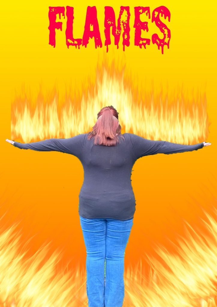
LEVEL 2 CREATIVE MEDIA 2026
GROUP A | GROUP B | GROUP C
As part of this year’s Dudley College ArtsFest, Level 2 Creative Media Skills learners proudly present their final major project, inspired by the powerful and enduring theme The Four Elements.
Commissioned to produce work for digital exhibition, learners have embraced this brief with imagination, ambition and creativity, developing original responses that celebrate both the natural world and personal interpretation.
The collection showcases a vibrant range of digital media, including photography, film, graphics and concept art. Each piece reflects a journey of exploration and experimentation, demonstrating growing technical skill, creative confidence and a strong sense of visual storytelling.
Natalya Barton, Creative Media L2 Tutor
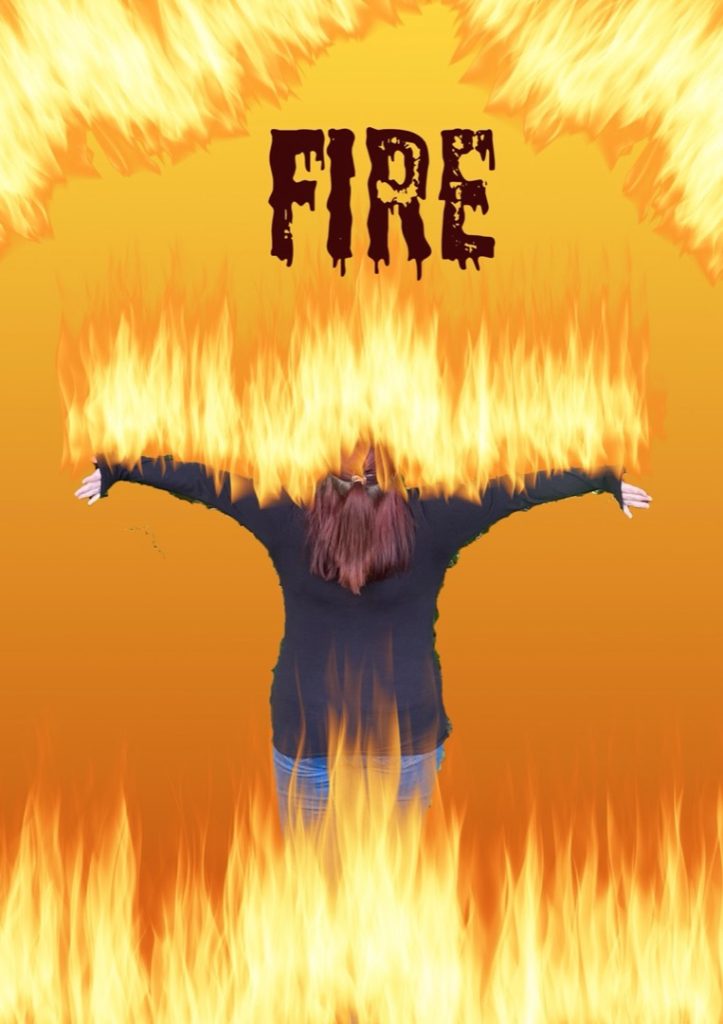
GROUP A
Mohammed Ahmed
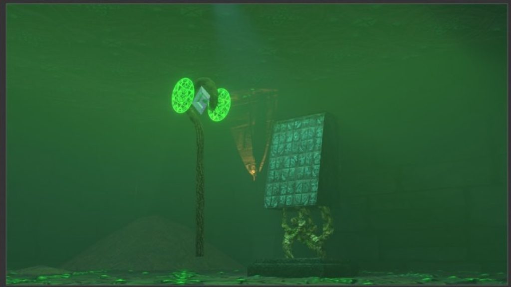
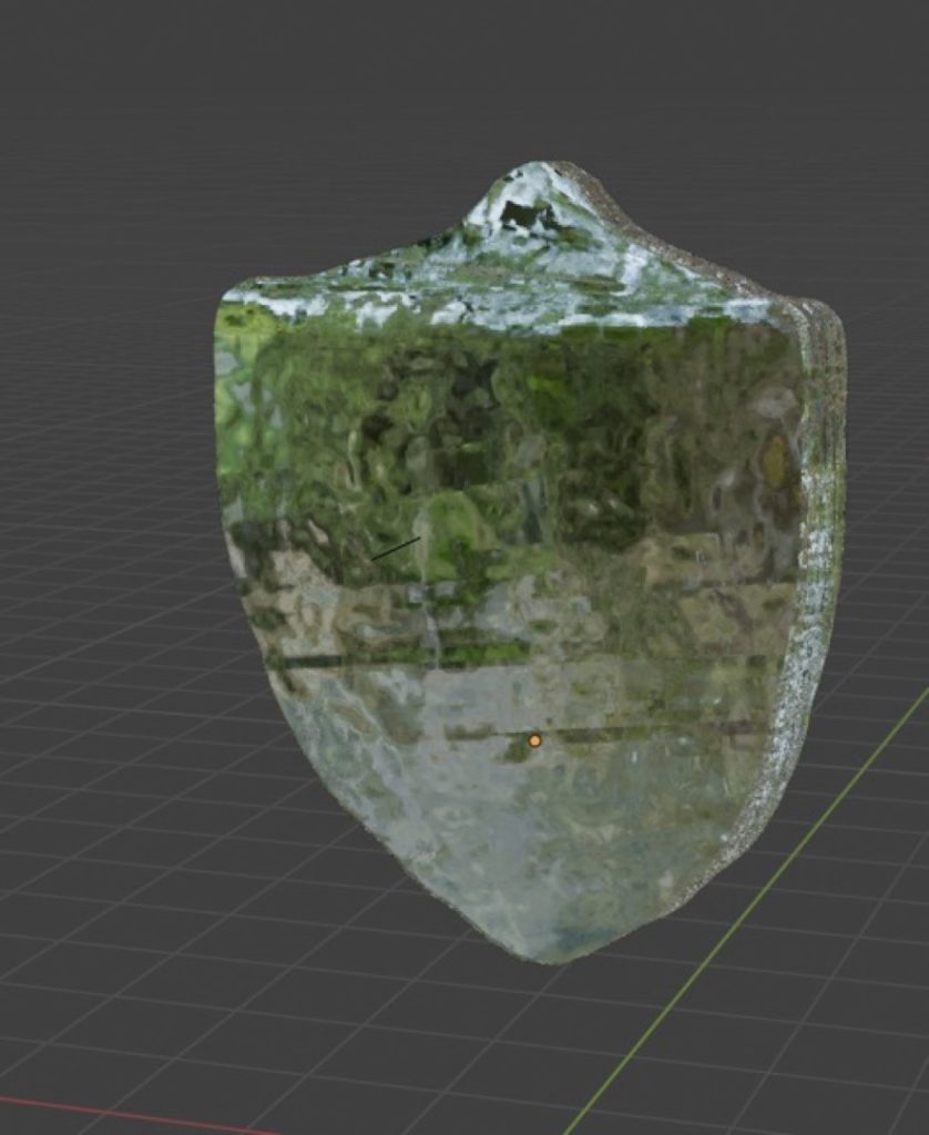
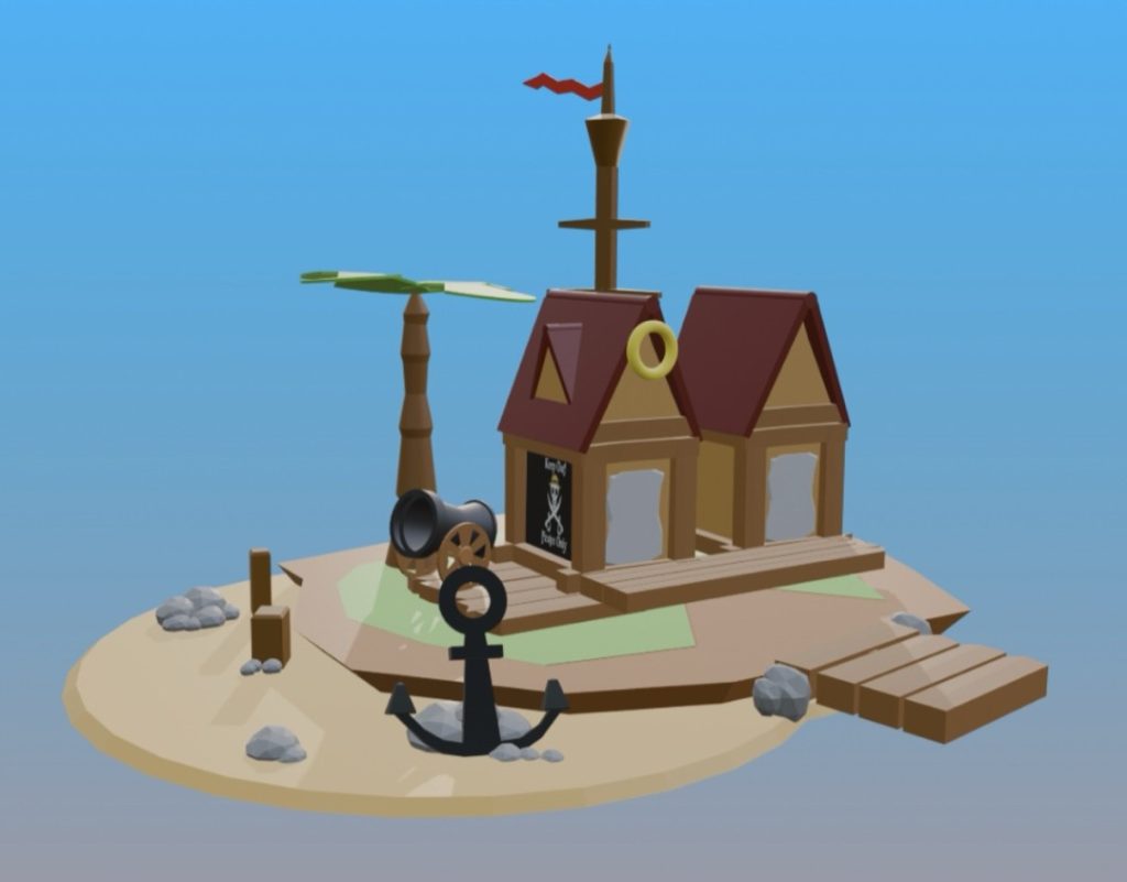
For this project, I chose to tackle all four elements to challenge myself and allow for complete creative freedom. My primary objective was to step out of my comfort zone to develop my existing skills in Blender while mastering entirely new techniques.
Throughout the process, I experimented extensively; for instance, I utilised the Grease Pencil tool to give 3D objects a 2D, illustrated appearance and to emphasise a highly artificial aesthetic. I also pushed myself to adopt tools I had previously avoided, setting my ego aside to grow as a digital artist.
While I initially attempted to animate the project—which was an incredibly fun learning process—hardware limitations unfortunately meant I could not render the final animation. However, I successfully taught myself how to build immersive scenes for each individual asset.
Driven by a desire to explore new technical territory, I also learned how to build custom shaders to achieve my final, highly stylised look.

Dwaine Bauwise-Haywood
I created this project because I was heavily inspired by the photographer Edward Burtynsky. I felt that focusing on photography would be the best way to explore my ideas.
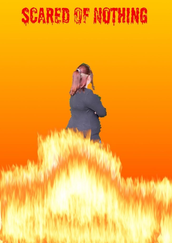
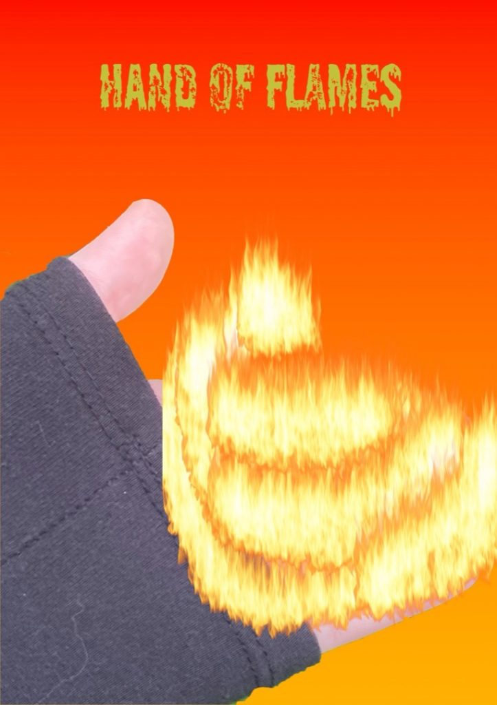
The element that inspired me the most was fire. I feel that fire is excellent for capturing intricate detail, making the photographs much more interesting for the viewer.
During the process, I used various techniques such as dark lighting and experimented with different camera angles. I chose these techniques to make the images more engaging for the audience, as I feel it creates a much more unique and distinct style compared to others’ work.
Overall, I think the entire project went really well. I am particularly proud of the variety of pictures I produced and feel that my chosen photographic style was very successful. Next time, however, I would definitely aim to improve my editing skills in Adobe Photoshop. I feel I could have added more detail to the images to make them even better.
My initial ideas changed throughout the project, largely due to the peer feedback I received. Janna and Meredith provided really helpful advice that shaped my final piece; Janna suggested cropping my images more to make them easier to view, while Meredith also gave me solid constructive feedback. Ultimately, my biggest professional influence remained Edward Burtynsky, as his unique and inspiring photography pushed me to create better work.
Demi Bourne
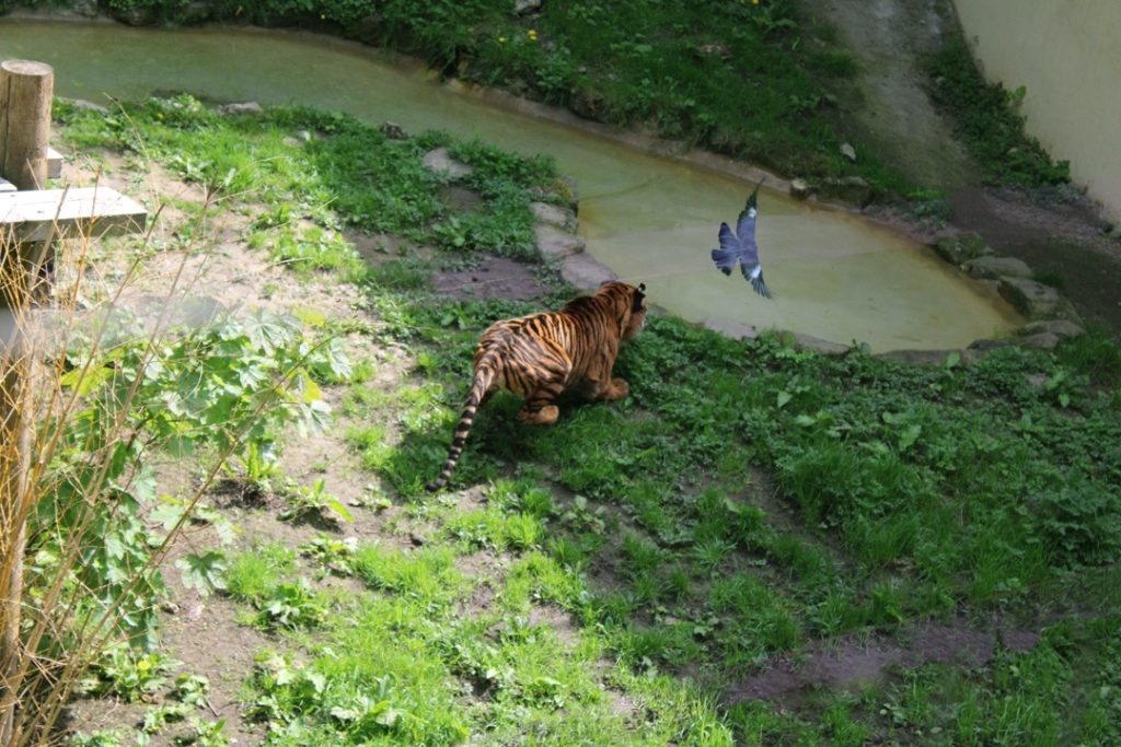
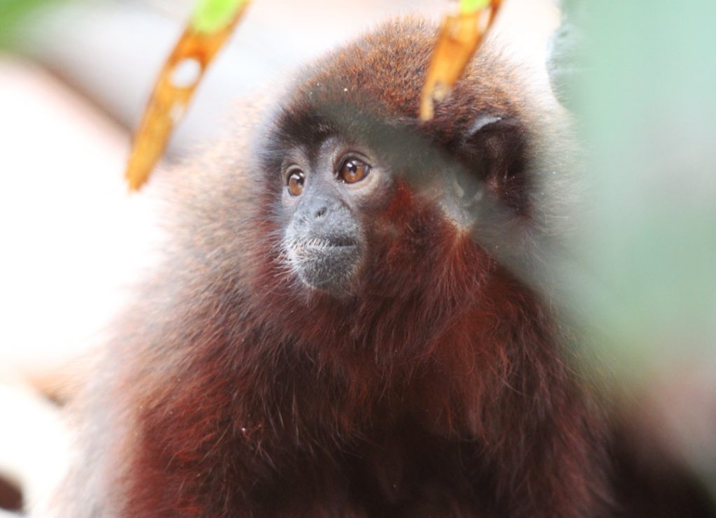
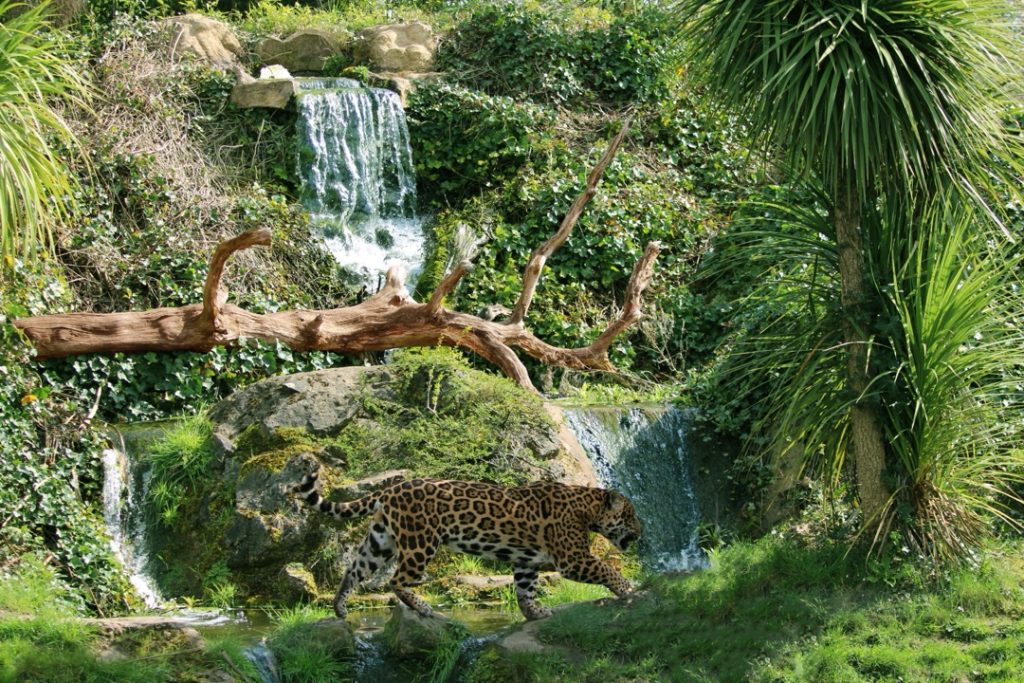
For my final project, I took inspiration from the photographer Danny Green, which led me to focus on all four elements. This seemed the most fun and fulfilling concept to try and achieve, especially as I want to go into wildlife and nature photography; it taught me a lot about editing and camera settings for those types of photos.
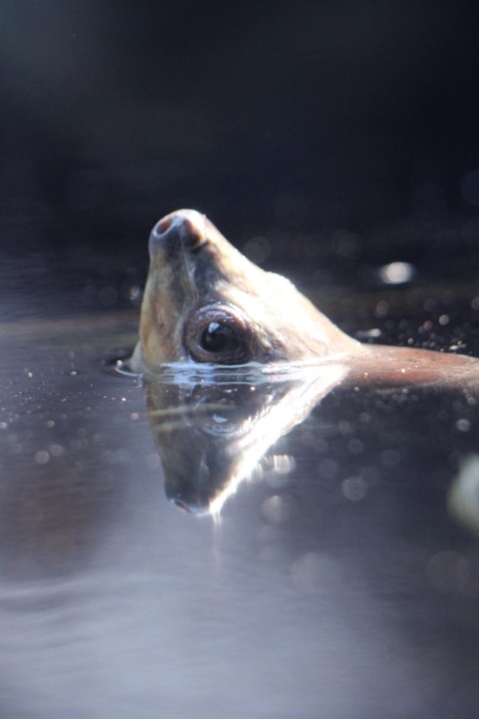
I wanted to show the connections between animals and the elements, as all animals have personality traits that link to them, much like humans do. I represented this through my chosen photos. For example, my ‘fire’ photo features a tiger pouncing at a pigeon, showing a fierce predatory response. In other shots, such as the photo I took of a coppery titi monkey, I made sure to capture catchlights in the subject’s eyes—a technique that can also be seen in the painted batagur photo.
Donique Clarke-Mason
I made this because I wanted to feature fire and water and represent them in a metaphorical way. I used two characters to portray them, with two distinct personalities: Fire being angry and passionate, and Water being calm and chill.
The elements that inspired me were fire and water; I just feel they are the best elements to choose to highlight the stark differences between them.
The techniques I used in my film included close-ups, tracking shots, medium shots, and wide shots. I used these to show more of the surroundings, and utilised close-ups so the audience could see the emotions on the characters’ faces more clearly.
What went well was definitely the camera work, particularly the end scene when Fire got angry and started crashing out everywhere. Next time, I could improve by adding more dialogue for Water. Having Water speak more would help to show his emotions better, which I think would be a good addition.
During the project, my idea changed. Initially, it was just going to be me playing both Fire and Water, but I obviously needed an extra student to make it more realistic. I couldn’t just have myself on screen; it wouldn’t have looked as authentic. So, I changed my plan by bringing in a background character.
A professional influence that helped me was a short film called The Weatherman and the Shadowboxer. It shows the differences between two characters and links closely to my own work. Finally, the feedback that made me change my piece came from Janna. She gave me great advice, and I acted on it.
Freya Cook
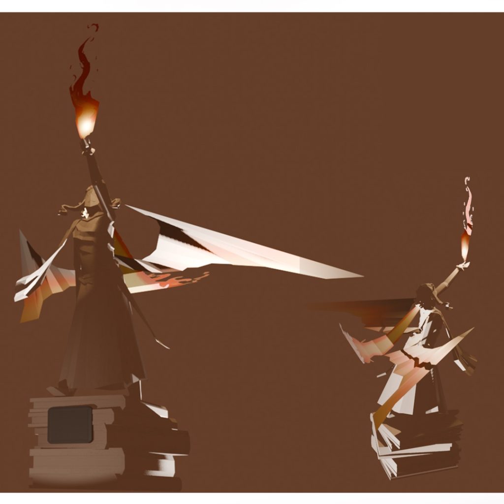
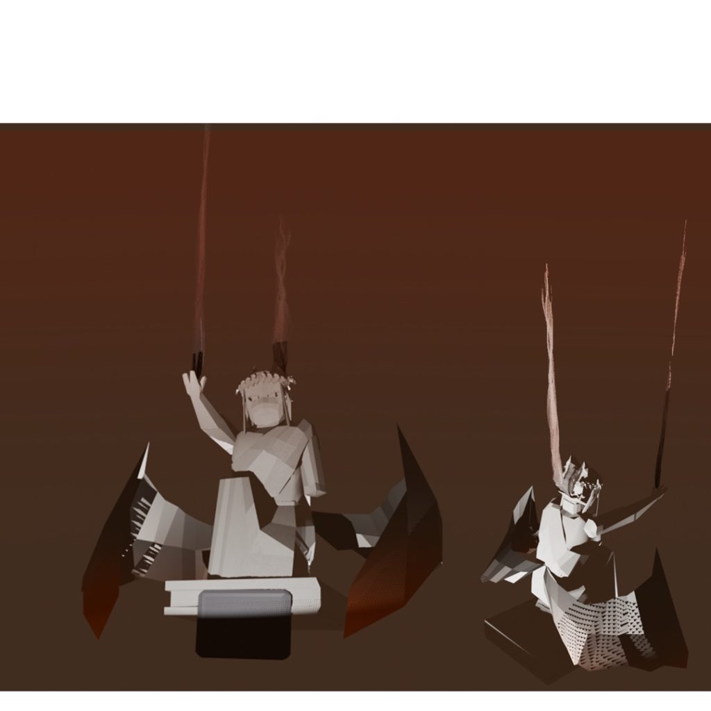
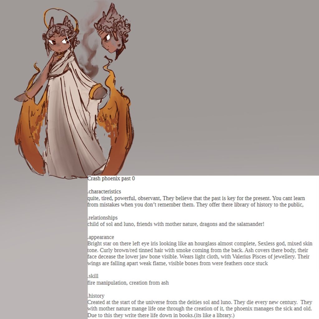
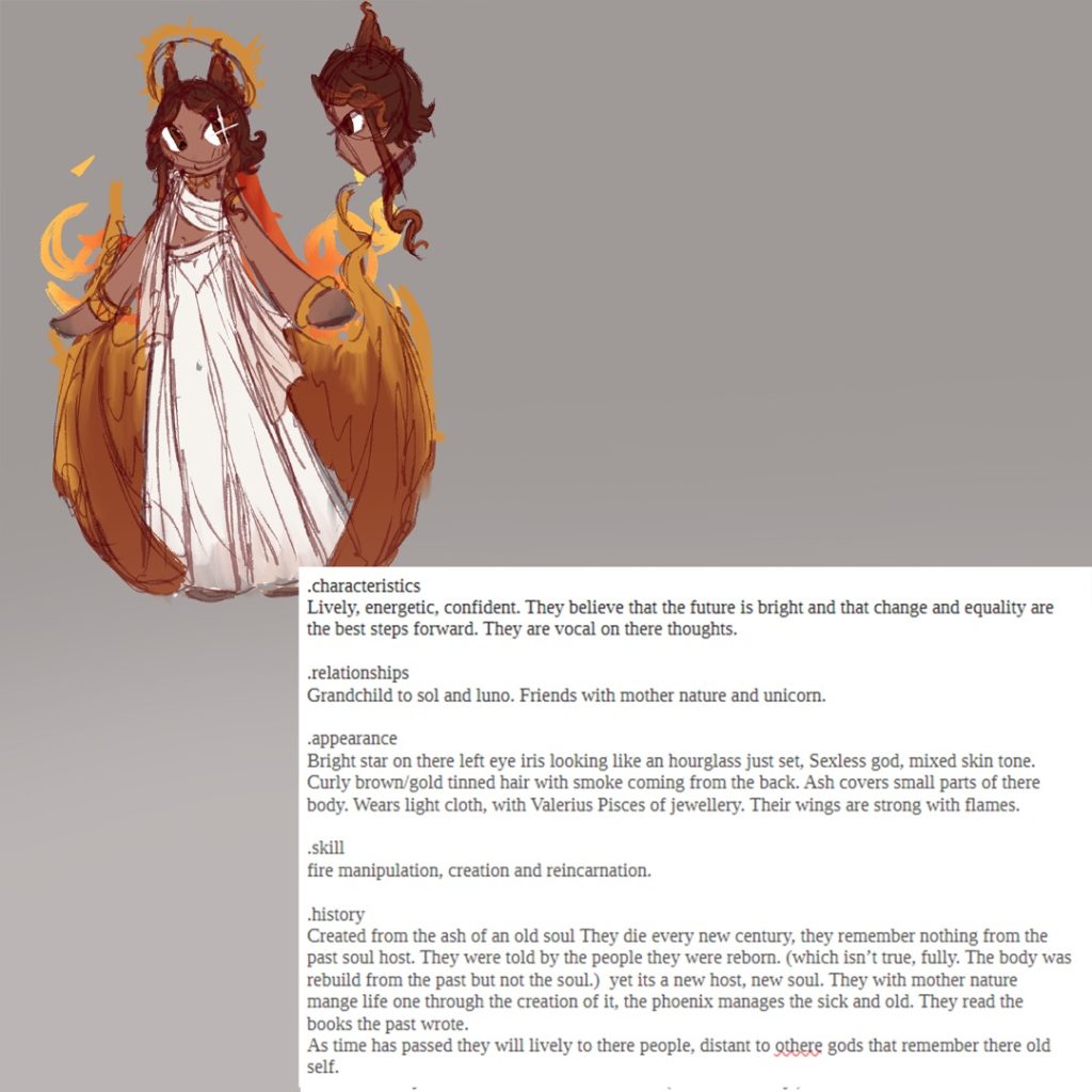
For this project, I’ve created two characters, illustrations, and 3D models, all based on the elemental theme of fire. I chose this element as I find fire more interesting because of how it stands out from the other elements. Nature and wind were already here; fire was discovered.
I represented this element through folklore, mainly the phoenix. I wanted to show the life of fire—its beginning and its end. The phoenix is a great example of that through being a symbol of mortality and rebirth. I thought it would be interesting to explore this theme within my character designs as well.
I used multiple techniques across the 3D models, character art, and illustrations. When refining the 3D models, I used the extrusion tool, loop cuts, and the occasional knife tool, too. I based the character designs on striking silhouettes and a warmer colour palette to make them visually interesting. For the illustrations, I used custom brushes to speed up the workflow, alongside layer effects like ‘outline’ and ‘add (glow)’.
Finally, I learned how important it is to plan out my art efficiently to make the most of my available time. It speeds up the process, and I think if I hadn’t done this, I wouldn’t have loved the project as much!
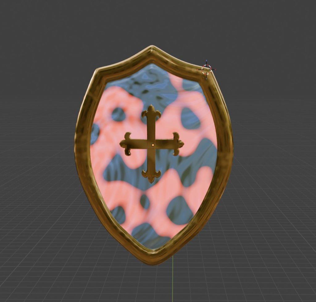
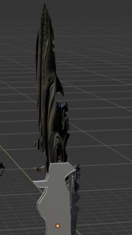
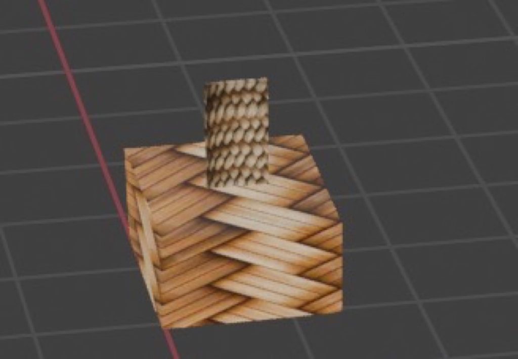
Alan Czerwinski
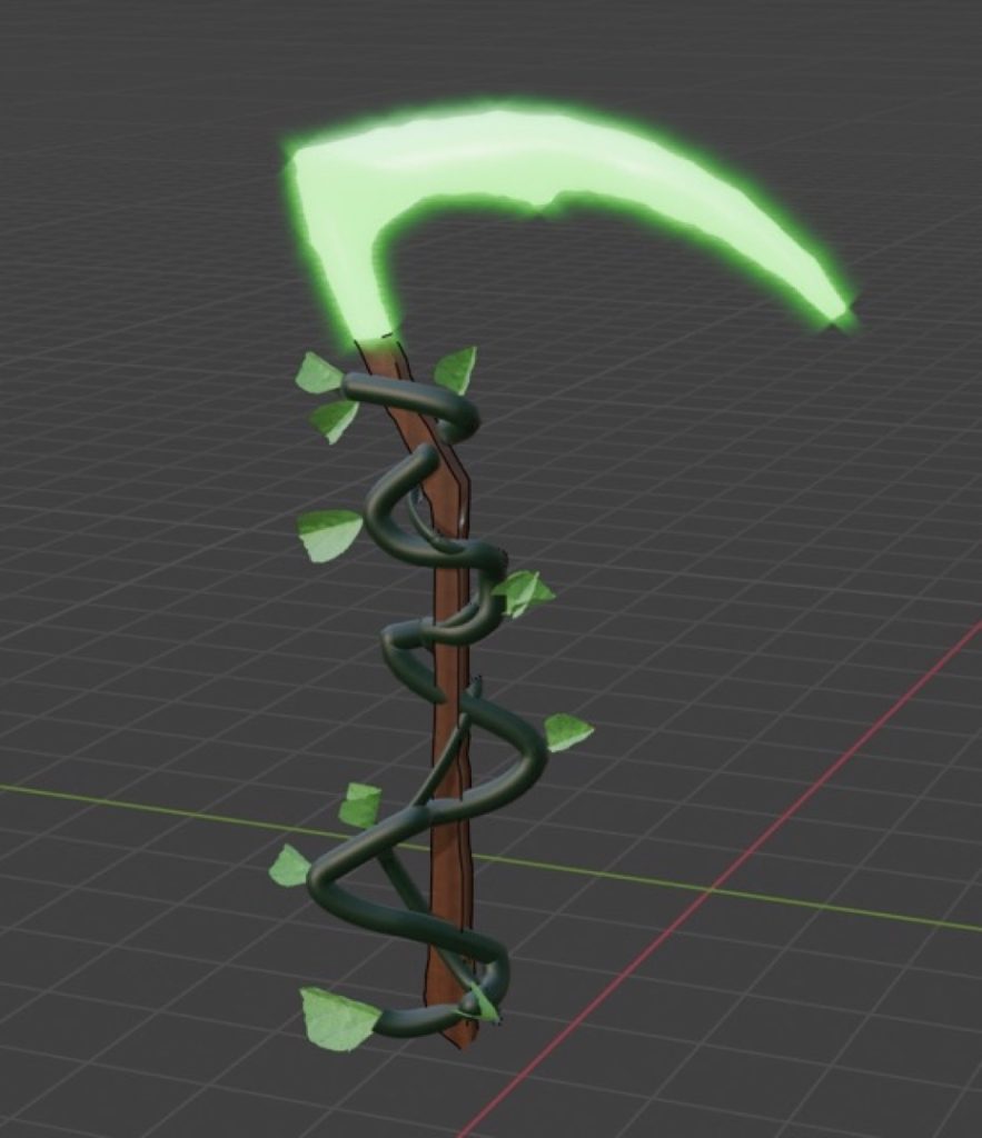
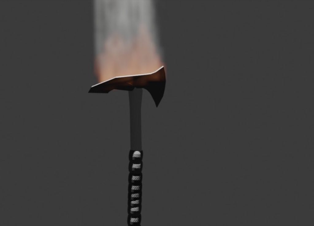
For this project, I chose to focus on medieval-era weaponry, drawing direct inspiration from my previous work. I wanted my models to embody the element of fire, representing themes of aggression, power, and destruction. To convey this, I utilised sharp, jagged edges and bold, imposing designs. My ultimate goal was to ensure the weapons felt intense, dangerous, and infused with heat energy.
To design and model the assets, I primarily utilised 3D modelling techniques such as extruding, mirroring, and loop cuts. I then used timeline editing tools to bring the models to life through animation. I focused heavily on shaping the weapons to strike a balance between creative fantasy and grounded realism.
While I attempted to integrate fire effects, I found the process technically challenging and could not fully realise my initial vision for the flames. As I had limited access to tutor support during this phase, I relied on peer review, seeking constructive feedback from my classmate, Mohammed, which proved incredibly helpful in refining my work.
Overall, the animations were successful, the core design is strong, and the models effectively communicate the theme of fire. If I were to revisit and improve this project, I would dedicate more time to mastering realistic fire simulations and further develop my shading skills to achieve a higher-quality finish. While my core concept remained consistent throughout the project, I continually refined the details in response to the peer feedback I received.
Rhyley Davis
Leah Davies
I chose the element ‘Earth’ because I wanted to create a short film that shows the beauty of Barbados. The meaning of my work is to show the culture and what you can get up to in Barbados. The techniques I used included different shot types, such as long shots, close-ups, and medium shots. The lighting was bright and sunny, which connotes the happiness that Barbados brings to you.
I used a range of different editing techniques, such as the cutting tool and adding text. I also added music from Pixabay and a range of transitions, which I did using Premiere Pro. From this project, I have learned how to successfully create a film by using a range of editing and filming techniques, so that my audience can get an insight into the beauty of Barbados and the culture behind it.
Jana Edwards
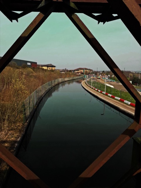
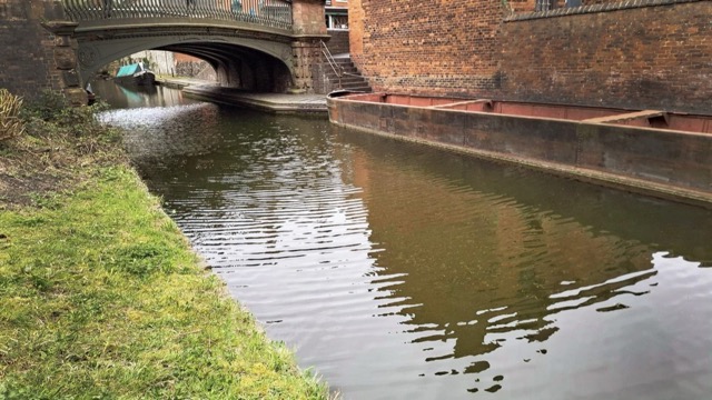
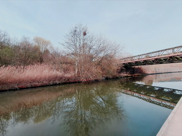
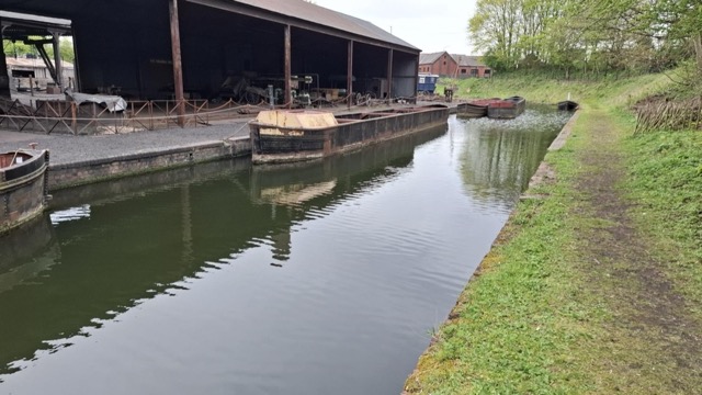
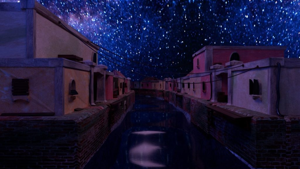
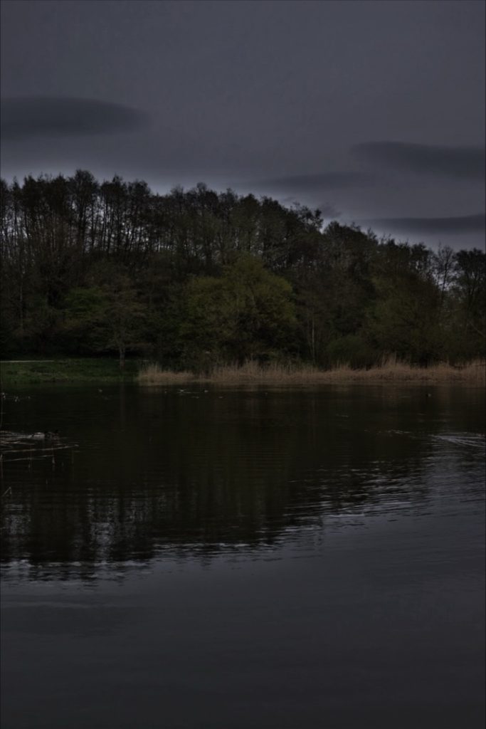
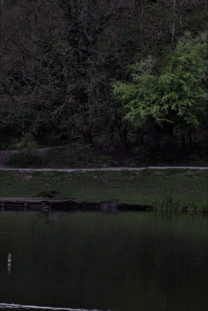
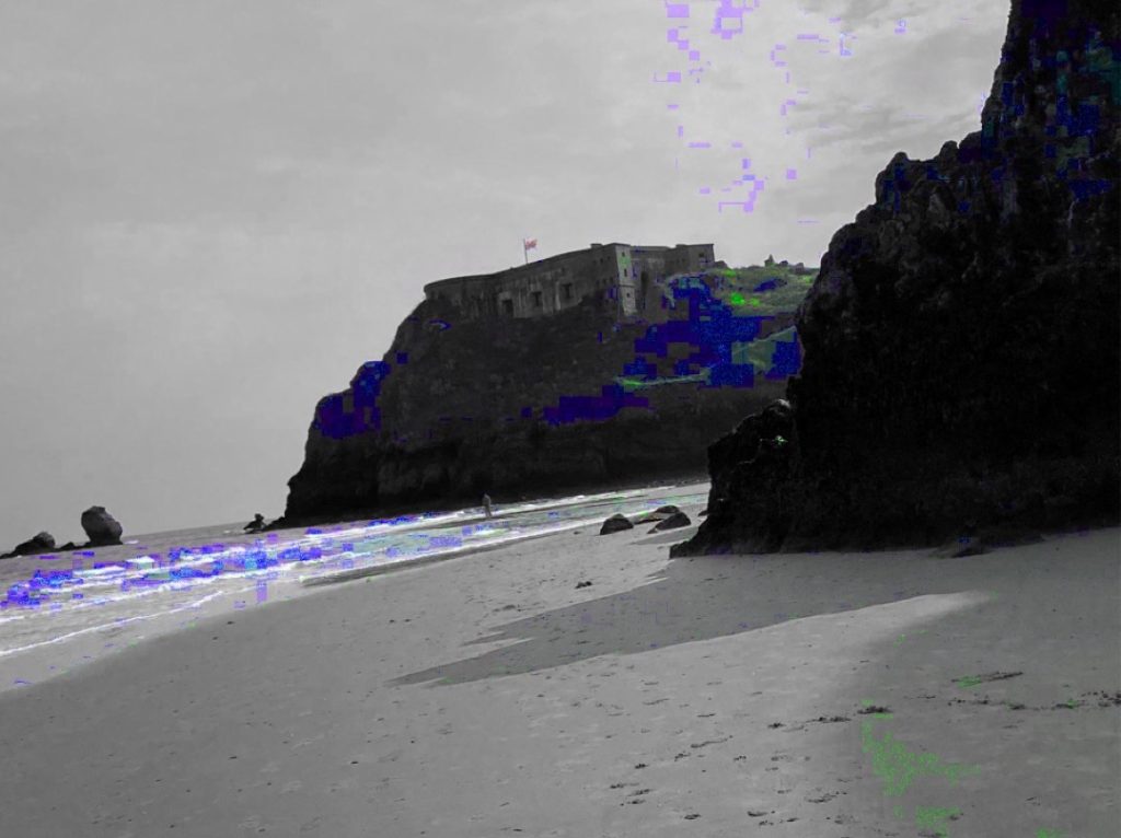
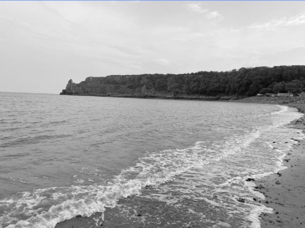
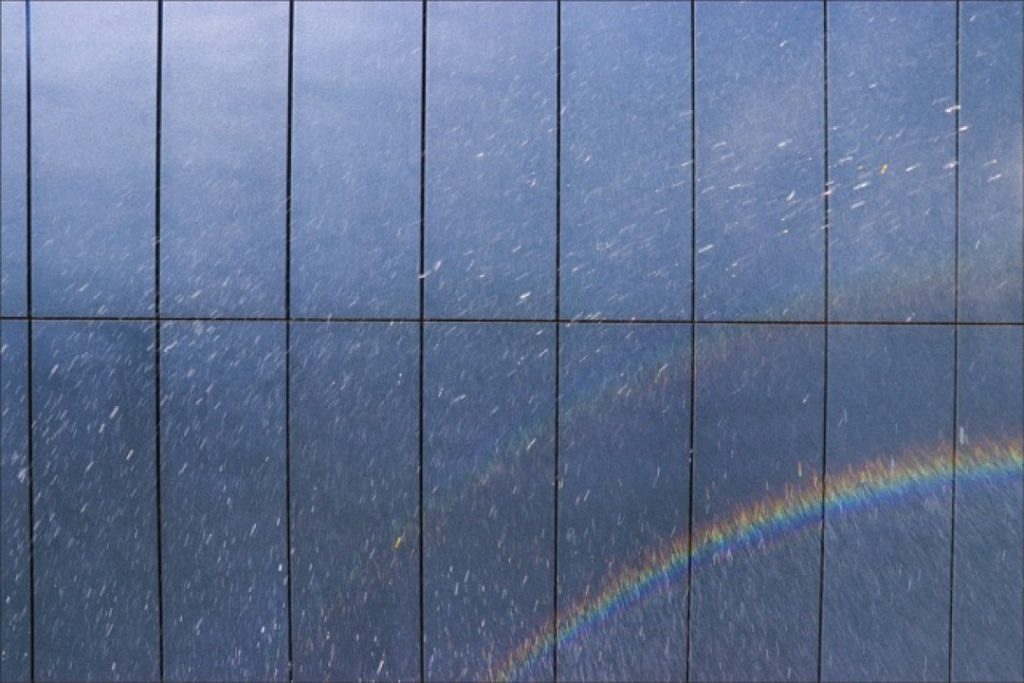
For this project, I chose to look at the elements of water and earth—with water being the primary focus of my photography. I wanted to highlight that there are many water sources in Dudley, a key part of the industrial Black Country. My work is centred on the Dudley No. 1 Canal, the Dudley No. 2 Canal, and the waterways at Dudley Zoo. The Black Country Living Museum features a canal as well, which was also a major source of inspiration for me.
I was inspired by Toshio Shibata; his work showcases the ‘intersection of nature and man-made infrastructure’, such as dams and bridges, a theme I have mirrored with my own refinements. I drew further inspiration from his work by ensuring water remained the dominant element in my frames. I took my photographs at key waterways around Dudley and the wider Black Country, as well as across the Caribbean. These locations included the Black Country Living Museum, Dudley Zoo, and a spot in the heart of St Thomas in Jamaica.
Meredith Holland
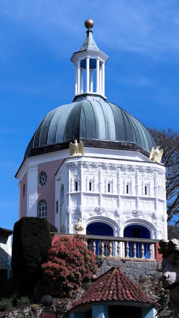
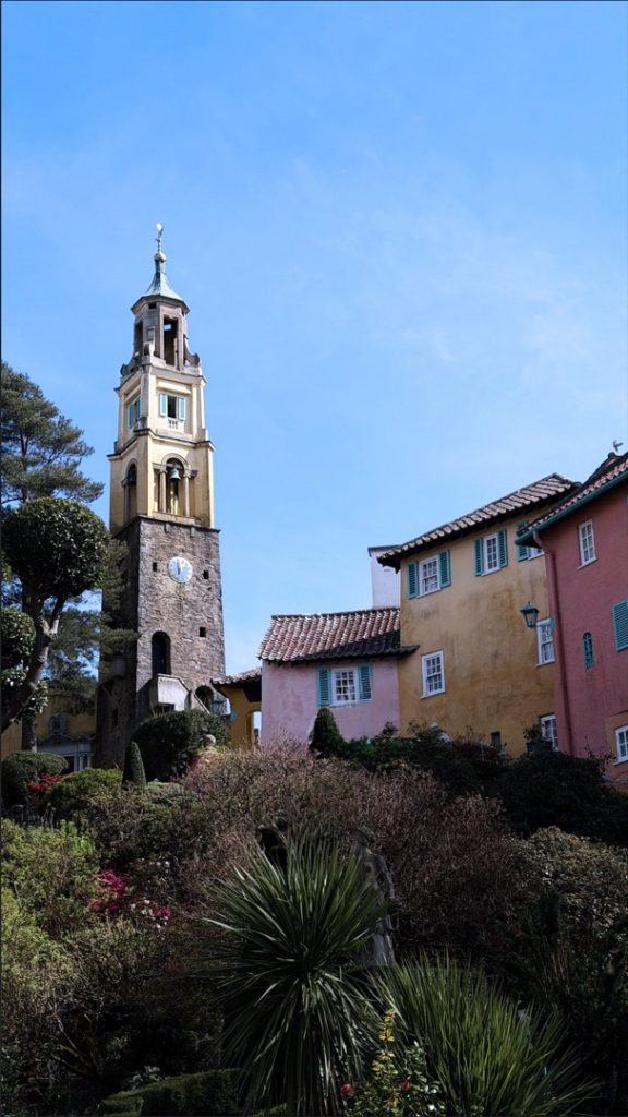
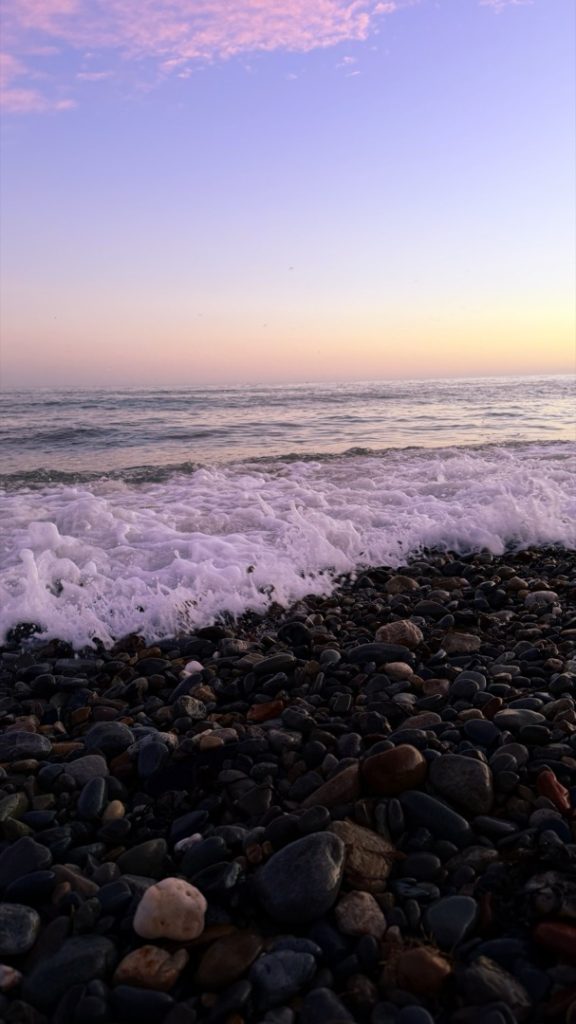
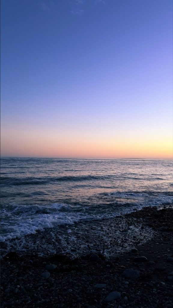
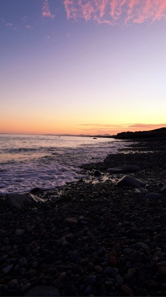
For my final project, I have chosen to explore both earth and water, as I felt these elements would work best for my concept. To represent the element of earth, I decided to create a triptych featuring the architecture of Portmeirion. I chose this Welsh landmark as it is very close to my heart; I have been visiting it since I was very young. For the element of water, I created a second triptych focusing on a beach in Criccieth. This location holds many fond memories for me, particularly of skimming stones with my parents.
The meaning behind my photography is to evoke a sense of joy and calmness, while also showcasing these locations as wonderful holiday destinations.
When shooting the coastal images, I focused on capturing bright natural light, the waves crashing onto the shore, and the colourful sky above. For my architectural triptych, I took a similar approach by also utilising natural lighting. I chose not to alter the colour saturation of the original images in order to truly highlight the vibrant, authentic colours of Portmeirion.
Josh Moseley
I chose to focus on the element of water because I felt it would be the most approachable, and it is the one that interests me the most.
I will explore this by creating a mood board of inspirational images based on a rough idea for a water-themed setting, or anything surrounding the concept of water. From there, I will sketch items and characters that fit this setting, adding notes on the textures I plan to use. These sketches will later be turned into 3D models in Blender, and I will document my creation process at each step.
I used multiple techniques, such as working from reference images, to create high-quality 3D models.
Throughout this project, I have fully learnt how to use the Shader Editor in Blender, allowing me to adjust materials and textures exactly as I see fit.
Martins Oliobi Omali
I chose the elements of fire and water because I wanted to highlight the contrast between them within a football match. The emotions portrayed by the actors demonstrated both anger and calmness during the game. Fire represents intense emotions like desire and rage, whereas water symbolises growth and tranquillity. The central meaning behind my work is to illustrate that fire and water reflect two completely different emotional states.
I represented this on film by using various camera techniques, such as medium close-ups and tracking shots. I filmed and produced the project myself using a standard camera. The tracking shots effectively followed the ball and the actors on screen, and I made sure to utilise natural lighting throughout the shoot.
Finally, I used Adobe Premiere Pro to edit my film, incorporating fades, custom text fonts, and various other effects. In conclusion, the audience will easily recognise the difference between fire and water, as the two actors clearly embody these contrasting personas during the match.
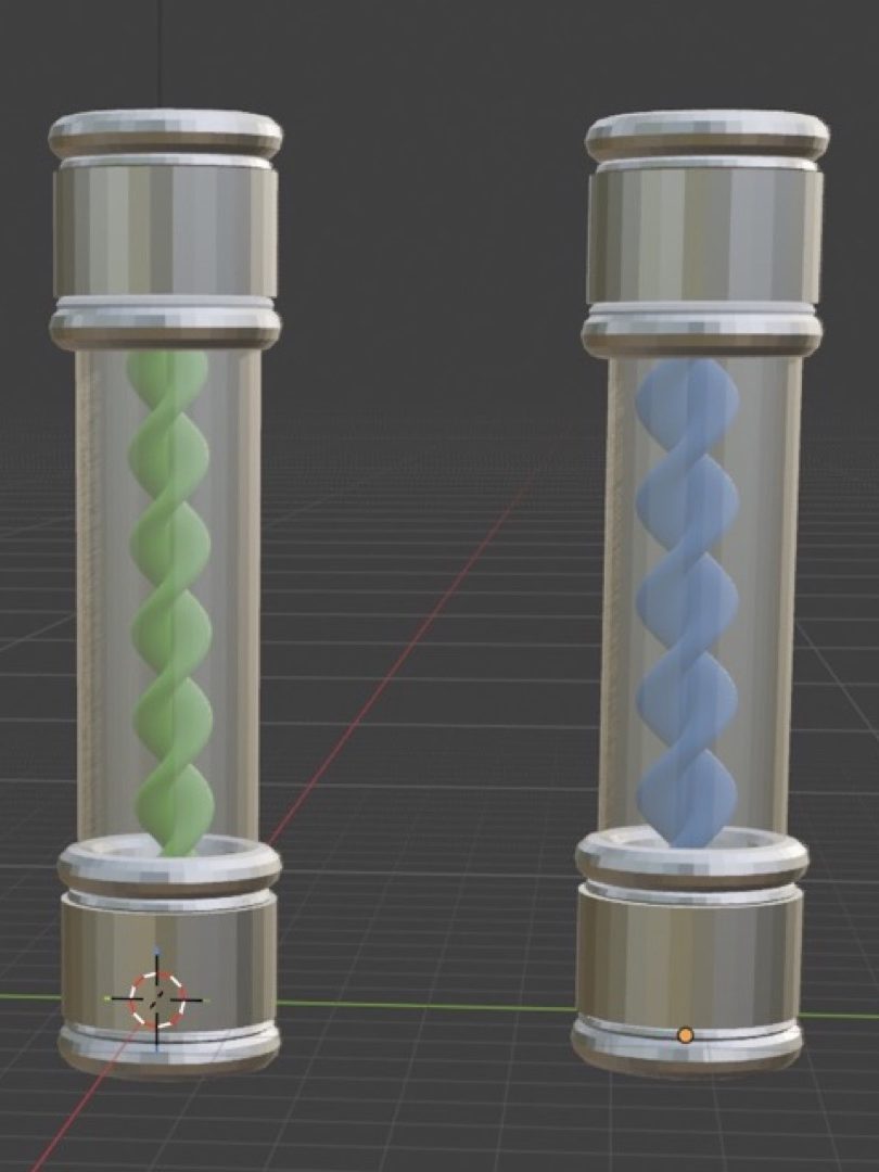
Tanesh Patel
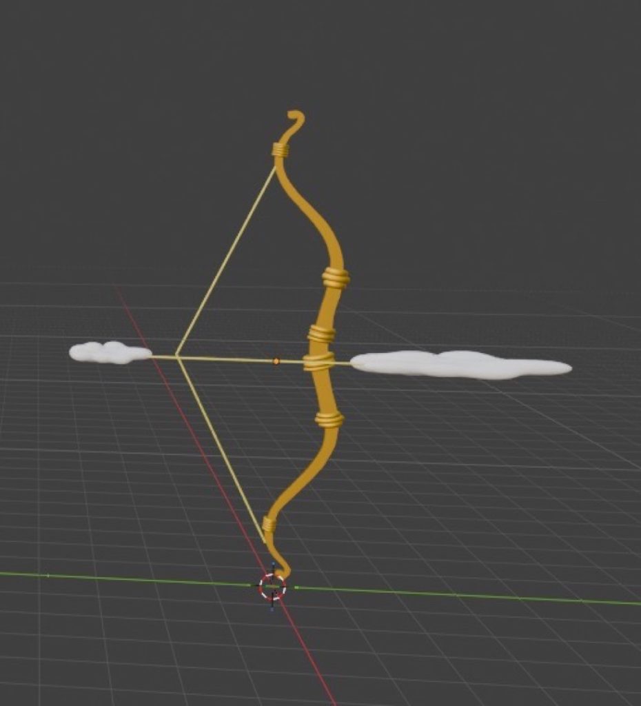
For this project, I chose to explore all four elements to challenge myself and create a diverse range of 3D models. I represented this theme by designing and modelling unique weapons for each element in Blender.
This approach provided me with a solid foundation in 3D modelling basics, which will be highly beneficial if I pursue further studies in this field. Throughout the creation process, the UV Editor became my most frequently used tool, allowing me to accurately texture my assets.
I also acquired several new technical skills, such as mastering the Knife tool to carve intricate shapes and closely replicate my reference images. To improve my workflow in the future, I aim to expand my technical repertoire and rely on a wider variety of modelling tools beyond just the Knife tool.
Jack Terry
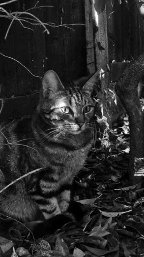
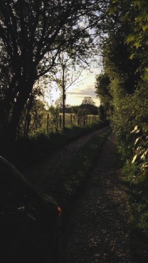
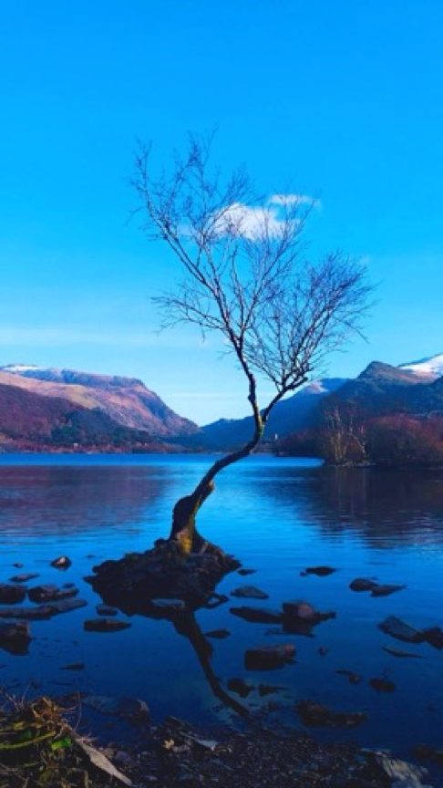
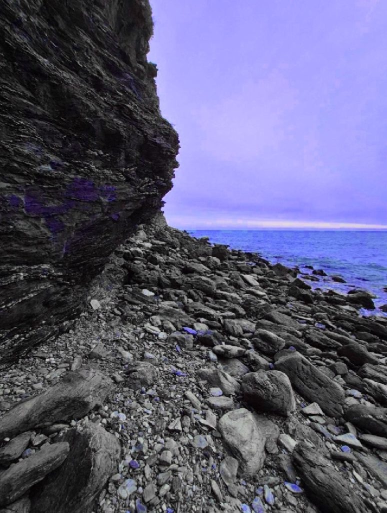
For this project, I chose to focus on the elements of water and earth, as they are the fundamental components of our planet. I represented these themes in my photography by capturing vast bodies of water alongside both sweeping and intimate natural landscapes.
My ultimate intention with this body of work is to inspire viewers to step outside and actively interact with the natural world. I am highly satisfied with the editing process across the collection, particularly with the ‘lonely tree’ and the black-and-white cat photographs, which remain my two standout favourites.
Throughout the creation of this project, I learnt the importance of connecting with my immediate surroundings rather than being solely focused on my phone or camera lens. This shift in perspective allowed me to truly live in the moment.
Furthermore, constructive peer review from my classmates (Jana, Euan, and Rhyley) was instrumental in elevating my work. Gaining outside perspectives helped me refine my final pieces to ensure they resonate with a much wider audience.
GROUP B
Kinzah Ajaz
I created a short film based on the elements of water and earth, focusing on the immense power of nature and the beauty of its capabilities. I chose this concept because it deeply interested me, and I found myself flooded with creative ideas for various shot types and camera angles.
Water and earth were the elements that stood out and inspired me the most. I was drawn to the idea of producing a piece that was calm and soothing on the surface, yet held a much deeper underlying meaning.
During the editing process, I incorporated audio elements such as music and sound effects, alongside smooth transitions between clips to ensure the visual narrative flowed seamlessly. I utilised these transitions intentionally to prevent the final edit from feeling plain or unengaging.
While I successfully completed my film project and efficiently organised all my assets within my project folders, I did submit the final piece slightly past the deadline.
Moving forward, improving my time management and keeping closer track of production schedules will be a primary focus for me, as this project was submitted three days late. Additionally, in future projects, I will actively seek out peer feedback during the editing phase—an invaluable step that I missed this time around.
Archie Byfield
I made these images because I’ve always wanted to take photos for a business and wanted to produce high-quality content for them. Having the experience and the ability to replicate this has been a dream.
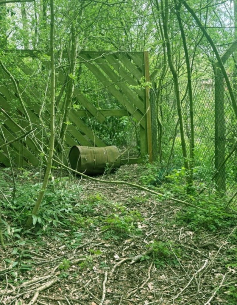
Earth has inspired me for this one. I like how the Earth is different anywhere you go. Mountains peak up, caves lead to the abyss, and every hill is different. It’s like a drag path. I love how everything has its own personality—how trees grow their leaves back in spring, and flowers bloom. Everything is like a cycle.
I have used multiple techniques, using a drone to get aerial shots of places that nobody else can get. Having that view from above is something I really like; it gives this zero-gravity effect to the image and makes everything feel like it’s out of this world.
I feel that the photoshoot went well, and some parts of the editing went well. I really enjoyed taking the drone shots because it’s a hobby of mine, and I just like flying it around seeing different angles of the places I am in.
Aaliyah Christine Gordon
My work explores the relationship between nature and people. I used high angles, filters, and professional editing to give it a summery feel. It presents a simplistic short film about a young couple exploring nature in the summer; the mood and the vibe represent the movie as a whole. The significance of the ‘Earth’ element brings my project together, as it represents how I feel towards the earth and how it reflects my personality.
The techniques I used were high-angle shots, establishing shots, and medium eye-level shots. I used these techniques as I wanted to try something new while filming and practice my camera skills. Some of the things that went well were that we worked well in a team, and each of us participated in the lighting, directing, and audio.
The meaning of the whole project is to bring people together and encourage them to enjoy their surrounding national parks, which can boost their mental health and well-being. My inspiration for the project was David Attenborough. He is a famous TV presenter who makes documentaries similar to the product I’m making, and being inspired by him made me use similar camera work and techniques to those his crew uses.
Islam Al Haj Hamoud
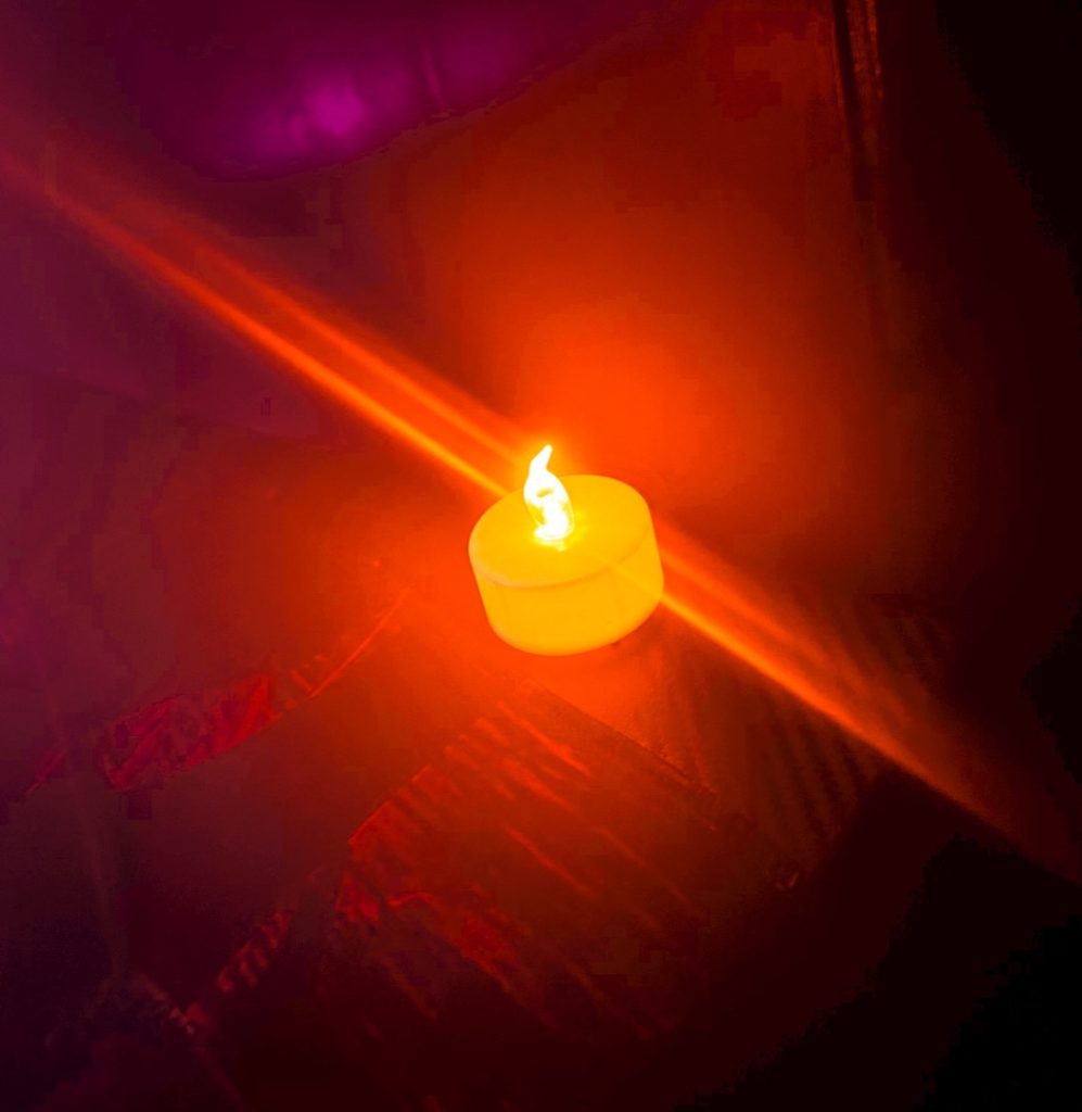
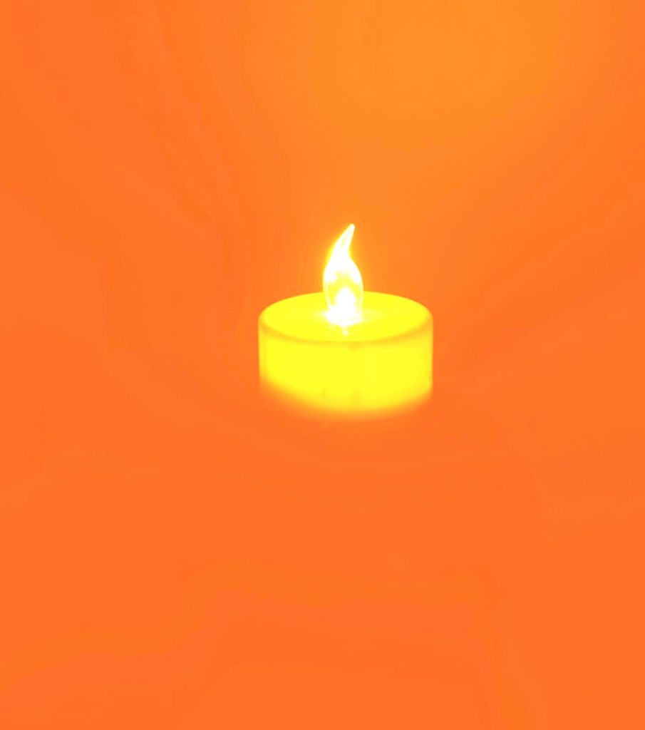
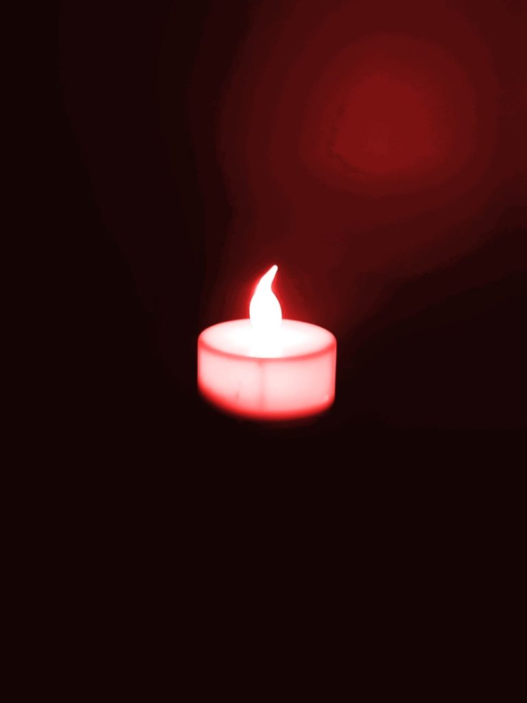
I made a short film inspired by the four elements. While they are all important, I chose to focus on just two—Fire and Water—so I could explore them clearly. I really liked the contrast between them, using fire to represent anger and water to represent fear. I portrayed water through rain and fire with a lit candle, trying to create an overall cosy vibe.
My original idea had to change when the weather didn’t cooperate; it wasn’t raining, and I didn’t have time to wait. To complete my film, I found some inspiring stock clips on Pexels to fill in the gaps.
The project really helped me focus on my editing skills. The process went smoothly, and using techniques like transitions, music, and sound effects made the final piece much better.
In the future, I will try to manage my time better and always have a backup plan ready in case my main idea doesn’t work out, ensuring I can submit my work on time.
Nicolas Latka
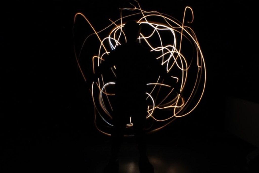
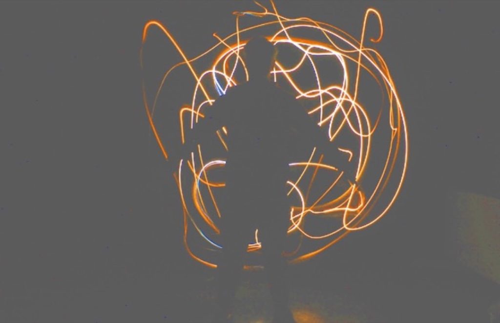
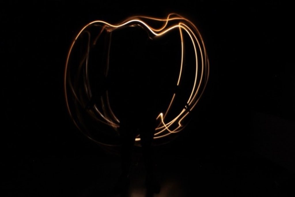
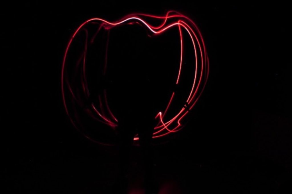
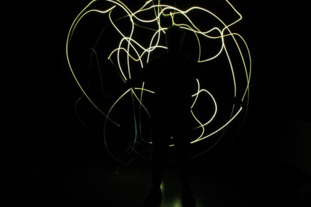
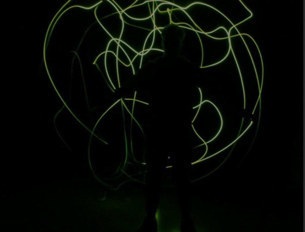
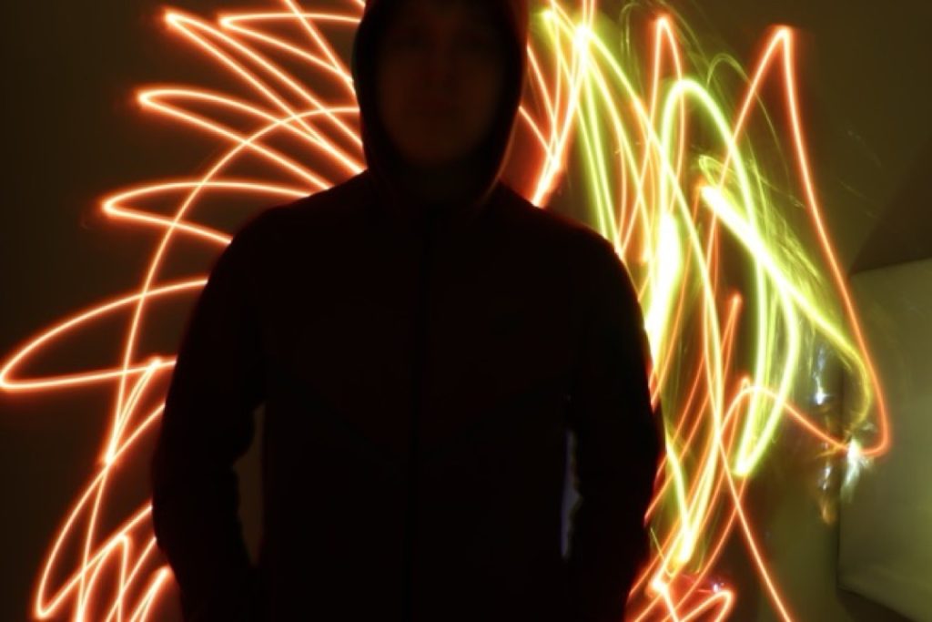
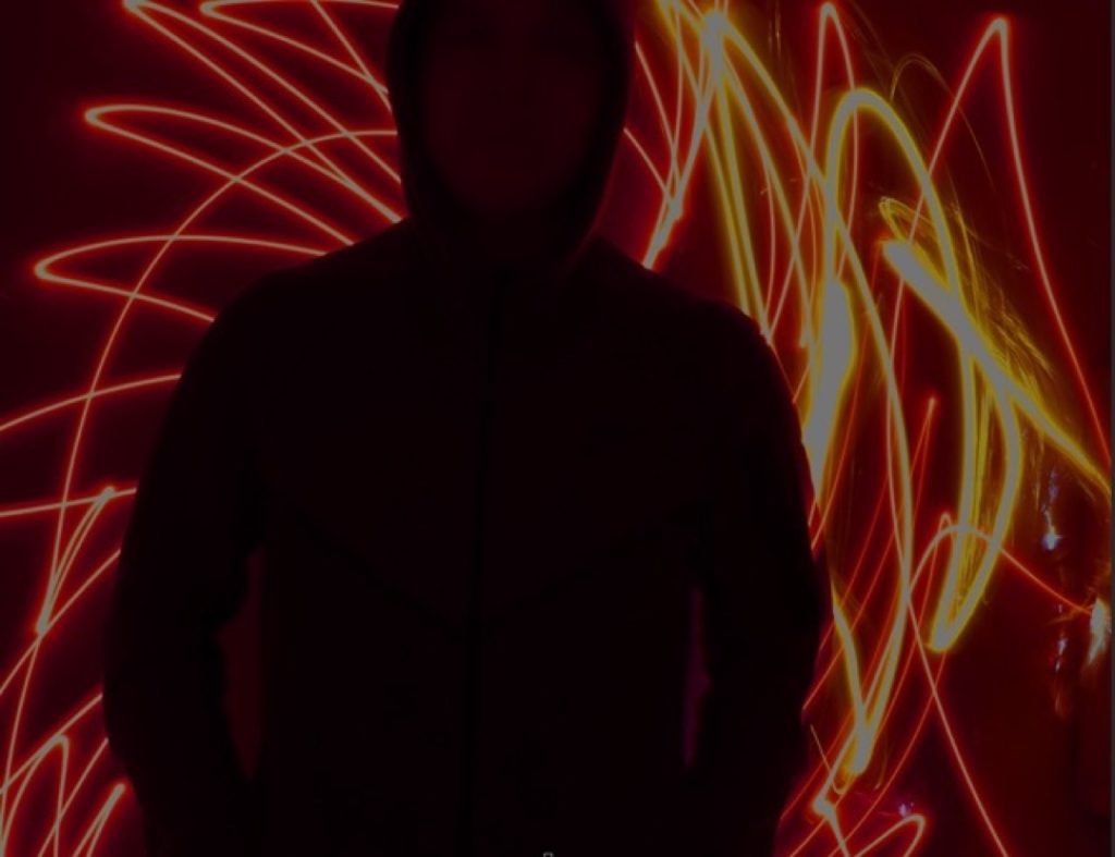
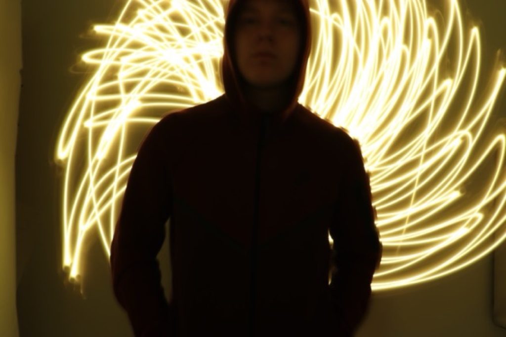
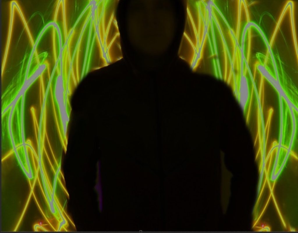
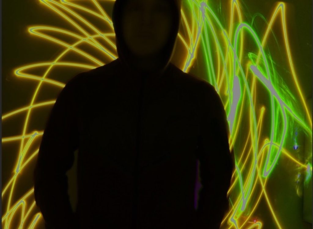
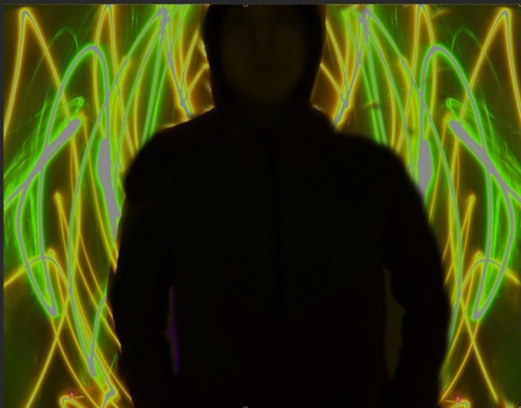
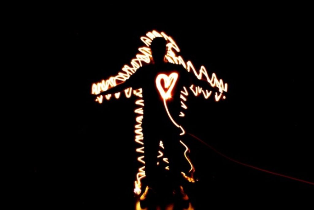
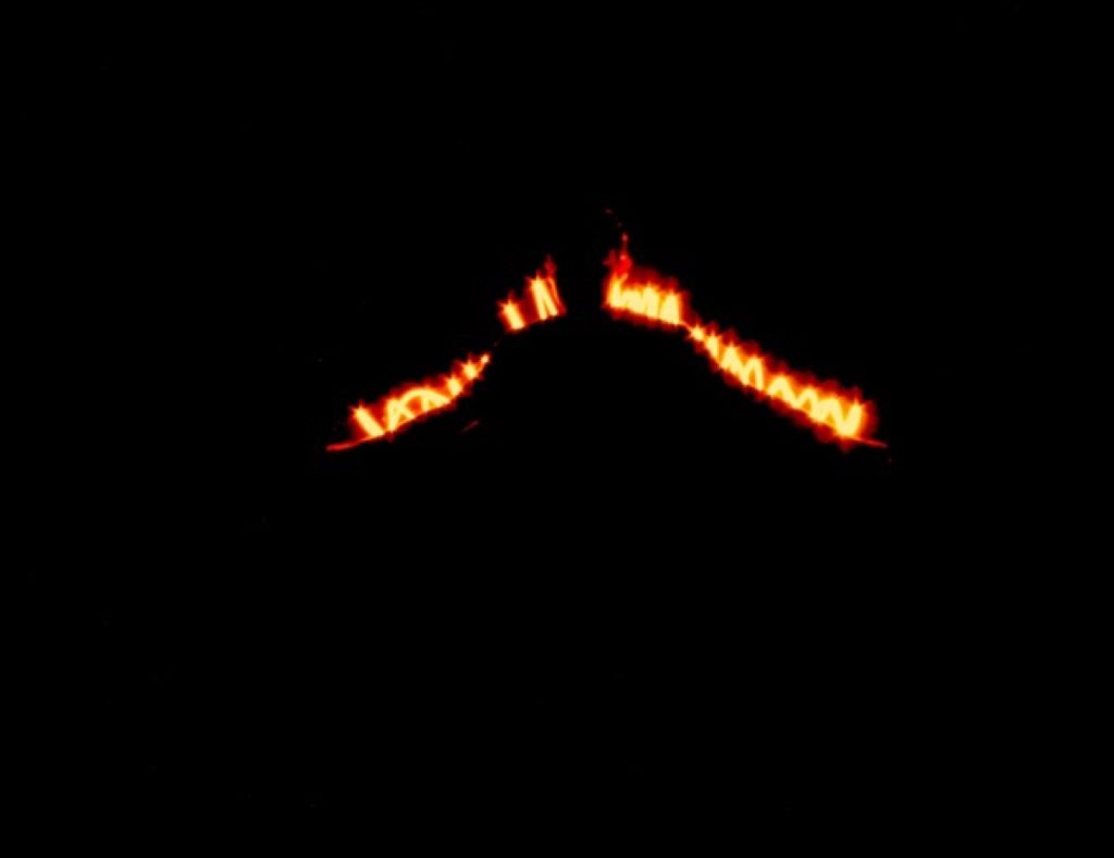
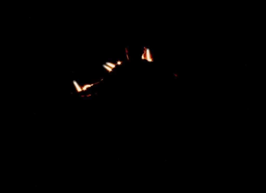
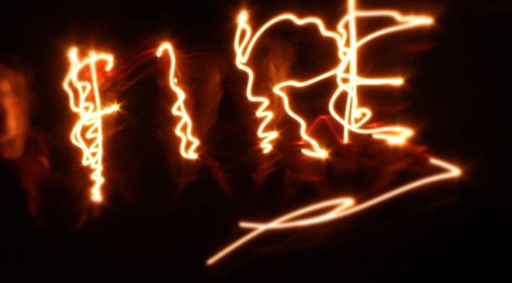
For this project, I created ‘light painting’ photography linked to the element of fire. I chose this technique because light painting is a process I thoroughly enjoy and wish to explore further. While fire was my primary inspiration, I also considered exploring water, given its vital importance to the Earth.
Technically, I utilised adjustment layers in Photoshop to manipulate the colours in my photographs and experiment with different visual outcomes. The shoot was highly successful; the light painting effects turned out exactly as I had envisioned, and I managed to capture unique, varied patterns in every single frame rather than repeating the same shapes. I am also very pleased with how the final colour grading enhanced each image.
To improve my work in the future, I would experiment with a much broader colour palette. For this project, I primarily stuck to traditional fire tones—red, orange, and yellow—with only a couple of exceptions where I introduced green. Additionally, I aim to develop my Photoshop skills further, allowing me to work more independently rather than relying on others for technical support.
My overarching intention was to represent the dynamic nature of fire through the medium of light painting. After researching numerous images online, I was driven to create my own interpretations. My primary influence was the artist Michael Bosanko, whose spectacular light painting photography heavily informed my approach. All final pieces are entirely original, consisting of my own primary photography and post-production editing.
Tyler Martin
The name of my project is New Perspective. My intention was to take a subject which in this case is a pool of water at Baggeridge Park, and take it from different perspectives and styles to symbolise how our experiences as individuals make us view the world in a different way.
My inspirations for the project was the Japanese photographer Toshiya Shibata and the British photographer Adam Bunten. I was also inspired by the aesthetic physical era and how I remember things looking from when I was a kid. I used that particular one in my landscape ones. And I used the general sense of black and white photographers for the portrait sides.
For production I used a DSLR camera with a wide lens and I used the landscape method for the first three camera shots and then use the portrait for the rest. I then used Photoshop to intensify what was already present in the photos.
For example, with the landscape ones which were already intended to be vibrant, I used filters and adjusted the hue and saturation to make them much more saturated in the greens. I also used stuff like the burn tool to make the clouds a bit more darker than they were to make them stand out more. I then used the other way to make the portrait ones appear darker than they were.
Ben Middleton
For my final major project, I decided to create a holiday video advert establishing some destinations tied to the four elements. The reason for doing this is because I want to showcase to the audience the positive aspects of the elements during the holiday season. The elements that inspired me the most would have to be all four of them.
A technique I utilised was an orange filter I applied to the Tiede volcano and African safari sections to reflect the hot climate these locations are in. One aspect of the project that went well in my opinion, would have to be the information I incorporated into the holiday location sections. A section of the project that could have been improved would have to be the non-capitalisation of certain words in the holiday location sections.
One idea I’d like to go in-depth with would have to be the information video idea. I was going to discuss the negative aspects of the elements, such as natural disasters. This was changed because of the depressing themes that idea presented. An industry professional who influenced me would have to be Wong Kar-Wai. He utilized the fire elements using a candle that was on the dining table to represent the connection the characters have in this screenshot of that scene.
The piece of feedback that helped shape the final product was Cody’s feedback, which he gave me on Tuesday, 24th March 2026. He mentioned to me that Jet2 Holidays doesn’t offer flights to the USA or Australia.

Oliver Nicholl
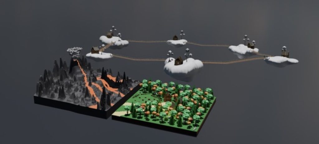
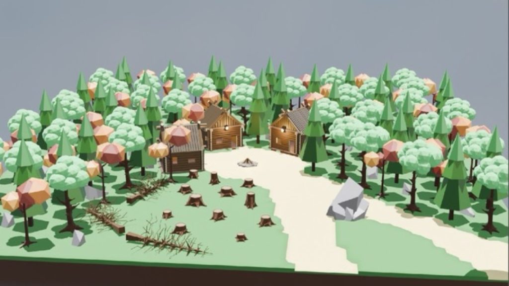
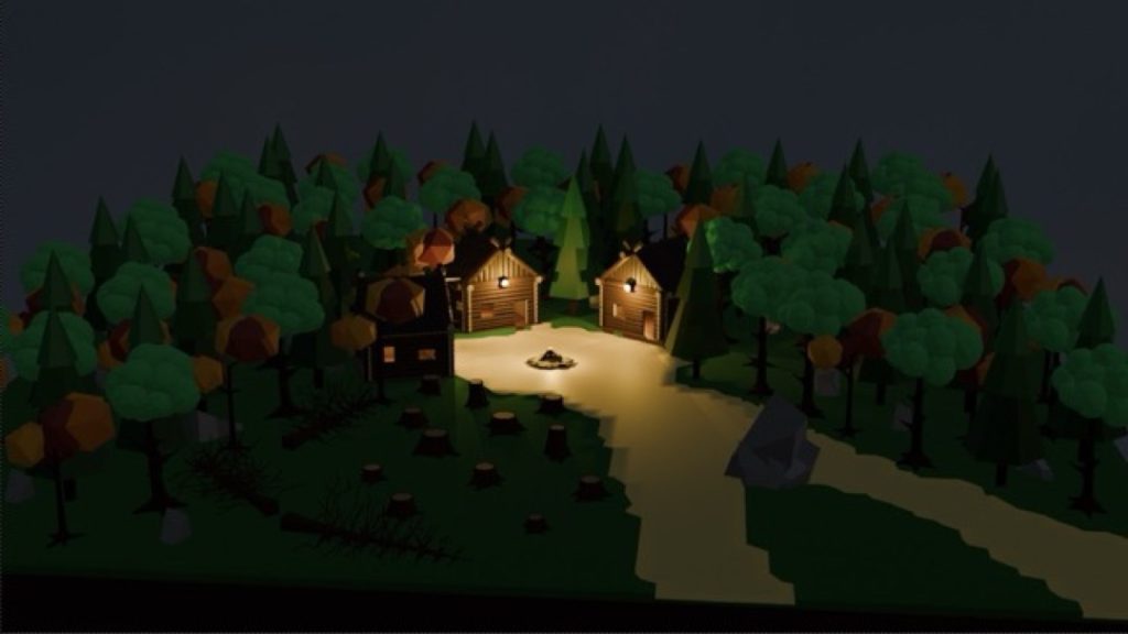
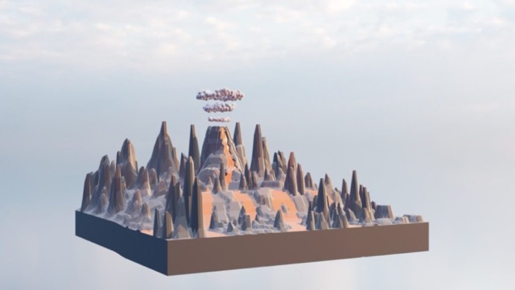
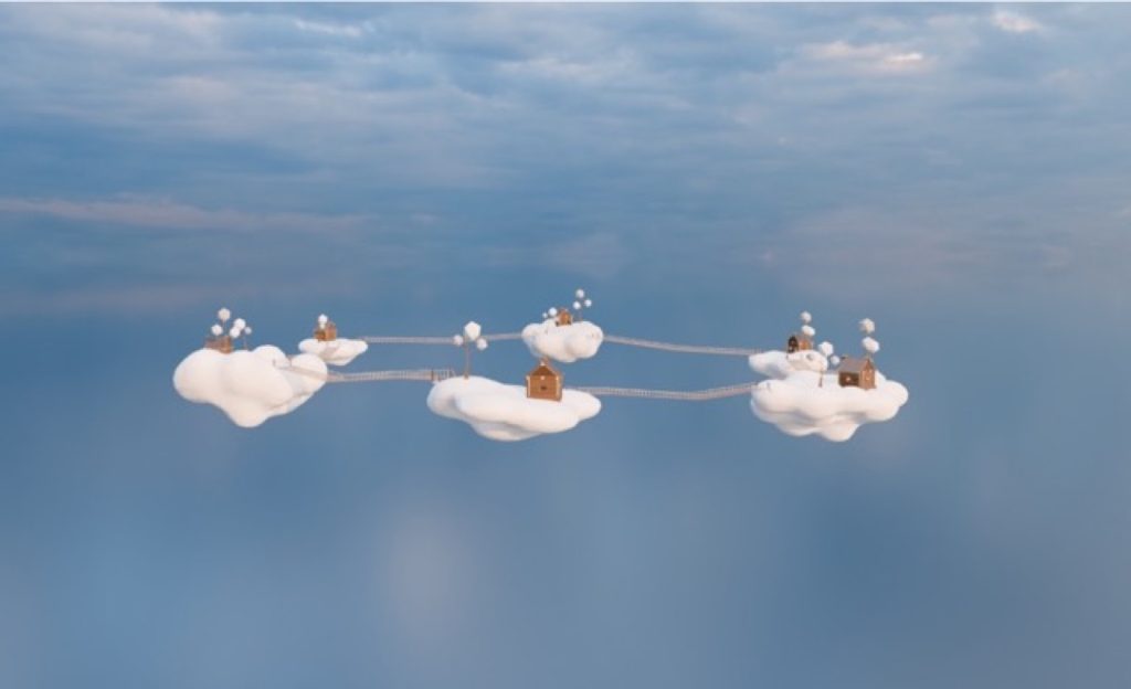
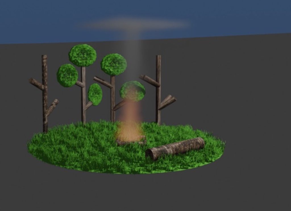
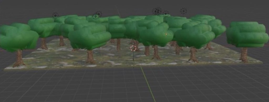
For my Final Major Project, I made three scenes in Blender, each representing one of three of the four major elements: a volcano to represent fire, a forest to represent earth, and islands of clouds to represent air. I chose these specific models for their respective elements to represent certain things typically associated with them.
Fire (the volcano) stands for anger and destruction. Earth (the forest) stands for life, as shown by the cabins dwelling inside. Air (the cloud islands) stands for freedom, as shown by the cabins atop each cloud, living free from the worries below.
I used a variety of tools during production, including scaling my objects to accurate sizes, extruding faces and points, rotating objects, subdividing objects, the Knife tool, merging vertices at the centre, the Screw modifier, the Skin modifier, the Simple Deform modifier, the Volume to Mesh modifier, adding HDRIs to my scene, sorting my assets into different scene collections based on element, and duplicating objects with Alt + D. One tool I really enjoyed using was ‘merge vertices at centre’—using this, I learnt a quick and easy method to make trees.
The general production of my project went smoothly with almost no issues. The only issue that came up was having to give up on making my originally planned fourth scene. Other than that, everything went well. If I had the chance to make this again, I’d like to try and incorporate my scenes all into one, as well as include my fourth planned scene.
Dylan Norton
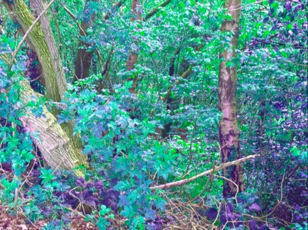
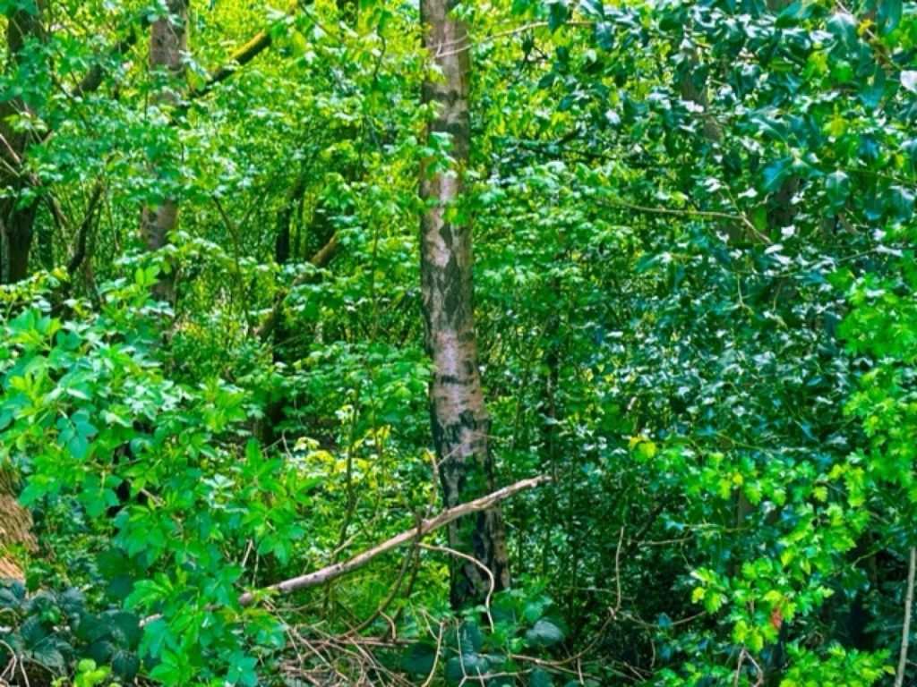
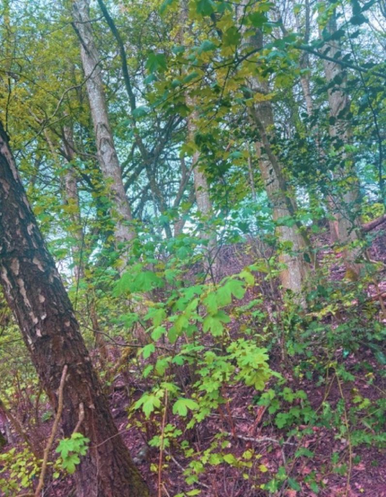
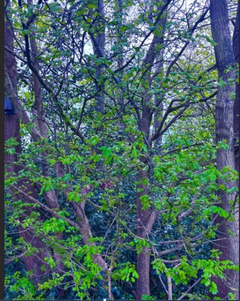
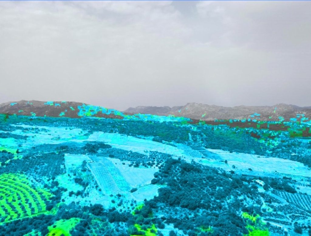
For my project, I decided to focus on photography. I wanted to showcase the element of earth by capturing the power of nature. I chose this theme because nature is a fundamental part of the earth, demonstrating just how beautiful our world can be.
I experimented with different camera angles of trees and leaves to highlight how crucial trees are to our environment. During the post-production stage, my aim was to make the images more uplifting and to create a calming mood for the viewer. I adjusted the saturation and vibrance to give the photographs a happier, more vibrant atmosphere.
The most successful part of my project was changing the colour balance of my first image to give it a mythical feel. This aligns perfectly with my overall goal, as I want my audience to reflect on how these visual changes make them feel.
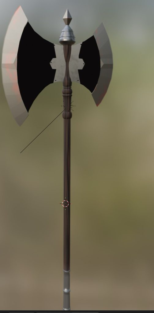
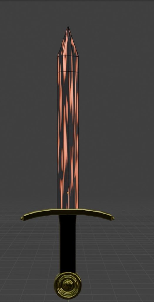
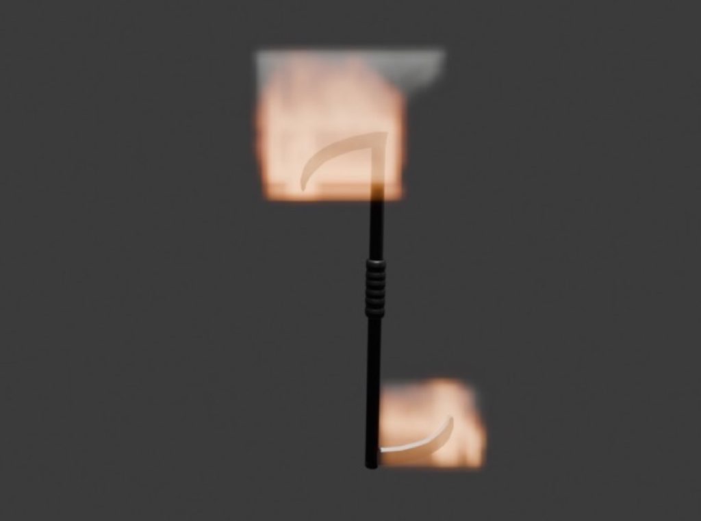
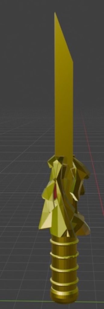
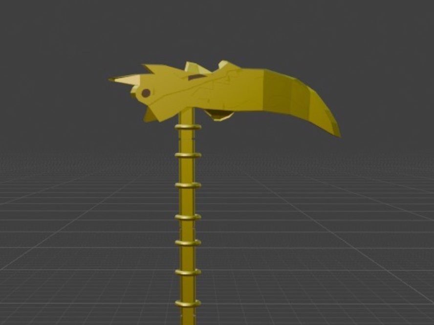
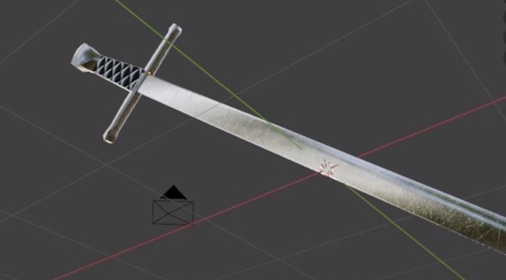
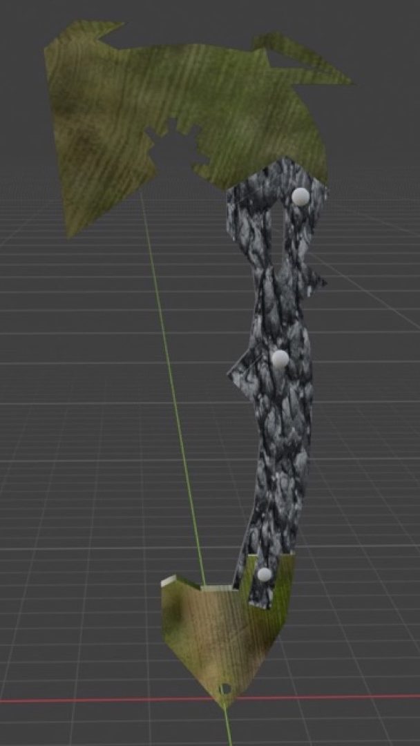
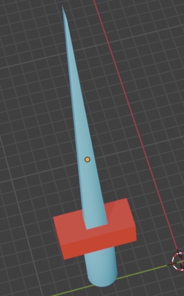
Camran Perera
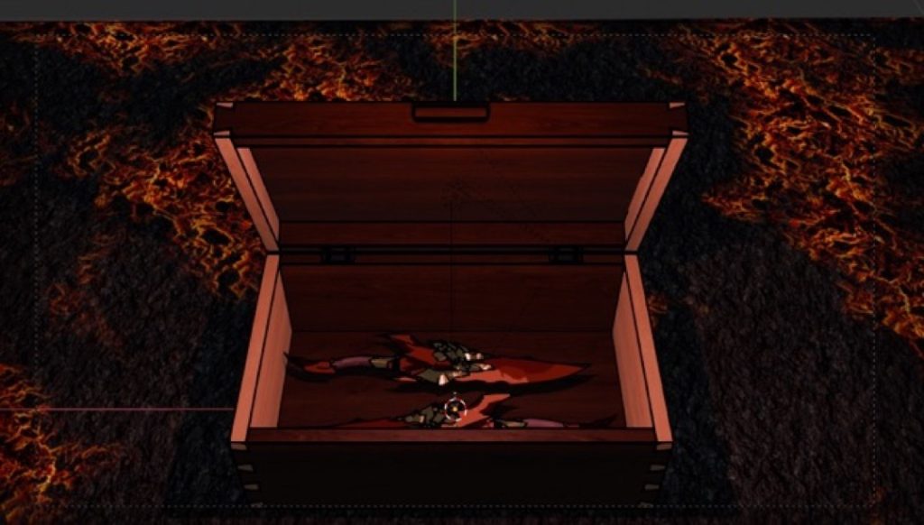
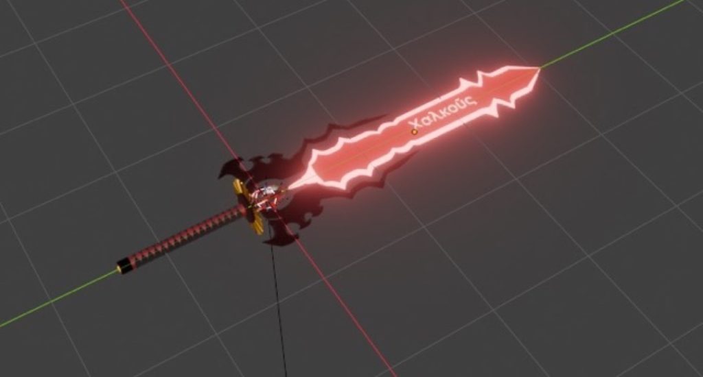
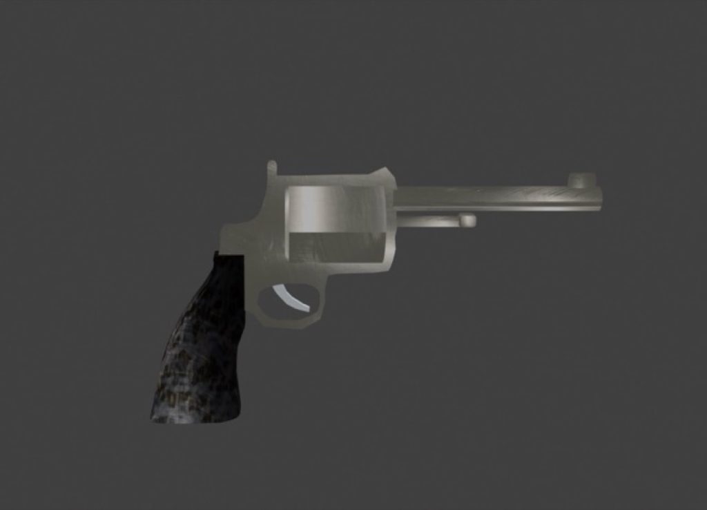
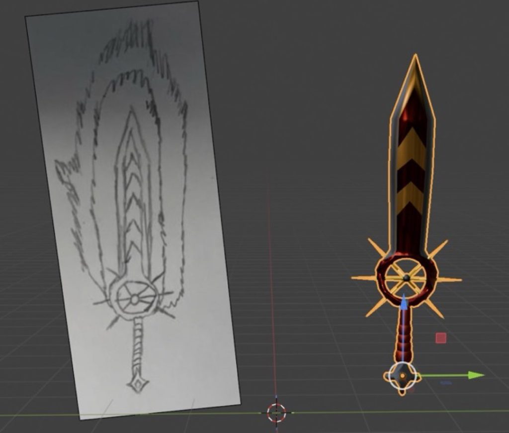
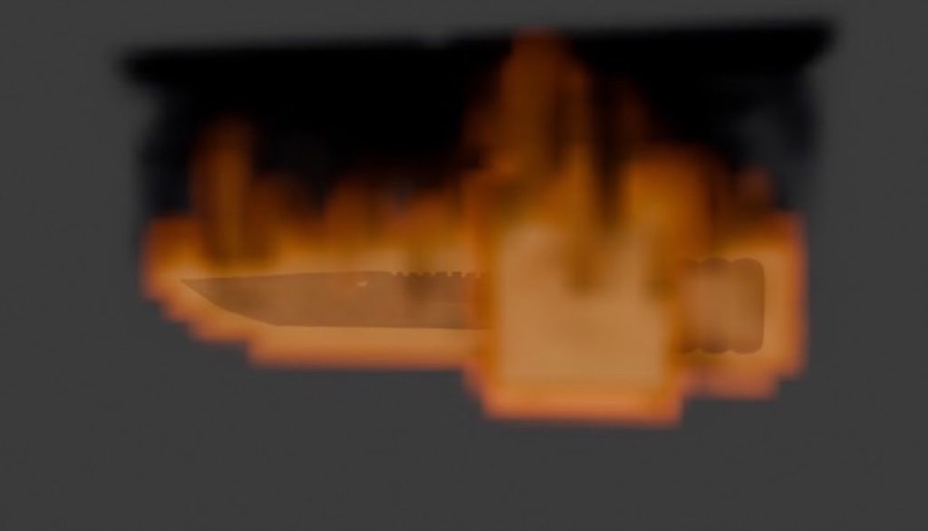
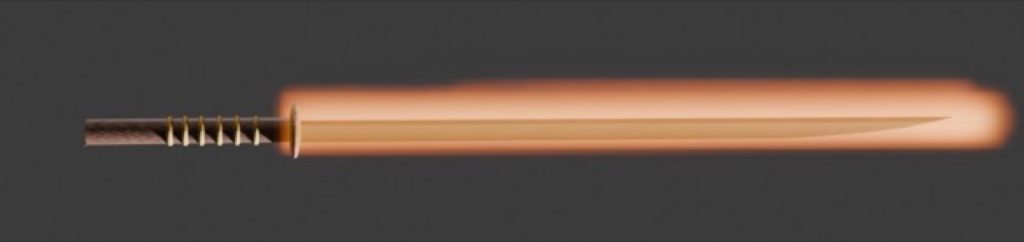
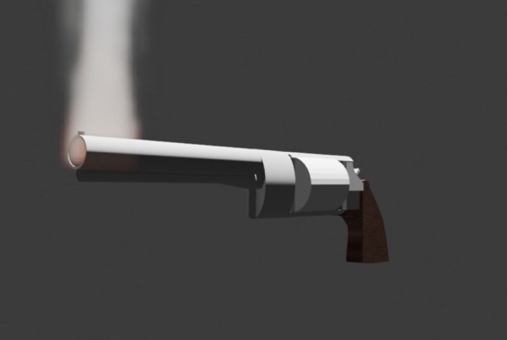
I created a series of 3D weapons in Blender inspired by the element of fire, aiming to portray the cultural links between these weapons and other anomalies found during my research. The element of fire inspired me to make these weapons because its main symbolism revolves around danger.
During the creation process, I used a range of different tools and techniques, including the knife tool, extrusion, bevelling, and UV mapping, alongside a rendering engine. When making the revolver and the sword, I combined various aspects of my initial designs. This meant I also had to manipulate the vertices to add a realistic 3D curvature to my work, preventing the blocky look it would have otherwise had.
A lot of my design relied on a tool that I particularly enjoyed using: the Push/Pull tool. This method gave me free rein to work on the projects and allowed for much of the depth and verticality visible in my final pieces.
Personally, I think the production and overall thought process behind my designs went well. However, if I could change one thing, it would be the katana. The sword wasn’t my best work and could definitely use a retexture; it felt slightly messy and out of place, and could have been executed much better with a little more time.
Jack Pitt
I made a 2-minute short film about the four elements so I can visualise each element in different contexts. All four elements, water, fire, earth and air, really inspired me because we are made up from these elements.
I used simple dissolves because that’s how we transition from one context to another in film, and dynamic typography in After Effects to make the video more appealing to the audience. My usage of video editing software and After Effects went outstanding as I put a lot of effort into my production.
Next time, I would make a longer version of the video and take more original footage myself. How my final piece of work differentiated from the storyboard is that I was originally going to put in the star signs into their associated element chapter cards, but I chose not to and instead put in the slogans formatted like this: “can be as [ADJECTIVE] as…”, and some clips not seen in the storyboard were replaced with something different, like a beach in Cornwall instead of Blackpool.
Additionally, the canal scene was replaced with a river in Trentham Monkey Forest and swapped it around with the pond scene, filmed at Bumble Hole.
Matthew Slater
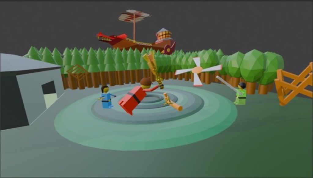
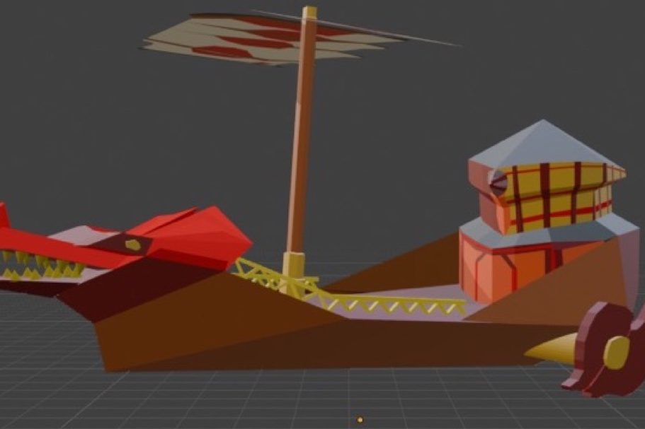
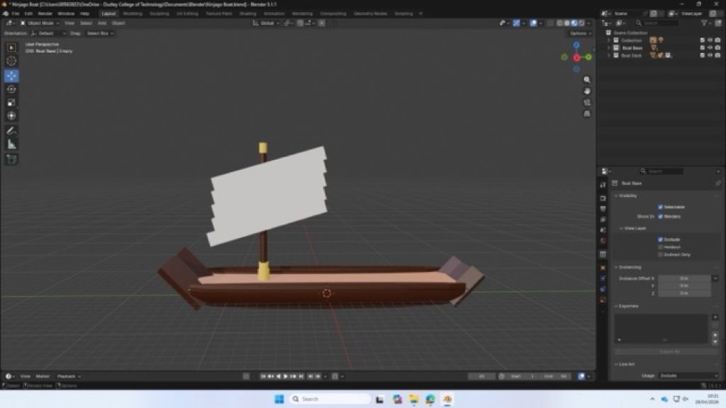
I made a scene freeze-frame inspired by the animated series Lego Ninjago. The elements that inspired me are fire, water, and air. The techniques I utilised included using a camera to make the perspective consistent and keeping the scale in mind.
I think that the models came out well, and the final freeze-frame scene looks good. The detail that I added to the ship seemed to transform it from just any normal boat into the Flying Bounty.
Given another chance, I would have improved the more minor details within the project. My idea changed slightly from making a couple of simple designs to making a few more complex and unique designs.
My area and characters were based on the real character and level design from the show. I got some feedback and then changed how it all came out, which made it seem much more realistic.
Cody Smith
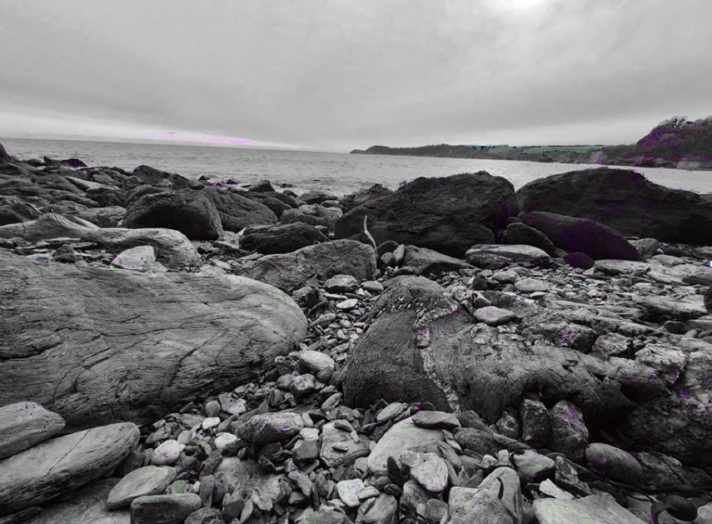
For my final project, I have produced six photographs based on the four elements; however, I decided to focus specifically on earth, wind, and water. I chose photography because I really enjoy capturing scenery. I chose to take photos mainly of the sea because it conveys a sense of relaxation and calmness. I took inspiration from John Blakemore’s work, as he photographs the sea beautifully, often using techniques that make the water look like mist. I would also love to live on the coast one day, as it is such a nice place to be. The element of earth inspired me as well, because nature is fascinating to be around and significantly reduces stress levels.
During the shooting phase of my project, one of the main techniques I used was a long exposure, so that I could capture all the moving aspects of the scene in a single photograph. In another one of my photos, I also incorporated leading lines. All of the locations I chose perfectly fit the type of photography I enjoy. However, the locations I picked were quite far away, so in hindsight, it might have been more practical to choose closer spots.
Originally, my plan was to take pictures of the countryside, but I then realised it would be a better idea to adjust my project to focus on the coast. As I mentioned, this is where I would like to live, and I find the sea very calming. Lizzy Davis’s photographs also inspired me, so I decided to integrate elements of her style into my own photography.
Steven Williams
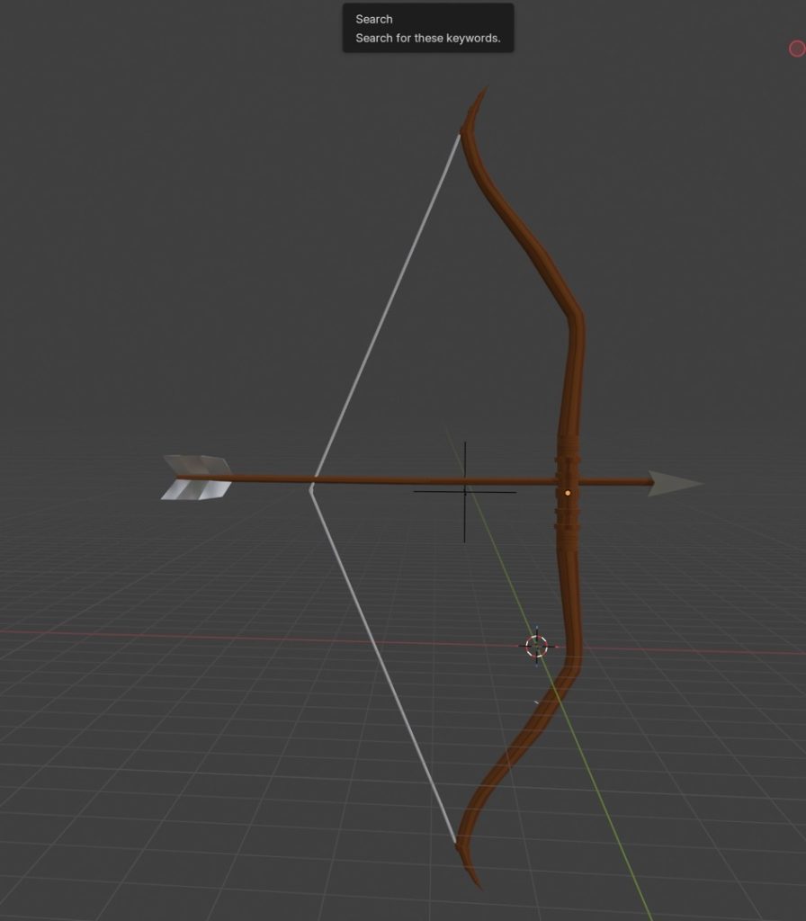
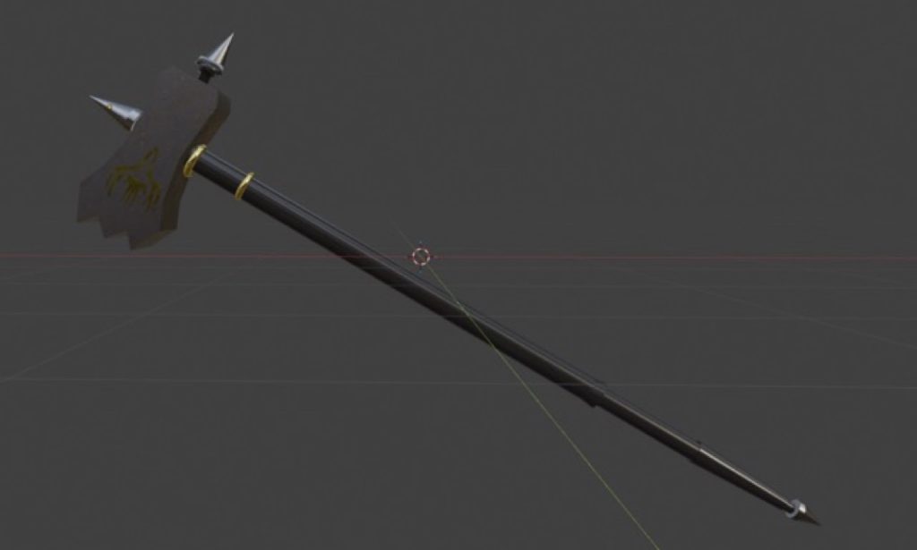
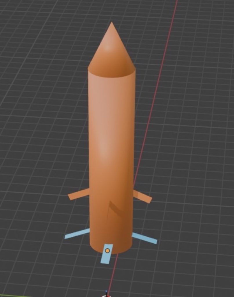
For my Blender project, I made four weapons and a boat to represent the four elements. I was inspired by all four elements (water, fire, earth, and air), and I made various things for them all. The techniques that I used included loop cuts, the Knife tool, and adding shapes and reference images.
The things that went well are the actual bases of the 3D models that I created. The thing that I struggled with was the dragon heads on my models, as it required quite a lot of trial and error. The thing that I would improve for next time is the detail of most of my 3D models; some parts of them don’t look as detailed as they should, as I thought I didn’t have enough skill to complete them down to the exact level of detail they were supposed to have.
My intention in the project was to include enough detail to get at least a Pass or a Merit grade, and maybe a Distinction, as I wanted to do as well as I could at my current skill level. My inspiration for my models was the show Ninjago, which I really enjoyed watching as a kid and is also related to the four elements. I produced my work by using various reference images and a few online models to base my designs on, creating them inside of Blender.

GROUP C
Adam Abraham
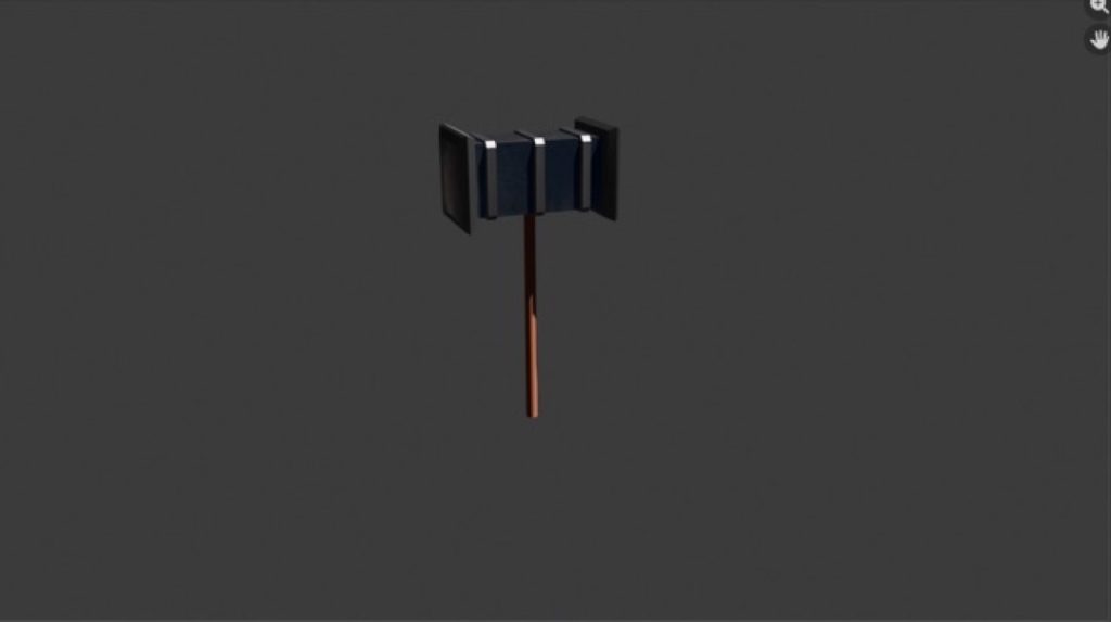
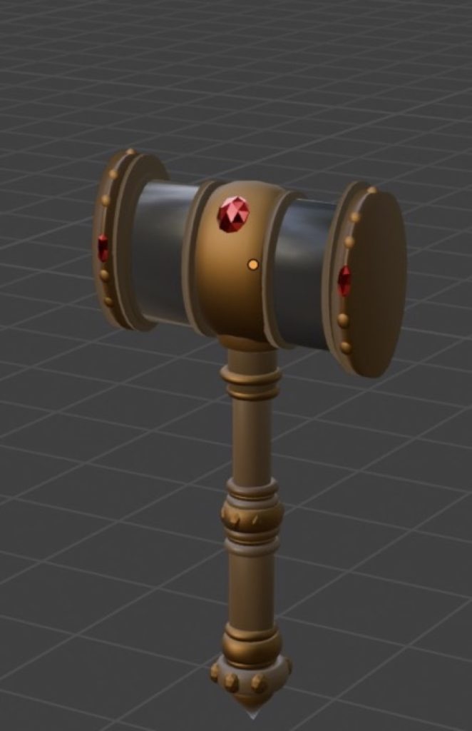
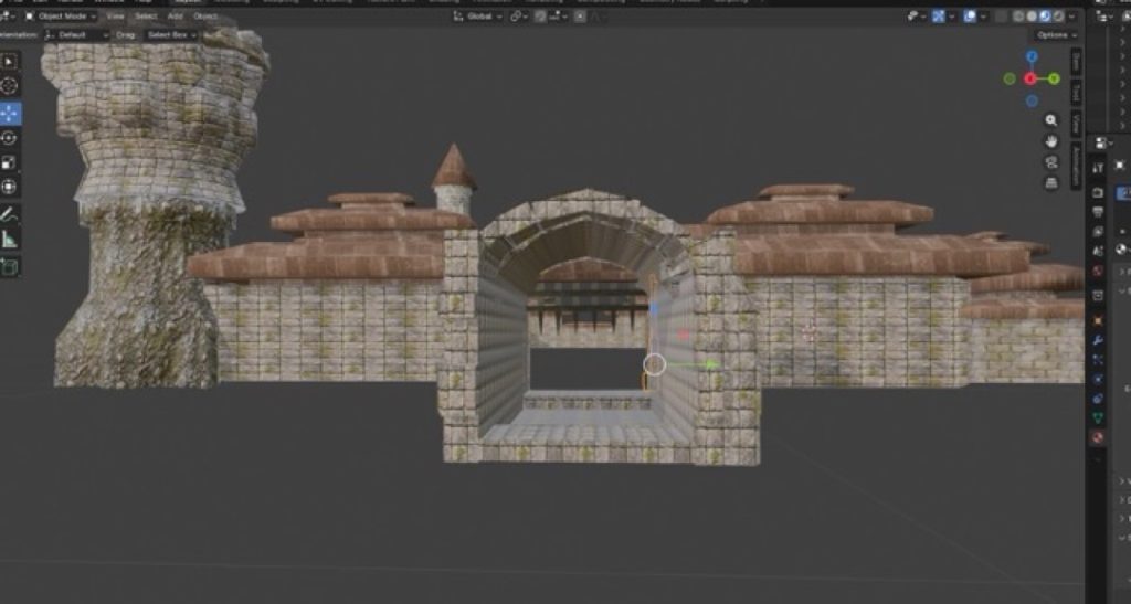
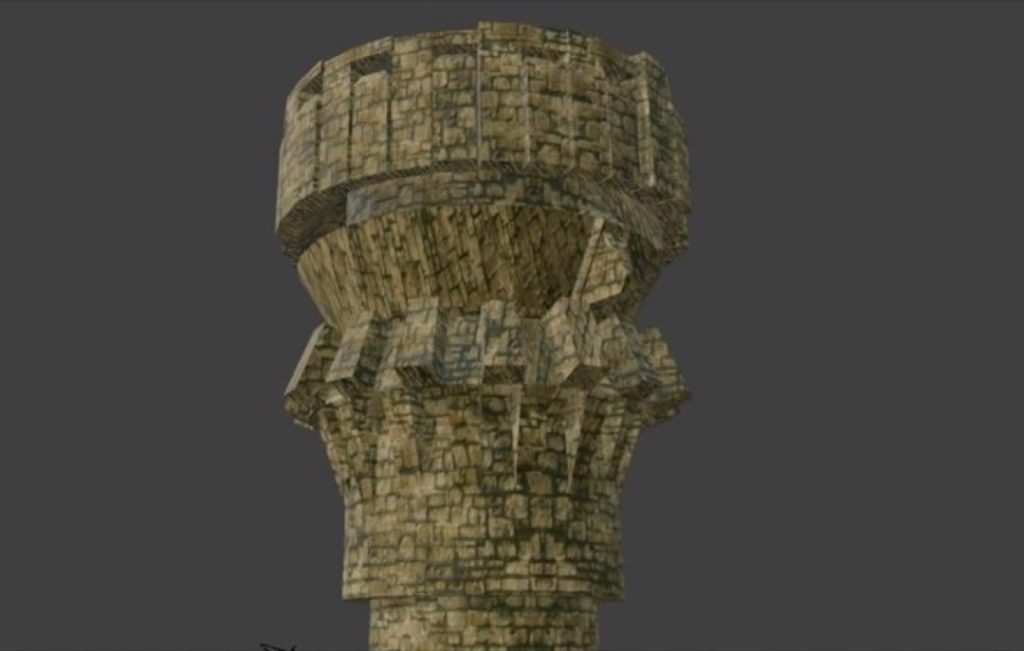
My favourite technique to use in Blender is the tracing tool. I find it very intuitive, and it significantly helps me improve my skills within the software. The hammer was my most successful asset, especially when I used material nodes to texture it and give it a highly realistic finish.
However, I would like to improve my castle by adding more detailed texturing to increase its realism and visual clarity. I changed my mind about the castle’s design a few times. Initially, I planned to keep it basic and low-poly to avoid any difficulties during the modelling process.
A major professional influence for this project was Hidetaka Miyazaki, the director of Elden Ring. The incredible detail he puts into his game environments inspired me to go much more in-depth with my own designs.
Finally, peer feedback really helped shape my final piece, particularly regarding the castle. The person reviewing my work was impressed by the modelling and texturing, but they pointed out some issues with the proportions. This prompted me to go back and adjust the scale, and overall, the project went very well.
Daniel Adams
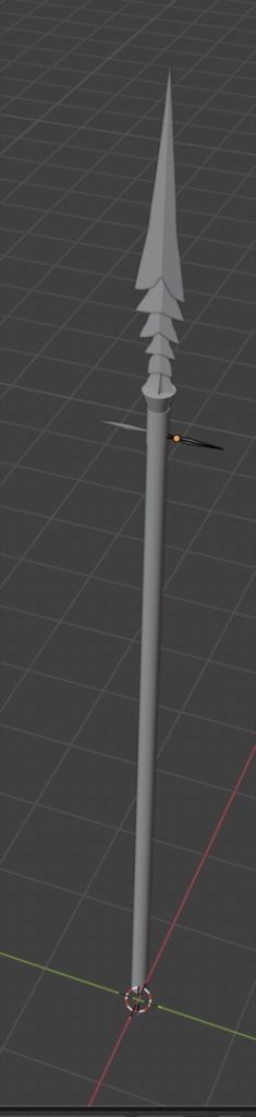
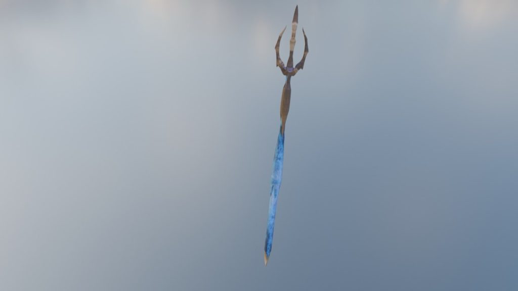
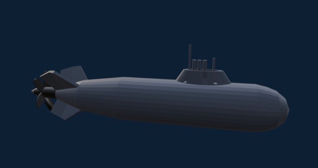
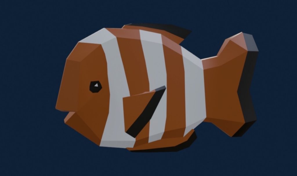
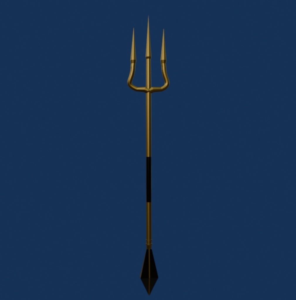
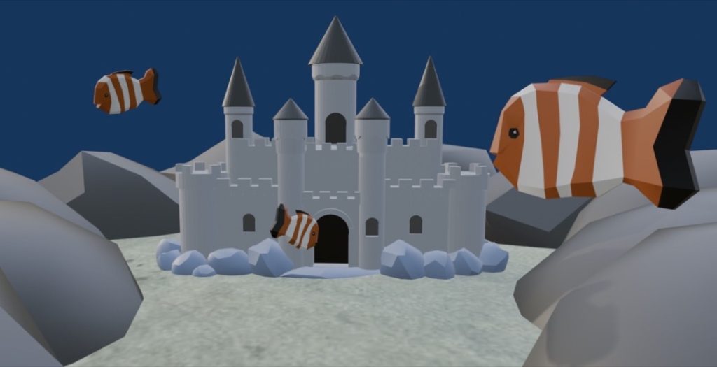
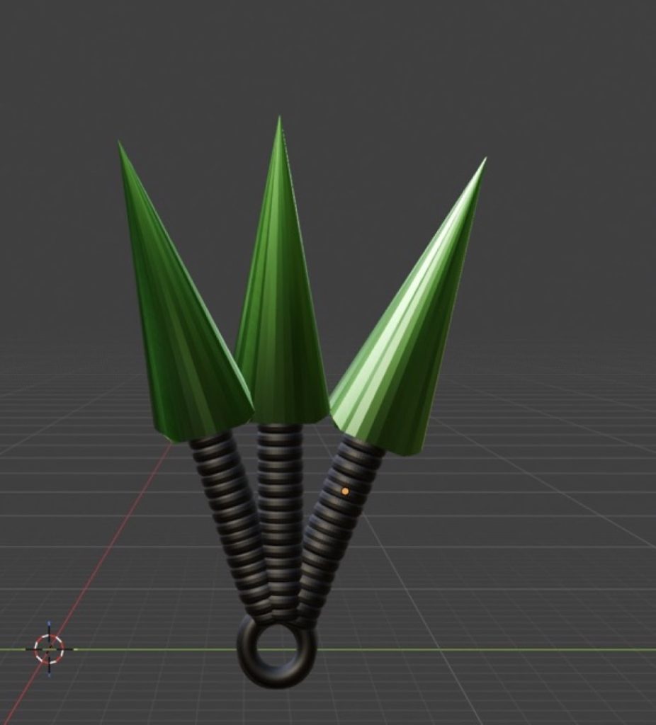
I have completed five 3D models in Blender: a trident, a castle, an island, a submarine, and a clownfish. I chose these specific assets because they each have a unique meaning and purpose. For example, the trident represents power as a weapon both in and out of the water; the castle serves as an underwater habitat; the submarine acts as underwater transport; the clownfish symbolises marine life; and the island represents an environment entirely surrounded by water.
Water was the element that inspired me the most, as it really stood out and immediately sparked ideas for me.
During the modelling process, I found Boolean modifiers incredibly useful for cutting holes into shapes. I also joined faces together using multiple cuts to achieve smooth, curved surfaces on my models. Ultimately, the project went very well; I was successfully able to create detailed, low-poly assets that all perfectly captured the theme of water.
Abdullah Alokozai
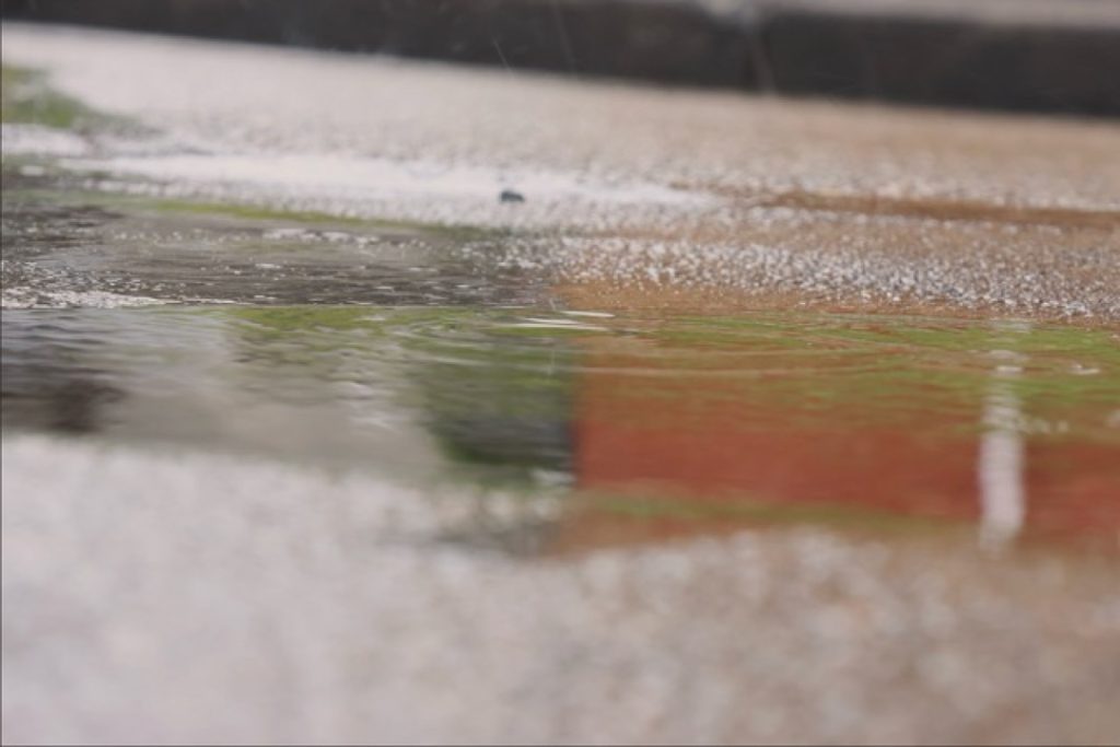
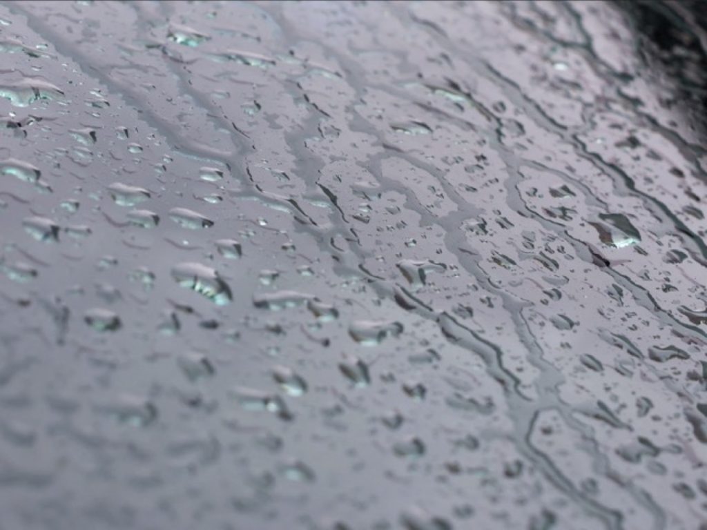
I am a photography and media student exploring the theme of water through creative images. My work focuses on textures, reflections, and movement found in everyday situations. I aim to show water in a simple but visually interesting way.
For this project, I created a photography series based on the element of water. I chose water because it can represent different ideas, such as calmness, movement, and reflection. I wanted to show how water can look in everyday situations, but in a more creative way.
My work was inspired by the different forms of water, including rain, puddles, water droplets, and flowing water. I also looked at how water can change shape and create intricate patterns.
To create my images, I used my Canon EOS R6 camera, taking many photos using different angles and lighting setups. I focused on close-up shots to capture finer details, before editing my photos using Adobe Photoshop. I adjusted the brightness, contrast, sharpness, and colour to improve the images and make the water stand out more. I also incorporated cool tones, like blue, to match the theme.
I feel the project went well, as I successfully created a variety of images showing different aspects of water. My editing improved the overall quality and made the images much clearer.
If I were to do this again, I would experiment with better lighting and try more advanced techniques. My initial idea also evolved during the project, as I started focusing more on close-up details instead of wider shots.
Jack Cox
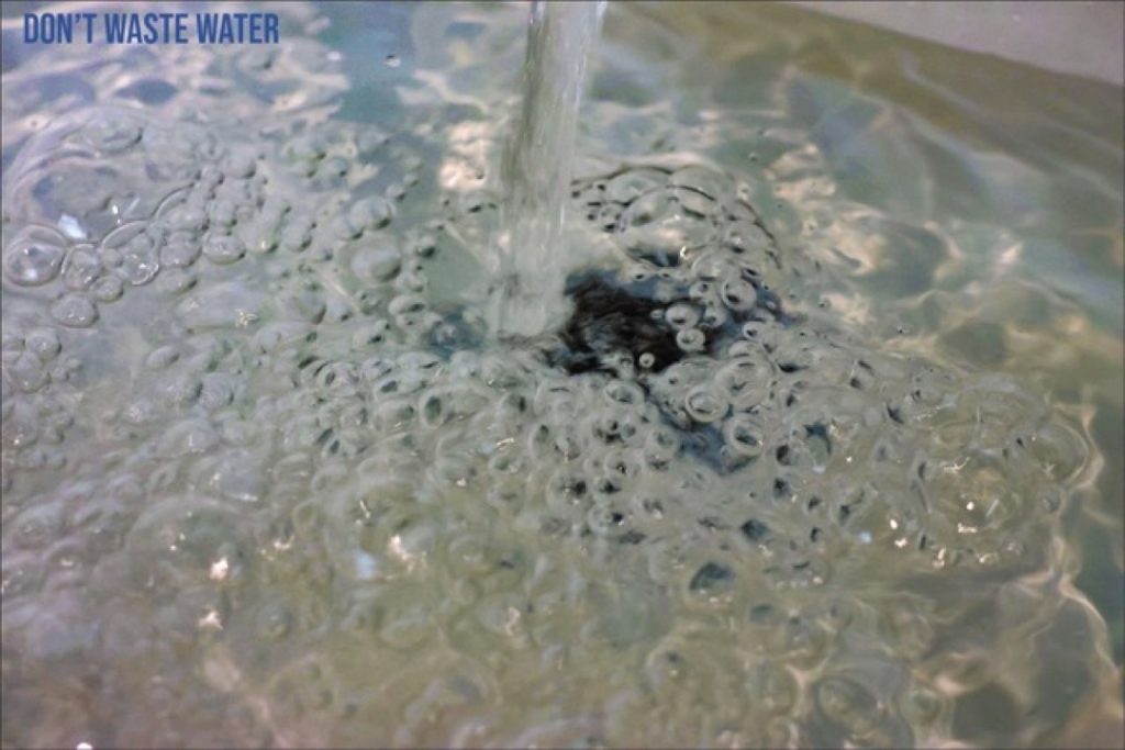
I was inspired to focus on the element of water because I feel it is the most calm, relaxing, and peaceful out of the four.
Additionally, I believe that out of all four elements, water is the one we damage the most. This environmental concern drew me closer to the topic and solidified my decision to explore it for my project.
Maison Edwards
For this project, I was inspired by the element of earth. This theme allowed me to generate a vast amount of ideas, as it can be easily linked to concepts such as the beginning of life, animals, plants, and biology. This ultimately inspired me to create models based on the hit horror gaming franchise, Resident Evil. Since I already had a wealth of knowledge on this subject, I began to design models and write lore linked to biology and the earth element. Through this, I was able to incorporate elements such as viruses, zombies, and mutated, animal-like creatures (including Las Plagas, the T-Virus, Hunter Bs, Lickers, and Tyrants).
For my models, I was inspired to design weapons embedded with specific anti-viruses. These weapons are capable of stunning, defeating, or curing these grotesque creatures, giving the host vessel a second chance at life. Whoever is worthy enough to wield such a weapon becomes a symbol of hope for those impacted by the harmful Bio Organic Weapons (B.O.W.s) unleashed by the depraved and malevolent pharmaceutical company, the Umbrella Corporation.
Brandon Foster
The purpose of my designs is to explore my chosen element, air, drawing inspiration from air-based video game characters. I chose this element because it aligns with my zodiac sign. Air can represent lightness, movement, and spirituality, and it is often visually depicted through clouds and wind. It can also symbolise freedom and the unknown.
Throughout the years, air has been utilised in so many different ways across entertainment. For instance, physical games like air hockey rely on it to function, while movies, television series, and video games frequently feature it as a superpower.
While the air element has been used in a multitude of exciting ways, reflecting on my own work, I think I could have improved the level of detail to create better-looking designs overall. In the future, I will aim to spend more time refining the designs as a whole.
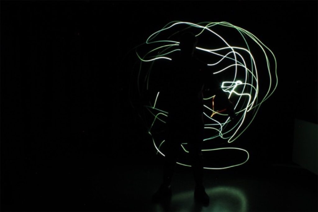
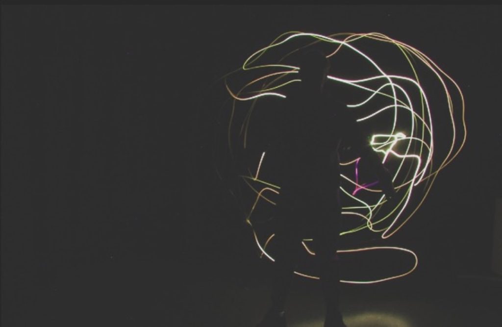
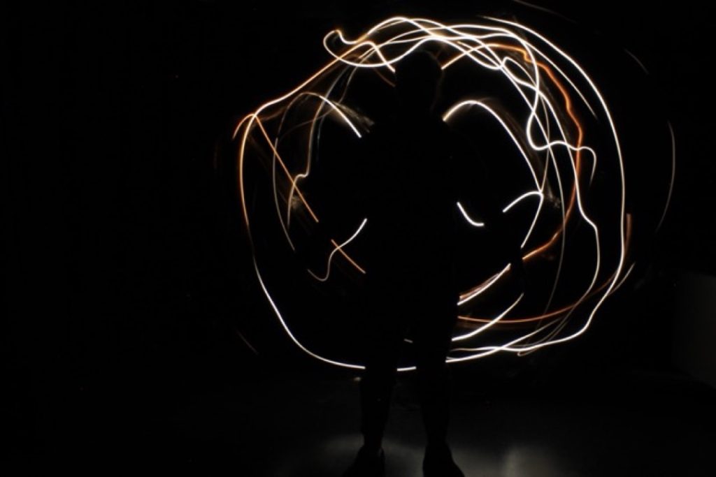
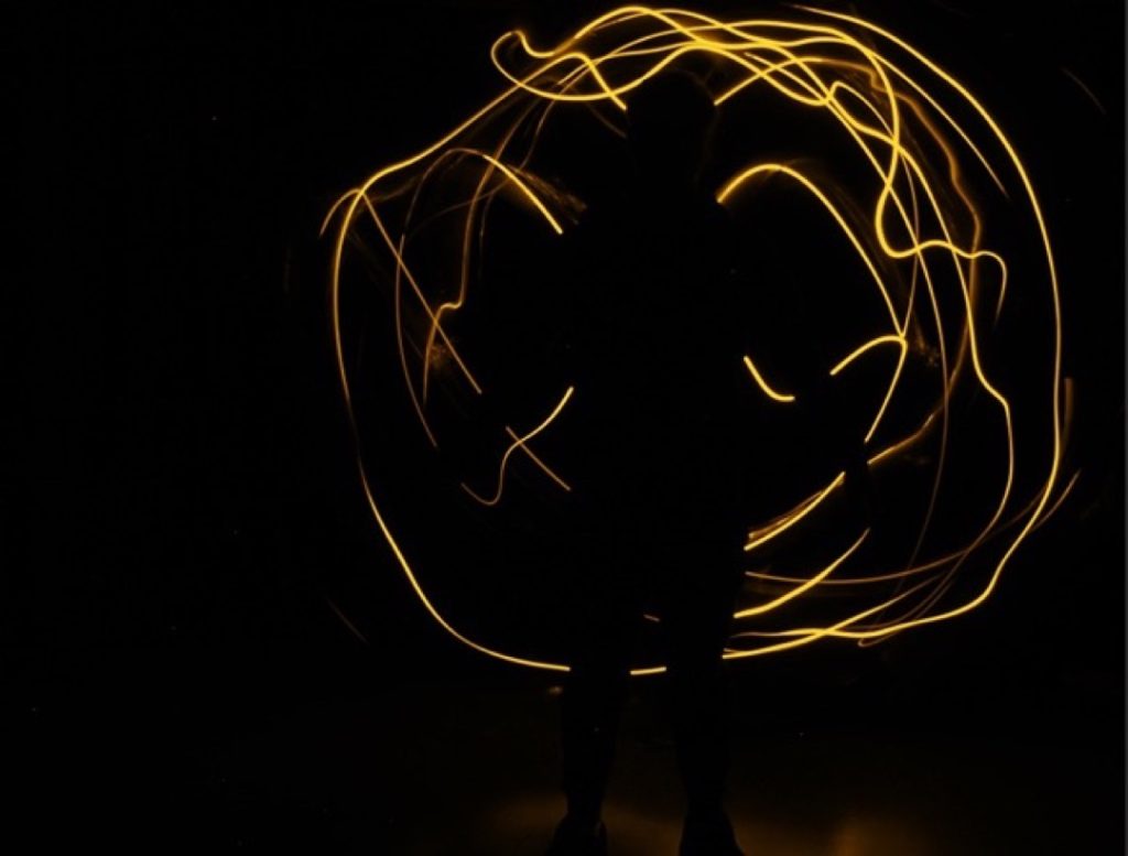
Jac Hickman
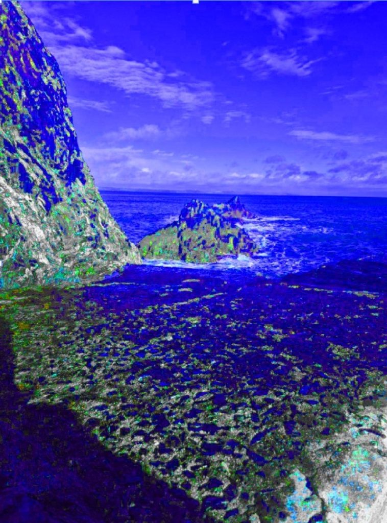
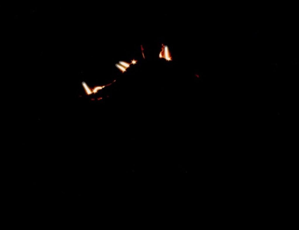
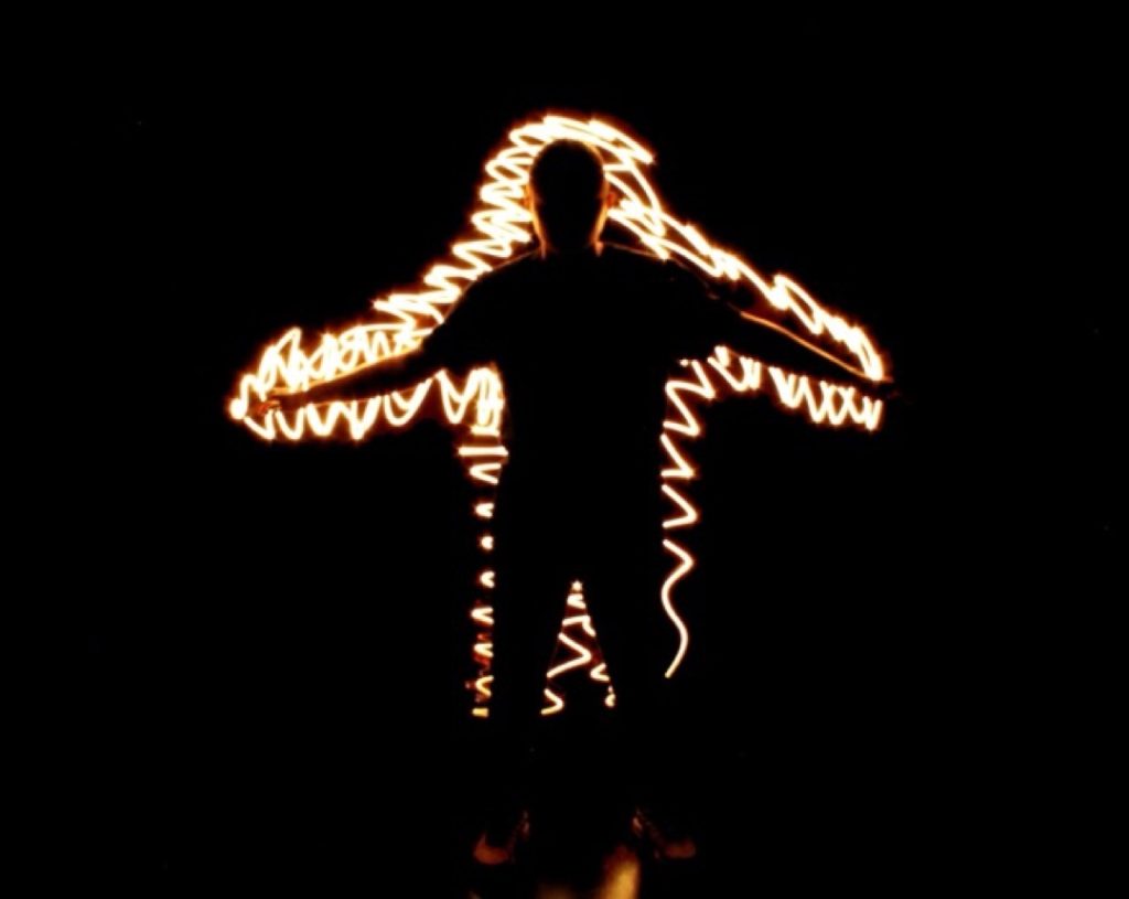
Fire has always existed as a dual symbol: creation and destruction, warmth and danger, light and chaos. I explored these contrasts through light photography, capturing long-exposure images and using coloured gels to mimic the natural hues of fire.
Across six images, I shaped light into forms that echo the emotional and symbolic weight of fire: its capacity to create and destroy, to direct, to warn, and to consume. Each of my images showcases the different symbolic meanings of fire while focusing on the core energy that it naturally exudes.
By removing physical flames and replacing them with light, my aim wasn’t to show fire as a physical phenomenon, but as a structured metaphor.
The resulting images allow the audience to use their imagination, inviting them to reflect on the internal meaning of fire.
This project became an exploration into the multifaceted nature of fire, delving into its history within mythology alongside its positive and negative traits. Through light and colour, I sought to capture and visualise the very energy that fire represents.

Ella Mcnaney
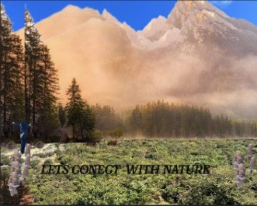
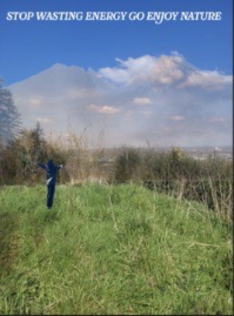
I took these photographs because they fit perfectly with my overall concept and creative process. I chose the element of earth because of how calming and relaxing nature is. Being outdoors is incredibly peaceful, fosters a deeper connection with the environment, and acts as a natural mood enhancer that is highly beneficial for mental health. Spending enough time outdoors can significantly strengthen our relationship with the natural world.
The techniques I used included experimenting with different lighting and camera angles. I chose these methods to ensure the photos looked their best—playing with both bright and dull lighting to create realistic, sharp images rather than blurry ones. Another technical aspect I focused on was the shutter speed, making sure it was set correctly to 1/1000th of a second.
Holly Walker
For my project, I was inspired by the element of earth. This theme allowed me to create six 3D models that link to the film Tangled; specifically, the tower hidden in a secret forest inspired me to create my own magical forest cottage.
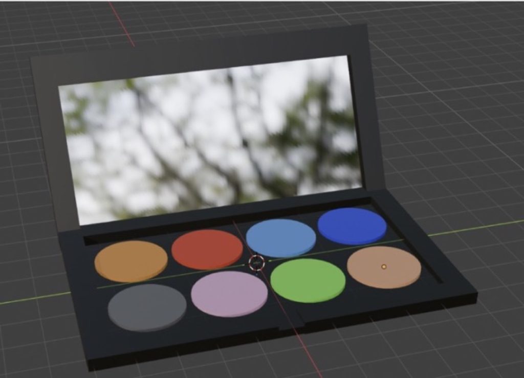
Building these 3D models helped me develop new skills and techniques, and I now feel much more confident and inspired to design even more. One of my standout models is a makeup palette where each colour represents a different element, possessing unique magical effects depending on which colour decides your fate!
Kaylee Wood
I chose to photograph fire because its warm colours evoke feelings that are simultaneously relaxing and powerful. Fire represents a duality of positive and negative forces; it stimulates plant growth and maintains ecological balance, but it can also cause atmospheric pollution, water contamination, and pose hazards to life and property.
This element inspired me through its symbolisation of personal growth and change, burning away the old to make space for new beginnings. It also embodies passion, energy, and enthusiasm, often igniting feelings of inspiration.
For my photography techniques, I experimented with various angles and lighting sources. Changing the light sources helped to make the pictures look more realistic, while adjusting the angles ensured each shot felt unique.
The standout parts of this project were taking the photos and editing them exactly how I envisioned. During the editing process, I experimented with different techniques, such as dimming the lighting to see how it affected the mood.
In hindsight, I might have chosen nature over fire, as it offers a wider variety of photography opportunities.
My ideas evolved throughout the project as I thought critically about my colour grading and workflow. I took the time to carefully test each editing tool and technique, deciding which ones best fit the visual style I was aiming to achieve.