LEVEL 2 CREATIVE MEDIA
Aisha Anam
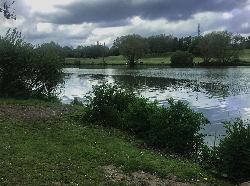
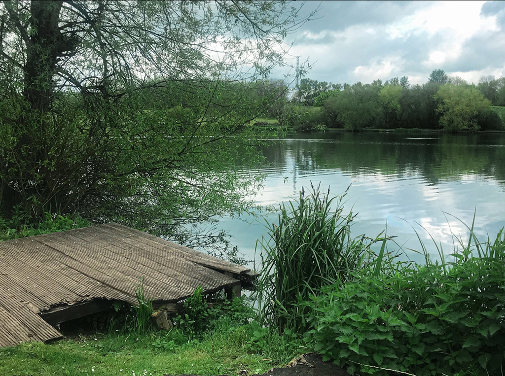
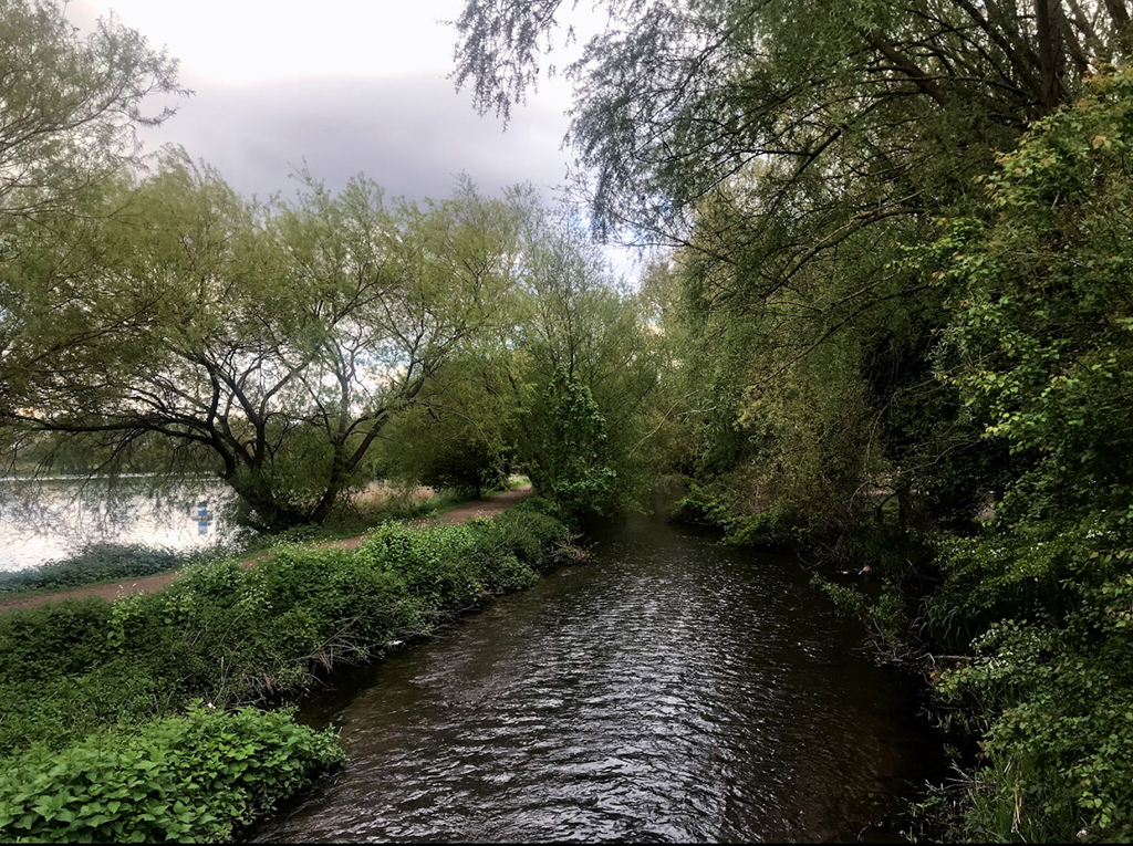
Nature
The theme of my final project is “Nature” looking at different techniques and different views. I took six pictures that I edited myself. I decided to do something that is based around landscape photography. I went to a park in Luton and took photos of the varied landscape including images of a river and trees. My aim for this project was to improve my editing skills and learn new and different techniques.
Dana Carter
Project X – Nature Photography
My plan was to create a nature photography video, so I edited and compiled the images into short movie and added a cross dissolve effect to have the images transition from one image to another as smoothly as possible. I added nature sounds and calm music to the video to have an atmosphere which would appeal to the audience. At first the video was too short but after feedback I made it much longer by adding more images, sounds, improved editing and included title cards. I chose to do this idea as I have watched plant videos in the past on YouTube, I feel people do not appreciate plant/wildlife enough and I love collecting crystals, rocks and seashells.
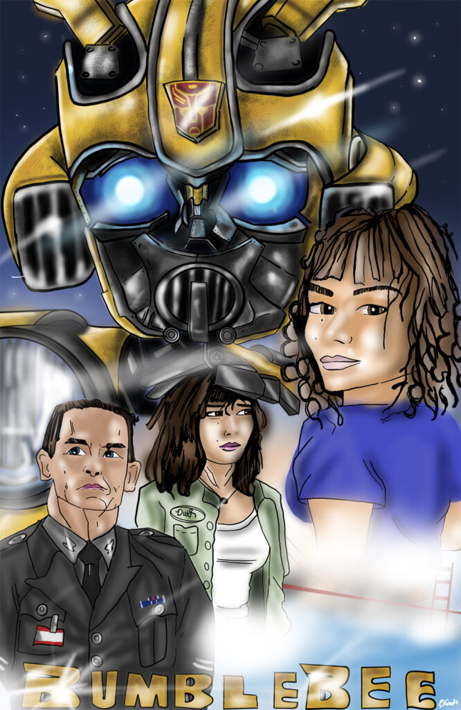
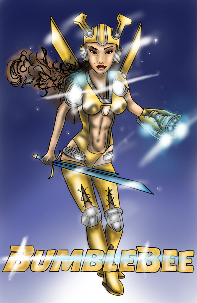
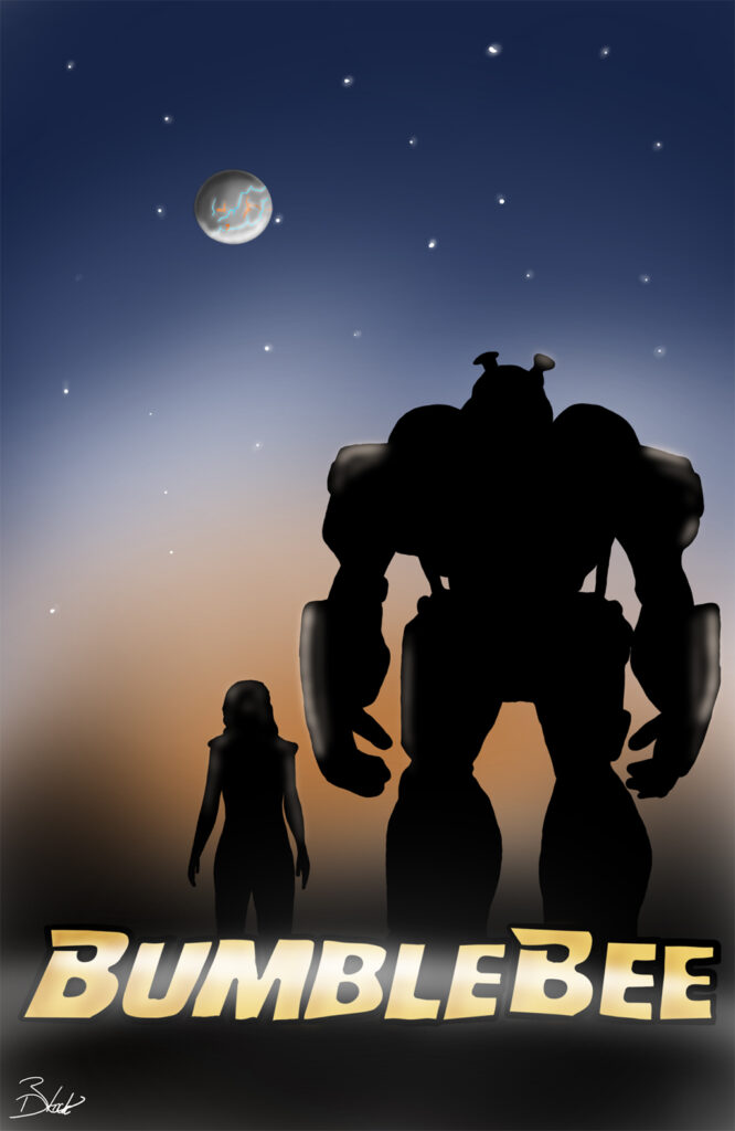
Bradley Finch
Bumblebee
The main aim was to have three posters that link together. The first one has a lot going on, making it stand out so that the first image attracts the attention for the others in the series. The second one is probably the main one that stands out as being a “remake” as I have combined two of the leading roles to make one character. Finally, the last one was originally going to be Disney inspired however I changed it into a minimalistic, simplified piece of art as I wanted the sunset and the silhouette to be the only things that caught your attention. The final poster is also supposed to encapsulate the final part of the movie as Charlie parts ways with Bumblebee to go back to Cybertron. Overall, I feel that I have captured the main characters and the setting quite well.
Charlotte George
Nature Photography Montage
Circle of Sorrow: For the first photo, I decided to take a picture of bluebells. I’m fond of this image because of how they are grouped around in a little circle together; they are the centre of attention in all the green grass. I particularly like the way they slightly turn down due to the way they grow which makes them look slightly sad which is contradictory because bluebells are a symbol of humanity, gratitude and everlasting love; all very positive things. The darkness surrounding the image though does create more focus to the flowers.
Field Day: My idea for this image was to capture more of nature. Keeping it simple by only having green, blue, yellow and white. I took this photograph because I like how the clouds looked in the sky coming out from behind the tree and with the sun appearing through the trees as well creating the shadow. This photograph is very bright which makes it look like its pouring with happiness, then the clear view with clouds just lightly flowing though the sky giving it a more relaxing feel. The sun very lightly peeking through the trees makes some parts of the grass brighter to the rest creating different shades through the shadows which is very intriguing to the eye.
The Field of Yellow: For this photograph I wanted to be able to get a close-up of some of the flowers so you could see detail while still getting a shot of the flowers across the whole field. Therefore, I chose to take the photo at a slightly lower angle to get that effect. This was a darker image so the yellow of the flowers really brings a staple colour to the image.
House Over Sunset: For this image I wanted to get some of the village below so I got a slightly lower angle allowing you to look down on to the houses. I composed between the trees to give the houses more attention, then having the sunset off to the side in the distance gives the image more of a relaxing tone. Seeing all of the houses gives the picture more of a homely feel. I liked this photo because the trees around the image frame the picture very nicely to give more focus on the centre and sky. Then the almost clear sky fading from dark blue to orange gives you a nice change of tone as well. If you look further in the distance, you can see more hills showing how the village is surrounded by nature.
Light in Darkness: My idea was to take pictures of nature so e.g., sunsets, trees, flowers, scenery. Then put them into a montage to show all the photos I have taken together. I like this photo I took because of how the sky, grass and trees contrast each other. The softness of the orange fading into blue is relaxing contrasting from the darkness coming from the trees in front of them, but still having red/orange glow around them. However, the comparison of brightness and darkness do complement each other. Lower down from the dark trees you can still see the green of the grass displaying along the bottom of the photo seeing the colour come back to the image.
Mother Nature’s Glow: The focus for this photo was the sky and sunset, I wanted to be able to capture the sun setting and all the colours it is displaying. You can see the sun glowing in the distance, having the yellow and orange surrounding it amongst the clouds, trees and grass in the foreground of the sunset gives more colour to the image and the natural feel of the image. In addition to this above the trees you have the blue sky with clouds glossing over it with the natural transition from the blue to orange/yellow.
Orange Horizon: For this image I wanted to capture a sunset. This image shows a lot more orange tones because it was taken during the golden hour when the sun was starting to set which gave the image a lovely orange/golden glow to it. The difference from the cold tones of the blue fading into the warm orange tones really brings out the silhouette of the trees and emphasizes them and shows more detail and texture to the trees and the ground. The two trees framing the sunset focuses more attention to the sun.
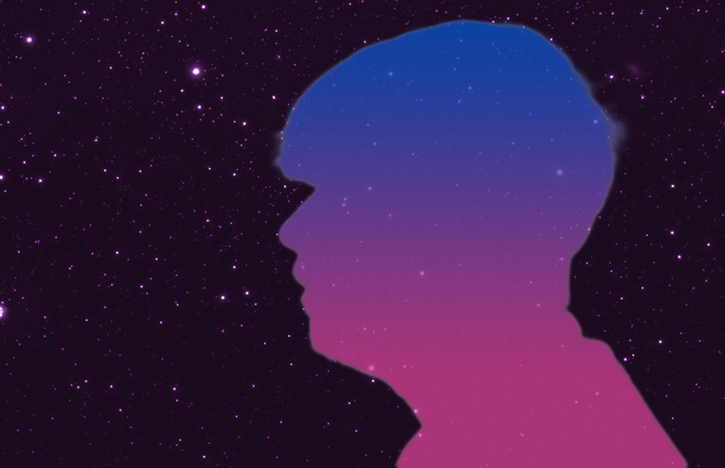
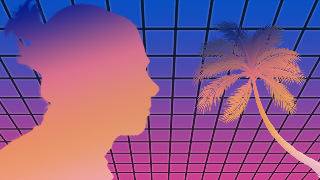
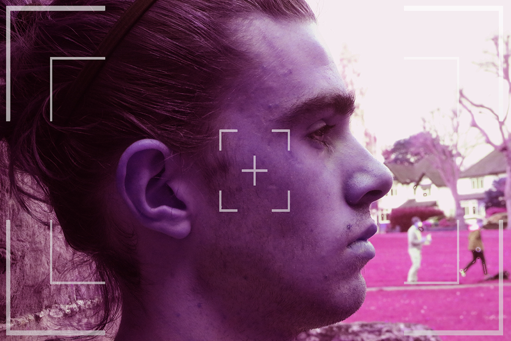
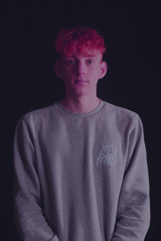
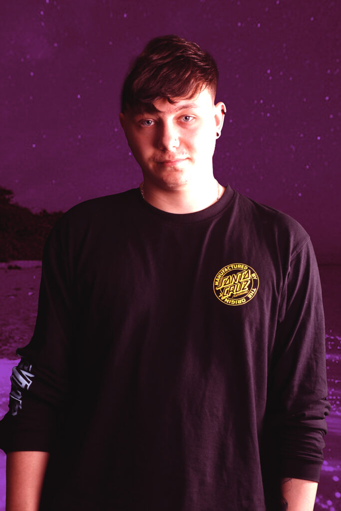
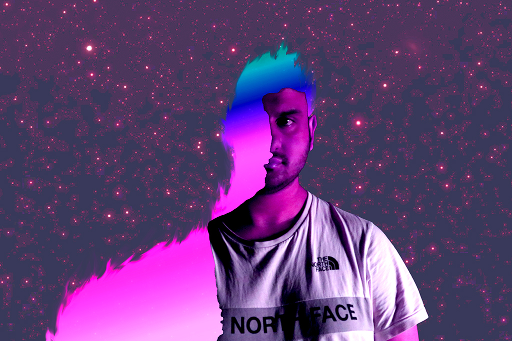
Thomas Hendrie
Retro-Portraiture
A merging of traditional portrait photography combined with a faux retro style known as Synth/Retro/Neonwave. This project professionally hand-picked images, editing them to bring out unique, nostalgia-inducing imagery in waves of pink, yellow, and purple.
Teigan Hoult
Nature Photography Montage
Bluebells of Kindness: I have loved photographing this piece of work, mainly because it’s my favourite flower. The colour in this piece of work stands out. So, I decided to change my shutter speed on my camera, so it gives a blurry effect in background and keeps the flowers at the front in focus. The meaning behind this photograph is gratitude. Just look at this photo! The reason behind it, is to be thankful for everything in your life, like your family, friends, yourself and to always stay positive no matter what challenges you face in life. I like how the purple stands out more in the background. The imagery is there to show you always have kindness in your heart.
Creepy Hollow: I loved this photo because I like how the church is positioned in-between two trees which makes the church look haunted and creepy at the same time. It also looks like it could be a very quiet place. The process behind this photo is that I tried to capture the church at the right angle so I photographed from behind the bush allowing the church to stand out more. Also, I like how church could possibly be used for a horror type film because of how spooky it looks behind the trees. My favourite thing about this photo is how the trees look lifeless and have no energy in them which gives off a ghostly look.
Enchanted forest: I enjoyed taking this photograph. You see sun beaming through the trees making a silhouette shape on the ground. I wanted to capture an ionic moment whilst on my walk through the forest, it gives out a feeling of being in a peaceful world. As I walked around the forest, I tried to capture more photos which looked like a magical scene from a film. It could also show a side of horror which is relatable, in addition this image could represent nightmares and not fairy tales. I’m fond of how it can be place that has birds chirping away and planes going through the sky.
Heavenly Dreams: This piece was taken by my house, and it is so unforgettable. I have decided to call this piece Heavenly Dreams because you can see the emotions in the clouds, so it gives out an expression that they are peaceful and relaxed. I wanted to create this piece as it represents goals in your life that you want to achieve. Finally, the process behind this picture is that I had to go behind a graveyard into a field so I could be high enough to capture the shot. I like how the clouds stand out more when they are on a blue background because you can see the detail of every single cloud in the sky.
Pink Carnation: I loved photographing this piece of work. The colour makes the photograph stand out more. I decided to take a photograph of a bunch of pink carnations which turned out to be so beautiful. The flower is to represent never ending love and a perfect flower for your own mother. This might be my favourite photograph so far due to the reason I took photograph, it symbolizes gratitude which means to always be grateful for life and to always say “thank you”. I like how you can see the texture and every little detail of flower which makes the photograph way better.
Winter magic: This photograph just speaks out Winter wonderland. Why? As you are drawn into the winter experience and just picture yourself dancing in the snow just like in a movie. I love how it gives out a sense of a peace, so soothing and calming, I want to show the importance of a positive mindset. I was inspired by a photographer that I saw online doing winter/landscape photography, so I decided to have a go at it myself. However, the first thing I did was to find the perfect place to take the photos. I decided to walk up a hill to the main road and I like how there was trees bunched together with snow on, so I decided to find the ideal angle to take this photo and I feel I have captured the perfect shot.
Caitlin Morton
Project X
My idea originally started as nature photography mixed with ‘dark’ elements, the final products designed to be displayed in a museum/art gallery. When taking my photographs, I changed my idea to focus only on nature. I used flowers that I had brought in from home and a variety of busts to combine. After taking a few photographs I decided to experiment with the lighting, moving the 2 lights that I had with me around to find a position that makes the photograph look a higher quality. The lighting style that I decided on was similar to ‘Rembrandt’ lighting. Additionally, I experimented with various techniques, such as spraying water and using fabric.
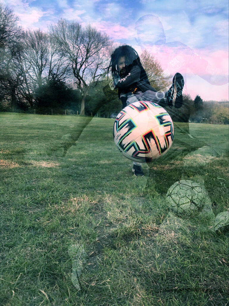
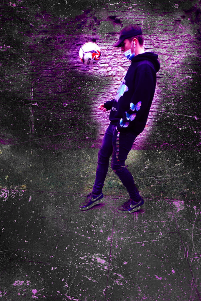
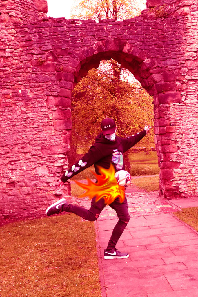
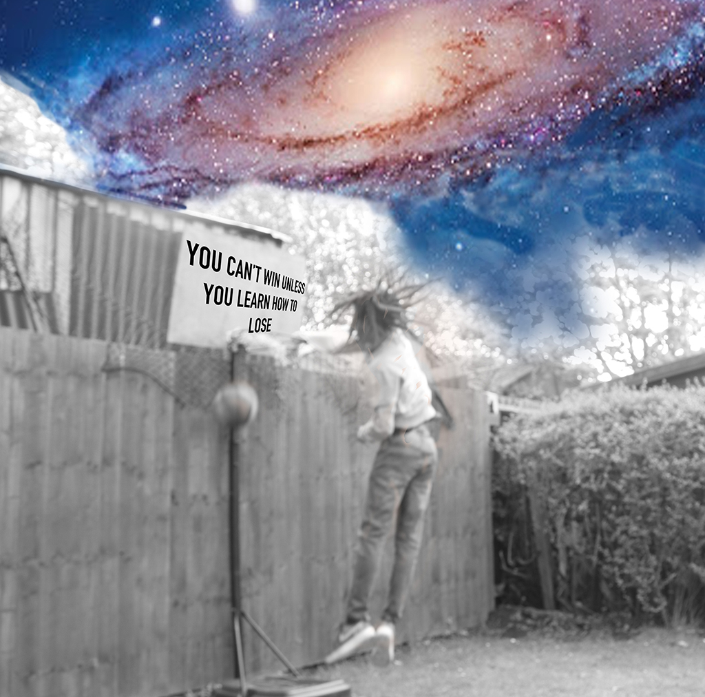
Tafari Pettitt
My Project X idea was to produce a set of action photos specifically being ‘in the moment’. The moment I wanted to attempt to capture, was finding different models and showing their ‘experience’, that were varied. I tried to get different topics, so I was varied. So, it would successfully looked like a collection of live action photographs.