Extended Art and Design 2023Extended Art and Design 2023
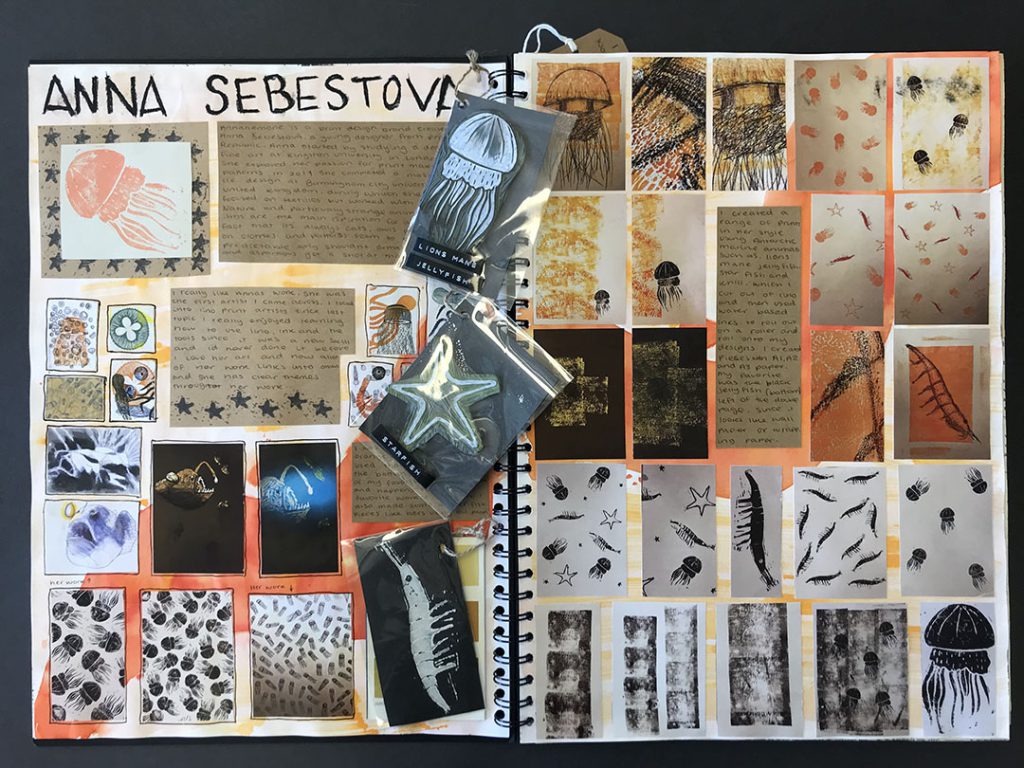

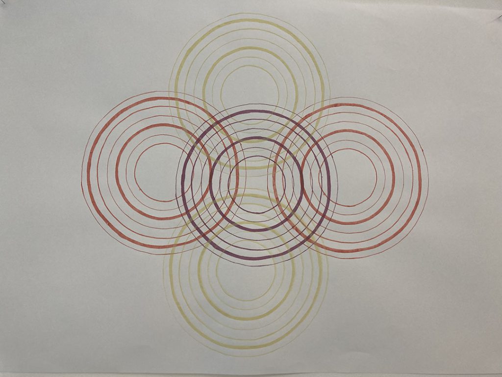
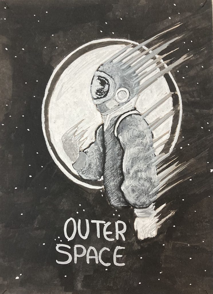
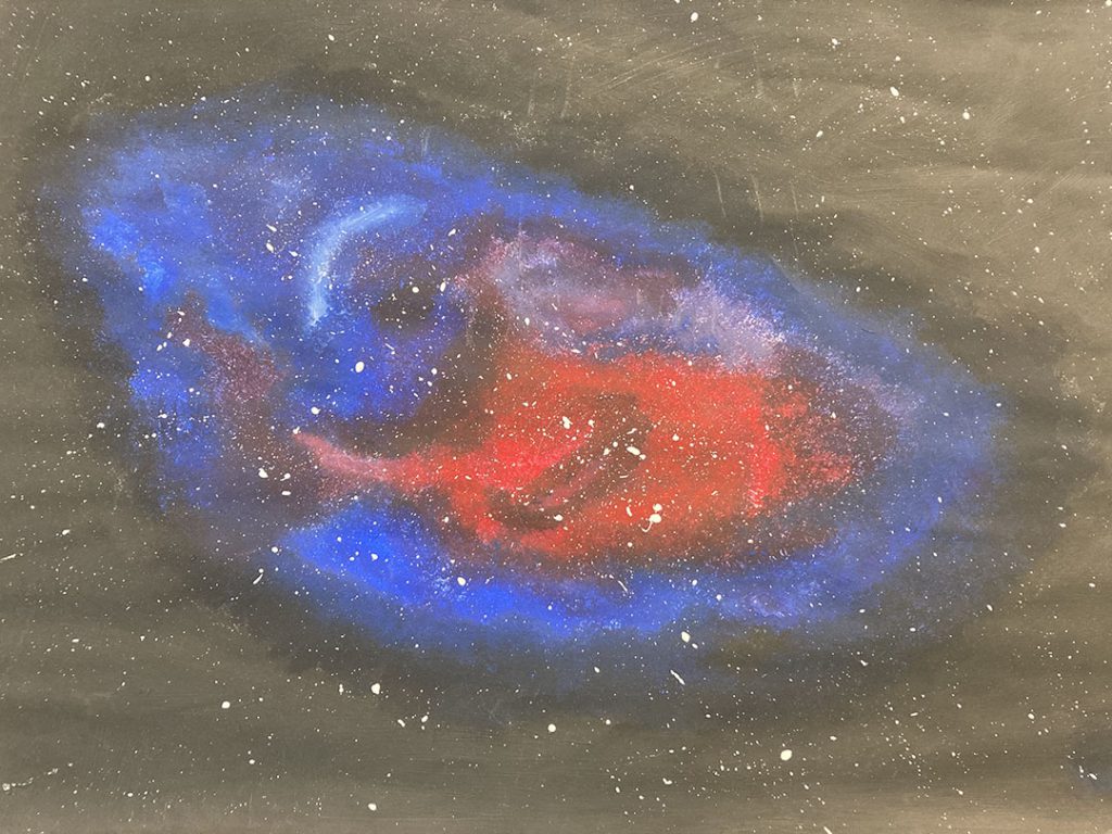
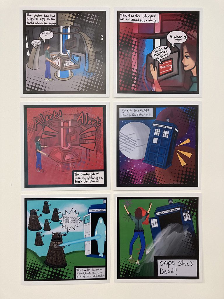
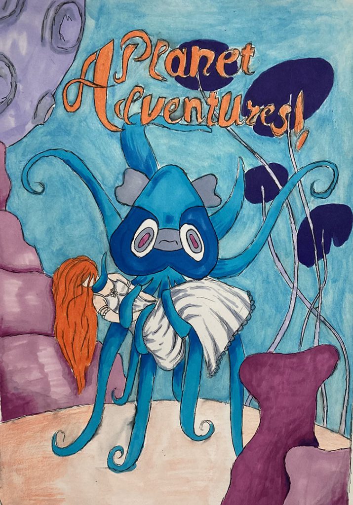
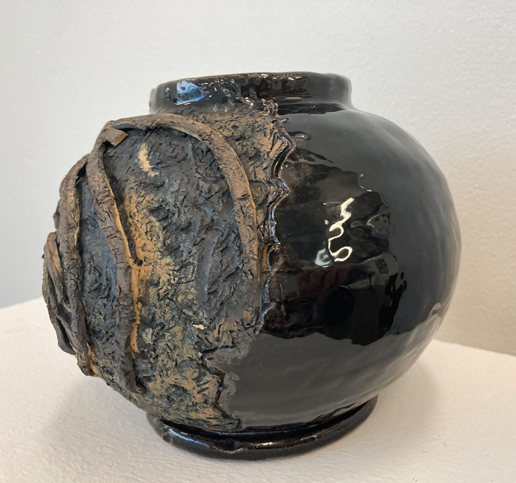
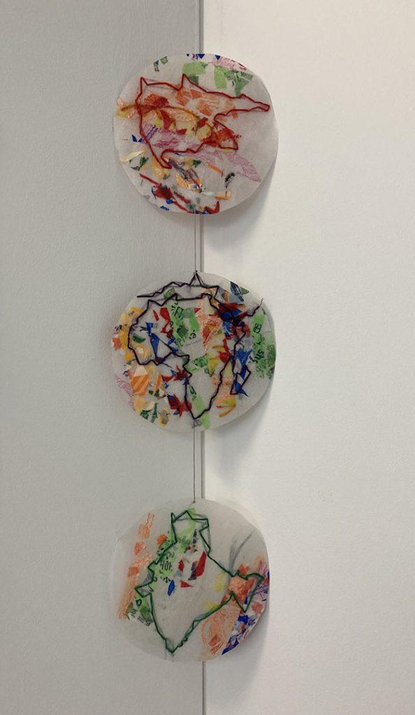
This year our Level 2 students have worked in a diverse range of projects, exploring creative disciplines such as photography, ceramics, print making and 3D. Learners have also had the opportunity to take part in live competitions and events, including Dudley Remembers and The Dudley young photographer of the year.
Jo Davis, Level 2 art tutor


This year has seen the return of our exam project (which due to COVID hasn’t been conducted since 2019) and with it, a workload increase for all on A-Level Fine art. The organisational skills and motivation of the students has really been tested, working with given topics presented by the exam board, which at times can often be frustrating. However, all the students have risen to the challenges presented over the year and produced high quality work they should be proud of.
This year we’ve even managed to resume our educational visits, with trips to Liverpool, London and even Berlin. These have inspired and engaged our cohort and provided them with some additional inspiration outside of the classroom.
The students should be extremely proud of their achievements – as am I – and I wish them all the luck for the future.
Gillian Worley, A-Level Fine Art Tutor, Dudley Sixth
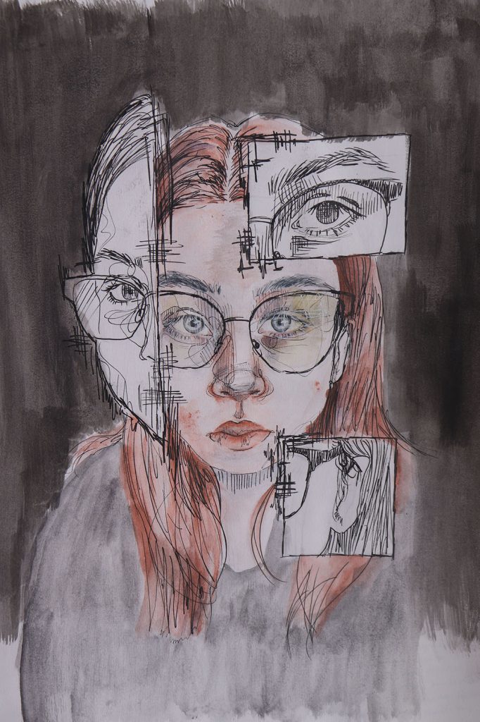

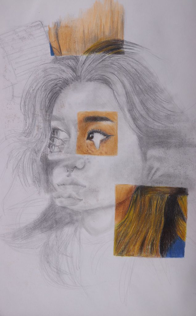


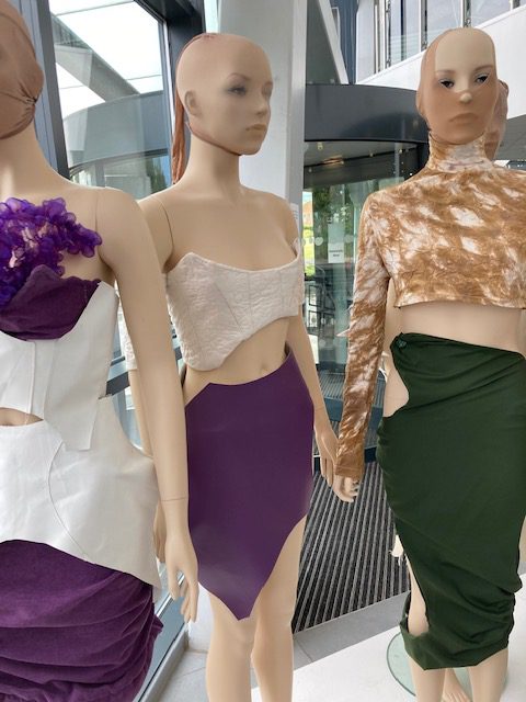
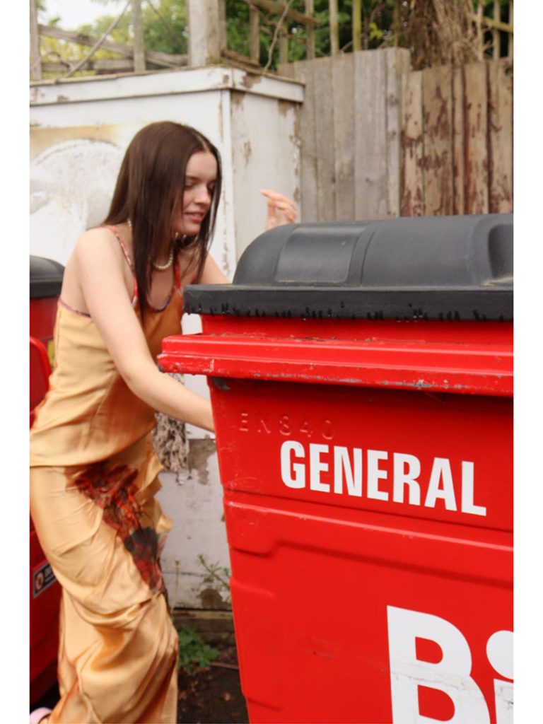
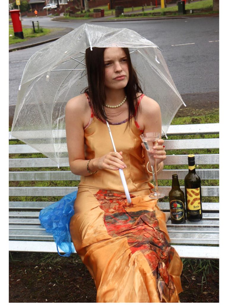
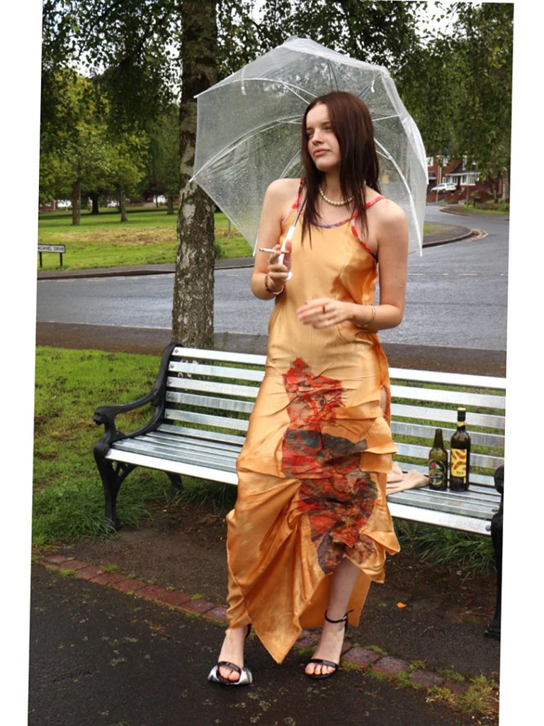
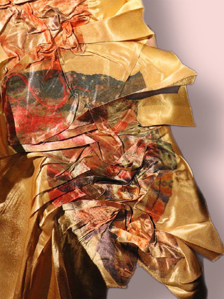
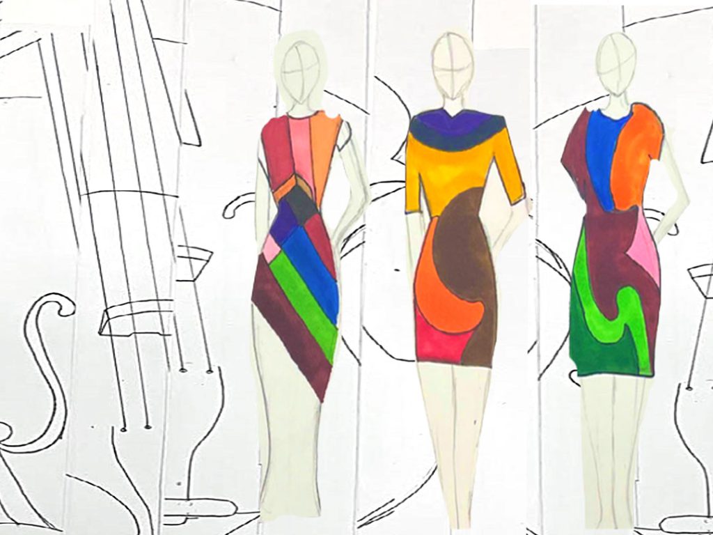
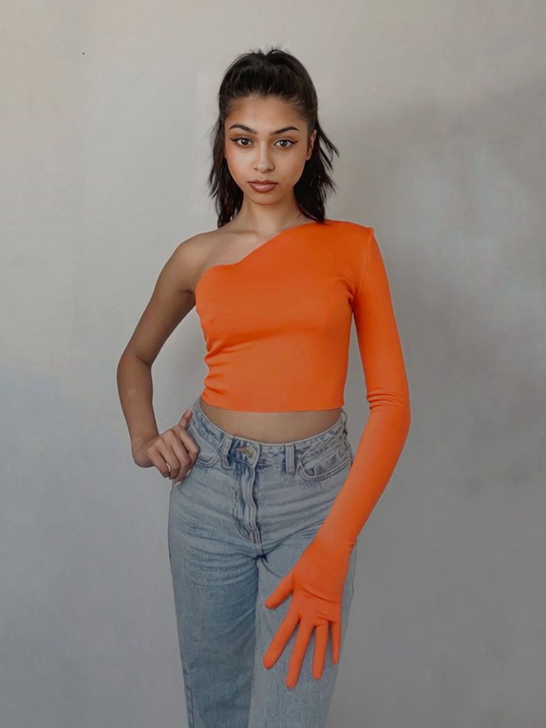
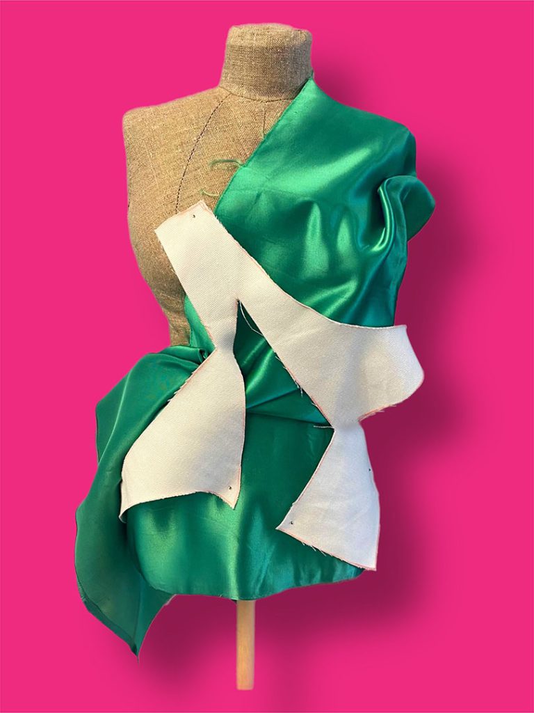
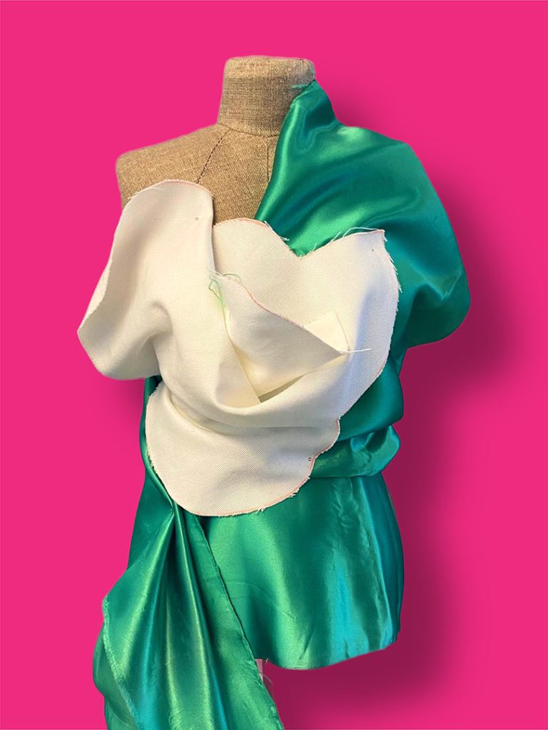
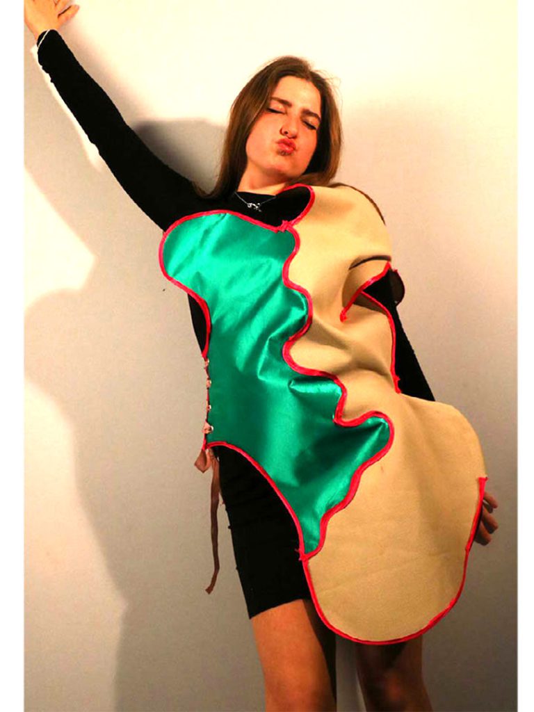
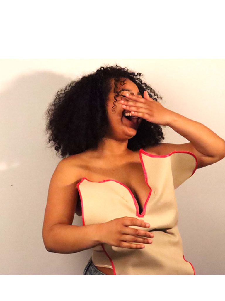
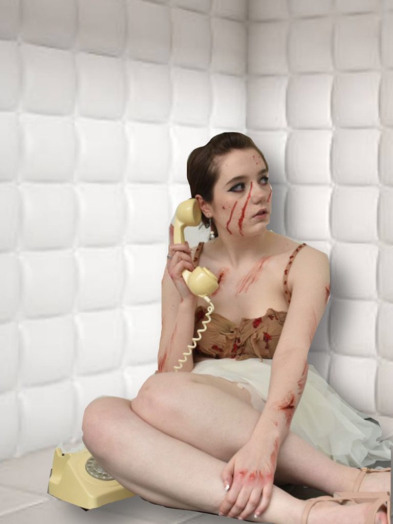
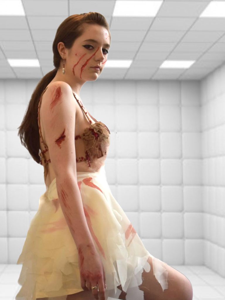
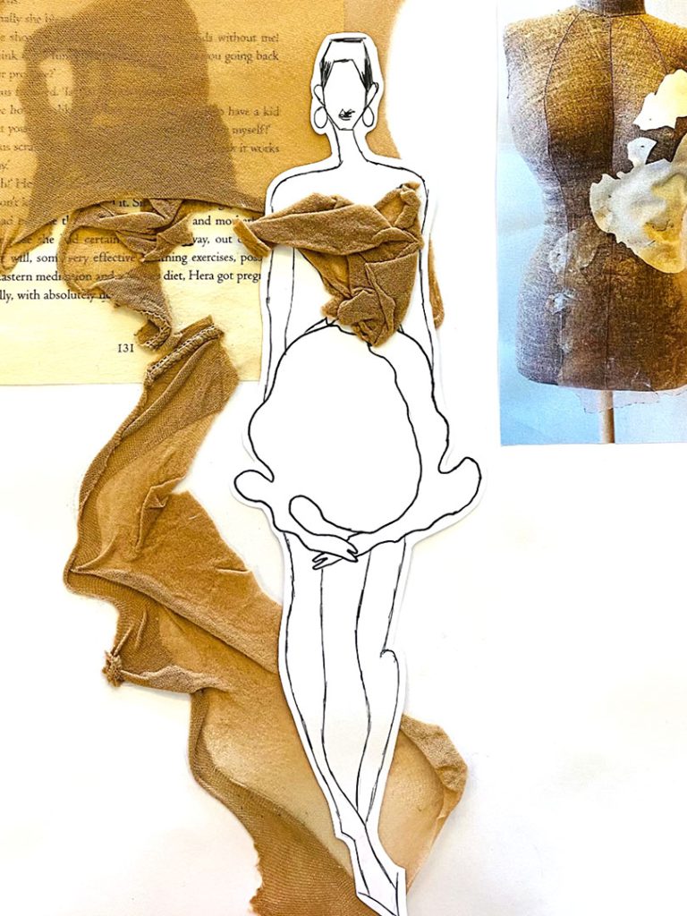
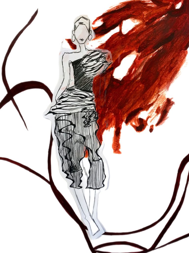
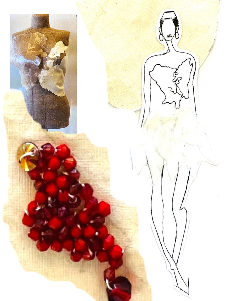
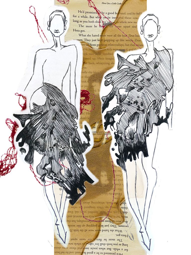
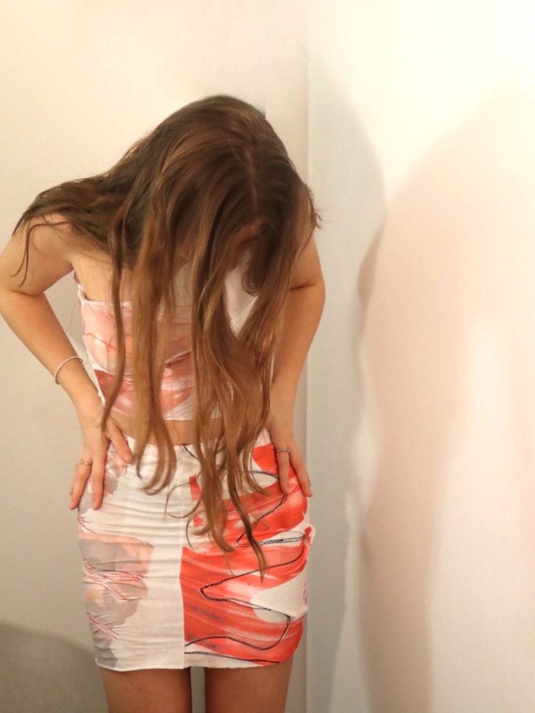
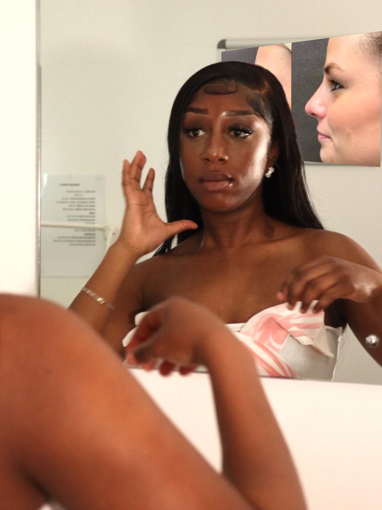
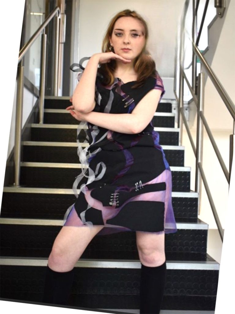
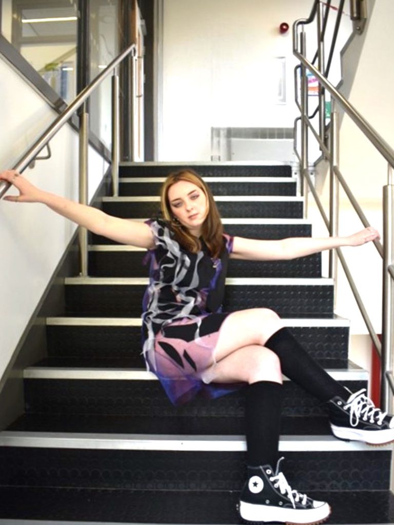
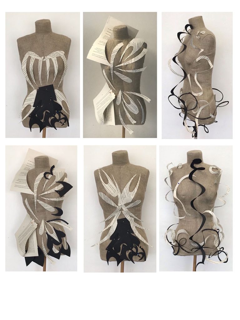
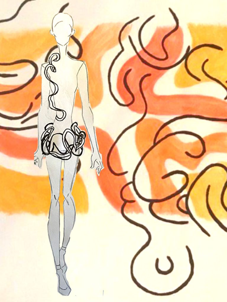
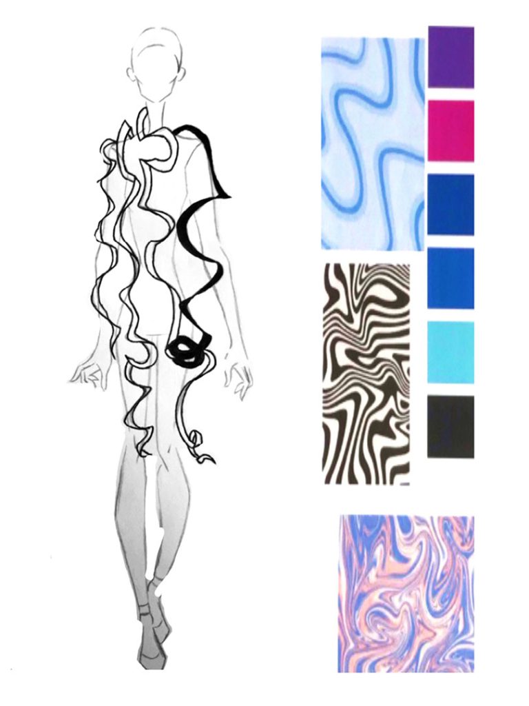
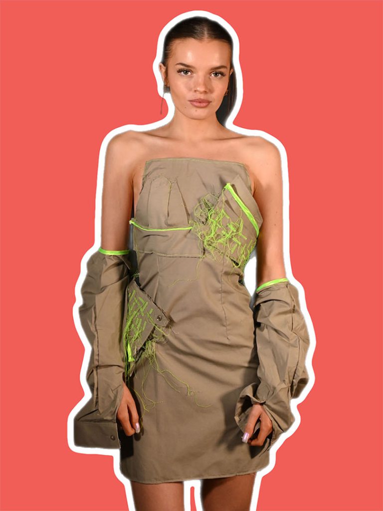
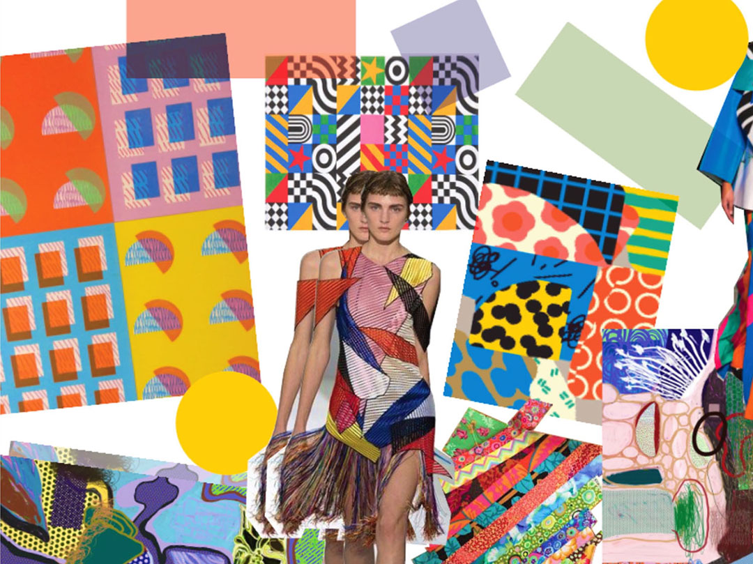
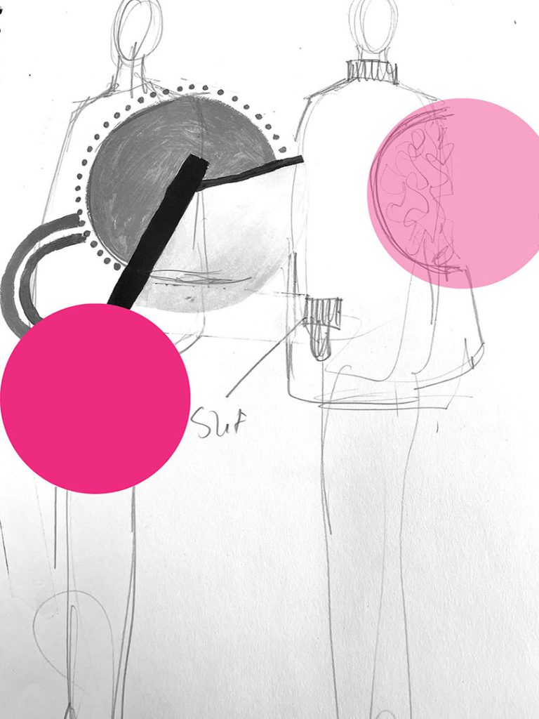
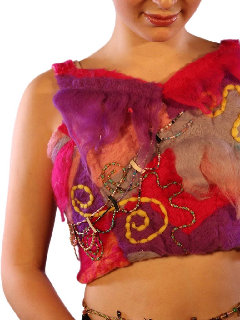
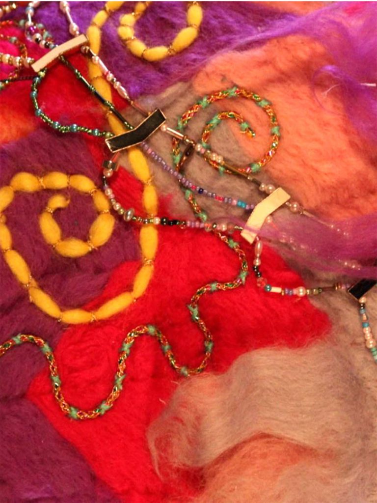
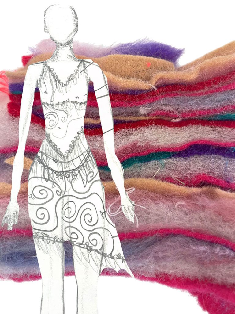
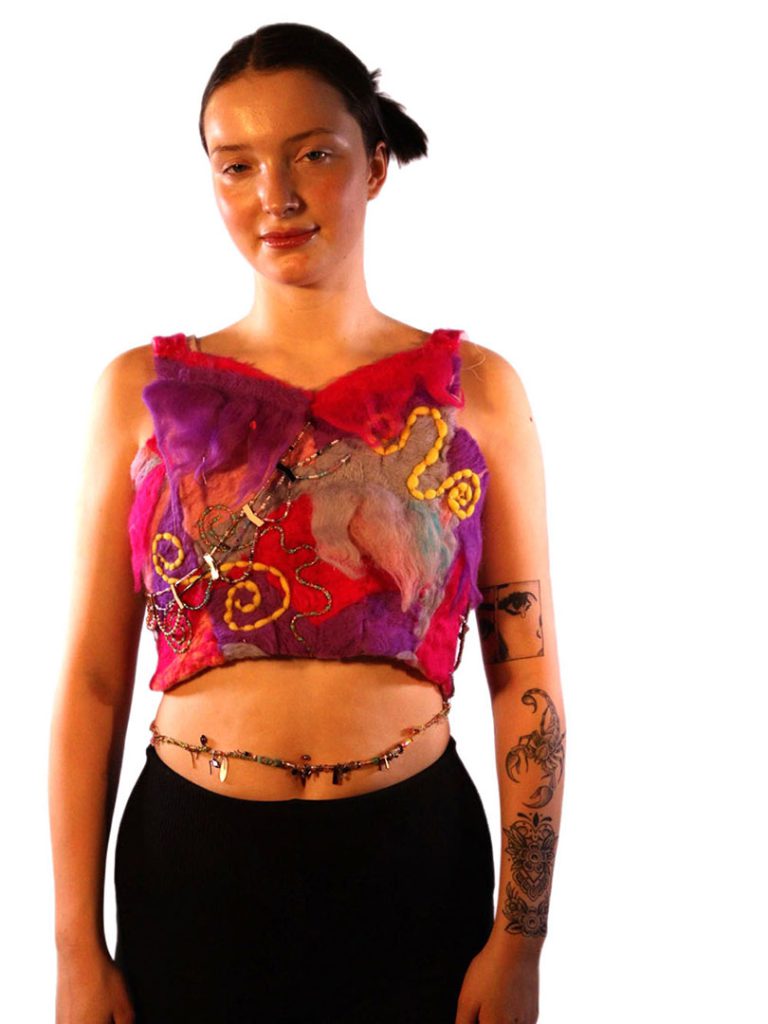
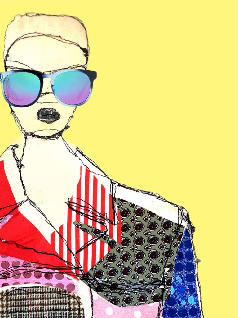
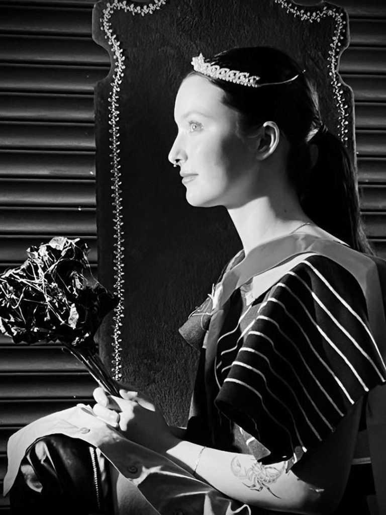
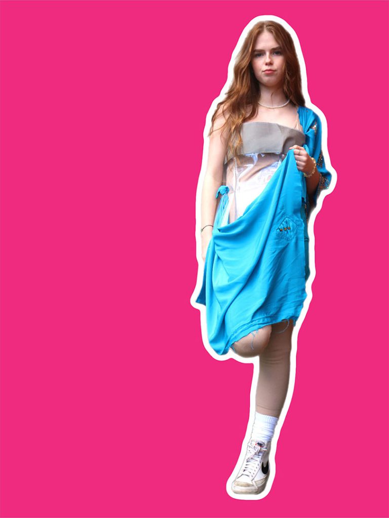
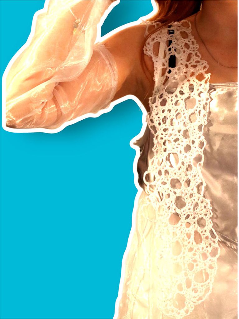
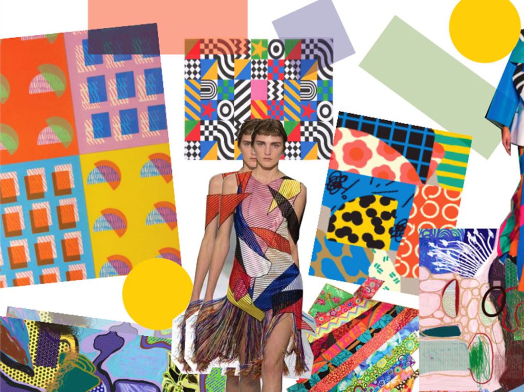
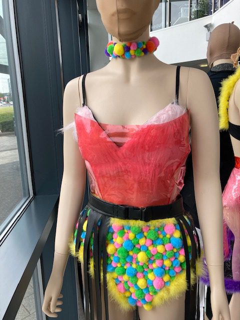
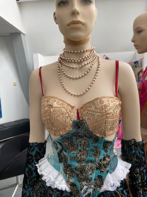
Heart, body and soil is an exploration into our human relationship with nature and its benefits. Recently I, alongside with a lot of the fashion industry, have become aware of the impact this industry creates ecologically, the commitment to sustainability is more prevalent than ever.
Whilst many people have explored this idea from the point of view of our negative impact and choices as a society towards our planet, I tackled this issue from the perspective of our positive human relationship with nature.
This idea was influenced from the architectural design of Biophilic design – ‘An architectural framework that weaves the patterns and forms of nature into the built environment to strengthen the human – nature connection.’
Biophilic design concentrates on the increase of wellbeing when human activity and nature work together and there is a positive link between the two. I considered Spirituality, Alternative Medicine such as crystals from a conceptual and physical perspectives, as well as exploring historical links in previous society’s with biophilic principles and environmental beliefs such as Goddess Gaia referred to as Mother Earth.
While the architectural aspect was a large focal point for me personally, the links are less noticeable at first and are instead imbedded into how I approached my design work, making sure that they follow the same general rules I would follow if these were instead architectural designs as this is how to best reach the psychological and physical benefits of this philosophy.
Some ways you can recognise these principles in the displayed garments are; curved edges for mystery, ordered complexity, nature textures, non-rhythmic movement (asymmetry) and reflection (relationship with light and life).
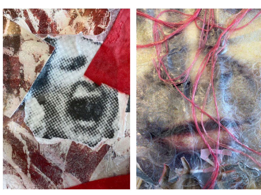
Finding ways to experiment with silhouette based on the structure of crystals as well as materials and shape was originated from primary crystal research and research from photographer/artist Elena Kulikova and her earth collection.
The concept maternity, femininity and protection arose from my research exploring how designers such as Charlotte Knowles portrays in their work. Another of these designers I looked at in relation to this is Iris Van Herpen’s Spring 2021 ‘Roots of Rebirth’ collection, which not only uses nature inspired details, but also in the harmonious movement of her clothes with the body and sustainable processes/materials in particular her Spring 2021 roots of rebirth collection.
Name: Millie Cooper
Title of FMP: The Creation of a Fashion Magazine
Previous School: Dudley College (Dudley Sixth)
Progression University: Liverpool John Moores University
Progression Course: Fashion: Design and Communication
For my FMP, I decided to create my own fashion magazine. Inspiration came from the knowledge and skills gained from Units 1 and 2 about Fashion Communication and Promotion. A contextual reference that was prominent in the development and the ideas generated for this project, was fashion photographer Nick Knights’s showstudio.com. This website helped me decide on the topic of climate change and its impact on the fashion industry. The critical analysis of my contextual references helped to develop my ideas as I was able to take aspects of the references, I liked most, and interpret them into my own work. A particular specialist skill I explored in depth within my project was studio photography and photo manipulation using Photoshop, I got to learn about what makes a successful studio shoot in terms of lighting and camera angles, as well as learning how to distort and manipulate images in Photoshop.
Since my magazine is a digital magazine, I decided to present the final outcome in a digital format as this made the images look more successful. Discussions with tutors/peers really helped influence my work as it helped me to see my work from different perspectives and this overall helped my work become more successful. Planning different aspects of my project helped my FMP develop, for example planning my photoshoots helped make sure I had everything I needed as well as know all crucial knowledge before going into the photoshoots. A challenge I faced towards the beginning of my FMP was deciding wether or not to make pretty much all of my work digital. After experimenting with hand rendered elements at the beginning of my FMP, I decided digitally rendered aspects would be more suitable for my digital magazine. If I were to develop this project further, I would explore even more types of fashion photography, such as studio fashion photography. One of the key things I have learnt on my FMP is developing my critical analysis skills.
Name: Francesca Ellis
Progression University: University of Huddersfield
Progression Course: B.A.(HONS) Costume Design
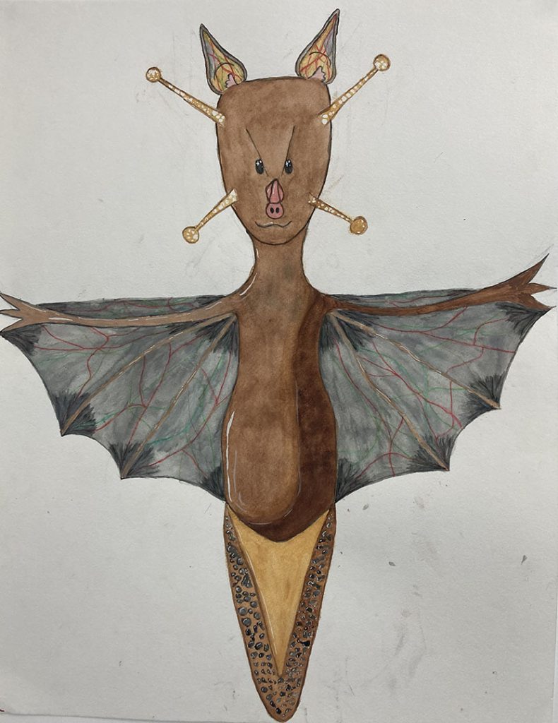
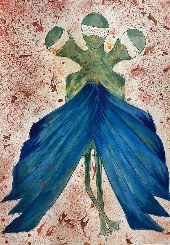
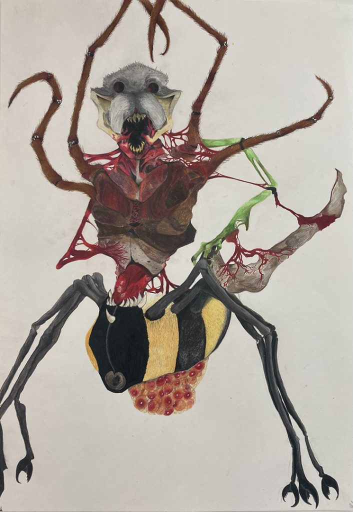
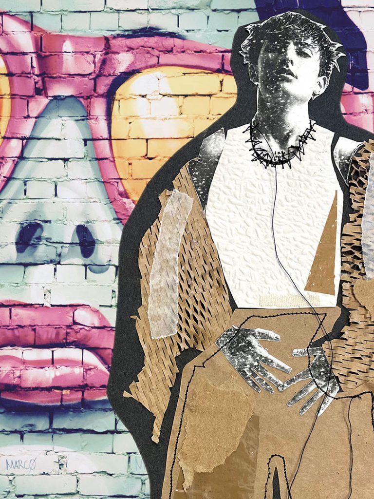
My FMP was inspired by work I made on Unit 2, where I made a range of costume ideas for the Caterpillar in Alice in Wonderland. The insect had a lot of potential that I didn’t have time to explore so want to develop some of those ideas in this FMP.
I wanted to explore the idea of anthropomorphism to produce a range of 2 and 3D costume design ideas for imaginative, fictional creatures with animal and humanistic traits.
The idea of anthropomorphism can be seen in a wide range of films, Disney animated features being a well-known one. Fine artists Jan Svankmajer creates weird creatures in 2D and 3D and Daniel Lismore creates extravagant costumes he wears everyday making him look a walking work of art; in public he would stick out like a sore thumb in the bold costumes he wears as ordinary clothes.
I really wanted to build on my construction and 3D making skills, not necessarily in relation to clothing but rather develop skills in the 3D workshop and work with other materials than just fabric. I experimented with wood, wire, metal, cardboard to create parts of my collection of creatures.
I used regular reflection to keep me on track and recoded the development of my ideas photographically. My critical skills have also improved in the process of this FMP
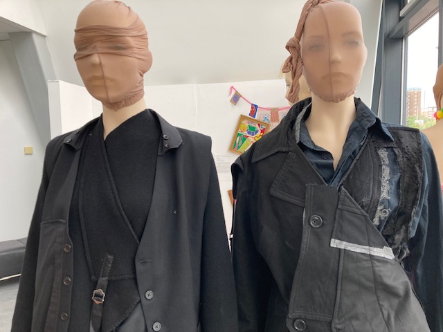
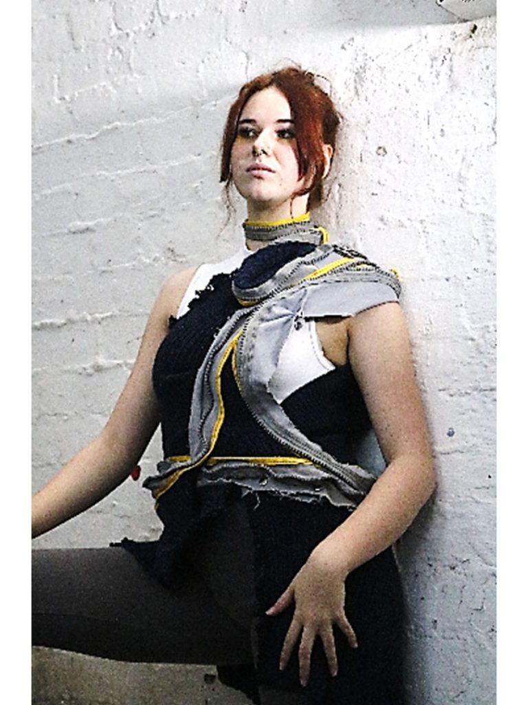
Name: Brandon Reece Hibberd
Title of FMP: Acceptable to the Unacceptable
Previous School: Kidderminster College
Progression University: UAL London College of Fashion
Progression Course: BA (Hons) Fashion Pattern Cutting
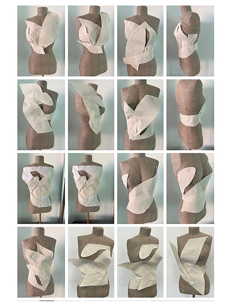
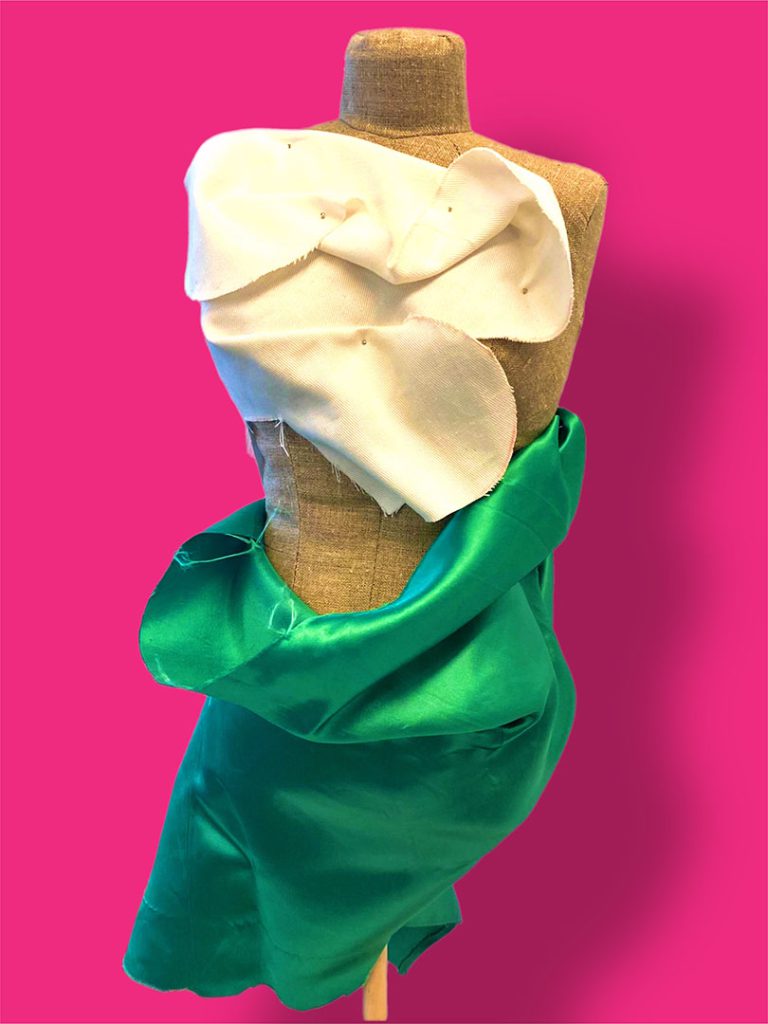
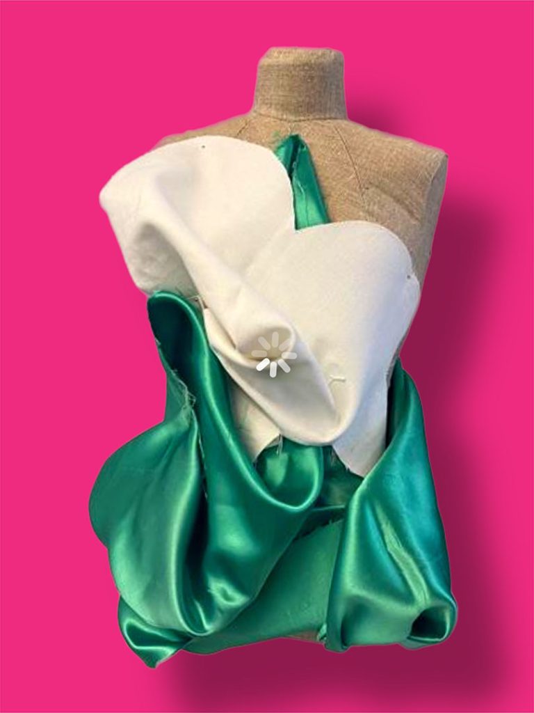
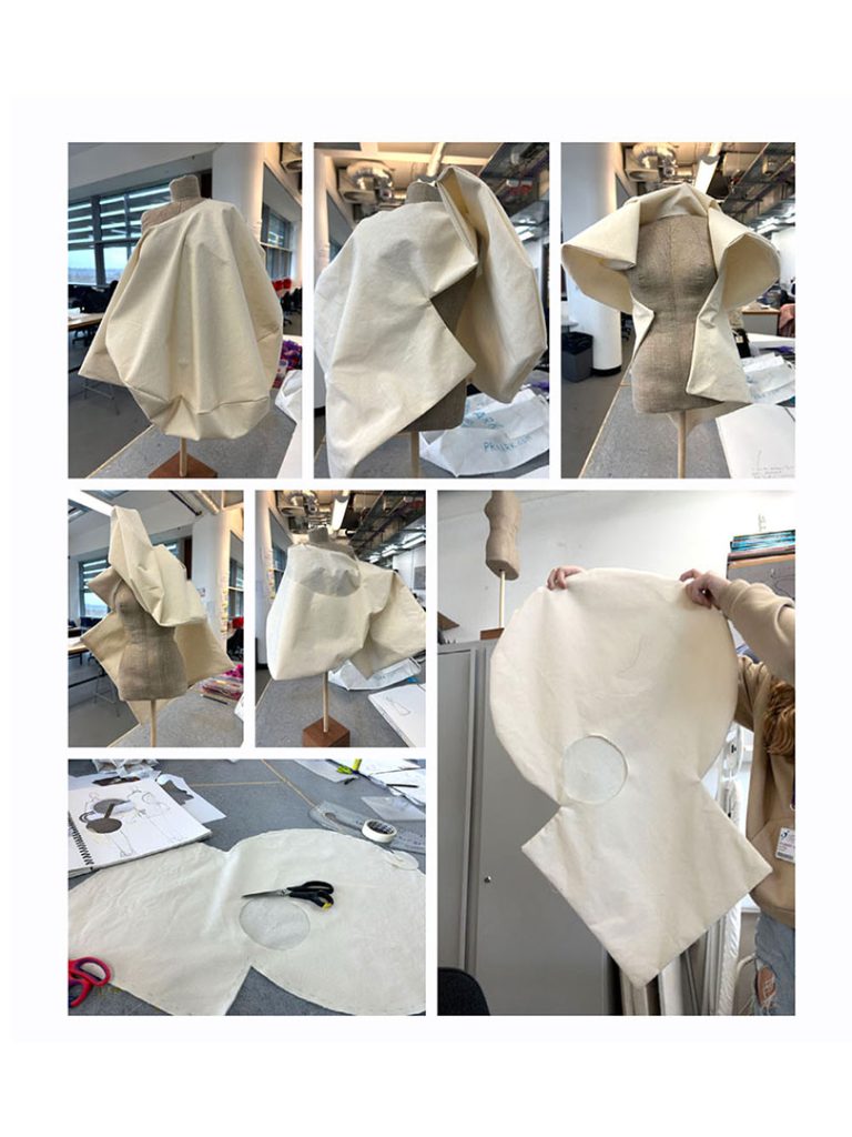
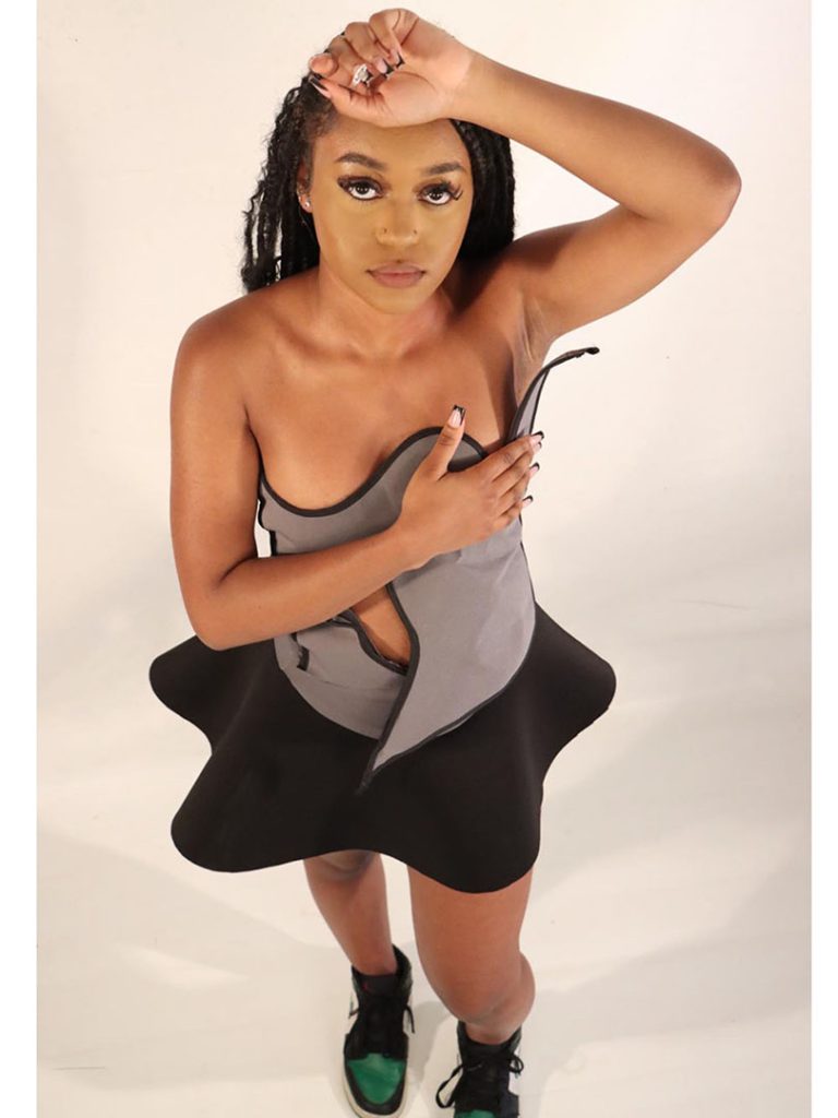
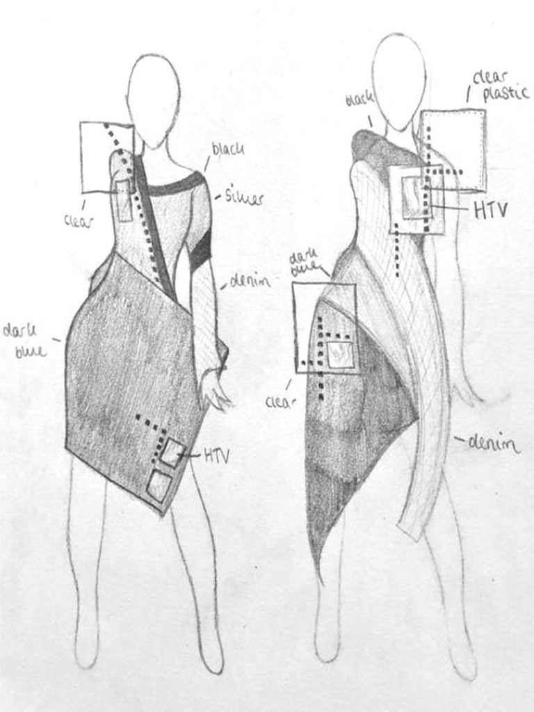
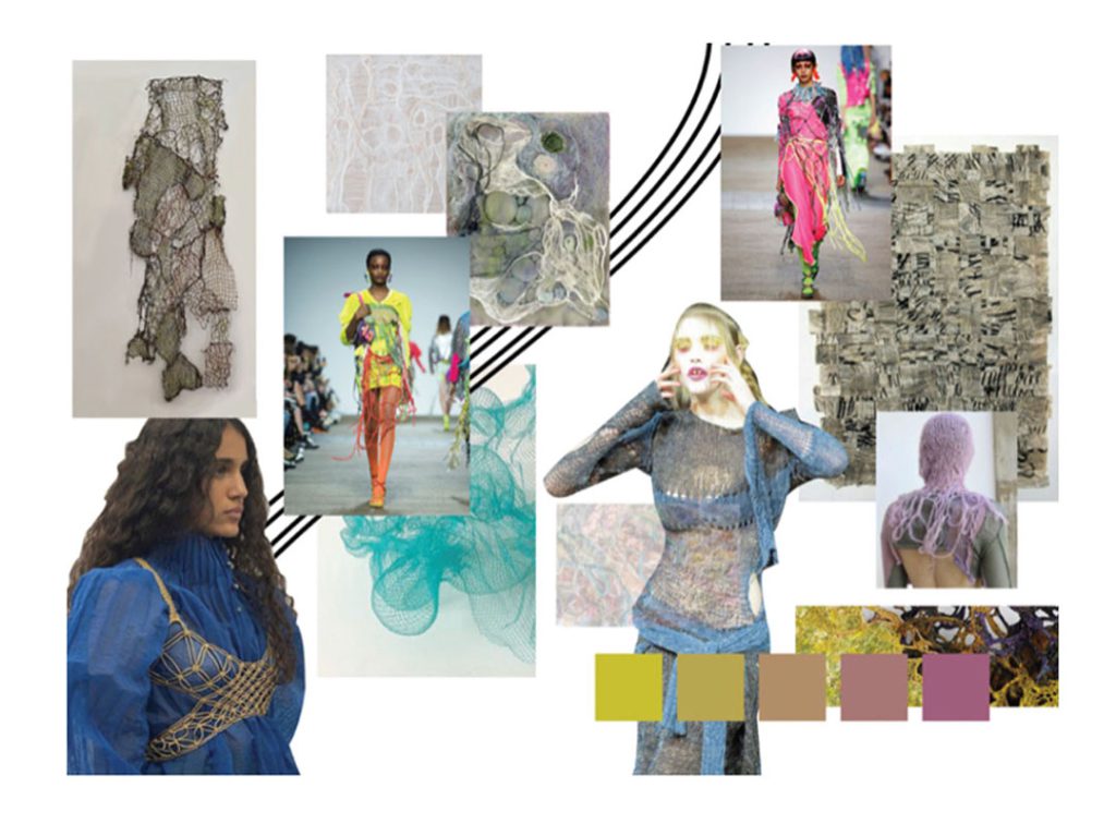
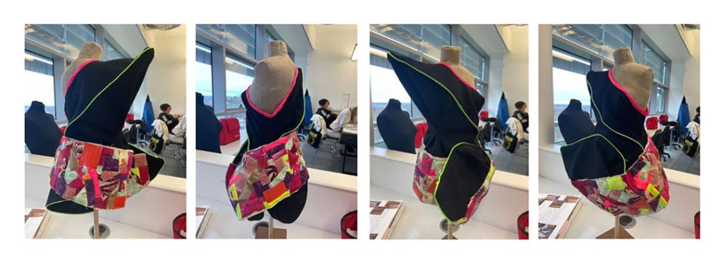
My FMP explores the concept of Deconstruction. I have deconstructed traditional menswear and reassembled it to explore fit, silhouette and layering to produce a collection of garments that while mainly designed for men can be worn by women too.
The ides for the new shapes and combination of fabrics came from my research into designers including Yohji Yamamoto, Rei Kawakubo, and Rick Owens. What I also took form their work was their use of monochromatic colours palettes. I also looked back at fashion history both men’s and womenswear, and current trends in fashion design.
I have explored a wide range of methods including manipulating parts of one garment to be used in a different way on another. I also experimented with creating different textures combining and layering these to create interesting surface details. I used critique form both my tutors and peers to improve on my work and documented how I developed my ideas thoroughly in my sketchbook and SRJ. I organised my time by planning every session and I have been following a timetable of set out of goals which helped me to work effectively and independently.
The challenges in my own work that I have faced was to make sure that all the existing garments and my approach to deconstruction and reconstruction would lead to a collection that was finished professionally with attention to detail and that they would fit real people properly. I think I achieved this and what I think also worked well was fitting my clothes on male and female models. My confidence in pattern drafting and garment construction was an aim I feel I met with this FMP.
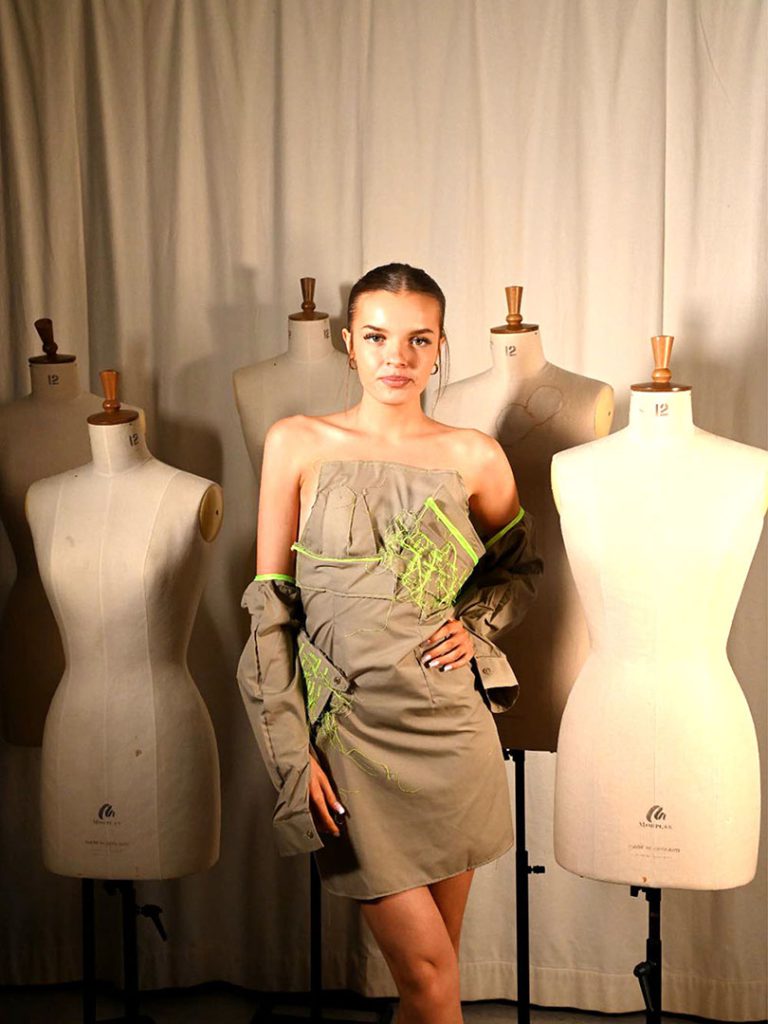
Name: Mia Honeygahn
Title of FMP: Ocean Life
Previous School: Dudley College of Technology
Progression University: Arts University Bournemouth
Progression Course: B.A (Hons) Fashion
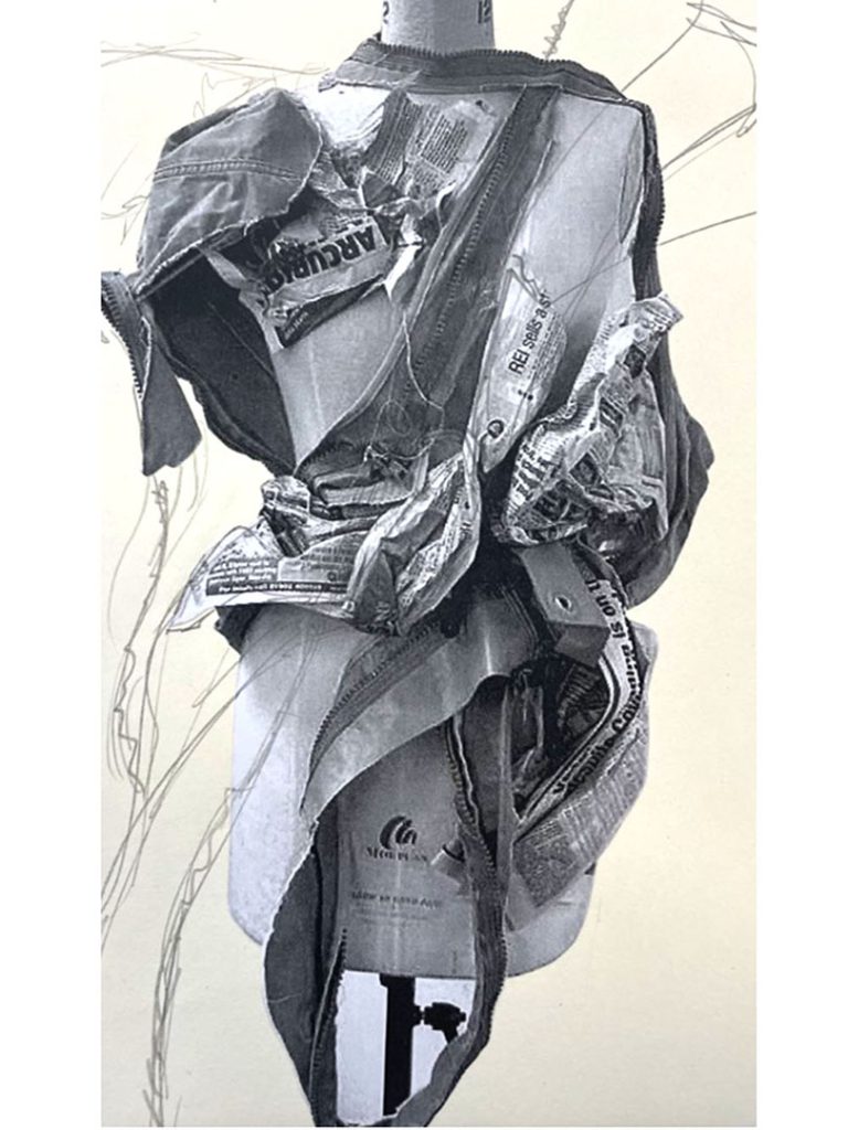
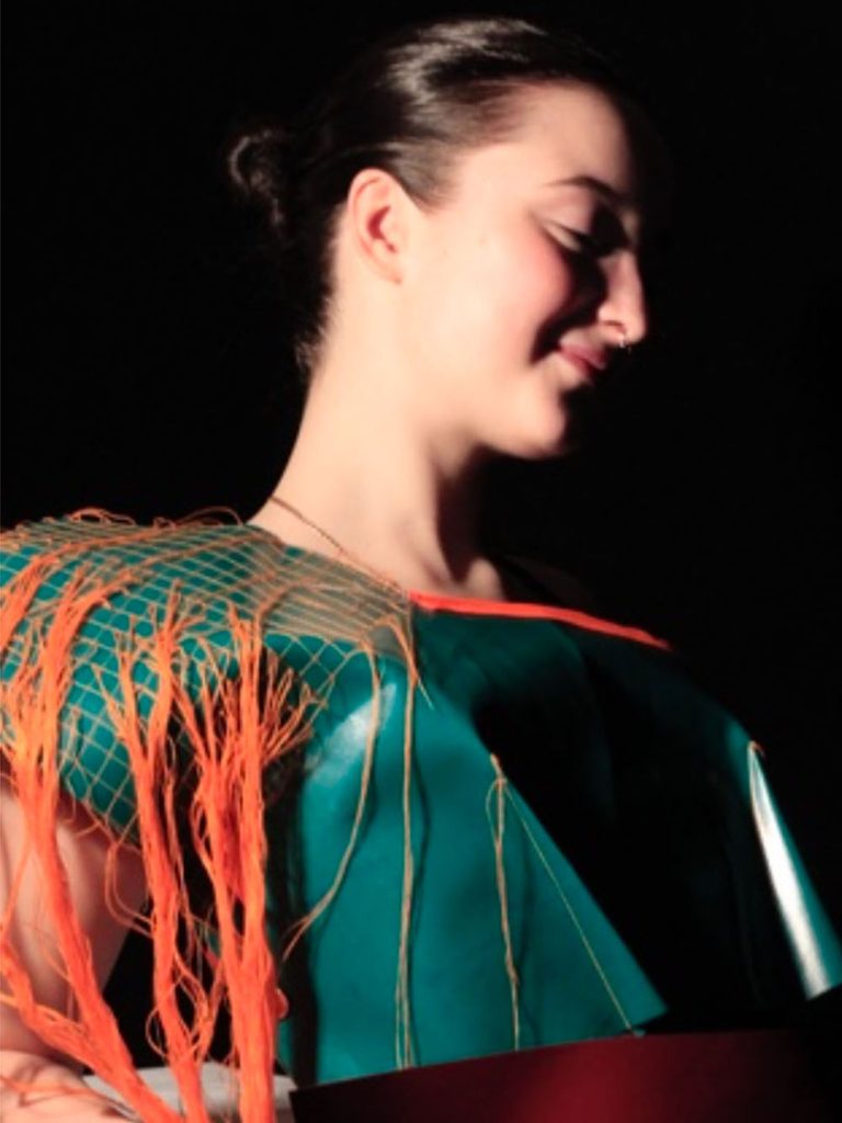
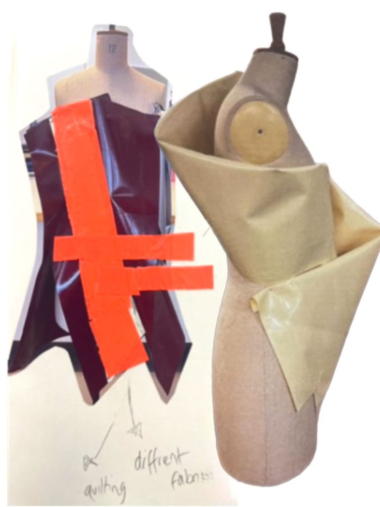
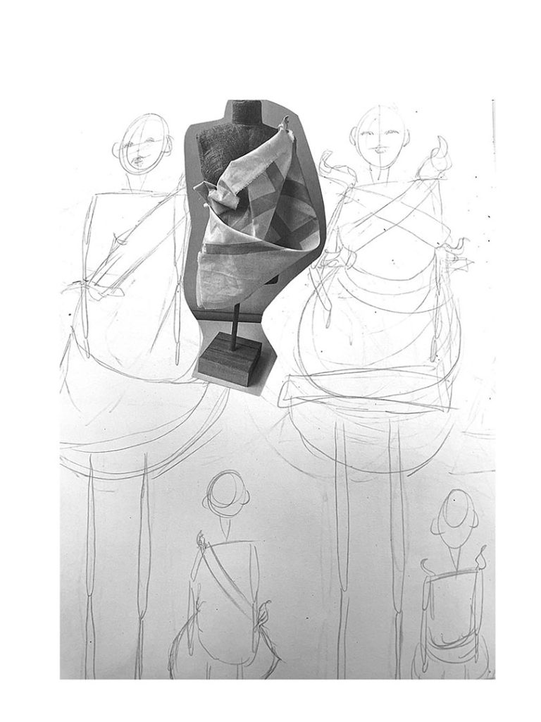
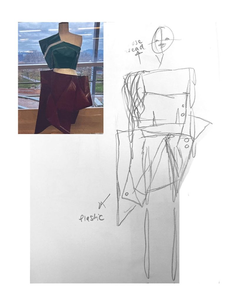
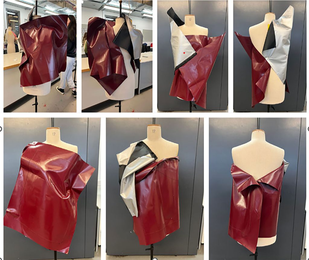
For my Final Major Project I wanted to raise awareness of the growing issue of plastic pollution in the Ocean. I approached this project by experimenting and building up a wide range of experimental textiles using a variety of recycled plastics. These would inform my final fashion collection. I mainly worked in 3D directly onto the mannequin exploring placement and silhouette with the samples I produced. These shapes then informed my design development, I found working directly on the body helped me to figure out how things would work full size and in 3D.
I researched a range of artists and designers to inspire my work including Iris van Herpen, Valentino and Alejandro Duran. I critically analysed each aspect of my project, deciding on which aspects I felt had the potential for further development and which aspects were not working well and needed problem solving.
I managed my project by producing a time plan that was the focus for the beginning of every session. Sticking to this helped me to keep on track with my project and kept it moving forward. I discussed my project with my tutors and my peers to ensure that my project made sense and to get more ideas and opinions to help inspire my work.
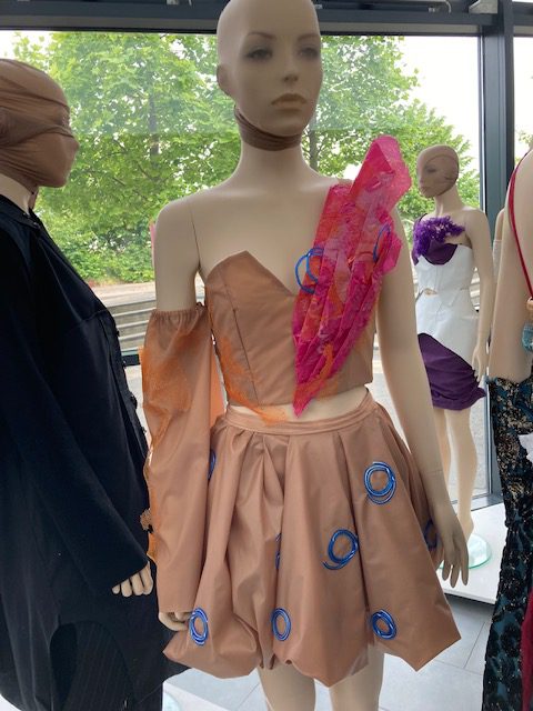
Name: Jennifer Latta
Previous School: King Edward VI College
Progression Course: B.A (Hons) Fashion Marketing
My project explores the idea of Aristocracy and I have produced a womenswear collection from which I chose to make one outfit. I carried out extensive research into the history of fashion worn by Royals and aristocrats over the decades. Drawing on Historical examples from diverse cultures, considering Ceremonial wear, sportswear used in hunting, shooting, and fishing garb were synergised and informed my initial design ideas.
I wanted my work to be relevant in relation to contemporary fashion so I researched the extravagant clothing worn in important social events like the Oscar ceremony and Met ball. I wanted my piece to be ornate, to borrow from history but to be contemporary too. Two designer collections really inspired me; Valentino’s Haute Couture AW2021 and Dolce & Gabbana Alta Moda July 2019, both designers were also inspired by the concept of aristocracy.
Issue beyond design were also important to me so I approached the project from cultural and political perspectives.
Although I am going on to study fashion marketing at university, I thought it important for me to gain a deeper understanding of fashion design and fashion history to give me valuable insight into my specialism in a broader context. Some of what I have learnt were new skills and approaches for me so I had to maintain focus, problem solve and be adaptable when working on new processes and techniques in this FMP.
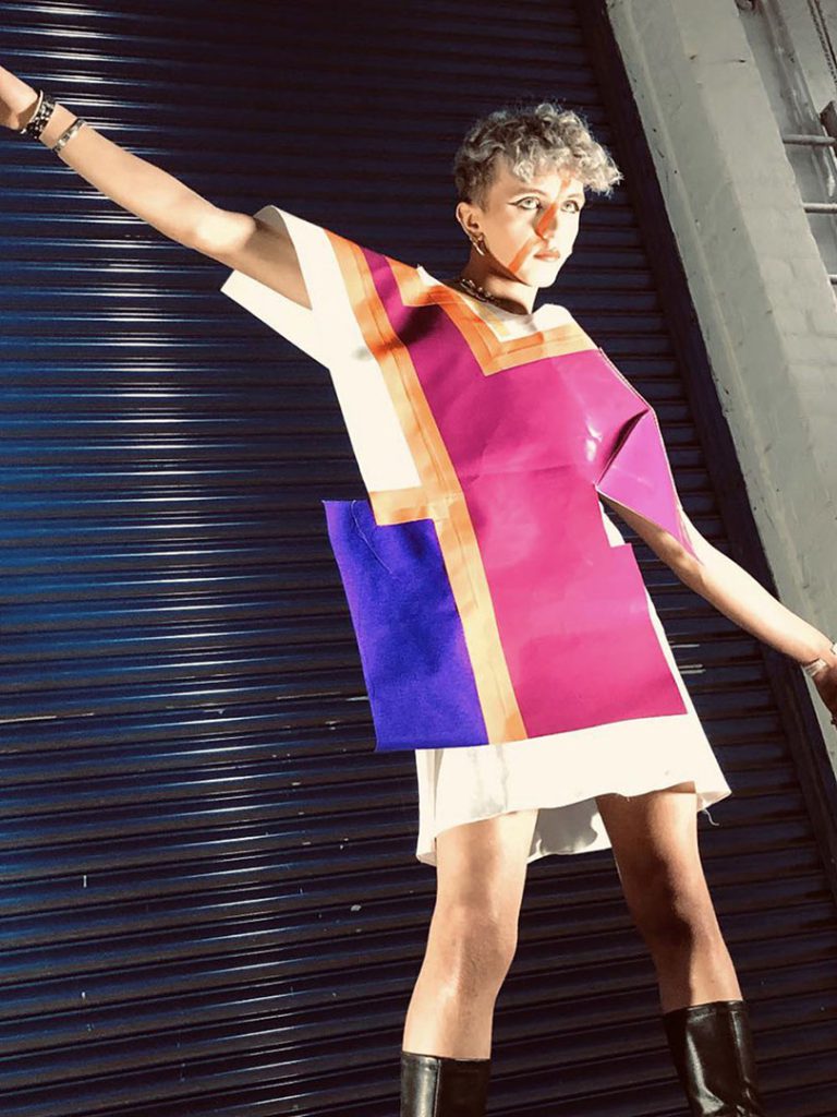
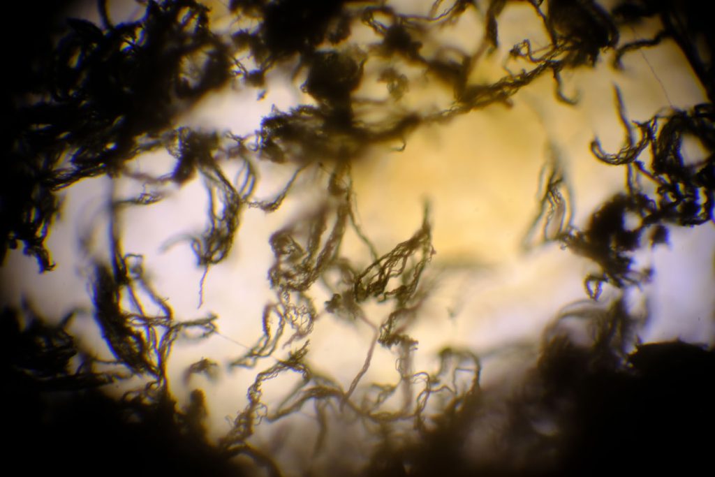
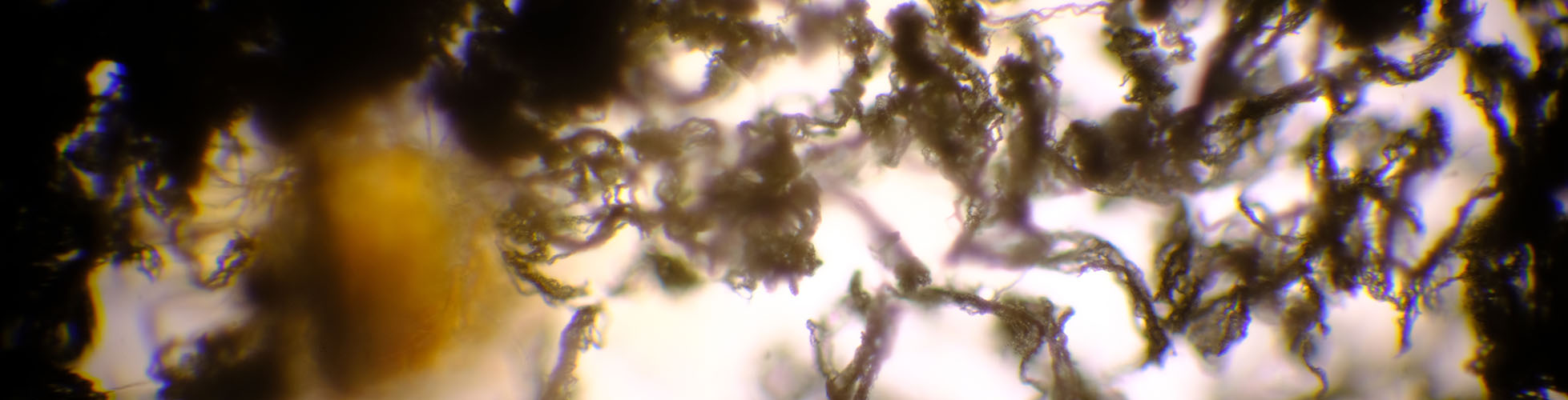
Name: Georgia Lewis
Title of FMP: Manipulation and Distortion
Previous School: Dudley College
Progression University: Birmingham City University
Progression Course: Textiles Design: Fibre Art
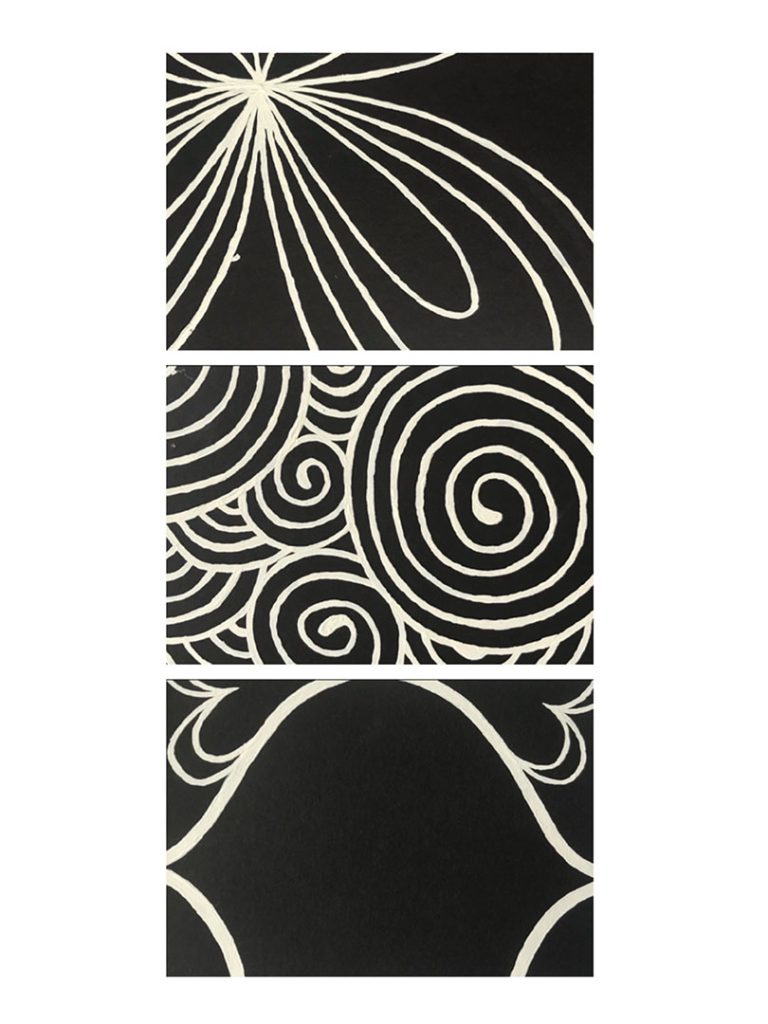
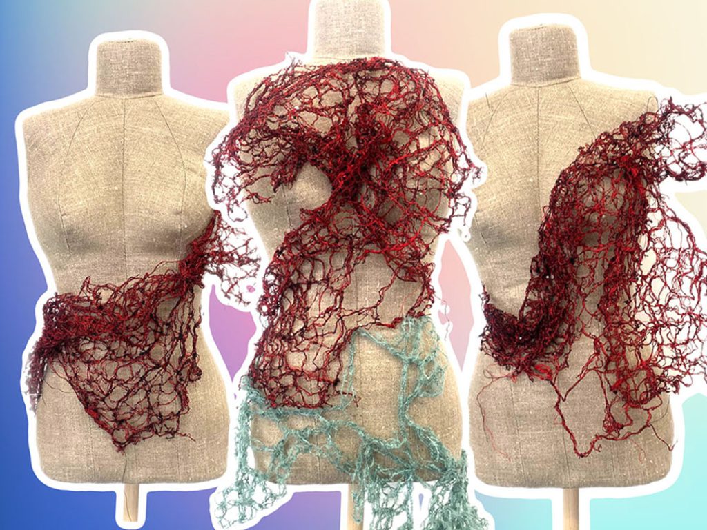
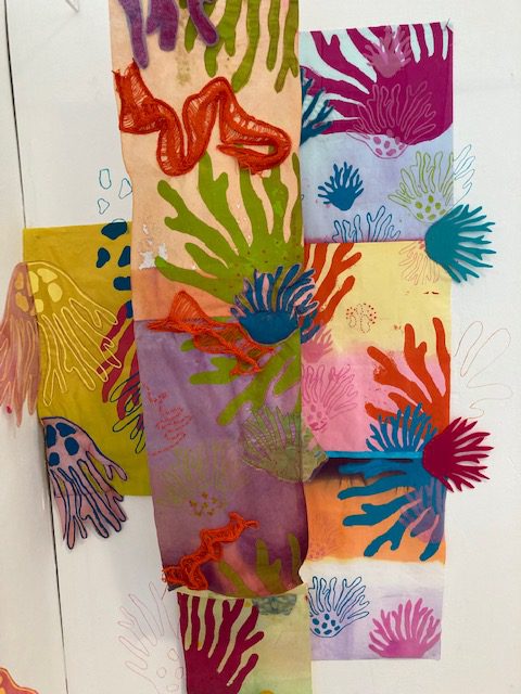
For my FMP project I wanted to create a gallery-based textiles piece themed around manipulation and distortion. My aim was to take inspiration from Nature and to investigate into shapes and motion of natural forms and how I can convey those characteristics through print, knit and the manipulation of fabric.
I have become far more experimental and showed a wider range of skills during this project, I used open screen and photographic screen prints, knit, stitch and hand embroidery. When I started to work with my prints, I knew I wanted to create decorative gallery-based textiles rather than functional pieces. The idea of banners developed as I experimented with composition and motif.
Textiles designer Diana Orving inspired my idea originally, so she is a main influence for my FMP, I was inspired to study the theme of manipulation due to her free-flowing installations. She inspired the shape I manipulated my knits and inspired my idea of focusing on natural forms and the environment. I also researched into green peace and the Great barrier reef, I assured my work would be environmentally friendly and only used reused materials and made use of all waste.
I feel my FMP has been effective and has allowed me to experiment and gain more confidence as an artist, peers and tutors have noticed an improvement not only in my work but also in my confidence and communication. These new skills I have learnt will follow me into university and allow me to progress more as an artist.
Name: Nathan Oakley
Title of FMP: Contemporary Contrast
Previous School: Haybridge High School
Progression University: Ravensbourne or Uni of Salford
Progression Course: Fashion Design
I wanted to create a collection which played on the ideas of masculinity and femininity, blurring them together creating a menswear collection. Initial inspiration came from the work of designer J.W Anderson who has challenged gender stereotypes in particular his 2013 Menswear collection.
I began by considering what femininity and masculinity were defined as. I then thought about typical menswear and womenswear fabrics, colour and shapes. I decided that I wanted to take a less extreme approach to the theme, I has pushed the boundaries further in an earlier project and I thought subtly was the way to go. So although i have used lace and frills in my collection theses are paired with existing pieces of tailored menswear.
I managed my project by consistently making sure I stayed on track setting daily aims. I also had group and peer crits to make sure that my whole SRJ and Sketchbook lead up to what I was creating at the time, as my biggest problem was keeping on path with my main idea.
Overall, I am really happy with the FMP. I could have developed a collection blurring the boundaries of femininity/masculinity and Androgyny in a more extravagant way, and then refined the idea. I think if I had been more confident in the early stages I could have been more experimental, but I was focussing on keeping to my time plan to make sure I competed the FMP on time. However, I think it’s been important to learn new skills in preparation for my university course. I have built a good range of technical skill and pushed my design development far in this project. I have been more critical and confident in my work as the FMP developed.
Name: Grace Pritchard
Title of FMP: Saprophyte
Previous School: King Edward VI College
Progression University: Central Saint Martins
Progression Course: BA (Hons) Fashion Communication: Fashion History and Theory
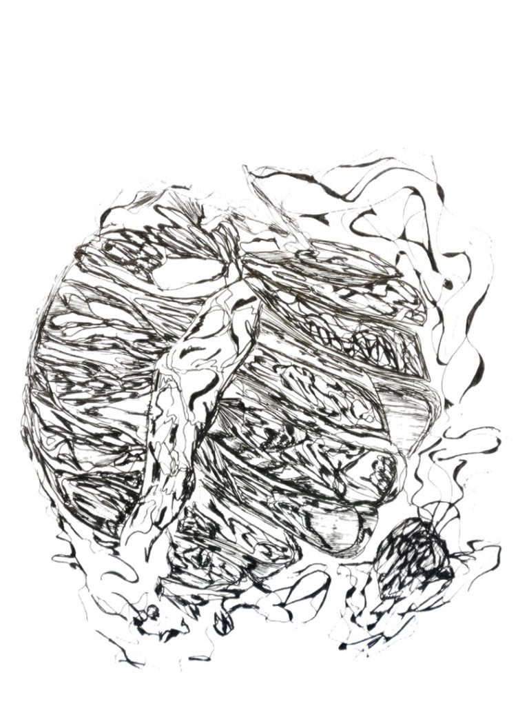
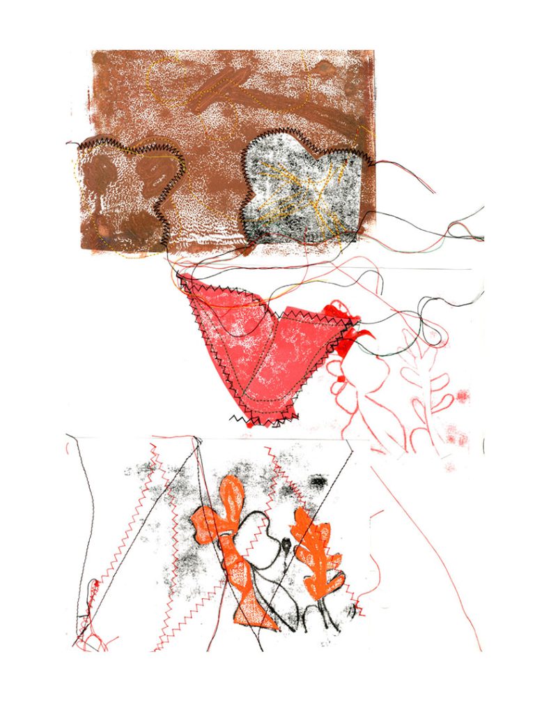
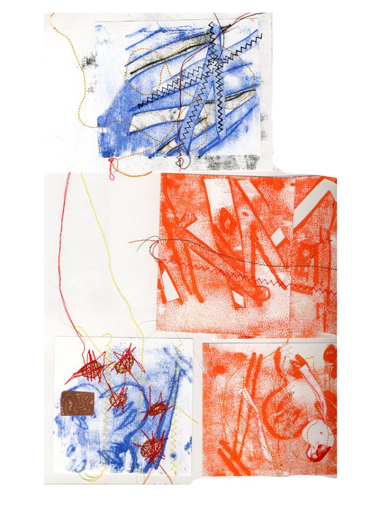
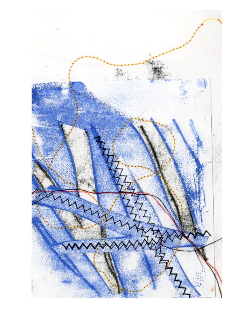
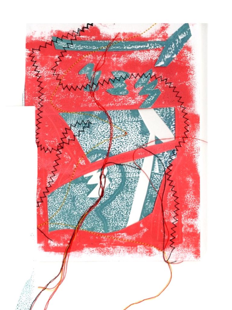
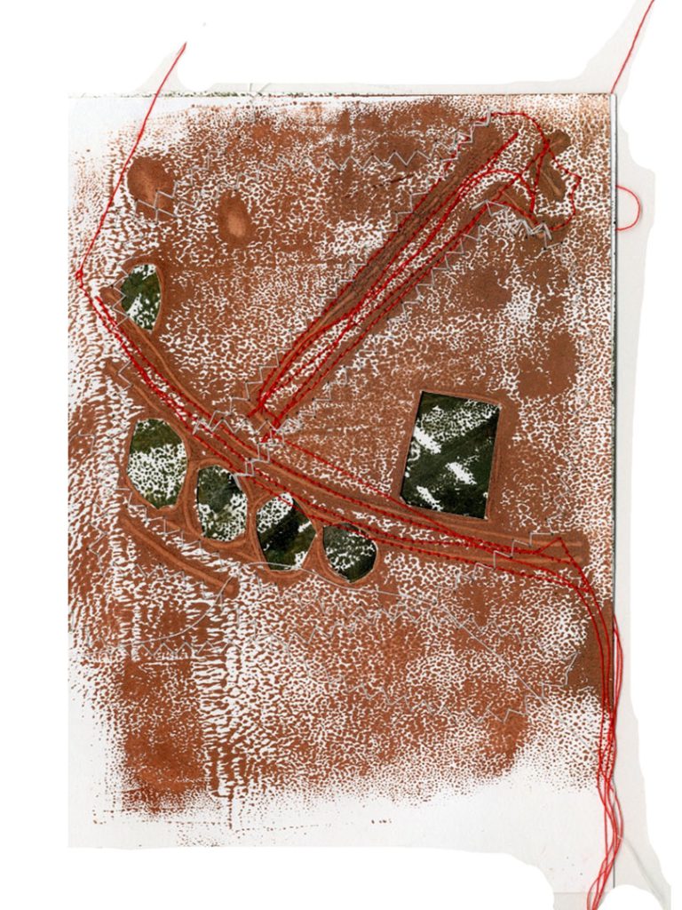
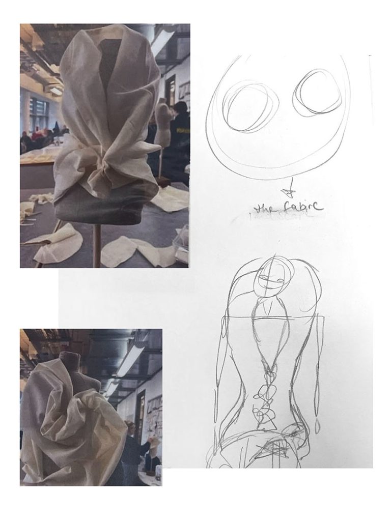
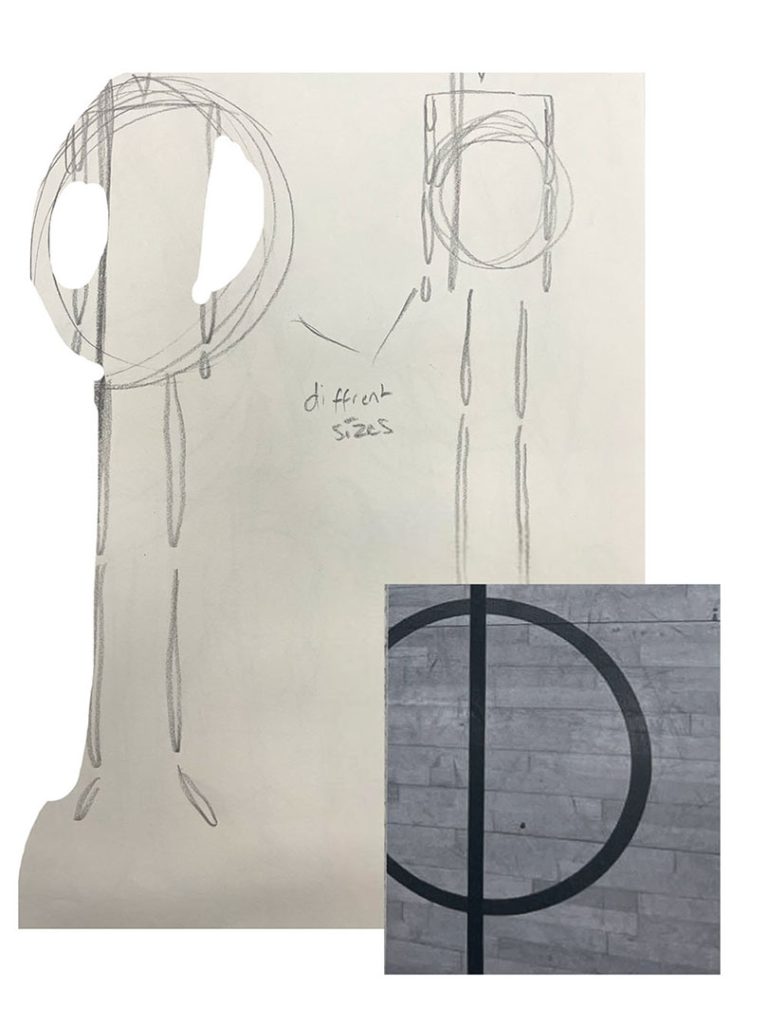
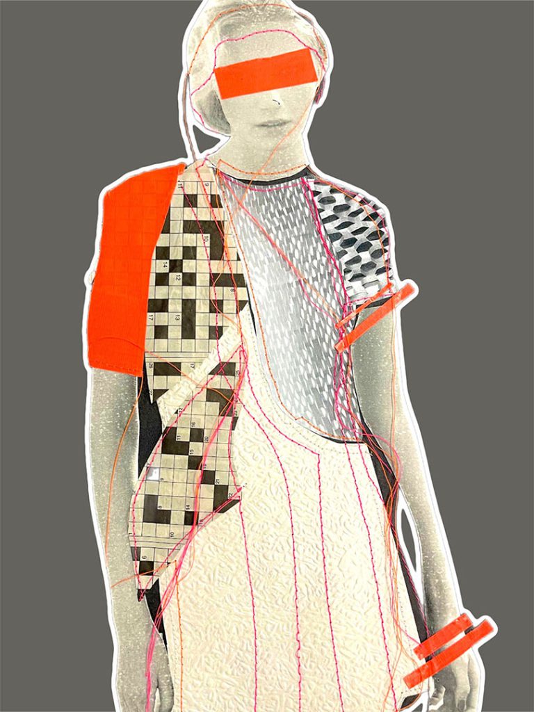
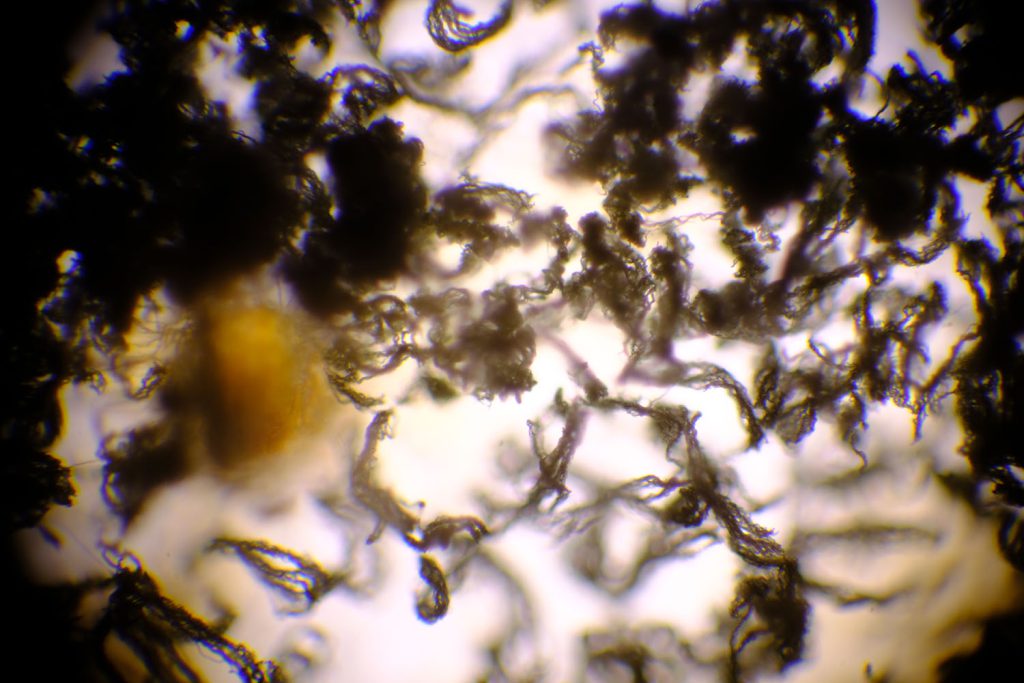
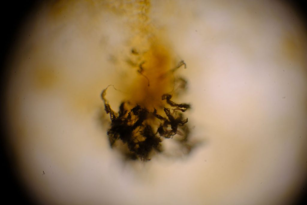
Saprophyte represents a confluence of the personal past and present. The project’s crux lies in the transferring of biological structures to fibre-bound media, thus unifying two vastly different schools of industrial practice: mycology- typically perceived as clinical and precise- meets textiles, a vivid and abstract expression of the self. Facilitating the coalition of these central themes held great personal significance, serving as a conduit through which I could ease an insightful conclusion to my academic journey. Seemingly, I had always been destined to follow a scientific path, yet today I find myself thoroughly immersed in the study of fashion and textiles.
Saprophyte reimagines the patterns and textures of moulds and fungi through the lens of fabric manipulation. Techniques utilised sought to reinterpret the appearance of several photomicrographs I had taken earlier on in the project- my predominant focus was upon how I might be able to replicate organic and spontaneous structures with my own hand. I was intrigued by the juxtaposition posed when synthetic materials impersonate elements of the biological realm, an aspect of Saprophyte which indicates my associated interest in sustainable fashion. Initial research into the work of designer-artist hybrid Hussein Chalayan inspired subsequent exploration of decomposition as an eventuality; Saprophyte’s namesake ‘saprophyte’ describes a now-defunct class of organisms deriving essential nutrients from decaying organic matter. What the notion of decomposition means for a fashion industry preoccupied by superficial beauty remains to be seen- this is a concept I wish onlookers to contemplate.
Confronting my perfectionism during FMP presented challenges, yet Saprophyte– fundamentally characterised by imperfection and spontaneity- enforced an organic and experimental attitude to my work. Recreating naturally occurring microorganisms and cultures almost demanded the occurrence of mistakes and happy accidents- often, these actually accentuated the decomposing and rotten appearance I desired.
By progressively accumulating a body of varied techniques, I was able to inject detail and intricacy into my three final pieces. Some of these techniques, such as screen printing, were purposeful revisitations of earlier experiments during FAD. Others- for example, couching, rust dyeing, shibori and use of a heat gun- were unfamiliar to me. Discussions with my tutors and college staff opened my mind to techniques that may have otherwise escaped my attention, providing a bridge with which I could guide my abstractions towards actualisation.
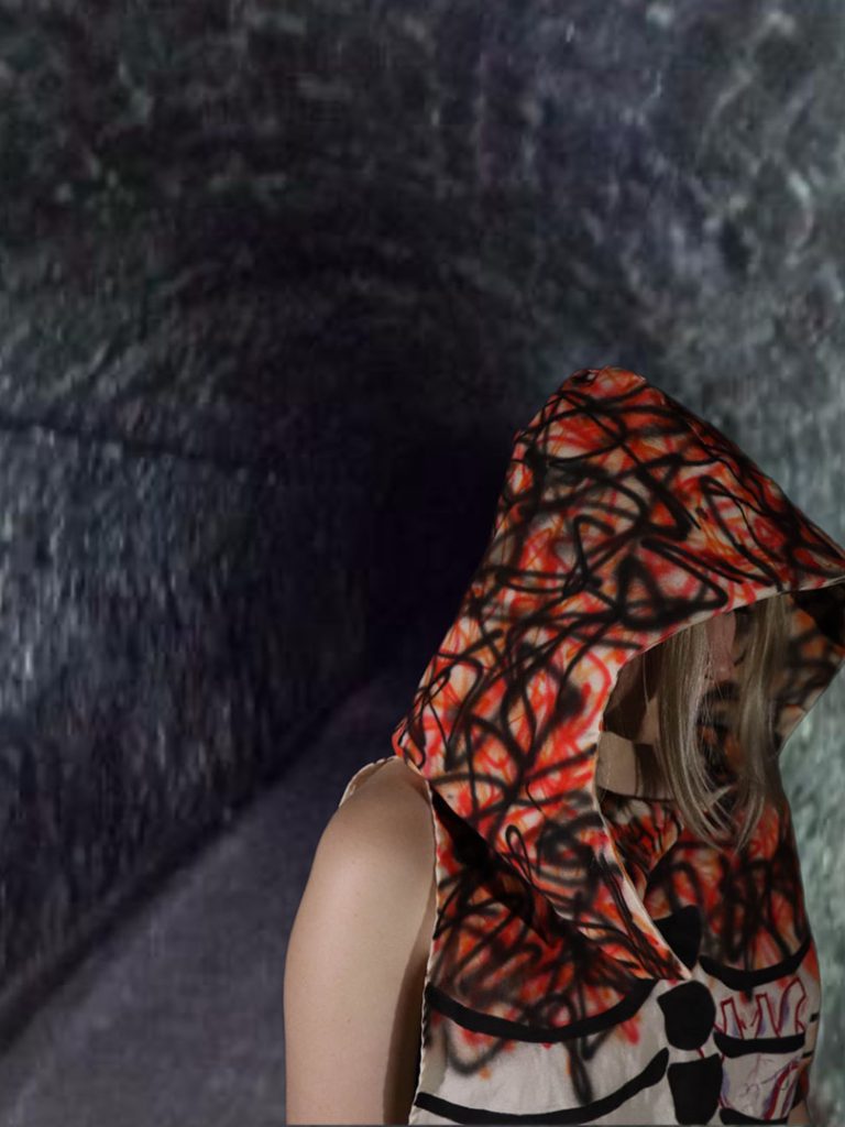
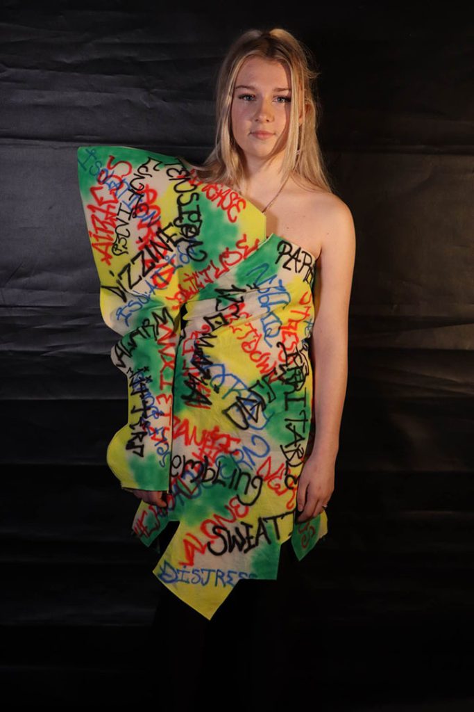
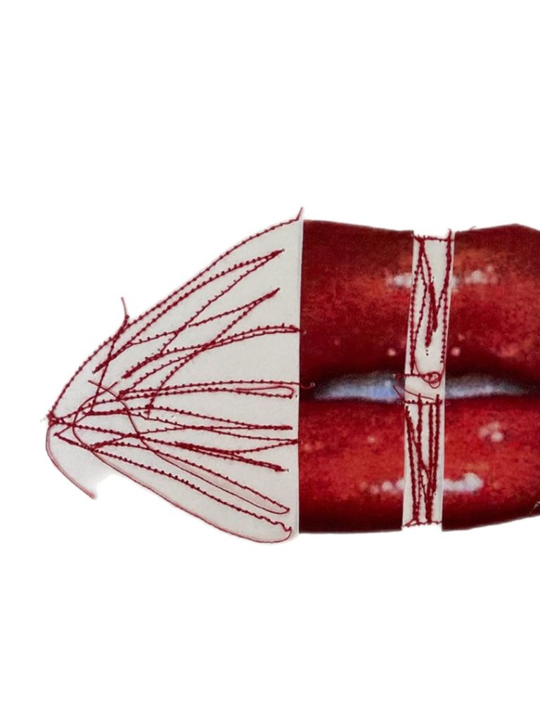
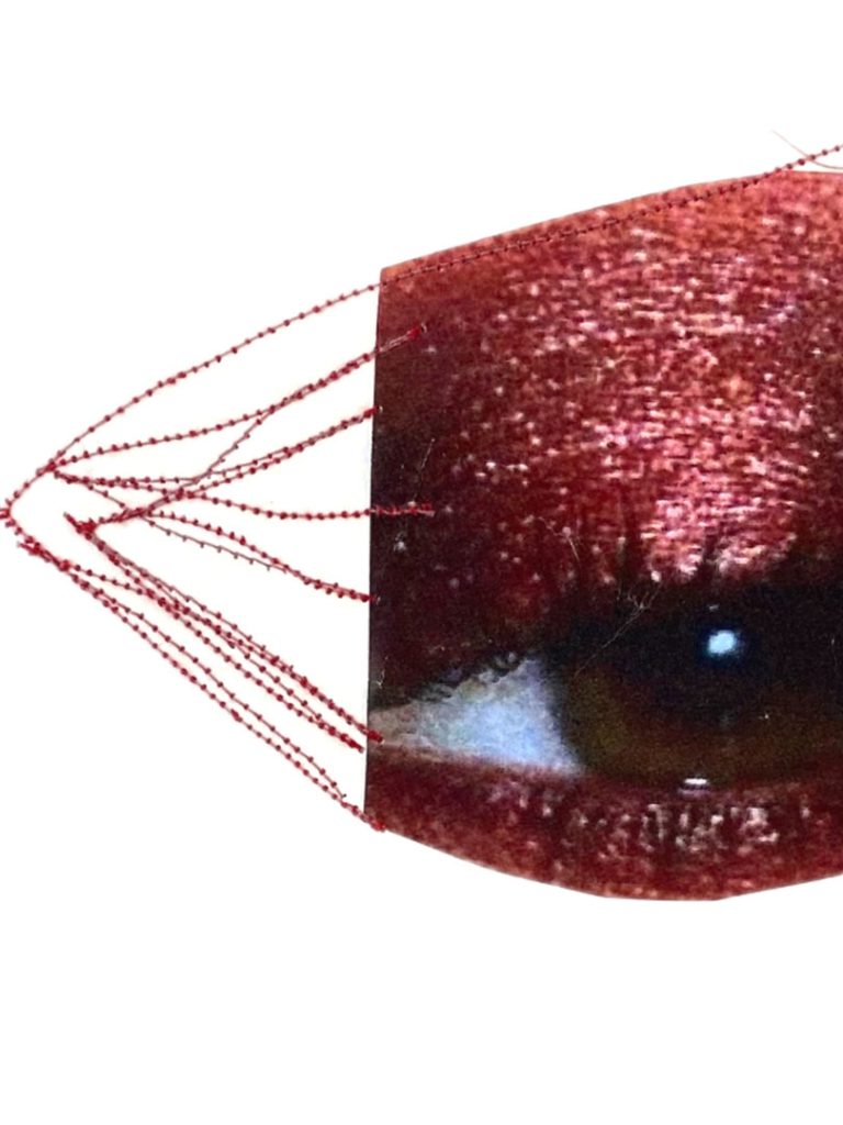
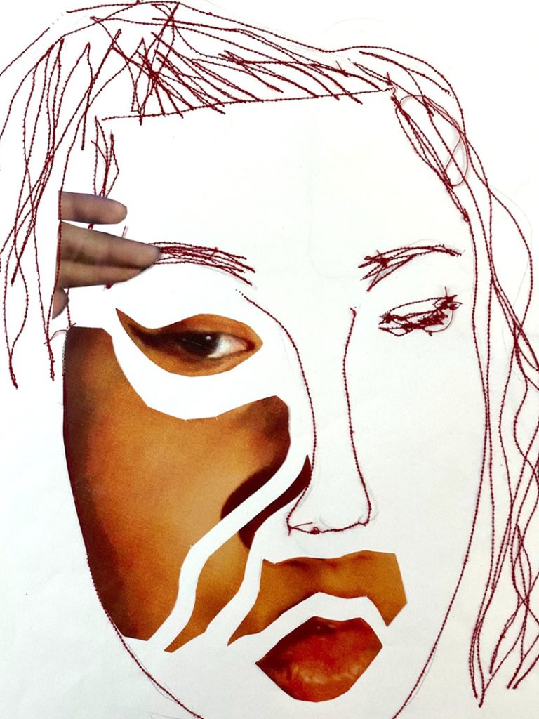
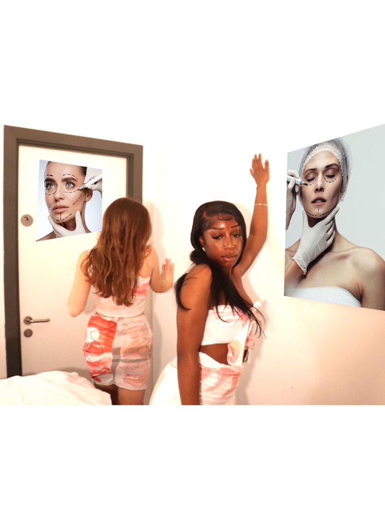
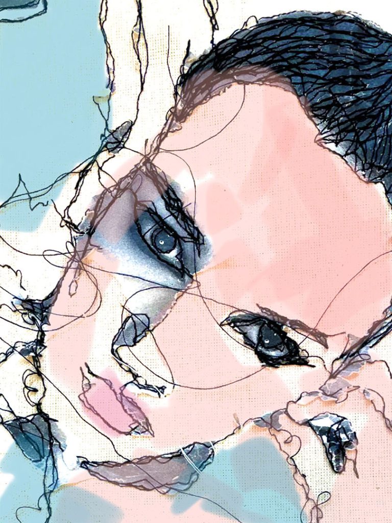
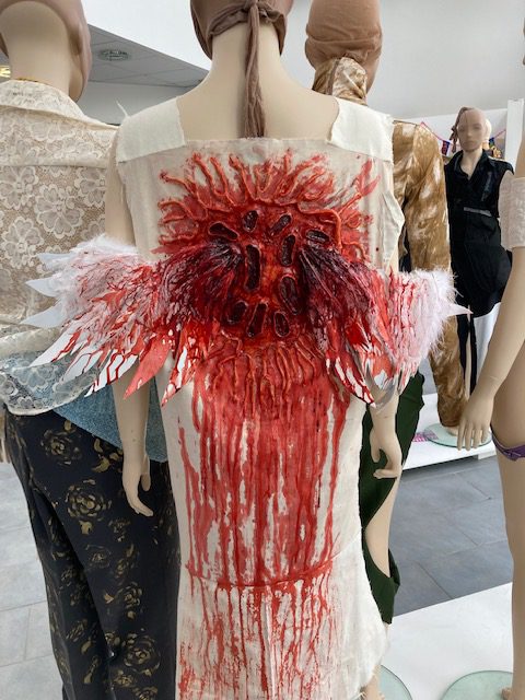
Name: Jessica Ray
Title of FMP: The Underlying Evil
Previous School: BMET
Progression University: Birmingham City University
Progression Course: B.A (Hons) Textiles Design
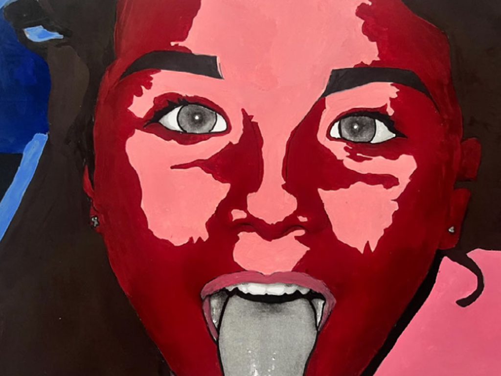
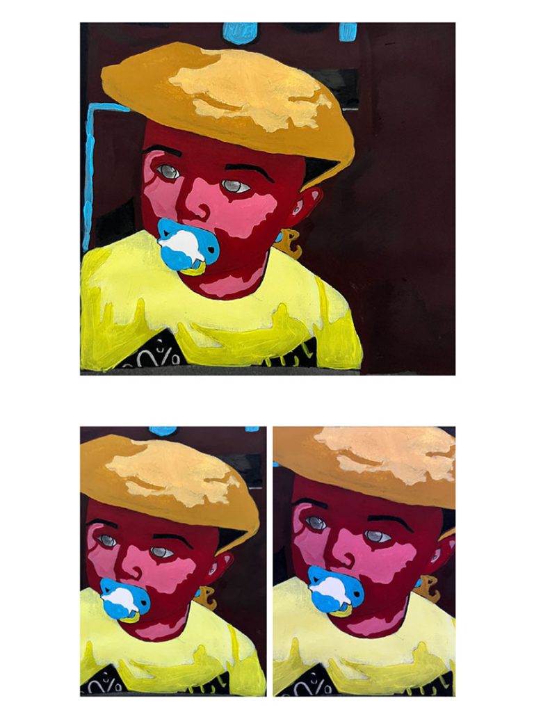
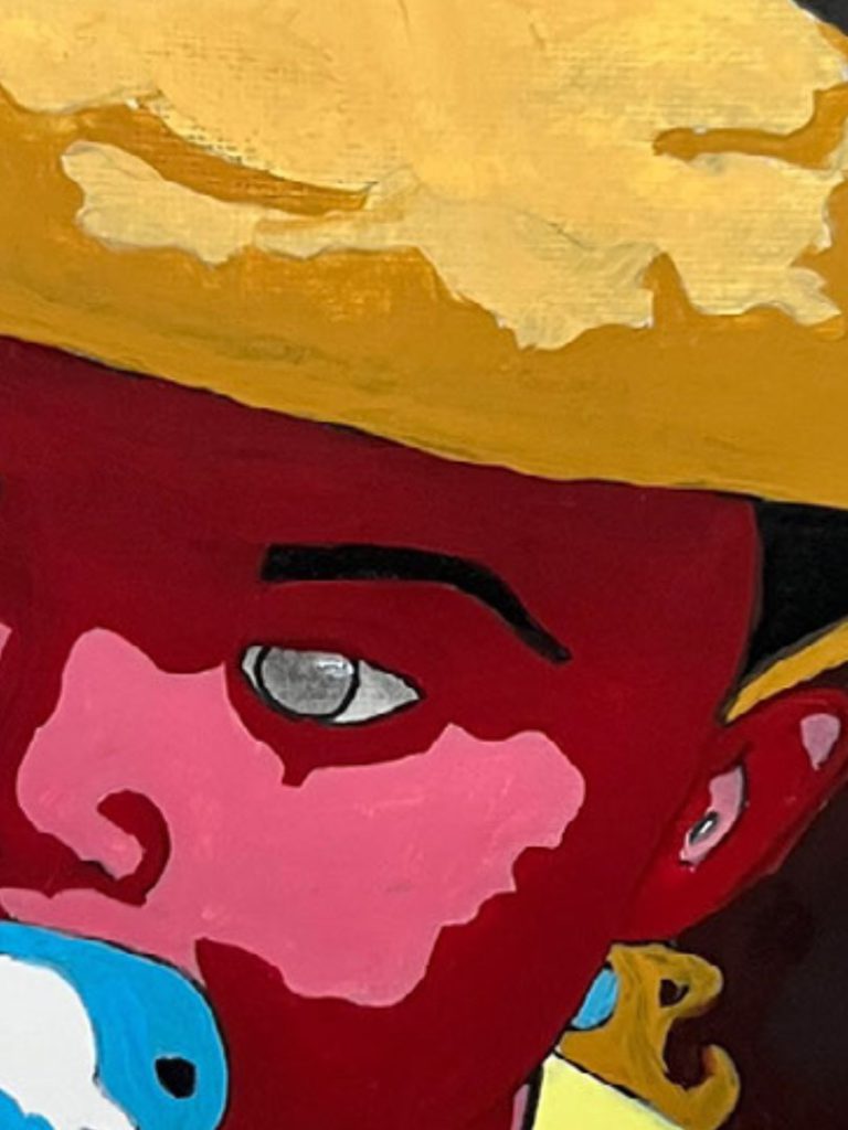
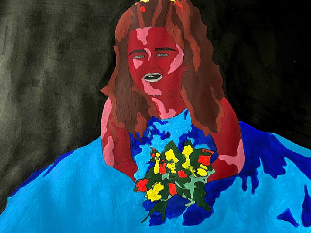
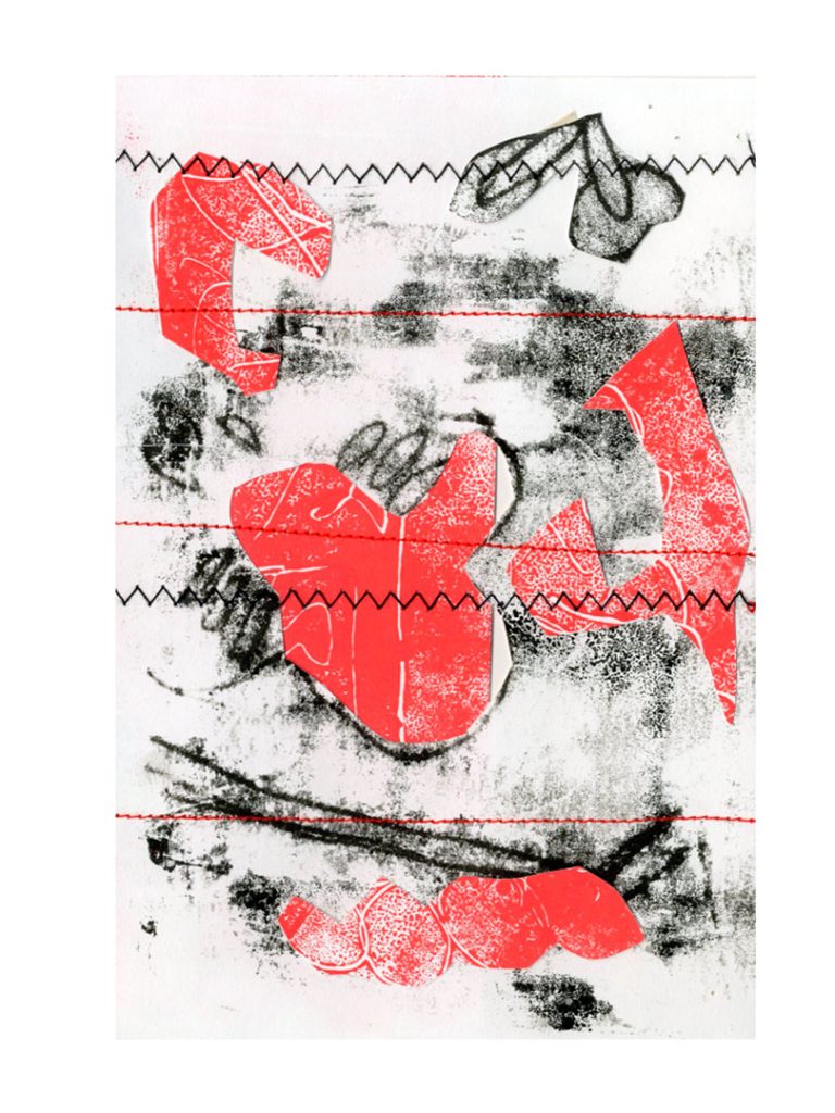
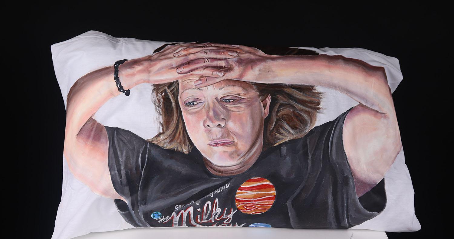
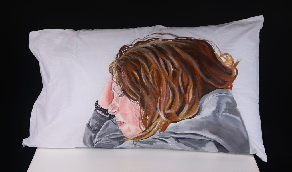
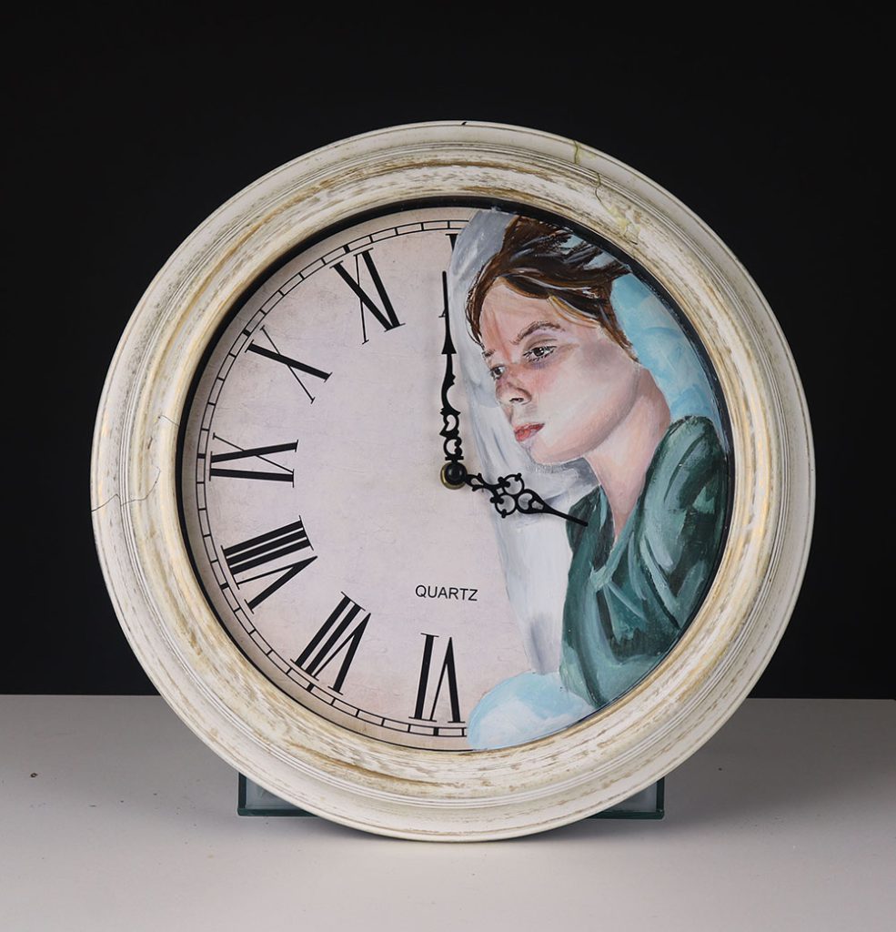
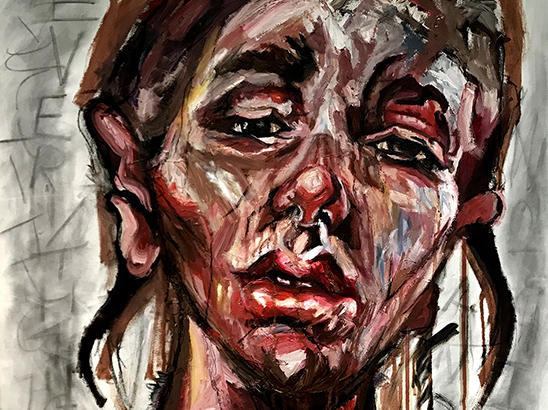
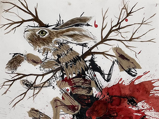
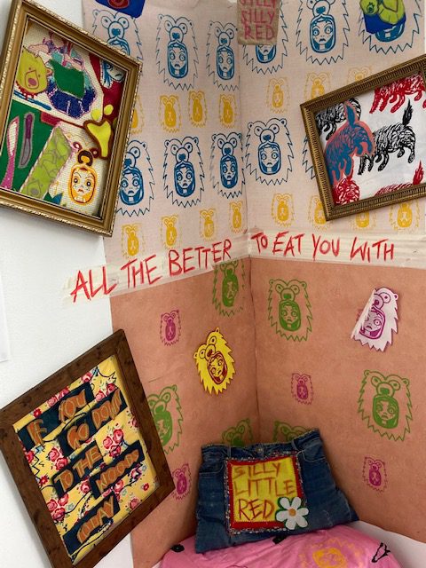
My FMP was based around the darkness underlying children’s fairy tale stories. I was greatly inspired byThe Brothers Grimm, their original tales are dark and scary, very different to some of the stories children read today. Gruesome death and peril feature in many of them. I wanted to take this idea and create imagery that illustrates the horror yet convey them in a way the modern tales do today – masking the embedded evil using bright, vivid colours and fun patterns.
I wanted to subvert how child’s bedrooms are usually decorated. Using my prints and designs, the subject matter would be challenging but by using colour and traditional textile techniques the viewer would bedrawn in and only then would they see the underlying evil. I have screen printed my designs onto wallpaper and framed some of my textile pieces. to dress the space. The frames hold no glass which gives the viewer chance to see and touch the different elements used. I also screen printed other designs onto a quilt to add to the bedroom scene as well as a pillow which I embellished and stuffed.
Artist Thomas Ascott impacted my work hugely, eventually inspiring the main pieces in my own work. Reflected in my designs are the scarily, realistic expressions and the eery atmosphere Ascott creates. Ipracticed a range of new skills and techniques, one being cross stitching. I found this gave a new texture to my textile pieces had a homely, cute feel to them and I was able to use this to outline and introduce flat areas of colour using this technique. This stitch work was inspired by Richard Saja and his embroidery work. I used print screening to give another aspect to my pieces, the colours and found fabrics contrasting with each other creates a busy scene to distract you from the real imagery.