Category: A-Levels
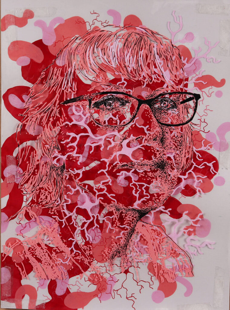
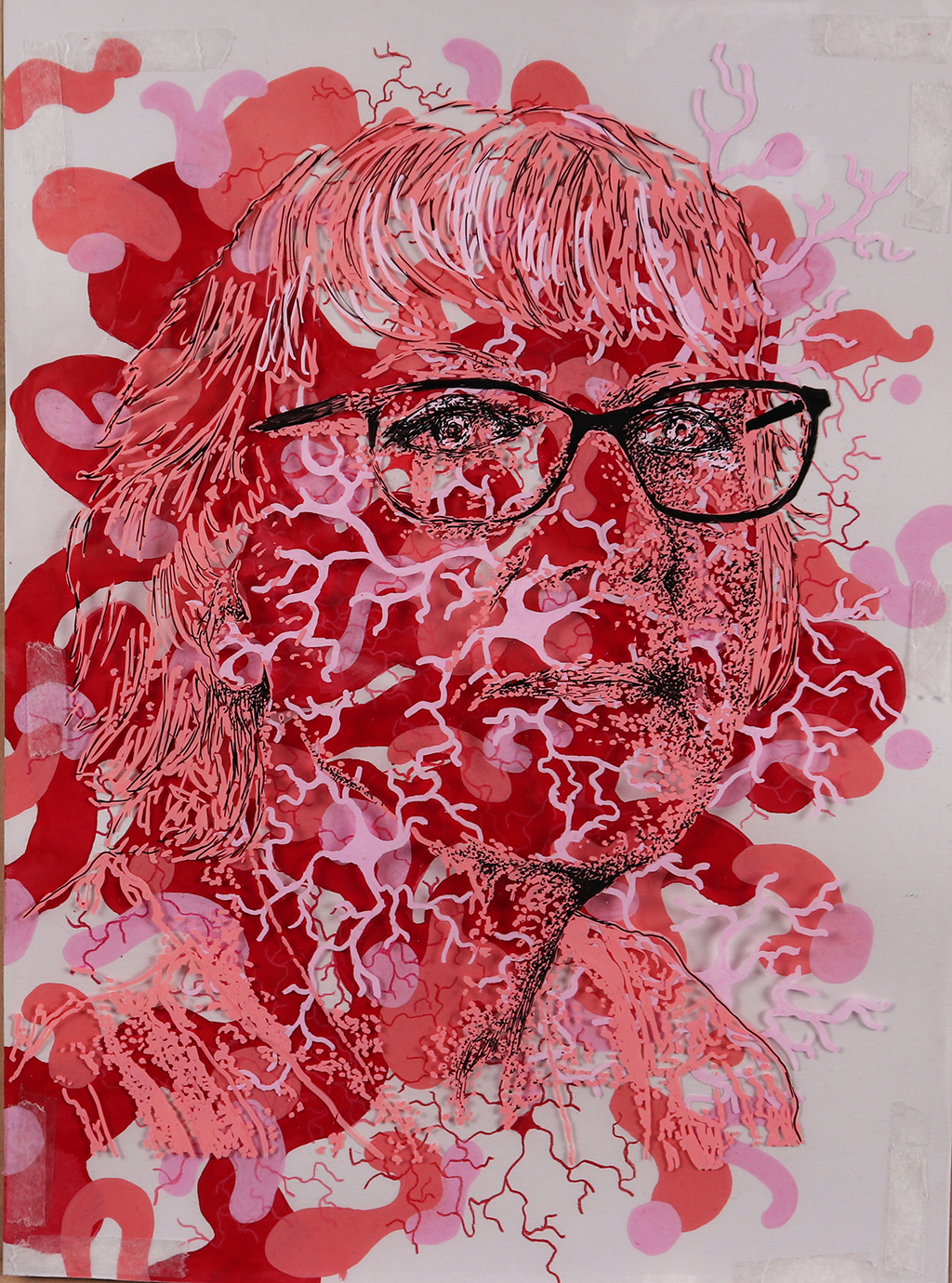
MYRA KHAN
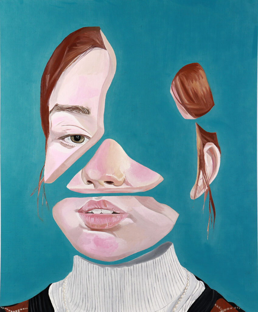
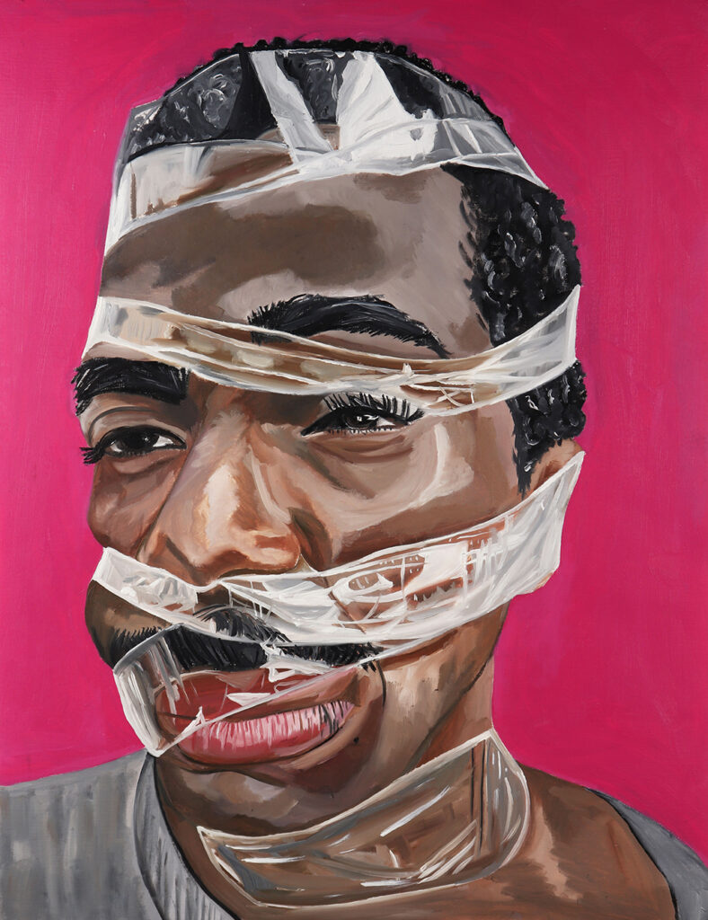
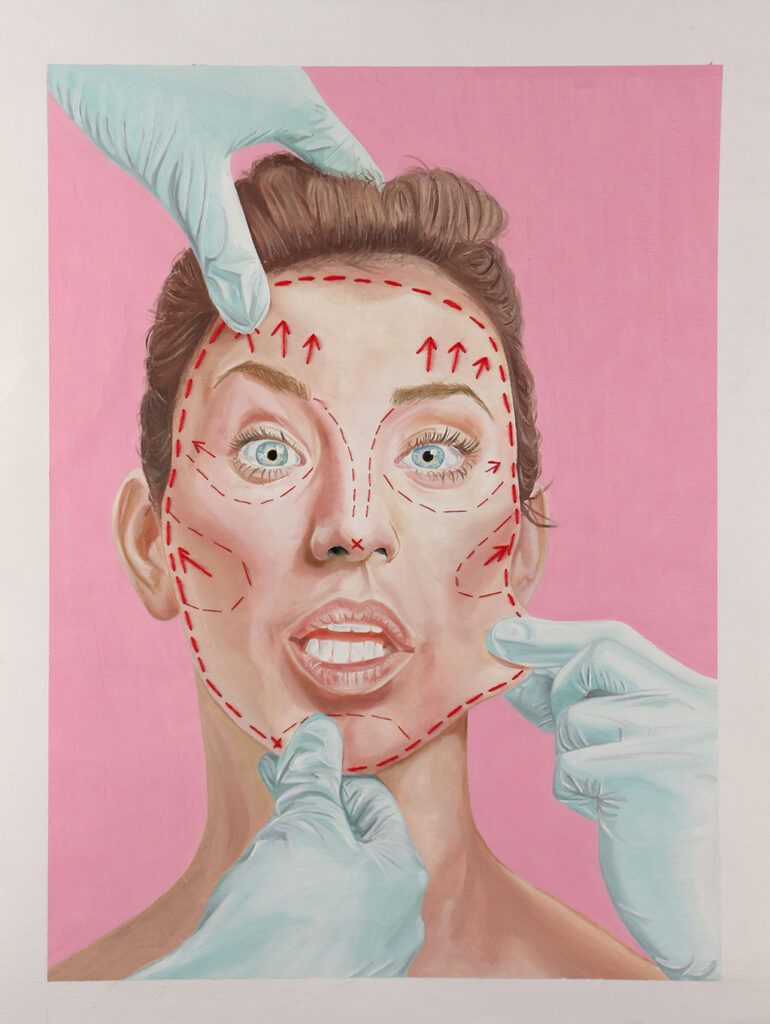
Project Title: Unconventional Beauty
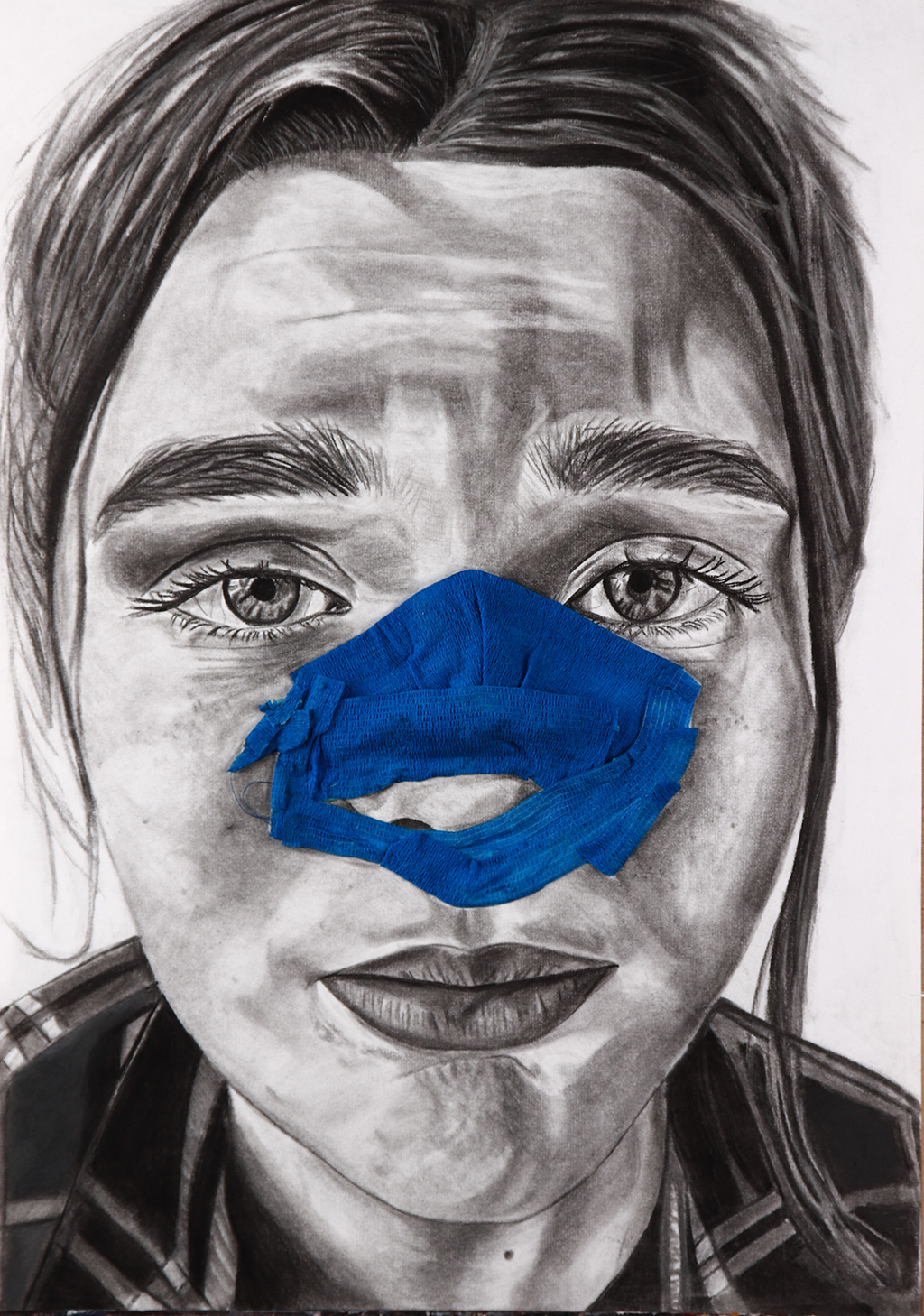
I have produced range of A2 portraits communicating the concept of unconventional beauty, through distortion and representation of unattractive portraiture as well as appearances pre and post plastic surgery. I aimed to capture the beauty existing in contemporary ugliness.
I found working with oil paints and charcoal allowed me to achieve realism, demonstrating an abstract concept in a more traditional style.
Upon producing responses inspired by artists Gillian Lambert and Martin Higgs, I began experimenting with 3-D elements, using materials such as bandages and stitching onto portraits using string to emulate the realities of cosmetic procedures. My abstract use of brighter colours within my work are inspired by the striking backgrounds often seen in editorial magazines featuring beauty models; emphasising my portrayal of unappealing features in a beautified manner.
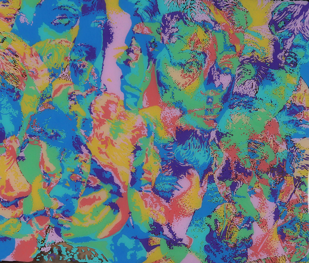
GEORGINA GUY
Project Title: Dreams and the Subconscious Mind
My project explores dreams and the subconscious mind, my final pieces serving as abstract depictions of three of four separate pathways of this project, replica five of the dreams and subconscious thoughts unique to each of the subjects I interviewed. My in-depth research into dream content inspired each separate section, and each subject chosen relayed dreams that led to very distinct pathways; one suffered from insomnia, another had very vibrant dreams that incorporated warped versions of people they knew in their waking life. Subject 3 had unrealistic and fantastical dream content.
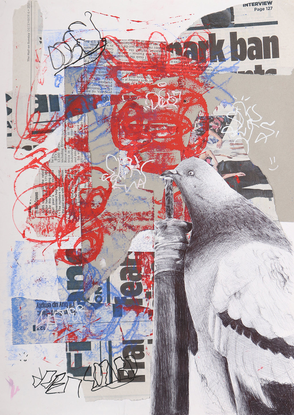

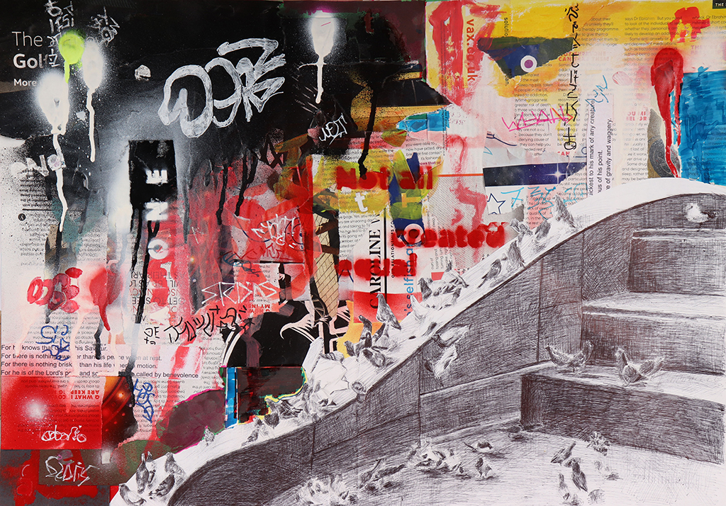
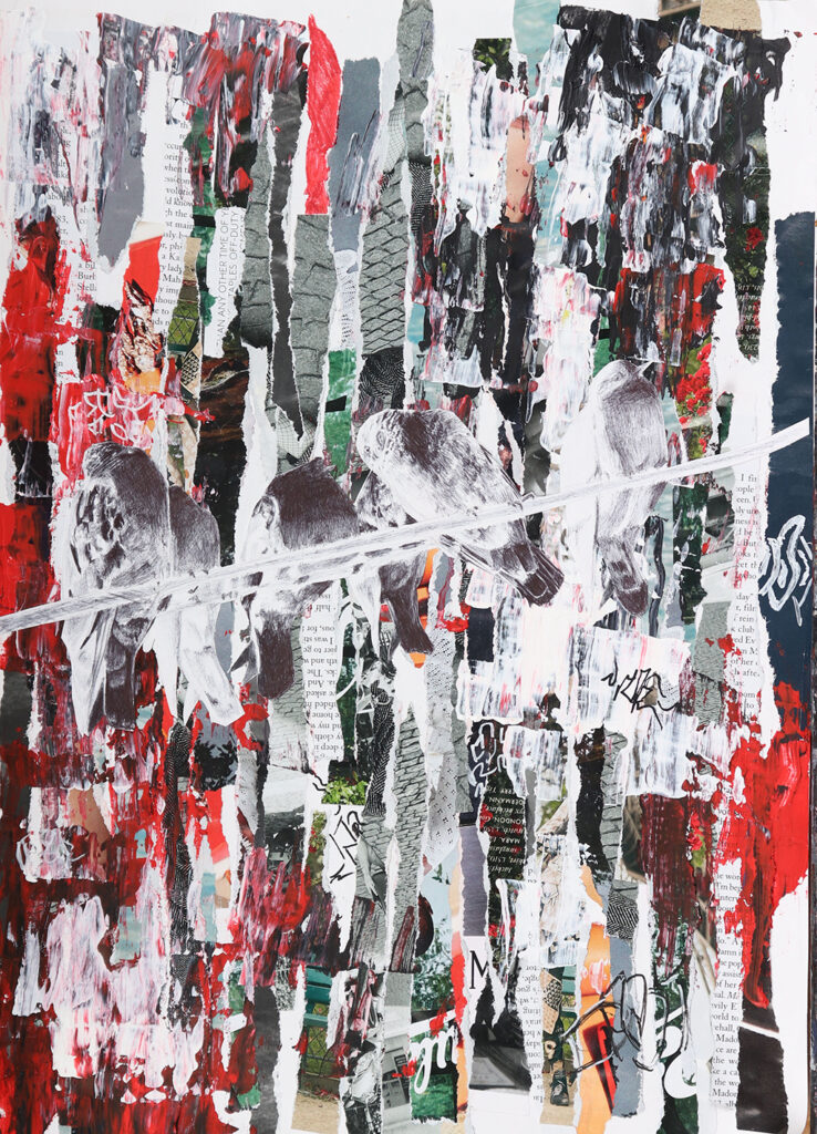
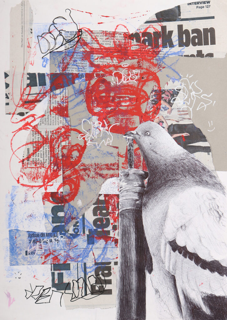
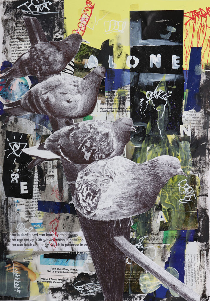
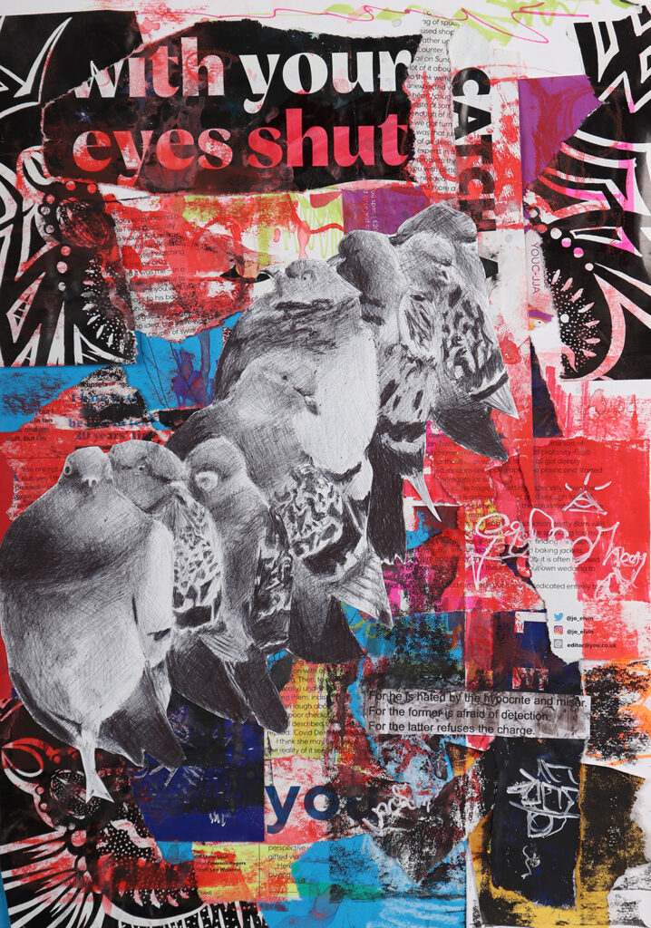
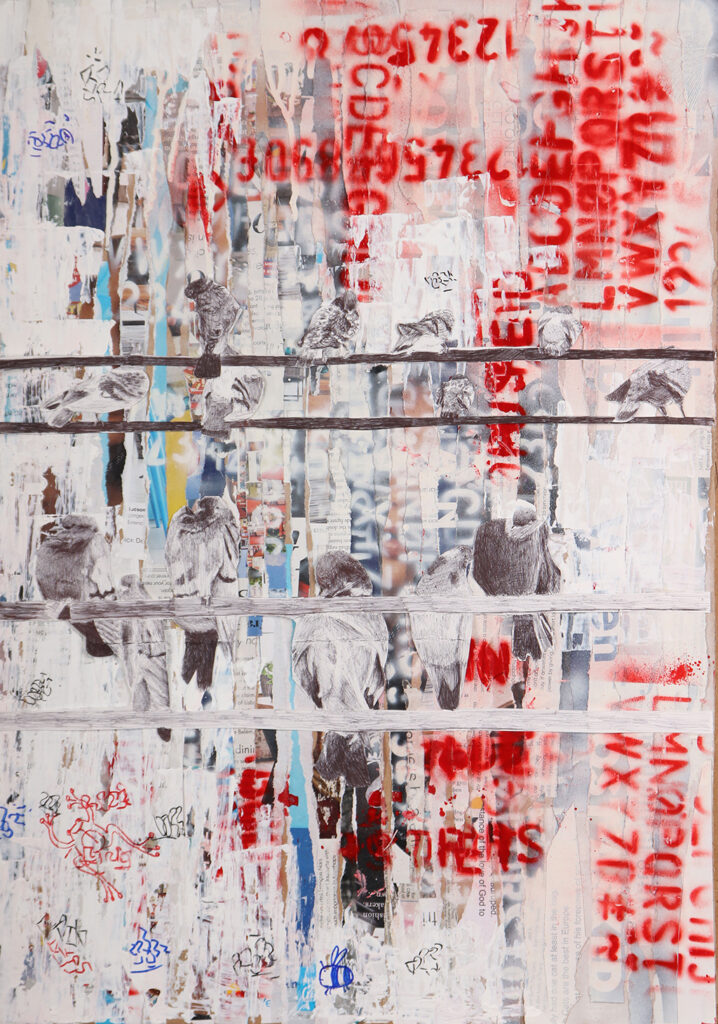
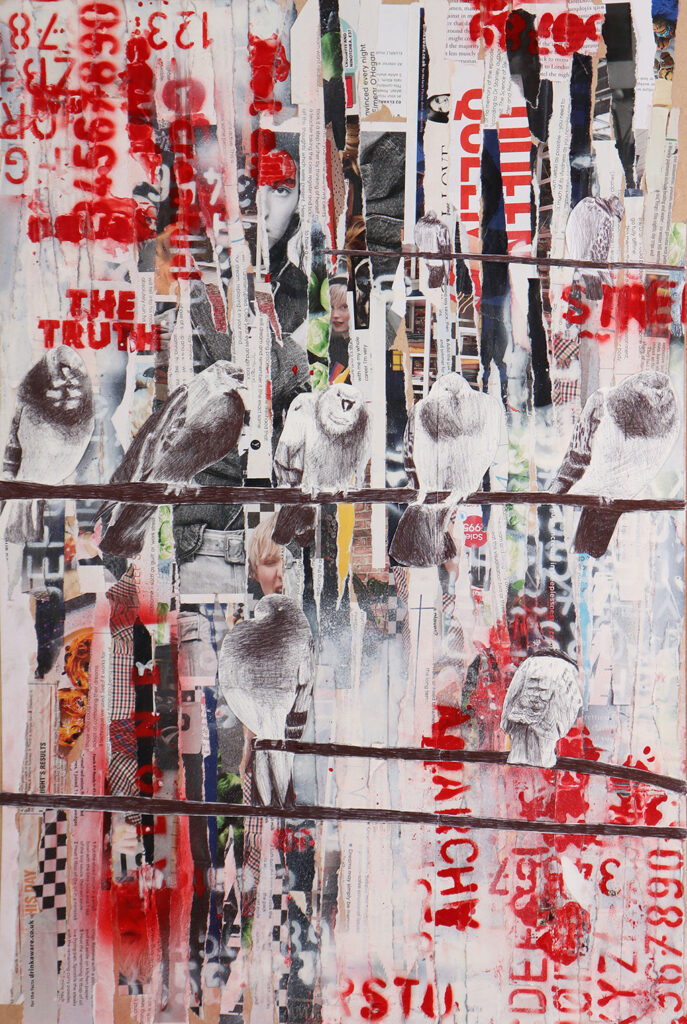
WILLIAM EDWARDS
Project Title: Urban Environments
My project ended up being inspired by gritty urban environments, dilapidated streets and the graffiti that appears within these places. I used animals as a broad starting point to explore different styles and techniques; I ended up being drawn towards the erratic, expressive and gritty styles. I narrowed the focus towards Pigeons, as they tend to inhabit these areas most often. My final pieces used a combination of collage work, spray-paint, graffiti marks and biro drawing. My aim was to recreate the sense of anarchy and doom found in the graffiti in these run down areas.
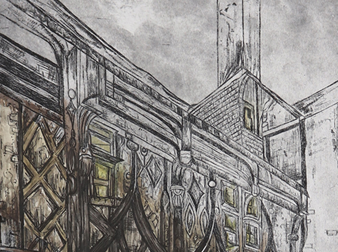
STEPHANIE CLEAVER
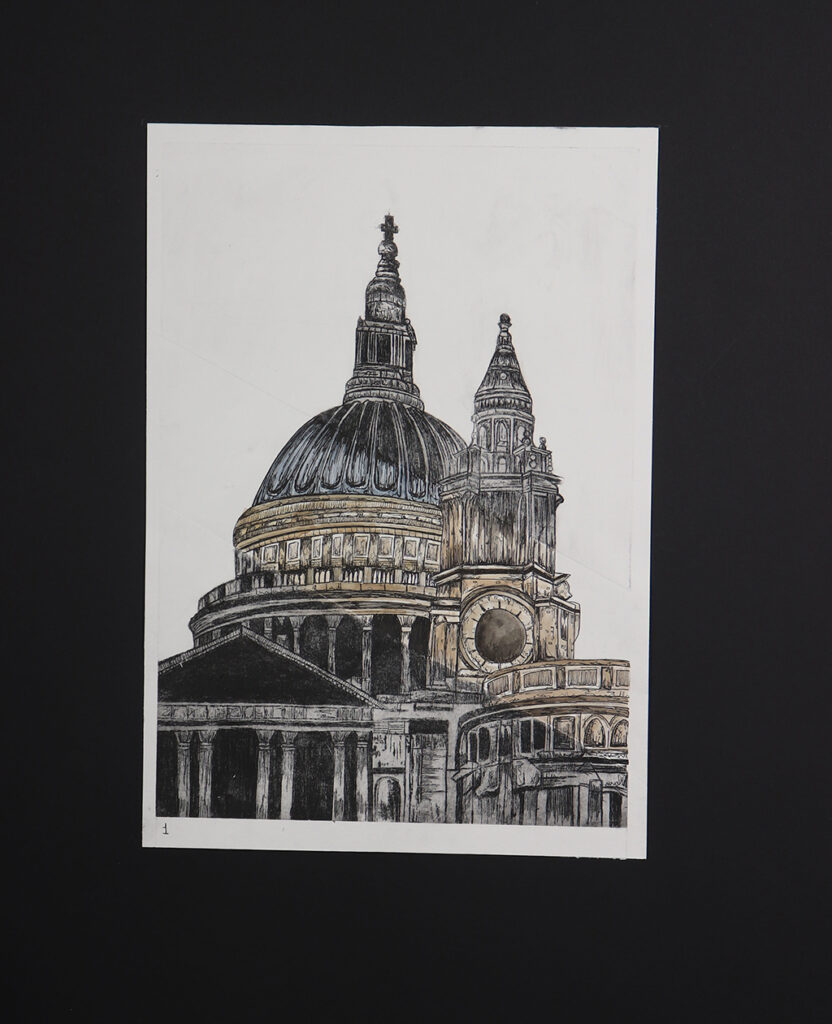
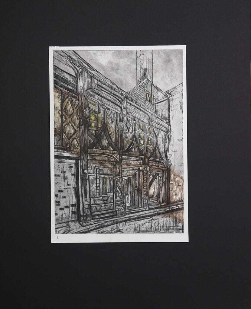
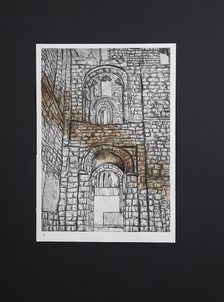
Project Title: Architecture in Colour
In my project, I explored how colour has an impact on how different types of architecture. For example, using two contrasting styles of architecture such as Christian and Victorian styles allowed me to experiment with different materials.
When looking at Christian style architecture, I was influenced by artists such as John Piper where I looked at similar colour schemes. I used mediums like fine liner and biro. However, for the Victorian style, I was inspired by Michael Goro and John Atkinson Grimshaw. Mediums like charcoal, ink and printing allowed me to convey this style in my work. This supported the development of my project looking at how colour can have an impact on how architecture can be perceived.
A defining point in my project was the introduction of dry-point etching which influenced a major part of my project. I went onto create a3 pieces using this technique incorporating colour schemes that reflect the different types of architecture.
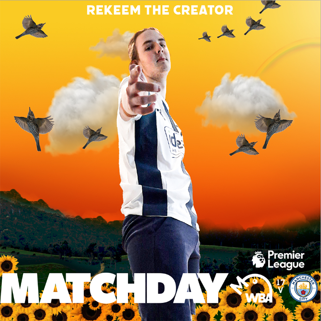
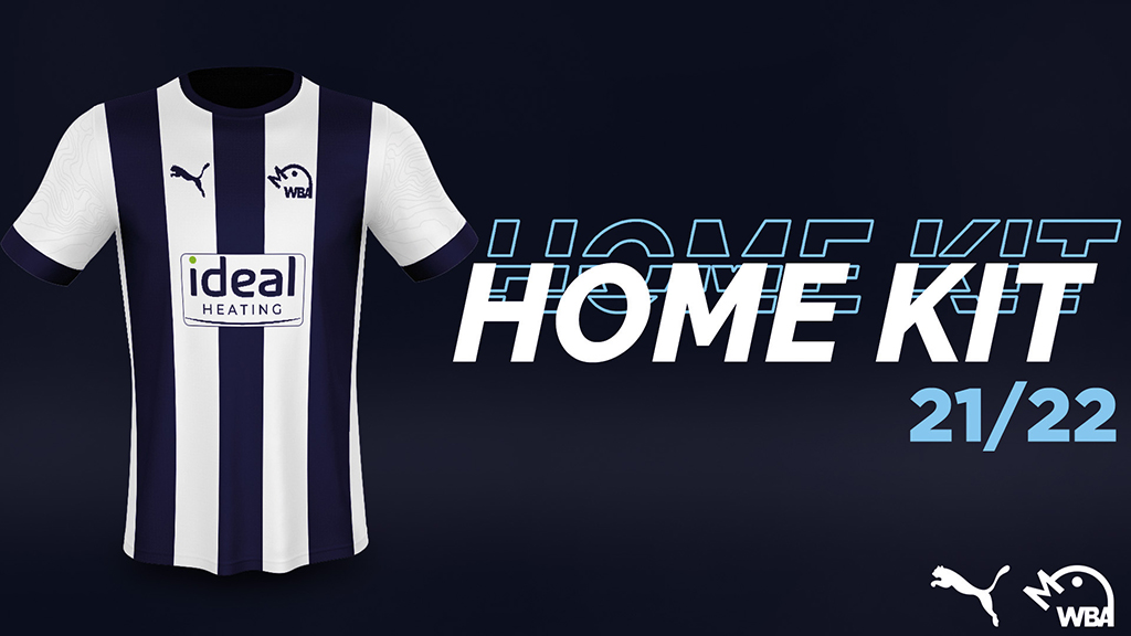
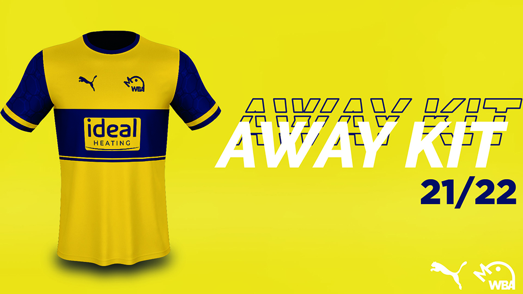
BENJAMIN SOUTHALL
WBA Rebrand
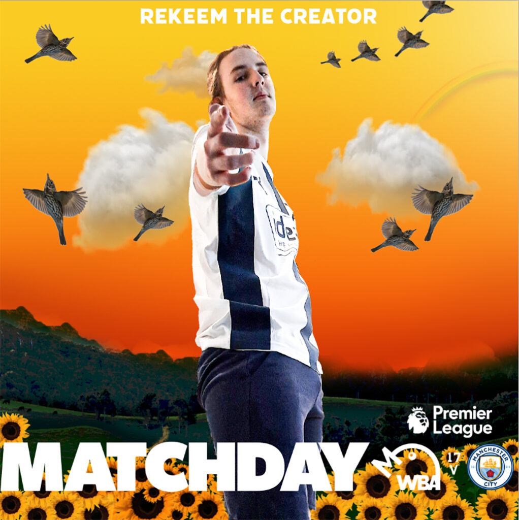
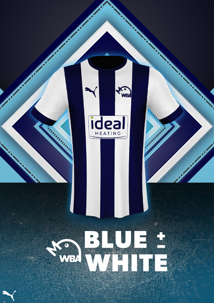
West Bromwich Albion is a football club that felt that they wanted a rebrand going into their next season. They mainly wanted a new logo, alongside two new kit designs and the accompanying announcement posts for social media, as well as other social media posts such as themed ‘matchday’ posts to be posted in the morning of each matchday. The club has a massive influence in the local community, and are aiming to become a more modern, sleek brand through how their logo looks, alongside embracing a rich history of success within the branding of the football club. The club is traditional and iconic within England, being a founding member of the Football League, alongside being an established Premier League team at time in the recent past.

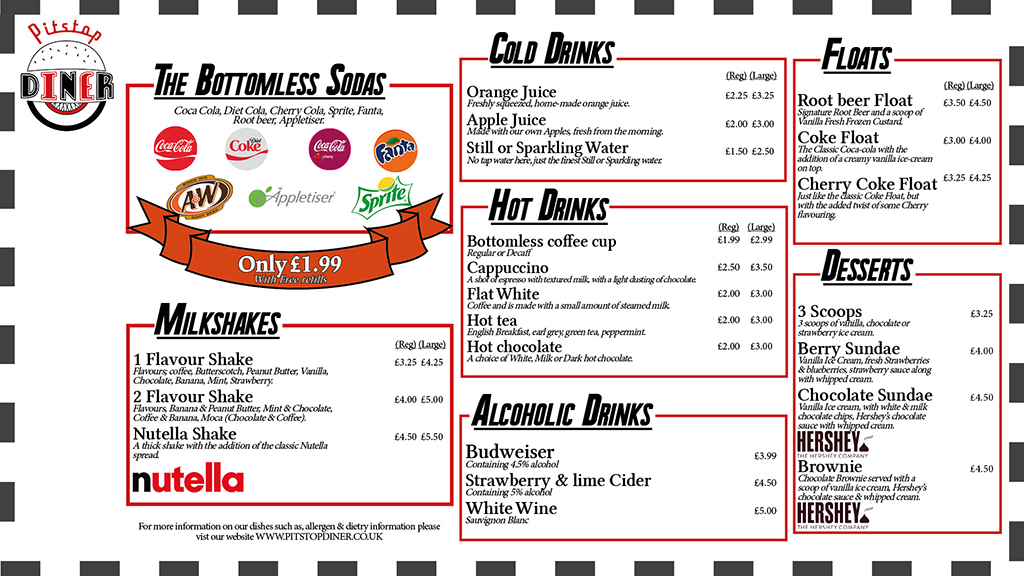
NURIA ROWLEY
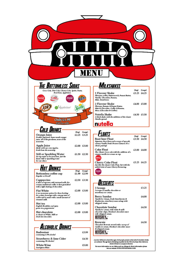
Corporate Identity for Pitstop Diner
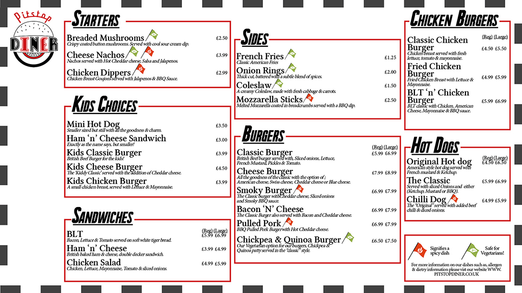
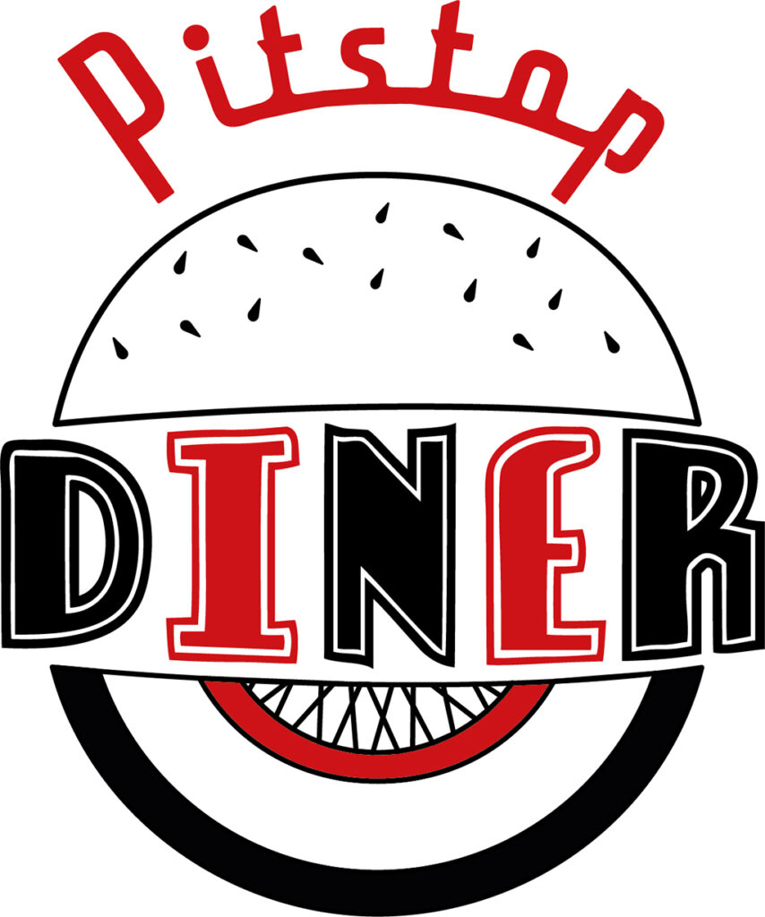
My Project was to create a corporate identity for a branch of Diner. I was inspired by modern Diner’s based on 1950’s aesthetics such as Ed’s Diner, Five guys and OK diner. To create accurate graphics for the diner in depth research into these branches and into the period of the 1950’s had to be done, this included looking into processes that were often used to create menus, logos and overhead boards. Throughout the project, I stuck as close to my intentions from the beginning as I could, creating a Logo, menu and Overhead board for a diner called “Pitstop”, a 1950’s inspired diner with a theme of racing/cars, by using a white walled wheel in the logo (a popular wheel used in the 50s) and including the front of a Cadillac in the menu. Overall, I was able to accurately create components that suit the 1950s theme and create a Diner that would be appealing to a wide variety of customers.

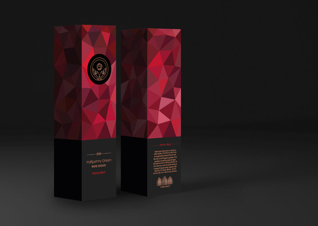
WILL POWELL
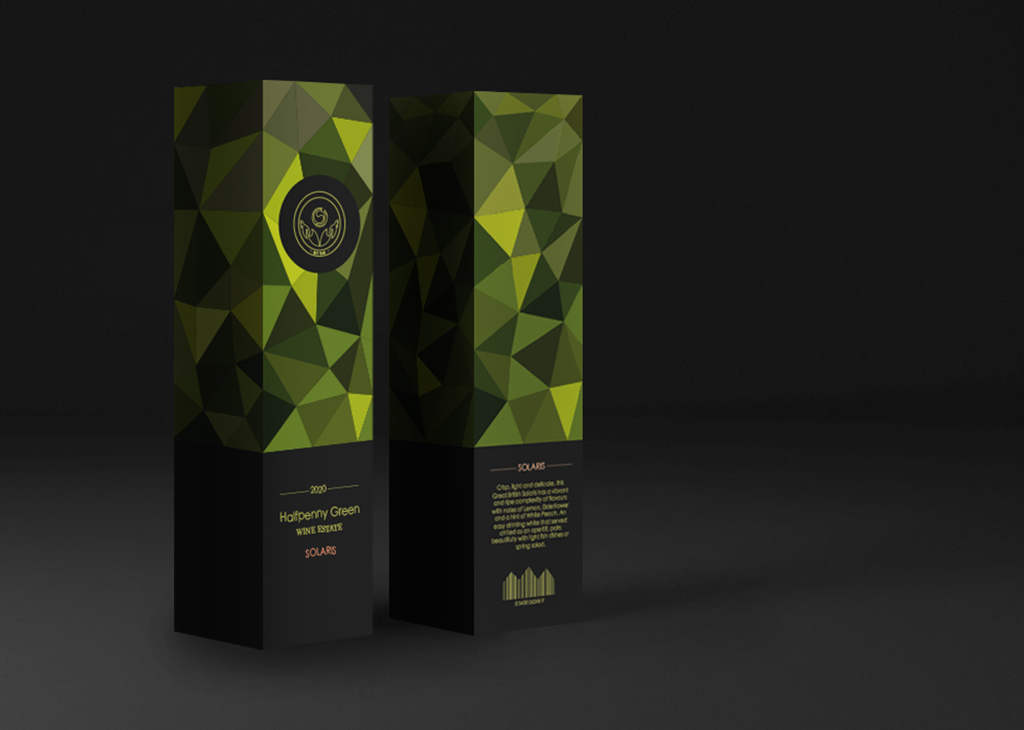
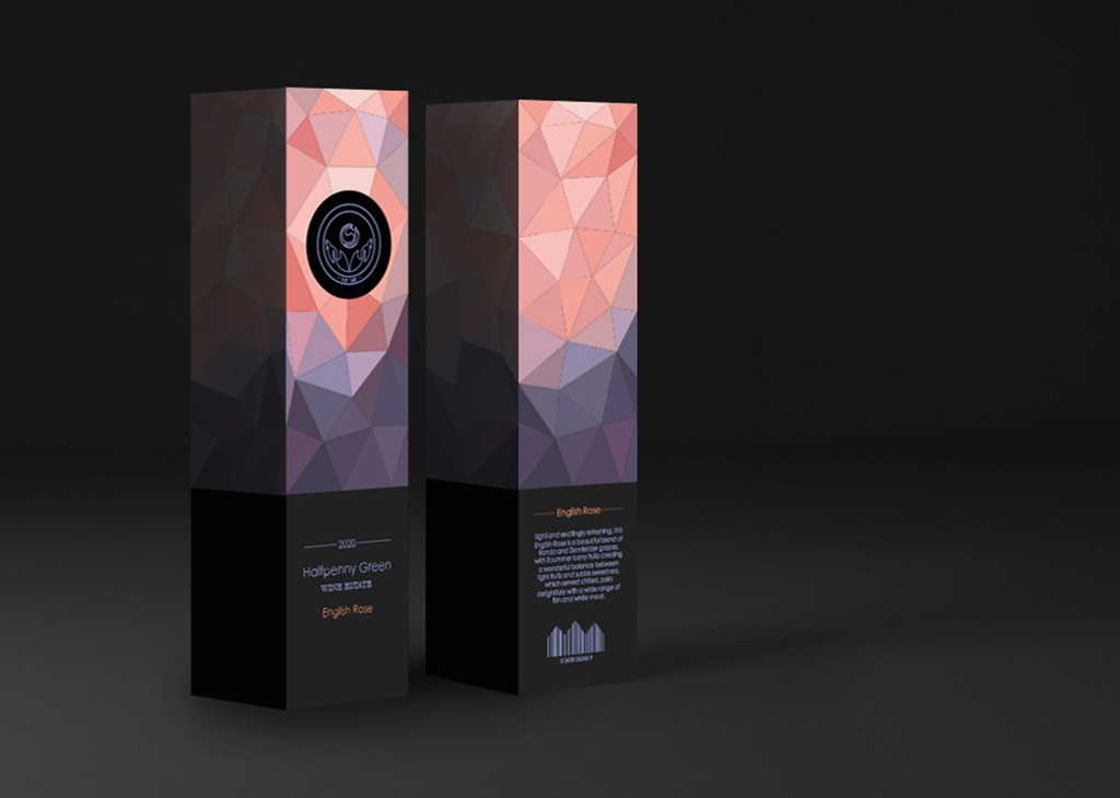
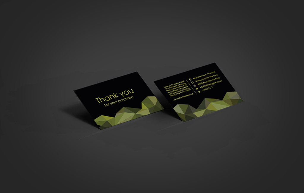
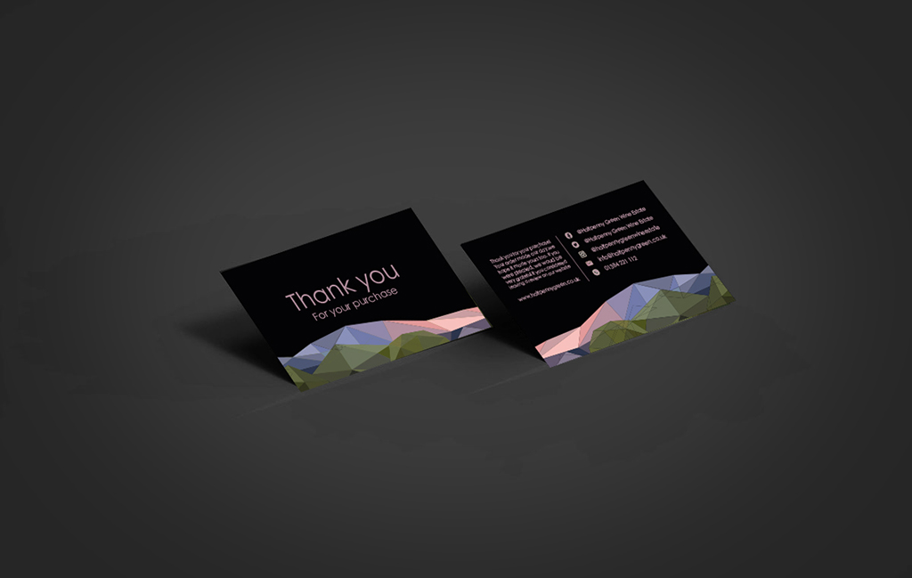
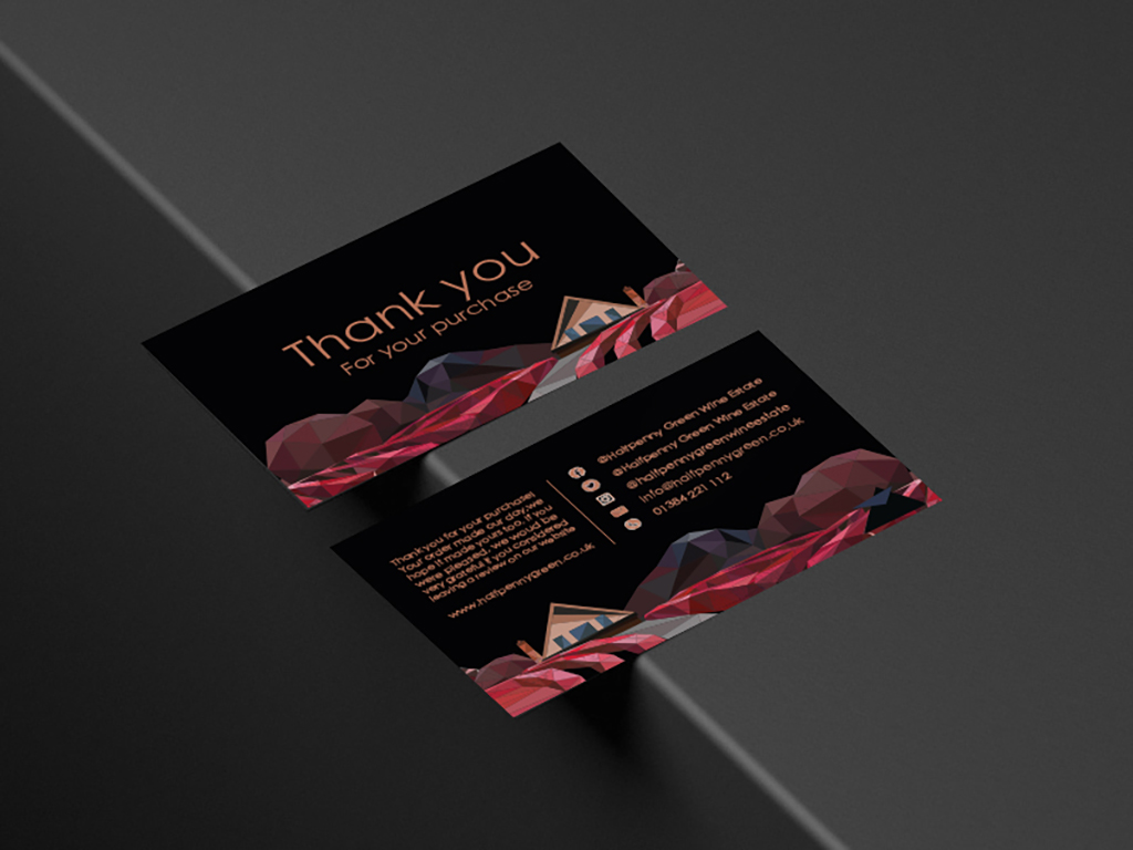
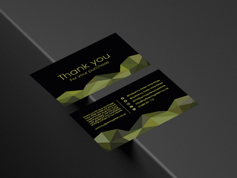
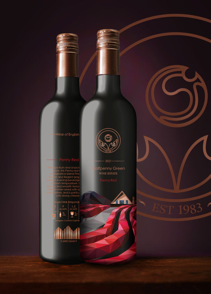
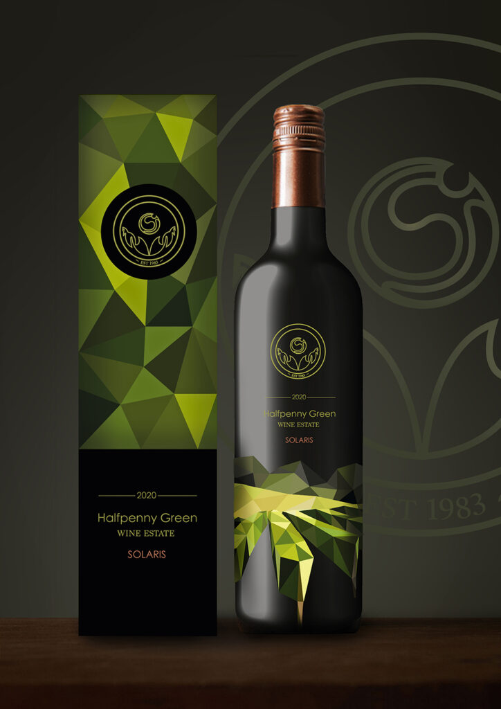
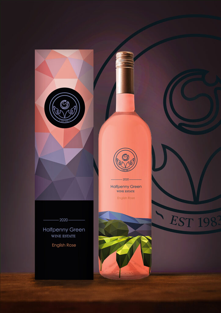
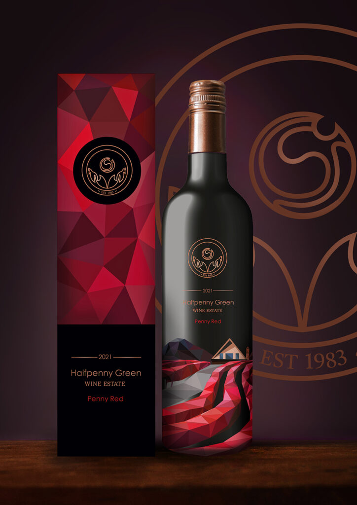
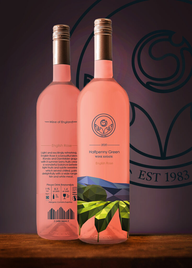
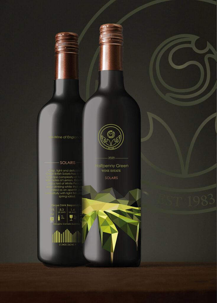
Graphics for Halfpenny Green Vineyard
As part of my project, I created a range of graphics for a local vineyard, the Halfpenny Green Vineyard and Wine Estate. These graphics included a brand-new modern logo, a set of labels for 3 flavours of wine, Solaris, English Rose and Penny red, as well as complementary wine boxes which would keep each of the bottles safe and secure. The final pieces I designed were ‘Thank you’ Business cards, tailored for the flavour of wine purchased, following the luxurious Morales of the brand. The Vineyards landscape is a large selling point of the business, so this was an element which I chose to focus my designs around, creating a range of beautiful illustrations in the minimalistic form of art, geometric art, inspired by artist Elyse Dodge a style which would make up the identity of the brand.
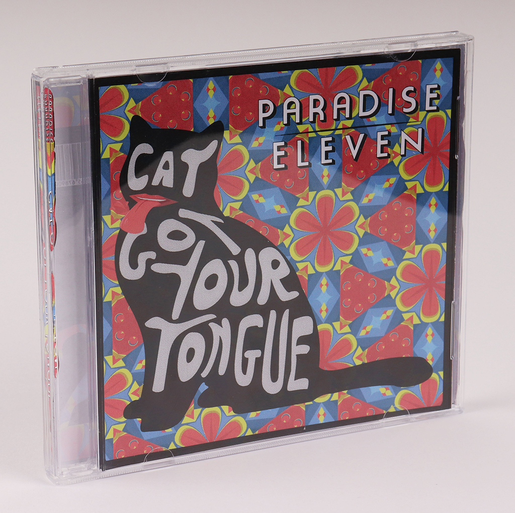
ANNA PETERS
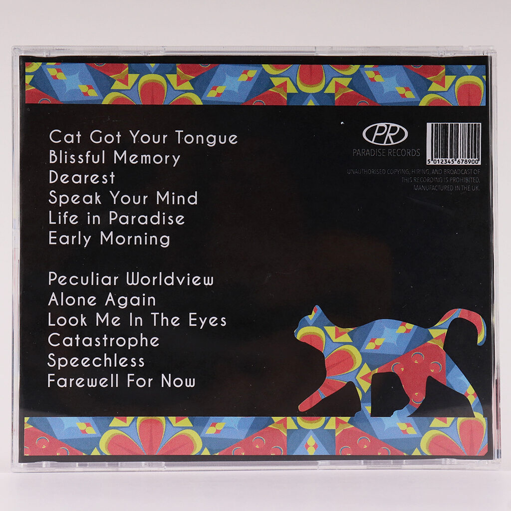
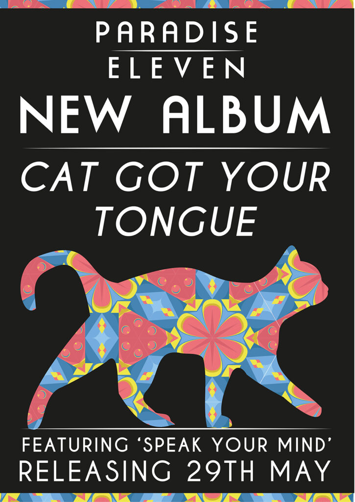
Paradise Eleven CD Cover Art
This project involved creating a brand identity and graphics for an upcoming band called ‘Paradise Eleven’. During this project, I created a logo, the front and the back of an album cover, and a poster advertising its new release. The band I was creating for made music in the style of 60s rock and roll, and so I took inspiration from famous 60s art of the time – taking inspiration from artists such as Andy Warhol, Roy Lichtenstein and Wes Wilson. The band wished for a piece that portrays the unique nature of their music, standing out from the crowd of modern music and using the nostalgia of the 60s as a selling point for older individuals. I explored popular art styles in the 60s such as psychedelia, pop art and op art, with most inspiration from psychedelia. Overall, these pieces were made to appeal to both a younger, hipster audience, and an older audience who may have nostalgia for retro styles of music.
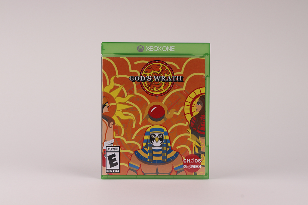
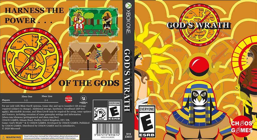
RUPINDER KAUR
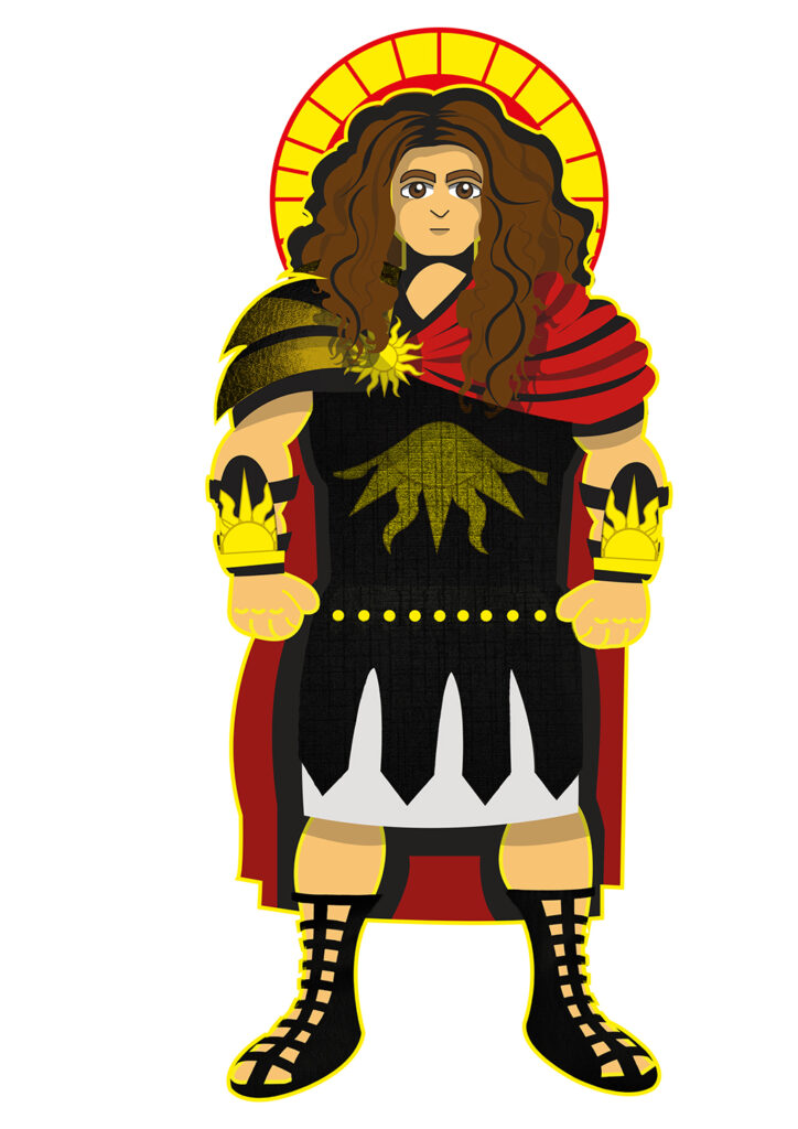
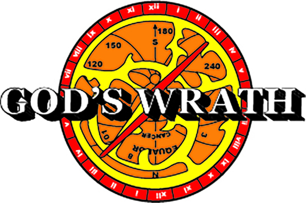
God’s Wrath Game Graphics
This project is a game targeted at ages six and above. In this project, I created the characters, the logo, and the cover. Each component was created with the target audience in mind hence, the colours are vibrant with bold outlines.
To gain inspiration, I looked at a series of artists and existing covers hence, these aspects are visible in the final outcomes of the project. Moreover, I focused on creating less realistic designs to ensure the aspects were unforgettable.
The characters in the game are existing gods from the Roman, Greek, and Egyptian culture which, all have their own weapons and outfits. Hence, I had a starting point when creating them.
The logo was roughly based off an astrolabe which plays a large role in the game. However, I had to alter it to appeal to my target audience therefore, it possesses more vibrant colours.
In conclusion, the project was successful as, the designs would be attractive to my target audience.
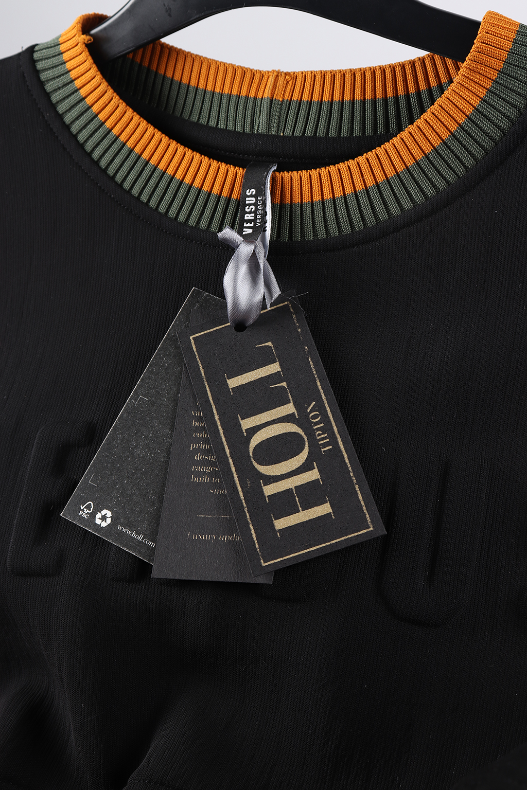
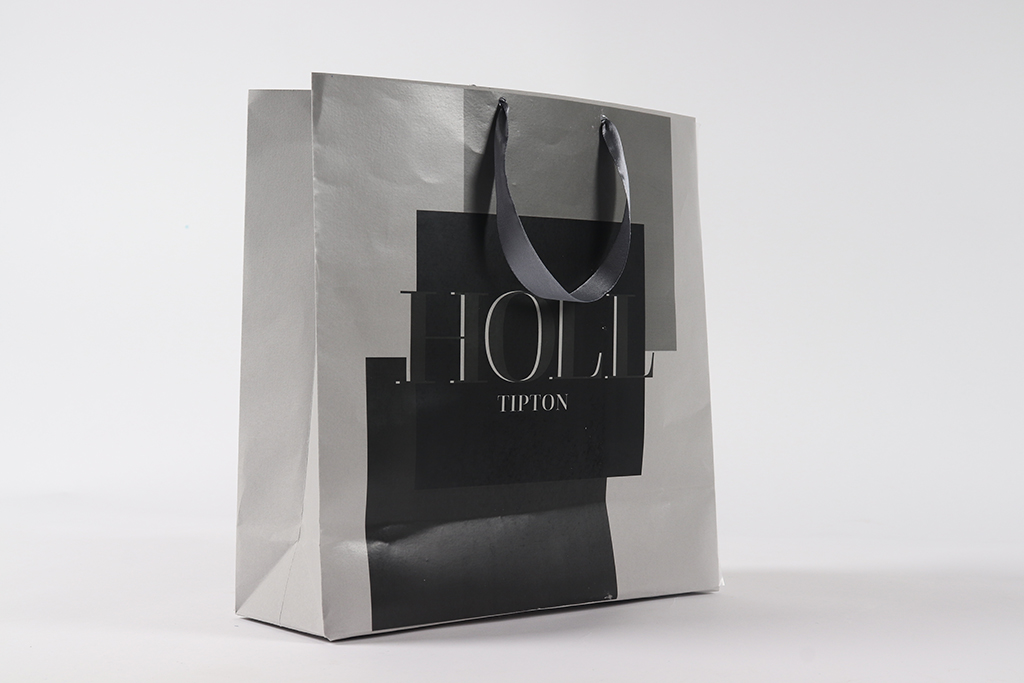
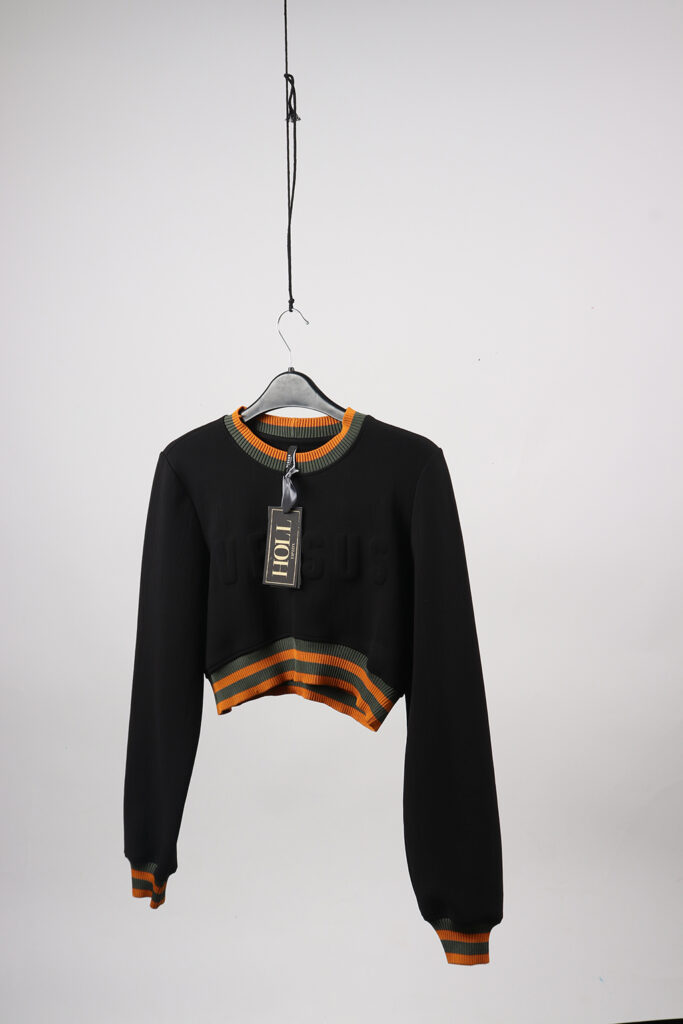
ABI HOLL
HOLL Fashion Label
HOLL is a luxury fashion label that strives to include all types of body shapes and ethnicities while keeping in tie with the high-end contemporary style. Today, the need to raise more awareness about these subjects is due to the increase in mental health. In the UK 1 in 4 people will experience mental health problems of some kind each year and it’s on the increase as the reporting’s of self-harm went up by 62% between 2000 and 2014, this has almost doubled. In Today’s society not accepting body inclusivity, ethnicities or races are on the rise within the luxury fashion industry as they don’t provide the correct shape and sized clothing to tailor for plus size and also colour schemes used which don’t compliment all skin tones. My final pieces reflect HOLL ethos by adding layers to reflect the shades of skin, while in keeping with the luxury feel by using complex techniques like screen printing and the use of precious colours such as gold.