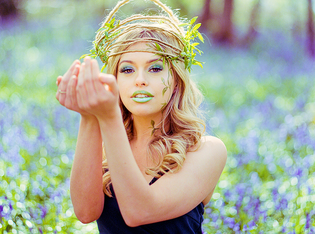
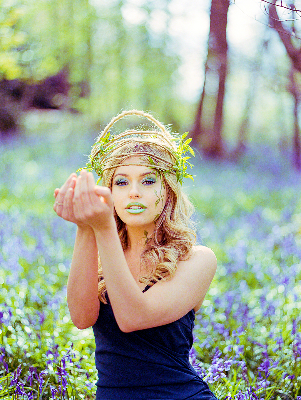
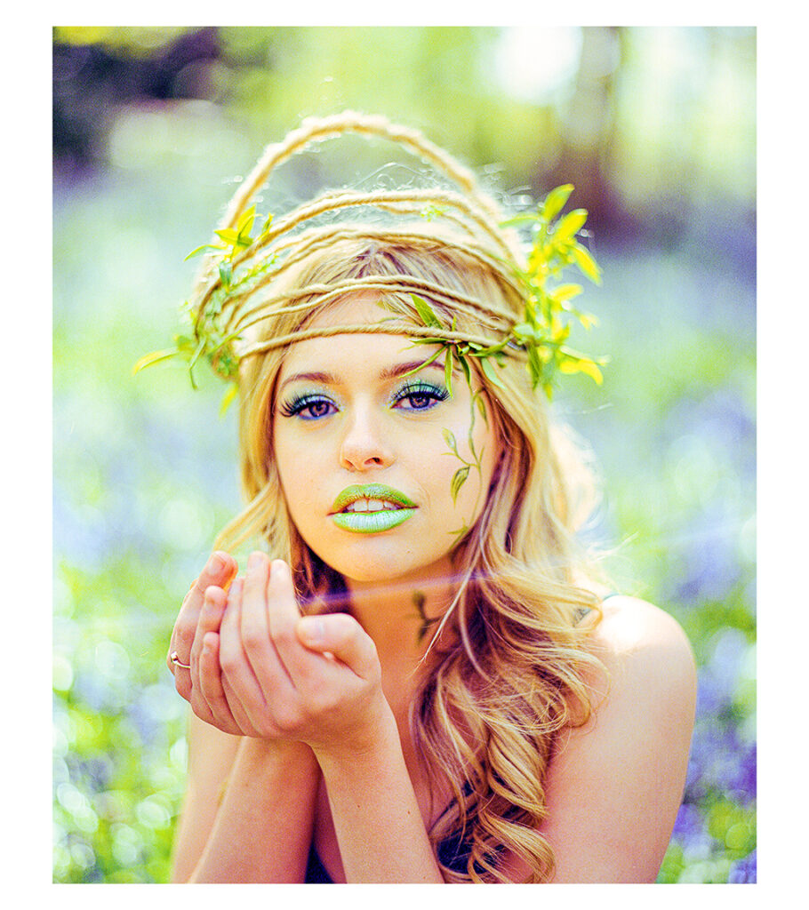
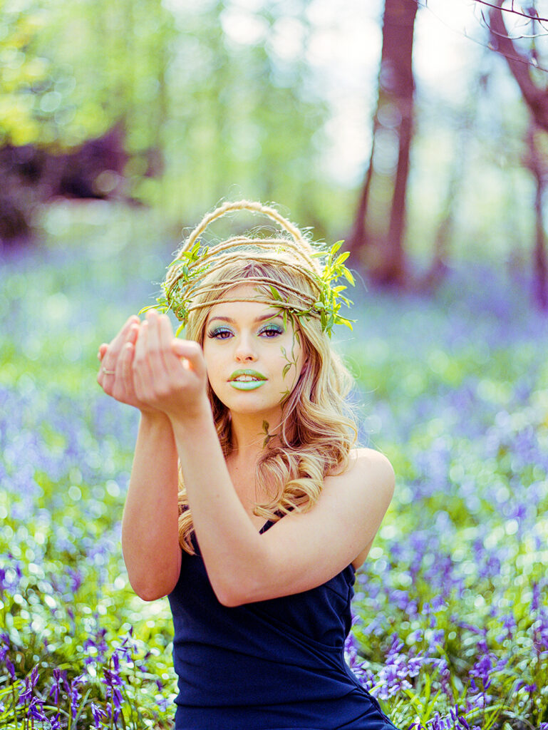
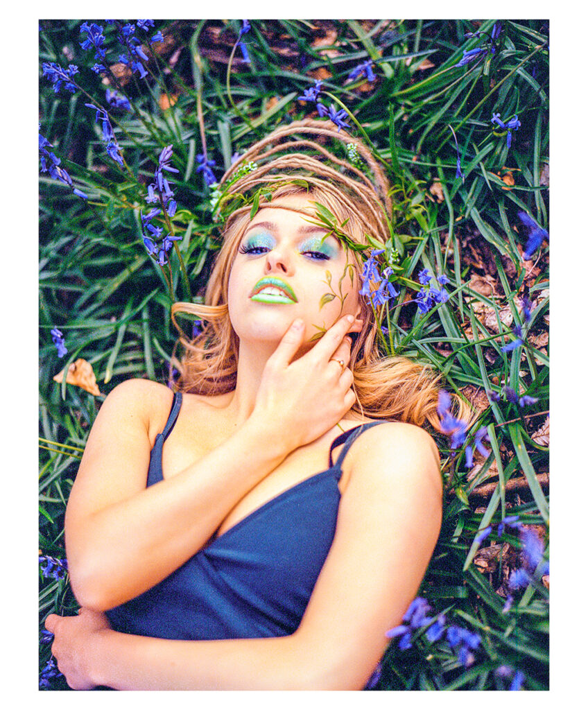
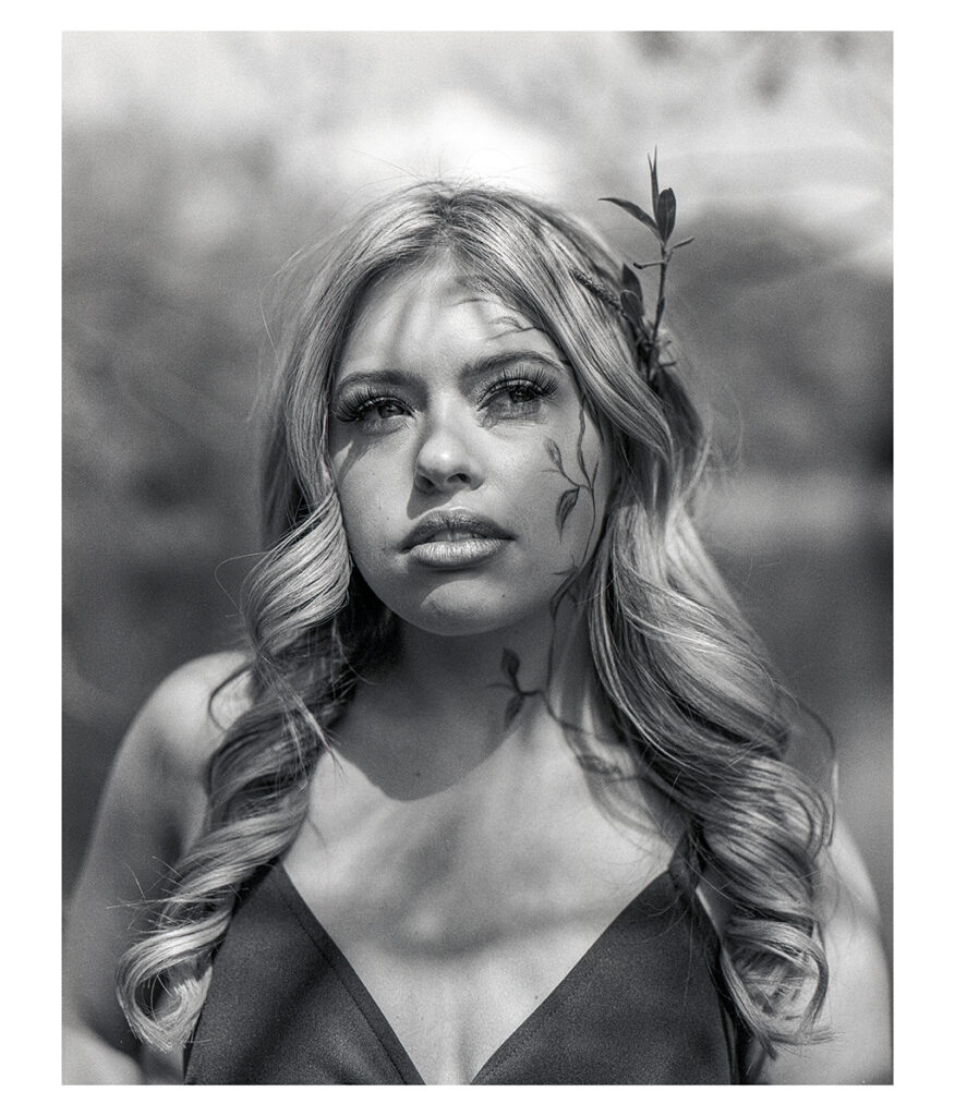
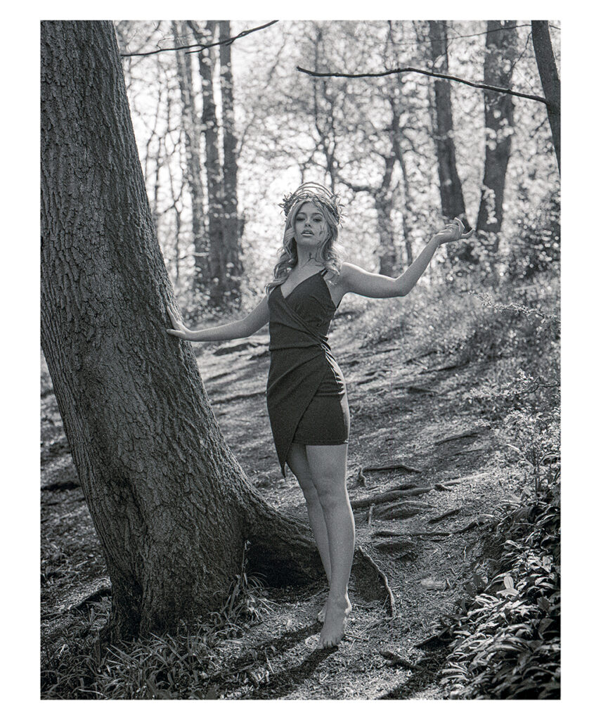
I got the opportunity to assist on a shoot with another Photographer (Josh Deakin) and Make Up Artist (Olivia H) who had come up with a concept for a woodland nymph character model (Alice Keay). Olivia prior to the shoot had worked upon designing a floral crown which integrated plants and braids of hair. As well as assisting with lighting I also brought my Medium Format Pentax 67 Camera and shot the following on a roll of Ilford Delta 400 (black & white) and Porta 400 (colour). We shot on location at Leasowes Park and found a grove full of bluebells which really made for the perfect setting.
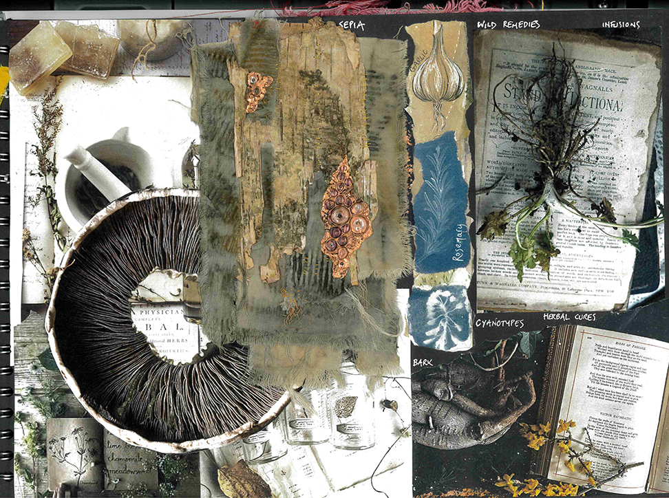
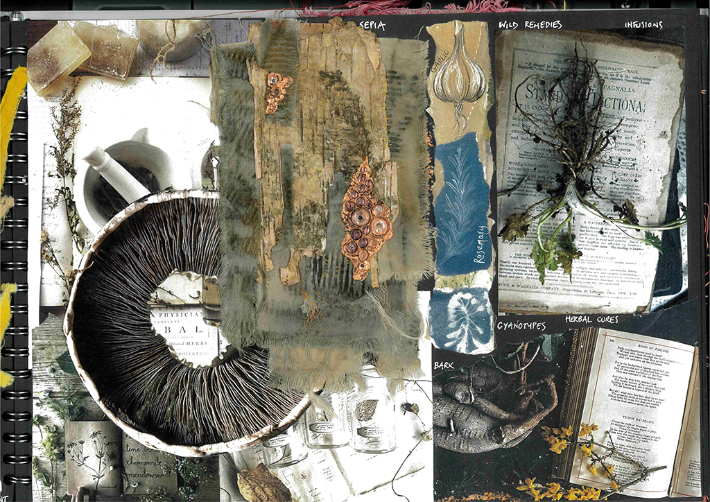
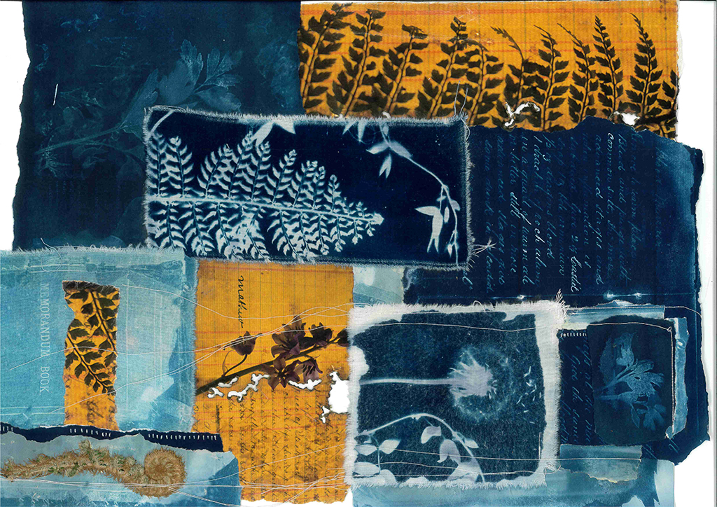
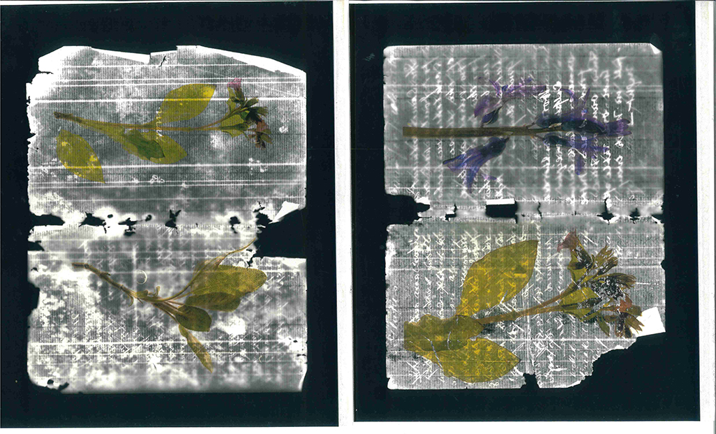
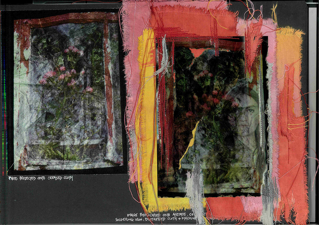
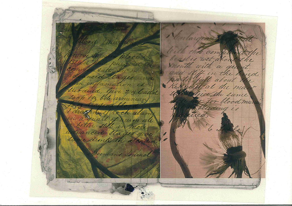
The starting point for this work was a notebook of handwritten herbal cures that has been passed down from my great grandfather. Growing up on a farm has given me a love of folklore and plants. I wanted to explore the idea of how plant knowledge is passed down through the generations and how we can continue to understand and appreciate our natural environment. Over the past few months I have enjoyed experimenting with photograms, the lightbox and cyanotypes, combining the outcomes with layers of acetate, plant dyed fabrics and stitching.
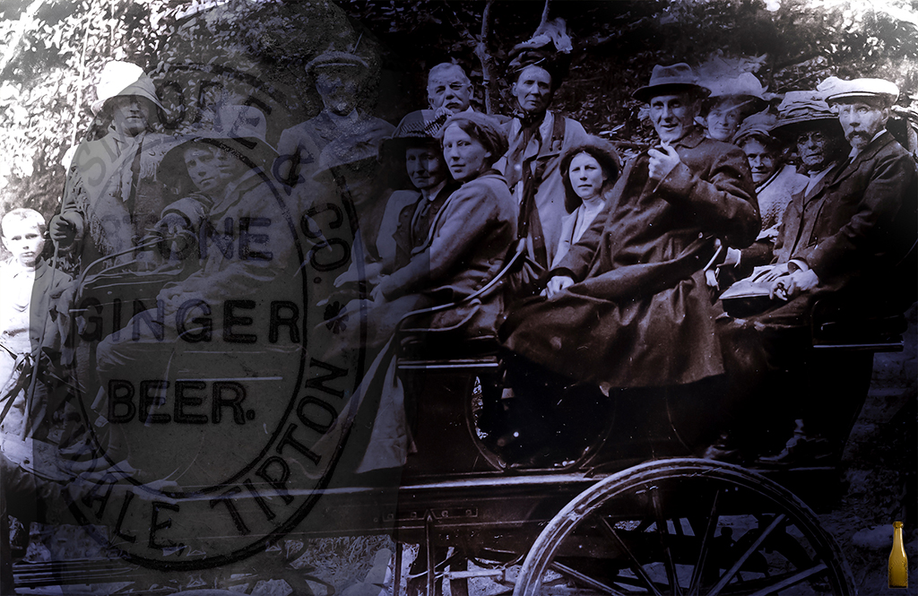
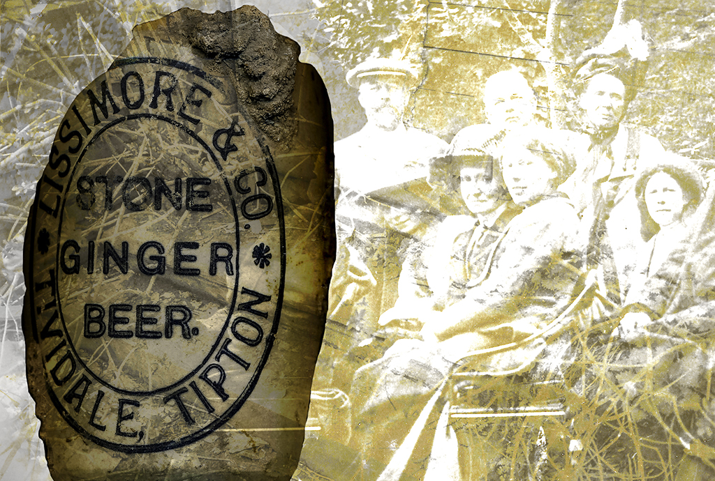
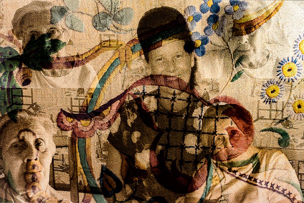
After experimenting with studio portraits and still life studio settings, some of the best individual images to arise were selected for this project. Moving in a different direction was the idea to combine images to create artistic photos depicting a theme. The title of this way of working could be termed “Trios”. The idea was to merge 3 images to create a bold historical statement. This format will be replicated to undertake further themes in the future. It is a unique way of working to combine multiple images which bring together a historical snapshot. Each image will represent historical evidence and memories. The images will stand alone but also merge to create a partial story or statement that has been lost with the passage of time. Generally, the three images which are combined will include a place (setting), a portrait (solo or group) and an artefact. The place will often be the backdrop to the key people and the artefact will be something rare and precious because of its scarcity.
This is my own concept but has been influenced by my love of history, particularly between 1876 and the 1920’s. The detailed photos taken in the “Golden age” will provide useful source material to edit thus being able to include rare images to create new artistic representations. Sepia and black and white and other tones will help to give the historical feel. There will be experimentation in both Lightroom and photoshop to create these artistic pieces.
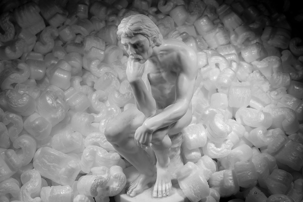
The first two images are contrasting portraits, addressing both the philosophical and physical aspects of the human form. The ‘thinking man’ and the ‘thinking woman’. It encourages thoughts of identity.
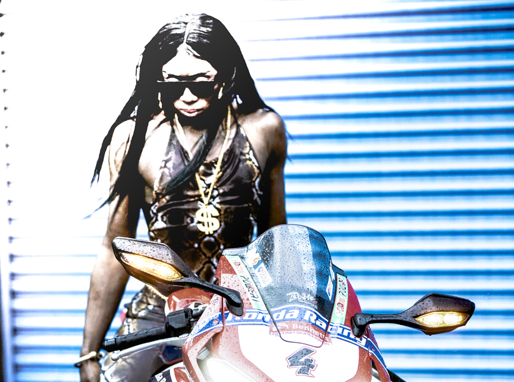
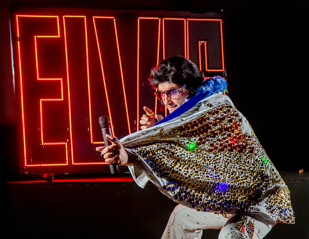
The second two images celebrate the fashion and entertainment.
The final four images include the “TRIOS”.
The first two “TRIOS” were created using iconic artefacts and photos of Lissimore’s Mineral Waters Tividale, (long since demolished) as a reminder of a bygone age.
The third “TRIO” is a tribute to the embroidery talents of an old lady showing how life changes over time and contrasting the youthful exuberance with the difficulties that come with age.
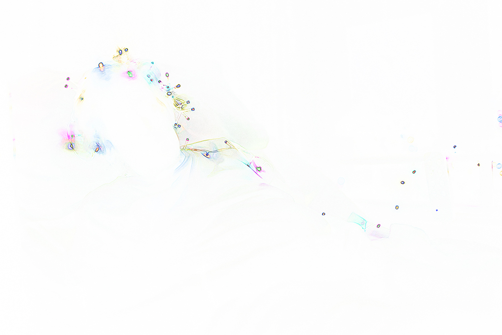
The final photo shows the same lady reclining, now bedbound, in time and space. (The Lady in white).
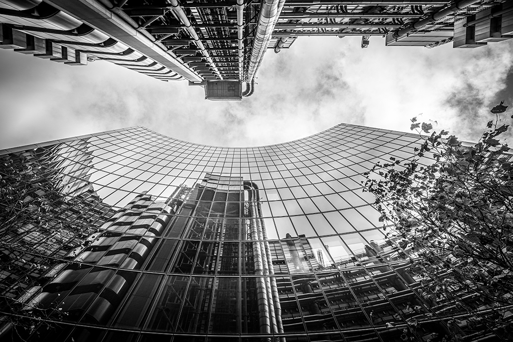
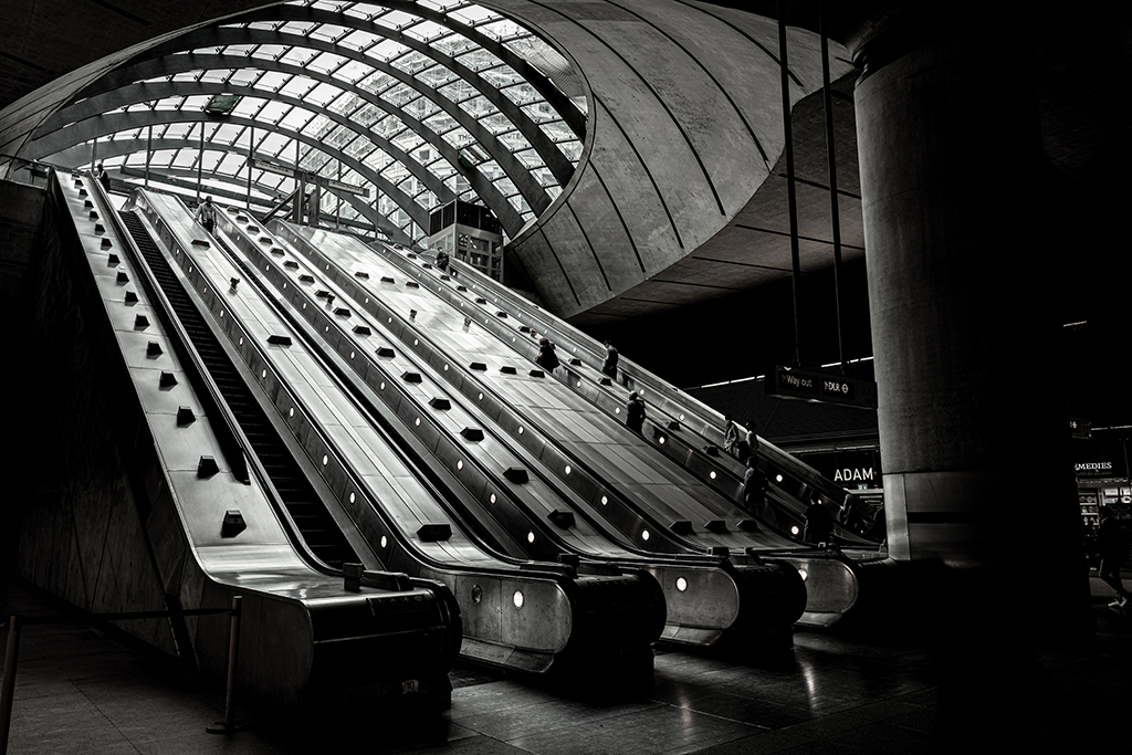
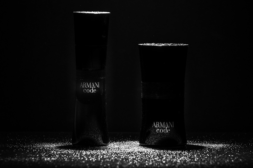
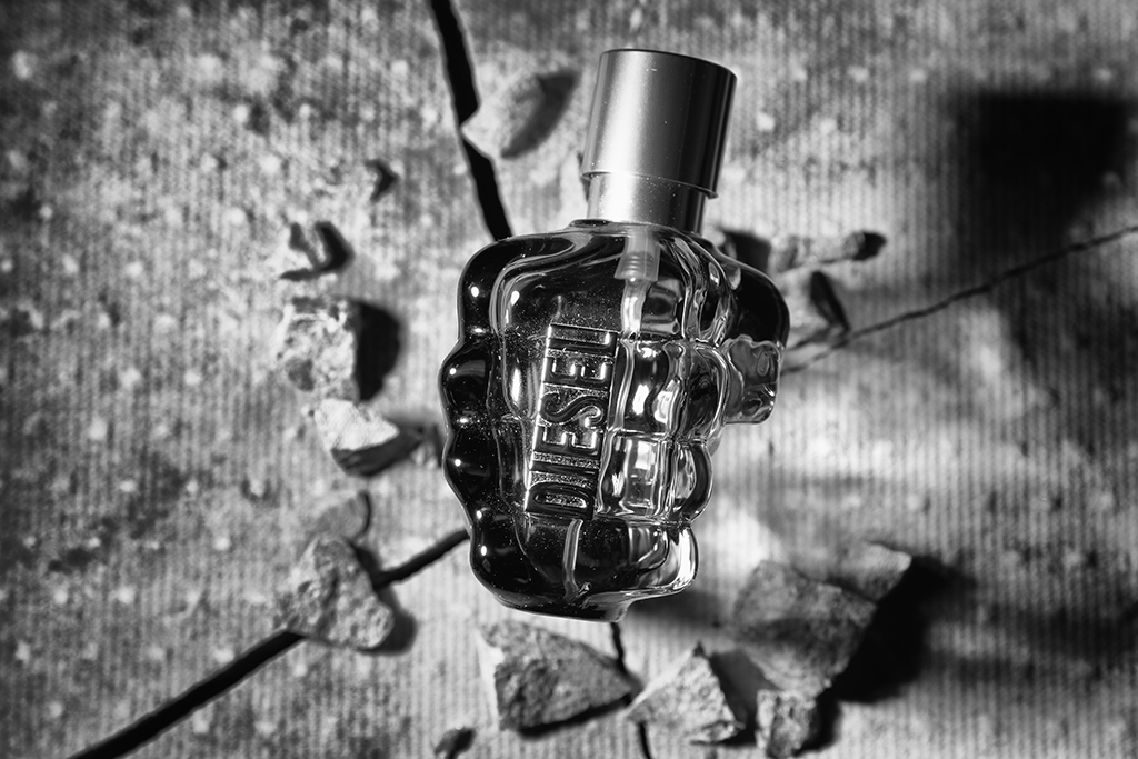
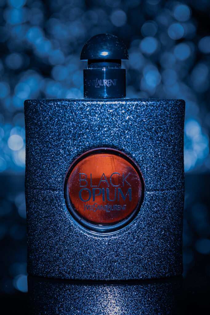
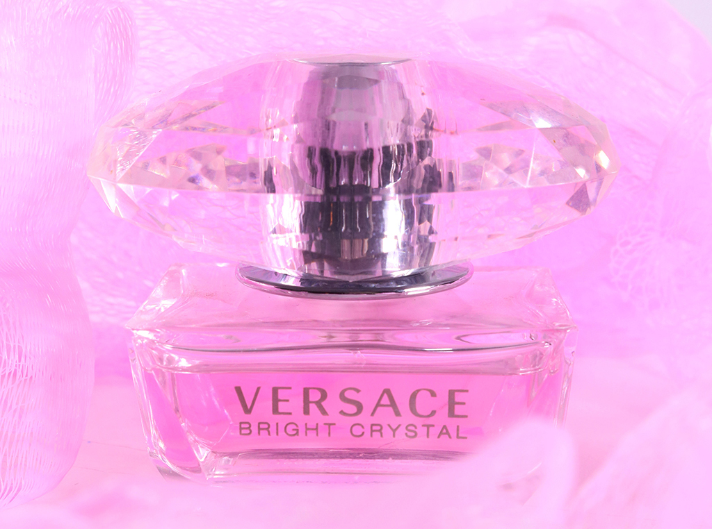
My interest in architectural photography undoubtedly stems from my near twenty years of experience of electrical contracting in the construction industry. The black and white, and often dark and gloomy, photographs of Birmingham and London, together with the Black Country, reflect my upbringing in the 1970s and 1980s landscape of the West Midlands, specifically Wednesbury. Wanting to try new photographic genres, and learn new techniques, I tried still life and product photography, but the dark styles persist even here, with few being bright and colourful.
Watch Richard’s Time-Lapse Video, Lockdown Lawn – the Unfinished Garden
Still Life and Portraits in Black and White
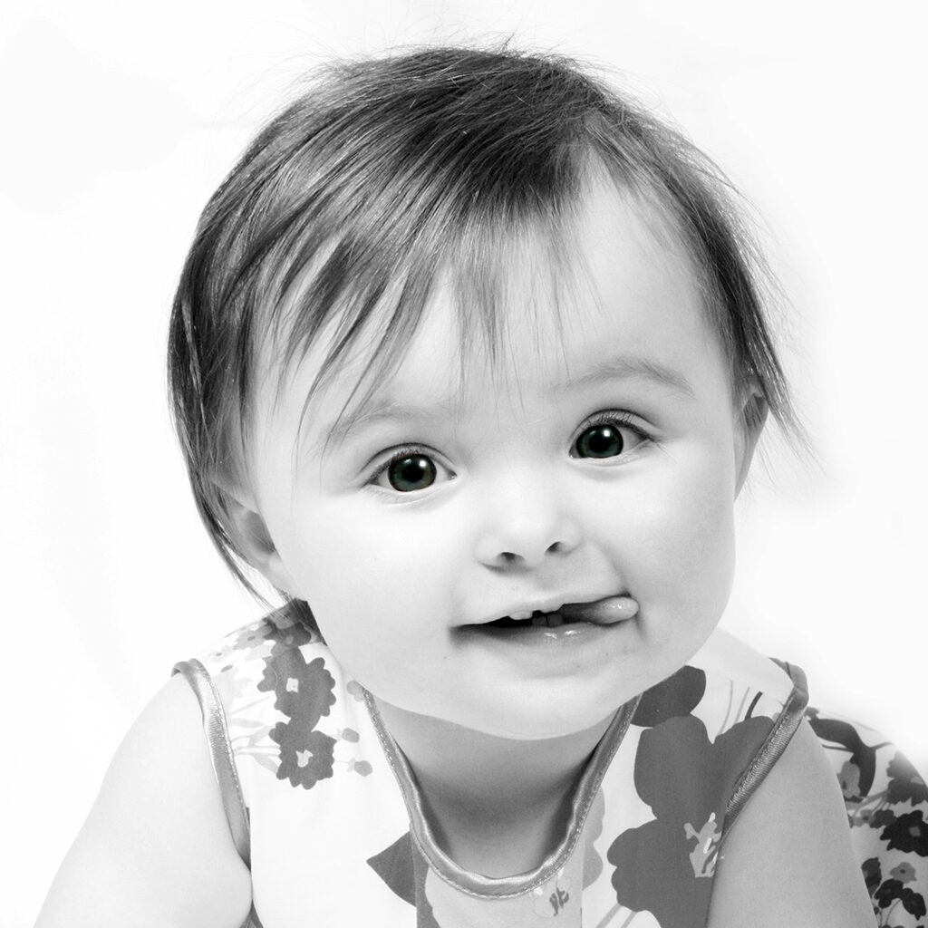
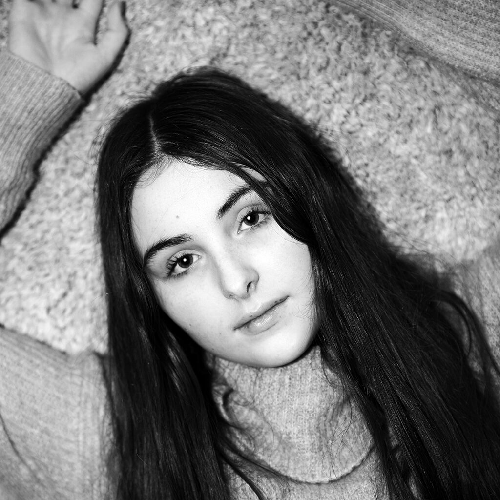
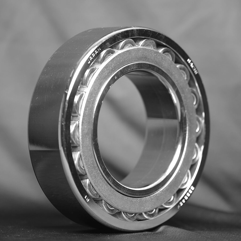
I have drawn my inspiration for my six images from various genres of photography. I love black and white images both portraits and still life. My still life images were inspired by Maurice Bromfield. Maurice’s images of industrial Britain inspired my images of the bearings that I have taken. Selling these products is my day job and I sell hundreds a day but have never taken the time to photograph them.
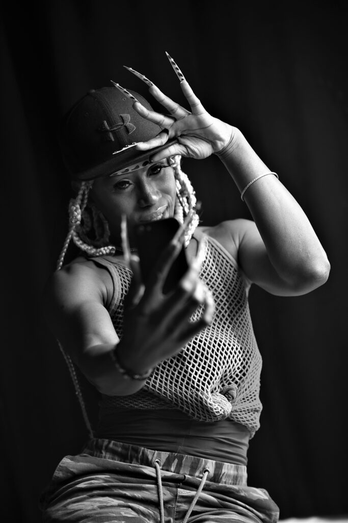
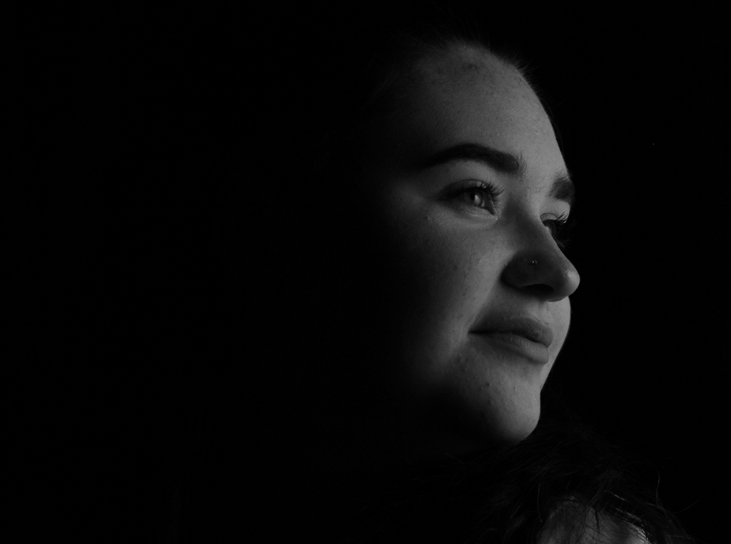
The Maurice Broomfield ‘Timken’s’ shot of a massive bearing being inspected (see below) inspired these images.In my part time I am a Wedding Photographer so really enjoy photographing people, so my other images are all based on my love for taking shots of people. I especially love black and white portraits. I enjoyed working with ‘Candy’ (Maurice) and although he was very colourful and vibrant I thought the pictures of him worked very well in black and white.
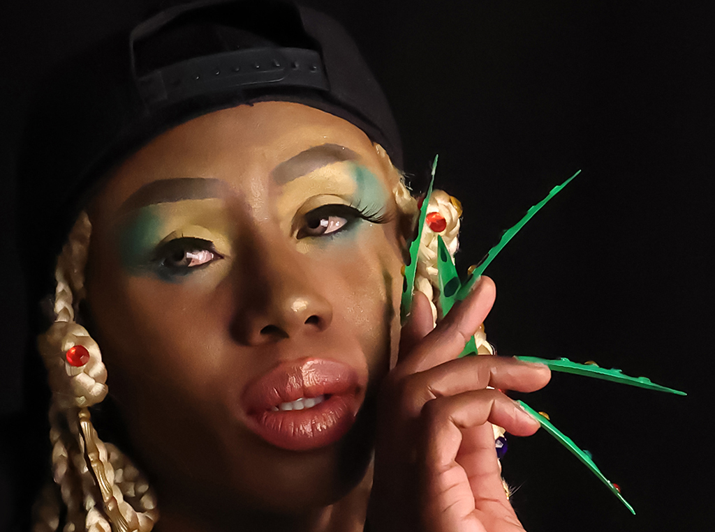
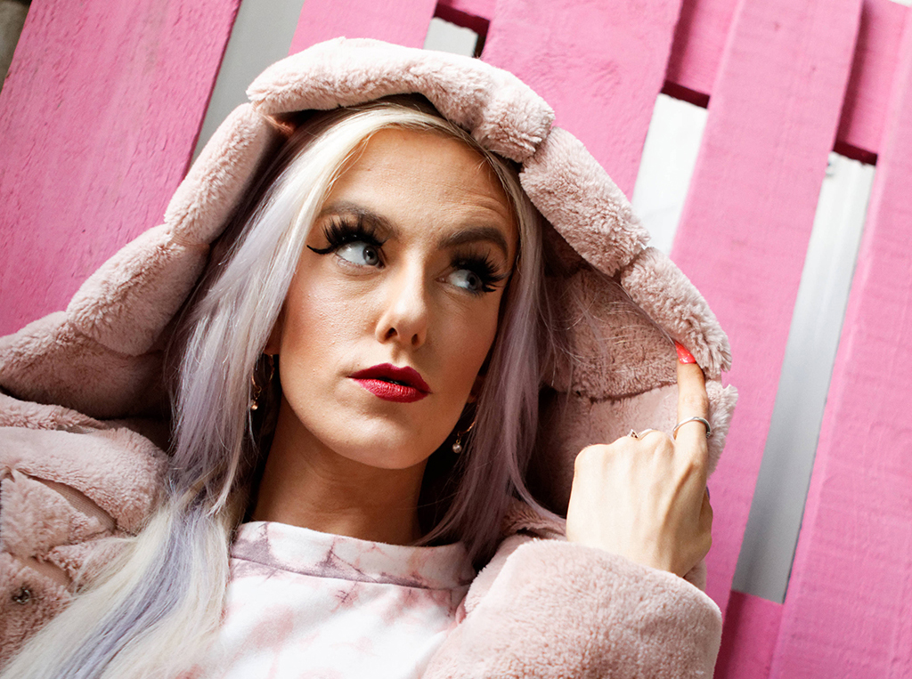
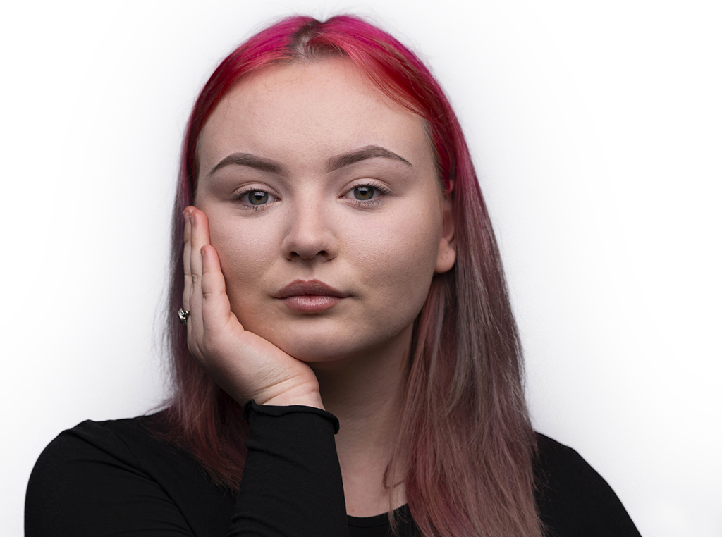
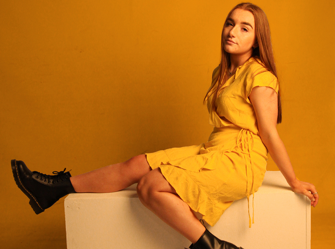
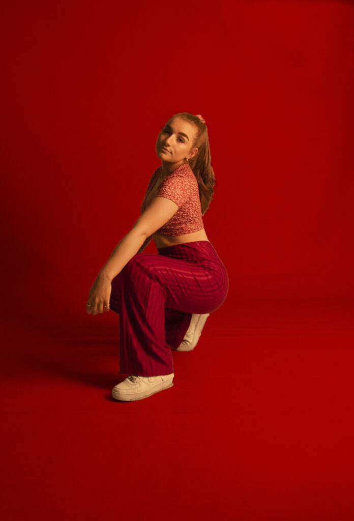
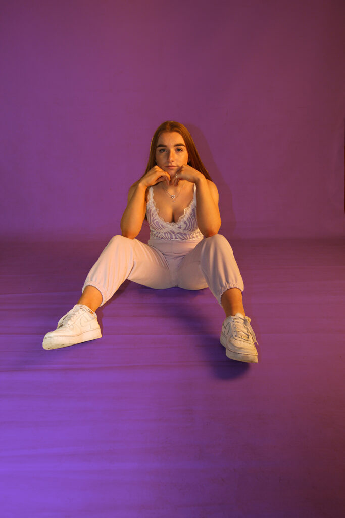
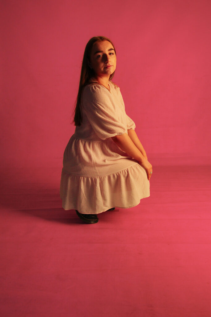
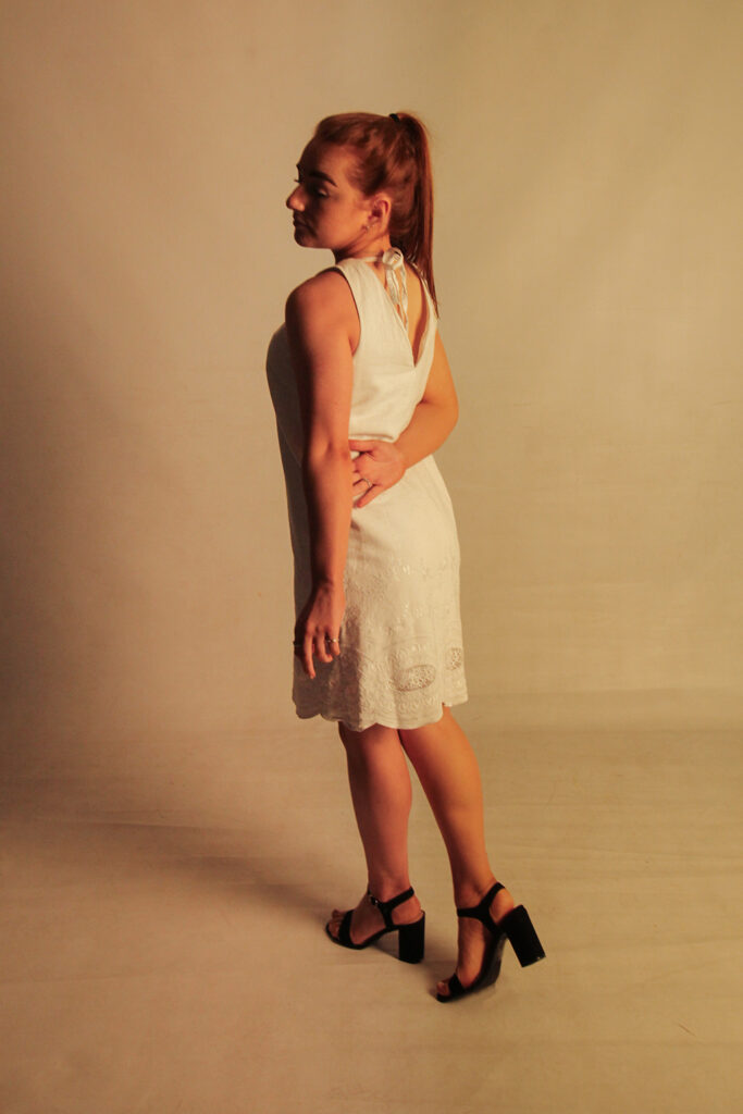
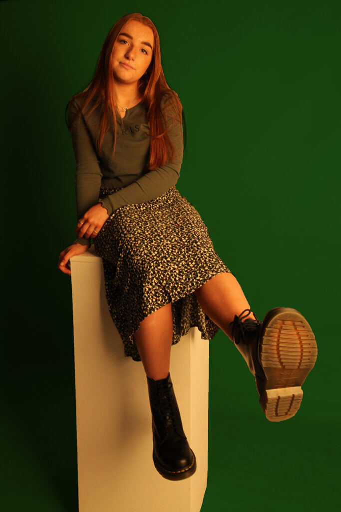
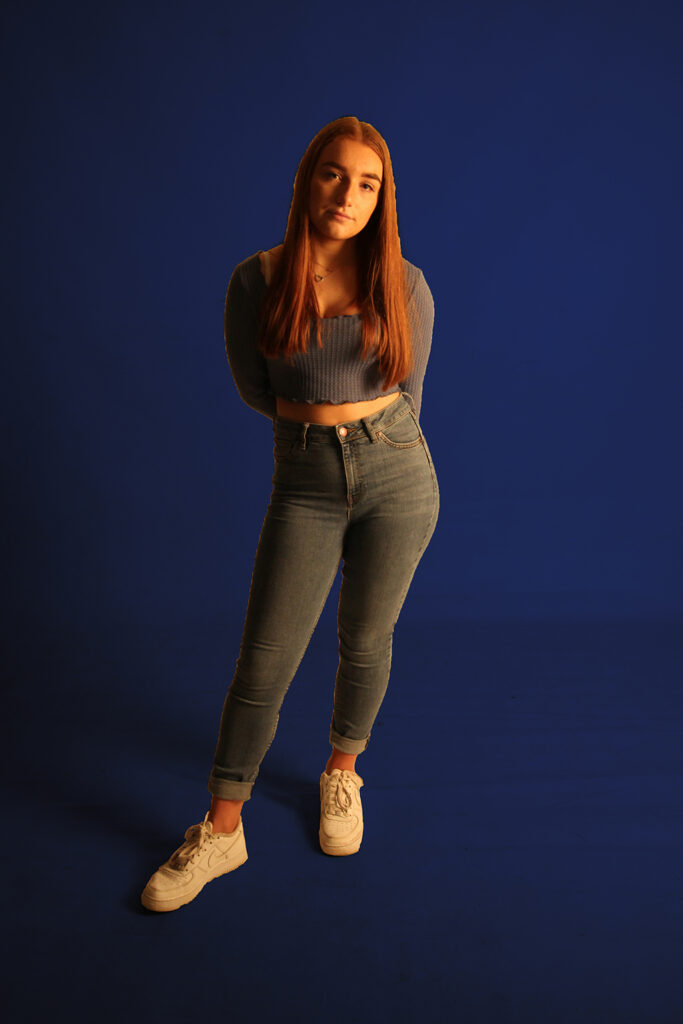
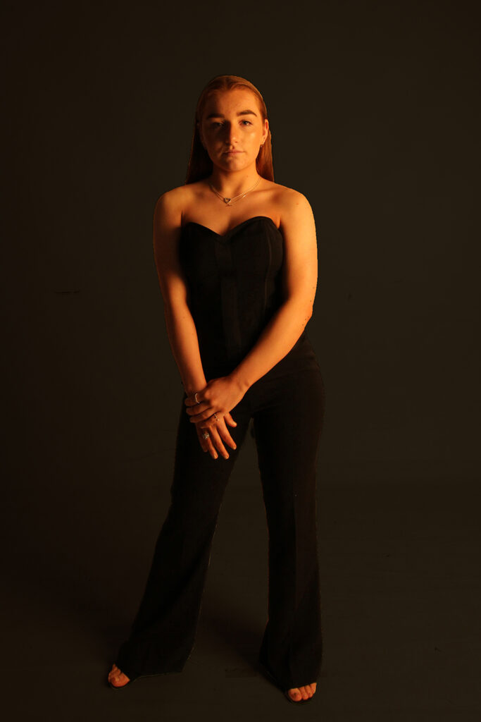
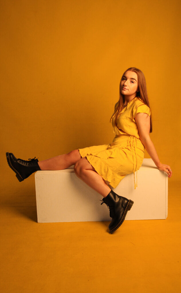
‘Colour’ explores the relationship between colour psychology and fashion photography. Each colour has its own characteristics associated with it that can alter viewers moods, thoughts and feelings upon viewing it. I have created a character associated with each colour portraying the feelings and emotions attached to it. The colour red is often associated with passion and sensuality but also can refer to danger. The colour blue has been known to lower both blood pressure and anxiety yet have little emotive connotations. Starting from left to right, the work attempts to alter viewers emotions. Red, the colour of emotion has physiological impacts that will raise the viewers’ heart rates. Orange, a colour known for its tension, discomfort and negative energy. Finally yellow, a representation of the sun, a colour of fun, warmth, happiness, and inspiration. The work intends to take the viewers on a journey of discomfort to comfort.
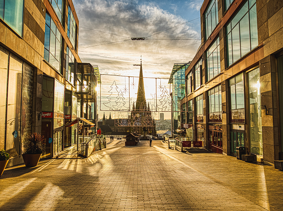
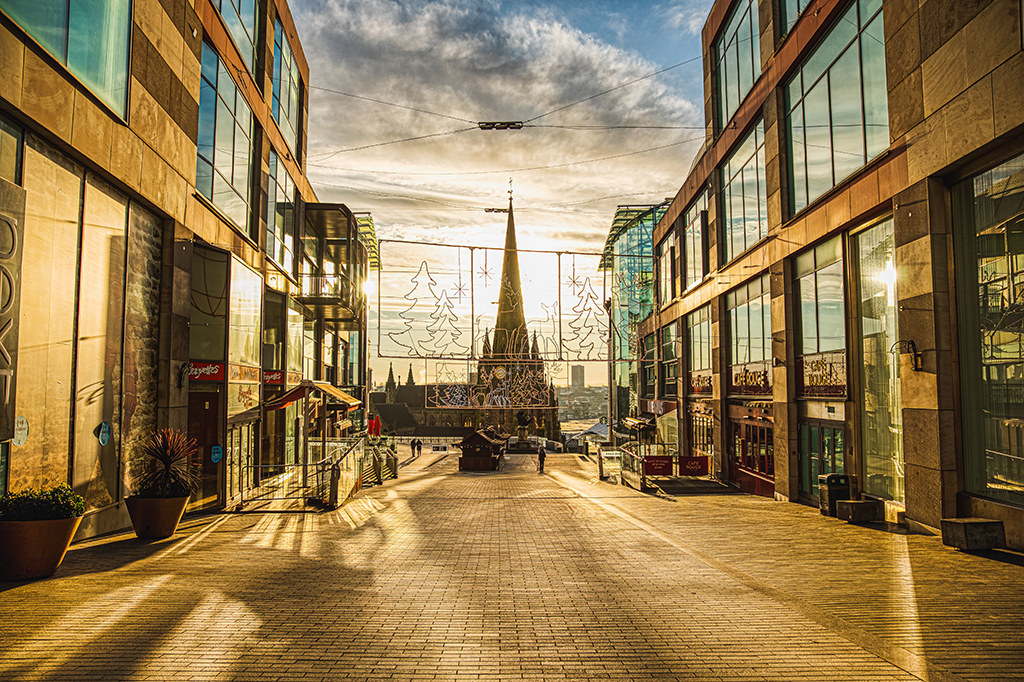
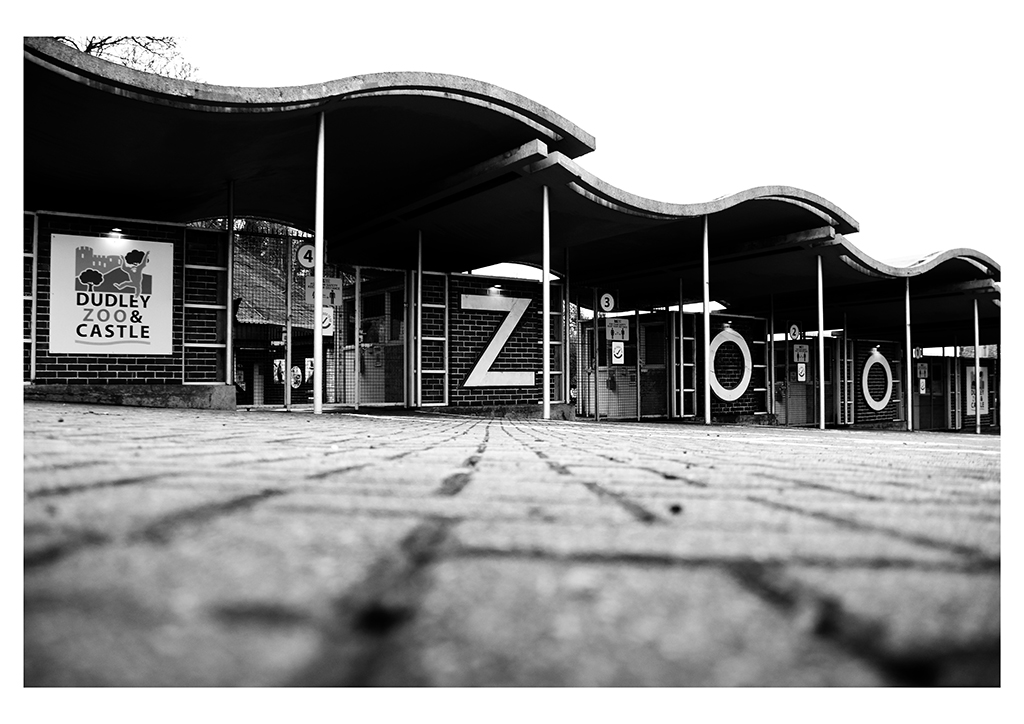
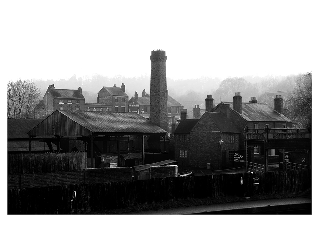
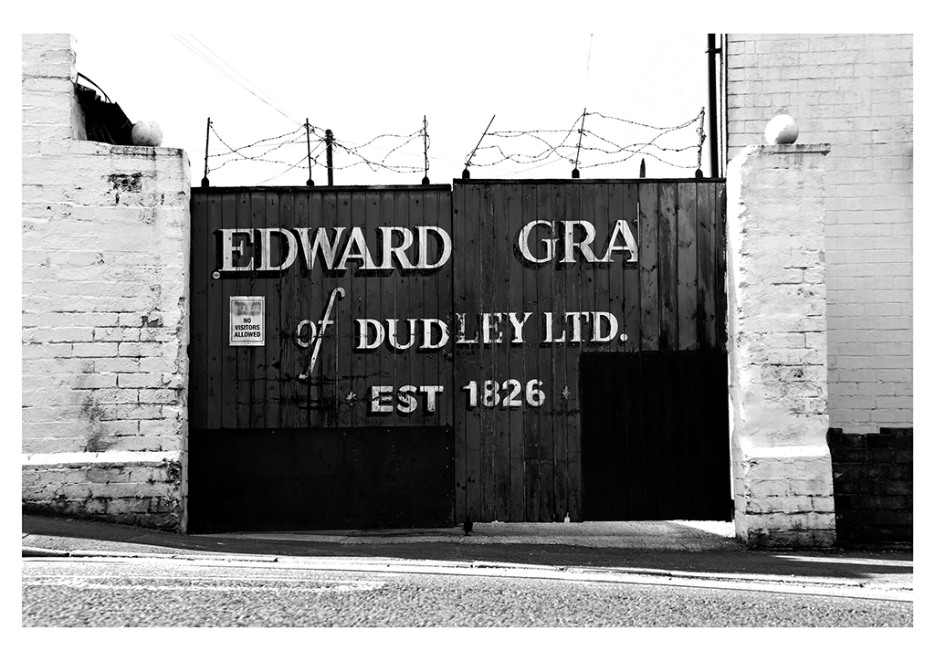
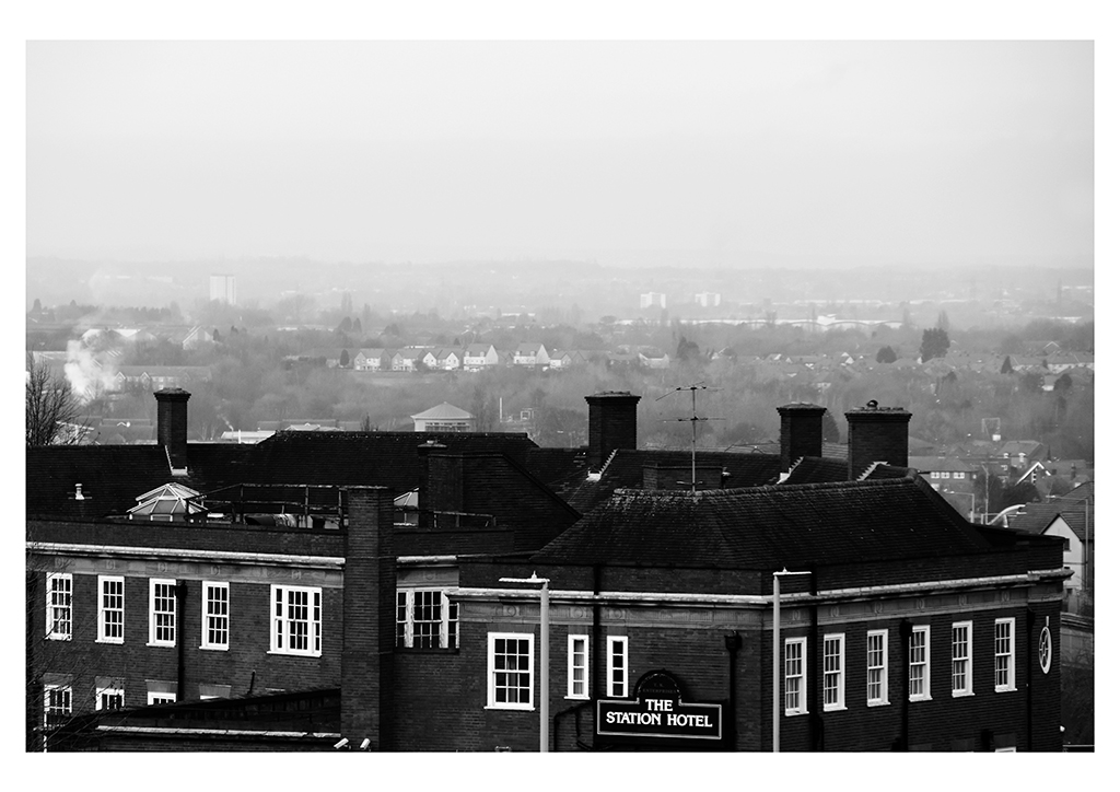
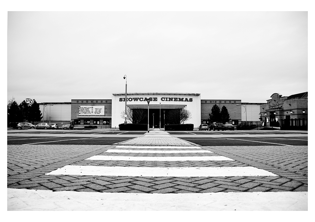
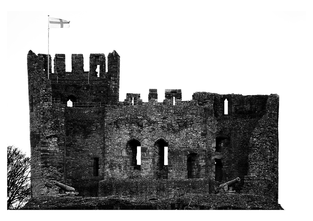
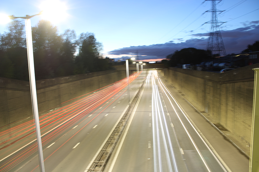
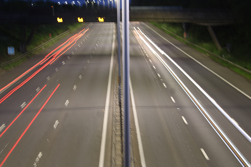
During my time at college, I have completed a number of projects ranging in different themes and technical skills. For my FMP project, I decided to photograph key locations and landmarks around the Black Country. It became clear that whilst I was photographing the key destinations that are popular with both tourists and locals, this project will be important for capturing the Black Country during a socially and financially difficult time. This year’s project reflects the domino effect of the pandemic on Dudley’s attractions. I think along with everyone else, I didn’t expect the pandemic to go on for this long, so I thought I’d make the most of documenting such an isolating and surreal time. Therefore, I have created a collection of monochrome photographs in the hope of proudly showcasing the heart of the Black Country, whilst also showing how the world we are so used to, has been paused and changed indefinitely.
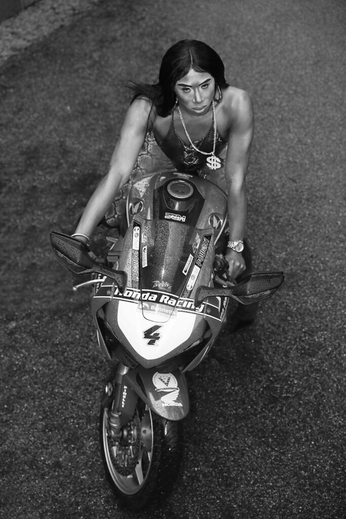
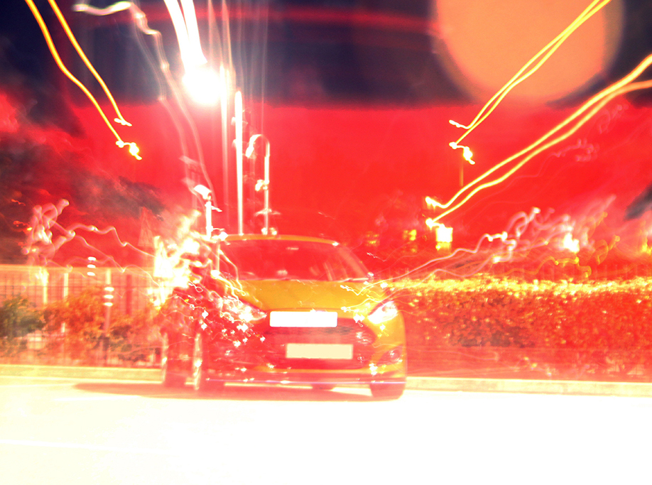
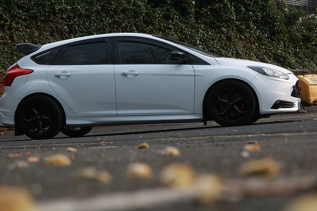
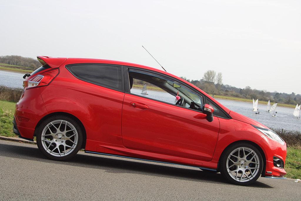
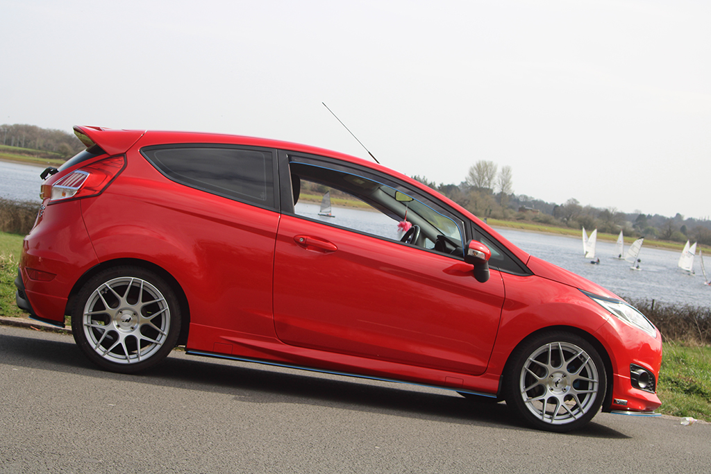
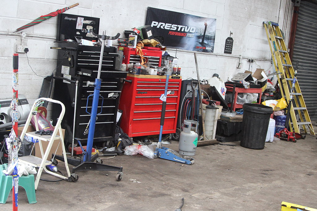
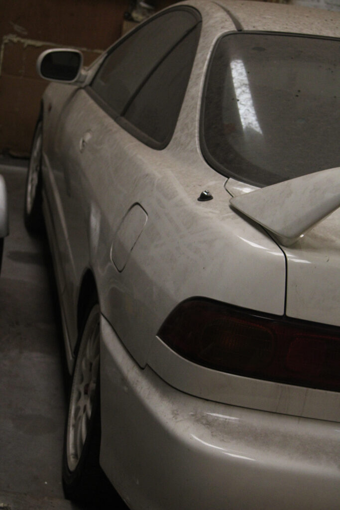
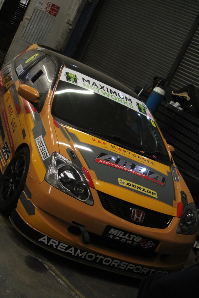
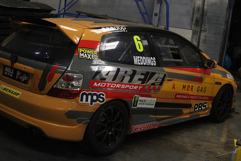
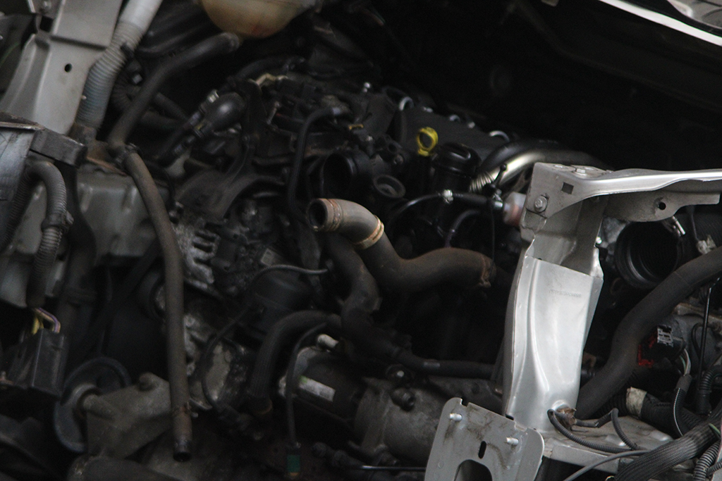
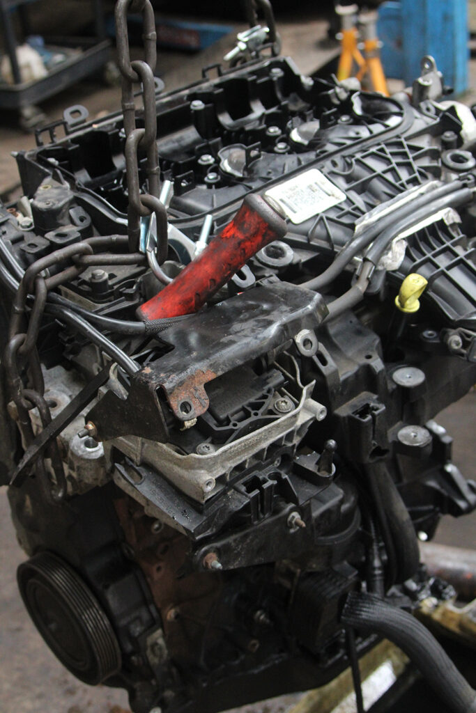
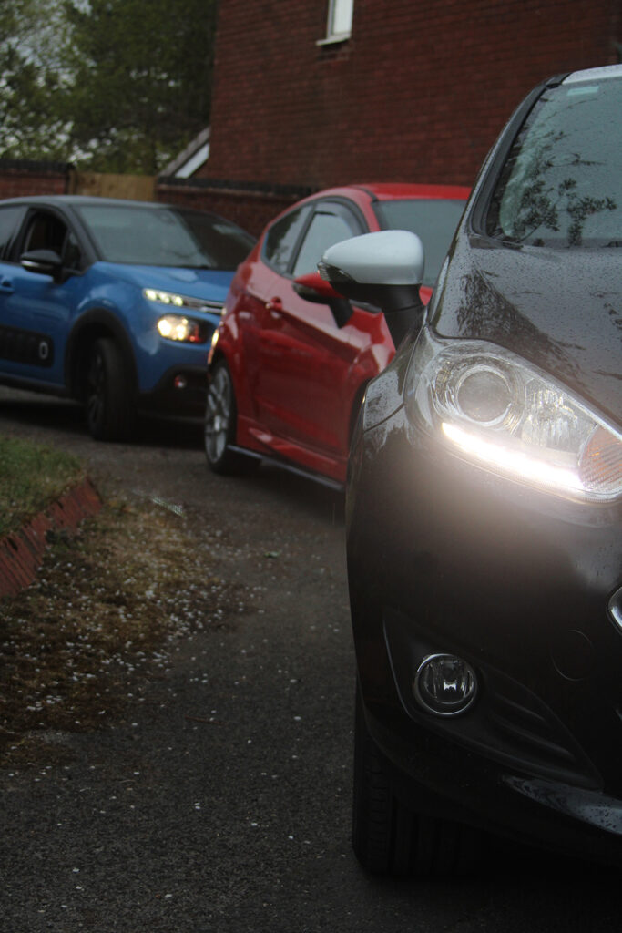
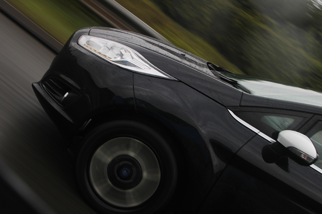
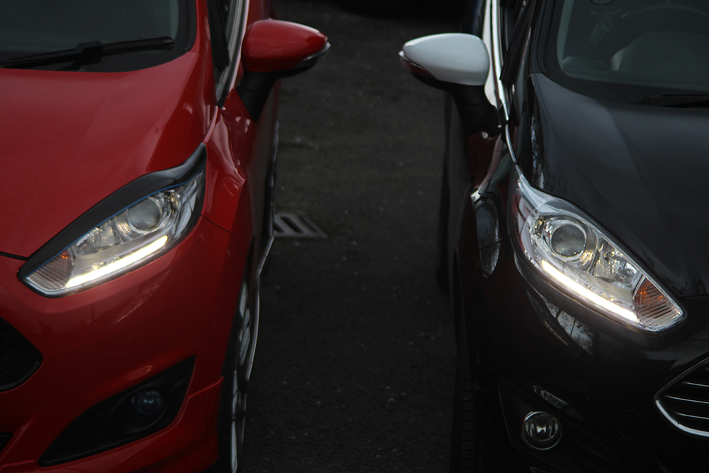
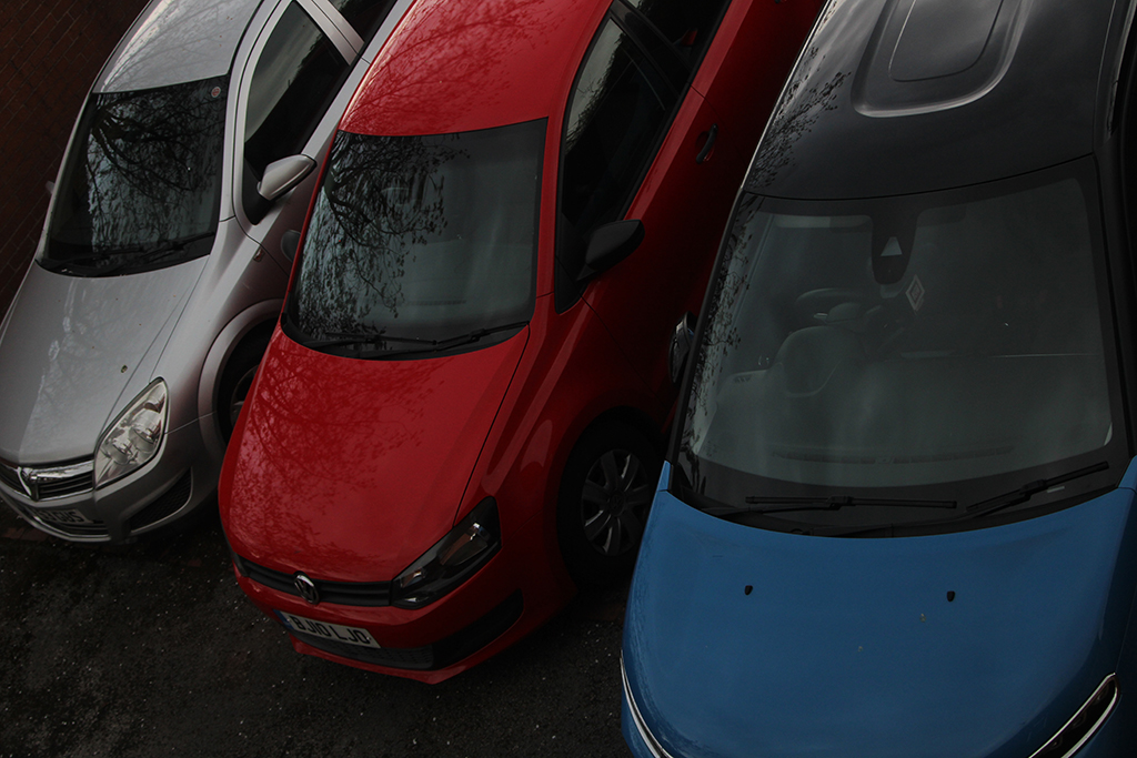
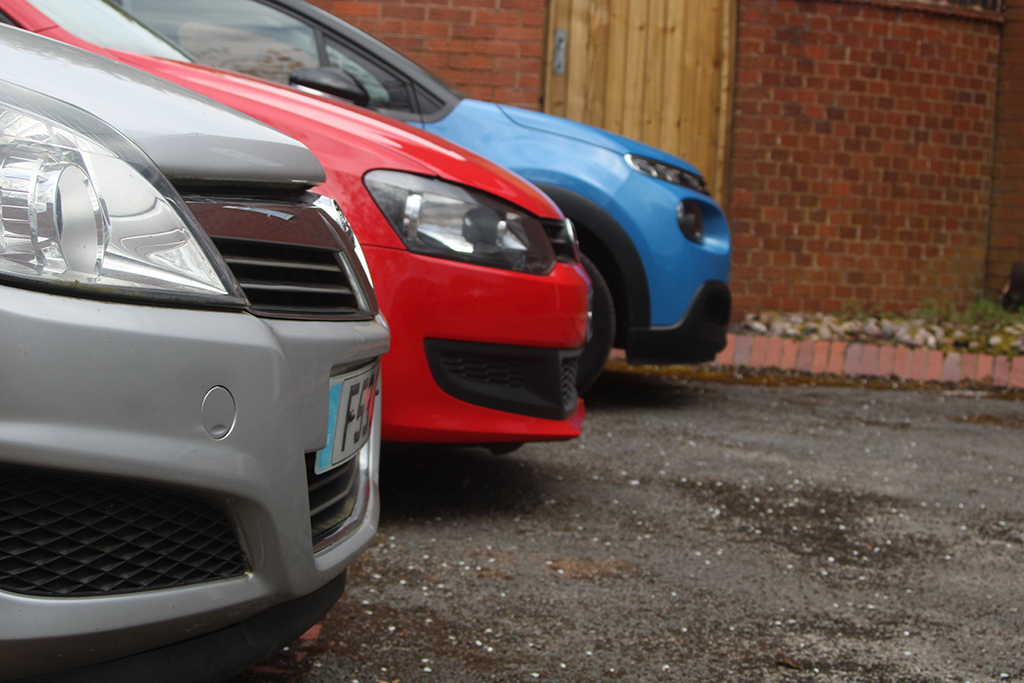
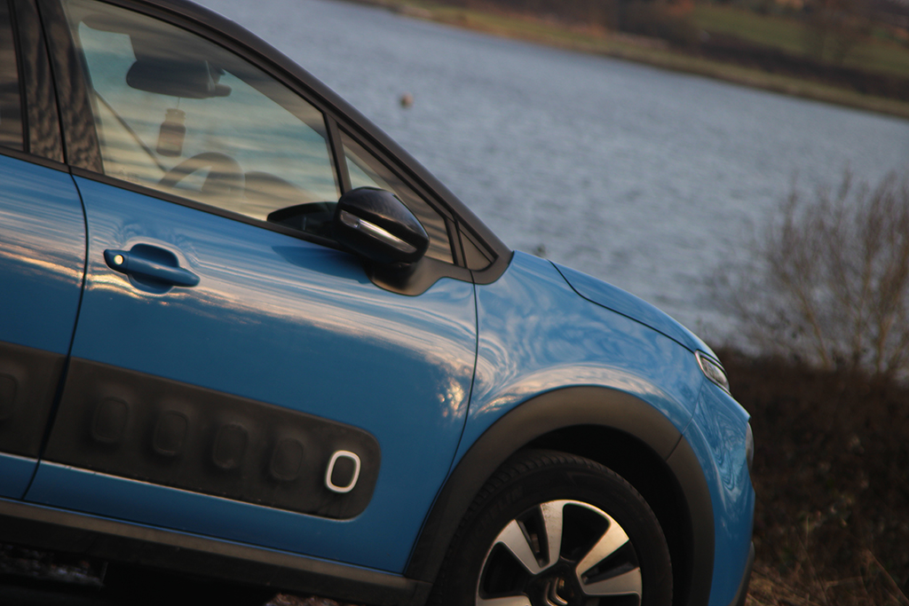
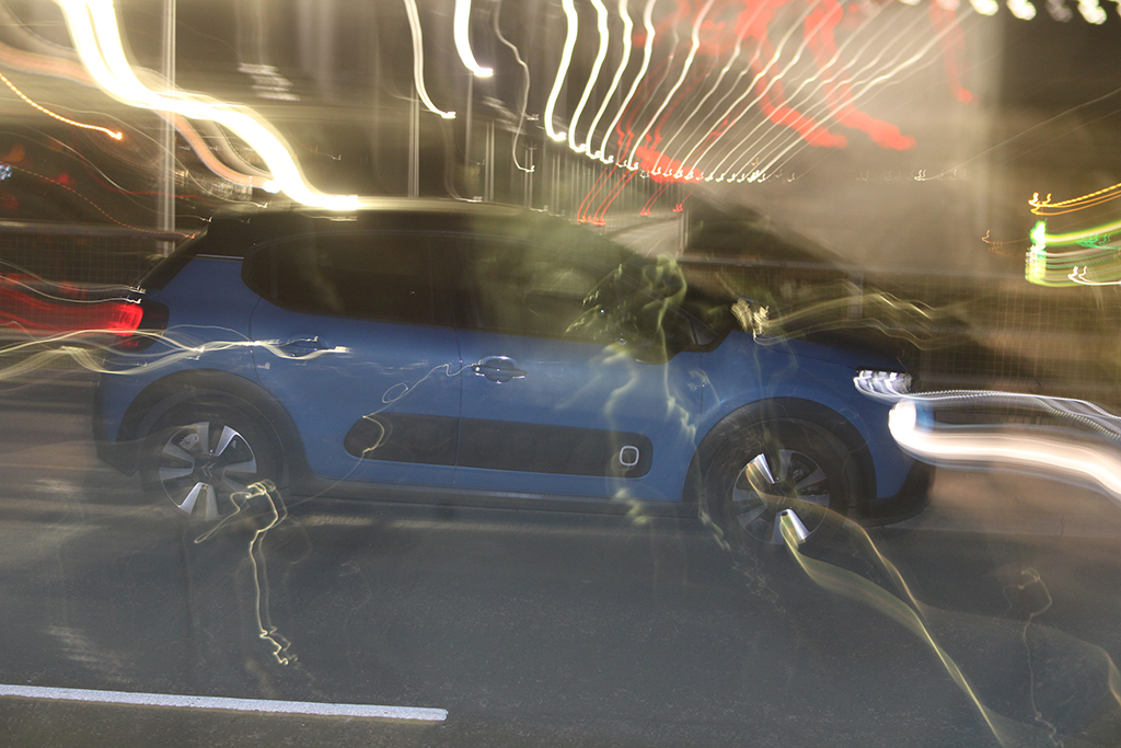
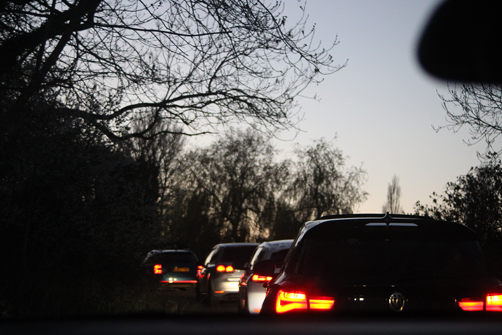
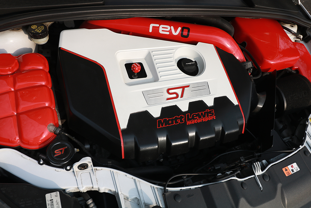
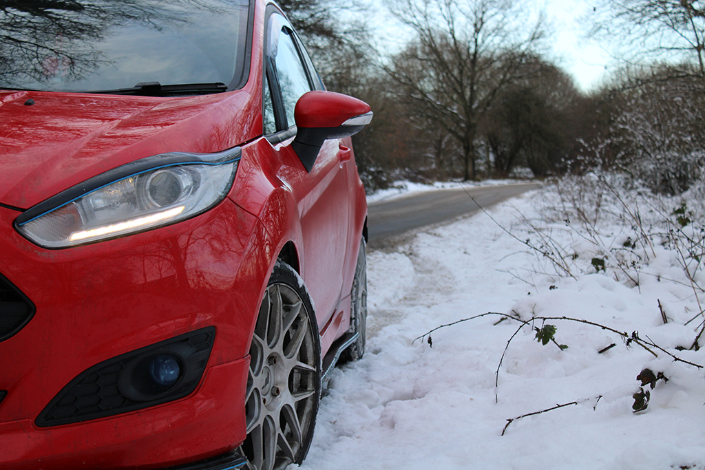
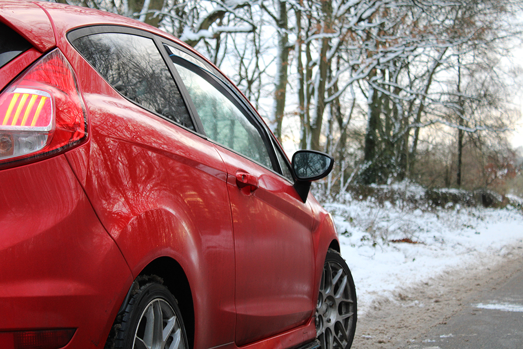
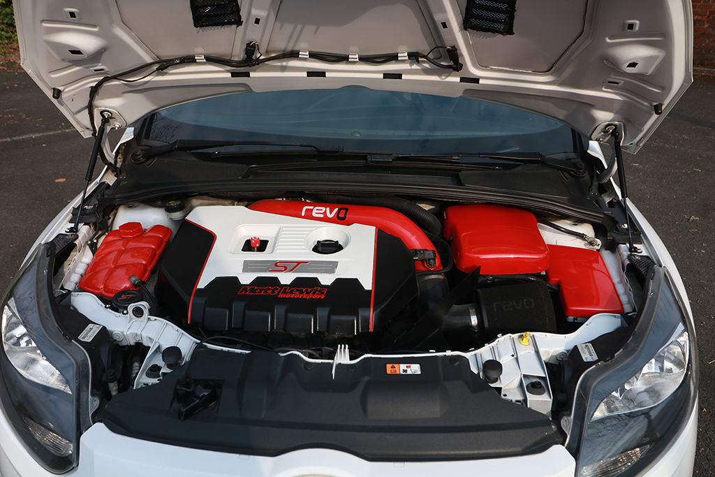
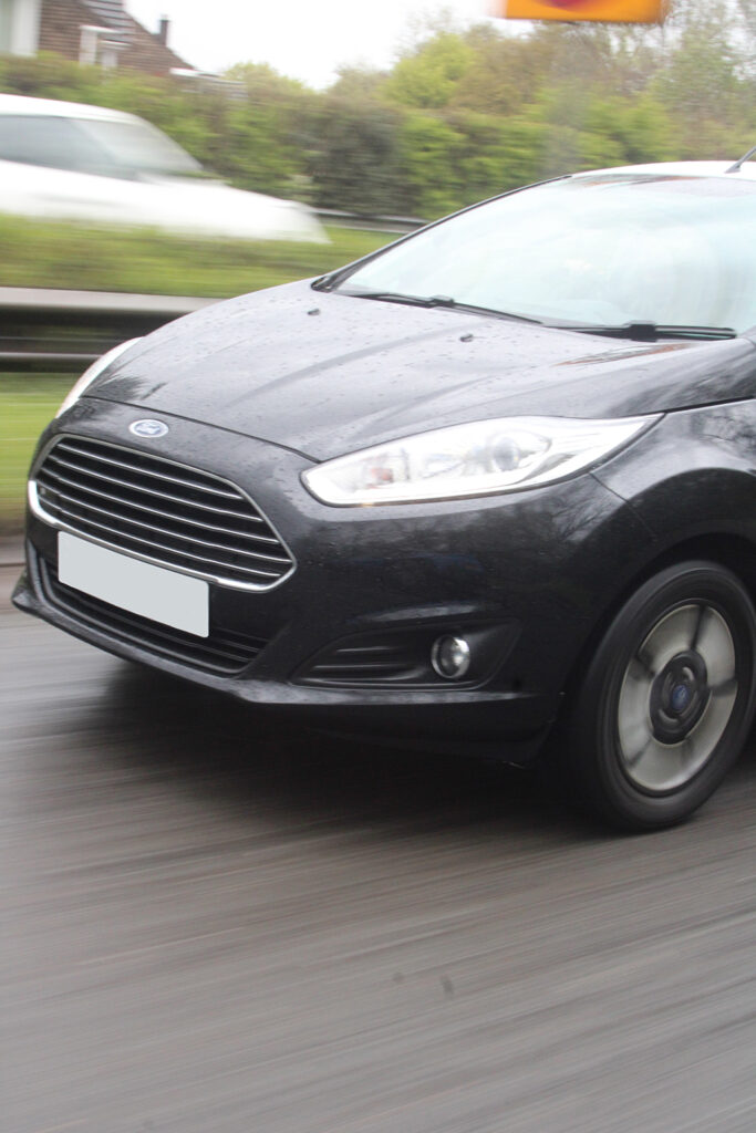
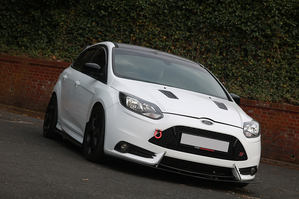
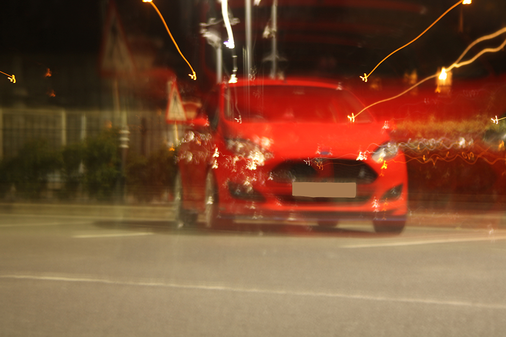
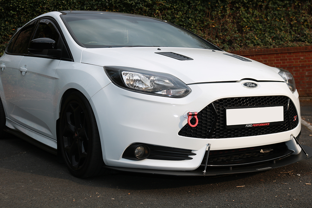
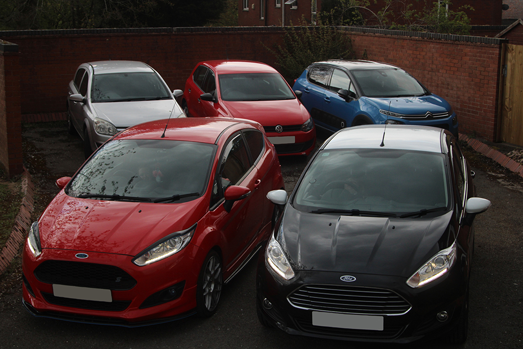
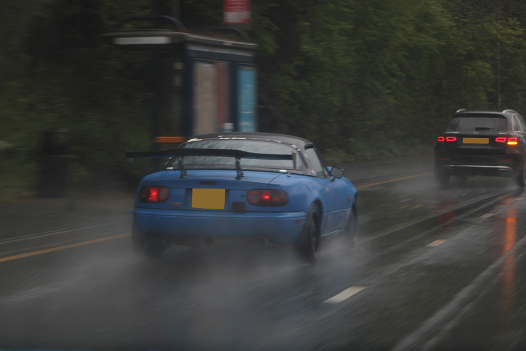
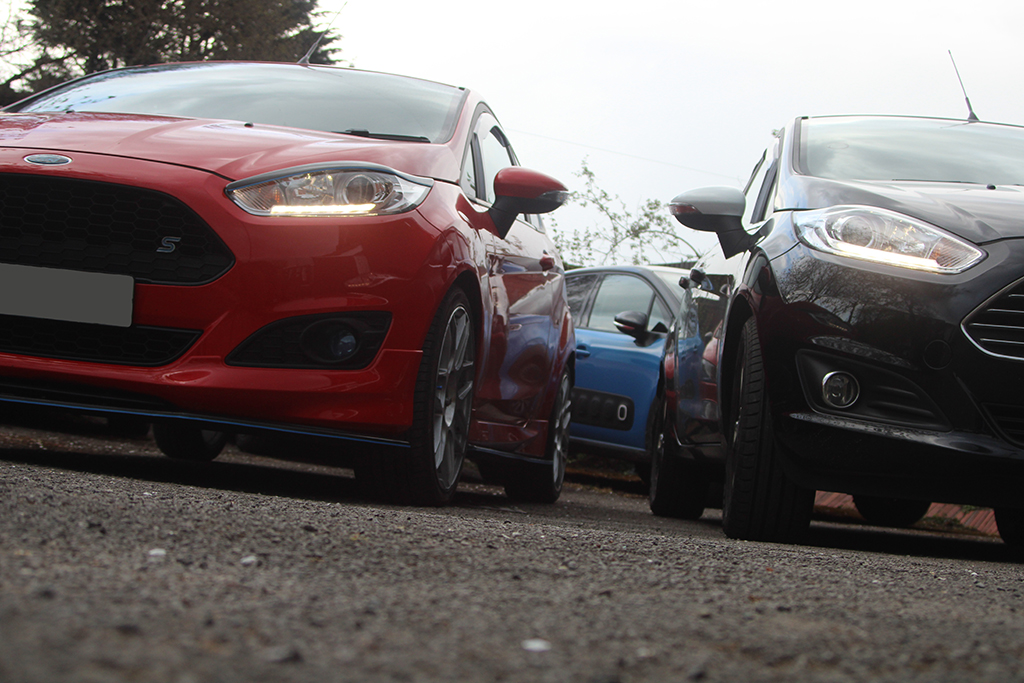
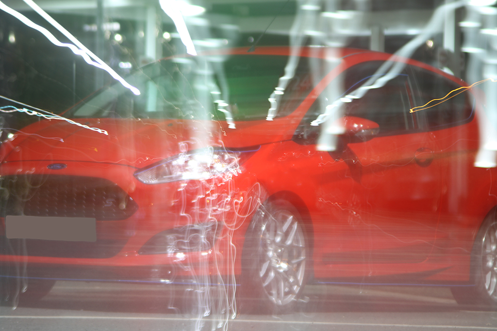
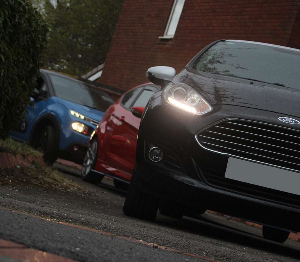
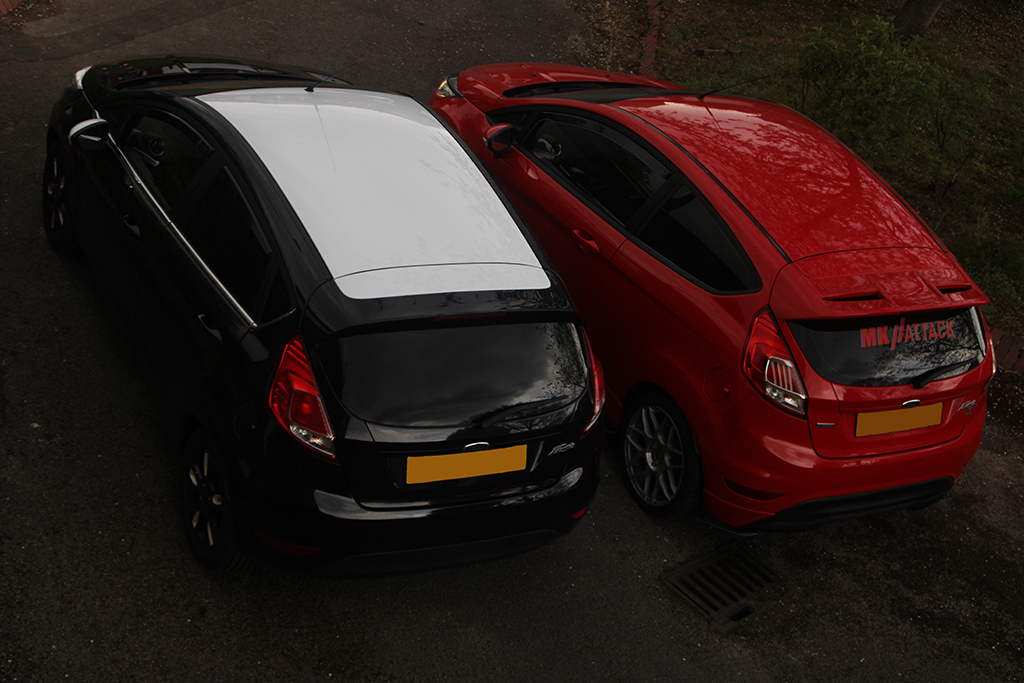
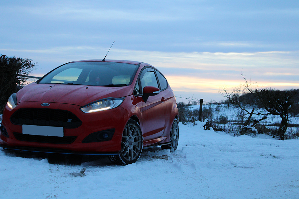
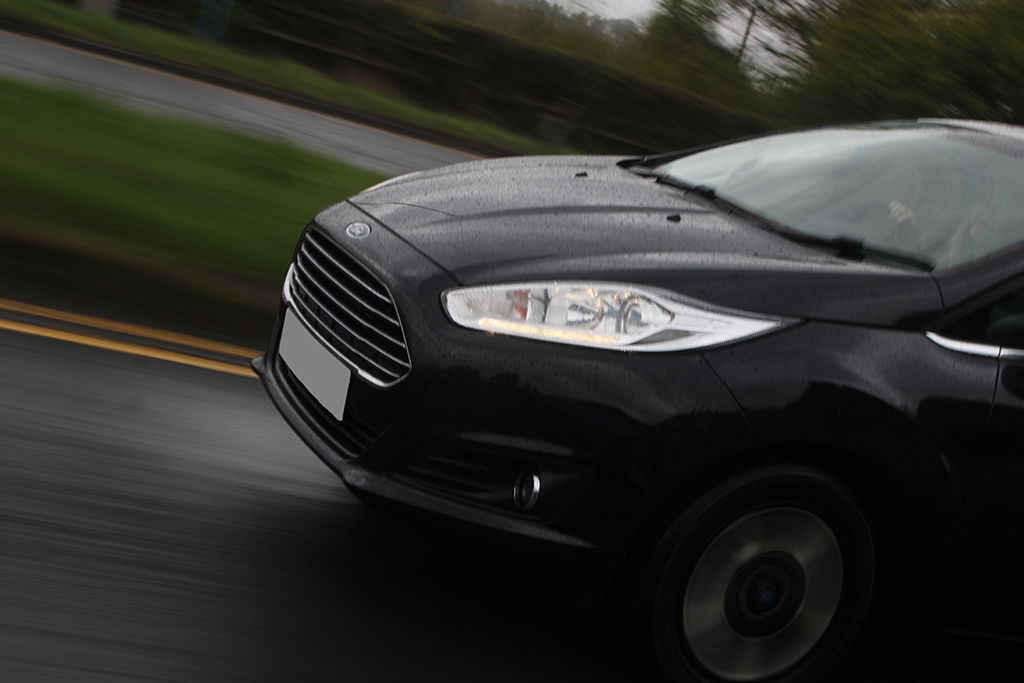
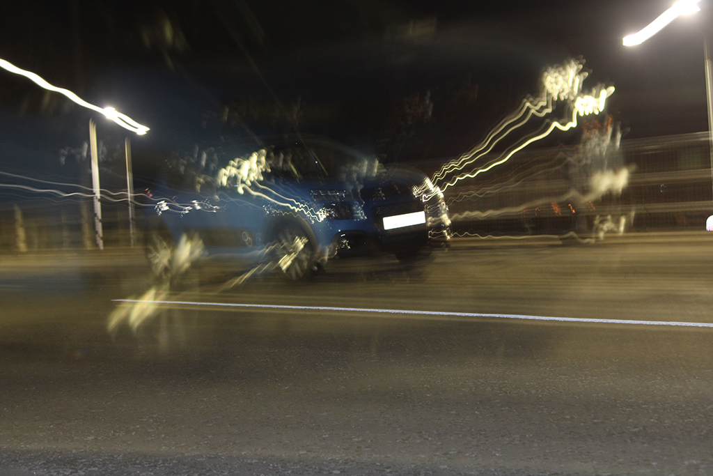
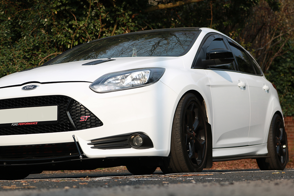
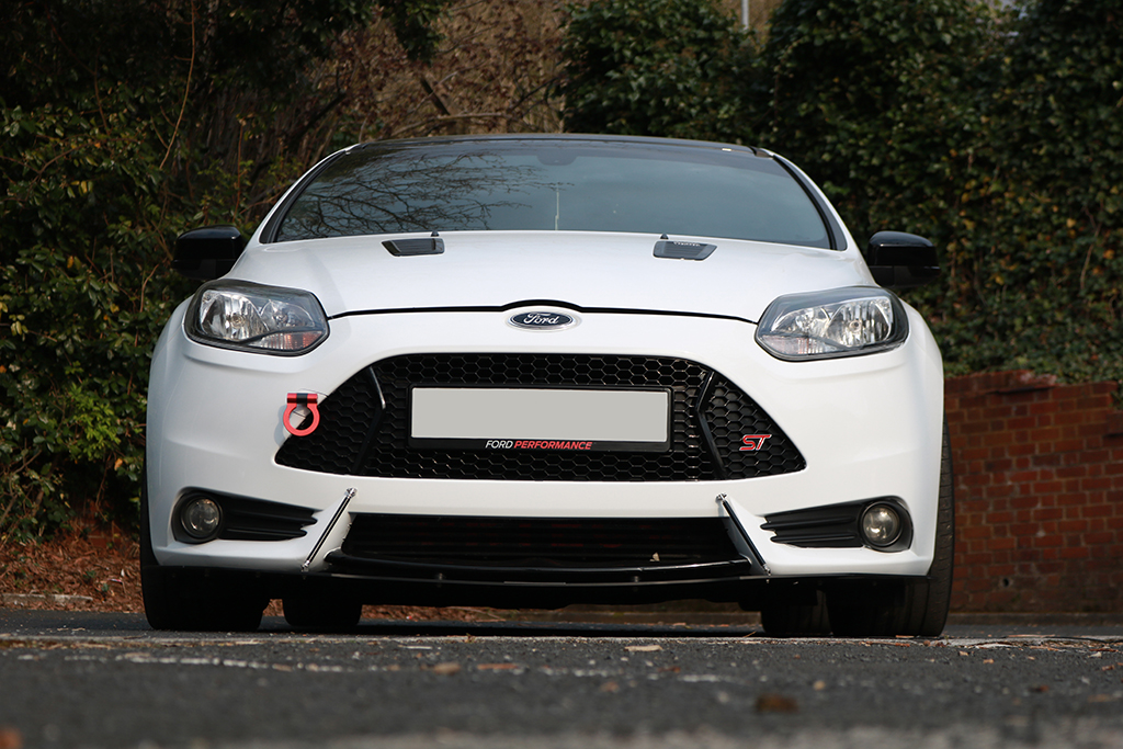
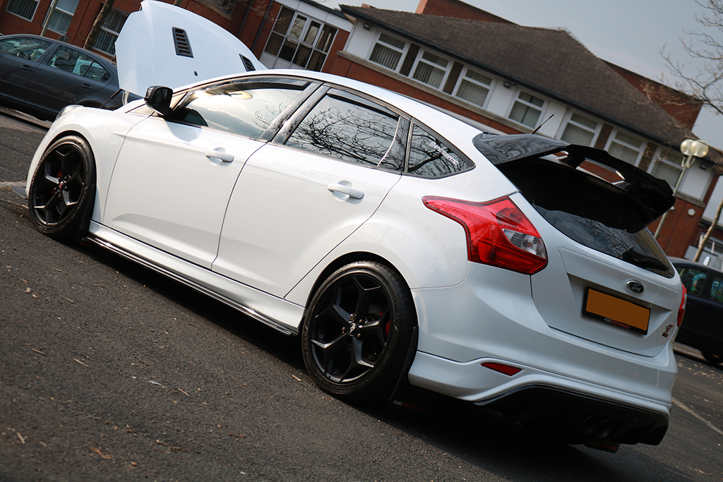
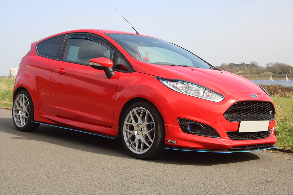
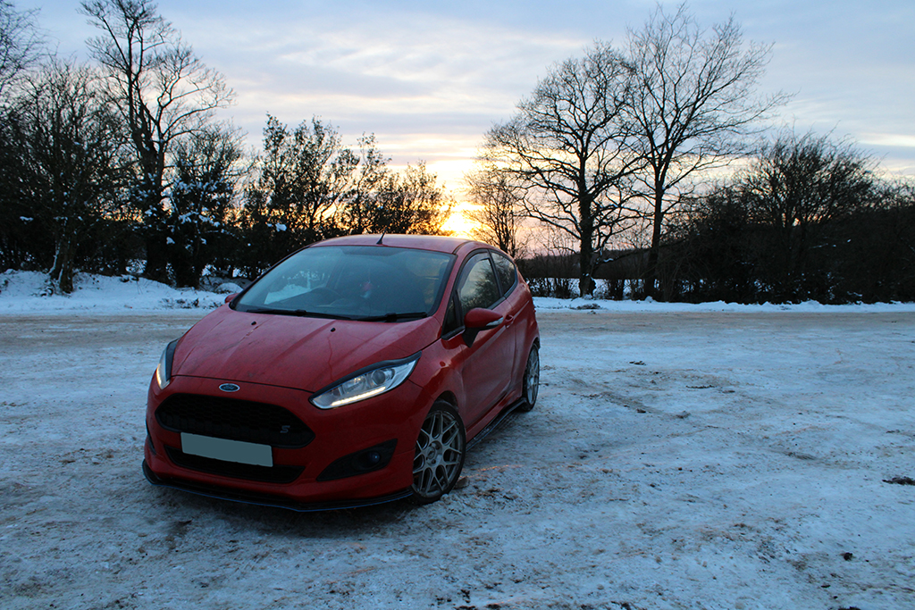
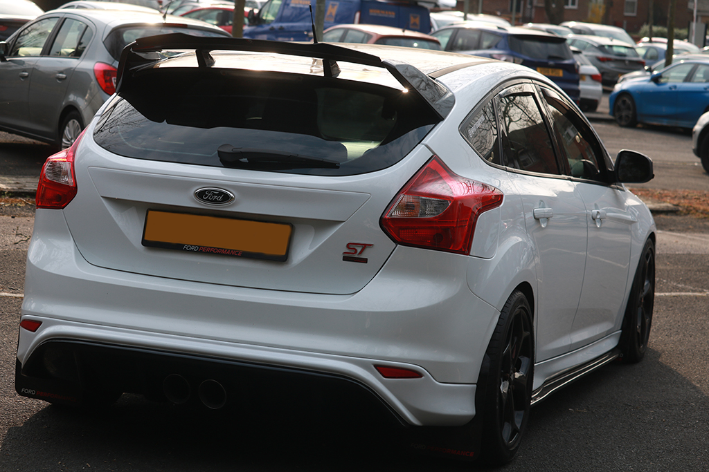
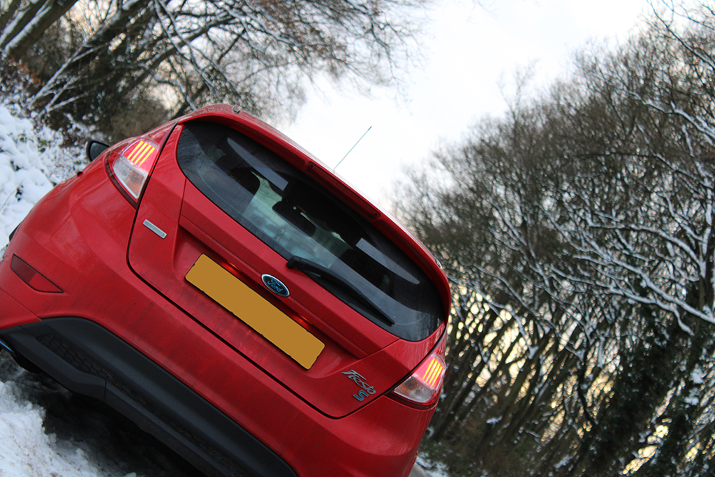
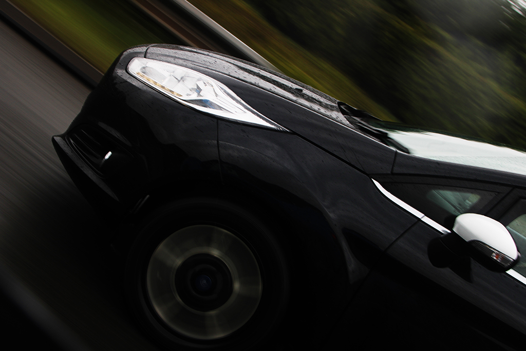
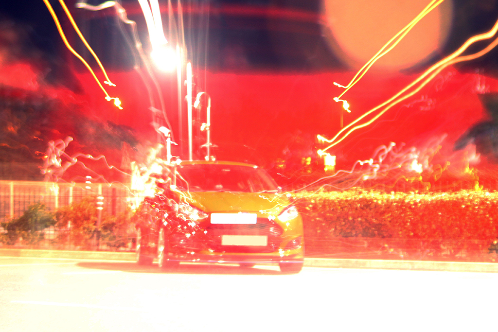
I have always grown up near and around cars as many of my family members have modified their vehicles or worked in garages. So, I got to see how cars could be changed to suit the owner better. I think this has always intrigued me as it is a way of expressing yourself right from the start, when you choose the make/model and colour of your vehicle. I feel a car represents the owner and makes a statement. We are what we drive!
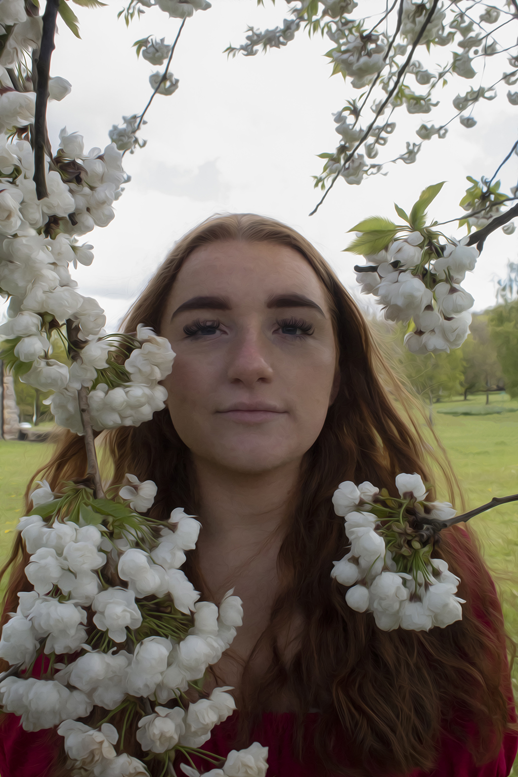
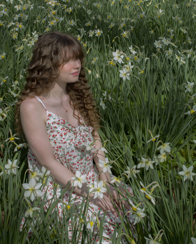
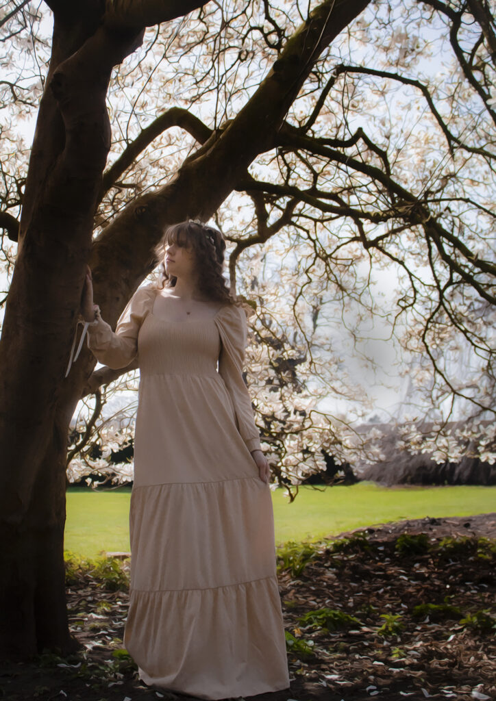
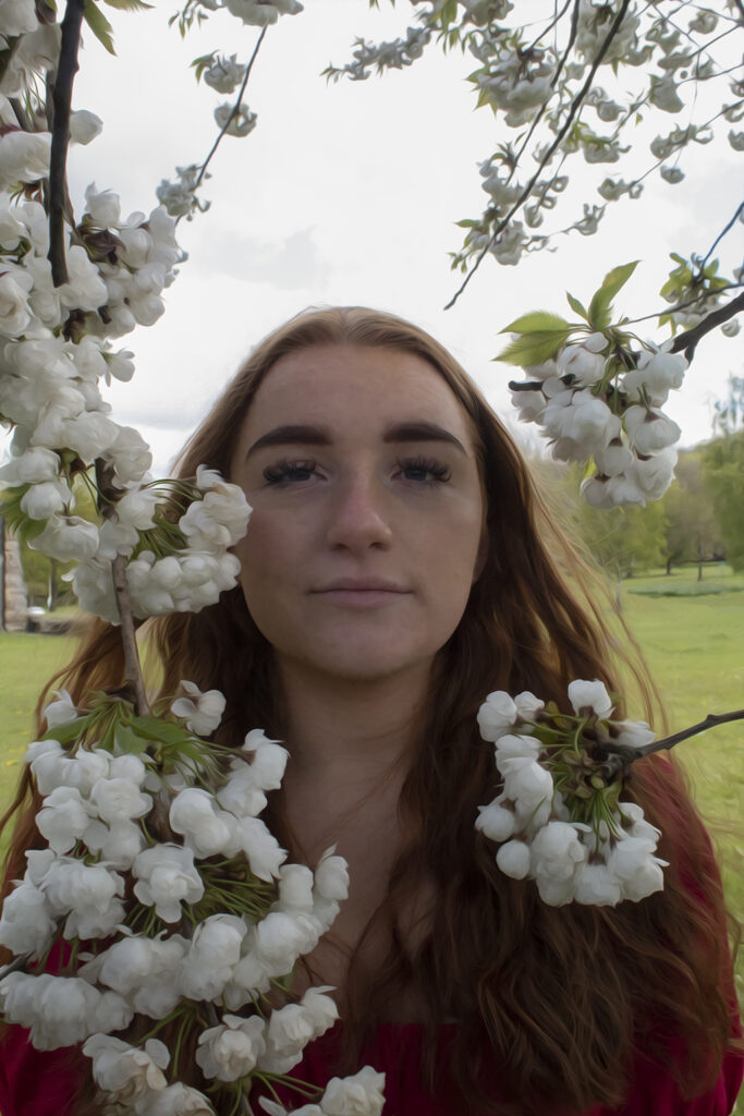
In the western philosophical tradition, the gendering of nature as female can be traced back to the writings of Aristotle. I have explored the romantic, feminine perspective prevalent in the 19th century Pre-Raphaelite movement and feel a need to re-imagine this tradition from a modern perspective, through the lens of a less gender binary society. In addition, technology advancements in our world have lessened the need for artists in some ways, and photography can sometimes be considered an ‘easier’ way to capture the details we wish of memories remembered for a long time. Therefore, I wanted to bring back to life the aesthetics and importance of the details that are hard to capture in paintings whilst also combining all that I have learnt about photography as they are both mediums which keep the creativeness in our lives apparent.