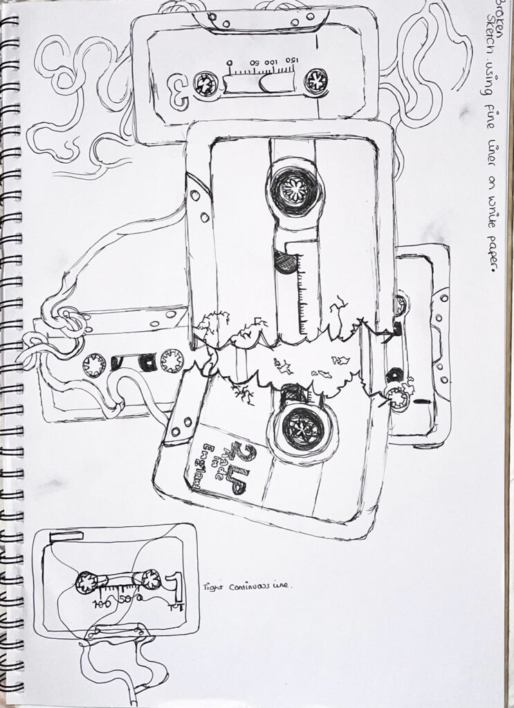
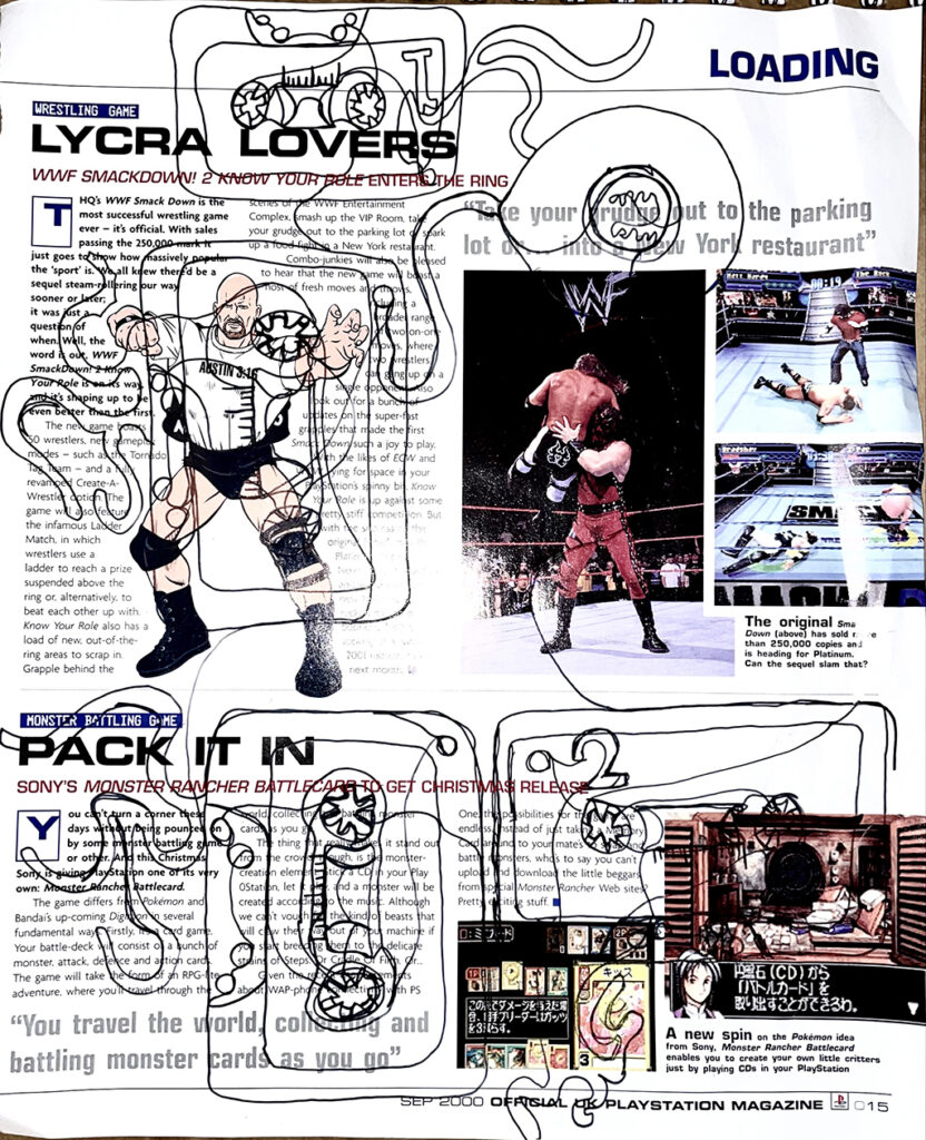
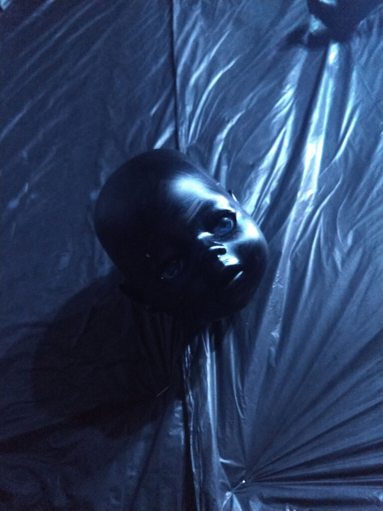
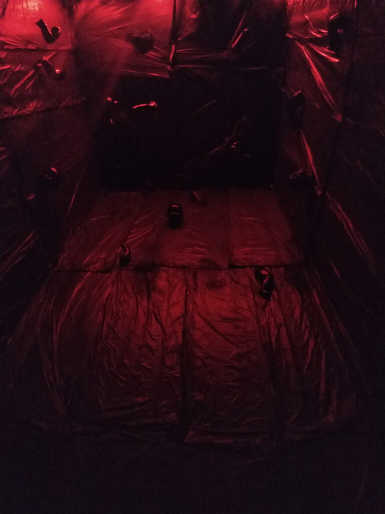
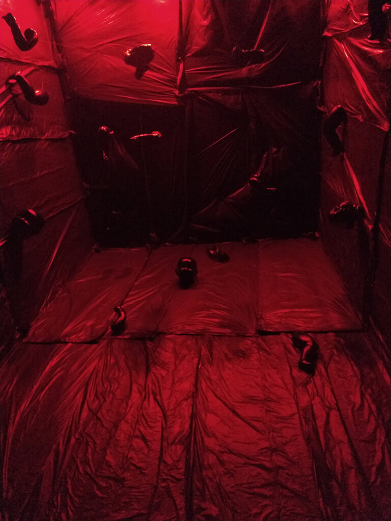
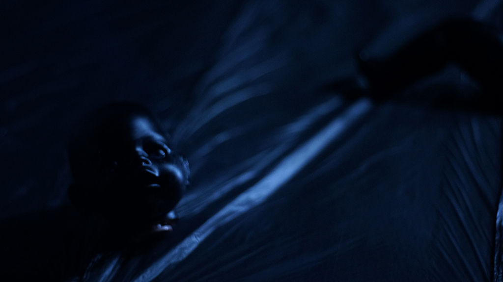
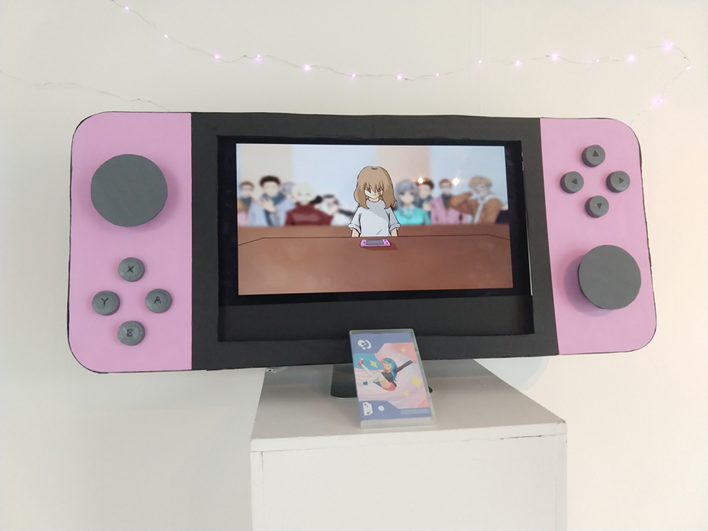
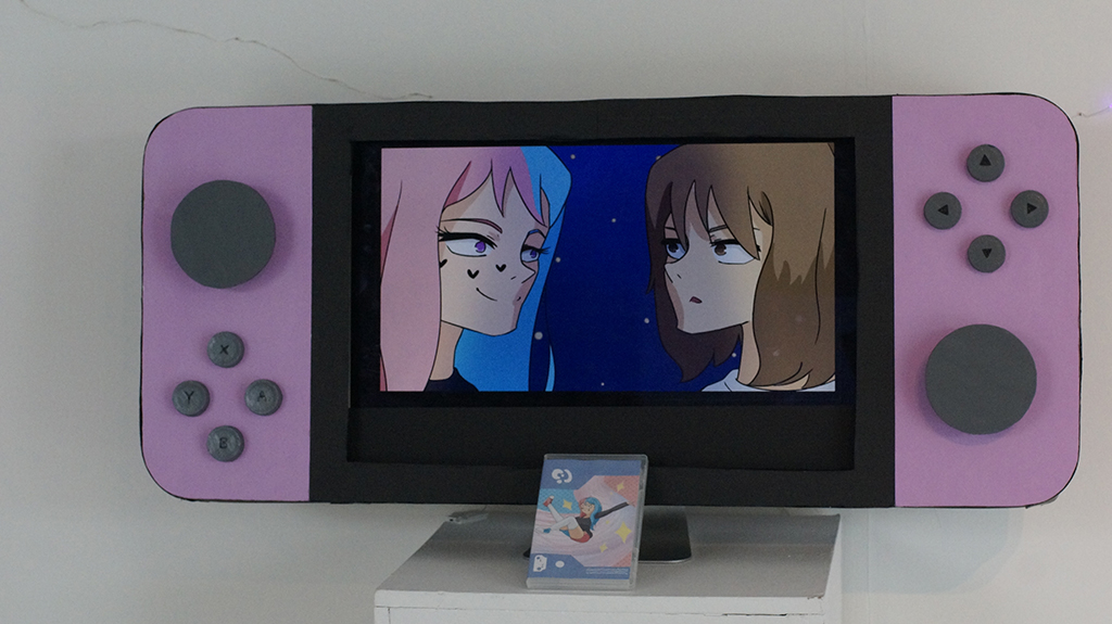
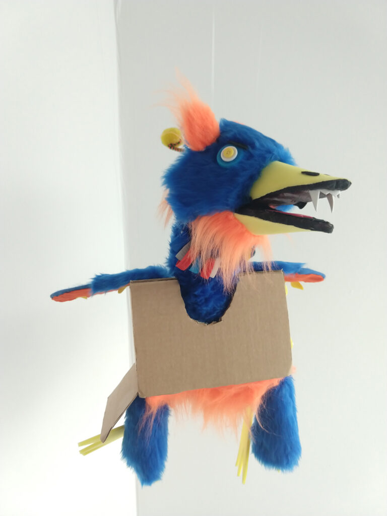
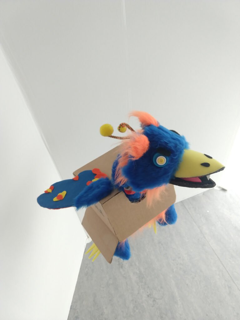
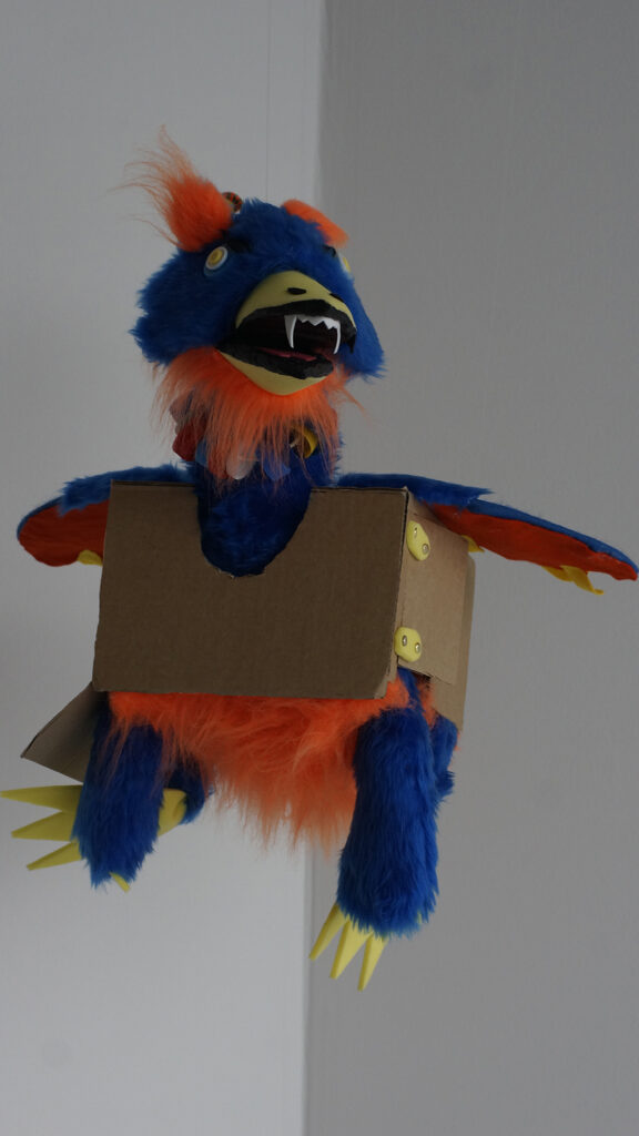
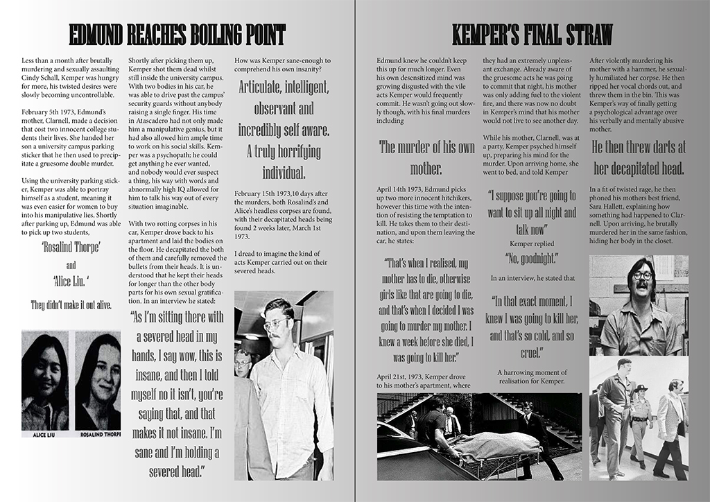
Level 3 and 4 Short FilmsLevel 3 and 4 Short Films
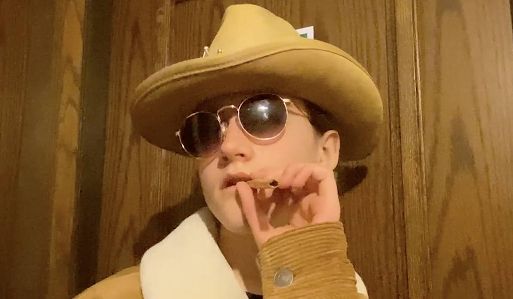
Students have been engaged in the production of media content for skills development in Script Writing, Cinematography and Video Editing. They have researched, planned and produced videos for various projects, including exploring a narrative theme, The Box and TV advert production for Sony products. Students also explored the theme of ‘Identity’ where they drew upon how they feel about their own image, their ethnicity, their social groupings and their personal tastes. They then planned and produced a series of short films based on this.
The standard of work has been excellent, with students adapting to the restrictions presented by lockdown with limited access to locations and actors, and team work being adversely affected. However, all students have proved themselves to be able to work independently and use their initiative in making good out of a difficult situation.
The work produced this year shows genuine creativity and imaginative uses of available resources.
Stuart McConnell, media tutor
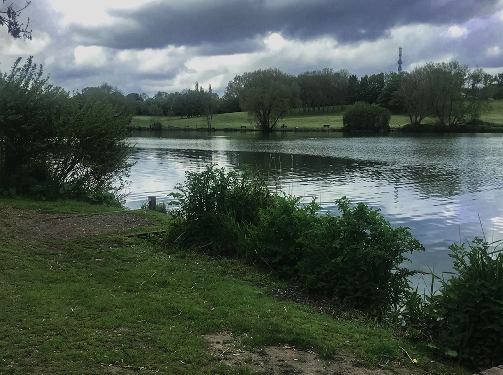
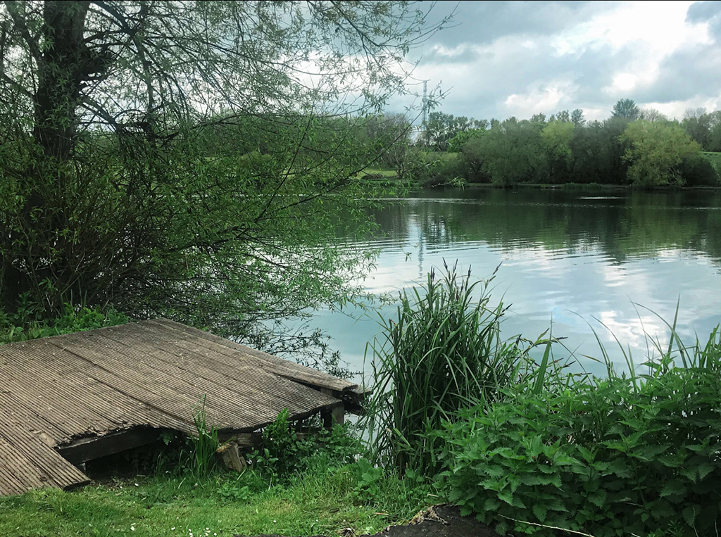
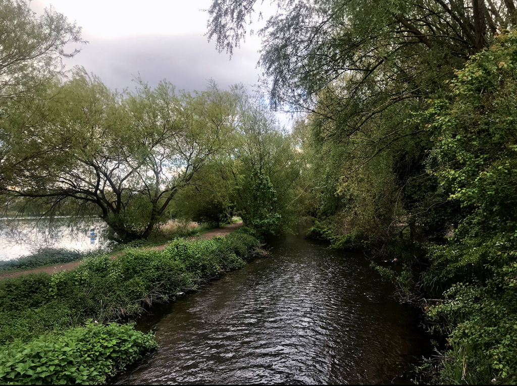
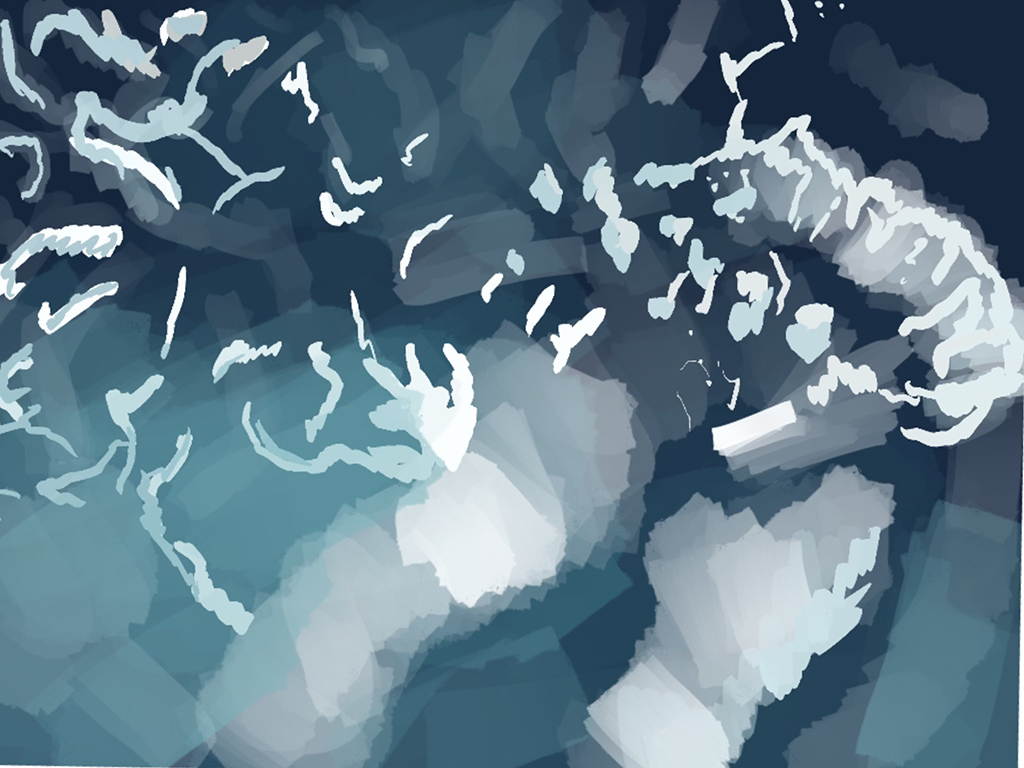
The theme of my final project is “Nature” looking at different techniques and different views. I took six pictures that I edited myself. I decided to do something that is based around landscape photography. I went to a park in Luton and took photos of the varied landscape including images of a river and trees. My aim for this project was to improve my editing skills and learn new and different techniques.
My plan was to create a nature photography video, so I edited and compiled the images into short movie and added a cross dissolve effect to have the images transition from one image to another as smoothly as possible. I added nature sounds and calm music to the video to have an atmosphere which would appeal to the audience. At first the video was too short but after feedback I made it much longer by adding more images, sounds, improved editing and included title cards. I chose to do this idea as I have watched plant videos in the past on YouTube, I feel people do not appreciate plant/wildlife enough and I love collecting crystals, rocks and seashells.
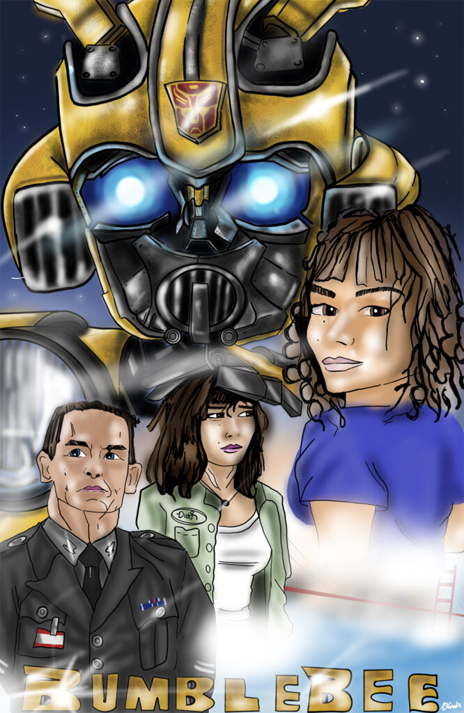
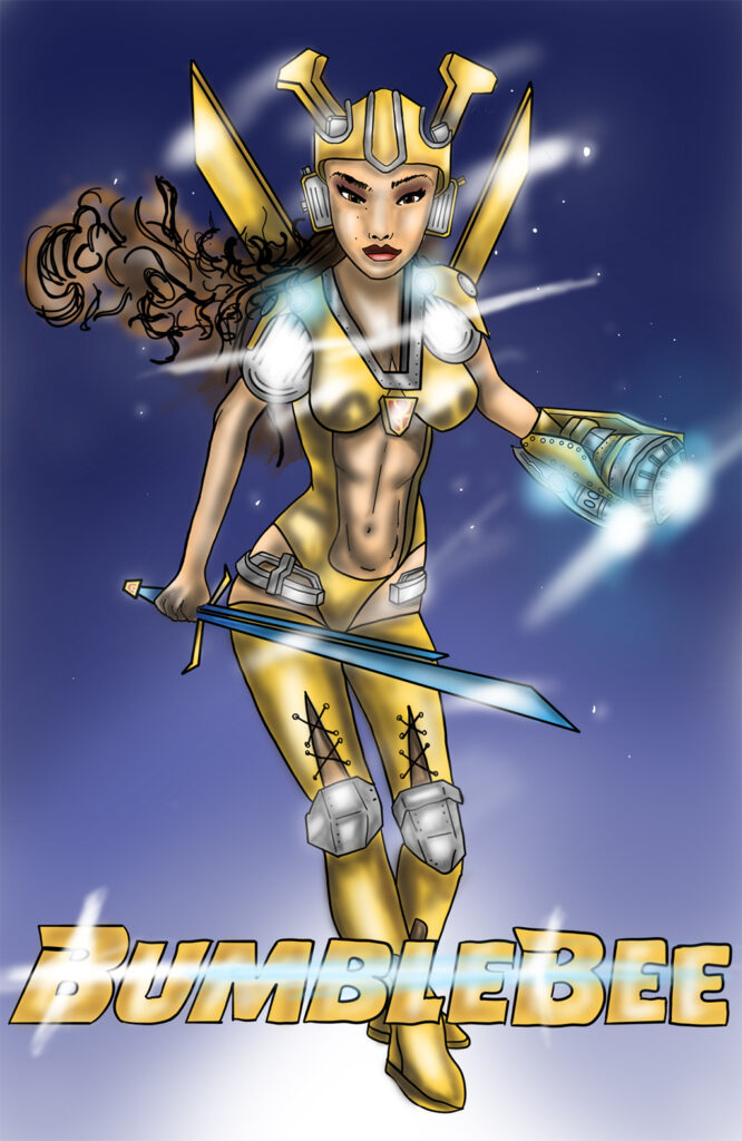
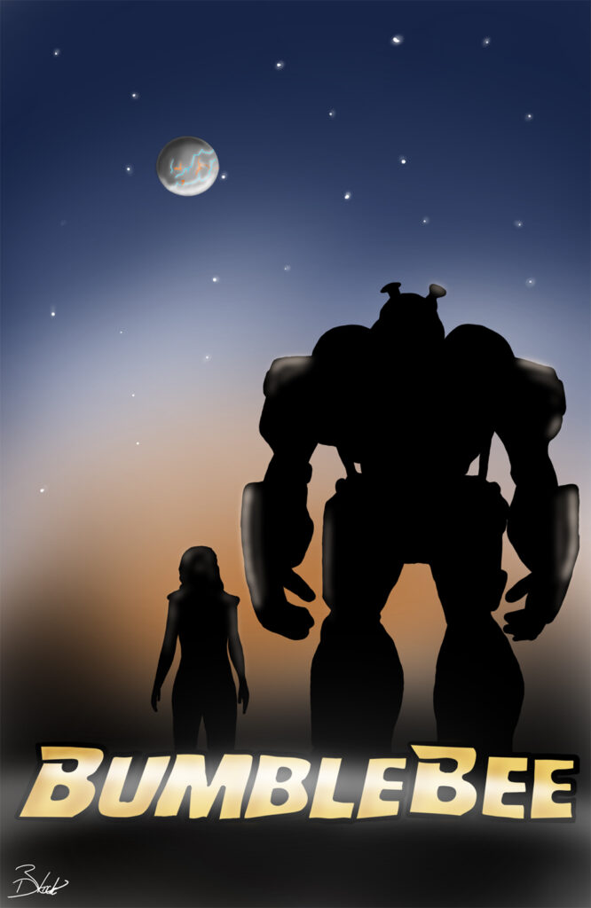
The main aim was to have three posters that link together. The first one has a lot going on, making it stand out so that the first image attracts the attention for the others in the series. The second one is probably the main one that stands out as being a “remake” as I have combined two of the leading roles to make one character. Finally, the last one was originally going to be Disney inspired however I changed it into a minimalistic, simplified piece of art as I wanted the sunset and the silhouette to be the only things that caught your attention. The final poster is also supposed to encapsulate the final part of the movie as Charlie parts ways with Bumblebee to go back to Cybertron. Overall, I feel that I have captured the main characters and the setting quite well.
Circle of Sorrow: For the first photo, I decided to take a picture of bluebells. I’m fond of this image because of how they are grouped around in a little circle together; they are the centre of attention in all the green grass. I particularly like the way they slightly turn down due to the way they grow which makes them look slightly sad which is contradictory because bluebells are a symbol of humanity, gratitude and everlasting love; all very positive things. The darkness surrounding the image though does create more focus to the flowers.
Field Day: My idea for this image was to capture more of nature. Keeping it simple by only having green, blue, yellow and white. I took this photograph because I like how the clouds looked in the sky coming out from behind the tree and with the sun appearing through the trees as well creating the shadow. This photograph is very bright which makes it look like its pouring with happiness, then the clear view with clouds just lightly flowing though the sky giving it a more relaxing feel. The sun very lightly peeking through the trees makes some parts of the grass brighter to the rest creating different shades through the shadows which is very intriguing to the eye.
The Field of Yellow: For this photograph I wanted to be able to get a close-up of some of the flowers so you could see detail while still getting a shot of the flowers across the whole field. Therefore, I chose to take the photo at a slightly lower angle to get that effect. This was a darker image so the yellow of the flowers really brings a staple colour to the image.
House Over Sunset: For this image I wanted to get some of the village below so I got a slightly lower angle allowing you to look down on to the houses. I composed between the trees to give the houses more attention, then having the sunset off to the side in the distance gives the image more of a relaxing tone. Seeing all of the houses gives the picture more of a homely feel. I liked this photo because the trees around the image frame the picture very nicely to give more focus on the centre and sky. Then the almost clear sky fading from dark blue to orange gives you a nice change of tone as well. If you look further in the distance, you can see more hills showing how the village is surrounded by nature.
Light in Darkness: My idea was to take pictures of nature so e.g., sunsets, trees, flowers, scenery. Then put them into a montage to show all the photos I have taken together. I like this photo I took because of how the sky, grass and trees contrast each other. The softness of the orange fading into blue is relaxing contrasting from the darkness coming from the trees in front of them, but still having red/orange glow around them. However, the comparison of brightness and darkness do complement each other. Lower down from the dark trees you can still see the green of the grass displaying along the bottom of the photo seeing the colour come back to the image.
Mother Nature’s Glow: The focus for this photo was the sky and sunset, I wanted to be able to capture the sun setting and all the colours it is displaying. You can see the sun glowing in the distance, having the yellow and orange surrounding it amongst the clouds, trees and grass in the foreground of the sunset gives more colour to the image and the natural feel of the image. In addition to this above the trees you have the blue sky with clouds glossing over it with the natural transition from the blue to orange/yellow.
Orange Horizon: For this image I wanted to capture a sunset. This image shows a lot more orange tones because it was taken during the golden hour when the sun was starting to set which gave the image a lovely orange/golden glow to it. The difference from the cold tones of the blue fading into the warm orange tones really brings out the silhouette of the trees and emphasizes them and shows more detail and texture to the trees and the ground. The two trees framing the sunset focuses more attention to the sun.
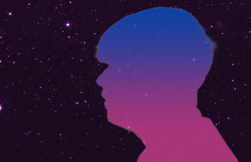
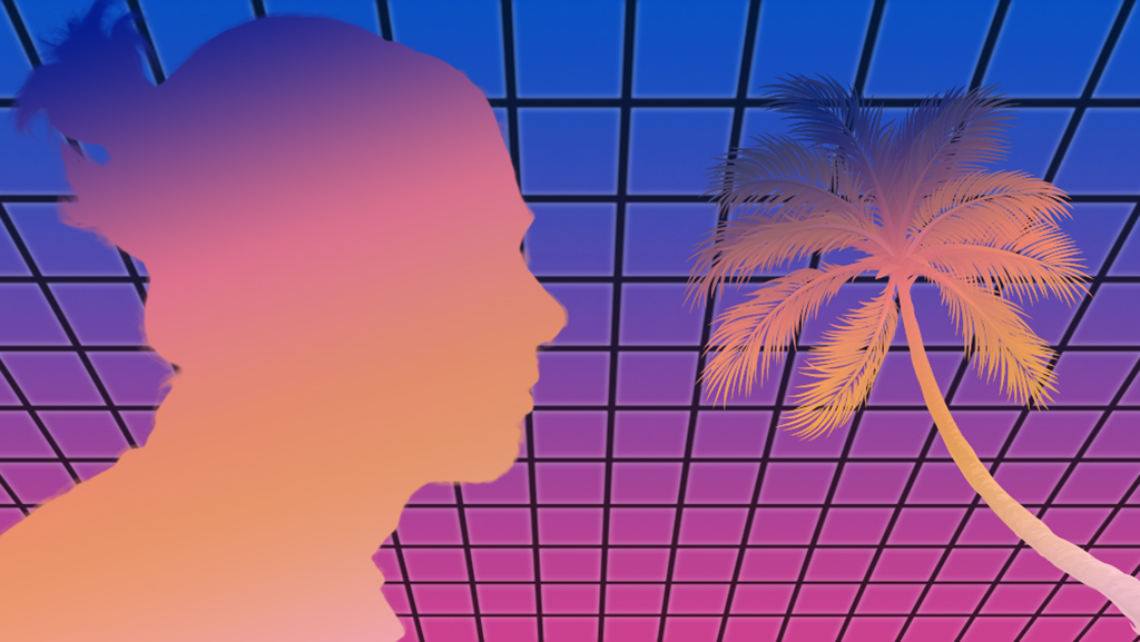
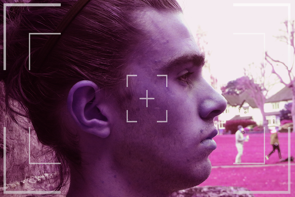
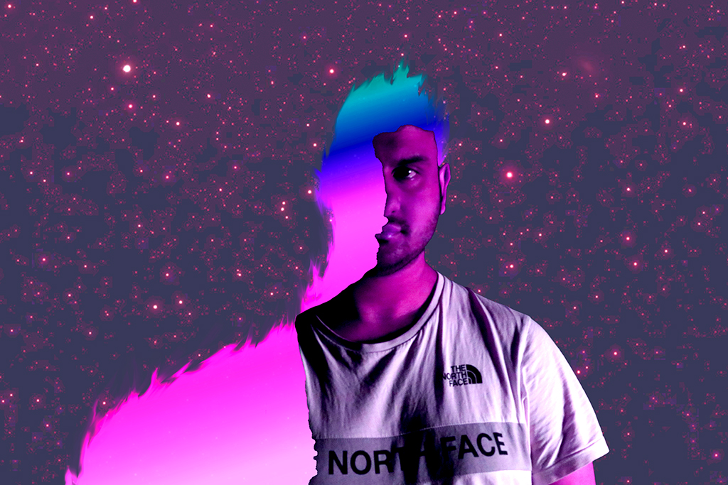
A merging of traditional portrait photography combined with a faux retro style known as Synth/Retro/Neonwave. This project professionally hand-picked images, editing them to bring out unique, nostalgia-inducing imagery in waves of pink, yellow, and purple.
Bluebells of Kindness: I have loved photographing this piece of work, mainly because it’s my favourite flower. The colour in this piece of work stands out. So, I decided to change my shutter speed on my camera, so it gives a blurry effect in background and keeps the flowers at the front in focus. The meaning behind this photograph is gratitude. Just look at this photo! The reason behind it, is to be thankful for everything in your life, like your family, friends, yourself and to always stay positive no matter what challenges you face in life. I like how the purple stands out more in the background. The imagery is there to show you always have kindness in your heart.
Creepy Hollow: I loved this photo because I like how the church is positioned in-between two trees which makes the church look haunted and creepy at the same time. It also looks like it could be a very quiet place. The process behind this photo is that I tried to capture the church at the right angle so I photographed from behind the bush allowing the church to stand out more. Also, I like how church could possibly be used for a horror type film because of how spooky it looks behind the trees. My favourite thing about this photo is how the trees look lifeless and have no energy in them which gives off a ghostly look.
Enchanted forest: I enjoyed taking this photograph. You see sun beaming through the trees making a silhouette shape on the ground. I wanted to capture an ionic moment whilst on my walk through the forest, it gives out a feeling of being in a peaceful world. As I walked around the forest, I tried to capture more photos which looked like a magical scene from a film. It could also show a side of horror which is relatable, in addition this image could represent nightmares and not fairy tales. I’m fond of how it can be place that has birds chirping away and planes going through the sky.
Heavenly Dreams: This piece was taken by my house, and it is so unforgettable. I have decided to call this piece Heavenly Dreams because you can see the emotions in the clouds, so it gives out an expression that they are peaceful and relaxed. I wanted to create this piece as it represents goals in your life that you want to achieve. Finally, the process behind this picture is that I had to go behind a graveyard into a field so I could be high enough to capture the shot. I like how the clouds stand out more when they are on a blue background because you can see the detail of every single cloud in the sky.
Pink Carnation: I loved photographing this piece of work. The colour makes the photograph stand out more. I decided to take a photograph of a bunch of pink carnations which turned out to be so beautiful. The flower is to represent never ending love and a perfect flower for your own mother. This might be my favourite photograph so far due to the reason I took photograph, it symbolizes gratitude which means to always be grateful for life and to always say “thank you”. I like how you can see the texture and every little detail of flower which makes the photograph way better.
Winter magic: This photograph just speaks out Winter wonderland. Why? As you are drawn into the winter experience and just picture yourself dancing in the snow just like in a movie. I love how it gives out a sense of a peace, so soothing and calming, I want to show the importance of a positive mindset. I was inspired by a photographer that I saw online doing winter/landscape photography, so I decided to have a go at it myself. However, the first thing I did was to find the perfect place to take the photos. I decided to walk up a hill to the main road and I like how there was trees bunched together with snow on, so I decided to find the ideal angle to take this photo and I feel I have captured the perfect shot.
My idea originally started as nature photography mixed with ‘dark’ elements, the final products designed to be displayed in a museum/art gallery. When taking my photographs, I changed my idea to focus only on nature. I used flowers that I had brought in from home and a variety of busts to combine. After taking a few photographs I decided to experiment with the lighting, moving the 2 lights that I had with me around to find a position that makes the photograph look a higher quality. The lighting style that I decided on was similar to ‘Rembrandt’ lighting. Additionally, I experimented with various techniques, such as spraying water and using fabric.
My Project X idea was to produce a set of action photos specifically being ‘in the moment’. The moment I wanted to attempt to capture, was finding different models and showing their ‘experience’, that were varied. I tried to get different topics, so I was varied. So, it would successfully looked like a collection of live action photographs.
I decided to do a stop-motion animation because I wanted to challenge myself by doing something more involved and more practical than a painting.
I used clay for the stop-motion animation because it was the most efficient material for movement. I also used it because it is easier to make models out of clay and the cost of materials is cheaper, I made the backgrounds out of paper because it would take too long to make a set.
The backgrounds and colours used are meant to represent different emotions such as red for anger or blue for sadness.
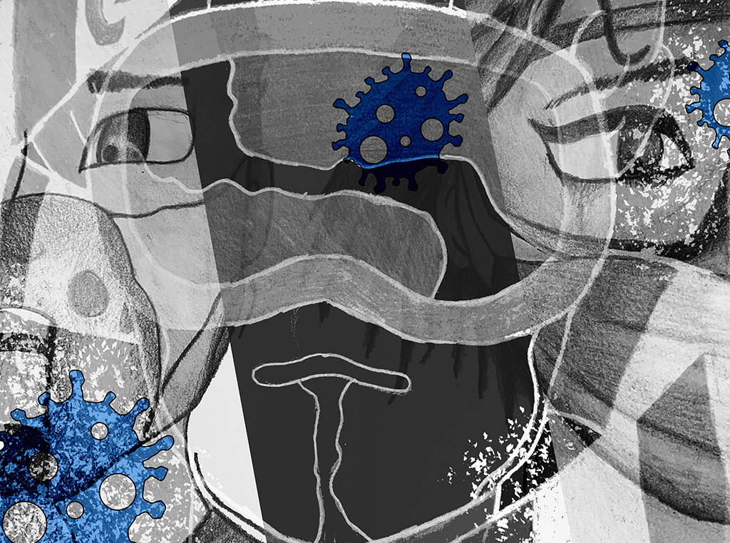
I was inspired to do the topic of BPD (Borderline Personality Disorder) because it interested me and I wanted to talk more about the mood disorder since it is not widely known about.
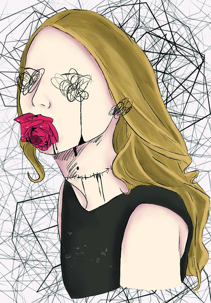
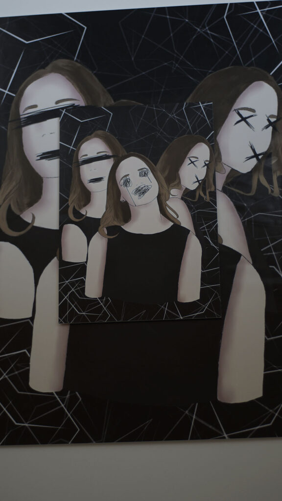
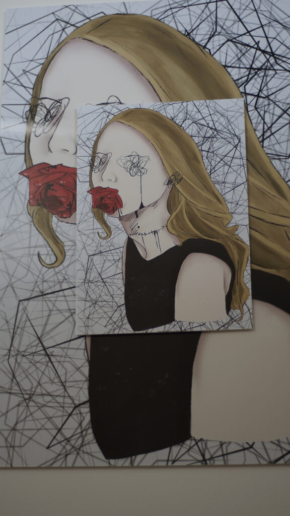
This design is all the sadness caused by discrimination that the LGBTQ community have been getting over the years.
When people are talking about you, and they do not understand just remember the mirror knows how you are feeling. Know that one day you will be the big star that you will be. The sadness and the fear that is there now will be in the past when you are a super star.
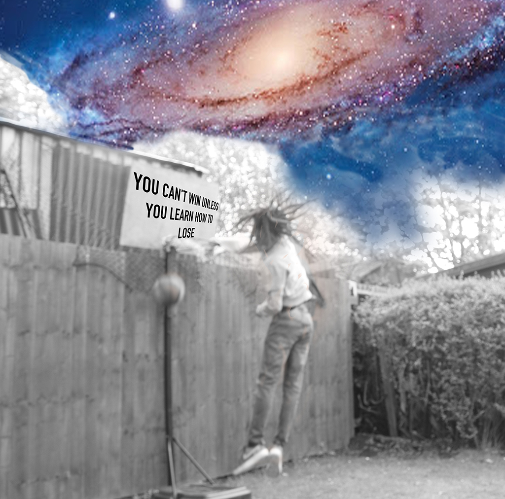
An old friend used to say, “Never Let Fare Strike You Out It Will Just Stop You from Playing the Game”.
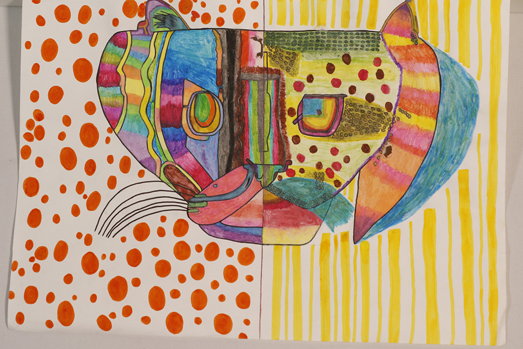
My thought was to help to raise awareness about endangered species of wildcats. My final piece is a drawing, of a half of two endangered Wildcat species, I thought this would be more interesting than doing two whole pictures. I used watercolour pencil crayons to blend the colours in and I made my drawing multicoloured, because it would be bright, bold and stand out nicely.
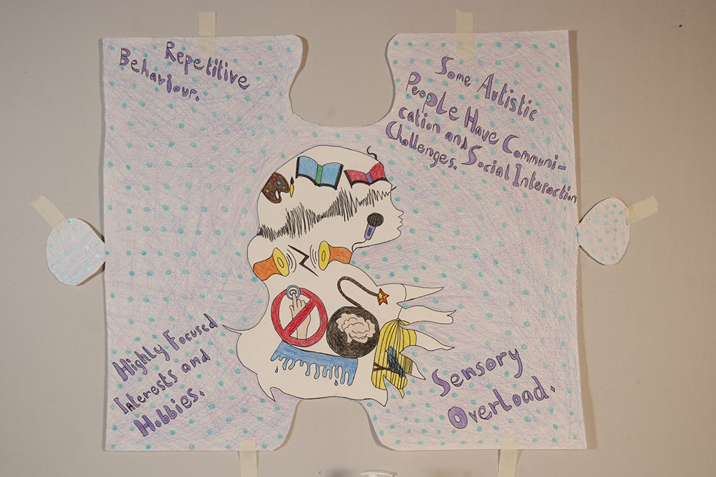
My work is based on Autism Awareness. I chose to do autism because I was diagnosed with it and I wanted to learn more about it. I learnt more about what makes me, me. To be proud of the differences of how my mind works and not thinking of myself as a hindrance.
I did not get diagnosed with Autism until I was in secondary school and proof says that it is harder to tell in girls than it is in boys 1:4. I want people to look at autism as a superpower because everyone is on the autistic spectrum whether you need more help or not so much help in our lives.
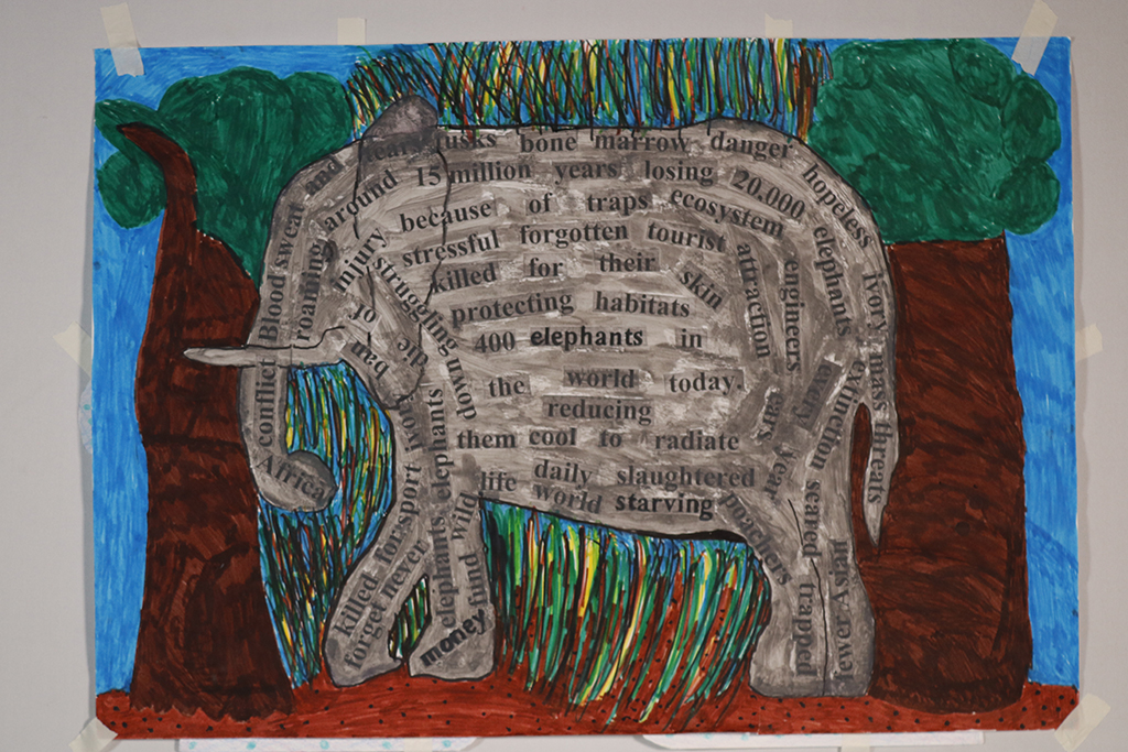
20,000 elephants every year get slaughtered. Daily elephants die of injury because of traps. They can live up to 70 years in their natural ecosystem. I wanted to raise awareness of this.
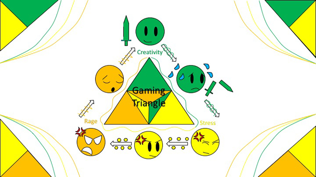
This Artwork Project is about the gaming triangle. It’s all about the benefits of the positives and negatives of gaming. The colours represent common feelings about gaming.
Yellow = Joyful, excited, creative
Green= Powerful, aware, confident
Orange = Scared, anxious, embarrassed.
Within the options I’ve chosen creativity stress and rage – the effects of gaming.
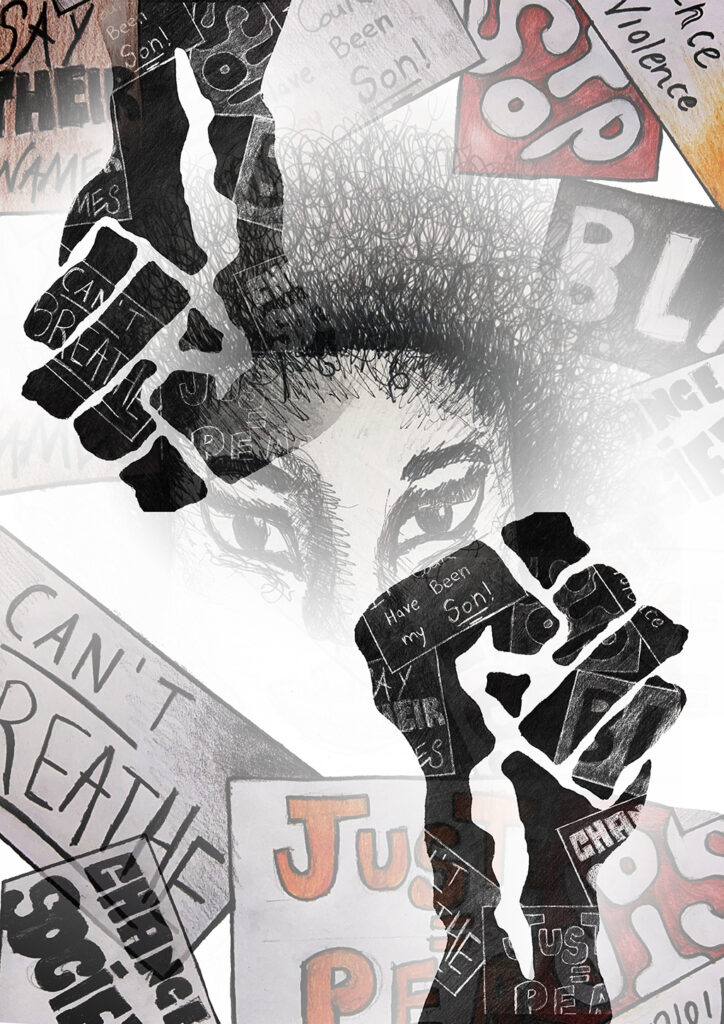
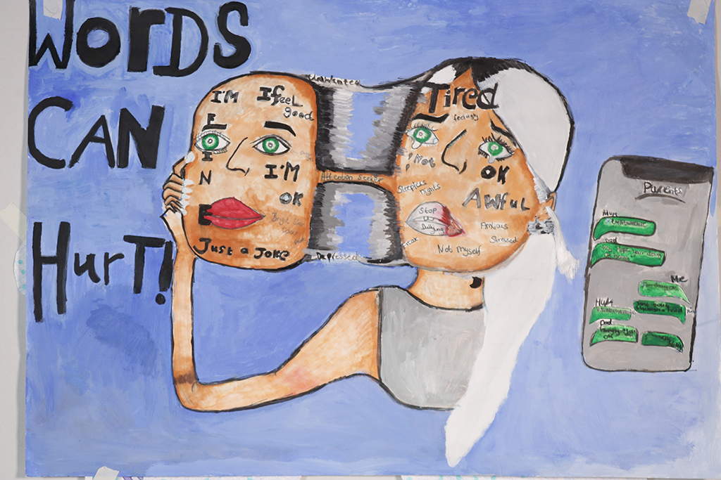
My design is based on bullying – I want to emphasise the imagery from a personal point of view of what that person is feeling inside. I believe this will be an eye opener to the public, to show how bullies make that person feel inside and that words can hurt.
The inspiration for the mask idea came from the No Tears Left to cry music video by Ariana Grande where she takes off the mask to show the truth that she’s not okay after what she experienced mentally. That came up as an idea for bullying as I experienced bullying for who I was as a person. I listened to other people’s personal experiences and it just made me think that this needs to be addressed some way or another so I decided to do a painting based on this situation and so that people can relate to it.
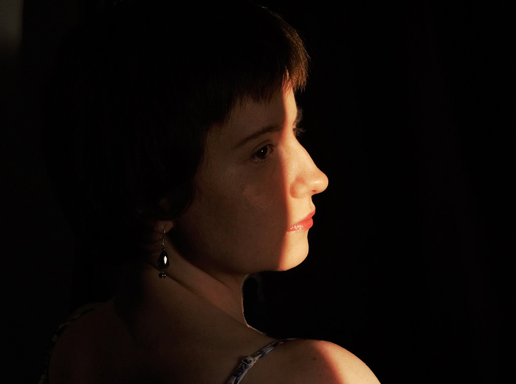

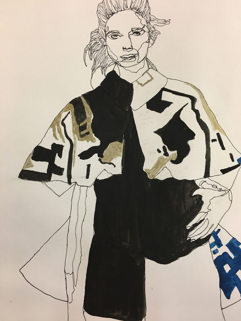
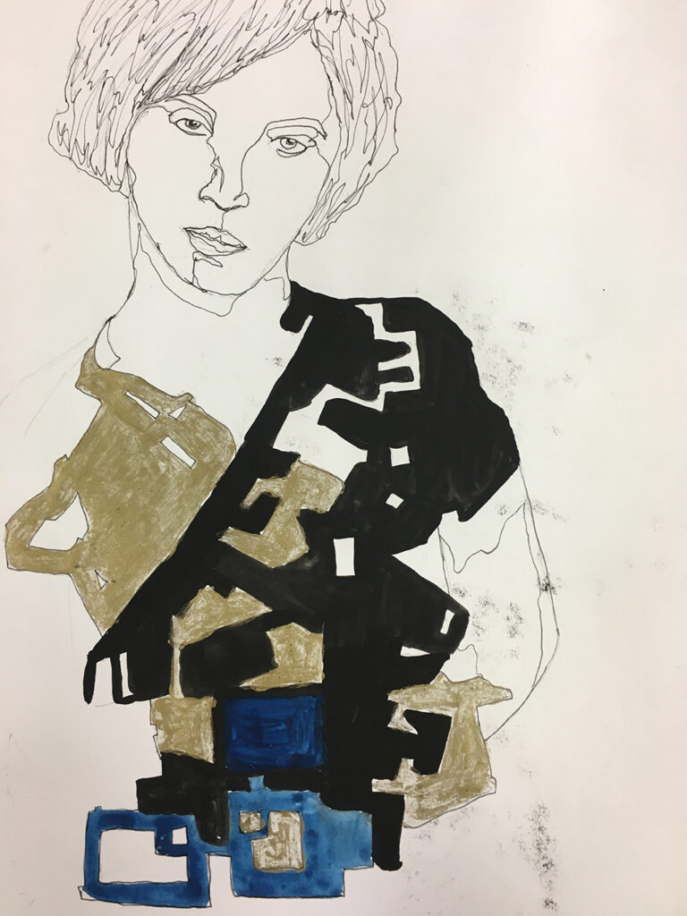
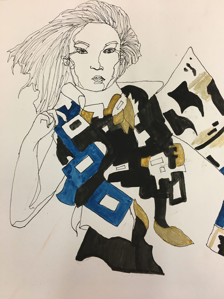
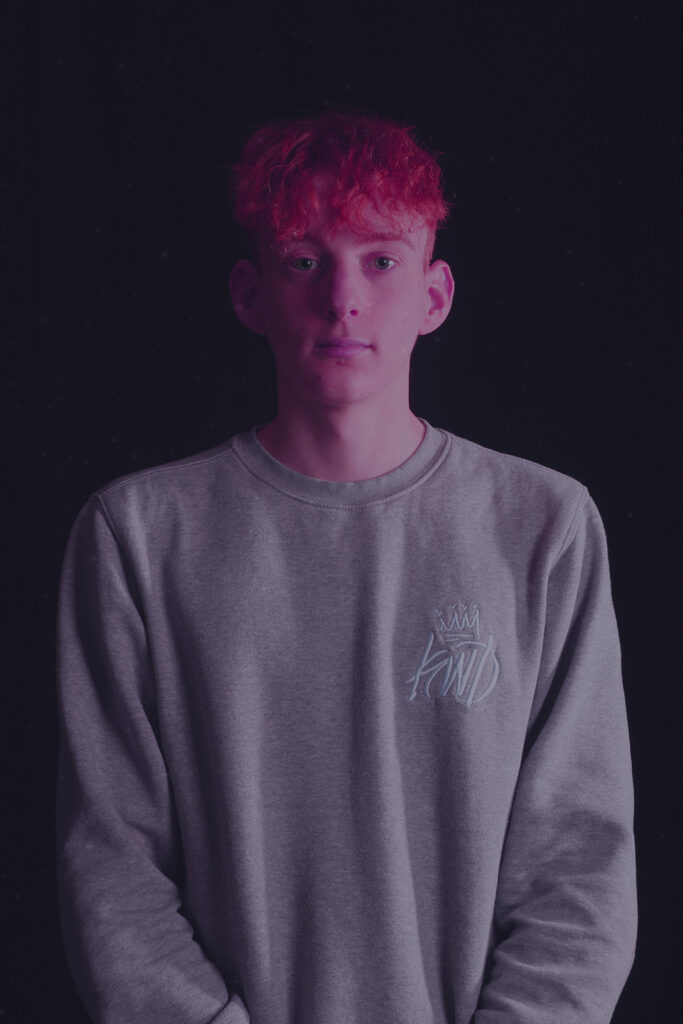
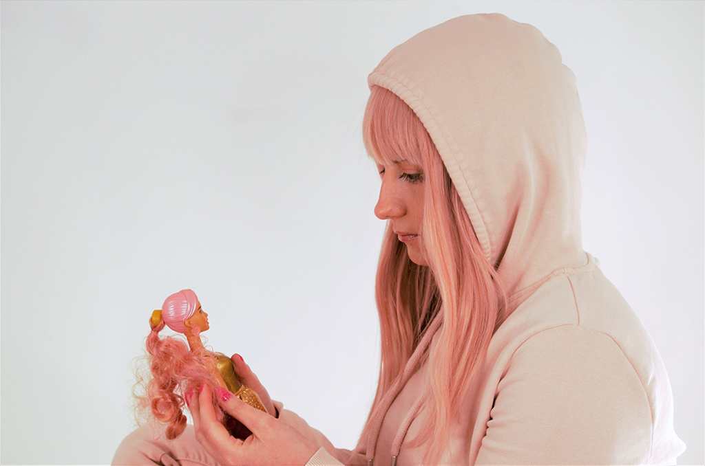
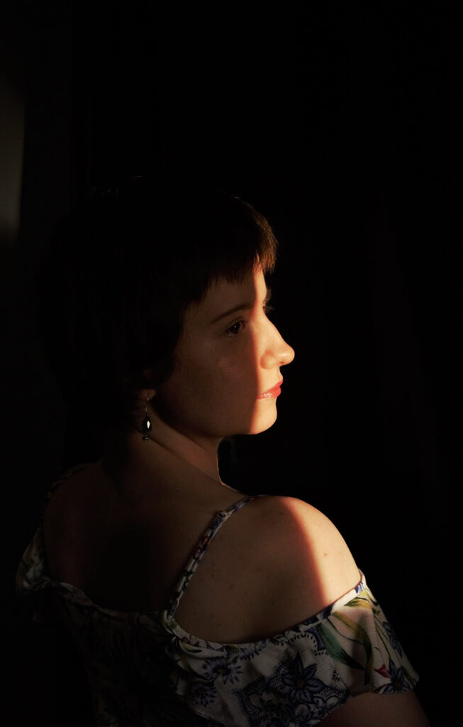
Over the course of this last year, I have developed a deeper understanding and a true passion for portraiture. This is now something that I want to go into professionally. In this selection, I’ve stepped outside my comfort zone to try self-portraiture.
Using a range of different lighting, from natural sunlight to the studio lights, I have been able to work and experiment with multiple styles of lighting and how they overall affect the final image. Some of my images offer a ‘story telling’ element, for example, the photograph of the adult looking at the barbie doll was from my final project and was part of a theme of work titled “Childhood Influences”.
My work over this last year has slowly begun to develop, along with a new sense of confidence and I wanted to be able to choose images which reflected these statements.
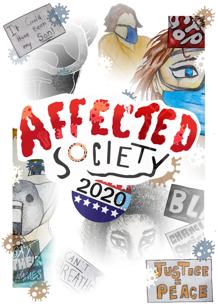
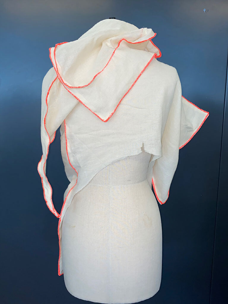
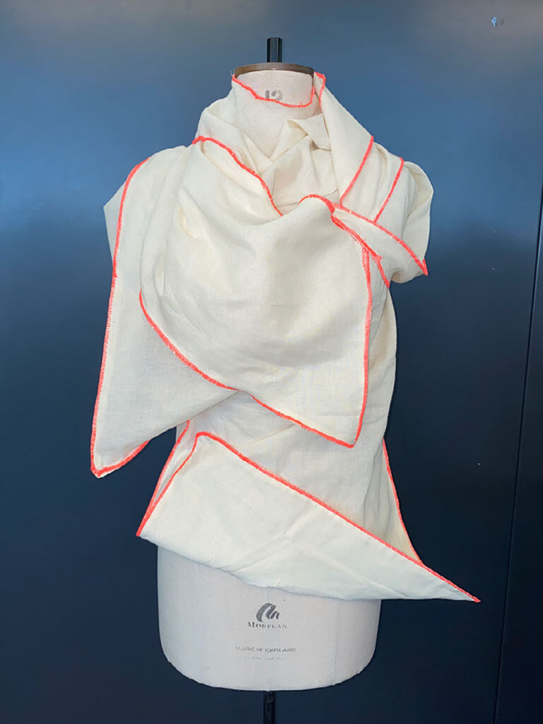
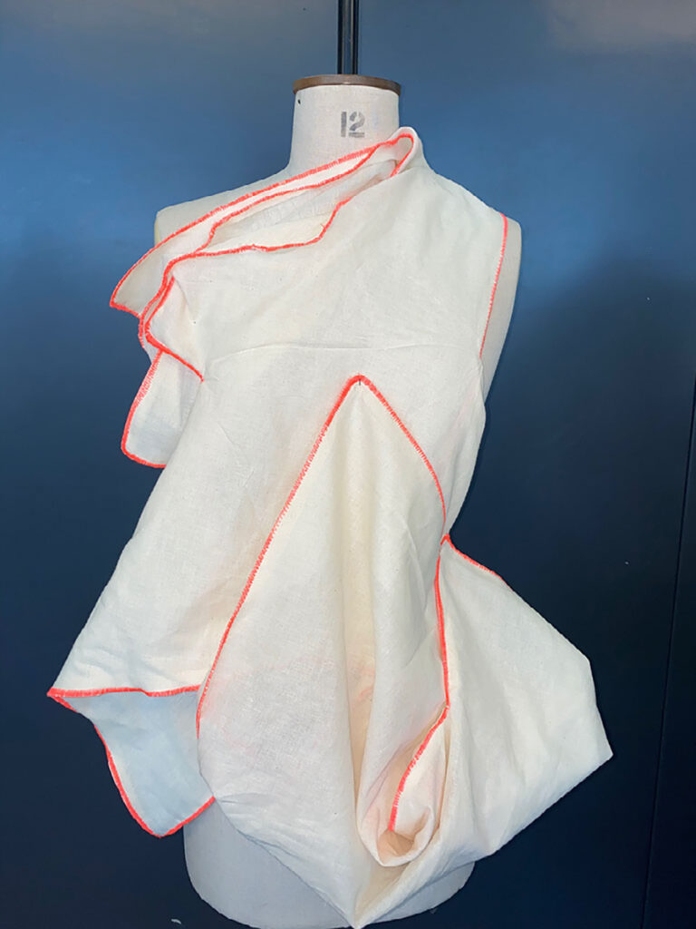
It is fair to say that Extended Diploma Art & Design has its challenges. No one could have anticipated the impact Covid would have on the last two years. The students on the second year Extended Diploma art and design have embraced this challenge with creativity, imagination, determination and good spirits. Having experienced a significant part of their first year with limited access to studios and equipment, they tackled industry-level project briefs using whatever materials and resources they had at home. The second year began with the hope that they might explore their creative pathways accessing the full college’s facilities. Lo and behold they went back into lockdown at what is often the most crucial point in their creative journey. It was heartening to see them continue undeterred and produce their university portfolios and coursework with little change in pace. Much of the last few months has been conducted in preparing them for the first professional exhibitions. They ably demonstrated that they could produce and exhibit work commencing with the entirely digital Silent Gallery. Returning to the studio they then had a very short space of time to conceive, produce and exhibit their first physical show despite the fact there was every chance the public would never be able to see it in person. This did not dissuade them from producing imaginative and thought-provoking pieces, showcasing the creative resilience and professionalism they have developed in these atypical times. It is testament to the dedication that the following work can at least be enjoyed in the digital realm.
We are delighted once again this year to have had Hereford College of Art support our learners’ progression into HE via their ‘One To Watch’ initiative. Tutors from their Fine Art, Graphics, Photography and Fashion/Textiles areas have judged entries from our corresponding courses and awarded those learners whose work shows potential for excellence beyond FE. Look out for the banners next to the recipients’ work who will also receive a book for their efforts. This recognition undoubtedly motivates learners to aspire to greater things.
Martin Doyle, lecturer, visual arts
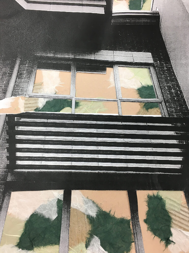
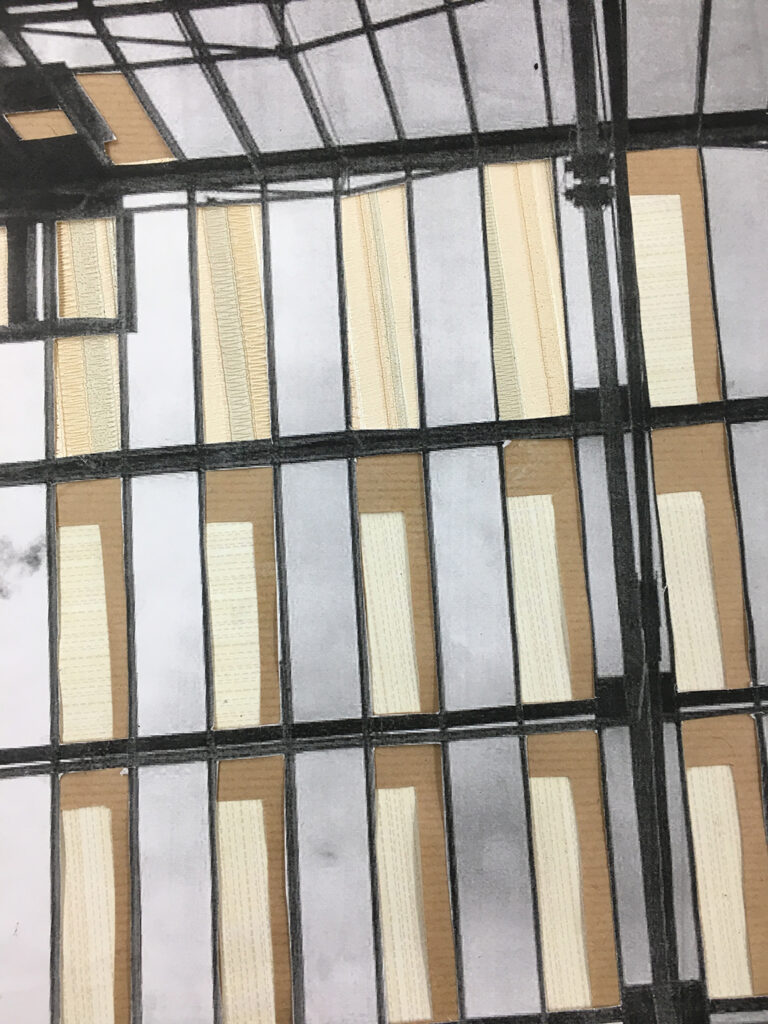
Interior design of a spacious living room, home space. Targeted at those who love a spacious and comfortable living space with cultural, modern/contemporary design. I am interested in marbling and repeat work.
The passing of time and events are constant and is not altered for anyone. No one gets more or less time.
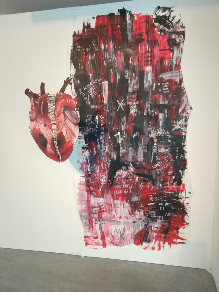
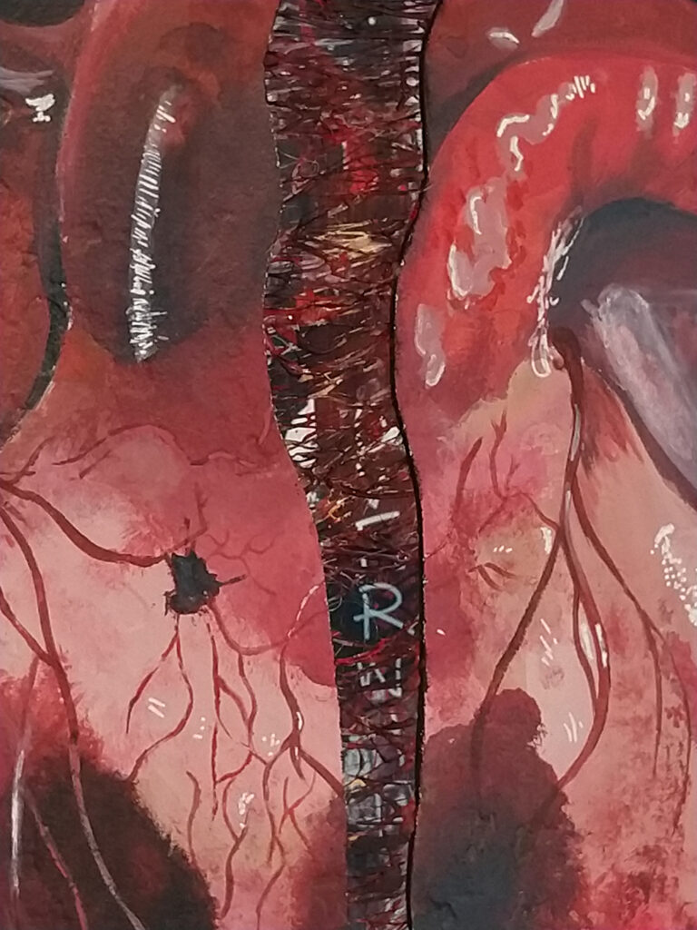
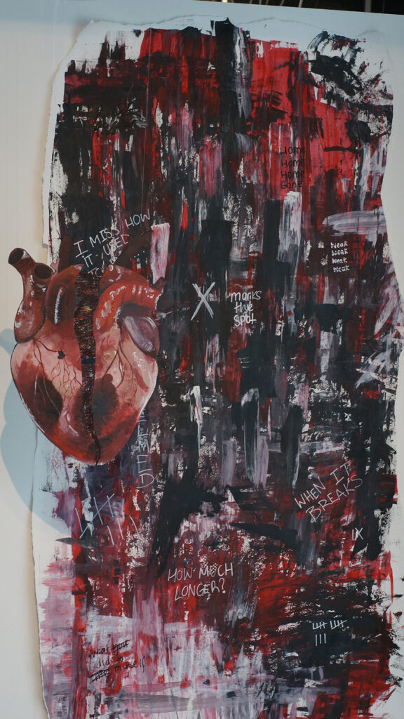
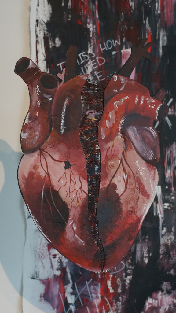
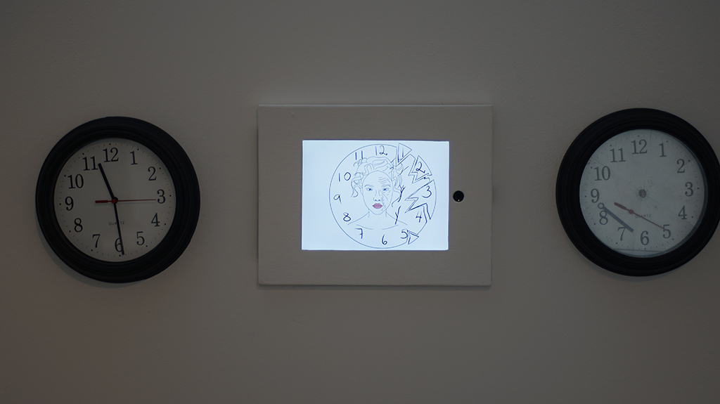
You will never truly understand someone’s internal emotions
We reflect ourselves on time which makes us regret afterwards that we dont have time to fulfil our small or big requests. As time passes we think about what we done in the past and how can we improve in the future but never do anything properly in the present.
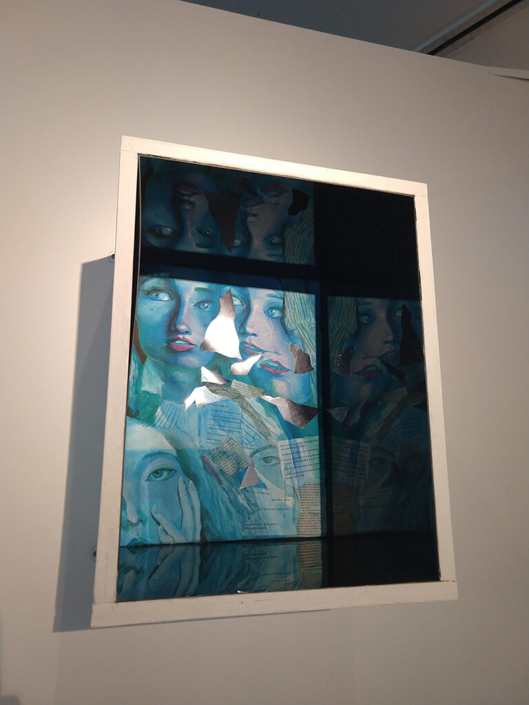
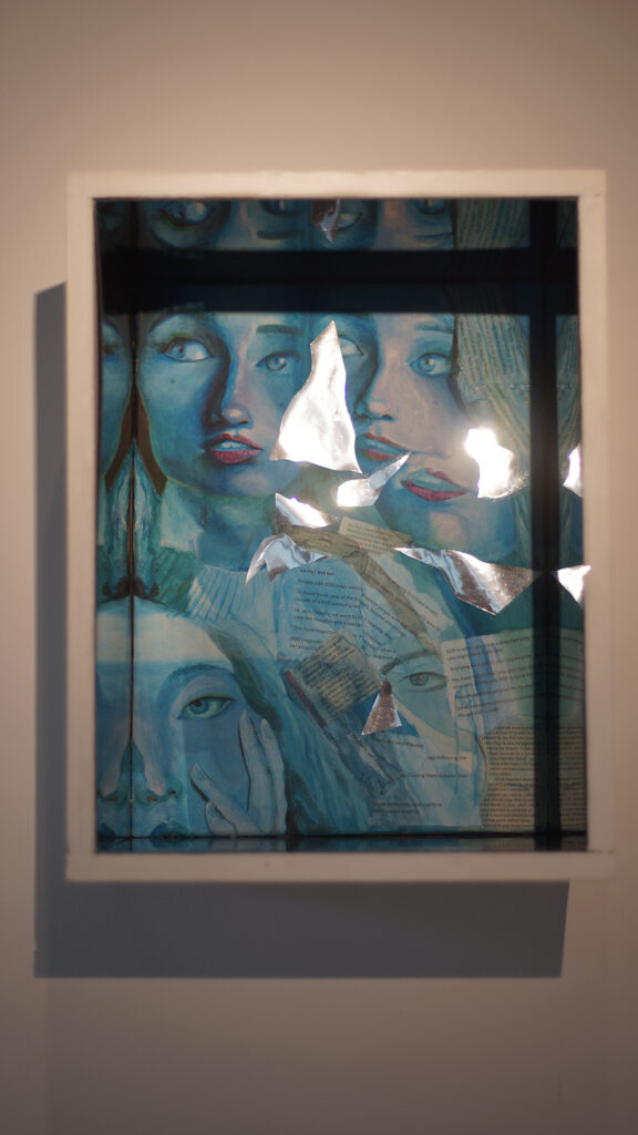
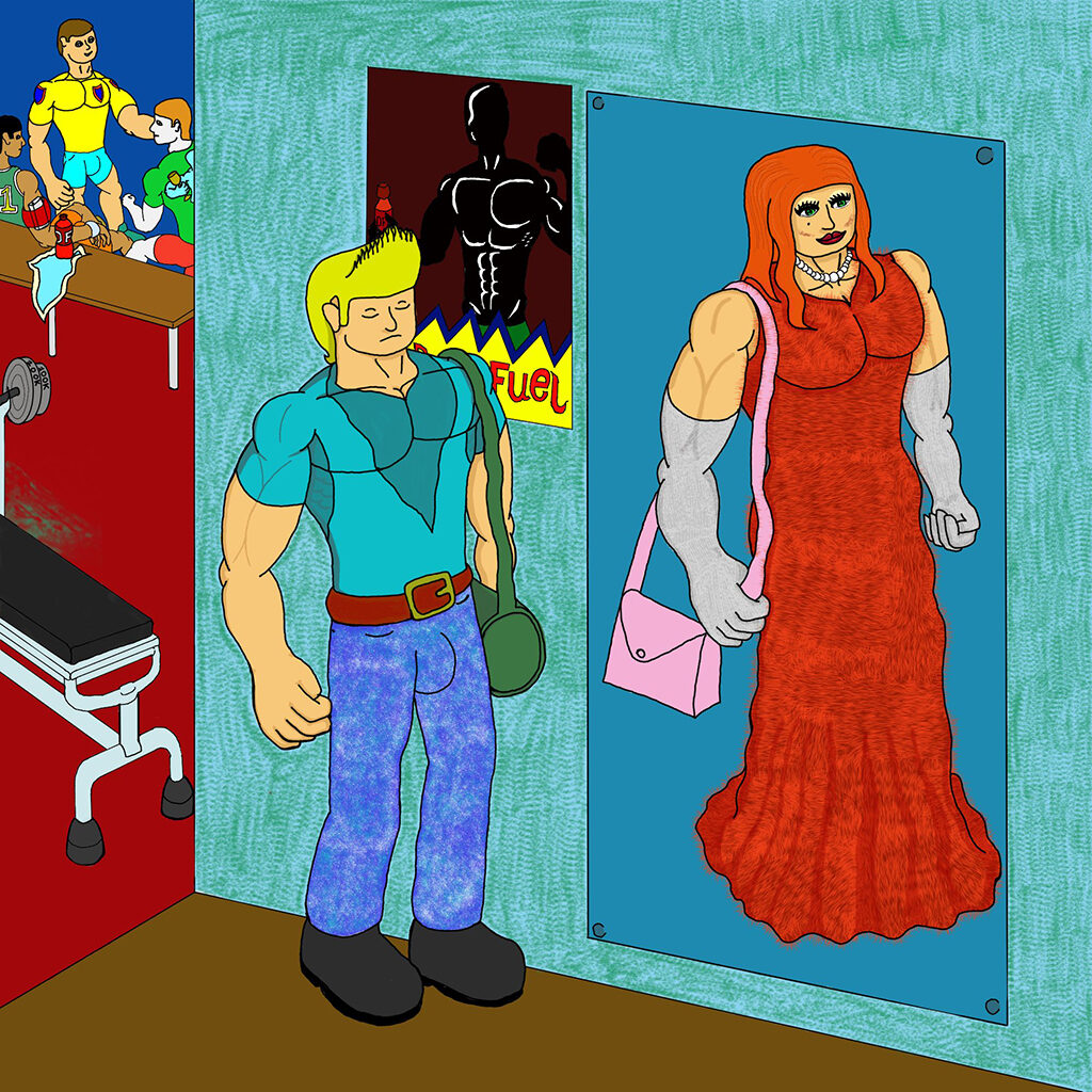
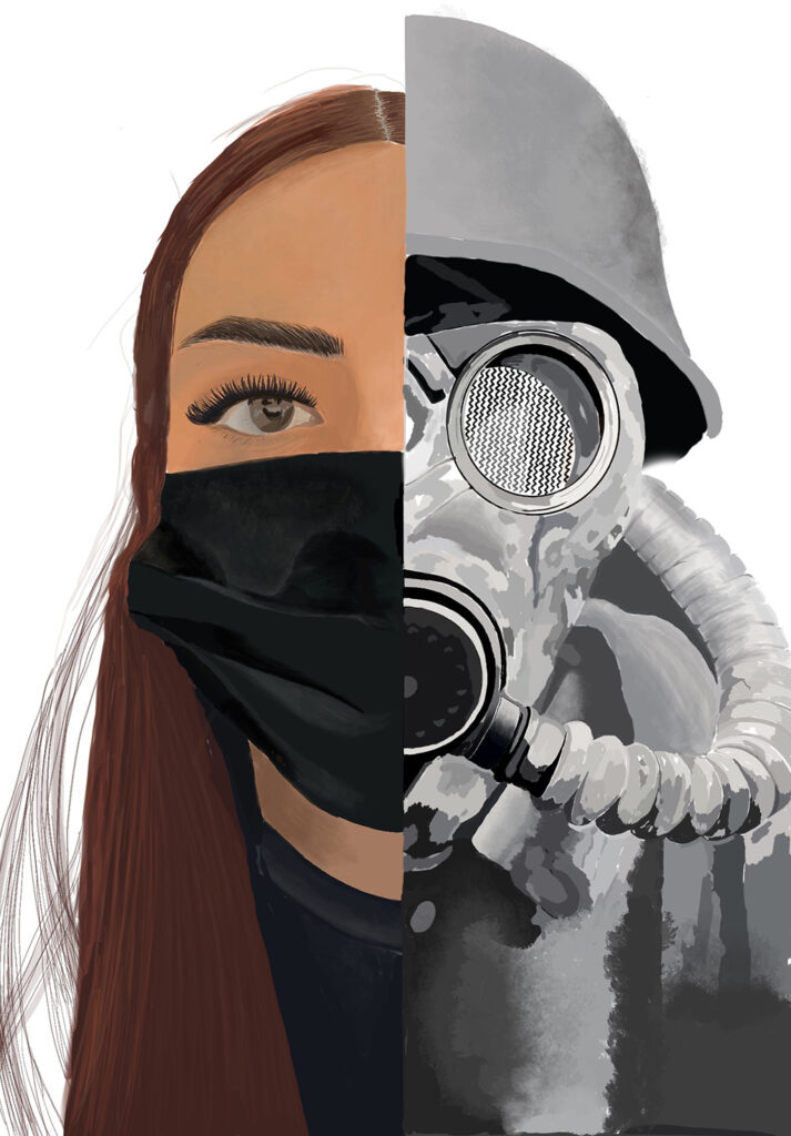
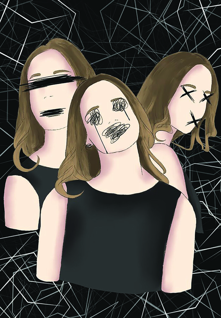
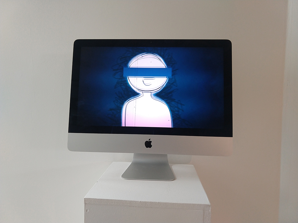
The way we see ourselves can be distorted, different to what others see and media can have a negative effect on this.
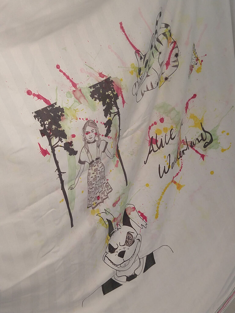
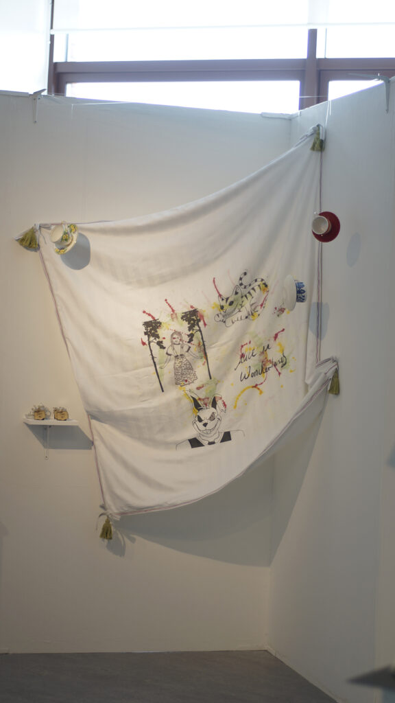
This is my interpretation of Alice in Wonderland where the characters are on a tablecloth along with home-made scented candles that I feel remind me of these characters and the story in general.
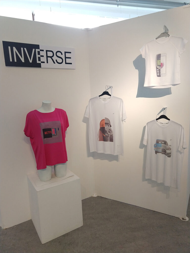
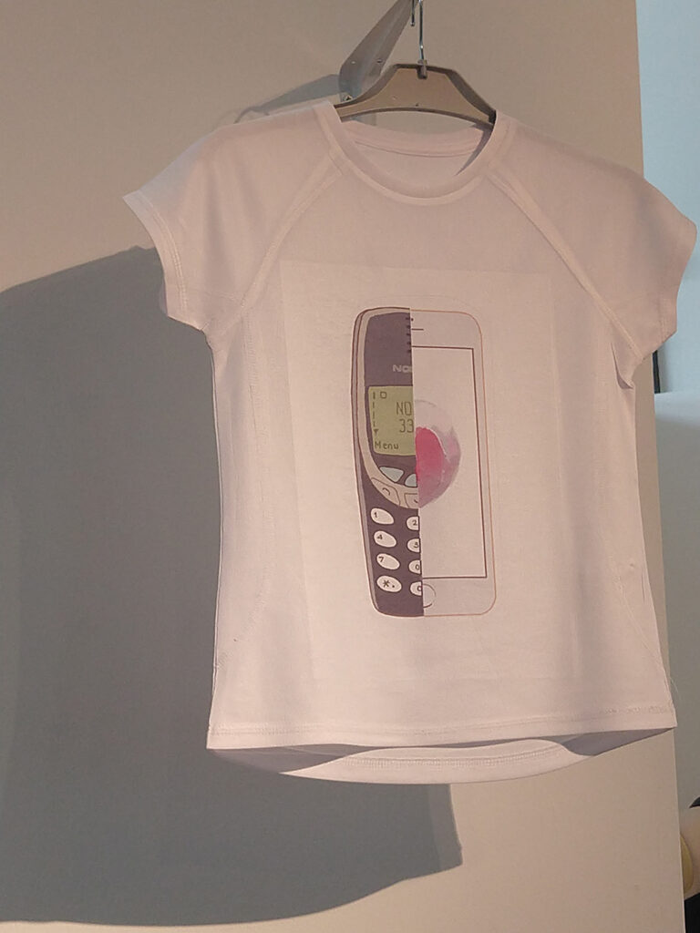
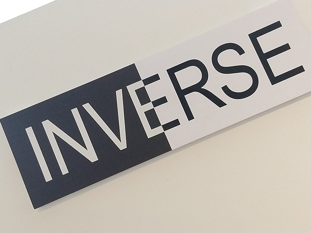
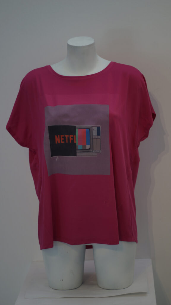
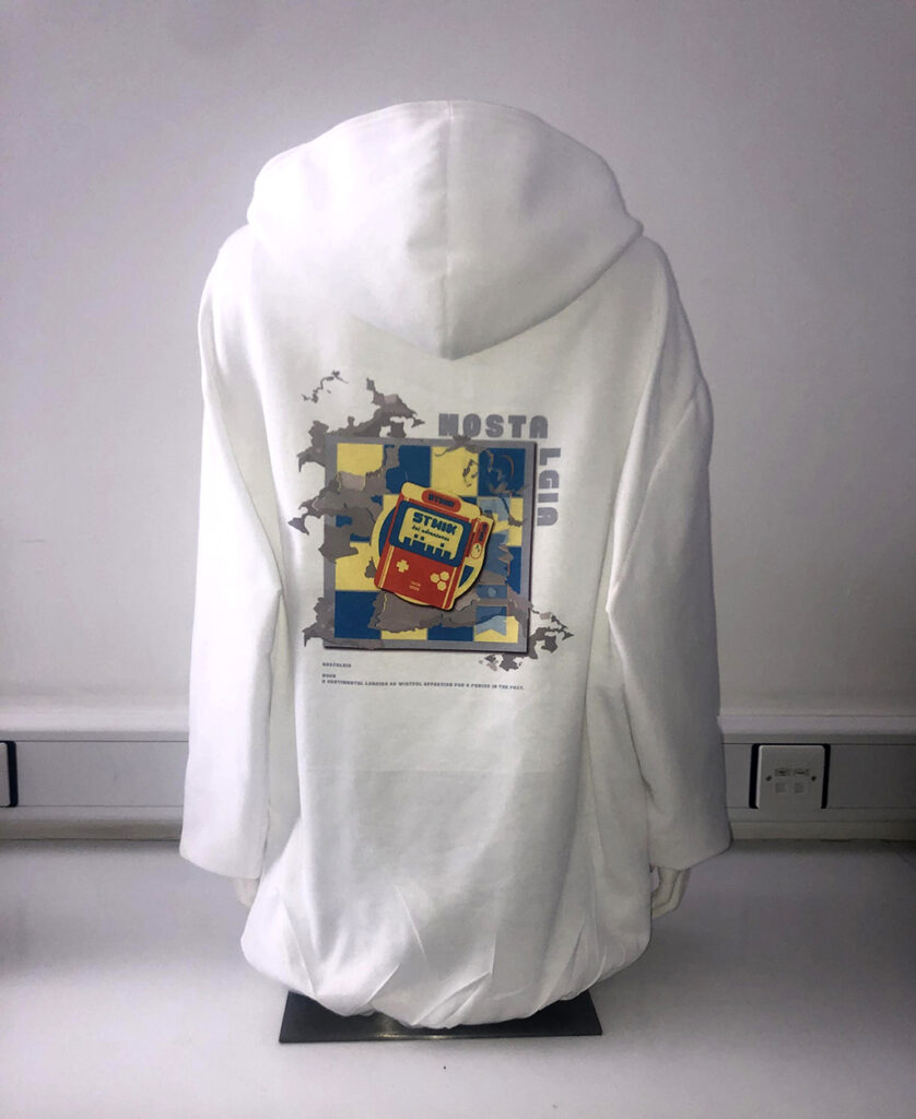
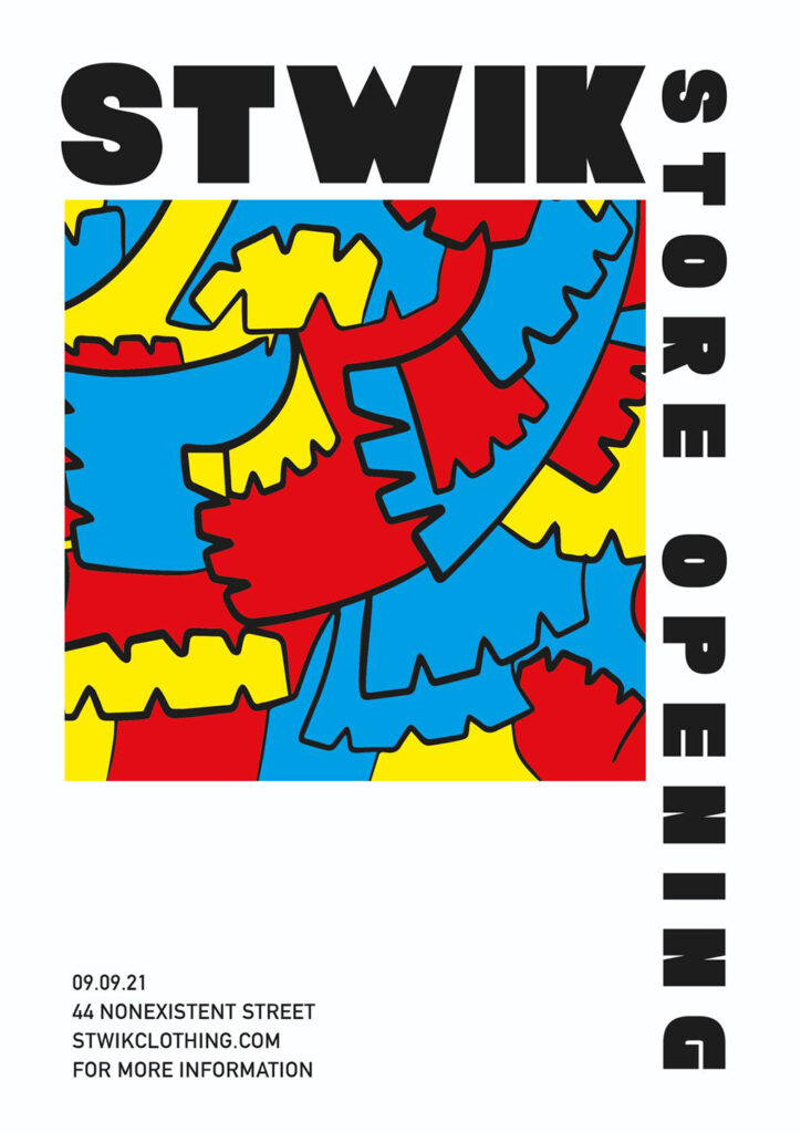
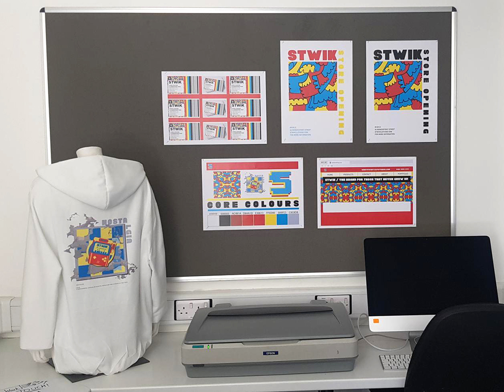
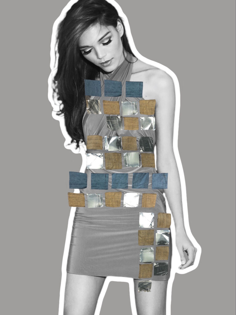
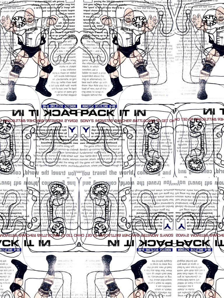
Researching into adverts and the reality behind them inspired this range of clothing graphics for ‘Inverse’ – a new brand that celebrates both new and old.
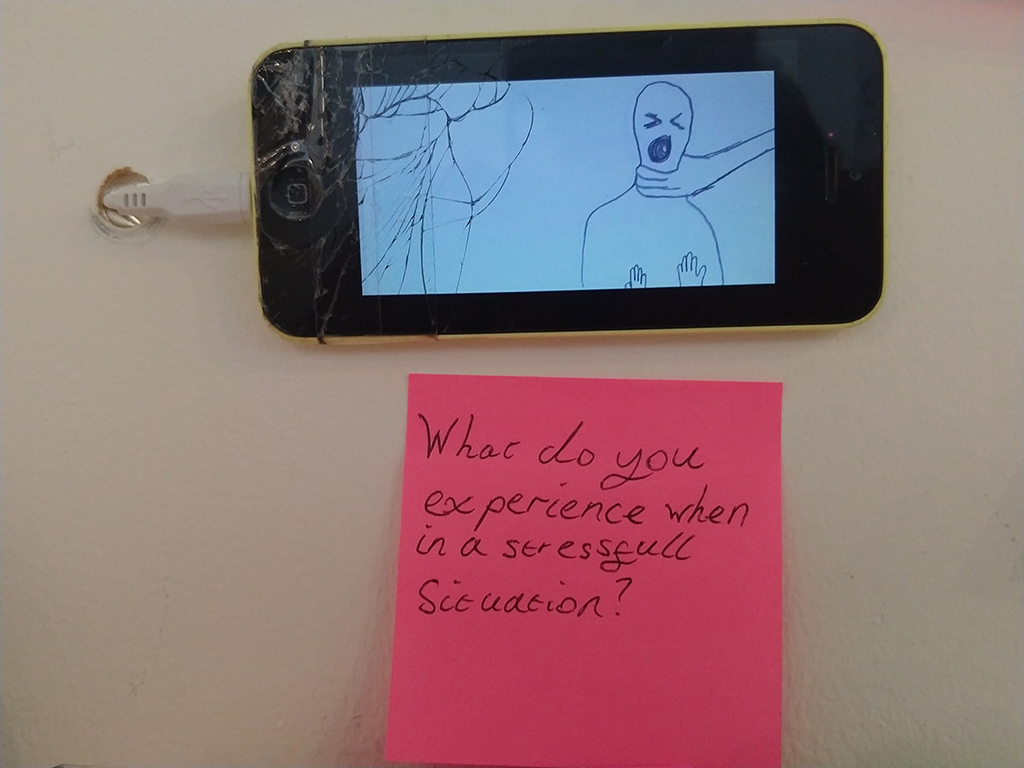
What do people use to escape reality? With stress being a main point, most people try to escape by using things such as Music, Art or books.
The fear of trusting others.
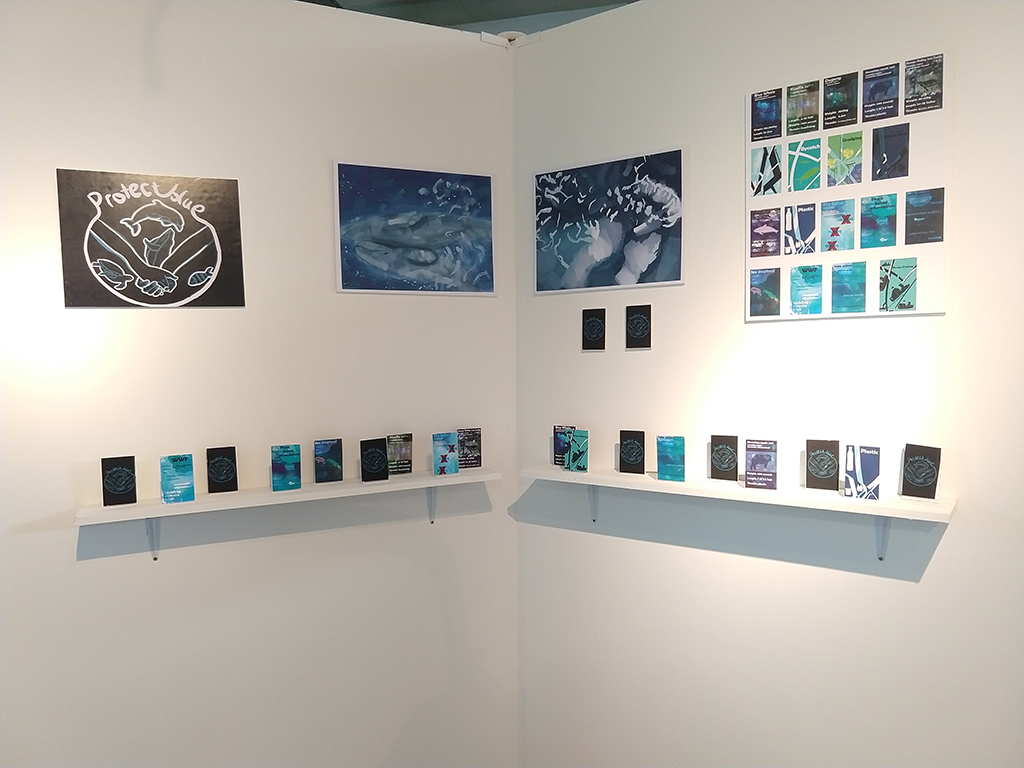
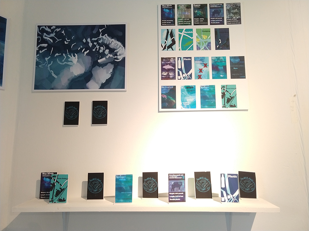
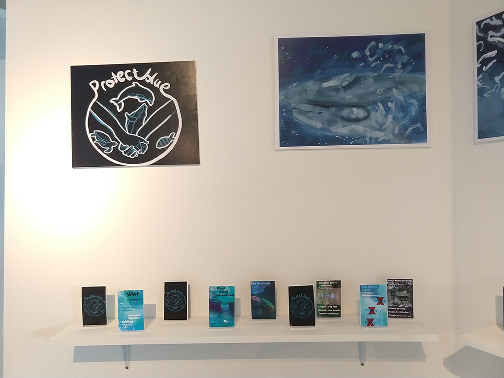
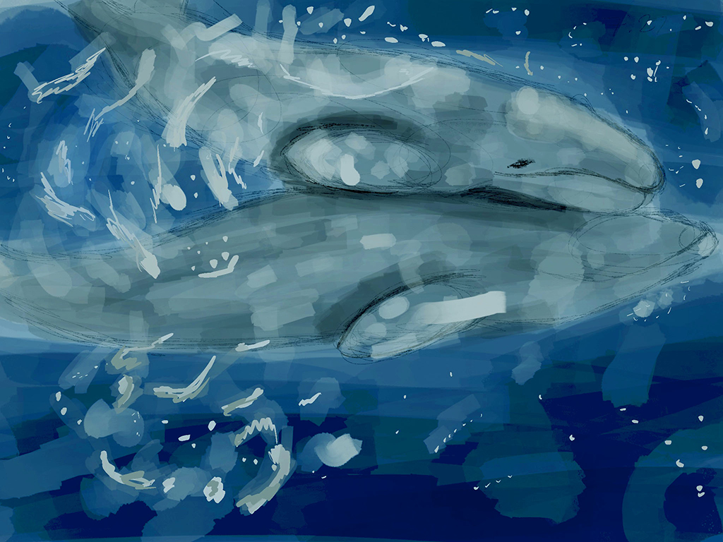
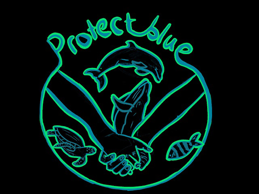
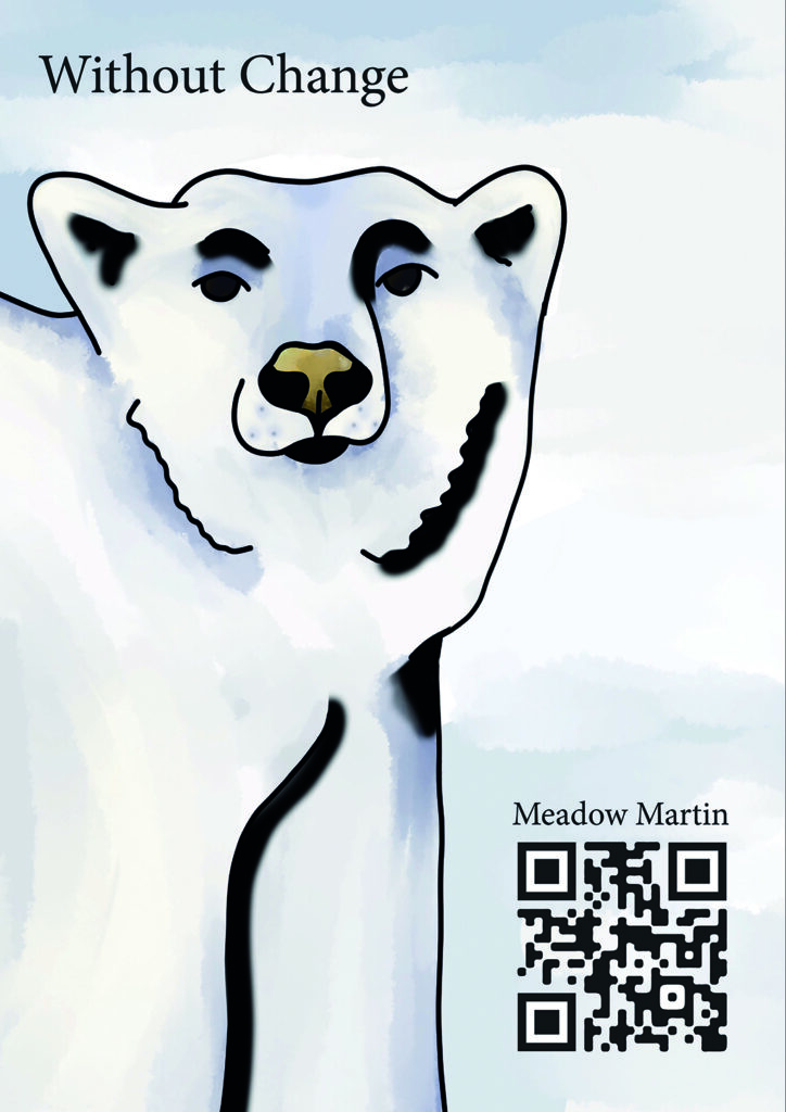
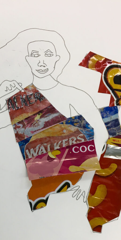
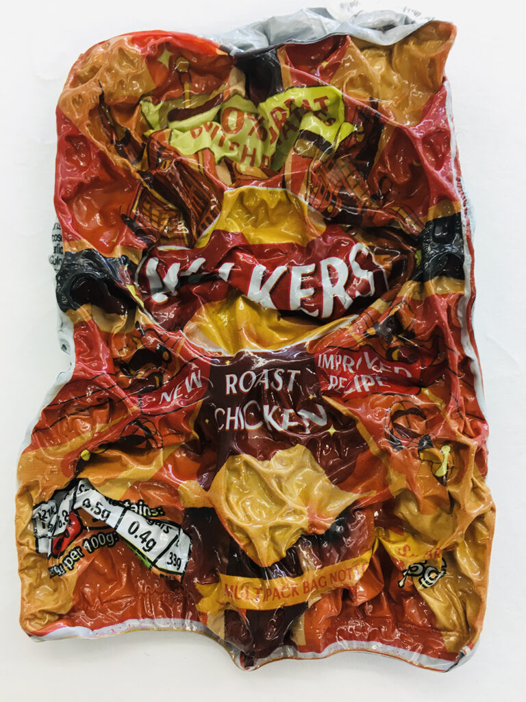
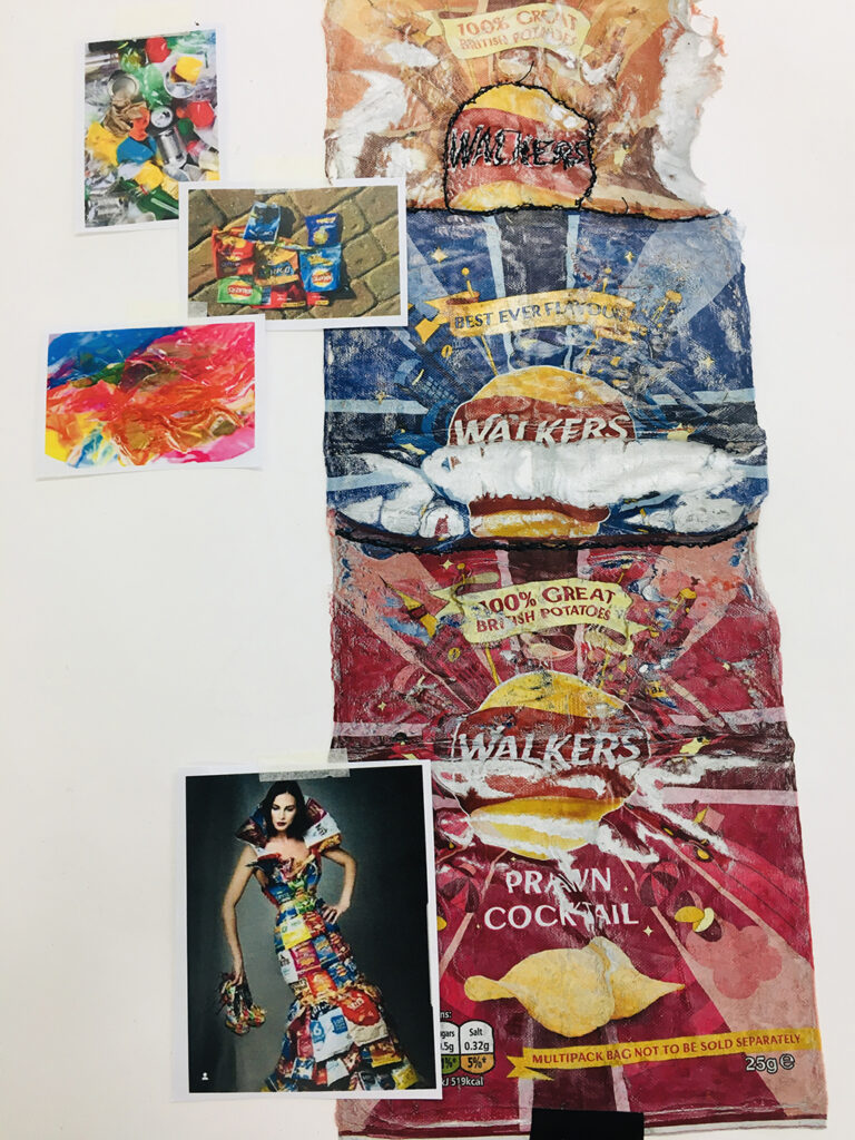
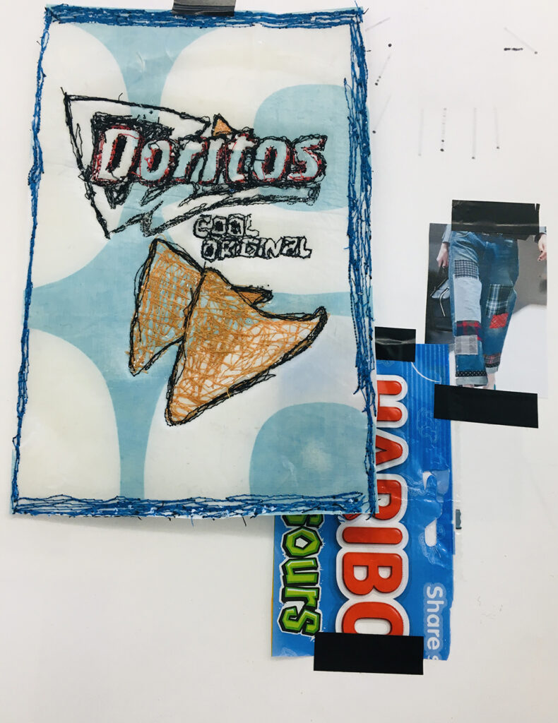
My work is about showing the beauty of the world that we continue to destroy everyday through simple things. It raises awareness for all ages to get involved and learn how we can make a change. Because as Sylvia Earle said “Start with someone. Some “one.” And no one can do everything but everyone can do something”.
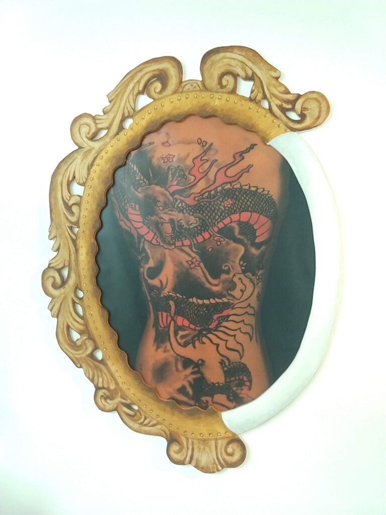
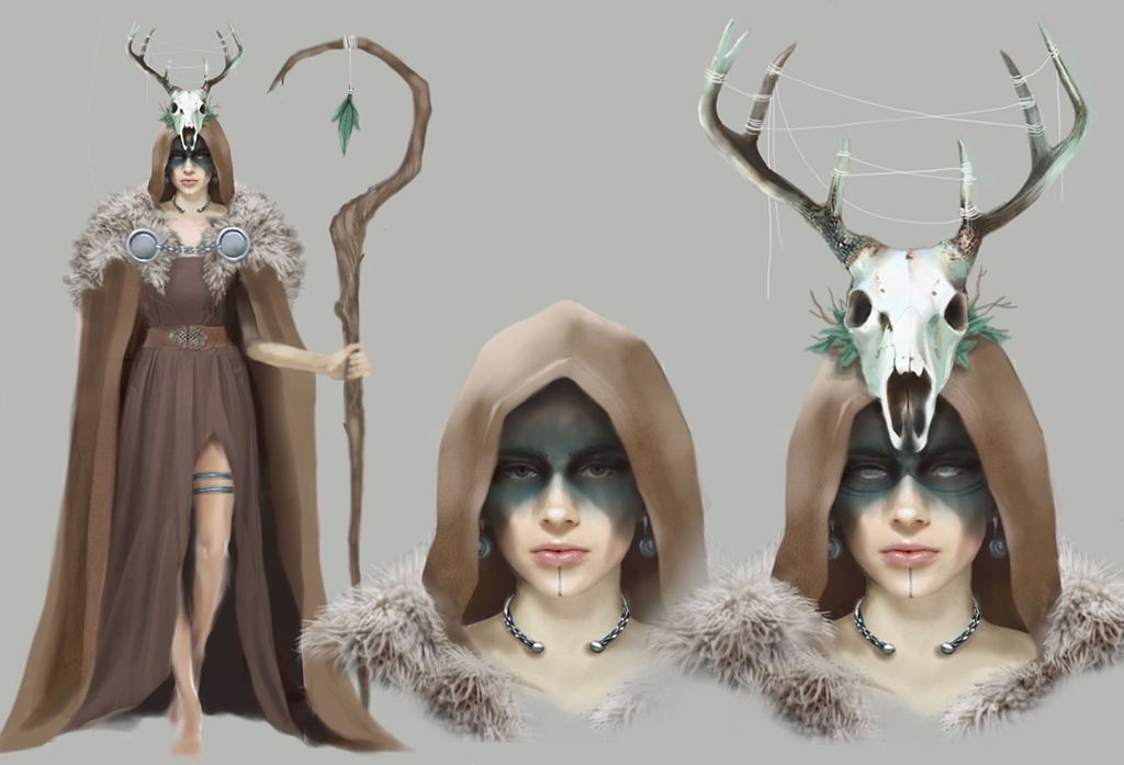
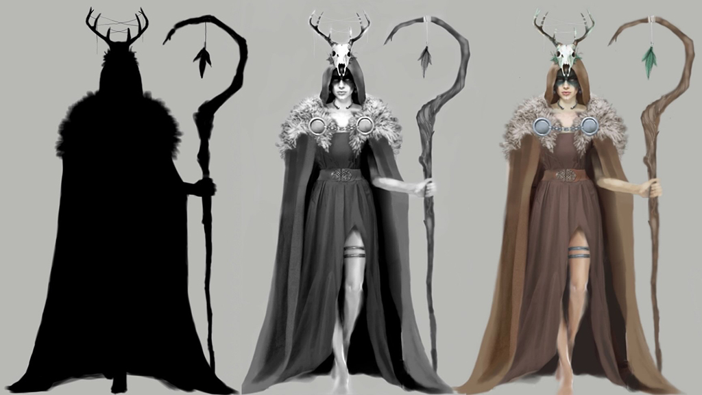
From a shamanistic practice within the roots of both love and war, to now modern times it’s always been a show of self-expression.
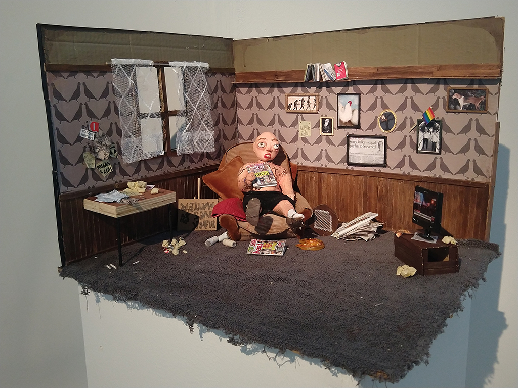
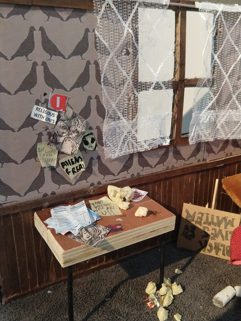
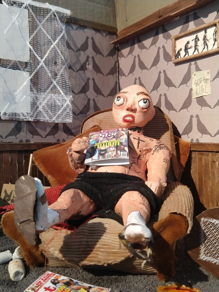
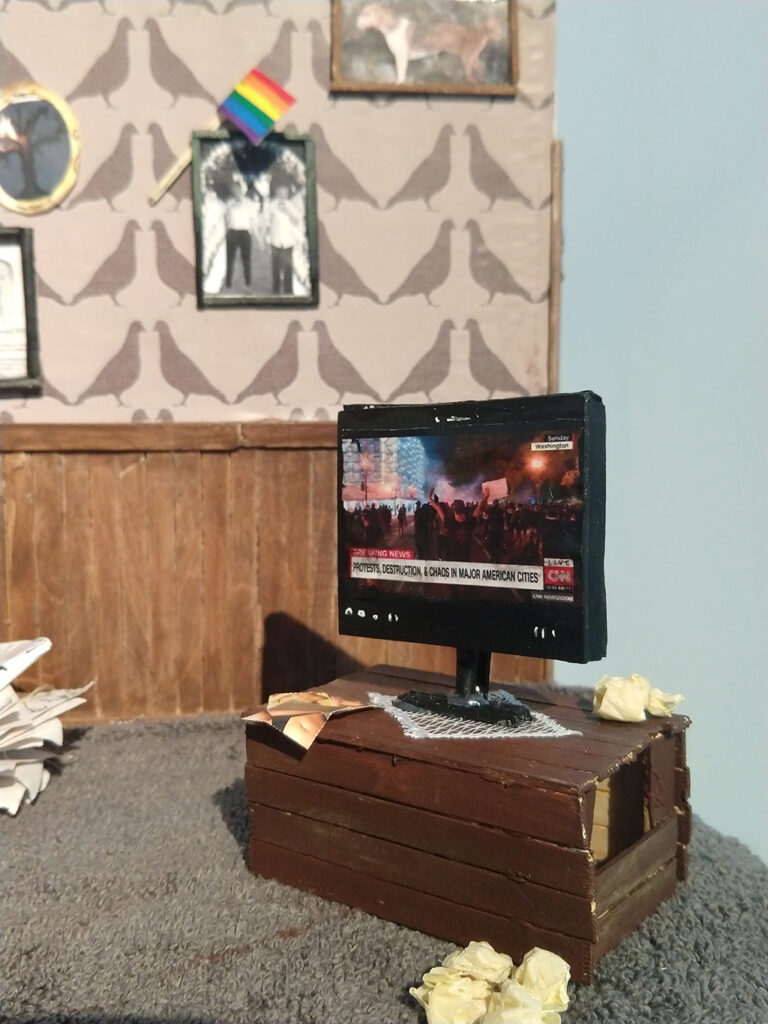
I want to create a piece of work about the idea that no matter how small or insignificant a controversial topic may seem to some people it can completely change your perception of a person. I want people who view my piece to have a moment ambiguity and to challenge their own thoughts and develop new ways of thinking.
As an interior designer, I want to push the ‘scare maze / tour’ to a different level.
I’m learning to fall in love with the twilight, spent a lifetime trying to.
For my project I looked at drag queens, taking into consideration the culture of Hawaii and how ‘mahu’ (the third gender) could be the future of drag.
Similarly to Muppet style characters in media, I have created a mascot to teach young children the creative side of recycling and how it helps the environment. Clutter, the Gryphon!
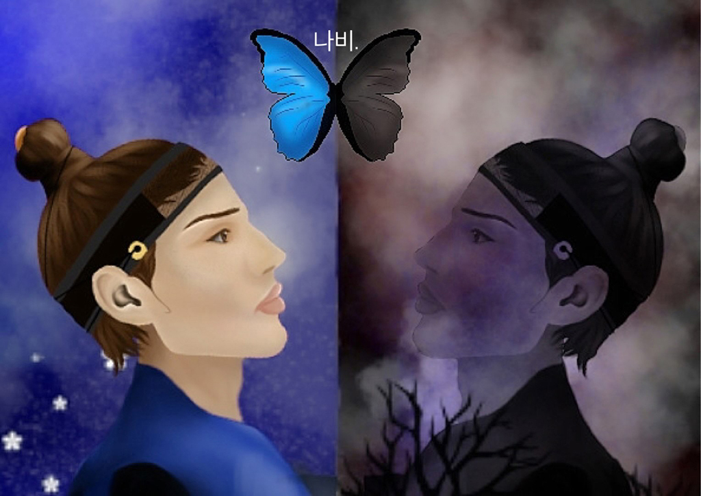
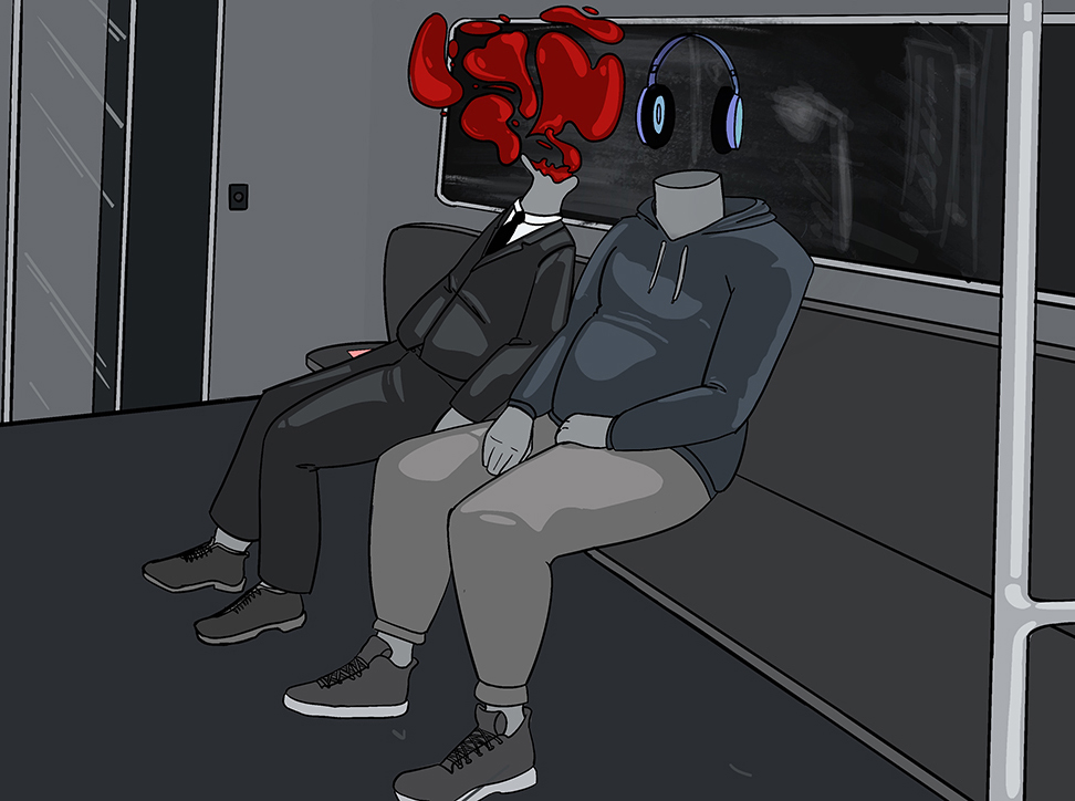
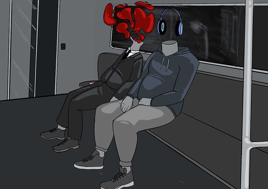
What if you over-thought until you can’t distinguish assumptions from reality? The lines between the real world and a fictitious world conjured from your mind becomes blurred. When you lose touch with the reality around you, the atmosphere can become sinister; plaguing your thoughts and emotions.
“Those kids with their spray paint, God love ’em” A physical demonstration of trashy teenage rebellion & the ageing process.
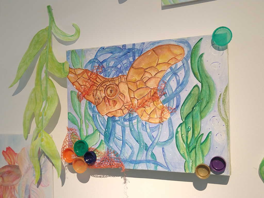
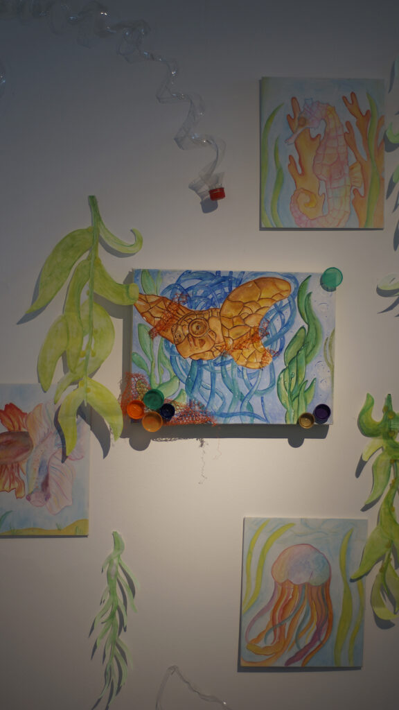
What we do impacts the ocean
Set in the near future of 20XX, Morgan escapes to a world which they consider their perfect world
A short film exploring how a sense of uneasiness can be achieved through sound and visuals. The character explores a forest that has a strange aura, causing him to get increasingly more paranoid as the film continues.
Translating to “House of books”, the design is a reminder of where society began and that knowledge and learning are part of our fundamental growth as humans.
My work is a visual representation of anxiety, and how it can feel isolating and take over your mind.
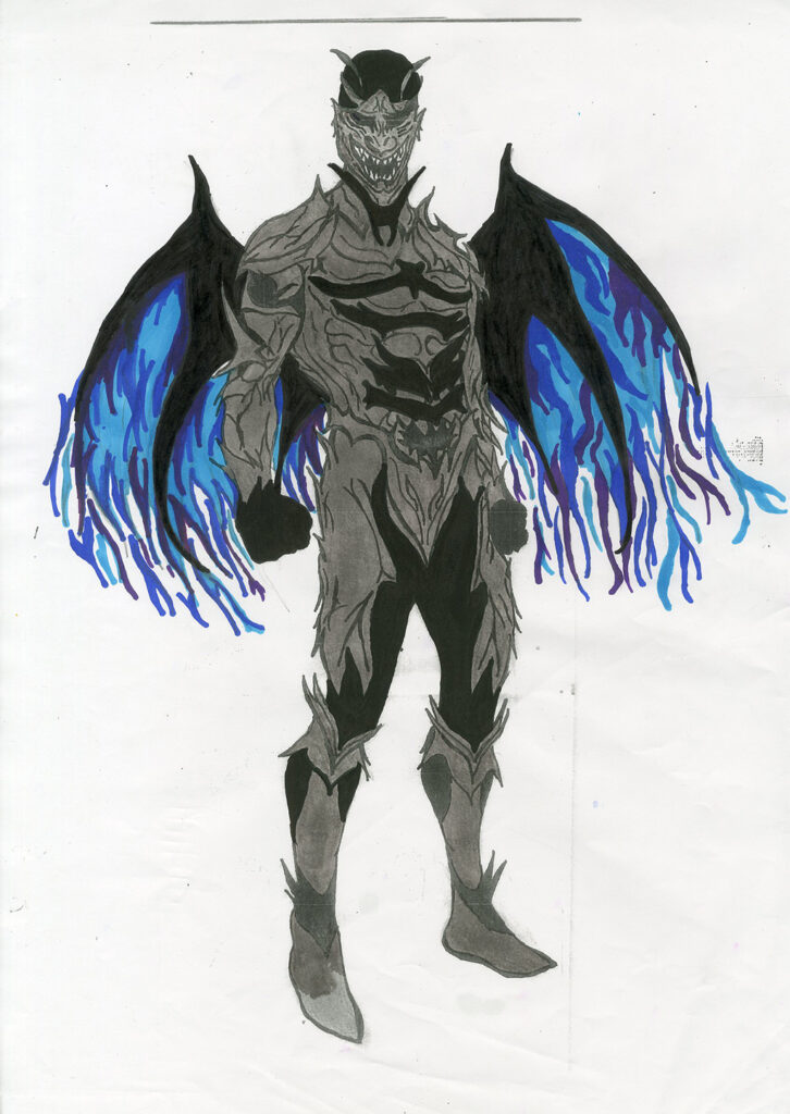
Developing my art skills to help me get better with my future in becoming a concept artist.
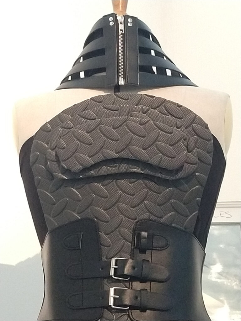
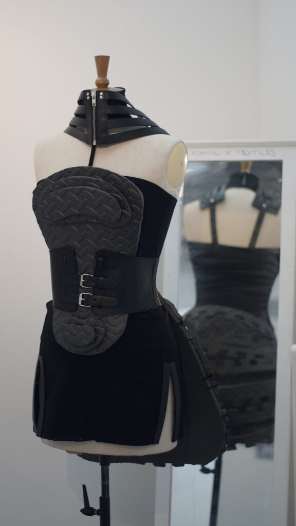
What you wear never justifies ‘asking for it’.
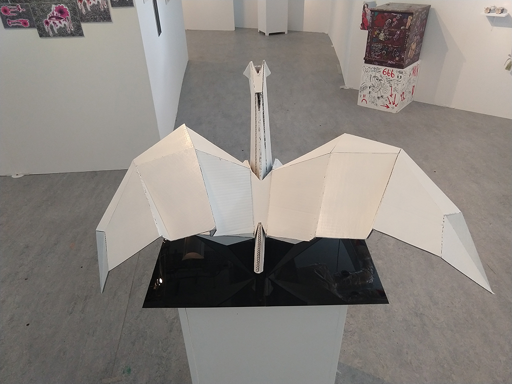
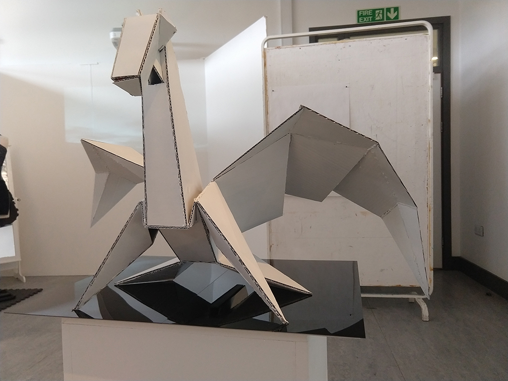
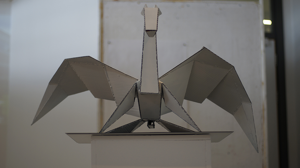
In the style of Kirigami, I have created a piece that combines the spiritual meaning of the Pegasus with the peacefulness and creative freedom that making an Origami piece provides.
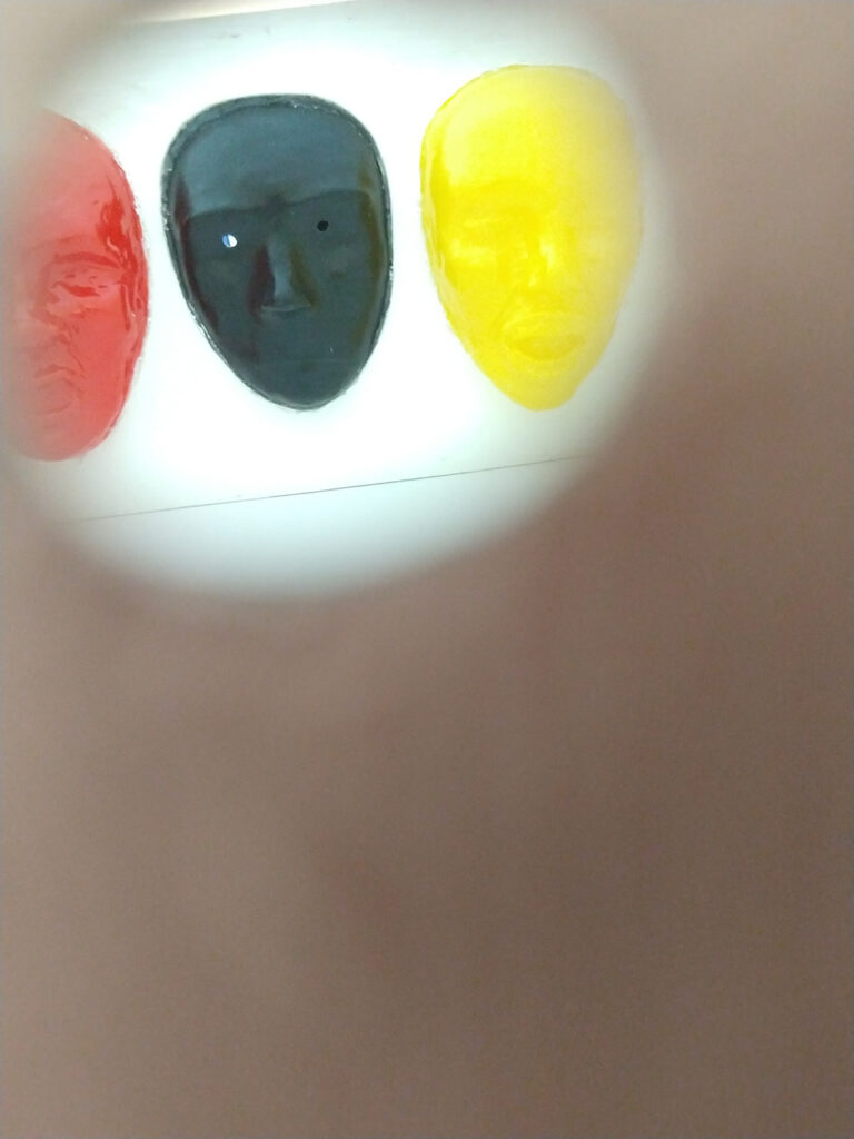
I want spread awareness of what anger is like in a creative way. Anger issues can cause severe mood swings and you can go from really angry to really happy quickly, I want to use masks to show this.
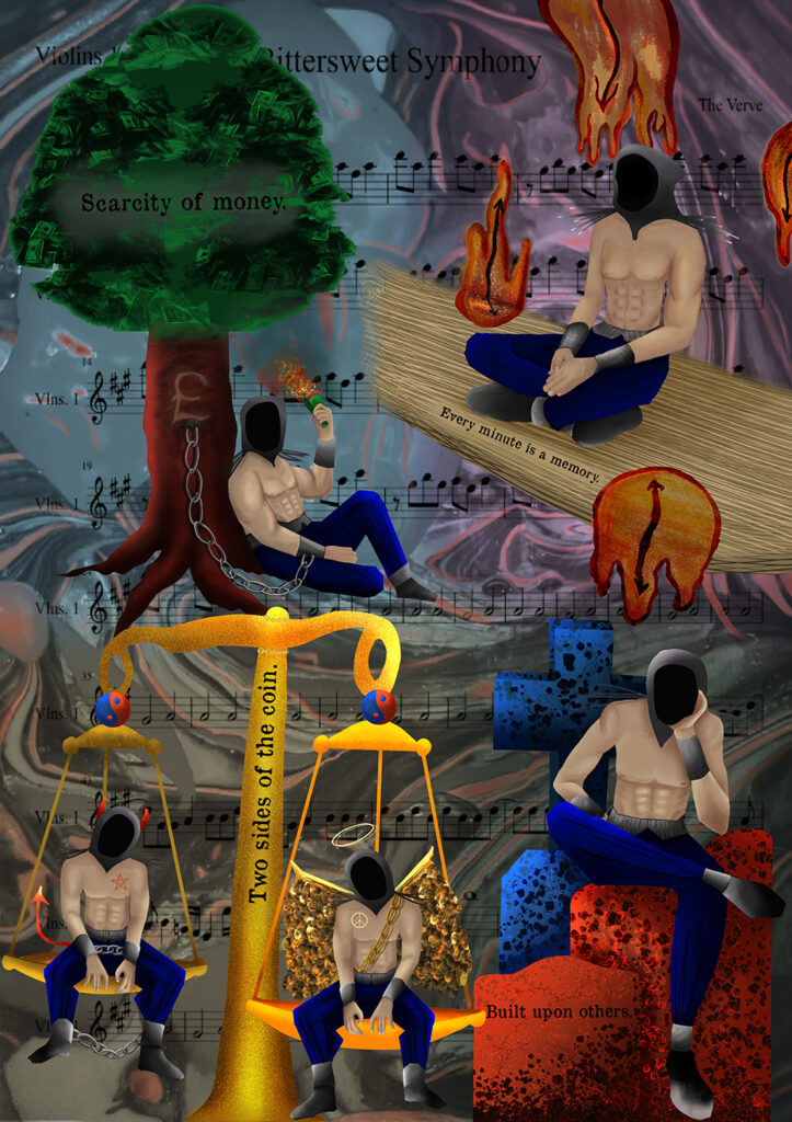
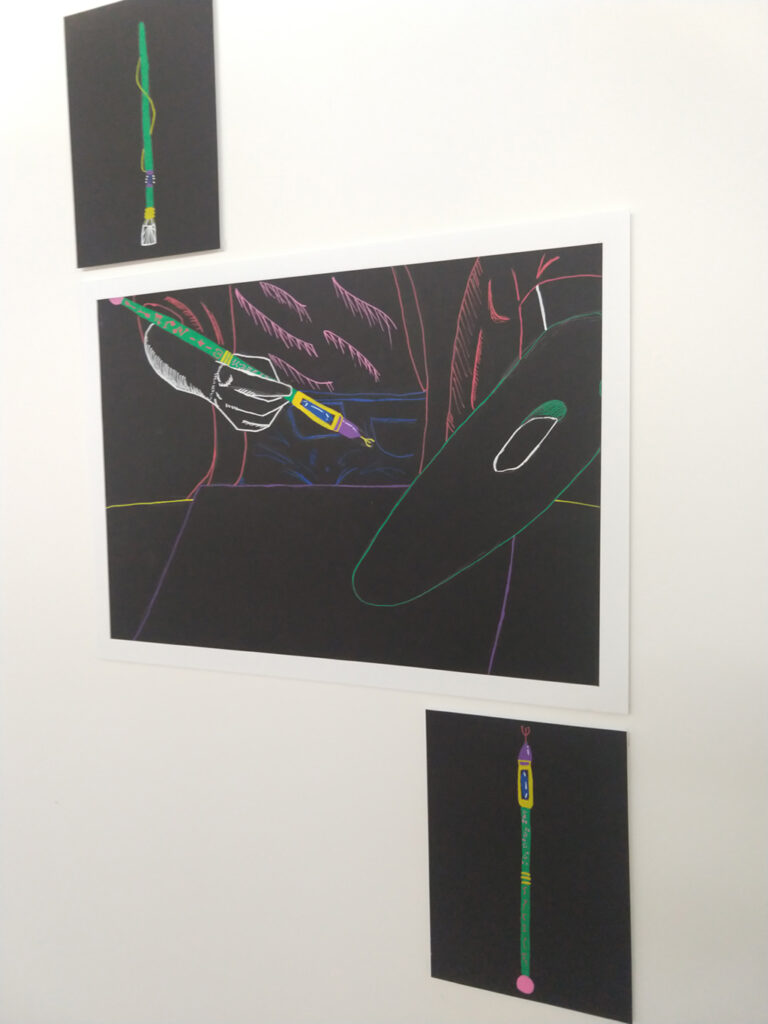
Currency’s deplete. Memories made. Human nature undefined. Built on others.
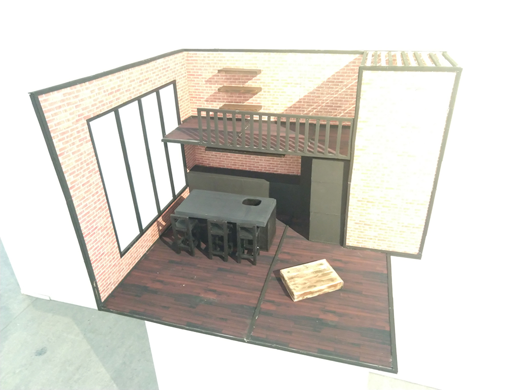
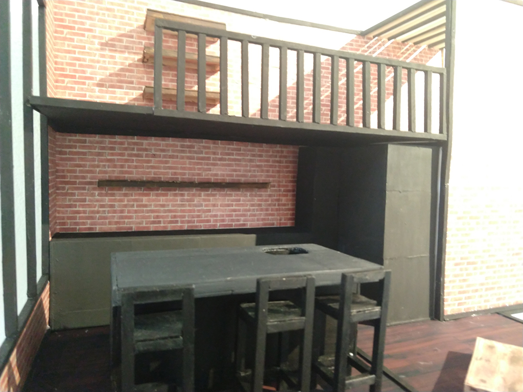
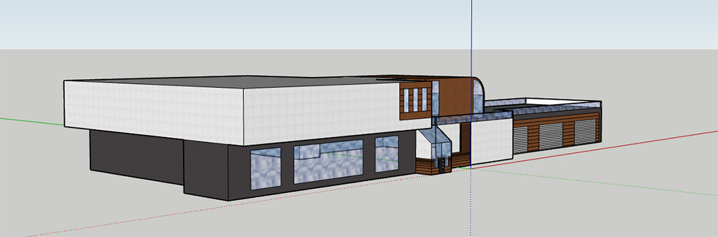
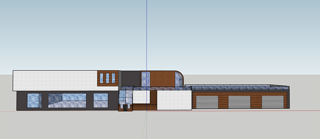
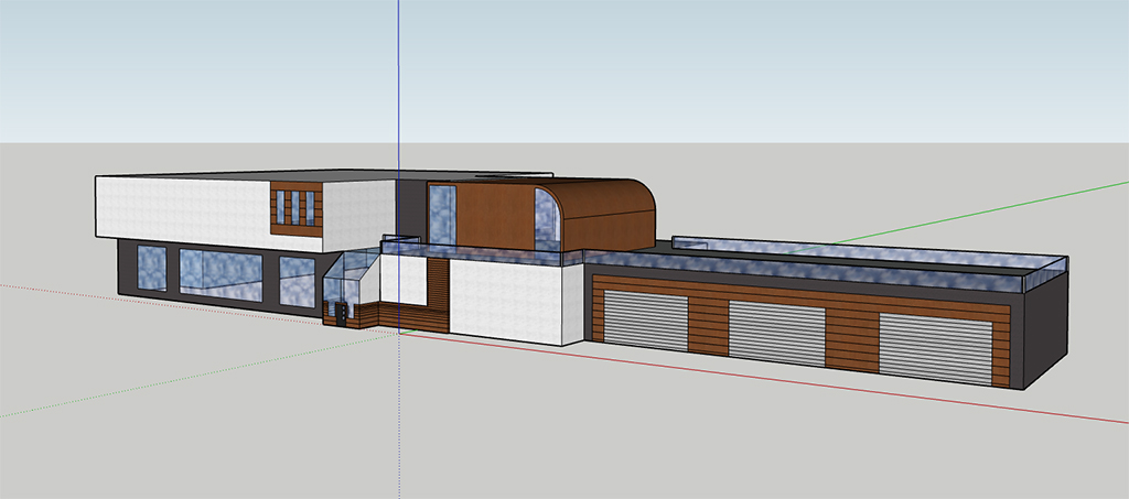
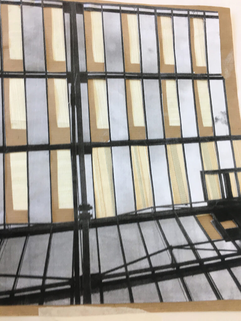
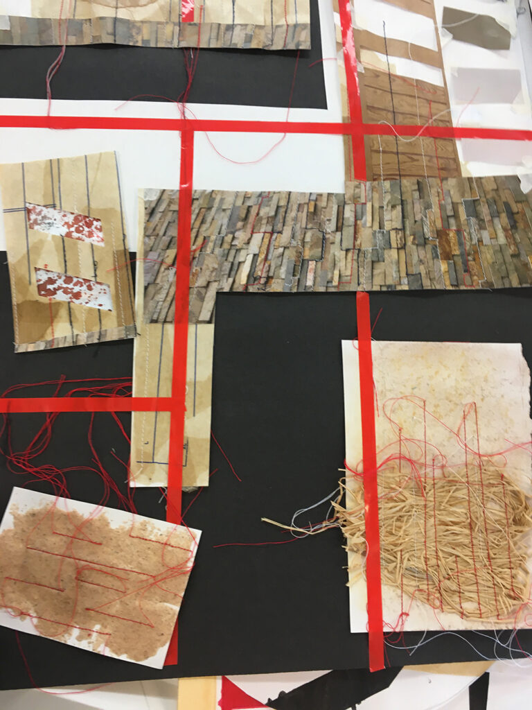
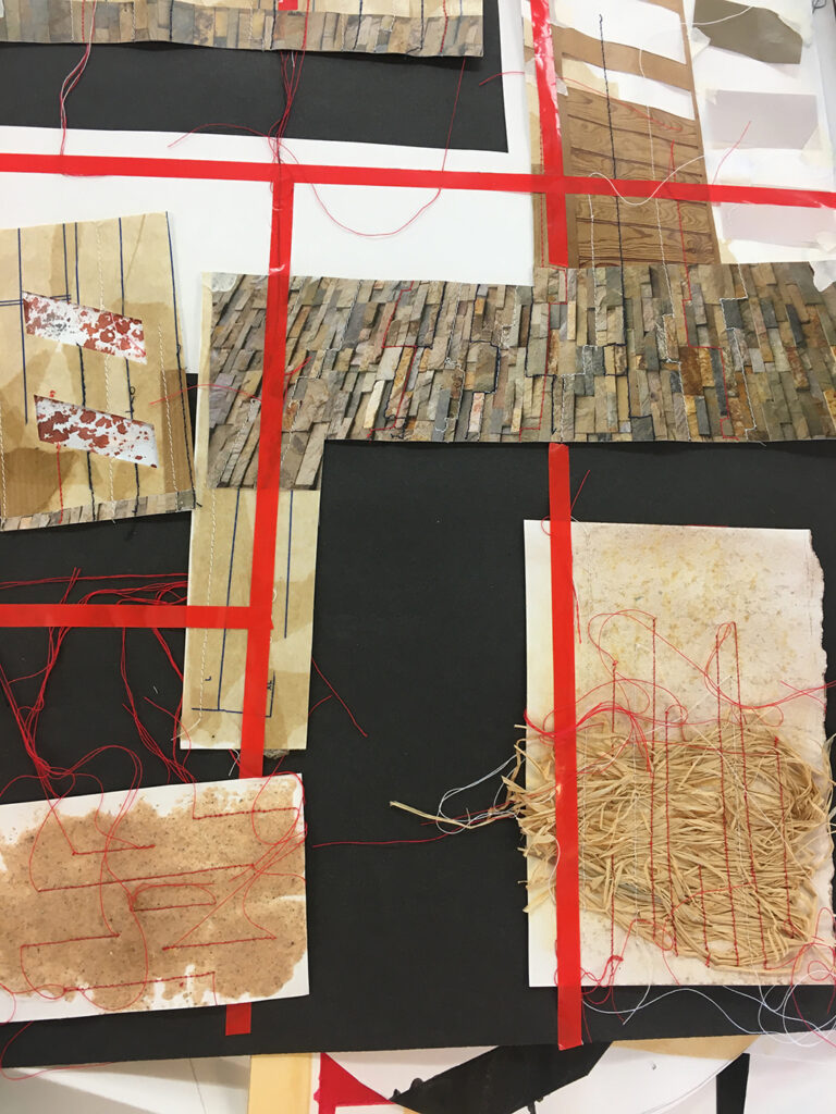
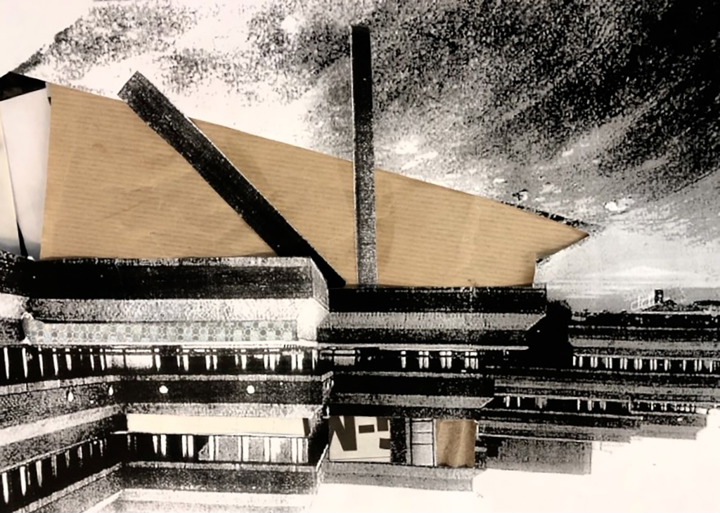
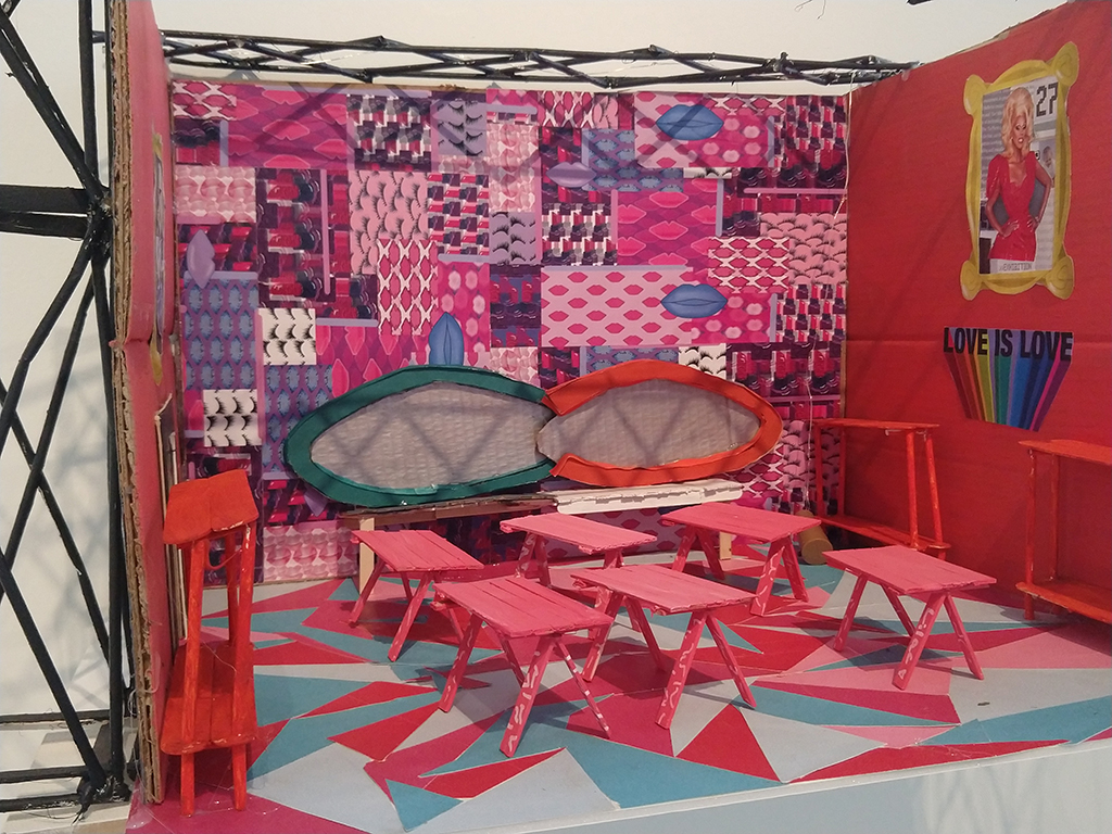
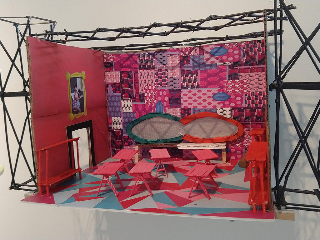
In this project I worked to achieve a proposal / 3D model design for a living studio space. The reason why I chose a studio space is because when searching for a studio apartment online the square footage size is very miniature with almost no room to move around.
Panic attacks suck. Simple as. They are humiliating and painful. For me my breathing speeds up and my heartbeat becomes all I can hear.

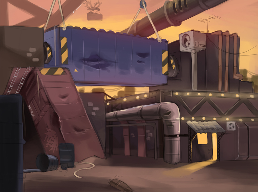
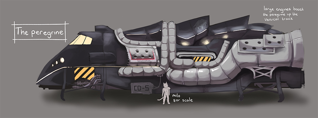
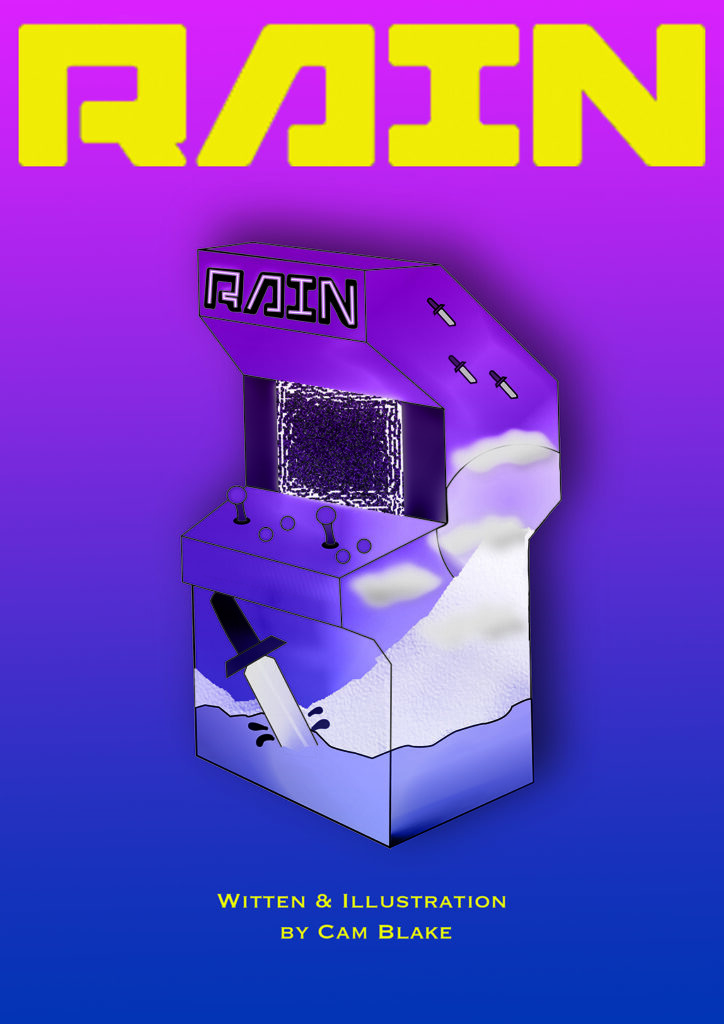
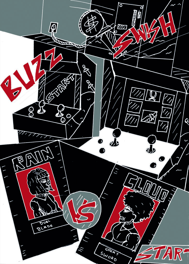
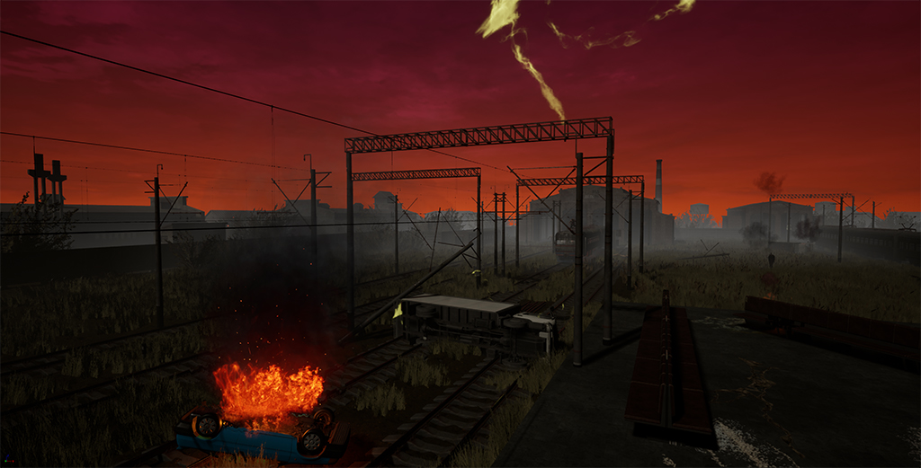
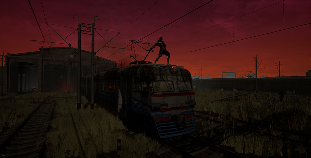
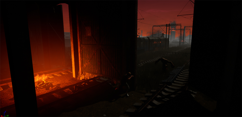
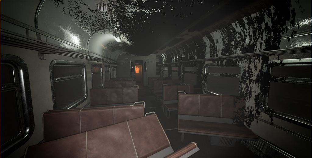
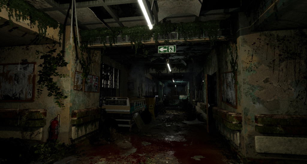
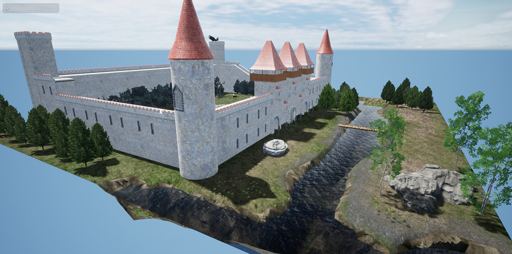
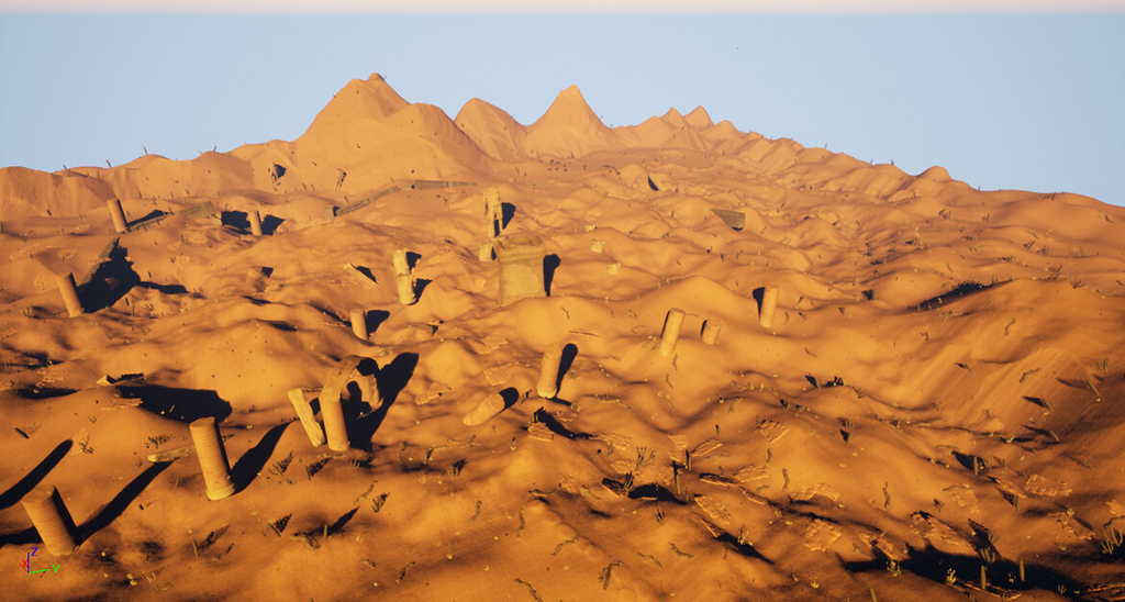
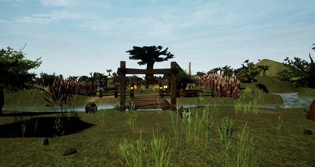
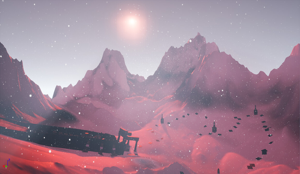
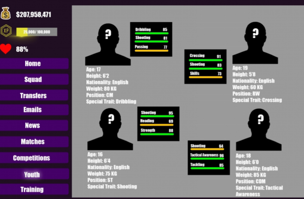
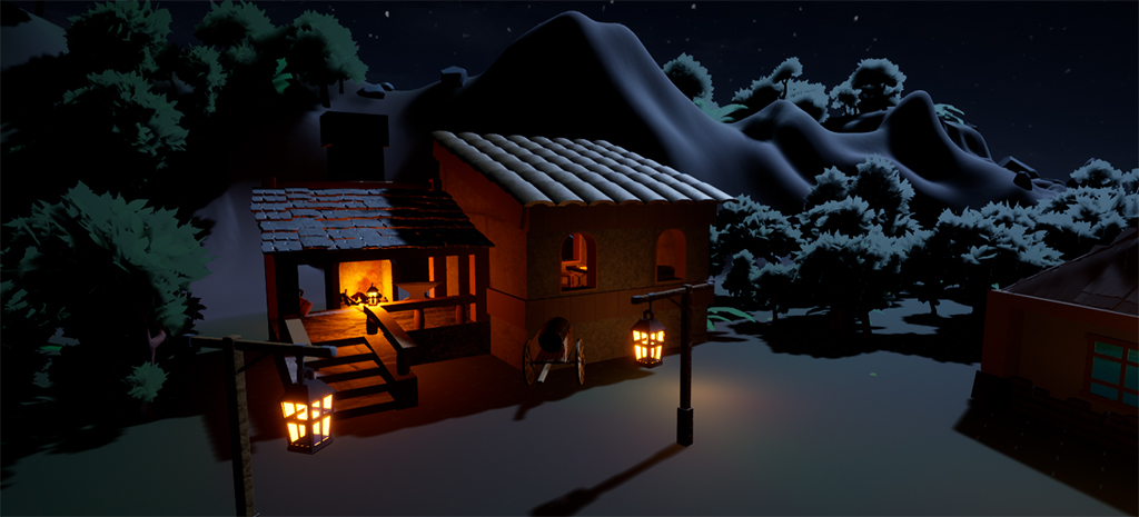
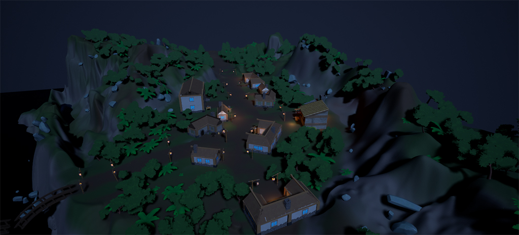
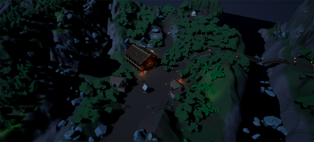
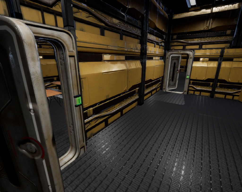
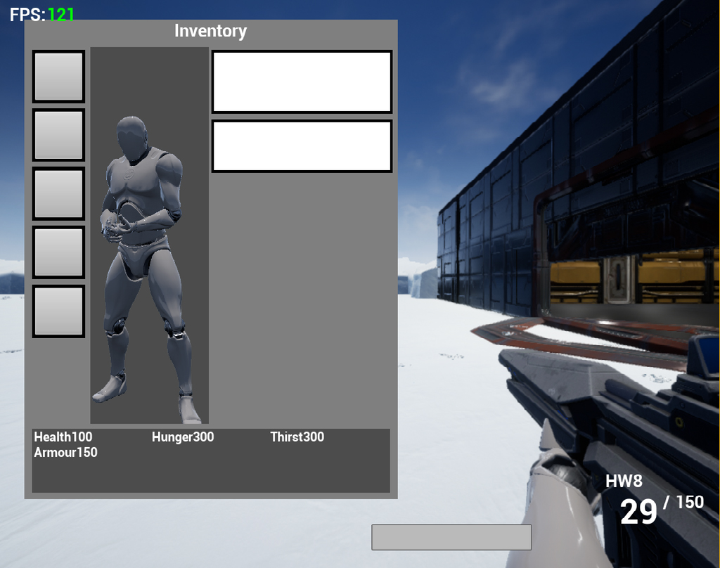
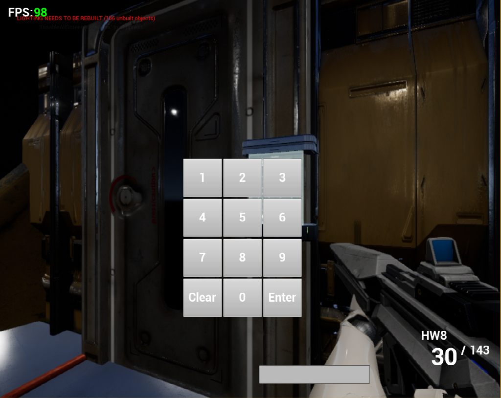
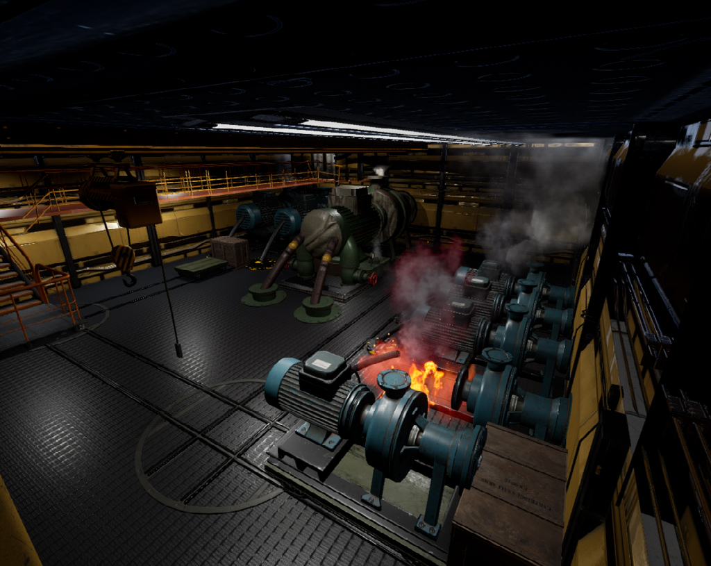
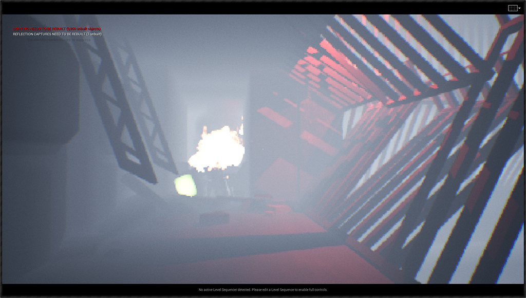
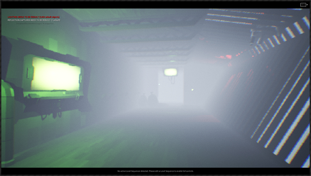
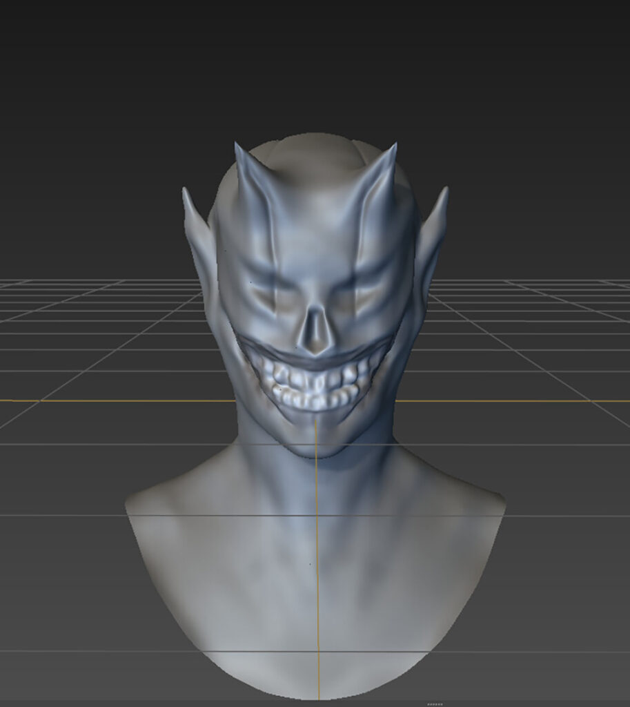
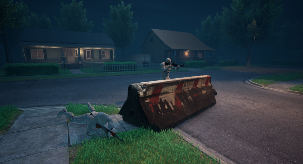
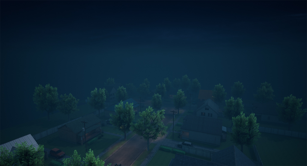
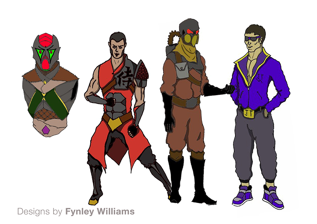
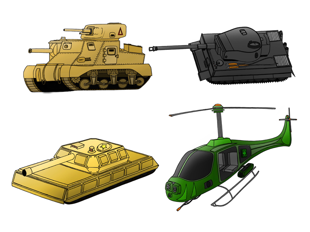
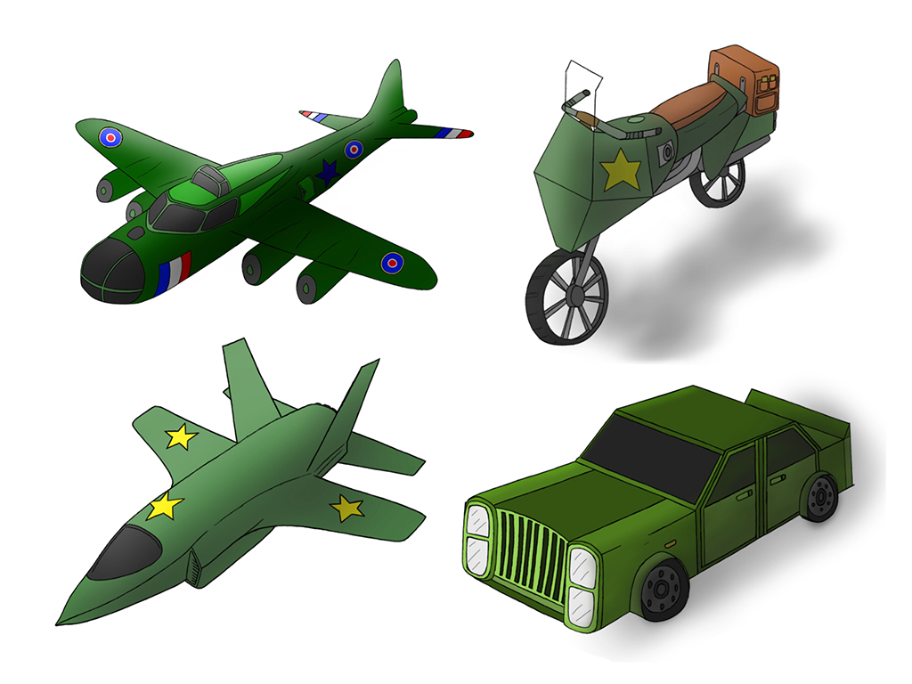
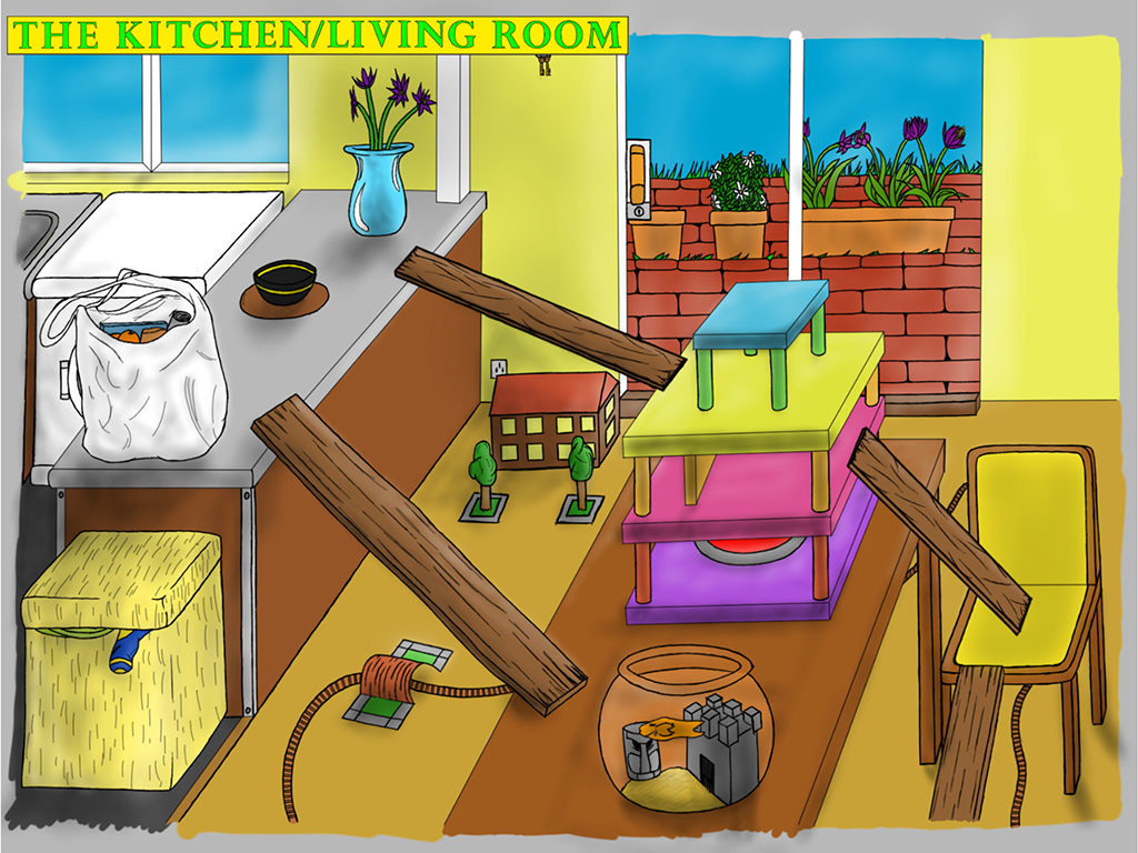
How do you build a computer game from the ground up? This course shows you how.
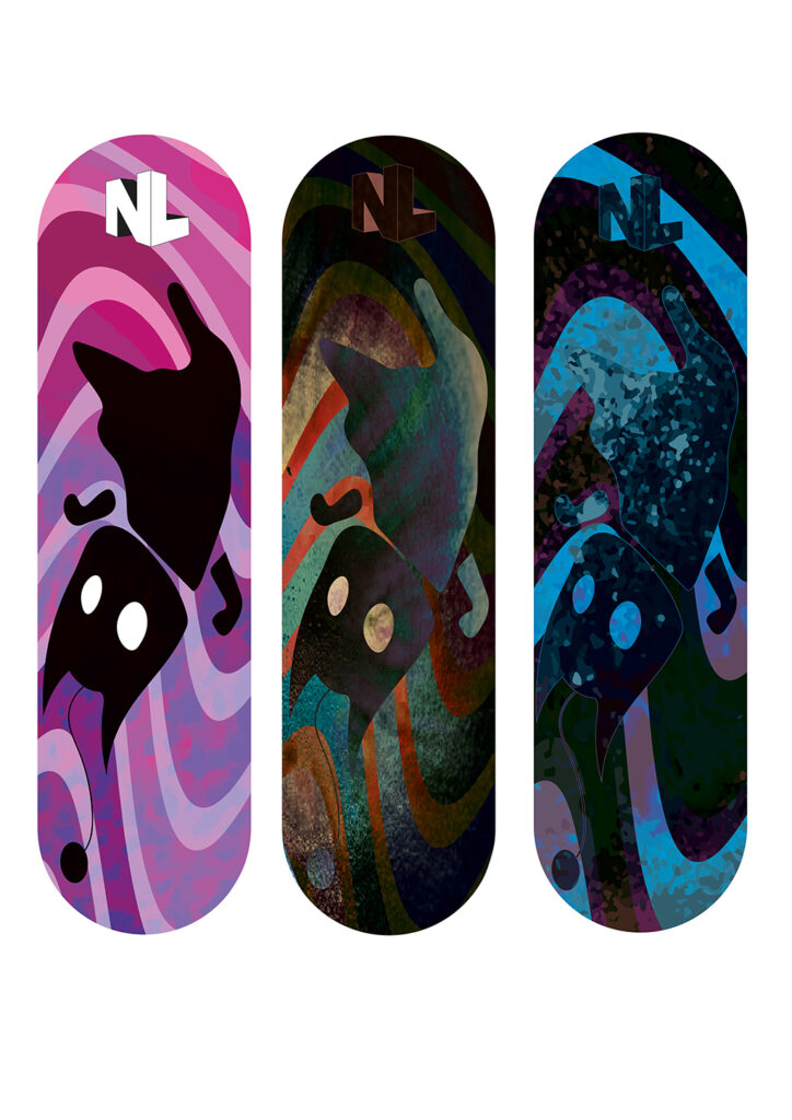
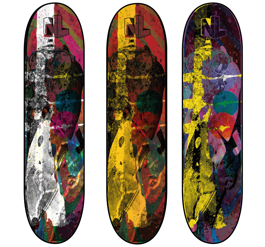
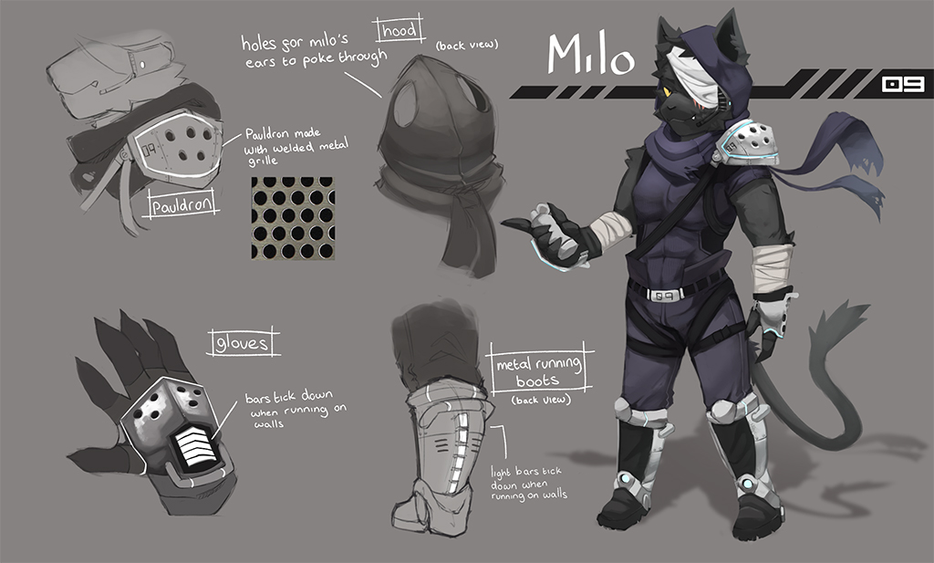
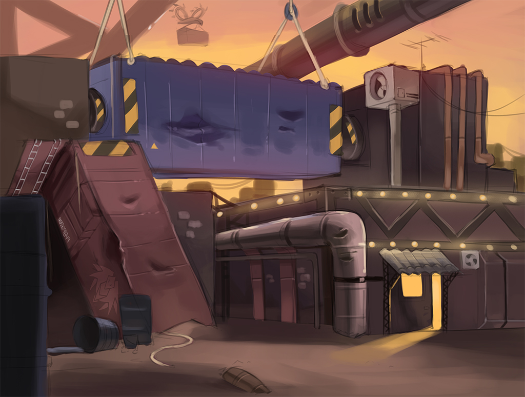
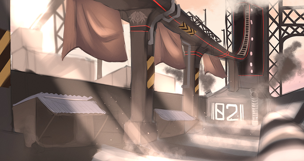
The work showcased demonstrates how young designers and artists at Dudley College have challenged the parameters of game design to present original and imaginative solutions for 2D and 3D game outcomes. Learners are challenged to ‘think outside of the box’ to explore and question conventions within the world of games design. The course provides learners with the opportunity to creatively develop dynamic conceptual outcomes, while working with industry-standard design and production applications.
Students produce a wide range of game related ideas, from creating and developing proposals for intriguing game play and challenging game mechanics, to learning how to visualise, design and build digital characters for game deployment. The learners also get the opportunity to imaginatively craft and sculpt 3D environments and worlds. The use of industry-standard software is at the core of what we offer.
Programmes such as 3D Studio Max, Unreal Engine 4, World Machine, Mudbox, Z Brush, Qiuixel Suite, Crazy Bump, Visual Studio, GameMaker Studio are embedded throughout the projects our learners undertake. As part of the creative aspect of the course, we encourage our learners to become keen practitioners in areas of conceptual illustration, using applications such as Photoshop and Sketchbook to visually portray aspects of their imagination. I hope that you enjoy viewing and watching examples of their work.
Who knows? In a few years, you could be playing one of their games . . .
John Jones, Computer Games Design Course Tutor

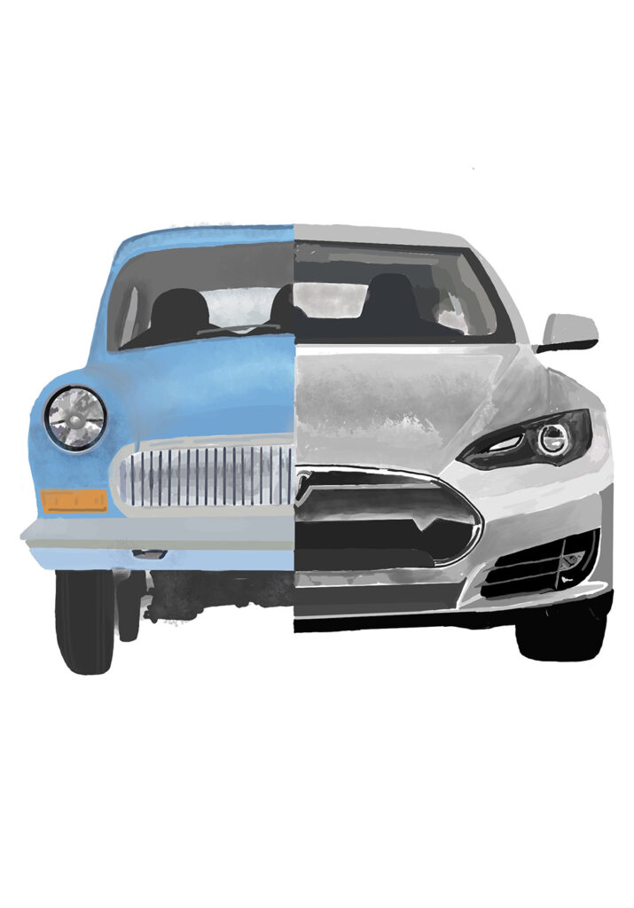
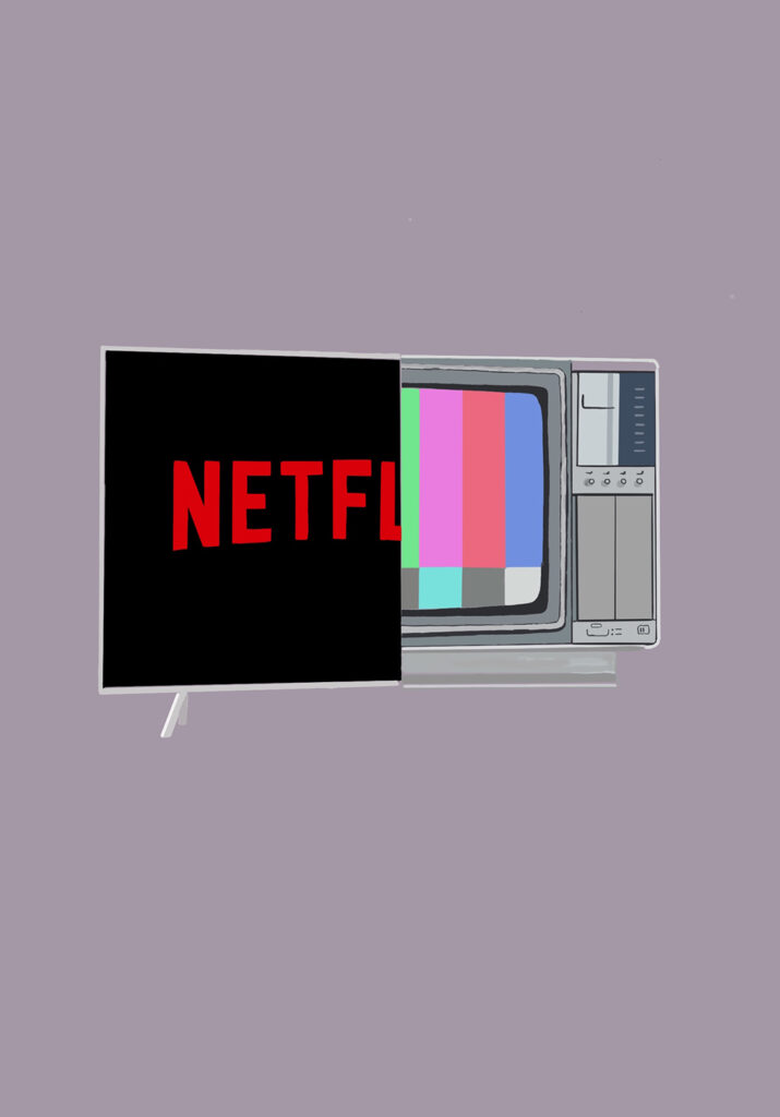
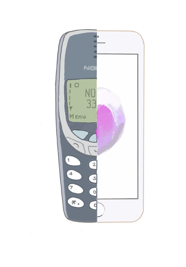
Although ‘Covid’ has had an impact on much of the curriculum, our Graphic Design students have continued with their studies using Adobe Creative Suite at home during periods of lockdown. Dudley College has made sure that all art students have access to Adobe software for the duration of their course in order to support their studies both in college and at home. The work on show here is just a snapshot of some of the work produced over the past two years. While our students are taught digital skills, they also learn traditional art and design skills in order to develop a broad portfolio of art and design for their progression onto higher education. Some of our recent students have gone on to study at degree level in subject areas such as visual communication or graphic design, but also illustration, animation, fashion illustration, automotive design, architecture, interior architecture, jewellery design, digital media, and many other creative pathways.
Over the past few months all our students who made university applications were accepted (as usual), and generally on their first choice. Some have chosen to begin their studies at degree level, and others have decided to stay on at Dudley College for a Foundation Year. Well done all – it’s been great working with you. Good luck for the future.
Paul Oldnall, graphics tutor