Fashion and Textiles 2022Fashion and Textiles 2022
FASHION AND TEXTILES
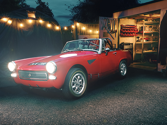
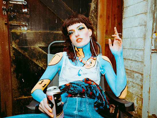
BTEC L3 Diploma in Fashion & Textiles Yr1

My New Year’s Resolution for 2020 was to try and expand my photography skills and photograph more people. With covid, lockdowns and social distancing, it was difficult to meet and photograph people, so I spent my time researching and planning photo shoots.
Unfortunately, lockdowns went on for longer than I could have ever imagined, so I took to another passion, which is macro photography.
This set of images is a mixture of skills I developed for taking macro and portrait photographs, which I have managed to achieve in and around lockdowns.
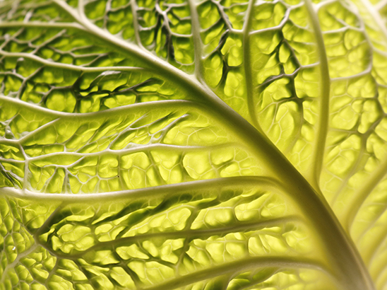
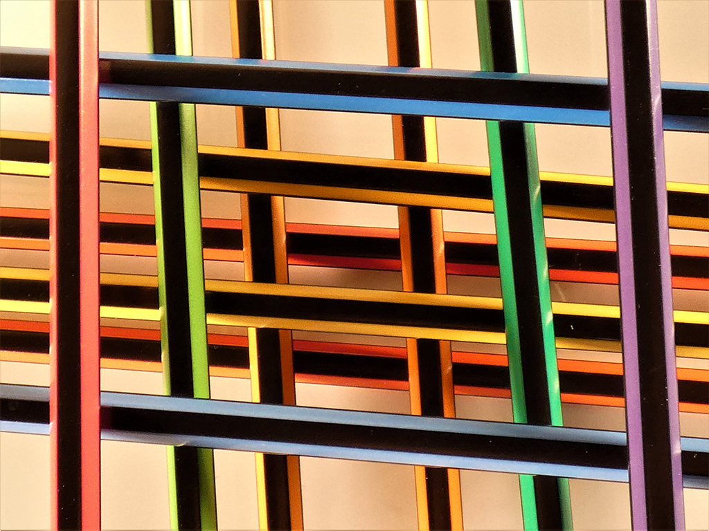
For this project I decided to go down the route of still life and focus on macro photography. I decided on this as I believe that there is beauty in everything, and we don’t always see these details. With our busy, hectic lifestyles we don’t have the time to stop, look and admire the true beauty of an object, so my aim was to try and capture this through my photography.
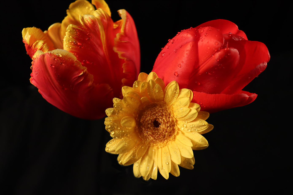
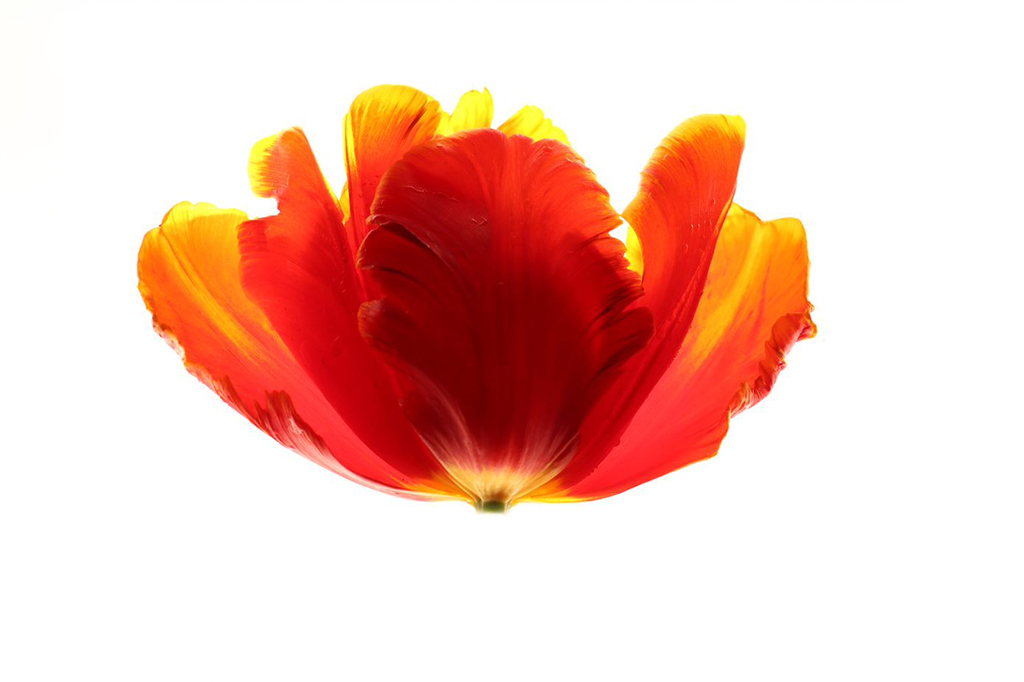
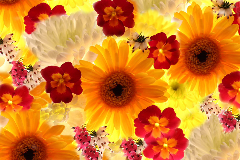
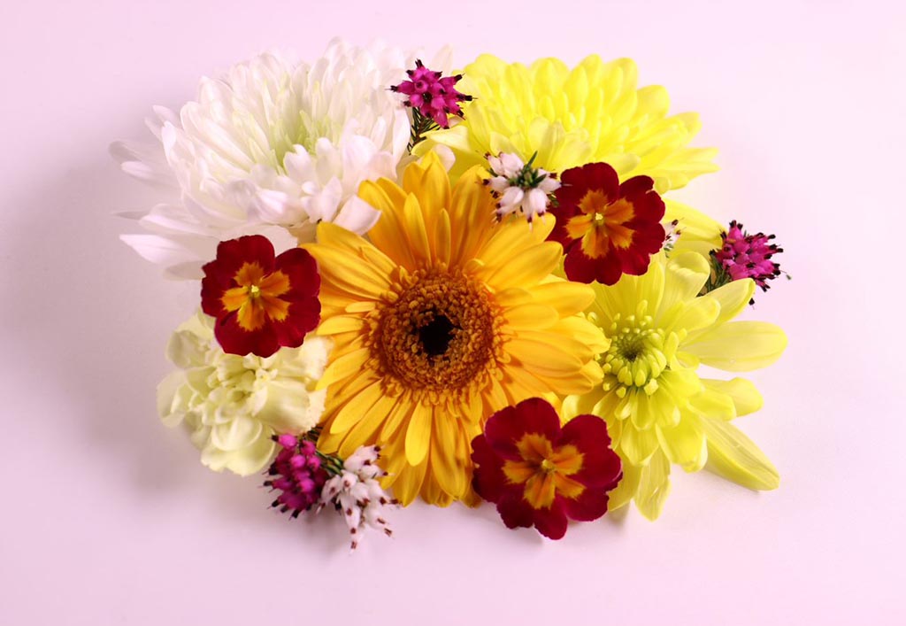
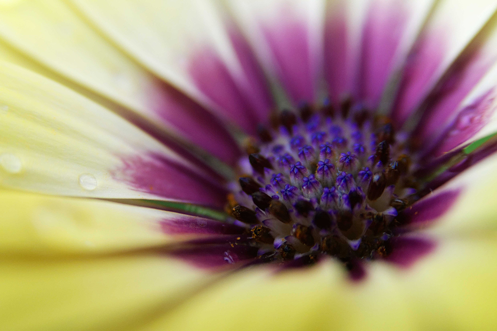
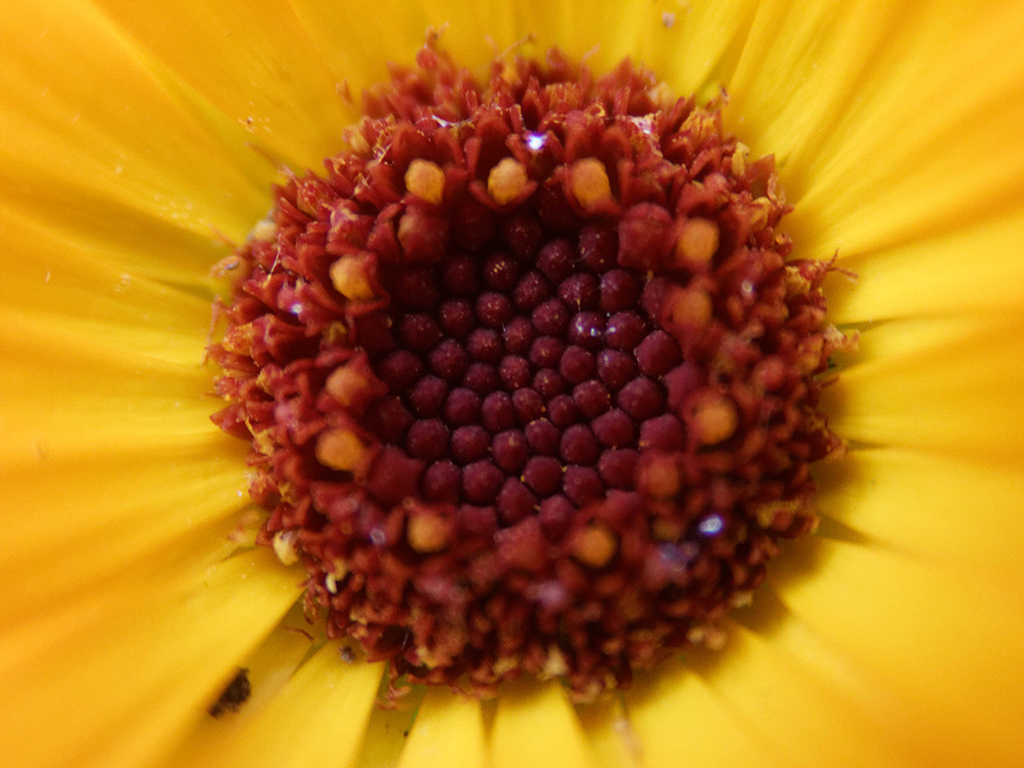
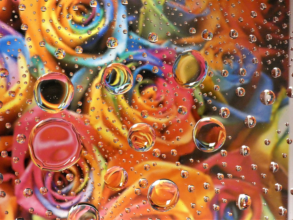
I began by looking at flowers and thought about going down a more commercial style of photography. I found it quite hard to photograph the flowers as there was either an imperfection with the flower or it just wasn’t quite ‘perfect’. Because of this I had to take into consideration the positioning of the flower, what part I would focus on and the lighting I used. I experimented with using both colour and black and white to see what effect it would have on the final image. I found that by using Black and white it removes the distraction of colour and helps you to focus on the shapes and patterns of the petals.
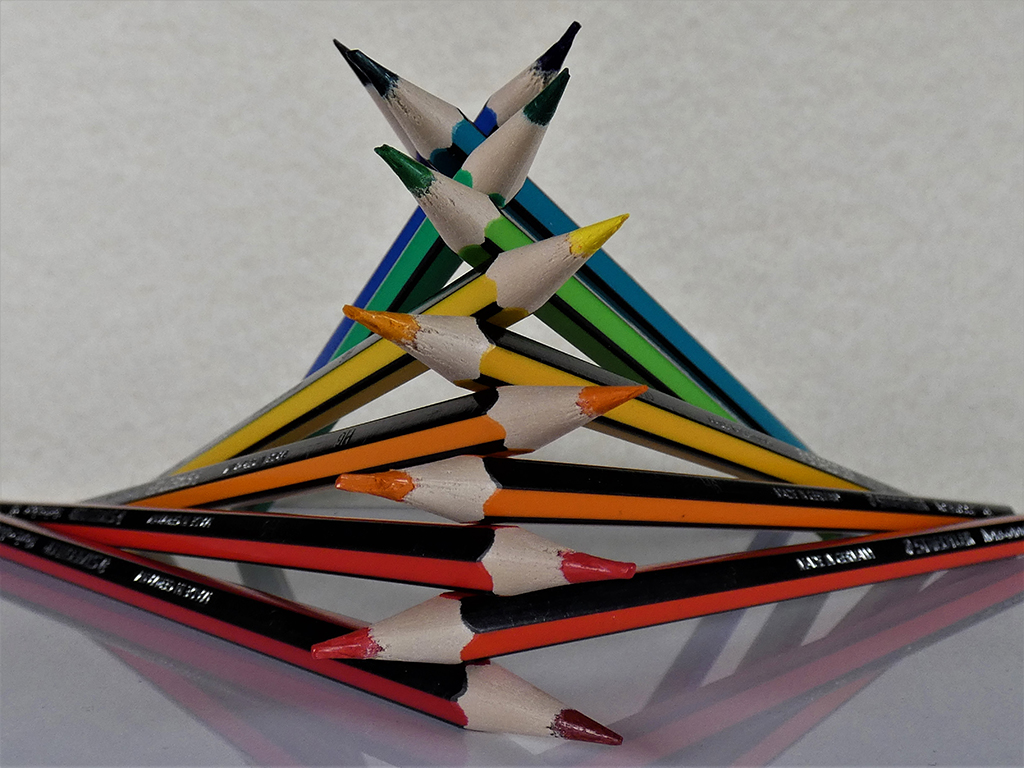
From flowers I then moved onto pencil crayons, again with a more commercial feel to the images. With pencils I found that I could be more creative in the way I arranged them on a surface and the angles at which I shot them from. As I was using branded crayons in my shot, I had to think about the placing of them so that in one of the shots you could see the name. This would then allow for the photos to be used for advertising purposes.
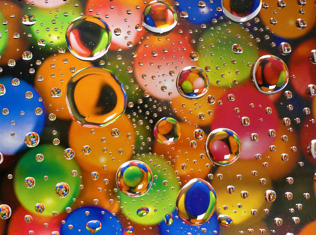
After experimenting with the commercial side of macro photography I tried going for a more artistic approach and tried photographing oil on water. This technique again allowed me to be more creative with the shot and produce an abstract effect. By simply placing a different image under the Perspex dish, I was getting a different result each time and an image that looked layered.


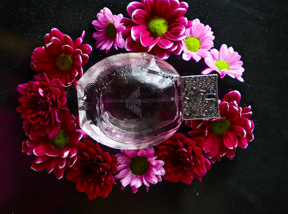
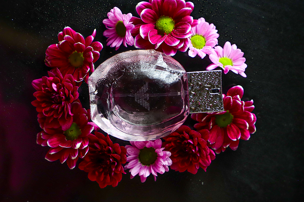
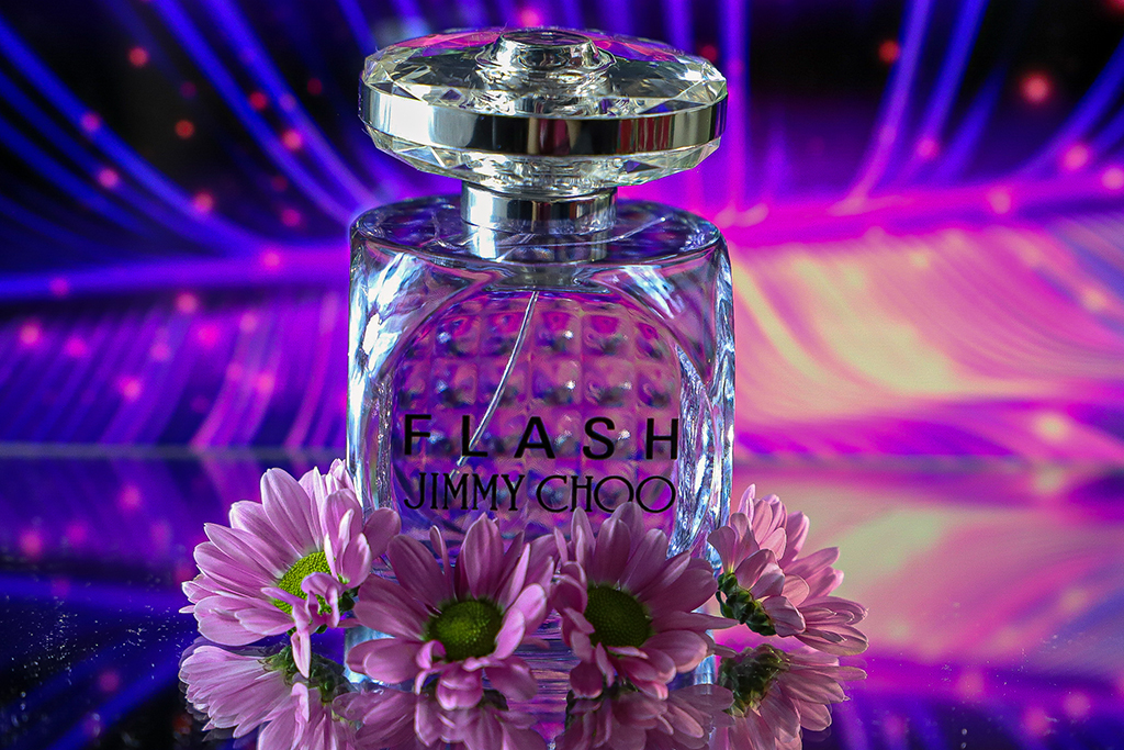
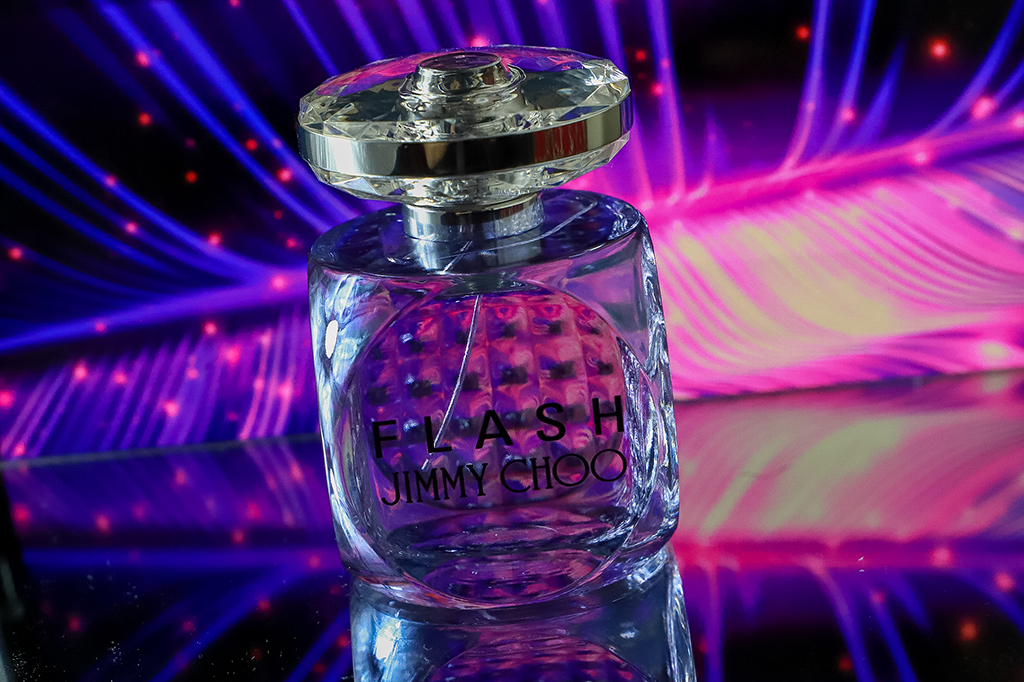
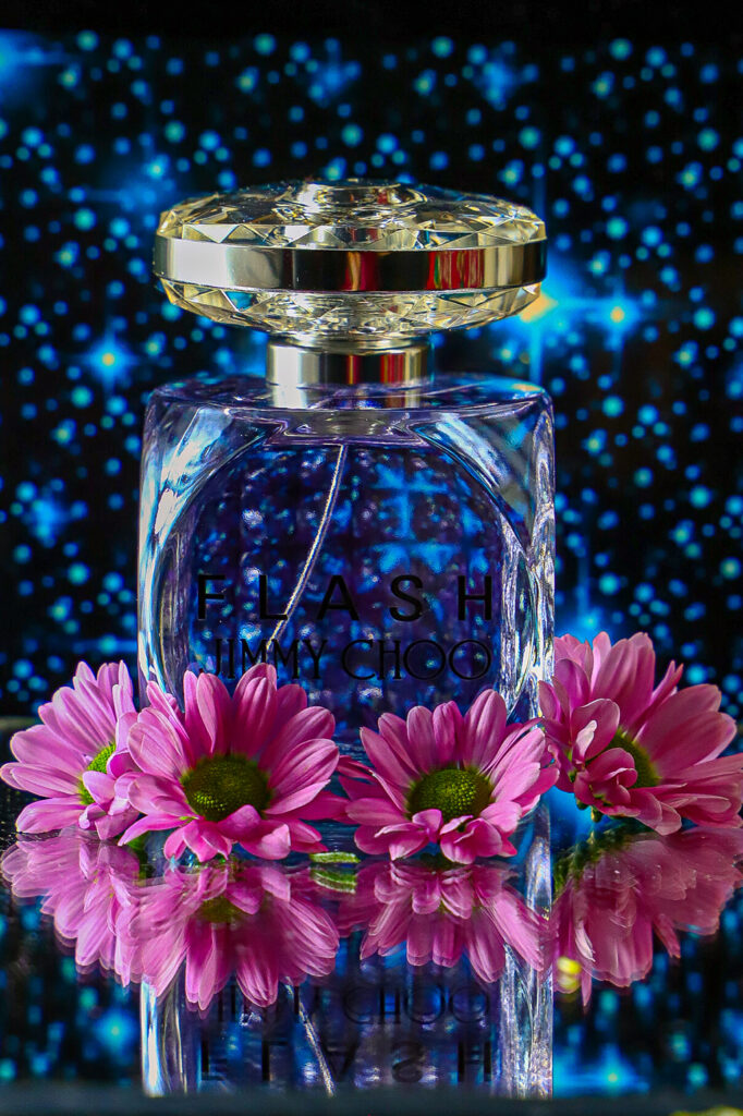
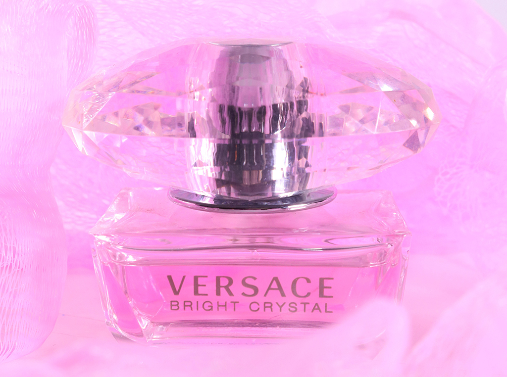
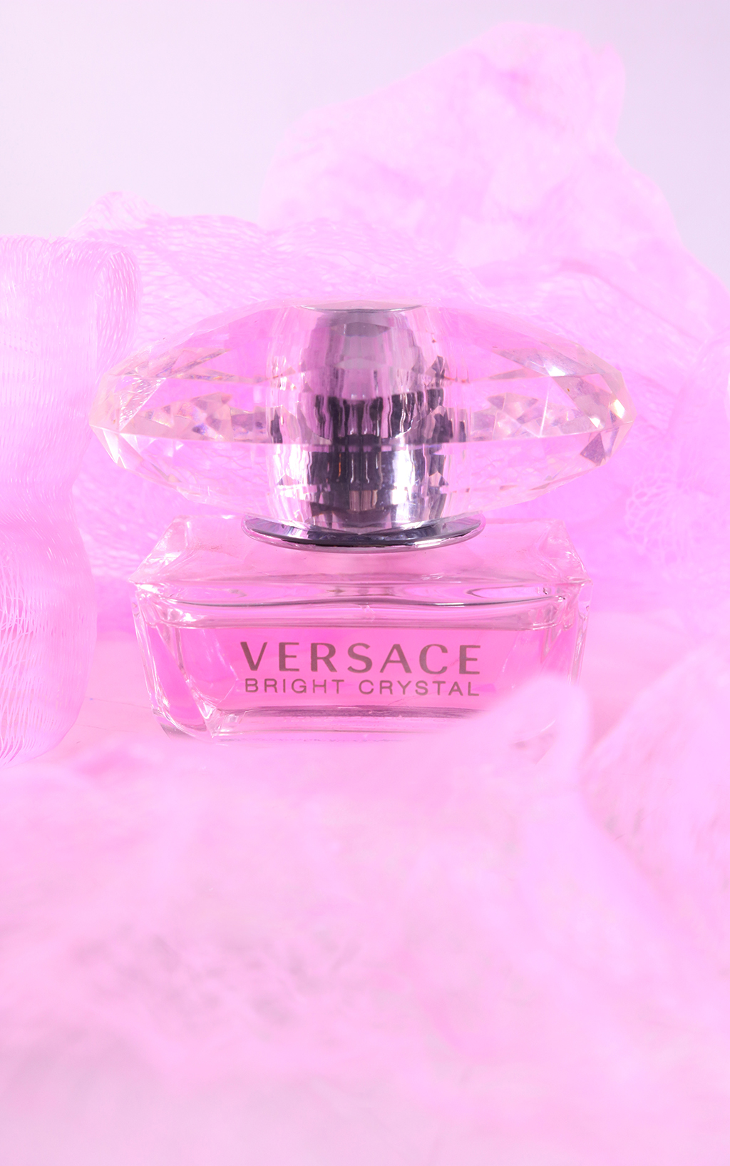
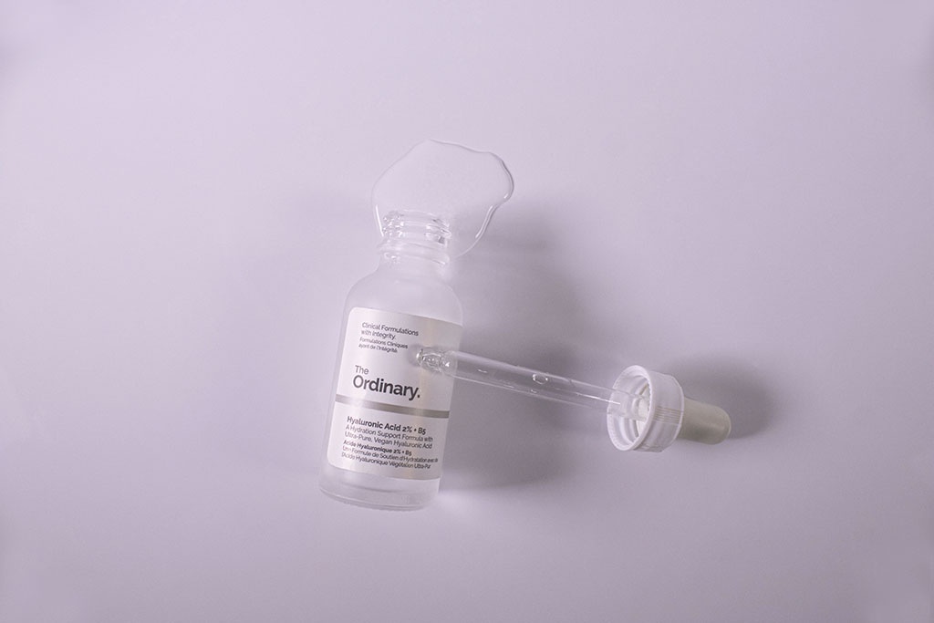
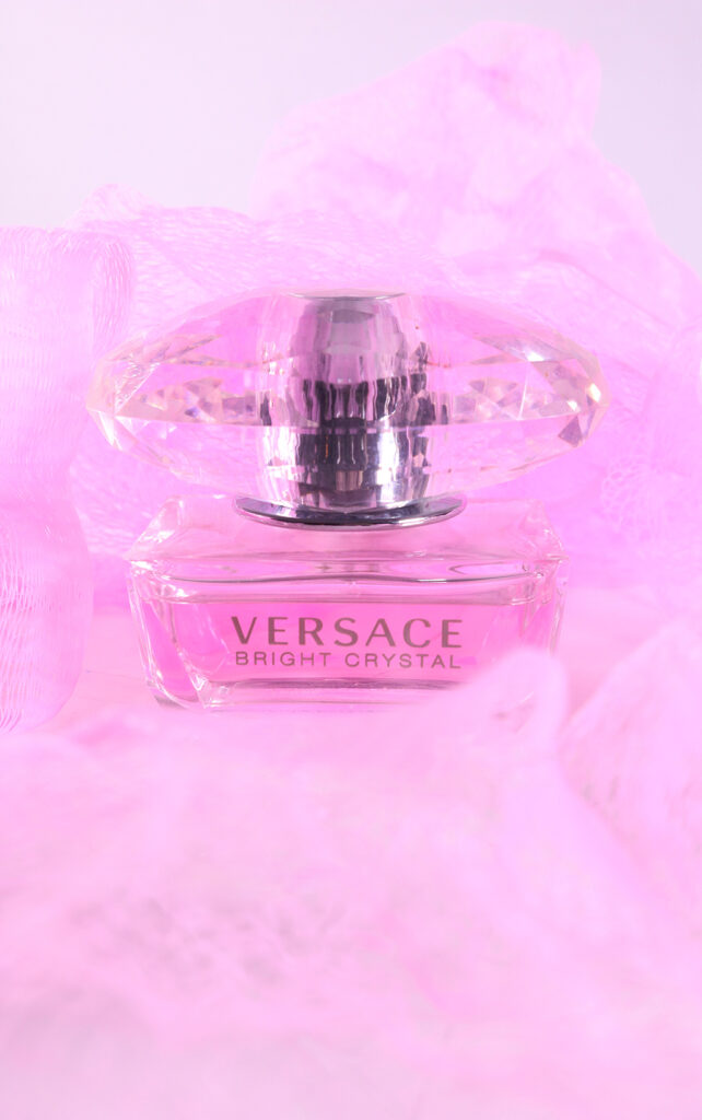
My original plan was to photograph still life objects to make them appear commissioned and then utilise them in commercials because this was such a broad topic, I began by looking at glass objects. Despite the fact that I began with perfume, I rapidly moved on to other things. My work with glass drink bottles has evolved as a result of this. I was able to exert more control such as composition, and lighting techniques as a result of this. Above aesthetic designs, the ability to light through the clear bottle is the most important.
This allowed me to have more control over artistic designs, the ability to see through the clear bottles and liquid is the most important feature. I was trying to figure out how professional photographers made product photos, I researched photographers which prompted me to try things I’d never tried before. Spraying liquid on products is an example. These items are intended to be used in magazines and blogs. I wanted my photographs to reflect this beauty that can be seen in the backgrounds. I was trying to understand how professional photographers created their product shots, which led me to experimenting with ways I never thought work such as spraying liquid on products. These objects are meant to be perfection and I wanted this to show in my images.
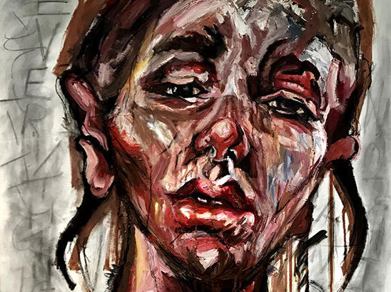
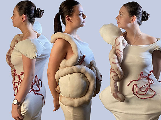
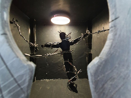
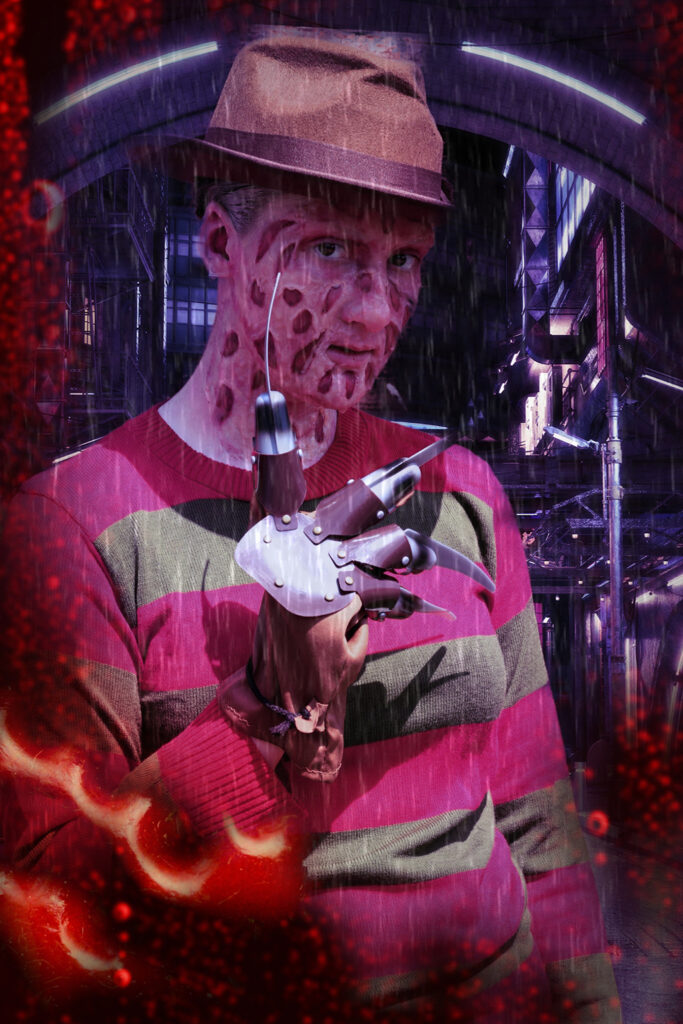
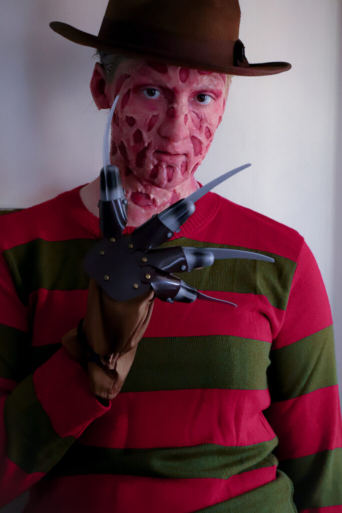
I produced a concept board for the Freddy Krueger makeup using photographs of the original makeup from the film as well as photographs of people who have cosplayed the appearance. I made a mental note of where the sunken regions were and used red eyeshadow to map them out on the models face. I used Aertex, which comes in two jars, one labelled part A and the other labelled part B. These have to be combined in equal parts. To activate the makeup, they had to be blended in equal parts. I applied the makeup with a spatula and sculpted it around the appropriate regions. I used a cream colour wheel to colour the appearance and painted the model’s hair to disguise the few portions that were visible. The costume is now complete. This all was about how I create the makeup and scene. I choose a horror and fashion theme for this project.
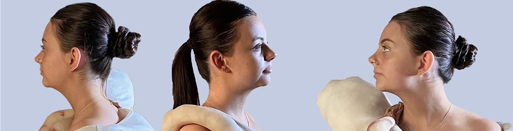
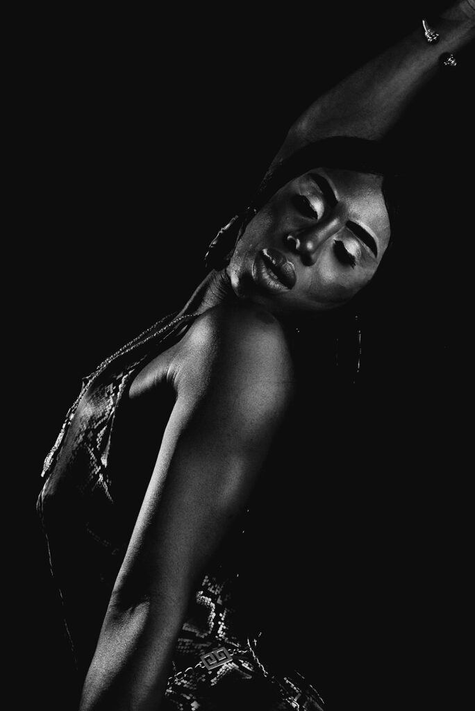
I came into this course with minimal studio photography experience, and I am leaving it with more confidence and knowledge, this was helped and influenced a lot by the other students on the course. My photos I have chosen are not following a theme, I chose these because they are the ones that stand out to me when looking back on what I have achieved during this course. Each week we were suggested a word that we would need to put into picture, a word which would make me question my abilities, but each time I would surprise myself when it came to submitting these photos.
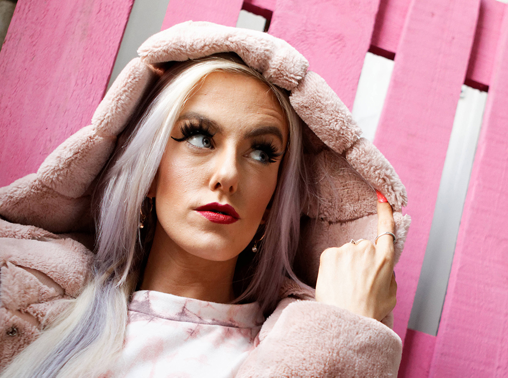
The image of the letters and the book are examples of these, the book I love because it’s taking an everyday object and turning it into something unique and pleasing to the eye, which is something I already enjoyed doing with my photos. The portraits were something I was more hesitant about because I had little experience in this area, and it has been a big learning curve that I wouldn’t change, I did not know that we were going to be photographing ‘Candy’ the drag queen artist until I walked into class that day, but I really enjoyed this experience and Candy was a fantastic model.
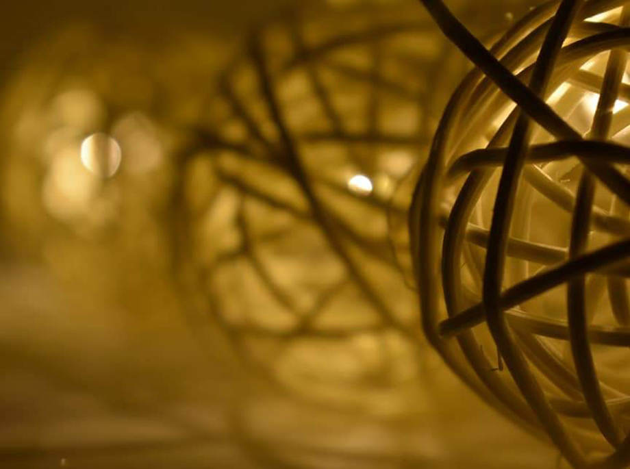
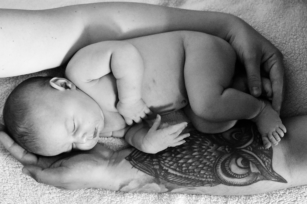
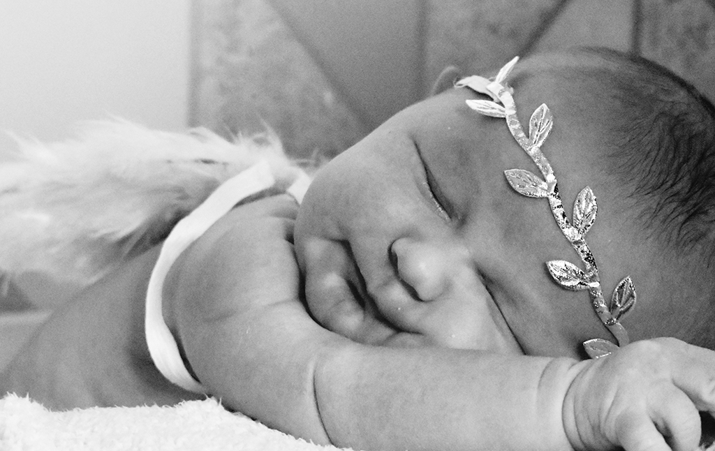
The baby photographs, I had limited equipment, but I still managed show how peaceful the little baby was. The final picture of the ‘little balls of light’ are an example of texture lighting, this is by far one of my favourite photographs I have taken throughout the course. I love the warmth it gets across and the split focus fading into the background, which leads the eye throughout. I have enjoyed every frustrating and challenging minute; I have laughed and could of cried but I am pleased and proud that I have come this far and would just like to thank the tutors for putting up with me and seeing me through to the end.


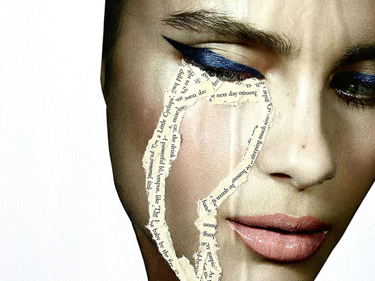
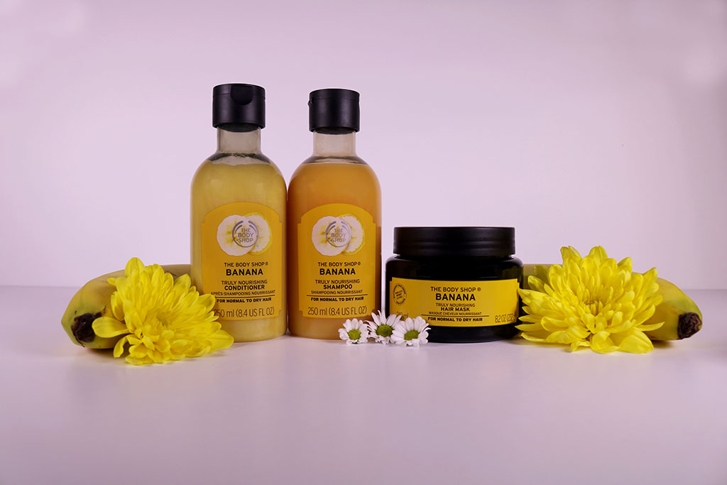
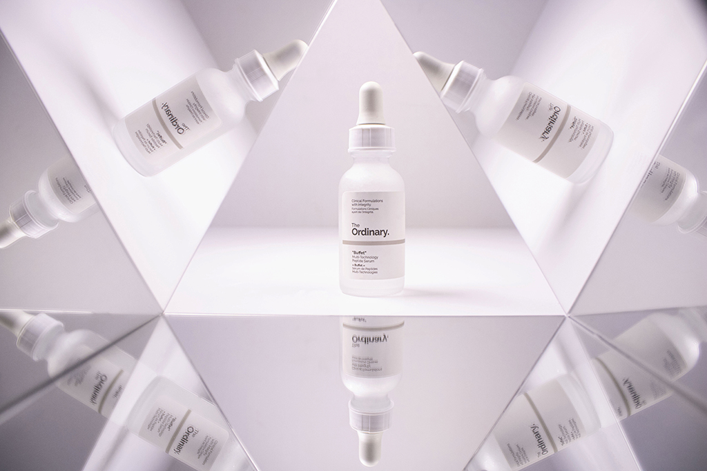
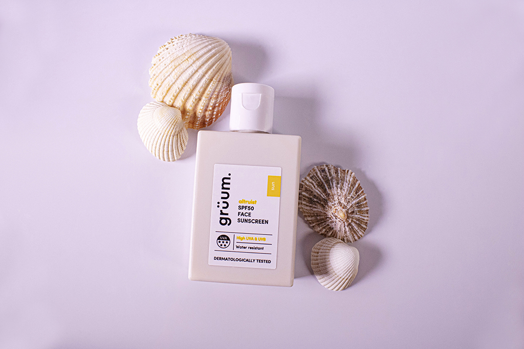
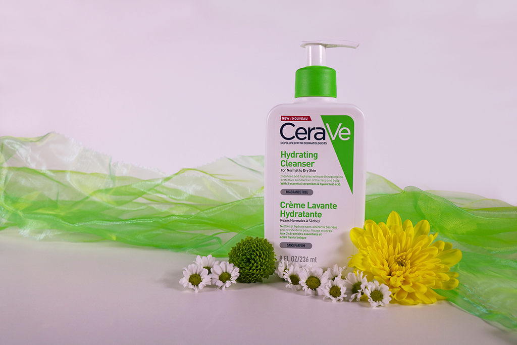
I started this project hoping that I could build upon my advertisement skills and possibly apply my soon to be found knowledge to mental health promotion projects at my workplace. This was something I have never done before and had little knowledge about; therefore, I was quite excited to give it a go. When I started to think about my project and themes more in depth, I decided to focus on photographing products with the aim of promoting self-care. This was because I felt inspired after researching some of the work done by product photographers and the idea also aligned well with wanting to promote mental health as self-care has been an extremely important factor in maintaining people’s wellbeing during COVID-19.
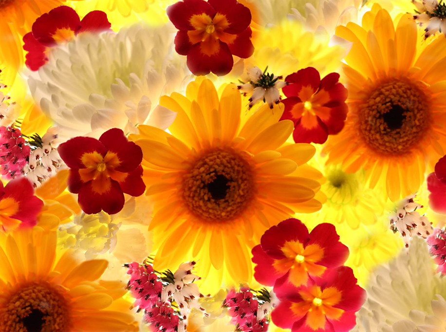
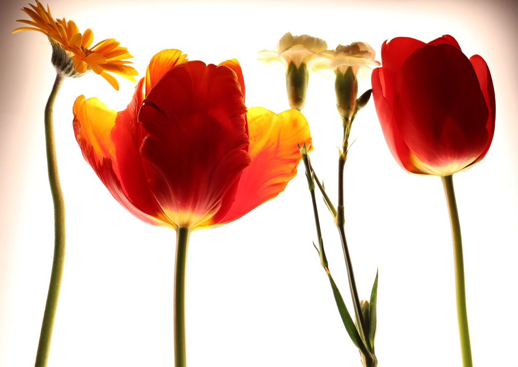
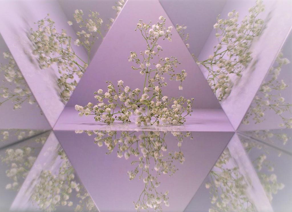
The theme for my project is ‘nature in studio’ with my images capturing flowers in different ways. This is my first time working in a studio, I have enjoyed being able to test out different techniques and find a balance between creating traditionally ‘still life’ images and more creative, arty ones. I took inspiration from looking at the work of photographers such as Harold Davis, which led me to experimenting with transparency techniques. I have also enjoyed developing my Photoshop skills and learning about different post processing techniques.